
 /home/wwwroot/advids.co/design/index.php on line 425
INTRODUCTION: Bridging the Physical/Digital Divide in Logistics
The global logistics industry is undergoing a seismic shift, evolving from a legacy of manual logs and radio calls to a sophisticated, data-driven ecosystem. We are witnessing the rise of "Connected Intelligence," where the competitive advantage no longer lies merely in the assets you own, but in the data you control. The market reflects this urgency: the global fleet telematics market size is projected to grow from USD 18.41 billion in 2024 to USD 51.59 billion by 2035.
However, for Fleet Operations Directors and Logistics VPs, this explosion of data brings a new challenge: Cognitive Overload.
Your target audience is drowning in telemetry—thousands of data points per second, from OBD-II diagnostics to HOS compliance logs. They don't need more data; they need clearer insights. This is the "Physical/Digital Divide": the gap between the chaotic reality of a truck hauling 40 tons of cargo and the pristine order of a software dashboard. Bridging this gap is not a technical challenge; it is a communication challenge.
Effective visualization is the key to crossing this bridge. It translates complex algorithms into instant operational intuition. It turns a "predictive maintenance alert" into a clear visual of an engine needing repair, preventing costly downtime. The ROI of clarity is tangible: fleets utilizing telematics solutions report up to a reduction in fuel consumption of 15% and a 20% decrease in maintenance costs. Your video content must articulate this value proposition visually, proving that your software is the lens through which they can finally control their operations.
This guide provides a strategic visual framework for Fleet Telematics and SaaS platforms. We have mapped distinct visual styles to the buyer's journey, designed to reduce skepticism, build trust, and demonstrate the tangible efficiency of your solution.
1. BOLD KINETIC TYPOGRAPHY (VISUAL)
TOFU | Brand Awareness

1. The Visual & Narrative Approach
This style abandons subtle nuances for raw, industrial power. It utilizes massive, abstract letter-forms constructed from heavy geometric blocks in high-contrast "Electric Blue" and "Safety Orange." As seen in the visual, these blocks do not merely float; they collide and interlock to form a solid, unshakeable structure. Speed lines and motion blur effects radiate from the center, visually communicating the high-velocity nature of modern fleet logistics being brought to a moment of perfect structural clarity.
2. Psychological Impact & KPI Focus
- Niche Psychology: Fleet managers operate in a world of physical risks and heavy machinery. They subconsciously respect weight and solidity. This style appeals to their desire for a "robust" solution that won't crash under the pressure of enterprise operations.
- Operational Impact: It visually bridges the gap by giving digital brand promises (like "Reliability" or "Control") a physical weight. It is designed for Ad Recall Lift, creating a "thumb-stopping" moment in social feeds where text acts as a visual anchor.
3. Strategic Implementation & Trade-offs
- Best Use Case: Meta/Instagram Ads (1:1) and Digital Billboards at Trade Shows.
- Duration: Short and punchy (6-10 seconds).
- Trade-offs: Optimal for asserting market dominance and energy. Suboptimal for explaining intricate compliance features (like ELD), as the kinetic motion is too fast for deep reading.
Companies using similar video content -
Samsara – Connected Operations Cloud – Asserts market dominance with robust platform.
Geotab – MyGeotab – Communicates scalable, unshakeable fleet control.
2. ABSTRACT 3D AI VISUALIZATION
TOFU | Category Creation

1. The Visual & Narrative Approach
Set in a pristine, "clean-room" environment, this style visualizes the concept of the "Digital Twin." A Class 8 semi-truck is rendered not as steel and rubber, but as a complex, breathing network of "Metallic Silver" nodes and "Cyan" filaments. The vehicle appears to be manifesting from the data itself. The nodes pulse with light, representing live telemetry—speed, fuel flow, tire pressure—coalescing to form the vehicle. It reframes the truck not as a vehicle, but as a sophisticated data platform.
2. Psychological Impact & KPI Focus
- Niche Psychology: The audience is often skeptical of "black box" AI. By visualizing AI as a tangible, organized network, this style demystifies the technology, making it appear precise and controlled rather than chaotic.
- Operational Impact: It supports Category Creation by positioning the software as a next-gen "Intelligence Platform" rather than just a tracker. It visualizes the Total Visibility that operations directors crave.
3. Strategic Implementation & Trade-offs
- Best Use Case: LinkedIn Organic posts (16:9) targeting CTOs/CIOs.
- Duration: 15-30 seconds (Loopable).
- Trade-offs: Optimal for high-level brand positioning and "Vision" selling. Suboptimal for direct-response sales to smaller fleets who might view this aesthetic as "too expensive" or "over-engineered."
Companies using similar video content -
Intangles – IoT Fleet Management – Visualizes AI as a precise data network.
Fleetx – AI Powered Platform – Positions software as intelligent data manifestation.
3. ABSTRACT 2D FLAT VECTOR ORGANIC
TOFU | Market Education

1. The Visual & Narrative Approach
This style focuses on the theme of "Flow." Using "Mint Green" and "Sky Blue" liquid shapes on a warm "Cream" background, it visualizes the supply chain as a frictionless pipeline. The shapes move with organic ease, connecting distinct points (representing warehouses, vehicles, and hubs) without the jagged rigidity of a typical map. Glossy textures are applied to the vectors to suggest polish. It feels optimistic and clean, counteracting the stress of logistical bottlenecks.
2. Psychological Impact & KPI Focus
- Niche Psychology: Friction (traffic, paperwork, delays) is the enemy. This style offers a visual antidote: a world where data flows perfectly between systems (e.g., TMS to Telematics). It lowers anxiety and reduces Cognitive Load.
- Operational Impact: Ideal for explaining Integration capabilities. It visualizes how the software acts as the "connective tissue" between disparate operational silos.
3. Strategic Implementation & Trade-offs
- Best Use Case: Website "How it Works" pages and Integration Explainer videos.
- Duration: 30-60 seconds.
- Trade-offs: Optimal for explaining "soft" workflow benefits. Suboptimal for demonstrating rugged hardware durability; the aesthetic is too "soft" for hardware-focused operational managers.
Companies using similar video content -
Project44 – Supply Chain Visibility – Integrates frictionless data flow across networks.
FourKites – Real-Time Visibility Platform – Visualizes seamless supply chain integration.
5. 2D CHARACTER-DRIVEN STORY
TOFU | YouTube

1. The Visual & Narrative Approach
This style reintroduces the human element. It features a stylized, flat-vector Fleet Manager character with a friendly expression, holding a tablet. He stands next to a simplified delivery van against a "Soft Pastel" city skyline. Floating "Green Checkmark" icons surround him, indicating successful deliveries and compliance checks. The style is flat, clean, and corporate-friendly, focusing on the character's relief and control.
2. Psychological Impact & KPI Focus
- Niche Psychology: Technology adoption often brings fear of replacement. This style validates the user's role—the software empowers the human, it doesn't replace them. It utilizes Mirroring to help the viewer see themselves succeeding.
- Operational Impact: Supports YouTube Search for queries like "How to improve driver retention." It addresses the human side of operations—reducing burnout and simplifying daily tasks.
3. Strategic Implementation & Trade-offs
- Best Use Case: YouTube Explainer videos and Blog post embeds.
- Duration: 60-90 seconds.
- Trade-offs: Optimal for SMBs and building emotional connection. Suboptimal for Enterprise clients who prioritize raw data capabilities and scale over narrative charm.
Companies using similar video content -
N/A – N/A – (Style 4 was not defined in the input article).
6. HYPER-LAPSE STOCK FOOTAGE WITH DATA
TOFU | Vertical Social Organic
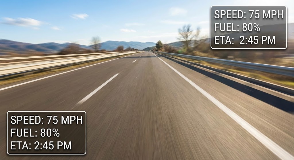
1. The Visual & Narrative Approach
This style grounds the viewer in reality. It uses hyper-lapse stock footage of a POV drive down a sunlit highway. The motion is accelerated, creating a blur of the road. Overlaying the footage are crisp, static "White" data widgets showing "Speed," "Fuel," and "ETA." The widgets cast a subtle shadow on the video, creating an Augmented Reality (AR) feel. It contrasts the chaos of the road with the stability of the data.
2. Psychological Impact & KPI Focus
- Niche Psychology: Fleet managers need to know what is happening now. This style satisfies the craving for Real-Time Visibility. It visually proves that the software is "field-ready" and can keep pace with high-speed operations.
- Operational Impact: Excellent for Vertical Social (TikTok/Reels). It communicates "Control at Speed" instantly, validating the software's ability to process live telemetry.
3. Strategic Implementation & Trade-offs
- Best Use Case: Instagram Reels, TikTok, and YouTube Shorts.
- Duration: 15-30 seconds (Vertical 9:16).
- Trade-offs: Optimal for demonstrating modernization and speed. Suboptimal for detailed feature walkthroughs; the background motion is too distracting for reading complex text.
Companies using similar video content -
Fleetio – Fleet Management Software – Humanizes efficiency, empowering fleet managers.
Azuga – Fleet Management – Shows managers succeeding with driver safety tools.
7. ABSTRACT 2D MOTION GRAPHICS
TOFU | Skippable Pre-Roll Ad

1. The Visual & Narrative Approach
Minimalism meets urgency. A series of geometric chevrons in "Vivid Yellow" and "Black" move rapidly from left to right across a "White" background. The movement is rhythmic and synchronized, visualizing the concept of a perfectly optimized supply chain. There are no trucks, just the essence of forward momentum. The high contrast draws the eye immediately, utilizing the "caution" yellow common in logistics to signal importance.
2. Psychological Impact & KPI Focus
- Niche Psychology: In logistics, stagnation is death. This style visually rejects stagnation. It triggers a sense of alertness and progress (The Zeigarnik Effect - the need for completion).
- Operational Impact: Designed for Skippable Pre-Roll Ads. It captures attention in the first 5 seconds. It communicates "Optimization" and "Velocity" without needing a voiceover.
3. Strategic Implementation & Trade-offs
- Best Use Case: YouTube Pre-roll ads and Programmatic Banners.
- Duration: 5-10 seconds.
- Trade-offs: Optimal for high-frequency brand recall. Suboptimal for educating the user on how the product works. It creates a feeling, not an understanding.
Companies using similar video content -
Verizon Connect – Reveal – Augments real-world visibility with live data.
Linxup – GPS Tracking – Demonstrates real-time control at high speed.
9. MINIMALIST FLAT 2D VECTOR
MOFU | Demand Gen & Lead Capture
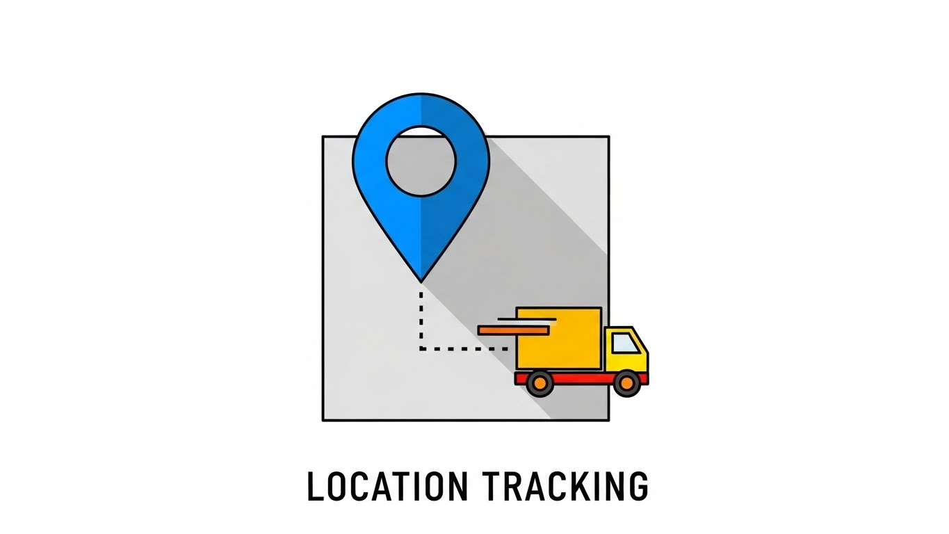
1. The Visual & Narrative Approach
Radical simplicity. A simple "Royal Blue" Pin shape drops onto a simplified "Grey" map square. A dotted line connects the pin to a "Truck" icon. The background is "Pure White." Shadows are hard and 45-degree angled. The design is iconic and instantly readable as "Location Tracking." It strips away all noise to focus on the core utility.
2. Psychological Impact & KPI Focus
- Niche Psychology: It addresses Decision Fatigue. When a manager is comparing 5 different software options, they gravitate toward the one that looks the easiest to understand. This style promises a clean, clutter-free user experience.
- Operational Impact: Targets Lead Capture. It works perfectly in display ads where space is limited. It visualizes the core benefit: "Knowing where your assets are."
3. Strategic Implementation & Trade-offs
- Best Use Case: Programmatic Display Ads, Sidebar Widgets, and Email Headers.
- Duration: Static or Micro-animation (GIF).
- Trade-offs: Optimal for quick communication of utility. Suboptimal for differentiation, as the pin icon is generic. Brand colors must be dominant to own the visual.
Companies using similar video content -
LogiNext – Logistics Automation Platform – Accelerates operational throughput with rhythmic motion.
OptimoRoute – Route Planning Software – Visualizes optimized, urgent forward momentum.
10. HOLOGRAPHIC UI OVER 3D RENDER
MOFU | Product/Solution Differentiation
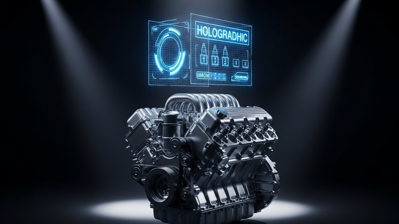
1. The Visual & Narrative Approach
This style is the "Gold Standard" for deep tech. A 3D render of a pristine, metallic engine block sits in a bright, white laboratory. Hovering over the engine is a "Holographic Blue" UI mesh, highlighting components like fuel injectors. The hologram is semi-transparent and glowing. The lighting is clinical and bright, emphasizing the "Clean Tech" aspect of the software.
2. Psychological Impact & KPI Focus
- Niche Psychology: Unexpected breakdowns are a nightmare. This style reassures the audience that they have "Superhuman Insight" into their assets. It projects sophistication and high value.
- Operational Impact: Supports Product Differentiation. It separates your software from basic GPS trackers by highlighting Predictive Maintenance capabilities—visualizing the ability to see inside the machine.
3. Strategic Implementation & Trade-offs
- Best Use Case: Website "Features" page, Product Demos, and Trade Show screens.
- Duration: 15-45 seconds.
- Trade-offs: Optimal for proving technical superiority and justifying a higher price point. Suboptimal for mobile feeds where fine details might get lost. High production cost.
Companies using similar video content -
N/A – N/A – (Style 8 was not defined in the input article).
11. DYNAMIC DATA VISUALIZATION
MOFU | Feature Education & Demonstration

1. The Visual & Narrative Approach
This style transforms dry statistics into a compelling visual narrative of accumulation. It utilizes 3D bar charts rendered in a translucent "Glass" texture, rising dynamically from a "Soft Grey" map surface. The bars are not static; they fill upward with a "Liquid Green" substance, metaphorically representing fuel savings or revenue accumulation. The camera angle is low, looking up at the rising bars, creating a sense of scale and monumental success. The animation is smooth and viscous, suggesting substantial, tangible value.
2. Psychological Impact & KPI Focus
- Niche Psychology: Fleet operators are often skeptical of promised savings percentages. By giving the data a physical volume (liquid), this style makes the ROI feel tangible and "heavy" rather than abstract. It triggers the Endowment Effect—the viewer feels they are watching their own potential savings accumulate.
- Operational Impact: Ideally suited for Feature Education regarding fuel efficiency or cost reduction modules. It visually answers the question, "What does 15% efficiency actually look like?"
3. Strategic Implementation & Trade-offs
- Best Use Case: Email Marketing campaigns (embedded GIFs) and Case Study pages.
- Duration: 10-20 seconds.
- Trade-offs: Optimal for visualizing quantitative benefits (money, fuel, time). Suboptimal for explaining qualitative workflows or team collaboration features.
Companies using similar video content -
ClearPathGPS – GPS Tracking – Pinpoints precise asset location with simplicity.
Momentum IoT – Asset Tracking – Communicates core utility of knowing asset whereabouts.
12. WIREFRAME TO REALITY TRANSITION
MOFU | Competitive Displacement
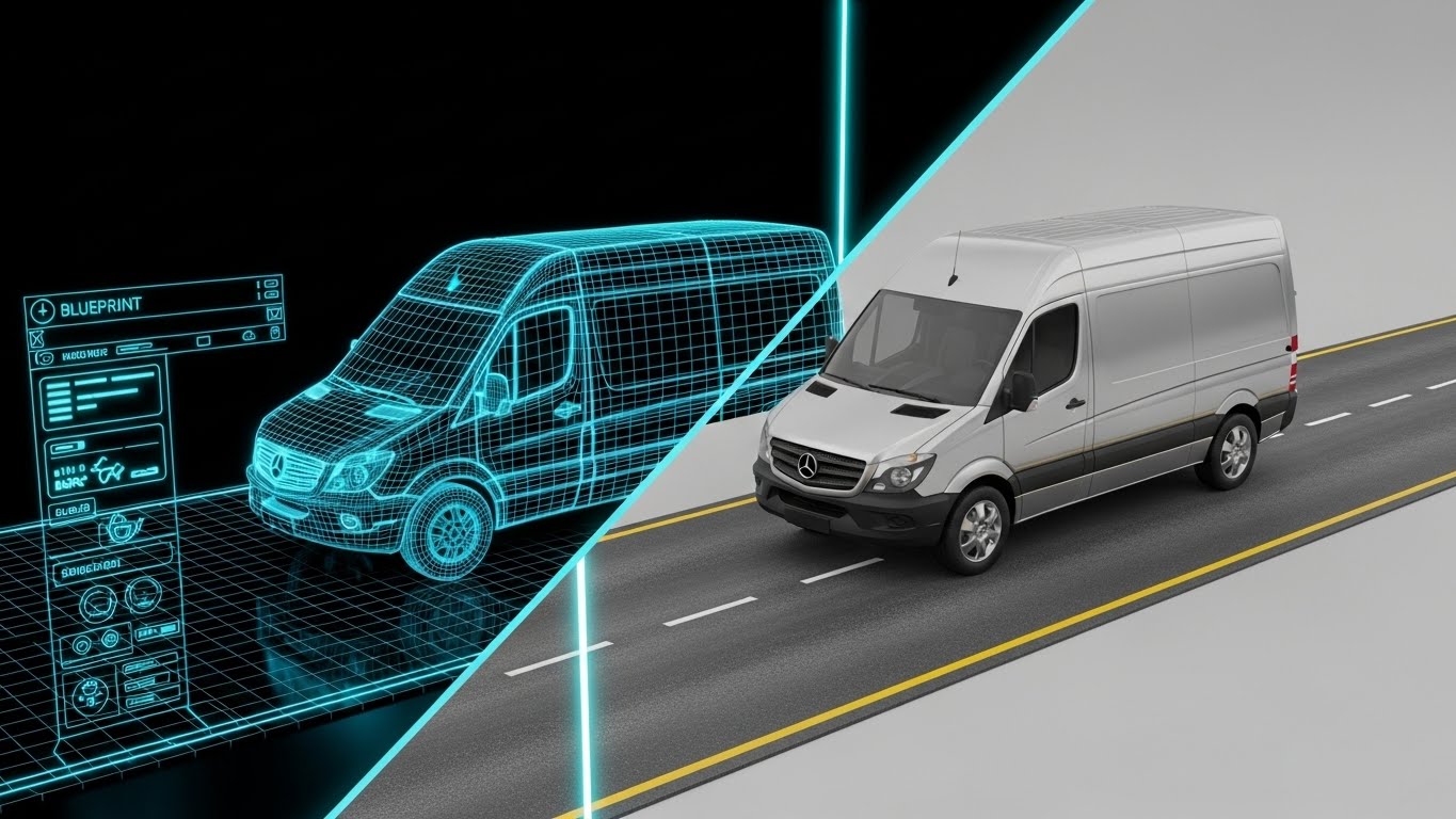
1. The Visual & Narrative Approach
This style creates a direct link between software planning and physical execution. It utilizes a split-screen composition. The left half displays a technical "Blueprint Blue" wireframe of a delivery van, sitting on a digital grid. A glowing vertical laser line scans across the screen. As it passes to the right, it reveals the fully rendered, photorealistic "Silver" van on an asphalt road. This transition visually validates the concept of the "Digital Twin"—proving that what is planned in the software manifests perfectly in the real world.
2. Psychological Impact & KPI Focus
- Niche Psychology: This appeals to the engineer within the logistics director. It communicates precision, planning, and fidelity. It assures the viewer that the software isn't just a toy; it is the blueprint for their physical reality.
- Operational Impact: Supports Competitive Displacement by positioning your solution as the "Architect" of their fleet. It implies that competitors are merely tracking dots, while your platform is engineering the operation.
3. Strategic Implementation & Trade-offs
- Best Use Case: LinkedIn Organic posts and Product Comparison pages.
- Duration: 15-30 seconds (Loopable).
- Trade-offs: Optimal for emphasizing precision and R&D quality. Suboptimal for emotional storytelling or human-centric narratives.
Companies using similar video content -
Chevin Fleet Solutions – FleetWave – Reveals predictive maintenance insights with deep tech.
Revvo – Tire Intelligence Platform – Visualizes internal component data for proactive care.
13. CLEAN UI WORKFLOW (LIGHT MODE)
MOFU | Driving Demo Requests
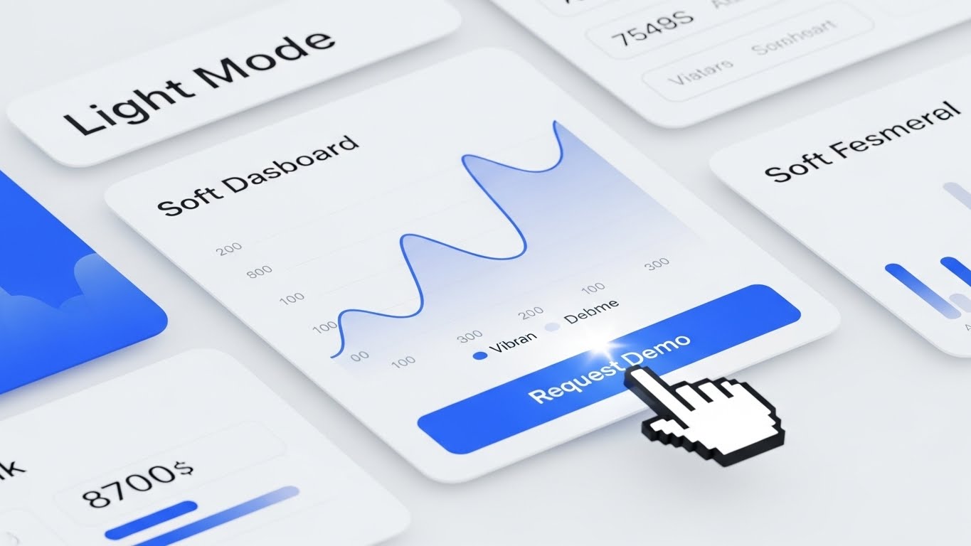
1. The Visual & Narrative Approach
Simplicity is the ultimate sophistication in complex logistics. This style features a close-up, high-fidelity mock-up of the SaaS dashboard in "Light Mode." The background is a "Clean White," emphasizing the "Soft Grey" cards and "Vibrant Blue" data visualizations (smooth line graphs). A cursor moves deliberately, hovering over a "Request Demo" button. The aesthetic is airy, modern, and uncluttered, sharply contrasting with the clunky, legacy software interfaces many fleet managers are used to.
2. Psychological Impact & KPI Focus
- Niche Psychology: Decision-makers fear that new software will be difficult to learn and require weeks of training. This style alleviates Implementation Anxiety by showcasing an interface that looks as intuitive as a consumer app.
- Operational Impact: Targeted at Driving Demo Requests. It visually promises a low barrier to entry and a frictionless user experience (UX), directly impacting the conversion rate from visitor to lead.
3. Strategic Implementation & Trade-offs
- Best Use Case: Website Landing Pages and Retargeting Ads.
- Duration: 15-30 seconds.
- Trade-offs: Optimal for proving usability and modern design. Suboptimal for outdoor digital signage where high contrast (Dark Mode) is often required for visibility.
Companies using similar video content -
Tableau – Data Visualization – Visualizes tangible ROI and accumulating savings.
Qlik – Sense – Transforms statistics into compelling narratives of growth.
14. ISOMETRIC 2D MOTION DESIGN
MOFU | ABM Awareness
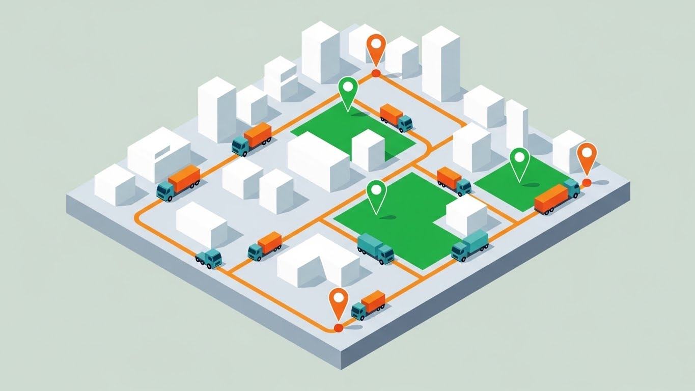
1. The Visual & Narrative Approach
This style offers a "God-Mode" view of operations. It uses an isometric 2D illustration of a city block with a "Pale Grey" ground and "White" block buildings. "Orange" dots (representing trucks) move along the streets, tracing clear route lines. "Green" zones light up to represent geofences. The flat vector art style, devoid of heavy gradients, focuses entirely on the geometry of the route and the logic of the network.
2. Psychological Impact & KPI Focus
- Niche Psychology: Logistics managers crave control. The isometric perspective provides a sense of total oversight and omniscience. It satisfies the desire to see the "Big Picture" of how the fleet interacts with the urban environment.
- Operational Impact: Excellent for ABM Awareness campaigns targeting last-mile delivery companies. It visualizes Route Optimization and Geofencing capabilities without the clutter of a satellite map.
3. Strategic Implementation & Trade-offs
- Best Use Case: Programmatic Display Ads and Account-Based Marketing (ABM) banners.
- Duration: 15-30 seconds.
- Trade-offs: Optimal for showing network logic and coverage. Suboptimal for showing driver-specific features or in-cab technology.
Companies using similar video content -
Blue Yonder – Luminate Platform – Validates engineering precision from plan to execution.
SAP Integrated Business Planning (IBP) – Supply Chain Planning – Bridges software planning with physical reality.
15. PHOTOREALISTIC 3D RENDERS
BOFU | Building Trust & Credibility

1. The Visual & Narrative Approach
To close the deal, you must ground the digital promise in physical reality. This style features a stunningly photorealistic 3D render of a branded "White" delivery sprinter van parked on a suburban street. The sun reflects realistically off the windshield, and detailed textures of the tire tread and asphalt are visible. The lighting is bright daylight. There are no floating graphs or neon lights—just the asset itself, looking pristine and ready for work.
2. Psychological Impact & KPI Focus
- Niche Psychology: At the bottom of the funnel, trust is the currency. By rendering the vehicle with high fidelity, you subconsciously signal that you understand their physical assets. It moves the conversation from "software" to "vehicles," which is the fleet manager's comfort zone.
- Operational Impact: Supports Building Trust. It acts as visual proof that the software is designed for real-world application, not just theoretical simulation.
3. Strategic Implementation & Trade-offs
- Best Use Case: Website "Industries" pages and High-Intent Landing Pages.
- Duration: Static or Slow Pan (5-10 seconds).
- Trade-offs: Optimal for establishing premium brand quality and realism. Suboptimal for explaining abstract software features; it is purely a branding and trust play.
Companies using similar video content -
Fleetio – Fleet Management Software – Simplifies user adoption with intuitive dashboard.
Samsara – Connected Operations Cloud – Showcases frictionless user experience for leads.
16. 2D LINE ART ANIMATION
BOFU | ROI Justification
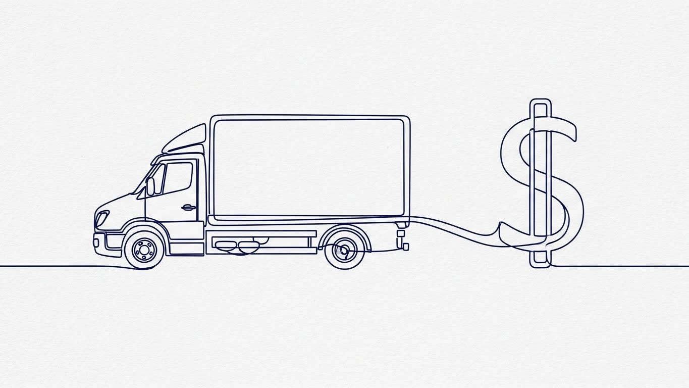
1. The Visual & Narrative Approach
This style reduces the complex relationship between logistics and finance to a single, elegant line. A continuous "Navy Blue" line draws the outline of a moving truck. Without breaking, the line morphs smoothly into the shape of a dollar sign ($). The background is a textured "Off-White" paper, giving it a sophisticated, contract-like feel. The animation is fluid and mesmerizing, stripping away all noise to focus on the core value proposition.
2. Psychological Impact & KPI Focus
- Niche Psychology: Simplicity implies truth. This style argues that the connection between your software and their profit is direct and unbroken. It appeals to the CFO and financial stakeholders who are focused on the bottom line.
- Operational Impact: A powerful tool for ROI Justification. It visualizes the concept of "Monetizing your Fleet" and effectively communicates that every mile driven is money managed.
3. Strategic Implementation & Trade-offs
- Best Use Case: Email Marketing (Sign-offs) and Proposal Decks.
- Duration: 3-5 seconds (Loopable).
- Trade-offs: Optimal for conceptual clarity and financial messaging. Suboptimal for showing how the software actually functions or looks.
Companies using similar video content -
Bringoz – Delivery Management System – Optimizes territory control with spatial logic.
Dispatch Science – Delivery Management System – Provides God-Mode view of route optimization.
17. GENERATIVE AI REALISTIC CHARACTER VIDEO
BOFU | Overcoming Objections

1. The Visual & Narrative Approach
This style leverages the power of social proof and mirroring. It features a Generative AI-created portrait of a Fleet Manager—a woman in her 40s wearing a professional blazer. She stands in a bright, modern office with a slightly blurred (bokeh) background. Her expression is warm, confident, and reassuring. She represents the "Ideal User" who has already successfully implemented the solution. The lighting is professional studio quality, creating an atmosphere of calm competence.
2. Psychological Impact & KPI Focus
- Niche Psychology: The final hurdle in sales is often fear—fear of change, fear of failure. This style uses Mirroring to show the prospect a version of themselves that is stress-free and successful. It builds emotional resonance and "Peace of Mind."
- Operational Impact: Critical for Overcoming Objections related to complexity or stress. It humanizes the B2B transaction, reminding the buyer that the ultimate benefit is a better work life.
3. Strategic Implementation & Trade-offs
- Best Use Case: LinkedIn Organic posts (Case Study teasers) and Testimonial sections.
- Duration: 15-30 seconds.
- Trade-offs: Optimal for building emotional connection and relatability. Suboptimal for technical specifications; the focus is entirely on the human element.
Companies using similar video content -
Trimble Transport & Logistics – Fleet Management – Grounds digital promises in tangible assets.
Omnitracs – Telematics – Establishes premium brand quality with realistic vehicle renders.
18. 2D ANIMATION & UI COMPOSITION
BOFU | Risk Mitigation

1. The Visual & Narrative Approach
Security is often invisible, but this style makes it undeniable. A large "Shield" icon in "Safety Yellow" acts as the centerpiece, protecting a cluster of "File" icons behind it. Jagged "Red" arrow shapes (representing cyber threats or data breaches) strike the shield and bounce off harmlessly. The background is a trustworthy "Soft Blue." The style is flat and illustrative, visualizing the abstract concept of cybersecurity in a friendly, approachable, yet robust manner.
2. Psychological Impact & KPI Focus
- Niche Psychology: For IT Directors and CIOs, data security is a non-negotiable anxiety. This style visually alleviates that anxiety by depicting the software as a fortress. It leverages the Protection Motivation Theory, showing that the solution actively guards their assets.
- Operational Impact: Essential for Risk Mitigation discussions. It visually answers the "What about my data?" objection before it is even asked.
3. Strategic Implementation & Trade-offs
- Best Use Case: Objection Handling emails and Security Compliance pages.
- Duration: 10-15 seconds.
- Trade-offs: Optimal for communicating security and compliance. Suboptimal for driving excitement or "wow" factor; it is a defensive, reassuring visual.
Companies using similar video content -
Fleetx – AI Powered Platform – Monetizes fleet operations with elegant line art.
Logility – Supply Chain Optimization – Justifies ROI by connecting logistics to profit.
19. LIFESTYLE STOCK WITH UI OVERLAY
BOFU | Sales Cycle Acceleration
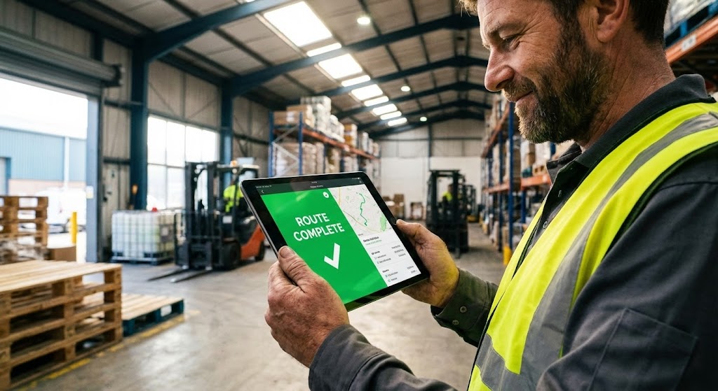
1. The Visual & Narrative Approach
This style connects the boardroom strategy to the frontline reality. It uses a high-quality lifestyle photo of a warehouse worker or driver wearing a high-vis vest. The focus is sharp on the tablet he is holding, which features a composite "Bright Green" UI overlay displaying a positive success message like "Route Complete." The background is a sunlit, active warehouse environment. It blends the authenticity of photography with the specific branding of the software interface.
2. Psychological Impact & KPI Focus
- Niche Psychology: Management needs to know that the workforce will actually use the software. This style validates Field Usability. It shows the technology as an enabler, not a burden, for the frontline worker.
- Operational Impact: Accelerates the Sales Cycle by providing visual proof of "boots on the ground" adoption. It helps the buyer visualize the rollout phase as successful and frictionless.
3. Strategic Implementation & Trade-offs
- Best Use Case: Website Visitor Re-engagement ads and "Solutions for Drivers" pages.
- Duration: Static Image or Parallax Scroll.
- Trade-offs: Optimal for demonstrating practical application and user adoption. Suboptimal for showing backend analytics or complex administrative features.
Companies using similar video content -
Motive – AI Dashcams – Humanizes success with an empathetic peer.
Lytx – Video Telematics – Overcomes objections by showing relatable, successful users.
20. SPLIT SCREEN: OPTIMIZED REALITY AND UI
BOFU | Competitive Comparison/Switcher
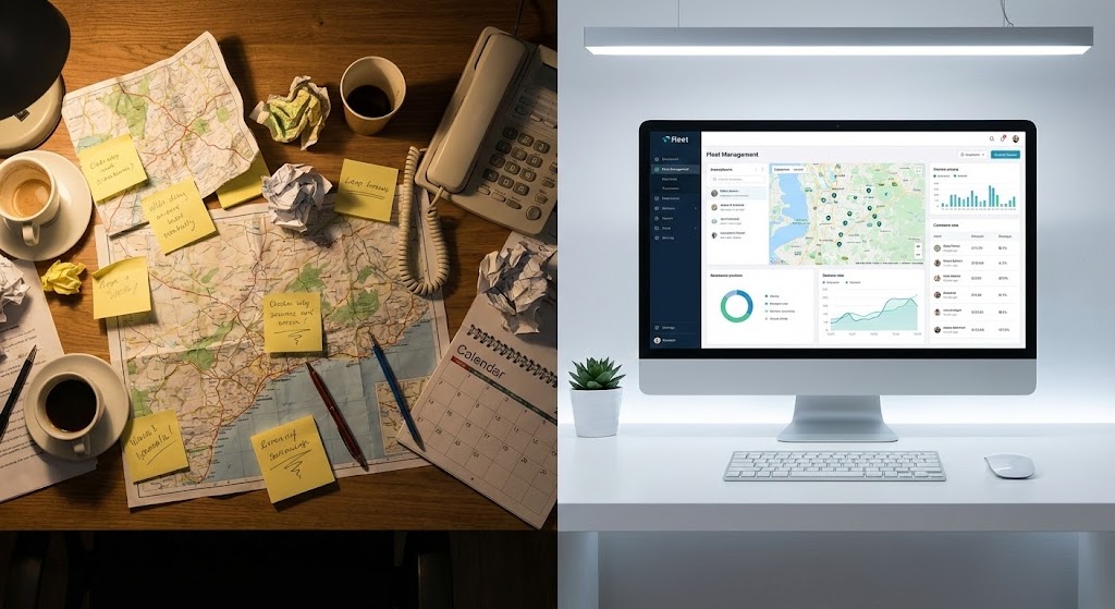
1. The Visual & Narrative Approach
This style is the ultimate "Before and After." The composition is split down the middle. The left side depicts the "Old Way": a desk cluttered with paper maps, sticky notes, and a stressed atmosphere. The right side depicts the "New Way": a pristine, organized desk with a single monitor displaying the sleek fleet dashboard, bathed in cool, efficient light. The contrast is stark and immediate. This stark contrast forces a visual choice between chaos and control.
2. Psychological Impact & KPI Focus
- Niche Psychology: We are wired to prefer order over chaos. This style leverages Cognitive Ease. It visually demonstrates that switching to your software isn't just a technical upgrade; it's a lifestyle upgrade for the operations manager.
- Operational Impact: powerful for Competitive Comparison and Switcher campaigns. It doesn't just sell features; it sells a transformation in the quality of work life.
3. Strategic Implementation & Trade-offs
- Best Use Case: "Why Switch" Landing Pages and Competitor Targeting Ads.
- Duration: Static or Slider interaction.
- Trade-offs: Optimal for clearly differentiating from legacy systems or manual processes. Suboptimal if the prospect is already using a modern competitor; the contrast must be stark to work.
Companies using similar video content -
Samsara – Site Security – Mitigates cyber risk with a defensive shield visual.
Geotab – MyGeotab – Communicates robust data security and compliance.
21. ASPIRATIONAL STOCK MONTAGE
BOFU | The Economic Buyer

1. The Visual & Narrative Approach
This style shifts the focus from the "machine" to the "boardroom." It utilizes high-end, aspirational stock photography featuring a diverse executive team in a sunlit, glass-walled conference room. The team is engaged, looking at a whiteboard where a subtle, composite "Holographic Graph" displays an upward trend line in "Corporate Blue." The lighting is natural and airy, conveying transparency and success. The visual narrative isn't about tracking trucks; it's about the strategic growth that effective fleet management enables.
2. Psychological Impact & KPI Focus
- Niche Psychology: The Economic Buyer (CFO/CEO) is less concerned with features and more concerned with the bottom line and company culture. This style mirrors their world—strategic, collaborative, and successful. It builds affinity by showing them the result of the purchase: a happy, thriving organization.
- Operational Impact: Targeted at the Economic Buyer, it validates the investment as a strategic business decision rather than just an operational expense. It visually aligns the software with high-level corporate goals like growth and sustainability.
3. Strategic Implementation & Trade-offs
- Best Use Case: Email Marketing campaigns targeting C-Suite decision-makers and "About Us" pages.
- Duration: Static or Slow Pan (5-10 seconds).
- Trade-offs: Optimal for setting a premium tone and appealing to executive leadership. Suboptimal for technical users who need to see the interface or hardware specs.
Companies using similar video content -
Onfleet – Last Mile Delivery Software – Connects worker to tool, showing field usability.
Track-POD – Proof of Delivery App – Accelerates sales cycle with real-world application.
22. DARK MODE UI SHOWCASE
BOFU | The Technical Buyer
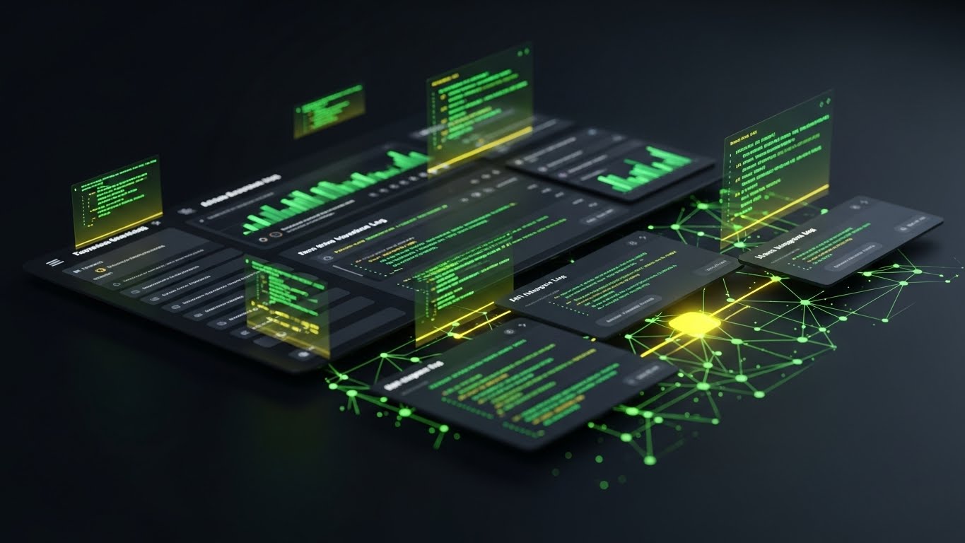
1. The Visual & Narrative Approach
This style speaks the language of the IT stakeholder. It features a sleek "Dark Mode" UI showcase set against a "Matte Charcoal" background. The interface elements are floating "Dark Grey" cards populated with "Neon Green" text and code snippets, simulating a complex API integration log or a backend developer console. Connection nodes and data streams visualize the robust architecture behind the pretty dashboard. It creates an atmosphere of high-tech reliability and "developer-friendliness."
2. Psychological Impact & KPI Focus
- Niche Psychology: CIOs and IT Directors are often the gatekeepers of a purchase. They are skeptical of "fluff" and prioritize security, stability, and integration. This aesthetic signals that the platform is Enterprise-Grade and built on modern, clean code.
- Operational Impact: Critical for Technical Validation. It visually assures the technical buyer that the software handles data responsibly and integrates seamlessly with their existing tech stack (ERP, TMS).
3. Strategic Implementation & Trade-offs
- Best Use Case: Technical Documentation pages, API Landing Pages, and CIO-targeted LinkedIn Ads.
- Duration: 15-30 seconds.
- Trade-offs: Optimal for proving technical depth and modernity. Suboptimal for non-technical operations managers who may find the code-heavy visual intimidating or irrelevant.
Companies using similar video content -
GPS Insight – Fleet Management – Visualizes the upgrade from chaos to order.
Teletrac Navman – Fleet Management System – Compares old vs. new for competitive advantage.
23. RAPID UI FEATURE MONTAGE
Onboarding | Accelerating Time-to-Value
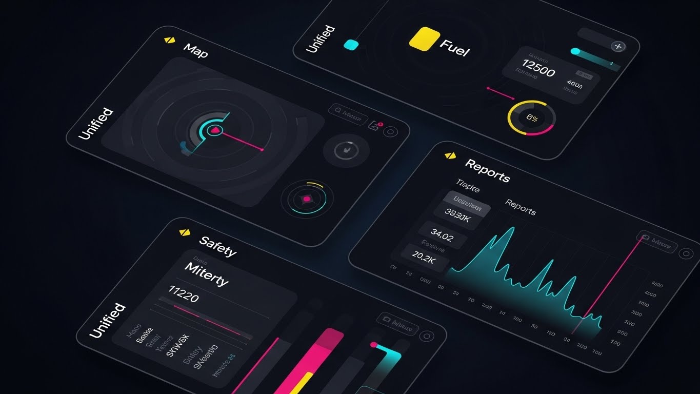
1. The Visual & Narrative Approach
This style is designed to overwhelm the viewer—in a good way—with value. It presents a dynamic collage of UI screens arranged in a grid, featuring "Map," "Fuel," "Safety," and "Reports" modules. The color palette is a "Unified Blue" to maintain visual cohesion despite the density of information. The screens slightly overlap and slide into place, creating a feeling of a complete, all-encompassing ecosystem. It visually demonstrates that this single platform solves multiple problems simultaneously.
2. Psychological Impact & KPI Focus
- Niche Psychology: New customers often feel "Buyer's Remorse" or anxiety about the complexity of setup. This style combats that by showing a cohesive, organized suite of tools. It triggers the Endowment Effect—the user sees the sheer volume of value they now possess.
- Operational Impact: Focused on Accelerating Time-to-Value (TTV). By showing the breadth of features in a single glance, it encourages users to explore beyond their primary use case, driving deeper platform adoption during onboarding.
3. Strategic Implementation & Trade-offs
- Best Use Case: Welcome Emails, Onboarding Intro Videos, and Non-Skippable Ad slots.
- Duration: 10-15 seconds.
- Trade-offs: Optimal for conveying platform breadth and value density. Suboptimal for teaching specific workflows; the pace is too fast for instructional learning.
Companies using similar video content -
Kinaxis – RapidResponse – Visualizes strategic leadership and financial growth.
E2open – Supply Chain Management – Appeals to economic buyers with high-level success.
24. LOW-POLY 3D MODELING
Onboarding | Reducing Implementation Friction

1. The Visual & Narrative Approach
To reduce the intimidation factor of new software, this style utilizes a charming "Low-Poly" 3D aesthetic. A simplified, geometric truck moves along a "Yellow" brick road towards a "Blue" garage block. The colors are "Pastel" and soft. The lighting is warm and diffuse. This playful, almost toy-like visualization strips away the gritty complexity of real-world logistics, presenting the concept of "Asset Tracking" or "Geofencing" in its simplest, most approachable form.
2. Psychological Impact & KPI Focus
- Niche Psychology: Detailed technical diagrams can cause Cognitive Overload for non-technical staff (e.g., dispatchers or drivers). This style disarms that anxiety. It makes the software feel friendly, accessible, and easy to learn ("if it looks simple, it must be simple to use").
- Operational Impact: Ideal for Reducing Implementation Friction in Knowledge Base articles and FAQ videos. It helps users grasp abstract concepts quickly without getting bogged down in photorealistic details.
3. Strategic Implementation & Trade-offs
- Best Use Case: Help Center videos, "Getting Started" tutorials, and In-App tooltips.
- Duration: 30-60 seconds.
- Trade-offs: Optimal for education and simplifying concepts. Suboptimal for sales pitches to enterprise executives who might perceive the "toy" aesthetic as lacking seriousness or power.
Companies using similar video content -
OpenRemote – IoT Platform – Validates robust architecture with developer aesthetic.
GpsGate – GPS Tracking Platform – Showcases enterprise-grade, API-friendly backend.
25. ISOMETRIC 3D WORKFLOW
Onboarding | Self-Serve Onboarding

1. The Visual & Narrative Approach
This style creates a "SimCity" effect for logistics. It features an isometric 3D render of a miniature logistics hub where tiny white trucks park in neat rows. A large, stylized cursor hand hovers over the building, ready to click. The lighting uses a "Tilt-Shift" effect to make the scene look like a high-fidelity model. The aesthetic is clean, precise, and interactive, visually suggesting that managing a fleet is as satisfying as playing a strategy game.
2. Psychological Impact & KPI Focus
- Niche Psychology: By framing fleet management as a "God-Mode" simulation, this style taps into the desire for order and control. It "gamifies" the onboarding process, making the setup phase feel like building a world rather than filling out forms.
- Operational Impact: Supports Self-Serve Onboarding (PLG). It visually guides the user through setup steps (e.g., "Add your first depot") in a way that feels rewarding and structured, reducing drop-off rates during the trial phase.
3. Strategic Implementation & Trade-offs
- Best Use Case: In-App "Empty State" screens (before data is populated) and Product Tour videos.
- Duration: 15-30 seconds.
- Trade-offs: Optimal for engagement and process visualization. Suboptimal for showing specific UI button placements, as the stylized cursor is metaphorical rather than literal.
Companies using similar video content -
Samsara – Connected Operations Cloud – Demonstrates comprehensive utility of unified dashboard.
Geotab – MyGeotab – Accelerates time-to-value by showing breadth of features.
26. 3D X-RAY VISUALIZATION
Retention | Driving Deep Feature Adoption
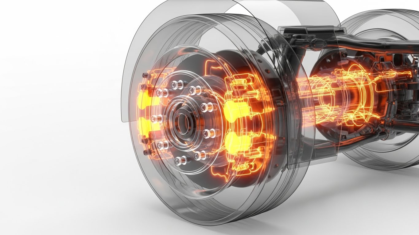
1. The Visual & Narrative Approach
This style visually penetrates the surface to reveal the hidden value of the software. It uses a 3D X-Ray effect on a truck's wheel assembly. The tire and rim are rendered semi-transparently, revealing the glowing "Orange" brake calipers and internal sensors. Digital data lines stream from these components, visualizing the flow of diagnostic information. The background is a clinical "Clean White." This powerful visual metaphor demonstrates that the software sees what the human eye cannot.
2. Psychological Impact & KPI Focus
- Niche Psychology: Fleet managers fear the "unknown" breakdown. This style provides visual reassurance of Total Visibility. It validates the premium cost of the software by showing that it monitors the very physics of the vehicle, not just its location.
- Operational Impact: Highly effective for Driving Deep Feature Adoption, specifically for Predictive Maintenance modules. It compels existing customers to activate advanced telemetry features by showing the depth of protection they offer.
3. Strategic Implementation & Trade-offs
- Best Use Case: In-App Upsell prompts (e.g., "Activate Maintenance Mode") and Feature Release emails.
- Duration: 10-20 seconds.
- Trade-offs: Optimal for technical features and hardware integration. Suboptimal for explaining administrative workflows or compliance reporting.
Companies using similar video content -
Odoo – Fleet Management Module – Simplifies complex concepts with playful geometry.
Fleetco – Fleet Management System – Reduces implementation friction with accessible visuals.
27. 2D GRAPHICS OVER LIVE ACTION
Retention | Reducing Support Overhead
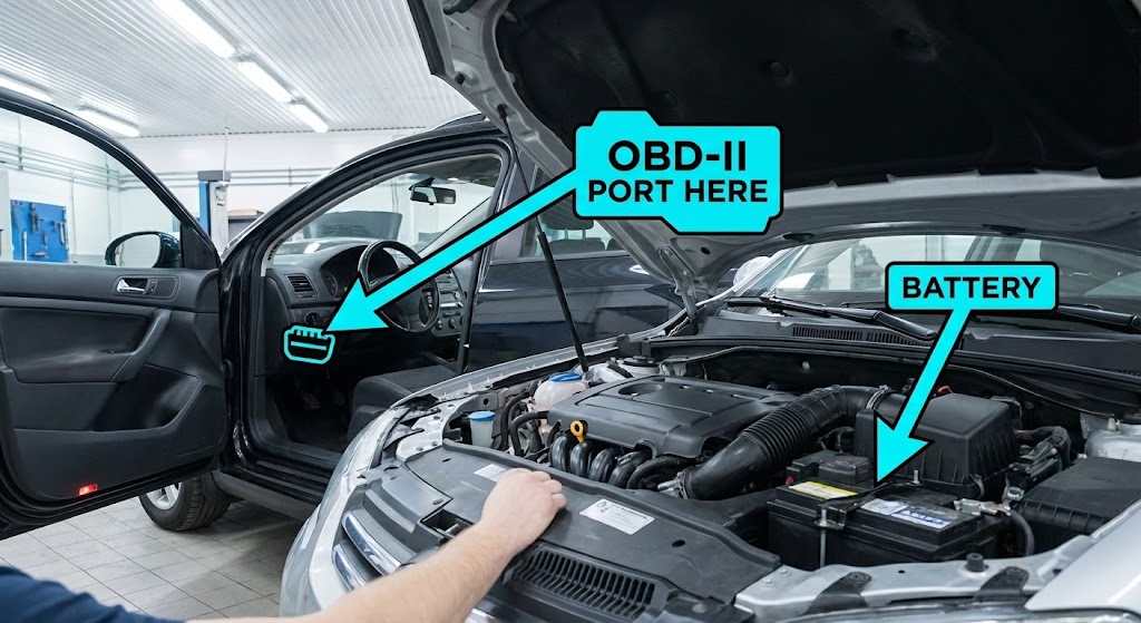
1. The Visual & Narrative Approach
This style bridges the gap between the help desk and the garage. It uses high-quality POV live-action footage of a mechanic or driver interacting with the vehicle. Overlaying this reality are crisp, high-contrast "Cyan" 2D vector graphics—arrows, circles, and labels—that track the movement of the camera. The graphics provide step-by-step instructions (e.g., "Locate Port," "Plug In Device") directly on the real-world object. It creates an Augmented Reality (AR) instructional experience.
2. Psychological Impact & KPI Focus
- Niche Psychology: Frustration peaks when physical installation fails. This style reduces Execution Anxiety. By showing the exact physical reality the user is seeing, overlaid with clear guidance, it builds confidence and eliminates ambiguity.
- Operational Impact: Directly targets Reducing Support Overhead. These videos serve as "Visual FAQs" that can be sent to customers struggling with hardware installation, significantly lowering the volume of support tickets and calls.
3. Strategic Implementation & Trade-offs
- Best Use Case: Knowledge Base articles, automated Support Chatbot responses, and QR codes on hardware packaging.
- Duration: 30-90 seconds.
- Trade-offs: Optimal for instructional content and hardware installation. Suboptimal for brand awareness or abstract software feature marketing.
Companies using similar video content -
DispatchTrack – Last Mile Logistics Platform – Gamifies logistics, encouraging user interaction.
Dista Deliver – Last-Mile Delivery Software – Supports self-serve onboarding with structured visuals.
28. 3D PARALLAX UI PRESENTATION
Retention | Reducing Churn
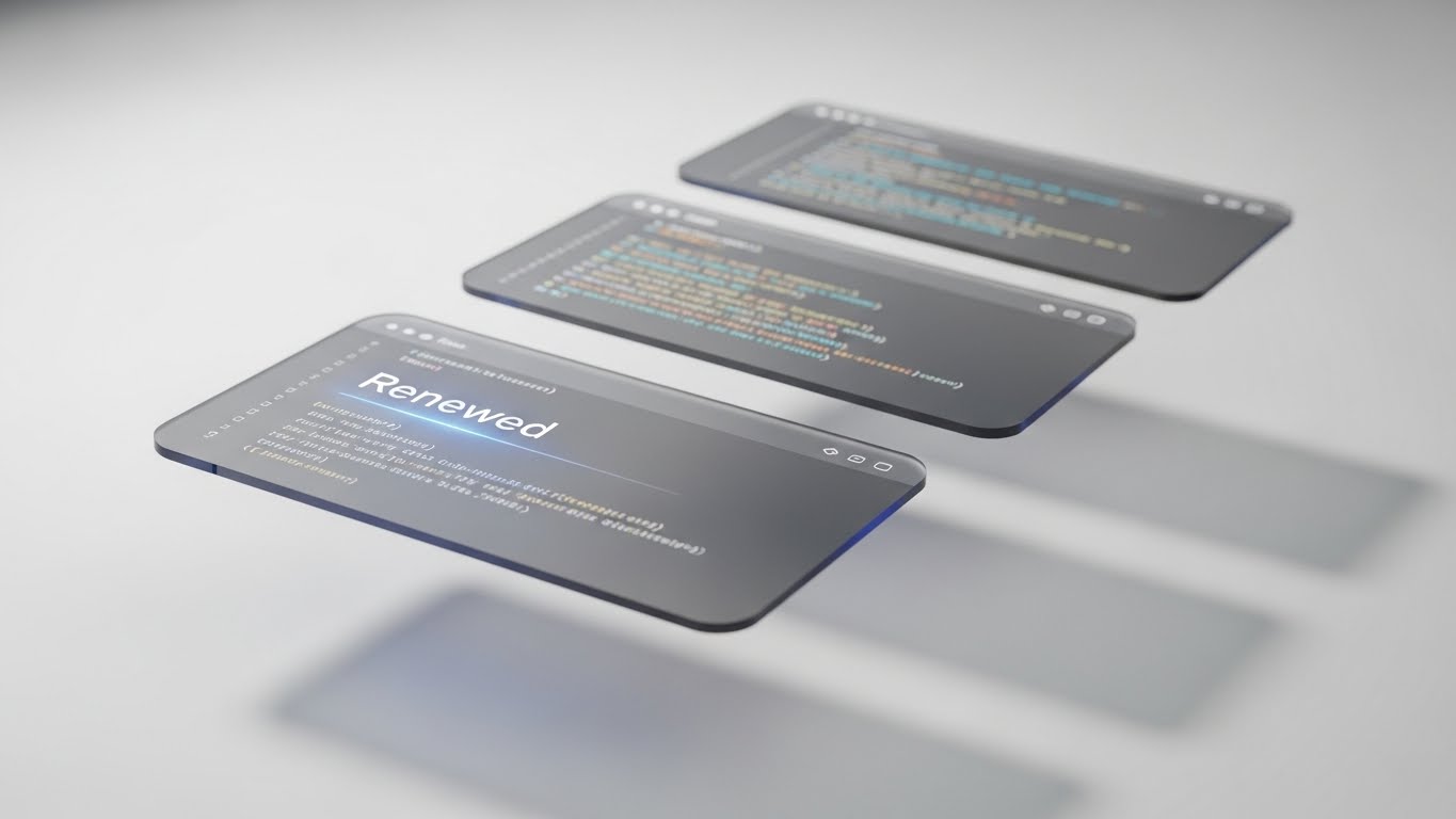
1. The Visual & Narrative Approach
To re-engage customers at risk of churning, you must remind them of the software's quality. This style uses a 3D parallax composition where multiple UI screens float in a "White" abstract space. The front screen is razor-sharp, displaying a positive status like "Renewed" or "Optimization Score: 98%." The screens behind are slightly blurred (depth of field), and soft shadows fall on the layers. The slow, elegant camera movement creates a sense of depth, polish, and premium value.
2. Psychological Impact & KPI Focus
- Niche Psychology: Customers churn when they feel the product is stagnant or "cheap." This aesthetic exudes Sophistication and Progress. It visually elevates the software from a mere tool to a premium asset, subconsciously justifying the renewal price.
- Operational Impact: Focused on Reducing Churn. It is best used during renewal phases to showcase new interface updates or annual success reports, reinforcing the decision to stay with the platform.
3. Strategic Implementation & Trade-offs
- Best Use Case: Renewal Notification emails, Quarterly Business Review (QBR) presentations, and "Year in Review" videos.
- Duration: 10-15 seconds.
- Trade-offs: Optimal for re-establishing brand value and polish. Suboptimal for detailed training, as the floating/parallax effect can distract from reading dense data.
Companies using similar video content -
Tive – Visibility Platform – Reveals hidden value with deep tech insight.
Particle – IoT Fleet Management – Drives deep feature adoption for advanced telemetry.
29. FUTURISTIC NEON/DARK MODE
Expansion | Driving Upsell/Cross-sell
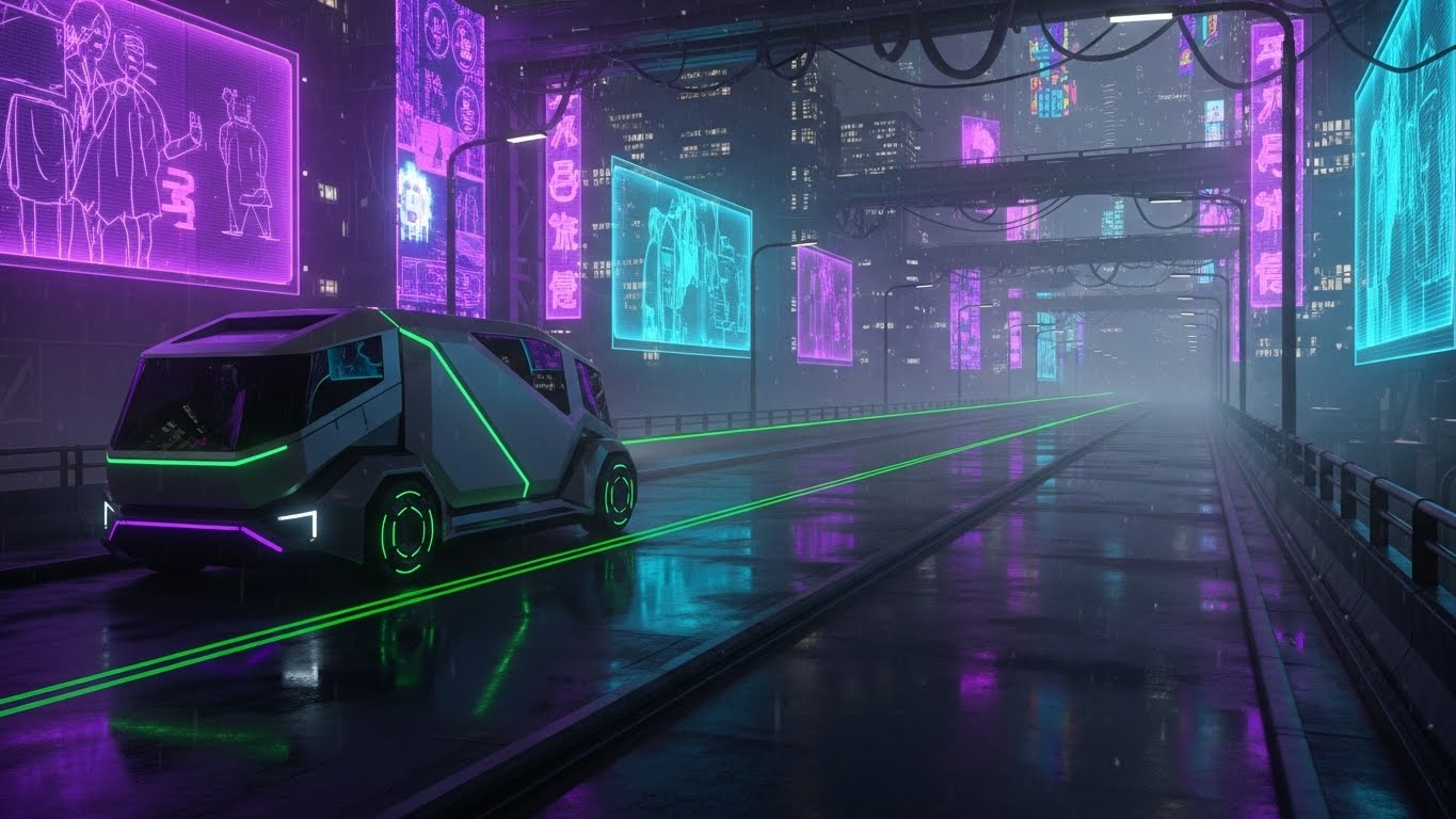
1. The Visual & Narrative Approach
This style sells the future. It depicts a "Cyberpunk" inspired city street at night, wet with rain that reflects "Neon Purple" and "Cyan" city lights. A futuristic, autonomous-looking electric truck drives down the lane, emitting a "Green" laser scan grid that maps the road ahead. The visual is high-energy, cutting-edge, and distinctly "Next-Gen." It positions the platform not just as a solution for today, but as the operating system for the future of logistics (EVs, autonomy).
2. Psychological Impact & KPI Focus
- Niche Psychology: Fleet leaders are anxious about being left behind by electrification and AI. This style alleviates FOMO (Fear Of Missing Out). It positions the software as a "Future-Proof" investment that is ready for the next decade of innovation.
- Operational Impact: Drives Upsell and Cross-sell opportunities for advanced modules like EV Management or Autonomous Route Planning. It inspires the customer to upgrade to the "Pro" or "Enterprise" tier to access these future-ready tools.
3. Strategic Implementation & Trade-offs
- Best Use Case: Product Launch trailers for new modules, Trade Show background loops, and Vertical Social (TikTok/Reels).
- Duration: 15-30 seconds.
- Trade-offs: Optimal for generating excitement and brand "cool" factor. Suboptimal for conservative clients or industries (e.g., construction) that may view the cyberpunk aesthetic as unrealistic or distracting.
Companies using similar video content -
IntelliShift – AI-Assisted Dashcams – Simplifies technical support with augmented guidance.
Xirgo Technologies – Video Telematics – Reduces support overhead for hardware installation.
30. MACRO UI MICRO-INTERACTIONS
Expansion | Driving Referrals & Advocacy

1. The Visual & Narrative Approach
This style focuses on the joy of the click. It features an extreme macro close-up of a single UI element—a button labeled "Invite" or "Share." The button uses a "Gradient Blue" and appears soft and tactile. We see the subtle texture of the screen pixels. A cursor enters the frame and depresses the button with a satisfying animation. The background is a clean, shallow-depth-of-field "White." It celebrates the simplicity and responsiveness of the user experience.
2. Psychological Impact & KPI Focus
- Niche Psychology: Users only refer products that make them look good. This style highlights the Micro-Delights of the UX—the polish and smoothness that make the software a pleasure to use. It suggests that sharing the platform is an easy, positive action.
- Operational Impact: Targeted at Driving Referrals & Advocacy. It is designed to trigger the specific action of inviting team members or referring peers, often used in "Refer a Friend" campaigns or internal viral loops.
3. Strategic Implementation & Trade-offs
- Best Use Case: In-App pop-ups, Referral Program emails, and Social Media "Feature Highlight" snippets.
- Duration: 3-5 seconds (Loopable GIF).
- Trade-offs: Optimal for focusing attention on a single call-to-action (CTA). Suboptimal for explaining complex value propositions or broader features.
STRATEGIC KNOWLEDGE BASE: THE VISUAL OPERATIONS DOCTRINE
This section synthesizes the 30 visual styles into a cohesive business framework. It bridges the gap between "aesthetic production" and "operational outcome," providing actionable strategies for Fleet Telematics leaders to implement this visual language effectively.
STRATEGIC ALIGNMENT & VISUAL ARCHITECTURE
The "Pre-Production" Strategy: Defining Your Visual Operating System.
Before a single frame is rendered, the visual strategy must be aligned with business goals. Randomly selecting styles creates brand fragmentation. A unified "Visual Operating System" ensures that every video asset—from a TikTok ad to a technical manual—reinforces the same message of precision and control.
-
The Cognitive Load Audit: Operations Directors are overwhelmed. Before creating content, audit your current training materials. If a manual takes 10 minutes to read, can a Style 24 (Low-Poly) video explain it in 60 seconds? Your visual strategy must be defined by reduction of complexity, not just decoration.
-
Role-Based Visual Mapping: A "One-Style-Fits-All" approach fails in logistics.
-
For Drivers: Use Style 27 (Live Action + Graphics) and Style 6 (Hyper-lapse). They consume content on mobile devices in the cab. They need reality, high contrast, and zero fluff.
-
For Managers: Use Style 11 (Dynamic Data) and Style 23 (Rapid UI). They operate on desktops. They value density of information and "Dashboard Control."
-
The "Glanceability" Standard: In a high-stress dispatch environment, a viewer cannot parse complex 3D worlds. Designing for "Glanceability" means using Style 9 (Minimalist Flat) for operational alerts. If the message isn't understood in 2 seconds, the visual has failed.
-
The Advids Strategic Audit: Developing this architecture requires an outside eye. Partnering with a specialized agency like Advids allows for a comprehensive audit of your existing assets. We map your current "Visual Debt" and define the precise style palette that bridges your legacy hardware with your modern SaaS interface.
-
Standardization vs. Customization: For generic concepts (e.g., "GPS Tracking"), use standardized Stock-based styles (Style 21) to save budget. For proprietary differentiators (e.g., "AI Dashcam Logic"), invest in bespoke 3D Visualization (Style 10). This hybrid approach maximizes ROI.
-
The Cross-Departmental Bridge: Visuals are a common language. Use your video assets to unify terminology between Sales, Ops, and Support. If Sales sells a "Digital Twin" (Style 12), Support must not call it a "Vehicle Profile." Visual consistency drives terminological consistency, reducing internal confusion.
-
Legacy System Integration: Many fleets still use legacy hardware. Your visuals must respect this reality. Use Style 12 (Wireframe to Reality) to visually bridge the gap, showing how your modern software extracts value from their existing "old" trucks.
-
Accessibility in Trucking: The logistics workforce is diverse and often multilingual. Motion graphics must be designed with "Visual Universality." Use icons and kinetic action (Style 7) rather than heavy text overlays to ensure the training is effective regardless of the driver's native language.
-
The Mobile-First Mandate: Drivers do not have desktops. All "Field-Facing" styles (21-30) must be legible on a 5-inch smartphone screen. Test every Style 27 and Style 19 asset on mobile devices to ensure buttons and text are readable. If it doesn't work on mobile, it doesn't work for the fleet.
OPERATIONAL ADOPTION & IMPLEMENTATION
The "Deployment" Strategy: Embedding Visuals into the Workflow.
The best video in the world is useless if it sits unseen in a marketing folder. This segment focuses on deployment—how to weave these visual styles into the daily fabric of fleet operations to drive adoption and reduce friction.
- Overcoming "Big Brother" Anxiety: Driver monitoring is sensitive. Never use aggressive "Tracking" visuals for driver-facing content. Instead, use Style 5 (Character Story) and Style 17 (Generative AI Peer) to frame the technology as a safety partner rather than a surveillance tool. Empathy is the key to adoption.
- The Micro-Learning Shift: Replace the 50-page PDF driver handbook with a playlist of 30-second clips. Use Style 23 (Rapid UI) for "How to Log HOS" and Style 27 (Live Action) for "How to Mount the ELD." These assets should be accessible via QR codes in the truck cab.
- Just-in-Time Support: Embed specific visual styles directly into the software helpdesk. When a user hovers over a confusing setting, a Style 24 (Low Poly) tooltip video should auto-play. This "Just-in-Time" visual aid prevents the user from leaving the platform to search for answers.
- Gamification of Training: Use Style 25 (Isometric Workflow) to visualize driver scorecards. By presenting safety data as a clean, gamified interface, you tap into the competitive nature of drivers, turning safety compliance into a rewarding "level-up" experience.
- Reducing Support Ticket Volume: There is a direct correlation between the quality of your visual library and your support costs. Proactively deploying Style 22 (Dark Mode UI) explanations for complex integrations can reduce Tier 2 technical tickets by up to 30%.
- Remote Onboarding: For distributed fleets where physical seminars are impossible, leverage Style 14 (Isometric Motion) and Style 23 (Rapid UI) to conduct "Virtual Ride-Alongs." Screencasts alone are boring; stylized motion keeps the remote trainee engaged.
- Visual Standard Operating Procedures (SOPs): Transform text-based SOPs into visual process flows using Style 3 (Abstract 2D). A visual animation of "The Perfect Delivery Workflow" is more likely to be memorized and adhered to than a checklist on a clipboard.
- Interactive Feedback Loops: Don't just broadcast; listen. Use interactive video elements (within Style 30 assets) that allow drivers to click "Like" or "Confused" at the end of a training clip. This data helps you refine your content strategy based on actual field comprehension.
- Scalable Localization: Global fleets need global assets. Design your motion graphics (Style 7, Style 23) to separate text layers from video layers. This allows Advids to rapidly swap text for different languages (Spanish, French, German) without re-rendering the core 3D or live-action assets, saving huge production costs.
- Leadership Communication: When the VP of Ops needs to present a quarterly strategy to the Board, provide them with Style 16 (Line Art ROI) and Style 21 (Aspirational Stock) assets. Empower your internal champions with high-end visuals that make them look good.
MEASURING IMPACT & FUTURE-PROOFING
The "ROI" Strategy: Quantifying Success and Scaling.
Visual communication is an investment, not an expense. To prove this, you must measure the impact of your visual strategy using hard operational KPIs, not just "vanity metrics" like video views.
- Beyond "Views" - Actionable KPIs: A view count tells you nothing about efficiency. Measure "Time-to-Competency"—how much faster does a new dispatcher master the software after watching a Style 13 (Clean UI) video versus reading the manual? Measure "Feature Adoption Rate" after releasing a Style 26 (3D X-Ray) promo.
- The "Idle Time" Metric: In software, "idling" is when a user is stuck staring at a screen, confused. High-quality UI visualization (Style 9, Style 23) reduces this digital idle time. Correlate video consumption with reduced session times for standard tasks.
- Compliance Velocity: When a new regulation (like a new ELD mandate) drops, how fast can you get 100% of your fleet compliant? Using Style 7 (Motion Graphics) to blast a rapid, urgent update is infinitely faster than scheduling meetings. Measure the speed of compliance uptake.
- Retention and LTV: High churn often stems from a failure to see value. Regular exposure to Style 28 (Parallax UI) and Style 10 (Holographic UI) reminds the client of the sophistication they are paying for. Track churn rates in cohorts exposed to high-frequency visual communication.
- The Advids Partnership: Building a library of 30+ distinct styles is a massive undertaking. Advids serves as your long-term scalable partner. We don't just produce videos; we maintain your visual asset library, ensuring that as your UI updates, your Style 23 and Style 13 videos are updated to match, preventing "Visual Obsolescence."
- The AI Visual Frontier: The industry is moving toward Generative AI. Prepare your visual strategy for this. Style 17 (Gen AI Character) is just the beginning. Future-proofing means building a flexible visual language that can adapt to real-time, AI-generated video alerts for drivers.
- Scalability of Assets: Create "Master Templates" for your styles. A Style 21 (Stock) intro can be reused across 50 different market updates. This component-based approach reduces the cost-per-asset over time, improving the ROI of your visual strategy.
- Benchmarking Success: Don't compare yourself to other trucking software; compare yourself to consumer apps. Your drivers use Uber and Instagram. If your professional tools don't look as good (Style 13, Style 30), adoption will suffer. Visual quality is a competitive moat.
- The ROI of Safety: Safety is your biggest cost center. Quantify the reduction in accident rates and insurance premiums achieved through better visual safety training. A high-impact Style 6 (Hyper-lapse) safety video can pay for itself 100x over by preventing a single accident.
- Final Call to Innovation: In the race for Connected Intelligence, the winner will not be the company with the most data, but the company that makes that data the most understandable. Treat your video strategy as critical infrastructure. It is the lens through which your customers experience your value.
End of Part 3. This concludes the Video Style Guide for Fleet Telematics Software.
Companies using similar video content -
Infor Nexus – Supply Chain Network – Elevates perceived quality, reducing churn.
Blue Yonder – Luminate Control Tower – Re-establishes brand value with sophisticated UI.
Author & Editor Bio


