
Introduction: The Architecture of Clarity
In the high-stakes world of B2B SaaS, clarity is the ultimate currency. For Flowchart Software and Visual Collaboration platforms, the challenge is not just technical—it is psychological. Your users, the "Digital Operations Architects," are drowning in data silos and "tribal knowledge." They are desperate for a tool that doesn't just draw boxes, but creates a Visual Operating System for their entire enterprise.
The market opportunity is undeniable. The visual collaboration sector is projected to exceed USD 138.21 billion by 2035, driven by the global shift to asynchronous, distributed work. However, the cost of failing to adapt is equally staggering; workplace miscommunication costs US businesses an estimated $1.2 trillion every year.
This guide is your strategic blueprint to bridge that gap. We have curated 30 distinct video styles that transform abstract features into compelling visual narratives. From the "Kinetic Pipes" that evoke robust infrastructure to the "Smart Guides" that demonstrate precision, these examples are engineered to reduce Cognitive Load, build Brand Authority, and drive Adoption.
1. Bold Kinetic Typography (Visual)
TOFU | Brand Awareness
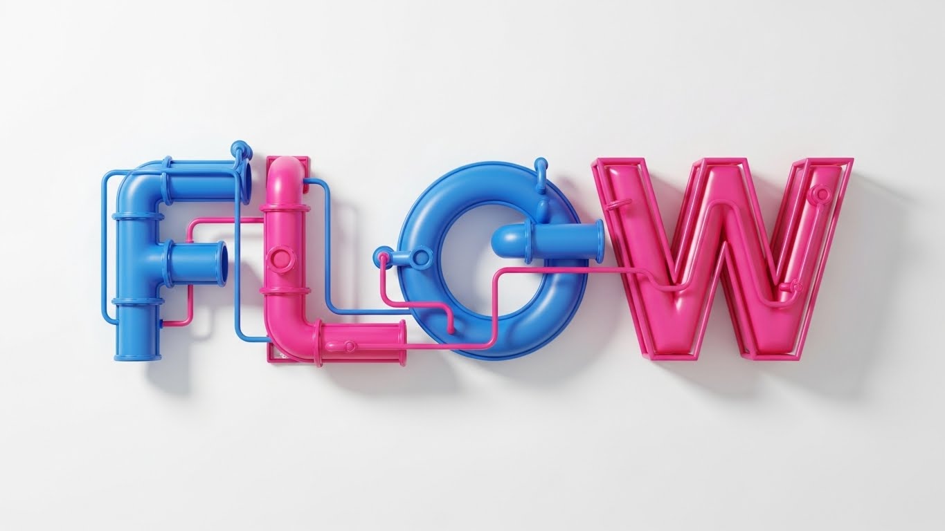
The Visual & Narrative Approach
This style abandons the traditional "screen recording" approach in favor of a visceral, structural metaphor. We see "FLOW" not as a flat word, but as a massive, functional hydraulic system composed of interlocking Industrial Pipes in Electric Blue and Hot Pink. The camera moves through the structure, emphasizing the connection points—the elbows and joints—where energy and logic transfer. The soft shadows on the white wall create a sense of physical presence, grounding the abstract concept of "software" in reality.
Psychological Impact & KPI Focus
- Niche Psychology: For an audience of systems thinkers and operations managers, this visual triggers the "Maker" instinct. It communicates that your platform is not just a drawing tool, but a piece of industrial-grade infrastructure for their business logic.
- Operational Impact: By utilizing Kinetic Typography, we bypass the need for reading and deliver immediate brand recognition. The goal here is Brand Recall; we want the viewer to associate your brand with robust, functional connectivity.
Strategic Implementation & Trade-offs
- Ideal for: High-frequency retargeting on TikTok/Instagram Reels.
- Duration: 6-10 Seconds (Looping).
- Trade-off: This is a pure "vibe" play. It does not explain how the software works, but it aggressively establishes what it feels like to use it—powerful and connected.
Companies using similar video content -
Cisco – Meraki – Visualizing robust network infrastructure and connectivity.
Palo Alto Networks – Cortex XDR – Emphasizing strong, interconnected security solutions.
Dell Technologies – APEX – Highlighting robust, high-performance cloud infrastructure.
2. Abstract 2D Motion Graphics
TOFU | Market Education
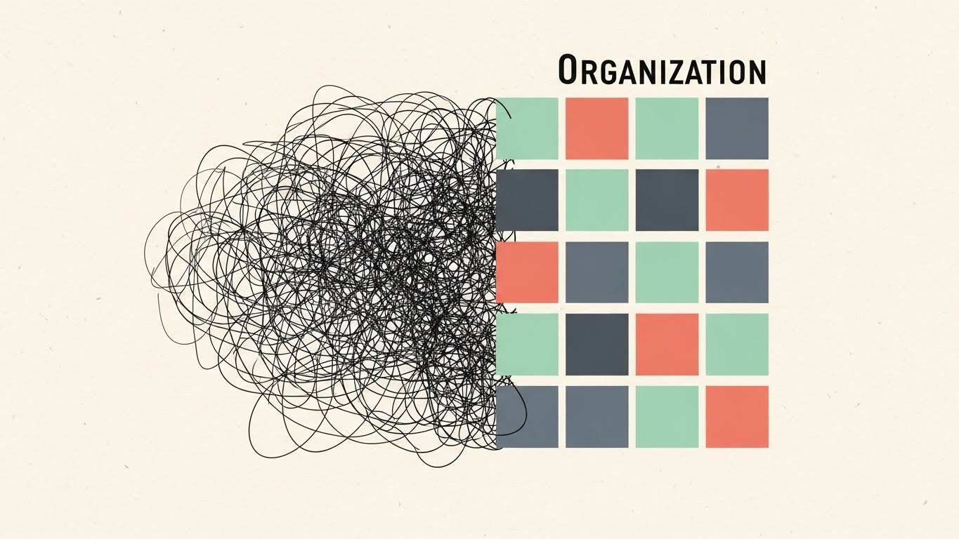
The Visual & Narrative Approach
This Bauhaus-inspired composition tells the universal story of the "process analyst": the journey from mental chaos to structured clarity. On the left, a chaotic, anxious tangle of black scribbles represents the "before state"—undefined requirements and messy brainstorming. As the eye moves right, these lines untangle and snap into a perfect Ordered Grid of Mint Green and Coral squares. The transition is smooth and rhythmic, symbolizing the cognitive load reduction that your software provides.
Psychological Impact & KPI Focus
- Niche Psychology: This style directly addresses the "Blank Canvas Anxiety" many users feel. It validates their struggle (the mess) and offers an immediate, soothing resolution (the grid).
- Operational Impact: It simplifies the abstract concept of "Process Management" into a universal visual metaphor. The primary KPI here is Engagement Rate on professional networks like LinkedIn.
Strategic Implementation & Trade-offs
- Ideal for: LinkedIn Feed Posts and Website Hero Sections.
- Duration: 15-20 Seconds.
- Trade-off: The abstract nature requires a strong headline (e.g., "Tame the Chaos") to ensure the message lands. It is less effective for demonstrating specific features.
Companies using similar video content -
Miro – Miro Board – Transforming chaotic brainstorming into structured insights.
Whimsical – Flowcharts – Simplifying complex ideas into clear, ordered structures.
Notion – Databases & Workflows – Organizing information from disparate sources into clarity.
3. Abstract 3D AI Visualization
TOFU | YouTube

The Visual & Narrative Approach
In an era where "AI-powered" is a buzzword, this style visualizes intelligence. We enter a sterile, infinite laboratory space where a constellation of Neon Cyan nodes glows and pulses. Faint data lines connect them, visualizing the invisible API integrations and data lineage that power modern enterprises. The camera drifts through this neural network, highlighting critical "decision nodes" that are brighter and larger. It looks less like a flowchart and more like a living brain.
Psychological Impact & KPI Focus
- Niche Psychology: This appeals to the Enterprise Architect and CTO persona—buyers who are looking for scalability and sophistication. It moves the conversation away from "drawing boxes" to "managing topology."
- Operational Impact: The high-fidelity 3D rendering signals a premium, enterprise-grade solution. The goal is to drive Brand Authority and associate the platform with cutting-edge technology.
Strategic Implementation & Trade-offs
- Ideal for: YouTube Pre-roll and Landing Pages discussing "AI Automation."
- Duration: 15-30 Seconds.
- Trade-off: High production value means higher cost. This style effectively communicates "complexity capability" but may intimidate smaller SMB users looking for a simple tool.
Companies using similar video content -
Databricks – Lakehouse Platform – Visualizing data and AI processing at scale.
Google Cloud – Vertex AI – Abstract representation of AI model training and deployment.
DataRobot – AI Platform – Visualizing automated machine learning processes and intelligence.
4. Minimalist Flat 2D Vector
TOFU | Social Ads

The Visual & Narrative Approach
Designed specifically to disrupt the cluttered feeds of mobile social media, this style utilizes extreme minimalism. Against a vibrant "Sunflower Yellow" background, three stark white decision diamonds with thick Black outlines form a vertical flow. There is no text, no UI chrome, and no distraction. It is a pure semiotic representation of "process." The animation is simple: arrows extend, and the shape pulses, guiding the eye downward in a satisfying rhythm.
Psychological Impact & KPI Focus
- Niche Psychology: This leverages the "Von Restorff Effect" (the isolation effect)—standing out by being radically simple. It communicates that the tool is accessible, easy to pick up, and frictionless.
- Operational Impact: It targets the "Prosumer" or Team Lead who needs a quick solution. The KPI focus is Click-Through Rate (CTR), as the bold color blocks serve as a powerful "thumb-stopper."
Strategic Implementation & Trade-offs
- Ideal for: Meta (Instagram/Facebook) Stories and Carousel Ads.
- Duration: 6-10 Seconds.
- Trade-off: This style lacks nuance. It cannot explain complex features like "collaborative editing." It is purely a hook to get users to the landing page.
Companies using similar video content -
Zapier – Workflow Automation – Simple, direct automation logic for instant decisions.
ClickUp – Whiteboards – Quick, intuitive decision mapping and process flow.
IFTTT – Applets – Instant, clear conditional logic for connected services.
5. AI Generated Mixed Media Video
TOFU | Skippable Pre-Roll Ad
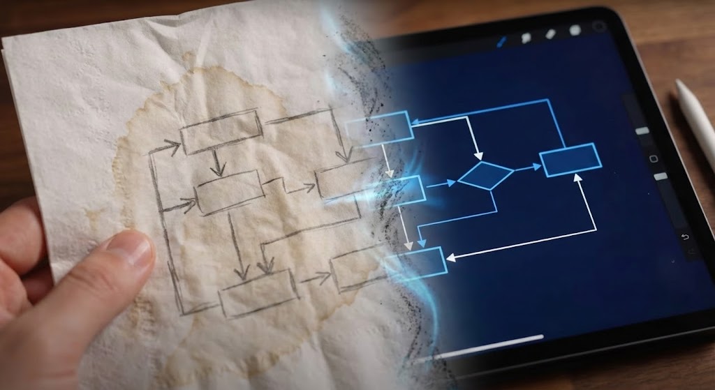
The Visual & Narrative Approach
This narrative bridges the physical/digital divide—a key pain point in process mapping. We start with a relatable, tactile scene: a hand-drawn pencil sketch on a coffee-stained, crumpled napkin. As the camera pans, a magical transition line sweeps across, turning the graphite dust into sharp, glowing "Digital Blue" pixels on a tablet screen. The rough sketch becomes a perfect, vector-based diagram instantly.
Psychological Impact & KPI Focus
- Niche Psychology: It visualizes the promise of "Digital Transformation" without the jargon. It validates the user's natural behavior (sketching on paper) and positions the software as the natural evolution of that habit.
- Operational Impact: It reduces the intimidation factor of new software. The focus is on View-Through Rate (VTR) for pre-roll ads, as the "magic trick" transition holds attention.
Strategic Implementation & Trade-offs
- Ideal for: YouTube Skippable Pre-Roll Ads.
- Duration: 15-30 Seconds.
- Trade-off: Requires careful execution to ensure the "AI/Magic" transition doesn't look glitchy. The contrast between the gritty real world and the pristine digital world must be sharp.
Companies using similar video content -
Figma – FigJam – Transforming hand-drawn sketches into polished digital designs.
Concepts App – Infinite Canvas – Digitizing freehand drawing and creative ideation.
Adobe – Fresco – Bridging traditional art with powerful digital tools.
6. Isometric 2D Motion Design
MOFU | Product/Solution Differentiation
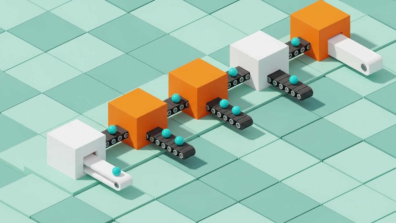
The Visual & Narrative Approach
This style visualizes the software as a "well-oiled machine." Using an Isometric Perspective, the screen displays a "Digital Factory." Geometric blocks in Orange and White represent workflow steps, sitting on a pale Teal grid. Tiny animated conveyor belts connect these blocks, carrying data spheres from one step to the next. The animation is precise and mechanical, symbolizing optimization, throughput, and automated efficiency.
Psychological Impact & KPI Focus
- Niche Psychology: Isometric views allow the viewer to see the "whole system" at once without perspective distortion. This appeals to the "Architect" persona who wants to understand the topology of their workflows.
- Operational Impact: The "factory" metaphor implies predictable, repeatable results—a key desire for Operations Managers. The goal is Time on Page and Feature Education.
Strategic Implementation & Trade-offs
- Ideal for: "How It Works" pages and MOFU explainer videos.
- Duration: 30-60 Seconds.
- Trade-off: The abstraction can sometimes obscure specific UI features. It sells the concept of the workflow, not the literal button clicks.
Companies using similar video content -
UiPath – RPA Platform – Visualizing robotic process automation flows and optimization.
Automation Anywhere – Automation 360 – Showing automated tasks moving through a system.
ServiceNow – Workflow Automation – Illustrating IT and business process flows efficiently.
7. Clean UI Workflow (Light Mode)
MOFU | Feature Education & Demonstration

The Visual & Narrative Approach
This is the "Gold Standard" for product demos. It features a Photorealistic Close-up of the actual software interface in Light Mode. The background is a crisp white. A semi-transparent cursor with a Royal Blue motion trail hovers over a Light Grey button. As it moves, a dotted Vivid Red "Smart Guide" line snaps into existence, aligning the element perfectly. The depth of field is shallow, blurring the edges to force focus on the interaction.
Psychological Impact & KPI Focus
- Niche Psychology: Watching a precise, smooth cursor interaction triggers the viewer's motor cortex, mentally simulating the act of using the software. This reduces anxiety about "usability" or "learning curve."
- Operational Impact: The high-fidelity rendering and smooth motion cues signal a polished, bug-free tool. The KPI is Trial Sign-ups.
Strategic Implementation & Trade-offs
- Ideal for: Product Feature Pages and Release Notes.
- Duration: 10-20 Seconds per feature.
- Trade-off: This style demands UI Stability. If the software interface changes, the video becomes obsolete. It focuses on micro-interactions rather than the big picture.
Companies using similar video content -
Lucidchart – Diagramming Software – Showcasing precise diagramming and alignment features.
Mural – Digital Whiteboard – Demonstrating smooth, intuitive collaboration and user experience.
Creately – Visual Workspace – Highlighting easy drag-and-drop functionality and precision.
8. 2D Animation & UI Composition
MOFU | Driving Freemium/Trials

The Visual & Narrative Approach
Utilizing the "Corporate Memphis" aesthetic, this style injects humanity into technical software. A stylized character with Lavender skin and Charcoal hair stands confidently next to a giant floating flowchart symbol. They hold a large stylus like a tool of empowerment. The soft Peach background and floating geometric shapes create a warm, inviting atmosphere, positioning the software as a friendly partner rather than a complex engineering tool.
Psychological Impact & KPI Focus
- Niche Psychology: It lowers the psychological barrier to entry for HR, Marketing, and Sales teams. It says, "You don't need to be an engineer to use this."
- Operational Impact: A key driver for Product-Led Growth (PLG) and freemium sign-ups, as it emphasizes accessibility and inclusivity.
Strategic Implementation & Trade-offs
- Ideal for: Social Ads targeting SMBs and non-technical roles.
- Duration: 15-20 Seconds.
- Trade-off: This style is common. To avoid blending in, the character design must be unique to your brand palette.
Companies using similar video content -
Process Street – Checklist & Workflow Software – Making process management approachable and friendly.
Kissflow Process – Low-Code Platform – Simplifying workflow creation for business users.
Asana – Work Management – Friendly visualization of project workflows and tasks.
9. Split Screen: Optimized Reality and UI
MOFU | Competitive Displacement
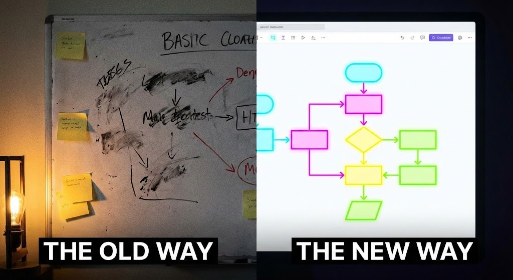
The Visual & Narrative Approach
The ultimate comparison. The screen is split down the middle. The Left Side (The Old Way) features a low-light, grainy photo of a physical whiteboard covered in messy, illegible marker scribbles. The Right Side (The New Way) displays a pristine, high-contrast screenshot of the digital software interface with Vivid RGB flowchart nodes glowing on a white canvas. The contrast highlights the shift from analog confusion to digital clarity.
Psychological Impact & KPI Focus
- Niche Psychology: It attacks the "Status Quo Bias." It visually quantifies the cost of sticking with manual methods (illegibility, lack of sharing).
- Operational Impact: It is a powerful tool for Competitive Displacement, proving the value of digitization in a single glance.
Strategic Implementation & Trade-offs
- Ideal for: LinkedIn Ads and Sales Decks.
- Duration: 10-15 Seconds.
- Trade-off: Authenticity is key. The "Old Way" must look like a real, relatable mess, not a staged stock photo.
Companies using similar video content -
Promapp (Nintex) – Process Management – Contrasting old manual processes with digital clarity.
Smartsheet – Work Management – Showing transition from spreadsheets to dynamic dashboards.
Wrike – Project Management – Highlighting digital transformation from traditional methods.
10. 3D Parallax UI Presentation
MOFU | Website & Landing Pages
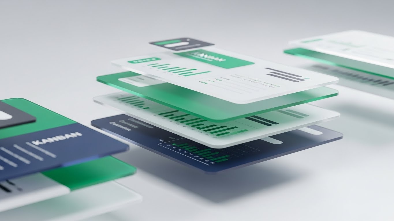
The Visual & Narrative Approach
This style elevates the UI to an art object. Using 3D parallax, the interface is deconstructed into floating Glass Layers in deep Z-space. We see Kanban cards and graphs hovering over a blurred dashboard background. The glassmorphism effect (frosted edges) and cool lighting create a premium, high-tech feel, implying that the software is deep, robust, and enterprise-ready.
Psychological Impact & KPI Focus
- Niche Psychology: It appeals to the Executive buyer who equates "Depth" with "Power." It signals that the platform is a comprehensive ecosystem, not just a simple app.
- Operational Impact: Perfect for Website Headers to establish immediate credibility and reduce bounce rates.
Strategic Implementation & Trade-offs
- Ideal for: Landing Page Hero Sections.
- Duration: 10-20 Seconds (Looping).
- Trade-off: It prioritizes "Vibe" over "Readability." It sets the tone for the brand but doesn't teach the user how to use it.
Companies using similar video content -
SAP – Signavio Process Manager – Visualizing layered business process intelligence and depth.
Oracle – BPM Suite – Presenting deep, interconnected enterprise processes and functionality.
IBM – Business Automation Workflow – Showcasing comprehensive automation capabilities and layers.
11. Aspirational Cinematic Montage
MOFU | Building Trust & Credibility

The Visual & Narrative Approach
To counter the cold abstraction of B2B software, this style re-centers the narrative on the humans behind the screen. We see a high-quality, cinematic shot of a diverse team of professionals in a sun-drenched, modern glass-walled office. They are gathered around a large monitor, smiling and pointing—not in frustration, but in discovery. The screen is blurred, but hints of "Office Blue" diagrams are visible, subtly linking their alignment to your platform. The lighting is warm and natural, emphasizing connection.
Psychological Impact & KPI Focus
- Niche Psychology: Enterprise buyers often fear that new tools will create isolation. This visual provides Social Proof that your platform fosters connection. It appeals to the "People Manager" who values culture as much as efficiency.
- Operational Impact: By associating the software with smiling, productive teams, we reduce the fear of "change resistance." The primary KPI is Brand Sentiment and Trust on "About Us" or "Culture" pages.
Strategic Implementation & Trade-offs
- Ideal for: "About Us" pages, Careers sections, and Case Study headers.
- Duration: 10-15 Seconds.
- Trade-off: This is a "soft sell." It builds brand affinity but conveys zero technical information. It must be paired with hard data or feature specifics nearby.
Companies using similar video content -
Microsoft – Teams/Loop – Highlighting seamless team collaboration and productivity.
Zoom – Collaboration Platform – Showcasing successful remote team interactions and connection.
Slack – Channel-based Messaging – Emphasizing team connection and shared success.
12. Dynamic Data Visualization
BOFU | ROI Justification

The Visual & Narrative Approach
When speaking to the CFO, subtlety is less effective than bold, quantifiable ambition. This style transforms standard bar charts into Crimson Red and Gold Rockets that blast off against a pristine white studio background. They leave trails of geometric "smoke," visualizing momentum. The trajectory is exaggerated—almost vertical—symbolizing the "hockey stick" growth that comes from standardizing operational workflows with your platform.
Psychological Impact & KPI Focus
- Niche Psychology: This speaks the language of the Economic Buyer. It bypasses features to focus entirely on outcomes. It triggers the "Growth" driver essential for closing deals, framing the software as an asset that generates lift.
- Operational Impact: It visualizes the intangible concept of "ROI" as a physical force. The goal is Lead Conversion, specifically convincing financial stakeholders to approve the budget.
Strategic Implementation & Trade-offs
- Ideal for: LinkedIn Ads targeting Finance Directors and Investor Pitch Decks.
- Duration: 6-10 Seconds (Looping).
- Trade-off: It is hyperbolic. It implies results but offers no proof of how those results are achieved. It requires supporting text overlays (e.g., "3x Faster Deployment") to be effective.
Companies using similar video content -
Tableau – Data Visualization – Dynamic charts showing business growth and velocity.
Qlik Sense – Analytics Platform – Visualizing rapid data insights and business impact.
Domo – Business Cloud – Presenting real-time business performance and ROI.
13. High-Contrast Cyber Security
BOFU | Risk Mitigation
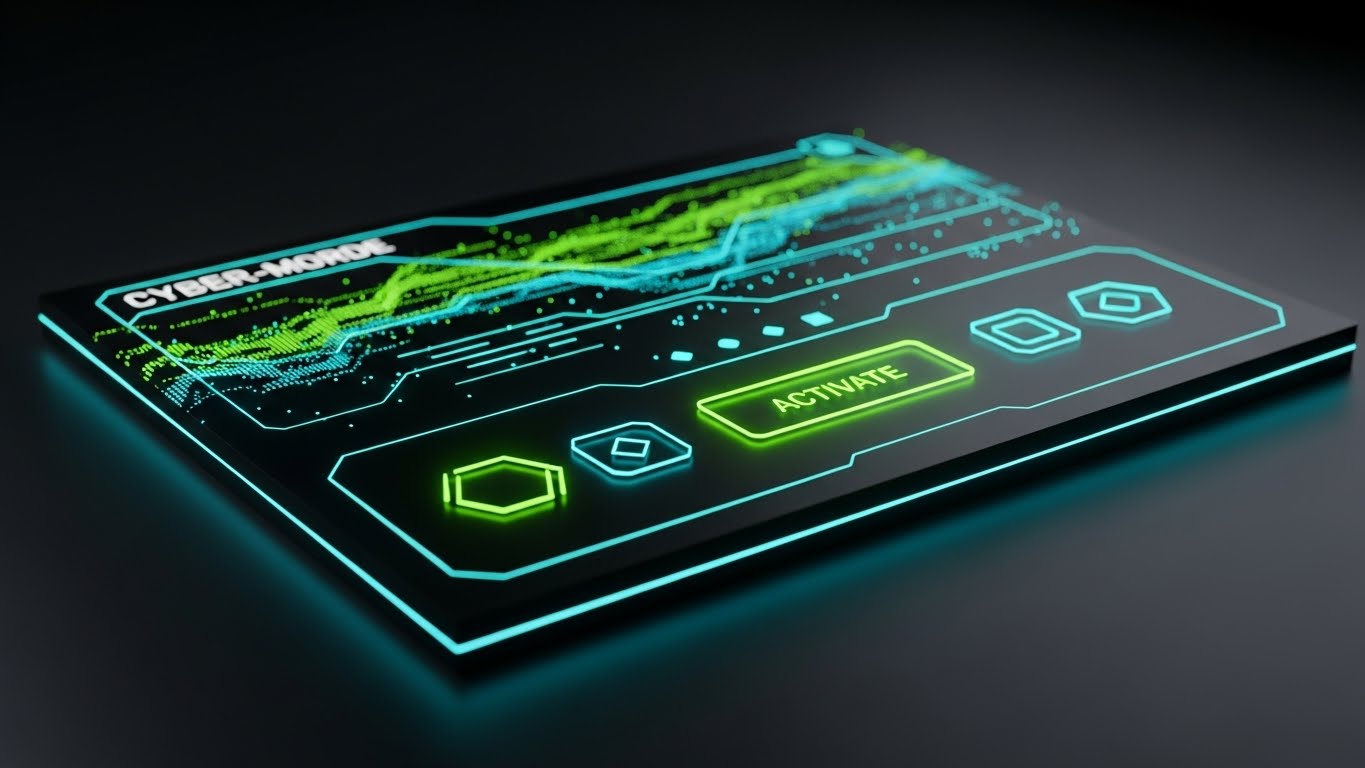
The Visual & Narrative Approach
For the IT/Security gatekeeper, "cool features" are secondary to safety. This style utilizes a "Dark Mode" aesthetic to signal robust protection. A central, padlock-shaped node constructed from Neon Cyber Blue circuit lines sits in a dark, reflective server room environment. Neon Green data streams flow into the lock, instantly turning into secure, solid lines. The heavy bloom and high contrast create an atmosphere of impenetrable safety, visualizing SOC2 compliance and encryption.
Psychological Impact & KPI Focus
- Niche Psychology: It addresses the "Risk Aversion" of the CISO (Chief Information Security Officer). The dark, precise aesthetic is culturally coded as "Military-Grade," reassuring them that their proprietary process data is safe.
- Operational Impact: It visualizes Governance—a concept that is usually invisible. The KPI goal is to accelerate the Security Review phase of the sales cycle.
Strategic Implementation & Trade-offs
- Ideal for: The "Security" or "Enterprise" landing page.
- Duration: 10-15 Seconds (Looping).
- Trade-off: The aggressive "hacker" aesthetic may alienate non-technical users (like HR or Marketing) who prefer a friendly, light UI. Use selectively.
Companies using similar video content -
CrowdStrike – Falcon Platform – Visualizing threat detection and robust response.
Fortinet – Security Fabric – Emphasizing interconnected security solutions and protection.
Zscaler – Zero Trust Exchange – Highlighting secure data flow and access.
14. Lifestyle Stock with UI Overlay
BOFU | The Economic Buyer

The Visual & Narrative Approach
This style bridges the gap between the boardroom and the dashboard. We see an over-the-shoulder shot of a silver-haired executive in a high-rise office at dusk. Projecting from their tablet is a pristine, floating Holographic Organizational Chart in crisp white and subtle gold. The visual implies that the software allows them to hold the entire structure of their organization in their hands, empowering high-level strategic restructuring and oversight against the backdrop of the city skyline.
Psychological Impact & KPI Focus
- Niche Psychology: It appeals to the Ego and Responsibility of the C-Suite. It elevates the software from a "diagramming tool" to a "Management Instrument." It implies control, clarity, and vision.
- Operational Impact: It targets the Economic Buyer who is less concerned with drawing flows and more concerned with optimizing talent and resources.
Strategic Implementation & Trade-offs
- Ideal for: LinkedIn Thought Leadership posts and Account-Based Marketing (ABM) campaigns.
- Duration: 10-15 Seconds.
- Trade-off: High production difficulty. The tracking of the hologram to the tablet movement must be perfect, or it will break the immersion and look cheap.
Companies using similar video content -
Workday – Human Capital Management – Executive view of organizational data and strategy.
Anaplan – Connected Planning – Strategic planning and financial modeling for executives.
ServiceNow – Strategic Portfolio Management – High-level IT and business strategy visualization.
15. Deep-Tech X-Ray Architecture
BOFU | The Technical Buyer
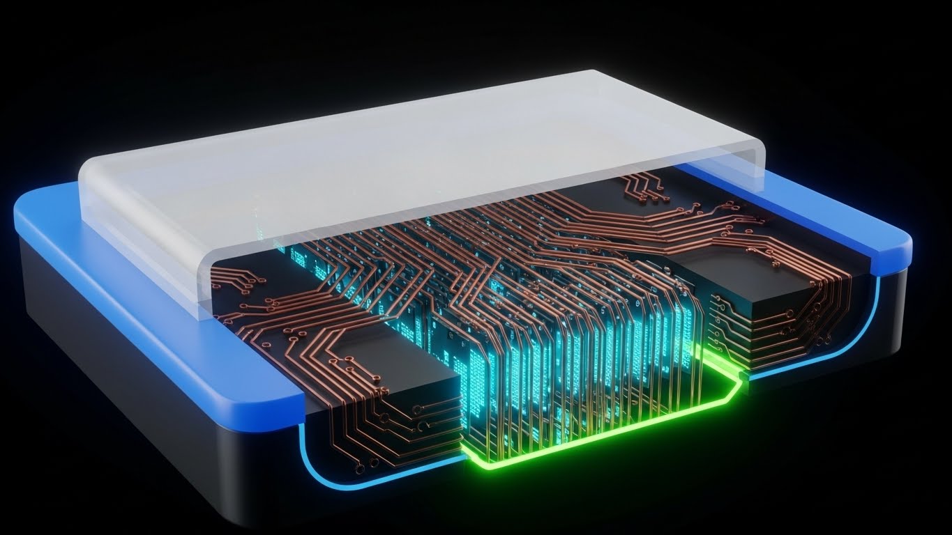
The Visual & Narrative Approach
To prove your platform plays nicely with others, we look "under the hood." This style uses a 3D X-Ray cross-section of a stylized server node or chip. Underneath a translucent white glass shell, we see a complex, organized highway of data packets glowing with an inner Cyan light, moving through copper-colored conduits. It visualizes the hidden complexity—API integrations, data lineage, and backend stability—that powers the simple front-end interface.
Psychological Impact & KPI Focus
- Niche Psychology: It validates the Technical Buyer's need for Architecture. It says, "We aren't just a pretty UI; we are a robust data platform." It satisfies the engineer's curiosity about scalability.
- Operational Impact: It builds Technical Authority. It differentiates the platform from lightweight, consumer-grade tools by showcasing "Heavy Lifting" capabilities.
Strategic Implementation & Trade-offs
- Ideal for: Developer Documentation, API pages, and Integration showcase videos.
- Duration: 15-20 Seconds (Looping).
- Trade-off: It is completely abstract. It tells the user nothing about the User Experience, only about the System Architecture.
Companies using similar video content -
MuleSoft – Anypoint Platform – Revealing complex API integrations and infrastructure.
Kong – API Gateway – Showcasing underlying microservices architecture and depth.
HashiCorp – Consul – Visualizing service mesh and network connectivity architecture.
16. Wireframe to Reality Transition
BOFU | Reducing Implementation Friction

The Visual & Narrative Approach
This narrative proves that your diagrams drive real-world action, specifically for vertical markets. The screen is split diagonally. The left side shows a blue-line architectural wireframe of a process map. The right side seamlessly transitions into a Realistic 3D representation, where the wireframe boxes become colorful Shipping Containers and the connectors become roads. While using a logistics metaphor, it powerfully demonstrates the concept of "Digital Twins"—showing how a flowchart directly models and controls physical assets.
Psychological Impact & KPI Focus
- Niche Psychology: It bridges the Physical/Digital Divide. For Operations Managers in heavy industries, it proves that the digital model directly correlates to their real-world assets, validating the "Digital Twin" concept.
- Operational Impact: It targets Conversion Rate for industry-specific use cases (Supply Chain, Logistics, Manufacturing). It helps the buyer visualize the end state.
Strategic Implementation & Trade-offs
- Ideal for: Industry Solutions pages (e.g., "Flowcharts for Supply Chain").
- Duration: 10-15 Seconds.
- Trade-off: It is niche-specific. The "shipping container" imagery is powerful for logistics but may confuse a pure software team. The metaphor must match the vertical.
Companies using similar video content -
Siemens Digital Industries Software – Teamcenter – Bridging design blueprints to physical products.
PTC – ThingWorx – Connecting digital models to real-world IoT assets.
AVEVA – Digital Twin Solutions – Visualizing industrial assets from design to operation.
17. Generative AI Cinematic Video
BOFU | Driving Demo Requests

The Visual & Narrative Approach
This style establishes the "Ultimate User Experience." We dolly zoom into a massive, wall-sized touchscreen in a high-tech command center. A hand enters the frame, tapping a glowing node on a complex Global Network Map. The node expands, revealing detailed metrics in Cinematic Teal and Orange. The dramatic lighting and Hollywood-level production quality position the software as the central nervous system of the enterprise.
Psychological Impact & KPI Focus
- Niche Psychology: It taps into the desire for Control and Significance. It elevates the mundane task of "monitoring" into a dramatic act of "orchestration," appealing to the Director of Operations.
- Operational Impact: A powerful driver for Demo Requests. It sells the "dream state" of the software deployment—total visibility and effortless control.
Strategic Implementation & Trade-offs
- Ideal for: High-budget YouTube Brand Ads and Event Keynotes.
- Duration: 15-30 Seconds.
- Trade-off: This is "Concept Video" territory. It sets a very high bar. If the actual product is a simple drag-and-drop tool, this creates a "Reality Gap" that must be managed.
Companies using similar video content -
Palantir – Foundry – Visualizing complex data analysis and operational control.
Splunk – Enterprise Security – Command center view of security and operations data.
Datadog – Monitoring & Security – Unified visibility across entire tech stack.
18. Low-Poly 3D Modeling
BOFU | ROI Logic Hook

The Visual & Narrative Approach
Finance flows are often dry, but they are the lifeblood of business. This style makes them tangible and satisfying. A playful Low-Poly 3D scene features a pipeline constructed of pastel Mint Green cylinders. Shiny Gold Coins flow smoothly through the pipe, dropping into a bin labeled "Receiving" with an upward arrow. The soft Pastel Pink background makes the image pop. It creates a friendly, gamified representation of "Cash Flow Management" or "Budget Approval Workflows."
Psychological Impact & KPI Focus
- Niche Psychology: It reduces the anxiety around financial complexity. The clean, toy-like aesthetic makes "Audit Compliance" or "Budgeting" look simple, manageable, and even delightful.
- Operational Impact: It drives Engagement on social platforms by disrupting the feed with color and satisfying motion. It visually communicates "efficiency = money saved" without the aggressive hard sell.
Strategic Implementation & Trade-offs
- Ideal for: Facebook/Instagram Ads targeting Finance/Admin roles.
- Duration: 6-10 Seconds (Looping).
- Trade-off: The playful style might feel "too young" for very conservative banking clients. It works best for Fintech or modern SaaS audiences.
Companies using similar video content -
Coupa – Business Spend Management – Gamifying procurement and expense flows.
Expensify – Expense Management – Simplifying financial processes with engaging visuals.
FreshBooks – Accounting Software – Making invoicing and cash flow management friendly.
19. 2D Line Art Animation
Onboarding | Self-Serve Onboarding
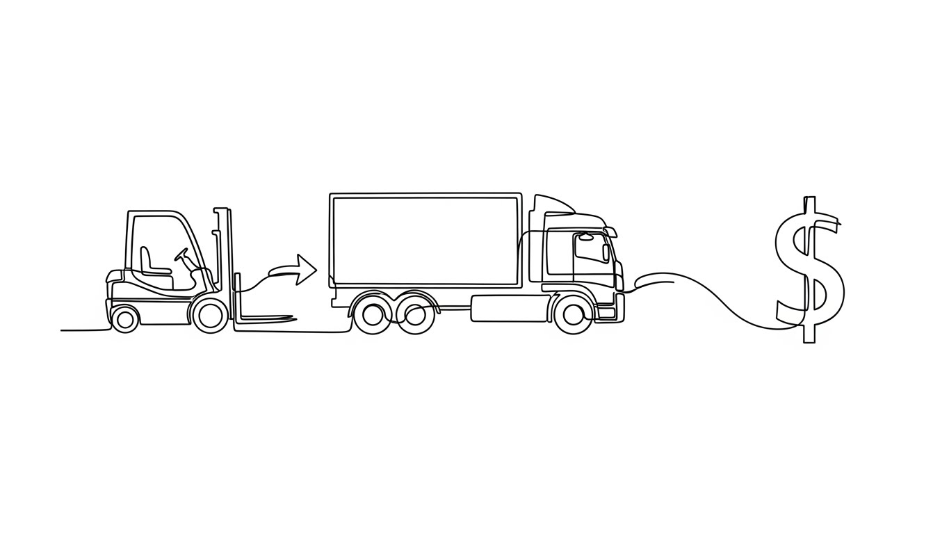
The Visual & Narrative Approach
Sometimes, you need to strip away all the noise to show the logic. This style uses an elegant, continuous Black Line Drawing on a textureless white background. It sketches a clear process: A Forklift moves goods to a Truck, which connects to a large Dollar Sign. This visualizes the "Value Stream Mapping" template within your software. The animation is fluid, drawing itself in real-time, creating a straight Red Line path through the process.
Psychological Impact & KPI Focus
- Niche Psychology: This appeals to the "Lean Six Sigma" practitioner. It prioritizes clarity and logic above all else. It implies that your software helps them find the "Red Line"—the shortcut through complexity.
- Operational Impact: Ideal for In-App Onboarding or empty states ("Start with a Logistics Template"). It encourages the user to start their first diagram, reinforcing the habit of "mapping to value."
Strategic Implementation & Trade-offs
- Ideal for: Empty State screens ("Start your first diagram") and Educational Tooltips.
- Duration: 3-5 Seconds.
- Trade-off: Minimalist. It lacks "wow factor" for ads but is unbeatable for educational clarity inside the product.
Companies using similar video content -
LeanKit (Planview) – Value Stream Management – Illustrating lean process flows and clarity.
Targetprocess – Agile at Scale – Visualizing agile workflow steps and paths.
draw.io (diagrams.net) – Diagramming Tool – Simple, clear process drawing and mapping.
20. Rapid UI Feature Montage
Onboarding | Trial/Freemium User Activation
The Visual & Narrative Approach
To excite a new user, you must show them the possibilities immediately. This style uses a Rapid-Fire Montage of multiple UI elements. Semi-transparent context menus, color pickers, and toolbars in Vibrant Pink, Cyan, and Yellow layer over each other in a dynamic collage against a dark background. Motion blur suggests speed. It captures the energy of a creative session, positioning the tool not just for "charts" but for "design and ideation."
Psychological Impact & KPI Focus
- Niche Psychology: It triggers Feature Curiosity and FOMO (Fear Of Missing Out). It shows the richness of the toolset, promising that the user will have everything they need to express their ideas.
- Operational Impact: The goal is Activation. By showing the depth of features in a high-energy clip, it motivates the user to explore menus they haven't clicked yet.
Strategic Implementation & Trade-offs
- Ideal for: Welcome Emails and "New Feature" announcement videos.
- Duration: 5-8 Seconds.
- Trade-off: It can be overwhelming. It is not for instruction, but for inspiration. It shows "what is possible" rather than "how to do it."
Companies using similar video content -
Figma – Design Platform – Rapidly showcasing design and collaboration features.
Adobe Creative Cloud – Various Apps – Quick cuts of creative tool capabilities.
Canva – Graphic Design Tool – Highlighting diverse design options and templates.
21. Macro UI Micro-Interactions
Onboarding | Accelerating Time-to-Value

The Visual & Narrative Approach
In the critical first moments of user onboarding, clarity is paramount. This style employs an Extreme Macro Close-up of the user interface, blurring out all peripheral noise to focus on a single, decisive action. We see a "Submit" button with a subtle gradient texture. As the interaction occurs, the icon within the button glows with a vivid Lime Green light, providing immediate, satisfying visual confirmation. The shallow depth of field ensures the user’s eye is locked exactly where it needs to be.
Psychological Impact & KPI Focus
- Niche Psychology: This triggers the dopamine reward system. By emphasizing the "success state" with a neon glow, we gamify the learning process. It reassures the anxious new user that they have performed the action correctly.
- Operational Impact: It drastically reduces Time-to-Value (TTV). By isolating micro-interactions, we prevent cognitive overload, helping users master the interface one button at a time.
Strategic Implementation & Trade-offs
- Ideal for: In-app tooltips, "First Click" tutorials, and Release Note highlights.
- Duration: 3-5 Seconds (Looping).
- Trade-off: Extremely narrow focus. It explains what happens when you click, but not why you should click it. It must be part of a larger sequence.
Companies using similar video content -
GitHub – Actions – Visualizing successful code commits or pipeline steps.
Jira – Workflow Management – Confirming task transitions or updates.
Salesforce – CRM Platform – Highlighting successful data entry or process completion.
22. 2D Character-Driven Story
Retention | Reducing Churn

The Visual & Narrative Approach
To combat churn, we must remind users of the human value the software unlocks. This style uses clean, vector-based 2D Character Animation to depict a moment of collaborative breakthrough. A colleague in a Corporate Blue shirt points excitedly at a simplified flowchart on a wall, while their partner in Warm Orange nods in agreement. The setting is a relatable, modern breakroom. The absence of complex outlines and the use of flat colors create a friendly, universal appeal that focuses on the relationship rather than the tech.
Psychological Impact & KPI Focus
- Niche Psychology: It reinforces the feeling of Belonging. It subtly suggests that using your software makes you a better teammate and a more effective communicator.
- Operational Impact: It targets Retention by associating the software with positive workplace culture. It reminds the buyer that this tool is the "campfire" around which their team gathers.
Strategic Implementation & Trade-offs
- Ideal for: "We Miss You" reactivation emails and Customer Success newsletters.
- Duration: 15-20 Seconds.
- Trade-off: It is generic. Without specific UI elements, it relies entirely on the script to connect the happy characters to your specific product features.
Companies using similar video content -
monday.com – Work OS – Humanizing project and team collaboration.
Asana – Work Management – Showing teams working together effectively.
Trello – Project Management – Friendly depiction of task management.
23. Isometric 3D Workflow
Retention | Driving Deep Feature Adoption
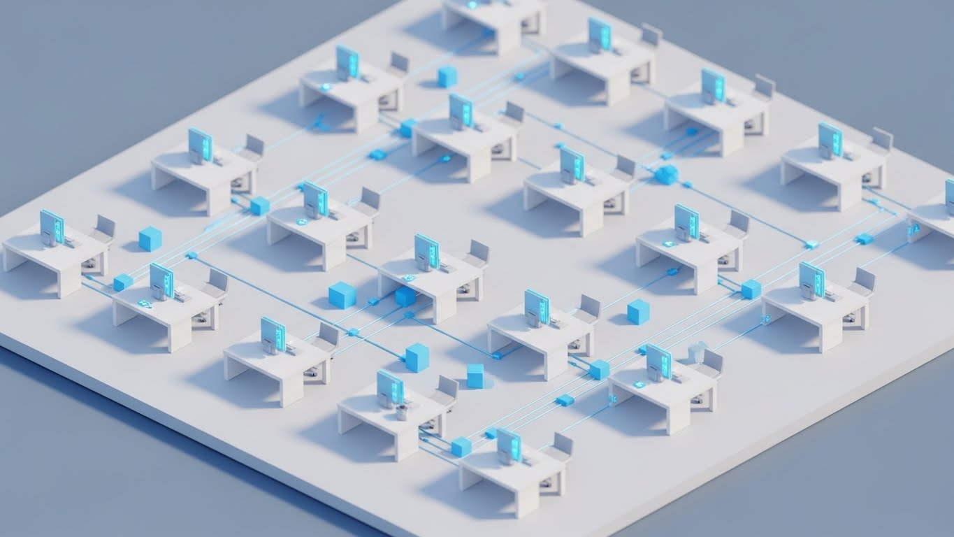
The Visual & Narrative Approach
As users mature, they need to see how their work fits into the bigger picture. This style uses a high-fidelity Isometric Miniature view, turning the office into a functioning "SimCity" ecosystem. Pristine white desks are interconnected by glowing blue fiber-optic cables running along the floor. Small, cubic data packets physically travel between workstations. It visualizes the invisible flow of data in a physical space, making the concept of "Enterprise Connectivity" tangible and toy-like.
Psychological Impact & KPI Focus
- Niche Psychology: It appeals to the System Administrator's desire for order and oversight. It satisfies the need to visualize the "topology" of the team's workflow.
- Operational Impact: It drives Feature Adoption for advanced collaboration tools (e.g., "Real-time Sync"). It shows that the software is the connective tissue of the physical office.
Strategic Implementation & Trade-offs
- Ideal for: Monthly Product Update emails and "Pro Tips" video headers.
- Duration: 10-15 Seconds (Looping).
- Trade-off: The "God's Eye View" can feel detached. It creates a sense of awe but doesn't show the user the specific mouse clicks needed to set up the connection.
Companies using similar video content -
Confluence – Team Collaboration – Visualizing how content and teams connect.
Miro – Visual Workspace – Showing how different teams interact on a board.
ServiceNow – ITSM – Illustrating interconnected IT services and teams.
24. Abstract 2D Organic Motion
Retention | Knowledge Base & FAQ Videos

The Visual & Narrative Approach
Support interactions are often fraught with frustration. This style aims to de-escalate anxiety. We use Abstract Organic Shapes in glossy Purple and Liquid Silver that float and merge effortlessly against a calm white background. The motion is slow, fluid, and lava-lamp-like. This visual metaphor represents "fluid knowledge" and the seamless resolution of problems. It provides a soothing visual anchor for voiceovers explaining complex troubleshooting steps.
Psychological Impact & KPI Focus
- Niche Psychology: It leverages Color Psychology (Cool Purples/Silvers) to induce a state of calm focus. It implicitly tells the frustrated user, "Relax, the solution is simple and smooth."
- Operational Impact: Ideally used as background for audio-heavy explanations, it improves Ticket Resolution Time by keeping the user engaged without adding visual cognitive load.
Strategic Implementation & Trade-offs
- Ideal for: Help Center video intros and "Waiting" screens during data processing.
- Duration: Continuous Loop.
- Trade-off: It is purely atmospheric. It conveys zero technical information. It must be overlaid with clear text or voiceover instructions to be useful.
Companies using similar video content -
Zendesk – Customer Service Software – Visualizing smooth support interactions.
Intercom – Customer Messaging – Representing fluid communication flows.
Freshdesk – Helpdesk Software – Abstractly showing problem resolution.
25. Dark Mode UI Showcase
Retention | Proactive Support/Announcements
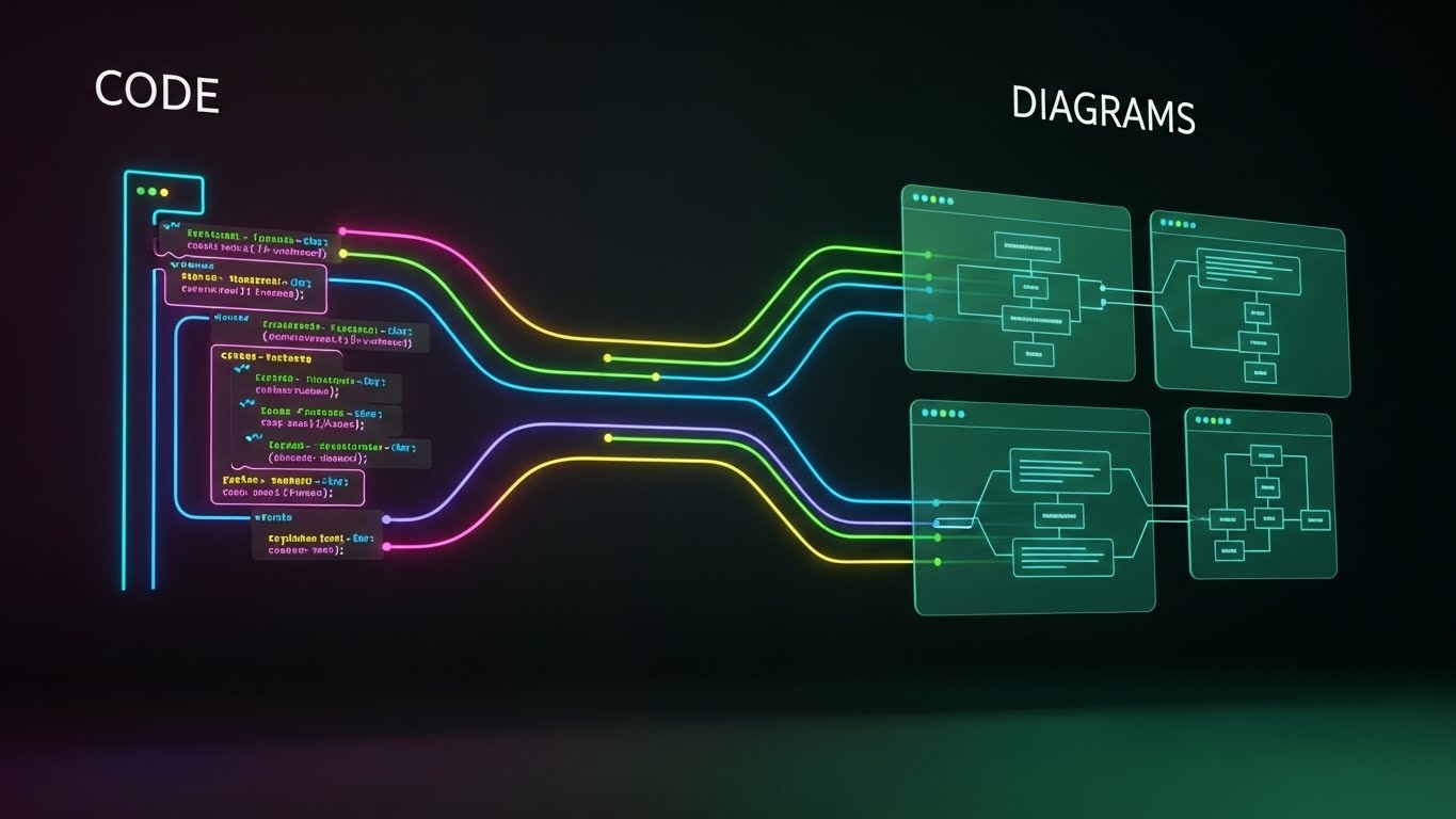
The Visual & Narrative Approach
Targeting the technical power-user, this style celebrates the "Dark Mode" aesthetic. The background is a deep, professional Charcoal. On the left, syntax-highlighted code blocks (in Neon Pink, Blue, and Yellow) represent the backend logic. Curving, multi-colored data cables connect this code directly to visual flowchart boxes on the right. This visualizes the symbiotic relationship between "Code" and "Diagrams," proving that the tool respects the developer's native environment.
Psychological Impact & KPI Focus
- Niche Psychology: It validates the Developer Persona. It signals that the tool is not just for "business types" but is a robust engineering instrument that supports "Infrastructure as Code" (IaC).
- Operational Impact: It drives adoption of API and Integration features. The high contrast ensures legibility of complex data structures, increasing Technical Confidence.
Strategic Implementation & Trade-offs
- Ideal for: Developer Newsletters, API Documentation, and "Dark Mode" feature launches.
- Duration: 10-15 Seconds.
- Trade-off: It alienates non-technical users who find code intimidating. Use strictly for segmenting your technical audience.
Companies using similar video content -
GitLab – DevOps Platform – Showcasing CI/CD pipelines and code in dark mode.
Postman – API Platform – Highlighting API development and testing.
Datadog – Monitoring & Security – Presenting metrics and logs in a dark UI.
26. Holographic UI over 3D Render
Expansion | Driving Upsell/Cross-sell

The Visual & Narrative Approach
To sell the Enterprise tier, we must project an image of futuristic command. This style features a realistic rendering of a high-end wooden executive desk in a sunlit office. Floating above the surface is a Holographic Blue Enterprise Relationship Diagram (ERD). The diagram is translucent, complex, and layered, casting a faint blue glow onto the wood grain. It implies that the software acts as an "Augmented Reality" layer for decision-making, hovering above the physical work.
Psychological Impact & KPI Focus
- Niche Psychology: It appeals to the aspiration of the Modern Executive. It frames the software as a "Heads-Up Display" for business, offering superior visibility and control.
- Operational Impact: It supports Upsell Campaigns by visualizing premium features (like "Enterprise Architecture Mapping") as high-value, futuristic tools that justify a higher price point.
Strategic Implementation & Trade-offs
- Ideal for: Pricing Pages (Enterprise Tier) and ABM Landing Pages.
- Duration: 10-20 Seconds (Looping).
- Trade-off: High complexity. The compositing of the hologram into the realistic scene must be flawless to avoid looking like a cheap sci-fi effect.
Companies using similar video content -
LeanIX – Enterprise Architecture Suite – Holographic view of IT landscape.
BiZZdesign – Enterprise Studio – Projecting strategic business models.
Mega International – HOPEX Platform – Visualizing enterprise governance and architecture.
27. 2D Graphics Over Live Action
Expansion | Driving Referrals & Advocacy

The Visual & Narrative Approach
Advocacy requires authenticity. This style mimics the "Instagram Story" aesthetic of the digital native creator. We see a vertical, selfie-style shot of a happy professional in a co-working space. Bursting around their head are hand-drawn White Vector Doodles—arrows, hearts, and flowchart nodes. The doodles animate playfully, suggesting that the user's creativity is spilling out into the real world. It feels personal, unscripted, and genuinely enthusiastic.
Psychological Impact & KPI Focus
- Niche Psychology: It leverages Social Proof. By stepping away from polished corporate graphics and using "UGC-style" (User Generated Content) visuals, it builds trust. It says, "Real people love this tool."
- Operational Impact: A primary driver for Referral Programs. It encourages users to share their own "flow" on social media. The goal is Viral Reach.
Strategic Implementation & Trade-offs
- Ideal for: Instagram Reels, TikTok, and Customer Testimonial montages.
- Duration: 15 Seconds.
- Trade-off: It lacks authority. It is too casual for the C-Suite but perfect for the end-user community.
Companies using similar video content -
Canva – Graphic Design Tool – Users showcasing their designs in real-world contexts.
TikTok for Business – Ad Platform – Encouraging creative, overlaid content.
Later – Social Media Management – Users demonstrating content creation.
28. Hyper-lapse Stock Footage with Data
Expansion | In-App Upsell
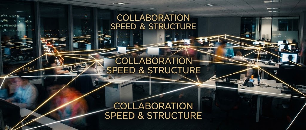
The Visual & Narrative Approach
To visualize the scale of enterprise collaboration, we use Hyper-lapse Photography. We see a busy, open-plan office where people are blurred streaks of motion, emphasizing speed and activity. Overlaid on this chaotic energy is a stable, structured network of Gold and White Lines connecting the desks. The text "COLLABORATION SPEED & STRUCTURE" is integrated into the scene. This contrasts the frenetic pace of business with the stable, golden order provided by your platform.
Psychological Impact & KPI Focus
- Niche Psychology: It validates the Operations Manager's reality: the workplace is chaotic. The visual promise is that the software provides the invisible "digital lattice" that holds it all together without slowing it down.
- Operational Impact: It targets Seat Expansion. It visualizes the value of adding every team member to the platform to complete the network, driving the purchase of additional licenses.
Strategic Implementation & Trade-offs
- Ideal for: LinkedIn Ads targeting Team Leads and "Invite Your Team" modal windows.
- Duration: 6-10 Seconds.
- Trade-off: Reliance on stock footage. If the office environment doesn't match the client's culture (e.g., remote teams), the metaphor may fall flat.
Companies using similar video content -
Asana – Work Management – Visualizing team activity and connected tasks.
monday.com – Work OS – Showing dynamic team collaboration across a busy office.
Wrike – Project Management – Highlighting accelerated project delivery.
29. Photorealistic 3D Renders
Expansion | Competitive Comparison/Switcher
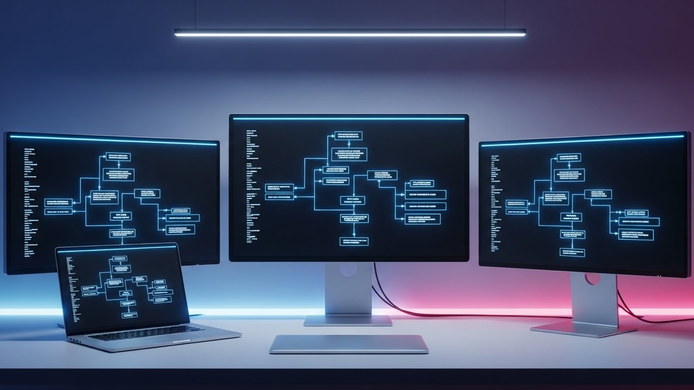
The Visual & Narrative Approach
This style appeals to the "Gear Head" aspect of the pro user. It features a stunning Photorealistic Render of a minimalist, high-end desk setup. A silver laptop is flanked by two large external monitors. Crucially, all three screens display perfectly aligned, matching White-and-Blue Flowcharts. The lighting is soft daylight. It conveys a sense of "Command Center" peace and organization, suggesting that this software is the centerpiece of the ultimate productive workflow.
Psychological Impact & KPI Focus
- Niche Psychology: It targets the Aspirational Prosumer. It sells the feeling of "being organized" and "having the best tools." It visualizes the software as a premium asset, akin to high-end hardware.
- Operational Impact: It positions the software as a Daily Driver—a tool that is always open on at least one screen. It is effective for Competitive Displacement, implying "other tools don't look this good."
Strategic Implementation & Trade-offs
- Ideal for: Retargeting Display Ads and Desktop Wallpaper downloads.
- Duration: Static or Slow Pan.
- Trade-off: It is a static concept. It implies functionality (multi-screen support) that must actually exist in the product.
Companies using similar video content -
JetBrains – IDE Suite – Showcasing developer tools in an ideal setup.
Autodesk – Fusion 360 – Highlighting professional design software in a sleek environment.
SolidWorks – 3D CAD Software – Presenting engineering tools in a high-fidelity workspace.
30. Generative AI Realistic Character Video
Expansion | Shaping Brand Perception

The Visual & Narrative Approach
The final style transcends the software to sell the vision. Utilizing advanced Generative AI, we present a realistic video of a charismatic thought leader (resembling a TED speaker) on a dramatic stage. They gesture towards a massive, off-camera screen that casts a Soft Blue Glow on their face. The composition focuses on the speaker's passion and authority. This isn't about features; it's about leading the industry conversation on "The Future of Work."
Psychological Impact & KPI Focus
- Niche Psychology: It builds Brand Authority. It suggests that your company is not just a software vendor, but a think tank and a leader. It appeals to buyers who want to partner with visionaries.
- Operational Impact: It drives Long-term Brand Equity and Trust. It elevates the conversation from "price" to "partnership."
Strategic Implementation & Trade-offs
- Ideal for: Event Keynotes, "Vision" manifestos on the About page, and high-level YouTube content.
- Duration: 30-60 Seconds.
- Trade-off: The "Uncanny Valley." AI video is improving, but lip-sync and movement must be perfect, or it risks looking cheap and eroding trust.
The Visual Operations Doctrine: A Strategic Knowledge Base
Having explored 30 distinct visual styles, the question shifts from "What does it look like?" to "How do we use this to drive business impact?" This final section synthesizes these styles into a cohesive strategic framework for Flowchart & SaaS platforms.
Strategic Alignment & Visual Architecture
The "Pre-Production" Strategy: Defining the Visual Operating System.
- The Cognitive Load Audit: Before creating a single video, audit your current user training. Where are users stalling? If "Advanced Exporting" has high friction, deploy Style 7 (Clean UI). If the friction is conceptual ("Why do I need this?"), deploy Style 2 (Abstract 2D) to simplify the mental model.
- Role-Based Visual Mapping: Do not serve the same video to the CEO and the SysAdmin. Use Style 14 (Lifestyle Overlay) to speak to the Executive's need for control, and Style 15 (Deep-Tech X-Ray) to satisfy the Engineer's need for architectural proof.
- The "Glanceability" Standard: In operational environments, attention is scarce. Visuals must be understood in under 5 seconds. Styles like Style 1 (Bold Kinetic) and Style 28 (Hyper-lapse) are designed for this "glanceability," delivering the core message without requiring audio.
- Brand Voice Consistency: Your software is a singular ecosystem; your video styles should reflect that. Whether using the friendly Style 8 (Corporate Memphis) or the serious Style 13 (Cyber Security), the color palette (e.g., "Office Blue," "Signal Red") must remain the consistent thread.
- The Advids Strategic Audit: Transforming a fragmented content library into a "Visual Operating System" requires an outside perspective. Advids specializes in auditing your feature set against these 30 styles to identify "Visual Gaps" where your value proposition is invisible to the user.
- Standardization vs. Customization: For core features, use standardized, scalable styles (like Style 21). For industry-specific verticals (e.g., Logistics or Healthcare), invest in bespoke visuals like Style 16 (Wireframe to Reality) to prove domain expertise.
- The Cross-Departmental Bridge: Visuals are the only common language between Sales, Product, and Support. A video created for Marketing (Style 6 - Isometric Factory) can and should be reused by Sales to explain workflow topology to a prospect.
- Legacy System Integration: Many B2B buyers are transitioning from legacy hardware. Use Style 9 (Split Screen) to visually acknowledge their current pain (the "Old Way") and validate their transition to the "New Way."
- Accessibility by Design: A Visual Operating System is inclusive. Styles relying on color (like Style 25) must check for color-blindness accessibility, or use secondary cues (shapes/icons) to ensure the message is universal for a global workforce.
- The Mobile-First Mandate: Decision-makers consume content on the go. Styles 1, 4, and 27 are specifically architected for vertical (9:16) mobile consumption, ensuring your brand presence extends to the morning commute.
Operational Adoption & Implementation
The "Deployment" Phase: Embedding Visuals into the Workflow.
- Overcoming "Big Brother" Anxiety: Automated monitoring tools can trigger fear. Use Style 22 (2D Character) to frame these features as "Collaborative Support" rather than "Surveillance," focusing on the human benefit.
- The Micro-Learning Shift: No user reads the manual. Replace PDF documentation with a library of Style 21 (Macro UI) clips. Embed these 5-second loops directly into the software tooltips for "Just-in-Time" learning.
- Just-in-Time Support: Reduce helpdesk volume by embedding Style 24 (Abstract Organic) videos in the "Waiting/Loading" screens of your app. This reduces perceived wait time and lowers frustration during technical delays.
- Gamification of Training: Use Style 18 (Low-Poly 3D) to turn dry topics like "Budget Approval" into visually satisfying, game-like loops. This increases engagement with mandatory compliance training.
- Reducing Support Ticket Volume: There is a direct correlation between proactive visual guides and lower support costs. A library of Style 7 (Clean UI) videos answers the question "How do I..." before the user opens a ticket.
- Remote Onboarding: For distributed teams, physical seminars are impossible. Use Style 23 (Isometric 3D) to create a "Virtual Office" orientation, helping remote workers visualize where they fit in the digital organization.
- Visualizing SOPs: Text-based Standard Operating Procedures are ignored. Convert them into Style 19 (2D Line Art) animations—simple, linear, and impossible to misunderstand.
- Feedback Loops: Use Style 27 (Mixed Media) to solicit user feedback. Seeing a "real person" ask for input increases response rates compared to a sterile automated email.
- Scalable Localization: Global SaaS platforms need global assets. Style 4 (Minimalist Flat) and Style 2 (Abstract 2D) rely on iconography rather than text, making them instantly deployable across all language regions without expensive translation.
- Leadership Communication: When rolling out a new enterprise strategy, use Style 30 (Gen AI Persona) or Style 11 (Cinematic Montage). These high-production styles signal importance and gravity, aiding Change Management efforts.
Measuring Impact & Future-Proofing
The "ROI" Phase: Metrics, Scalability, and Evolution.
- Beyond "Views": Vanity metrics are useless. Measure Time-to-Competency (how fast a user masters a feature after watching Style 21) and Feature Adoption Rate (did usage spike after the Style 23 email campaign?).
- The "Idle Time" Metric: High idle time in software suggests confusion. Correlate the deployment of Style 7 tutorials with a reduction in "Idle Time," proving that visuals are smoothing the workflow.
- Compliance Velocity: How quickly does the team adopt a new regulation? Use Style 13 (High-Contrast Security) to explain new compliance rules and measure the speed of acknowledgment/sign-off.
- Retention and Churn: High-quality UX visualization is a retention tool. By using Style 22 to humanize the software, you increase emotional switching costs, directly impacting Lifetime Value (LTV).
- The AI Visual Frontier: Prepare for the future where video is generated in real-time. Styles like Style 3 (Abstract 3D AI) pave the way for dynamic interfaces that change based on user behavior.
- Scalability of Assets: Build a "Visual Component Library." If you use Style 8, keep the character vector files organized. This allows you to rapidly create new scenarios without starting from scratch.
- The Advids Partnership: Building this library is not a one-time project; it is an ongoing operational function. Advids serves as the long-term partner, maintaining the "Visual Source Code" and ensuring that as your software evolves, your visual language evolves with it.
- Benchmarking Success: "Good enough" is a competitive risk. If your competitor uses Style 29 (Photorealistic 3D) and you use blurry screenshots, you lose the perception war. Regularly benchmark your visual fidelity against the market leaders.
- The ROI of Safety: For platforms managing critical data, better visualization means fewer breaches. Quantify the reduction in "User Error" incidents after deploying Style 16 (Wireframe to Reality) training.
- Final Call to Innovation: Treat video not as "Marketing Content," but as Digital Infrastructure. Just as you invest in your server architecture, invest in your Visual Architecture. It is the interface through which the world experiences your logic.
Companies using similar video content -
OpenAI – ChatGPT Enterprise – Visionary discussions on AI's future.
Anthropic – Claude AI – Thought leadership on responsible AI development.
NVIDIA – AI Enterprise – Keynotes on the future of AI and computing.
Author & Editor Bio


