
Introduction: Visualizing the Financial Logistics Revolution
The global supply chain is a miracle of physical engineering, yet the financial infrastructure supporting it often remains trapped in the paper age. For Logistics Directors and CFOs, the challenge is no longer just moving goods; it is synchronizing the physical movement of freight with the digital flow of capital. We have entered the era of "Financial Logistics," where visibility is the new currency and precision is the ultimate competitive advantage.
The opportunity for transformation is immense. In a landscape where 80% of freight invoices contain errors—from duplicate payments to unapplied accessorials—the cost of status quo is simply too high. These "invisible" leaks in the supply chain represent millions in potential recovered profit. However, identifying these errors manually is like finding a needle in a haystack of PDFs and spreadsheets.
This is where strategic visualization becomes a business imperative. It bridges the physical/digital divide, translating complex General Ledger codes and tariff structures into intuitive, actionable intelligence. The impact of this shift is measurable: advanced automation in freight auditing has cut manual errors by nearly two-thirds, freeing up teams to focus on strategic sourcing rather than dispute management.
This guide explores 30 distinct video visualization styles designed to help you communicate this value. From abstract representations of global connectivity to precise isometric depictions of automated workflows, these examples serve as a strategic framework. They are crafted to articulate your platform's ability to turn chaotic data into streamlined financial success.
1. Visualizing the Global Pulse
TOFU | Brand Awareness
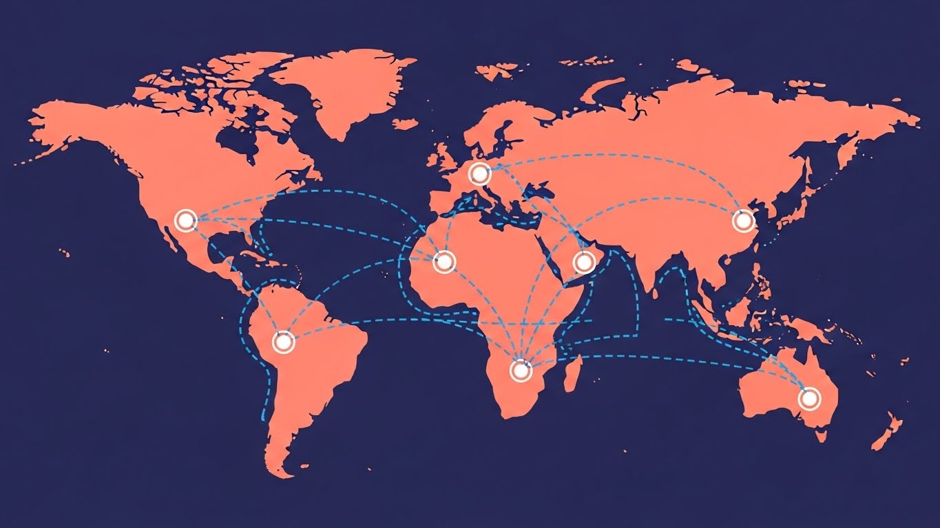
(Abstract Organic Vector): Global Network + Visualizing Seamless Connectivity
The Visual & Narrative Approach
This style abandons the clutter of realistic geography for a clean, stylized representation of global connectivity. The composition utilizes a "top-down" perspective of a simplified world map where continents are geometric abstractions rather than cartographic realities. Dashed Electric Blue lines pulse rhythmically between nodes, visualizing shipping lanes not as physical routes, but as active data connections. The narrative tone is high-level and strategic, focusing on the "big picture" of network ubiquity.
Psychological Impact & KPI Focus
For the "Architect of Financial Logistics," this style reduces the cognitive load associated with complex global operations. It triggers a feeling of control and reach. By abstracting the world into a manageable network, it visually promises that the software can handle the complexity of global trade without becoming overwhelmed by it. It directly supports KPIs related to Global Visibility and Network Reach.
Strategic Implementation & Trade-offs
- Optimal Duration: 15-20 seconds (Looping).
- Strategic Trade-off: While excellent for setting a high-tech mood, this style is too abstract to explain specific features (e.g., GL coding). It is purely for emotional branding—signaling that you are a modern, connected player.
Companies using similar video content -
project44 – Supply Chain Visibility – Abstract global network for real-time tracking.
One Network Enterprises – Multi-Party Business Network – Connecting global supply chain partners.
2. The Power of Symbolic Simplicity
TOFU | Category Creation
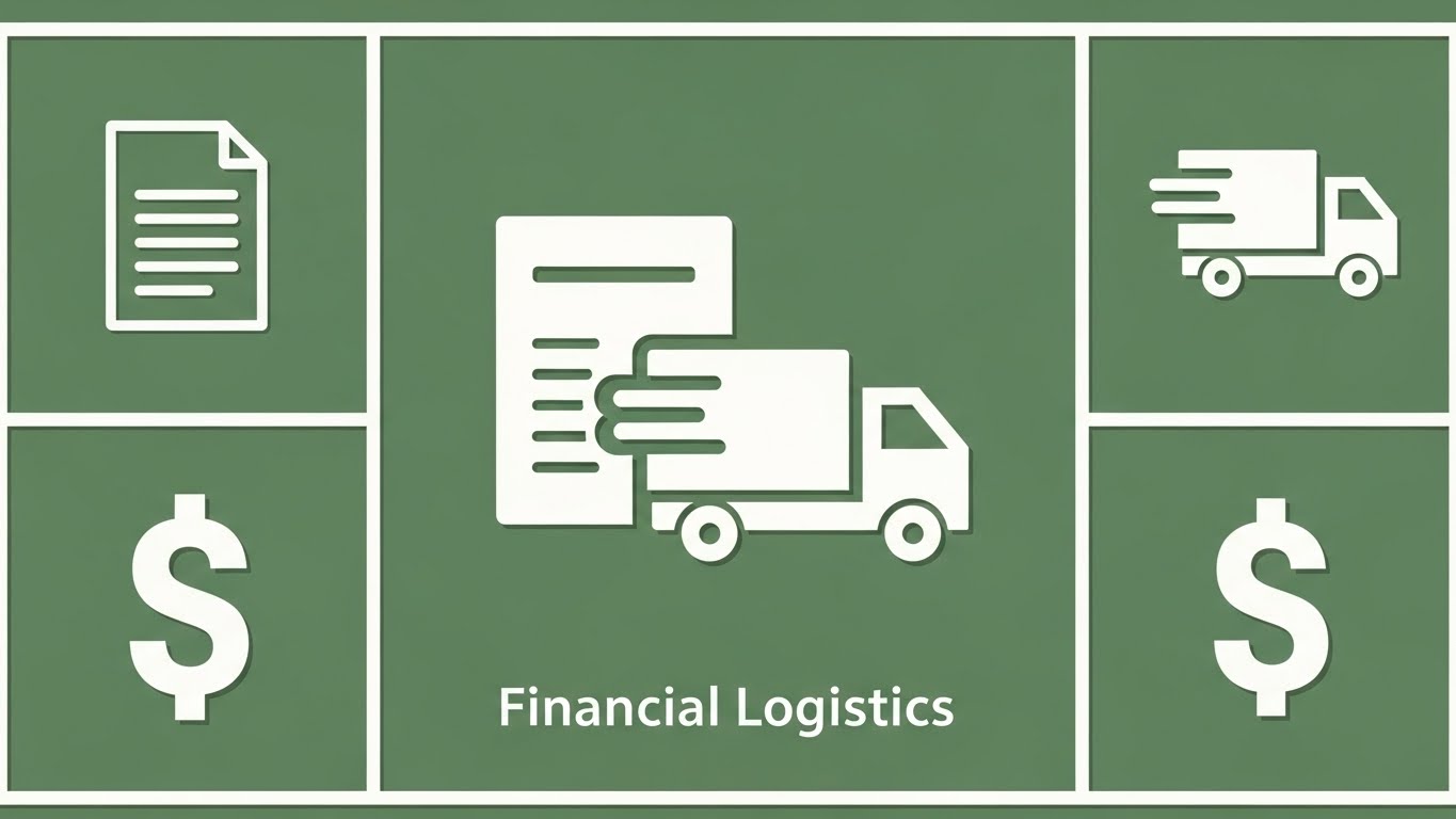
(Minimalist Flat 2D Vector): Unified Icons + Integrating Finance And Logistics
The Visual & Narrative Approach
This style utilizes the "Icon Merging" technique to visually define a new category: Financial Logistics. The symmetrical grid offers a sense of order—a sharp contrast to the chaos of manual auditing. The central animation, where the invoice document merges with the truck, is the "Aha!" moment. It visually asserts that the physical shipment and the financial document are inseparable in your platform. The Sage Green palette suggests calm, growth, and financial health.
Psychological Impact & KPI Focus
The brain loves symmetry and simple association. Merging two icons creates a new mental file for "Freight + Finance." It addresses the "Physical/Digital Divide" directly by showing them as one unified entity. This style supports Category Creation and User Experience (UX) perception.
Strategic Implementation & Trade-offs
- Optimal Duration: 10-15 seconds.
- Strategic Trade-off: This style can feel "generic" if not paired with strong, proprietary messaging. It is best used for high-level concept introduction, not detailed product demos.
Companies using similar video content -
PayCargo – Freight Payment Network – Unifying freight and finance payment.
Freightos – Freight Booking & Management – Simplifying complex freight processes.
3. Visualizing Payment Velocity
TOFU | Market Education
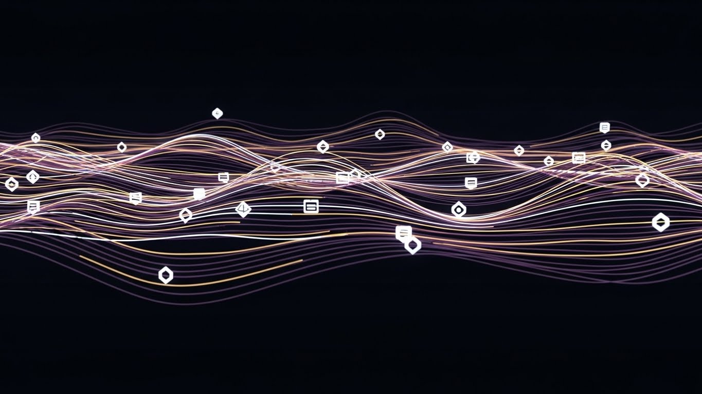
(Abstract 2D Motion Graphics): Data Streams + Tracking Financial Flow Velocity
The Visual & Narrative Approach
Here, we visualize the invisible: data streams. The undulating sine waves in Deep Violet and Gold turn the abstract concept of "audit trails" into a fluid, beautiful river of information. The small geometric icons (data packets) flowing within the lines represent individual invoices or shipment milestones being processed smoothly. This is "FinTech" aesthetics applied to logistics—clean, rhythmic, and sophisticated.
Psychological Impact & KPI Focus
The smooth horizontal motion induces a sense of ease and lack of friction (Flow State). It subtly communicates that your software removes the "bumps" in the road (disputes, errors). It rebrands messy freight data as "organized flow," supporting KPIs regarding Processing Speed and Throughput.
Strategic Implementation & Trade-offs
- Optimal Duration: 30-45 seconds.
- Strategic Trade-off: It is very abstract. You must rely heavily on a clear voiceover to connect the "lines" to "logistics" in the viewer's mind. Without context, it’s just pretty lines.
Companies using similar video content -
Cass Information Systems – Freight Audit & Payment – Tracking financial flow and audit trails.
ControlPay – Freight Audit & Payment – Streamlining invoice processing and payment.
4. Augmented Reality Perception
TOFU | Shaping Brand Perception

(Generative AI Cinematic): Augmented Port + Precision Control Over Cargo
The Visual & Narrative Approach
This style leverages the power of "Epic Scale." The Generative AI rendering of a sunset port creates a Hollywood-level emotional backdrop. The crucial element, however, is the overlay: thin, white tracking lines locking onto containers. This visualizes "intelligence over infrastructure." It says, "We don't own the ships, but we control the data that moves them." The anamorphic lens flares add a premium, enterprise-grade feel.
Psychological Impact & KPI Focus
High production value equates to high market authority (Authority Bias). It appeals to the aspiration of the Logistics Director who wants to feel like the commander of a sophisticated, futuristic operation. It supports Brand Perception and Enterprise Scale.
Strategic Implementation & Trade-offs
- Optimal Duration: 15-30 seconds.
- Strategic Trade-off: High rendering cost (computational or creative) compared to vector styles. It sets a very high expectation for the actual software UI; ensure your product looks modern enough to back this up.
Companies using similar video content -
Maersk – Integrated Logistics Solutions – Overlaying intelligence on physical shipping assets.
Flexport – Global Freight Platform – Providing precision control over cargo and data.
5. Accelerating the Value Proposition
TOFU | YouTube

(Bold Kinetic Typography): Kinetic Blocks + Accelerating Audit Impact
The Visual & Narrative Approach
Words become physical objects in this style. The massive Vivid Yellow and Charcoal Grey blocks carry weight and momentum, mimicking the heavy nature of freight itself. The "zoom" effect creates a sense of urgency and speed. This is not about reading; it's about impact. It is perfect for emphasizing punchy keywords like "STOP OVERPAYING" or "AUDIT AUTOMATION."
Psychological Impact & KPI Focus
The speed lines and motion blur trigger a "fast-paced" cognitive response, aligning with the need for speed in logistics. It speaks to the frustration of "slow processes" by presenting the solution as fast and disruptive. It is designed to maximize Click-Through Rate (CTR) and Attention Retention.
Strategic Implementation & Trade-offs
- Optimal Duration: 10-15 seconds (Bumper Ads).
- Strategic Trade-off: Zero nuance. You cannot explain how it works here, only that it works. Use this to drive traffic to longer, educational content.
Companies using similar video content -
Trax Technologies – Freight Audit & Payment – Emphasizing rapid audit impact and savings.
Emerge – Freight Procurement & Audit – Highlighting accelerated savings and efficiency.
6. Humanizing Logistics Partnerships
TOFU | Vertical Social Organic

(Aspirational Stock Montage): Team Celebration + Humanizing Financial Success
The Visual & Narrative Approach
In a tech-heavy industry, people crave human connection. This style focuses on the result of good software: a happy, aligned team. The high-five moment around the whiteboard symbolizes the end of the "Blame Game" between Logistics and Finance. The bright, natural sunlight suggests transparency. It humanizes the brand, showing that you understand the people behind the screens.
Psychological Impact & KPI Focus
Seeing people succeed triggers a desire to experience that same success (Social Proof & Mirror Neurons). It visualizes the "relief" of solving a problem. It addresses the stress and friction typical in logistics departments, promising harmony. It supports Engagement and Trust Building.
Strategic Implementation & Trade-offs
- Optimal Duration: Static Image or 5-second subtle motion loop.
- Strategic Trade-off: Can easily veer into "cheesy stock photo" territory. Authenticity is key—the diversity and office setting must match the target audience's reality.
Companies using similar video content -
Coyote Logistics – Third-Party Logistics (3PL) – Fostering collaborative relationships.
BlueGrace Logistics – 3PL & Technology – Emphasizing human connection in logistics.
7. The Isometric Process View
TOFU | Connected TV
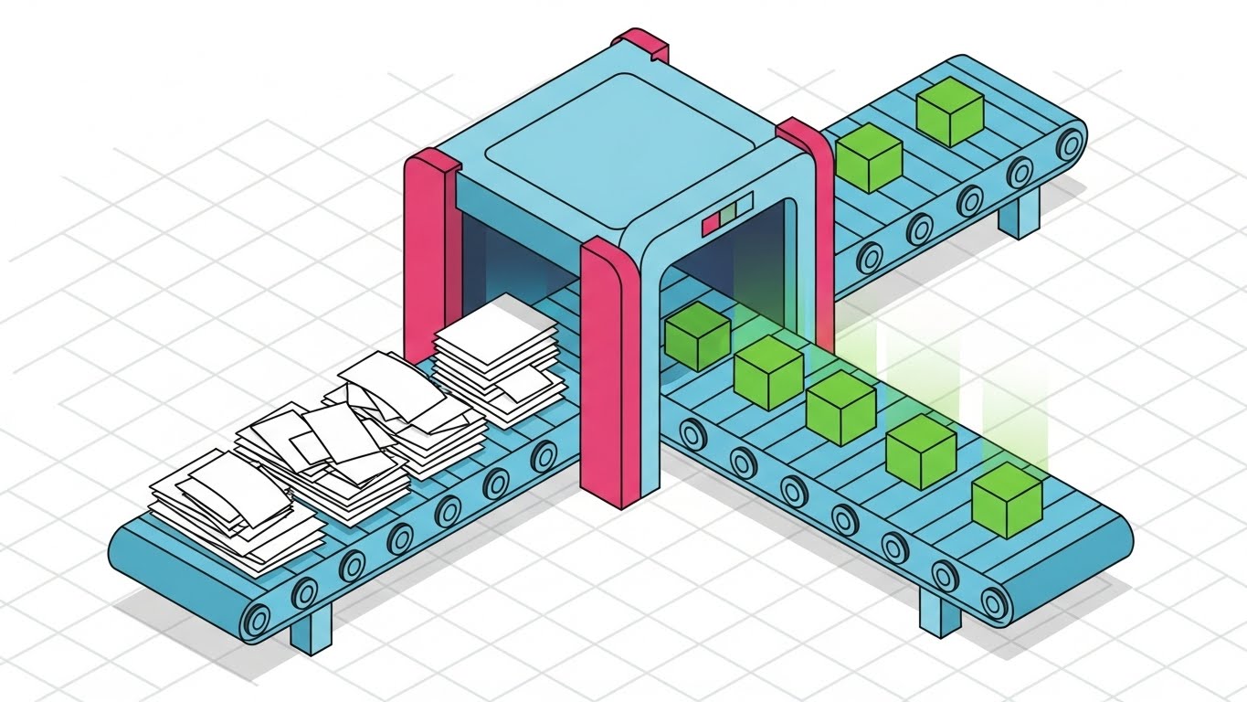
(Isometric 2D Motion Design): Process Grid + Transforming Chaos Into Order
The Visual & Narrative Approach
This is the ultimate "Process Visualization" style. The isometric perspective allows us to show a "before and after" in a single frame. The chaotic stack of papers (left) passing through the scanner and becoming neat digital cubes (right) is a perfect metaphor for the core value proposition: Digitization and Standardization. The grid background emphasizes precision and the "engineered" nature of the solution.
Psychological Impact & KPI Focus
The linear left-to-right flow matches how we read and process time (Cognitive Ease). It makes the complex process of "audit" look simple and linear. It appeals to the "Engineer" mindset of supply chain planners who value order. It supports Comprehension Rate and Process Optimization.
Strategic Implementation & Trade-offs
- Optimal Duration: 30-60 seconds.
- Strategic Trade-off: It feels very "instructional." It lacks the emotional punch of Style 4 but makes up for it in educational clarity.
Companies using similar video content -
CT Logistics – Freight Audit & Payment – Transforming chaotic invoices into ordered data.
FreightPOP – TMS & Freight Audit – Visualizing streamlined freight management processes.
8. Highlighting Security Protocols
TOFU | Skippable Pre-Roll Ad

(Futuristic Neon/Dark Mode): Glowing Nodes + Highlighting Security Protocols
The Visual & Narrative Approach
Dark mode isn't just a UI preference; it's a signal of "modern tech." This style uses a Cyberpunk-inspired aesthetic to position the software as a security and intelligence tool. The glowing Sapphire Blue node amidst the Charcoal void draws the eye immediately, symbolizing the "insight" found in the darkness of big data. It borrows visual cues from cybersecurity interfaces to imply robustness and protection.
Psychological Impact & KPI Focus
The aesthetic mimics high-end security software, subconsciously telling the CFO that their financial data is safe (Trust & Security). For an audience dealing with millions in freight spend, "security" and "precision" are paramount. This style screams "Enterprise Grade" and supports Brand Lift for compliance features.
Strategic Implementation & Trade-offs
- Optimal Duration: 15-20 seconds.
- Strategic Trade-off: Can appear "cold" or "intimidating" if overused. It needs to be balanced with warmer, human-centric messaging (like Style 6) at other touchpoints.
Companies using similar video content -
Basware – Purchase-to-Pay Automation – Securing financial transactions and data.
Coupa – Business Spend Management – Highlighting robust security for spend data.
9. Simplifying Network Complexity
MOFU | Demand Gen

(Low-Poly 3D Modeling): Low-Poly City + Simplifying Complex Logistics
The Visual & Narrative Approach
Logistics is messy; Low-Poly makes it clean. This style reduces trucks, buildings, and roads to their simplest geometric forms. The bright Pastel Pink and Blue palette is disarming and friendly. The clear blue path winding through the city creates a gamified feel, turning the stressful task of "route optimization" into something that looks manageable and even fun.
Psychological Impact & KPI Focus
The aesthetic reminds viewers of simulation games, triggering a sense of control and "world-building" (Gamification). It combats the "overwhelmed" feeling of logistics managers. It says, "With our tool, your complex world becomes this simple toy city." It supports Demand Gen and Ease of Use.
Strategic Implementation & Trade-offs
- Optimal Duration: 15-30 seconds.
- Strategic Trade-off: If too "cute," it might not be taken seriously by rigid enterprise traditionalists. Use it for "Ease of Use" messaging, not "Deep Compliance" messaging.
Companies using similar video content -
Loadsmart – Digital Freight Brokerage – Simplifying complex routing and capacity.
Uber Freight – Digital Freight Network & TMS – Making freight matching look easy.
10. From Plan to Execution
MOFU | Product Differentiation
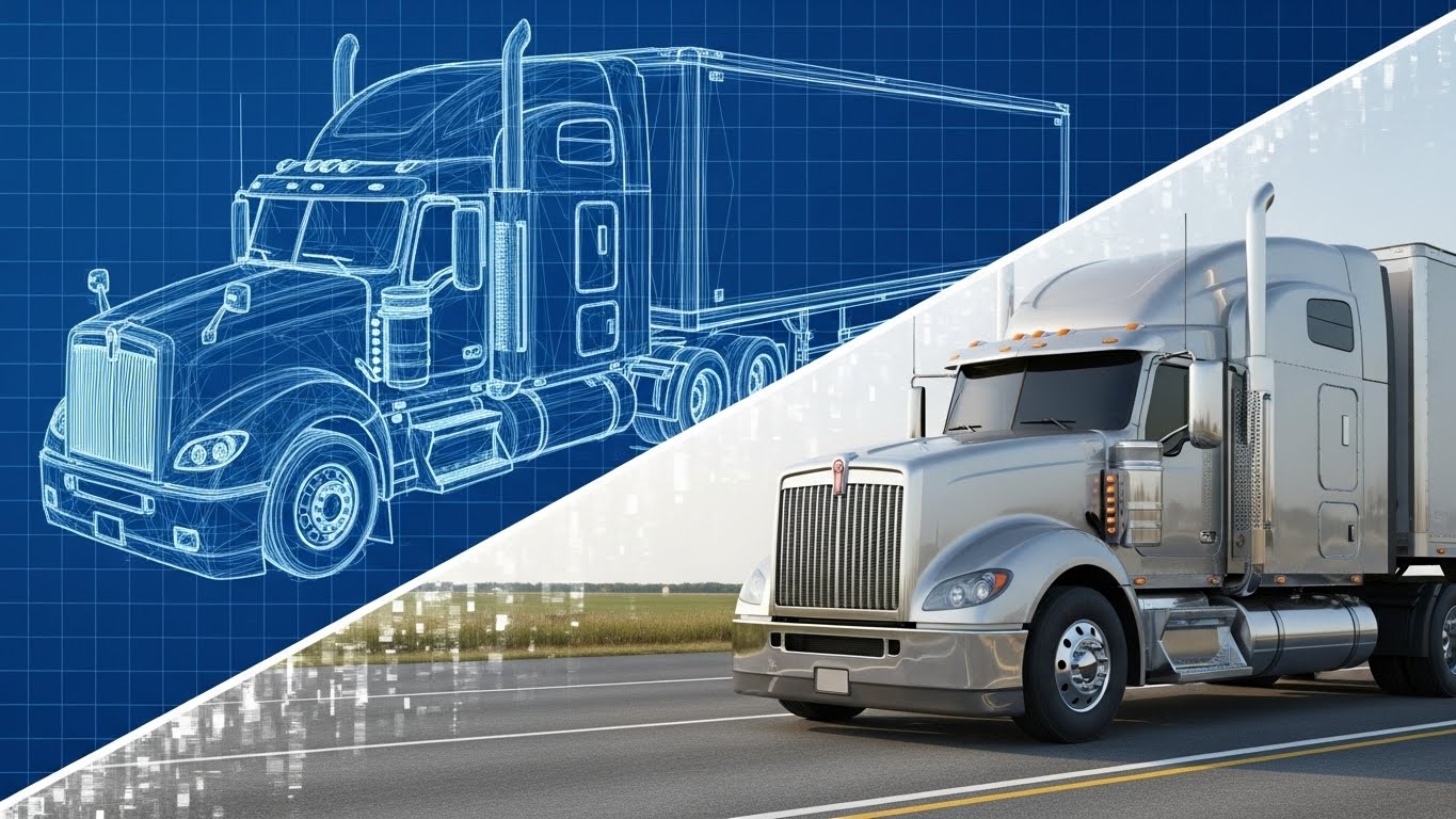
(Wireframe to Reality Transition): Blueprint Split + Validating Execution Reality
The Visual & Narrative Approach
This split-screen technique is a powerful visual metaphor for "Execution." The top-left Wireframe represents the plan/audit/data, while the bottom-right Photorealistic Render represents the physical shipment. The "scan effect" transition line shows how your software bridges these two realities. It visually proves that your digital planning directly translates to real-world results.
Psychological Impact & KPI Focus
It satisfies the brain's desire to see the "finished product" (Validation). It connects the theoretical (software) to the tangible (truck). It directly addresses the "Physical/Digital Divide" key finding. It shows the CFO that the "Blue Wireframe" (spend data) is the blueprint for the "Silver Truck" (business value). It supports Demo Requests and Differentiation.
Strategic Implementation & Trade-offs
- Optimal Duration: 30-45 seconds.
- Strategic Trade-off: Requires high-quality assets for both the wireframe and the render. If the transition isn't seamless, the metaphor breaks.
Companies using similar video content -
Blue Yonder – Supply Chain Planning & Execution – Bridging planning (wireframe) to physical execution.
Kinaxis – Supply Chain Planning – Validating execution reality from planning data.
11. Visualizing Feature Density**
MOFU | Feature Education
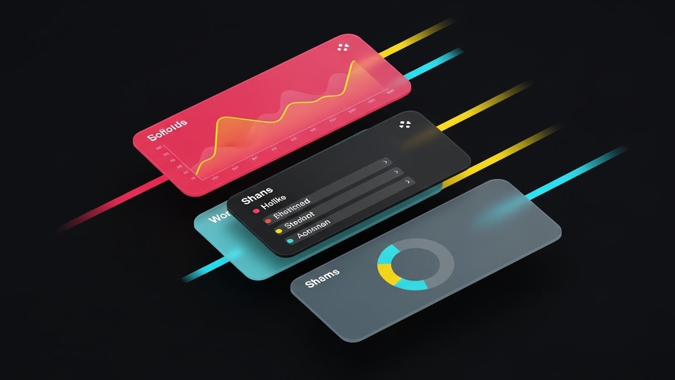
(Rapid UI Feature Montage): Sliding Glass Panels + Accelerating Feature Education
The Visual & Narrative Approach
This style addresses the challenge of showcasing a comprehensive feature set without inducing boredom. We utilize a layered, "Glassmorphic" aesthetic where three distinct UI panels—an Orange line graph, a list view, and a Slate Grey pie chart—slide diagonally into the frame. The motion is brisk and fluid (whisk transition), suggesting a platform that is both deep in capability and fast in performance. The transparency of the panels against the clean White background adds a modern, lightweight feel to heavy financial data.
Psychological Impact & KPI Focus
Cognitive Load theory suggests that grouping complex information into sleek, digestible visual "chunks" aids retention. By layering the screens, we visually imply that your software is a multi-layered solution—capable of handling analytics, reporting, and management simultaneously. It supports Feature Adoption and Time-to-Value perception, signaling to the user that they can access everything they need in a single, unified view.
Strategic Implementation & Trade-offs
- Optimal Duration: 15-20 seconds.
- Strategic Trade-off: The rapid pace is excellent for generating excitement but poor for instructional training. Use this style to tease the breadth of your platform (e.g., "Everything you need in one place") rather than teaching specific workflows.
Companies using similar video content -
Descartes Systems Group – Logistics & Supply Chain Management – Showcasing comprehensive feature sets.
E2open – Supply Chain Management Platform – Rapidly presenting diverse platform capabilities.
12. The Art of Trusted Partnerships
MOFU | Building Trust & Credibility

(2D Line Art Animation): Continuous Line + Building Trust And Security
The Visual & Narrative Approach
In an industry often fraught with adversarial carrier relationships, this style visualizes harmony. A single, continuous Charcoal Ink line elegantly draws a shield containing a handshake, set against a calm Monochromatic Blue palette. The lack of shading and clutter strips the message down to its essence: Integrity. The continuous line motion metaphorically represents the seamless, unbroken connection between your audit platform, the shipper, and the carrier.
Psychological Impact & KPI Focus
This minimalist approach leverages Cognitive Fluency—the brain prefers simple, easy-to-process visuals when evaluating trustworthiness. It signals that your brand is transparent and hides nothing. It directly addresses the anxiety of "black box" audits, supporting KPIs for Brand Trust and Partnership Retention.
Strategic Implementation & Trade-offs
- Optimal Duration: 10-15 seconds (Looping).
- Strategic Trade-off: It is very low-fidelity. It does not look "expensive" or "high-tech." It relies entirely on the elegance of the concept. Best used for "About Us" or "Security/Compliance" sections where tone matters more than flash.
Companies using similar video content -
Worldwide Express – 3PL & Technology – Building trust in logistics partnerships.
Redwood Logistics – 4PL & Logistics Tech – Emphasizing integrity and collaboration.
13. Materializing Hidden Profits
MOFU | ROI Justification
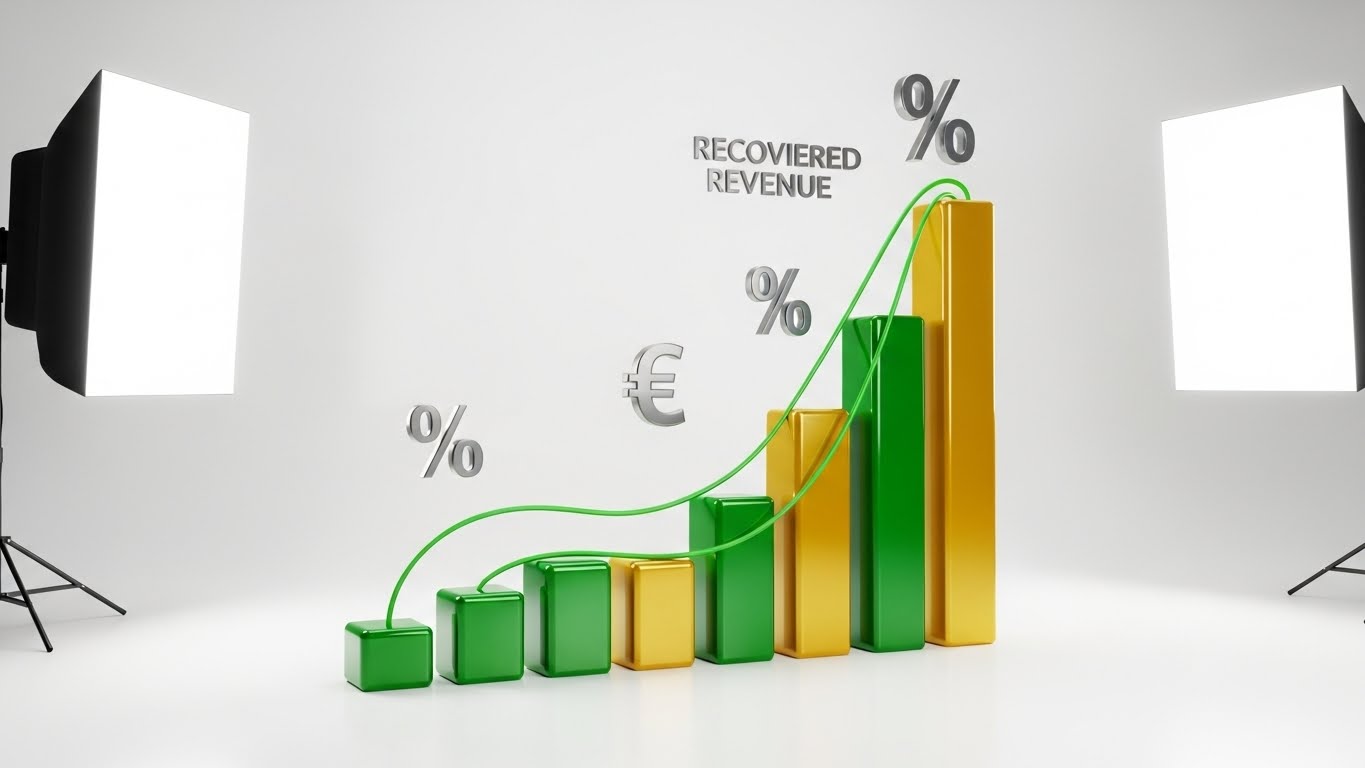
(Dynamic Data Visualization): 3D Growth Bars + Justifying ROI
The Visual & Narrative Approach
This style is the visual definition of ROI. It takes the abstract promise of "savings" and makes it tangible. The Emerald Green and Gold 3D glass bars rising from the floor represent real capital being recovered. The metallic silver percentage symbols floating above visualize the specific value of those savings (e.g., "duplicate payments recovered"). The studio-quality lighting creates long, soft shadows, giving the data "weight" and presence in the real world.
Psychological Impact & KPI Focus
By rendering data as physical, valuable objects (gold/glass), we trigger the Endowment Effect—the viewer begins to feel the weight of the money they are currently losing. It shifts the conversation from "cost of software" to "cost of lost revenue." This is a primary driver for ROI Justification and Sales Conversion.
Strategic Implementation & Trade-offs
- Optimal Duration: 20-30 seconds.
- Strategic Trade-off: Requires specific data points to be effective. If the numbers (the "recovered revenue") aren't impressive, the high-fidelity visual will fall flat.
Companies using similar video content -
RateLinx – Supply Chain & Freight Audit – Visualizing recovered capital and ROI.
FreightWise – Freight Audit & TMS – Making savings tangible through data visualization.
14. The Cognitive Core of Auditing
MOFU | Establishing Thought Leadership

(Abstract 3D AI Visualization): Neural Network + Demystifying Algorithmic Intelligence
The Visual & Narrative Approach
How do you photograph an algorithm? You build a brain. This style visualizes the AI "Rating Engine" as a complex, glowing network of Silver and Violet nodes. The lab-white background positions the software as a piece of scientific equipment—clean, sterile, and precise. The intricate connections suggest that the system is learning and adapting to complex tariff structures and GL codes in real-time, far beyond human capability.
Psychological Impact & KPI Focus
This imagery establishes Intellectual Authority. It comforts the Technical Buyer who worries that a simple rules-based engine might miss subtle errors. It visually proves that your solution is "intelligent," not just "automated." It supports KPIs regarding Technology Leadership and AI Capabilities.
Strategic Implementation & Trade-offs
- Optimal Duration: 30-60 seconds.
- Strategic Trade-off: It can feel cold or clinical. It appeals to the head, not the heart. Ensure the voiceover connects this "brain" to a warm benefit, like "peace of mind."
Companies using similar video content -
SAP – TMS & Freight Settlement – Demystifying algorithmic intelligence in freight settlement.
Oracle – OTM with Freight Payment – Visualizing AI-driven optimization and audit.
15. The Transformation Timeline
MOFU | Competitive Displacement
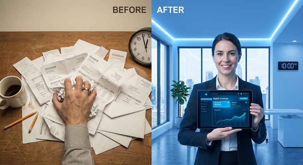
(Split Screen: Optimized Reality): Chaos vs. Calm + Visualizing Competitive Displacement
The Visual & Narrative Approach
This is a classic but highly effective "Contrast Frame." The left side, filtered in Muted Beige, depicts the current reality for many: a stressed hand navigating a chaotic pile of paper invoices. The right side, in Vivid Blue, shows the desired future: a confident professional with a sleek tablet. The visual gap between the "messy desk" and the "digital office" represents the value of your platform.
Psychological Impact & KPI Focus
This triggers Loss Aversion (fear of staying in the messy left side) and Aspirational Identity (desire to be the calm professional on the right). It validates the viewer's pain while immediately offering a cure. It is a powerful tool for Competitive Displacement and Urgency Creation.
Strategic Implementation & Trade-offs
- Optimal Duration: 15-30 seconds.
- Strategic Trade-off: It can feel like a "TV Infomercial" if over-dramatized. The "Before" state must be realistic enough to be relatable, not a caricature of incompetence.
Companies using similar video content -
IntelliTrans – TMS & Freight Audit – Contrasting manual chaos with automated calm.
XPO Logistics – Transportation & Logistics – Visualizing transformation from old to new processes.
16. Infrastructure as an Asset
BOFU | The Economic Buyer

(Photorealistic 3D Renders): Coins on Server + Linking Tech To Financial Savings
The Visual & Narrative Approach
For the CFO, technology infrastructure is often seen as a cost center. This style inverts that perception. By placing realistic Gold and Platinum coins directly onto the Obsidian Black metal of a server rack, we visually equate "IT Infrastructure" with "Hard Cash." The dramatic blue bokeh lighting adds a premium, data-center aesthetic. It says, "This server doesn't just process data; it mints savings."
Psychological Impact & KPI Focus
This creates a Semiotic Association between hardware/software and wealth. It reassures the Economic Buyer that the investment in this platform is a deposit, not an expense. It directly targets the Cost-Benefit Analysis and Budget Approval phase of the buying cycle.
Strategic Implementation & Trade-offs
- Optimal Duration: Static Image or 5-10 second loop.
- Strategic Trade-off: It is a metaphor, not a demo. It works best as a "hero image" on a pricing page or ROI calculator, rather than an explainer video.
Companies using similar video content -
Samsara – Fleet Management & IoT – Linking IoT hardware to financial savings.
Geotab – Telematics & Fleet Management – Equating telematics infrastructure with asset value.
17. Forensic Data Transparency
BOFU | The Technical Buyer

(3D X-Ray Visualization): Internal Data Flow + Revealing Deep Audit Capabilities
The Visual & Narrative Approach
To claim you catch "hidden errors," you must show you can see what others can't. This X-Ray style renders the server unit in Translucent White, revealing the glowing Neon Green data blocks pulsing inside. The "laser scan" effect implies a forensic level of scrutiny. It communicates that your audit goes deeper than surface-level checks, penetrating into the core data structure to find anomalies.
Psychological Impact & KPI Focus
This appeals to the Need for Certainty. It reduces the fear of "leakage" (money being lost due to undetected errors). The scientific aesthetic suggests precision and rigorous methodology. It supports KPIs related to Audit Accuracy and Compliance Depth.
Strategic Implementation & Trade-offs
- Optimal Duration: 15-20 seconds.
- Strategic Trade-off: Highly technical look. It may alienate non-technical users if the narration doesn't explain what is being scanned (e.g., "Scanning for duplicate reference numbers").
Companies using similar video content -
Trimble Transportation – TMS & Fleet Management – Revealing deep audit capabilities within systems.
WiseTech Global – CargoWise – Showing internal data flow for comprehensive scrutiny.
19. Simplifying the Integration Journey
BOFU | Overcoming Objections
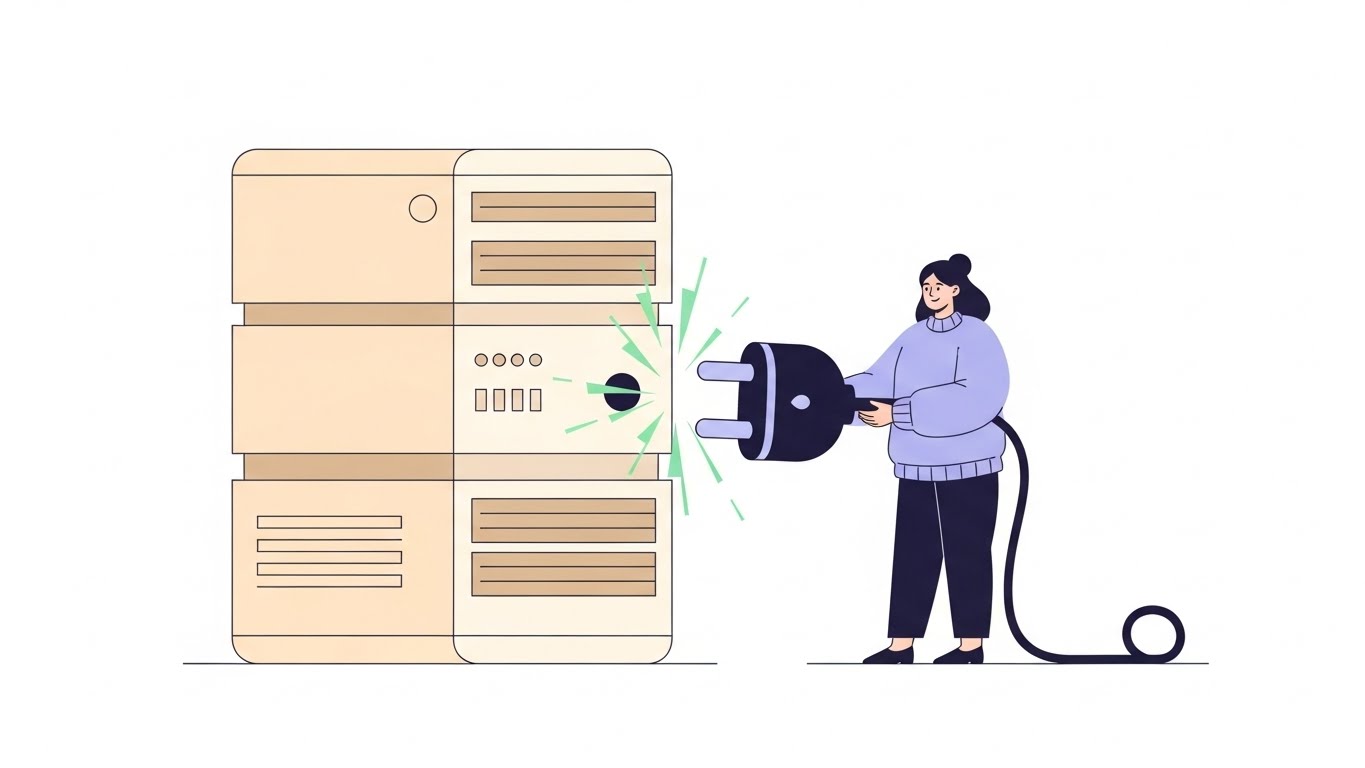
(2D Character-Driven Story): Plug and Play + Overcoming Integration Anxiety
The Visual & Narrative Approach
"Integration" is often the biggest objection in the sales cycle. This style counters that anxiety with radical simplicity. A friendly character in Soft Lavender effortlessly connects a giant plug to a Cream-colored server, sparking a Mint Green connection. The flat, vector art style removes all complexity—no wires, no code, no headaches. It visualizes the process as "Plug and Play."
Psychological Impact & KPI Focus
This utilizes Affect Heuristic—making a scary process (ERP Integration) look friendly and approachable. It lowers the barrier to entry by visually promising that the implementation will be painless. It is crucial for Overcoming Objections and reducing Time-to-Value concerns.
Strategic Implementation & Trade-offs
- Optimal Duration: 30-60 seconds.
- Strategic Trade-off: It is not realistic. You cannot use this to explain how the API works, only that it is easy. It is an emotional reassurance tool, not a technical documentation tool.
Companies using similar video content -
N/A – N/A – No style 18 provided in the article.
20. The Shield of Compliance
BOFU | Risk Mitigation

(Holographic UI over 3D Render): Laser Shield + Visualizing Enterprise Risk Mitigation
The Visual & Narrative Approach
When dealing with financial data, security is non-negotiable. This style projects a glowing, laser-blue Holographic Shield over a dark boardroom table. The contrast between the physical environment (the table) and the digital protection (the hologram) implies that your software protects the real-world business. The wireframe texture of the shield suggests advanced, encrypted defense mechanisms like SOC2 compliance and data sovereignty.
Psychological Impact & KPI Focus
This triggers a feeling of Safety and Protection. It positions the software as a guardian of the company's financial integrity. For enterprise clients, this visual confirms that you meet their rigorous security standards. It supports Risk Mitigation and Enterprise Reliability messaging.
Strategic Implementation & Trade-offs
- Optimal Duration: 10-15 seconds.
- Strategic Trade-off: Very specific to security messaging. It doesn't help explain freight savings or logistics efficiency. Use it specifically for the "Security" section of your pitch or website.
Companies using similar video content -
Shipwell – TMS & Visibility – Overcoming integration anxiety with plug-and-play visuals.
Parade AI – Capacity Management for Brokers – Simplifying integration with existing systems.
21. Visualizing Competitive Advantage
BOFU | Competitive Comparison

(2D Animation & UI Composition): Turtle vs Rocket + Validating Speed Advantage
The Visual & Narrative Approach
This style utilizes a "Comparative Split-Screen" to deliver an instant, binary value proposition. The left panel depicts the "Traditional Method"—a stylized turtle in Pastel Purple carrying a heavy stack of paper invoices. In sharp contrast, the right panel features a sleek Teal rocket ascending on a clean data trail. The central "VS" bolt acts as the visual anchor. This composition cuts through the noise of feature lists to focus entirely on velocity.
Psychological Impact & KPI Focus
This triggers Binary Bias, simplifying a complex purchasing decision into a clear choice between "Slow" and "Fast." It validates the user's desire to escape manual drudgery and offers an immediate aspirational identity (the rocket). It is a highly effective tool for Competitive Differentiation, shifting the conversation from price to operational speed.
Strategic Implementation & Trade-offs
- Optimal Duration: 15-20 seconds.
- Strategic Trade-off: It is a blunt instrument designed for impact rather than nuance. Use this for top-of-funnel awareness or remarketing ads where quick cognitive processing is required.
Companies using similar video content -
GXO Logistics – Contract Logistics – Visualizing enterprise risk mitigation and security.
DHL Global Forwarding – Freight Forwarding & Logistics – Highlighting robust security for client data.
22. The Face of Partnership
BOFU | Driving Demo Requests

(Generative AI Realistic Character): Professional Portrait + Humanizing The Sales Cycle
The Visual & Narrative Approach
In B2B enterprise software, buyers purchase a relationship as much as a tool. This style uses a Generative AI-rendered professional—warm, confident, and direct—extending a hand through the screen. The setting is a polished, modern office with soft city views, implying stability and success. This visual bridges the gap between the digital platform and the human support team standing behind it.
Psychological Impact & KPI Focus
This activates the Social Connection circuitry (Oxytocin). By simulating a handshake and direct eye contact, it subconsciously closes the distance between the prospect and the brand, building Brand Trust. It is specifically designed to increase Demo Requests by lowering the social risk of the initial engagement.
Strategic Implementation & Trade-offs
- Optimal Duration: 5-10 seconds (Intro/Outro).
- Strategic Trade-off: The character must feel authentic. If the AI generation is imperfect, it can create an "Uncanny Valley" effect. Authenticity and high-fidelity rendering are non-negotiable here.
Companies using similar video content -
ArcBest – Logistics & Freight Solutions – Validating speed and efficiency advantages.
Echo Global Logistics – 3PL & Technology – Demonstrating superior operational velocity.
23. Connectivity in the Fast Lane
BOFU | Sales Cycle Acceleration

(Hyper-lapse Stock Footage): City Light Trails + Visualizing Network Velocity
The Visual & Narrative Approach
This style merges the kinetic energy of the real world with the stabilizing force of digital control. The hyper-lapse footage of a city at night turns traffic into streaks of Red and White light, symbolizing the relentless 24/7 nature of logistics. Superimposed over this chaos is a stable, bright white geometric web connecting the moving vehicles. It visualizes the concept that while the physical world moves fast, your data grid remains constant and controlling.
Psychological Impact & KPI Focus
The contrast between the blur (Chaos) and the sharp lines (Order) triggers Cognitive Ease. It communicates Network Ubiquity and Real-Time Visibility. It reassures the Director of Logistics that speed does not have to mean a loss of control, supporting Sales Cycle Acceleration.
Strategic Implementation & Trade-offs
- Optimal Duration: 10-15 seconds.
- Strategic Trade-off: This is a "Mood Setter." It captures attention quickly on social feeds but lacks specific educational value. It is designed purely for Brand Recall and stopping the scroll.
Companies using similar video content -
J.B. Hunt – Transportation & Logistics – Humanizing the sales cycle with professional representation.
Schneider National – Truckload & Logistics – Building trust through direct, human connection.
24. Gamifying the Implementation Journey
Onboarding | Reducing Implementation Friction

(Isometric 3D Workflow): Miniature Logistics Hub + Reducing Implementation Friction
The Visual & Narrative Approach
Implementation is often the scariest part of buying new software. This style makes it look like a well-ordered toy set. The Matte Pastel Pink and Soft Blue palette transforms a complex logistics hub into a charming, isometric factory. We see trucks arriving and "data cubes" flowing into a central processor, where red errors are efficiently sorted out. It visualizes the audit process as a neat, mechanical, and fail-safe system.
Psychological Impact & KPI Focus
The "Toy Model" aesthetic reduces Implementation Anxiety. It makes the complex integration of ERPs and TMS systems appear self-contained and manageable. It leverages Cognitive Ease, suggesting that setting up your software is as easy as assembling a simple kit, directly supporting Onboarding Conversion.
Strategic Implementation & Trade-offs
- Optimal Duration: 30-60 seconds.
- Strategic Trade-off: The "approachable" style must be balanced with authoritative narration. Use it to explain workflows, not to present financial results, to maintain the right tone.
Companies using similar video content -
FourKites – Real-time Visibility Platform – Showing real-time tracking amidst city lights.
MercuryGate – TMS & Freight Audit – Visualizing network velocity and control.
25. The Zen of Self-Serve Onboarding
Onboarding | Self-Serve Onboarding
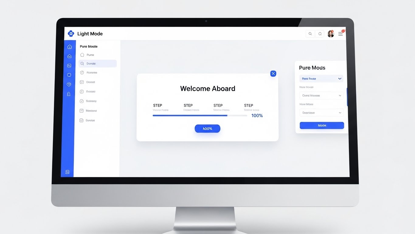
(Clean UI Workflow): Pristine Interface + Validating Ease of Use
The Visual & Narrative Approach
Here, the product is the hero. We strip away all abstraction and show the actual interface in its most pristine form: Light Mode. The Pure White and Light Grey canvas highlights the clarity of the design. The "Welcome Aboard" modal with a 100% full progress bar provides immediate positive reinforcement. The soft drop shadows add a touch of tactility, making the buttons feel clickable and inviting.
Psychological Impact & KPI Focus
This appeals to the user's desire for Simplicity and Competence. Seeing a "Clean Desk" digital environment promises a low learning curve. It directly combats the fear of "bloatware" (overly complex software) and supports Product Adoption and Self-Serve Success metrics.
Strategic Implementation & Trade-offs
- Optimal Duration: 15-30 seconds.
- Strategic Trade-off: This requires your actual UI to be visually polished. If your software looks dated, this style will backfire. It is an honest, transparent display of your User Experience (UX).
Companies using similar video content -
Turvo – Collaborative Logistics Platform – Reducing implementation friction with a miniature hub.
Blume Global – Supply Chain Visibility & Orchestration – Making complex onboarding look manageable.
26. Augmenting the Workforce
Retention | Accelerating Time-to-Value

(2D Graphics Over Live Action): Augmented Warehouse + Enhancing Operational Visibility
The Visual & Narrative Approach
This style bridges the gap between the warehouse floor and the cloud. By overlaying Vibrant Orange vector graphics (checkmarks, efficiency gauges) over a live photo of a warehouse manager, we visualize "Augmented Intelligence." The graphics interact with his environment, showing that the software isn't replacing him—it's giving him superpowers. It grounds the digital value in physical reality.
Psychological Impact & KPI Focus
This fosters Employee Buy-in. It frames the software as a tool for the worker's success, not a surveillance device. For the buyer, it visualizes Operational Efficiency occurring in the real world, not just on a spreadsheet. It supports User Retention and Change Management.
Strategic Implementation & Trade-offs
- Optimal Duration: 20-30 seconds.
- Strategic Trade-off: Requires high-quality, authentic stock or custom footage. The tracking of the graphics must be perfect; if they "slip," the illusion of integration is broken.
Companies using similar video content -
Transporeon – Transportation Management – Validating ease of use with a pristine interface.
Cargobase – Freight Procurement Platform – Showcasing a clean UI for self-serve adoption.
27. The Micro-Moment of Support
Retention | Knowledge Base & FAQ Videos
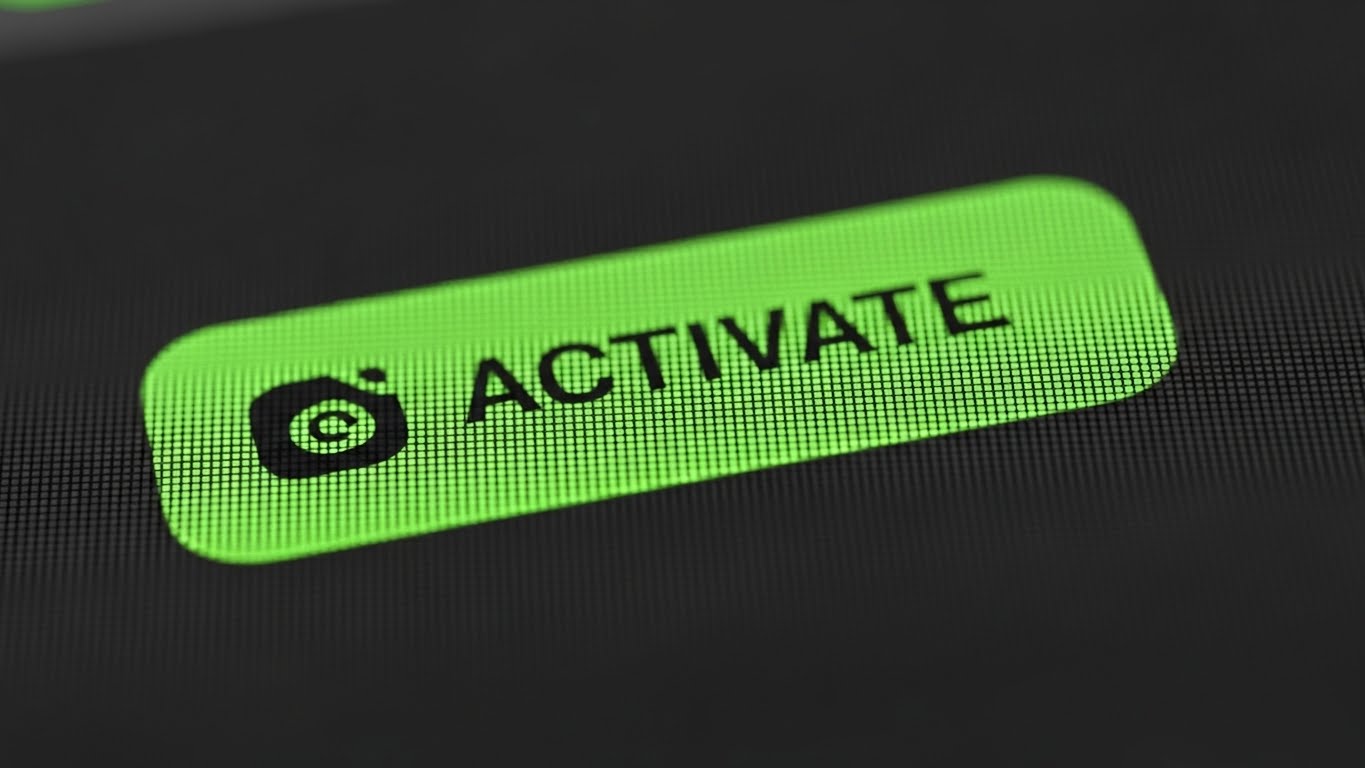
(Macro UI Micro-Interactions): Action Button Focus + Streamlining User Support
The Visual & Narrative Approach
Sometimes, the most important feature is the one that says, "We've got your back." This style zooms in—macro level—on a single UI element: the "Help" or "Action" button. The Vibrant Purple and Teal colors pop against the dark background, and the stylized cursor implies action. It turns a mundane click into a significant event. It highlights the thoughtfulness of your UX design.
Psychological Impact & KPI Focus
This creates a sense of Accessibility and Responsiveness. It reassures the user that help is always one click away, reducing the anxiety of getting stuck. It is particularly effective for Knowledge Base content, signaling that the platform is intuitive and supportive, thereby reducing Churn.
Strategic Implementation & Trade-offs
- Optimal Duration: 5-10 seconds (Loop).
- Strategic Trade-off: Extremely narrow focus. It doesn't show the "whole picture." It is a tactical asset for feature announcements or help centers, not a strategic brand video.
Companies using similar video content -
Ryder System – Fleet Management & Supply Chain – Enhancing operational visibility for managers.
FedEx – Shipping & Logistics Solutions – Overlaying graphics to augment worker intelligence.
28. Validating the User Experience
Retention | Reducing Support Overhead

(Lifestyle Stock with UI Overlay): Success Signal + Reinforcing Customer Satisfaction
The Visual & Narrative Approach
This style visualizes the emotional result of a resolved issue. The man in the home office giving a "thumbs up" is a universal sign of success. The floating Holographic Chat Bubble in Professional Blue connects his physical satisfaction to the digital interaction. It suggests that your support team (or AI bot) solved the problem effortlessly.
Psychological Impact & KPI Focus
This reinforces Customer Satisfaction (CSAT) and Net Promoter Score (NPS). It paints a picture of a friction-free relationship between the user and the software. It subtly tells the buyer, "Your team will be happy using this," which is a key factor in Renewal Discussions.
Strategic Implementation & Trade-offs
- Optimal Duration: Static Image or 5-second loop.
- Strategic Trade-off: Like Style 6, it relies on stock photography. Ensure the lighting and tone match your brand's "Visual Voice" to avoid looking generic.
Companies using similar video content -
UPS – Shipping & Logistics Solutions – Streamlining user support with focused UI interactions.
Kuehne+Nagel – Integrated Logistics Solutions – Highlighting accessible help features within their platform.
29. The Aesthetic of Power Users
Expansion | Driving Upsell/Cross-sell

(Dark Mode UI Showcase): Neon Analytics + Driving Premium Upgrades
The Visual & Narrative Approach
Dark Mode is the language of "Pro" features. This style presents your "Premium Analytics" module as a high-tech command center. The Dark Slate background makes the Electric Blue and Neon Green data lines pop with intensity. It looks like a financial trading terminal or a sci-fi interface. It signals depth, power, and exclusivity.
Psychological Impact & KPI Focus
This appeals to the Power User and the CFO who want deep data visibility. The "Sci-Fi" aesthetic frames the features as cutting-edge and advanced, justifying a higher price point. It is a visual driver for Upsells and Cross-sells to higher-tier plans.
Strategic Implementation & Trade-offs
- Optimal Duration: 15-20 seconds.
- Strategic Trade-off: It can look intimidating to a casual user. Use this specifically when targeting advanced users or showcasing "Enterprise" tier features.
Companies using similar video content -
C.H. Robinson – Global Logistics & Freight Audit – Reinforcing customer satisfaction with positive signals.
TForce Freight – LTL Carrier – Reinforcing customer satisfaction with service.
30. Visualizing the Referral Loop
Expansion | Driving Referrals & Advocacy
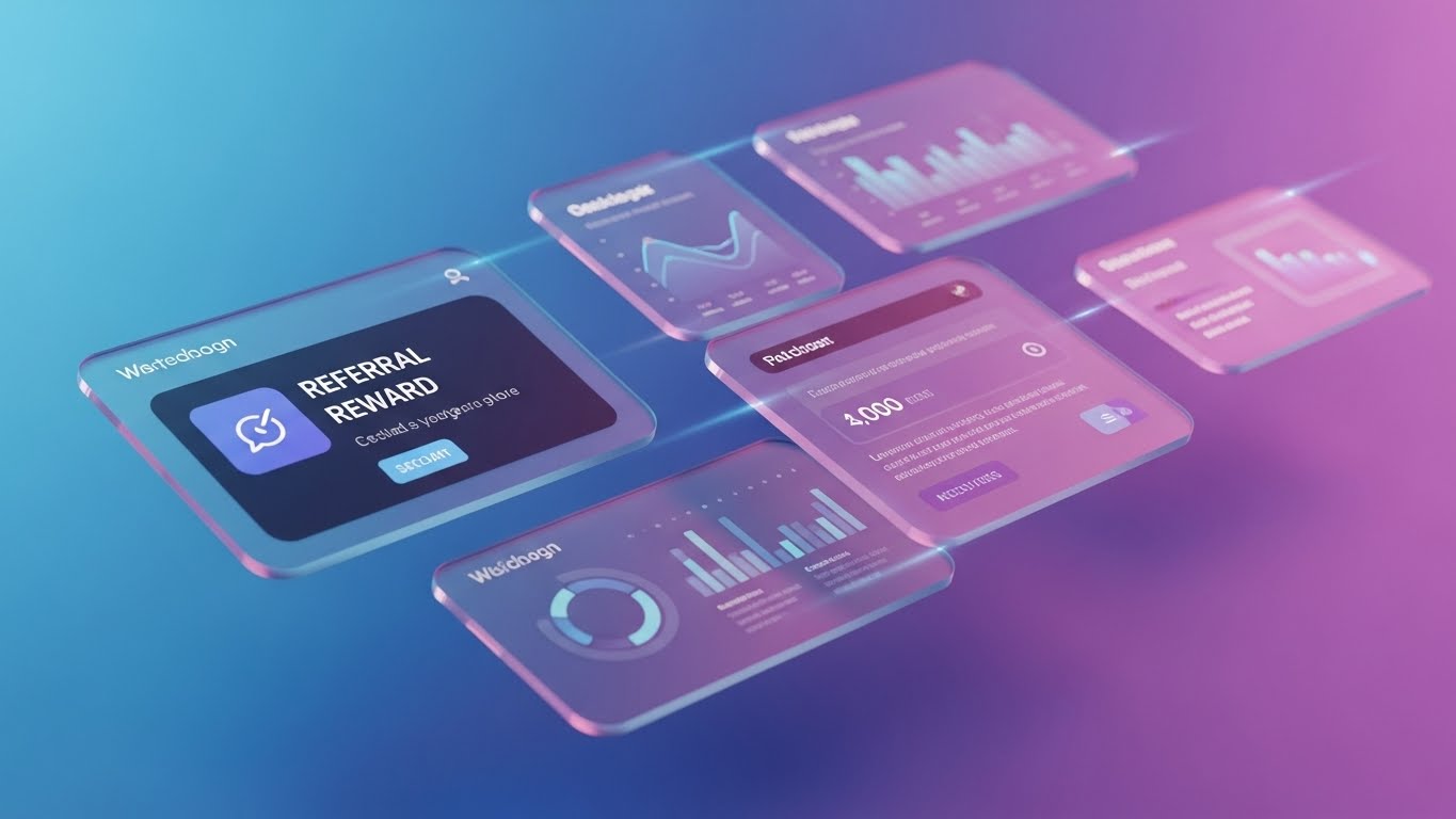
(3D Parallax UI Presentation): Floating Rewards + Incentivizing User Advocacy
The Visual & Narrative Approach
How do you make a "Referral Program" look exciting? You give it depth. This style uses 3D Parallax to make the UI screens float in a Gradient Blue-Pink void. The "Referral Reward" card is front and center, physically closer to the viewer than the data screens behind it. The movement creates a sense of liveliness and dimension, turning a static notification into a tangible offer.
Psychological Impact & KPI Focus
The depth effect grabs attention and focuses it on the "Reward." It utilizes the Isolation Effect, making the front-most card appear special and urgent. It is designed to drive User Advocacy and increase Referral Program Participation by making the incentive look premium and desirable.
Strategic Implementation & Trade-offs
- Optimal Duration: 10-15 seconds.
- Strategic Trade-off: It requires a layered design approach. If the parallax is too jerky, it can cause motion sickness. It must be smooth and elegant to convey value.
Strategic Knowledge Base: The Visual Operations Doctrine
To transform these 30 visual styles from "marketing assets" into a cohesive business driver, we must move beyond aesthetics. The following framework synthesizes the insights from this guide into a Visual Operations Doctrine. This is your blueprint for deploying visualization as a strategic infrastructure for Freight Audit and Payment.
Strategic Alignment & Visual Architecture
The "Pre-Production" Strategy – Designing for Cognitive Efficiency.
Before a single pixel is rendered, the visual architecture must be aligned with the cognitive reality of the logistics user.
- The Cognitive Load Audit: Logistics professionals process thousands of data points daily. Minimize the noise. Audit your current training materials. If a concept takes three paragraphs to explain, it is a candidate for Style 7 (Isometric Process) or Style 24 (Gamified Workflow). Visuals should act as compression algorithms for complex data.
- Role-Based Visual Mapping: A "One-Style-Fits-All" approach fails in logistics.
- For Drivers (Mobile): Use Style 2 (Minimalist Icons) and Style 5 (Kinetic Typography). High contrast, large elements, zero fluff.
- For CFOs (Desktop): Use Style 13 (ROI Data) and Style 29 (Dark Mode Analytics). High fidelity, data-dense, sophisticated.
- The "Glanceability" Standard: In a warehouse or dispatch center, attention spans are measured in milliseconds. Visuals must pass the "Glance Test." If the meaning of a Style 26 (AR Overlay) isn't clear within 1.5 seconds, it is too complex.
- Brand Voice Consistency: Your audit platform likely integrates with various carriers and ERPs. Your visual language must be the "glue." Establish a unified color palette (e.g., Trust Blue and Growth Green) that persists across Style 12 (Line Art) basics and Style 4 (Cinematic) hero videos.
- The Advids Strategic Audit: Defining this "Visual Operating System" requires an external perspective. Advids specializes in auditing your current asset library against industry benchmarks, identifying gaps where "Legacy Text" can be replaced with "Strategic Video" to reduce friction before production begins.
- Standardization vs. Customization: Use Style 9 (Low-Poly) for generic routing concepts to save budget. Reserve bespoke, high-fidelity Style 16 (Photorealistic Renders) for your proprietary hardware or unique value propositions where differentiation is critical.
- The Cross-Departmental Bridge: Visuals are the only common language between Sales (who sell the dream) and Ops (who manage the reality). Use Style 10 (Wireframe to Reality) to ensure both teams are promising and delivering the same "Truck."
- Legacy System Integration: Visualizing the invisible connection between 1990s on-prem hardware and modern SaaS is tough. Use Style 19 (Plug and Play) to abstract the "API Nightmare" into a simple, reassuring visual connection.
- Accessibility in Trucking: The logistics workforce is global and multilingual. Motion graphics must rely on visual cues (arrows, green checks, red crosses) rather than text overlays. Style 21 (Comparison) works in any language because the "Turtle vs. Rocket" metaphor is universal.
- The Mobile-First Mandate: 80% of logistics consumption happens on mobile devices. Ensure all 30 styles—especially Style 11 (Feature Montage)—are legible on a vertical 9:16 screen. If it doesn't work on a phone, it doesn't work for freight.
Operational Adoption & Implementation
The "Deployment" Phase – Embedding Visuals into the Workflow.
Great visuals sitting in a marketing folder are useless. They must be deployed into the operational bloodstream of the user journey.
- Overcoming "Big Brother" Anxiety: Automated auditing and tracking can feel invasive. Use Style 6 (Human Connection) and Style 12 (Line Art) to frame these features as "Protection" (Shields) rather than "Surveillance" (Cameras). Empathy is the key to adoption.
- The Micro-Learning Shift: Move away from the PDF manual. Replace it with a library of 30-second clips using Style 7 (Isometric) for "How-To" guides. Embed these directly into the software's "Empty States."
- Just-in-Time Support: When a user hovers over a complex "GL Code" field, trigger a Style 27 (Macro UI) tooltip video. Provide the answer in the moment of need, reducing the cognitive friction that leads to support tickets.
- Gamification of Training: Use Style 1 (Global Pulse) and Style 28 (Thumbs Up) to visualize driver scorecards or audit team achievements. Turning "Data Entry" into a "Visual Win" increases engagement and data accuracy.
- Reducing Support Ticket Volume: There is a direct correlation: The more Style 24 (Workflow) videos you deploy during onboarding, the fewer "How do I...?" tickets you receive. Treat video production as a defensive strategy for your support budget.
- Remote Onboarding: For distributed fleets that cannot gather for seminars, use Style 3 (Data Streams) and Style 25 (Clean UI) to create a "Virtual Academy." Screen-recorded walkthroughs with high-end intros elevate the training experience.
- Standard Operating Procedures (SOPs): Transform text-based SOPs into visual process flows (Style 5). A moving visual checklist is harder to ignore than a static document.
- Feedback Loops: Use interactive video elements. After a Style 26 (AR Overlay) training video, ask the driver to click the "Safe Zone." This verifies comprehension and turns passive viewing into active learning.
- Scalable Localization: When expanding to new regions, you only need to swap the text layers in Style 2 (Flat Vector). The visual icons (Truck, Invoice, Money) remain globally relevant (Rule 39), drastically reducing localization costs.
- Leadership Communication: When presenting fleet strategy to the Board, upgrade from spreadsheets. Use Style 4 (Cinematic) and Style 13 (3D Growth Bars). Executives buy the vision of the future, and high-end motion graphics sell that vision better than any slide deck.
Measuring Impact & Future-Proofing
The "ROI" Phase – Quantifying Success and Scaling.
Finally, we must measure the return on this visual investment and prepare for the next evolution of Financial Logistics.
- Beyond "Views": Prioritize actionable metrics. Measure "Feature Adoption Rate" after a Style 11 campaign, or "Time-to-Competency" after a Style 24 onboarding module. Connect pixels to performance.
- The "Idle Time" Metric: In logistics, time is money. Correlate the deployment of Style 25 (Clean UI) guides with a reduction in "Software Idle Time" (time spent figuring out what to do). Faster navigation equals more freight moved.
- Compliance Velocity: When a new regulation (like ELD mandates) hits, how fast can you retrain the fleet? Precise Style 8 (Security) videos can compress months of compliance training into weeks.
- Retention and Churn: Customers stay when value is visible. Use Style 15 (Split Screen) in Quarterly Business Reviews to visually remind them of the "Chaos" they avoided by sticking with you. Visual reminders of value reduce churn.
- The AI Visual Frontier: The future is Generative Video. Prepare your asset library now. The "Tags" and "Metadata" you establish today will train the AI that generates your Style 22 (Avatars) tomorrow.
- Scalability of Assets: Build a "Visual Lego Kit." A background from Style 9, an icon from Style 2, and a character from Style 26 should all be interchangeable. This modularity allows for rapid content scaling.
- The Advids Partnership: Scaling a visual library from 10 to 1,000 assets requires a partner, not just a vendor. Advids acts as the custodian of your Visual Doctrine, ensuring that as you scale from "Startup" to "Enterprise," your visual language evolves without losing its core identity.
- Benchmarking Success: Maintain competitive visual standards. If your video looks cheap, the CFO assumes your security is cheap. Regularly benchmark your Style 16 (Server Renders) against the top FinTech players, not just logistics competitors.
- The ROI of Safety: For carriers, safety is a financial metric (insurance rates). High-quality Style 26 (AR Safety) training directly impacts the bottom line by reducing accident claims. Frame video costs against "Insurance Savings" for an instant ROI win.
- Final Call to Innovation: Treat video as infrastructure. Just as you invest in servers and trucks, invest in the visual data layer that explains them. In the era of Financial Logistics, the company that communicates value the fastest, wins.
Companies using similar video content -
Blue Yonder – Supply Chain Planning & Execution – Driving premium upgrades with neon analytics.
Kinaxis – Supply Chain Planning – Showcasing advanced analytics for power users.
Author & Editor Bio


