
 /home/wwwroot/advids.co/design/index.php on line 425
Introduction: Visualizing the Bridge Between Physical Logistics and Digital Precision
The global supply chain is a marvel of physical engineering, yet the financial infrastructure supporting it often relies on archaic, fragmented systems. As the Freight Audit and Payment (FAP) Service Market is projected to reach USD 1.18 Billion in 2025, the industry is witnessing a massive shift from reactive processing to strategic intelligence.
For VPs of Logistics and CFOs, the challenge is no longer just "moving the box"; it is accurate accounting for the move. The core friction point lies in the Physical/Digital Divide. A container ship navigating a storm is a physical reality, but the resulting detention charge on an invoice is a digital abstraction. If your software marketing fails to bridge this gap, you aren't just losing engagement; you are losing trust.
Operational reality is messy, but financial reporting requires perfection. Recent audits reveal that between 3 to 6 percent of invoices contain errors—a silent leakage that erodes margins. In a high-volume environment, this status quo represents a significant opportunity cost.
This guide explores 30 specific visualization styles designed to dismantle skepticism and accelerate the "Aha!" moment. We move beyond generic "corporate video" aesthetics to explore styles that articulate complex concepts—from General Ledger coding to automated tariff validation—in a language that resonates with the modern CFO.
1. Generative AI cinematic video
TOFU | Brand Awareness
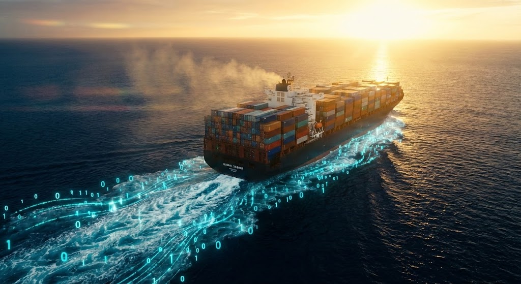
The Visual & Narrative Approach
This style leverages high-fidelity realism to establish immediate industry authority. The camera opens on a massive container ship at golden hour—the physical embodiment of capital risk and logistical scale. As the ship cuts through the deep blue ocean, the white foam of its wake doesn't just fade; it transmutes into streaming binary code and bioluminescent cyan data streams. This visual metaphor instantly communicates that your platform captures the "digital exhaust" of physical operations.
Psychological Impact & KPI Focus
Cognitive Scale: This style triggers a sense of "Awe." It reassures the anxiety-ridden CFO that the software is robust enough to handle global complexity. By merging the photorealistic ship with the glowing data, we visually resolve the Physical/Digital Divide, suggesting that your software is the connective tissue between the ocean and the balance sheet.
Strategic Implementation & Trade-offs
- Best Use: Homepage Hero sections or Event Openers (Keynotes).
- Trade-off: High rendering cost. Excellent for establishing scale and mood but poor for explaining mechanics. Use it to open the door, not to close the deal.
Companies using similar video content -
Trax Technologies – Trax – AI-powered global freight audit and spend management.
Pando – Pando Fulfillment Cloud – AI agents for logistics automation and freight spend control.
2. Abstract 2D flat vector organic
TOFU | Market Education

The Visual & Narrative Approach
Here, we strip away the noise of the real world to focus on the flow of information. The image depicts a stylized global map where shipping routes are not rigid lines but glowing, emerald green vines connecting abstract landmasses. Silver nodes act as "audit checkpoints," pulsating gently. This style softens the technical rigidity of logistics, presenting the supply chain as a living, breathing ecosystem that your software nurtures rather than restricts.
Psychological Impact & KPI Focus
Cognitive Ease: Complex network graphs can be intimidating. By using organic, fluid shapes and a glossy, high-contrast palette, we reduce cognitive load. The "Green" implies approval, cash flow, and sustainability—subconsciously aligning your platform with positive outcomes (Audit Pass) rather than negative ones (Disputes).
Strategic Implementation & Trade-offs
- Best Use: Social media explainers (LinkedIn) to simplify concepts like "Global Connectivity" or "Multi-modal Integration."
- Trade-off: Highly stylized. It communicates "Connection," but struggles to convey technical details like "Invoice Line Item Matching."
Companies using similar video content -
Acuitive Solutions – Acuitive Solutions – Cloud-based global supply chain management with automated workflows.
OpenText – Trading Grid – Supply chain automation and B2B integration platform.
3. Bold Kinetic Typography (Visual)
TOFU | Shaping Brand Perception

The Visual & Narrative Approach
In an industry obsessed with reliability, your brand must look unshakeable. This visual utilizes massive, Swiss-style architectural letterforms constructed from corrugated shipping container textures. The word "IMPACT" is not just written; it physically crashes into the scene, surrounded by floating geometric debris, creating a solid foundation. The Vivid Tangerine against Charcoal Gray creates an aggressive, high-energy contrast that signals "Action."
Psychological Impact & KPI Focus
Perceived Authority: Heavy, bold typography conveys weight and stability. The "crash zoom" effect adds kinetic energy, suggesting that your software makes an immediate, undeniable impact on the bottom line. It appeals to the persona who wants a partner "Heavy Duty" enough to handle millions in freight spend.
Strategic Implementation & Trade-offs
- Best Use: Hype videos, feature launch announcements, or conference interstitials.
- Trade-off: Excellent for mood and keywords, but zero capability for explaining features. It builds Brand Recall, not Product Understanding.
Companies using similar video content -
Fortigo – Fortigo – Cloud-based TMS and Freight Audit for optimizing logistics decisions.
eShipz – eShipz – Digital freight audit and reconciliation for cost savings.
5. Minimalist Flat 2D Vector
TOFU | Vertical Social Organic

The Visual & Narrative Approach
This style simplifies the role of the Audit Manager into a clean, geometric interaction. We see a stylized character effortlessly flicking floating shapes: Red Triangles (errors) into a bin, and Green Circles (approved invoices) into a neat stack. The clean lines and cheerful palette remove the stress from the concept of "Auditing." It transforms a tedious task into a satisfying, gamified process.
Psychological Impact & KPI Focus
Stress Reduction: The target persona often associates "Audit" with "Overwork" and "Burnout." This visual re-frames the process as effortless. The visual categorization (Red vs. Green) leverages basic pattern recognition to instantly communicate the software’s core value: automated error detection.
Strategic Implementation & Trade-offs
- Best Use: Quick, relatable content for TikTok/Shorts to show "Before/After" comparisons.
- Trade-off: Can feel too "playful" for conservative stakeholders. Use for user-level advocacy and engagement, not board presentations.
6. Abstract 2D Motion Graphics
TOFU | Category Creation

The Visual & Narrative Approach
This style visualizes the "Network Effect." A complex system of nodes (Cobalt Blue) and lines (Translucent Amber) swirls around a central focal point. The depth-of-field effect blurs the edges, forcing the viewer to focus on the sharp, precise connections in the center. The rhythmic pulsing of the nodes simulates the heartbeat of a live logistics network, implying that your platform is the central nervous system.
Psychological Impact & KPI Focus
Pattern Recognition: The human brain seeks order in chaos. This visualization demonstrates "Centralization." It appeals to the Supply Chain Director who manages fragmented data from 50+ carriers. It visually promises that your software brings everything into a single, sharp focus.
Strategic Implementation & Trade-offs
- Best Use: Background visuals for webinars, "Technology" pages, or "Why Us" sections.
- Trade-off: Abstract. Requires voiceover or text overlays to define what the nodes represent (e.g., "Carriers," "Warehouses," "Suppliers").
Companies using similar video content -
GoComet – Freight Audit – Automates freight auditing and identifies incorrect charges.
FreightPOP – FreightPOP – Cloud-based TMS for rate comparison, booking, tracking, and auditing.
7. Wireframe to Reality Transition
MOFU | Demand Gen
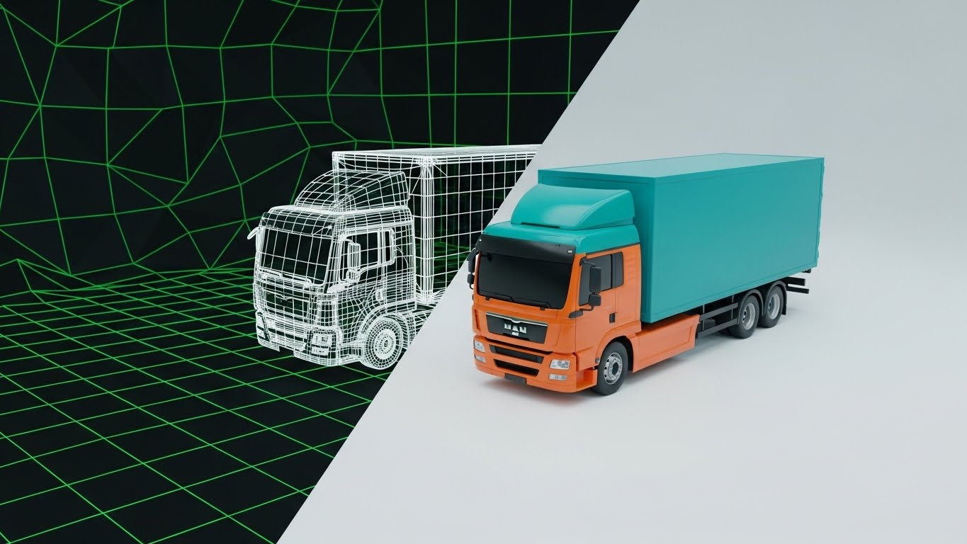
The Visual & Narrative Approach
This split-screen visual acts as a powerful metaphor for "Realization." A vertical divider slides across the frame. On the left, a logistics truck is rendered as a technical white wireframe—representing the contracted rate. As the slider moves, it reveals the truck in photorealistic 3D render—representing the executed payment. The transition symbolizes the verification that the plan matches the reality.
Psychological Impact & KPI Focus
Validation: This appeals to the "Engineer" mindset. It visually validates that what was planned (Wireframe) matches what happened (Reality). It builds trust in the system's ability to audit against the blueprint (the contract).
Strategic Implementation & Trade-offs
- Best Use: LinkedIn Ads targeting "Digital Transformation" keywords.
- Trade-off: Requires high-quality 3D assets to look convincing. If the transition is glitchy, it undermines the message of precision.
Companies using similar video content -
LogiNext Solutions – LogiNext Mile – Logistics management software with real-time visibility and optimization.
Descartes Systems Group – Descartes – Cloud-based logistics and SCM platform with rate management.
8. Split Screen: Optimized Reality
MOFU | Product Differentiation

The Visual & Narrative Approach
A horizontal split-screen forces a direct comparison. The top half is a high-quality photograph of a "Legacy" environment—a chaotic desk overflowing with paper bills in desaturated tones. The bottom half is a pristine, vibrant Vector UI screen showing those same invoices as clean, digital rows. Items from the top "drop" into the bottom, instantly snapping into a clean grid.
Psychological Impact & KPI Focus
Contrast Principle: By placing the pain (physical mess) directly adjacent to the cure (digital order), we trigger an immediate desire for the solution. It validates the user's pain and offers an achievable escape.
Strategic Implementation & Trade-offs
- Best Use: Direct sales presentations and "Problem/Solution" social ads.
- Trade-off: Can be cliché if not executed with high quality. The "mess" must look authentic, not stock-photo staged.
Companies using similar video content -
Zero Down Supply Chain Solutions – FreightOptics – Transportation spend management, auditing, and optimization.
Broussard Logistics – Broussard Logistics – Manages freight invoices and payables, parcel audit.
9. Isometric 3D Workflow
MOFU | Feature Education
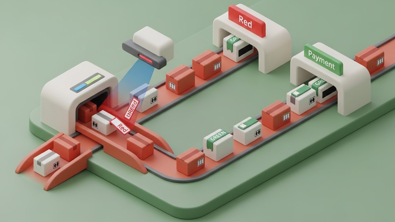
The Visual & Narrative Approach
This style uses "Claymorphism"—soft, rounded 3D shapes—to explain complex routing logic. The scene is a miniature isometric sorting facility. Packages (Invoices) glide along a track. A scanner beam (The Audit Engine) hits them. "Red" packages (Exceptions) are diverted down a chute, while "Green" ones continue to payment. It turns an invisible algorithm into a visible physical process.
Psychological Impact & KPI Focus
Process Transparency: "Black Box" algorithms create anxiety. This visualization reveals the "logic" inside the box. The soft clay aesthetic makes the complex machinery of automation feel approachable, reducing the intimidation factor.
Strategic Implementation & Trade-offs
- Best Use: "How It Works" pages or detailed feature explainer videos.
- Trade-off: Time-consuming to produce. Best reserved for core differentiator features that need simplified explanation.
Companies using similar video content -
iTech Data Services – iTech Logistics Freight Audit and Payment Solutions – AI-enhanced OCR for faster invoice processing.
Stampli – Stampli – Collaborative AP automation for streamlined invoice workflows.
10. Macro UI Micro-Interactions
MOFU | Driving Freemium/Trials

The Visual & Narrative Approach
We zoom in—extreme close-up. The background blurs into Emerald Green bokeh. The focus is razor-sharp on a single toggle switch in the UI. We witness the exact moment of interaction: the cursor clicks, the switch slides, a soft green glow emits, and the state changes from "Off" to "On." This makes the software feel tactile and responsive.
Psychological Impact & KPI Focus
Dopamine & Control: Micro-interactions trigger small dopamine releases. Seeing a button click and light up gives a sense of control. It signals that the software is modern, responsive, and "satisfying" to use.
Strategic Implementation & Trade-offs
- Best Use: Email marketing (GIFs), onboarding screens, or feature updates.
- Trade-off: Extremely narrow. It sells the feel of the UX, not the utility. Must be paired with benefit-driven copy.
Companies using similar video content -
Kuebix – Kuebix – TMS with automated carrier invoice audit and supply chain management.
Bourque Logistics – Bourque Logistics – Integrated software systems for freight, rail, trucking logistics.
11. 3D X-Ray Visualization
MOFU | Building Trust

The Visual & Narrative Approach
This style acts as a powerful metaphor for "Forensic Auditing." We present a standard steel shipping container—the universal atom of logistics. As the camera tracks forward, an "X-Ray" effect sweeps across the metal, rendering the outer shell in translucent blue glass. Inside, instead of standard pallets, the cargo is revealed to be stacks of glowing gold bars. This powerful transition visualizes the hidden value locked inside freight spend that only a deep audit can uncover.
Psychological Impact & KPI Focus
Revelation & Reward: Skepticism in this industry often stems from the belief that "we catch most errors manually." This visual challenges that assumption without being aggressive. By visualizing savings as tangible gold bars already inside the container, we trigger the realization that the prospect is currently "shipping money away." It directly addresses the KPI of Cost Recovery, positioning the software not as an expense, but as a mining tool for retained revenue.
Strategic Implementation & Trade-offs
- Best Use: "Why Audit?" website sections or as a visual hook in intro meetings to illustrate "Cost Recovery."
- Trade-off: High conceptual load. It requires a clear headline like "Unlock the Value Hidden in Your Shipping Data" to ensure the metaphor is instantly understood.
Companies using similar video content -
Rillion – Rillion – AI-powered invoice automation with intuitive workflows.
Avantiico – Avantiico – Embedded Dynamics 365 solution for freight invoice auditing.
12. Low-Poly 3D Modeling
MOFU | Competitive Displacement
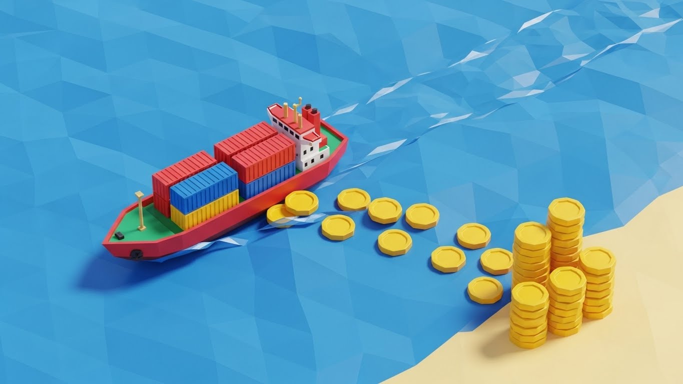
The Visual & Narrative Approach
To disrupt the visual monotony of social feeds, this style utilizes a playful, "Low-Poly" aesthetic commonly associated with modern strategy games. A toy-like container ship cuts through a faceted blue sea. Instead of a foaming water wake, the ship leaves a trail of gold coins that drift ashore and stack neatly. It simplifies the complex mechanism of "Audit Recovery" into a satisfying, linear process: The ship moves, and value is generated.
Psychological Impact & KPI Focus
Disarming Simplicity: Complex legacy software can feel burdensome. This aesthetic signals "Ease of Use" and "Modernity." By gamifying the concept of revenue recovery (collecting coins), it triggers a subconscious desire for the reward. It positions your platform not as another tool to manage, but as an automatic generator of value—appealing to the Change Champion looking for a frictionless switch.
Strategic Implementation & Trade-offs
- Best Use: Social media retargeting ads (LinkedIn/Meta) aimed at users fatigued by complex, heavy enterprise tools.
- Trade-off: The "toy-like" aesthetic may lack gravitas for the C-Suite. It is a tactical tool for engagement, not a strategic tool for board meetings.
Companies using similar video content -
Orca – Freight Audit & Analytics – Automates freight payable process and consolidates data for analytics.
ConData Global – ConData – Post-audit services for identifying billing errors and recovering funds.
13. 2D Graphics Over Live Action
MOFU | Competitive Comparison

The Visual & Narrative Approach
This style bridges the physical reality of the warehouse with the digital precision of your software. We use high-quality footage of a warehouse manager holding a clipboard—representing the "Manual Status Quo." Overlaid on this scene are bold, animated 2D graphics: Red "X" marks highlight errors on the paper, while a holographic, friendly avatar gives a "Thumbs Up" with a Green Badge of approval. It visually augments the human worker, suggesting your software is a partner, not a replacement.
Psychological Impact & KPI Focus
Validation & Support: Operational staff often fear automation will make them obsolete. This visual narrative frames the software as a "Superpower" that helps them spot errors they would otherwise miss. The contrast between the static clipboard and the dynamic, glowing overlay emphasizes the speed and accuracy of digital validation over manual checking, focusing on Error Reduction Rates.
Strategic Implementation & Trade-offs
- Best Use: "Day in the Life" use cases on social media, targeting operational managers who need to champion the software internally.
- Trade-off: Requires high-quality stock or custom footage. If the live-action footage looks generic or staged, the credibility of the "Real World" application is lost.
Companies using similar video content -
Shipista – Shipista – Freight procurement platform for shippers and carriers.
WebCargo – WebCargo – Air shipment solutions and air cargo booking platform.
14. Isometric 2D Motion Design
MOFU | Overcoming Objections
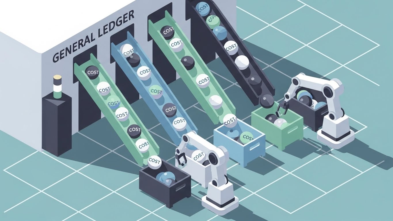
The Visual & Narrative Approach
This visualization tackles the specific headache of General Ledger (GL) coding. The scene depicts a stylized, isometric "Sorting Factory." Spheres representing different costs (Fuel, Accessorials, Line Haul) roll down chutes. Robotic arms—representing your platform's business rules—precisely pick and place them into the correct colored bins. The clean, pastel palette and rhythmic motion transform a chaotic accounting headache into a mesmerizing, organized process.
Psychological Impact & KPI Focus
Cognitive Order: For Controllers and Accountants, miscoded freight spend is a source of constant low-level anxiety. This visual demonstrates "Categorical Perfection." The isometric grid implies structure and stability. Watching the balls be perfectly sorted induces a sense of relief and confidence that the software handles the complexity of allocation logic automatically.
Strategic Implementation & Trade-offs
- Best Use: Integration pages or "Features" sections specifically addressing Accounting/ERP integration.
- Trade-off: Can feel mechanical. It effectively explains how it works but needs accompanying copy to explain why it matters (e.g., "Close books 3x faster").
Companies using similar video content -
C.H. Robinson – Navisphere Optimizer – Freight optimization with real-time visibility and intelligence.
15. 3D Parallax UI Presentation
MOFU | Driving Demo Requests
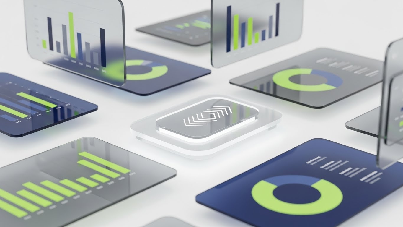
The Visual & Narrative Approach
To communicate that your solution is a comprehensive "Platform" rather than a single tool, we use a 3D Parallax effect. High-fidelity glass UI screens float in a bright, white digital void. As the camera drifts, we see layers of data—bar charts, pie graphs, and heat maps—separated by depth. This visualization suggests deep functionality and an ecosystem of features that work in concert, rather than flat, isolated pages.
Psychological Impact & KPI Focus
Perceived Value: Depth signals substance. By exploding the UI into 3D space, we visually metaphorize the "Deep Dive" analytics capabilities of the software. It appeals to the buyer looking for a robust, enterprise-grade solution (an "Operating System" for freight) rather than a simple point solution.
Strategic Implementation & Trade-offs
- Best Use: Landing page "Hero" sections or the closing sequence of a product tour video to encourage a demo request.
- Trade-off: It is abstract. While it looks premium, it doesn't show specific workflows. It sells the sophistication of the tool, not the utility of a specific button.
Companies using similar video content -
SAP Transportation Management (TM) – Freight Settlement – End-to-end transportation and freight settlement.
HighRadius – HighRadius – Invoice processing automation with intelligent matching and coding.
16. Dynamic Data Visualization
BOFU | ROI Justification

The Visual & Narrative Approach
When speaking to the CFO, data must look like an asset. This style renders a bar chart not as flat pixels, but as rising pillars of crystalline emerald, glowing from within. They rise from a clean white bedrock, surrounded by floating golden particles. This elevates "Savings" from a number in a spreadsheet to a tangible, high-value structure. It visualizes the solidification of loose change (leakage) into substantial capital.
Psychological Impact & KPI Focus
Asset Crystallization: Financial decision-makers want to see "Hard Savings." The gem-like texture and upward trajectory communicate growth, stability, and wealth. The color Green is deliberately used to trigger associations with profit and approval. It reassures the buyer that the ROI is real, solid, and significant—validating the Strategic Financial Contribution.
Strategic Implementation & Trade-offs
- Best Use: Investment pitch decks, Quarterly Business Review (QBR) presentations, or ROI calculator output pages.
- Trade-off: Purely symbolic. It is a "mood setter" for financial discussions. It must be paired with hard numbers to be effective; otherwise, it looks like empty hype.
Companies using similar video content -
Oracle Transportation Management (OTM) – OTM Freight Payment – Logistics management and freight payment.
Infor Nexus – Global Transportation Management System – Manages and optimizes transport modes and logistics.
17. Futuristic Neon/Dark Mode
BOFU | Risk Mitigation

The Visual & Narrative Approach
This style adopts a "Cybersecurity" aesthetic to visualize risk management. Set in a dark, digital void, we see a Heads-Up Display (HUD) overlay composed of neon green arcs and streaming binary code. The HUD identifies a "Safe Zone" amidst the data chaos, highlighting potential obstacles (risks) in red wireframe. This visual language borrows from high-tech defense and cybersecurity interfaces, implying that your platform protects the user from external threats (fraud, audits, compliance risks).
Psychological Impact & KPI Focus
Security & Control: In the BOFU stage, fear of risk (compliance failure, data breaches) becomes a blocker. This "Dark Mode" aesthetic triggers feelings of vigilance and protection. It suggests a "Command Center" capability where the software is actively monitoring and shielding the supply chain 24/7.
Strategic Implementation & Trade-offs
- Best Use: Email marketing headers for "Security" or "Compliance" feature updates, or sections addressing fraud detection.
- Trade-off: Can appear "ominous" if overused. It works best when framing the solution as a "Shield" against a chaotic outside world.
Companies using similar video content -
Cass Information Systems – CassPort® – Freight audit and payment with detailed business intelligence.
Shipware – Shipware – Transportation spend analysis and carrier contract optimization.
18. Realistic Character Video
BOFU | The Economic Buyer
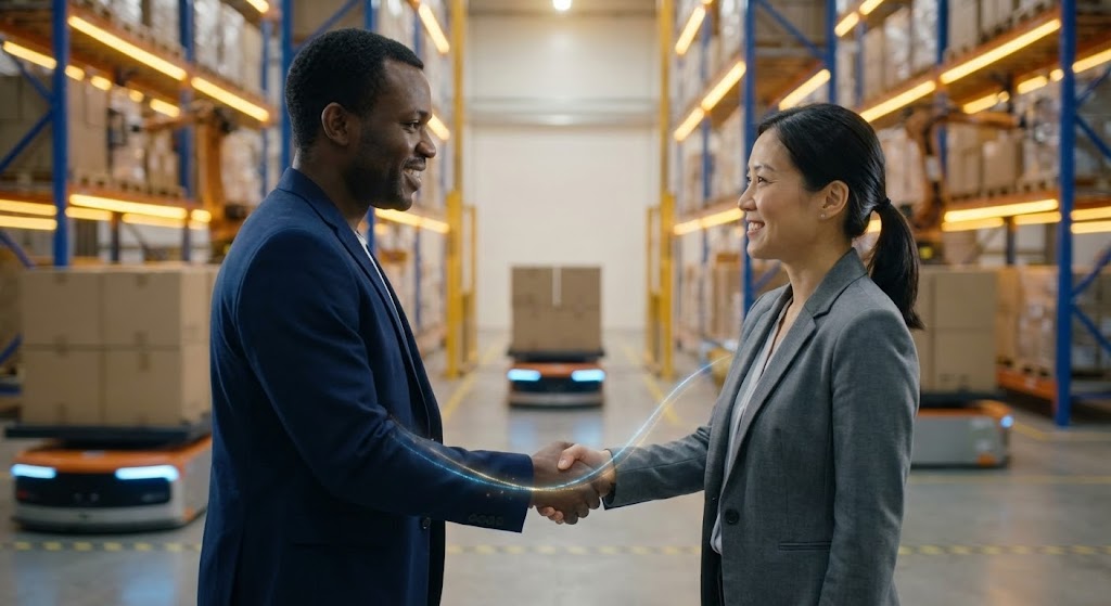
The Visual & Narrative Approach
At the bottom of the funnel, people buy from people. This visual captures a high-quality, cinematic moment of a handshake between two diverse professionals in a modern, automated warehouse. A subtle, glowing digital line connects them, symbolizing the successful data bridge. The lighting is warm and aspirational. It moves away from the software interface to focus on the result of the software: a trusted, successful business relationship.
Psychological Impact & KPI Focus
Social Proof & Trust: The "Economic Buyer" (CFO/VP) is ultimately investing in a partnership. This imagery humanizes the transaction. It visually validates the buyer's status as a successful leader who builds strong alliances. The "Handshake" is the ultimate symbol of a deal closed and a promise kept.
Strategic Implementation & Trade-offs
- Best Use: LinkedIn case study posts, "About Us" pages, or the final slide of a sales deck.
- Trade-off: Generic stock footage can be fatal here. It must feel authentic to the industry (PPE, warehouse background) to resonate with logistics professionals.
Companies using similar video content -
RateLinx – PayLinx – AI-driven freight audit and spend intelligence platform.
19. Clean UI Workflow (Light Mode)
BOFU | The Functional Buyer
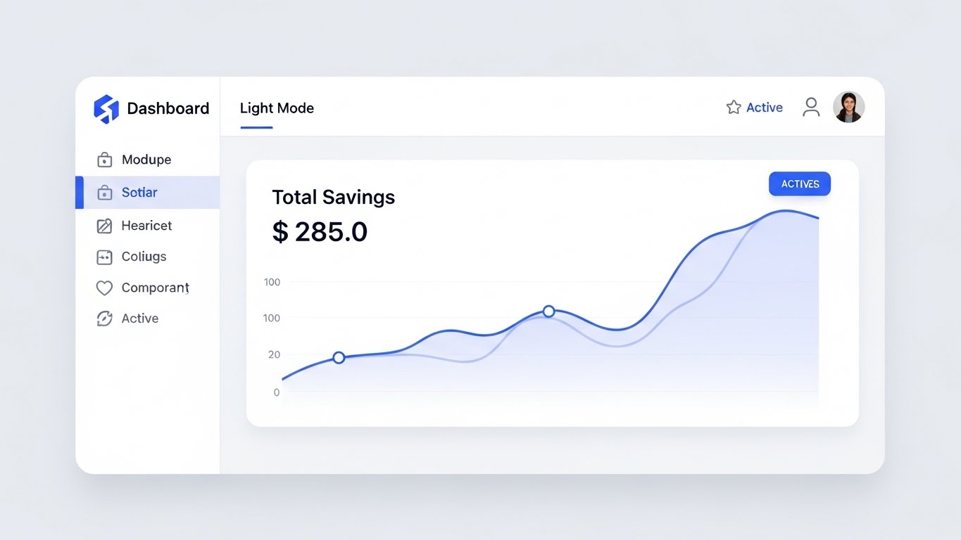
The Visual & Narrative Approach
For the "Functional Buyer" who will use the tool daily, clarity is king. This visual presents the software interface in its most idealized form: Pixel-perfect "Light Mode," soft shadows, and a clean white background. The focus is exclusively on a "Total Savings" widget with a smooth, rising blue graph. There is no clutter, no noise—just the pure signal of success. It promises a user experience that is frictionless and financially rewarding.
Psychological Impact & KPI Focus
Cognitive Ease & Clarity: After seeing complex demos, the buyer wants reassurance that the tool is usable. This "Idealized UI" reduces anxiety about learning curves. The prominent "$285.0" (or similar metric) anchors the viewer on the primary KPI: Savings. It reinforces the decision to buy by showing the "Scoreboard" of success.
Strategic Implementation & Trade-offs
- Best Use: Sales enablement one-pagers, implementation guides, and BOFU nurturing emails.
- Trade-off: It must be accurate. If the actual product UI is clunky or dark, this idealized version can set false expectations. It represents the outcome of a configured dashboard.
Companies using similar video content -
DSi – Transportation Spend Management Program – Managed services for freight bill audit and payment.
Interlog Services – Interlog Services – Transforms transportation into a valuable asset.
20. 2D Line Art Animation
BOFU | ROI Justification Hook

The Visual & Narrative Approach
This style caters to the executive eye, utilizing a sophisticated "New Yorker" illustration style. A single, continuous line in forest green and gold draws the complex skyline of a port city—cranes, ships, skyscrapers. As the eye travels right, the city skyline seamlessly morphs into a rising financial growth chart. This elegant transition visualizes the strategic connection: The physical complexity of the city is the foundation of the financial growth.
Psychological Impact & KPI Focus
Sophistication & Strategy: This appeals to the "Architect" mindset of the C-Suite. It avoids the "techy" look of neon or 3D, opting instead for timeless elegance. It frames the software purchase not as a tech expense, but as a high-level strategic maneuver that translates operational infrastructure directly into shareholder value.
Strategic Implementation & Trade-offs
- Best Use: Board-level presentation decks, Annual Reports, or high-end whitepaper covers.
- Trade-off: Low energy. It is contemplative and intellectual, designed for a captive audience (the Boardroom), not for stopping thumbs on a fast-scrolling social feed.
Conclusion: The Visual Advantage in Freight Audit
The transition from a reactive "cost center" mindset to a strategic "intelligence" mindset requires more than just data; it requires a narrative. By selecting the right visualization style—from the cinematic awe of Generative AI (Style 1) to the boardroom elegance of Line Art (Style 20)—you do more than market a software. You build a bridge.
You bridge the gap between the physical reality of a container ship and the digital reality of a General Ledger. You bridge the gap between a skeptical prospect and a confident buyer. In a market racing toward USD 1.18 Billion, the winners will be those who can make the complex simple, the invisible visible, and the future tangible.
Actionable Next Steps:
- Audit Your Assets: Review your current video library against the "Funnel Stage" tags in this guide. Do you have a gap in MOFU (Trust)?
- Select Your Pilot: Choose one style (e.g., Style 14 for a specific feature launch) and test its engagement against your standard screen recordings.
- Bridge the Divide: Ensure every visual you produce clearly connects the physical movement of freight to the financial movement of capital.
The future of Freight Audit is not just verified; it is visualized.
Companies using similar video content -
ControlPay – ControlPay – Transport financial management with freight audit and settlement.
Medius – Medius – Invoice processing automation for large invoice volumes.
21. Photorealistic 3D Renders
BOFU | ABM Awareness

The Visual & Narrative Approach
This style addresses the paramount concern of the CFO: Data Security. We utilize a high-fidelity, photorealistic 3D render of a heavy, brushed-metal shield interlocking with a complex industrial lock mechanism. The texture is imperfect—brushed metal with microscopic scratches—to induce a sense of tangible reality. As the lock engages, a laser-red status light snaps to a solid, reassuring "Emerald Green." The volumetric fog adds a cinematic weight, visualizing the concept of "Financial Protection" not as a feature, but as a fortress.
Psychological Impact & KPI Focus
Trust & Assurance: In the final stages of the deal, technical scrutiny is high. This visual triggers a visceral sense of safety. It moves the conversation from "Software" to "Infrastructure," assuring stakeholders that their financial data is behind a bank-grade vault. It directly supports KPIs related to Risk Mitigation and Compliance Adherence.
Strategic Implementation & Trade-offs
- Best Use: "Security & Compliance" pages, IT procurement documentation, and final closing decks.
- Trade-off: High rendering cost. It creates a "heavy" and serious mood. Use sparingly; it is for reassurance, not for excitement.
Companies using similar video content -
Blue Yonder – Freight Audit & Pay – Predictive supply chain optimization and freight audit.
Oracle NetSuite – NetSuite – Cloud-based inventory management and Procure-to-Pay.
22. Dark Mode UI Showcase
BOFU | Sales Cycle Acceleration
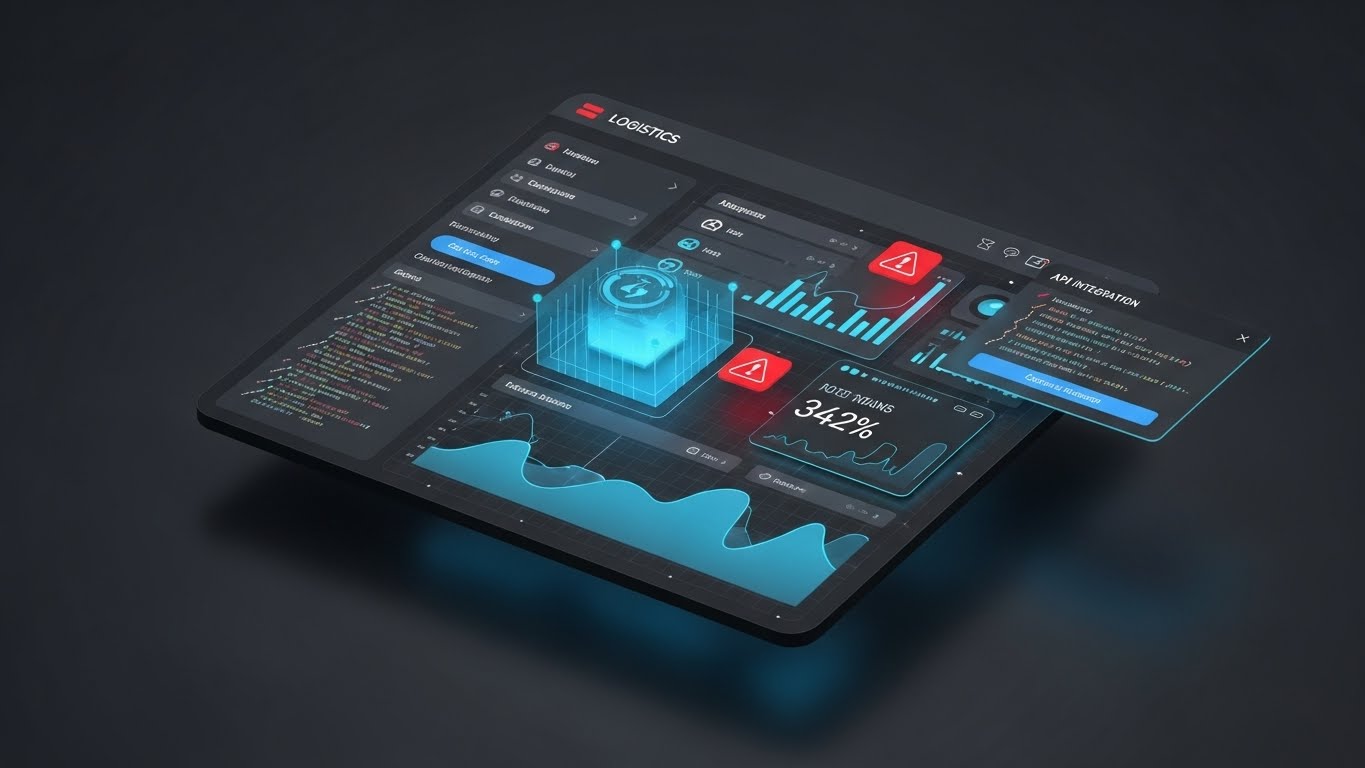
The Visual & Narrative Approach
To appeal to the technical stakeholders (CIOs, Data Analysts) who often have the final veto, we present the software in a sleek "Dark Mode." The interface features dark charcoal backgrounds illuminated by Neon Blue data lines and Red alert icons. Code snippets representing "API Integration" float in the periphery. The low-key, moody lighting mimics a modern command center, positioning the platform as a high-performance tool for power users.
Psychological Impact & KPI Focus
Competence & Modernity: Dark mode is the preferred aesthetic of developers and data scientists. This style signals that the platform is "Developer Friendly" and robust enough to handle complex API calls. It validates the technical buyer’s preference for modern, strain-free interfaces, focusing on Integration Velocity and Technical Buy-in.
Strategic Implementation & Trade-offs
- Best Use: API documentation, "For Developers" landing pages, and technical demo reels.
- Trade-off: Can feel "cold" or too complex for non-technical business users. Use specifically for the technical audience segment.
Companies using similar video content -
Trax Technologies – Trax – Global freight audit and spend management with AI-powered security.
PayAnyBiz – PayAnyBiz – Financial settlement platform for accelerating cash flow.
23. 2D Character-Driven Story
Onboarding | Self-Serve Onboarding

The Visual & Narrative Approach
Onboarding is where the promise meets the pavement. This style uses warm, relatable 2D character illustrations with flat shading and film grain. We see a professional logistics manager—representing the user—initially looking at a chaotic spreadsheet, then switching to a tablet. Her expression shifts to visible relief as a bright green "Savings Graph" rises on the screen. The natural skin tones and "Warm Ocher" palette create a human, empathetic connection, reassuring the user that they are supported.
Psychological Impact & KPI Focus
Empathy & Support: New software induces "Change Anxiety." This visual narrative validates that feeling and immediately offers the resolution. It humanizes the learning curve, promising that the user will be the hero, not the victim, of this digital transformation. It targets Time-to-First-Value (TTFV) and User Adoption Rates.
Strategic Implementation & Trade-offs
- Best Use: Welcome emails, first-login tutorial videos, and Customer Success introductions.
- Trade-off: If the characters feel too cartoonish, it can trivialize the professional nature of the work. The style must remain grounded and mature.
Companies using similar video content -
Coupa – Logistics Spend – Procurement, expense, and logistics invoice automation.
Tipalti – Tipalti – Global AP and payments for multi-entity businesses.
24. Aspirational Stock Montage
Onboarding | Accelerating TTV

The Visual & Narrative Approach
To maintain the excitement of the sale during implementation, we use a high-energy montage. The screen is sliced into three vertical sections: a cargo plane taking off (Motion), a firm handshake (Partnership), and a digital tablet flashing a green "Approved" checkmark (Result). The images are unified with a "Cool Blue" color grade and separated by sharp white diagonal lines. This visual urgency reinforces the momentum of the partnership.
Psychological Impact & KPI Focus
Momentum & Success: The "Post-Purchase Slump" is a real risk. This style reinjects energy into the relationship. The imagery of takeoffs and approvals subconsciously primes the client for speed and success, keeping them engaged through the setup process. It focuses on Implementation Speed and Client Satisfaction.
Strategic Implementation & Trade-offs
- Best Use: Kick-off meeting intros, "What to Expect" emails, and implementation roadmaps.
- Trade-off: Relies heavily on stock footage. It requires precise editing and color grading to ensure it feels like a cohesive brand story rather than a random reel.
Companies using similar video content -
AvidXchange – AvidXchange – Cloud-based invoice processing automation and payments.
25. 2D Animation & UI Composition
Onboarding | Reducing Friction

The Visual & Narrative Approach
This style demystifies the technical integration process. Using clean, pastel blue and soft yellow tones, we show a simplified animation of a character plugging a single cable into a floating server block. The moment it clicks, a "Happy Face" icon pops up. It is a visual metaphor for "Plug-and-Play." It deliberately oversimplifies the complexity to communicate ease of use and low technical overhead.
Psychological Impact & KPI Focus
Simplicity & Ease: Implementation teams often fear long, painful integration projects. This visual alleviates that fear by framing the process as a simple "connection" rather than a "migration." It encourages a mindset of "Quick Wins," directly impacting Implementation Timeline and Support Ticket Reduction.
Strategic Implementation & Trade-offs
- Best Use: Support articles about integrations, in-app tooltips, and "Help" widgets.
- Trade-off: Oversimplification. Be careful not to promise "Instant Integration" if the actual process involves weeks of mapping.
Companies using similar video content -
Freight Management Inc. (FMI) – FMI – Global transportation management and freight audit.
CTSI-Global – CTSI-Global – Global supply chain management and freight audit.
26. Abstract 3D AI Visualization
Retention | Reducing Support Overhead

The Visual & Narrative Approach
To foster retention, we visualize the client as part of a larger, robust ecosystem. We use an abstract "Plexus" effect—a network of glowing white nodes and interconnected blue lines against a bright data void. Closer inspection reveals the nodes are tiny metallic shipping icons (trucks, ships). This structure looks organic yet unbreakable, symbolizing the strength and stability of the platform’s network effect.
Psychological Impact & KPI Focus
Belonging & Stability: Clients stay when they feel they are part of a winning infrastructure. This visual implies that the platform is a living, growing entity that gets stronger with every connection. It reassures the client that their data is supported by a massive, resilient framework, influencing Retention Rates and Churn Reduction.
Strategic Implementation & Trade-offs
- Best Use: Customer portals, login screens, and "Year in Review" videos.
- Trade-off: Very abstract. It creates a feeling of stability but does not communicate specific features. Use it to set the mood for loyalty.
Companies using similar video content -
TrueCommerce – TrueCommerce – Integrated EDI and supply chain solutions with freight auditing.
Magaya – Magaya Digital Freight Platform – Logistics operations and freight forwarding.
27. Holographic UI over 3D Render
Retention | Reducing Churn

The Visual & Narrative Approach
For Quarterly Business Reviews (QBRs), we need to project the future. This style features a realistic 3D render of a boardroom table. Hovering above it is a futuristic holographic projection in transparent silver and blue. The hologram displays a rapidly spinning clock face surrounded by orbiting data nodes, symbolizing "Optimization Over Time." It visually elevates the conversation from tactical audits to strategic future-planning.
Psychological Impact & KPI Focus
Vision & Partnership: Executives want a partner who looks ahead. This "Sci-Fi" aesthetic suggests that your software is future-proof and ahead of the curve. It positions the relationship as a long-term strategic alliance rather than a transactional service, directly supporting Net Dollar Retention (NDR) and Contract Renewal.
Strategic Implementation & Trade-offs
- Best Use: QBR presentations, product roadmap announcements, and executive briefing videos.
- Trade-off: Can look disconnected from current reality if the actual product is legacy-heavy. It sells the vision of where you are going.
Companies using similar video content -
Infios – Infios AI-powered TMS – AI-powered freight optimization and predictive rerouting.
Optym – Optym – Advanced optimization and simulation for freight logistics.
28. Rapid UI Feature Montage
Expansion | Driving Upsell
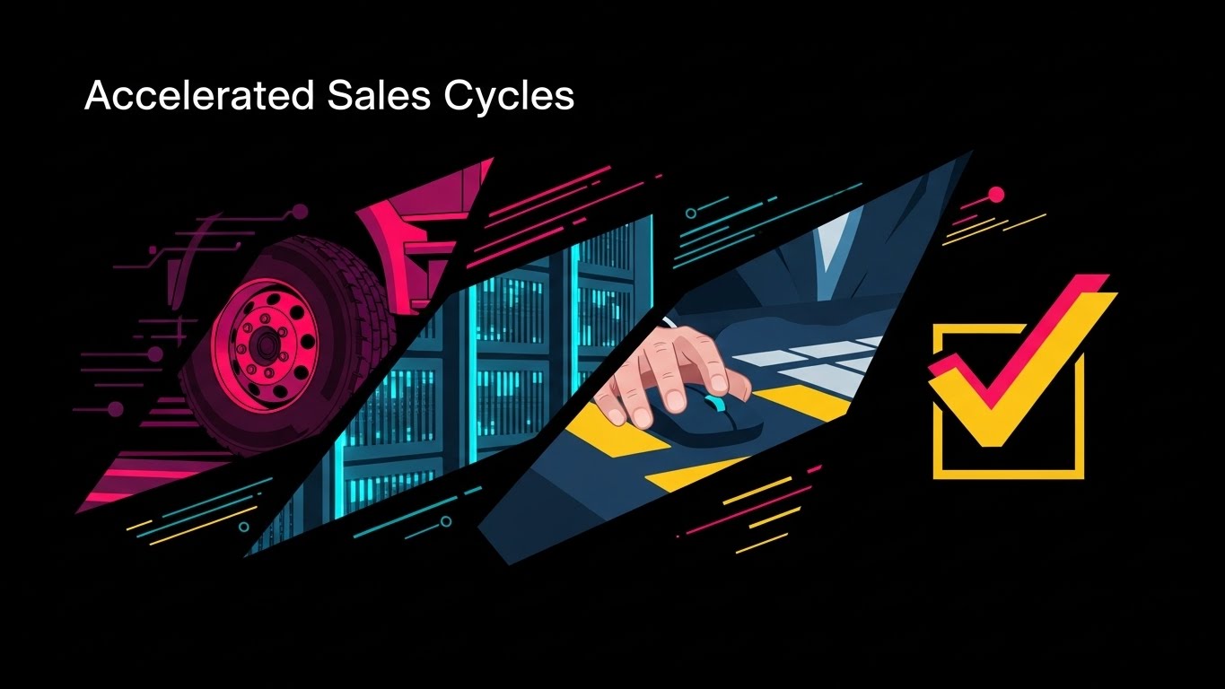
The Visual & Narrative Approach
To drive expansion and cross-sell, we need energy. This composition uses a high-contrast Black and White photography style with sharp "Red" accents. The image is fragmented into diagonal shards, each revealing a different aspect of the platform: a truck wheel (Logistics), a server rack (Data), a hand on a mouse (Control), and a checkmark (Success). Speed lines and motion blur suggest high velocity. It communicates that adding more features equals more speed.
Psychological Impact & KPI Focus
Urgency & Growth: This style triggers a "Fear of Missing Out" (FOMO) on potential speed and efficiency. The kinetic energy suggests that the platform is moving fast, and the client should expand their usage to keep up. It targets Upsell Revenue and Feature Adoption.
Strategic Implementation & Trade-offs
- Best Use: Feature launch teasers, in-app notifications for new modules, and expansion campaigns.
- Trade-off: Can be overwhelming if too fast. The "Shards" must be clear enough to be recognized in split seconds.
Companies using similar video content -
nVision Global – iMpact Transportation Management System – Supply chain optimization and freight audit.
Transporeon – Freight Settlement – Links shippers, carriers, and retailers for efficient transportation.
29. Hyper-lapse Stock Footage
Expansion | Driving Referrals

The Visual & Narrative Approach
To encourage referrals, we visualize the "Network Density." We use hyper-lapse footage of a busy city intersection at night, with car lights streaking in long-exposure red and white trails. Overlaid on this organic chaos is a clean, glowing digital grid connecting the buildings. Nodes pop up on the buildings, representing satisfied clients. It combines the gritty reality of urban logistics with the clean, expanding reach of your digital network.
Psychological Impact & KPI Focus
Social Proof & Scale: Seeing a dense, glowing network implies that "everyone is using this." It creates a bandwagon effect. The hyper-lapse speed implies a thriving, fast-paced community that the user is proud to invite others into. It supports Referral Generation and Brand Authority.
Strategic Implementation & Trade-offs
- Best Use: "Refer a Colleague" landing pages, social media case study teasers, and event backdrops.
- Trade-off: Generic city time-lapses are common. The custom "Digital Grid" overlay is essential to brand it and make it relevant to software.
Companies using similar video content -
MercuryGate – Freight Payment – Multimodal transportation control and freight payment.
CT Logistics – CT Logistics – Freight audit, payment, and business intelligence.
30. Lifestyle Stock with UI Overlay
Expansion | Proactive Support

The Visual & Narrative Approach
Finally, we celebrate the user. This style uses high-key, airy photography of a confident professional woman—"The Champion"—standing in a modern office. She holds a tablet displaying a glowing, holographic "Trophy" icon in sky blue. She smiles at a colleague, shifting the focus from the software to the result of the software: recognition and success. It validates the user's decision to champion your platform.
Psychological Impact & KPI Focus
Validation & Status: Ultimately, B2B buyers want to look good to their peers and bosses. This visual projects that outcome. It connects the software usage directly to personal professional success (the Trophy). It cements loyalty and encourages them to be vocal advocates, driving NPS (Net Promoter Score) and Customer Advocacy.
Strategic Implementation & Trade-offs
- Best Use: Case study headers, "Ambassador Program" invites, and community newsletters.
- Trade-off: Must be authentic. Avoid "cheesy" stock smiles. The environment should look like a real logistics office, not a generic studio.
Strategic Knowledge Base: The Visual Operations Doctrine
To transition from a "Vendor of Software" to a "Partner in Intelligence," the visual language must be as strategic as the code itself. This 3-Segment Framework synthesizes the 30 styles into an actionable doctrine for Freight Audit & Payment leaders.
Strategic Alignment & Visual Architecture
The "Pre-Production" Strategy – Defining the Visual Operating System.
- The Cognitive Load Audit: Before creating a single asset, audit your current training materials. If a concept takes 3 paragraphs to explain (e.g., General Ledger coding), it must be converted to a visual style (e.g., Style 14: Isometric Factory).
- Role-Based Visual Mapping: Do not use the same visuals for the CFO and the Warehouse Manager. Use Style 16 (Crystalline Data) for the CFO to show value solidity, and Style 13 (Augmented Reality) for the Warehouse Manager to show operational support.
- The "Glanceability" Standard: In logistics, time is scarce. Design visuals for "Glanceability"—can the viewer understand the "Red vs. Green" status in 1.5 seconds? Style 5 (Minimalist Vector) is the benchmark here.
- Brand Voice Consistency: Your marketing videos (Style 1) and your support tutorials (Style 25) often look like they come from different companies. Establish a unified "Visual CSS" (Color, Shape, Speed) to bridge the gap between "Promise" and "Product."
- The Advids Strategic Audit: We recommend conducting a "Visual Gap Analysis." Identify where your funnel leaks—is it Trust (MOFU)? Or Onboarding (Retention)? Map the missing styles to these leak points before commissioning production.
- Standardization vs. Customization: Use high-end custom 3D (Style 11) for core differentiators (Audit Logic). Use standardized 2D (Style 23) for generic features (Login, Settings) to optimize budget.
- The Cross-Departmental Bridge: Use visuals to unify terminology. If Sales says "Audit," Ops says "Check," and Finance says "Reconcile," use Style 7 (Wireframe to Reality) to visually demonstrate that these are all the same data event.
- Legacy System Integration: Visualizing the invisible link between old hardware and new SaaS is critical. Use Style 2 (Abstract Organic) to show the "flow" of data from legacy green screens to your modern dashboard without disparaging the client's existing tech.
- Accessibility in Trucking: The logistics workforce is diverse. Visuals must rely on universal symbols (Red X, Green Check, Icons) rather than heavy text. Style 25 (Flat Animation) is crucial for multi-lingual driver training.
- The Mobile-First Mandate: 60% of logistics interactions happen on the road. Ensure all styles—especially Style 29 (Hyper-lapse)—are legible on a vertical mobile screen (9:16 aspect ratio).
Operational Adoption & Implementation
The "Deployment" Phase – Embedding Visuals into the Workflow.
- Overcoming "Big Brother" Anxiety: When introducing AI monitoring, use Style 13 (Mixed Reality) to frame the software as a "Co-pilot" that protects the driver, rather than a "Watchdog" that punishes them.
- The Micro-Learning Shift: Replace 50-page PDF manuals with a library of 30-second clips using Style 10 (Macro UI). Users learn by watching a specific toggle switch, not by reading about it.
- Just-in-Time Support: Embed Style 9 (Isometric Workflow) videos directly into the "Help" hover states of your software. Support should be contextual, not a separate destination.
- Gamification of Training: Use Style 12 (Low-Poly) visuals in driver scorecards. Visualizing "Gold Coins" or "Trophies" for clean data entry increases engagement and data accuracy.
- Reducing Support Ticket Volume: There is a direct correlation between the clarity of onboarding visuals (Style 25) and the volume of "How-to" tickets. Invest in the former to reduce the cost of the latter.
- Remote Onboarding: For distributed fleets that cannot attend seminars, use Style 15 (Parallax UI) to create immersive, "hands-on" product tours that simulate a live demo experience.
- Standard Operating Procedures (SOPs): Transform text-based SOPs into Style 14 (Isometric Factory) animations. Visual process flows reduce error rates by ensuring every step is seen and understood.
- Feedback Loops: Use interactive video elements. After a Style 23 (Character Story) tutorial, ask for a "Thumbs Up/Down" to gauge if the visual successfully explained the concept.
- Scalable Localization: When expanding globally, separate text overlays from the animation in Style 3 (Kinetic Typo). This allows for rapid, low-cost translation of assets without re-rendering the core visual.
- Leadership Communication: When a VP needs to present the fleet strategy to the Board, provide them with Style 20 (Line Art) slides. Empower your champion to sell your value internally with high-end visuals.
Measuring Impact & Future-Proofing
The "ROI" Phase – Metrics and Evolution.
- Beyond "Views": Do not measure video success by "Views." Measure it by "Feature Adoption Rate." Did usage of the "Audit Module" increase after the release of the Style 11 (X-Ray) explainer?
- The "Idle Time" Metric: High-quality UX visualization (Style 19) should reduce the "Idle Time" users spend figuring out the interface. Correlate video views with faster task completion times.
- Compliance Velocity: Measure how quickly a new regulation (e.g., ELD mandate) is adopted across the fleet. Visual explainers (Style 22) often result in 3x faster compliance than text memos.
- Retention and Churn: Use Style 26 (Abstract Network) during the 90-day renewal window. Reminding clients of the "Ecosystem Value" visually is a proven tactic to reduce churn.
- The AI Visual Frontier: Prepare for Generative AI. The assets you build today for Style 1 (Cinematic) will train the custom AI video generators of tomorrow. High-quality inputs yield high-quality AI outputs.
- Scalability of Assets: Build a "Visual Lego Kit." Elements from Style 5 (Vector) should be reusable in Style 25 (Animation). A modular asset library reduces long-term production costs.
- The Advids Partnership: As your platform evolves, your visual language must adapt. We view this not as a one-time project but as a "Visual Subscription"—continuously updating your asset library to match your feature set.
- Benchmarking Success: If your competitor is using "Screen Recordings" and you are using Style 9 (Isometric Clay), you have a brand advantage. Visual quality is a proxy for product quality in the buyer's mind.
- The ROI of Safety: For logistics, "Safety" is a financial metric. Better visual safety training (Style 13) directly lowers insurance premiums and accident claims. Quantify this savings.
- Final Call to Innovation: Treat video as infrastructure, not content. In a digital supply chain, the visual explanation of data is as important as the data itself. The winners will be those who make the complex simple, and the invisible visible.
[End of Guide]
Companies using similar video content -
CargoWise – CargoWise – Cloud-based logistics software for complex international operations.
Shipthis – Shipthis – Digital freight forwarding software for managing shipping processes.
Author & Editor Bio


