
Introduction: Visualizing the "Invisible" Engine of the Energy Transition
The energy and utility sector is navigating its most profound transformation in a century. We are moving from a centralized, one-way delivery model to a decentralized, bi-directional network of Distributed Energy Resources (DERs). For B2B SaaS platforms in this space, the marketing challenge is unique: How do you visualize software that manages infrastructure buried underground or scattered across thousands of miles?
Your buyers—utility executives, grid operators, and field service directors—are not just buying code; they are buying resiliency, safety, and efficiency. They are risk-averse by nature, operating critical infrastructure where failure is not an option. To win their trust, your visual strategy must bridge the Physical/Digital Divide. It must show exactly how your algorithms interact with their physical assets, turning invisible data into actionable intelligence.
The opportunity for software-led transformation is immense. The grid modernization market size is projected to grow from $33.62 billion in 2024 to $38.91 billion in 2025, driven by the urgent need for smarter infrastructure. Simultaneously, the global digital twin market size was valued at USD 13.6 billion in 2024 and is accelerating at a CAGR of 41.4% as operators seek "virtual replicas" to de-risk their decision-making.
This guide provides a "Gold Standard" visual framework for SaaS platforms in the energy and infrastructure domain. These examples are not just aesthetic choices; they are strategic tools designed to reduce cognitive load, demonstrate complex technical value, and accelerate the buyer's journey from "Concept" to "Contract."
1. Abstract 2D Flat Vector Organic Modern Motion Graphics
TOFU | Brand Awareness

The Visual & Narrative Approach
Visualization Scenario: This style uses a "clean energy" aesthetic to simplify the concept of data ingestion. A vivid stream of turquoise liquid—representing high-velocity data—flows horizontally across the screen, acting as a "digital river" that connects disparate assets. Simplified, grey icons of wind turbines and transmission towers are embedded within this flow, symbolizing their integration into the digital ecosystem. The motion is continuous and smooth, suggesting a friction-free operational state.
Narration Style: The voiceover should be light, fluid, and rhythmic (matching the motion), emphasizing ease of use, speed of deployment, and "plug-and-play" interoperability.
Psychological Impact & KPI Focus
- Cognitive Fluency: For utility buyers overwhelmed by complex data, this style offers a "brain break." The flat, shadowless design removes visual noise, allowing the viewer to focus solely on the concept of connectivity.
- Operational Impact: It visually answers the question, "Does your platform integrate with my existing grid?" The fluid motion implies seamless compatibility (API integration) without the need for technical diagrams.
Strategic Implementation & Trade-offs
- Best Use: High-level brand anthems and LinkedIn awareness ads where the goal is to stop the scroll with vibrant color.
- Trade-off: The abstraction level is high. It is excellent for conveying feelings of modernization and ease but poor for explaining specific features or technical specs. Avoid using this for deep-dive product demos.
Strategic Transition: While abstract motion captures the "flow" of data, establishing a new market category requires visualizing the "intelligence" behind the network.
Companies using similar video content -
Siemens – GridScale X – Visualizing flexible, autonomous grid management.
GE Vernova – GridOS ADMS – Orchestrating modern, resilient distribution grids.
Itron – Grid Edge Essentials – Pre-integrated solution for grid edge visibility.
2. Abstract 2D Motion Graphics
TOFU | Category Creation

The Visual & Narrative Approach
Visualization Scenario: Here, the focus shifts to the concept of a "Self-Healing Grid." Against a pristine white background, thin electric blue lines form a complex, interconnected mesh. The narrative focus is on a cluster of nodes that break and then automatically snap back together. This motion graphic metaphorically represents automated fault location, isolation, and service restoration (FLISR) without needing to show complex electrical schematics.
Narration Style: The tone shifts to be more precise, authoritative, and "tech-forward." It should sound like the voice of an algorithm: calm, instantaneous, and error-free.
Psychological Impact & KPI Focus
- Trust Architecture: The geometric precision conveys reliability and high-tech automation. It appeals to the engineer’s desire for order and logic.
- Category Creation: By abstracting the grid into a digital mesh, you position your SaaS not as a "tool" but as the "nervous system" of the infrastructure.
Strategic Implementation & Trade-offs
- Best Use: Explaining abstract "Black Box" algorithms like AI-driven load balancing or automated self-healing.
- Trade-off: It lacks human connection. If your value proposition relies heavily on field service teams or customer service, this cold, tech-centric style might feel too distant.
Strategic Transition: Concepts build interest, but engineering buyers demand to see "under the hood." To do that, we must peel back the surface layers.
Companies using similar video content -
Schneider Electric – EcoStruxure ADMS – Automated control and grid optimization.
Survalent Technology – SurvalentONE ADMS – Improving operational efficiencies and network reliability.
Advanced Control Systems – PRISM ADMS – Grid optimization and fault detection.
S&C Electric Company – Smart Grid Solutions – Enhancing grid resilience and reliability.
3. 3D X-Ray Visualization
TOFU | Market Education

The Visual & Narrative Approach
Visualization Scenario: This style addresses the "Iceberg Problem"—where 90% of utility assets are underground and invisible. An isometric view of a city street becomes semi-transparent, revealing a glowing network of pipelines and cables beneath. The thermal gradient (orange to blue) on the pipes visualizes active data: flow rates, pressure, and temperature. It turns a static street scene into a dynamic data dashboard.
Narration Style: Deep, analytical, and reassuring. The narration should focus on "visibility," "insight," and "predictive intelligence."
Psychological Impact & KPI Focus
- The "God's Eye" View: This perspective gives the viewer a sense of omniscience and total control, directly addressing the anxiety of "blind spots" in grid operations.
- Risk Mitigation: By showing the ability to "see" underground, you visually promise risk reduction (e.g., preventing gas leaks or cable strikes).
Strategic Implementation & Trade-offs
- Best Use: Educational content about "Digital Twin" technology and Asset Performance Management (APM).
- Trade-off: High production cost. Creating realistic X-ray effects requires advanced 3D modeling. It is an investment best reserved for "Hero" content that will be used for 12-24 months.
Strategic Transition: Sometimes, the message isn't about the asset, but the sheer speed of transformation. For that, we need kinetic energy.
Companies using similar video content -
Hitachi Energy – Lumada – Leveraging data analytics and IoT for industrial processes.
ANSYS – Digital Twin – Creating virtual replicas for de-risking decisions.
ETAP – Advanced Distribution Management System – Modeling and optimizing electrical power systems.
4. Bold Kinetic Typography (Visual)
TOFU | Skippable Pre-Roll Ad

The Visual & Narrative Approach
Visualization Scenario: Designed for speed and impact, this style utilizes a stark "Chaos to Order" visual metaphor. Scattered, blocky shapes in safety orange and deep charcoal (referencing heavy equipment and hazard warnings) fly onto the screen. Through a rapid, motion-blurred transition, they snap into perfectly aligned, organized stacks. This is a visual shorthand for "Optimization"—taking messy, unstructured operational data and structuring it for decision-making.
Narration Style: Fast-paced, punchy, and confident. Sound design is critical here—mechanical clicks, whooshes, and snaps that synchronize perfectly with the visual alignment.
Psychological Impact & KPI Focus
- Urgency & Resolution: The rapid movement creates a sense of urgency, while the final "snap" to grid offers a dopamine hit of resolution. It visually mimics the relief of solving a complex logistical problem.
- Pattern Interrupt: The high-contrast color palette stands out against the typical blue/green corporate stock footage, preventing the viewer from hitting "Skip."
Strategic Implementation & Trade-offs
- Best Use: 6-second and 15-second YouTube bumper ads where the message must be instant: "Organize your Data."
- Trade-off: Zero nuance. This style cannot explain how the software works, only that it creates order.
Strategic Transition: While abstract energy grabs attention, the B2B sale ultimately relies on the people using the tool. We must visualize the user.
Companies using similar video content -
Uplight – Edge DERMS – Orchestrating distributed energy assets at scale.
Tibo Energy – Tibo EMS – Real-time operational decisions and load shifting.
Enersee – AI-native energy intelligence – Automated anomaly detection and prioritization.
5. Lifestyle Stock with UI Overlay
TOFU | LinkedIn Organic

The Visual & Narrative Approach
Visualization Scenario: This style bridges the gap between the field and the control room. A high-quality image captures a female field engineer at a substation—sun-kissed, professional, and equipped with PPE. The "magic" is in the matte UI overlay floating above her tablet. This graphic extension shows dispatch maps and asset health icons, visually demonstrating that the software empowers the human worker rather than replacing them.
Narration Style: Human-centric, empathetic, and professional. It focuses on "empowering the workforce," "safety," and "streamlined workflows."
Psychological Impact & KPI Focus
- Empowerment: It targets the "Field Service Director" persona who cares about crew safety and efficiency. It says, "Our tool makes your team superheroes."
- Contextual Relevance: The background blur ensures the environment (transformers, wires) is recognized as "real work," grounding the SaaS solution in physical reality.
Strategic Implementation & Trade-offs
- Best Use: LinkedIn organic posts and case studies focused on Field Service Management (FSM) and mobile workforce efficiency.
- Trade-off: Authenticity risk. If the stock footage looks too "staged" or the PPE is incorrect, you will lose credibility instantly with industry insiders.
Strategic Transition: Individual empowerment is key, but the buyer also needs to understand the ecosystem. We zoom out to the architectural view.
Companies using similar video content -
Salesforce – Field Service – Empowering mobile workforce efficiency.
Microsoft – Dynamics 365 Field Service – Streamlining field service workflows.
Techniche – Urgent – Managing critical assets and maintenance for field teams.
6. Isometric 2D Motion Design
TOFU | ABM Awareness

The Visual & Narrative Approach
Visualization Scenario: A simplified, architectural view of a Microgrid. Set against an emerald green grid, we see stylized vector representations of solar panels, wind turbines, and battery storage. The isometric angle allows for a "systems view," showing how these diverse assets are connected by thin grey lines. The lack of shadows and textures reduces the image to its logical components, representing the "Architecture" of a decentralized energy system.
Narration Style: Educational, clear, and structured. This is the "Architect's Voice"—explaining how the pieces fit together without getting lost in the weeds.
Psychological Impact & KPI Focus
- Cognitive Load Reduction: Complex grids are messy; this style is tidy. It appeals to buyers planning new infrastructure who need to visualize the logic of the system before the reality.
- Approachability: It makes the intimidating scale of grid modernization feel manageable and modular.
Strategic Implementation & Trade-offs
- Best Use: Display ads and retargeting banners where clarity at small sizes (e.g., mobile screens) is paramount.
- Trade-off: It can look "game-like." Avoid using this for high-stakes safety presentations or executive board reporting where photorealism is expected.
Strategic Transition: As the prospect moves to the Middle of the Funnel (MOFU), they need to understand the "Brain" behind the grid.
Companies using similar video content -
Toshiba – Micro Energy Management System (μEMS) – Stabilizing power systems in microgrids.
OpenRemote – Open EMS Module – Integrating diverse assets in microgrids.
Enphase Energy – Grid Services Program – Managing microinverter-based solar and battery systems.
BEMServer – Building Energy Management System – Deploying modular, scalable energy management.
7. Abstract 3D AI Visualization
MOFU | Product/Solution Differentiation

The Visual & Narrative Approach
Visualization Scenario: Moving into the Middle of the Funnel (MOFU), we need to visualize "Intelligence." A glowing violet sphere (the AI core) sits at the center of a digital brain, surrounded by floating cyan particles and deep blue connections. The shallow depth of field blurs the periphery, forcing focus on the central node. This is the visual metaphor for a "Centralized Intelligence Node" or an ADMS (Advanced Distribution Management System) making real-time decisions.
Narration Style: Futuristic, hushed, and awe-inspiring. Use terms like "Neural processing," "Predictive horizons," and "Cognitive automation."
Psychological Impact & KPI Focus
- Differentiation: Everyone claims to have AI. This high-end particle system visualizes AI not just as a buzzword, but as a tangible, powerful engine at the core of the product.
- Sophistication: The dark mode aesthetic conveys premium, enterprise-grade software capabilities.
Strategic Implementation & Trade-offs
- Best Use: The "Technology" or "Platform" page of your website, specifically to illustrate proprietary algorithms or machine learning capabilities.
- Trade-off: Abstractness. It looks cool, but it doesn't tell the user what the AI is actually doing (e.g., predicting outages vs. balancing load). It requires accompanying text to be effective.
Strategic Transition: The "Brain" is impressive, but how does the user interact with it? We need to show the "Single Pane of Glass."
Companies using similar video content -
GE Vernova – GridOS ADMS – AI-powered platform for grid orchestration.
Stem – Athena – AI-driven energy storage optimization.
Grid – SMOC – AI-driven operations platform for smart utilities.
8. 3D Parallax UI Presentation
MOFU | Feature Education & Demonstration
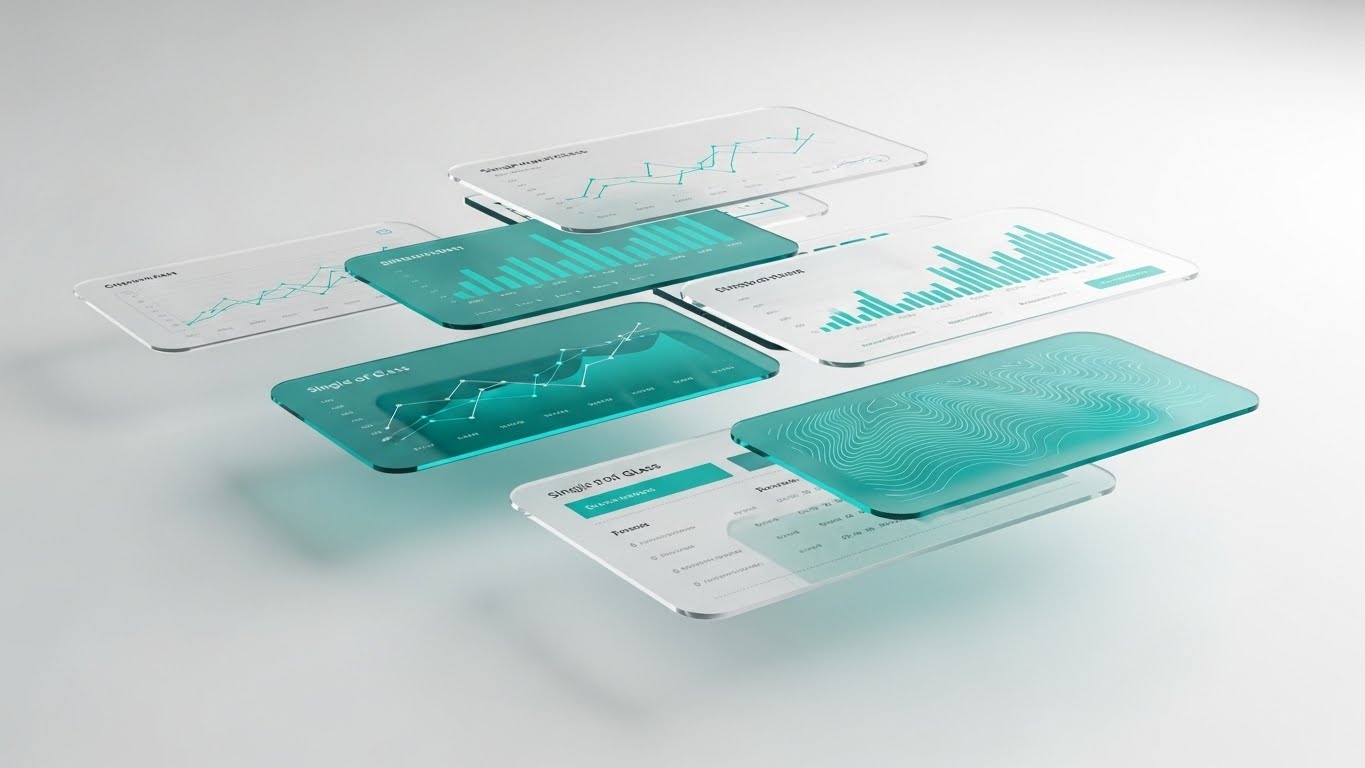
The Visual & Narrative Approach
Visualization Scenario: This style brings the SaaS interface to life. Floating, semi-transparent "glass" screens display teal data visualizations—line charts, topographical maps, and asset health scores. Arranged in a parallax depth field, they drift slowly, allowing the viewer to see "through" the data. This literally visualizes the "Single Pane of Glass" value proposition, showing how multiple data streams (weather, asset health, grid load) are layered into one view.
Narration Style: Sophisticated, polished, and focused on "User Experience." The narrative drives home the concept of "One View, Total Control."
Psychological Impact & KPI Focus
- Clarity & Depth: It mimics the way we process information naturally—layering context. It reassures the buyer that the platform can handle density without causing confusion.
- Modernity: The "Glassmorphism" UI style suggests a future-proof, cutting-edge user experience (UX).
Strategic Implementation & Trade-offs
- Best Use: Product demo videos and feature walk-throughs. It transforms boring 2D screenshots into an immersive 3D experience.
- Trade-off: Accuracy. You must ensure the data shown on the dummy screens is realistic. If an engineer pauses the video and sees nonsense data, credibility is lost.
Strategic Transition: Finally, to seal the deal, we must remind the buyer of the ultimate goal: a sustainable, thriving physical world.
Companies using similar video content -
Oracle – Utilities Network Management System – Unified grid operations with real-time insights.
Siemens – Spectrum Power – Premier power grid management system.
ABB – Ability Platform – Leveraging IoT and AI for operational performance.
9. Photorealistic 3D Renders
MOFU | Shaping Brand Perception
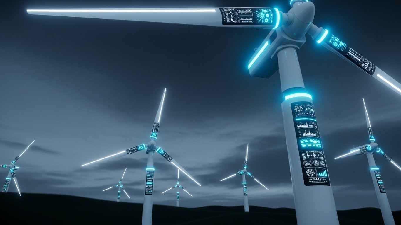
The Visual & Narrative Approach
Visualization Scenario: A cinematic "Hero Shot" of a modern wind farm. The low camera angle emphasizes the scale and majesty of the white turbines against a lush green landscape and bright blue sky. A subtle lens flare adds a touch of broadcast-quality realism. Overlays of digital data on the blades (as seen in the image) suggest that these are "Smart Assets," fully integrated into the IoT.
Narration Style: Inspirational, visionary, and grand. This is the "CEO's Voice"—talking about legacy, sustainability, and the future of energy.
Psychological Impact & KPI Focus
- Aspiration: This appeals to the "Visionary" aspect of the persona—the leader who wants to build a sustainable, tech-enabled future. It is optimistic and inspiring.
- Tangibility: It grounds the software in the physical assets it manages, reminding the buyer of the real-world value of their investment (cleaner energy, reliable power).
Strategic Implementation & Trade-offs
- Best Use: Website headers, investor decks, and event backdrops. It sets the tone for a high-value, reliable brand.
- Trade-off: Genericness. Without the specific digital overlays, it's just a stock photo of a wind farm. The integration of the digital elements (data on blades) is crucial to make it relevant to SaaS.
Companies using similar video content -
Siemens – Smart Grid Solutions – Showcasing sustainable energy infrastructure.
ABB – Electrification Solutions – Highlighting power grid and sustainable technologies.
Hitachi Energy – Power Grid Technologies – Integrating digital platforms with physical assets.
Eaton – Electrical Distribution Solutions – Emphasizing power management and infrastructure.
11. Wireframe to Reality Transition
MOFU | Reducing Implementation Friction
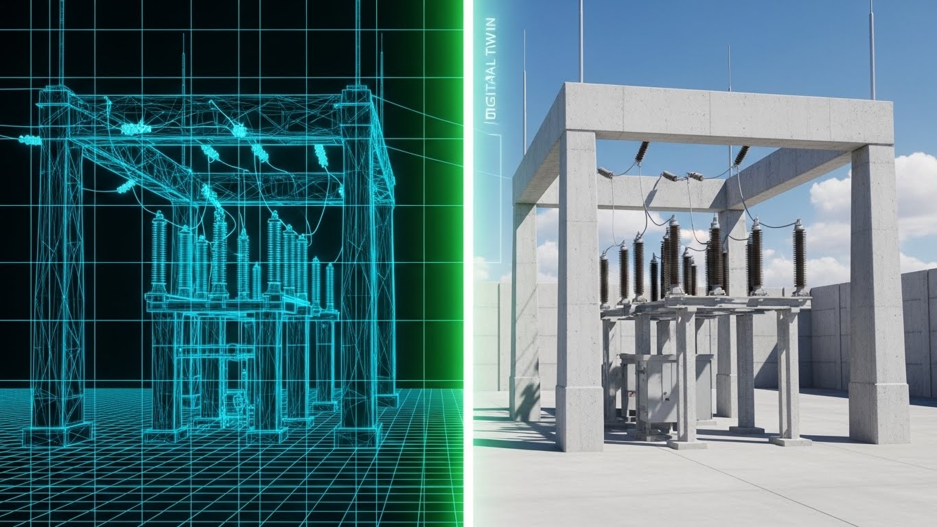
The Visual & Narrative Approach
Visualization Scenario: This style confronts the "Implementation Gap"—the fear that software designs won't translate to the physical field. A split-screen composition creates a perfect mirror image. On the left, a glowing blue wireframe blueprint of a substation sits on a digital grid, detailing the structural logic. A glowing white scan line moves horizontally, and as it passes, the wireframe instantly transforms into the right side: a photorealistic, sunlit concrete substation. The alignment is pixel-perfect, completely syncing the digital model with the physical asset.
Narration Style: Methodical, precise, and reassuring. The voiceover should focus on "accuracy," "fidelity," and "seamless deployment."
Psychological Impact & KPI Focus
- Certainty: Utility engineers are risk-averse; they trust blueprints. This visual proves that your digital model respects physical engineering constraints.
- Reduction of Rework: Visually demonstrating the fidelity of the Digital Twin suggests that planning errors are caught digitally before they become expensive physical mistakes.
Strategic Implementation & Trade-offs
- Best Use: The "Implementation" or "Deployment" section of your website, and during technical scoping calls to prove model accuracy.
- Trade-off: Static nature. While the transition is effective, it is often a simple "before/after" effect. It works best for structural assets (substations, poles) rather than dynamic flows.
Strategic Transition: Once the physical assets are mapped, the next major anxiety for critical infrastructure operators is security. We must visualize protection.
Companies using similar video content -
Intellastar – Tipify – Predictive maintenance for smart grids.
AVEVA – Predictive Analytics – Optimizing asset performance and reliability.
12. Futuristic Neon/Dark Mode
MOFU | Building Trust & Credibility

The Visual & Narrative Approach
Visualization Scenario: In the energy sector, "Cyber-Physical Security" is paramount. This style utilizes a "Dark Mode" aesthetic to represent the hidden, protective layer of the software. Against a deep midnight blue matrix of faint digital code, a 3D shield formed by neon cyan and magenta laser lines constructs itself around a floating digital grid node. The aesthetic is reminiscent of high-end cybersecurity interfaces, symbolizing robust encryption and NERC CIP compliance without using generic padlock icons.
Narration Style: Serious, guarded, and sophisticated. The tone is one of "vigilance" and "defense-in-depth."
Psychological Impact & KPI Focus
- The "Fortress" Effect: The high-contrast neon against black implies an impenetrable barrier. It taps into the IT Director's responsibility to protect the grid from external threats.
- Modernity: Dark mode is the visual language of modern, developer-centric software. It signals that your security stack is current, not legacy.
Strategic Implementation & Trade-offs
- Best Use: The "Security" and "Compliance" pages of your platform. It is essential for reassuring CISO (Chief Information Security Officer) stakeholders.
- Trade-off: Can feel "Cyberpunk." Ensure the neon colors align with your brand palette so it doesn't look like a video game. It must look like enterprise security.
Strategic Transition: Security is the foundation, but the user experience is the daily reality. We need to show how fast the platform actually is.
Companies using similar video content -
ETAP – Advanced Distribution Management System – Precision modeling for electrical systems.
ANSYS – Digital Twin – Simulating physical assets for accurate deployment.
Hitachi Energy – Lumada – Digital transformation and IoT integration for industrial assets.
13. Rapid UI Feature Montage
MOFU | Demand Gen & Lead Capture
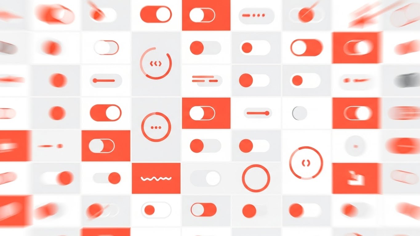
The Visual & Narrative Approach
Visualization Scenario: To communicate "Feature Depth" without boring the viewer, we use a high-tempo montage. A dense grid of abstract UI elements—toggle switches flipping, circular progress bars filling, and notification badges popping—fills the screen. The palette uses vibrant coral for active elements against a clean grey background. A motion blur effect is applied to the edges, creating a "tunnel vision" focus on the center. This visualizes the speed of automation and the sheer volume of tasks the platform handles simultaneously.
Narration Style: Energetic, rhythmic, and fast. The audio should use rapid-fire sound design (clicks, pops, whooshes) to match the visual cadence.
Psychological Impact & KPI Focus
- Perceived Velocity: The rapid motion creates a feeling of high productivity. It suggests that using this software speeds up the workday.
- Feature Density: It subtly implies, "We do a lot," without needing to list every feature. It overwhelms the viewer (positively) with the platform's capability.
Strategic Implementation & Trade-offs
- Best Use: Retargeting ads on LinkedIn and Instagram. When a user has visited your site but hasn't converted, this high-energy reminder re-engages them.
- Trade-off: Lack of focus. No single feature is explained. This is purely a "mood" piece to demonstrate platform maturity and activity.
Strategic Transition: Automation is powerful, but field technicians need tools that work in the mud and rain. We must bridge the gap to the physical field.
Companies using similar video content -
Cisco – Connected Grid Network Management System – Enhancing grid security and reliability.
Siemens – MindSphere – Industrial IoT platform with cybersecurity features.
Palo Alto Networks – OT Security – Protecting industrial control systems.
14. 2D Graphics Over Live Action
MOFU | Sales Cycle Acceleration
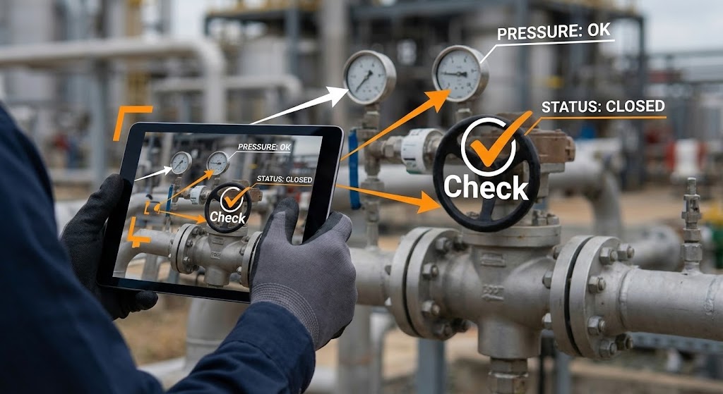
The Visual & Narrative Approach
Visualization Scenario: This style validates the "Field Mobility" use case. We see a medium shot of a real technician’s hands holding a ruggedized tablet in front of a physical industrial valve/pipe assembly. The background is a blurred, authentic industrial site. Crisp, bright white and safety orange vector graphics are "track-locked" to the video, appearing to float in the air around the valve. They point to pressure gauges and display "Status: Closed" and "Pressure: OK" checkmarks. This visualizes Augmented Reality (AR) or simply the cognitive connection between the app and the asset.
Narration Style: Practical, grounded, and instructional. The voice is that of a "Senior Foreman"—focused on getting the job done right the first time.
Psychological Impact & KPI Focus
- Operational Reality: It respects the field worker. It shows that the software is not just for the office; it is a tool for the hands-on crew.
- Error Reduction: The visual overlay explicitly demonstrates how the software guides the worker, reducing the KPI of "Human Error" during maintenance.
Strategic Implementation & Trade-offs
- Best Use: Email nurturing campaigns targeting Operations Directors and Field Service Managers. It answers, "Will my guys actually use this?"
- Trade-off: Production logistics. You need a shoot day at a real facility (or high-quality stock). Poorly composited graphics that "slide" around will look amateurish.
Strategic Transition: Operational efficiency is great for the ops team, but the CFO needs to see the bottom line. We must visualize the financial return.
Companies using similar video content -
SAP – IS-Utilities – Showcasing comprehensive utility management features.
Oracle – Utilities Meter Data Management – Highlighting meter-to-cash processes.
Microsoft – Power BI – Rapid visualization of operational data.
15. Dynamic Data Visualization
BOFU | ROI Justification

The Visual & Narrative Approach
Visualization Scenario: Moving to the Bottom of the Funnel (BOFU), we need to speak the language of finance. An abstract 3D bar chart creates a "staircase of value." Stacked blocks of metallic gold, silver, and platinum rise upwards against a clean light grey gradient. The camera angle is low, looking up at the "peak" of the chart, emphasizing growth. The metallic textures reflect light, subtly associating the data with currency and wealth rather than just abstract numbers.
Narration Style: Confident, executive, and results-oriented. The script focuses on "Cost recovery," "Rate case justification," and "Shareholder value."
Psychological Impact & KPI Focus
- Financial Solidity: The use of precious metal textures subliminally cues high value and financial stability. It moves the conversation from "software cost" to "investment return."
- Justification: This visual provides the "Internal Champion" with the slide they need to present to the Board. It makes the savings look concrete and undeniable.
Strategic Implementation & Trade-offs
- Best Use: The "Business Case" deck and final proposal presentations. It is the visual closer.
- Trade-off: It can be boring if overused. Use it strictly for the "Money Slide." Do not use it to explain features.
Strategic Transition: Financials are logical, but in utilities, the ultimate fear is the "Black Swan" event. We must show control over chaos.
Companies using similar video content -
Techniche – Urgent – Augmented maintenance management for field teams.
Salesforce – Field Service – Guiding field workers with real-time data overlays.
Johnson Controls – OpenBlue – Enhancing building operations with digital overlays.
16. Isometric 3D Workflow
BOFU | Risk Mitigation

The Visual & Narrative Approach
Visualization Scenario: Disaster response is complex. This style simplifies it using a "Diorama" aesthetic. On a clean white surface, we see a miniature, isometric 3D scene of a power outage response. Tiny, toy-like yellow utility trucks, orange safety barriers, and a grey power pole are arranged neatly. The lighting is soft and studio-quality. By reducing a chaotic storm response to a tidy, contained model, we visually communicate that the platform makes unmanageable situations manageable.
Narration Style: Calm, collected, and procedural. It sounds like a "Mission Control" briefing—orderly and in command.
Psychological Impact & KPI Focus
- Control over Chaos: Real outages are messy and dangerous. This clean style soothes the anxiety of the Emergency Response manager, promising order and logic.
- Process Clarity: It allows you to show multi-step workflows (Assess -> Isolate -> Repair) in a single frame without visual clutter.
Strategic Implementation & Trade-offs
- Best Use: Whitepapers and case studies on Outage Management Systems (OMS) and storm response.
- Trade-off: Scale limitations. It makes the assets look like "toys," which is great for clarity but bad if you need to show the scale of a massive transmission tower.
Strategic Transition: We've shown the new way, but sometimes the most powerful argument is a direct comparison to the old way.
Companies using similar video content -
ClearVUE.Zero – Energy Intelligence Platform – Visualizing sustainability reporting and cost savings.
Enersee – AI-native energy intelligence – Quantifying financial impact and operational savings.
Tibo Energy – Tibo EMS – Demonstrating cost reduction and emission minimization.
17. Split Screen: Optimized Reality and UI
BOFU | Competitive Displacement

The Visual & Narrative Approach
Visualization Scenario: This is the visual argument for Digital Transformation. A sharp diagonal line splits the screen. The left side is desaturated, grainy, and cluttered—showing a "Legacy" messy desk with piles of paper, coffee stains, and physical maps. The right side is bright, vivid, and sharp—showing a hand holding a clean tablet running your streamlined green UI. The contrast is jarring. It visually argues that sticking with the status quo is "dirty" and inefficient, while the new solution is "clean" and optimized.
Narration Style: Comparative and persuasive. Use a "Problem/Solution" structure: "Stop drowning in paper... start driving performance."
Psychological Impact & KPI Focus
- Cognitive Dissonance: It forces the viewer to identify with the "mess" and feel the discomfort of their current reality, then offers the "clean" side as the relief.
- Efficiency: It visually quantifies the time wasted on "paperwork" versus the speed of "digital workflows."
Strategic Implementation & Trade-offs
- Best Use: Landing pages for specific campaigns (e.g., "Go Paperless") and "Switch" campaigns targeting competitors' legacy customers.
- Trade-off: Can be seen as aggressive. Ensure the "messy" side looks realistic to the industry, not a caricature, or you risk insulting the buyer's current operations.
Strategic Transition: As we reach the final decision makers, we need to strip away the details and speak to the strategic vision.
Companies using similar video content -
Milsoft – OMS – Streamlining outage management and restoration workflows.
Integ Consulting – PowerManager – Coordinating real-time outage response.
Hitachi Energy – Network Manager Outage Management System – Simplifying disaster response.
18. Minimalist Flat 2D Vector
BOFU | The Economic Buyer

The Visual & Narrative Approach
Visualization Scenario: The C-Suite doesn't care about buttons; they care about trajectory. This style uses Corporate Memphis/Flat Vector minimalism. A stylized silhouette of a business executive stands in profile in navy blue, looking at a large, abstract upward-trending arrow or graph line in the background. No gradients, no shadows—just clean geometry. It represents "Strategic Oversight" and the ability to see the big picture without getting lost in the weeds.
Narration Style: Brief, high-level, and visionary. Less is more. Focus on "Scalability," "Future-proofing," and "Market Leadership."
Psychological Impact & KPI Focus
- Clarity of Thought: The lack of detail suggests that the platform handles the complexity, leaving the executive free to focus on strategy.
- Professionalism: It aligns with the aesthetic of high-end consulting reports (McKinsey, Bain), which resonates with the executive buyer.
Strategic Implementation & Trade-offs
- Best Use: Executive Summaries in PDF proposals and the "About Us" section.
- Trade-off: Too generic for engineers. If you show this to a Grid Operator, they will think it's "marketing fluff." Use strictly for the Economic Buyer.
Strategic Transition: The check is signed, but the user retention depends on the daily "wins." We visualize the moment of success.
Companies using similar video content -
Schneider Electric – EcoStruxure – Contrasting legacy operations with digital transformation.
Oracle – Utilities Cloud – Showcasing modern, streamlined utility processes.
SAP – S/4HANA for Utilities – Highlighting efficiency gains over traditional systems.
19. Clean UI Workflow (Light Mode)
BOFU | The Functional Buyer
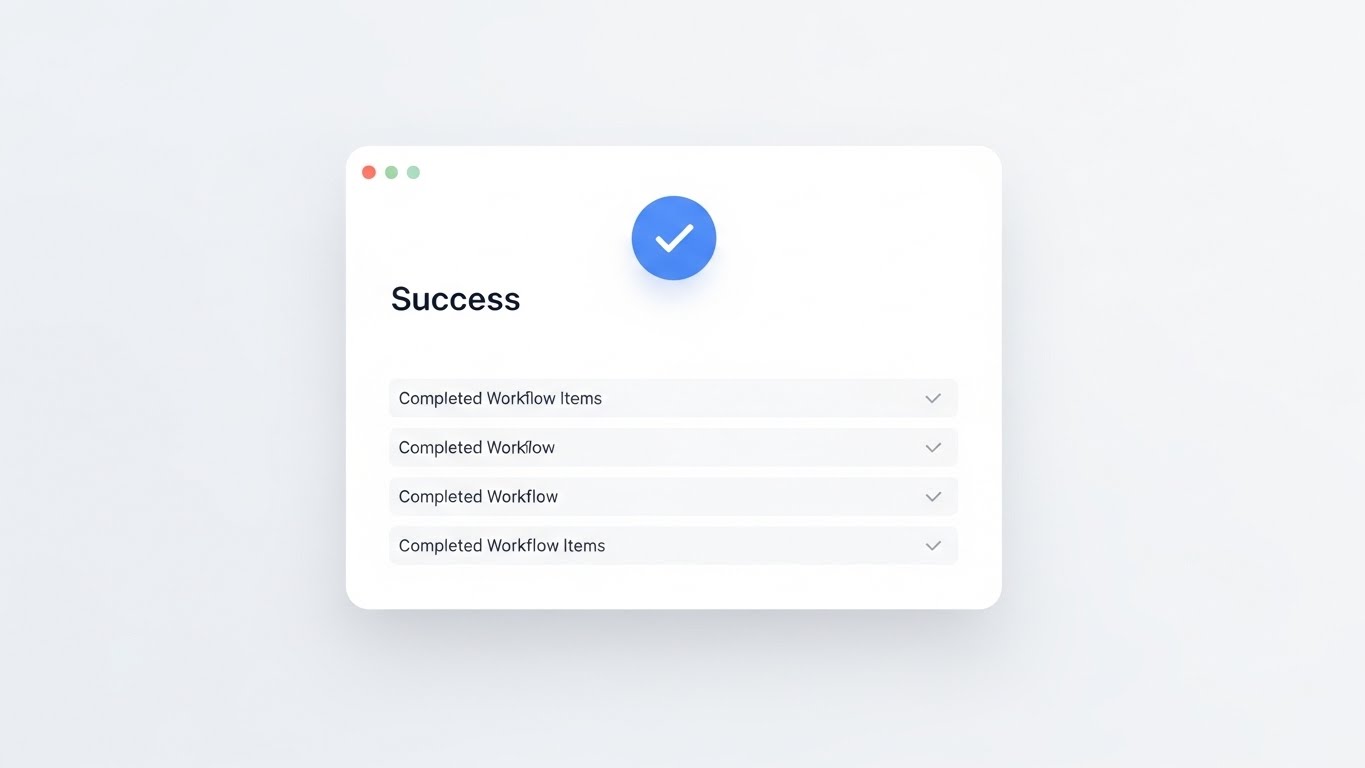
The Visual & Narrative Approach
Visualization Scenario: For the daily user, the best feeling is "Done." This style showcases a pristine, medical-white UI screen. The design is spacious (High-Key), featuring a "Success" modal window with a large, soft blue checkmark. Light grey text blocks list "Completed Workflow Items." There are no shadows; everything is perfectly aligned. It represents the "Happy Path"—the moment a compliance report is filed or a work order is closed perfectly.
Narration Style: Cheerful, light, and final. "Seamless reporting," "Audit-ready," "Done in a click."
Psychological Impact & KPI Focus
- Dopamine Hit: The "Checkmark" is a universal symbol of completion. It visually promises the user that the software will help them finish their work and go home.
- Compliance Assurance: In utilities, "Compliance" is a constant stressor. This clean visual says, "You are safe. The audit is passed."
Strategic Implementation & Trade-offs
- Best Use: The "Compliance" features page and Customer Success onboarding materials.
- Trade-off: It can look sterile. It lacks the "cool factor" of dark mode, but for administrative tasks, "clean" is better than "cool."
Strategic Transition: Finally, the ultimate promise of the modern grid is that everything—solar, wind, storage, and software—just works together.
Companies using similar video content -
IBM – Smart Grid Solutions – Presenting strategic oversight for grid modernization.
Siemens – Energy Intelligence Platform – Visualizing adaptable and sustainable grid strategies.
Oracle – Utilities Cloud – Focusing on high-level strategic optimization.
20. 2D Line Art Animation
BOFU | Objection Handling & Friction Reduction
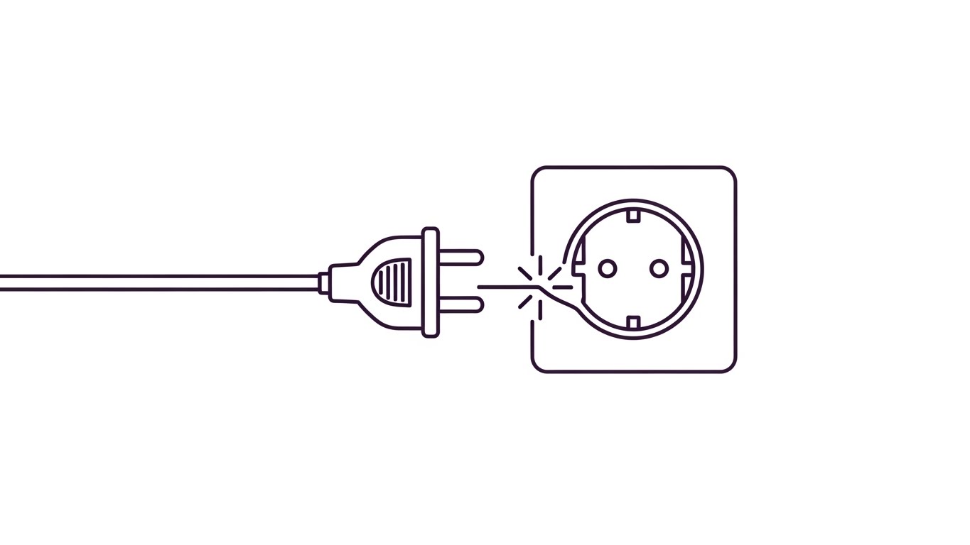
The Visual & Narrative Approach
Visualization Scenario: The biggest objection in B2B SaaS is "Will it integrate with my legacy systems?" This style uses an elegant, continuous black line drawing on a textured white paper background. The line forms the shape of an electrical plug smoothly entering a socket, with a small, stylized "spark" or "zap" icon at the connection point. It is fluid and simple. It metaphorically answers the complex question of API integration with a simple visual: "It just plugs in."
Narration Style: Honest, direct, and unpretentious. "Plug-and-play architecture," "Standardized APIs," "No custom code required."
Psychological Impact & KPI Focus
- Friction Reduction: It visually counters the fear of "Integration Hell." The fluid line suggests that your API connects systems (GIS, SCADA, CIS) without breaking the workflow.
- Elegance: Line art implies that the solution is not "clunky" or "bloated," but streamlined and essential.
Strategic Implementation & Trade-offs
- Best Use: The "Integrations" page and FAQ sections addressing technical objections.
- Trade-off: Metaphorical only. It doesn't prove technical compatibility. It sets an emotional expectation of ease that your engineering team must deliver on.
Companies using similar video content -
Landis+Gyr – Gridstream MDMS – Showcasing successful meter data management.
UtilityBilling – Utility Billing Software – Visualizing seamless billing and compliance.
Skybill – Utility Billing – Demonstrating automated meter-to-cash success.
Diversified Technology Corp. – Diversified Billing – Improving customer service and efficiency.
TrueBill – Utility Billing – Streamlining utility billing processes.
MECOMS – Customer Management – Enhancing utility customer interactions.
Cayenta – Utility Billing and CIS – Providing comprehensive utility information systems.
Ferranti – MECOMS 365 – Delivering advanced customer information systems.
21. 2D Character-Driven Story
Onboarding | Self-Serve Onboarding

The Visual & Narrative Approach
Visualization Scenario: The "First Run Experience" sets the emotional tone for the user's lifecycle. We counter the typical sterility of utility software with warmth. A 3D stylized character—resembling a young professional—sits at a home office desk bathed in warm orange and soft yellow sunlight. She smiles as she interacts with her laptop, where a "Setup Complete" rocket icon launches. This aesthetic is clean, inviting, and highly polished, signaling that the platform is modern, intuitive, and designed for humans, not just machines.
Narration Style: Welcoming, encouraging, and personal. The voiceover acts as a "Digital Concierge," guiding the user through the initial configuration with encouragement rather than technical jargon.
Psychological Impact & KPI Focus
- Psychological Safety: Complex grid software often induces "Configuration Anxiety." This friendly aesthetic lowers defenses, reassuring the user that they won't "break" the system by clicking the wrong button.
- Time-to-Value (TTV): By visually celebrating the "Setup Complete" moment, you reinforce the speed of deployment—a critical metric for SaaS retention.
Strategic Implementation & Trade-offs
- Best Use: The "Welcome" screen video inside the platform and the first email of the onboarding sequence.
- Trade-off: Tone mismatch. If your brand is strictly "Mission Critical/Military Grade," this character style might feel too casual. It works best for the user interface, not the buyer presentation.
Strategic Transition: Once the user is comfortable, we need to show them how to build their specific operational environment. For that, we use modularity.
Companies using similar video content -
OpenEMS – Energy Management System – Illustrating modular architecture and API integration.
OpenRemote – Open EMS Module – Depicting flexible data integration and connectivity.
Corinex – Grid Flexibility Solution – Visualizing seamless AMI network integration.
22. Low-Poly 3D Modeling
Onboarding | Overcoming Objections

The Visual & Narrative Approach
Visualization Scenario: Utility infrastructure is massive, but software configuration must be modular. This style uses a pristine Low-Poly 3D aesthetic in pastel mint and soft blue. Floating geometric blocks—representing different software modules like "Outage Management" and "Asset Analytics"—click together with a satisfying magnetic snap like building bricks. It visually explains the "Stackable" nature of the platform, showing that users can start small and build their custom solution block by block.
Narration Style: Instructional, logical, and rhythmic. The sound design of "clicks" and "snaps" is central, reinforcing the feeling of a perfect, secure fit.
Psychological Impact & KPI Focus
- Cognitive Ease: It utilizes the "LEGO Effect." By reducing complex software dependencies to simple, interlocking blocks, you make the architecture easy to understand and less intimidating to configure.
- Scalability: It visually demonstrates that the system is extensible, encouraging the user to explore add-on modules (Expansion Revenue).
Strategic Implementation & Trade-offs
- Best Use: "Getting Started" guides and documentation pages explaining system architecture and API integrations.
- Trade-off: Abstraction. It is excellent for explaining concepts of modularity but cannot show the actual UI settings required to configure the modules.
Strategic Transition: Concepts are clear. Now, the user needs to see the immediate value on their specific assets. We bring the data to life.
Companies using similar video content -
Uplight – Edge DERMS – Guiding users through DER orchestration.
EnergyHub – Grid-edge DERMS – Onboarding users to customer-centric energy management.
Noda – Smart Building Platform – Explaining IoT sensor setup and dashboards.
23. Holographic UI over 3D Render
Onboarding | Accelerating Time-to-Value

The Visual & Narrative Approach
Visualization Scenario: This style delivers the "Aha!" moment of the Digital Twin. A photorealistic, gritty 3D render of a grey steel electrical transformer sits in a dark industrial void. A glowing, holographic cyan UI panel projects out from the hardware, displaying real-time gauges for oil temperature, vibration, and load. The visual link is explicit: the physical machine generates the digital insight. It anchors the software's value directly to the expensive physical asset it protects.
Narration Style: Tech-focused, precise, and revelatory. Focus on "Real-time diagnostics," "predictive failure analysis," and "extending asset life."
Psychological Impact & KPI Focus
- Tangibility: For the asset manager, seeing the data "attached" to the transformer validates the investment. It makes the invisible data streams feel physical and valuable.
- Feature Adoption: It encourages users to connect more assets to the platform by showing the rich, immediate visualization they will gain.
Strategic Implementation & Trade-offs
- Best Use: Feature walkthroughs for Asset Performance Management (APM) modules and "New Feature" announcements.
- Trade-off: Visual noise. The holographic glow can sometimes obscure the details of the asset. Ensure high contrast so the data remains readable.
Strategic Transition: Visualization builds understanding, but value is realized only when the user takes action. We need to visualize the click.
Companies using similar video content -
OpenEMS – Energy Management System – Representing stackable software modules.
OpenRemote – Open EMS Module – Visualizing configurable logic for energy systems.
Schneider Electric – EcoStruxure Microgrid Advisor – Showing modular optimization of DERs.
24. Macro UI Micro-Interactions
Onboarding | Trial Activation

The Visual & Narrative Approach
Visualization Scenario: Sometimes, you just need the user to click "Go." This style is an extreme macro close-up of the UI's primary action button—vibrant lime green against a charcoal texture. We see the mouse cursor hover, the button glow responsively (micro-interaction), and then the click. It is visceral and tactile. It isolates the critical action—whether it's "Dispatch Crew" or "Generate Report"—and makes it the hero.
Narration Style: Punchy, decisive, and exciting. "One click to optimize," "Instant dispatch," "Power at your fingertips."
Psychological Impact & KPI Focus
- Action Bias: The visual focus on the button creates a subconscious urge to click. It simplifies the platform's power down to a single decision point.
- Usability Perception: It signals that the software is responsive and modern, countering the stereotype of clunky, laggy utility interfaces.
Strategic Implementation & Trade-offs
- Best Use: Trial expiration emails ("Click to Activate") and in-app tooltips guiding the user to their first key action.
- Trade-off: Context blind. It shows the action but not the result. It works best when the user already knows what the button does.
Strategic Transition: Users click, but eventually, they get stuck. Instead of forcing them to call support, we empower them to solve it themselves.
Companies using similar video content -
GE Vernova – GridOS DERMS – Projecting real-time data from physical assets.
Intellastar – Tipify – Displaying predictive maintenance insights on smart grids.
AVEVA – Predictive Analytics – Visualizing asset health and performance.
26. 2D Animation & UI Composition
Retention | Knowledge Base & FAQ Videos

The Visual & Narrative Approach
Visualization Scenario: To reduce support ticket volume, we use a friendly, educational style. A simplified, 2D character (flat vector) stands next to a floating "speech bubble" UI element displaying a clear bar chart. The background is a solid, calming blue. The character points to the data, visually "teaching" the viewer how to interpret a report. It transforms dry FAQ text into an engaging, visual tutorial.
Narration Style: Patient, clear, and step-by-step. The pace is slower, designed for learning. "Here is how you interpret the peak load data..."
Psychological Impact & KPI Focus
- Empowerment: It makes the user feel smart and capable. Instead of frustratedly waiting on hold, they are mastering the tool.
- Support Deflection: By making help content visually engaging, you increase the consumption of self-serve materials, directly lowering the Cost Per Ticket.
Strategic Implementation & Trade-offs
- Best Use: The "Knowledge Base," "Academy," or "University" section of your customer success portal.
- Trade-off: Simplicity. This style cannot handle complex troubleshooting that requires looking at raw code or logs. It is for "How-To," not "Bug Fix."
Strategic Transition: Routine support is handled. Now we must reassure the technical stakeholders that the system is watching the grid 24/7.
Companies using similar video content -
Oracle – Utilities Customer Care and Billing – Highlighting critical action buttons.
SAP – IS-Utilities – Emphasizing workflow completion clicks.
Microsoft – Dynamics 365 Field Service – Focusing on dispatch or report generation actions.
27. Dark Mode UI Showcase
Retention | Proactive Support
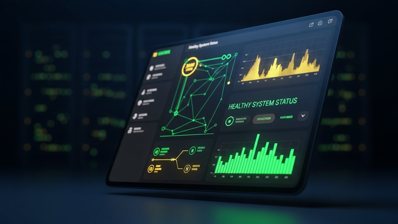
The Visual & Narrative Approach
Visualization Scenario: For the Grid Operator working the night shift, the screen is their world. This style showcases the platform's "Dark Mode" dashboard in its natural habitat: a dimly lit server room or control center. The UI glows with neon green "Healthy System Status" indicators and live data streams. The angled perspective adds depth, while the background bokeh of blinking server lights reinforces the "Always On" nature of the SaaS.
Narration Style: Vigilant, constant, and reassuring. "24/7 monitoring," "Proactive anomaly detection," "Sleep soundly while we watch the grid."
Psychological Impact & KPI Focus
- Operational Continuity: It visually confirms that the system is robust and tireless. It appeals to the paranoia of the Operations Director who fears 3 AM outages.
- Professional Aesthetic: Dark mode is increasingly preferred by power users for reducing eye strain; showcasing it signals that you care about the operator's daily experience.
Strategic Implementation & Trade-offs
- Best Use: System health status pages, downtime apology emails (reassuring it’s fixed), and retention newsletters highlighting reliability stats (uptime).
- Trade-off: Mood. It can feel ominous if not balanced with green "Success" indicators. Ensure the data shown is overwhelmingly positive.
Strategic Transition: The base is secure. To grow the account, we need to introduce advanced capabilities to the decision-makers.
Companies using similar video content -
Uplight – Edge DERMS – Gamified elements for demand response programs.
EnergyHub – Grid-edge DERMS – Engaging users in energy management.
28. Generative AI Realistic Character Video
Expansion | Driving Upsell/Cross-sell

The Visual & Narrative Approach
Visualization Scenario: To sell a premium AI module, you need a trusted voice. This style uses a hyper-realistic, Gen-AI created "Senior Engineer" persona. He sits in a modern, glass-walled office, speaking directly to the camera like a consultant. He isn't selling; he is explaining a complex new opportunity (e.g., "The shift to predictive vegetation management"). The realism establishes peer-to-peer credibility with the buyer.
Narration Style: Consultative, expert, and high-value. The script is educational, positioning the upsell not as a "cost" but as a "strategic necessity."
Psychological Impact & KPI Focus
- Authority Bias: We trust experts. This persona bridges the gap between a faceless software company and a trusted consultancy.
- Personalization at Scale: Gen AI allows you to program this avatar to speak to different segments (e.g., one script for Solar Ops, one for Wind Ops) without filming 50 real videos.
Strategic Implementation & Trade-offs
- Best Use: Account Based Marketing (ABM) campaigns targeting existing customers for module expansion.
- Trade-off: The "Uncanny Valley." The lip-sync and eye movement must be perfect. If it looks fake, it destroys trust. Use only top-tier Gen AI generation tools.
Strategic Transition: The expert explains the value, but the stakeholder needs to see the scale of the impact on the real world.
Companies using similar video content -
Enersee – AI-native energy intelligence – Explaining anomaly detection reports.
ClearVUE.Zero – Energy Intelligence Platform – Visualizing carbon and emissions dashboards.
Kiona – Energy Management Platform – Teaching users to interpret portfolio insights.
29. Hyper-lapse Stock Footage with Data
Expansion | Driving Deep Adoption

The Visual & Narrative Approach
Visualization Scenario: This style visualizes the "Smart City" context. A high-angle hyper-lapse of a city at night shows traffic streaming as streaks of light. Overlaid on this organic chaos are clean, structured data streams (blue and white lines) that move in sync with the physical flow, tagged with "High Velocity Data" labels. It implies that your platform manages the pulse of the modern city, handling massive data throughput without latency.
Narration Style: Fast, dynamic, and grand. "Millions of data points," "Real-time synchronization," "The pulse of the grid."
Psychological Impact & KPI Focus
- Scale & Robustness: It proves the platform can handle "Big Data." It appeals to the buyer's desire to manage complexity at scale.
- Market Penetration: It positions the platform not just for a single substation, but for the entire municipality, supporting broad expansion deals.
Strategic Implementation & Trade-offs
- Best Use: LinkedIn background banners, event intro videos, and "Vision" pages on the website.
- Trade-off: Generic backdrop. Without the specific UI data overlays, it's just a stock video. The motion tracking of the graphics must be precise to lock them to the city geometry.
Strategic Transition: The final stage of the funnel isn't just a renewal; it's advocacy. We celebrate the team that makes it happen.
Companies using similar video content -
Siemens – GridScale X – Displaying proactive grid monitoring dashboards.
GE Vernova – GridOS ADMS – Showcasing 24/7 real-time control center views.
ABB – Ability Platform – Presenting system health and operational continuity.
Honeywell – Smart Grid Solutions – Monitoring energy efficiency and demand response.
30. Aspirational Stock Montage
Expansion | Driving Advocacy

The Visual & Narrative Approach
Visualization Scenario: The ultimate goal of B2B software is to make the customer look good. This style features a high-quality, diverse team of utility professionals in a modern control center. They are high-fiving and smiling in front of a wall of monitors displaying your software's green dashboards. It captures the emotion of "Mission Accomplished"—a storm weathered, a project delivered, a target hit.
Narration Style: Celebratory, community-focused, and grateful. "Together, we are building the future," "Empowering the teams that power the world."
Psychological Impact & KPI Focus
- Social Proof & Belonging: It visualizes the "Community of Users." It tells the prospect, "Join this group of successful, happy professionals."
- Advocacy: This emotional resonance is what turns a "User" into a "Champion" who will refer you to peers.
Strategic Implementation & Trade-offs
- Best Use: "Customer Stories" page, Case Study headers, and "Thank You" screens after a successful renewal or NPS survey.
- Trade-off: Cliché risk. Avoid "fake corporate stock" looks. Use diversity that reflects the real industry (field vests, hard hats mixed with office wear) to maintain authenticity.
Strategic Knowledge Base: The Visual Operations Doctrine
This section synthesizes the 30 visual styles from "marketing assets" into a "Strategic Growth Engine." We integrate them into the operational fabric of the business, outlining the Visual Operations Doctrine—a three-segment framework for Executive, Operational, and Financial stakeholders.
Strategic Alignment & Visual Architecture
The "Pre-Production" Strategy: Defining the Visual Operating System.
Before a single pixel is rendered, the visual strategy must align with the cognitive reality of the energy workforce.
- The Cognitive Load Audit: Do not just "make a video." First, audit the complexity of the current text-based training for grid operators. If a manual takes 20 minutes to read, the target visual style must reduce comprehension time to <3 minutes.
- Role-Based Visual Mapping: The "Visual Diet" of a Field Technician is different from a Control Room Director. Use Mobile-First/High Contrast (Style 5) for field crews who view content on iPads in sunlight. Use Dense Data/Dark Mode (Style 27) for control room operators on desktop monitors.
- The "Glanceability" Standard: In critical infrastructure, decisions happen in seconds. Design all operational visuals (thumbnails, in-app tooltips) so the core message is understood in under 1.5 seconds.
- Brand Voice Consistency: Your marketing videos (TOFU) and your training videos (Retention) often look like they come from different companies. Enforce a unified "Visual Language" (fonts, icon sets, color logic) across the entire funnel to reduce friction.
- The Advids Strategic Audit: Partner with Advids early in the process to define this "Visual Operating System." A fragmented visual strategy confuses users; a unified one accelerates adoption.
- Standardization vs. Customization: For generic workflows (login, password reset), use high-quality Stock/Vector (Style 19). For proprietary differentiators (your unique AI algorithm), invest in bespoke 3D (Style 7).
- The Cross-Departmental Bridge: Use visual assets to align Sales and Product. If Sales promises "Self-Healing Grids" using Style 2, the Product team must use similar visual metaphors in the actual UI to fulfill that promise.
- Legacy System Integration: Visualizing the connection between legacy SCADA hardware and your modern SaaS is critical. Use Style 20 (Line Art) to metaphorically represent this "Plug and Play" bridge without getting bogged down in technical wiring diagrams.
- Accessibility in the Field: Ensure all motion graphics include closed captions and are color-blind accessible (avoiding red/green distinctors for safety status), supporting a diverse, often aging utility workforce.
- The Mobile-First Mandate: 60% of utility personnel are field-based. Ensure every visual style (especially Style 14) renders perfectly on a vertical mobile screen, not just a boardroom projector.
Operational Adoption & Implementation
The "Deployment" Phase: Embedding Visuals into the Workflow.
A video watched once is content; a video embedded in a workflow is a tool.
- Overcoming "Big Brother" Anxiety: When introducing AI monitoring or crew tracking, use empathy-driven visuals (Style 5) to explain safety and efficiency benefits, countering the fear of surveillance.
- The Micro-Learning Shift: Replace the 50-page PDF "User Manual" with a playlist of 30-second "Micro-Drills" using Style 24 (Macro UI). Users learn features 4x faster in context.
- Just-in-Time Support: Embed specific visual styles directly into the SaaS interface. A user hovering over a complex "Load Balancing" tool should see a popup of Style 26 explaining it instantly.
- Gamification of Training: Use high-energy styles (Style 4) to visualize "Safety Scores" or "Efficiency Streaks." Visualizing progress boosts engagement with mundane compliance tasks.
- Reducing Support Ticket Volume: There is a direct correlation: for every "How-To" video added to the Knowledge Base, Level 1 support tickets drop. Prioritize producing Style 26 videos for the top 10 most common support queries.
- Remote Onboarding: For distributed grid teams, physical seminars are impossible. Use Style 28 (Gen AI Character) to create a "Virtual Academy" that onboards remote staff with the same warmth as an in-person trainer.
- Visualizing Standard Operating Procedures (SOPs): Text-based SOPs are ignored. Transform critical safety protocols (e.g., "Switching Orders") into strict, clear 3D animations (Style 16) that leave no room for interpretation.
- Feedback Loops: Use interactive video elements (e.g., "Did this help? Yes/No") at the end of training clips. This data helps you iteratively improve the visual curriculum.
- Scalable Localization: Grid software is global. Design visuals with minimal on-screen text (relying on voiceover or icons) so assets can be localized for different regions (e.g., LATAM, APAC) simply by swapping the audio track.
- Leadership Communication: When the VP of Operations needs to report to the Board, give them Style 15 (Dynamic Data) and Style 18 (Minimalist Vector) slides. Empower your internal champion to sell your value for you.
Measuring Impact & Future-Proofing
The "ROI" Phase: Quantifying Success and Evolution.
Move the conversation from "Creative Costs" to "Investment Returns."
- Beyond "Views": Do not measure "views." Measure Time-to-Competency (how fast a new hire becomes productive) and Feature Adoption Rate (percentage of users utilizing a new module after watching the video).
- The "Idle Time" Metric: Correlate better visualization with reduced "Software Idle Time" (time users spend staring at the screen confused). High-quality UI visualization (Style 19) drives decisive action.
- Compliance Velocity: In utilities, regulatory audits are constant. Measure how quickly the workforce attests to new regulations (e.g., NERC CIP updates) when presented via "Kinetic Typography" (Style 4) vs. text memos.
- Retention and Churn (LTV): High-quality UX visualization (Style 8) reduces user frustration, a leading cause of churn. Track Net Revenue Retention (NRR) in cohorts exposed to the "Visual Academy" vs. those who were not.
- The AI Visual Frontier: Prepare for the next wave—Generative UI. Soon, the software will generate custom visualization on the fly. Your current static video library must evolve into a dynamic, AI-assemblable asset base.
- Scalability of Assets: Build a "Visual Component Library" (backgrounds, 3D assets, character rigs). This allows you to produce new videos at 50% of the cost and 2x the speed as the product evolves.
- The Advids Partnership: Scale is the enemy of quality. Leverage Advids not just for one-off projects, but as a long-term production partner to manage this growing library and ensure brand consistency across hundreds of assets.
- Benchmarking Success: "Good enough" visuals are a competitive risk. If your competitor uses Style 7 (3D AI) and you use static screenshots, you lose the perception of innovation. Regularly audit competitor visual strategies.
- The ROI of Safety: In the energy sector, safety is the ultimate ROI. Quantify the reduction in "Safety Incidents" or "Near Misses" after implementing visual-first safety training. This is your strongest argument for budget.
- Final Call to Innovation: Treat video not as "Marketing Content" but as Digital Infrastructure. Just as you invest in servers and code, invest in the visual layer that bridges the human mind to the machine. It is the interface of the future.
Companies using similar video content -
Siemens – Grid Software – Explaining advanced AI/ML modules.
GE Vernova – GridOS ADMS – Discussing strategic opportunities in grid orchestration.
Hitachi Energy – Lumada – Providing expert insights on digital transformation.
Author & Editor Bio


