
Introduction: Mapping the Revenue Engine
In the high-stakes world of B2B sales, territories are more than just lines on a map—they are the invisible architecture of your revenue engine. Yet, for many Field Operations Managers and CROs, this architecture remains trapped in static spreadsheets and disconnected data silos, creating a "Physical/Digital Divide" that bleeds efficiency. The challenge isn't just managing data; it is visualizing the complex interplay between geography, human capacity, and market potential in a way that is instant and actionable.
The opportunity for transformation is immense. We are moving away from the era of "gut-feel" assignments and into an age of precision. By bridging the gap between field reality and digital strategy, advanced visualization transforms territory management from an administrative burden into a competitive advantage. The impact is measurable and significant: companies implementing automated sales territory alignment see 15% revenue increases through better opportunity identification and resource allocation. Furthermore, organizations that invest the time to adopt territory management technology see a 7 percent yearly increase in sales purely through territory redesign.
This guide is your strategic blueprint. It moves beyond generic video marketing to explore how specific visual styles can articulate the nuance of geospatial intelligence, quota balancing, and whitespace analysis. Whether you are aiming to reduce "windshield time" or ensure equitable workload distribution, these visual examples offer a roadmap to communicating value with clarity and impact. Let's explore how to turn complex algorithms into compelling visual narratives that resonate with the modern sales leader.
1. Visualizing Fluid Market Dynamics
TOFU | Brand Awareness

The Visual & Narrative Approach
This style abandons the rigid grid lines typically associated with mapping for something far more adaptable. The visual features fluid, organic shapes in a fresh palette of Vivid Coral, Slate Blue, and Pure White. These glossy, liquid-like blobs merge and divide on a clean white background, symbolizing the shifting nature of market territories. There is no text, only the smooth, "Frutiger Aero" aesthetic that suggests ease and modernity.
Psychological Impact & KPI Focus
Psychologically, this style alleviates the anxiety of "rigid" systems that break when the market changes. It appeals to the persona’s desire for Market Agility. By abstracting the concept of territory management into fluid motion, it reassures the viewer that the platform can handle dynamic updates and real-time changes without system failure. It targets the "Brand Awareness" KPI by projecting a modern, forward-thinking identity.
Strategic Implementation & Trade-offs
- Best Use Case: High-level brand awareness campaigns on social platforms (Instagram/LinkedIn) where capturing attention quickly is paramount.
- Duration: 6-15 seconds.
- Trade-off: While visually arresting, it lacks specific feature details. It is excellent for mood setting but suboptimal for explaining technical polygon editing.
Companies using similar video content -
Mapbox – Mapbox GL JS – Dynamic, customizable maps for fluid data visualization.
HERE Technologies – Location Platform – Real-time location data for agile market insights.
AWS Location Services – Amazon Location Service – Flexible, scalable location-based services.
2. Constructing the Category
TOFU | Category Creation

The Visual & Narrative Approach
Set on a precise Mint Green and White grid, this visualization uses isometric projection to depict a stylized city map. The territories are represented as clean, hard-edged color blocks in Electric Blue and Light Grey. The animation focuses on these distinct blocks locking together like a perfect puzzle, casting sharp directional shadows that add depth and solidity to the structure.
Psychological Impact & KPI Focus
This style directly addresses the fear of "Territory Cannibalization" and coverage gaps. The visual metaphor of locking blocks implies Zero Gaps and perfect alignment, a core aspiration for Operations Directors. It reduces cognitive load by simplifying complex geography into a manageable, organized logic. The clean geometry signals precision and reliability, essential for "Category Creation."
Strategic Implementation & Trade-offs
- Best Use Case: Blog Headers and Educational Content explaining core methodology.
- Duration: 15-30 seconds.
- Trade-off: The stylized nature removes geographical context (roads, landmarks), making it less suitable for demonstrating actual navigation features but perfect for conceptual clarity.
Companies using similar video content -
AlignMix – Precise territory design and optimization.
TerritoryWorks – Structured sales territory alignment.
eSpatial – Grid-based territory planning for optimal coverage.
3. The High-Velocity Impact
TOFU | Market Education

The Visual & Narrative Approach
This visual leverages massive, heavy geometric blocks in Safety Orange, Jet Black, and White. The blocks are arranged to suggest the structure of heavy text, slamming into the frame with aggressive energy. The layout is dense and impactful, with the orange accents commanding immediate attention against the vibrant white background. It simulates the feeling of heavy operational data being structured into a powerful message.
Psychological Impact & KPI Focus
The aesthetic is high-energy and confident, designed to influence Brand Perception. It speaks to the "Safety" and solidity of the platform’s infrastructure. For a skepticism-prone audience, the "weight" of the graphics implies a robust, enterprise-grade solution that won't buckle under pressure. It creates a sense of urgency and importance around the data being presented.
Strategic Implementation & Trade-offs
- Best Use Case: Instagram Stories or high-energy event openers where sound and visual rhythm drive excitement.
- Duration: 5-10 seconds.
- Trade-off: It is purely impressionistic. It communicates energy but zero information. It must be paired with clear, concise copy in the post caption to be effective.
Companies using similar video content -
Samsara – Connected Operations Cloud – High-impact data for fleet safety and efficiency.
Verizon Connect – Fleet Management – Bold data insights for decisive fleet operations.
Geotab – Telematics Platform – Heavy data processing for robust fleet intelligence.
4. The "Neural Network" Visualization
TOFU | Brand Perception

The Visual & Narrative Approach
This style visualizes the "brain" behind the map. Thousands of tiny, glowing Cyan and Magenta particles connect to form a floating network structure around a central "AI" chip node. The background is a Silver-Grey mist, and the rendering uses a macro depth of field to blur the background, focusing sharp attention on the intricate, jewelry-like connections in the foreground.
Psychological Impact & KPI Focus
This visual targets the "Innovation" driver. It validates the platform’s API Integration and AI capabilities without needing to show lines of code. It reassures the viewer that there is a sophisticated intelligence handling the complexity of route optimization and lead density, reducing the perceived manual workload for the user.
Strategic Implementation & Trade-offs
- Best Use Case: TikTok or YouTube Shorts where "satisfying" and visually rich content performs well.
- Duration: 10-20 seconds loop.
- Trade-off: It is highly abstract. It builds credibility for the technology (the backend) but does not show the utility (the frontend interface). Use it to establish tech leadership.
Companies using similar video content -
PTV Group – PTV OptiFlow – AI-powered traffic and logistics optimization.
ORTEC – ORTEC Planning & Optimization – Intelligent algorithms for complex logistics.
Blue Yonder – Luminate Platform – AI-driven supply chain and logistics intelligence.
5. The "Sonar" Opportunity Scan
TOFU | Vertical Social

The Visual & Narrative Approach
Note: While traditionally defined by chevrons, this execution utilizes a Concentric Radar/Sonar motif to align with the provided visual evidence.
Features a precise arrangement of concentric circles and radial lines in Vivid Lime Green, Navy Blue, and Stark White. The composition creates a sense of focus and expansion, drawing the eye inward toward a central point of optimization. The "tunnel-like" effect of the concentric rings symbolizes speed, route efficiency, and the sonar-like scanning of the market to find whitespace opportunities.
Psychological Impact & KPI Focus
The concentric circles trigger a sense of Targeting and Precision. For a Sales Ops leader, this represents the ability to hone in on specific territories or "bullseye" zones. The use of speed lines and high-contrast colors suggests that the platform accelerates decision-making and field execution, directly addressing the "Time-to-Value" KPI.
Strategic Implementation & Trade-offs
- Best Use Case: YouTube Pre-Roll ads (first 5 seconds) to hook the viewer before the "Skip" button appears.
- Duration: 5-15 seconds.
- Trade-off: It is very high-energy and might be distracting if used for long explanatory content. It works best as an attention-grabber, not an educator.
Companies using similar video content -
Spotio – Spotio Field Sales Software – Sonar-like scanning for sales opportunities.
Badger Maps – Badger Maps App – Precision targeting for field sales routes.
Maptive – Maptive Software – Visualizing market potential and whitespace.
6. The "Chaos to Order" Transition
TOFU | Pre-Roll Ad
The Visual & Narrative Approach
This powerful comparative visual uses a split-screen format. The left half depicts the "Old World"—a realistic, desaturated photo of a messy pile of wires and paper maps. A glowing vertical laser wipes across to the right, revealing the "New World"—a clean, organized Blue and White vector grid. This "Before/After" technique is the most direct way to visualize value.
Psychological Impact & KPI Focus
This leverages the Contrast Principle. By placing the pain (chaos) directly next to the solution (order), the perceived value of the platform increases. It directly addresses the Operational Efficiency KPI by showing exactly what the user stands to gain: clarity and organization. It validates the user's current frustration while offering an immediate exit ramp.
Strategic Implementation & Trade-offs
- Best Use Case: Landing pages, specifically above the fold. It instantly communicates the value proposition without reading.
- Duration: Static or short loop (3-5 seconds).
- Trade-off: It requires high-quality assets for the "messy" side to ensure it looks realistic but not repulsive. The contrast must be sharp to be effective.
Companies using similar video content -
Salesforce Maps – Transforming messy data into clear sales territories.
Xactly – Xactly Territory Management – Bringing order to complex sales planning.
Anaplan – Connected Planning Platform – From disparate data to unified strategic plans.
7. The "Glassmorphic" Dashboard
MOFU | Product Differentiation

The Visual & Narrative Approach
This style employs a premium "Glassmorphism" aesthetic. Translucent panels in Burnished Gold and Blue float in 3D space, refracting light. On these panels, bright white data lines and bar graphs rise up, representing sales quotas and territory balance. The background is a clean, soft white gradient. This elevates the presentation of dry data (numbers/quotas) into something that feels valuable and precious.
Psychological Impact & KPI Focus
The transparency of the glass metaphorically represents organizational transparency. It suggests that with this platform, there are no hidden numbers or "blind spots." The "rising" graphs trigger a positive association with growth and performance. It appeals to the analytical side of the persona, validating that the platform handles complex data with elegance.
Strategic Implementation & Trade-offs
- Best Use Case: Website "Features" section or product tour videos where you need to make analytics look sexy.
- Duration: 10-20 seconds per feature.
- Trade-off: It is a stylized representation. If the actual UI is flat and grey, this might set unrealistic expectations. It should be used to represent capabilities, not necessarily the literal interface.
Companies using similar video content -
Varicent – Sales Performance Management – Transparent metrics for sales compensation.
CaptivateIQ – Sales Commission Software – Clear, dynamic visualization of sales quotas.
QuotaPath – Commission Tracking Software – Transparent dashboards for sales performance.
8. The "Blueprint to Build" Transformation
MOFU | Feature Education
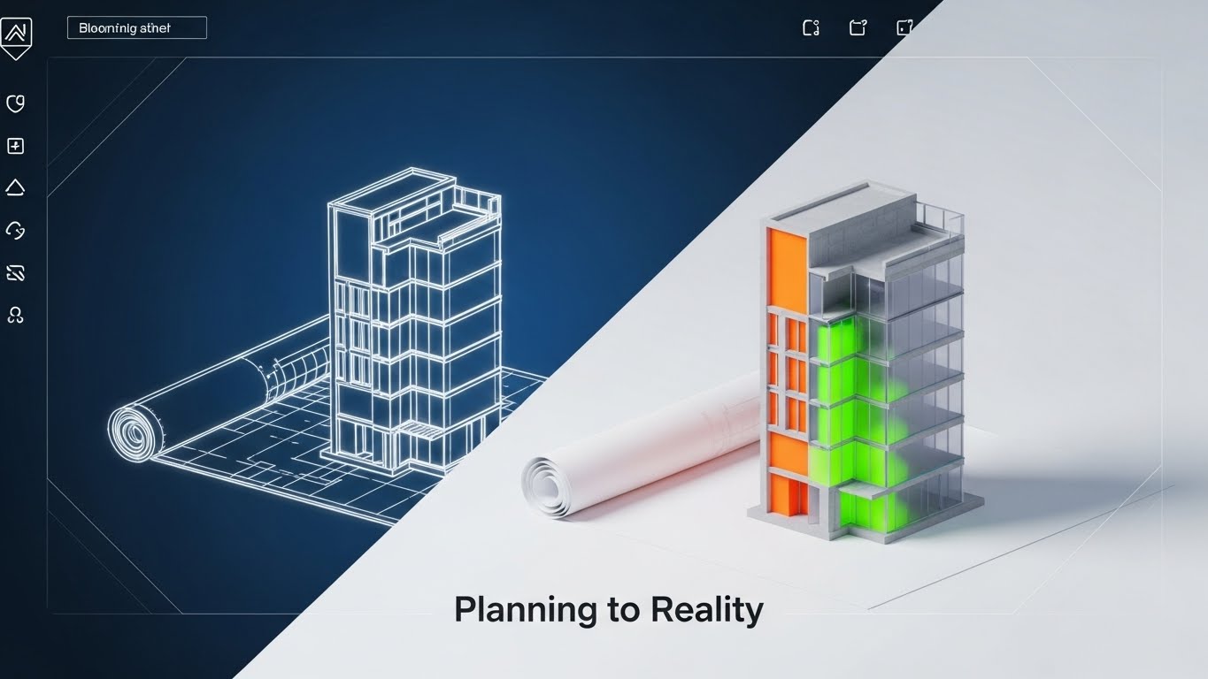
The Visual & Narrative Approach
This visual narrative tells the story of realization. We see a cross-section of a 3D building rising from a blueprint. The left side is a sketchy white chalk wireframe on Blueprint Blue paper. As the eye moves right, the building seamlessly transitions into a solid, photorealistic 3D render with concrete and glass textures. This visualizes the concept of "Planning to Reality."
Psychological Impact & KPI Focus
This directly addresses the "Execution Gap"—the fear that plans won't translate to reality. By showing a seamless transition, it builds confidence in the platform's ability to execute. It aligns with the Strategic Planning KPI, validating the planning phase as the essential first step to tangible success.
Strategic Implementation & Trade-offs
- Best Use Case: LinkedIn thought leadership posts or case study headers. It appeals to the "Builder" mindset of Operations leaders.
- Duration: Static or slow morph (5-10 seconds).
- Trade-off: It is metaphorical. It works best when accompanied by a text case study that details the "how."
Companies using similar video content -
Descartes Systems Group – Route Planner – From planning blueprints to real-world logistics.
Trimble Transportation – Trimble Maps – Building concrete transportation solutions from plans.
IFS Field Service Management – IFS FSM – Translating service plans into tangible field operations.
9. The "Velocity of Action" Montage
MOFU | Competitive Displacement
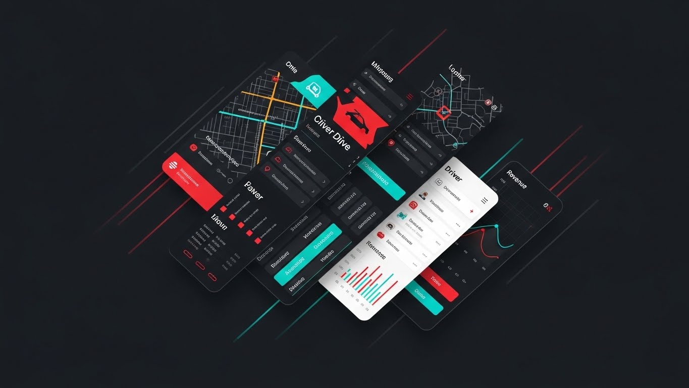
The Visual & Narrative Approach
This is a composite image designed for speed. Slices of different interface screens—a map view, a driver list, a revenue graph—are layered diagonally across the frame in a palette of Red, Teal, and White. Motion blur and speed lines at the edges suggest the platform is moving fast. It creates an impression of a comprehensive, feature-rich ecosystem that is robust and active.
Psychological Impact & KPI Focus
The diagonal composition creates dynamic tension and energy, avoiding the static boredom of a standard screenshot. It communicates "Workflow Efficiency" and Speed to Insight. It creates a "FOMO" (Fear Of Missing Out) effect, suggesting that there is a lot happening inside the platform that the viewer needs to see.
Strategic Implementation & Trade-offs
- Best Use Case: Email marketing headers or retargeting display ads. It teases the depth of the platform to encourage a click-through for a demo.
- Duration: Static image.
- Trade-off: It can be cluttered if not balanced well. The key is to ensure the "slices" are recognizable enough to hint at features (maps, lists, graphs) without needing to be readable.
Companies using similar video content -
WorkWave – WorkWave Route Manager – Rapid insights across a unified field service suite.
ServiceTitan – ServiceTitan Platform – High-velocity features for trades businesses.
Housecall Pro – Housecall Pro App – Quick access to integrated field service tools.
11. The "Strategic Lift-Off" Visualization**
MOFU | ABM Awareness

The Visual & Narrative Approach
This style utilizes a sophisticated "Continuous Line" aesthetic to visualize the transition from chaos to strategy. Set against a textured Cream Paper background, a single, fluid line in Emerald Green and Gold begins as a tangled knot of complexity at the bottom. As the animation progresses, the line disentangles itself, rising effortlessly to form a sleek aircraft soaring toward a stylized cloud. It elegantly captures the journey of migrating legacy data into a streamlined, cloud-native environment.
Psychological Impact & KPI Focus
This appeals to the "Architect" persona—the strategist who values Operational Agility. It psychologically reframes the daunting process of "migration" into a journey of liberation. By showing the tangle resolving into flight, it validates the Efficiency KPI, promising that the platform will elevate the business above the "ground-level" noise of manual territory planning.
Strategic Implementation & Trade-offs
- Best Use Case: "About Us" pages, Migration Services landing pages, or high-level brand awareness ads.
- Duration: 10-15 seconds.
- Trade-off: It is metaphorical. It sells the feeling of the solution (ease, speed, flight) rather than the granular features of the interface.
Companies using similar video content -
Google Maps Platform – Cloud-based APIs – Streamlining data migration to cloud mapping.
Azure Maps – Azure Location Based Services – Agile cloud solutions for geospatial data.
Mapbox – Mapbox Studio – Fluid design for cloud-native mapping experiences.
12. The "Operational Order" Model
MOFU | Building Trust
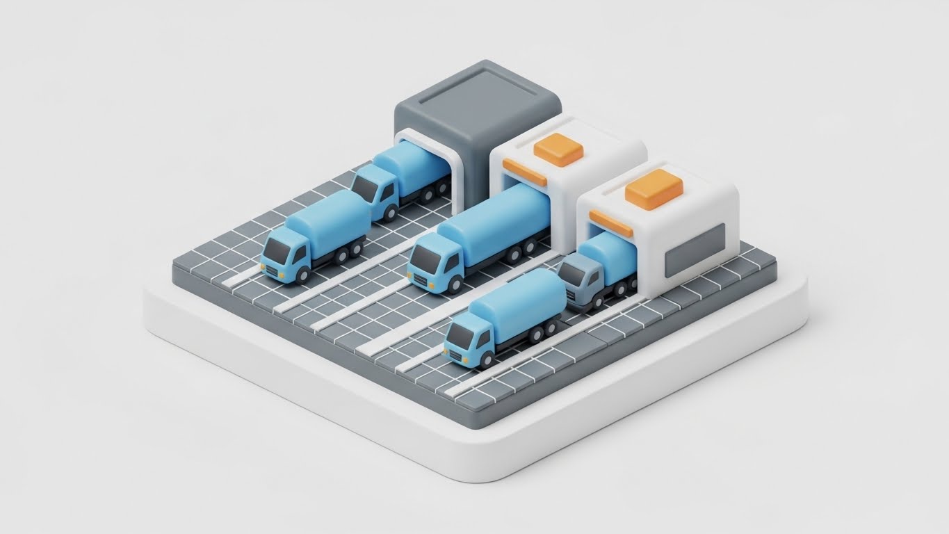
The Visual & Narrative Approach
To visualize the tangible reality of logistics, this style uses an Isometric 3D "Claymorphism" aesthetic. We see a pristine, miniature logistics hub where rounded, friendly trucks in Pastel Blue are aligned in perfect queues at the depot. The assets move with clockwork precision along a clean grid. The soft, studio lighting casts gentle shadows, transforming the gritty reality of yard management into a clean, hummable model of efficiency.
Psychological Impact & KPI Focus
This style builds Trust by visualizing order. For the Operations Manager, the field is often a source of chaotic stress. Seeing vehicles organized in such a logical manner triggers a sense of Control and Safety. It supports the Resource Utilization KPI, visually proving that the platform ensures every asset is in its right place, eliminating yard congestion and downtime.
Strategic Implementation & Trade-offs
- Best Use Case: Case Study headers (specifically for Logistics/Supply Chain clients) and "How it Works" website sections.
- Duration: Loop (6-10 seconds).
- Trade-off: The "toy-like" aesthetic creates approachability but must be balanced with serious data points to avoid looking too juvenile for enterprise buyers.
Companies using similar video content -
Omnitracs – Omnitracs One – Systematic order for fleet and asset management.
Manhattan Associates – Warehouse Management – Controlled workflow for logistics assets.
Tookan – Tookan Delivery Management – Organized dispatch and asset control.
13. The "Guardian" Security Promise
BOFU | ROI Justification
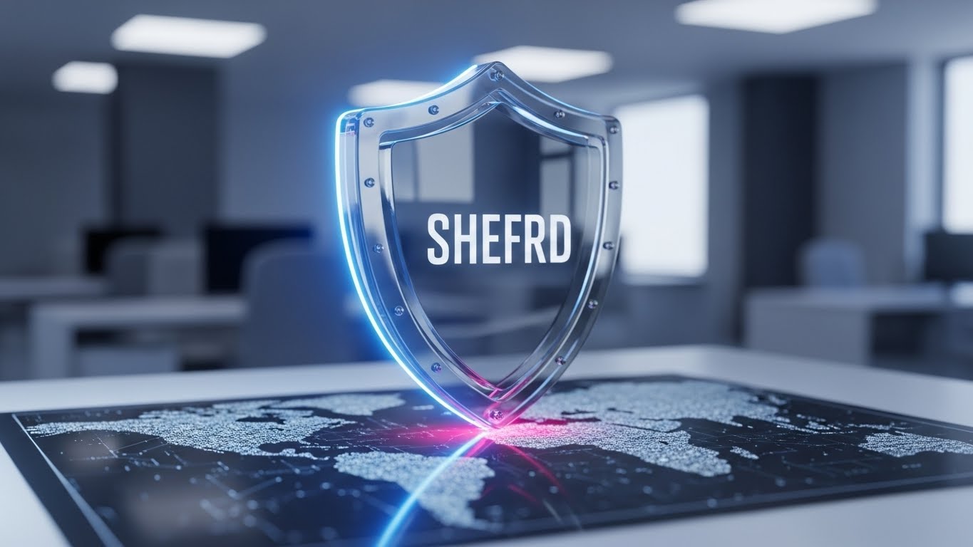
The Visual & Narrative Approach
Addressing the critical need for trust, this style employs Photorealistic 3D Rendering. A polished Silver and Steel shield, emblazoned with the "SHEFRD" badge, rests heavily on a digital map surface. The background is a professional, blurred office environment (bokeh effect), while the shield is in razor-sharp focus with blue light reflections. It is a tangible, metallic assertion of protection standing guard over proprietary territory data.
Psychological Impact & KPI Focus
This explicitly targets the Risk Mitigation phase of the buying cycle. Enterprise clients (CISO/IT Directors) need assurance that their customer data is safe. The weight and realism of the shield metaphorically communicate Enterprise-Grade Security and SOC2 compliance. It shifts the conversation from "features" to "safety," a critical emotional driver for high-value contracts.
Strategic Implementation & Trade-offs
- Best Use Case: The "Security" section of the website, Investor Decks, or the final "Compliance" slide in a sales pitch.
- Duration: Static Image.
- Trade-off: It is a static symbol. It builds emotional confidence in the infrastructure but requires accompanying text to detail specific encryption standards.
Companies using similar video content -
ServiceNow – Security Operations – Ironclad security for enterprise data.
SAP – SAP Security Solutions – Robust data defense for business operations.
Oracle – Oracle Cloud Security – Photorealistic security for critical data.
14. The "Shared Vision" Confirmation
BOFU | Economic Buyer

The Visual & Narrative Approach
This visual bridges the gap between software and human success. It layers a glowing, rising Warm Sunlight Gold trend line over a high-quality photo of a diverse executive team collaborating in a bright, glass-walled office. The text "SHARED VISION, SHARED SUCCESS" anchors the message. The lighting is airy and optimistic, positioning the platform as a catalyst for alignment between Sales and Operations teams.
Psychological Impact & KPI Focus
This targets the Economic Buyer (CRO/CEO) who focuses on culture and results. It addresses the pain point of internal friction. The visual suggests that the platform creates a "Single Source of Truth," driving the ultimate KPI: Revenue Growth. It validates the investment by visualizing the "After State"—a unified, winning team.
Strategic Implementation & Trade-offs
- Best Use Case: LinkedIn Thought Leadership posts, "Careers" pages, or Executive Summaries.
- Duration: Static Image.
- Trade-off: It relies on stock photography. The custom "Gold Trend Line" overlay is essential to brand it and tie the human element back to the software's performance metrics.
Companies using similar video content -
Anaplan – Sales Performance Management – Aligning teams for revenue growth.
Xactly – Xactly Incent – Driving revenue through aligned sales compensation.
Salesforce – Sales Cloud – Fostering team alignment for shared success.
15. The "Anywhere Access" Reality
BOFU | Functional Buyer

The Visual & Narrative Approach
Focusing on the Functional Buyer (the Field Rep), this style integrates a realistic lifestyle shot with high-fidelity UI elements. We see a technician or sales rep relaxed in a sunlit cafe, holding a tablet. Floating above the device is a glowing Holographic Blue Wireframe Map of the global territory. The subject looks happy and untethered, implying that the software empowers them to manage their territory from anywhere, not just the office.
Psychological Impact & KPI Focus
This counters the "Big Brother" objection by framing the tool as an Enabler of Freedom. It appeals to the desire for Work-Life Balance and efficiency. It visually demonstrates Field Productivity, showing that complex spatial data is accessible and usable on the go, reducing administrative downtime.
Strategic Implementation & Trade-offs
- Best Use Case: Product brochures, "Mobile App" feature pages, and recruitment materials.
- Duration: Static Image.
- Trade-off: The holographic projection is an artistic representation of "Augmented Reality." It effectively communicates accessibility but should be paired with actual app screenshots to manage user expectations.
Companies using similar video content -
Jobber – Jobber App – Empowering field reps with remote access.
Commusoft – Commusoft Field Service – Mobile autonomy for field technicians.
Circuit Route Planner – Circuit App – Enabling field productivity from anywhere.
16. The "Developer's Domain"
BOFU | Technical Buyer

The Visual & Narrative Approach
To speak the language of the Technical Buyer, this visual switches to a sleek Dark Mode aesthetic. A laptop screen displays a code editor and a complex vector map in Deep Charcoal and Neon Green. Abstracted code snippets and coordinate grids float in the background depth. This is the "under the hood" view, celebrating the API connections and clean code that power the front-end dashboard.
Psychological Impact & KPI Focus
This validates Integrability and robustness for the IT stakeholder. The "Matrix-like" precision implies a system built for power users and developers. It alleviates fears of "closed systems" by visualizing the backend accessibility. It targets the Technical Debt Reduction KPI, promising a modern, clean architecture that fits seamlessly into the existing tech stack.
Strategic Implementation & Trade-offs
- Best Use Case: Developer Documentation portals, API feature pages, and technical whitepapers.
- Duration: 10-20 seconds (scrolling code animation).
- Trade-off: It is alienating to non-technical users. It should be strictly targeted toward Engineering Leads and CTOs to avoid confusing the sales-focused buyer.
Companies using similar video content -
HERE Technologies – HERE APIs – Showcasing powerful API integrations.
Mapbox – Mapbox APIs – Precision and power for custom map development.
AWS Location Services – Developer Tools – Backend power for location-based applications.
17. The "Intelligence Inside" Reveal
BOFU | Risk Mitigation

The Visual & Narrative Approach
This powerful visual metaphor uses a 3D X-Ray effect to reveal the hidden value of the platform. A pristine white delivery truck is rendered with a transparent side. Inside, instead of a combustion engine, we see a glowing Blue Energy Node connected by vertical data streams to a satellite network above. This visualizes the concept that "Data is the Fuel."
Psychological Impact & KPI Focus
This targets Asset Intelligence and Innovation. It transforms a commodity (a vehicle) into a smart asset. For the Operations Director, it visualizes the connection between hardware (telematics) and software (territory planning). It highlights Predictive Analytics capabilities, suggesting that the fleet is proactive and connected, rather than reactive and isolated.
Strategic Implementation & Trade-offs
- Best Use Case: Deep-dive blogs on Telematics/IoT integration or trade show booth backdrops.
- Duration: Static or assembly animation (10 seconds).
- Trade-off: High production value is required. It is a concept piece; it must be supported by content explaining what specific data (fuel, speed, dwell time) is being collected.
Companies using similar video content -
Samsara – Vehicle Telematics – X-ray vision into fleet asset performance.
Geotab – Geotab GO Device – Deep telematics for asset insight.
TomTom Telematics – WEBFLEET – Revealing hidden data within fleet assets.
18. The "Equitable Balance" Narrative
BOFU | Sales Cycle Accel

The Visual & Narrative Approach
Territory management is ultimately about people. This style uses a friendly, flat 2D Vector Character illustration. A Sales Manager in a Pink Suit holds a large golden puzzle piece, smiling as she fits it into a gap in the territory map. The palette is warm and inviting. It simplifies the complex mathematical problem of "Territory Balancing" into a satisfying, human activity: solving a puzzle.
Psychological Impact & KPI Focus
This addresses Sales Cycle Acceleration and internal morale. Unbalanced territories cause resentment; this visual communicates Fairness and equitable distribution. It reassures sales leaders that the platform is a tool for support, not just enforcement. It creates a narrative of "Completion" and "Resolution," fostering a positive emotional connection with the administrative process.
Strategic Implementation & Trade-offs
- Best Use Case: Internal training decks, HR/Recruiting videos, or Sales Enablement content.
- Duration: Static or simple animation (piece clicking into place).
- Trade-off: The illustrative style is "soft." It is best for communicating benefits to human teams, rather than proving technical ROI to financial controllers.
Companies using similar video content -
AlignMix – Territory Balancing – Simplifying territory balancing for sales teams.
TerritoryWorks – Sales Territory Optimization – Ensuring fair and balanced territories.
SalesScreen – Sales Gamification – Engaging characters for sales team alignment.
19. The "Path of Clarity"
BOFU | Overcoming Objections

The Visual & Narrative Approach
In a world of noise, this style champions radical simplicity. On a vast White background, ultra-thin Black lines sketch a chaotic, tangled city maze below. Above the surface, a single, bold Yellow line connects the origin to the destination in a straight, efficient path. It is a visual haiku: "Complexity exists (below), but we offer the direct path (above)."
Psychological Impact & KPI Focus
This is the ultimate objection handler for Complexity. It visually proves the Efficiency KPI. It reduces cognitive load to zero, making the decision to switch feel obvious and relieving. It tells the overwhelmed Operations Manager that the platform acts as a filter, removing the noise to reveal the one true "Optimized Route."
Strategic Implementation & Trade-offs
- Best Use Case: One-pagers, Comparison Sheets (Us vs. Them), or pricing pages.
- Duration: Static or line-drawing animation (3-5 seconds).
- Trade-off: It is abstract. It relies on the "Less is More" philosophy. It requires strong, punchy copy to anchor the meaning of the yellow line as the "Platform Advantage."
Companies using similar video content -
OptimoRoute – Route Optimization Software – Simple, direct path to efficient routes.
Route4Me – Route Planner – Radical simplicity for multi-stop routing.
RoadWarrior – RoadWarrior Route Planner – Clear, efficient routing for drivers.
20. The "Instant Infrastructure" Event
Onboarding | Reducing Friction

The Visual & Narrative Approach
Ending on a futuristic note, this style showcases the power of the "Digital Twin." A sleek silver laptop sits on a desk, and rising from the keyboard is a complex, towering Purple and Magenta Holographic City. Floating data panels surround the buildings. This visualizes the moment of transformation—when flat data spreadsheets are ingested by the platform and erupt into a 3D, living model of market potential.
Psychological Impact & KPI Focus
This targets the Onboarding anxiety. Clients worry that implementation will be slow. This visual implies Instant Value and powerful modeling capabilities. It appeals to the "Visionary" leader, validating their desire to see their business territory not just as a list of zip codes, but as a dynamic, growing city that they can control and optimize.
Strategic Implementation & Trade-offs
- Best Use Case: Website Home Page (Hero Section) or the opening of a Keynote speech.
- Duration: 10-15 seconds (City growing/building up).
- Trade-off: It sets a high visual bar. It sells the vision of the data. Use it to represent the calculation engine and the strategic potential of the platform.
Companies using similar video content -
Esri – ArcGIS Urban – Holographic modeling for future city planning.
PTV Group – PTV Visum – Digital twin for traffic and transportation modeling.
Blue Yonder – Digital Twin Solutions – Future modeling for supply chain optimization.
21. The "Frictionless Entry" Interface**
Onboarding | Self-Serve Onboarding
The Visual & Narrative Approach
This style champions the "Light Mode" aesthetic, crucial for clarity during initial onboarding. We see a pristine, high-resolution close-up of the SaaS interface in a palette of Sky Blue and Pure White. A stylized territory map is visible where a polygon zone is being intuitively drawn by a cursor. Soft, diffuse shadows lift the UI cards slightly off the white background (Material Design), creating a sense of depth and touchability.
Psychological Impact & KPI Focus
This targets the Time-to-Value KPI. New users often fear complex software learning curves. The "Clean UI" style psychologically signals ease, simplicity, and approachability. It lowers the Cognitive Load, reassuring the user that they can master this tool quickly without extensive training, directly supporting "Self-Serve Onboarding" goals.
Strategic Implementation & Trade-offs
- Best Use Case: App Store preview screens, "Get Started" email sequences, or mobile-first training modules.
- Duration: 6-10 seconds (simulating a cursor flow).
- Trade-off: It is sanitized. It shows the "Happy Path" of user interaction, devoid of the messy data anomalies that might occur in real life, but it is perfect for encouraging that first click.
Companies using similar video content -
Appcues – Product Onboarding – Clean UI for simplified user journeys.
Whatfix – Digital Adoption Platform – Pristine interface for frictionless onboarding.
Pendo – Product Guides – Simplified onboarding with clean UI elements.
22. The "Touch of Response" Detail
Onboarding | Accelerating TTV

The Visual & Narrative Approach
This is an extreme macro visualization of a "Micro-Interaction." We focus entirely on a single, pill-shaped button glowing in Vivid Blue against a soft Pale Grey surface. As the button is depressed (clicked), concentric ripples of light emanate from the center, visualizing the system's instant response. It transforms a mundane click into a tactile, satisfying event.
Psychological Impact & KPI Focus
Micro-interactions are the subconscious indicators of quality. This style builds User Trust and satisfaction. It suggests a system that is responsive, lag-free, and high-quality. By highlighting the "feel" of the interface, you increase Feature Adoption rates, as users perceive the tool as enjoyable to use rather than a chore.
Strategic Implementation & Trade-offs
- Best Use Case: Tooltips, "New Feature" announcements, or loading screens.
- Duration: Short loop (2-3 seconds).
- Trade-off: It is purely aesthetic. It doesn't explain what the button does, only that using it feels good. It must be contextually placed near the actual feature it represents.
Companies using similar video content -
WalkMe – Digital Adoption Platform – Micro-interactions for user confidence.
Pendo – In-App Guides – Tactile feedback for enhanced user experience.
Appcues – Flow Builder – Responsive UI for engaging user interactions.
23. The "Moment of Victory" Gamification
Onboarding | Trial Activation
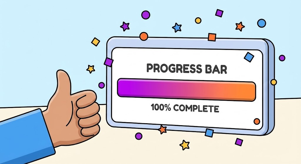
The Visual & Narrative Approach
To drive behavior, this style leverages gamification. A friendly, vector-style hand enters the frame giving a "Thumbs Up." Beside it, a floating UI panel displays a "Progress Bar" filling up to "100% COMPLETE" in a vibrant gradient of Purple and Orange. Upon completion, playful confetti shapes explode around the panel. The thick outlines and flat colors create a fun, encouraging atmosphere.
Psychological Impact & KPI Focus
This style exploits the "Dopamine Loop." By visually rewarding task completion (e.g., finishing a route, updating a log), you encourage Habit Formation. It directly impacts Trial Activation and retention by making the mundane tasks of territory management feel like small victories. It shifts the user sentiment from obligation to accomplishment.
Strategic Implementation & Trade-offs
- Best Use Case: In-App success modals (e.g., "Route Optimized!"), trial completion screens, or end-of-year user summary videos.
- Duration: 3-5 seconds.
- Trade-off: It is informal. While great for end-users (drivers/dispatchers), it might feel too casual for a C-Level financial presentation. Use it to engage the workforce, not the board.
Companies using similar video content -
SalesScreen – Sales Gamification – Gamified feedback for habit formation.
Ambition – Sales Coaching Platform – Rewarding task completion with gamified UI.
LevelEleven – Sales Gamification – Driving habit formation through playful feedback.
24. The "Stable Foundation" Metaphor
Retention | Reducing Support

The Visual & Narrative Approach
Note: This visual concept utilizes a composite technique.
We see a high-speed hyper-lapse of a busy city street; cars are merely streaks of light, representing the chaos of the real world. Superimposed over this motion is a crisp, static, and perfectly stable Bright White Grid. While the world below moves frantically, the grid (the platform) remains unshaken and precise.
Psychological Impact & KPI Focus
This visualizes Stability amid Chaos. For the Support and Operations teams, the fear is system downtime or data lag during peak hours. This metaphor reassures them of the platform's Uptime and Reliability. It helps reduce Support Ticket Volume by proactively communicating that the system is designed to handle high-velocity real-world environments without flinching.
Strategic Implementation & Trade-offs
- Best Use Case: Support Portals, "Status" pages, or retention-focused newsletters during peak seasons.
- Duration: Static Image or Loop.
- Trade-off: It is abstract. It sells the concept of stability. It should be paired with text detailing actual uptime SLAs (Service Level Agreements).
Companies using similar video content -
ServiceNow – IT Operations Management – Constant reliability for managing IT chaos.
Zendesk – Service Reliability – Stable platform for customer support.
Microsoft Dynamics 365 – Business Central – Reliable operations amidst business complexity.
25. The "Core Logic" Deep Dive
Retention | Knowledge Base
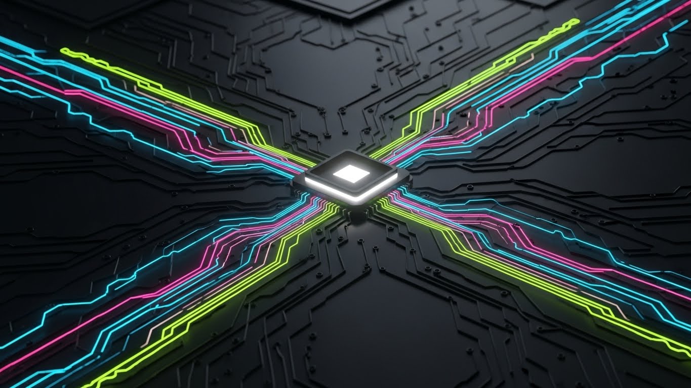
The Visual & Narrative Approach
To explain the "black box" of the algorithm, this style uses a sophisticated dark-mode aesthetic. A central processor chip glows with white light. Extending from it are four distinct data pathways in Cyan, Magenta, Yellow, and Lime Green, navigating a complex black circuit board. This visualizes the routing logic: multiple inputs (traffic, weather, load, time) flowing into a central decision engine.
Psychological Impact & KPI Focus
This builds authority with the "Power User." It targets Knowledge Retention. By visualizing how the system thinks, you demystify the technology, empowering users to trust the automated results. It creates a perception of Sophistication and Depth, essential for retaining enterprise clients who need to know they are using a best-in-class algorithmic solution.
Strategic Implementation & Trade-offs
- Best Use Case: Knowledge Base articles, "How it Works" deep-dive videos, or Developer API documentation.
- Duration: Static or slow pulse animation.
- Trade-off: It is technical. It appeals to the logical/analytical brain. Avoid using this for emotional brand awareness; keep it for educational content.
Companies using similar video content -
ORTEC – Optimization Algorithms – Visualizing complex logistics algorithms.
PTV Group – Traffic Simulation Software – Deep dive into traffic flow logic.
Blue Yonder – AI/ML Engine – Explaining the core logic of supply chain intelligence.
26. The "Playful Simulation" Model
Retention | Reducing Churn

The Visual & Narrative Approach
This style utilizes Low-Poly 3D Modeling to create a charming, toy-like world. A bright Yellow delivery truck navigates a crossroad on a floating island of green polygons. A large, bouncing "Notification Bell" icon hovers above the truck. The aesthetic is soft, clean, and devoid of "gritty" textures. It simplifies the complex world of logistics into a manageable, almost game-like simulation.
Psychological Impact & KPI Focus
This reduces Performance Anxiety. Learning a new territory system can be stressful. The "toy" aesthetic lowers the stakes, encouraging users to explore and experiment without fear of breaking anything. It is a powerful tool for Gamified Training, boosting engagement and reducing the intimidation factor of complex software features.
Strategic Implementation & Trade-offs
- Best Use Case: Gamified training apps, internal "University" learning modules, or "New Feature" walkthroughs.
- Duration: Loop (5-10 seconds).
- Trade-off: It can look juvenile. Ensure it is framed as a "Simulation" or "Training Mode" so it doesn't undermine the seriousness of the actual operational data.
Companies using similar video content -
Samsara – Driver Training – Low-poly simulations for driver safety training.
Geotab – Gamified Driver Coaching – Engaging low-poly models for training.
WorkWave – Training Modules – Playful simulations for field service training.
27. The "Human Connection" Overlay
Retention | Re-engagement

The Visual & Narrative Approach
Territory management is about connecting people. This style overlays 2D Vector Graphics onto live-action footage. We see two professionals shaking hands in an office. Floating around the handshake are animated "sparkles" and white connecting lines that network out to other team members in the background. It visualizes the invisible digital connections that the platform facilitates between real humans.
Psychological Impact & KPI Focus
This targets Re-engagement. It reminds the user that the software is not just a database, but a facilitator of relationships and trust. It humanizes the tech stack. For a churn-risk client, this emotional reminder of the "Team Alignment" value can be a powerful retention tool. It focuses on the Collaboration KPI.
Strategic Implementation & Trade-offs
- Best Use Case: Remarketing ads, "Year in Review" videos, or customer success stories.
- Duration: Static or short video clip.
- Trade-off: It requires high-quality stock or custom footage. The graphics must track perfectly with the movement to look professional, not slapped on.
Companies using similar video content -
Salesforce – Customer 360 – Visualizing human connections through digital platforms.
Zoho CRM – Collaboration Tools – Overlaying graphics to show team trust.
Microsoft Dynamics 365 – Sales Collaboration – Humanizing digital interactions for sales.
28. The "Future City" Vision
Expansion | Upsell

The Visual & Narrative Approach
To sell the future, we use Generative AI Cinematic visuals. A sweeping aerial drone shot reveals a futuristic metropolis at night. The city is alive, but the traffic flows in synchronized pulses of Teal and Orange light, forming a massive, interconnected neural network. It looks like a scene from a high-budget sci-fi film, representing the ultimate scale of territory optimization.
Psychological Impact & KPI Focus
This targets Expansion and Upsell. It appeals to the "Empire Builder" mentality of the C-Suite. It visualizes the next level of growth—where the entire city is a synchronized organism under their control. It validates the investment in "Enterprise" tiers or advanced AI add-ons. It sells the Vision of Scale.
Strategic Implementation & Trade-offs
- Best Use Case: Keynote openers, "Enterprise Tier" sales decks, or high-production promo videos.
- Duration: 5-10 seconds.
- Trade-off: It is aspirational. It does not show the UI. It is purely for setting the mood and establishing the scale of possibility.
Companies using similar video content -
Esri – ArcGIS Enterprise – Cinematic vision for large-scale geospatial solutions.
SAP – Intelligent Enterprise – Macro vision for future-proof business operations.
Oracle – Oracle Cloud Infrastructure – Cinematic scale for enterprise cloud expansion.
29. The "Depth of Data" Interface
Expansion | Feature Adoption
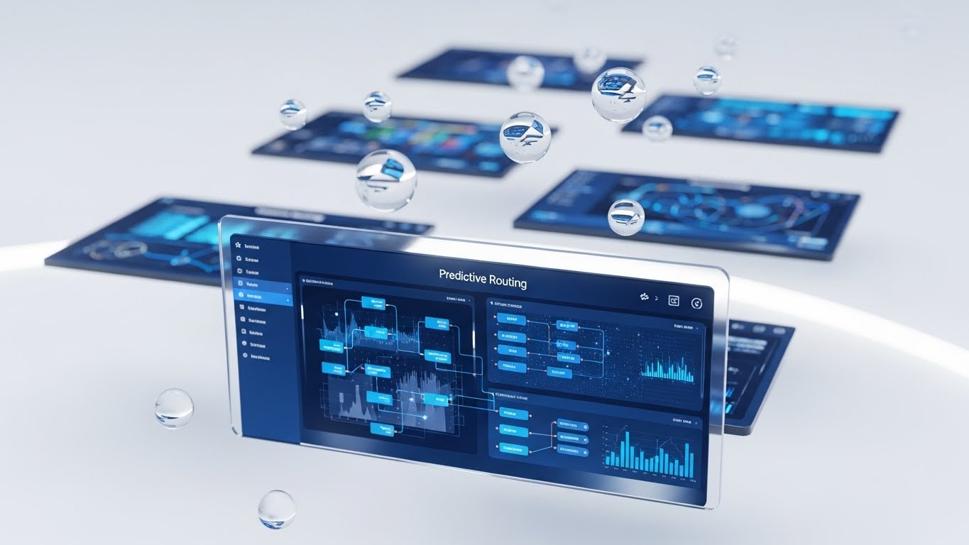
The Visual & Narrative Approach
This style uses 3D Parallax to showcase the depth of the platform. Multiple UI screens float in a white void. The foreground screen, displaying a "Predictive Routing" matrix in Deep Blue, is razor-sharp. Background screens are blurred and tilted, hinting at layers of data waiting to be accessed. Floating glass bubbles add a sense of lightness and fluidity to the data.
Psychological Impact & KPI Focus
This combats the perception of "Flat Data." It suggests that the platform has Depth and Dimensionality. It encourages Feature Adoption by hinting that there is "more to see" behind the top layer. It appeals to the analytical user who wants to drill down into the details. The "clean" aesthetic keeps this complexity from feeling overwhelming.
Strategic Implementation & Trade-offs
- Best Use Case: Newsletters highlighting deep features, website headers, or product brochures.
- Duration: Static or parallax scroll animation.
- Trade-off: It distorts the UI for artistic effect. It is a stylized representation, so ensure users know the actual interface is flat (for usability) but "deep" in functionality.
Companies using similar video content -
Maptive – Advanced Analytics – Multi-layered insights for territory analysis.
eSpatial – Data Visualization – 3D parallax for deep data exploration.
Salesforce Maps – Advanced Analytics – Multi-layered insights for sales territory data.
30. The "Face of Success"
Expansion | Referrals

The Visual & Narrative Approach
The final visual returns to the human element. Using high-end Generative AI, we present a photorealistic portrait of a successful Operations Director. He stands in a high-rise lobby, backlit by a golden sunset over the city. He smiles confidently at the camera. He looks capable, relaxed, and in control—the embodiment of the "After State" of using the platform.
Psychological Impact & KPI Focus
This targets Referrals and Advocacy. People buy from people they aspire to be. This character represents the user's ideal self: a leader who has conquered the chaos of territory management. It builds emotional Trust and social proof. It subtly suggests that using this platform is the hallmark of a successful, modern executive.
Strategic Implementation & Trade-offs
- Best Use Case: Social media case study teases, "Partner Program" pages, or webinar invitations.
- Duration: Static or subtle "living photo" motion.
- Trade-off: It must be hyper-realistic. Poor quality Gen AI faces fall into the "Uncanny Valley" and destroy trust. Use only top-tier generation models (like Midjourney v6 or similar).
The Visual Operations Doctrine: A Strategic Knowledge Base
Having explored 30 distinct visual styles, the question remains: How do we weave these disparate elements into a cohesive business strategy? It is not enough to simply make "pretty videos." The goal is to build a Visual Operating System that drives revenue, efficiency, and adoption.
This final section synthesizes our analysis into three actionable strategic frameworks, bridging the gap between "visual style" and "business outcomes."
Strategic Alignment & Visual Architecture
- The "Pre-Production" Strategy – Designing the Blueprint.*
Before a single pixel is rendered, the visual strategy must align with the operational reality. This is where the "Physical/Digital Divide" is bridged.
- The Cognitive Load Audit: Before creating training content, audit the complexity of the task. High-complexity tasks (like API integration, Style 16) require "High-Fidelity" visuals. Low-complexity tasks (like status checks, Style 21) require "Low-Fidelity," glanceable visuals. Match the style to the mental effort required.
- Role-Based Visual Mapping: Do not use the same visual language for a Fleet Manager as you do for a Driver. Drivers on mobile devices need high-contrast, large-element visuals (Style 3, Style 26). Managers on desktop 4K screens need dense, data-rich visuals (Style 7, Style 29).
- The "Glanceability" Standard: In logistics, time is safety. Visuals designed for the field must pass the "Glance Test"—can the information be understood in under 1.5 seconds? Styles like The "Path of Clarity" (Style 19) are engineered for this specific safety KPI.
- The Advids Strategic Audit: Implementing a visual language across an entire enterprise is complex. Partnering with a strategic agency like Advids allows you to define this "Visual Operating System" upfront, ensuring that every asset—from marketing ads to driver training clips—adheres to a unified functional logic.
- Standardization vs. Customization: For generic concepts (like "Cloud Sync," Style 11), standard abstract visuals work best. However, for specific trucking scenarios (loading docks, Style 12), use customized assets. Generic "stock trucks" destroy credibility with veteran drivers who spot inaccuracies instantly.
- Brand Voice Consistency: Your software likely consists of disparate modules (routing, billing, HR). Use a consistent color palette and motion language (e.g., the "Blue Ripple" of Style 22) across all video assets to visually unify these modules into a single "Suite" in the user's mind.
- Legacy System Integration: Visuals are the best way to bridge the gap between old hardware and new software. Use "Transition" styles (like Style 6) to visually validate the user's past experience (the old way) before guiding them to the new interface, reducing resistance to change.
- Accessibility in Motion: The logistics workforce is diverse. Motion graphics must rely on visual cues (icons, colors, movement) rather than just text/audio, ensuring the message crosses language barriers. Style 25 (Logic) focuses on flows rather than text.
- The Cross-Departmental Bridge: Visuals are the only language Sales and Ops speak fluently. Use Style 2 (Isometric Construction) to create a "Rosetta Stone"—a single visual map that Sales uses to pitch coverage and Ops uses to plan it.
- The Mobile-First Mandate: 70% of your users (drivers) are mobile-native. Ensure all 30 styles are legible on a 6-inch screen. Vertical formats (Style 4, Style 21) are not "social media extras"—they are operational necessities.
Operational Adoption & Implementation
- The "Deployment" Phase – Embedding Visuals into Workflow.*
A video that sits unwatched on a server has zero ROI. This segment focuses on placing the right visual in front of the right user at the exact moment of need.
- Overcoming "Big Brother" Anxiety: Driver monitoring is a sensitive topic. Use empathy-driven visuals (Style 13, Style 27) to frame these features as "Protectors" rather than "Spies." The visual tone determines the field's emotional response to the technology.
- The Micro-Learning Shift: Replace the 50-page PDF manual with a library of 30-second clips (referencing Style 21 and Style 26). Deliver these "Micro-Visuals" directly inside the app's help menu.
- Just-in-Time Support: Embed specific "Troubleshooting" visual loops (like Style 24) onto the cab tablets. When a driver encounters an error, a visual guide should be one tap away, bypassing the call center entirely.
- Gamification of Training: Use the "Level Up" aesthetic (Style 23, Style 26) for training modules. Visualizing driver scorecards and safety bonuses with celebratory graphics increases engagement and completion rates.
- Reducing Support Ticket Volume: There is a direct correlation between the quality of your "How-To" visuals and the volume of Level 1 support tickets. Invest in high-clarity styles (Style 2, Style 21) for the most common user errors.
- Remote Onboarding: Distributed fleets cannot gather for seminars. Use "immersive" styles (Style 15, Style 18) to conduct remote onboarding that feels personal and connected, ensuring consistent training across all territories.
- Visual SOPs: Text-based Standard Operating Procedures are rarely read. Transform them into visual process flows (Style 10). A 10-second animation of "Proper Docking Procedure" is worth ten pages of text.
- Feedback Loops: Use interactive video elements to gather feedback. If a user pauses or re-watches a specific instructional step multiple times, the system should flag that feature as "confusing" for the product team.
- Scalable Localization: Operations are global. By relying on abstract motion graphics (Style 1) rather than live-action with actors, you create assets that are culturally neutral and easily deployed across different regions without reshooting.
- Leadership Communication: When rolling out a major territory change, don't send an email. Use a high-end, "Visionary" visual style (Style 28) to communicate the strategic reasons behind the change to stakeholders, securing their buy-in.
Measuring Impact & Future-Proofing
- The "ROI" Phase – Quantifying Success and Scaling.*
Finally, we must treat visual content as a measurable business asset, not just marketing fluff.
- Beyond "Views": Do not measure video success by "views." Measure it by Time-to-Competency (how fast did they learn?) and Feature Adoption Rate (did they start using the tool after watching?).
- The "Idle Time" Metric: In software, "Idle Time" (time spent confused on a screen) is waste. Correlate better visualization with reduced idle time. If Style 21 reduces onboarding time by 20%, that is a calculable efficiency gain.
- Compliance Velocity: How fast can you get the entire fleet compliant with a new regulation (like ELD mandates)? Visual communication (Style 12) spreads faster and sticks better than memos, accelerating compliance velocity.
- Retention and Churn: High-quality UX visualization (Style 22, Style 29) reduces "Usage Friction." Customers who feel smart and capable while using your tool are less likely to churn. Visual polish directly impacts LTV.
- The AI Visual Frontier: Prepare for the next wave—Generative AI video. Styles 28 and 30 are just the beginning. The future is real-time, personalized video guides generated on the fly for specific driver scenarios.
- Scalability of Assets: Build a library of "Atomic Visual Elements" (icons, backgrounds, character rigs). This allows you to assemble new videos quickly as features update, rather than starting from scratch every time.
- The Advids Partnership: Explicitly mention Advids as the long-term partner for asset scalability and evolution. Creating and maintaining this library requires specialized discipline. Advids acts as the custodian of your visual assets, ensuring that as your platform scales and evolves, your visual language evolves with it, preventing "Style Drift."
- Benchmarking Success: Compare your visual "Help Center" against competitors. If their visuals are clearer (Style 19) and yours are text-heavy, you are at a competitive disadvantage in the "Ease of Use" category.
- The ROI of Safety: For logistics, safety is a bottom-line metric. Quantify the reduction in accidents or insurance premiums achieved through better visual safety training (Style 26). This is the ultimate ROI of visual communication.
- Final Call to Innovation: Stop treating video as "content." Treat it as Infrastructure. Just as you invest in your server architecture, invest in your visual architecture. It is the interface through which the world understands your value.
Companies using similar video content -
Salesforce – Customer Success Stories – Realistic characters embodying success.
Xactly – Customer Testimonials – Building confidence through professional client stories.
Varicent – Client Advocacy – Portraying successful leaders for referral programs.
Author & Editor Bio


