
The operational landscape of global business has shifted irrevocably. As organizations scale across borders, the "Global Efficiency Architect"—the modern payroll leader—is no longer just processing transactions but orchestrating a complex, high-stakes financial ecosystem. The challenge has evolved from simple payment delivery to ensuring absolute precision amidst a web of diverse statutory regulations, currency volatilities, and data sovereignty requirements.
In this environment, the gap between physical banking rails and digital reporting dashboards represents both a significant risk and a massive opportunity for optimization. Visual communication has emerged as the most potent tool to bridge this physical/digital divide. It transforms the abstract complexity of multi-country compliance and general ledger integrations into tangible, comprehensible narratives. This is not merely about aesthetic enhancement; it is a strategic imperative for reducing cognitive load and accelerating decision-making.
The stakes are high. The global payroll services market is projected to reach USD 32.6 billion in 2025, driven by the demand for unified solutions. Yet, the cost of inefficiency remains a formidable barrier. Industry data reveals that it costs an average of $291 to rectify a single payroll error. When scaled across thousands of employees and multiple jurisdictions, these errors become a silent drain on profitability.
Forward-thinking SaaS platforms are now leveraging sophisticated video strategies to articulate their value, moving beyond feature lists to demonstrate seamless operational reality. This guide presents a curated taxonomy of high-impact video styles designed to resonate with the specific anxieties and aspirations of global payroll professionals, offering a roadmap to articulate reliability, speed, and compliance through the power of motion.
1. Generative AI Cinematic Video
TOFU | Brand Awareness

The Visual & Narrative Approach
This style leverages the grandeur of a low-orbit cinematic perspective to elevate the concept of cross-border payments from a transactional process to a global phenomenon. The visualization focuses on a photorealistic Earth where neon cyan fiber-optic lines replace traditional borders, symbolizing the seamless velocity of funds moving between continents. The dramatic "sunrise from space" lighting creates an optimistic, forward-looking tone, while the slow camera orbit instills a sense of stability and macro-level control, essential for reassuring stakeholders about global reach.
Psychological Impact & KPI Focus
- Niche Psychology: For the "Global Efficiency Architect," this visual style directly addresses the anxiety of fragmentation. By showing the world as a single, interconnected network of light, it psychologically reinforces the concept of a unified global system. This reduces the perceived complexity of multi-country operations, replacing the fear of black-box banking with a vision of illuminated transparency.
- Operational Impact: Establish the vendor as a dominant, omnipresent player capable of handling scale, directly influencing Top-of-Funnel (TOFU) engagement and brand recall.
Strategic Implementation & Trade-offs
- Ideal Use Case: High-impact social ads (LinkedIn/Instagram) where stopping the scroll is critical.
- Duration: 15-30 Seconds.
- Trade-off: While visually stunning and excellent for brand perception, this style is less effective for explaining specific granular features (like tax engine logic) due to its high-level abstraction.
Companies using similar video content -
Deel – Global People Platform – Simplifies hiring, paying, and managing international workforces.
Remote – Global HR Solutions – Provides compliant global HR and payroll for distributed teams.
Papaya Global – Papaya Payroll OS – Offers global workforce payment and management for multinational corporations.
2. Abstract 2D Flat Vector Organic
TOFU | Market Education

The Visual & Narrative Approach
This style utilizes fluid, organic shapes in a soothing palette of coral and teal to demystify the often-rigid concept of a General Ledger. The animation features glossy, abstract forms drifting and merging into a central, interlocking structure, visually metaphorizing the reconciliation of disparate data sources into a single source of truth. The shadowless, flat-lay composition ensures clarity and approachability, suggesting that the software handles complexity with effortless grace rather than mechanical force.
Psychological Impact & KPI Focus
- Niche Psychology: The use of soft, organic motion is calculated to lower cognitive load. Payroll integration is often viewed as a "hard," friction-filled problem; this visual style reframes it as a natural, fluid process. It appeals to the persona's desire for harmony and error-free consolidation.
- Operational Impact: By abstracting the technical details of API calls into elegant merging shapes, the viewer focuses on the outcome of security and unity, driving interest in how the platform achieves such seamlessness.
Strategic Implementation & Trade-offs
- Ideal Use Case: Website "How it Works" sections or introductory explainer videos.
- Duration: 45-60 Seconds.
- Trade-off: The abstract nature requires a strong voiceover to connect the visual metaphors to specific business benefits. Without clear narration, the "merging shapes" might be interpreted as generic collaboration.
Companies using similar video content -
CloudPay – Global Payroll Platform – Unifies and streamlines global payroll processing.
Payslip – Global Payroll Control Platform – Standardizes international payroll processes and data.
Workday – Workday Payroll – Streamlines HR processes and payroll within a single platform.
3. Bold Kinetic Typography
TOFU | Vertical Social Organic

The Visual & Narrative Approach
This style is an adrenaline shot of information, utilizing massive, blocky geometric shapes and electric lime accents to convey the urgency and power of Real-time Analytics. The dynamic diagonal movements and motion blur simulate the high-velocity flow of data, transforming static numbers into a kinetic experience. The visual language—careening arrows and forming data blocks against a deep void—narrates a story of speed, precision, and the immediate availability of critical financial insights.
Psychological Impact & KPI Focus
- Niche Psychology: Designed for the short attention spans of vertical social platforms (TikTok/Reels), this style leverages "sensory gating" to force attention. It appeals to the persona's need for speed and immediate gratification in data retrieval.
- Operational Impact: The aggressive motion suggests a platform that is proactive rather than reactive. By visualizing data as fast-moving physical objects, it makes the intangible concept of "processing speed" feel tangible and robust.
Strategic Implementation & Trade-offs
- Ideal Use Case: Vertical Social Organic content (TikTok/Reels/Shorts) or high-energy event openers.
- Duration: 10-15 Seconds.
- Trade-off: This style creates high excitement but low retention of complex details. It is excellent for asserting "speed" as a value proposition but poor for explaining "accuracy" or "compliance nuance."
Companies using similar video content -
Rippling – Global Payroll Platform – Integrates HR, IT, and finance for global automation.
Dayforce – Dayforce HCM – Provides real-time payroll processing and HR services.
iiPay – Global Payroll Services – Delivers proficient payroll services with advanced analytics.
4. AI Generated Mixed Media Video
TOFU | Skippable Pre-Roll Ad
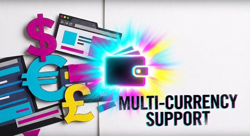
The Visual & Narrative Approach
This energetic mixed-media style bridges the physical and digital worlds by blending tactile paper textures with sleek screen overlays. The visual narrative features cut-outs of global currency symbols ($, €, £) "dancing" and merging into a unified digital wallet, perfectly illustrating Multi-currency support. The vibrant CMYK palette and rapid, stop-motion style editing create a playful yet sophisticated tone, suggesting that the platform creates order out of the chaotic reality of global finance.
Psychological Impact & KPI Focus
- Niche Psychology: The juxtaposition of "paper" (traditional banking/cash) and "digital overlays" (SaaS platform) subconsciously addresses the Physical/Digital Bridge challenge. It acknowledges the legacy aspect of money while championing the digital solution.
- Operational Impact: This style reduces the intimidation factor of multi-currency management, presenting it as dynamic and manageable. It is highly effective for a "Skippable Pre-Roll Ad" as the unique visual texture disrupts the standard "corporate sleek" pattern.
Strategic Implementation & Trade-offs
- Ideal Use Case: YouTube Pre-Roll Ads or disruption-focused social campaigns.
- Duration: 15-20 Seconds.
- Trade-off: The "collage" aesthetic can sometimes feel less "enterprise-grade" if not executed with high polish. It risks appearing too playful for very conservative financial institutions.
Companies using similar video content -
Multiplier – Global Payroll Solution – Simplifies hiring and paying employees across 170+ countries.
Oyster – Global Employment Platform – Offers payroll and HR management in 180+ countries.
Lano – Global Payroll Platform – Streamlines hiring and paying full-time employees and contractors.
5. Minimalist Flat 2D Vector
TOFU | Shaping Brand Perception

The Visual & Narrative Approach
This style employs a disciplined, minimalist aesthetic to project absolute clarity and professionalism. The isometric, top-down view of a pristine desk with a large, stylized checkmark on the monitor serves as the ultimate symbol of Automated Workflows. The consistent thick strokes and slate blue palette communicate stability, reliability, and corporate maturity. The narrative is one of "job done"—a celebration of the moment when complex tasks are completed error-free.
Psychological Impact & KPI Focus
- Niche Psychology: For the "Global Efficiency Architect" plagued by the fear of error, this visual is a balm. It leverages the psychology of "closure" (the checkmark) to signal reliability and finality.
- Operational Impact: The lack of clutter and shadows implies a lack of hidden problems or "shadow payroll" issues. It positions the software not just as a tool, but as a guarantor of accuracy, directly appealing to the desire for a frictionless, "set it and forget it" operational state.
Strategic Implementation & Trade-offs
- Ideal Use Case: LinkedIn feed posts and feature highlight carousels.
- Duration: 10-20 Seconds (looped).
- Trade-off: It risks being generic. To succeed, the "Micro-interactions" (the bounce of the checkmark, the slide of the bar) must be incredibly smooth and satisfying to denote quality engineering.
Companies using similar video content -
ADP – ADP Workforce Now – Provides scalable payroll, HR, time, and benefits management.
Gusto – Online Payroll & HR – Automates payroll, taxes, and benefits for remote teams.
BambooHR – HR Platform – Manages payroll, time tracking, and benefits from one platform.
6. 2D Line Art Animation
TOFU | YouTube
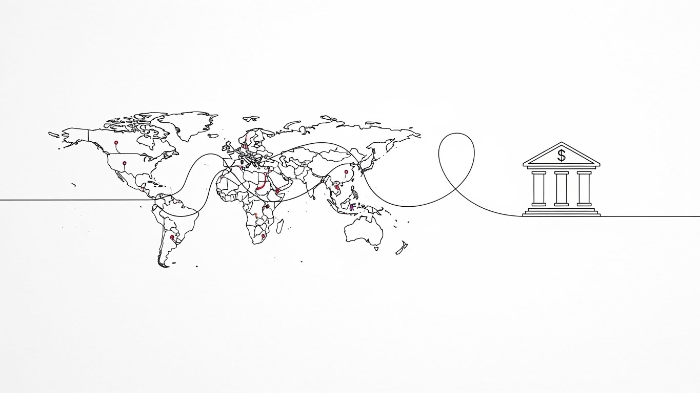
The Visual & Narrative Approach
Elegance and continuity define this style, where a single ink-black line draws a journey from a global map to a local bank icon. This continuous flow visually narrates the path of a Direct Deposit—unbroken, traceable, and direct. The textured paper background adds a layer of "contractual" authority, while the subtle red accents highlight key nodes. The smooth camera pan follows the line, reinforcing the narrative of a journey without interruption.
Psychological Impact & KPI Focus
- Niche Psychology: The "Continuous Line" is a powerful metaphor for integrity and lack of breakage in the payment rail. It reassures the viewer that there are no gaps in the system where money or data could be lost.
- Operational Impact: This style is highly effective for "Organic Search" education, as it allows the viewer to follow a logical process step-by-step. It appeals to the persona's need for logical, traceable workflows and reinforces the platform's capability to handle the "last mile" of payment delivery.
Strategic Implementation & Trade-offs
- Ideal Use Case: Explainer videos on specific features or "About Us" brand stories.
- Duration: 60-90 Seconds.
- Trade-off: This style is inherently slow-paced. It requires a compelling script to keep the viewer engaged, as the visuals are subtle rather than explosive.
Companies using similar video content -
Safeguard Global – Managed Payroll (GMP) – Offers adaptive, data-driven solutions for global employees.
RemotePass – Global HR & Payroll Platform – Manages teams worldwide with compliant payroll.
7. Abstract 2D Motion Graphics
TOFU | Category Creation

The Visual & Narrative Approach
This visualization tackles the core pain point of data chaos. It begins with chaotic, scattered dots (representing fragmented local payroll data) that flow into a central stream, morphing into neat, rhythmic rows. This visual arc perfectly demonstrates Payroll Reconciliation—the transformation of disorder into order. The modern violet and mint palette signals a contemporary, tech-forward solution, while the camera's forward movement through the stream creates a sense of progress and process efficiency.
Psychological Impact & KPI Focus
- Niche Psychology: Every payroll manager fears "Data Chaos." This style provides a "Visual Catharsis." Watching the scattered elements snap into a grid triggers a sense of relief and satisfaction, subliminally associating the software with the resolution of disorder.
- Operational Impact: This style helps visual a concept (reconciliation) that is often invisible, making the software's backend value tangible and appreciable. It validates the platform as an "Organizer" of global complexity.
Strategic Implementation & Trade-offs
- Ideal Use Case: Website background video (Hero section) or product feature pages.
- Duration: 15-30 Seconds (Loopable).
- Trade-off: It is metaphorical. It needs adjacent headlines or voiceover to clarify that the "dots" represent employee data and payment records.
Companies using similar video content -
CloudPay – Global Payroll Platform – Consolidates payroll data and automates tasks for efficiency.
Payslip – Global Payroll Control Platform – Integrates and validates employee and financial data.
8. Rapid UI Feature Montage
MOFU | Demand Gen
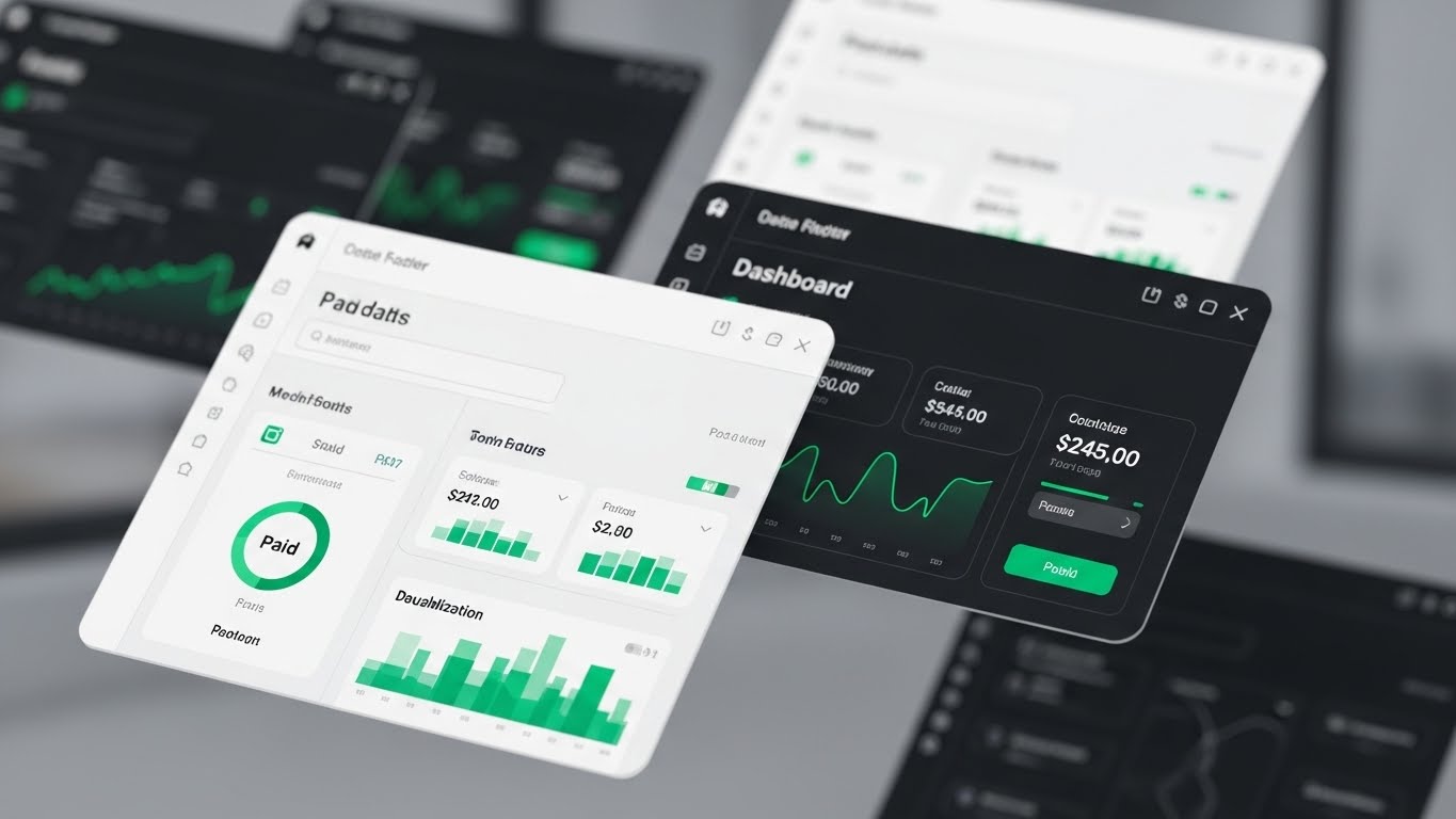
The Visual & Narrative Approach
Transitioning to the Middle of the Funnel (MOFU), this style moves from abstract metaphors to concrete reality. It features a high-fidelity 3D render of the software interface floating in a blurred, modern workspace. The camera performs rapid, rhythmic zoom-ins on specific widgets: a "Paid" status indicator turning green, a bar chart rising, and a notification bell ringing. This montage focuses entirely on Dashboard Visualization, highlighting the UI's polish and the immediate visibility of critical status updates.
Psychological Impact & KPI Focus
- Niche Psychology: Buyers are skeptical of "Vaporware." They want to see the actual product. This style builds "Product Trust" by showing high-resolution, tangible evidence of the interface's quality and usability.
- Operational Impact: It targets Demand Gen by stimulating the "desire to use." The focus on the "Paid" indicator triggers a dopamine hit—the ultimate goal of the payroll function achieved.
Strategic Implementation & Trade-offs
- Ideal Use Case: Retargeting ads for users who have visited the pricing or features page.
- Duration: 15-30 Seconds.
- Trade-off: The UI shown must be current. If the software updates, the video becomes obsolete. It requires close alignment with the product team's roadmap.
Companies using similar video content -
Rippling – Global Payroll Platform – Provides real-time financial visibility and dynamic spend policies.
Deel – Global People Platform – Offers a central view of your entire workforce in one place.
IRIS Software Group – IRIS Global – Centralized payroll solution with intuitive dashboard.
9. Split Screen: Optimized Reality
MOFU | ABM Awareness

The Visual & Narrative Approach
This classic yet powerful composition utilizes a split-screen to force a direct comparison. The left side creates a sense of claustrophobia: a dimly lit, chaotic desk piled high with photorealistic stacks of paper. The right side is open and airy: a pristine, navy and gold vector UI interface floating in a clean space. The visual contrast is stark, pitting the manual friction of the past against the Frictionless digital present. An arrow moves from the left (chaos) to the right (order), reinforcing the transition.
Psychological Impact & KPI Focus
- Niche Psychology: This leverages "Loss Aversion" and "Aspiration." It reminds the viewer of the pain they are currently feeling (the papers) and offers an immediate visual escape (the UI). It validates their struggle before offering the cure.
- Operational Impact: It creates a binary choice for the viewer: "Do you want this (mess) or that (clarity)?" This simplifies the decision-making process for buying committees and is highly effective for ABM Awareness.
Strategic Implementation & Trade-offs
- Ideal Use Case: Display Ads and email marketing campaigns where quick visual comprehension is necessary.
- Duration: Static Image or 5-10 Second Loop.
- Trade-off: It can feel clichéd if the "Before" state is too exaggerated. The "messy desk" must look realistic to maintain professional empathy.
Companies using similar video content -
Remote – Global HR Solutions – Simplifies global payroll and compliance for distributed teams.
Lano – Global Payroll Platform – Streamlines global hiring, payments, and payroll procedures.
10. Isometric 2D Motion Design
MOFU | Product Differentiation
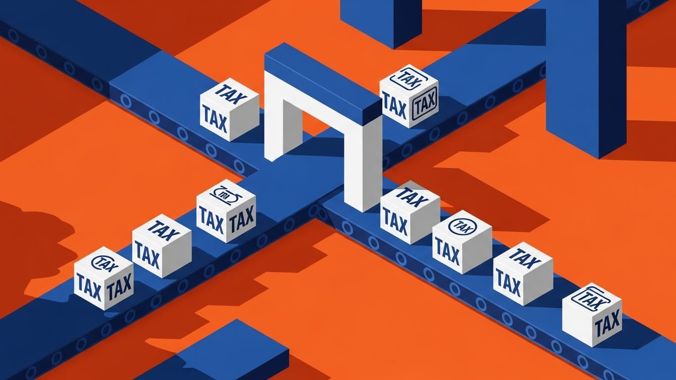
The Visual & Narrative Approach
This style uses the metaphor of a factory floor to visualize the industrial-strength processing power of the platform. Vibrant orange and deep blue conveyor belts move isometric blocks stamped with "Tax" through a processing gateway. This mechanical metaphor creates a strong narrative of reliability, repetition, and standard output—crucial for Tax Compliance. The clean, hard shadows and top-left lighting add a sense of depth and architectural solidity to the process.
Psychological Impact & KPI Focus
- Niche Psychology: Compliance is a repetitive, never-ending burden. This style reframes it as a "Systematic Process." The factory metaphor implies that the vendor has built a machine to handle the heavy lifting, allowing the human to supervise rather than labor.
- Operational Impact: This communicates "Robustness" and "Scale," showing that the system is designed to handle high volumes without breaking. It differentiates the product as an enterprise-grade engine.
Strategic Implementation & Trade-offs
- Ideal Use Case: Product pages specifically related to compliance or global tax engines.
- Duration: 30-45 Seconds.
- Trade-off: The factory metaphor can feel impersonal. It emphasizes efficiency over the human element. It is best paired with copy that highlights how this automation frees up people for more strategic work.
Companies using similar video content -
Papaya Global – Papaya Payroll OS – Guarantees 100% compliance with an AI-based engine.
Mercans – HR Blizz – Manages payroll across 160 countries with in-country expertise.
ADP – ADP GlobalView Payroll – Consolidates multi-country payrolls and standardizes workflows.
11. Clean UI Workflow (Light Mode)
MOFU | Feature Education
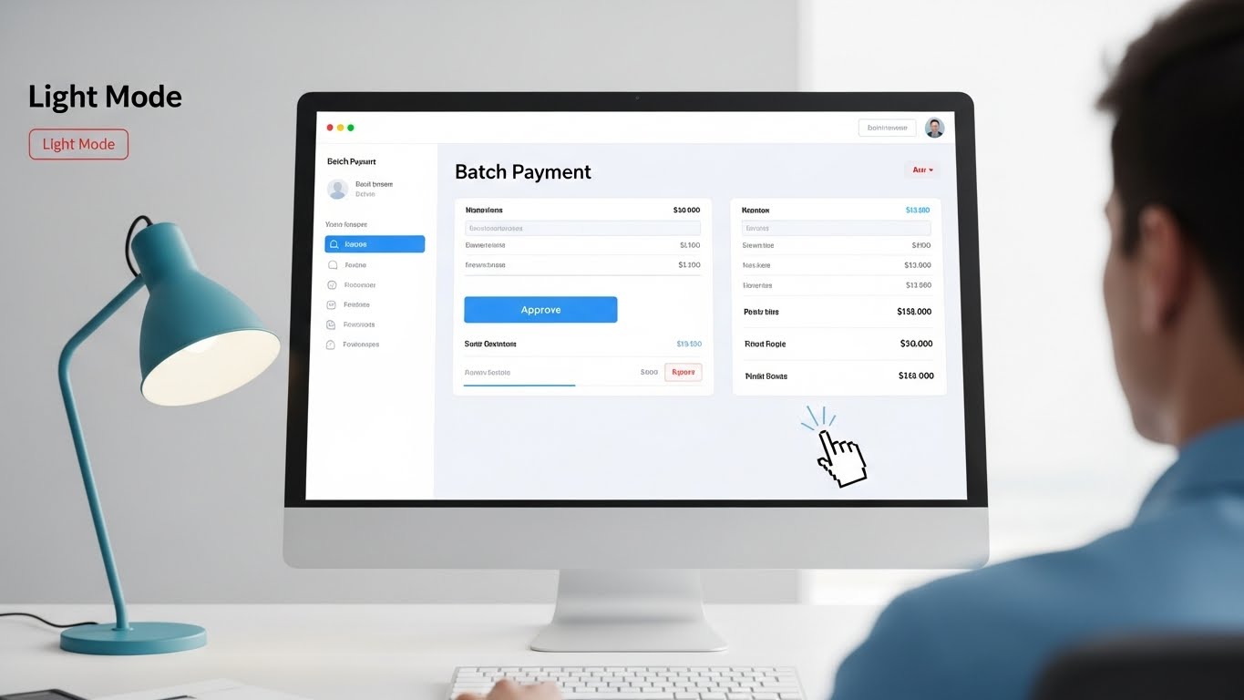
The Visual & Narrative Approach
This style strips away all cinematic distraction to focus on the "hero" of the daily workflow: the interface itself. Presented in a crisp, high-key lighting environment, the visual simulates an over-the-shoulder POV of a user executing a Batch Payment. The screen is sharp, displaying a "Batch Payment" interface in a calming sky blue and white palette. The narrative action is micro but critical: a mouse cursor hovering over and clicking the "Approve" button, followed by an immediate, satisfying confirmation animation.
Psychological Impact & KPI Focus
- Niche Psychology: Payroll managers are often traumatized by clunky, "grey-screen" legacy software. This "Light Mode" aesthetic signals hygiene, modernity, and clarity. It visually promises that the days of eye-straining, spreadsheet-induced headaches are over.
- Operational Impact: By focusing on the "Batch" aspect—approving thousands of payments with one click—it directly visualizes Operational Leverage. It demonstrates that the platform multiplies the user's effort, turning hours of work into a single second of execution.
Strategic Implementation & Trade-offs
- Ideal Use Case: Email nurture sequences for leads who have requested a demo, or specific "Feature Spotlight" videos in the help center.
- Duration: 45-60 Seconds.
- Trade-off: This style is purely functional. It lacks emotional grandeur. It relies entirely on the UI being actually beautiful; if the product UI is cluttered, this style will backfire.
Companies using similar video content -
Oyster – Global Employment Platform – Offers a simple interface for payroll approvals and expenses.
Gusto – Online Payroll & HR – Provides an intuitive, user-friendly dashboard for payroll.
Paylocity – Cloud-based Platform – Automates payroll processes and tax filing for mid-sized businesses.
12. Wireframe to Reality Transition
MOFU | Competitive Displacement
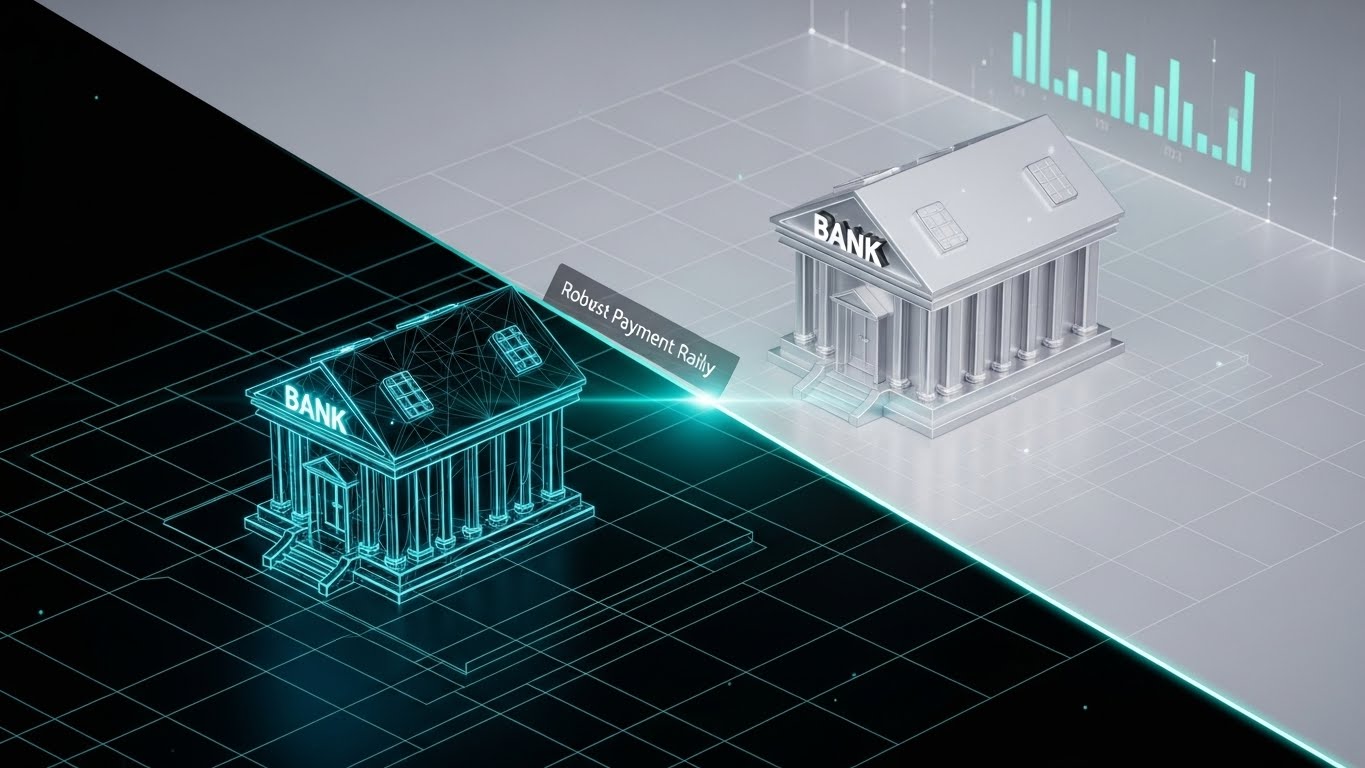
The Visual & Narrative Approach
This style is a powerful visual metaphor for "upgrading." The composition features a diagonal split. The bottom left reveals a "sketchy," blueprint-blue wireframe of a bank structure—representing the theoretical or legacy way of doing things. As the viewer's eye moves across the "scanning light" transition to the top right, the structure transforms into a solid, photorealistic silver and white building. This transformation visually creates the narrative of Robust Payment Rails evolving from a mere concept to a concrete, heavy-duty infrastructure.
Psychological Impact & KPI Focus
- Niche Psychology: Many competitors sell "vaporware"—solutions that look good on paper (wireframe) but fail in reality. This style psychologically positions your platform as the "Realized Solution." It validates the buyer's need for stability over novelty.
- Operational Impact: It effectively communicates Infrastructure Maturity. It tells the viewer, "We haven't just planned this; we have built it, and it is solid." This is crucial for displacing competitors who may be cheaper but less proven.
Strategic Implementation & Trade-offs
- Ideal Use Case: LinkedIn comparative ads or "Why Switch?" landing pages.
- Duration: 15-20 Seconds (Loopable).
- Trade-off: It is abstract. The text overlay must explicitly state what is being upgraded (e.g., "From Manual Rails to Automated Networks") to ensure the metaphor lands.
Companies using similar video content -
TMF Group – TMF Horizon – Simplifies administrative complexities across 86 jurisdictions.
Safeguard Global – Managed Payroll (GMP) – Focuses on efficient management of global employees.
13. 3D Parallax UI Presentation
MOFU | Website Visitor Re-engagement

The Visual & Narrative Approach
To visualize the depth of the platform without overwhelming the viewer, this style explodes the UI into floating glass layers in deep space. Using a sophisticated purple and pink gradient palette against a dark void, the animation separates the Tax Forms from the data fields. The camera uses a shallow depth of field to blur the rear layers, drawing focus to the frontmost "active" layer. This visual technique metaphorically "peels back" the layers of complexity, showing that while the system is deep, the user interaction is simple and focused.
Psychological Impact & KPI Focus
- Niche Psychology: Global tax compliance is multi-layered and terrifyingly dense. This style utilizes "Parallax Depth" to organize that density. It suggests that the software manages the depth (the background layers) so the user only needs to handle the surface (the foreground).
- Operational Impact: It creates a premium "Enterprise" feel. The glass texture and smooth motion suggest a high-end, carefully engineered product, directly influencing the perceived value of the software during re-engagement campaigns.
Strategic Implementation & Trade-offs
- Ideal Use Case: Retargeting ads (Display/Video) for users who bounced from the pricing page.
- Duration: 6-10 Seconds (Loop).
- Trade-off: It sacrifices readability for aesthetics. It is not for training; it is for impression. Do not use this to teach how to use a feature, use it to make the feature look desirable.
Companies using similar video content -
Papaya Global – Papaya Payroll OS – Offers advanced features for global payroll needs.
Multiplier – Global Payroll Solution – Simplifies tax compliance and employee benefits management.
14. Realistic Character Video
MOFU | Driving Demo Requests

The Visual & Narrative Approach
As we approach the bottom of the funnel, the human element becomes critical. This style features a high-end cinematic shot (ARRI Alexa style) of a professional woman in a teal blazer, standing confidently in a modern glass-walled office. She holds a tablet displaying a rising green "Success" graph. The focus is on her warm, confident expression. This visualizes Customer Success—not just the software, but the human partnership and expertise that backs it up.
Psychological Impact & KPI Focus
- Niche Psychology: B2B buyers don't just buy code; they buy a relationship. They fear being left alone with a complex tool. This style transfers trust from the person to the platform. It answers the silent question: "Who will help me when things go wrong?"
- Operational Impact: It humanizes the Service Level Agreement (SLA). It suggests that behind the "SaaS" is a "Service" that ensures the green graph (growth/success) is achieved.
Strategic Implementation & Trade-offs
- Ideal Use Case: "Book a Demo" video ads or the "Team/Support" section of the website.
- Duration: 30-60 Seconds.
- Trade-off: Production quality is binary: it is either excellent or terrible. Bad acting or poor lighting will immediately degrade trust. Authenticity is paramount.
Companies using similar video content -
Remote – Global HR Solutions – Provides dedicated support and local experts for compliance.
Playroll – Global HR Platform – Blends automation, local compliance, and human support.
IRIS Software Group – IRIS Global – Offers dedicated payroll experts and global support.
15. Dynamic Data Visualization
BOFU | ROI Justification

The Visual & Narrative Approach
When the conversation shifts to the CFO, emotional metaphors must yield to hard numbers. This style features 3D infographic elements rendered with a glossy plastic texture in forest green, lime, and white. Bar charts grow upwards like skyscrapers against a clean infinite background, physically demonstrating the output of the ROI Calculator. The low camera angle looks up at the bars, emphasizing the scale of growth and the dominance of the financial return.
Psychological Impact & KPI Focus
- Niche Psychology: The "Economic Buyer" (CFO) operates in a world of risk vs. reward. This visual speaks their language: linear, measurable growth. The solid, glossy texture implies that the data is "hard" and reliable, not projected or flimsy.
- Operational Impact: It serves as a visual "Proof of Value." By visualizing the savings (time, penalties avoided, headcount efficiency) as rising structures, it makes the intangible ROI concrete and defensible during budget approval meetings.
Strategic Implementation & Trade-offs
- Ideal Use Case: Sales decks, proposal PDFs, and closing-stage email sequences.
- Duration: Static Image or 10-15 Second Animation.
- Trade-off: It can be dry. It needs to be paired with customized data (e.g., "Your projected savings: $200k") to be truly effective. Generic charts are less persuasive.
Companies using similar video content -
ADP – ADP Workforce Now – Provides in-depth analytics and benchmarking into one platform.
Dayforce – Dayforce HCM – Offers AI-powered cloud HCM platform with data-driven insights.
Workday – Workday Payroll – Unifies core HR functions and provides efficient tracking.
16. Futuristic Neon/Dark Mode
BOFU | Risk Mitigation

The Visual & Narrative Approach
For the IT Buyer and CISO, security is the only feature that matters. This style utilizes a "Dark Mode" aesthetic to simulate the interior of a secure server environment. The palette is jet black with glowing neon green accents. A central shield icon forms from streams of binary code, visualizing Encryption and the impenetrable nature of the platform. The blurred rack lights in the background reinforce the context of a high-tech, monitored, and fortified infrastructure.
Psychological Impact & KPI Focus
- Niche Psychology: The IT buyer's primary emotion is fear of a breach. This visual acts as a "Security Blanket." The neon green is associated with "System Normal" and "Access Granted" (to authorized users only). It communicates that the platform is a fortress.
- Operational Impact: It visually answers the Due Diligence questionnaire. Instead of just saying "We are SOC2 compliant," it shows a visual representation of active defense, reducing the perceived risk of data sovereignty violations.
Strategic Implementation & Trade-offs
- Ideal Use Case: IT security whitepapers, "Security" page on the website, and technical blog posts.
- Duration: 15-30 Seconds.
- Trade-off: It can look "Cyberpunk" or "Gaming-focused" if overdone. It must retain a sense of corporate seriousness despite the neon aesthetic.
Companies using similar video content -
Remote – Global HR Solutions – Protects sensitive employee data with industry-leading security.
Deel – Global People Platform – Ensures compliance with local labor laws and security.
17. 2D Graphics Over Live Action
BOFU | Building Trust

The Visual & Narrative Approach
This style bridges the gap between the legal contract and the human relationship. It features a candid, warm-lit live-action shot of two professionals shaking hands—the universal symbol of agreement. Overlaid on this physical act is a glowing, stylized 2D shield icon in warm beige and gold. This creates a composite reality that visualizes the Employer of Record (EOR) model: real human connection protected by a digital legal framework.
Psychological Impact & KPI Focus
- Niche Psychology: Hiring internationally feels risky. "Is this legal? Am I compliant?" This visual calms those fears. The shield "protecting" the handshake visually explains that the software wraps the human relationship in compliance, allowing the managers to focus on the person, not the paperwork.
- Operational Impact: It simplifies the concept of Co-employment. It shows that the platform exists around the relationship, facilitating it without interfering with the human connection.
Strategic Implementation & Trade-offs
- Ideal Use Case: "About Us" videos, EOR service pages, and trust-building social posts.
- Duration: 15-20 Seconds.
- Trade-off: The tracking of the graphic to the video must be perfect. If the shield "slips" or jitters, it subconsciously suggests the protection is glitchy.
Companies using similar video content -
Deel – Deel EOR – Hires and onboards employees in 130+ countries compliantly.
Oyster – Employer of Record (EOR) – Manages payroll and HR for international employees.
Remote – Employer of Record (EOR) – Manages hiring, onboarding, payroll, and compliance.
18. Aspirational Stock Montage
BOFU | The Economic Buyer

The Visual & Narrative Approach
This style appeals directly to the ego and aspiration of the ultimate decision-maker (CEO/Founder). It uses a powerful silhouette shot of a leader looking out at a sunset orange city skyline—the classic "Visionary" stance. Crucially, the reflection in the window subtly reveals a digital overlay of a growth curve. This links the Economic Buyer's internal vision of market dominance with the external reality of the software's performance metrics.
Psychological Impact & KPI Focus
- Niche Psychology: Executives do not buy "payroll software"; they buy "expansion capability." This visual aligns the software with their self-image as a leader who conquers new markets. It moves the conversation from "cost center" to "strategic enabler."
- Operational Impact: It visualizes Scalability. The vast city skyline implies that the platform can handle unlimited growth, reassuring the buyer that they won't outgrow the solution in 18 months.
Strategic Implementation & Trade-offs
- Ideal Use Case: Annual Reports, Investor Decks, and high-level case studies (PDFs).
- Duration: Static Image.
- Trade-off: It borders on cliché. To work, the image quality must be premium, and the "digital overlay" must be subtle, not cartoonish. It works best as a static anchor image rather than a video.
Companies using similar video content -
ADP – ADP Lyric HCM – Designed for large enterprises with global reach and readiness.
Workday – Workday Payroll – Best suited for large enterprises with complex international operations.
TMF Group – TMF Horizon – Aids in simplifying administrative complexities in foreign markets.
19. Dark Mode UI Showcase
BOFU | The Technical Buyer
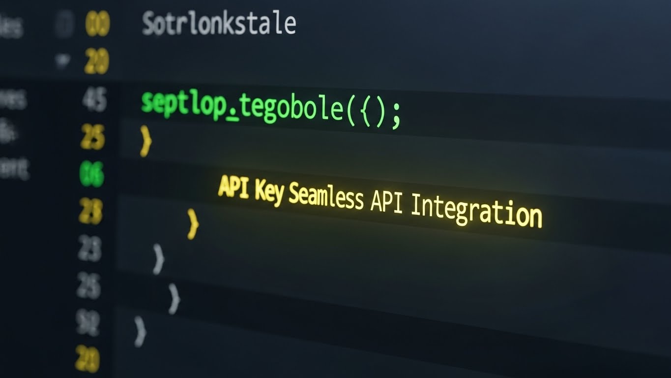
The Visual & Narrative Approach
To close the deal, you must win over the developers who have to implement the solution. This style ignores the pretty dashboard and goes straight to the code editor. It features an extreme close-up of a code screen in dark charcoal, with syntax highlighting in vibrant colors. The focus is on a glowing "API Key" string, representing Seamless API Integration. The clean, monospaced font and correct syntax signal respect for the engineering craft.
Psychological Impact & KPI Focus
- Niche Psychology: Developers hate "Marketing Fluff." They trust code. This visual signals "Developer Experience (DX)." It tells the technical team: "We are built for you. We have clean documentation, robust endpoints, and we won't break your build."
- Operational Impact: It proves Interoperability. It shows that this payroll data can flow effortlessly into the ERP, HRIS, and General Ledger without custom "spaghetti code."
Strategic Implementation & Trade-offs
- Ideal Use Case: Developer Documentation (Dev Docs), API Reference pages, and technical implementation guides.
- Duration: Static Image or Scrolling Code Animation.
- Trade-off: It is unintelligible to the non-technical buyer. Keep this strictly in the technical documentation or the "For Developers" section of the site.
Companies using similar video content -
Rippling – Global Payroll Platform – Integrates HR, IT, and finance functions into a unified system.
Deel – Remote API – Seamlessly integrates HR into workflows for global teams.
20. Isometric 3D Workflow
BOFU | Sales Cycle Acceleration

The Visual & Narrative Approach
The final hurdle in many sales cycles is the fear of migration: "How do we get our data from the old system to the new one?" This style uses a "Tilt-shift/Miniature" isometric city effect to visualize Data Migration. Small, glowing cyan data packets fly through the air between office buildings in a teal and white grid. This makes the migration process look organized, manageable, and magical, rather than messy and dangerous.
Psychological Impact & KPI Focus
- Niche Psychology: Migration is viewed as a surgery—painful and risky. This visual acts as "Anesthesia." The orderly movement of data packets minimizes the perceived risk of data loss. It frames migration as a smooth "flow" rather than a chaotic "dump."
- Operational Impact: It visualizes Connectivity. It shows that the platform connects the entire "city" of the organization (HR, Finance, Legal) into a unified grid, accelerating the final decision to sign the contract.
Strategic Implementation & Trade-offs
- Ideal Use Case: "Onboarding" explainers and Final Proposal emails.
- Duration: 30-45 Seconds.
- Trade-off: It must be clear that the "packets" are data. If the animation is too fast, it just looks like traffic. The motion needs to be rhythmic and purposeful to convey data integrity.
Companies using similar video content -
Payslip – Global Payroll Control Platform – Simplifies and standardizes international payroll processes.
CloudPay – Global Payroll Platform – Unifies global payroll and pay through a cloud-based system.
21. Low-Poly 3D Modeling
BOFU | Objection Handling

The Visual & Narrative Approach
This style addresses the complex friction of currency volatility using a "Low-Poly" aesthetic. The visual features a sphere composed of faceted, pastel-colored geometric puzzle pieces (pink, blue, yellow), each etched with a currency symbol ($, €, ¥). These pieces drift and click together with satisfying magnetic precision to form a perfect whole. The shadowless, soft-lighting environment creates a sense of calm, mathematical certainty, contrasting the usual chaos associated with fluctuating exchange rates.
Psychological Impact & KPI Focus
- Niche Psychology: For the CFO or Finance Director, FX (Foreign Exchange) volatility is a constant source of background stress. The "Puzzle" metaphor psychologically resolves this tension. It suggests that the platform takes the fragmented, jagged pieces of global currency markets and fits them into a unified, coherent sphere of control.
- Operational Impact: This style effectively handles objections regarding Cost Predictability. It visualizes the abstract algorithms of the software as a tangible, interlocking system that "solves" the currency puzzle, reassuring the buyer that margins are protected.
Strategic Implementation & Trade-offs
- Ideal Use Case: Retargeting ads for prospects who stalled due to pricing/currency concerns.
- Duration: 10-15 Seconds.
- Trade-off: The simplified "Low-Poly" look can appear childish if the textures aren't premium. It requires high-quality rendering (subsurface scattering) to look like high-end design rather than a mobile game.
Companies using similar video content -
Multiplier – Global Payroll Solution – Processes payroll in over 120 currencies.
Lano – Global Payroll Platform – Leverages experts for compliance and payments.
22. 2D Animation & UI Composition
Onboarding | Driving Freemium/Trials

The Visual & Narrative Approach
Onboarding is where the emotional journey shifts from "buying" to "learning." This style blends energetic 2D cel animation with UI elements to celebrate the user's first win. A stylized, vibrant character is shown high-fiving a floating UI element that displays a "%" symbol—representing the successful configuration of Statutory Deductions. The motion is fluid and "snappy," emphasizing the ease and speed of the setup process. The background is minimal, ensuring the focus remains on the interaction between the human and the software.
Psychological Impact & KPI Focus
- Niche Psychology: The "Fear of Setup" is a major barrier to adoption. New users worry about breaking the law by misconfiguring tax rules. This visual validates their competence. The high-five creates a "Moment of Delight," associating the completion of a complex compliance task with a feeling of joy and partnership.
- Operational Impact: This style directly drives Time-to-Value (TTV). By visualizing the setup as a quick, gamified interaction, it encourages users to complete the initial configuration steps immediately, reducing the "Empty State" drop-off rate.
Strategic Implementation & Trade-offs
- Ideal Use Case: Welcome emails or the "Success" screen after a user completes their first task.
- Duration: 5-8 Seconds (Loop).
- Trade-off: It is inherently casual. It works best for "Self-Service" or SMB tiers; it may feel too informal for enterprise implementation teams who prefer Gantt charts to high-fives.
Companies using similar video content -
Gusto – Online Payroll & HR – Includes customizable onboarding checklists and self-onboarding.
BambooHR – HR Platform – Proactive onboarding tasks create a compelling candidate experience.
23. Macro UI Micro-Interactions
Onboarding | Self-Serve Onboarding

The Visual & Narrative Approach
This style creates a tactile connection with the digital interface. It features an extreme close-up (Macro) of a photorealistic finger toggling a "Switch" on a glass surface. The switch glides from a dormant grey to a vibrant, glowing "Button Green" next to the text "Auto-Pay." The lighting highlights the texture of the skin and the reflection on the glass, making the action feel physically responsive. The narrative is simple: a small touch leads to a powerful automated outcome.
Psychological Impact & KPI Focus
- Niche Psychology: This leverages the concept of "Haptic Visuals"—visuals that evoke the sense of touch. For a user overwhelmed by a new dashboard, seeing a simple, binary interaction (On/Off) builds confidence. It promises that the system is responsive and easy to control.
- Operational Impact: This is a potent tool for Ticket Deflection. By showing exactly how simple a feature is to enable, it empowers users to help themselves, reducing the burden on the customer support team during the critical first 30 days.
Strategic Implementation & Trade-offs
- Ideal Use Case: In-app tooltips, "New Feature" modals, or help center articles.
- Duration: 3-5 Seconds (Loop).
- Trade-off: It has zero context. It shows how to click, but not why. It must be embedded within a context that explains the value of the feature being toggled.
Companies using similar video content -
Rippling – Global Payroll Platform – User-friendly, self-serve interface for employee lifecycle.
Deel – Global People Platform – User-friendly and very easy to use.
BambooHR – HR Platform – Easy to simplify HR with award-winning solutions.
24. 3D X-Ray Visualization
Onboarding | Reducing Implementation

The Visual & Narrative Approach
To explain the "black box" of payroll processing, this style uses an X-Ray effect. A translucent, bone-white and blue server unit reveals its internal architecture: a mesmerizing network of glowing green optical fibers and perfectly meshed gears turning in unison. This visualizes the System Uptime and the complex backend logic that the user never sees but relies upon. The "inner glow" suggests a system that is alive, active, and healthy.
Psychological Impact & KPI Focus
- Niche Psychology: Implementation leads often worry about "what's under the hood." Is the code spaghetti, or is it engineered? This style provides "Technical Validation." It satisfies the engineer's need to see the mechanism, proving that the platform's beauty isn't just skin deep.
- Operational Impact: It builds trust in Data Integrity. By showing the "internal wiring" as organized and clean, it subconsciously reassures the client that their data is flowing through a structured, robust engine, not a chaotic void.
Strategic Implementation & Trade-offs
- Ideal Use Case: Technical implementation webinars, "System Architecture" documentation, or loading screens.
- Duration: 15-30 Seconds.
- Trade-off: It is abstract. Real servers don't have gears. The metaphor must be clear: "This represents our processing logic," otherwise, it can be confusing to non-technical users.
Companies using similar video content -
CloudPay – Global Payroll Platform – Strong data security to protect sensitive payroll information.
iiPay – Global Payroll Services – Operates on advanced, cloud-based technology for proficient services.
25. 2D Character-Driven Story
Retention | Accelerating TTV

The Visual & Narrative Approach
Retention is about reminding the user of the life-improvement the software provides. This style uses a high-quality, Pixar-esque 3D character design to depict the "After State." A payroll manager is shown in a cozy, warm-lit home office, leaning back in a plush chair with a satisfied smile. A steaming coffee cup sits on the desk, and the laptop screen glows with a large green checkmark and the word "DONE." This narrative visualizes the reclaim of personal time thanks to efficient Time and Attendance management.
Psychological Impact & KPI Focus
- Niche Psychology: Burnout is real in the payroll profession. This visual sells "Relief." It doesn't focus on the features of the software, but on the result of the software: the ability to finish work on time and relax. It connects the brand with work-life balance.
- Operational Impact: It reinforces Net Promoter Score (NPS). Users who feel the software gives them time back are more likely to recommend it. This visual reminds them of that specific value proposition right before a renewal discussion.
Strategic Implementation & Trade-offs
- Ideal Use Case: "Year in Review" emails, customer newsletters, or login screens on Friday afternoons.
- Duration: Static Image or 10-15 Second Animation.
- Trade-off: It must be relatable. If the character looks too cartoonish or the setting is unrealistic, it can feel patronizing. The "coziness" must feel earned.
Companies using similar video content -
Gusto – Online Payroll & HR – Automatically calculates and syncs team's hours, PTO, and holidays.
BambooHR – HR Platform – Tracks hours and manages multi-rate pay.
Paycor – Payroll + Time Tracking – Modernizes people management with real-time payroll calculations.
26. Minimalist Flat Hybrid
Retention | Knowledge Base

The Visual & Narrative Approach
When users are stuck, they need clarity, not cinema. This style employs a clean, hybrid vector aesthetic to visualize the transition from confusion to understanding. A turquoise question mark (?) in the center of a white void morphs smoothly into a glowing peach-colored lightbulb. This simple, elegant transformation visualizes the function of the Knowledge Base: turning questions into instant answers. The spotlight effect adds a sense of focus and solution.
Psychological Impact & KPI Focus
- Niche Psychology: A confused user is an anxious user. This visual acts as a "Cognitive Reset." The clean white space and smooth morphing motion lower the user's heart rate and signal that the answer is simple and accessible.
- Operational Impact: It promotes Self-Service Adoption. By making the concept of "finding an answer" look effortless and bright, it encourages users to search the knowledge base before logging a support ticket.
Strategic Implementation & Trade-offs
- Ideal Use Case: Header images for the Help Center, "No Results" search pages (turning to a suggestion), or support email signatures.
- Duration: 3-5 Seconds (Loop).
- Trade-off: It is generic. The "lightbulb" is a cliché. It relies entirely on the quality of the animation (the "morph") to feel modern and premium rather than stock clip art.
Companies using similar video content -
Remote – Global HR Solutions – Provides country guides for managing business in 100+ countries.
Oyster – Global Employment Platform – Offers global hiring guides and HR best practices.
27. Abstract 3D AI Visualization
Retention | Reducing Churn

The Visual & Narrative Approach
To retain enterprise clients, you must prove you can scale with them. This style uses an abstract 3D visualization of a neural network. Metallic silver and neon blue nodes (spikes) rise from a digital grid, connecting via glowing filaments to form a dense, unbreakable net. The camera flies through these connections, suggesting infinite expandability. This visualizes Scalable Architecture—a system that grows stronger and more interconnected as more data is added, rather than slowing down.
Psychological Impact & KPI Focus
- Niche Psychology: The "Fear of Outgrowing" the platform is a primary driver of churn for growing companies. This visual reassures the stakeholders that the system is a "Living Network" capable of handling complexity. The "spikes" suggest a solid, anchored infrastructure.
- Operational Impact: It supports Long-Term Contract Renewals. It positions the platform as future-proof infrastructure, discouraging the client from looking for "enterprise" alternatives because they already have one.
Strategic Implementation & Trade-offs
- Ideal Use Case: Quarterly Business Review (QBR) presentations, "Product Roadmap" updates, or background video for the "Enterprise" page.
- Duration: 15-20 Seconds (Loop).
- Trade-off: It is cold. It lacks humanity. It appeals strictly to the CTO/CIO mindset and should be used in technical contexts.
Companies using similar video content -
Deel – Global People Platform – Built to scale with organizations of all sizes.
Workday – Workday Payroll – Cloud-based architecture allows for easy access and scalability.
Globalli – Helios Platform – Leverages AI for automation and insights in workforce management.
28. Photorealistic 3D Renders
Expansion | Driving Deep Feature Adoption

The Visual & Narrative Approach
Expansion often involves selling premium modules like Treasury Management. This style uses the language of "Premium Finance." A photorealistic, gold coin spins elegantly on a reflective black marble surface. Etched into the face of the coin is a detailed globe texture. The dramatic lighting captures sharp specular highlights, emphasizing weight and value. This elevates the concept of Treasury Management from a utility to a strategic asset.
Psychological Impact & KPI Focus
- Niche Psychology: This appeals to the "CFO Persona." Gold, marble, and precision are visual codes for wealth, stability, and high finance. It subconsciously positions the software module as a tool for wealth preservation and strategic capital allocation.
- Operational Impact: It drives Upsell Revenue. By packaging the feature as a "Premium" product through high-fidelity visuals, it justifies a higher price point and deeper adoption of financial modules.
Strategic Implementation & Trade-offs
- Ideal Use Case: Digital brochures for add-on modules, premium tier landing pages, or executive summary covers.
- Duration: Static Image or 5-10 Second Spin Loop.
- Trade-off: It creates high expectations. If the actual software interface for Treasury Management is clunky or dated, the disconnect between the marketing visual (gold coin) and the product (grey grid) will cause disappointment.
Companies using similar video content -
TMF Group – TMF Horizon – Offers comprehensive solutions for financial, legal, and employee administration.
Papaya Global – Papaya Payroll OS – Provides finance teams clear overview and control over workforce spending.
29. Holographic UI over 3D Render
Expansion | Driving Upsell

The Visual & Narrative Approach
When a client expands to a new country, they need to feel like they are in command. This style places a semi-transparent, holographic blue globe floating above a futuristic black boardroom table. Specific regions light up with neon flag icons and "Local Filing" data tags. The scan lines and "Projected" aesthetic create a "War Room" or "Command Center" vibe. This visualizes the capability of Local Filing in new markets as a strategic operation managed from headquarters.
Psychological Impact & KPI Focus
- Niche Psychology: Global expansion is chaotic. This visual offers "Centralized Command." It appeals to the VP of Operations who wants to oversee a global footprint from a single seat. It makes the world feel small and manageable.
- Operational Impact: It facilitates Cross-Border Expansion. By visualizing new markets as "nodes" that can be simply lit up on a map, it reduces the perceived friction of entering a new jurisdiction, encouraging the client to add more countries to their contract.
Strategic Implementation & Trade-offs
- Ideal Use Case: Upsell email campaigns ("Launching in Germany?"), in-app dashboard "Global View" teasers, or expansion webinars.
- Duration: 10-20 Seconds.
- Trade-off: It looks "Sci-Fi." It must be grounded with text that explains the specific practical benefit (e.g., "Instant German Tax Compliance") to avoid looking like a movie prop.
Companies using similar video content -
Multiplier – Global Payroll Solution – Partners with local payroll and tax experts in 150+ countries.
Papaya Global – Papaya Payroll OS – Connects various payroll aspects and aligns data and processes.
30. Hyper-lapse Stock Footage
Expansion | Driving Referrals

The Visual & Narrative Approach
To conclude the journey, we return to the real world, but accelerated. This style uses hyper-lapse footage of a busy city street at night, with lights blurring into streaks of energy. Overlaid on this environment are crisp, white UI elements (HUD style) showing "Wire Transfer Initiated" and "Confirmed." This juxtaposes the chaotic speed of the real world with the instant, calm precision of Wire Transfer technology.
Psychological Impact & KPI Focus
- Niche Psychology: Speed is the ultimate currency. This visual proves that the platform moves faster than the world around it. It appeals to the user's desire to be ahead of the curve.
- Operational Impact: It drives Referrals and Advocacy. Users who feel they are using "cutting-edge" technology are more likely to advocate for it. This visual style encapsulates the feeling of "powered by the future," which is a strong emotional driver for sharing.
Strategic Implementation & Trade-offs
- Ideal Use Case: Social media "Hype" reels, event background loops, or "Thank You" pages after a successful transaction.
- Duration: 10-15 Seconds.
- Trade-off: The stock footage must be generic enough to be global (no recognizable landmarks that alienate other regions) but specific enough to feel urban and professional.
The Visual Operations Doctrine: A Strategic Knowledge Base
To transition from "creating videos" to "engineering visual assets," the Global Efficiency Architect must adopt a systemic approach. This Knowledge Base synthesizes the 30 visual styles into three operational frameworks designed to maximize ROI, adoption, and strategic alignment.
Strategic Alignment & Visual Architecture
The "Pre-Production" Strategy: Defining the Operating System
Before a single frame is rendered, the visual language must be codified to ensure it serves the business, not just the brand.
- The Cognitive Load Audit: Payroll is inherently heavy. Before approving a visual style, audit the complexity of the topic. If the topic is "Tax Code 401," use Style 2 (Abstract 2D) to simplify. If the topic is "Global Reach," use Style 1 (Cinematic) to inspire. Match the visual density to the cognitive weight of the subject.
- Role-Based Visual Mapping: Differentiate your visual strategy by user role. The CFO (Economic Buyer) responds to Style 15 (Data Viz) and Style 28 (Photorealism)—styles that imply value and solidity. The Payroll Admin (Daily User) responds to Style 11 (Clean UI) and Style 23 (Macro UI)—styles that promise ease and speed. Do not show the CFO a tutorial; do not show the Admin a sunset.
- The "Glanceability" Standard: In a high-stakes payroll environment, clarity is safety. Enforce a "Glanceability" standard for all operational videos (Styles 23, 26, 30). If the viewer cannot understand the core message within 3 seconds without audio, the visual has failed.
- The Advids Strategic Audit: Partnering with a specialized agency like Advids allows for a "Visual Audit" before production. This ensures that your library of assets shares a unified "Visual DNA," preventing the disjointed operational experience that comes from using disparate freelancers.
- Legacy System Integration: When visualizing the bridge between old banking rails and new SaaS (Style 12), ensure the visual language respects the legacy infrastructure while highlighting the modern overlay. This "Respectful Disruption" prevents alienating traditional stakeholders who are still attached to the old ways.
- Accessibility in Motion: Global platforms have global users. Motion graphics must be designed for accessibility. Ensure high contrast in Style 3 (Kinetic Typography) and provide text alternatives for Style 27 (Abstract) to support neurodiverse users and those with visual impairments.
- The Mobile-First Mandate: Your users are increasingly approving payments on the go. Ensure all styles, especially Style 11 (Clean UI), are legible on mobile screens. A video that works on a 27-inch monitor but fails on an iPhone is an operational liability.
- Brand Voice Consistency: Your visual voice must match your written voice. If your brand is "The Safe Choice," lean heavily on Style 5 (Minimalist Vector) and Style 16 (Security Mode). If your brand is " The Disruptor," leverage Style 3 (Kinetic) and Style 30 (Hyper-lapse). Inconsistency breeds distrust.
- Standardization vs. Customization: Use standardized templates (Styles 8, 11, 23) for feature updates to maintain velocity. Reserve bespoke, high-budget production (Styles 1, 14, 28) for "Flagship" brand moments.
- The Cross-Departmental Bridge: Use these visuals to unify terminology. If Sales calls it "Global Pay" and Ops calls it "Cross-Border Remittance," use Style 2 (Abstract Merge) to visually link the terms, creating a shared internal language.
Operational Adoption & Implementation
The "Deployment" Phase: Embedding Visuals into Workflow
A video stored on YouTube is marketing; a video embedded in the dashboard is infrastructure.
- Overcoming "Big Brother" Anxiety: When introducing employee monitoring or time-tracking features, use Style 25 (Character Story) to frame the technology as a helper, not a warden. Visual empathy is the fastest route to user acceptance.
- The Micro-Learning Shift: Replace 50-page PDF manuals with a library of 30-second clips using Style 23 (Macro UI). Users learn faster by watching a specific micro-interaction than by reading a text block.
- Just-in-Time Support: Embed Style 26 (Minimalist Hybrid) videos directly into the "Help" widgets of the software. Trigger them contextually—if a user hovers over "Tax Settings" for too long, offer a 10-second visual guide. This is "Pre-emptive Support."
- Gamification of Training: Use Style 22 (2D Animation) to celebrate training milestones. Visual rewards (high-fives, unlocking badges) for completing certification modules increase engagement with dry compliance material.
- Reducing Support Ticket Volume: There is a direct correlation between the quality of your Style 11 (Clean UI) videos and the volume of "How-to" tickets. Invest in these styles as a cost-saving measure, not just a marketing expense.
- Remote Onboarding: For distributed global teams, physical seminars are impossible. Use Style 24 (X-Ray) and Style 9 (Split Screen) to visually demonstrate the architecture and value proposition during remote onboarding webinars, ensuring all regions understand the "Why" behind the "How."
- Standard Operating Procedures (SOPs): Transform text-based SOPs into visual process flows using Style 6 (Line Art). A continuous line animation is easier to memorize than a numbered list, improving adherence to compliance protocols.
- Feedback Loops: Use interactive video elements (embedded forms in Style 29) to gather user feedback on new features immediately after they watch the explainer.
- Scalable Localization: Global payroll requires global languages. Design Style 2 (Abstract) and Style 5 (Vector) graphics to be text-agnostic or easily replaceable. Separate the text layer from the animation layer to allow for rapid translation into 20+ languages without re-animating.
- Leadership Communication: When the VP of Finance presents to the Board, provide them with Style 18 (Aspirational) and Style 15 (Data Viz) assets. Empower your internal champions to sell your success visually.
Measuring Impact & Future-Proofing
The "ROI" Phase: Quantifying Success and Scaling Up
Visual assets are investments. They must demonstrate a return and adapt to the future.
- Beyond "Views": Stop measuring video success by "Views." Measure it by "Time-to-Competency" (did they learn faster?) and "Feature Adoption Rate" (did they use the tool after watching?). Style 8 (Rapid UI) should be correlated with click-throughs to the specific feature it showcases.
- The "Idle Time" Metric: Monitor how long users spend "idle" or confused on a screen. Correlate this data with the deployment of Style 23 (Macro UI) tooltips. A successful visual strategy reduces idle time.
- Compliance Velocity: Measure how quickly a new regulation (e.g., a change in EU data laws) is understood and actioned by your user base after releasing a Style 10 (Isometric Compliance) explainer.
- Retention and Churn: High-quality UX visualization (Style 11, Style 25) contributes to "Sticky" product experiences. Track the retention rates of cohorts exposed to high-touch onboarding videos versus those who were not.
- The AI Visual Frontier: Prepare your visual library for Generative AI. Styles like Style 1 (Gen AI) and Style 27 (Abstract) are precursors to a future where the dashboard generates a custom video explanation for every unique data anomaly a user faces.
- Scalability of Assets: Build a "Visual Component Library." If you change your UI color, you shouldn't have to re-shoot 50 videos. Use vector-based styles (Style 5, Style 11) where colors can be updated globally via code or batch processing.
- The Advids Partnership: As your feature set explodes, your internal team will struggle to keep the video library current. A long-term partnership with Advids ensures that your "Visual Documentation" scales in lockstep with your code deployment, preventing "Documentation Debt."
- Benchmarking Success: Do not compare your visuals to other payroll software; compare them to consumer apps (Spotify, Uber). Your users expect Style 30 (Hyper-lapse) quality speed and polish, even in B2B software. "Good enough" is a competitive risk.
- The ROI of Safety: For compliance features, quantify the cost of errors. If Style 16 (Security Mode) reduces phishing attempts or data mishandling by 10%, that value is calculable and huge.
- Final Call to Innovation: Treat video as infrastructure. It is not "content" to be consumed and forgotten; it is the visual interface of your knowledge. By mastering these 30 styles, you transform your platform from a tool that is merely "used" into a partner that is "understood."
PHASE 8: GLOBAL RULES AND INPUTS
(Executed throughout the generation process.)
Companies using similar video content -
Deel – Global People Platform – Facilitates secure and fast transactions for global workforce management.
Remote – Global HR Solutions – Offers greater flexibility, speed, and support for global payroll.
Rippling – Global Payroll Platform – Known for its time-saving automation and customizable workflows.
Author & Editor Bio


