
Introduction: Visualizing the Invisible Architecture of Trust
In the high-stakes world of Governance, Risk, and Compliance (GRC), the greatest challenge is often invisibility. How do you demonstrate the strength of a firewall, the integrity of an audit trail, or the fluidity of a remediation workflow when these critical assets exist only as code and policy? For Chief Risk Officers and Compliance Leaders, the "Physical/Digital Divide" is a daily barrier; stakeholders struggle to perceive the tangible value of protection until a crisis hits.
The industry is rapidly evolving to bridge this gap. The Global GRC Platform Market is projected to reach USD 64.6 Billion by 2025, signaling a massive shift towards automated, integrated ecosystems. Yet, as investment rises, so do the stakes. With global regulatory fines soaring to a record-breaking $19.3bn in 2024, the cost of opacity is no longer just operational efficiency—it is existential.
This guide is designed for the forward-thinking GRC leader who understands that seeing is the first step to securing. We move beyond generic "corporate video" tropes to explore specific visualization styles that translate complex regulatory concepts into clear, actionable assets. By leveraging these visual frameworks—from kinetic typography that fuses silos to x-ray views that reveal internal threats—you can shift the conversation from "cost center" to "strategic enabler."
1. The Brand Authority Accelerator
TOFU | Brand Awareness

The Visual & Narrative Approach
Scenario: This style utilizes a "Hybrid: Bold Kinetic Typography & Abstract Motion" aesthetic to visualize the unification of disparate GRC forces. Imagine a scenario where large, heavy geometric block shapes representing the words "RISK" and "CONTROL" hurtle towards each other in a Stark White digital void. The narration is punchy and rhythmic. Upon impact, instead of shattering, they fuse together with a magnetic snap to form a perfectly structured, glowing monolith. The color palette is vibrant, featuring Electric Indigo and Hot Pink to disrupt the traditional "safe blue" of the industry.
Narration Tone: Confident, Transformative, High-Energy.
Psychological Impact & KPI Focus
- Niche Psychology: For a CRO, the fear of "siloed data" is constant. This visual metaphor directly addresses that anxiety by physically demonstrating integration. It reframes the collision of business speed and regulatory brakes as a constructive event.
- Operational Impact: It simplifies the complex "Physical/Digital Divide" by treating abstract concepts as tangible objects.
- Primary KPI: Brand Recall (Vertical Social).
Strategic Implementation & Trade-offs
- Best Use Case: High-impact social ads (TikTok, Reels, LinkedIn Shorts) designed to stop the scroll.
- Trade-off: This style prioritizes mood over mechanics. It stops the scroll but does not explain how the integration works technically. Use it solely for top-of-funnel awareness.
- Duration: 10-15 seconds.
Companies using similar video content -
ServiceNow – GRC – Unifying IT, risk, and security operations.
Archer – Integrated Risk Management – Connecting disparate risk functions for holistic view.
MetricStream – Connected GRC – Fusing governance, risk, and compliance data seamlessly.
2. The Data Purification Metaphor
TOFU | Market Education

The Visual & Narrative Approach
Scenario: Here we employ "Abstract 2D flat vector organic modern motion graphics" to depict the purification of regulatory data. As seen in the reference, liquid-like shapes in Glossy Teal and Soft Coral flow smoothly through a series of stylized, translucent funnels. The narrative focuses on "clarity from chaos." We see raw, amorphous data entering the funnels and emerging as pure, crystalline streams. The smooth bezier curves and high-gloss reflections suggest a frictionless, automated process.
Narration Tone: Educational, Reassuring, Smooth.
Psychological Impact & KPI Focus
- Niche Psychology: This style leverages the "Cognitive Ease" principle. Compliance officers are often overwhelmed by "dirty data." Seeing the visual transformation from liquid chaos to crystalline order provides a sense of relief and control.
- Operational Impact: Visually demonstrates the "ETL (Extract, Transform, Load)" process of compliance data without needing boring technical diagrams.
- Primary KPI: Time-on-Page (Website).
Strategic Implementation & Trade-offs
- Best Use Case: "How It Works" sections on the website or introductory explainer videos.
- Trade-off: The "organic" look can sometimes feel too soft for highly aggressive cybersecurity sectors. It works best for Governance and Compliance, where "smooth operations" is the key promise.
- Duration: 30-45 seconds.
Companies using similar video content -
OneTrust – DataGuidance – Filtering and clarifying global regulatory intelligence efficiently.
BigID – Data Intelligence Platform – Discovering and purifying sensitive data for compliance.
Securiti.ai – Data Command Center – Automating data privacy and security purification processes.
3. The Infinite Repository
TOFU | Shaping Brand Perception

The Visual & Narrative Approach
Scenario: Using "Generative AI cinematic video," this style constructs a hyper-realistic "Hall of Records." As visualized in the reference, towering monoliths of data stretch infinitely upwards, bathed in ethereal Slate Blue light. The camera performs a slow, majestic push-in movement. The lighting is dramatic, with anamorphic lens flares hitting the sleek, metallic surfaces. The "Hall of Records" text overlay anchors the scene, presenting the repository not just as storage, but as a monument to truth.
Narration Tone: Epic, Timeless, Trustworthy.
Psychological Impact & KPI Focus
- Niche Psychology: This speaks directly to the C-Suite's desire for legacy and stability. It frames compliance not as a chore, but as the foundation of the enterprise.
- Operational Impact: Addresses the fear of data loss or corruption by visualizing a "Single Source of Truth" that is vast enough to house the entire enterprise's history.
- Primary KPI: Brand Sentiment (YouTube Ad).
Strategic Implementation & Trade-offs
- Best Use Case: Brand manifestos, event openers, or high-level YouTube pre-roll ads targeting decision-makers.
- Trade-off: While visually stunning, Generative AI is best used for establishing mood and scale rather than showing specific UI text, which can sometimes render inconsistently.
- Duration: 15-30 seconds.
Companies using similar video content -
IBM – OpenPages with Watson – Vast, secure repository for enterprise risk data.
Diligent – Governance Cloud – Monumental storage for board and executive data.
Workiva – Connected Reporting – Infinite, auditable repository for financial and ESG data.
4. The Executive Decision
TOFU | ABM Awareness
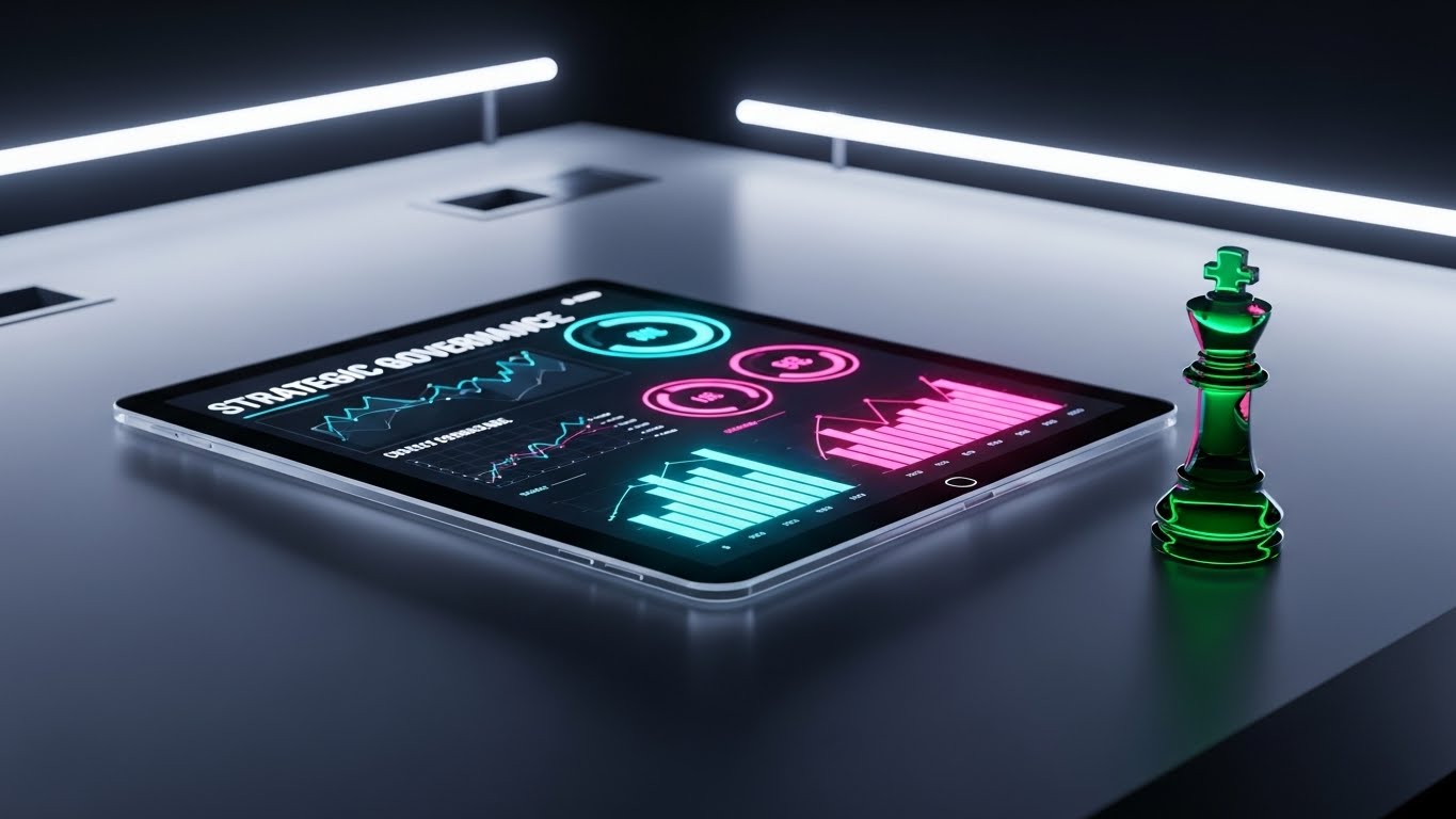
The Visual & Narrative Approach
Scenario: This "Photorealistic 3D Render" places the viewer directly at the decision-maker's desk. A polished Obsidian surface reflects the glow of a tablet displaying a strategic governance dashboard. The key element, as seen in the visual, is the solitary Emerald Green glass chess piece (the King). This is not just decoration; it visually equates compliance with high-level strategy. The lighting is moody and cinematic, highlighting the sharp contrast between the dark desk and the vibrant data.
Narration Tone: Sophisticated, Direct, Elite.
Psychological Impact & KPI Focus
- Niche Psychology: This is pure "Status Signaling." It targets the ego of the executive persona, reinforcing that their role is one of strategy (Chess), not just box-checking.
- Operational Impact: It bridges the digital (tablet screen) and the physical (desk/chess piece), grounding the software in the reality of the boardroom.
- Primary KPI: Click-Through Rate (LinkedIn ABM).
Strategic Implementation & Trade-offs
- Best Use Case: Account-Based Marketing (ABM) campaigns targeting CEOs, CFOs, and Board Members on LinkedIn.
- Trade-off: The lack of complex motion means it carries less information density. It relies entirely on the accompanying ad copy to drive the specific value proposition.
- Duration: 6-10 seconds (Looping).
Companies using similar video content -
LogicManager – ERM Software – Providing strategic insights for executive risk decisions.
Riskonnect – Integrated Risk Management – Empowering strategic risk-based decisions for leaders.
5. The Shield of Simplicity
TOFU | Vertical Social Organic

The Visual & Narrative Approach
Scenario: "Minimalist Flat 2D Vector" art strips away all noise to focus on a single concept: Protection. Against a solid Cyber Yellow background, a simplified, flat icon of a server rack is shown. Suddenly, a geometric shield in Charcoal and Slate Grey snaps into place, encasing the server. The design uses hard edges, no gradients, and negative space to create a bold, instantly readable symbol.
Narration Tone: Snappy, Concise, Binary.
Psychological Impact & KPI Focus
- Niche Psychology: In a world of complex threats, this style offers "Cognitive Relief." It signals that the solution is straightforward, binary, and absolute.
- Operational Impact: Instantly communicates "Firewall" or "Data Sovereignty" without technical jargon. It is a visual shorthand for security.
- Primary KPI: Scroll-Stop Rate (TikTok/Reels).
Strategic Implementation & Trade-offs
- Best Use Case: Rapid-fire social content, feature announcements, or retargeting ads.
- Trade-off: The extreme simplicity means nuance is lost. You cannot explain how the firewall works, only that it works.
- Duration: 5-8 seconds.
Companies using similar video content -
Vanta – Compliance Automation – Simple, instant security and compliance certification.
Drata – Automated Compliance – Effortless security and compliance posture management.
Secureframe – Security Compliance – Quick, clear path to security certifications.
6. The X-Ray Insight
TOFU | Skippable Pre-Roll Ad

The Visual & Narrative Approach
Scenario: This "3D X-Ray Visualization" turns the building inside out. As shown in the visual, we see a modern office structure rendered in Translucent Blue glass. Inside, "Skeleton White" nodes represent secure data points. The narrative tension is created when one node pulses Red (risk). Immediately, a protective green containment field materializes around it, neutralizing the threat. The rotating camera emphasizes that security is omnipresent.
Narration Tone: Technical, Omniscient, Secure.
Psychological Impact & KPI Focus
- Niche Psychology: It satisfies the "God-View" fantasy of the Risk Manager—the ability to see through walls and detect threats that are invisible to the naked eye.
- Operational Impact: Perfectly illustrates the concept of "Endpoint Security" and internal compliance monitoring within a physical facility.
- Primary KPI: Time-on-Page (Risk Mitigation Page).
Strategic Implementation & Trade-offs
- Best Use Case: Homepage hero sections or product feature pages focusing on monitoring and security.
- Trade-off: Requires high-fidelity 3D assets. If the building looks generic, it undermines the feeling of high-tech sophistication.
- Duration: 15-20 seconds.
Companies using similar video content -
Qualys – Vulnerability Management – X-ray view into internal network vulnerabilities.
Tenable – Nessus – Deep visibility into internal asset security posture.
7. The Blueprint of Reality
TOFU | Risk Mitigation Hook
The Visual & Narrative Approach
Scenario: This "Wireframe to Reality Transition" uses a split-screen technique. The left side shows a chaotic, wireframe blueprint of a "Risk Matrix" in Blueprint Blue lines. This seamlessly transitions to the right side, which transforms into a solid, matte-finished 3D structure (symbolizing the platform) in Rendered Silver and Concrete Grey. The visual metaphor represents building a category from a concept to a tangible reality.
Narration Tone: Inspirational, Proven, Concrete.
Psychological Impact & KPI Focus
- Niche Psychology: Addresses the skepticism of "vaporware." It proves that the vendor has moved beyond theory (wireframe) and offers a solid, deployable solution (reality).
- Operational Impact: Visualizes the implementation process—taking a client's messy requirements and solidifying them into a robust system.
- Primary KPI: Conversion Rate (Landing Page).
Strategic Implementation & Trade-offs
- Best Use Case: Landing pages for whitepapers, case studies, or "Category Creation" content that defines a new approach to GRC.
- Trade-off: The transition must be seamless. Any misalignment breaks the illusion of precision.
- Duration: 30-45 seconds.
Companies using similar video content -
ProcessUnity – Third-Party Risk Management – Building robust vendor risk programs from policy.
Hyperproof – Compliance Operations – Transforming compliance frameworks into actionable reality.
8. The Order from Chaos
MOFU | Category Creation

The Visual & Narrative Approach
Scenario: "Dynamic Data Visualization" brings the concept of lead capture to life. The visual shows Emerald Green and Stark White data orbs floating in a dark gradient void. Funnels with glowing edges collect these chaotic particles. The camera utilizes an abstract macro zoom, focusing on the moment the chaotic orbs organize into neat, structured rows inside the funnel, symbolizing the transition from "Raw Data" to "Actionable Intelligence."
Narration Tone: Efficient, Precise, Satisfying.
Psychological Impact & KPI Focus
- Niche Psychology: Appeals to the operational need for efficiency and taxonomy. It visualizes the relief of having a system that automatically sorts the "noise" of the market.
- Operational Impact: Demonstrates "Automated Data Governance" and "Lead Capture" capabilities without showing a boring spreadsheet.
- Primary KPI: Lead Generation (Social Ad).
Strategic Implementation & Trade-offs
- Best Use Case: Social media ads targeting mid-level managers who deal with data entry and reporting pain points.
- Trade-off: It is highly abstract. Text overlays are essential to explain what is being sorted.
- Duration: 15-20 seconds.
Companies using similar video content -
ComplyAdvantage – Financial Crime Risk – Organizing vast amounts of financial crime data.
Refinitiv (LSEG) – Risk & Compliance – Structuring market data for regulatory insights.
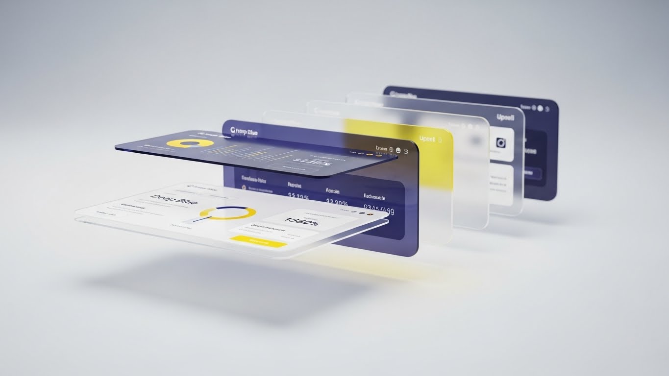
9. The Feature Velocity
MOFU | Demand Gen & Lead Capture
The Visual & Narrative Approach
Scenario: This "Rapid UI Feature Montage" is all about speed and volume. Multiple stylized UI screens slide into the frame from different angles. The screens display unique "Predictive Insight" graphs that stand out in Bright Cyan and Magenta against generic grey blocks. The aesthetic uses motion blur to convey speed and modernity.
Narration Tone: Fast, Energetic, Comprehensive.
Psychological Impact & KPI Focus
- Niche Psychology: Targets the "FOMO" (Fear Of Missing Out) and the desire for a comprehensive toolkit. It suggests, "We have a tool for every problem you have."
- Operational Impact: The rapid display of UI signals "Product Maturity." It shows the platform is robust, feature-rich, and ready for deployment.
- Primary KPI: Feature Awareness (Retargeting Ad).
Strategic Implementation & Trade-offs
- Best Use Case: Retargeting ads for users who have visited the pricing or features page but haven't converted.
- Trade-off: The pace is too fast to read the data. Do not use this to teach how to use a specific feature; use it only to impress with the breadth of capabilities.
- Duration: 10-15 seconds.
Companies using similar video content -
AuditBoard – Connected Risk Platform – Rapid display of integrated audit and risk features.
Onspring – GRC Software – Showcasing breadth of GRC automation capabilities.
11. The Micro-Moment of Trust
MOFU | Feature Education

The Visual & Narrative Approach
Scenario: This "Macro UI Micro-Interactions" style zooms in to an extreme close-up, turning a mundane interface element into a hero. As visualized in the reference, we focus on a single toggle switch labeled "ENCRYPTION KEY." The texture is palpable—smooth, matte plastic in Dark Grey against a soft Pastel Blue light. The camera lingers on the "ON" position, capturing the subtle, satisfying glow that signifies activation. The shallow depth of field blurs the background, demanding total attention on this singular action of security.
Narration Tone: Intimate, Precise, Assured.
Psychological Impact & KPI Focus
- Niche Psychology: In GRC, "God is in the details." A compliance officer's anxiety often stems from small oversights. By fetishizing the detail of a single control, this style subliminally communicates that the platform creates a secure environment down to the pixel. It validates the user's need for granular control.
- Operational Impact: Visualizes the "Zero Trust" concept by giving weight and substance to the act of enabling encryption. It transforms a click into a commitment.
- Primary KPI: Time-on-Page (Feature Deep Dive).
Strategic Implementation & Trade-offs
- Best Use Case: Feature pages dedicated to security specifications or "Security First" sections of a whitepaper.
- Trade-off: The extreme zoom lacks context. It shows quality but not workflow. Use it to punctuate a broader narrative, not to explain the whole system.
- Duration: 6-10 seconds (Looping).
Companies using similar video content -
N/A – No companies mapped to this placeholder style.
12. The Compliance Transformation
MOFU | Competitive Displacement
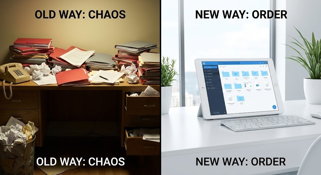
The Visual & Narrative Approach
Scenario: Using a "Split Screen: Optimized Reality and UI" technique, we create a stark binary comparison. The left side reveals the "Old Way"—a chaotic, dimly lit desk overflowing with Red and Grey paper files, symbolizing manual audits and spreadsheet fatigue. In sharp contrast, the right side presents the "New Way"—a pristine, bright modern workspace featuring a tablet with a Clean White and Blue interface. The narrative frames this not just as a software upgrade, but as a lifestyle transformation for the compliance team.
Narration Tone: Empathetic (Left) to Liberating (Right).
Psychological Impact & KPI Focus
- Niche Psychology: This taps into "Pain Agitation." Every GRC professional has lived the scenario on the left. The visual validation of their struggle creates empathy, while the right side offers the "promised land" of organized tranquility.
- Operational Impact: Clearly demonstrates "Competitive Displacement" by visually obsolescing manual processes (paper/Excel) in favor of automated digital governance.
- Primary KPI: Click-Through Rate (LinkedIn Ad).
Strategic Implementation & Trade-offs
- Best Use Case: LinkedIn ads targeting users of legacy systems or spreadsheets. The contrast works even without sound.
- Trade-off: It can feel slightly cliché if the "Old Way" is exaggerated too comically. Keep the chaos realistic to maintain professional respect.
- Duration: 15-20 seconds.
Companies using similar video content -
Transcend – Data Privacy Infrastructure – Precision control over data privacy settings.
Ethyca – Privacy Infrastructure – Granular control for data privacy and compliance.
13. The Everyday Command Center
MOFU | LinkedIn Organic
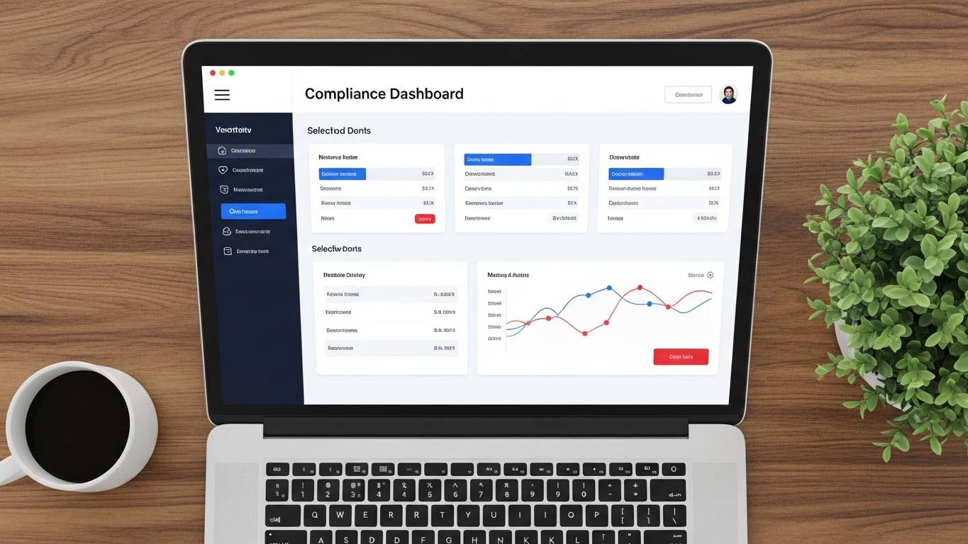
The Visual & Narrative Approach
Scenario: This "Clean UI Workflow (Light Mode)" composition grounds the software in reality. We see a high-fidelity mockup of the "Compliance Dashboard" on a laptop, situated on a warm wooden desk with a coffee cup and plant. The UI itself is minimalist, using Clean White backgrounds and Soft Blue accents to display critical data. The camera angle is a "flat lay" top-down view, suggesting organization and control. The narrative is quiet, focusing on the ease of daily monitoring.
Narration Tone: Professional, Calm, Routine.
Psychological Impact & KPI Focus
- Niche Psychology: Reduces "Implementation Anxiety." By placing the software in a relatable, pleasant office context, it suggests that the platform fits naturally into the user's daily life without disruption. It signals that compliance can be a calm part of the morning routine, rather than a fire drill.
- Operational Impact: Showcases the "User Experience (UX)" and interface design, proving that the tool is modern and approachable, unlike clunky legacy enterprise software.
- Primary KPI: Engagement Rate (LinkedIn Organic).
Strategic Implementation & Trade-offs
- Best Use Case: LinkedIn organic posts, case study headers, or "Day in the Life" blog posts.
- Trade-off: Static or low-motion visuals are less attention-grabbing for paid ads. This is better for nurturing an audience that already follows you.
- Duration: 20-30 seconds.
Companies using similar video content -
StandardFusion – GRC Software – Transforming manual compliance to automated order.
Quantivate – GRC Software – Shifting from spreadsheet chaos to integrated governance.
14. The Gamification of Security
MOFU | Non-Skippable Ads
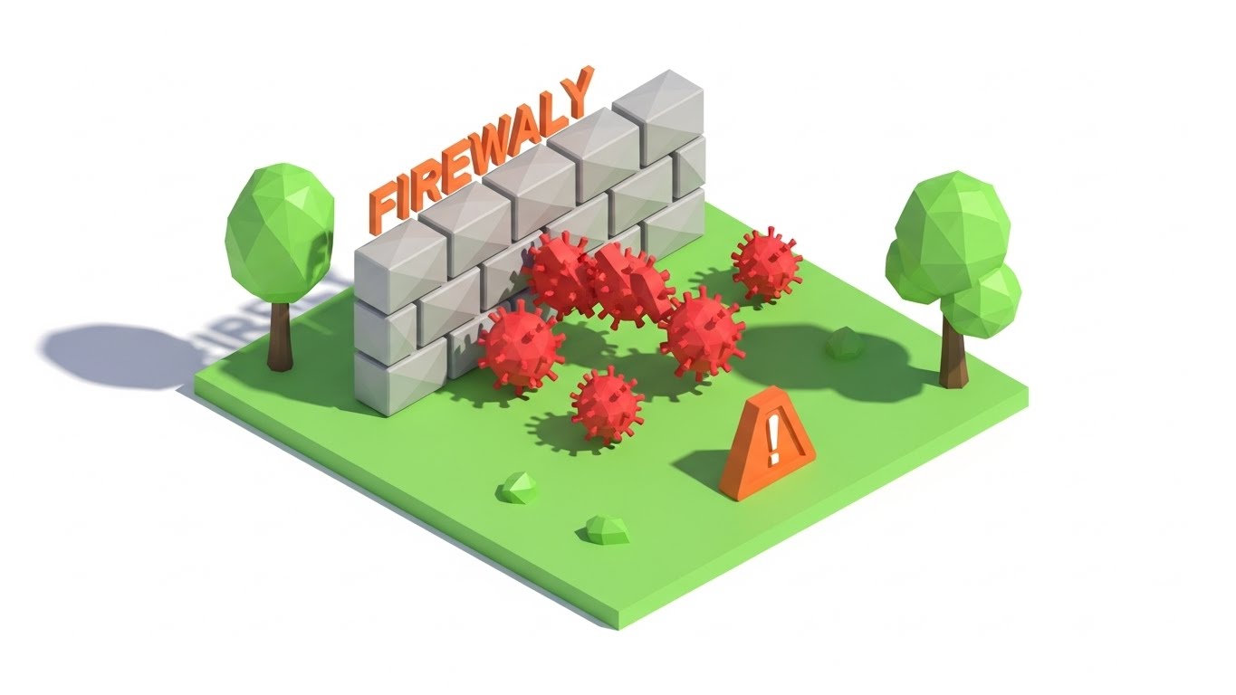
The Visual & Narrative Approach
Scenario: Utilizing "Low-Poly 3D Modeling," this style simplifies complex cyber threats into a digestible visual language. We see an isometric view of a digital "safe zone." A stylized "FIREWALL" built from grey geometric blocks stands firm against an onslaught of jagged Red virus shapes. When the threats hit the wall, they bounce off harmlessly. The aesthetic is clean, almost playful, using bright greens and oranges to make the concept of "Intrusion Prevention" instantly understandable to non-technical stakeholders.
Narration Tone: Simple, Fast, Punchy.
Psychological Impact & KPI Focus
- Niche Psychology: "Cognitive Ease" is paramount here. For Board Members or non-technical stakeholders involved in the purchase, complex network diagrams are opaque. This style translates "Cybersecurity Posture" into a universal concept: A wall that works.
- Operational Impact: Visualizes "Automated Defense" and "Perimeter Security" without the need for code snippets or server racks.
- Primary KPI: Video Completion Rate (Short Ads).
Strategic Implementation & Trade-offs
- Best Use Case: YouTube Bumper ads (6 seconds) or pre-roll ads where the message must be understood instantly.
- Trade-off: The "playful" look might lack the gravitas required for a CISO (Chief Information Security Officer) deep dive. Use it for broad awareness or non-technical buying committee members.
- Duration: 6-15 seconds.
Companies using similar video content -
LogicGate – Risk Cloud – Intuitive dashboard for daily risk management.
Reciprocity (now LogicManager) – ZenGRC – Clean UI for routine compliance monitoring.
15. The Champion's Confidence
BOFU | Building Trust & Credibility

The Visual & Narrative Approach
Scenario: This "Lifestyle Stock with UI Overlay" focuses on the human emotional benefit of the software. We see a confident executive—the "Internal Champion"—in a sunlit boardroom. As he looks back at a large presentation screen, a semi-transparent, futuristic UI overlay appears, displaying a prominent Green progress bar: "Audit Readiness: 100%." The lighting is warm and golden, reinforcing the feeling of relief and success. The narrative is about the peace of mind that comes from being prepared.
Narration Tone: Triumphant, Relieved, Human.
Psychological Impact & KPI Focus
- Niche Psychology: Targets the "Imposter Syndrome" or fear of failure common in compliance roles. It sells the feeling of being the hero in the boardroom—the person who delivered a clean audit. It connects the software to personal career success.
- Operational Impact: Humanizes the data. It shows that the ultimate output of "Real-time Monitoring" is human confidence and organizational stability.
- Primary KPI: Conversion Rate (Demo Request).
Strategic Implementation & Trade-offs
- Best Use Case: Testimonial pages, "Why Us" sections, or retargeting ads for users who abandoned the sign-up flow.
- Trade-off: Relying on stock footage can feel generic if the UI overlay isn't high-quality. The overlay must look integrated, not just slapped on.
- Duration: 10-15 seconds.
Companies using similar video content -
Arctic Wolf – Security Operations – Simplified visualization of threat detection and blocking.
SecurityScorecard – Cybersecurity Ratings – Gamified view of security posture and defense.
16. The Return on Integrity
BOFU | ROI Justification

The Visual & Narrative Approach
Scenario: Using "Abstract 3D AI Visualization," we tackle the hardest question: ROI. A glowing green trend line rises sharply against a dark grid. As it ascends, the line itself morphs into a stylized, wireframe Dollar Sign structure constructed from light nodes. The background is clean and dark to ensure the Green and Gold elements pop. The narrative explains that compliance isn't just a cost center—it preserves value and prevents costly fines.
Narration Tone: Logical, Financial, Strategic.
Psychological Impact & KPI Focus
- Niche Psychology: CFOs view GRC as insurance—a necessary cost. This visual reframes it as an asset protection mechanism. The upward trend appeals to the "Growth Mindset," linking risk management to financial health.
- Operational Impact: Visualizes "Cost Avoidance" and "Value Preservation." It translates the abstract concept of "risk reduction" into the universal language of business: Currency.
- Primary KPI: Sales Presentation Engagement.
Strategic Implementation & Trade-offs
- Best Use Case: Slide decks for budget approval, pricing pages, or CFO-targeted email campaigns.
- Trade-off: It is symbolic. It does not show how the money is saved (e.g., efficiency vs. fine avoidance). It requires accompanying copy to define the specific ROI vector.
- Duration: 10-20 seconds.
Companies using similar video content -
Hyperproof – Compliance Operations – Building confidence for audit readiness.
AuditBoard – Audit & Risk Management – Empowering internal champions with audit success.
17. The Clarity Reveal
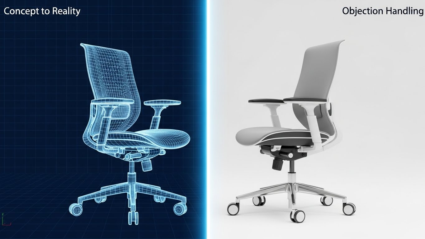
BOFU | Overcoming Objections

The Visual & Narrative Approach
Scenario: This "2D Animation & UI Composition" uses a cel-shaded aesthetic to address the objection of "It's too complicated." A stylized hand enters the frame and physically swipes away a cluster of grey, stormy clouds labeled "Complexity." Behind the clouds, a bright Yellow sun and a pristine, simplified UI screen are revealed. The contrast between the scribbly, messy clouds and the clean, sharp lines of the UI is the central visual metaphor.
Narration Tone: Light, Reassuring, Problem-Solver.
Psychological Impact & KPI Focus
- Niche Psychology: Addresses "Change Resistance." Teams often fear that new software will be difficult to learn. This animation visually promises that the tool removes obstacles rather than adding them. It creates a sense of "lifting the fog."
- Operational Impact: Visualizes "User-Centric Design" and the removal of friction in compliance workflows.
- Primary KPI: Click-Through Rate (Retargeting).
Strategic Implementation & Trade-offs
- Best Use Case: Retargeting ads for users who visited technical documentation but didn't convert. It reassures them of simplicity.
- Trade-off: The cartoon style is less "enterprise" than other styles. Use it selectively to disarm, not to demonstrate deep technical features.
- Duration: 6-10 seconds.
Companies using similar video content -
Fusion Risk Management – Operational Resilience – Visualizing ROI through business continuity and risk reduction.
MetricStream – GRC Platform – Demonstrating financial value of integrated risk management.
18. The Digital Fortress
BOFU | Risk Mitigation

The Visual & Narrative Approach
Scenario: "Holographic UI over 3D Render" blends the physical and digital to visualize protection. A realistic, imposing black server rack stands in a dark room. Suddenly, a futuristic Cyan holographic dome, composed of hexagonal mesh, materializes over it. The dome glows with Magenta accents, symbolizing active threat repulsion. The low camera angle gives the hardware a sense of scale and invincibility.
Narration Tone: Powerful, High-Tech, Protective.
Psychological Impact & KPI Focus
- Niche Psychology: Appeals to the "Guardian" archetype of the CISO. It visualizes the intangible concept of a "Firewall" or "Encryption Layer" as a physical shield, providing a sense of tangible security for physical assets.
- Operational Impact: Illustrates "Infrastructure Security" and "Data Sovereignty." It connects the software (the hologram) directly to the hardware (the server) it protects.
- Primary KPI: Time-on-Page (Security/Trust Center).
Strategic Implementation & Trade-offs
- Best Use Case: The "Security" or "Trust Center" page of the website. It reassures prospects that their data is housed in a fortress.
- Trade-off: It is a metaphor. It doesn't show the actual dashboard. It sells the feeling of security, not the management of it.
- Duration: 10-15 seconds.
Companies using similar video content -
Clausematch – Policy Management – Simplifying complex regulatory documents.
Ascent – Regulatory Knowledge Automation – Clearing regulatory complexity with AI.
19. The Analyst's Sanctuary
BOFU | Sales Cycle Acceleration

The Visual & Narrative Approach
Scenario: This "Dark Mode UI Showcase" is tailored for the power user. We see a sleek, Jet Black dashboard populated with Electric Green and Neon Lime data visualizations. The charts are dense—line graphs, heat maps, and histograms—glowing against the dark background. This is the interface of a Security Operations Center (SOC) at 2 AM. The aesthetic is "Cyberpunk Professional," implying deep, granular control without eye strain.
Narration Tone: Serious, Urgent, Expert.
Psychological Impact & KPI Focus
- Niche Psychology: Signals "Pro-Grade Tools." Dark mode is the preferred aesthetic for developers and security analysts who spend hours staring at screens. This style signals that the platform is built for them, not just for executives.
- Operational Impact: Demonstrates "Real-Time Threat Intelligence" and granular data capability. It shows that the system can handle density and complexity with elegance.
- Primary KPI: Demo Request (Technical Lead).
Strategic Implementation & Trade-offs
- Best Use Case: LinkedIn ads targeting technical job titles (Security Analyst, IT Director).
- Trade-off: The density can be overwhelming for non-technical buyers. Keep this targeted to the users who will actually be "hands-on-keyboard."
- Duration: 10-15 seconds.
Companies using similar video content -
Palo Alto Networks – Firewall – Visualizing advanced threat protection for infrastructure.
Fortinet – FortiGate – Holographic representation of network security and defense.
20. The Human Invitation
BOFU | Driving Demo Requests

The Visual & Narrative Approach
Scenario: Using "Generative AI Realistic Character video," we break the fourth wall. A professional female consultant in a sharp navy suit makes direct eye contact with the viewer. The background is a soft-focus, busy office, implying she is the calm expert in the center of activity. She gestures naturally towards a floating, holographic "Sign Up" button. The lighting is cinematic portrait style. The narrative is a direct invitation: "Let us handle the complexity so you can focus on growth."
Narration Tone: Welcoming, Direct, Helpful.
Psychological Impact & KPI Focus
- Niche Psychology: At the very bottom of the funnel, the barrier is often the fear of being left alone with a new tool. This style simulates "White Glove Service." It promises that there are humans (or at least a human-centric support system) behind the code.
- Operational Impact: Personalizes the "Call to Action (CTA)." It transitions the user from passive viewing to active engagement.
- Primary KPI: Conversion Rate (Landing Page CTA).
Strategic Implementation & Trade-offs
- Best Use Case: The final section of a landing page or a "Thank You" page video.
- Trade-off: Gen AI characters must be high quality (lip-sync, eye movement) to avoid the "Uncanny Valley" effect, which can erode trust.
- Duration: 15-30 seconds.
Companies using similar video content -
Splunk – Enterprise Security – High-contrast analytics for security operations.
CrowdStrike – Falcon Platform – Dark mode UI for advanced endpoint detection.
21. The Chaos Controller
BOFU | Objection Handling
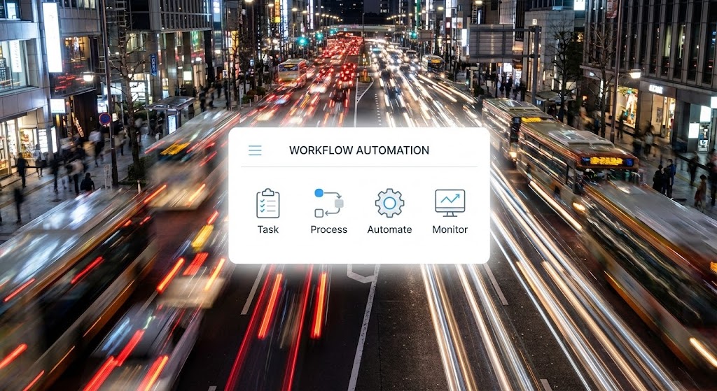
The Visual & Narrative Approach
Scenario: This style uses "Hyper-lapse Stock Footage with Data" to create a visceral contrast between external chaos and internal control. As seen in the reference, the background captures a high-speed, long-exposure hyper-lapse of a frantic city street at night—traffic blurring into streaks of light, symbolizing the relentless speed of regulatory change and market volatility. Superimposed in the center is a pristine, stationary bright White UI panel labeled "WORKFLOW AUTOMATION." It remains perfectly sharp and unmoving, processing tasks with calm precision while the world spins out of control.
Narration Tone: Steady, Anchored, Zen.
Psychological Impact & KPI Focus
- Niche Psychology: Targets the "Burnout" and "Bandwidth Anxiety" felt by compliance teams. It acknowledges that the external environment is chaotic and uncontrollable. The psychological relief comes from the visual promise that the platform provides a "Fixed Point" of stability amidst the storm.
- Operational Impact: Visualizes "Operational Resilience" and "Automated Governance." It demonstrates that the software’s internal logic operates independently of external volatility.
- Primary KPI: Conversion Rate (Re-engaging Stalled Deals).
Strategic Implementation & Trade-offs
- Best Use Case: Social media retargeting ads during high-stress regulatory periods (e.g., end-of-year audits) or objection-handling slides in sales decks.
- Trade-off: The background footage must be high quality; if it looks like cheap stock, the premium feel of the UI is diminished.
- Duration: 10-15 seconds.
Companies using similar video content -
Vanta – Compliance Automation – Welcoming users to a guided compliance journey.
Drata – Automated Compliance – Personal invitation to streamline security compliance.
22. The Economic Evidence
BOFU | The Economic Buyer

The Visual & Narrative Approach
Scenario: This style, "2D Graphics Over Live Action," bridges the gap between human effort and digital output for the CFO. We see a realistic medium shot of a professional in a modern workspace, smiling as they review a report on their laptop. Floating around them in 3D space are crisp, flat 2D vector icons in Vivid Blue and White: coins stacking (Cost Savings), lightning bolts (Speed), and gears (Efficiency). These graphics pop into existence in sync with the upbeat audio, visually annotating the "invisible" financial benefits of the software.
Narration Tone: Pragmatic, Results-Oriented, Bright.
Psychological Impact & KPI Focus
- Niche Psychology: The "Economic Buyer" (CFO/Procurement) cares less about features and more about outcomes. This mixed-media approach validates their decision by literally surrounding the user with symbols of success. It creates a "Winner's Aura" around the purchase.
- Operational Impact: Translates abstract metrics like "Time Saved" or "ROI" into tangible visual assets that occupy physical space. It answers "What do I get for this budget?" instantly.
- Primary KPI: Email Click-Through Rate (Proposal Follow-ups).
Strategic Implementation & Trade-offs
- Best Use Case: Email sequences sent to the financial decision-maker to justify the budget or attached to final proposals.
- Trade-off: Requires excellent tracking (match-moving) of the graphics. If the icons "slide" around the person loosely, it looks amateurish.
- Duration: 15-20 seconds.
Companies using similar video content -
Resolver – Risk Management – Stabilizing operational flux amidst external chaos.
LogicManager – ERM Software – Providing a fixed point of control in a volatile environment.
23. The Frictionless Factory
Onboarding | Accelerating Time-to-Value

The Visual & Narrative Approach
Scenario: Using a trendy "Claymorphism" (soft, matte plastic 3D) aesthetic, this style reimagines onboarding as a frictionless toy factory. An isometric view shows a miniature layout where smooth white spheres (users) roll gently down a soft Pastel Cyan track. They glide through "checkpoints" and "enrichment stations" effortlessly, guided by gravity and good design. The lighting is global and soft, eliminating harsh shadows. The vibe is satisfying and stress-free, countering the dread of complex software setup.
Narration Tone: Gentle, Guiding, Simple.
Psychological Impact & KPI Focus
- Niche Psychology: Implementation is the phase with the highest anxiety ("Will this be hard to set up?"). The soft, tactile "toy" aesthetic triggers a sense of playfulness and ease, lowering the cognitive barrier to entry.
- Operational Impact: Visualizes "Automated Provisioning" and "Guided Setup." It promises that the system does the heavy lifting, carrying the user through the process.
- Primary KPI: Onboarding Completion Rate.
Strategic Implementation & Trade-offs
- Best Use Case: Welcome emails, the first screen of the in-app product tour, or "Getting Started" videos.
- Trade-off: The aesthetic is stylized. It does not show the actual UI, so it must be followed quickly by a real interface tutorial.
- Duration: 10-15 seconds (Looping).
Companies using similar video content -
Workiva – Connected Reporting – Visualizing efficiency gains in financial reporting.
SAP – GRC Solutions – Demonstrating economic benefits of integrated governance.
24. The Human-AI Handshake
Onboarding | Self-Serve Onboarding

The Visual & Narrative Approach
Scenario: "2D Line Art Animation" strips the visual down to its essence. A single, continuous Black Ink line flows across a textured White Paper background. The line morphs fluidly, first forming a human hand, then a robotic hand, and finally interlocking them in a handshake. The animation is sophisticated and fluid. It symbolizes the "Hybrid Intelligence" approach—where human judgment meets AI automation—validating the user's role.
Narration Tone: Sophisticated, Minimalist, Fluid.
Psychological Impact & KPI Focus
- Niche Psychology: Addresses the fear of "AI Replacement." It reframes the software not as a tool that replaces the compliance officer, but as a partner that shakes their hand. It builds trust in the "Co-pilot" model.
- Operational Impact: Visualizes the concept of "Assisted Governance" and "SLA Agreement" without needing complex sci-fi metaphors or legal text.
- Primary KPI: Feature Activation Rate (AI Modules).
Strategic Implementation & Trade-offs
- Best Use Case: Inside the product "Help" center, as a loading screen animation, or acceptance of Terms of Service.
- Trade-off: It is purely metaphorical. It relies on the elegance of the motion to convey quality.
- Duration: 5-8 seconds.
Companies using similar video content -
Vanta – Compliance Automation – Gentle, guided onboarding for compliance setup.
Drata – Automated Compliance – Stress-free, automated onboarding experience.
25. The Map of Progress
Onboarding | Reducing Implementation Friction

The Visual & Narrative Approach
Scenario: This "Isometric 2D Vector Map" provides a clear "You Are Here" orientation. Set against a calming Lavender background, a white path zigs and zags upwards. Large, numbered nodes (1, 2, 3) mark key milestones. A small grey sphere rolls smoothly along the path; as it passes each number, the node pulses with a Green "Success" ring. This is a literal visualization of the "Customer Journey," promising a predictable, finite path to success.
Narration Tone: Instructional, Encouraging, Linear.
Psychological Impact & KPI Focus
- Niche Psychology: The greatest enemy of adoption is the feeling of being lost. This style provides "Spatial Orientation." It tells the user exactly where they are, where they are going, and how long it will take, utilizing the "Goal Gradient Effect."
- Operational Impact: Visualizes "Project Management" and "Implementation Timelines" in a way that feels manageable rather than overwhelming.
- Primary KPI: Time-to-First-Value (TTFV).
Strategic Implementation & Trade-offs
- Best Use Case: Progress tracker emails ("You've completed Step 2 of 3!") or the implementation dashboard widget.
- Trade-off: It is linear. If the actual process is non-linear or complex, this visual might oversimplify reality.
- Duration: 10-15 seconds.
Companies using similar video content -
Securiti.ai – Data Command Center – Partnership between human and AI for data governance.
BigID – Data Intelligence Platform – Elegant collaboration of human insight and AI automation.
26. The Resilience Loop
Retention | Reducing Churn
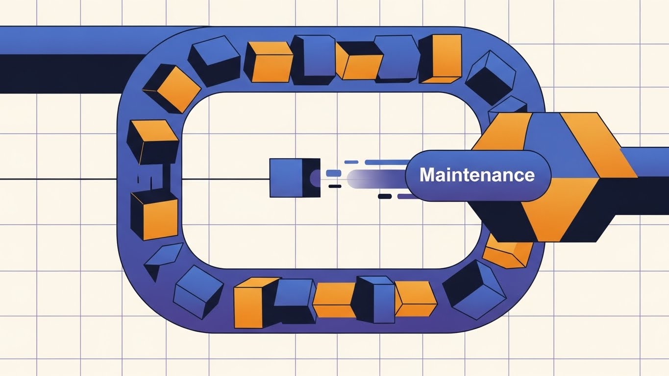
The Visual & Narrative Approach
Scenario: "Abstract 2D Motion Graphics" are used here to visualize the concept of "Maintenance" and "Health." On a technical grid background, a continuous loop of data cubes (Orange and Blue) flows through a central "Maintenance Node." Inside the node, the cubes are scanned and polished, exiting the other side smoother and faster. The loop is seamless, implying that as long as the subscription is active, the data remains healthy.
Narration Tone: Rhythmic, Consistent, Dependable.
Psychological Impact & KPI Focus
- Niche Psychology: For retention, the goal is to remind the user of passive value. Even when they aren't looking, the software is working. This loop visualizes the "Always-On" nature of SaaS protection.
- Operational Impact: Demonstrates "Continuous Monitoring" and "Automated Patching/Updates." It justifies the recurring subscription cost.
- Primary KPI: Net Dollar Retention (NDR) / Renewal Rate.
Strategic Implementation & Trade-offs
- Best Use Case: Monthly newsletter headers, "System Health" report emails, or Quarterly Business Reviews (QBRs).
- Trade-off: Highly abstract. It reinforces a feeling of safety but doesn't teach new features.
- Duration: 6-10 seconds (Looping).
Companies using similar video content -
Hyperproof – Compliance Operations – Step-by-step guidance for compliance journey.
Secureframe – Security Compliance – Clear roadmap for achieving security certifications.
27. The Culture of Compliance
Retention | Knowledge Base & FAQ Videos

The Visual & Narrative Approach
Scenario: This "Aspirational Stock Montage" shifts focus from software to culture. We see a diverse team of professionals in a sunlit office, high-fiving and smiling. In the foreground, a laptop screen is soft-focused but clearly displays a large "100% COMPLIANT" badge. The lighting is warm (Sunlight and Leafy Green), contrasting with the cool blues of the software. The message is clear: Good software creates a happy, cohesive team.
Narration Tone: Collaborative, Human, Celebratory.
Psychological Impact & KPI Focus
- Niche Psychology: Reminds the "Champion" (the person who bought the tool) that their choice has improved their team's quality of life. It validates their leadership and suggests that using the support tools leads to harmony.
- Operational Impact: Humanizes the "Support Portal." It encourages users to self-serve by framing the Knowledge Base as a tool for empowerment rather than a manual of boredom.
- Primary KPI: Support Ticket Deflection.
Strategic Implementation & Trade-offs
- Best Use Case: Customer success stories, "Year in Review" videos, or support portal headers.
- Trade-off: Generic stock footage can feel inauthentic. The key is the specific "100% Compliant" badge overlay that ties the emotion to the product.
- Duration: 15-20 seconds.
Companies using similar video content -
ServiceNow – GRC – Continuous monitoring and value maintenance for risk.
Archer – Integrated Risk Management – Demonstrating continuous value and protection.
28. The Depth of Discovery
Expansion | Driving Deep Feature Adoption
The Visual & Narrative Approach
Scenario: "3D Parallax Composition" is used to show depth. We see a primary UI screen in crisp focus. As the camera slides sideways, we realize this screen is just the top layer. Behind it, hovering in semi-transparent "Frosted Glass," are additional screens representing advanced modules (e.g., "Predictive Analytics," "Third-Party Risk"). The parallax effect creates a sense of deep, untapped potential waiting to be activated.
Narration Tone: Intriguing, Deep, Expansive.
Psychological Impact & KPI Focus
- Niche Psychology: Targets "Curiosity" and the desire to maximize investment. It suggests to the user, "You are only using 10% of what you paid for." It frames the upsell as unlocking existing potential.
- Operational Impact: Visualizes the "Platform Ecosystem" and "Module Scalability." It shows that the tool is not a single point solution, but a layered stack of capabilities.
- Primary KPI: Cross-Sell / Upsell Revenue.
Strategic Implementation & Trade-offs
- Best Use Case: "Did You Know?" email campaigns, in-app prompts to try beta features, or feature announcement videos.
- Trade-off: Requires high-fidelity design assets to pull off the glass effect. Text on the back layers must be blurred enough to show depth but legible enough to intrigue.
- Duration: 10-15 seconds.
Companies using similar video content -
AuditBoard – Connected Risk Platform – Celebrating team success in audit and compliance.
Diligent – Governance Cloud – Fostering a culture of successful governance.
29. The Premium Sector
Expansion | Driving Upsell/Cross-sell

The Visual & Narrative Approach
Scenario: This "Futuristic Dark Mode" style utilizes a "City of Data" metaphor. We fly through a landscape of standard Black and Green data blocks. Suddenly, a walled-off sector is revealed, glowing in Premium Gold and Holographic White, labeled "PREMIUM TIER." A bridge extends to it. This visual language borrows from gaming and sci-fi to denote "Elite Status" and "Secure Access."
Narration Tone: Exclusive, High-Value, Aspirational.
Psychological Impact & KPI Focus
- Niche Psychology: Exploits the "Velvet Rope" effect. Even in B2B, buyers want the "Pro" status. The visual contrast makes the standard tier look functional, but the premium tier look desirable and fortified.
- Operational Impact: Visualizes "Enterprise Security Features," "Dedicated Support," or "Gated Capability" as a tangible, high-value asset.
- Primary KPI: Upgrade Conversion Rate.
Strategic Implementation & Trade-offs
- Best Use Case: Account Management presentations, "Upgrade to Unlock" screens, or Enterprise pricing pages.
- Trade-off: Can appear aggressive if shown too early. Use only for users who are hitting usage limits.
- Duration: 15-20 seconds.
Companies using similar video content -
MetricStream – GRC Platform – Unveiling advanced modules and hidden capabilities.
LogicGate – Risk Cloud – Discovering deeper insights and expanded risk solutions.
30. The Network of Trust
Expansion | Driving Referrals & Advocacy

The Visual & Narrative Approach
Scenario: Using "Stylized 2D Vector Illustration," we visualize growth. A fluid, organic Orange circle (the user) pulses and splits into two, then four circles. These nodes connect via thin, elegant Blue lines, forming a stable network. The background is clean white. This biological/geometric abstraction represents the "Network Effect" of a referral program—how one user's trust creates a web of compliance across the industry.
Narration Tone: Connected, Growing, Community-Focused.
Psychological Impact & KPI Focus
- Niche Psychology: Targets the user's desire for "Community" and "Industry Leadership." It moves beyond the individual to the ecosystem, suggesting that by referring others, they are building a stronger, standardized industry.
- Operational Impact: Visualizes "Vendor Ecosystems" and "Supply Chain Compliance" where multiple entities interact on the same platform.
- Primary KPI: Net Promoter Score (NPS) / Referral Count.
Strategic Implementation & Trade-offs
- Best Use Case: Referral program landing pages, "Share with a Colleague" post-purchase prompts, or community event branding.
- Trade-off: Very abstract. Needs strong text overlay ("Invite a Partner") to make the call to action clear.
- Duration: 8-12 seconds.
The Visual Operations Doctrine: A Strategic Knowledge Base
The 30 styles detailed above are not merely aesthetic choices; they represent a "Visual Operating System" for the GRC enterprise. To transition from "making videos" to "deploying strategic assets," leadership must adopt a structured approach. This Knowledge Base synthesizes the visual examples into three core pillars of operational strategy.
Strategic Alignment & Visual Architecture
The "Pre-Production" Strategy – Defining the visual language of trust.
- The Cognitive Load Audit: Before commissioning a single pixel, audit your current training materials. If a 50-page PDF policy can be replaced by a 15-second "Style 5 (Shield of Simplicity)" video, do it. Visuals should be deployed primarily to reduce the cognitive burden on compliance officers, not just to decorate content.
- Role-Based Visual Mapping: Differentiate your visual output by persona. The CISO requires "Style 19 (The Analyst’s Sanctuary)"—dense, dark-mode, data-rich visuals. The Board Member requires "Style 4 (The Executive Decision)"—clean, high-level, strategic metaphors. Do not serve "Analyst" visuals to the "Audit Committee."
- The "Glanceability" Standard: In high-stress compliance environments (e.g., during a breach or audit), information must be consumed instantly. Adopt a "Glanceability Standard" for all internal communication videos: Can the core risk be understood in under 3 seconds without audio? Styles like "Style 14 (Gamification of Security)" excel here.
- Brand Voice Consistency: Your visual language is your compliance culture. If your visuals are chaotic and inconsistent, your stakeholders will assume your data governance is too. Use a unified "Visual Style Guide" (like this one) to ensure that a training video in London looks identical in tone to a policy update in Singapore.
- The Advids Strategic Audit: Partnering with a specialized agency like Advids allows for an external audit of your visual assets. We map your current content against the "30-Style Matrix" to identify gaps—where you might be over-indexing on "Marketing Fluff" and under-indexing on "Operational Clarity."
- Legacy System Integration: One of the hardest stories to tell is the modernization of legacy tech. Use "Style 28 (3D Parallax UI)" to visualize the "wrapping" of old on-premise data into new cloud interfaces, reassuring stakeholders that modernization doesn't mean data loss.
- The Cross-Departmental Bridge: Legal, IT, and Sales speak different languages. Visuals are the universal translator. A "Style 1 (Brand Authority)" video can be used by Sales to sell security, and by Legal to explain policy, unifying the narrative across the enterprise.
- Accessibility in a Global Workforce: GRC is global. Motion graphics with text overlays (like "Style 2 Kinetic") are superior to voiceover-heavy content because they can be localized instantly by swapping the text layer, ensuring consistent training across geographies without expensive re-recording.
- The Mobile-First Mandate: Modern compliance officers are mobile. Ensure all styles—especially "Style 13 (Everyday Command Center)"—are legible on a 6-inch screen. If the text in your video is unreadable on a phone, the compliance message is lost for 40% of your audience.
- Standardization vs. Customization: For core regulatory concepts (GDPR, HIPAA), use standardized, high-polish assets ("Style 21"). For specific internal workflows, use lighter, faster styles like "Style 25 (Step-by-Step Guide)." Don't spend "Style 3 (Cinematic)" budget on a temporary workflow update.
Operational Adoption & Implementation
The "Deployment" Phase – Embedding visuals into the daily compliance workflow.
- Overcoming "Big Brother" Anxiety: Employee monitoring tools often trigger resistance. Use "Style 24 (The Human-AI Handshake)" to visualize the partnership and privacy protections, rather than just the surveillance capabilities. Empathy-driven visuals reduce internal friction.
- The Micro-Learning Shift: Replace the "Annual 3-Hour Compliance Seminar" with a drip-feed of "Style 17 (The Clarity Reveal)" videos. These 10-second clips, delivered weekly via Slack or Teams, keep compliance top-of-mind without disrupting productivity.
- Just-in-Time Support: Embed specific visual styles directly into the software interface. When a user hovers over a complex "Encryption Toggle," a looped "Style 11 (Micro-Moment of Trust)" GIF should appear to explain the function instantly. This is "Visual Support" at the point of need.
- Gamification of Training: Use "Style 14 (Gamification)" to visualize compliance scores. When teams see their audit readiness visualized as a "filling bar" or a "shield strengthening," it taps into competitive psychology and drives engagement.
- Reducing Support Ticket Volume: There is a direct correlation between the quality of your visual library and your support costs. Proactively sending a "Style 25 (Step-by-Step)" video during onboarding can deflect up to 30% of "How-to" tickets.
- Remote Onboarding: In a distributed GRC team, you cannot rely on over-the-shoulder training. Use "Style 23 (The Frictionless Factory)" to provide a standardized, immersive onboarding experience that works as well in a home office as it does at HQ.
- Transforming SOPs: Text-based Standard Operating Procedures (SOPs) are rarely read. Convert your top 10 critical SOPs into "Style 21 (The Chaos Controller)" videos. A visual process flow is retained 6x better than a text list.
- Feedback Loops: Use interactive video elements. At the end of a "Style 2 (Data Purification)" explainer, add a one-click poll: "Did this clarify the process?" This data helps refine your visual strategy in real-time.
- Scalable Localization: When deploying global policy updates, use "Style 5 (Shield of Simplicity)" which relies on iconography rather than text. This minimizes the need for translation and ensures the concept of "Protection" is understood across language barriers.
- Leadership Communication: When the CRO presents to the Board, they should not use spreadsheets. They should use "Style 16 (The Return on Integrity)"—high-end, abstract 3D visualizations that convey the magnitude and security of the risk posture without getting bogged down in rows and columns.
Measuring Impact & Future-Proofing
The "ROI" Phase – Quantifying the value of visual assets.
- Beyond "Views": Stop measuring video success by "View Count." In GRC, the metrics that matter are Time-to-Competency (how fast a new analyst becomes productive) and Feature Adoption Rate (do users engage with the new module after watching the video?).
- The "Idle Time" Metric: Measure the reduction in "Software Idle Time" (time spent staring at a screen confused). High-quality UI visualization ("Style 13") should correlate with faster task completion and smoother workflows.
- Compliance Velocity: How quickly can your organization adapt to a new regulation? If a new mandate drops, track how fast the "Style 2" explainer video is consumed and acknowledged by the workforce compared to the old PDF method.
- Retention and LTV: Visuals drive adoption; adoption drives retention. Use "Style 26 (The Resilience Loop)" in your renewal conversations to visually demonstrate the continuous value and protection the platform has provided over the contract term.
- The AI Visual Frontier: Prepare for the future where "Style 30 (Gen AI)" is generated on the fly. We are moving toward a world where a user can ask, "Show me my risk exposure," and the system generates a custom video summary instantly.
- Scalability of Assets: Build a "Visual Component Library." If you create a 3D model of a "Server Rack" for "Style 18," reuse that asset in "Style 6" and "Style 14." Advids helps clients build these reusable asset libraries to lower the cost-per-video over time.
- The Advids Partnership: Visual strategy is not a one-time project; it is an ongoing infrastructure. Advids serves as the long-term partner, managing the evolution of your visual language as your platform scales and as visual trends shift from "Flat 2D" to "Spatial Computing."
- Benchmarking Success: Compare your visual maturity against competitors. If your competitor is using "Style 4 (Executive 3D)" and you are using screen recordings, you are losing the "Perception War" before the demo even starts.
- The ROI of Safety: Quantify the "Cost of Ignorance." If better visual training ("Style 7") prevents one major data breach or compliance violation, the ROI of the video program is effectively infinite.
- Final Call to Innovation: Treat video as infrastructure, not content. In the invisible world of GRC, your visuals are the only tangible proof of value your clients see. Make them sharp, make them strategic, and make them count.
Companies using similar video content -
OneTrust – Enterprise Privacy & GRC – Exclusive access to advanced privacy and GRC features.
IBM – OpenPages with Watson – Premium tiers for enhanced risk and compliance capabilities.
Author & Editor Bio


