
Introduction: Visualizing the "Invisible" Art of Hospitality
The hospitality industry is navigating a paradoxical era. On one side, the "Modern Hotelier" faces an unprecedented operational squeeze, balancing staffing shortages with the demand for 24/7 service. On the other, guest expectations have shifted permanently; the traveler of 2026 demands the autonomy of a digital journey combined with the warmth of traditional hospitality.
For SaaS marketing teams, the challenge is not just to sell "features," but to visualize "relief." Your software is the invisible bridge that connects the chaotic back office to the pristine guest experience. Recent industry data confirms that 73% of travelers are more likely to stay at a hotel that offers self-service technology, validating that digitalization is now a baseline expectation, not a perk.
However, selling this transformation requires a sophisticated visual language. Standard screen recordings fail to capture the feeling of a synchronized operation. This guide explores 30 distinctive visualization styles designed to reduce the cognitive load for your buyers, helping them "see" how your platform transforms their property. With evidence that modern cloud-based systems can increase RevPAR by up to 20%, the narrative must shift from "efficiency" to "profitability."
By moving beyond generic marketing to strategic visualization, we position your software not as another tool to manage, but as the invisible concierge that empowers their existing team to do more with less.
1. 2D Character-Driven Story
TOFU | Brand Awareness
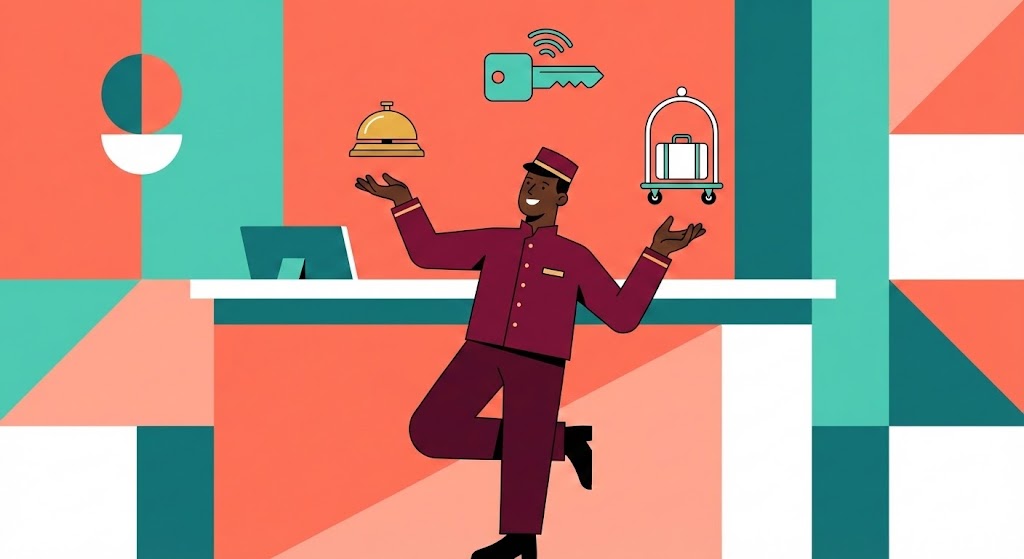
The Visual & Narrative Approach
This style employs a "Corporate Memphis" aesthetic to humanize the often-overwhelming role of hospitality staff. The visual centerpiece is a stylized concierge character, executed with deep espresso skin tones and a crisp burgundy uniform, dynamically "juggling" floating icons. These icons—a golden bell (service), a teal digital key (access), and a white luggage cart (logistics)—represent the myriad tasks a manager handles daily. The background is a simplified geometric abstraction of a reception desk in coral and teal. The narrative tone is empathetic and playful, acknowledging the difficulty of the job while presenting the software as the ultimate "balancing act" partner that makes the weight feel effortless.
Psychological Impact & KPI Focus
- Niche Psychology: Hotel managers often feel like they are "juggling" too many responsibilities and fear burnout. This visual validates their struggle (empathy) without being negative. The "flat, shadowless" style reduces cognitive load, making the solution appear simple and attainable.
- Operational Impact: By abstracting "Guest Services" into simple floating icons, we visually organize the chaos. This style is excellent for improving Staff Morale messaging and Brand Recall at the Top of Funnel.
Strategic Implementation & Trade-offs
- Duration: 15-20 Seconds (Looping).
- Strategic Trade-off: While highly engaging and friendly, this abstract style is suboptimal for showing specific UI features. It sells the feeling of efficiency, not the interface. Use it to open the conversation.
Companies using similar video content -
Unifocus – Workforce Management – Simplifies scheduling and labor optimization.
Connecteam – Team Management App – Streamlines staff communication and tasks.
2. Split Screen: Optimized Reality and UI
TOFU | Market Education
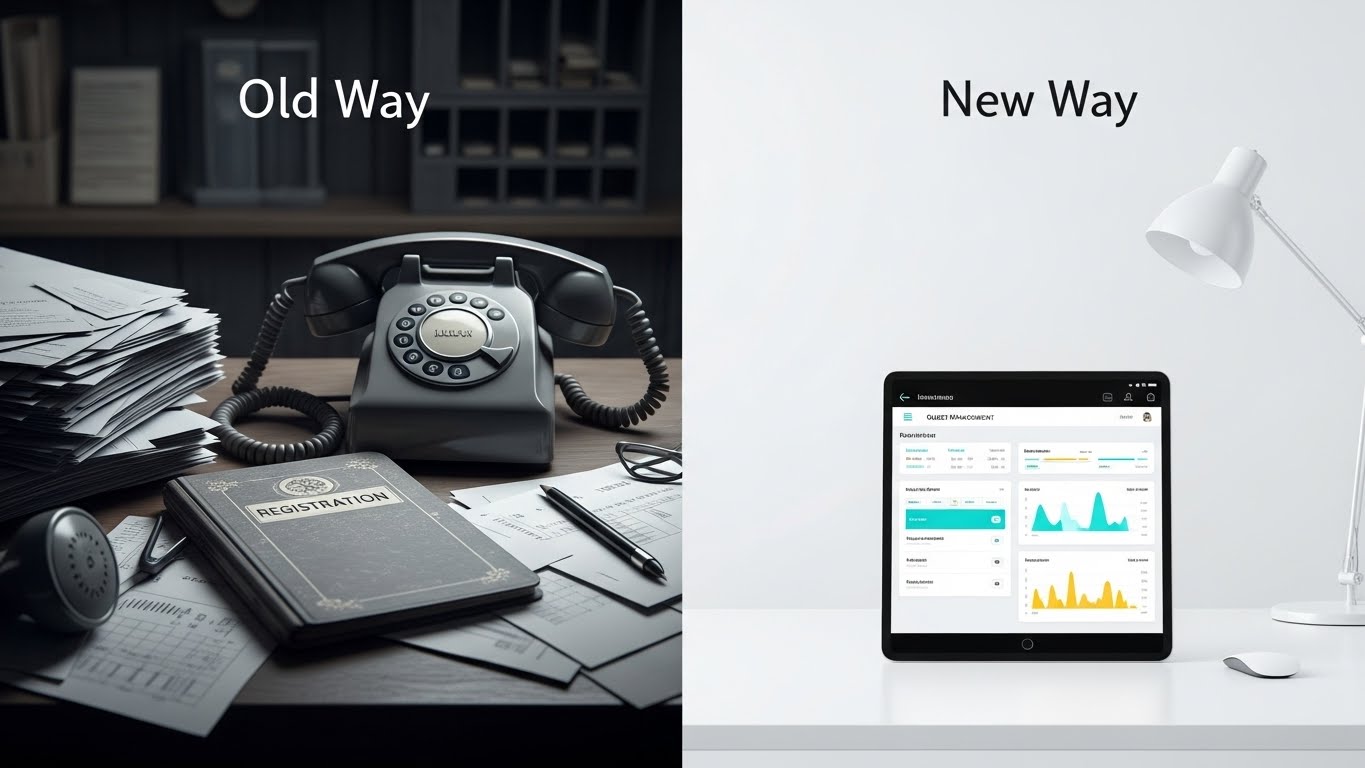
The Visual & Narrative Approach
This composition utilizes a classic yet powerful "Before & After" framework. The screen is bisected: the left side is a desaturated, grayscale scene of a chaotic "Old Way" front desk—messy papers, vintage phones, and clutter. The right side is a beacon of "New Way" clarity—bright, clinical lighting illuminating a sleek tablet displaying a vibrant cyan and gold guest dashboard. The narrative is one of transition. We are not just selling software; we are selling a move from analog anxiety to digital serenity. The contrast in lighting (dim vs. bright) reinforces this emotional journey.
Psychological Impact & KPI Focus
- Niche Psychology: It taps into the "Pain of Disorganization." The grayscale left side triggers a subtle stress response (reminding them of lost paperwork), while the right side offers an immediate dopamine hit of organization.
- Operational Impact: This style directly addresses the Time-to-Value objection. It visually proves that the transition leads to immediate clarity. It is highly effective for visualizing Operational Efficiency improvements.
Strategic Implementation & Trade-offs
- Duration: 30-45 Seconds.
- Strategic Trade-off: This style can feel slightly "salesy" if the "Old Way" is exaggerated to the point of caricature. Ensure the "Old Way" looks realistic to maintain empathy with operators who are still struggling with legacy systems.
Companies using similar video content -
Mews – Hotel PMS – Transforms operations from traditional to cloud-native.
MaintainX – CMMS – Replaces manual maintenance with digital workflows.
4. Hyper-lapse Stock Footage with Data
TOFU | Skippable Pre-Roll Ad
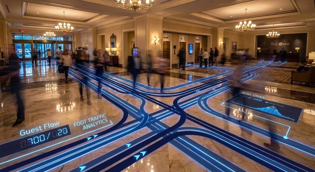
The Visual & Narrative Approach
This style bridges the physical world of the hotel with the digital world of analytics. We use high-quality stock footage of a luxury lobby with polished marble floors, accelerated into a hyper-lapse to show the bustle of activity. Ghosted motion blur trails represent the guests, but the hero is the overlay: glowing deep navy and electric blue data lines tracking "Guest Flow." These lines turn invisible foot traffic into tangible data. The lighting is warm and grand (the physical asset), contrasting with the sharp, neon precision of the data (the digital asset).
Psychological Impact & KPI Focus
- Niche Psychology: Hoteliers love their properties. This style celebrates the physical beauty of the hotel while adding a layer of "Matrix-like" intelligence. It appeals to the Innovative/Visionary persona who wants to see their property through a data-driven lens.
- Operational Impact: It visually demonstrates Operational Visibility. It proves that the software captures data that the naked eye misses, directly supporting KPIs related to Space Utilization and Staffing Efficiency.
Strategic Implementation & Trade-offs
- Duration: 10-15 Seconds.
- Strategic Trade-off: This style requires high-production value. Poorly tracked data lines will look "fake" and undermine the message of precision. It is best for demonstrating enterprise-grade capabilities.
Companies using similar video content -
AQe Digital – Hospitality AI – Visualizes operational intelligence and F&B insights.
5. Generative AI Cinematic Video
TOFU | Aspiration & Identity Hook
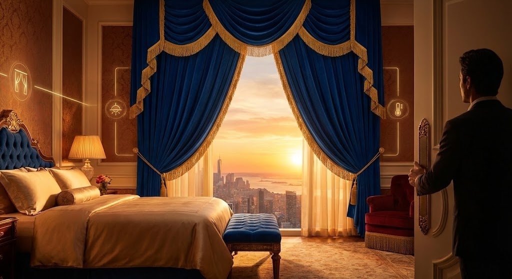
The Visual & Narrative Approach
This style leverages Generative AI to create a "Hero Shot" that visualizes the emotional payoff of automation. We see a low-angle perspective of a guest entering a high-end suite. The magic happens in the automation: velvet curtains part automatically to reveal a sunset, and faint gold "Smart Room" icons glow on the walls. The palette is warm sunset gold and velvet blue. The narrative is purely aspirational—selling the feeling of arrival that the software enables, not the code behind it.
Psychological Impact & KPI Focus
- Niche Psychology: It targets the Identity of the hotelier. They want to provide this level of seamless luxury. The "faint glow" of the icons suggests that technology is present but unobtrusive—"invisible service."
- Operational Impact: It supports Category Creation and Brand Awareness. It moves the conversation from "features" to "guest delight," supporting higher ADR (Average Daily Rate) justification.
Strategic Implementation & Trade-offs
- Duration: 30 Seconds.
- Strategic Trade-off: While visually stunning, this is an emotional hook, not a logical argument. It requires a follow-up with more substantive content to explain how the automation is achieved.
Companies using similar video content -
Canary AI – AI Solutions – Automates guest communications for exceptional service.
EasyWay – AI-driven Hotel Management – Optimizes guest experiences with automation.
6. Abstract 2D Flat Vector Organic
TOFU | Category Creation
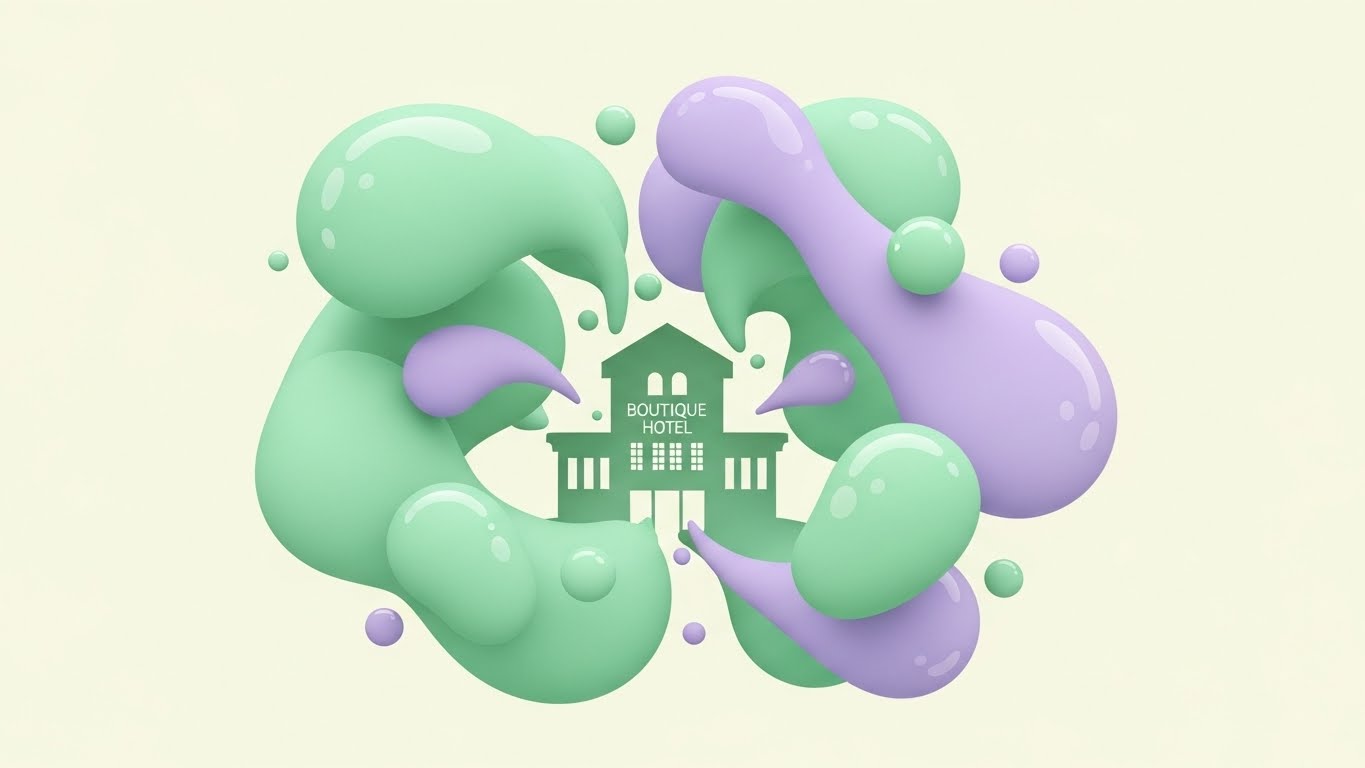
The Visual & Narrative Approach
Here, we move away from literal representation to abstract metaphor. Soft pastel green and lavender fluid shapes morph and coalesce in the center of the frame, forming the negative space silhouette of a boutique hotel. These "data blobs" have glossy textures, implying a liquid, seamless flow. The background is a calming cream. This style visualizes the concept of "Integration"—showing how disparate data points (the blobs) naturally come together to form the structure of the business.
Psychological Impact & KPI Focus
- Niche Psychology: Integration is a major pain point; it usually implies headaches and broken APIs. This visual re-frames integration as organic, smooth, and natural. It lowers the Cognitive Load associated with technical adoption.
- Operational Impact: It is excellent for Category Creation in blog posts, where you need to explain abstract concepts like "ecosystem" or "holistic management" without getting bogged down in screenshots.
Strategic Implementation & Trade-offs
- Duration: N/A (Static or Loop).
- Strategic Trade-off: It is too abstract for a hard sell. If a prospect wants to know functional details, this image will be insufficient. It is strictly for conceptual alignment.
Companies using similar video content -
Cloudbeds – Hospitality Platform – Integrates various hotel operations seamlessly.
SiteMinder – Channel Manager – Connects various booking channels for hotels.
7. Minimalist Flat 2D Vector
MOFU | Product Differentiation
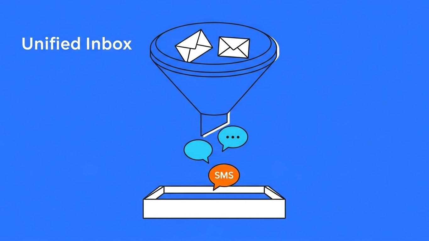
The Visual & Narrative Approach
Precision is the goal here. This isometric composition features a "Unified Inbox" represented by a central electric blue funnel. It collects distinct icons—email envelopes, chat bubbles, SMS speech bubbles—and deposits them into a neat, white organization tray. The background is a solid, vivid electric blue with zero gradients or shadows. This is "Hard-Edged Geometry" conveying that the software is a precise tool that eliminates mess. The narrative is: Input (Chaos) -> Funnel (Software) -> Output (Order).
Psychological Impact & KPI Focus
- Niche Psychology: It appeals to the COO/Operations Director who values structure and predictability. The lack of shadows and fluff communicates honesty and directness.
- Operational Impact: It effectively differentiates the product by visualizing Centralization. It supports KPIs related to Response Time Reduction by showing how multiple channels become one stream.
Strategic Implementation & Trade-offs
- Duration: N/A (Static).
- Strategic Trade-off: The minimalist style can feel "clinical." It appeals to the logical brain but may feel cold to the emotional brain. It works best when paired with benefit-driven copy.
Companies using similar video content -
GuestTouch – Guest Messaging Platform – Consolidates guest communication and reviews.
8. Clean UI Workflow (Light Mode)
MOFU | Feature Education
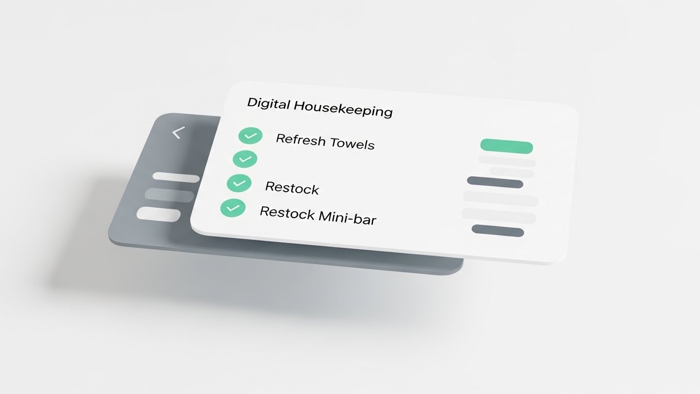
The Visual & Narrative Approach
This is a high-fidelity representation of the actual product, idealized. A pristine white UI card floats in a soft white void. It displays a "Digital Housekeeping Checklist" with mint green checkmarks next to tasks like "Refresh Towels" and "Restock Mini-bar." The typography is abstract gray bars to keep the focus on the structure of the list. The "Mint Green" accents subconsciously signal hygiene, freshness, and "correctness."
Psychological Impact & KPI Focus
- Niche Psychology: For housekeeping managers, the clipboard is the enemy (dirty, lost, slow). This floating card represents the "lightness" and "cleanliness" of digital task management.
- Operational Impact: It drives Feature Education. By isolating the UI component, we force the viewer to understand the specific utility of the checklist feature. It validates Ease of Use.
Strategic Implementation & Trade-offs
- Duration: 30-60 Seconds (Screen Recording).
- Strategic Trade-off: It lacks context. Without seeing who is using it or where, it's just a screen. It needs to be part of a broader narrative that connects the tool to the outcome (a clean room).
Companies using similar video content -
QloApps – Housekeeping Addon – Manages daily housekeeping tasks efficiently.
Xenia – Hospitality Management Software – Provides tools for hotel operations and maintenance.
9. Lifestyle Stock with UI Overlay
MOFU | Driving Demo Requests
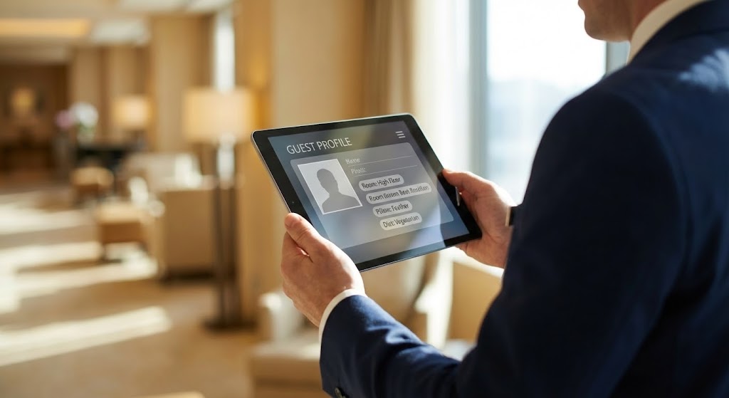
The Visual & Narrative Approach
This style grounds the technology in the real world. We see a professional hotel manager in a sharp suit, viewed from over the shoulder (OTS). The focus is sharp on the tablet they are holding, which displays a semi-transparent "Guest Profile" UI overlay (photo placeholder, preference tags). The background is a creamy, bokeh-blurred hotel lobby. This technique tells the viewer: "This technology doesn't replace you; it empowers you in your environment."
Psychological Impact & KPI Focus
- Niche Psychology: It addresses the fear of technology creating a barrier. Here, the manager is still in the lobby, potentially looking at a guest. The technology is a lens through which they see the guest better.
- Operational Impact: It is highly effective for Driving Demo Requests (MOFU). It helps the prospect visualize themselves holding the device. It creates a "mental rehearsal" of using the software.
Strategic Implementation & Trade-offs
- Duration: 15-20 Seconds.
- Strategic Trade-off: The UI overlay must be designed carefully to be readable against the background. If the background is too busy, the UI gets lost.
Companies using similar video content -
RoomRaccoon – RaccoonUpsell – Offers personalized upgrades during online check-in.
10. Rapid UI Feature Montage
MOFU | Non-Skippable Ads
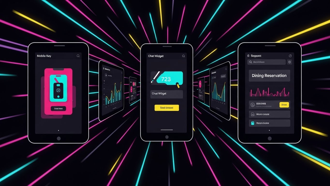
The Visual & Narrative Approach
Speed and integration are the themes. A series of UI screens—Mobile Key, Chat Widget, Dining Reservation—are arranged in a "Tunnel Formation," creating a zoom-through vortex effect. Motion lines radiate from the center, suggesting forward velocity. The palette is high-contrast CMYK, which is vibrant and energetic. This isn't about reading the details; it's about the volume and variety of features available in one platform.
Psychological Impact & KPI Focus
- Niche Psychology: In the evaluation phase, buyers want to know "Does it do X, Y, and Z?" rapidly. They don't have time for slow explanations. This visual bombardment reassures them that the platform covers everything.
- Operational Impact: This style conveys "Completeness" and "Speed." It suggests that the platform is a robust engine that drives the entire hotel operation forward.
Strategic Implementation & Trade-offs
- Duration: 6-10 Seconds.
- Strategic Trade-off: Zero retention of specific details. The viewer won't remember how the chat widget works, only that you have one. Use it to remind, not to teach.
Companies using similar video content -
Oracle OPERA Cloud PMS – PMS – Comprehensive management features for large hotels.
WebRezPro – Cloud PMS – Streamlines all front desk and back office operations.
11. Generative AI Realistic Character video
MOFU | Shaping Brand Perception

The Visual & Narrative Approach
This style utilizes high-fidelity Generative AI to construct the "Ideal User Persona." We feature a silver-haired, sophisticated Operations Director standing in a glass-walled office, bathed in cool, professional studio lighting. The narrative hook is the subtle reflection in her glasses—a rising "Occupancy Graph" in professional navy blue—which suggests she is looking through the data to the future. The aesthetic is one of calm, seasoned authority. We are not showing the software interface directly, but rather the result of using it: a leader who is in total control, backed by intelligence.
Psychological Impact & KPI Focus
- Niche Psychology: It appeals to the Aspirational Identity of the senior hotelier. They don't just want a tool; they want to be perceived as visionary leaders who master market trends. This visual mirrors that self-image, validating their experience.
- Operational Impact: This style effectively builds Brand Trust. It subtly communicates that your platform is designed for the "C-Suite," elevating the conversation from "task management" to "strategic oversight" and "market leadership."
Strategic Implementation & Trade-offs
- Duration: 15-20 Seconds.
- Strategic Trade-off: This is a mood piece. It establishes prestige but explains nothing about functionality. It is best used on the "About Us" or "Mission" page to establish enterprise credibility before the hard sell.
Companies using similar video content -
Amadeus – Digital Transformation – Visualizes strategic evolution in hospitality.
12. Wireframe to Reality Transition
MOFU | Competitive Displacement
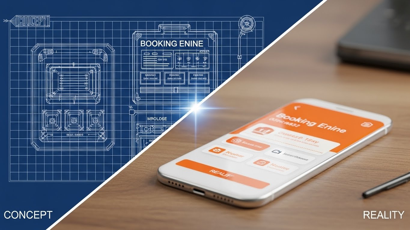
The Visual & Narrative Approach
This visual metaphor attacks the "Status Quo" bias. The composition is split diagonally. The upper left displays a technical "blueprint" wireframe of a booking engine—representing the planning or legacy phase. The lower right transforms seamlessly into a glossy, vibrant orange and white 3D rendered interface on a physical device. The narrative is one of manifestation. It tells the prospect: "Your ideas for a better guest experience are just blueprints until you implement our software." The glowing transition line symbolizes the upgrade path.
Psychological Impact & KPI Focus
- Niche Psychology: Many hoteliers are stuck with legacy systems they struggle with but fear replacing. This visual frames the replacement not as a risky demolition, but as a natural Evolution. It validates the desire to modernize without implying failure.
- Operational Impact: It is a powerful tool for Competitive Displacement. It visually juxtaposes the "old/theoretical" against the "new/tangible," making the legacy system look unfinished and the new solution look polished and ready for Immediate Deployment.
Strategic Implementation & Trade-offs
- Duration: 10-15 Seconds.
- Strategic Trade-off: It assumes the viewer understands the "blueprint" language. If the wireframe is too abstract, the comparison might fail. Keep the UI elements recognizable in both states.
Companies using similar video content -
Little Hotelier – PMS – Modernizes operations for small hotel businesses.
Sirvoy – Hotel Management Platform – Combines simplicity with advanced features.
13. Bold Kinetic Typography (Visual)
MOFU | Demand Gen

The Visual & Narrative Approach
In the noisy environment of display advertising, subtlety is invisible. This style uses "High-Voltage" aesthetics—massive, blocky kinetic typography in stark black and yellow. The words "DOWNLOAD REPORT" don't just sit; they crash into the frame like heavy blocks, creating a sense of weight and importance. The diagonal composition adds dynamic tension. The narrative is purely transactional and urgent: "We have intelligence (the report) that you need now."
Psychological Impact & KPI Focus
- Niche Psychology: It triggers FOMO (Fear of Missing Out). The aggressive visual style suggests that the information is critical and time-sensitive. It disrupts the "scroll trance" of a busy manager looking for answers.
- Operational Impact: This is a pure Lead Generation engine. It is not designed to explain the software, but to drive the Click-Through Rate (CTR) for whitepapers or industry reports, filling the top of the sales funnel with MQLs.
Strategic Implementation & Trade-offs
- Duration: 5-8 Seconds (Looping).
- Strategic Trade-off: It is aggressive. While effective for clicks, it lacks "hospitality warmth." Use it strictly for asset downloads, not for brand building or relationship management.
Companies using similar video content -
Keen – Reputation Management – Drives positive reviews and online presence.
14. 2D Line Art Animation
BOFU | Sales Cycle Acceleration
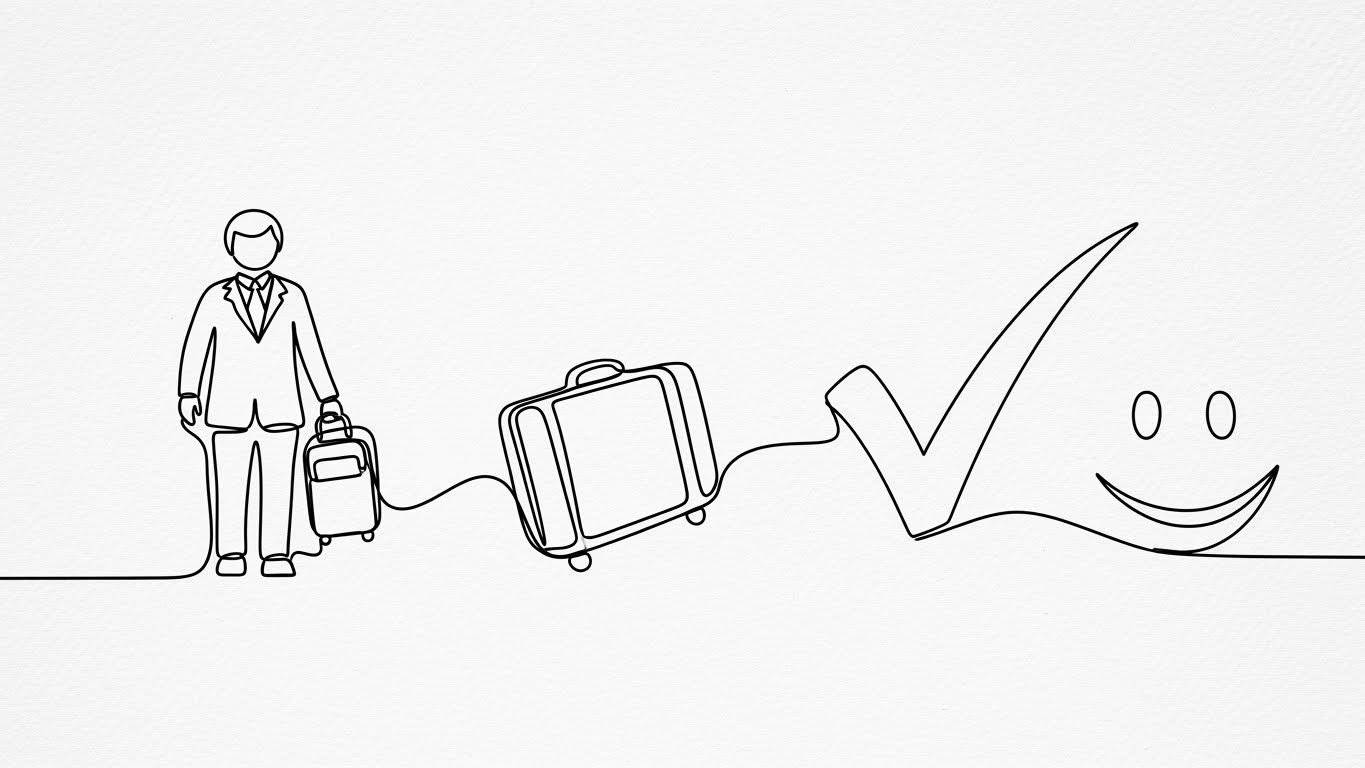
The Visual & Narrative Approach
As we move closer to the sale, we need to simplify. This style uses a single, continuous black line on a textured white background to draw the "Perfect Guest Journey." The line morphs effortlessly from a guest to a suitcase, to a verified check-mark, and finally to a smile. It is elegant, minimal, and sophisticated. The narrative is "Frictionless Flow." It promises that the software connects every disparate part of the stay (booking, arrival, checkout) into one unbroken thread of satisfaction.
Psychological Impact & KPI Focus
- Niche Psychology: Friction is the enemy of hospitality. This continuous line subconsciously soothes the anxiety of "dropped balls" or broken processes. It appeals to the manager's desire for Elegance and Simplicity.
- Operational Impact: It visually summarizes the value proposition for Sales Cycle Acceleration. It removes the complexity of the tech stack and focuses entirely on the seamless outcome, helping to close the deal by visualizing Guest Satisfaction.
Strategic Implementation & Trade-offs
- Duration: 10-15 Seconds.
- Strategic Trade-off: It is metaphorical. It does not show how the software connects the dots, only that it does. It works best as a "signature" visual in a closing email or proposal.
Companies using similar video content -
Duve – Guest Management Platform – Personalizes guest journey from check-in to surveys.
Prostay Nexus – Guest Messaging App – Connects hotels and guests directly for smooth communication.
15. Dynamic Data Visualization
BOFU | ROI Justification
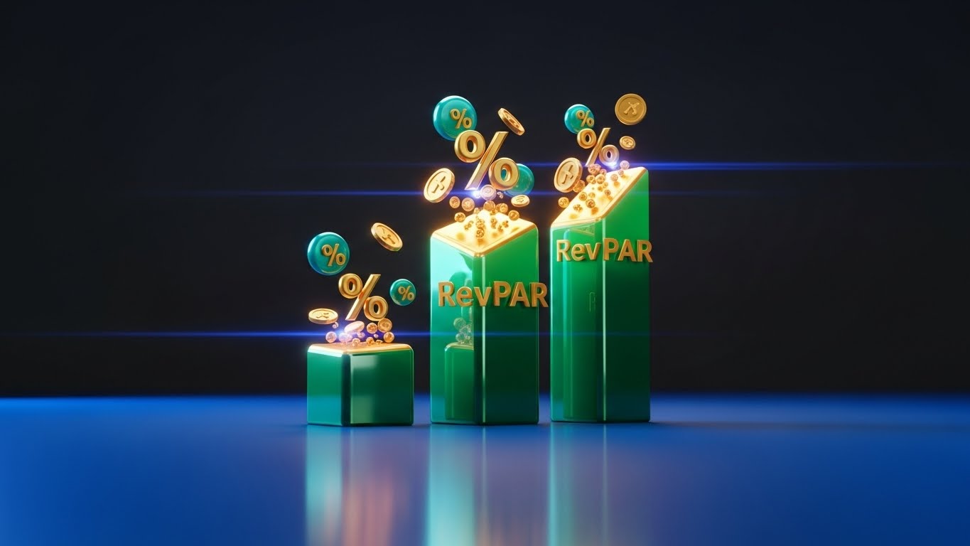
The Visual & Narrative Approach
For the Revenue Manager and the Owner, only one thing matters: the bottom line. This style dramatizes the data. We use a "Monumental" aesthetic where 3D emerald green bars grow upwards like skyscrapers against a dark graphite background. Floating gold coins and percentage symbols aren't just icons; they are rendered with glossy, tactile textures. The low camera angle makes the growth look imposing and undeniable. The narrative is clear: "This software pays for itself."
Psychological Impact & KPI Focus
- Niche Psychology: It appeals to the Economic Buyer's ambition and need for security. The solid, heavy rendering of the bars makes the projected revenue feel "real" and attainable, rather than just numbers on a spreadsheet.
- Operational Impact: This is the ultimate tool for ROI Justification. It directly visualizes RevPAR (Revenue Per Available Room) growth, providing the visual evidence needed to get budget approval from the CFO.
Strategic Implementation & Trade-offs
- Duration: 15-20 Seconds.
- Strategic Trade-off: It can appear "greedy" if not paired with service messaging. Ensure the narrative connects the revenue growth to better guest service (i.e., "Profit through Excellence").
Companies using similar video content -
Oaky – Hotel Upsell Software – Maximizes TRevPAR with personalized offers.
Allora – AI-powered Revenue Management – Dynamically adjusts room rates for maximum revenue.
16. Isometric 2D Motion Design
BOFU | Feature Education
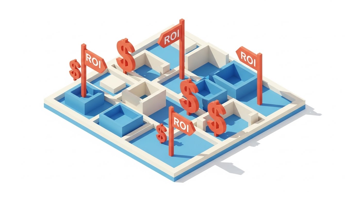
The Visual & Narrative Approach
This style takes a "God's Eye View" of the property. Using clean, architectural isometric projection, we show a stylized hotel floor plan. The magic is in the "Pop-Up" animations: terracotta flags labeled "ROI" and dollar signs spring up from specific rooms (e.g., the spa, the lobby bar, the upgrade suite). The narrative is "Spatial Intelligence." It shows the operator that their building is full of untapped revenue potential that the software helps uncover.
Psychological Impact & KPI Focus
- Niche Psychology: Hoteliers are spatial thinkers; they visualize their business in terms of rooms and floors. This style maps the software's value directly onto their mental map of the physical asset.
- Operational Impact: It bridges Feature Education with revenue goals. It is highly effective for explaining features like "Upselling Prompts" or "Ancillary Revenue Tracking" by showing where they happen in the physical space.
Strategic Implementation & Trade-offs
- Duration: 20-30 Seconds.
- Strategic Trade-off: It simplifies the layout. It won't match their specific hotel layout, so it serves as a general example of potential rather than a specific site plan.
Companies using similar video content -
Triparound – Upselling Software – Encourages guests to buy additional services.
17. Photorealistic 3D Renders
BOFU | Building Trust & Credibility

The Visual & Narrative Approach
In an era of data breaches, security is a luxury product. This style uses hyper-realistic 3D rendering to visualize the "Invisible Vault." We focus on a macro shot of a brushed silver server rack—symbolizing heavy-duty infrastructure. A glowing, translucent cyber-blue "Lock Icon" sits physically on the hardware. The bokeh background of blue LED status lights implies active, 24/7 monitoring. The narrative is "Uncompromising Protection." It reassures the IT Director that guest data is locked behind enterprise-grade steel.
Psychological Impact & KPI Focus
- Niche Psychology: It addresses the Fear of Liability. For the Technical Buyer (CTO), a "pretty" interface is meaningless if the backend is weak. This visual communicates weight, permanence, and impenetrability.
- Operational Impact: It is essential for Risk Mitigation discussions. It visually validates compliance (GDPR, PCI-DSS) without using boring checklists, building deep Trust and Credibility.
Strategic Implementation & Trade-offs
- Duration: 10 Seconds (Static or Loop).
- Strategic Trade-off: It is cold. It speaks to the machine, not the guest. Use it specifically on "Security" or "Compliance" pages, or in the technical section of a proposal.
Companies using similar video content -
Mobotix – Video Surveillance – Delivers advanced AI-powered security solutions.
IRIS – Hospitality HR & Payroll – Ensures compliance and data security for HR.
18. 3D Parallax UI Presentation
BOFU | The Economic Buyer
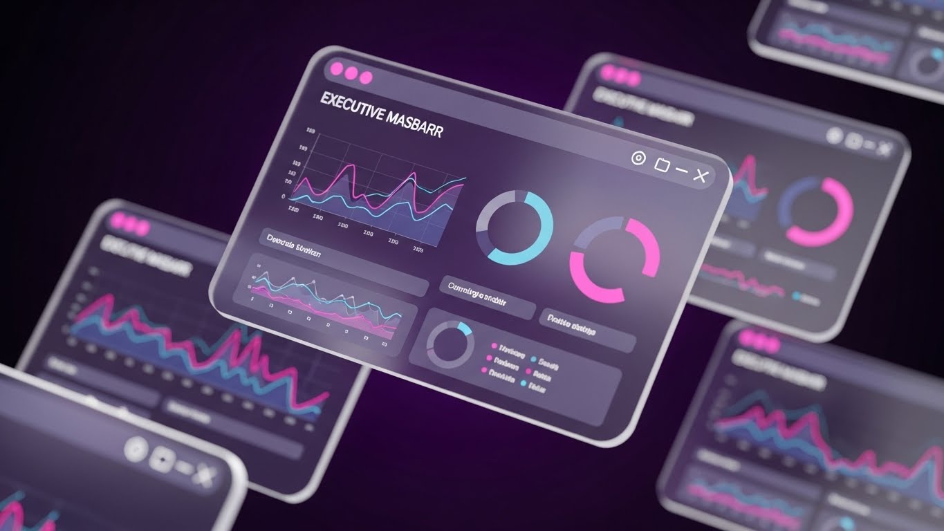
The Visual & Narrative Approach
The General Manager needs to see the "Big Picture." This style elevates the flat dashboard into a 3D command center. We use "Glassmorphism"—frosted, semi-transparent UI panels floating in a deep purple void. The parallax effect creates depth: as the camera moves, the foreground charts (Operational Efficiency) move faster than the background charts (Historical Trends), creating an immersive data environment. The narrative is "Total Command." It suggests that the user is not just reading data, but inhabiting it.
Psychological Impact & KPI Focus
- Niche Psychology: It strokes the Executive Ego. It frames the software not as a tool for staff, but as a cockpit for the pilot. It aligns with the desire for control and high-level perspective.
- Operational Impact: It is a closing tool for the Economic Buyer. It visualizes the Holistic Overview they crave, showing how the system aggregates complex data into clear, layered insights for better decision-making.
Strategic Implementation & Trade-offs
- Duration: 15-20 Seconds.
- Strategic Trade-off: It can look overwhelming to a front-desk user who just wants to check a guest in. Keep this visual reserved for management-tier communications to demonstrate power and scope.
Companies using similar video content -
Resort Data – PMS – Handles resort and timeshare properties with comprehensive data.
19. 3D X-Ray Visualization
BOFU | The Technical Buyer
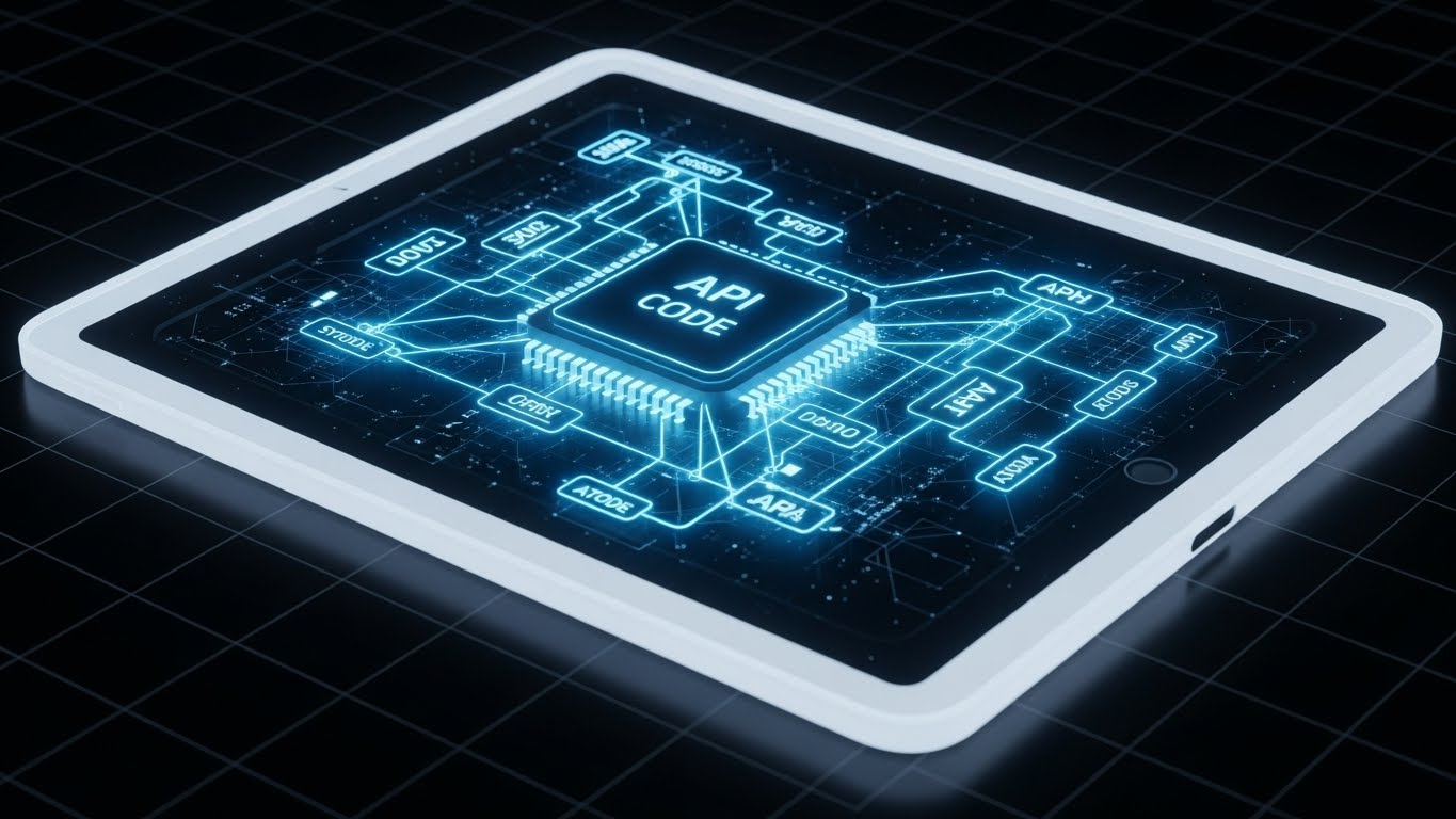
The Visual & Narrative Approach
When the IT team asks, "How does it integrate?", show them this. We see a sleek tablet device, but the outer casing is semi-transparent "X-Ray" white. Inside, we don't see battery packs; we see a glowing, structural lattice of "API Code" and data nodes in electric blue. The visual reveals the software as the "Living Nervous System" of the hardware. The narrative is "Deep Integration." It proves that the beauty isn't just skin deep; the architecture is robust and ready to connect.
Psychological Impact & KPI Focus
- Niche Psychology: It validates the Technical Buyer's scrutiny. They are skeptical of "wrappers" or shallow apps. This visual metaphor for "clean code" and "solid architecture" speaks their language.
- Operational Impact: It effectively visualizes API Connectivity and System Stability. It supports the argument that the software will play nicely with the existing tech stack (PMS, POS, Key Cards) without breaking.
Strategic Implementation & Trade-offs
- Duration: 15 Seconds (Loop).
- Strategic Trade-off: Highly technical. It will bore the marketing manager. Use it in technical documentation, whitepapers, or the "Integrations" section of the site.
Companies using similar video content -
Agilysys – PMS – Integrates multiple upselling channels.
RoomKeyPMS – PMS – Integrates with POS and CRM systems.
20. Futuristic Neon/Dark Mode
BOFU | Risk Mitigation
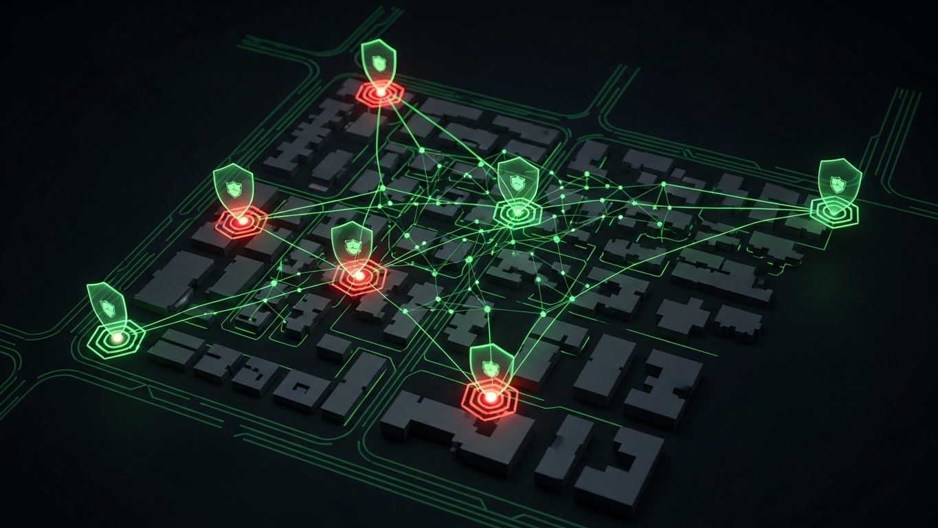
The Visual & Narrative Approach
The final barrier to sale is often the fear of "what if things go wrong?" This style visualizes the platform as a defensive shield. We use a "Cyber-Security Control Room" aesthetic: a dark, top-down map of the hotel property. Neon green lines represent secure data flows. Crucially, we see "Threats" (red glowing dots) attempting to enter, but being blocked by neon green hexagonal shields. The narrative is "Active Guardianship." It shows that the software is proactive, not reactive.
Psychological Impact & KPI Focus
- Niche Psychology: It taps into the Protective Instinct. Hoteliers are responsible for the safety of their guests (and their data). This visual equates the software with a high-tech security detail that never sleeps.
- Operational Impact: It visually demonstrates Operational Resilience and Risk Mitigation. It is particularly effective for selling cloud-based solutions by visualizing the firewall and security protocols that on-premise servers often lack.
Strategic Implementation & Trade-offs
- Duration: 15-20 Seconds.
- Strategic Trade-off: It is somewhat aggressive/dark. It should be used to reassure the buyer about safety, not to scare them. Balance the dark aesthetic with the reassuring "green" of the shields.
Companies using similar video content -
TrustYou – Reputation Management – Pre-empts issues with in-stay surveys.
21. Isometric 3D Workflow
BOFU | Competitive Comparison
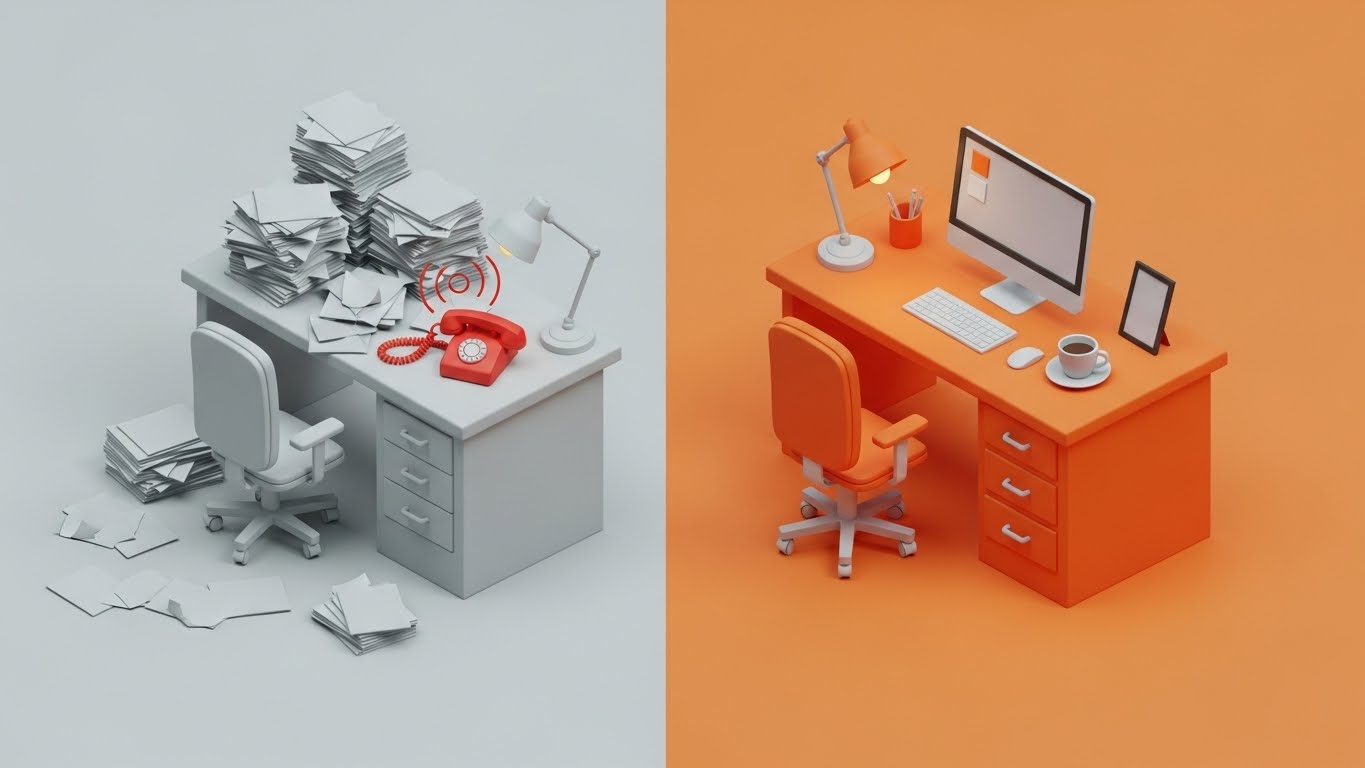
The Visual & Narrative Approach
This style creates an undeniable choice for the viewer through a side-by-side isometric comparison. The left side ("The Old Way") depicts a gray, chaotic desk overflowing with paper stacks and a ringing red analog phone—visual shorthand for stress and bottlenecking. A divider line separates this from the right side ("The New Way"), which features a tidy, vibrant orange desk with a sleek monitor and a calm coffee cup. The clay-like matte finish gives the scene a tactile, friendly quality. The narrative is binary: "You can stay in the gray chaos, or move to the organized, colorful future."
Psychological Impact & KPI Focus
- Niche Psychology: It targets the Operational Fatigue of the hotel manager. The clutter on the left triggers a recognition of their daily pain, while the clean desk on the right offers an immediate sense of relief and control.
- Operational Impact: This is a powerful Competitive Comparison tool. It visually de-positions legacy, on-premise systems as "clutter" and positions your cloud-based solution as "clarity," directly supporting the argument for Modernization and Staff Efficiency.
Strategic Implementation & Trade-offs
- Duration: 15-20 Seconds (Looping).
- Strategic Trade-off: It is a simplification. Real hotel operations are never quite as empty as the desk on the right, but as a comparative metaphor for mental space, it is highly effective.
Companies using similar video content -
Hippo CMMS – Maintenance Platform – Streamlines maintenance operations.
tamigo – Workforce Management – Optimizes operations with cloud-based software.
22. 2D Animation & UI Composition
Onboarding | Self-Serve Onboarding

The Visual & Narrative Approach
Software adoption fails when it feels like homework. This style injects joy into the learning process. We see a stylized 2D character (representing a staff member) in soft pink and teal, physically "high-fiving" a glowing "Success Message" bubble that pops out of a UI screen. The background is a soft, abstract cloud pattern. The narrative is "Victory." It frames the completion of a digital task (like checking in a guest or updating a room status) not as administrative labor, but as a win to be celebrated.
Psychological Impact & KPI Focus
- Niche Psychology: Frontline staff (Gen Z/Millennials) respond well to Gamification and positive reinforcement. This visual style validates their effort, reducing the intimidation factor of learning a new PMS (Property Management System).
- Operational Impact: It drives Self-Serve Onboarding. By making the "success state" look fun and rewarding, you encourage staff to explore the software, reducing the burden on the training manager and accelerating Staff Proficiency.
Strategic Implementation & Trade-offs
- Duration: 5-10 Seconds (Micro-animation).
- Strategic Trade-off: It creates a casual tone. While great for internal staff training, it might feel too playful for a serious investor presentation. Keep it inside the product or training academy.
Companies using similar video content -
HelloShift – AI-powered Hotel Assistant – Combines messaging with team collaboration.
MyAIFrontDesk – Front Desk Operations – Automates check-in/out and guest queries.
23. 2D Graphics Over Live Action
Onboarding | Accelerating TTV

The Visual & Narrative Approach
This style bridges the gap between hardware and software. We use a First-Person Point of View (POV) shot of a hand holding a generic keycard up to a lock. The "magic" is added via 2D vector overlays—gold sparkles and "WiFi signal" arcs that animate upon contact. The background is a realistic, blurred hotel hallway. The narrative is "Instant Connection." It visualizes the invisible handshake between the door lock and your software, proving that the system works instantly and magically.
Psychological Impact & KPI Focus
- Niche Psychology: It addresses the anxiety of Technical Failure. Hoteliers fear guests standing in hallways with non-working keys. This visual reassures them that the integration is seamless, "magical," and reliable.
- Operational Impact: It visualizes Time-to-Value (TTV). It shows the specific moment the technology delivers its promise (access), which is critical for reassurance during the deployment phase.
Strategic Implementation & Trade-offs
- Duration: 6-10 Seconds.
- Strategic Trade-off: Requires live-action filming or high-quality stock. The hand and environment must look premium; a dirty hallway or cheap keycard will degrade the brand perception.
Companies using similar video content -
Akia – Text-Messaging Platform – Facilitates contactless check-in.
24. Macro UI Micro-Interactions
Onboarding | Trial Activation
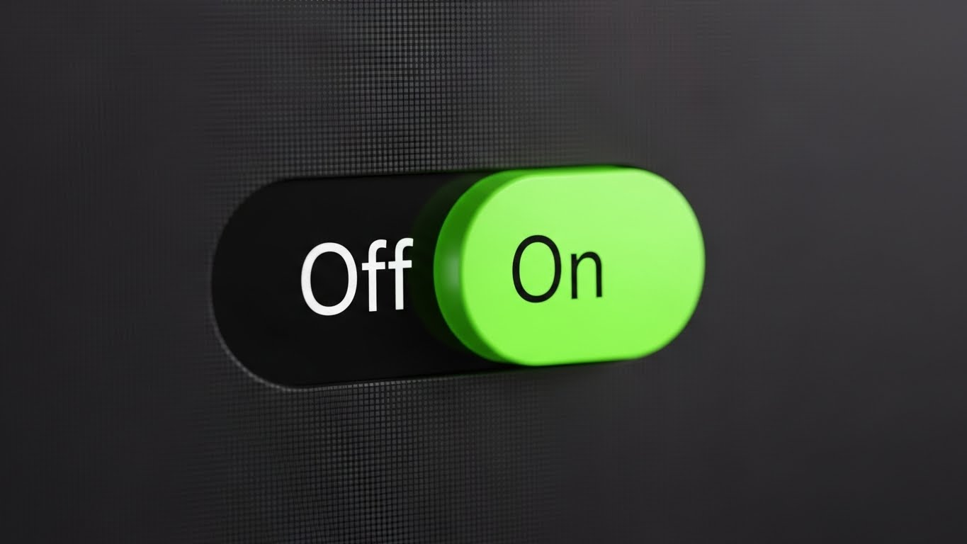
The Visual & Narrative Approach
Sometimes, the smallest details sell the biggest vision. This style uses an extreme macro close-up of a single UI element: a toggle switch sliding from "Off" to "On." As it activates, it glows a vivid electric lime green against a dark charcoal background. We see the faint texture of screen pixels, emphasizing high-definition precision. The narrative is "Responsiveness." It tells the user that the system is snappy, modern, and built with obsessive attention to detail.
Psychological Impact & KPI Focus
- Niche Psychology: Clunky, lagging software drives staff crazy. This visual implies Haptic Satisfaction—the feeling that the software is a finely tuned instrument. It builds confidence in the engineering quality.
- Operational Impact: It supports Trial Activation. By highlighting the satisfaction of a simple setting change, it encourages users to start clicking and configuring their dashboard, moving them from "Observer" to "User."
Strategic Implementation & Trade-offs
- Duration: 3-5 Seconds (Loop).
- Strategic Trade-off: It is hyper-specific. It doesn't explain what the switch does, only how well it works. Use it as B-roll or transitional footage to emphasize quality.
Companies using similar video content -
RoomChecking – Hotel Operations – Streamlines operations with real-time room status updates.
LIKE MAGIC – Guest Communication – Personalizes guest communication and enhances stay.
25. Dark Mode UI Showcase
Retention | Driving Deep Feature Adoption
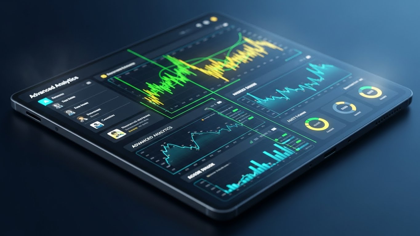
The Visual & Narrative Approach
For the power user, "Dark Mode" signifies serious work. This style features a sleek device displaying complex "Advanced Analytics" graphs with glowing cyan data lines against a midnight blue background. The angle is dynamic, suggesting a high-tech dashboard. The narrative is "Depth and Insight." It appeals to the Revenue Manager who spends hours in the system and wants a comfortable, professional, data-rich environment.
Psychological Impact & KPI Focus
- Niche Psychology: It targets the Expert Identity. Dark mode is often associated with pro-level tools (coding, trading, gaming). Offering this visual suggests your platform is for serious professionals, not just casual users.
- Operational Impact: It drives Deep Feature Adoption. It entices users to explore the analytics module, moving them beyond basic features and increasing the "stickiness" of the software (Retention).
Strategic Implementation & Trade-offs
- Duration: 10-15 Seconds.
- Strategic Trade-off: Dark interfaces can sometimes feel "intimidating" or complex to non-technical users. Target this specifically at data-focused roles (Revenue Managers, GMs).
Companies using similar video content -
Fourth – Workforce Management – AI-powered tools for real-time visibility and analytics.
26. Abstract 3D AI Visualization
Retention | Reducing Support Overhead

The Visual & Narrative Approach
How do you visualize an algorithm? This style uses an abstract metaphor: a cloud-like "brain" formed by thousands of iridescent pearl nodes connected by soft blue light filaments. The background is a soft, ethereal gray. It represents the collective intelligence of your AI support bot or predictive engine. The narrative is "Always Thinking." It reassures the client that the system is constantly learning and resolving issues in the background, even when they sleep.
Psychological Impact & KPI Focus
- Niche Psychology: It addresses the Fear of Complexity. Instead of showing lines of code, we show a beautiful, organic "mind" that handles the complexity for them. It positions AI as a helpful entity rather than a cold robot.
- Operational Impact: It supports Reducing Support Overhead. By selling the competence of the AI, you encourage users to trust the automated suggestions or chatbots rather than calling a human support agent.
Strategic Implementation & Trade-offs
- Duration: 10-20 Seconds (Loop).
- Strategic Trade-off: It is purely conceptual. It must be paired with text that explains what the AI actually does (e.g., "Predicts Occupancy," "Answers Guest FAQs").
Companies using similar video content -
Visito AI – AI-powered Operating System – Automates guest communication with advanced AI.
HiJiffy – AI-driven Hotel Upselling – Leverages AI-powered chatbot technology.
27. Abstract 2D Motion Graphics
Retention | Reducing Churn

The Visual & Narrative Approach
Retention is a cycle, not a destination. This style utilizes a continuous, flowing arrow loop in salmon and navy blue, circulating around a central white core. The smooth, vector-based motion implies a frictionless, infinite process. The narrative is "Continuous Value." It visualizes the relationship between the hotel and the software not as a one-time purchase, but as an ongoing engine of renewal and improvement.
Psychological Impact & KPI Focus
- Niche Psychology: It subconsciously reinforces Stability and Continuity. The closed loop suggests a complete, self-sustaining ecosystem that the hotelier is safe within.
- Operational Impact: It is used to visualize Churn Reduction concepts, such as "Continuous Updates," "24/7 Uptime," or "Loyalty Loops." It is a branding anchor for long-term partnership discussions.
Strategic Implementation & Trade-offs
- Duration: 5-8 Seconds (Loop).
- Strategic Trade-off: It is generic on its own. It needs strong copy (e.g., "The Engine That Never Stops") to give it specific meaning within the hospitality context.
Companies using similar video content -
GuestRevu – Reputation Management – Drives continuous improvement and guest loyalty.
28. Holographic UI over 3D Render
Expansion | Driving Upsell

The Visual & Narrative Approach
When pitching an upgrade or a multi-property rollout, you need to sell the future. This style shows a realistic wooden meeting room table with a tablet. Projecting upwards from the tablet is a sci-fi blue holographic wireframe of a new hotel tower wing. The hologram creates a sense of cutting-edge planning and growth. The narrative is "Scalability." It tells the owner: "Our software grows with you. We are ready for your next building."
Psychological Impact & KPI Focus
- Niche Psychology: It appeals to the Owner/Developer mindset. They are builders. Seeing their future assets projected from your current software bridges the gap between today's operations and tomorrow's empire.
- Operational Impact: It is a key tool for Driving Upsell and Expansion Revenue. It visualizes the software as the foundation for growth, making the case for enterprise-tier contracts.
Strategic Implementation & Trade-offs
- Duration: 15-20 Seconds.
- Strategic Trade-off: The "Sci-Fi" look must be grounded. Ensure the table and environment look like a real boardroom, or the hologram will look like a video game rather than a business tool.
Companies using similar video content -
The Access Group – Hospitality HR – Provides integrated HR and workforce management.
NetSuite – Digital Transformation – Rethinks processes through modern technology.
29. Low-Poly 3D Modeling
Expansion | Driving Referrals

The Visual & Narrative Approach
Referrals are about people connecting. This style uses faceted, pastel-colored low-poly human figures connected by white glowing lines to form a mesh or web. The geometric style is modern and clean, avoiding the cheesiness of standard "shaking hands" stock photos. The narrative is "Community." It visualizes the user base not as isolated customers, but as a strong, interconnected network of modern hoteliers.
Psychological Impact & KPI Focus
- Niche Psychology: Hoteliers value their peer network highly. This visual suggests that by using your software, they are joining a Forward-Thinking Club. It leverages social proof in an abstract, artistic way.
- Operational Impact: It is effective for Driving Referrals. It frames the referral not as a sales transaction, but as "adding a node to the network," strengthening the community of smart operators.
Strategic Implementation & Trade-offs
- Duration: 10 Seconds (Static or Loop).
- Strategic Trade-off: Low-poly art is stylized. It works well for "Community" or "Ecosystem" pages but is not suitable for showing detailed product features.
Companies using similar video content -
Hotelogix – PMS – Integrated approach for multi-functional hotels.
QloApps – Open Source PMS – Community-driven development for hotel management.
30. Aspirational Stock Montage
Expansion | Proactive Support
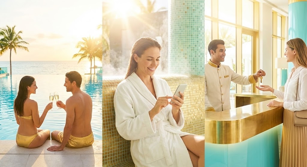
The Visual & Narrative Approach
We conclude with the "Why." This is a high-key, aspirational montage blending three scenes: a couple clinking glasses by a sun-drenched pool, a guest smiling at a smartphone in a spa, and a concierge handing over a key. The lighting is golden and aqua blue. This is not about software; it is about The Outcome. The narrative is: "This is what we enable. We handle the bits and bytes so you can create these moments."
Psychological Impact & KPI Focus
- Niche Psychology: It reconnects the hotelier with their Passion. They didn't enter the industry to manage databases; they entered it to host guests. This visual reminds them that your software is the silent partner in their guest's happiness.
- Operational Impact: It supports Brand Loyalty and Proactive Support. It frames every software update or support ticket as a contribution to this beautiful end goal, keeping the relationship positive and outcome-focused.
Strategic Implementation & Trade-offs
- Duration: 15-30 Seconds.
- Strategic Trade-off: It is generic "Hotel Marketing" imagery. To work for SaaS, it must be bookended by UI shots or logos to remind the viewer that technology made this relaxation possible.
The Visual Operations Doctrine: 3 Strategic Frameworks
To transition from "viewing" these styles to "operationalizing" them, we must adopt a strategic framework. The following three segments synthesize the insights from all 30 examples into a cohesive "Visual Operations Doctrine" for Guest Experience Management Software. This is your blueprint for transforming "content" into "infrastructure."
Strategic Alignment & Visual Architecture (Pre-Production)
The "Why" and "Who" before the "What."
- The Cognitive Load Audit: Before approving a visual style, audit the "Mental Bandwidth" of the viewer. A Front Desk Agent handling a check-in queue (High Stress) needs high-contrast, simple visuals (Style 7, 24). A Revenue Manager in a quiet office (Low Stress) can digest complex data visuals (Style 15, 18). Match the complexity to the environment.
- Role-Based Visual Mapping: Do not use a "One-Style-Fits-All" approach. Map specific styles to specific personas. Use Kinetic Typography (Style 13) for the distracted General Manager on LinkedIn, but use Clean UI Workflow (Style 8) for the Housekeeping Manager who needs to see the checklist functionality.
- The "Glanceability" Standard: In hospitality, speed is currency. Visuals for operational features (like housekeeping apps) must be "glanceable"—understood in under 2 seconds. Use Icon-Driven styles (Style 1) for these features to ensure instant comprehension during a busy shift.
- Brand Voice Consistency: Your software likely has multiple modules (Booking, POS, Housekeeping). Use a unifying visual element (e.g., the "Mint Green" accent from Style 8 or the "Neon Line" from Style 4) across all videos to visually bind these disparate tools into one cohesive ecosystem.
- The Advids Strategic Audit: Before production begins, partner with Advids to define this "Visual Operating System." We help you decide which features merit high-fidelity 3D renders (for investor trust) and which only need simple 2D animations (for staff training), optimizing your budget for impact.
- Standardization vs. Customization: For features that are universal (e.g., login screens), use standardized Clean UI (Style 8). For unique value propositions (e.g., your proprietary AI algorithm), invest in bespoke Abstract 3D (Style 26) to create a defensible brand asset.
- The Cross-Departmental Bridge: Use visuals to unify terminology. If Sales calls it "Guest Journey" and Ops calls it "Check-in Flow," use the 2D Line Art (Style 14) to visually demonstrate that they are talking about the same continuous process.
- Legacy System Integration: Visualizing the connection between old on-premise hardware and your new cloud SaaS is critical. Use the Wireframe to Reality (Style 12) or 3D X-Ray (Style 19) to visually demystify how your modern software "wraps" or "replaces" their aging infrastructure without breaking it.
- Accessibility in Hospitality: Your end-users (cleaning staff, maintenance) often speak multiple languages. Prioritize Visual-First styles (Style 22, 23) that rely on gesture and iconography rather than heavy text or voiceover, ensuring your training assets are globally scalable.
- The Mobile-First Mandate: Hotel staff are rarely at desks. Ensure all styles (especially 8, 9, and 24) are legible on a 6-inch mobile screen. If the UI details are lost on a phone, the visual fails the "Frontline Test."
Operational Adoption & Implementation (Deployment)
Embedding visuals into the daily workflow.
- Overcoming "Big Brother" Anxiety: Staff monitoring features can cause unrest. Use empathy-driven styles like Character-Driven Story (Style 1) to frame these features as "Support tools that balance the workload," rather than surveillance tools that catch mistakes.
- The Micro-Learning Shift: Abandon the 50-page PDF manual. Slice your training into 30-second Rapid UI Montages (Style 10) or Macro UI interactions (Style 24). Deliver these "video pills" directly inside the app to provide help exactly when needed.
- Just-in-Time Support: Embed specific Clean UI (Style 8) loops into your Help Desk ticketing system. When a user searches "How to split a bill," they should see a 10-second looping GIF, not read a paragraph of text.
- Gamification of Training: Use 2D Animation (Style 22) to visualize staff scorecards and rewards. Visualizing the "Win State" (e.g., a high-five animation) can significantly boost engagement with the software during the critical first week of onboarding.
- Reducing Support Ticket Volume: There is a direct correlation between proactive visual guides and reduced call center load. Implementing Abstract AI (Style 26) visuals on the support page can reassure users that the chatbot is capable, increasing their willingness to use self-service tools.
- Remote Onboarding: For hotel chains expanding rapidly, you cannot fly trainers to every site. Leverage Photorealistic 3D (Style 17) and Lifestyle Overlays (Style 9) to create a "Virtual Academy" that trains distributed teams with consistent quality, regardless of location.
- Standard Operating Procedures (SOPs): Transform text-based brand standards into visual process flows. Use Split Screen (Style 2) to show "The Wrong Way" vs. "The Right Way" to clean a room or greet a guest, making the standard unmistakable.
- Feedback Loops: Use interactive video elements (Style 22 aesthetics) to gather staff feedback on software usability. If a user struggles, a friendly visual prompt can ask "Need help?"—turning frustration into a support opportunity.
- Scalable Localization: When expanding to new regions (e.g., APAC or LATAM), use Abstract 2D (Style 6) and Iconography (Style 1) which require zero translation. Keep text layers separate in your source files to allow Advids to rapidly version videos for different languages.
- Leadership Communication: When the CTO needs to explain the roadmap to the Board, do not use spreadsheets. Use Holographic UI (Style 28) and Dynamic Data (Style 15) to visualize the future value of the technology investment in a language that investors understand: Growth.
Measuring Impact & Future-Proofing (ROI)
Measuring success and looking ahead.
- Beyond "Views": Do not measure success by video views. Define actionable KPIs: Time-to-Competency (how fast a new hire learns the system via video) and Feature Adoption Rate (how many users activate a feature after seeing the Dark Mode Style 25 video).
- The "Idle Time" Metric: Correlate better visualization with reduced software navigation time. If Macro UI (Style 24) videos reduce the time it takes to check in a guest by 15 seconds, multiply that by 100 check-ins a day to calculate massive efficiency gains.
- Compliance Velocity: Measure how fast new regulations (e.g., New Hygiene Standards or GDPR) are understood across the property. Kinetic Typography (Style 13) videos are proven to transmit urgent compliance info faster than internal memos.
- Retention and LTV: High-quality UX visualization (Style 27) directly impacts Customer Lifetime Value (LTV). When users feel the software is "Modern" and "Evolving" (Style 12), they are less likely to churn to a competitor.
- The AI Visual Frontier: Prepare for the next wave. Generative AI (Style 5, 11) allows for real-time personalization. Imagine a sales video that automatically inserts the prospect's hotel name into the 3D Render (Style 17). This is the future of conversion.
- Scalability of Assets: Build a library, not a landfill. Ensure all 30 styles use a consistent color palette and font hierarchy. This allows you to mix and match assets (e.g., combining a Style 1 Character with a Style 8 UI) to create new videos without starting from scratch.
- The Advids Partnership: Visual strategy is not a one-time project; it is an ongoing operation. Advids acts as your long-term partner, managing the evolution of your asset library, ensuring that as your software updates, your visuals (Styles 8, 10, 25) update synchronously.
- Benchmarking Success: "Good enough" visuals are a competitive risk. If your competitor uses 3D Parallax (Style 18) and you use static screenshots, you look outdated before the demo begins. visual fidelity is a proxy for product quality.
- The ROI of Safety: For back-of-house operations, quantify the reduction in accidents or data breaches. Use Security Visualization (Style 20) to train staff on cyber-hygiene, and measure the drop in security incidents as a direct ROI of the video training.
- Final Call to Innovation: Treat video as infrastructure. Your guest experience is premium; your software is premium; your visuals must match. By adopting this Visual Operations Doctrine, you stop marketing a tool and start broadcasting a vision of the future of hospitality.
Companies using similar video content -
Canary Technologies – Guest Messaging – Creates better guest experiences.
Zingle – Guest Text Messaging – Communicates with customers across various channels.
Author & Editor Bio


