
Introduction: Visualizing the Future of Care
The healthcare industry stands at a defining precipice. We have successfully digitized the patient record, but we have not yet fully unlocked its intelligence. For today's healthcare executives, the challenge is no longer data acquisition—it is data interpretation. The "Physical/Digital Divide" remains a persistent barrier, where valuable insights are trapped in complex code, invisible to the clinicians and administrators who need them most.
The market is responding with unprecedented speed. The global healthcare analytics market is projected to reach $198.79 billion by 2033, driven by a universal demand for smarter, faster decision-making. Yet, adoption relies on trust. With 66% of physicians already utilizing health AI tools in 2024, the expectation for software is no longer just functionality; it is clarity.
This guide serves as your strategic framework for Visual Interoperability. It moves beyond generic marketing to provide a lexicon of visual styles designed to reduce cognitive load and communicate complex value propositions instantly. From the board room to the operating room, these visual examples demonstrate how to translate "Big Data" into the trusted, actionable insights that will define the next era of patient care.
1. The Foundation of Trust
TOFU | Brand Awareness

1. The Visual & Narrative Approach
Visualization Scenario:
The screen opens on a sterile, pale grey canvas, evoking a clean clinical environment. Hundreds of "Mint Green" and "Sterile White" circles—representing disparate data points like patient vitals and lab results—float chaotically. In a crisp, synchronized movement, they snap together to form a perfectly aligned medical cross. The design is devoid of gradients or shadows, relying on solid, hard-edged blocks to convey absolute precision.
Narration Style:
Calm, authoritative, and foundational. "Before you can predict the future, you must organize the present. Structure is the cure."
2. Psychological Impact & KPI Focus
Niche Psychology:
Healthcare stakeholders are risk-averse; they fear "messy" data integration. This visual provides a "Safety Signal." The geometric perfection of the nodes forming the cross reassures the viewer that the underlying architecture is robust, organized, and error-free.
Operational Impact:
This style visually addresses Data Integrity and Compliance. It reduces cognitive load, signaling that the platform simplifies complexity rather than adding to it.
3. Strategic Implementation & Trade-offs
Best Use Case:
LinkedIn Organic feeds (Duration: 10-15 seconds). Perfect for brand awareness campaigns focusing on security and foundational architecture.
Strategic Trade-off:
It is symbolic, not literal. While it builds trust, it does not explain specific features or workflows.
Companies using similar video content -
Gaine – Coperor Health Data Management Platform – Unified data platform with master data management.
Health Chain – Centaur Data Platform – Data intra/inter-operability platform connecting siloed data.
2. The Fluid Ecosystem
TOFU | Category Creation

1. The Visual & Narrative Approach
Visualization Scenario:
To visualize "Interoperability," we move away from rigid lines to organic fluidity. A "Warm Coral" shape (representing Clinical Data) and a "Deep Teal" shape (representing Financial Data) drift toward the center of a clean white frame. Instead of crashing, they merge like liquid, creating a seamless, unified entity with soft, glossy highlights. The motion is smooth and biological, suggesting a living ecosystem.
Narration Style:
Fluid and innovative. "Silos are history. Experience the seamless flow of unified intelligence."
2. Psychological Impact & KPI Focus
Niche Psychology:
The "Silo Effect" is a primary source of frustration. This visual uses the metaphor of "liquid merging" to promise friction-free integration. The organic shapes feel human-centric, contrasting with the cold, mechanical nature of legacy systems.
Operational Impact:
This style visualizes Interoperability and Data Harmonization. It demonstrates that the software dissolves barriers between departments, directly linking to efficiency KPIs.
3. Strategic Implementation & Trade-offs
Best Use Case:
Website Hero backgrounds (Duration: 20-30 seconds). It sets a modern, innovative tone for the brand.
Strategic Trade-off:
The abstract nature requires strong accompanying copy to clarify what is merging (e.g., "EHR + Claims").
Companies using similar video content -
Talend – Data Integration Platform – Integrates clinical and administrative data seamlessly.
Redox – API Platform – Cloud-based API for healthcare data integration.
3. The Intelligent Bridge
TOFU | Market Education

1. The Visual & Narrative Approach
Visualization Scenario:
We enter a high-end 3D environment—a pristine "White Void." Suspended in this space is a complex network of "Polished Silver" nodes. Suddenly, "Electric Blue" filaments ignite, shooting from node to node to form a sophisticated bridge structure. The camera pans cinematically, showing light pulses traveling across the connections. The lighting is studio-quality, casting soft, realistic shadows.
Narration Style:
Futuristic and premium. "Artificial Intelligence that builds bridges, not walls. Connect the unconnected."
2. Psychological Impact & KPI Focus
Niche Psychology:
AI is often viewed as a "Black Box." This visual gives it a tangible, premium form. The "bridge" metaphor directly addresses the anxiety of disconnected systems, while the high-fidelity rendering signals enterprise-grade quality.
Operational Impact:
This targets Clinical Decision Support (CDS). It implies that the AI is actively building new neural pathways between data points to generate unique insights.
3. Strategic Implementation & Trade-offs
Best Use Case:
YouTube pre-roll ads or "Technology" pages (Duration: 30-45 seconds). It justifies a premium price point through premium aesthetics.
Strategic Trade-off:
High production cost. It creates high expectations for the sophistication of the actual product interface.
Companies using similar video content -
Google Cloud Healthcare API – Healthcare API – Secure data access with ML tools for interoperability.
Viz.ai – Care Coordination Platform – AI-powered platform for medical imaging analysis.
4. High-Velocity Growth
TOFU | Shaping Brand Perception

1. The Visual & Narrative Approach
Visualization Scenario:
Speed is the message. Large, heavy geometric blocks in "Electric Yellow," "Jet Black," and "White" collide with high energy. Upon impact, they instantly rearrange into sharp arrow shapes pointing aggressively upward. The edges feature motion blur to convey high velocity. The background remains stark white to maximize contrast and impact.
Narration Style:
Energetic and rhythmic. No voiceover needed; the visual rhythm drives the message of "Acceleration."
2. Psychological Impact & KPI Focus
Niche Psychology:
Healthcare is often criticized for being slow. This style disrupts that narrative. It appeals to the "Forward-Looking Executive" who wants to inject speed and momentum into their organization.
Operational Impact:
This style visualizes Rapid ROI and Performance Improvement. The upward arrows are a universal symbol for positive growth in revenue or patient outcomes.
3. Strategic Implementation & Trade-offs
Best Use Case:
LinkedIn Video interruptions (Duration: 10-15 seconds). Designed to stop the scroll and create an impression of energy.
Strategic Trade-off:
It conveys emotion but zero information. It must be paired with clear text to explain what is accelerating.
Companies using similar video content -
UiPath – RPA Platform – Automates rule-based tasks across digital systems.
Automation Anywhere – RPA Platform – Automates repetitive back-office tasks.
5. The Workflow Cure
TOFU | LinkedIn Organic

1. The Visual & Narrative Approach
Visualization Scenario:
The camera flies through a tunnel of angled UI screens. As we approach, "Red Alert" icons (indicating errors or risks) pop up. Instantly, they transform into "Green Checkmarks" with a satisfying animation. This happens in rapid succession—Red to Green, Red to Green—creating a rhythm of resolution against a radial blur background.
Narration Style:
Direct and solution-oriented. "Identify. Resolve. Optimize. In seconds."
2. Psychological Impact & KPI Focus
Niche Psychology:
"Alert Fatigue" is a major issue for hospital staff. This visual offers a psychological reward—the resolution of anxiety (Red) into safety (Green). It promises a tool that reduces workload rather than adding to it.
Operational Impact:
This visualizes Exception Management and Workflow Automation. It proves the software is a problem-solving engine.
3. Strategic Implementation & Trade-offs
Best Use Case:
YouTube Skippable Ads (Duration: 6-15 seconds). The visual hook works instantly even without sound.
Strategic Trade-off:
The pace is too fast for reading details. It showcases the volume of solutions, not the depth of the data.
Companies using similar video content -
Medsphere – Intelligent Workflow Automation – Automates processes to save time and resources.
Xerox Workflow Automation Solutions for Healthcare – Workflow Automation – Transforms manual processes into digital ones.
6. From Chaos to Clarity
TOFU | Skippable Pre-Roll Ad

1. The Visual & Narrative Approach
Visualization Scenario:
A cloud of chaotic "Violet" particles (representing unstructured notes/data) swirls on the left. A suction force pulls them into a central funnel. As they pass through, they emerge on the right as a perfectly straight, organized line of "Emerald Green" geometric shapes. The transition from chaos to linear order is smooth and mechanical.
Narration Style:
Analytical and reassuring. "We handle the mess. You handle the care."
2. Psychological Impact & KPI Focus
Niche Psychology:
Data cleansing is a hidden but massive cost. This visual validates the pain of "Dirty Data" and offers a visual guarantee of Data Normalization. It reduces the anxiety of implementation.
Operational Impact:
This visualizes ETL Processes (Extract, Transform, Load) and Data Standardization. It connects to KPIs regarding data accuracy and administrative efficiency.
3. Strategic Implementation & Trade-offs
Best Use Case:
Display Ads or Sidebar visuals (Looping). It reinforces the "Clean Data" value proposition simply.
Strategic Trade-off:
It is highly abstract. It works best when targeting technical buyers who understand the difficulty of backend data normalization.
Companies using similar video content -
Health Compiler – Healthcare Data Integration Platform – Real-time data integration and standardization.
AWS HealthLake – Health Data Platform – Organizes, indexes, and stores raw clinical data.
7. The Blueprint of Care
MOFU | Demand Gen
1. The Visual & Narrative Approach
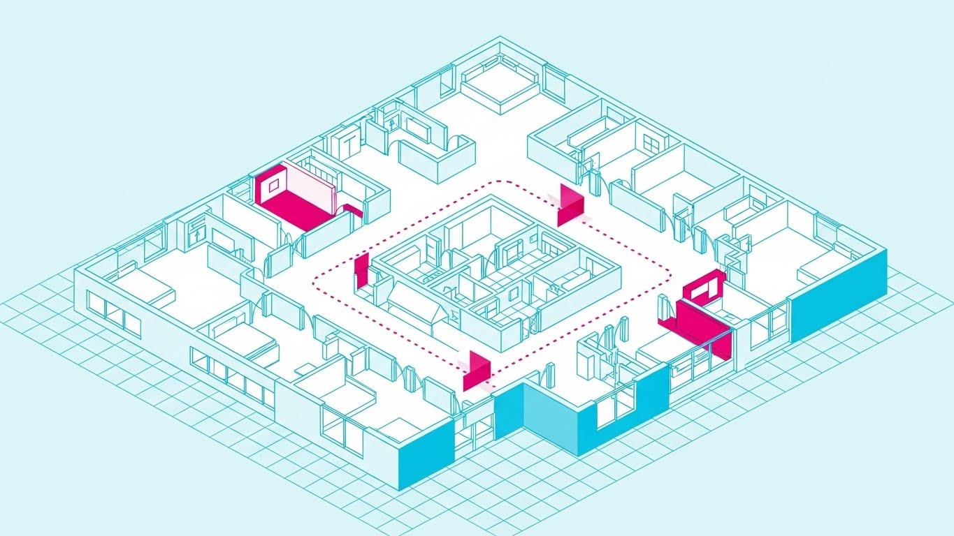
Visualization Scenario:
We see an isometric (3/4 view) grid layout of a hospital floor, resembling an architectural blueprint. The walls are "Cyan," and the floors are "White." Dotted "Magenta" lines trace the paths of patients moving between rooms. Specific rooms pulse with magenta light to indicate occupancy or bottlenecks.
Narration Style:
Technical and precise. "See your operation from every angle. Optimize flow. Reduce wait times."
2. Psychological Impact & KPI Focus
Niche Psychology:
Hospital administrators think in terms of physical space and bed capacity. This style maps digital analytics onto their physical reality (Rule 37), giving them a "God's Eye View" of their domain.
Operational Impact:
This targets Patient Flow Optimization and Capacity Management. It helps visualize bottlenecks that spreadsheets cannot show.
3. Strategic Implementation & Trade-offs
Best Use Case:
Product pages for "Operations" modules (Duration: 30-60 seconds). It contextualizes data in the real world.
Strategic Trade-off:
Requires specific assets to match the facility type (e.g., ER vs. ICU). Can look static if not animated with active movement.
Companies using similar video content -
Qmatic – Patient Flow Management System – Optimizes patient journeys and resource efficiency.
Kohezion – Patient Flow Management – Custom solutions for scheduling and registration.
8. Predictive Transparency
MOFU | Product Differentiation

1. The Visual & Narrative Approach
Visualization Scenario:
A 3D bar chart floats in a blurred, bright office environment. The bars are made of frosted glass (glassmorphism), filled with "Vivid Lime Green" light. They rise smoothly, and a glowing white line connects their peaks, extending into empty space to visualize a prediction. The translucency suggests depth and clarity.
Narration Style:
Sophisticated and strategic. "Don't just report on the past. Predict the future."
2. Psychological Impact & KPI Focus
Niche Psychology:
Standard charts feel "dead" and retrospective. This "living" chart feels predictive and modern. The glass texture implies transparency in reporting, while the rising green bars signal financial health.
Operational Impact:
This is crucial for visualizing Predictive Analytics and Revenue Forecasting. It elevates the tool from a "reporting" system to a "strategic planning" asset.
3. Strategic Implementation & Trade-offs
Best Use Case:
Blog headers or Feature Highlight videos (Duration: 10-20 seconds).
Strategic Trade-off:
Can appear generic if the data labels aren't specific to healthcare KPIs (e.g., "Readmissions" or "Claims Denials").
Companies using similar video content -
Enter.Health – Revenue Cycle Analytics – AI/ML for predictive, real-time financial decision-making.
PMMC – Revenue Cycle Analytics – Business intelligence for optimizing revenue cycle performance.
9. The Developer's Command Center
MOFU | Feature Education
1. The Visual & Narrative Approach
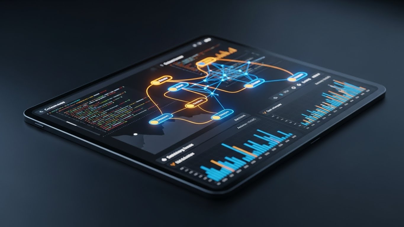
Visualization Scenario:
The camera angles down onto a tablet displaying a complex dashboard in "Dark Mode" (Deep Charcoal). Delicate data lines glow in "Neon Amber" and "Blue." The focus is on the density and precision of the data, highlighting code snippets or complex query results.
Narration Style:
Quiet, intense, and expert. "Power for the builders. Analytics for those who speak code."
2. Psychological Impact & KPI Focus
Niche Psychology:
Designed for the Technical Buyer (CTO/Data Scientist). "Dark Mode" signals a professional, developer-friendly environment. It implies that the software is robust enough for heavy, late-night usage.
Operational Impact:
This visualizes Code-Level Analytics and System Performance. It builds credibility with the technical gatekeepers who vet the software.
3. Strategic Implementation & Trade-offs
Best Use Case:
Account-Based Marketing (ABM) ads targeting IT decision-makers.
Strategic Trade-off:
May alienate non-technical users who find dark interfaces "intimidating." Use strictly for technical segmentation.
Companies using similar video content -
CapMinds – Healthcare API Development Services – Builds secure, scalable APIs for healthcare apps.
Topflight Apps – Medical Device Integration Software – Focuses on medical device software integration.
11. The Modernization Contrast**
MOFU | Competitive Displacement

1. The Visual & Narrative Approach
Visualization Scenario:
The screen is divided by a sharp "Pristine White" vertical line. On the left, labeled "OLD WAY" in handwritten text, is a sepia-toned, chaotic scene: a desk overflowing with paper files and dusty binders, evoking administrative gridlock. On the right, labeled "NEW WAY" in crisp blue text, is a bright, sunlit surface where a hand holds a tablet displaying a sleek, organized "Blue and White" dashboard. As the video progresses, the white line moves left, allowing the digital reality to cleanse and replace the physical clutter.
Narration Style:
Comparative and decisive. "Leave the paper trail behind. Step into the clarity of digital precision."
2. Psychological Impact & KPI Focus
Niche Psychology:
Healthcare organizations often suffer from "Shadow IT" and fragmented workflows. This visual validates the frustration of the legacy approach (the mess) while offering an immediate, accessible antidote. It triggers a "Repulsion/Attraction" response, making the upgrade feel like a relief rather than a burden.
Operational Impact:
This visually targets Operational Efficiency and Legacy Migration. It demonstrates the tangible elimination of manual redundancy and the consolidation of data silos.
3. Strategic Implementation & Trade-offs
Best Use Case:
Landing Pages for "Digital Transformation" campaigns (Duration: 30-45 seconds). Excellent for competitive displacement against manual processes.
Strategic Trade-off:
It is a binary comparison. It works best when the prospect is already aware of their problem but needs a push to choose a solution.
Companies using similar video content -
InterScripts – BytePad – Legacy data archival and access to archived data.
Oracle Health – EHR System – Modernizing healthcare operations from legacy systems.
12. The Augmented Clinician
MOFU | Functional Buyer

1. The Visual & Narrative Approach
Visualization Scenario:
We see an over-the-shoulder shot of a female physician in a sunlit office, reviewing a tablet. Floating in the air above the device is a semi-transparent, holographic interface. It displays patient vitals in "Warm Orange" and blood pressure trends in "Teal." The graphics track perfectly with the tablet’s movement, suggesting an augmented reality layer that provides deeper insight without obstructing the human connection.
Narration Style:
Empathetic and professional. "Insights that travel with you. Intelligence that amplifies your expertise, right at the point of care."
2. Psychological Impact & KPI Focus
Niche Psychology:
Clinicians fear that technology will disrupt the patient-provider relationship (the "screen gaze" problem). This visual integrates the tech into the workflow naturally. The warm lighting and human presence signal that the software supports, rather than replaces, the doctor.
Operational Impact:
This visualizes Clinical Workflow Integration and Real-Time Decision Support. It emphasizes that data is available instantly, bridging the physical exam with digital intelligence.
3. Strategic Implementation & Trade-offs
Best Use Case:
"Solutions for Providers" Website Sections (Duration: 45-60 seconds). Builds empathy and functional trust.
Strategic Trade-off:
Requires high-quality tracking and compositing. If the hologram looks "stuck on" or artificial, it breaks the immersion and credibility.
Companies using similar video content -
Suki – Ambient Clinical Intelligence – AI assistant for documentation and coding.
Glass Health AI – Clinical Decision Support – LLM-based AI agent for real-time clinical insights.
13. The Approachable Narrative
MOFU | Visitor Re-engagement

1. The Visual & Narrative Approach
Visualization Scenario:
A stylized, friendly character with "Pastel Blue" skin (Corporate Memphis style) sits at a desk. They are smiling while looking at a simplified bar chart that is animating upwards. The background is a soft "Peach" circle, isolating the action. The animation is bouncy and fluid. The entire scene communicates ease, friendliness, and a lack of friction, removing the intimidation factor of "Big Data."
Narration Style:
Light, inviting, and reassuring. "Complex analytics, simplified for your daily routine. No PhD required."
2. Psychological Impact & KPI Focus
Niche Psychology:
Software adoption is a massive hurdle; non-technical staff fear steep learning curves. This friendly, flat aesthetic disarms that fear. It signals "Consumer-Grade UX"—implying the software is as easy to use as a favorite smartphone app.
Operational Impact:
This targets User Adoption Rates and Training Time Reduction. It creates a perception of intuitive design, critical for administrative buy-in.
3. Strategic Implementation & Trade-offs
Best Use Case:
Retargeting Ads and Onboarding Videos (Duration: 15-30 seconds). Great for re-engaging visitors who didn't convert due to perceived complexity.
Strategic Trade-off:
Can feel "too casual" for C-Suite buyers focused on security. Use primarily for end-user advocacy and onboarding.
Companies using similar video content -
PatientNow – Practice Management Software – Automates patient-facing and administrative workflows.
Heidi Health AI – Clinical Documentation Organization – Structures visit information for consistency.
14. The Staff Morale Booster
MOFU | Building Trust
1. The Visual & Narrative Approach
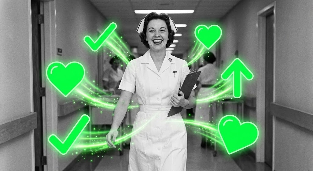
Visualization Scenario:
Black and white footage of a smiling nurse walking confidently down a hospital corridor. As she moves, vibrant "Bright Green" vector icons—checkmarks, hearts, and upward arrows—burst forth and float around her, leaving a glowing trail. The contrast between the desaturated reality and the neon graphics highlights the "spark" the software brings to her day.
Narration Style:
Uplifting and human-centric. "Restore the joy of nursing. Less paperwork, more patient work."
2. Psychological Impact & KPI Focus
Niche Psychology:
Burnout is the industry's crisis. This visual positions the software as a tool for Staff Retention and well-being. The "Green Hearts" and "Checkmarks" act as dopamine triggers, associating the software with success, validation, and task completion.
Operational Impact:
This visualizes Operational Efficiency and Burnout Reduction. It shifts the conversation from "Data" to "Quality of Life" for the staff.
3. Strategic Implementation & Trade-offs
Best Use Case:
Case Study Videos and Social Proof (Duration: 30-60 seconds). It humanizes the ROI.
Strategic Trade-off:
Relies heavily on the quality of the stock footage. If the footage feels staged, the emotional connection breaks.
Companies using similar video content -
Limbic – Clinical AI – Reduces staff burnout and improves community engagement.
Thoughtful AI – Workflow Automation – Streamlines administrative and operational workflows.
15. The Value Equation
BOFU | ROI Justification

1. The Visual & Narrative Approach
Visualization Scenario:
A high-end, cinematic close-up of a pristine white surface. "Matte White" 3D medical crosses are intermixed with stacks of realistic Gold and Silver coins. The lighting is crisp (High-Key), creating sharp reflections. The camera pans slowly over this arrangement, suggesting a perfect balance between clinical excellence and financial sustainability.
Narration Style:
Serious, valuable, and bottom-line focused. "Value-Based Care isn't just a concept. It's a measurable return."
2. Psychological Impact & KPI Focus
Niche Psychology:
The CFO needs to know the software pays for itself. This visual literalizes the concept of Value-Based Care (Quality + Cost). It treats the medical symbol as a precious asset, equal to the currency, reinforcing that profitability comes from better care.
Operational Impact:
This targets ROI Justification and Revenue Cycle Management (RCM). It anchors the abstract software investment to tangible financial outcomes.
3. Strategic Implementation & Trade-offs
Best Use Case:
Sales Decks and Investor Presentations (Static or Loop). It serves as a powerful visual anchor during pricing discussions.
Strategic Trade-off:
It is purely symbolic. It must be accompanied by hard numbers (e.g., "3x ROI in 12 months") to be effective.
Companies using similar video content -
Milliman MedInsight – MedInsight VBC Insights – Healthcare data and analytics for value-based care.
Persivia – CareSpace – AI-driven platform for value-based care models.
16. The Architecture of Trust
BOFU | Risk Mitigation

1. The Visual & Narrative Approach
Visualization Scenario:
We are looking at a sleek server tower. The outer shell turns into "Ghost White" transparent glass, revealing the internal components. Deep inside, a glowing "Cyan" digital padlock mechanism locks into place with a mechanical thud. The background is a clean "Clinical White," avoiding the "scary hacker" aesthetic of typical cybersecurity imagery.
Narration Style:
Reassuring and technical. "Security isn't an add-on. It is built into the DNA of our architecture."
2. Psychological Impact & KPI Focus
Niche Psychology:
Data breaches are a career-ending risk for CIOs. This "X-Ray" view proves there is nothing to hide. It uses the metaphor of transparency to demonstrate HIPAA Compliance and robust encryption without using fear tactics.
Operational Impact:
This visualizes Data Security and Risk Mitigation. It transforms a mandatory "check-box" feature into a premium value proposition.
3. Strategic Implementation & Trade-offs
Best Use Case:
Whitepapers and Security Documentation (Duration: 15-20 seconds). Essential for the "Security Review" phase of the buying cycle.
Strategic Trade-off:
Very technical. It appeals almost exclusively to the IT/Security stakeholder, not the clinical user.
Companies using similar video content -
Vanta – Compliance Automation – Automates compliance and security-related workflows.
Inovaare – Health Cloud Platform – Automates compliance monitoring and regulatory protocols.
17. The Physician Champion
BOFU | Sales Cycle Acceleration

1. The Visual & Narrative Approach
Visualization Scenario:
A high-quality cinematic portrait of a male doctor, approximately 50 years old, conveying experience and authority. He stands in a blurred, bright hospital environment. The lighting is soft and flattering (Rembrandt lighting). He looks directly into the lens, smiling gently. This is not a stock photo actor; he feels like a peer, a "Physician Champion."
Narration Style:
Testimonial and peer-to-peer. "I don't need more data. I need better answers. This is how we get them."
2. Psychological Impact & KPI Focus
Niche Psychology:
Doctors trust other doctors. This visual leverages Social Proof and authority bias. It overcomes the "Not Invented Here" syndrome by presenting the software as a tool chosen by respected leaders.
Operational Impact:
This targets Stakeholder Buy-in and Change Management. It helps the champion within the buying committee sell the solution to their peers.
3. Strategic Implementation & Trade-offs
Best Use Case:
Email Video Signatures for Sales Reps (Duration: 30-60 seconds). It personalizes the outreach and builds immediate trust.
Strategic Trade-off:
The "actor" must be perfectly cast. If they lack gravitas or authenticity, the trust signal backfires.
Companies using similar video content -
OpenEvidence – Medical Information Platform – Provides evidence-based clinical findings.
18. The Connected Horizon
BOFU | Economic Buyer

1. The Visual & Narrative Approach
Visualization Scenario:
A low-angle shot of a diverse group of hospital executives standing in a glass atrium, looking upward toward the sunlight. The color palette is "Warm Gold" and "Sky Blue." Subtle, white geometric network lines are overlaid in the sky above them, suggesting a connected, limitless future. The mood is triumphant.
Narration Style:
Visionary and grand. "Build a legacy of health. Connect your vision to the world."
2. Psychological Impact & KPI Focus
Niche Psychology:
The Economic Buyer (CEO/Board) buys a vision, not just a tool. This style appeals to their desire for Market Leadership and legacy. It moves the conversation from "fixing problems" to "defining the future."
Operational Impact:
This visualizes Scalability and Population Health Management. It suggests the organization is ready for growth and regional dominance.
3. Strategic Implementation & Trade-offs
Best Use Case:
LinkedIn Company Page Header or Annual Report Video. It establishes the "Big Picture" brand identity.
Strategic Trade-off:
It is generic. It builds feeling but explains nothing about the product. Must be supported by specific case studies.
Companies using similar video content -
Optum Analytics – Population Health Solutions – Healthcare analytics for population health.
N1 Health – Health Data Platform – Focuses on future health needs and plans.
19. The Resilient Core
BOFU | Technical Buyer

1. The Visual & Narrative Approach
Visualization Scenario:
A wide, cinematic shot of a digital server room. The walls are lined with black server racks emitting "Neon Pink" and "Cyber Blue" light. In the center of the room, a glowing 3D shield icon floats, rotating slowly. The floor is reflective black glass, doubling the visual impact. The aesthetic is "High-Tech Fortress."
Narration Style:
Intense and powerful. "Unstoppable uptime. Unbreakable defense. The power behind the care."
2. Psychological Impact & KPI Focus
Niche Psychology:
For the CTO, "uptime" is the currency of sleep. This visual provides a "Dark Mode" aesthetic that signals robustness, 24/7 reliability, and enterprise-grade power. It differentiates from the "soft" clinical visuals.
Operational Impact:
This visualizes System Reliability, Disaster Recovery, and Infrastructure Resilience. It reassures the technical team that the backend can handle massive data loads.
3. Strategic Implementation & Trade-offs
Best Use Case:
Technical Specification Pages or "How it Works" Deep Dives (Duration: 30-45 seconds).
Strategic Trade-off:
Can appear "cold" or "impersonal" to clinical staff. Use strictly for technical segmentation.
Companies using similar video content -
Google Cloud Healthcare – Cloud Infrastructure – Provides scalable and secure cloud services.
Microsoft Azure – Cloud Platform – Offers scalable cloud services for healthcare.
20. The Implementation Bridge
BOFU | Objection Handling

1. The Visual & Narrative Approach
Visualization Scenario:
The screen shows a horizontal wipe effect moving from left to right. The left side displays a "Blueprint Blue" wireframe schematic of a hospital wing—precise, mathematical lines. As the wipe passes, the wireframe dissolves instantly into a photorealistic render in "Pristine White" and "Green," showing the fully operational facility.
Narration Style:
Process-oriented and confident. "From strategy to reality. Implementation without the interruption."
2. Psychological Impact & KPI Focus
Niche Psychology:
The fear of "Implementation Hell" (long, costly delays) is a major objection. This visual metaphor implies that the transition from "Plan" (Wireframe) to "Result" (Reality) is smooth, pre-calculated, and inevitable.
Operational Impact:
This visualizes Time-to-Value and Implementation Speed. It promises that the software can be deployed with minimal disruption to ongoing operations.
3. Strategic Implementation & Trade-offs
Best Use Case:
"Implementation" or "Onboarding" web pages (Duration: 15-20 seconds). It closes the gap between the promise and the delivery.
Strategic Trade-off:
Requires distinct assets (wireframe vs. photo) that match perfectly. Misalignment ruins the effect.
Companies using similar video content -
CitiusTech Inc. – Digital Health Solutions – Focuses on digital transformation and implementation.
21. The Partnership Trigger
BOFU | Driving Demo Requests

1. The Visual & Narrative Approach
Visualization Scenario:
A single, continuous line in "Navy Blue" begins to draw on a textured "Off-White" paper background. It gracefully forms the icon of a handshake, symbolizing agreement. Without breaking the line, the handshake morphs fluidly into a "Play" button. The animation is elegant, minimal, and devoid of visual noise, focusing entirely on the transition from "Agreement" to "Action."
Narration Style:
Professional and concise. "Partnership is just the beginning. Press play on progress."
2. Psychological Impact & KPI Focus
Niche Psychology:
At the bottom of the funnel, decision fatigue sets in. This minimalist style removes all distraction, focusing the prospect's attention on a single action: starting. The "handshake" visual validates the relationship, while the "play button" triggers the next step.
Operational Impact:
This targets Conversion Rate Optimization (CRO) and Demo Requests. It visually bridges the gap between signing a contract and initiating the service.
3. Strategic Implementation & Trade-offs
Best Use Case:
Email Signatures for Account Executives or "Thank You" pages after form submission (Duration: 5-8 seconds).
Strategic Trade-off:
It is purely metaphorical. It does not show the product, so it relies on the prospect already understanding the value proposition.
Companies using similar video content -
Salesforce Health Cloud – Health Cloud – Integrates AI with CRM for customer interactions.
22. The Self-Serve Standard
Onboarding | Self-Serve Onboarding
1. The Visual & Narrative Approach
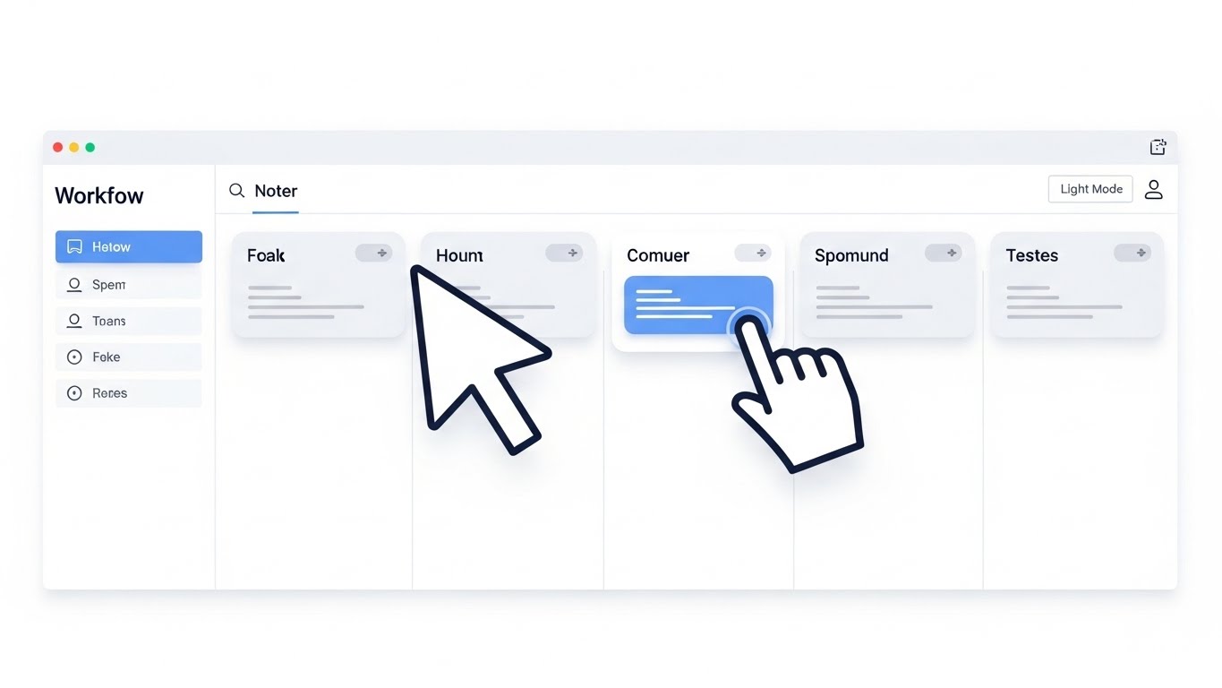
Visualization Scenario:
We see a direct, straight-on view of a minimalist dashboard on a stark "White" background. The interface is clean, featuring soft "Sky Blue" buttons and "Light Grey" containers. A cursor enters and drags a patient record card from a "Pending" column to a "Resolved" column. The movement is smooth, and soft drop shadows provide depth, highlighting the card being moved.
Narration Style:
Helpful and instructive. "Organize your workflow with a simple gesture. No manuals needed."
2. Psychological Impact & KPI Focus
Niche Psychology:
Healthcare software is notorious for "clunky" interfaces (the EHR burden). This visual proves that this specific tool is modern, lightweight, and intuitive. It lowers the psychological barrier to learning a new system.
Operational Impact:
This visualizes Ease of Use and Self-Serve Onboarding. It directly supports KPIs related to "Time to First Value" for new users.
3. Strategic Implementation & Trade-offs
Best Use Case:
Product Tour modals or "Welcome" emails (Duration: 10-15 seconds).
Strategic Trade-off:
It is generic. To be effective, the specific text on the cards (e.g., "Patient Discharge") must align with the viewer's specific role.
Companies using similar video content -
Text Blaze – Workflow Automation – Creates powerful medical templates for note-taking.
Sully AI – Clinical Documentation Structuring – Helps structure and generate clinical documentation.
23. The Research Accelerator
Onboarding | Accelerating TTV

1. The Visual & Narrative Approach
Visualization Scenario:
A photorealistic white laboratory microscope sits on a dark table, bathed in "Cyber Pink" rim lighting. Orbiting the microscope is a curved, transparent "Holographic Cyan" user interface. The UI displays real-time analytics and instructional nodes that glow brightly. The background is a blurred, high-tech lab environment. The hologram feels like an advanced layer of intelligence guiding the user.
Narration Style:
Advanced and scientific. "Precision data, overlaying your reality. See what others miss."
2. Psychological Impact & KPI Focus
Niche Psychology:
For researchers and lab technicians, accuracy is paramount. This style associates the software with high-tech precision instruments. The "hologram" metaphor suggests that the software provides a "heads-up display" for their work, augmenting their capabilities rather than distracting them.
Operational Impact:
This targets Training Efficiency and Error Reduction. It implies that the software provides real-time guardrails and insights during complex physical tasks.
3. Strategic Implementation & Trade-offs
Best Use Case:
Training Videos for technical staff or "Advanced Features" showcases (Duration: 20-30 seconds).
Strategic Trade-off:
High production complexity. The tracking of the hologram to the 3D object must be flawless, or it looks like a cheap filter.
Companies using similar video content -
PathAI – Digital Pathology Platform – Applies machine learning to improve diagnostic accuracy.
Tempus – Precision Medicine Platform – Applies AI to clinical and molecular data.
24. The Integration Island
Onboarding | Reducing Friction
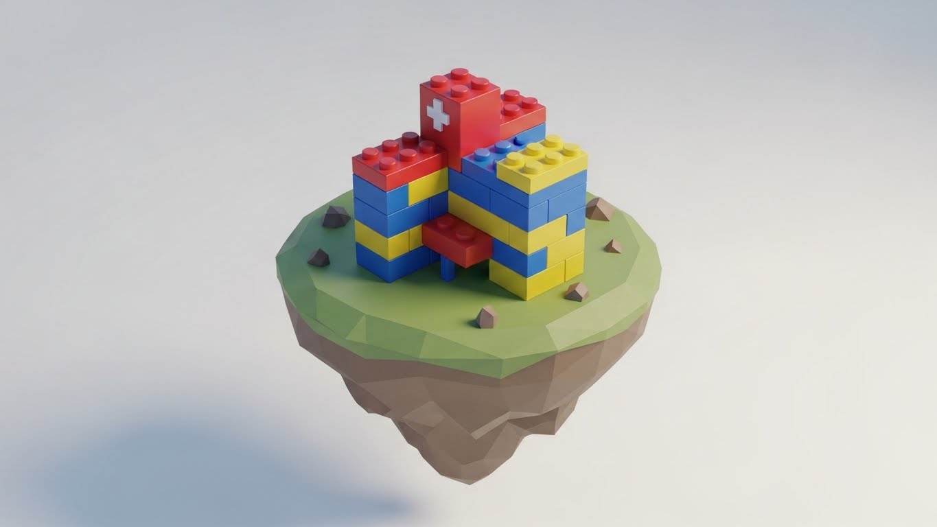
1. The Visual & Narrative Approach
Visualization Scenario:
A bird's-eye view of a whimsical floating island in a soft "White" void. On the island, a simplified hospital is being built from "Primary Color" blocks (Red, Blue, Yellow). The blocks snap together with a satisfying "click" animation, symbolizing the connection of different software modules. The low-poly style makes the complex process of integration look like a playful, easy toy set.
Narration Style:
Playful and reassuring. "Stack your solutions. Build your ecosystem. It just clicks."
2. Psychological Impact & KPI Focus
Niche Psychology:
Integration is usually a headache involving APIs and code. This visual gamifies the concept, reducing the anxiety of "setup." It frames the configuration process as building something stable and complete.
Operational Impact:
This visualizes System Configuration and Modularity. It is perfect for explaining how different modules (HR, Finance, Clinical) fit together.
3. Strategic Implementation & Trade-offs
Best Use Case:
"Getting Started" guides and Integration Hub covers (Duration: 15-20 seconds).
Strategic Trade-off:
The aesthetic is "cute." It works for setup/configuration contexts but may lack the seriousness required for clinical safety features.
Companies using similar video content -
Mirth Connect – Integration Engine – Open-source engine for healthcare data exchange.
Cloverleaf Integration Suite – Integration Platform – Healthcare-specific platform for data exchange.
25. The Activation Moment
Onboarding | Trial Activation

1. The Visual & Narrative Approach
Visualization Scenario:
An extreme close-up (Macro) of a digital toggle switch on a pristine screen. As a soft-focus finger taps it, the switch slides from grey to a vibrant "Vivid Lime Green," displaying the word "On." The pixels are visible, emphasizing high resolution. The visual focuses entirely on the tactile satisfaction of turning a feature on.
Narration Style:
Short and punchy. "Power on. Protection active."
2. Psychological Impact & KPI Focus
Niche Psychology:
Micro-interactions define the "feel" of quality software. This visual highlights the responsiveness of the application. The "Green" activation signal provides a dopamine hit, confirming that the user has successfully performed an action.
Operational Impact:
This targets User Engagement and Feature Activation. It encourages users to explore the settings and configure the tool.
3. Strategic Implementation & Trade-offs
Best Use Case:
In-App Tooltips or "New Feature" announcements (Duration: 3-5 seconds).
Strategic Trade-off:
It is extremely specific. It draws attention to UI polish rather than deep functionality. Best used as visual punctuation.
Companies using similar video content -
Ascom – Medical Device Integration – Seamlessly connects medical devices.
26. The Error Eraser
Retention | Knowledge Base
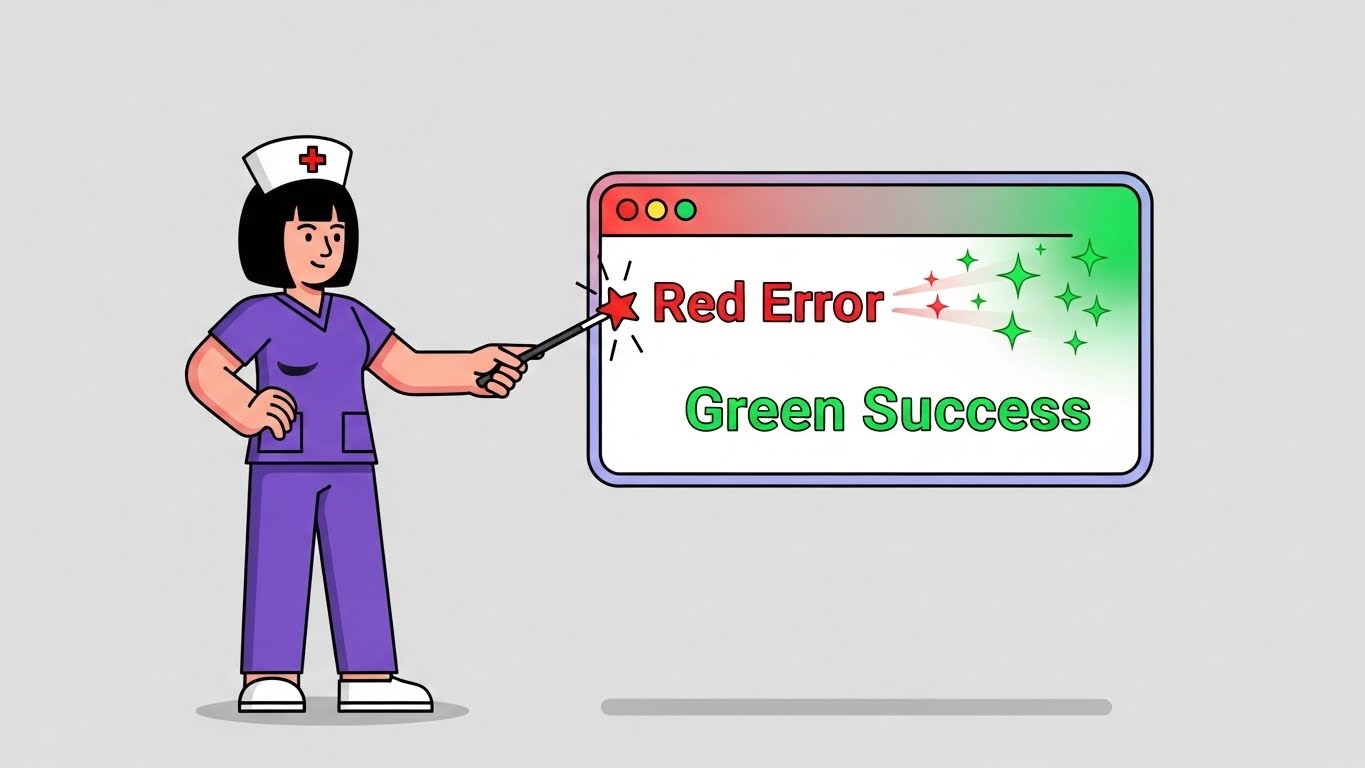
1. The Visual & Narrative Approach
Visualization Scenario:
A flat vector character—a nurse in "Purple" scrubs—stands next to a floating UI window displaying a "Red Error" message. She smiles and points a magical wand at the window. Instantly, the red error clears and transforms into a "Green Success" notification with sparkling particle effects. The background is a solid, neutral "Light Grey."
Narration Style:
Empowering and lighthearted. "Don't let errors stop the care. Fix it with a click."
2. Psychological Impact & KPI Focus
Niche Psychology:
Errors and "stuck" workflows cause frustration and support tickets. This visual empowers the user, suggesting they have the magic touch to resolve issues themselves. It frames troubleshooting as a simple, positive interaction.
Operational Impact:
This visualizes Self-Service Support and Error Resolution. It is a key tool for reducing Help Desk volume.
3. Strategic Implementation & Trade-offs
Best Use Case:
Knowledge Base articles and "Help Center" videos (Duration: 10-15 seconds).
Strategic Trade-off:
The "magic wand" is a metaphor. The actual video must show the real button click that solves the problem to be educationally valid.
Companies using similar video content -
Oracle – HealtheEDW – Provides data insights for proactive problem-solving.
27. The Data Grid
Retention | Reducing Support

1. The Visual & Narrative Approach
Visualization Scenario:
A high-angle hyper-lapse view of a busy city street at night. Car lights form chaotic, rushing streaks of "Red" and "White." Superimposed over this chaos is a static, glowing "White" geometric data grid that remains perfectly stable. The grid highlights specific intersections, bringing order to the visual noise below.
Narration Style:
Commanding and stable. " The world moves fast. Your data stays grounded."
2. Psychological Impact & KPI Focus
Niche Psychology:
Healthcare operations (like ERs or Logistics) feel chaotic, like the traffic. The "Static Grid" represents the software: a stable, unshakeable framework that makes sense of the chaos. It reassures the user that the system won't crash under pressure.
Operational Impact:
This targets System Stability and Operational Control. It reinforces the reliability of the platform for existing customers.
3. Strategic Implementation & Trade-offs
Best Use Case:
Social Media "Status Update" posts or System Uptime reports (Duration: 10-15 seconds).
Strategic Trade-off:
Abstract. It conveys a feeling of reliability but doesn't show specific features.
Companies using similar video content -
Epic – Grand Central Patient Flow – Manages patient flow and capacity.
Cerner – HealtheIntent – Cloud-based PHM platform for data insights.
28. The Visionary Path
Retention | Reducing Churn

1. The Visual & Narrative Approach
Visualization Scenario:
A smooth, cinematic dolly shot moves through a futuristic, pristine hospital corridor. The walls are made of "White" panels and "Glass." Guiding the way along the ceiling are streams of fluid "Teal" light, pulsing gently forward. The lighting is high-key and hopeful. A blurred figure in scrubs walks confidently in the distance, guided by the light.
Narration Style:
Inspirational and premium. "You are walking the path of innovation. Keep moving forward."
2. Psychological Impact & KPI Focus
Niche Psychology:
Existing customers need to feel they have backed a winner. This high-end visual reinforces the "Premium" nature of their investment. It prevents churn by reminding them that they are part of a forward-thinking, futuristic ecosystem.
Operational Impact:
This visualizes Long-Term Strategy and Brand Loyalty. It targets KPIs related to Customer Lifetime Value (LTV) and Churn Reduction.
3. Strategic Implementation & Trade-offs
Best Use Case:
Customer Conference (Event) screens or Annual Review videos (Duration: 30-60 seconds).
Strategic Trade-off:
It sets a very high aesthetic bar. The actual software updates must feel as innovative as this video suggests.
Companies using similar video content -
Arcadia – Healthcare Data Platform – Cloud-based platform for advanced analytics.
Innovaccer – Data Aggregation Platform – Transforms healthcare delivery with AI.
29. The Deep Dive
Expansion | Feature Adoption

1. The Visual & Narrative Approach
Visualization Scenario:
In a bright, abstract "Indigo" space, multiple layers of semi-transparent glass UI screens float. The camera travels through these layers, using a parallax effect to create a sense of immense depth. The front layer comes into focus, displaying a "New Feature" button in vibrant "Orange." The background layers blur, hinting at even more functionality waiting to be discovered.
Narration Style:
Exciting and expansive. "Go deeper. Unlock the next layer of potential."
2. Psychological Impact & KPI Focus
Niche Psychology:
Expansion relies on curiosity. This visual suggests that the customer has only scratched the surface of what the tool can do. The "depth" metaphor visually represents the "Enterprise Tier" features that are available for upsell.
Operational Impact:
This visualizes Feature Depth and Scalability. It is a primary tool for driving Upsells and Cross-sells.
3. Strategic Implementation & Trade-offs
Best Use Case:
"Feature Update" emails or Upgrade pages (Duration: 10-20 seconds).
Strategic Trade-off:
Requires clear UI assets. If the "glass" screens are too blurry, the user won't understand what specific features are being teased.
Companies using similar video content -
Tableau for Healthcare – Data Visualization Tool – Creates interactive dashboards and reports.
SAS Health Analytics – Analytics Platform – Combines advanced analytics, ML, data visualization.
30. The Premium Tier
Expansion | Driving Upsell
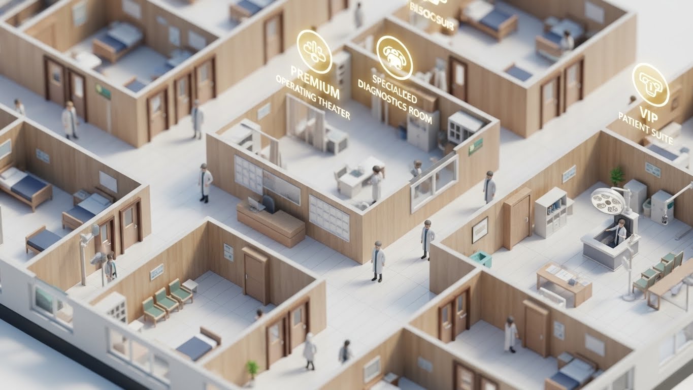
1. The Visual & Narrative Approach
Visualization Scenario:
A "miniature" hospital floor is rendered in a clean, isometric tilt-shift style. The floor is "White," and the walls are "Light Wood," giving it a premium, architectural model feel. Tiny 3D avatars of doctors walk between rooms. Suddenly, glowing "Gold" icons float up above specific rooms (like the OR and ICU), highlighting premium features or "VIP" zones that are unlocked with the enterprise plan.
Narration Style:
Strategic and authoritative. "See the full picture. Command the entire floor."
2. Psychological Impact & KPI Focus
Niche Psychology:
The "God's Eye View" is the ultimate fantasy of the hospital administrator. This style appeals to the desire for total control and visibility. The "Gold" highlights subtly code the new features as valuable and exclusive.
Operational Impact:
This visualizes Enterprise Resource Planning and Holistic Management. It is designed to sell the "Full Suite" rather than individual modules.
3. Strategic Implementation & Trade-offs
Best Use Case:
In-App Upsell Modals or Executive Dashboards (Duration: 15-30 seconds).
Strategic Trade-off:
It looks like a simulation game. It must be clear that this is a representation of data coverage, not a literal patient tracking game.
Strategic Knowledge Base: The Visual Operations Doctrine
To conclude this guide, we move beyond individual styles to a unified strategic framework. The following three segments synthesize the 30 visual examples into a "Visual Operations Doctrine" for Healthcare Analytics. This section transforms these visuals from "marketing assets" into critical infrastructure for adoption, efficiency, and growth.
Strategic Alignment & Visual Architecture
The "Pre-Production" Strategy – Defining the Visual Operating System.
- The Cognitive Load Audit: Before commissioning any visual, audit the "Mental Bandwidth" of the target clinician. An ICU nurse has less cognitive surplus than a backend administrator. Select minimalist styles (Style 1, 22) for high-stress roles and data-dense styles (Style 9, 30) for analytical roles.
- Role-Based Visual Mapping: Do not use a "one-size-fits-all" aesthetic. Create a Visual Map: "Mobile/Simple" styles for point-of-care providers (Doctors/Nurses) and "Desktop/Complex" styles for Fleet Managers (Hospital Admins/CFOs).
- The "Glanceability" Standard: Borrowing from logistics, apply the "Glanceability" rule to clinical dashboards. If a physician cannot understand the data trend (Red/Green) in under 2 seconds (Style 5), the visual has failed. Speed of comprehension is a safety metric.
- Brand Voice Consistency: Use visuals to unify disparate software modules. If your "Clinical" module uses flat vector art and your "Billing" module uses 3D glassmorphism, the platform feels fragmented. Establish a unified "Visual Language" (e.g., all "Alerts" are Neon Red) across the entire suite.
- The Advids Strategic Audit: Partnering with a specialized agency like Advids allows for a comprehensive audit of your current assets. We define the "Visual Operating System" before production begins, ensuring every asset contributes to a cohesive user journey.
- Standardization vs. Customization: Use standardized, "Stock-High-Quality" assets (Style 27, 28) for general brand feelings (trust, future). Use bespoke, custom visualization (Style 3, 30) strictly for proprietary workflows that differentiate your IP.
- The Cross-Departmental Bridge: Visuals are the only common language between Medical Staff and IT Support. Use "Workflow" styles (Style 7, 26) to create shared mental models, reducing friction when these two groups interact.
- Legacy System Integration: Visualizing the connection between old on-premise hardware and new SaaS interfaces is critical. Use "Transformation" styles (Style 11, 20) to validate the existence of legacy data while showing its migration to the cloud.
- Accessibility in Healthcare: Design motion graphics with accessibility in mind. High contrast modes and clear typography (Style 4, 16) are not just aesthetic choices; they are requirements for a diverse workforce operating in variable lighting conditions.
- The Mobile-First Mandate: 60% of clinical interaction happens on tablets or mobile devices. Ensure all 30 styles—especially the detailed UI animations—are legible on smaller screens (Style 13, 22).
Operational Adoption & Implementation
The "Deployment" Phase – Embedding Visuals into the Clinical Workflow.
- Overcoming "Big Brother" Anxiety: AI and analytics can feel like surveillance to staff. Use empathy-driven visuals (Style 12, 14) that focus on "Support" and "Augmentation" rather than "Monitoring" to reduce resistance to new tools.
- The Micro-Learning Shift: Clinicians do not have time for PDF manuals. Replace 100-page guides with libraries of 30-second "Micro-Learning" loops (Style 22, 25) embedded directly into the software's "Help" section.
- Just-in-Time Support: Embed specific visual styles into the point of need. If a user hovers over a complex metric, trigger a "Tooltip Video" (Style 25) that explains the data in 5 seconds.
- Gamification of Training: Use "Level Up" visuals (Style 24) to visualize training progress. Awarding digital "badges" or visual completion bars improves engagement with mandatory compliance training.
- Reducing Support Ticket Volume: There is a direct correlation between the quality of proactive visual guides and the volume of "How-to" support tickets. A library of "Error Resolution" videos (Style 26) acts as a Tier-1 support agent.
- Remote Onboarding: For distributed health networks, use 3D and Screencast hybrids (Style 23) to train staff across multiple locations without the cost of physical seminars.
- Standard Operating Procedures (SOPs): Transform text-based clinical SOPs into visual process flows (Style 2, 7). A visual flowchart reduces ambiguity and standardization errors in patient processing.
- Feedback Loops: Use interactive video elements to gather feedback. A "Thumbs Up/Down" animation at the end of a training clip provides instant data on the effectiveness of the content.
- Scalable Localization: Healthcare is global. Design visual assets (Style 1, 8) that rely on iconography rather than on-screen text, allowing for rapid deployment across different language regions without re-rendering.
- Leadership Communication: Use high-end, cinematic styles (Style 18, 28) for "Town Hall" updates. When leadership communicates strategy via premium video, it signals confidence and stability to the entire organization.
Measuring Impact & Future-Proofing
The "ROI" Phase – Metrics, Scalability, and the Path Forward.
- Beyond "Views": Move beyond vanity metrics. Measure "Time-to-Competency" (how fast a user masters a feature after watching) and "Feature Adoption Rate" (clicks immediately following a video).
- The "Idle Time" Metric: Correlate better visualization with reduced "Software Idle Time" (time spent staring at the screen). Good design (Style 5, 15) speeds up the interaction, returning the doctor to the patient faster.
- Compliance Velocity: Measure how fast new regulations (e.g., Interoperability Rules) are understood and actioned by staff when introduced via video versus text memos.
- Retention and Churn: High-quality UX visualization (Style 25, 29) creates "Product Stickiness." Measure the LTV of cohorts exposed to the visual onboarding series versus those who were not.
- The AI Visual Frontier: Prepare for Generative AI. The next phase of analytics will involve real-time, AI-generated data overlays (Style 3, 23). Your current visual style guide is the training data for that future AI.
- Scalability of Assets: Build a library of "Atomic Visual Elements" (icons, backgrounds, character rigs) that can be reassembled into new videos. This reduces the cost and time of future production.
- The Advids Partnership: Advids acts as your long-term partner in this scalability. We don't just create videos; we build and maintain the "Visual Asset Library" that allows your communication to scale with your product roadmap.
- Benchmarking Success: "Good enough" visuals are a competitive risk. If your competitor's training is Netflix-quality and yours is PowerPoint-quality, you will lose the battle for user adoption.
- The ROI of Safety: Quantify the reduction in "Medical Errors" or "Data Entry Errors" linked to better visual training. This is the ultimate ROI for healthcare analytics.
- Final Call to Innovation: Treat video not as "Marketing Content," but as "Digital Infrastructure." In the era of Big Data, Visual Interoperability is the key to unlocking human intelligence. The organizations that master this visual language will define the future of care.
Companies using similar video content -
3M Health Information Systems – 3M 360 Encompass – Health analytics suite for comprehensive insights.
Cotiviti Medical Intelligence – Medical Intelligence – Leader in healthcare analytics.
Author & Editor Bio


