
Introduction: Visualizing the Nervous System of Modern Healthcare
We stand at the precipice of a connectivity renaissance. The vision of a "Patient 360" ecosystem—where clinical data flows fluidly between payers, providers, and patients—is no longer a futuristic aspiration but an immediate operational imperative. However, for the innovators building the infrastructure of this transformation, the challenge is rarely the code itself. The true challenge lies in articulating the value of invisible connections to a non-technical audience.
The "Physical/Digital Divide" in healthcare is widening. While the industry accelerates toward API-led connectivity, the complexity of backend integration often obscures the value for stakeholders. This invisibility is costly. With the global healthcare interoperability market growing to $6.23 billion in 2024, the race to define the infrastructure of the future is intensifying. Yet, the friction of disconnected systems remains a heavy anchor; it is estimated that inefficiency due to poor data integration continues to cost over $30 billion annually in the US alone.
For CIOs and Product Leaders, the goal is clear: replace the opacity of "black box" integrations with transparent, intuitive visual narratives. This guide serves as your strategic framework. We have curated 30 distinct visual styles, mapped to the buyer's journey, designed to reduce cognitive load and accelerate the adoption of your solutions. These are not just aesthetic choices; they are strategic assets in your mission to unify the healthcare ecosystem.
1. The Organic Flow of Data
TOFU | Brand Awareness
The Visual & Narrative Approach
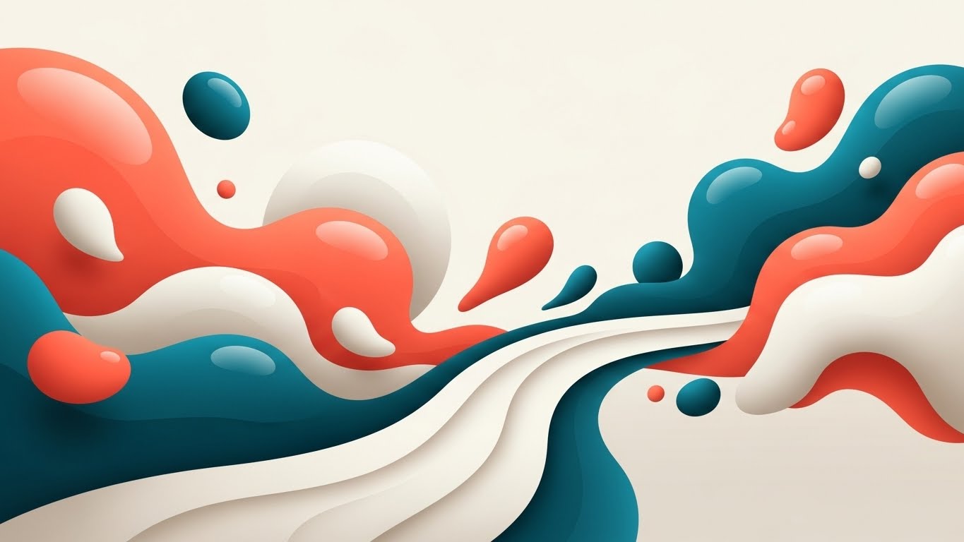
This style utilizes an Abstract 2D Flat Vector aesthetic to soften the rigid perception of data integration. The scenario features organic, fluid shapes in a palette of Vivid Coral, Deep Teal, and Creamy White. Glossy textures and soft gradients are applied to "data droplets"—representing isolated patient records or disparate systems—which elegantly merge into a unified, flowing river. The background remains a clean, shadowless off-white. The narration should be soothing and aspirational, emphasizing harmony and the elimination of friction.
Psychological Impact & KPI Focus
Niche Psychology: This style directly addresses the anxiety of "fragmentation." By using organic shapes rather than rigid blocks, we subconsciously signal that integration is a natural, healing process rather than a mechanical disruption. It reduces Cognitive Load by simplifying complex ETL (Extract, Transform, Load) processes into a universally understood metaphor: water flowing.
KPI: Ad Recall (Brand Awareness) – The distinct palette stands out in a feed dominated by "corporate blue."
Strategic Implementation & Trade-offs
- Best Use Case: Social Ads (Instagram/LinkedIn) where capturing attention quickly is paramount.
- Trade-off: Suboptimal for technical demos. It visualizes the feeling of integration, not the mechanics of the FHIR standard. Use this to open doors, not to close technical deals.
Companies using similar video content -
Redox – Redox Platform – Fluidly connects disparate healthcare systems.
MuleSoft – Anypoint Platform – Orchestrates data flow across enterprise applications.
2. The Kinetic Architecture of Stability
TOFU | Market Education
The Visual & Narrative Approach
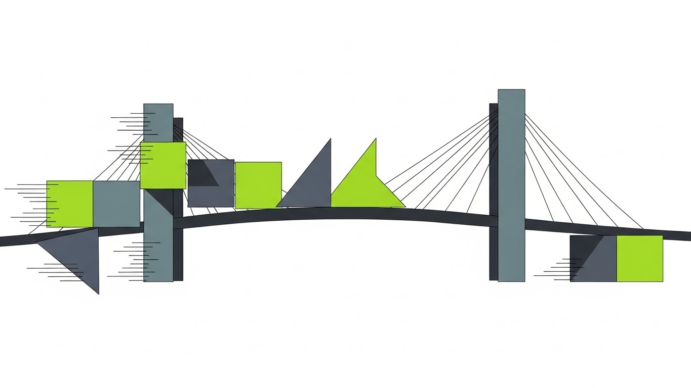
Drawing inspiration from Bauhaus design, this Abstract 2D Motion Graphics style uses geometric precision to convey stability. The scene visualizes squares and triangles in Electric Lime, Slate Grey, and Pure White actively rearranging themselves to construct a perfect, sturdy bridge structure. The movement is conveyed through sharp kinetic lines and motion blur, suggesting speed and efficiency. The lighting is flat, emphasizing the structural forms. The tone is confident and rhythmic.
Psychological Impact & KPI Focus
Niche Psychology: We address the skepticism surrounding "system reliability." The geometric precision implies that your software is architecturally sound and logically built. The Electric Lime serves as a focal point for the "active" elements (data transfer), guiding the viewer's eye across the bridge.
KPI: Video Completion Rate – The "satisfying" mechanical motion keeps viewers watching to see the final structure.
Strategic Implementation & Trade-offs
- Best Use Case: YouTube Pre-roll or Explainer Video Intros.
- Trade-off: Abstract buffer. It educates on the concept of connection but may feel too theoretical for bottom-of-funnel prospects who need to see the actual interface.
Companies using similar video content -
Infor – Cloverleaf Integration Suite – Builds robust, scalable data bridges.
InterSystems – IRIS for Health – Architecting stable, high-performance data platforms.
3. The Clarity of the Ecosystem
TOFU | Shaping Brand Perception
The Visual & Narrative Approach
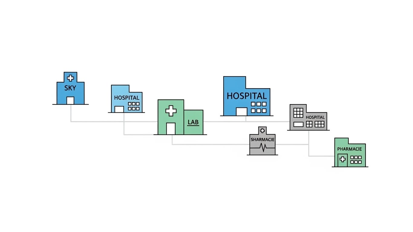
This Minimalist Flat 2D Vector style employs a Swiss Design philosophy to map the healthcare ecosystem. Utilizing Sky Blue, Soft Grey, and Mint Green, the composition relies heavily on negative space to convey breathing room and clarity. Icons representing hospitals, labs, and pharmacies are linked by thin, elegant lines that trace the path of information. There are no gradients; only solid, clean color blocks. The narrative is clinical, precise, and professional.
Psychological Impact & KPI Focus
Niche Psychology: In a domain plagued by complexity, a clean, organized visual signals a clean, organized product. It reassures the viewer that your solution brings order to chaos. The "Map" metaphor helps stakeholders visualize the "Patient 360" scope.
KPI: Time on Site – Encourages the viewer to study the connections and understand the breadth of connectivity.
Strategic Implementation & Trade-offs
- Best Use Case: Website "Solutions" pages or Hero sections.
- Trade-off: Generic Risk. The minimalism risks looking generic if not branded carefully. It is excellent for high-level overviews but lacks the dynamism needed for high-energy social ads.
Companies using similar video content -
1upHealth – 1upHealth Platform – Maps patient-centered data across systems.
Health Gorilla – Health Gorilla Platform – Clarifies network complexity for data exchange.
4. Shattering the Data Barriers
TOFU | Category Creation
The Visual & Narrative Approach
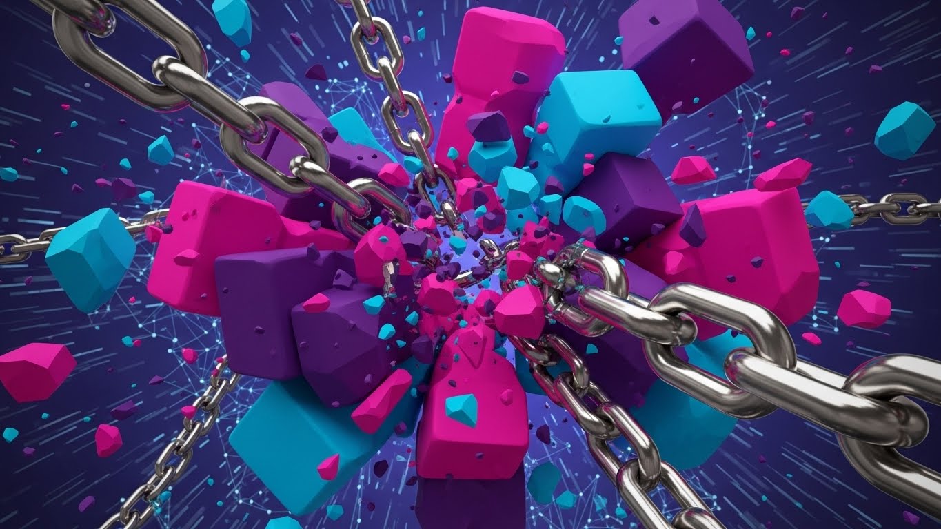
This is a high-energy Bold Kinetic Typography visualization. We strip away characters and use heavy, blocky shapes representing words to physically break chains. The palette is aggressive and modern: Magenta, Cyan, and Deep Purple. The camera uses a fast-zoom effect, diving into the collision points where blocks shatter barrier lines. This visualizes the concept of "Category Creation"—breaking the old way of doing things.
Psychological Impact & KPI Focus
Niche Psychology: This style taps into the frustration of "Vendor Lock-in." The act of shattering chains triggers a sense of liberation and empowerment. It frames your software not just as a tool, but as a movement toward data freedom. The Cyan and Magenta contrast creates a "glitch" aesthetic that appeals to modern, tech-forward audiences.
KPI: Click-Through Rate (CTR) – Designed to stop the scroll on mobile feeds.
Strategic Implementation & Trade-offs
- Best Use Case: Vertical Social Ads (Stories/Reels/TikTok).
- Trade-off: Zero technical depth. It is purely emotional and attention-grabbing. It must be followed up with substantive educational content.
Companies using similar video content -
Bridge Connector – Bridge Connector Platform – Breaks down data silos with workflow automation.
Open Integration Engine – Open Integration Engine – Liberates healthcare data from proprietary lock-in.
5. The Blueprint of Transformation
TOFU | Competitive Displacement
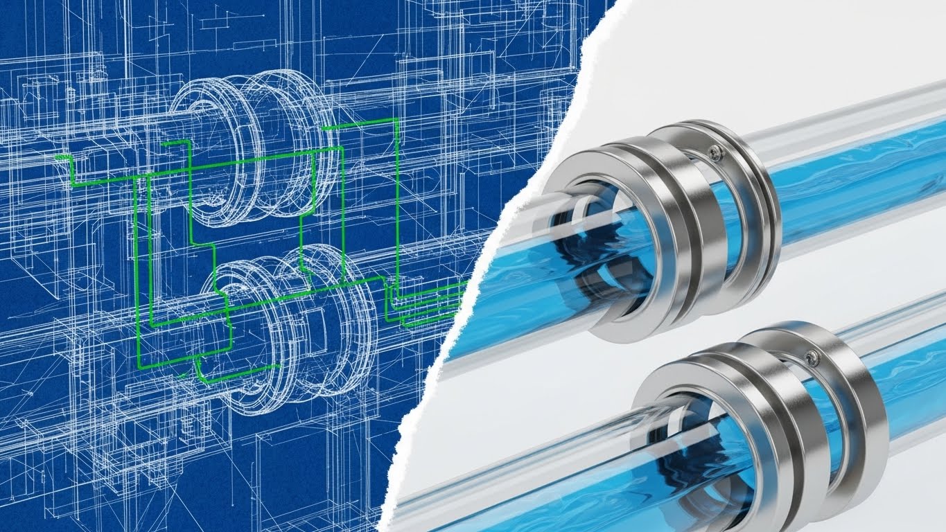
The Visual & Narrative Approach
A sophisticated Wireframe to Reality Transition utilizing a split-screen technique. The left side displays a chaotic, scrolling blueprint of a data pipeline in Blueprint Blue and Wireframe Green. A jagged transition line sweeps across, revealing the right side: a pristine, Octane-rendered 3D pipe of chrome and glass, flowing with clean blue liquid. This visualizes the journey from "messy legacy code" to "polished modern infrastructure."
Psychological Impact & KPI Focus
Niche Psychology: This visual addresses "Implementation Anxiety." Buyers often fear that the "after" state will be just as messy as the "before." This style proves the transformation. The Wireframe Green appeals to the technical side (planning), while the Chrome appeals to the executive side (polish/value).
KPI: Lead Generation – Proves tangibility to skeptics.
Strategic Implementation & Trade-offs
- Best Use Case: LinkedIn Thought Leadership posts or Case Study videos.
- Trade-off: Production Cost. Requires high-fidelity 3D rendering. If the "reality" side looks cheap, the trust is broken.
Companies using similar video content -
NextGen Healthcare – Mirth Connect – Transforms messy legacy integrations into modern flows.
DreamFactory – DreamFactory Platform – Blueprints secure, low-code API integrations.
6. The Pulse of the Smart City
MOFU | Product Differentiation
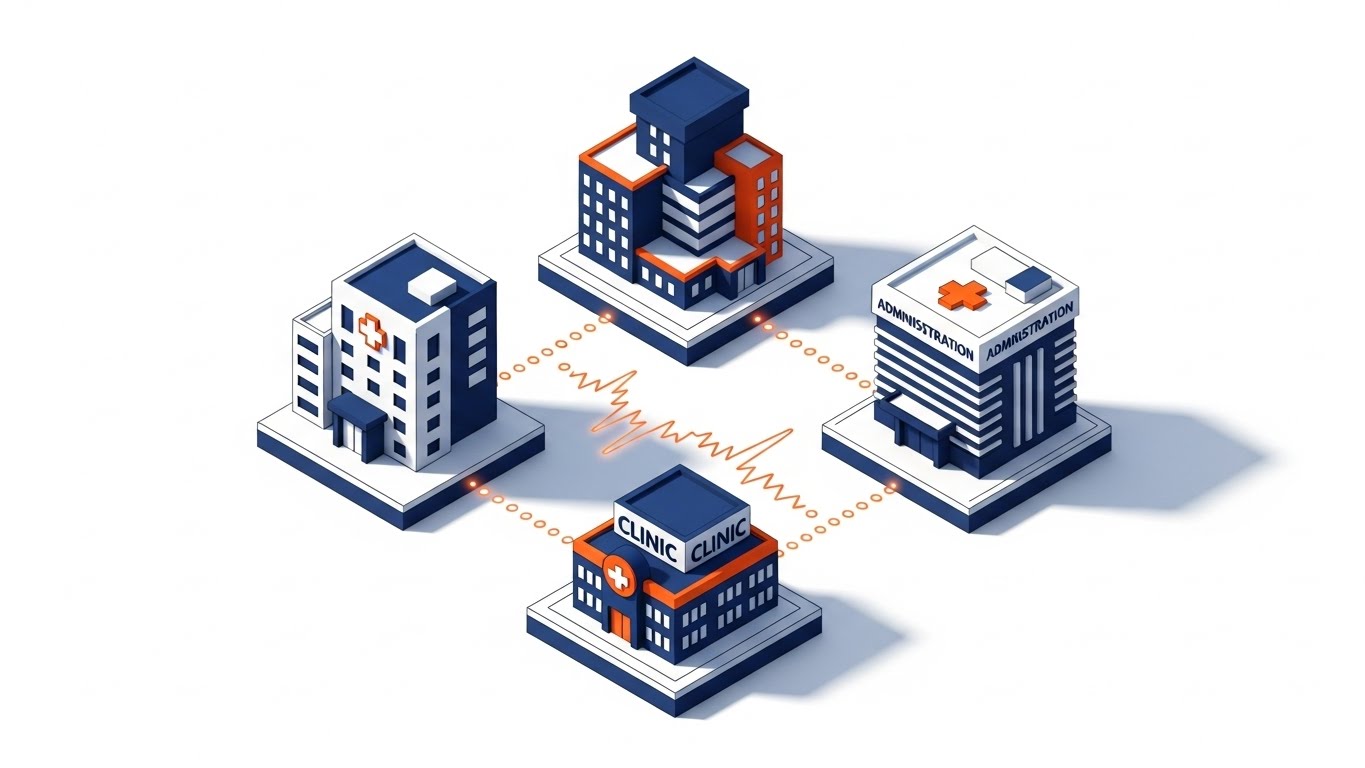
The Visual & Narrative Approach
An Isometric 2D Motion Design presents a "Smart Health City" at a strict 45-degree angle. The palette uses Orange (Action), Navy Blue (Trust), and White (Clarity). We see distinct buildings—Hospital, Clinic, Admin—connected by glowing dotted lines that pulse rhythmically. This implies a heartbeat. The art style creates depth through hard-edged drop shadows rather than realistic lighting.
Psychological Impact & KPI Focus
Niche Psychology: This style frames your software as the "central nervous system" of a healthcare network. The pulsing lines are a powerful visual metaphor for real-time data exchange (Webhooks/API calls) versus static file transfers. It differentiates your product by showing the liveness of the connection.
KPI: Engagement Time – Viewers track the pulses between buildings, increasing dwell time.
Strategic Implementation & Trade-offs
- Best Use Case: Website Product Pages or trade show booth loops.
- Trade-off: Visual Clutter. Isometric art can sometimes feel "game-like." It must be kept professional to ensure it is taken seriously by enterprise buyers.
Companies using similar video content -
Oracle Health – Cerner Millennium – Powers real-time data exchange across health networks.
Validic – Validic Inform – Connects IoT devices for a living health ecosystem.
7. The Engine Room of Interoperability
MOFU | Feature Education

The Visual & Narrative Approach
This 3D X-Ray Visualization treats the server rack like a high-end medical device. The outer casing is rendered in Translucent Cyan glass, allowing us to see inside. The internal "engine"—representing your API Gateway—is a glowing core of Skeleton White and Gold light. The camera performs a slow, macro zoom into the processor, visualizing the precise moment of data processing.
Psychological Impact & KPI Focus
Niche Psychology: This appeals to the "Infrastructure" mindset of the CTO. It makes software feel tangible and valuable, like a physical asset. The Gold light signifies value and premium quality data. It demystifies the "black box" by literally looking inside it, satisfying the curiosity of technical stakeholders.
KPI: Information Retention – The visual anchor helps explain complex routing logic.
Strategic Implementation & Trade-offs
- Best Use Case: Deep-dive product demos or YouTube explainer series.
- Trade-off: Hardware Metaphor. You aren't selling servers, so ensure the voiceover clarifies this is a metaphor for the software engine.
Companies using similar video content -
iNTERFACEWARE Inc. – Iguana Integration Engine – Reveals the core of data transformation.
Qvera – Qvera Interface Engine (QIE) – Shows precise data processing within the engine.
8. The Thread of Continuity
MOFU | Reducing Implementation Friction
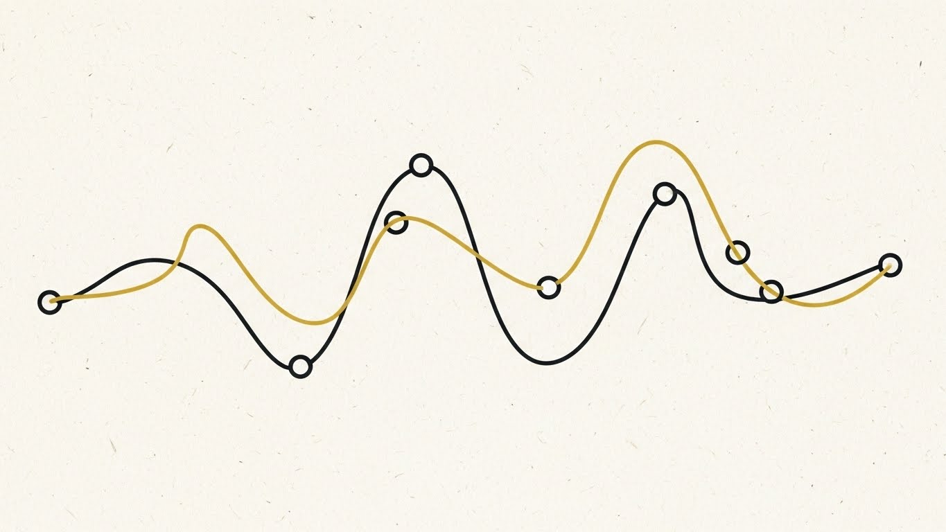
The Visual & Narrative Approach
A highly sophisticated 2D Line Art Animation featuring a single, continuous line in Charcoal and Gold. The background is a textured Paper White. The line moves elegantly, looping and weaving to connect various dots (nodes) without ever tangling or breaking. Variable line weights give it an "ink on paper" feel. This symbolizes the "Golden Thread" of a patient's medical history.
Psychological Impact & KPI Focus
Niche Psychology: The psychology here is "Elegance." Implementation is often seen as messy and knotted. This visual proves that your workflow is seamless and unbroken. The Gold accent on the line emphasizes the high value of the connected path. It appeals to the desire for simplicity in a complex industry.
KPI: Email Click-Through Rate – The lightweight visual loads quickly and delights the eye.
Strategic Implementation & Trade-offs
- Best Use Case: Email Signatures or nurture campaign headers.
- Trade-off: Subtlety. It doesn't convey power or scale, but rather finesse. Use it for relationship building, not for "shock and awe."
Companies using similar video content -
Particle Health – Particle Health API – Creates a seamless thread of patient data.
athenahealth – athenaOne – Ensures unbroken workflow for patient care.
9. The Fortress of Trust
MOFU | Building Trust

The Visual & Narrative Approach
A Low-Poly 3D scene depicts a stylized digital fortress. The geometry is faceted and clean, using Pastel Pink, Lavender, and Faceted Grey. The lighting simulates a miniature studio setup with soft shadows. In the center, protected by the walls, floats a glowing gemstone representing the data. This "papercraft" aesthetic makes the concept of security (often scary) feel approachable yet robust.
Psychological Impact & KPI Focus
Niche Psychology: Security discussions (HIPAA, SOC2) can be dry and fear-inducing. This style flips the script, focusing on protection rather than threat. The Gemstone visualizes data as something precious to be guarded. The friendly, tactile low-poly style builds trust by showing that security is a core, built-in feature.
KPI: Trust Sentiment – Enhances perception of safety on compliance pages.
Strategic Implementation & Trade-offs
- Best Use Case: Blog posts about security compliance or whitepaper covers.
- Trade-off: Tone Balance. The "cute" factor of low-poly must be balanced with serious copy to avoid looking childish.
Companies using similar video content -
Collibra – Collibra Platform – Builds approachable yet robust data governance.
DataGalaxy – Data & AI Product Governance Platform – Protects data with clear, structured policies.
10. The Ascent of ROI
MOFU | Overcoming Objections

The Visual & Narrative Approach
A high-contrast Dynamic Data Visualization using Emerald Green, White, and Silver. Abstract 3D bar charts rise dramatically from a digital grid, glowing and translucent. The camera adopts a "worm's eye view," looking up at the bars as they soar like skyscrapers. The background is a pale, clean grey. This perspective emphasizes scale, dominance, and a massive upward trend.
Psychological Impact & KPI Focus
Niche Psychology: This is the "Closer." It addresses the ultimate objection: "Is it worth the money?" The Emerald Green (money, growth) and the soaring perspective psychologically prime the viewer to see massive potential. It visualizes the financial opportunity of efficiency. The translucency of the bars suggests transparency in reporting.
KPI: Conversion Rate – Visualizes the "Upside" argument effectively.
Strategic Implementation & Trade-offs
- Best Use Case: LinkedIn Slide decks or Proposal videos.
- Trade-off: Generic Metaphor. It must be overlaid with specific metrics (e.g., "30% Efficiency Gain") to ground the visual excitement in factual reality.
Companies using similar video content -
Innovaccer – Data Activation Platform – Projects significant ROI through data insights.
Waystar – Waystar Platform – Visualizes financial gains from revenue cycle optimization.
11. The Architecture of Defense**
BOFU | Risk Mitigation
The Visual & Narrative Approach
This style leverages a Futuristic Neon/Dark Mode aesthetic, heavily inspired by Tron Legacy, to visualize the intangible concept of cybersecurity. Against a Deep Black void, a protective architectural cage constructed of Neon Purple and Laser Blue beams forms a containment box around a volatile data stream. The camera angle is low, looking up at the "firewall," emphasizing its towering, impenetrable nature. The narrative is serious and protective, emphasizing "military-grade encryption" and "sovereignty."
Psychological Impact & KPI Focus
Niche Psychology: For the CSO (Chief Security Officer) and Compliance Officers, "Open APIs" sound like "Vulnerabilities." This style inverts that fear. The Grid visualizes containment and control. It utilizes the Dark Mode aesthetic which is synonymous with "backend power" and "cybersecurity" in the tech world. It visually asserts that while data flows, it flows only where you permit it.
KPI: Trust Score – Reducing the time spent in security reviews.
Strategic Implementation & Trade-offs
- Best Use Case: Security Whitepapers, "Trust Center" website sections, or BOFU retargeting ads.
- Trade-off: Intimidation Factor. The stark, dark aesthetic can feel cold or aggressive. It is not suitable for patient-facing marketing, only for infrastructure buyers.
Moving from the backend infrastructure to the frontline reality, we must remind stakeholders of the ultimate beneficiary: the clinician.
Companies using similar video content -
Concentric AI – Concentric AI Platform – Digitally shields sensitive healthcare data.
Microsoft – FHIR Server for Azure – Provides robust, cloud-native FHIR security.
12. The Human Side of Data
BOFU | The Functional Buyer

The Visual & Narrative Approach
A Lifestyle Stock with UI Overlay style that bridges the digital and physical worlds. We see a high-quality, sun-drenched photo of a female doctor in a modern hospital corridor, smiling as she views a tablet. Hovering above the device is a semi-transparent, futuristic UI displaying "Patient 360" graphs in Clean White and Soft Blue. The lighting is natural and optimistic. The narrative shifts from "efficiency" to "empowerment," focusing on how better data leads to better care.
Psychological Impact & KPI Focus
Niche Psychology: This addresses the "Functional Buyer" (CMIOs, Head of Nursing). They don't care about JSON schemas; they care about burnout and patient outcomes. Seeing a smiling doctor interacting seamlessly with the data triggers Mirror Neurons, suggesting that this software relieves stress rather than adding to it.
KPI: Conversion Rate (Demo Request) – Validates the "User Experience" for non-technical decision-makers.
Strategic Implementation & Trade-offs
- Best Use Case: LinkedIn Sponsored Content targeting healthcare professionals and "About Us" videos.
- Trade-off: Stock Photo Fatigue. If the base image looks too staged or generic, credibility drops. The UI overlay must look premium and bespoke to elevate the stock footage.
While clinicians value the outcome, the technical architects implementing the solution value the code itself.
Companies using similar video content -
DrChrono – DrChrono EHR – Empowers clinicians with intuitive patient data access.
NexHealth – NexHealth Platform – Enhances patient experience and provider efficiency.
13. The Developer's Canvas
BOFU | The Technical Buyer
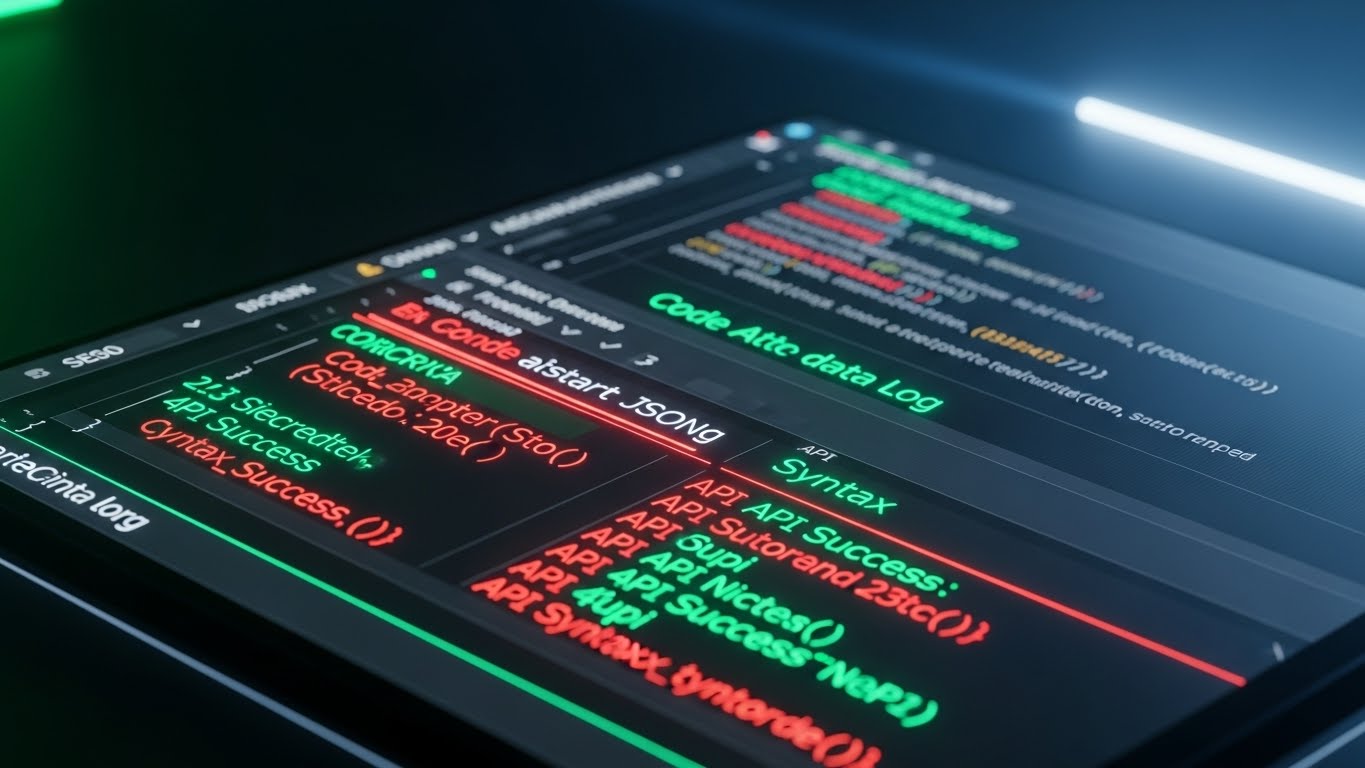
The Visual & Narrative Approach
A Dark Mode UI Showcase designed specifically for the software architect. The visual is a crisp, flat-lay view of a code editor (IDE). The palette is high-contrast: Graphite background with Code Green, Syntax Red, and Blue highlighting structured JSON data logs. We see "API Success: 200 OK" messages. There is no fluff—just elegant, clean syntax. The narrative speaks the language of developers: "low latency," "clean documentation," and "robust SDKs."
Psychological Impact & KPI Focus
Niche Psychology: Developers are often the hidden veto power in a deal. If they smell "spaghetti code," they will block the purchase. This visual respects their expertise. The Dark Mode is the native environment of the modern developer; using it signals, "We are built by devs, for devs." It visualizes Technical Debt Reduction.
KPI: Developer Portal Sign-ups – Encourages technical testing of the API.
Strategic Implementation & Trade-offs
- Best Use Case: API Documentation pages, Developer Portal headers, and technical webinars.
- Trade-off: Alienating Business Users. This is unintelligible to a CEO. Keep it strictly in technical channels.
Once the technical feasibility is proven, the conversation inevitably turns to the financial bottom line.
Companies using similar video content -
HAPI FHIR – HAPI FHIR Library – Showcases clean, functional Java FHIR code.
Firely – Firely Server – Presents elegant FHIR server implementation for developers.
14. The Tangibility of ROI
BOFU | ROI Justification
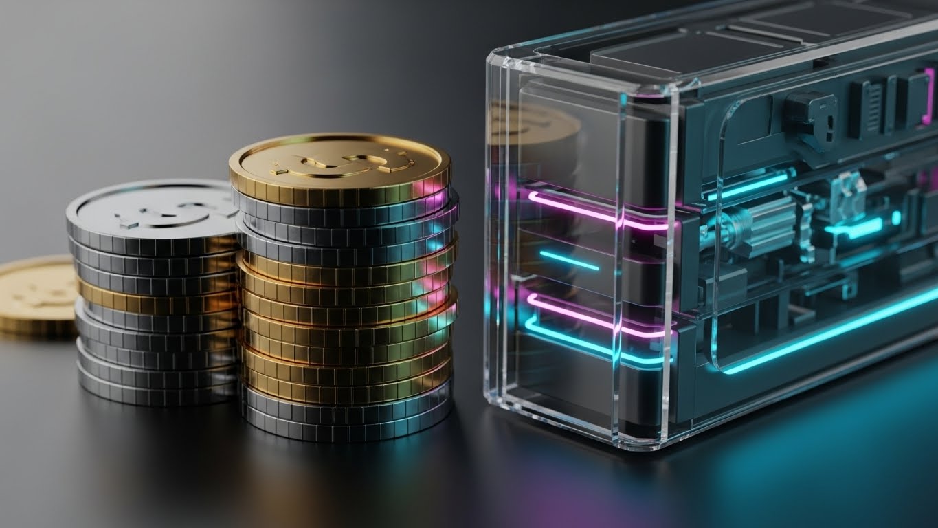
The Visual & Narrative Approach
This style uses Photorealistic 3D Renders to give physical weight to digital savings. We see a stack of metallic Gold and Silver coins, rendered with exquisite detail, sitting neatly beside a sleek, glass-encased server blade. The lighting is reminiscent of high-end luxury product photography. The visual metaphor creates a direct link between the "Server" (Infrastructure) and "Wealth" (ROI).
Psychological Impact & KPI Focus
Niche Psychology: Software is intangible, making the price tag feel abstract. By pairing the hardware with physical money, we use Tangibility Bias to make the value feel real and weighty. It subconsciously justifies the high contract value by associating the software with premium, physical assets.
KPI: Proposal Acceptance Rate – Visuals for the "Pricing" slide in the sales deck.
Strategic Implementation & Trade-offs
- Best Use Case: Sales Presentations (Pricing Section) and ROI Calculator landing pages.
- Trade-off: Literalism. It is a blunt metaphor. It must be paired with hard data (e.g., "$2M saved annually") to avoid looking like a generic banking ad.
To sustain momentum in the decision process, we must demonstrate the platform's speed and comprehensive nature.
Companies using similar video content -
Talend – Talend Data Fabric – Visualizes tangible value from data integration.
Denodo – Denodo Platform – Connects data to real-world financial outcomes.
15. The Velocity of Innovation
BOFU | Driving Demo Requests
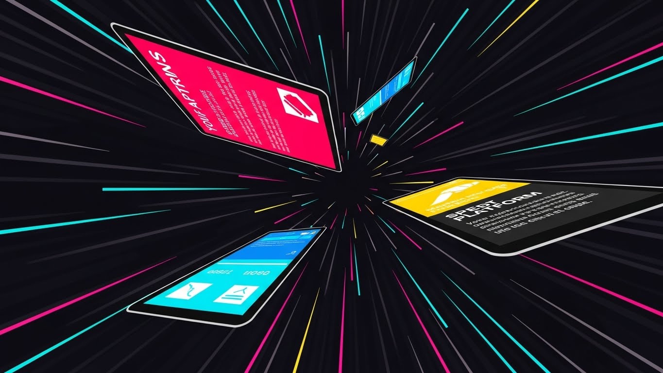
The Visual & Narrative Approach
A high-energy Rapid UI Feature Montage. Tilted UI screens fly toward the camera through an abstract digital tunnel. We use Vibrant Primary Colors (Red, Blue, Yellow) and Motion Blur to convey high speed. The screens flash briefly, showing a variety of dashboards, logs, and maps, implying a massive feature set. The pacing is fast, rhythmic, and overwhelming in a positive way.
Psychological Impact & KPI Focus
Niche Psychology: This triggers the Heuristic of Quantity—if there are this many features moving this fast, the platform must be powerful. It creates a sense of "FOMO" (Fear Of Missing Out) and urgency. The motion blur suggests that the software itself is fast (low latency).
KPI: Ad Click-Through Rate (CTR) – High-energy visuals work best to disrupt passive scrolling on social feeds.
Strategic Implementation & Trade-offs
- Best Use Case: Retargeting Ads on LinkedIn/Meta (0:06 - 0:15 seconds).
- Trade-off: Low Comprehension. Viewers won't read the screens. The goal is to convey feeling (Speed/Power), not information.
As the deal nears closure, the focus shifts from the product to the partnership.
Companies using similar video content -
Bluestream – Bluestream Virtual Care Platform – Showcases rapid virtual care feature deployment.
eClinicalWorks – eClinicalWorks EHR – Highlights fast-paced feature updates and dashboards.
16. The Deal Closer
BOFU | Sales Cycle Acceleration

The Visual & Narrative Approach
This style combines Live Action Photography with 2D Vector Graphics. We see a diverse pair of professionals shaking hands in a boardroom—a classic "deal struck" moment. However, floating around the handshake are bright Graphic Green and White icons (checkmarks, synched nodes) that glow. This visualizes the result of the handshake: a successful technical integration.
Psychological Impact & KPI Focus
Niche Psychology: At the end of the funnel, buyers aren't just buying software; they are entering a relationship. This visual reinforces the concept of Partnership. The floating graphics overlay the "magic" of your solution onto the human agreement, suggesting that your company bridges the gap between business agreement and technical execution.
KPI: Email Open Rates – Perfect for "Just checking in" or "Contract attached" emails.
Strategic Implementation & Trade-offs
- Best Use Case: Bottom-of-funnel email signatures or "Thank You" pages after a demo.
- Trade-off: Cheesiness. Handshake photos are the cliché of B2B. The graphic overlay must be modern and high-quality to save it from looking like generic stock.
Even at the final stage, security doubts can resurface. We handle this with a visual metaphor of absolute impermeability.
Companies using similar video content -
Epic Systems – Epic Bridges – Visualizes successful integration partnerships.
Rhapsody – Rhapsody Integration Engine – Seals deals with seamless connectivity.
17. The Vault of Sovereignty
BOFU | Objection Handling - Security

The Visual & Narrative Approach
To handle the "Security Objection" with finality, we use a Holographic UI over 3D Render. A heavy, realistic Steel Bank Vault Door dominates the frame, rendered with gritty texture. Floating in front of it is a delicate, complex Cyan Holographic Interface displaying encryption keys, lock mechanisms, and a padlock icon. This contrasts the physical weight of the "Vault" (Infrastructure) with the sophisticated intelligence of the "Hologram" (Software).
Psychological Impact & KPI Focus
Niche Psychology: This addresses the "Breach Anxiety" of the CIO. It visualizes Encryption at Rest and Role-Based Access Control (RBAC) without using lines of code. The steel door represents the impenetrability of the backend, while the hologram represents the sophistication of the security protocols. It says: "Your patient data is in a fortress."
KPI: Objection Resolution – Reduces the time spent in security review cycles.
Strategic Implementation & Trade-offs
- Best Use Case: The "Security" or "Compliance" section of the website.
- Trade-off: Aggressive. It implies a threat exists. Use it to reassure, not to fear-monger.
Post-sale, the challenge becomes adoption. We must visualize the ease of getting started.
Companies using similar video content -
Atlan – Atlan Data Governance – Secures data with advanced holographic encryption.
Alation – Alation Data Governance – Protects sensitive data like a digital vault.
18. The Frictionless Start
Onboarding | Self-Serve Onboarding
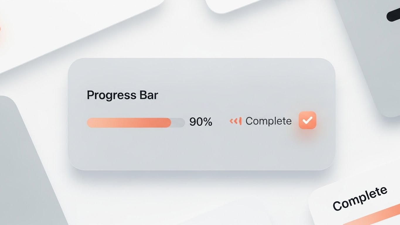
The Visual & Narrative Approach
Moving into Onboarding, we strip away the drama. This Clean UI Workflow (Light Mode) focuses on pure clarity. A Material Design card floats on a soft grey background. A progress bar, filled with a warm Peach/Orange gradient, sits at 90%. A crisp checkmark and the text "Complete" appear. The shadows are soft and lifted. The aesthetic is calm, encouraging, and frictionless.
Psychological Impact & KPI Focus
Niche Psychology: Implementation is the highest friction point in healthcare software. This visual utilizes the Zeigarnik Effect (the desire to complete unfinished tasks) by showing a progress bar near completion. The clean, light aesthetic reduces Cognitive Load, making the onboarding process feel like a simple checklist rather than a complex migration.
KPI: Onboarding Completion Rate – Reduces drop-off during the initial setup phase.
Strategic Implementation & Trade-offs
- Best Use Case: Welcome emails or in-app "Empty State" screens.
- Trade-off: Boring. It is functional, not exciting. It belongs strictly inside the product or onboarding sequence.
Companies using similar video content -
Tebra – Tebra Platform – Guides users through smooth, easy onboarding.
ModMed – ModMed EHR – Simplifies initial setup with clear progress.
19. The Spark of Activation
Onboarding | Accelerating Time-to-Value
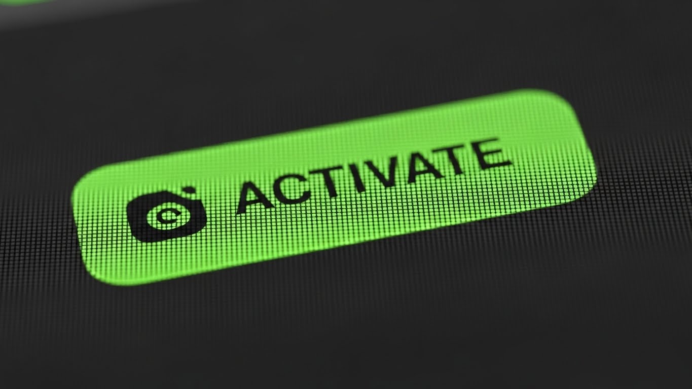
The Visual & Narrative Approach
This Macro UI Micro-Interaction zooms in to the molecular level of user experience. We see an extreme close-up of a digital "ACTIVATE" button. The button is Intense Green on a dark pixel grid, suggesting a high-resolution screen. The depth of field is razor-shallow, blurring the edges and focusing completely on the text and the "clickable" texture of the button. It freezes the precise millisecond of "Going Live."
Psychological Impact & KPI Focus
Niche Psychology: In B2B SaaS, the "Aha! Moment" is critical. This visual amplifies the significance of that first successful action. The Intense Green is the universal signal for "Go" and "Success," creating a positive neurological reward. It builds anticipation and satisfaction, reinforcing the value of the action the user is about to take.
KPI: Feature Adoption Rate – Effective for highlighting key "Activation" features in email campaigns.
Strategic Implementation & Trade-offs
- Best Use Case: "Go Live" notification emails, feature announcement teasers, or empty-state screens.
- Trade-off: Context Free. The extreme close-up removes all context. It must be paired with text that clearly explains what is being activated.
Companies using similar video content -
AdvancedMD – AdvancedMD EHR – Highlights the "Go Live" moment for practices.
Practice Fusion – Practice Fusion EHR – Emphasizes quick activation of features.
20. The Joy of Efficiency
Onboarding | User Activation

The Visual & Narrative Approach
Finally, we celebrate the user with a 2D Character-Driven Story. In a modernized Corporate Memphis vector style, a female professional sits at her desk, throwing her hands up in genuine joy. Floating around her are icons of completed work—charts, documents with "DONE" stamps—in a palette of Corporate Blue, Teal, and Warm Orange. The scene is clean, shadowless, and purely optimistic.
Psychological Impact & KPI Focus
Niche Psychology: Ultimately, your software is a tool to make the user a hero in their organization. This visual validates their effort. It mirrors the feeling of relief and success after a complex integration project is finalized. By centering the human, not the screen, we build an emotional connection and brand loyalty.
KPI: Net Promoter Score (NPS) – Fostering a positive emotional association with the brand increases the likelihood of advocacy.
Strategic Implementation & Trade-offs
- Best Use Case: "Milestone Reached" emails, Quarterly Business Review (QBR) presentations, or Customer Success newsletters.
- Trade-off: Tone Management. The vector style can be polarizing. It must be executed with high quality to avoid looking like a generic tech startup template. Use it for celebration, not for technical reporting.
Companies using similar video content -
CureMD – CureMD EMR – Celebrates user success and streamlined workflows.
SimplePractice – SimplePractice EHR – Depicts joy from efficient practice management.
21. The Bridge to Self-Sufficiency**
Retention | Knowledge Base

The Visual & Narrative Approach
This style utilizes a friendly Cel-Shaded 2D Animation aesthetic designed to lower heart rates in high-stress support scenarios. We see a large, soft Turquoise question mark (?) in the center of the frame. Through a smooth, elastic morphing animation, it transforms into a glowing Amber lightbulb. Background elements—search bars and chat bubbles in Clean White—float softly, organizing themselves from a scattered state into a neat stack. The tone is helpful, patient, and clear.
Psychological Impact & KPI Focus
Niche Psychology: Post-purchase, the user's anxiety shifts from "Will this work?" to "How do I use this?" This visual style lowers the barrier to learning. The "rubber-hose" animation style feels forgiving and accessible, countering the intimidation of complex technical documentation. It visually promises that the answer is just one click away.
KPI: Ticket Deflection Rate – Engaging visuals in help centers encourage self-serve resolution over filing tickets.
Strategic Implementation & Trade-offs
- Best Use Case: Embedded "Help" widgets, FAQ headers, or "Did You Know?" email series.
- Trade-off: Too Playful for Critical Errors. Do not use this style for "Server Down" or critical failure notifications; it lacks the necessary gravity.
Companies using similar video content -
Medplum – Medplum Docs – Simplifies complex FHIR support with friendly visuals.
OpenEMR – OpenEMR Community Support – Guides users to self-serve solutions.
22. The Depth of Discovery
Retention | Driving Deep Feature Adoption

The Visual & Narrative Approach
A sophisticated 3D Parallax UI Presentation. We see the user interface not as a flat screen, but as a series of floating, layered glass panels in a Deep Blue void. As the camera pans laterally, the parallax effect reveals that "behind" the summary data lies rich, deep analytical layers. Highlights shimmer across the Silver edges of the panels. This visualizes the depth of the platform that might be missed at first glance.
Psychological Impact & KPI Focus
Niche Psychology: Users often stick to the 10% of features they know. This style triggers curiosity about the other 90%. By physically layering the UI, we subconsciously tell the user, "There is more to discover here." It frames the software as a deep well of value rather than a flat surface.
KPI: Feature Utilization Rate – Motivating users to click deeper into advanced modules.
Strategic Implementation & Trade-offs
- Best Use Case: Feature Spotlight emails or "Advanced Tips" loading screens.
- Trade-off: Production Complexity. Requires high-end motion design to ensure the glass textures look premium, not muddy.
Companies using similar video content -
Google Cloud – Healthcare API – Reveals deep analytical layers within health data.
IBM – IBM Health Solutions – Explores comprehensive data insights through layered UI.
23. The Transformation of Chaos
Retention | Reducing Support Overhead
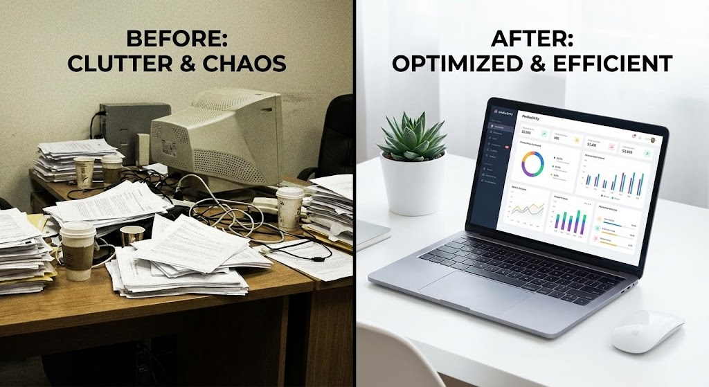
The Visual & Narrative Approach
A Split-Screen Realism comparison. The left side is desaturated, grainy, and chaotic, showing a physical desk buried under paper piles and tangled wires—the "Old Way." The right side is Saturated, Sharp, and High-Key, depicting a pristine minimalist workspace with a single laptop displaying your software. A vertical divider slides across, "cleaning" the chaos as it moves.
Psychological Impact & KPI Focus
Niche Psychology: This validates the user's decision to modernize. It serves as a "mirror of success," reminding them of the pain they have left behind. For support teams, this visual reinforces that the software is the solution to chaos, encouraging patience during learning curves by reminding them of the alternative.
KPI: Customer Satisfaction Score (CSAT) – Reinforcing the value proposition during the renewal cycle.
Strategic Implementation & Trade-offs
- Best Use Case: Quarterly Business Reviews (QBRs) or "Year in Review" personalized videos.
- Trade-off: Cliché Risk. The "Before/After" trope is common. The execution of the "messy" side must feel authentic to healthcare admin (e.g., showing fax machines), not just generic office clutter.
Companies using similar video content -
ViSolve – ViSolve OpenEMR Pro – Contrasts old, chaotic systems with modern efficiency.
MD Link – MD Link Integration Engine – Shows transformation from messy to streamlined data.
24. The Pulse of Activity
Retention | Reducing Churn

The Visual & Narrative Approach
A Hyper-lapse Photography with Data Overlay. We see a modern hospital exterior at Sunrise, with the sky transitioning from Golden to Bright Blue. As cars streak by in fast motion, glowing White and Laser Blue data lines weave seamlessly between the hospital windows and the cloud. The image conveys operational speed, constant uptime, and the "always-on" nature of your service.
Psychological Impact & KPI Focus
Niche Psychology: Reliability is the currency of retention. This visual subliminally communicates "Pulse" and "Flow." The sunrise metaphor suggests a new day of efficiency. It reassures stakeholders that while they sleep, your software is tirelessly working, moving data at the speed of light.
KPI: Net Dollar Retention (NDR) – Reminding clients of the continuous, invisible work the software performs.
Strategic Implementation & Trade-offs
- Best Use Case: Login screens, screen savers, or "System Uptime" report headers.
- Trade-off: Generic Building. Ensure the stock footage looks like a top-tier medical facility, or ideally, use footage of a recognizable client (with permission).
Companies using similar video content -
Masimo – Masimo Hospital Automation – Visualizes continuous, real-time hospital data flow.
Ascom – Ascom Medical Device Integration – Shows always-on data exchange from medical devices.
25. The Viral Network
Retention | Driving Referrals

The Visual & Narrative Approach
An Abstract 3D Particle Visualization. In a deep Cosmic Violet void, a central node of Electric Indigo emits streams of Gold particles. These particles travel outward to ignite new nodes, creating a rapidly expanding constellation. This abstractly visualizes the network effect of interoperability—how one connected system adds value to the entire ecosystem.
Psychological Impact & KPI Focus
Niche Psychology: This appeals to the "Ecosystem" mindset. Healthcare leaders want to be part of the largest, most connected network. The Gold particles signify value transfer. It visualizes the concept of "Referral" and "Growth" without being salesy. It makes the user feel like the center of a growing universe.
KPI: Referral Rate – Visualizing the benefit of bringing partners onto the platform.
Strategic Implementation & Trade-offs
- Best Use Case: Referral program invitations or "Community" pages.
- Trade-off: Abstractness. It requires copy to ground it. "Grow your network" text is essential to link the particles to the business concept.
Companies using similar video content -
Blaze – Blaze FHIR Server – Illustrates expanding FHIR network connections.
Bwell – Bwell FHIR Server – Visualizes growing data ecosystems and advocacy.
26. The Expansion Blueprint
Expansion | Driving Upsell/Cross-sell

The Visual & Narrative Approach
An Isometric 3D Render of a digital construction site. In a clean palette of Construction Orange and Blueprint Blue, stylized cranes lift new server modules and "drop" them into slots on an existing architecture. The seamless "click" of the new module locking into place implies modularity and ease of expansion.
Psychological Impact & KPI Focus
Niche Psychology: Upselling often meets resistance due to fear of integration headaches. This visual counters that by showing Modularity. It suggests that adding a new feature (e.g., "Telehealth Module") is as simple as snapping a LEGO brick into place. It visualizes "Plug-and-Play" scalability.
KPI: Cross-Sell Conversion – Visualizing the ease of adding new SKUs.
Strategic Implementation & Trade-offs
- Best Use Case: "New Feature" announcement emails or product dashboards showing locked/unlocked modules.
- Trade-off: Gamification. It looks a bit like a simulation game. Ensure the surrounding text is business-focused to maintain authority.
Companies using similar video content -
Ceiba Health – Ceiba IoMT Platform – Shows modular expansion of IoT medical device integration.
Emorphis Health – Medical Device Integration Software – Blueprints scalable medical device connectivity.
27. The Visionary's Stance
Expansion | Establishing Thought Leadership

The Visual & Narrative Approach
A Cinematic Live-Action shot. A diverse group of executives stands in a sun-drenched, futuristic command center, looking upward and off-camera at a large screen (implied). The lighting is High-Key White with Lens Flares, creating a sense of optimism and horizon-gazing. They look confident, not stressed. This sells the feeling of being a market leader.
Psychological Impact & KPI Focus
Niche Psychology: Executives buy from peers. This style mirrors the self-image of the buyer: a forward-thinking leader. It moves the conversation from "software" to "strategy." By placing the viewer in the shoes of these confident leaders, we associate your brand with their professional success.
KPI: Brand Equity – Elevating the perception of the vendor from "Service Provider" to "Strategic Partner."
Strategic Implementation & Trade-offs
- Best Use Case: Webinar invitations, whitepaper covers, or event keynotes.
- Trade-off: Casting. Poor casting ruins this. The models must look like credible C-suite executives, not generic young models.
Companies using similar video content -
ELLKAY – ELLKAY Interoperability – Positions executives as leaders in health information exchange.
eMedApps – Care Connectivity Platform – Showcases executive vision for future healthcare.
29. The Executive Brief
Expansion | ABM Awareness

The Visual & Narrative Approach
A highly detailed, Photorealistic Generative AI Character video. We see a close-up of a middle-aged CIO with Professional Grey hair and a Navy Suit. He speaks directly to the camera in a high-tech podcast studio setting with Bokeh background lights. The lip-sync is perfect. He delivers a concise, authoritative message about "Strategic Interoperability."
Psychological Impact & KPI Focus
Niche Psychology: High-value targets (ABM) respond best to peers. This style simulates a Peer-to-Peer conversation. It bypasses the "marketing filter" because it looks like a podcast clip or a thought leadership snippet rather than an ad. It builds authority by proxy—using a persona that looks and sounds like the target audience.
KPI: Account Engagement Score – High-touch feel for high-value targets.
Strategic Implementation & Trade-offs
- Best Use Case: Personalized LinkedIn messages to key accounts or welcome videos for VIP clients.
- Trade-off: Uncanny Valley. The AI generation must be top-tier (e.g., HeyGen/Synthesia high-fidelity). If it glitches, trust is instantly destroyed.
Companies using similar video content -
Decube – Decube Data Trust Platform – Presents data governance with realistic AI authority.
Concentric AI – Concentric AI Platform – Delivers authoritative insights on data security.
Author & Editor Bio


