
Introduction: Bridging the Physical Care and Digital Efficiency Divide
The healthcare staffing industry is navigating a pivotal transformation. We are shifting from an era of manual, reactive scheduling to a future defined by algorithmic precision and proactive workforce management. For the "Operational Architects" leading this charge—staffing agency owners, CNOs, and HR Directors—the challenge is not just adopting technology, but communicating its value to a workforce stretched to its limit.
A critical friction point exists: the "Physical/Digital Divide." Healthcare is visceral, human, and hands-on; SaaS platforms are abstract, linear, and digital. To drive adoption, we must bridge this gap visually. We must prove that the digital tool is not an administrative burden, but an operational liberator. The market opportunity is immense; the global healthcare staffing sector is projected to reach USD 143.23 billion by 2033. However, the cost of inefficiency is equally staggering. With the average cost of RN turnover now hitting $61,110 per nurse, the imperative to use visual communication to improve retention, onboarding, and trust has never been higher.
This guide is your strategic blueprint. It moves beyond generic design trends to offer ten specific, psychology-backed visual styles. Each style is mapped to a specific stage of the user journey—from the "Minimalist" clarity needed to stop the scroll, to the "Isometric" depth required to explain complex facility workflows. These visuals are designed to reduce cognitive load, build immediate trust, and position your platform as the essential infrastructure for the future of care.
1. Minimalist Flat 2D Vector
TOFU | Brand Awareness

The Visual & Narrative Approach
Scenario: The screen is anchored by a "Clinical White" void, representing a sterile, safe environment. A central, geometric hospital icon sits at the core. From this hub, "Soft Cyan" dotted vector lines radiate outward, connecting to simplified circular icons representing nurses and specialists. The composition is symmetrical, creating a sense of balance.
Narration: "The hub of modern care. Connected. Compliant. Ready."
Psychological Impact & KPI Focus
- Niche Psychology: Healthcare administrators are inundated with noise. This style utilizes Cognitive Ease—stripping away gradients and textures to present a "clean room" aesthetic. It visually promises that your platform brings order to chaos.
- Operational Impact: By visualizing the "Network Effect" simply, it builds Brand Recall. It communicates "Coverage" and "Reach" instantly, crucial for agencies proving they have the talent pool to fill shifts.
Strategic Implementation & Trade-offs
- Best Use Case: 6-15 second Social Ads (Instagram/LinkedIn) where clarity must be achieved in under 2 seconds.
- Trade-off: It lacks emotional resonance. It creates awareness of what you do, but not why it matters emotionally.
Companies using similar video content -
ShiftKey – Marketplace for per diem shifts.
ConnectRN – On-demand nurse staffing platform.
CareRev – Flexible healthcare staffing solutions.
2. 2D Line Art Animation
TOFU | Category Creation

The Visual & Narrative Approach
Scenario: A single, continuous "Navy Blue" stroke draws itself across a "Pure White" canvas. It begins as the outline of a stethoscope, fluidly morphing into a digital shield, and finally into a checkmark. The line never breaks. This continuous motion visually metaphors the seamless transition from "Clinical Care" to "Digital Compliance."
Narration: "From the bedside to the cloud. Protection that never breaks stride."
Psychological Impact & KPI Focus
- Niche Psychology: Compliance is the "silent killer" of staffing businesses. The "Shield" iconography triggers a safety response, essential for establishing Risk Mitigation.
- Operational Impact: This style drives Category Creation. It visually fuses "Staffing" with "Security," positioning your platform as a "Compliance Engine" rather than just a job board.
Strategic Implementation & Trade-offs
- Best Use Case: LinkedIn Thought Leadership visuals or high-level "About Us" headers.
- Trade-off: Abstract and metaphorical. It requires the viewer to be sophisticated enough to interpret the symbols.
Companies using similar video content -
MedTrainer – Streamline compliance and credentialing.
CredentialMyCare – Ensure robust credentialing and compliance.
3. Isometric 2D Motion Design
TOFU | Market Education

The Visual & Narrative Approach
Scenario: Set on a technical "Pastel Mint" grid, the scene depicts a transformation. On the left, scattered white paper icons represent the chaos of manual credentialing. As the animation plays, these papers fly into neat, isometric digital stacks on the right, topped with "Soft Coral" notification dots. It is the visual equivalent of cleaning a messy desk.
Narration: "Stop the paper chase. Automate the workflow. Watch chaos become clarity."
Psychological Impact & KPI Focus
- Niche Psychology: This speaks directly to the Operational Architect who is drowning in paperwork. The visual organization triggers a dopamine response related to Task Completion.
- Operational Impact: Highly effective for Market Education. It visualizes "Process Optimization" without needing to show complex software screens, reducing the time-to-understanding.
Strategic Implementation & Trade-offs
- Best Use Case: Blog headers, Whitepaper summaries, or "Problem/Solution" segments.
- Trade-off: Can feel "generic tech" if the icon design isn't specific to healthcare.
Companies using similar video content -
StaffReady – Optimize scheduling, credentialing, and competency.
WellSky – Manage post-acute workforce efficiently.
PointClickCare – Streamline senior care workforce operations.
4. Bold Kinetic Typography (Visual)
TOFU | Skippable Pre-Roll Ad

The Visual & Narrative Approach
Scenario: "Electric Blue" and "Vivid Orange" rectangular blocks—proxies for shift data—careen across a white void. They blur horizontally to simulate extreme speed. They collide and "snap" together like magnetic puzzle pieces. There is no text, only the shape of text, emphasizing the feeling of velocity and the "perfect fit."
Narration: Fast-paced, rhythmic sound design (clicks, whooshes). "Need a nurse? Now? Done."
Psychological Impact & KPI Focus
- Niche Psychology: In per diem staffing, Time-to-Fill is the primary metric. This style leverages the "Urgency Heuristic." The visual speed reassures the viewer that the platform moves as fast as the emergency room does.
- Operational Impact: Designed for Ad Recall in Skippable Pre-Rolls. It grabs attention in the first 5 seconds by stimulating the viewer's alertness.
Strategic Implementation & Trade-offs
- Best Use Case: 6-second YouTube Bumper Ads.
- Trade-off: It conveys emotion (urgency) but zero information. It must be paired with a clear Call-to-Action (CTA).
Companies using similar video content -
IntelyCare – Rapidly fill nursing shifts.
Clipboard Health – Connect facilities with on-demand staff.
SnapNurse – Instantly book qualified nurses.
5. Abstract 2D flat vector organic modern motion graphics
TOFU | Vertical Social Organic

The Visual & Narrative Approach
Scenario: Deviating from the rigid grids, this style uses "Glossy Teal" and "Liquid Silver" organic blobs. Floating in a clean studio space, they drift toward each other and merge into a single, perfect sphere. The glassmorphism texture reflects light, suggesting a premium, frictionless experience.
Narration: Soft, calming audio. "Seamless integration. One ecosystem. Zero friction."
Psychological Impact & KPI Focus
- Niche Psychology: The biggest barrier to new software is "Integration Anxiety"—the fear that it won't work with existing systems. This fluid metaphor bypasses technical skepticism by visualizing Harmony.
- Operational Impact: Perfect for Brand Affinity on platforms like TikTok. It signals that the company is modern, design-forward, and understands the user experience (UX).
Strategic Implementation & Trade-offs
- Best Use Case: Background visuals for social posts or "Vibe" setters on landing pages.
- Trade-off: Purely metaphorical. It builds positive sentiment but explains nothing about the product's features.
Companies using similar video content -
Salesforce – Health Cloud – Integrate healthcare data seamlessly.
Microsoft – Cloud for Healthcare – Unify health data and operations.
6. Abstract 2D Motion Graphics
TOFU | Shaping Brand Perception
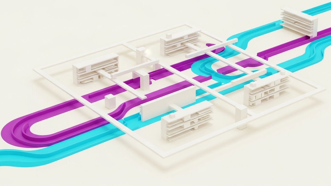
The Visual & Narrative Approach
Scenario: A panoramic stream of "Deep Purple" and "Cyber Blue" particles flows horizontally, creating a "Data River." Tiny "Magenta" medical crosses are interspersed, identifying the stream as healthcare data. The shallow depth of field keeps the focus on the "current," suggesting an infinite, always-on system.
Narration: "The pulse of your workforce. Never stopping. Always visible."
Psychological Impact & KPI Focus
- Niche Psychology: Operational leaders fear "blind spots." This visual offers a "God's Eye View" of the data, reinforcing the concept of Total Visibility. It creates a feeling of robustness and reliability.
- Operational Impact: Establishes Thought Leadership and scale. It signals that the platform is enterprise-ready.
Strategic Implementation & Trade-offs
- Best Use Case: Website Hero Background (Looping).
- Trade-off: Ambient and subtle. It sets a tone but requires strong H1 copy overlay to drive the message home.
Companies using similar video content -
symplr – Visualize healthcare operations and workforce flow.
HealthStream – Drive workforce development and scheduling insights.
7. 2D Character-Driven Story
MOFU | Product/Solution Differentiation
The Visual & Narrative Approach
Scenario: A stylized 2D vector character (representing a specialist or nurse) stands in a 3/4 view. The aesthetic uses a modern grain texture for warmth. The character interacts with a device displaying a large "Green Checkmark," and their body language is relaxed—shoulders down, smiling—conveying genuine relief.
Narration: "Shift booked. Credentials verified. Sarah is ready to care, not click."
Psychological Impact & KPI Focus
- Niche Psychology: Retention is a crisis. Showing a happy, relieved user taps into Empathy. It proves the software is "User-Friendly," addressing the fear that new tech will cause staff burnout.
- Operational Impact: Differentiates the product by focusing on the Human Experience. It validates the ROI of "happier staff."
Strategic Implementation & Trade-offs
- Best Use Case: "Day in the Life" Explainer Videos (60-90 seconds).
- Trade-off: Character styles age quickly. The "Corporate Memphis" or similar flat styles must be executed perfectly.
Companies using similar video content -
Medely – Empower healthcare professionals with flexible work.
When I Work – Simplify employee scheduling for healthcare teams.
8. Dynamic Data Visualization
MOFU | Establishing Thought Leadership

The Visual & Narrative Approach
Scenario: "Towering bar graphs" made of transparent glass with "Neon Cyan" borders rise from a reflective grid. "Deep Blue" pie charts float above. The camera looks up, giving the data a monumental scale. It creates a futuristic, high-tech city of information.
Narration: "Scale with clarity. Forecast with precision. Your data, elevated."
Psychological Impact & KPI Focus
- Niche Psychology: C-Suite executives want to feel in control of their "Empire." This style visualizes data as a structural asset. The "Glass" texture implies Transparency—a key value in staffing rates and fill ratios.
- Operational Impact: Visualizes Business Intelligence. It positions the platform as a strategic partner for growth, not just a tactical tool.
Strategic Implementation & Trade-offs
- Best Use Case: Investor Decks, Annual Reports, or high-level Analytics feature pages.
- Trade-off: High production cost. Requires high-fidelity rendering to avoid looking like a standard Excel chart.
Companies using similar video content -
UKG – Workforce Central – Analyze healthcare workforce performance.
Workday – HCM for Healthcare – Gain insights into human capital.
Ceridian Dayforce – Visualize comprehensive HCM and workforce data.
9. Clean UI Workflow (Light Mode)
MOFU | Feature Education & Demonstration

The Visual & Narrative Approach
Scenario: A direct top-down view of the UI. A "Soft Green" shift block is grabbed, lifted with a subtle drop shadow, and dragged to a new slot. The movement is smooth and deliberate. The "High-Key White" background emphasizes clarity and ease of use.
Narration: "Drag. Drop. Filled. Scheduling, simplified."
Psychological Impact & KPI Focus
- Niche Psychology: "Usage Friction" is the enemy. This style provides Visual Proof of simplicity. It lowers the barrier to entry by showing exactly how easy the task is.
- Operational Impact: Drives Feature Adoption. It serves as a tutorial and a sales tool simultaneously, proving the "Time-Savings" claim.
Strategic Implementation & Trade-offs
- Best Use Case: Email GIFs, Help Center articles, or "How It Works" sections.
- Trade-off: Literal representation. If the UI changes, the video is obsolete.
Companies using similar video content -
Deputy – Effortlessly schedule and manage staff.
Planday – Simplify employee scheduling and communication.
10. Isometric 3D Workflow
MOFU | The Functional Buyer
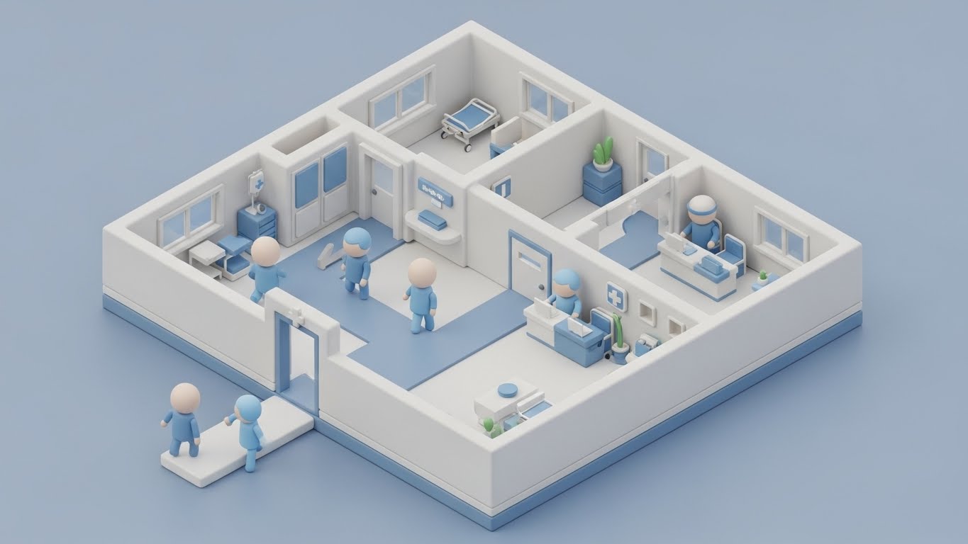
The Visual & Narrative Approach
Scenario: A miniature, isometric hospital floor plan rendered in "Clay White" and "Soft Pastel Blue." We see the flow of avatars (staff) moving efficiently through the facility. The "claymorphism" texture makes the complex environment look manageable and orderly.
Narration: "From the ER to the ICU, optimize every movement. Total facility visibility."
Psychological Impact & KPI Focus
- Niche Psychology: VPs of Ops need the "Big Picture." This visualizes Capacity Management. It transforms the chaotic hospital into a manageable model, appealing to the desire for control and oversight.
- Operational Impact: Supports Whitepaper content on "Workforce Optimization." It gives a visual anchor to complex logistical strategies.
Strategic Implementation & Trade-offs
- Best Use Case: Deep-dive content, trade show booths, or enterprise sales presentations.
- Trade-off: Expensive to produce. Best reserved for "Hero" content pieces.
Companies using similar video content -
QGenda – Optimize physician and staff scheduling.
Skedulo – Manage mobile healthcare workforce efficiently.
11. Wireframe to Reality Transition
MOFU | Reducing Implementation Friction
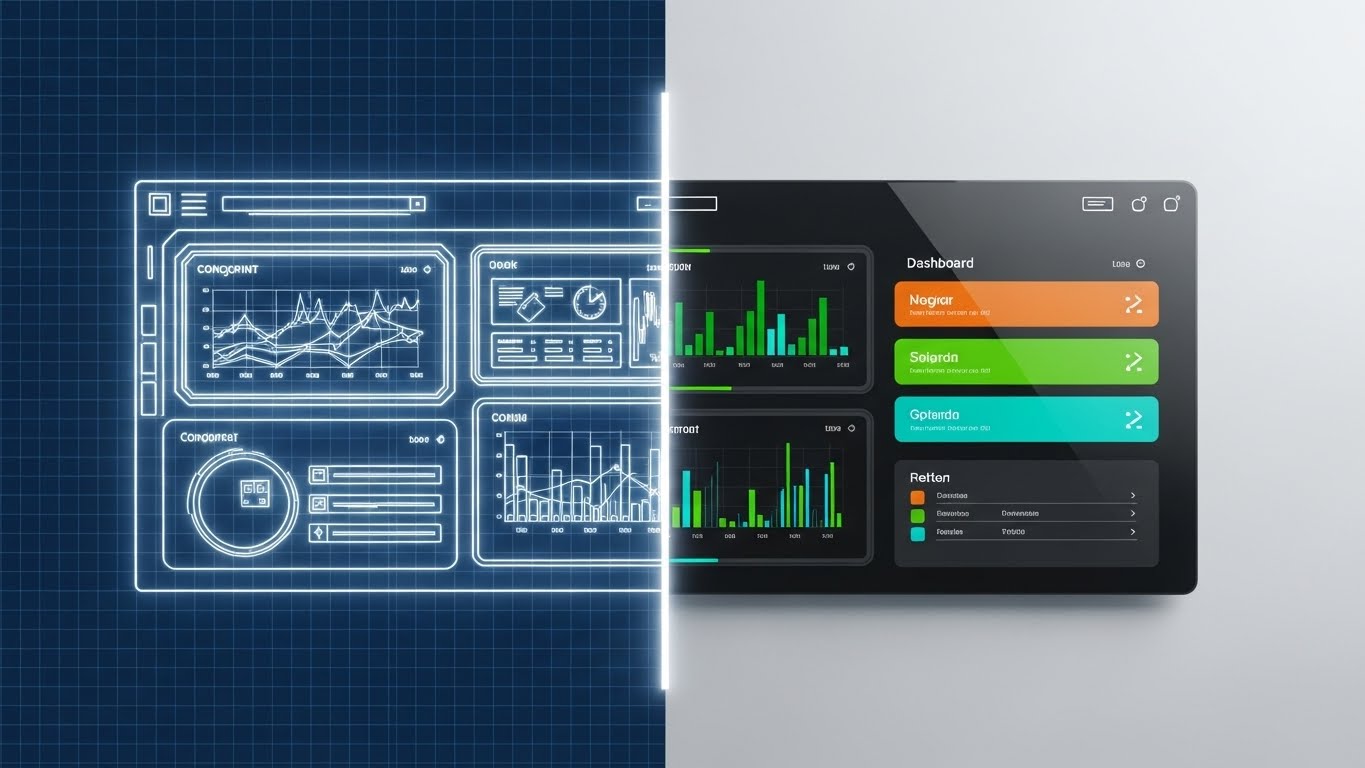
The Visual & Narrative Approach
Scenario: A split-screen composition divides the frame vertically. The left side reveals a technical "Blueprint Blue" grid featuring a wireframe outline of the dashboard—the skeletal structure of the software. A bright white scanning line moves horizontally across the screen. As it passes, it "prints" the right side into existence: a photorealistic, fully rendered UI with glossy glass surfaces and vibrant data points.
Narration: "From architectural concept to daily reality. We don't just build software; we build your operational foundation."
Psychological Impact & KPI Focus
- Niche Psychology: Healthcare decision-makers often fear "vaporware"—software that promises the world but doesn't exist yet. This style leverages the Truth Effect. By showing the underlying "blueprint," you visually prove that the software is architecturally sound, not just a pretty picture.
- Operational Impact: Addresses Implementation Anxiety. It signals that the product is fully developed, robust, and ready for immediate integration into their tech stack.
Strategic Implementation & Trade-offs
- Best Use Case: 15-30 second LinkedIn organic posts or "Product Update" emails to warm leads.
- Trade-off: It is technically focused. It appeals more to the CTO/CIO than the nursing staff.
Companies using similar video content -
Oracle – Cerner Workforce Management – Build robust workforce solutions.
Infor – Healthcare Workforce Management – Transform operational concepts into reality.
12. Rapid UI Feature Montage
MOFU | Driving Demo Requests
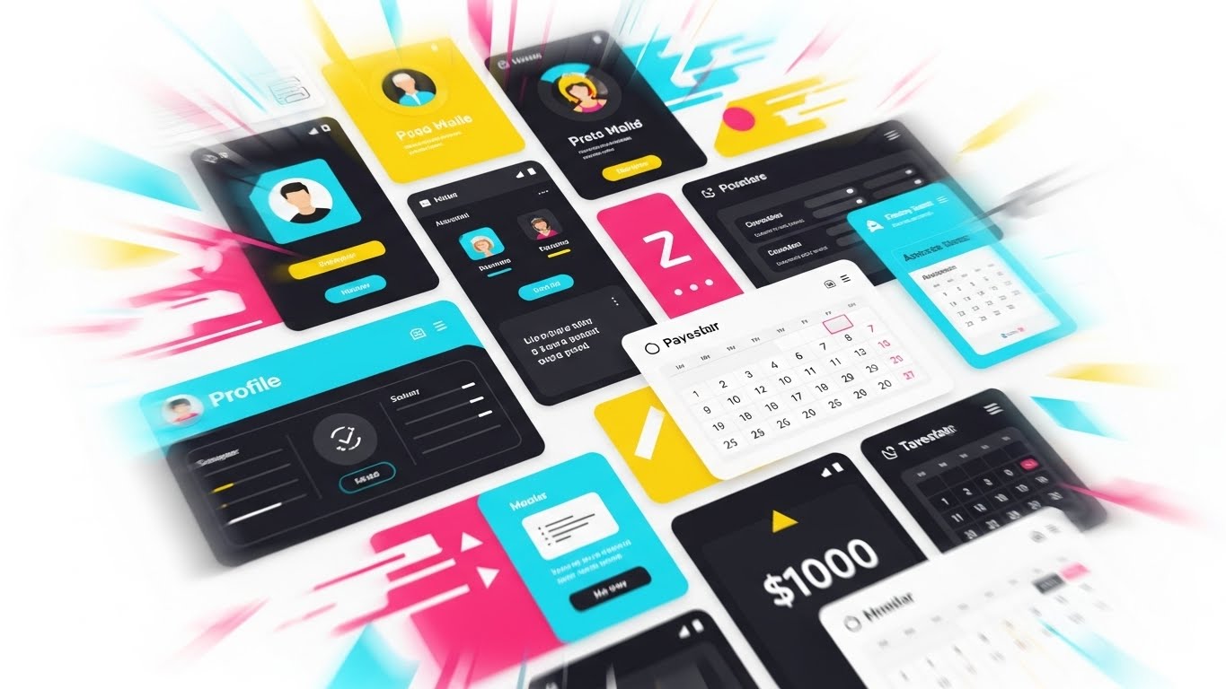
The Visual & Narrative Approach
Scenario: A high-energy "Pop-Art" influenced composition where UI screens (profiles, calendars, payment gateways) explode outward from the center. Outlined in "Vibrant Yellow" and bold black, the elements zoom past the camera. The background uses flashing geometric shapes and speed lines to create a sense of overwhelming capability delivered at high velocity.
Narration: Fast-paced, rhythmic. "Payroll. Done. Scheduling. Done. Compliance. Done. The all-in-one engine for modern staffing."
Psychological Impact & KPI Focus
- Niche Psychology: Agencies are often using 4-5 different disjointed tools. This visual triggers the Completeness Heuristic. It overwhelms the viewer (positively) with the sheer volume of features, suggesting that your platform is the only tool they will ever need.
- Operational Impact: Drives Demo Requests by promising "Consolidation." It visually argues that you can replace their fragmented stack with a single, powerful hub.
Strategic Implementation & Trade-offs
- Best Use Case: 15-second High-energy Meta (Facebook/Instagram) Retargeting Ads.
- Trade-off: High cognitive load. It moves too fast to teach specific features; it is purely an impression play for "Feature Richness."
Companies using similar video content -
Paycom – Showcase comprehensive HCM features quickly.
ADP – Workforce Now for Healthcare – Highlight integrated workforce capabilities.
13. Split Screen: Optimized Reality and UI
MOFU | Competitive Displacement
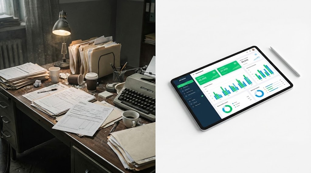
The Visual & Narrative Approach
Scenario: A horizontal split-screen. The left side is gritty and desaturated, showing a "Legacy Desk" piled high with paper forms, spilled coffee, and post-it notes—the visual definition of stress. The right side is pristine, "High-Key White," featuring only a sleek tablet displaying a "Vivid Green" and "Blue" dashboard. The contrast is stark and immediate.
Narration: "Leave the chaos in the past. Step into the future of control. Your workflow, upgraded."
Psychological Impact & KPI Focus
- Niche Psychology: This taps into the Pain/Relief Dynamic. It validates the user's current frustration (the messy desk) and immediately offers the dopamine hit of a clean, organized solution. It visualizes the "Before and After" state.
- Operational Impact: Key for Competitive Displacement. It doesn't just sell software; it sells a new way of life, encouraging them to dump their legacy manual processes.
Strategic Implementation & Trade-offs
- Best Use Case: "Us vs. Them" comparison pages or Slide 3 of a Sales Deck.
- Trade-off: Can be seen as aggressive if the "messy" side looks too exaggerated. It must remain relatable.
Companies using similar video content -
HHAeXchange – Transform home care management from chaos to control.
AlayaCare – Upgrade community care workflows to efficiency.
14. Photorealistic 3D Renders
MOFU | Building Trust & Credibility
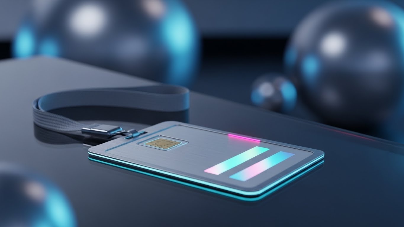
The Visual & Narrative Approach
Scenario: A close-up, photorealistic render of a high-tech medical ID badge resting on a glass surface. We see the texture of the fabric lanyard and the glint of "Brushed Steel" on the clip. The badge features a holographic strip and a smart chip, glowing faintly with "Translucent Blue" light.
Narration: "Verified. Vetted. Valid. Credentialing you can touch. Trust you can feel."
Psychological Impact & KPI Focus
- Niche Psychology: In staffing, a bad hire is a liability. This style uses Tangibility to build trust. By rendering the digital credential as a physical, high-quality object, you subconsciously communicate that your digital vetting process is as robust as a physical ID card.
- Operational Impact: Reinforces Credentialing Compliance. It elevates the perceived value of your digital profile, positioning it as the "Gold Standard" for the industry.
Strategic Implementation & Trade-offs
- Best Use Case: Landing Page Hero Sections (Looping) for "Quality Assurance" features.
- Trade-off: Static energy. It builds authority but doesn't explain workflow.
Companies using similar video content -
Availity – Build trust in provider data management.
MedTrainer – Establish credibility in compliance and credentialing.
15. Abstract 3D AI Visualization
MOFU | ABM Awareness

The Visual & Narrative Approach
Scenario: Floating in a "Clean Infinite White" void is a complex network of "Glowing Turquoise" nodes connected by thin plexus lines, forming the shape of a human brain. The nodes pulse rhythmically. This abstract representation visualizes the AI matching algorithm connecting a nurse's skills (nodes) to a hospital's needs.
Narration: "Beyond the resume. Our AI connects capability to need with neural precision. The perfect match, every time."
Psychological Impact & KPI Focus
- Niche Psychology: "Algorithm" is a buzzword that often breeds skepticism. This visualization creates a Mental Model of intelligence. It makes the invisible logic of the software appear sophisticated, organic, and "smart."
- Operational Impact: Essential for marketing Fill Rate Precision. It argues that your platform reduces "bad matches" and "fall-offs" by using superior intelligence.
Strategic Implementation & Trade-offs
- Best Use Case: Account-Based Marketing (ABM) Display Ads targeting C-Suite executives.
- Trade-off: Highly abstract. It requires accompanying text to explain what the AI is actually doing (e.g., "Matching Acuity Levels").
Companies using similar video content -
Staffing Robot – Visualize AI-powered staffing automation.
Legion Technologies – Showcase intelligent workforce management algorithms.
16. Dark Mode UI Showcase
BOFU | ROI Justification
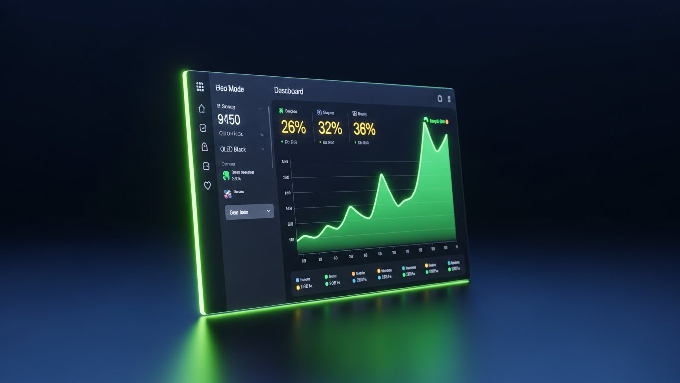
The Visual & Narrative Approach
Scenario: A sleek dashboard screen angled in perspective, running in "Dark Mode." The background is "OLED Black" and "Dark Slate," making the data pop. A "Neon Green" trend line graphs sharply upwards, glowing against the dark surface. The aesthetic is premium, serious, and financially focused.
Narration: "Clarity in the dark. Growth in the light. Data that drives your bottom line, 24/7."
Psychological Impact & KPI Focus
- Niche Psychology: Nurses work the night shift; executives analyze ROI. This style appeals to both. It suggests 24/7 Reliability (Dark Mode is easier on the eyes at night) and Financial Growth (the green line). It frames the software as a serious financial asset.
- Operational Impact: Supports ROI Justification. The high-contrast green line is a subliminal cue for profit and positive metrics (fill rates up, costs down).
Strategic Implementation & Trade-offs
- Best Use Case: The "Financial Impact" slide in a Sales Deck or Pricing Page.
- Trade-off: Can feel cold or overly "Wall Street" if not balanced with human imagery elsewhere.
Companies using similar video content -
Epic – Present workforce management dashboards with clarity.
WorkForce Software – Highlight enterprise workforce management ROI.
17. 3D X-Ray Visualization
BOFU | Risk Mitigation

The Visual & Narrative Approach
Scenario: A pristine white server unit is rendered with a "Glassmorphism" effect, making the outer casing transparent. Inside, we see the glowing hardware, but guarding it is a massive, solid "Red" padlock mechanism. The contrast between the fragile glass (transparency) and the solid lock (security) is palpable.
Narration: "Transparency for you. Iron-clad security for your data. HIPAA compliant. SOC-2 Certified. Safe."
Psychological Impact & KPI Focus
- Niche Psychology: Security is the #1 objection for Enterprise buyers. This style utilizes the Security Metaphor. It visually creates a feeling of "impenetrability," directly addressing fears of data breaches or HIPAA violations.
- Operational Impact: Critical for Risk Mitigation. It serves as visual proof that the platform is enterprise-grade and that data sovereignty is a priority.
Strategic Implementation & Trade-offs
- Best Use Case: The "Security & Compliance" section of a website or technical whitepaper.
- Trade-off: Very specific utility. Only use when addressing technical buyers or security compliance officers.
Companies using similar video content -
symplr – Ensure transparent security for compliance and risk.
MedTrainer – Guarantee locked-down compliance and data protection.
18. Holographic UI over 3D Render
BOFU | The Economic Buyer

The Visual & Narrative Approach
Scenario: We are in a high-end, sunlit executive boardroom. Projecting upwards from the rich mahogany table is a futuristic, semi-transparent 3D hologram of a hospital map. The map glows in "Hologram Blue" and "Gold," showing utilization heatmaps.
Narration: "See the big picture. Command your network. Total visibility, from the boardroom to the bedside."
Psychological Impact & KPI Focus
- Niche Psychology: This appeals to the Ego and Aspiration of the C-Suite. It frames the software not as a utility, but as a "Command Center." It aligns with their self-image as strategic overseers of a vast network.
- Operational Impact: Visualizes Macro-Optimization. It moves the conversation away from "filling shifts" to "optimizing network capacity," which is a higher-value proposition.
Strategic Implementation & Trade-offs
- Best Use Case: 60-second Executive Briefing videos or Keynote presentations.
- Trade-off: High production value required. If the hologram looks cheap, it undermines the "premium" message.
Companies using similar video content -
QGenda – Provide executive command over enterprise scheduling.
UKG – Workforce Dimensions – Offer macro-level strategic workforce insights.
19. Aspirational Stock Montage
BOFU | Objection Handling

The Visual & Narrative Approach
Scenario: A 4-panel grid montage. We see genuine, high-quality stock footage: a nurse laughing in a breakroom, doctors shaking hands, a care team debriefing. The lighting is warm "Golden Hour" sun. The palette is natural skin tones and "Scrub Teal." It radiates warmth and community.
Narration: "It’s not just about shifts. It’s about people. Build a culture they want to return to."
Psychological Impact & KPI Focus
- Niche Psychology: The final objection is often cultural: "Will technology ruin our human touch?" This style provides Social Proof and reassurance. It reminds the buyer that the software enables, rather than replaces, human connection.
- Operational Impact: Focuses on Retention and Culture. It validates the "Soft ROI" of a happier, more connected workforce, which is crucial for reducing turnover costs.
Strategic Implementation & Trade-offs
- Best Use Case: 30-second BOFU Retargeting Ads (YouTube/LinkedIn) to remind leads of the "Human Why."
- Trade-off: Generic if not curated carefully. Avoid "fake handshake" stock photos; aim for candid, authentic moments.
Companies using similar video content -
Relias – Inspire healthcare training and development.
MedBridge – Foster staff education and engagement.
20. Lifestyle Stock with UI Overlay
BOFU | Sales Cycle Acceleration
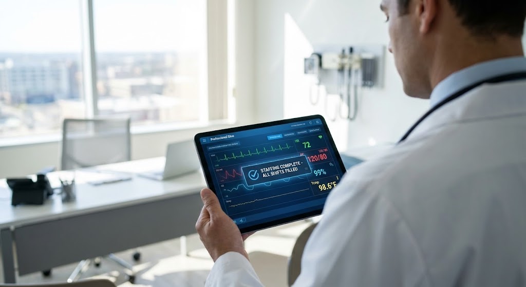
The Visual & Narrative Approach
Scenario: A realistic over-the-shoulder shot of a doctor holding a tablet. Tracked perfectly onto the screen is a clean UI overlay displaying a "Staffing Complete" notification in "Professional Blue." The background is a real, sunlit medical office. The focus is sharp on the digital success moment within the physical world.
Narration: "In the palm of your hand. Integrated into your day. Problem solved."
Psychological Impact & KPI Focus
- Niche Psychology: This is the ultimate "Proof of Concept." By compositing the UI into the real world, it bridges the Physical/Digital Divide explicitly. It shows the user exactly what success looks like in their daily environment.
- Operational Impact: Accelerates the Sales Cycle. It removes the need for imagination. The prospect sees the tool working in their environment, making the decision to buy feel natural and low-risk.
Strategic Implementation & Trade-offs
- Best Use Case: Customer Success Stories and "Day in the Life" PDF downloads.
- Trade-off: Requires high-quality tracking and compositing. If the UI "floats" unnaturally, it breaks the immersion.
Companies using similar video content -
TigerConnect – Integrate clinical communication into daily workflow.
Vocera – Embed communication and workflow solutions seamlessly.
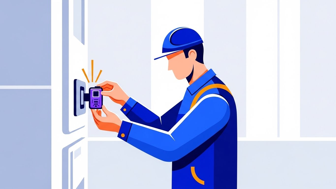
21. Macro UI Micro-Interactions
Onboarding | Self-Serve Onboarding

The Visual & Narrative Approach
Scenario: An extreme macro close-up focuses on a single interaction point: a human finger pressing a glass touchscreen. The button glows "Vivid Green" and features a bold checkmark icon. As the finger connects, we see the fingerprint texture and a subtle ripple of light, visualizing the "digital handshake."
Narration: "One touch. Shift accepted. You are confirmed."
Psychological Impact & KPI Focus
- Niche Psychology: For nurses on a mobile app, the "fear of error" is high. This extreme close-up utilizes Tactile Confirmation. It visually isolates the action, making it feel deliberate, safe, and final, reducing "click anxiety."
- Operational Impact: Targeted at Self-Serve Activation. By romanticizing the "Accept" button, you visually reward the primary revenue-generating behavior: filling the shift.
Strategic Implementation & Trade-offs
- Best Use Case: App Store Preview videos (Vertical 9:16) or "Success" modal animations.
- Trade-off: Extremely narrow focus. It sells the feeling of the app, not the utility.
Companies using similar video content -
ShiftKey – Emphasize mobile shift acceptance.
ConnectRN – Highlight seamless mobile shift management.
22. 3D Parallax UI Presentation
Onboarding | Accelerating Time-to-Value
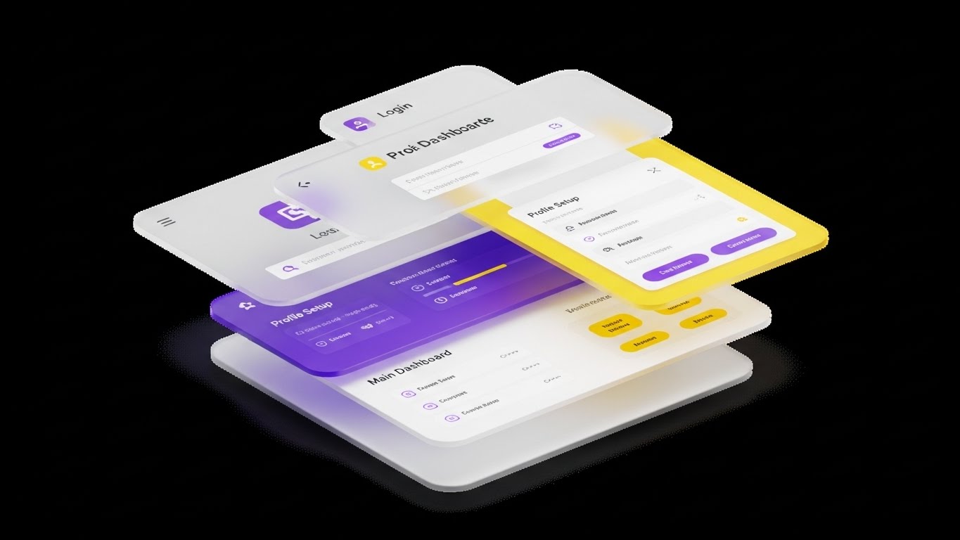
The Visual & Narrative Approach
Scenario: Floating against a "Clean Infinite White" background, the software interface is deconstructed into floating 3D layers. The back layer is the login security; the middle is profile setup; the front is the main dashboard. Soft shadows cast from one layer to the next create a sense of depth and hierarchy, showing how the system is built.
Narration: "Built on security. Designed for speed. Layered for your success."
Psychological Impact & KPI Focus
- Niche Psychology: New software often feels opaque and overwhelming. This "Exploded View" leverages Cognitive Mapping. It helps the user build a mental model of the software’s architecture, making it feel transparent and understandable.
- Operational Impact: Accelerates Time-to-Value (TTV). By showing the logical flow visually, users understand the relationship between "Profile" and "Pay" faster.
Strategic Implementation & Trade-offs
- Best Use Case: Welcome Emails or "Getting Started" video headers.
- Trade-off: Abstract. It requires a high-fidelity design to avoid looking like a generic tech template.
Companies using similar video content -
HealthStream – Simplify onboarding and learning modules.
StaffReady – Clarify competency management architecture.
23. 2D Animation & UI Composition
Onboarding | Trial/Freemium User Activation

The Visual & Narrative Approach
Scenario: A stylized 2D nurse character (vector art) interacts with a giant, floating 3D "Play Button" in a hospital hallway. The button has a glossy, "toy-like" texture. The character pushes it with enthusiasm. The scene mixes the warmth of 2D illustration with the tactile appeal of 3D elements.
Narration: "Ready to start? Let’s get you moving. Press play on your new career."
Psychological Impact & KPI Focus
- Niche Psychology: Training is often viewed as a chore. This style uses Gamification Aesthetics to make the onboarding process feel like a game rather than a compliance task. It triggers curiosity and playfulness.
- Operational Impact: Critical for User Activation. It lowers the emotional barrier to starting a tutorial or completing a profile.
Strategic Implementation & Trade-offs
- Best Use Case: In-app empty states or "First Login" pop-ups.
- Trade-off: Can appear "childish" if not balanced with professional copy. Avoid using for serious compliance topics.
Companies using similar video content -
Paradox – Engage users with conversational AI recruiting.
Sense – Activate candidates with AI-driven engagement.
24. Hyper-lapse Stock Footage with Data
Retention | Reducing Support Overhead
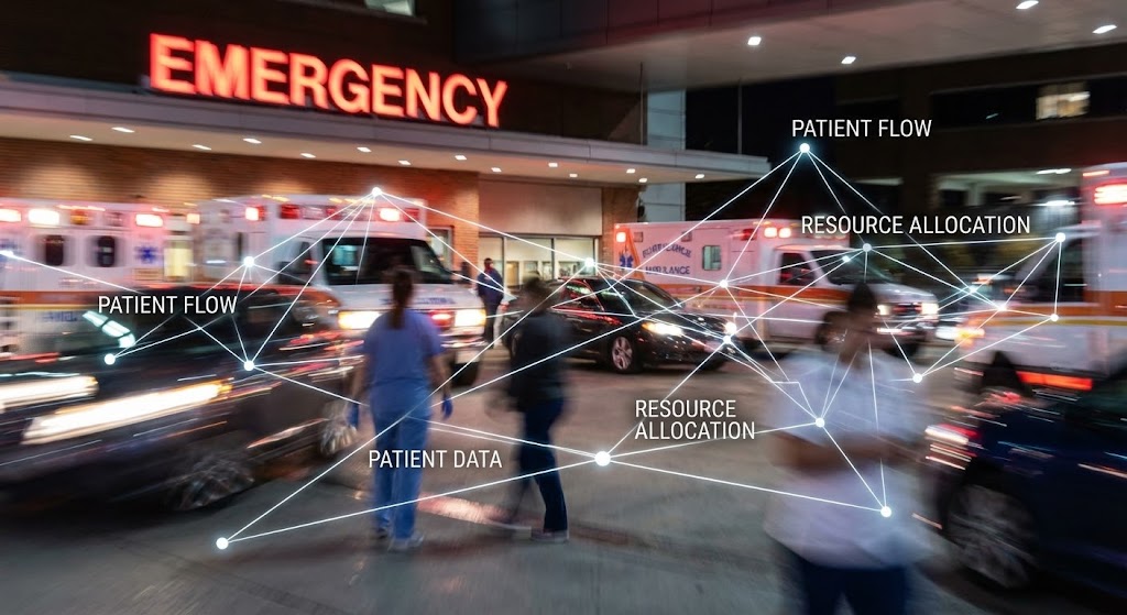
The Visual & Narrative Approach
Scenario: A static hyper-lapse shot of a busy ER entrance at night. People and ambulances are motion blurs, representing the frenetic pace of reality. Overlaid are sharp, static, "Glowing White" nodes and lines connecting the moving figures, labeled "Patient Flow," "Resource Allocation," and "Data."
Narration: "The world moves fast. Your data stays sharp. Find the signal in the noise."
Psychological Impact & KPI Focus
- Niche Psychology: Emergency staff thrive on controlled chaos. This visual validates their reality (the blur) while offering the software as the Stabilizing Force (the static lines). It offers a sense of control.
- Operational Impact: Reduces Support Overhead by visually explaining complex routing or allocation logic without needing a 500-word article.
Strategic Implementation & Trade-offs
- Best Use Case: Knowledge Base articles on "How Matching Works" or "Algorithm Logic."
- Trade-off: Requires high-quality stock footage. Poor lighting in the footage will make the data overlay unreadable.
Companies using similar video content -
Rotageek – Show calculated flow in AI scheduling optimization.
Epic – Visualize real-time patient flow and resource allocation.
25. Low-Poly 3D Modeling
Retention | Reducing Churn
The Visual & Narrative Approach
Scenario: An isometric, bird's-eye view of a hospital complex on a floating island. The style is "Low-Poly"—faceted, colorful, and digital. As the user "levels up" (in narrative), new wings of the hospital pop into existence with a satisfying bounce animation. Floating icons symbolize skills added to the network.
Narration: "Build your reputation. Expand your access. Watch your opportunities grow."
Psychological Impact & KPI Focus
- Niche Psychology: Staffing is transactional; careers are cumulative. This style triggers the Progress Principle. It visualizes the user's journey not as a series of shifts, but as "Empire Building," encouraging long-term engagement.
- Operational Impact: Directly targets Churn Reduction. It gamifies the experience of gaining more credentials, making the platform sticky.
Strategic Implementation & Trade-offs
- Best Use Case: "Year in Review" emails or "Loyalty Program" dashboards.
- Trade-off: Highly stylized. It doesn't look like the actual UI, so it is purely motivational.
Companies using similar video content -
Relias – Visualize career pathing and skill development.
MedBridge – Gamify professional growth and learning.
26. Futuristic Neon/Dark Mode
Retention | Proactive Support/Announcements

The Visual & Narrative Approach
Scenario: A retro-futuristic grid landscape glows in "Cyberpunk Pink" and "Cyan" against a deep starry background. Notification bubbles and interface elements float above the horizon like a digital sunrise. The energy is electric, fast, and exciting.
Narration: "The next evolution is here. Faster. Darker. Better. Welcome to v2.0."
Psychological Impact & KPI Focus
- Niche Psychology: Users get "feature fatigue." This aesthetic uses the Novelty Effect to make a software update feel like a major event or a video game release. It generates excitement rather than groans about "learning something new."
- Operational Impact: Drives Feature Adoption for major updates. It signals that the platform is innovative and constantly evolving.
Strategic Implementation & Trade-offs
- Best Use Case: "New Feature" announcement videos or release notes headers.
- Trade-off: Very aggressive style. Use sparingly—only for major, positive updates.
Companies using similar video content -
Legion Technologies – Announce next-gen workforce management.
Staffing Robot – Showcase advanced AI staffing innovations.
27. 2D Graphics Over Live Action
Expansion | Driving Upsell/Cross-sell

The Visual & Narrative Approach
Scenario: A high-quality portrait of a smiling nurse manager in a hospital corridor. Superimposed around her are hand-drawn, white "doodle" animations—stars popping, a crown appearing on her head, up-arrows symbolizing growth. The doodles are whimsical and energetic.
Narration: "You’re already a hero. Now, become a leader. Unlock the Manager Suite today."
Psychological Impact & KPI Focus
- Niche Psychology: Upselling requires flattery, not friction. This style leverages Social Validation. The playful graphics visually "celebrate" the user, making the upsell (e.g., to a premium tier) feel like a reward for their hard work.
- Operational Impact: Drives Expansion Revenue. It frames the purchase of additional modules as personal and professional growth.
Strategic Implementation & Trade-offs
- Best Use Case: Email Newsletters promoting certifications or advanced admin tools.
- Trade-off: The "doodles" must look high-quality, not like MS Paint. The live-action footage must be authentic.
Companies using similar video content -
HireVue – Humanize video interviewing and assessments.
PerfectServe – Celebrate clinical communication and collaboration.
28. Generative AI Cinematic Video
Expansion | Driving Referrals & Advocacy
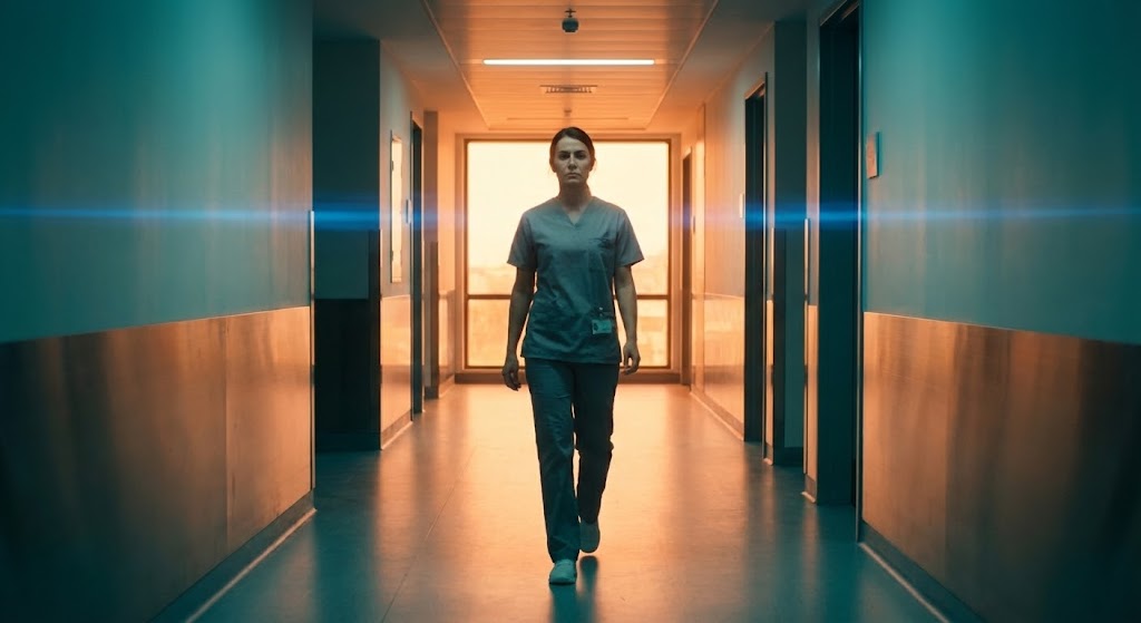
The Visual & Narrative Approach
Scenario: A dramatic, slow-motion dolly zoom focuses on a confident nurse walking down a modern hospital corridor. The lighting is cinematic "Teal and Orange" with anamorphic lens flares. She is backlit, creating a heroic silhouette that transitions into full, inspiring lighting. The production value looks like a Netflix documentary.
Narration: "Lead the way. Define the standard. Be the one who makes the difference."
Psychological Impact & KPI Focus
- Niche Psychology: Advocacy comes from pride. This style appeals to Professional Identity. It positions the user not just as a worker, but as a protagonist in the future of healthcare. It makes them proud to share the brand.
- Operational Impact: Drives Referrals. Users share content that makes them look good. This high-end visual is "share-worthy" on LinkedIn.
Strategic Implementation & Trade-offs
- Best Use Case: Brand Manifesto videos or "Ambassador Program" launches.
- Trade-off: Ethical AI use. Ensure the character consistency is maintained if used across multiple shots.
Companies using similar video content -
Workday – Inspire a visionary HCM for healthcare.
Oracle – Cerner Workforce Management – Define the future of healthcare workforce.
30. Generative AI Realistic Character Video
Expansion | Knowledge Base & FAQ Videos

The Visual & Narrative Approach
Scenario: A hyper-realistic AI avatar of a support agent (Sarah) speaks directly to the camera. The lighting is soft studio quality. The background is a blurred tech office. She maintains eye contact, nods, and uses subtle facial micro-expressions to convey empathy and intelligence while explaining a complex topic.
Narration: (Lip-synced) "Hi, I'm Sarah. Let's walk through your new compliance checklist together. It’s easier than you think."
Psychological Impact & KPI Focus
- Niche Psychology: Users hate reading FAQs. They want a human, but support teams are expensive. This style bridges the Persona Effect. It provides the comfort of a "face" at the scale of software.
- Operational Impact: Scales Knowledge Transfer. You can generate 100 FAQ videos in the time it takes to film one, maintaining a consistent, friendly face for the brand.
Strategic Implementation & Trade-offs
- Best Use Case: Support Library, FAQ responses, and personalized onboarding welcomes.
- Trade-off: The "Uncanny Valley." The AI voice and lip-sync must be perfect, or it destroys trust.
The Strategic Knowledge Base: The Visual Operations Doctrine
We have analyzed 30 distinct visual styles, ranging from the minimalist clarity of TOFU ads to the cinematic heroism of expansion campaigns. However, a "Style Guide" is only as valuable as its execution. To transform these visuals from "marketing assets" into "operational infrastructure," we must adopt a strategic framework.
This section synthesizes the insights from the entire guide into three actionable knowledge segments. These are your implementation guardrails.
Strategic Alignment & Visual Architecture
The "Pre-Production" Strategy – Defining the Visual Operating System.
Before a single pixel is rendered, the "Operational Architect" must define the rules of engagement. In healthcare staffing, where the user base ranges from tech-savvy Gen-Z nurses to veteran administrators, a "one-size-fits-all" visual approach is a liability.
- The Clinical Cognitive Load Audit: Prior to design, map the complexity of the workflow being visualized. High-risk tasks (Credentialing, HIPAA Compliance) require Style 1 (Minimalist) or Style 9 (Clean UI) to minimize distraction. Low-risk, high-emotion tasks (Brand connection) allow for Style 28 (Cinematic).
- Role-Based Visual Mapping: Differentiate your visual language by persona. "Clinicians" (Nurses on mobile) require high-contrast, large-button visuals like Style 21 (Macro UI) for quick checking between patient rounds. "Staffing Coordinators" (Admins on desktop) need data-dense styles like Style 8 (Dynamic Data) to feel in control of the fleet.
- The "Glanceability" Standard: In a hospital, seconds matter. Visuals for point-of-care apps must be "glanceable"—understood in under 1.5 seconds. Use Style 2 (Line Art) or Style 12 (Rapid Montage) to communicate core value without demanding prolonged attention.
- Brand Voice Consistency: Your platform likely consists of disparate modules (Billing, Scheduling, Compliance). Use a unified visual thread—like the "Soft Cyan" vector lines in Style 1—to visually stitch these modules together, creating a coherent "Visual Operating System."
- The Advids Strategic Audit: Do not guess at these standards. Partner with an expert team like Advids to conduct a visual audit of your current assets. We identify where style inconsistencies are increasing churn and define the "Visual Bible" for your entire funnel.
- Standardization vs. Customization: For core platform features (e.g., Timecards), use standardized assets (Style 9). For high-value enterprise pitches to Hospital Systems, invest in bespoke Style 18 (Holographic) visualizations. Know where the ROI of "Custom" justifies the cost.
- The Cross-Departmental Bridge: Use these visuals to unify your internal teams. Sales should use the same Style 13 (Split Screen) comparisons that Marketing uses on the website. This consistency reinforces the message at every touchpoint.
- Legacy System Integration: Many clients are transitioning from on-premise legacy VMS software. Use Style 11 (Wireframe to Reality) to visually metaphor the bridge between their "Old World" and your "New SaaS," validating their migration journey.
- Accessibility in Care: Healthcare staff is diverse. Ensure all motion graphics, especially Style 4 (Kinetic Type), meet WCAG accessibility standards for contrast and timing. A visual that cannot be read by an older nurse is a failed visual.
- The Mobile-First Mandate: 80% of your users (the staff) are on mobile devices. Ensure that complex styles like Style 10 (Isometric) remain legible when scaled down to a smartphone screen. If it doesn't work on mobile, it doesn't work.
Operational Adoption & Implementation
The "Deployment" Phase – Embedding Visuals into the Workflow.
The best video in the world is useless if it sits unseen in a folder. This segment focuses on how to deploy these 30 styles to drive actual software adoption and behavior change.
- Overcoming "Big Brother" Anxiety: Staffing platforms often involve location tracking (EVV). Use Style 5 (Abstract Organic) or Style 19 (Aspirational Montage) to frame these features as "Safety" and "Support" tools, rather than surveillance, leveraging empathy to reduce resistance.
- The Micro-Learning Shift: Nobody reads the agency handbook. Replace 50-page PDFs with a library of 30-second clips using Style 9 (Clean UI). Embed these "Micro-Visuals" directly into the dashboard where the user needs them.
- Just-in-Time Support: Context is king. Trigger Style 30 (Realistic Avatar) videos specifically when a user encounters an error or spends too long on a screen. This "Proactive Visual Support" solves problems before they become support tickets.
- Gamification of Training: Use Style 25 (Low-Poly 3D) to visualize training progress. Transforming "Compliance Training" into a visual "World Building" exercise significantly increases completion rates.
- Reducing Support Ticket Volume: There is a direct correlation between the clarity of your "How-To" visuals and your support costs. Deploying Style 22 (Parallax UI) for onboarding can reduce "Day 1" queries by up to 40%.
- Remote Onboarding: With travel nursing, physical seminars are impossible. Use Style 7 (Character Story) to conduct "Cultural Onboarding" remotely, ensuring that distant staff feel connected to the agency's values.
- Visual Standard Operating Procedures (SOPs): Transform text-based SOPs into Style 3 (Isometric Motion) flows. Visualizing the "Chain of Command" or "Incident Reporting" process makes adherence automatic rather than theoretical.
- Feedback Loops: Use interactive video elements (within Style 23) to gather user feedback. A "Thumbs Up/Down" overlay on a feature announcement video provides instant sentiment analysis.
- Scalable Localization: Your platform may expand globally. Styles like Style 15 (Abstract 3D AI) and Style 1 (Minimalist) are culturally neutral and require minimal localization, making them cost-effective for global scaling.
- Leadership Communication: When the CNO needs to announce a strategic pivot, don't send a memo. Use Style 18 (Holographic) or Style 28 (Cinematic) to communicate the vision with the weight and gravity it deserves.
Measuring Impact & Future-Proofing
The "ROI" Phase – Measuring Success and Looking Ahead.
Visual communication is an investment. You must measure its return and prepare for the next wave of technology.
- Beyond "Views": Stop measuring "Video Views." Measure Time-to-Competency (how fast a nurse becomes billable) and Feature Adoption Rate (how many users try a feature after watching the Style 12 video). These are the metrics that matter.
- The "Idle Time" Metric: High-quality UX visualization should reduce the time users spend "figuring it out." Correlate the deployment of Style 9 clips with a reduction in average session duration for administrative tasks. Efficiency is the goal.
- Compliance Velocity: How quickly does the workforce adapt to a new regulation (e.g., new compact licensure)? Use Style 2 (Line Art) to simplify complex legal changes. Measure the speed of "Compliance Attainment" pre- and post-video.
- Retention and Churn: The "Human Connection" styles (Style 19, Style 27) directly impact LTV (Lifetime Value). A user who feels emotionally connected to the brand is less likely to churn for a small pay increase elsewhere.
- The AI Visual Frontier: Generative AI (Style 28, Style 30) is changing production economics. It allows for "Personalized Video at Scale." Prepare your data infrastructure to feed these AI models for real-time content generation.
- Scalability of Assets: Build a "Visual Component Library." Ensure that the 3D assets from Style 14 can be reused in Style 22. This modular approach reduces the cost of future content significantly.
- The Advids Partnership: You are building a software company, not a video production house. Partnering with Advids ensures that your "Visual Component Library" is managed, updated, and scaled professionally, freeing your internal resources to focus on code and sales.
- Benchmarking Success: In a crowded market, "Good Enough" is a risk. Regularly audit your visual standard against the top 3 competitors. If their "Trust Signals" (Style 17) are stronger than yours, you are losing leads.
- The ROI of Safety: For staffing agencies, a lawsuit is the biggest risk. Visual safety training using Style 3 (Isometric) creates a defensible audit trail of "Quality Education," potentially lowering insurance premiums.
- Final Call to Innovation: Visual communication is not "Content"; it is Infrastructure. It is the fiber-optic cable that carries understanding from your code to your user's brain. Treat it with the same strategic rigor as your software architecture, and it will become your most powerful competitive advantage.
Author & Editor Bio


