
Introduction: Visualizing the "Invisible" Tech
The future of healthcare is undeniably digital, yet the industry’s greatest challenge remains the physical execution of that reality. In 2024, compounding inefficiencies and poor health IT integration have led to total industry losses exceeding $8 billion annually. For Healthcare SaaS leaders, this statistic is not just a warning; it is the defining battleground of the decade.
The divide between sophisticated backend algorithms and the frontline clinician’s experience is often vast. Medical professionals are facing unprecedented burnout, navigating clunky legacy interfaces while tasked with life-or-death decisions. They do not need more software; they need clarity. They need Invisible Tech—solutions that integrate so seamlessly they disappear into the workflow.
This is where strategic visualization becomes your most powerful Go-To-Market asset. With the global healthcare software as a service market valued at USD 38.50 billion in 2025, the winners will not necessarily be the ones with the most complex code, but those who can communicate simplicity, safety, and efficiency instantly.
This guide is not merely a gallery of "pretty" videos. It is a strategic framework designed to help you bridge the Physical/Digital divide. We will explore how specific visualization styles—from cinematic AI to clean UI transitions—can reduce cognitive load, build clinical trust, and accelerate the adoption of your platform.
Here are the first 10 "Gold Standard" visualization styles to transform your healthcare narrative.
1. The "Brand Prestige" Opener
TOFU | Brand Awareness

The Visual & Narrative Approach
This style leverages the power of high-end Generative AI to create a breathtaking, cinematic opening. We visualize a sun-drenched, modern hospital atrium where the physical architecture blends with digital artistry. Ethereal streams of golden and sky-blue light flow like rivers through the air, representing Interoperability—patient data moving seamlessly between departments without friction. The camera executes a slow, majestic dolly zoom, capturing diverse medical professionals walking confidently through these data streams, suggesting a workplace in perfect harmony.
Psychological Impact & KPI Focus
- Niche Psychology: Hospital administrators often associate "Digital Transformation" with disruption and chaos. This style counters that anxiety by presenting a "Utopian Workflow"—a vision of organized serenity.
- Operational Impact: By visualizing data as "light" rather than "spreadsheets," you bypass the cognitive friction of technical details and appeal directly to the aspiration of a unified, efficient healthcare system. This drives Brand Awareness and elevates perceived market value.
Strategic Implementation & Trade-offs
- Best Use Case: Homepage Hero sections or Keynote Event Openers.
- Duration: 15–30 Seconds.
- Trade-off: This is a mood-setter, not a feature explainer. Use it to establish authority before diving into technical specifics.
Companies using similar video content -
Epic Systems – Payer Platform – Visualizing seamless data exchange between payers and providers.
Google Cloud Healthcare – Healthcare Data Engine – Cinematic visualization of data flowing across healthcare systems.
AWS HealthLake – HealthLake – Ethereal streams representing secure, scalable health data management.
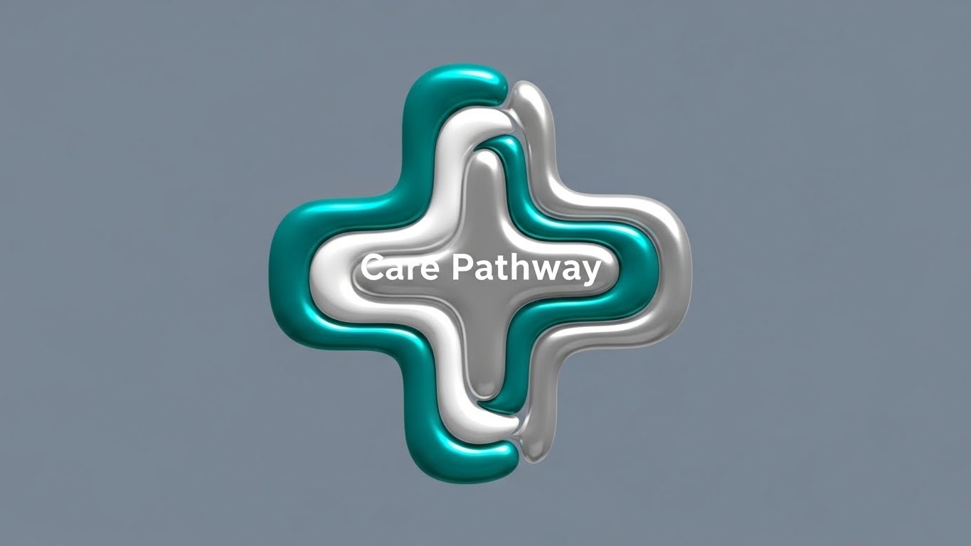
2. The "Frictionless Pathway" Illustration
TOFU | Category Creation
The Visual & Narrative Approach
Here, we move away from realism to abstract clarity. Using a Liquid Motion technique, glossy teal and latex white shapes morph and coalesce to form a stylized healthcare cross. The movement is fluid, with shapes flowing into one another like wet paint, representing the "Care Pathway." The absence of rigid borders or friction points visually demonstrates how your SaaS platform eliminates administrative bottlenecks. The matte slate grey background ensures the focus remains entirely on the fluid evolution of the central icon.
Psychological Impact & KPI Focus
- Niche Psychology: Clinicians are weary of "clunky" interfaces. The liquid physics in this animation subconsciously signal "Ease of Use" and adaptability.
- Operational Impact: This style is perfect for Category Creation. It doesn't show how the software works, but what it feels like to use it: smooth, integrated, and organic. It creates a strong Brand Salience on social platforms like LinkedIn.
Strategic Implementation & Trade-offs
- Best Use Case: Social Media Feeds (LinkedIn/Instagram) for brand recall.
- Duration: 10–15 Seconds (Loopable).
- Trade-off: Highly abstract. It requires accompanying copy to ground the visual metaphor in specific business benefits.
Companies using similar video content -
Huma – Remote Patient Monitoring Platform – Liquid motion illustrating seamless virtual care pathways.
Amalgam Rx – Digital Therapeutics – Fluid shapes representing adaptable, personalized treatment plans.
CareCloud – Platform – Organic flow demonstrating streamlined practice management.
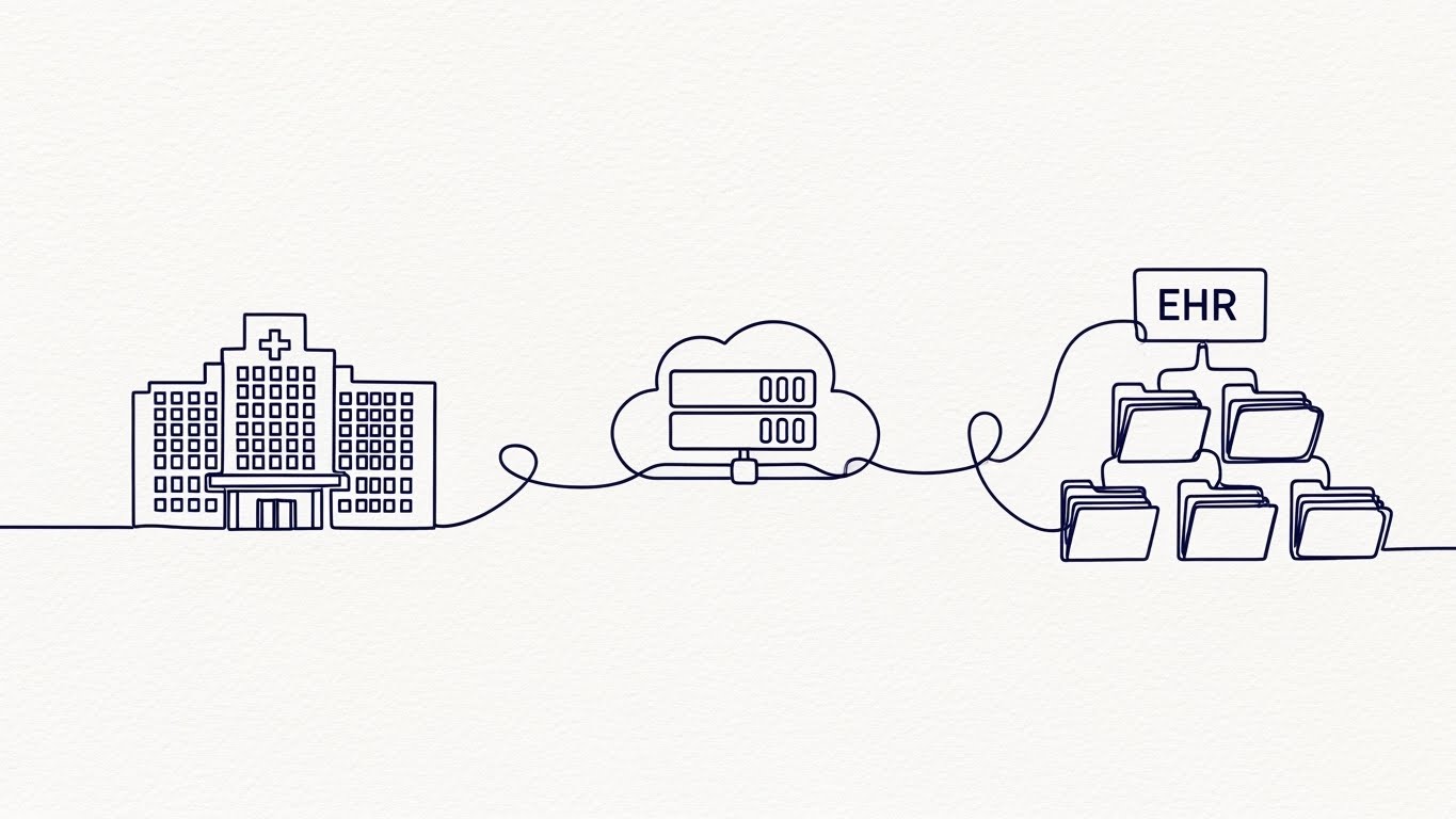
3. The "End-to-End" Connector
TOFU | Market Education
The Visual & Narrative Approach
Simplicity is the ultimate sophistication in healthcare tech. This style uses a single, continuous line drawn in deep navy blue ink against a textured paper-white background. The line acts as a narrative thread, first drawing the architectural outline of a hospital, extending to form a cloud server icon, and finally looping into a structured digital file folder (EHR). The unbroken nature of the line is the hero here—it visually proves that your solution offers "End-to-End Connectivity" without dropping data packets or losing patient records.
Psychological Impact & KPI Focus
- Niche Psychology: For CIOs concerned with Data Silos, this visual is deeply reassuring. It promises integrity and continuity.
- Operational Impact: This style effectively reduces Cognitive Load. By stripping away color and texture, the viewer focuses purely on the process and the connection. It is highly effective for Market Education on complex integration topics.
Strategic Implementation & Trade-offs
- Best Use Case: YouTube explainer intros or "How it Works" web pages.
- Duration: 30–60 Seconds.
- Trade-off: Can feel "low-tech" if not executed with high-precision motion fidelity. The animation must be buttery smooth to convey quality.
Companies using similar video content -
NextGen Healthcare – EHR – Continuous line showing integrated patient records from clinic to cloud.
Veradigm – Allscripts EHR – Unbroken line illustrating comprehensive interoperability across systems.
Mirth Connect – Integration Engine – Line art depicting seamless data exchange between disparate formats.
4. The "Deep Tech" Visualizer
TOFU | Shaping Brand Perception

The Visual & Narrative Approach
To visualize the invisible power of AI Algorithms, we descend into a dark, volumetric void. Deep indigo and bioluminescent blue nodes float in 3D space, connected by pulsing cyan synapses. This represents a "Cybernetic Neural Network." The camera utilizes a shallow depth of field, keeping the central "processing" node in sharp focus while the periphery blurs, mimicking a macro lens. This visualizes the backend intelligence—the Clinical Decision Support (CDS) engines—processing millions of data points to generate a single, actionable insight.
Psychological Impact & KPI Focus
- Niche Psychology: It addresses the "Black Box" problem of AI. By giving the algorithm a tangible, sophisticated form, you build trust in its Diagnostic Accuracy.
- Operational Impact: This style shapes Brand Perception as an innovative leader. It signals that your platform is not just a database, but an intelligent partner in care.
Strategic Implementation & Trade-offs
- Best Use Case: High-impact Paid Ads or Product Launch Trailers.
- Duration: 15–20 Seconds.
- Trade-off: It is purely conceptual. It must be paired with clear voiceover or text overlays to explain what data is being processed (e.g., "Analyzing Vitals").
Companies using similar video content -
Tempus – Precision Medicine Platform – Glowing nodes visualizing AI processing clinical and molecular data.
Aidoc – AI Platform for Medical Imaging – Bioluminescent nodes representing AI algorithms for diagnostic accuracy.
PathAI – Digital Pathology AI Platform – Abstract 3D visualization of AI analyzing pathology images.
5. The "Telehealth" Simplifier
TOFU | YouTube

The Visual & Narrative Approach
In the era of remote care, human connection is key. This style uses a clean, Corporate Memphis aesthetic with pastel mint, slate grey, and coral pink tones. A simplified, faceless doctor avatar holds a tablet device displaying a "Telemedicine" icon. The composition is symmetrical and stable. By removing facial features and detailed environments, we create a universal symbol of care that applies to any region or demographic, focusing strictly on the interaction—the Telehealth Modality.
Psychological Impact & KPI Focus
- Niche Psychology: It lowers the barrier to entry. The friendly, pastel palette counters the clinical coldness often associated with medical software.
- Operational Impact: This style drives Organic Search engagement on platforms like YouTube by appearing approachable and educational. It visualizes Patient Accessibility without navigating complex privacy releases for real actors.
Strategic Implementation & Trade-offs
- Best Use Case: Patient-facing educational videos or onboarding tutorials.
- Duration: 45–90 Seconds.
- Trade-off: Can feel "generic" if the color palette isn't strictly aligned with your brand guidelines.
Companies using similar video content -
Teladoc Health – Virtual Care Platform – Pastel avatars symbolizing accessible remote consultations.
Amwell – Converge Platform – Minimalist avatars representing hybrid care delivery and virtual visits.
Doxy.me – Telehealth Platform – Clean 2D vectors humanizing simple, no-download virtual care.
6. The "Urgency" Signal
TOFU | Vertical Social Organic

The Visual & Narrative Approach
Healthcare moves fast; sometimes, your video needs to match that pace. This style utilizes Kinetic Typography where large, blocky shapes (representing text) in electric yellow, jet black, and bold white collide and stack dynamically. Icons of emergency sirens and clocks flash intermittently. The motion is rapid and percussive, simulating the high-stakes environment of Triage Efficiency. We are not reading text here; we are feeling the speed of information transfer in an emergency department.
Psychological Impact & KPI Focus
- Niche Psychology: It taps into the adrenaline of acute care. It proves you understand the "Golden Hour"—that time is the most critical resource.
- Operational Impact: Excellent for Vertical Social (TikTok/Shorts). It stops the scroll by creating immediate visual urgency, ideal for highlighting features like "Real-Time Alerts" or "Rapid Response Workflows."
Strategic Implementation & Trade-offs
- Best Use Case: Social Media Teasers or Conference Booth Loops.
- Duration: 10–15 Seconds.
- Trade-off: High energy can be exhausting. Use sparingly to punctuate a message, not for long-form content.
Companies using similar video content -
Medhost – EHR – Kinetic typography highlighting rapid information transfer in acute care.
Ascom – Medical Device Integration – Dynamic text emphasizing real-time alarm management and clinical surveillance.
WellSky – EHR – Bold typography signaling accelerated workflows for patient throughput.
7. The "Bird’s Eye" Manager
MOFU | Demand Gen & Lead Capture

The Visual & Narrative Approach
For operations managers, the hospital is a logistical puzzle. This style uses a strict 45-degree Isometric Projection to view a hospital emergency room floor plan. Tiny, abstract cylinder-shaped "patients" flow through the rooms. The key visual mechanism is color-coding: Beds snap from Red (Occupied) to Green (Available) in real-time. This is a direct visualization of Bed Management and Patient Throughput KPIs, turning a chaotic physical space into a manageable data board.
Psychological Impact & KPI Focus
- Niche Psychology: This appeals to the "Controller" persona—the admin who wants to see the whole picture at once. It creates a sense of God-Mode control over facility operations.
- Operational Impact: Perfect for Lead Capture in the middle of the funnel. It demonstrates that your software transforms physical occupancy into digital data that can be optimized.
Strategic Implementation & Trade-offs
- Best Use Case: LinkedIn Solution Demos or Whitepaper Landing Pages.
- Duration: 30–60 Seconds.
- Trade-off: Can look like a mobile game. Ensure the textures (cool greys, safety orange) remain professional and corporate.
Companies using similar video content -
Meditech – Expanse EHR – Isometric view of hospital floor plans optimizing bed management.
Epic Systems – Bed Management Module – Orthographic projection visualizing patient flow and capacity.
SPRY – All-in-One Platform – Isometric motion showing optimized resource allocation in hybrid care.
8. The "Chaos vs. Order" Split
MOFU | Product/Solution Differentiation

The Visual & Narrative Approach
This is the ultimate "Before and After" comparative tool. The screen is divided vertically. The Left Side depicts "Analog Chaos"—a dimly lit, desaturated desk cluttered with paper files, sticky notes, and coffee stains. The Right Side reveals "Digital Transformation"—a pristine, vivid azure dashboard interface in sharp focus. A vertical divider acts as a portal; as it slides, the chaos is wiped away, replaced by the clean structure of your software. This visualizes Legacy Displacement.
Psychological Impact & KPI Focus
- Niche Psychology: It validates the user's pain (the messy desk) while offering an immediate cure. It visualizes the Opportunity Cost of staying with paper.
- Operational Impact: High conversion potential on Websites. It explicitly differentiates your solution from the status quo, making the ROI of Digital Transformation visually undeniable.
Strategic Implementation & Trade-offs
- Best Use Case: Homepage "Why Us" sections or Sales Decks.
- Duration: 15–30 Seconds.
- Trade-off: The "Before" side must not look too depressing—it should look "busy" and "overwhelmed" rather than incompetent.
Companies using similar video content -
Kareo – Practice Management – Split screen showing transformation from cluttered paper to digital efficiency.
eClinicalWorks – EHR – Before/after comparison of legacy systems versus streamlined digital workflows.
AdvancedMD – EHR & Practice Management – Visualizing the shift from manual chaos to organized digital operations.
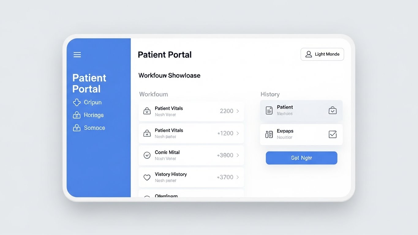
9. The "Clinical Trust" Interface
MOFU | Feature Education
The Visual & Narrative Approach
Sometimes, the most powerful visual is the product itself—perfected. This style showcases a high-fidelity "Patient Portal" interface in "Light Mode." The palette is strictly clinical: sterile whites, soft blues, and text greys. The rendering is flat and shadowless, ensuring maximum legibility. We see a cursor gliding through patient vitals and history, highlighting the User Interface Fluidity. Framed by a subtle modern bezel, it grounds the software in reality.
Psychological Impact & KPI Focus
- Niche Psychology: "Light Mode" mimics the sterile, bright environment of a hospital. It subconsciously signals hygiene, transparency, and Patient Safety.
- Operational Impact: Essential for Feature Education via Email. It proves that the system is intuitive and won't require months of training, directly addressing fears of "Provider Burnout" from complex UI.
Strategic Implementation & Trade-offs
- Best Use Case: Product Demos, Customer Onboarding, Email Newsletters.
- Duration: 60–90 Seconds.
- Trade-off: It is literal. It relies entirely on the quality of your actual UI design.
Companies using similar video content -
Epic Systems – MyChart Patient Portal – High-fidelity UI in light mode, showcasing patient safety and transparency.
athenahealth – athenaOne EHR – Clean, sterile white UI demonstrating intuitive clinical workflows.
Praxis EMR – AI-driven EHR – Flat, shadowless UI emphasizing ease of use and reduced cognitive load.
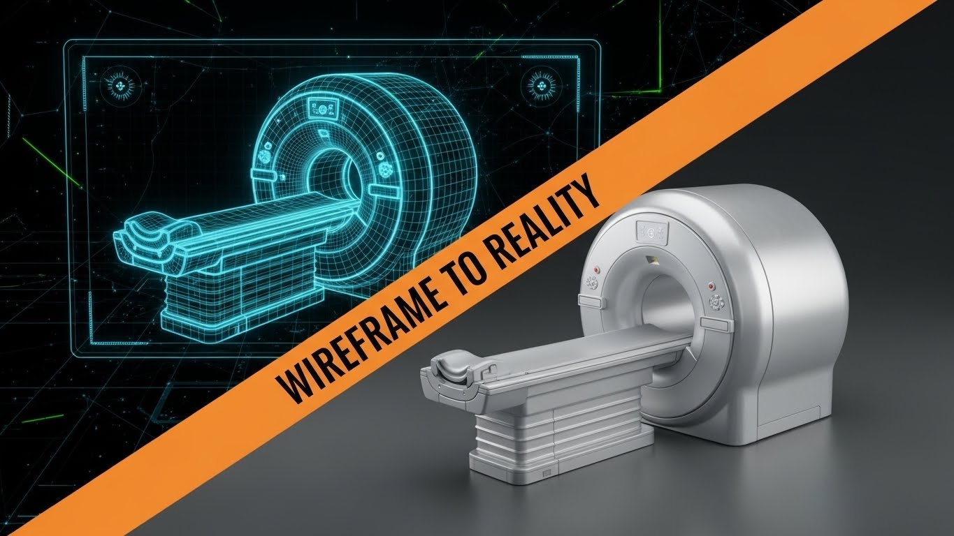
10. The "Innovation" Transition
MOFU | Competitive Displacement
The Visual & Narrative Approach
How do you visualize R&D? This style uses a diagonal wipe effect to transition from concept to execution. The Left Side shows a schematic blueprint of an MRI machine in technical "blueprint blue" with white wireframe lines. The Right Side reveals a photorealistic, metallic silver render of the same machine. This dynamic shift visualizes R&D Innovation—the journey from a theoretical plan (the wireframe) to a tangible, high-value asset (the reality).
Psychological Impact & KPI Focus
- Niche Psychology: It appeals to the buyer's desire for Precision Engineering. It suggests that your software is built on a solid, well-architected foundation.
- Operational Impact: Strong for Competitive Displacement ads. It implies that while competitors might have "concepts," you have a "finished reality."
Strategic Implementation & Trade-offs
- Best Use Case: LinkedIn Ads aiming for decision-makers (CTOs).
- Duration: 10–15 Seconds.
- Trade-off: Requires high-quality 3D assets. Best for hardware-software integration stories (IoT).
Companies using similar video content -
Butterfly Network – Portable Ultrasound – Wireframe to photorealistic render of medical hardware-software integration.
Lapsi Health – Smart Stethoscope – Blueprint transition showcasing R&D innovation in medical devices.
Propeller Health – Connected Devices – Visualizing the evolution from concept to tangible respiratory health devices.
11. The "Revenue" Validator**
MOFU | ROI Justification
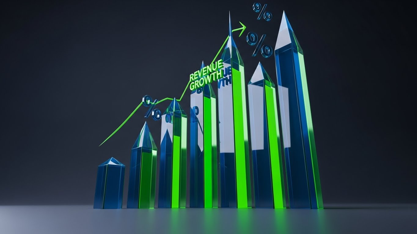
The Visual & Narrative Approach
To the Hospital CFO, the most critical patient vital sign is often the operating margin. This style transforms dry financial data into a compelling visual narrative. We use Dynamic Data Visualization where 3D bar charts, rendered in translucent glass, rise like skyscrapers against a dark, professional studio background. The bars are illuminated in vivid lime green, signifying growth. As the camera angles up, abstract percentage symbols float near the peaks, visualizing Revenue Cycle Management (RCM) success—specifically the reduction of claim denials and the acceleration of AR days.
Psychological Impact & KPI Focus
- Niche Psychology: Healthcare margins are razor-thin. This visual language speaks the language of "Financial Health" without being boring. The upward trajectory and premium glass texture subconsciously validate the High-Value Investment and transparency.
- Operational Impact: This is pure ROI Justification. It translates the abstract efficiency of your software into the concrete reality of recovered revenue, making the purchase decision a financial imperative rather than an IT cost.
Strategic Implementation & Trade-offs
- Best Use Case: LinkedIn Thought Leadership (CFO targeting) or Investor Decks.
- Duration: 15–20 Seconds.
- Trade-off: It is data-heavy. It requires real or highly plausible "Hero Numbers" (e.g., "30% Reduction in AR Days") to be effective.
Companies using similar video content -
RelayHealth – Revenue Cycle Management – Translucent glass bar charts showing reduced claim denials.
Health Catalyst – Analytics Platform – Dynamic data visualization of financial health and operational margins.
Welltok – CafeWell Platform – Glowing metrics illustrating ROI from population health management.
12. The "Momentum" Driver
MOFU | ROI Justification Hook

The Visual & Narrative Approach
Scaling a healthcare operation requires momentum. This style utilizes Abstract Motion Graphics with a focus on fluid dynamics. Organic shapes in neon orange and deep purple swirl upwards against a black void, coalescing to form a stylized arrow soaring through concentric rings. The motion is continuous and liquid, representing the seamless scaling of Value-Based Care initiatives. Unlike the rigid glass of the previous style, this focuses on energy and velocity—visualizing how your platform removes friction to accelerate patient throughput and organizational growth.
Psychological Impact & KPI Focus
- Niche Psychology: It appeals to the "Visionary" leader looking for momentum. The vibrant colors stand out in a sea of sterile "medical blue," signaling Innovation and agility to the Chief Strategy Officer.
- Operational Impact: Ideal for visualizing Scalability. It demonstrates that as patient volume increases (the swelling shapes), your software effortlessly adapts, preventing the operational bottlenecks that usually plague growth.
Strategic Implementation & Trade-offs
- Best Use Case: Paid Social Ads (Instagram/LinkedIn) to arrest "Scroll Fatigue."
- Duration: 10–15 Seconds (Looping).
- Trade-off: Very abstract. It functions best as a "Hook" to grab attention before transitioning to a more literal screen recording or statistic.
Companies using similar video content -
Huma – Virtual Care Platform – Organic shapes swirling upwards, representing accelerated organizational growth.
Vida Health – Digital Health Coaching – Fluid dynamics visualizing momentum in managing chronic conditions.
Omada Health – Digital Care Program – Abstract motion showing seamless scaling of health initiatives.
13. The "Heritage" Bridge
BOFU | Establishing Thought Leadership
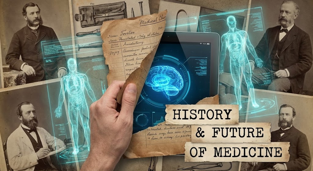
The Visual & Narrative Approach
Healthcare has a deep reverence for history, yet a desperate need for modernization. This Mixed Media style bridges that gap. We see a collage aesthetic where vintage, sepia-toned medical photographs of 19th-century doctors are dynamically "torn away" or overlaid with futuristic, bright cyan holograms of digital anatomy and tablets. This visualizes the "History and Future of Medicine." It acknowledges the tradition of care while forcefully demonstrating the necessity of Digital Transformation—moving from the paper chart to the Digital Twin.
Psychological Impact & KPI Focus
- Niche Psychology: Many senior physicians resist tech because they feel it erodes the "art" of medicine. This style honors their heritage while framing your software as the natural evolution of that art, not a replacement of it.
- Operational Impact: It visualizes Legacy Displacement without insult. It positions the transition from paper to digital not as a disruption, but as a necessary upgrade to maintain the standard of care.
Strategic Implementation & Trade-offs
- Best Use Case: Brand Anthem videos on YouTube or Conference Openers.
- Duration: 45–60 Seconds.
- Trade-off: Complexity. It requires a sophisticated artistic touch to ensure the clash of styles feels intentional and cohesive, not messy.
Companies using similar video content -
Veradigm – Allscripts EHR – Mixed media contrasting historical paper charts with modern digital records.
Meditech – EHR – Collage aesthetic bridging traditional care with digital transformation.
GNU Health – Hospital Information System – Visualizing the evolution from legacy systems to open-source digital health.
14. The "Bedside" Realist
BOFU | Building Trust & Credibility

The Visual & Narrative Approach
Adoption fails when clinicians feel the software was designed by engineers who have never touched a patient. This style uses Photorealistic 3D (Octane-style lighting) to prove ergonomic fit. We see an extreme close-up, over-the-shoulder view of a doctor in a white coat, hands visible, typing on a tablet. The screen displays a CPOE (Computerized Physician Order Entry) button in sharp focus. The lighting is warm tungsten, and the hospital background is heavily blurred (bokeh). This is not "marketing fluff"; it is a simulation of the actual Provider Experience.
Psychological Impact & KPI Focus
- Niche Psychology: It builds Trust. The high-fidelity texture of the coat and the realistic lighting signal that you understand the physicality of their work environment.
- Operational Impact: It addresses Workflow Integration. By showing the device in hand, in context, you visually demonstrate that the tool fits into the rounding workflow, reducing fears of "clunky" hardware implementation.
Strategic Implementation & Trade-offs
- Best Use Case: Product Pages and BOFU Consideration Decks.
- Duration: 15–30 Seconds.
- Trade-off: High production cost. The textures and lighting must be flawless; any "uncanny valley" effect will destroy credibility with discerning medical professionals.
Companies using similar video content -
Epic Systems – CPOE (Computerized Physician Order Entry) – Photorealistic 3D render of a doctor using a tablet at the bedside.
Altera Digital Health – EHR – Extreme close-up of provider interaction with a device in a clinical setting.
GE Healthcare – EHR – Realistic depiction of a clinician interacting with advanced diagnostic imaging software.
15. The "Empathy" Anchor
BOFU | Overcoming Objections
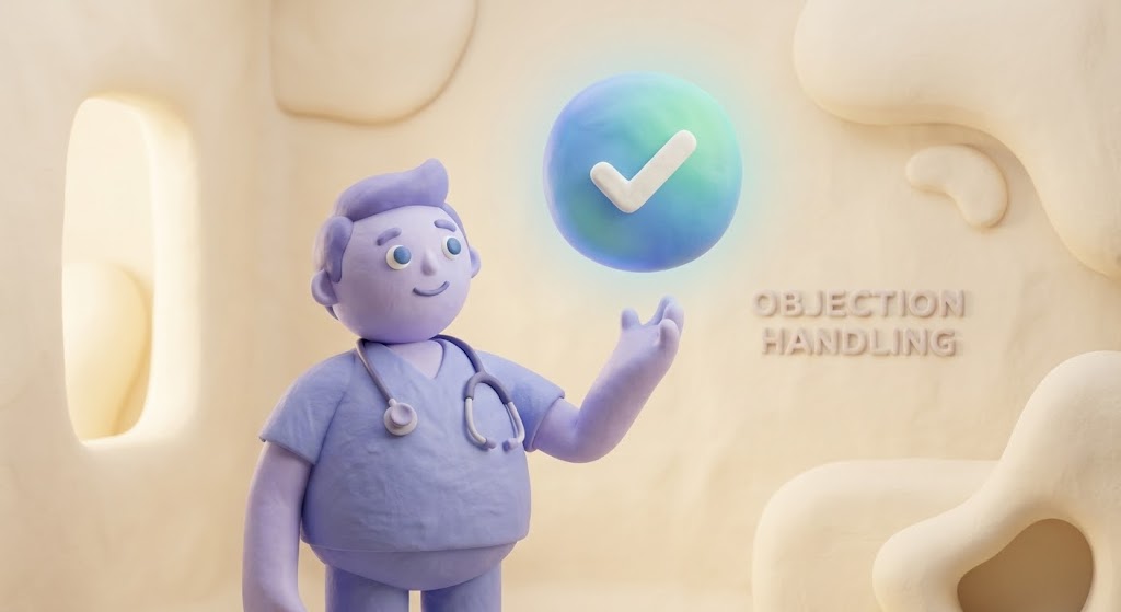
The Visual & Narrative Approach
Change management is often 10% technology and 90% psychology. This style uses 3D "Claymorphism"—soft, rounded, tactile character design—to lower defenses. A friendly doctor avatar in soft lavender scrubs stands in a warm, cream-colored abstract room, interacting with a floating UI bubble containing a checkmark. The aesthetic is welcoming and safe. We use this to visualize Objection Handling—taking a scary concept like "New Compliance Protocols" and presenting it as a simple, manageable interaction.
Psychological Impact & KPI Focus
- Niche Psychology: It counters Alert Fatigue and tech anxiety. The "toy-like" texture subconsciously suggests, "This is easy. This is manageable." It disarms the defensive posture often taken by overworked staff.
- Operational Impact: Perfect for Internal Communications and change management. It frames the adoption of new protocols as a positive, supportive shift rather than a punitive mandate.
Strategic Implementation & Trade-offs
- Best Use Case: Email Nurture Campaigns for end-users (nurses/staff).
- Duration: 30–45 Seconds.
- Trade-off: Can feel too "juvenile" for the C-Suite. Keep this strictly for user-focused education and onboarding content.
Companies using similar video content -
Medisafe – Medication Management – Friendly claymorphism character disarming anxiety around new protocols.
Babylon Health – Virtual Consultations – Soft, rounded characters simplifying AI-based symptom checking.
Heal – House Call App – Welcoming character design to lower defenses for remote care adoption.
16. The "Fortress" Reveal
BOFU | Risk Mitigation

The Visual & Narrative Approach
Security is the "Invisible Shield" of healthcare SaaS. To visualize it, we use a 3D X-Ray effect. We look at a computer server rack, but the outer casing is rendered in translucent blue glass. Inside, we see the glowing anatomy of data flow, centering on a laser-red "Lock" mechanism within a data packet. This visualizes Cybersecurity, HIPAA Compliance, and SOC2 Encryption. It effectively tells the viewer: "We have nothing to hide; look at how robust our architecture is from the inside out."
Psychological Impact & KPI Focus
- Niche Psychology: For the CIO and Risk Officers, this is the money shot. It speaks to Risk Mitigation. It visualizes the abstract concept of encryption as a physical barrier.
- Operational Impact: Critical for the Security Review stage of the sales cycle. It provides visual evidence of data integrity, helping to speed up the often-lengthy compliance approval process.
Strategic Implementation & Trade-offs
- Best Use Case: Security Whitepapers and LinkedIn Technical Posts.
- Duration: 15–20 Seconds.
- Trade-off: Must be technically accurate. The "tech" inside the server needs to look plausible to an IT audience.
Companies using similar video content -
Fortinet – HIPAA-compliant Telehealth – 3D X-ray of secure data flow and encryption.
TruBridge – EHR – Translucent server rack visualizing robust data integrity and security.
Zato – Integration Platform – X-ray effect revealing secure architecture for healthcare interoperability.
17. The "Boardroom" Pact
BOFU | The Economic Buyer

The Visual & Narrative Approach
Ultimately, enterprise software is bought by people. This style uses High-End Aspirational Stock to visualize the partnership. We feature a low-angle hero shot of diverse hospital executives shaking hands over a glass boardroom table, with a digital report visible on a tablet. Sunlight streams in, creating a "Corporate Blue" and mahogany palette. This isn't about features; it's about Strategic Alignment. It visualizes the final agreement, the handshake that signifies a shared vision for the hospital's future.
Psychological Impact & KPI Focus
- Niche Psychology: It mirrors the Self-Image of the Economic Buyer (CEO/CFO). They see themselves in these confident, successful decision-makers. It validates their authority.
- Operational Impact: Key for Closing. It reinforces the idea that buying your software places them in a league of forward-thinking, successful leadership.
Strategic Implementation & Trade-offs
- Best Use Case: Proposal Videos and "About Us" pages.
- Duration: 15–20 Seconds (Static or Slow Pan).
- Trade-off: Generic stock footage is the enemy. You must use premium, cinematic footage that avoids the cheesy "smiling at salad" tropes.
Companies using similar video content -
Oracle Health – Millennium EHR – Aspirational stock footage of executives shaking hands, signifying strategic partnership.
Health Catalyst – Analytics Platform – High-end montage visualizing leadership alignment on data-driven strategies.
Verily – Onduo Platform – Executive presence conveying shared vision for chronic condition management.
18. The "Architecture" Deep-Dive
BOFU | The Technical Buyer

The Visual & Narrative Approach
While the CEO looks at the handshake, the IT Director looks at the code. This style employs a Futuristic Dark Mode aesthetic. We see a close-up of a Network Operations Center (NOC) screen displaying scrolling "Server Architecture" code in matrix green and cyberpunk pink. The background is deep black with sleek reflections. This visualizes the High-Availability Infrastructure and real-time monitoring capabilities. It is unapologetically technical, designed to impress the gatekeepers of the hospital's tech stack.
Psychological Impact & KPI Focus
- Niche Psychology: It signals Competence. To a technical buyer, a "pretty" white UI often suggests a lack of depth. This "Dark Mode" aesthetic suggests power, stability, and deep control.
- Operational Impact: Essential for Technical Due Diligence. It visually answers questions about uptime, latency, and system resilience before they are even asked.
Strategic Implementation & Trade-offs
- Best Use Case: Technical Documentation videos and IT-focused landing pages.
- Duration: 15–20 Seconds (Loopable).
- Trade-off: It can be alienating to non-technical users. Use strictly for the "Technical Buyer" persona.
Companies using similar video content -
Google Cloud Healthcare – Healthcare API – Dark mode aesthetic with scrolling code, visualizing high-availability infrastructure.
AWS HealthLake – HealthLake – Futuristic neon display of server architecture and real-time monitoring.
Medplum – Developer Platform – Dark mode UI showcasing API robustness and ease of integration for healthcare apps.
19. The "Self-Serve" Guide
Onboarding | Self-Serve Onboarding
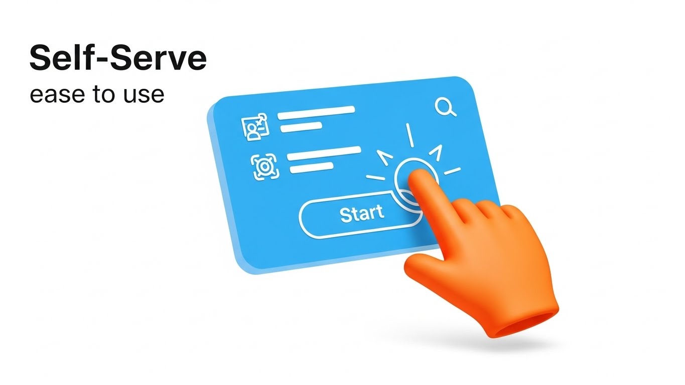
The Visual & Narrative Approach
The hidden cost of SaaS is training. This style visualizes the solution: Self-Serve Onboarding. We use a flat, crisp 2D Animation composition where a bright orange animated hand cursor interacts with a floating, simplified UI card. It clicks a "Start" button, which pulses with energy. The background is white and clean. This focuses entirely on User Agency—showing how easily a new user can navigate the system without requiring a 4-hour seminar.
Psychological Impact & KPI Focus
- Niche Psychology: It promises Autonomy. Users hate feeling stupid; they want to feel capable. This style emphasizes simplicity and intuitive design.
- Operational Impact: Drives Product-Led Growth (PLG). It visually demonstrates that the software is intuitive enough for "viral" adoption within a department, reducing the burden on the hospital's internal IT support.
Strategic Implementation & Trade-offs
- Best Use Case: Onboarding Welcome Videos and App Store Previews.
- Duration: 10–15 Seconds.
- Trade-off: The UI simplification must still be recognizable as your actual product.
Companies using similar video content -
Epic Systems – MyChart Patient Portal – Animated hand cursor interacting with simplified UI for self-scheduling.
Healthie – Patient Portal – Flat 2D animation demonstrating frictionless onboarding for patient engagement.
OpenEMR – EHR & Practice Management – Guided touch animation for intuitive self-serve training.
20. The "Velocity" Sprint
Onboarding | Accelerating Time-to-Value
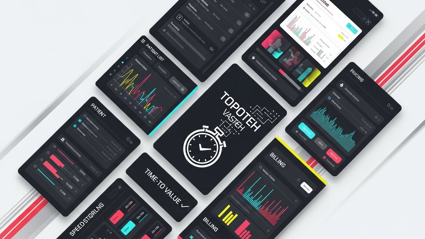
The Visual & Narrative Approach
When you need to show the full breadth of your platform in seconds, use the Rapid UI Montage. Multiple UI screens—Patient List, Scheduling, Billing, Analytics—are arranged in a dynamic diagonal layout with motion blur lines in racing red and silver. The camera flies over them as they populate with data. A central stopwatch icon morphs into a checkmark. This visualizes Time-to-Value and the comprehensive nature of your Unified Ecosystem. It shows that you are not a point solution; you are a complete platform.
Psychological Impact & KPI Focus
- Niche Psychology: It appeals to the buyer's desire for Consolidation. Why buy three tools when this one platform does it all? The speed of the montage suggests efficiency and comprehensiveness.
- Operational Impact: Perfect for Re-engagement emails. It reminds the prospect of the sheer volume of value they get, creating a sense of "getting more for less."
Strategic Implementation & Trade-offs
- Best Use Case: Event Sizzle Reels and Closing Email sequences.
- Duration: 15–20 Seconds.
- Trade-off: No single feature is explained in depth. This is about volume and speed, not detail.
Companies using similar video content -
athenahealth – athenaOne – Rapid UI montage showcasing comprehensive EHR, RCM, and patient engagement features.
SPRY – All-in-One Platform – Dynamic diagonal layout of UI screens, visualizing a unified ecosystem.
CareCloud – Platform – Fast-paced montage of features demonstrating quick time-to-value.
21. The "Modular" Builder
Onboarding | Reducing Implementation Friction
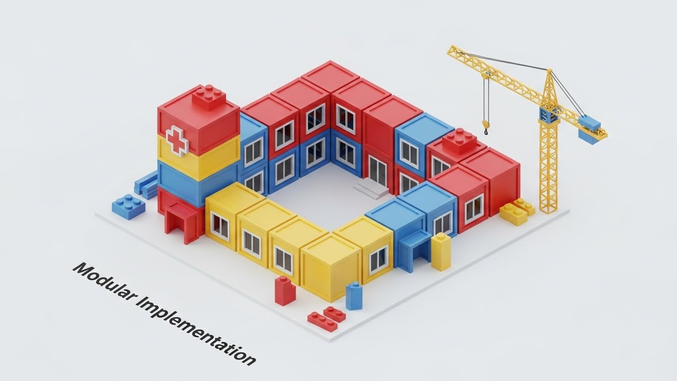
The Visual & Narrative Approach
Implementation anxiety is a major barrier to sale. This style addresses it by visualizing the "build" process as a simple, logical assembly. We use Isometric 3D to depict a miniature hospital construction site where toy-like blocks in primary colors (Red, Blue, Yellow) snap together with a satisfying "click" to form a complete hospital wing. The texture is glossy plastic, set on a clean white surface. This visual metaphor represents "Modular Implementation"—showing that your software stack is customizable, scalable, and fits together perfectly without disrupting the existing structure.
Psychological Impact & KPI Focus
- Niche Psychology: Hospital administrators often associate "Digital Transformation" with disruption and chaos. This "Lego-like" aesthetic subconsciously signals Flexibility and low risk. It suggests that the system is composed of manageable, interchangeable parts.
- Operational Impact: Best for Onboarding and kick-off meetings. It frames the complex deployment process as an organized, step-by-step construction project, reducing the perceived magnitude of the task.
Strategic Implementation & Trade-offs
- Best Use Case: Implementation Kick-off Decks or "How We Integrate" web pages.
- Duration: 15–30 Seconds.
- Trade-off: The "toy" aesthetic must be balanced with professional voiceover to ensure it doesn't trivialize the complexity of clinical operations.
Companies using similar video content -
EHRbase – OpenEHR Backend – Isometric 3D blocks snapping together, representing modular EHR implementation.
OpenMRS – Open-source EMR – Toy-like blocks illustrating customizable and scalable system assembly.
GNU Health – Hospital Information System – Modular construction visualizing flexible software stack integration.
22. The "Trigger" Moment
Onboarding | Trial/Freemium User Activation

The Visual & Narrative Approach
Adoption happens one click at a time. This style focuses on the Micro-Interaction. We use an extreme macro close-up of a specific UI element—a "Complete Task" button turning from dormant grey to a vibrant emerald green upon activation. The camera focus is razor-sharp on the typography, with the background heavily blurred. We can faintly see the RGB pixel texture of the screen, grounding the digital action in physical reality. This visualizes "User Agency" and the immediate feedback loop that gratifies the user.
Psychological Impact & KPI Focus
- Niche Psychology: It combats "Click Fatigue." By highlighting the responsiveness and clarity of a single interaction, you promise a Frictionless Experience. It triggers a dopamine response associated with task completion.
- Operational Impact: Crucial for Freemium Activation or trial users. It highlights the specific "Aha!" moments in the software that drive habit formation and daily active usage (DAU).
Strategic Implementation & Trade-offs
- Best Use Case: Feature Highlight reels on App Stores or "New Feature" email announcements.
- Duration: 5–10 Seconds (Loopable).
- Trade-off: It requires a flawless UI design. If your button design is outdated, this style will magnify that flaw.
Companies using similar video content -
Doximity – Professional Network – Macro close-up of a "send message" button activating, showing frictionless communication.
Propeller Health – Mobile App – Razor-sharp focus on a "medication reminder" button, triggering user action.
Medisafe – Medication Management – Micro-interaction of a "log dose" button turning green, gratifying task completion.
23. The "Automated" Assistant
Retention | Reducing Support Overhead

The Visual & Narrative Approach
How do you visualize an invisible support bot? We use Low-Poly 3D Modeling to create a friendly, faceted robot head icon in soft teal and grey. It floats above an abstract laptop in a clean white void. The robot emits small "speech bubbles" made of geometric shapes that resolve into checkmarks. This style avoids the "Uncanny Valley" of realistic human avatars, instead presenting AI as a helpful, non-threatening tool. It visualizes "Automated Support" and the reduction of administrative burden.
Psychological Impact & KPI Focus
- Niche Psychology: Staff often fear AI will replace them. This "cute" and abstract aesthetic frames AI as a Subordinate Assistant, not a replacement. It lowers the "Threat Response" and encourages engagement with help tools.
- Operational Impact: Directly targets Support Overhead Reduction. By visually promoting the ease of self-help tools, you encourage staff to solve problems via the bot rather than calling the IT helpdesk.
Strategic Implementation & Trade-offs
- Best Use Case: In-App Help Widgets or Support Portal landing pages.
- Duration: 10–15 Seconds.
- Trade-off: It implies a "Basic" level of support. Do not use this for critical clinical decision support (CDS) features where authority is needed.
Companies using similar video content -
Babylon Health – AI-based Symptom Checker – Low-poly robot head emitting speech bubbles, visualizing automated support.
Ada Health – AI-powered Symptom Assessment – Friendly geometric bot representing a helpful, non-threatening AI assistant.
Infinitus Systems – Smart Admin Tools – Faceted robot icon automating administrative tasks and support.
24. The "Retention" Reality
Retention | Reducing Churn

The Visual & Narrative Approach
Software retention is ultimately about people retention. This style combines High-End Lifestyle Stock with sleek Motion Graphics. We see a candid, medium shot of a nurse in blue scrubs standing in a sunlit station, smiling genuinely. Overlaid in 3D space is a glowing, transparent "Retention Graph" or "Staff Satisfaction" metric that trends upward. The lighting is natural and warm. This connects the abstract software metric to the human outcome: a happier, less burned-out workforce.
Psychological Impact & KPI Focus
- Niche Psychology: It addresses the crisis of Provider Burnout. It visually links your software to the well-being of the staff, positioning your platform as a tool for "Wellness" and "Sustainability."
- Operational Impact: Powerful for Customer Success stories and Quarterly Business Reviews (QBRs). It helps the buyer visualize the "Soft ROI" of improved morale and reduced staff turnover.
Strategic Implementation & Trade-offs
- Best Use Case: Email Renewal Campaigns and Case Study videos.
- Duration: 15–20 Seconds.
- Trade-off: Relying on stock footage can risk feeling generic. The UI overlay must be high-fidelity to brand the footage as your own.
Companies using similar video content -
Vida Health – Digital Health Coaching – Lifestyle stock of a happy patient with an overlaid "satisfaction" graph.
Omada Health – Digital Care Program – Candid shot of a user with an upward-trending "engagement" metric overlay.
Welltok – CafeWell Platform – Warm lifestyle footage with UI overlay showing improved well-being metrics.
25. The "Knowledge" Pop-Up
Retention | Knowledge Base & FAQ Videos

The Visual & Narrative Approach
Training needs to be dynamic, not static. This style superimposes 2D Vector Graphics over live-action footage. As a clinician types on a laptop, bright yellow and white question mark icons pop out of the keyboard, swirling into the air and transforming into lightbulbs. The camera movement is handheld and dynamic. This visualizes the concept of "Just-in-Time Learning"—answers appearing exactly when and where they are needed, transforming confusion into clarity instantly.
Psychological Impact & KPI Focus
- Niche Psychology: It counters the dread of "Training Seminars." It promises that learning is integrated, quick, and accessible. It appeals to the Continuous Learner mindset.
- Operational Impact: Ideal for Knowledge Base promotion. It demonstrates that your system supports users proactively, reducing the "Time-to-Competency" for new hires.
Strategic Implementation & Trade-offs
- Best Use Case: YouTube "Tips & Tricks" series or FAQ headers.
- Duration: 30–60 Seconds.
- Trade-off: Requires tight synchronization between the live footage and the graphics (tracking). Poor tracking looks amateurish.
Companies using similar video content -
HealthTap – Dr. AI – Live action of a user with question mark pop-ups transforming into lightbulbs, showing just-in-time learning.
Zocdoc – Online Booking Platform – Dynamic pop-ups over live action, illustrating quick access to doctor information.
Epic Systems – Patient Education – 2D graphics over live action, visualizing instant answers to patient questions.
26. The "Feature" Stack
Retention | Proactive Support/Announcements
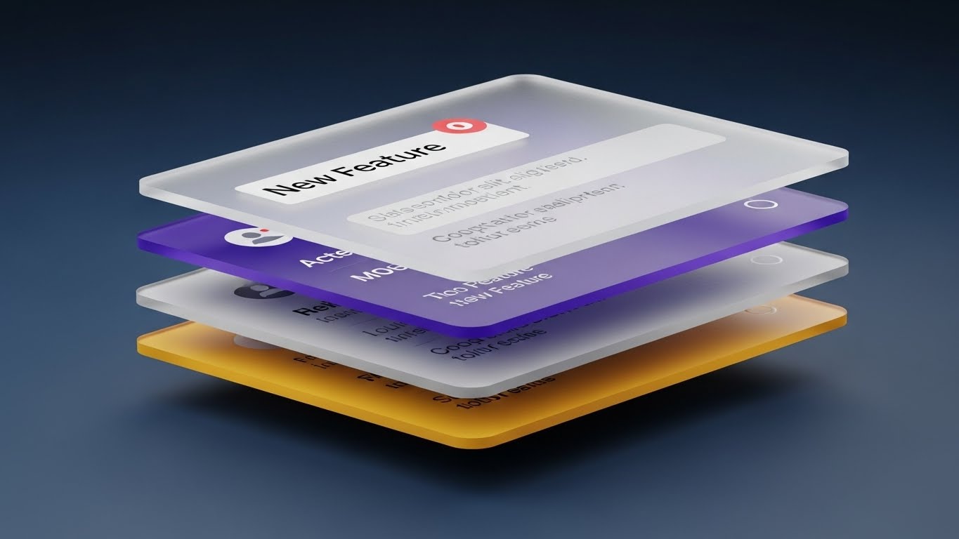
The Visual & Narrative Approach
SaaS platforms are deep; flat screenshots don't do them justice. This style uses 3D Parallax to explode the UI into layers. Stacked interface screens hover in a deep ocean-blue space. We view them from a side angle, revealing the "thickness" of the data. The top layer, a glass-like notification card, slides forward to reveal the complex data grid beneath. This visualizes "Feature Depth" and the multi-layered value of the platform, specifically highlighting updates or new modules.
Psychological Impact & KPI Focus
- Niche Psychology: It appeals to the "Power User" and the CIO who wants to see the architecture. It implies that there is Substance beneath the surface—that this is a robust enterprise tool, not a simple app.
- Operational Impact: Excellent for Upsell/Cross-sell (Expansion). It visually reveals "hidden" value or add-on modules that the current customer might not be utilizing.
Strategic Implementation & Trade-offs
- Best Use Case: "What's New" Product Updates or Webinar backgrounds.
- Duration: 10–15 Seconds (Loopable).
- Trade-off: Text on the lower layers can be hard to read. Focus the viewer's eye on the primary top-layer message.
Companies using similar video content -
BrightInsight – Digital Health Platform – Stacked UI screens in 3D parallax, revealing layered data integration and analytics.
Truveta – Real-World Data Platform – Exploded UI layers showcasing feature depth in de-identified clinical data.
Merative – Healthcare Data & Analytics – Parallax presentation of multi-layered value in population health solutions.
27. The "Developer" Mode
Expansion | Driving Deep Feature Adoption

The Visual & Narrative Approach
For the technical gatekeeper, code is beautiful. This style strips away the friendly UI to reveal the "Dark Mode" Code Editor. We see complex JSON snippets and API calls in syntax-highlighted neon greens, alert reds, and blues against a midnight background. Glowing lines connect code blocks, visualizing "Interoperability" and data exchange. The aesthetic is cybernetic and precise. This validates the platform's API Robustness and ease of integration for the hospital's internal IT team.
Psychological Impact & KPI Focus
- Niche Psychology: Developers trust code, not marketing copy. This visual speaks their language, signaling Transparency and technical maturity. It assures them that the "backend" is clean and modern.
- Operational Impact: Critical for Developer Documentation and API Portal landing pages. It reduces friction during the technical review phase of the buying cycle.
Strategic Implementation & Trade-offs
- Best Use Case: Technical Whitepapers and Integration Guide videos.
- Duration: 15–30 Seconds.
- Trade-off: Completely alienating to non-technical users. Use strictly for the IT/Dev persona segment.
Companies using similar video content -
Metriport – Interoperability Platform – Dark mode code editor with syntax highlighting, validating API robustness.
OpenHIM – Health Information Mediator – Cybernetic aesthetic showcasing code for seamless data exchange.
Zato – Integration Platform – Dark mode UI displaying complex API calls for healthcare interoperability.
28. The "Future" Vision
Expansion | Driving Upsell/Cross-sell
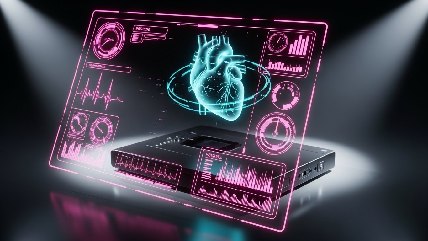
The Visual & Narrative Approach
To sell the long-term vision, you must show the future. This style overlays a Holographic UI onto a photorealistic 3D object. A translucent, glowing cyan hologram of a human heart floats and rotates above a sleek, matte black medical device box. Data points orbit the heart. The background is a dark, high-tech lab. This visualizes the concept of the "Digital Twin" and Predictive Analytics—showing not just what is happening now, but what will happen.
Psychological Impact & KPI Focus
- Niche Psychology: It taps into the aspiration for Innovation. It positions your brand as a "Future-Ready" partner, protecting the hospital from obsolescence.
- Operational Impact: High impact for Brand Awareness ads. It creates a "Halo Effect" of sophistication around your entire product suite, justifying premium pricing.
Strategic Implementation & Trade-offs
- Best Use Case: Keynote presentations and "Vision" videos.
- Duration: 10–15 Seconds.
- Trade-off: It looks expensive because it is expensive. It sets a very high bar for the actual product experience.
Companies using similar video content -
Nucleus Genomics – Genetic Testing – Holographic UI over 3D DNA render, visualizing predictive health insights.
CareNostics – AI Platform – Glowing digital twin visualizing AI spotting invisible health issues.
Google Cloud Healthcare – Predictive Analytics – Holographic UI over 3D medical object, showing future-ready innovation.
29. The "Advocate" Speak
Expansion | Driving Referrals & Advocacy

The Visual & Narrative Approach
Peer validation is the strongest currency in healthcare. This style uses Generative AI Realism (or high-end footage) to simulate a testimonial. We use an 85mm portrait lens close-up of a professional doctor with warm skin tones and trustworthy blue scrubs. The background is a blurred hospital corridor. The key is Direct Eye Contact—the doctor looks right at the viewer, speaking with passion and conviction. This visualizes "Advocacy" and social proof, humanizing the success of your platform.
Psychological Impact & KPI Focus
- Niche Psychology: Doctors trust other doctors. This style bypasses corporate skepticism by leveraging Mirror Neurons—the viewer sees a peer succeeding and wants to emulate that success.
- Operational Impact: The ultimate tool for Referral Generation. It serves as the "Social Proof" anchor on LinkedIn and case study pages, driving the "Bandwagon Effect."
Strategic Implementation & Trade-offs
- Best Use Case: LinkedIn Feeds and Case Study libraries.
- Duration: 30–45 Seconds.
- Trade-off: If using Gen-AI, the lip-sync and eye movement must be perfect. Any "glitch" destroys trust immediately.
Companies using similar video content -
Doximity – Professional Network – Generative AI realistic character (doctor) giving a testimonial for peer validation.
Sword Health – AI Healthcare Startup – Direct eye contact from a professional, building advocacy for virtual care.
Practo – Healthcare Platform – Realistic character speaking with conviction about improved patient access.
30. The "Efficiency" Flow
Expansion | In-App Upsell
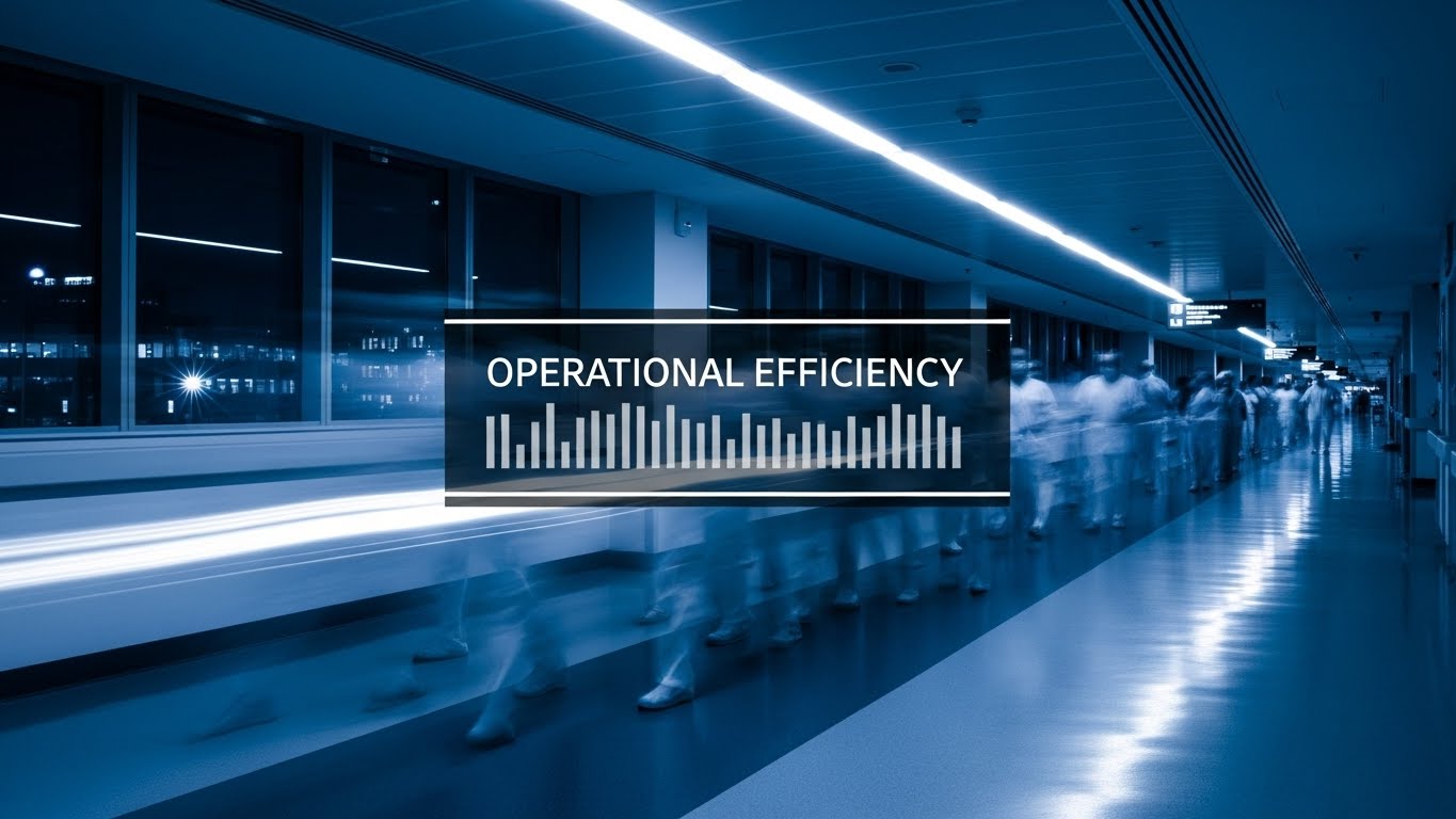
The Visual & Narrative Approach
Hospitals are chaotic; your software brings order. This style uses a Hyper-lapse of a busy hospital hallway at night. Staff and gurneys move as colorful blurs of light, signifying the frenetic pace of care. However, a sharp, white Data Overlay remains perfectly static and centered in the frame. The contrast between the blurring background and the stable data visualizes "Operational Control" amidst chaos. It proves that your platform provides a steady source of truth in a fast-moving environment.
Psychological Impact & KPI Focus
- Niche Psychology: It validates the reality of the High-Pressure Environment while offering a solution. It says, "We know your world is fast; we are your anchor."
- Operational Impact: Strong for In-App Upsell prompts. It reminds the user of the efficiency gains they are achieving, reinforcing the value proposition every time they log in.
Strategic Implementation & Trade-offs
- Best Use Case: Website Hero Backgrounds or "Why Us" video loops.
- Duration: 5–10 Seconds (Loopable).
- Trade-off: The stabilization of the data graphic is critical. It must feel "locked" to the screen to convey stability.
Strategic Knowledge Base: The Visual Operations Doctrine
Having explored 30 distinct visualization styles, we must now synthesize these into a cohesive operational strategy. Video in healthcare SaaS is not merely "marketing content"; it is a Visual Operating System that bridges the gap between complex algorithms and patient care.
Here is the 3-part framework to transform these visuals into business outcomes.
Strategic Alignment & Visual Architecture
The "Pre-Production" Phase: Defining the Visual Language.
Before a single pixel is rendered, the "Clinical Operations Architect" must define the rules of engagement. Inconsistent visuals lead to cognitive friction, which leads to medical error.
- The Cognitive Load Audit: Before creating training assets, assess the current "Mental Weight" of your text manuals. Identify where visual simplification (Style 19, Style 25) can reduce reading time by 50% or more.
- Role-Based Visual Mapping: Do not use the same style for everyone. Use "Mobile/Simple" styles (Style 22) for frontline nurses who need quick answers, and "Desktop/Data" styles (Style 11, Style 27) for Admin and IT staff who need depth.
- The "Glanceability" Standard: In a triage situation, a clinician has milliseconds to process information. Your product videos must train them to recognize UI patterns instantly. Design assets that reinforce these "Glanceable" UI heuristics.
- Brand Voice Consistency: A fragmented visual identity suggests a fragmented platform. Whether it’s a marketing ad or a support bot, the visual DNA (colors, motion physics) must remain consistent to build subconscious trust.
- The Advids Strategic Audit: Building a "Visual Operating System" requires architectural precision. Partnering with a specialized agency like Advids allows you to conduct a comprehensive audit of your visual touchpoints, ensuring that every video asset—from the cinematic hero to the micro-support clip—aligns with your broader clinical goals.
- Standardization vs. Customization: Use standardized "Stock + UI" (Style 24) for general concepts like "Staff Satisfaction," but invest in bespoke, high-fidelity motion (Style 28) for your proprietary "Core Differentiators" (e.g., your unique AI algorithm).
- The Cross-Departmental Bridge: Use these visuals to unify language. When Sales, Ops, and Support all use the same "Visual Metaphor" (e.g., the "Continuous Line" of Style 3), miscommunication between departments drops significantly.
- Legacy System Integration: Use "Transformation" styles (Style 8, Style 27) to visually acknowledge the existence of legacy hardware. Show the connection, not just the replacement, to respect the hospital's existing capital investments.
- Accessibility in Motion: Healthcare is global. Ensure your motion graphics (Style 5) rely on symbols and motion semantics rather than heavy text, making them instantly localized for multi-lingual staff.
- The Mobile-First Mandate: Doctors are mobile. Ensure all 30 styles are legible on a 6-inch screen. If a video detail is lost on mobile, it is lost on the user.
Operational Adoption & Implementation
The "Deployment" Phase: Bridging the Implementation Gap.
The best software fails if it isn't used. This segment focuses on using visuals to drive the actual adoption of the tool on the hospital floor.
- Overcoming "Big Brother" Anxiety: When introducing monitoring tools, use empathy-driven styles (Style 15, Style 23) to frame the tech as a "Supportive Assistant" rather than a "Surveillance Tool."
- The Micro-Learning Shift: Replace the 40-page PDF manual with a library of 30-second "Micro-Interaction" videos (Style 22). Nurses will watch a 10-second clip; they will not read a 10-page chapter.
- Just-in-Time Support: Embed specific "Pop-Up" visual styles (Style 25) directly into your helpdesk or bedside tablets. Deliver the visual answer at the exact moment of the user's question.
- Gamification of Training: Use "Progress Bar" and "Achievement" visuals (Style 6) in your training modules to visualize competency scorecards. Visual feedback loops increase engagement with safety protocols.
- Reducing Support Ticket Volume: There is a direct correlation between the quality of your "Self-Serve" visuals (Style 19) and the volume of Level 1 support tickets. Invest here to lower support costs.
- Remote Onboarding: For distributed clinics or telehealth staff, use "Immersive" styles (Style 14) to simulate the physical workflow remotely, allowing for standardized training without travel costs.
- Visual SOPs: Transform text-based Standard Operating Procedures into "Linear Animation" flows (Style 3). Visual processes are recalled 60% better than text processes.
- Feedback Loops: Use interactive video elements to gather feedback. If a user drops off at 10 seconds in a "New Feature" video, you have a usability problem, not just a content problem.
- Scalable Localization: By separating text layers from the animation source files (as recommended in Styles 6 and 25), you can efficiently translate your training library for global health systems (Rule 39).
- Leadership Communication: When rolling out a major update, use "Boardroom" and "Vision" styles (Style 17, Style 28) to communicate the strategic value to department heads, ensuring top-down buy-in.
Measuring Impact & Future-Proofing
The "ROI" Phase: Quantifying Success and Scaling.
Finally, we must measure the impact of this visual strategy and prepare for the next decade of healthcare innovation.
- Beyond "Views": Do not measure video success by "Views." Measure it by "Time-to-Competency" (how fast a user learns) and "Feature Adoption Rate" (how many users click the button after watching the clip).
- The "Idle Time" Metric: Correlate better visualization with reduced software navigation time. Every second saved in the EHR is a second returned to the patient.
- Compliance Velocity: Measure how quickly new regulations (e.g., new billing codes) are understood and adopted when communicated via video (Style 6) versus email text.
- Retention and Churn: High-quality UX visualization (Style 9, Style 24) reduces "User Frustration." Track the correlation between video engagement and user retention (LTV).
- The AI Visual Frontier: Prepare your library for Generative AI. Styles like Style 28 (Holographic) and Style 29 (Gen-AI Character) are the precursors to real-time, personalized video construction.
- Scalability of Assets: You cannot rebuild your video library every year. Build a "Modular System" (Style 21) of assets—backgrounds, UI plates, icons—that can be remixed and updated easily.
- The Advids Partnership: As your platform adds features, your visual library can become unwieldy. Advids acts as a long-term partner to manage this scalability, ensuring that your "Visual Documentation" evolves in lockstep with your code, preventing your training materials from becoming obsolete.
- Benchmarking Success: "Good enough" is a competitive risk. If your competitor uses "Cinematic AI" (Style 1) and you use "Screen Recordings," you lose the perception war before the demo starts.
- The ROI of Safety: Quantify the reduction in medical errors or insurance costs achieved through better visual safety training. This is the ultimate ROI of the "Clinical Operations Architect."
- Final Call to Innovation: Treat video as Infrastructure, not marketing. In a world of "Invisible Tech," your visuals are the only part of your code that the user actually sees. Make them count.
Companies using similar video content -
Epic Systems – Digital Arrival – Hyper-lapse of a busy hospital with static data overlay, quantifying check-in efficiency.
Oracle Health – PowerChart Ambulatory EHR – Stabilized data over frenetic hospital footage, showing operational control.
Greenway Health – Intergy EHR – Hyper-lapse stock footage with data overlay, proving efficiency gains in ambulatory care.
Author & Editor Bio


