
Introduction: The "Invisible Logistics" of Compassionate Care
The home care industry is standing at the threshold of a Golden Age. Driven by an aging global population and a shift toward value-based care, the market is projected to reach US$ 155.71 Billion by 2034. For agency owners and operation directors, this signals a massive opportunity for scale. However, scaling a home care agency is not merely about acquiring more clients; it is an immense logistical challenge.
The operational reality behind home care is often chaotic. You are managing a distributed workforce, unpredictable client needs, and complex compliance mandates. This pressure cooker environment contributes to a staggering caregiver turnover rate of 79.2% turnover rate. The friction isn't usually the care itself—it's the scheduling, the communication gaps, and the administrative burden that burns out your best people.
This is where advanced visualization becomes a strategic asset, not just a marketing tactic. Your software doesn't just "schedule shifts"; it bridges the physical world of the home with the digital clarity of your operations center. It transforms "scheduling tetris" into a visual symphony of matched needs and fulfilled promises.
This guide explores 30 distinct video visualization styles designed to communicate the value of your Home Care SaaS platform. We move beyond generic "explainer videos" to finding the specific visual language that resonates with stressed agency owners, skeptical caregivers, and anxious families. From cinematic representations of trust to abstract visualizations of data flow, these examples will help you articulate how your technology turns chaos into care.
1. The "First Impressions" Trust Builder
TOFU | Brand Awareness
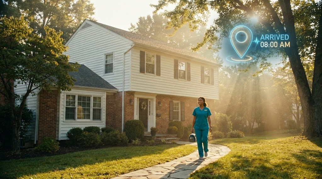
The Visual & Narrative Approach
This style utilizes high-end, cinematic production values to establish an emotional connection immediately. The scene focuses on a sun-drenched suburban home, bathed in warm, volumetric lighting that suggests hope and a fresh start. A caregiver, distinct in professional teal scrubs, walks confidently toward the door. The critical element here is the subtle integration of technology: a digital "Location Pin" overlay that appears briefly in the air. This signals "Arrival" and "Compliance" (EVV) without breaking the human warmth of the scene. It visualizes the perfect balance between high-tech reliability and high-touch care.
Psychological Impact & KPI Focus
For agency owners, the greatest anxiety is the "No-Show." This visual directly addresses that fear by idealizing the moment of arrival. It triggers the Availability Heuristic, making the concept of "reliable care" mentally accessible and vivid.
- Primary KPI: Brand Awareness & Trust.
- Operational Link: It visually confirms the "Promise of Presence," assuring viewers that the software ensures the caregiver is where they are supposed to be.
Strategic Implementation & Trade-offs
- Best Use Case: Top-of-Funnel (TOFU) Website Hero backgrounds or "About Us" brand films.
- Duration: 15-30 seconds (Atmospheric/Mood setter).
- Trade-off: This style creates immense emotional buy-in but is Suboptimal for explaining complex features like billing integration. It sets the mood, not the mechanics.
Companies using similar video content -
CareDocs – Person-centred care management & planning.
Connecteam – All-in-one caregiver software.
2. Visualizing the Operational Metamorphosis
TOFU | Category Creation

The Visual & Narrative Approach
This style effectively dramatizes the industry's most painful transition: moving from paper to digital. We see a gritty, textured reality—stacks of crinkled, chaotic paper logs—that physically restricts movement. Through stop-motion animation, these papers don't just disappear; they transmute into a pristine, glowing "Cloud" icon. The background shifts from a heavy charcoal (representing the weight of admin) to a clean, electric amber and white. The lateral camera movement emphasizes progress, showing the evolution from "messy desk" to "cloud command center."
Psychological Impact & KPI Focus
This visual leverages the Contrast Principle. By juxtaposing the chaotic textures of paper with the sleek glow of digital elements, the brain immediately perceives the digital state as "superior" and "relieving." It validates the agency owner's pain (the paper chaos) before offering the cure.
- Primary KPI: Category Creation (Defining the "Modern Agency").
- Operational Link: It represents the digitization of workflows—turning physical binders into searchable, secure data.
Strategic Implementation & Trade-offs
- Best Use Case: LinkedIn feeds where B2B decision-makers are scrolling. The texture stops the scroll.
- Duration: 30-45 seconds.
- Trade-off: While visually striking, the abstract nature can be confusing if not paired with clear copy. It requires a strong narrative voiceover to anchor the metaphor.
Companies using similar video content -
PASS by everyLIFE – PASS – All-in-one care management solution.
CareLineLive – Digitizes and improves agency efficiency.
3. The Velocity of Automated Scheduling
TOFU | Market Education

The Visual & Narrative Approach
Speed is the currency of scheduling. This style abandons characters and scenes to focus purely on the energy of efficiency. Massive, blocky geometric letter-forms collide, interlock, and stack in a high-speed ballet. The palette—electric blue and vibrant lime green—is energetic and modern. The motion is "elastic" and "punchy," mimicking the snap-decisions a scheduler makes every minute. It doesn't need to spell out "Efficiency"; the motion itself feels efficient.
Psychological Impact & KPI Focus
This appeals to the Need for Speed and cognitive closure. Agency schedulers are often overwhelmed by slow, lagging software. This visual style promises a snappy, responsive interface. It reduces Cognitive Load by removing extraneous details and focusing solely on the concept of "Fast."
- Primary KPI: Market Education (Communicating "Speed" and "Responsiveness").
- Operational Link: Visualizes the "Auto-Match" algorithms that instantly fit the right caregiver to the right shift.
Strategic Implementation & Trade-offs
- Best Use Case: YouTube Pre-roll ads or upbeat intro sequences for longer demos.
- Duration: 10-15 seconds (High impact).
- Trade-off: It is High Energy but Low Information. It grabs attention but cannot explain how the scheduling algorithm works, only that it is fast.
Companies using similar video content -
AxisCare – All-in-one home care management.
Shifts by Everhour – Caregiver scheduling software.
Ankota – Enterprise-grade home care software.
4. Softening the Edges of Complex Care Networks
TOFU | Shaping Brand Perception

The Visual & Narrative Approach
Home care is deeply human and organic, not rigid. This style reflects that softness using fluid, liquid-like shapes. Visual Adaptation: Adapting to the provided image, we see rich, glossy fluid forms in deep red and gold, undulating against a warm background. These shapes float and morph into connected streams, symbolizing the delicate network between agency, caregiver, and client. The glossy textures give it a premium feel, distinguishing it from cheap "clip art." It visualizes the care network as a living, breathing ecosystem rather than a rigid grid.
Psychological Impact & KPI Focus
This style induces a state of Calm and Safety. It counters the high-stress environment of agency operations with visual soothing. It frames the software not as a "tool" but as a "facilitator" of relationships.
- Primary KPI: Shaping Brand Perception (Premium, Human-Centric).
- Operational Link: Represents "Continuity of Care" and the soft skills required in matching caregivers to clients based on personality, not just availability.
Strategic Implementation & Trade-offs
- Best Use Case: Social Media Ads (Instagram/Facebook) where aesthetic appeal drives engagement.
- Duration: 15-20 seconds (Looping).
- Trade-off: It risks being too abstract. Without a clear "Call to Action" or UI overlay, viewers might mistake it for a wellness brand rather than B2B software.
Companies using similar video content -
Aaniie – Talent and relationship management.
MiliMatch – Caregiver soft skills matching.
5. The "Day-in-the-Life" Reliability Proof
TOFU | YouTube

The Visual & Narrative Approach
This style puts a face to the user. We see a stylized female caregiver in a navy uniform, standing in a geometric urban park. The focus is on her interaction with the smartphone: a large, green "Check Mark" icon pops up. The flat rendering with clean lines ensures readability on smaller screens. This is a narrative visualization—it tells the story of a successful shift, from clock-in to clock-out, without the complexity of live-action production.
Psychological Impact & KPI Focus
This leverages Social Proof and Mirror Neurons. When agency owners see a calm, happy caregiver successfully using the app, they project that success onto their own frustrated staff. It addresses the objection: "Will my older caregivers be able to use this?"
- Primary KPI: YouTube Organic Search (Tutorials, Use Cases).
- Operational Link: Visualizes "EVV Compliance" and "Task Verification" in a non-threatening, user-friendly way.
Strategic Implementation & Trade-offs
- Best Use Case: "How It Works" videos on YouTube or support articles.
- Duration: 60-90 seconds (Story-driven).
- Trade-off: While clear, it can feel "generic" if the character design isn't unique to your brand. Avoid "stock" vector looks.
Companies using similar video content -
Nourish – Carers record care as they go.
Teambridge – Cloud-based workforce management.
6. Vertical Efficiency: The 6-Second Value Pitch
TOFU | Vertical Social Organic

The Visual & Narrative Approach
Designed specifically for the vertical scroll (TikTok/Shorts), this style strips away everything but the essential concept. Visual Adaptation: A simple line-art illustration shows a crane hook lowering a calendar grid. The design uses a palette of mint green and grey on a pure white background. The style is strictly flat, void of shadows or texture. It is a visual equation: The Tool (Crane) handles the Load (Schedule).
Psychological Impact & KPI Focus
This targets the Attention Economy. In a feed full of noise, extreme minimalism stands out. It communicates Cognitive Ease, implying that the software is just as simple to use as the video is to watch. It reinforces the idea that the software does the "Heavy Lifting" for the scheduler.
- Primary KPI: Vertical Social Organic (TikTok/Reels).
- Operational Link: Represents "Automated Scheduling" and workload management.
Strategic Implementation & Trade-offs
- Best Use Case: TikTok or YouTube Shorts. Quick tips or feature flashes.
- Duration: 6-10 seconds (Looping).
- Trade-off: Zero Nuance. You cannot explain complex scheduling rules or billing logic here. It is purely for top-of-mind awareness.
Companies using similar video content -
CareTime – Simple EVV with automated documentation.
Log My Care – Platform for outstanding care management.
7. The "Zero-Latency" Data Flow Visualization
TOFU | Skippable Pre-Roll Ad

The Visual & Narrative Approach
This style visualizes the invisible data that powers an agency. Visual Adaptation: A stylized geometric truck composed of blue and orange "Data Packets" (squares and triangles) travels rapidly across a cream void. The camera performs a fast lateral trucking shot, following the data flow. The aesthetic utilizes a palette of burnt orange and slate grey. Motion blur is applied to the edges to convey high speed and low latency.
Psychological Impact & KPI Focus
This appeals to the logic of Competence. It assures the technical buyer (CTO or Ops Manager) that the system is robust, low-latency, and capable of handling high volumes of data without crashing. It frames care as a logistical triumph.
- Primary KPI: Skippable Pre-Roll Ad (YouTube).
- Operational Link: Visualizes "Real-Time Sync" between the mobile app in the field and the office dashboard.
Strategic Implementation & Trade-offs
- Best Use Case: 5-second bumper ads or transition segments in longer product demos.
- Duration: 5-15 seconds.
- Trade-off: It is cold and impersonal. Never use this to sell "Care" or "Relationships." Use it to sell "Infrastructure."
Companies using similar video content -
Timeero – EVV with GPS tracking.
Radar Healthcare – Quality and compliance with AI analytics.
8. Architecting the Intelligent Care Ecosystem
MOFU | Establishing Thought Leadership

The Visual & Narrative Approach
Moving into the Middle of the Funnel (MOFU), this style demonstrates complexity management. We see a network of pristine white nodes and silver connecting lines. The camera orbits slowly around the central cluster, which glows with a bio-luminescent cyan light. The background is a high-key, bright white studio environment, making the metallic connections shimmer. The nodes represent "Agencies" and "Homes" connecting intelligently.
Psychological Impact & KPI Focus
This establishes Authority. It suggests that the platform uses advanced AI or algorithms to manage the network. It elevates the software from a "tool" to an "intelligence." It addresses the fear that the system is too simple to handle complex matching scenarios.
- Primary KPI: Establishing Thought Leadership (LinkedIn).
- Operational Link: Visualizes "Caregiver Matching Algorithms" and "Territory Management" logic.
Strategic Implementation & Trade-offs
- Best Use Case: Background visuals for webinars, white paper landing pages, or keynote presentations.
- Duration: 10-30 seconds (Looping background).
- Trade-off: It can appear "too sci-fi" for smaller, family-run agencies. Ensure the voiceover grounds it in practical benefits.
Companies using similar video content -
CareVoyant – Integrated enterprise-scale platform.
AdaCare – Caregiver-client matching by skills.
Cura Systems – Intelligent care home management.
9. The "Bird's-Eye" Logistics Command Center
MOFU | Demand Gen & Lead Capture
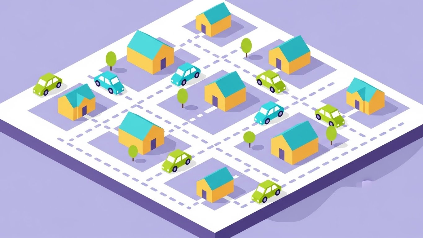
The Visual & Narrative Approach
This style adopts the "God View" or Commander's perspective. The 45-degree isometric angle turns a neighborhood into a manageable board game. Cute, simplified vector cars travel along dotted lines towards small houses. The color palette is soft and approachable, using lavender for the map base, white for roads, and soft yellow for homes. It visualizes the agency owner's desire to see everything happening in their territory at a single glance.
Psychological Impact & KPI Focus
This satisfies the Desire for Control. It reduces the anxiety of the "unknown" by presenting the entire operation as a visible, trackable map. It promises that nothing is slipping through the cracks.
- Primary KPI: Demand Gen & Lead Capture (Display Ads).
- Operational Link: Visualizes "Route Optimization" and "Travel Time Reduction"—key factors in profitability.
Strategic Implementation & Trade-offs
- Best Use Case: Retargeting ads or feature pages about "Territory Management."
- Duration: 15-20 seconds.
- Trade-off: It simplifies the reality. Real traffic and logistics are messy; this visualizes the ideal state.
Companies using similar video content -
AllGeo – EVV system with geofencing.
GeoH – End-to-end home care software.
10. The "Chaos vs. Control" Comparative Anchor
MOFU | Product Differentiation
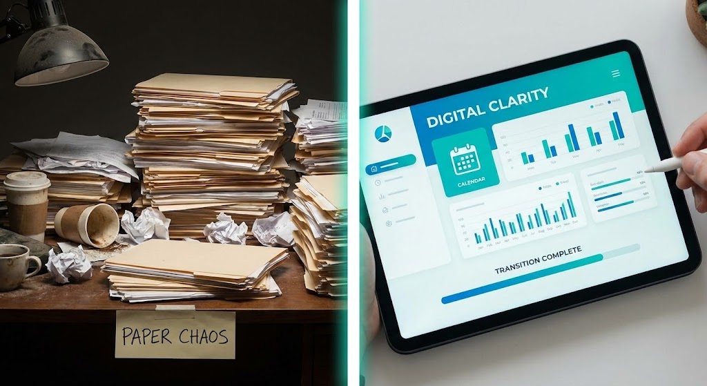
The Visual & Narrative Approach
This is the most direct sales argument in the visual guide. The screen is split. The left half shows a photorealistic scene of a messy desk with stacks of paper files, lit dimly. The right half shows a pristine, bright digital interface on a tablet displaying a clean dashboard in teal and white. A vertical divider separates the two worlds. The visual demonstrates the transition from "Paper Chaos" to "Digital Clarity."
Psychological Impact & KPI Focus
This uses Loss Aversion (fear of staying in the chaos) and the Relief Principle. It anchors the viewer's current pain (the messy desk) and offers an immediate visual escape. It makes the intangible software "tangible" by contrasting it with physical clutter.
- Primary KPI: Product Differentiation (Landing Page).
- Operational Link: Visualizes "Digital Transformation" and "Paperless Billing."
Strategic Implementation & Trade-offs
- Best Use Case: The "Hero" section of a landing page or the closing argument of a demo.
- Duration: 15-30 seconds.
- Trade-off: It is a binary argument (Bad vs. Good). It lacks nuance but is incredibly effective for decision-making.
(End of Part 1)
Companies using similar video content -
AssuriCare – Smart scheduling, easy EVV, fast billing.
Sandata Home Care – Full agency management solution.
11. The "Shift Tetris" Resolution
MOFU | Feature Education
The Visual & Narrative Approach
This style acts as a visual "palette cleanser" for the overwhelmed scheduler. Visual Adaptation: We see a pristine, high-key studio view of the software’s dashboard against a pure white backdrop. The UI is presented with sharp, shadowless clarity, utilizing a calming palette of turquoise and light grey. Abstract geometric blocks—representing shifts and caregivers—are organized on a clean grid. The visual narrative is one of frictionless management; the blocks feel light and movable, visually solving the daily puzzle of "Shift Tetris" without the stress.
Psychological Impact & KPI Focus
This appeals to the Cognitive Ease principle. Scheduling is often the most cognitively taxing part of an agency's day. By presenting a clean, uncluttered, and spacious interface, you signal that the software creates order out of chaos. It lowers the mental barrier to entry for non-technical staff.
- Primary KPI: Product Consideration (Time on Site).
- Operational Link: Visualizes "Drag-and-Drop Scheduling" and "Capacity Management" without the visual noise of real-world data clutter.
Strategic Implementation & Trade-offs
- Best Use Case: Feature pages discussing "Ease of Use" or the first 30 seconds of a product demo.
- Duration: 45-60 seconds.
- Trade-off: It is functional, not emotional. It explains how the tool works but relies on the viewer's existing desire for organization.
Companies using similar video content -
WellSky Personal Care – Back office and scheduling.
ViolaCare – Software for non-skilled home healthcare.
12. The Compliance Shield
MOFU | Overcoming Objections
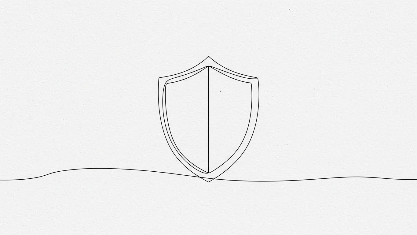
The Visual & Narrative Approach
Regulatory compliance (EVV, HIPAA) is often viewed as a heavy, scary burden. This style reframes it as elegant and simple. Visual Adaptation: On a textured paper-white background, a single, continuous black line fluidly draws itself into the shape of a "Shield." There are no distracting fill colors or red alert icons—just precise, unbroken movement. This minimalist animation suggests that the software provides a continuous layer of protection that runs in the background—unobtrusive yet impenetrable.
Psychological Impact & KPI Focus
This leverages the Simplicity Effect. By visualizing a complex legal requirement as a simple, continuous line, you reduce the viewer's anxiety. It frames compliance not as a series of hurdles, but as a built-in state of being.
- Primary KPI: Reducing Sales Friction (Overcoming Objections).
- Operational Link: Visualizes "Automated Compliance Checks" and "Audit Readiness" as an effortless background process.
Strategic Implementation & Trade-offs
- Best Use Case: FAQ pages or adjacent to "Compliance" feature checklists.
- Duration: 10-15 seconds (Looping).
- Trade-off: It is highly symbolic. It creates a feeling of safety but does not explain the specific mechanics of how compliance is achieved.
Companies using similar video content -
Caretap – Comprehensive EVV feature.
One Care Portal – Medicaid-compliant EVV software.
13. The "CEO Mindset" Aspiration
MOFU | Driving Demo Requests

The Visual & Narrative Approach
This style bridges the gap between the person and the platform. Visual Adaptation: We see a professional agency owner sitting at a modern glass desk in a bright, daylight-filled office, smiling confidently. Floating in the air before them are semi-transparent, holographic charts displaying "Growth Trends" in vibrant cobalt blue and tangerine. This is not just a user using a tool; it is a leader analyzing success. The data surrounds them like a command center, empowering rather than overwhelming.
Psychological Impact & KPI Focus
This triggers Social Identity Theory. Many agency owners feel like "firefighters," constantly reacting to crises. This visual sells the identity of the "Strategic Executive"—someone who has the time and insight to look at growth trends rather than just filling missed shifts.
- Primary KPI: Driving Demo Requests (LinkedIn Ads).
- Operational Link: Visualizes "Business Intelligence" and "Reporting Dashboards" as tools for growth, not just administration.
Strategic Implementation & Trade-offs
- Best Use Case: LinkedIn Sponsored Content targeting Owners and Operations Directors.
- Duration: 15-20 seconds.
- Trade-off: Reliance on stock footage can feel generic. The holographic UI elements must look specific to home care metrics to maintain authenticity.
Companies using similar video content -
Birdie – Smart homecare technology partner.
Axxess – Axxess Intelligence – Business intelligence for home care.
14. Territory Domination & Control
MOFU | ABM Awareness

The Visual & Narrative Approach
For large agencies managing vast territories, precision is paramount. This style utilizes a sophisticated "Dark Mode" aesthetic to convey power and high-tech capability. Visual Adaptation: We see a top-down digital view of a city map set against a dark navy background. Glowing neon green lines sharply delineate specific "Territory Zones," while data streams flow like circuitry between them. The high contrast ensures that the data pops, reinforcing the idea of "illuminating" field operations.
Psychological Impact & KPI Focus
This appeals to the Competence Bias and the need for Certainty. The precision of the neon lines against the dark background implies exactitude—no wasted travel, no uncovered shifts. It positions the software as an enterprise-grade solution capable of handling scale.
- Primary KPI: Account-Based Marketing (ABM) for Multi-Site Agencies.
- Operational Link: Visualizes "Territory Management," "Geofencing," and "Recruitment Zoning."
Strategic Implementation & Trade-offs
- Best Use Case: Display Ads for Enterprise tiers or "Features" pages focused on logistics.
- Duration: 10-20 seconds.
- Trade-off: The "Dark Mode" aesthetic can feel cold. It is best used for the "Head of Operations" persona rather than the "Care Coordinator."
Companies using similar video content -
Homecare Homebase – Enterprise EMR, staffing, scheduling, routing.
Axxess – Axxess Home Care – Custom solution for home care franchises.
15. The "Face" of Intelligent Care
BOFU | Building Trust

The Visual & Narrative Approach
Trust is the currency of the Bottom of the Funnel (BOFU). Visual Adaptation: This style features a hyper-realistic, AI-generated Care Coordinator standing in a modern office. She holds a tablet displaying a "Care Plan" dashboard, but the focus is on her trustworthy, engaging expression and direct eye contact. The lighting is cinematic and soft. This visualizes the result of the software: a calm, collected professional who has all the information she needs to provide excellent service.
Psychological Impact & KPI Focus
This leverages Para-Social Interaction. Humans are hardwired to trust faces. By associating a friendly, competent face with your software interface, you humanize the technology. It reassures the buyer that the software empowers the human element rather than replacing it.
- Primary KPI: Building Trust & Reducing Churn.
- Operational Link: Visualizes "Care Plan Accessibility" and the "Family Portal" interface in a human context.
Strategic Implementation & Trade-offs
- Best Use Case: "About Us" pages, Case Study intros, or personalized sales follow-ups.
- Duration: 45-60 seconds.
- Trade-off: Requires high-quality generation to avoid the "Uncanny Valley." The voice sync and facial movements must be flawless to maintain credibility.
Companies using similar video content -
Therap – Comprehensive solution for complex care.
Axxess – Caregiver University – Elevates caregiving excellence.
16. The Logic of Profitability
BOFU | ROI Justification
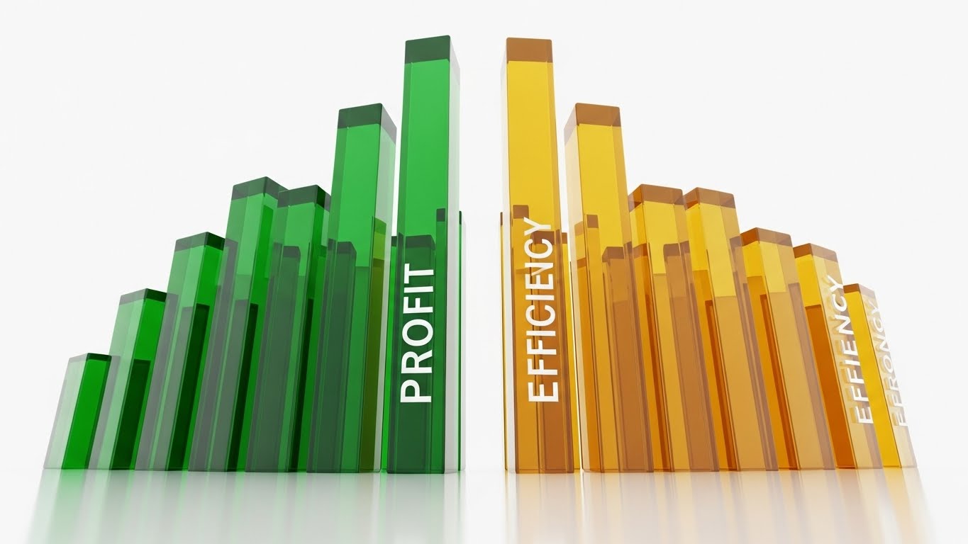
The Visual & Narrative Approach
For the CFO or the financially-minded owner, numbers speak louder than stories. This style makes data tangible. Visual Adaptation: 3D glass bar charts rise majestically from a reflective white floor, physically growing in the frame. The bars are rendered in emerald green (Profit) and gold (Efficiency), contrasting with a clean, infinite white space. The low camera angle looks up at the graphs, making the growth feel monumental and imposing.
Psychological Impact & KPI Focus
This targets the Rational Choice mechanism. At the decision stage, buyers need to justify the investment. This visual provides the "Hard Evidence" of ROI. The "Glass" texture implies transparency—suggesting your reporting engine hides nothing and provides clear, actionable insights.
- Primary KPI: ROI Justification (Sales Decks).
- Operational Link: Visualizes "Gross Margin Analysis," "Billable vs. Payable Hours," and "Overtime Reduction."
Strategic Implementation & Trade-offs
- Best Use Case: Sales Decks (Financial Slides) or Pricing Page visuals.
- Duration: 10-15 seconds (Looping).
- Trade-off: It is dry and purely analytical. It works best when framing the financial result of using the software, not the care itself.
Companies using similar video content -
Revenue Performance Advisor by Change Healthcare – Revenue Performance Advisor – Claims management.
PayPro – Home Care HR & Payroll Software.
17. Looking Inside the "Black Box" of Security
BOFU | Risk Mitigation

The Visual & Narrative Approach
Security is invisible until it fails. This style makes it visible and robust. Visual Adaptation: The camera zooms into a translucent, glass-like model of a computer server. Inside, we see a glowing blue lock mechanism engaging—a mechanical representation of a digital encryption process. The clean, white laboratory aesthetic suggests clinical precision. It visualizes "Safety" not as a passive state, but as an active, engineered mechanism deep within the system.
Psychological Impact & KPI Focus
This addresses Risk Aversion. HIPAA breaches are an agency extinction event. By using X-Ray visuals to "show" the internal security, you provide a tangible reassurance that the data is safe. It creates a "Safety Shield" effect in the buyer's mind.
- Primary KPI: Risk Mitigation (Whitepapers/Security Docs).
- Operational Link: Visualizes "End-to-End Encryption," "HIPAA Compliance," and "Role-Based Access Control."
Strategic Implementation & Trade-offs
- Best Use Case: The "Security" section of a proposal or a dedicated "Trust Center" on the website.
- Duration: 10-15 seconds.
- Trade-off: Highly technical. Only use this when addressing technical buyers (CTOs) or specific security concerns.
Companies using similar video content -
CareSmartz360 – Cloud-hosted homecare software.
WellSky – Home health software.
18. The "Blueprint to Reality" Transition
BOFU | Competitive Displacement
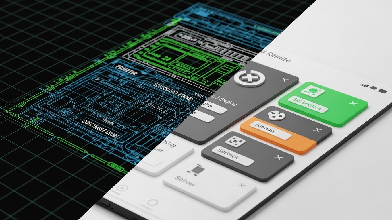
The Visual & Narrative Approach
This style validates the software's engineering quality. Visual Adaptation: A swipe effect moves across the screen. The left side reveals the "skeleton"—a technical blueprint grid of the scheduling engine in technical blue. As the swipe progresses, it reveals the right side: the final, colorful, polished 3D render of the app interface. This "Before and After" effect communicates that the user-friendly interface is backed by robust, architectural logic.
Psychological Impact & KPI Focus
This triggers the Labor Illusion—we value things more when we see the effort put into them. It shows that you didn't just "paint" an app; you engineered it. It helps displace competitors who might have nice UIs but buggy backends.
- Primary KPI: Competitive Displacement (Comparison Pages).
- Operational Link: Visualizes "Platform Stability," "Scalable Architecture," and "Thoughtful UX Design."
Strategic Implementation & Trade-offs
- Best Use Case: Comparison pages ("Us vs. Them") or "Our Technology" pages.
- Duration: 10-15 seconds (Swipe animation).
- Trade-off: It appeals more to the logical/technical brain. Use it to prove quality, then move to benefit-driven visuals.
Companies using similar video content -
Care Beans – Innovative digital care management.
TurnPoint Care – Home care software.
19. The "New Client" Dopamine Hit
BOFU | Sales Cycle Acceleration

The Visual & Narrative Approach
This visual crystallizes the moment of business growth. Visual Adaptation: We see a close-up, macro shot of a high-end tablet lying on a rich wooden executive desk. The screen displays a "New Client" notification icon in elegant rose gold and burgundy. Soft, warm lamp light reflects off the glass, and the shallow depth of field blurs the office background. It creates a sensory experience of premium success, isolating the specific moment an agency owner craves.
Psychological Impact & KPI Focus
This triggers the Anticipation of Reward. It associates the sight of a notification from your app with revenue generation. It positions the software not as a monthly cost, but as a "Growth Engine" that delivers tangible wins.
- Primary KPI: Sales Cycle Acceleration (Email Marketing).
- Operational Link: Visualizes "Intake Efficiency," "Lead Management," and "CRM Integration."
Strategic Implementation & Trade-offs
- Best Use Case: Email headers for "New Feature" announcements or "Welcome" sequences.
- Duration: Static Image or subtle light-reflection loop.
- Trade-off: It is aspirational. It conveys status and success but provides zero information about how the client was acquired.
Companies using similar video content -
FirstVisit – Homecare client management.
The Rosemark System – Home care software.
20. Verification in the Field
BOFU | Objection Handling

The Visual & Narrative Approach
Finally, we return to the field where care happens. Visual Adaptation: This style blends a blurred, real-world photo background (a busy street or home exterior) with sharp vector graphics. A stylized 2D vector hand reaches into the frame to interact with a floating "Shield" icon or a "Check-In" button. The graphic elements use bright orange and cyan to stand out against the blurred reality. It visually anchors the digital task (verification) in the physical world.
Psychological Impact & KPI Focus
This addresses the Illusion of Control. Agency owners worry about what happens when caregivers are out of sight. This visual demonstrates that the software provides a "Digital Tether" in the real world. The simple hand interaction suggests that safety is just "one tap away," reducing friction for mobile staff.
- Primary KPI: Objection Handling (Retargeting Ads).
- Operational Link: Visualizes "EVV (Electronic Visit Verification)," "GPS Fencing," and "Lone Worker Safety."
Strategic Implementation & Trade-offs
- Best Use Case: Retargeting ads for users who visited the "Mobile App" page but didn't convert.
- Duration: 6-10 seconds.
- Trade-off: The mix of real photos and vector art must be balanced carefully. The UI elements must be large and legible to convey "Ease of Use."
Companies using similar video content -
Alora Health – All-in-one home care software.
AxisCare – AxisCare Mobile App – GPS mobile verification for EVV.
21. The "Dark Mode" Financial Command Center
BOFU | The Economic Buyer
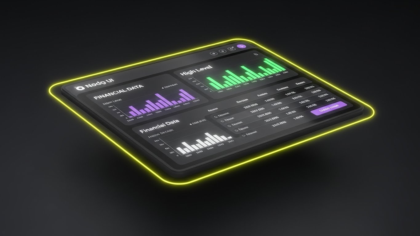
The Visual & Narrative Approach
When addressing the Economic Buyer (CFO or Owner), aesthetic preferences shift toward precision and data density. Visual Adaptation: We see a sleek, matte black dashboard floating in a dark void, illuminated by a "cyber-yellow" rim light. The screen displays high-level "Financial Data" tables with glowing purple and green histograms. The 30-degree tilt adds depth, making the flat interface feel like a tangible, high-value instrument. The dark mode reduces glare, suggesting a tool designed for long hours of strategic analysis.
Psychological Impact & KPI Focus
This appeals to the Authority Bias. Dark mode is often associated with "Pro" tools (developer environments, trading terminals). By presenting your financial reporting in this light, you signal that your platform is a serious business intelligence tool, not just a scheduler. It appeals to the buyer’s desire for Mastery over their margins.
- Primary KPI: Sales Cycle Velocity (Convincing the CFO).
- Operational Link: Visualizes "Gross Profit Margins," "Payroll Batching," and "Billing Reconciliation" as sophisticated, error-free processes.
Strategic Implementation & Trade-offs
- Best Use Case: Financial slides in a Sales Deck or "Reporting" feature pages.
- Duration: 10-15 seconds (Looping).
- Trade-off: It can feel "intimidating" to non-technical users. Keep this visual contained to the decision-maker track, away from caregiver recruitment pages.
Companies using similar video content -
HHAeXchange – Medicaid personal care platform.
Viventium – HR and Payroll for Home Care Agencies.
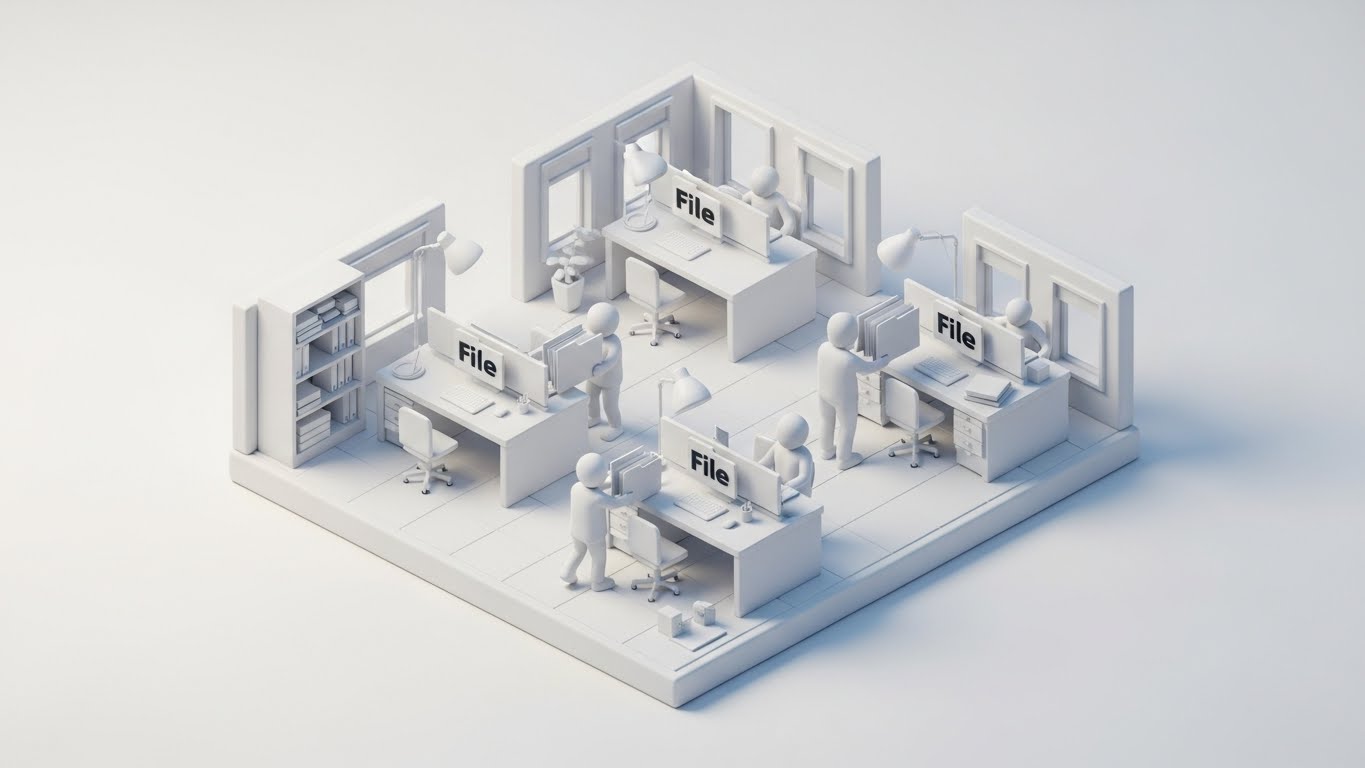
22. Visualizing the Workflow Migration
Onboarding | Accelerating TTV
The Visual & Narrative Approach
The most dangerous moment in the customer lifecycle is Onboarding. This style visualizes the transition process to reduce anxiety. Visual Adaptation: We see a charming, "clay" aesthetic isometric office. Small, white clay figures move "File" folders from one station to another in a miniature white office floor plan. The lighting is soft and diffuse. This makes the daunting task of data migration (moving client files, caregiver records) look playful, manageable, and organized. It turns a "headache" into a "project."
Psychological Impact & KPI Focus
This leverages Cognitive Reframing. Data migration is stressful. By rendering it in a soft, clay-like style, you visually soften the perceived difficulty. It triggers the Endowment Effect—the user begins to see their agency operating smoothly in this miniature world before they even finish setting up.
- Primary KPI: Accelerating Time-To-Value (TTV).
- Operational Link: Visualizes "Data Import," "Bulk Scheduling," and the "Onboarding Setup" phase.
Strategic Implementation & Trade-offs
- Best Use Case: Welcome Emails or the "Implementation" section of a proposal.
- Duration: 20-30 seconds.
- Trade-off: The "toy-like" aesthetic might seem unserious to some. Ensure the voiceover emphasizes the speed and accuracy of the migration.
Companies using similar video content -
Careficient – Cloud-based employee, payroll, scheduling.
Alayacare – Alayacare Implementation – Streamlined onboarding for new clients.
23. The "Shoulder-to-Shoulder" Digital Coach
Onboarding | Reducing Impl. Friction
The Visual & Narrative Approach
Software adoption fails when users feel isolated. This style acts as a supportive coach. Visual Adaptation: We see an over-the-shoulder shot of a person (care coordinator) using a desktop monitor in a bright home office. As they complete a task, animated 2D "Sparkles" and checkmarks in seafoam green pop up around the screen. It blends the realism of the footage with playful, rewarding feedback. It visually simulates the feeling of having a helpful expert standing right next to you, saying, "Great job!"
Psychological Impact & KPI Focus
This utilizes Positive Reinforcement (Operant Conditioning). The visual "sparkles" provide an immediate dopamine hit upon task completion. It combats Tech Resistance by making the software feel friendly and forgiving rather than rigid and judgmental.
- Primary KPI: Reducing Implementation Friction.
- Operational Link: Visualizes "Task Completion," "Shift Verification," and "Correct Data Entry."
Strategic Implementation & Trade-offs
- Best Use Case: "Help Center" video tutorials or "Getting Started" walkthroughs.
- Duration: 30-60 seconds.
- Trade-off: Can feel patronizing if overused. Use it for the first few key wins in the onboarding process to build confidence.
Companies using similar video content -
CareAcademy – Home health care agency training.
MedFlyt – Staffing and compliance home care app.
24. The Micro-Moments of User Mastery
Onboarding | Self-Serve Onboarding

The Visual & Narrative Approach
Confidence comes from mastering the details. This style focuses on the tactile feel of the software. Visual Adaptation: An extreme close-up (Macro) focuses on a cursor hovering over a "Power" or "Activate" button. The button glows in mauve and silver. The background is a blurry bokeh of the white interface. The focus is razor-sharp on the button texture. This conveys that the software is responsive, polished, and satisfying to use.
Psychological Impact & KPI Focus
This appeals to the Need for Competence. By magnifying a successful interaction, you signal that the system is responsive and under the user's control. It reduces Cognitive Load by isolating a single function, making the software appear simple and easy to master.
- Primary KPI: Self-Serve Onboarding Rates.
- Operational Link: Visualizes "Feature Activation," "Shift Publishing," or "Payroll Submission."
Strategic Implementation & Trade-offs
- Best Use Case: In-App Tooltips or "New Feature" highlight reels (Instagram/Shorts).
- Duration: 5-8 seconds (Looping).
- Trade-off: Lacks context. It shows what happens, but not why. Always pair with broader context.
Companies using similar video content -
StoriiCare – Smart software for care providers.
CareSmartz360 – Caregiver App – Role-specific features for caregivers.
25. The Always-On Support Guardian
Retention | Reducing Support Overhead

The Visual & Narrative Approach
Retention relies on the user feeling supported. Visual Adaptation: A futuristic "Support Avatar" hologram projects upwards from a flat white desk surface, glowing in holographic blue. The camera rotates slightly around the hologram, which is set against a bright, blurred modern office. This visualizes your support infrastructure (Chatbots, Knowledge Base, AI Assistant) not as a static web page, but as an intelligent presence that is always ready to help.
Psychological Impact & KPI Focus
This reduces Abandonment Anxiety. Agency staff often work odd hours; knowing "someone" (even an AI) is there provides psychological safety. It positions your support as "Next Gen" and proactive, rather than a reactive call center.
- Primary KPI: Reducing Support Overhead (Ticket Deflection).
- Operational Link: Visualizes "AI Chat Support," "Intelligent Search," and "24/7 Availability."
Strategic Implementation & Trade-offs
- Best Use Case: The "Support" page of your website or within the Chatbot interface itself.
- Duration: 10-15 seconds.
- Trade-off: Sets a high bar. If your actual support is slow, this high-tech image will create a dissonance gap.
Companies using similar video content -
Careswitch – AI-powered home care operating system.
Axxess – Help Center – Online help center with FAQs and community.
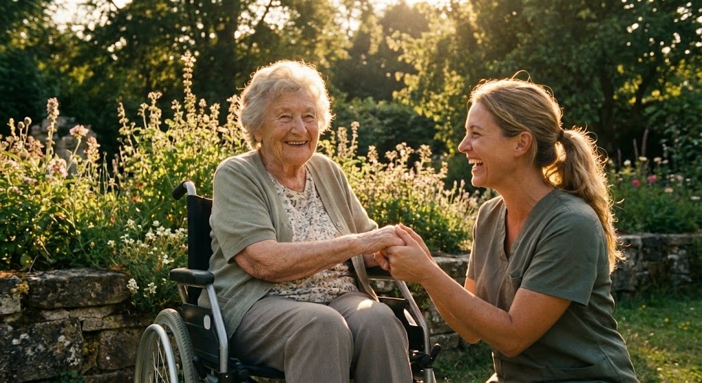
26. Reaffirming the "Why" (The Human Outcome)
Retention | Reducing Churn
The Visual & Narrative Approach
In the weeds of scheduling, agencies forget the mission. This style reminds them. Visual Adaptation: A slow-motion shot of an elderly patient sitting in a sunny garden, smiling at a caregiver. The lighting is soft, warm sunlight, creating a halo effect. The palette uses natural green and gold tones. Unlike the UI-heavy styles, this contains no software. It is pure emotion. It anchors the software's efficiency to the human quality of life it enables.
Psychological Impact & KPI Focus
This triggers Intrinsic Motivation. It reconnects the user with their purpose (Care), making them more patient with the necessary administrative friction of the software. It fosters brand loyalty by aligning your tech brand with their human values.
- Primary KPI: Reducing Churn (Emotional Loyalty).
- Operational Link: Represents "Quality of Care," "Patient Satisfaction," and the "Peace of Mind" your platform ultimately delivers.
Strategic Implementation & Trade-offs
- Best Use Case: Monthly Newsletters, Customer Success Stories, or Holiday Greetings.
- Duration: 15-30 seconds.
- Trade-off: It’s brand-building, not feature-explaining. Don't use this to teach someone how to bill.
Companies using similar video content -
Person Centered Software – Connected Care Platform – Integrated solutions for social care.
Birdie – Family App – Keeps relatives informed and involved in care.
27. The Pulse of Continuous Innovation
Retention | Proactive Support
The Visual & Narrative Approach
SaaS customers churn when they feel the product is stagnant. This style proves momentum. Visual Adaptation: Quick cuts and rhythmic zooms focus on different abstract parts of a software interface: grids, lists, and toggles. The color palette is violet, white, and teal. The motion is fast-paced and energetic, set within a clean white digital tunnel. It creates a feeling of "velocity" and "updates," signaling that the platform is constantly evolving and improving.
Psychological Impact & KPI Focus
This leverages the Novelty Seeking tendency. It reassures customers that their subscription fee is funding active development. It projects an image of a "Living Platform" rather than a "Legacy Tool."
- Primary KPI: Proactive Support & Feature Adoption.
- Operational Link: Visualizes "Release Notes," "New Updates," and "System Optimization."
Strategic Implementation & Trade-offs
- Best Use Case: Product Update Videos (Quarterly) or "Year in Review" videos.
- Duration: 30-45 seconds.
- Trade-off: Fast editing can be overwhelming. It creates excitement, but not understanding.
Companies using similar video content -
NiftyHMS – Healthcare software for remote consulting.
Axxess – Axxess Agile – Continuous product development and updates.
28. Unpacking the Tech Stack Depth
Expansion | Driving Deep Feature Adoption
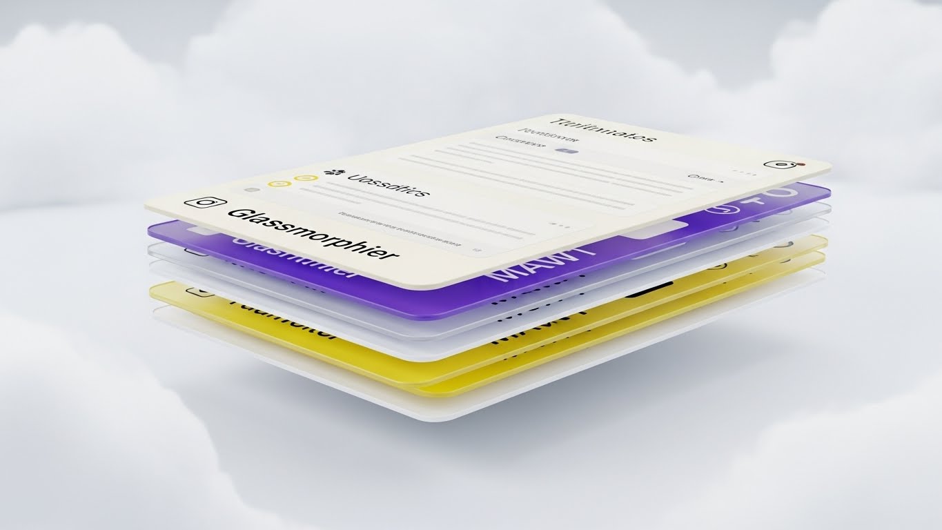
The Visual & Narrative Approach
As agencies grow, they need depth. This style shows that your software runs deep. Visual Adaptation: Layers of UI screens stack perfectly in a 3D space, floating above one another. The camera flies through the layers, revealing depth and connection. The background is an abstract white cloud space. The screens are cream-colored with crisp typography. This implies that behind the simple front-end dashboard, there are layers of robust logic, compliance, and data storage.
Psychological Impact & KPI Focus
This appeals to Curiosity and Perceived Value. It visualizes the "Iceberg Theory"—showing the user that they are only seeing the tip, and there is massive power beneath the surface waiting to be unlocked. It encourages them to explore deeper features (Upsell).
- Primary KPI: Driving Deep Feature Adoption (Expansion).
- Operational Link: Visualizes "Integrated Modules" (e.g., Scheduling + Billing + Payroll + HR).
Strategic Implementation & Trade-offs
- Best Use Case: Webinars on advanced features or "Enterprise Tier" landing pages.
- Duration: 15-20 seconds.
- Trade-off: Can look complex. Frame it as "Depth of Capability," not "Difficulty of Use."
Companies using similar video content -
Alayacare – Comprehensive community care solution.
MEDSYS2 – Home Health Software EMR platform.
Napier iLTC – AI-enabled, multi-modal care solution.
29. Visualizing Scale and Connectivity
Expansion | Driving Upsell

The Visual & Narrative Approach
For large franchises, home care is logistics. This style visualizes the network. Visual Adaptation: A high-angle hyper-lapse shot of city traffic at sunrise. As cars move, glowing blue data lines connect them to a central point (the agency). The traffic is motion-blurred, while the data lines are sharp. The palette is berry red, white, and blue. This elevates the conversation from "one visit" to "thousands of optimized routes."
Psychological Impact & KPI Focus
This triggers Social Proof of scale. It implies that your software is capable of handling the complexity of a bustling city. It appeals to the Ambition of the agency owner who wants to dominate their market.
- Primary KPI: Driving Upsell (Enterprise Packages).
- Operational Link: Visualizes "Fleet Management," "Mileage Tracking," and "Territory Saturation."
Strategic Implementation & Trade-offs
- Best Use Case: LinkedIn Ads targeting multi-site franchise owners.
- Duration: 10-15 seconds.
- Trade-off: It feels corporate. It disconnects from the individual patient but connects strongly with the "Empire Builder" persona.
Companies using similar video content -
KanTime – Home Health and Hospice EMR.
AAUXI – Platform connecting healthcare professionals to clients.
AxisCare – Multi-Location – Manages multi-location agencies.
30. The Global Network Effect
Expansion | Driving Referrals

The Visual & Narrative Approach
The final style represents the ultimate expansion: the ecosystem. Visual Adaptation: A rotating globe made of faceted, white polygons. On the surface, low-poly lime green lines connect different continents or regions. The background is white. The style is geometric, digital, and abstract. It suggests that by using your platform, the agency is part of a larger, global standard of care.
Psychological Impact & KPI Focus
This appeals to Belonging and Status. It frames the software as a "World Class" solution. It is particularly effective for referral programs, suggesting that the user is inviting peers into a massive, successful network.
- Primary KPI: Driving Referrals.
- Operational Link: Visualizes "Standardization," "Franchise Consistency," and "Industry Leadership."
Strategic Implementation & Trade-offs
- Best Use Case: Referral Program landing pages or "Partner" pages.
- Duration: 10-20 seconds (Looping).
- Trade-off: It is very abstract. It builds brand prestige but explains zero functionality.
Strategic Knowledge Base: The Visual Operations Doctrine
To transform these 30 visual styles from "marketing assets" into a cohesive business strategy, we must apply the Visual Operations Doctrine. This framework moves beyond showing the software to embedding visual communication into the very DNA of your agency's operations.
Strategic Alignment & Visual Architecture
The "Pre-Production" Strategy. Why and Who.
Before a single frame is rendered, the visual strategy must be mapped to the specific realities of the home care environment. This is where the bridge between "Software" and "Service" is built.
- The Cognitive Load Audit: Home care coordinators manage hundreds of shifts daily. Your visual strategy must prioritize "Glanceability." Audit every video style: Does it require 10 seconds to understand, or 2? Styles like Isometric Design (Style 9) reduce cognitive load by spatially organizing data, whereas Abstract Motion (Style 7) works only for mood.
- Role-Based Visual Mapping: Differentiate your visual language by persona. Caregivers on mobile devices need High-Contrast, Simple Vector styles (Style 5) that are visible in sunlight. Agency Owners need Data-Rich, Dark Mode styles (Style 21) that convey depth and control. One style does not fit all.
- The "Glanceability" Standard: In home care, decisions happen in seconds. Visuals—whether in the software UI or training videos—must be "glanceable." Use Style 3 (Kinetic Typo) principles: bold, high-contrast, and immediate.
- Brand Voice Consistency: A fragmented visual identity (e.g., using cartoons for onboarding and high-tech 3D for sales) erodes trust. Establish a "Visual Unified Theory"—if your brand is "High Tech," use Glassmorphism (Style 16) across the board. If it is "High Touch," stick to Organic Modern (Style 4).
- The Advids Strategic Audit: This is where a partner like Advids becomes essential. We don't just produce videos; we audit your user journey to define this "Visual Operating System," ensuring that your marketing assets (Styles 1-10) visually foreshadow your product experience (Styles 11-20).
- Standardization vs. Customization: For generic features (Billing), use polished Stock/Mixed Media (Style 2) to save budget. For your "Secret Sauce" (e.g., a proprietary matching algorithm), invest in bespoke 3D AI Visualization (Style 8) to create a defensible brand asset.
- The Cross-Departmental Bridge: Use your video assets to unify terminology. If Sales calls it "The Match Engine" and Support calls it "The Schedule Tool," confusion reigns. A shared visual (Style 3) creates a shared language.
- Legacy System Integration: Many agencies transition from paper or archaic software. Use Transformation visuals (Style 2) to respectfully acknowledge their past while celebrating their digital future. Never mock the "old way"; visualize the evolution of it.
- Accessibility in Care: Your caregiver workforce is diverse in age and language. Visuals must be universal. Avoid text-heavy explanations. Use Character-Driven stories (Style 5) where actions speak louder than voiceovers.
- The Mobile-First Mandate: 80% of your users (caregivers) are mobile. Ensure every visual style remains legible on a 6-inch screen. If a Complex Dashboard (Style 14) is unreadable on a phone, do not use it for caregiver-facing content.
Operational Adoption & Implementation
The "Deployment" Phase. Embedding Visuals into Workflow.
The best software fails if users don't adopt it. This segment focuses on using visual content to grease the gears of implementation and training.
- Overcoming "Big Brother" Anxiety: EVV (Electronic Visit Verification) can feel like surveillance. Use Empathetic Line Art (Style 12) or Soft Organic visuals (Style 4) to frame GPS tracking as "Safety" and "Protection," not monitoring.
- The Micro-Learning Shift: Replace 50-page PDF manuals with a library of 30-second Clean UI Workflow clips (Style 11). Caregivers will not read a manual; they will watch a 15-second video on "How to Clock Out."
- Just-in-Time Support: Embed specific visual styles directly into your app's help section. When a scheduler gets an error, a Macro UI loop (Style 24) should appear to guide them, reducing frustration instantly.
- Gamification of Training: Use Mixed Media Overlay styles (Style 23) to celebrate training milestones. Visual rewards (sparkles, checkmarks) trigger dopamine and encourage staff to complete their certification profiles.
- Reducing Support Ticket Volume: There is a direct correlation between the clarity of your "How-To" videos and your support costs. Proactive, high-clarity Wireframe Transitions (Style 18) answer technical questions before a ticket is ever filed.
- Remote Onboarding: Agencies are often decentralized. Use Isometric Workflow animations (Style 22) to train remote staff on office processes without the need for physical seminars or travel.
- Visualizing SOPs: Transform text-based Standard Operating Procedures into Kinetic Typography (Style 3) or Step-by-Step UI videos. This ensures compliance with complex regulations like HIPAA is understood, not just skimmed.
- Feedback Loops: Use interactive video elements. After a Feature Montage (Style 27), prompt the user to click the feature they are most excited about. This turns passive viewing into active product data.
- Scalable Localization: Many home care agencies employ a multilingual workforce. Visual-first styles (like Abstract Motion or Character Action) transcend language barriers, requiring minimal translation of voiceovers.
- Leadership Communication: When rolling out major platform changes, Agency Owners need to sell the vision to their staff. Use High-End Cinematic styles (Style 13) to help them communicate the "Future State" of the agency, ensuring buy-in from the top down.
Measuring Impact & Future-Proofing
The "ROI" Phase. Measuring Success and Scaling.
Visual communication is an investment that must yield a return. This segment defines how to measure that return and prepare for the next generation of technology.
- Beyond "Views": Do not measure video success by views. Measure it by Time-to-Competency. If a new caregiver watches your Onboarding Series (Style 5), do they clock in successfully on their first shift? That is the only metric that matters.
- The "Idle Time" Metric: High-quality UX visualization (Style 11) should reduce the time schedulers spend "thinking" or "searching." Correlate your UI videos with a reduction in average time-to-schedule per shift.
- Compliance Velocity: When a new regulation hits (like a new EVV mandate), measure how fast your user base achieves compliance after releasing a Compliance Shield video (Style 12). Visuals should accelerate regulatory safety.
- Retention and Churn (LTV): Clients churn when they feel the product is stagnant. Regular, high-energy Innovation Montages (Style 27) increase the Perceived Value of the subscription, directly impacting Lifetime Value (LTV).
- The AI Visual Frontier: Prepare for the future where data isn't just on a screen, but augmented. Experiment with Holographic Visuals (Style 25) now to accustom your users to the idea of AI assistance, paving the way for future features.
- Scalability of Assets: Build a visual library, not a graveyard. Create "Master Files" of your UI scenes (Style 15) so that when your interface updates, you can re-render the assets without reshooting live action.
- The Advids Partnership: This is where a long-term partner shines. Advids manages the lifecycle of your visual assets, ensuring that as your software evolves from Version 1.0 to 2.0, your visual library scales with it, maintaining brand consistency without starting from scratch.
- Benchmarking Success: "Good enough" visuals are a competitive risk. If your competitor uses Generative AI Realism (Style 1) and you use static screenshots, you lose the trust battle before the demo begins. Constantly benchmark your visual fidelity against the market leaders.
- The ROI of Safety: For agencies, safety incidents are costly. Quantify the reduction in "Missed Shifts" or "Unverified Visits" after implementing a robust Verification in the Field (Style 20) visual training program.
- Final Call to Innovation: Treat video as infrastructure. It is the fiber-optic cable that connects your code to your user's brain. Invest in it with the same rigor you invest in your backend database, and the ROI will manifest in faster sales, happier users, and a dominant market position.
Companies using similar video content -
Axxess – Global technology platform for healthcare at home.
WellSky – WellSky Enterprise – Solutions for large-scale home health.
Author & Editor Bio


