
Introduction: Visualizing the "Silent Hospital"
The healthcare industry is currently navigating a profound paradox. While the sector is investing heavily in digital infrastructure—with the global hospital EMR systems market size reaching $18.65 billion in 2024—the human capacity to process this influx of information is being tested. We are drowning in data but starving for clarity. For Hospital EMR and SaaS platforms, the challenge is no longer just about storing patient records; it is about synthesizing that complexity into intuitive, actionable intelligence.
For the "Clinical Innovation Architect"—the CIOs and Medical Directors steering this transformation—the goal is to build a "Silent Infrastructure." They need technology that supports care without obstructing it. However, skepticism is high. The fear of "Implementation Failure" looms large over every procurement decision.
This is where strategic visualization becomes your decisive competitive advantage. Research indicates that the user propensity to adopt EMR solutions increased by 18.357 times with each unit rise in the perception of its usefulness. This staggering statistic proves that perceived utility—directly influenced by visual clarity and intuitive design—is the strongest lever you have to drive adoption.
This guide presents a "Gold Standard" visual language designed to bridge the physical-digital divide. By leveraging these 30 distinct video styles—from the bioluminescent connectivity of AI to the reassuring logic of isometric workflows—you can transform abstract concepts like "Interoperability" and "Compliance" into tangible assets that reduce cognitive load, build trust, and articulate the immense value of your platform.
1. Abstract 3D AI Visualization
TOFU | Brand Awareness

The Visual & Narrative Approach
This style abandons the literal for the metaphorical. A mesmerizing 3D abstract visualization is set in a deep space blue and neon magenta void. Complex networks of glowing volumetric particles and nodes form a towering, interconnected structure resembling a "neural network" of medical data. The lighting is bioluminescent, emitting from the nodes themselves to symbolize "live" intelligence. The low-angle composition emphasizes the grandeur and foundational importance of the data structure.
Psychological Impact & KPI Focus
- Niche Psychology: Healthcare executives often view data as "heavy" and fragmented. This style reframes data as an ethereal, unified asset, significantly reducing Cognitive Load.
- Operational Impact: It visualizes the breaking of Data Silos. The fluid connection between nodes subtly reassures the viewer that the system is integrated, addressing the anxiety of fragmentation without needing technical diagrams.
Strategic Implementation & Trade-offs
- Best Use: High-impact hero banners on websites or the opening hook of a "Vision" video on Social Media.
- Duration: 10-15 Seconds.
- Trade-offs: While visually stunning, it is low on specificity. It builds feeling and awe but does not explain how the AI works. Use this to open doors, not to close deals.
Companies using similar video content -
Google Health – AI/ML Solutions – Visualizes complex AI networks for health insights.
NVIDIA – Clara Platform – AI-powered medical imaging and data processing.
Insilico Medicine – AI Drug Discovery – Abstract representation of AI in drug development.
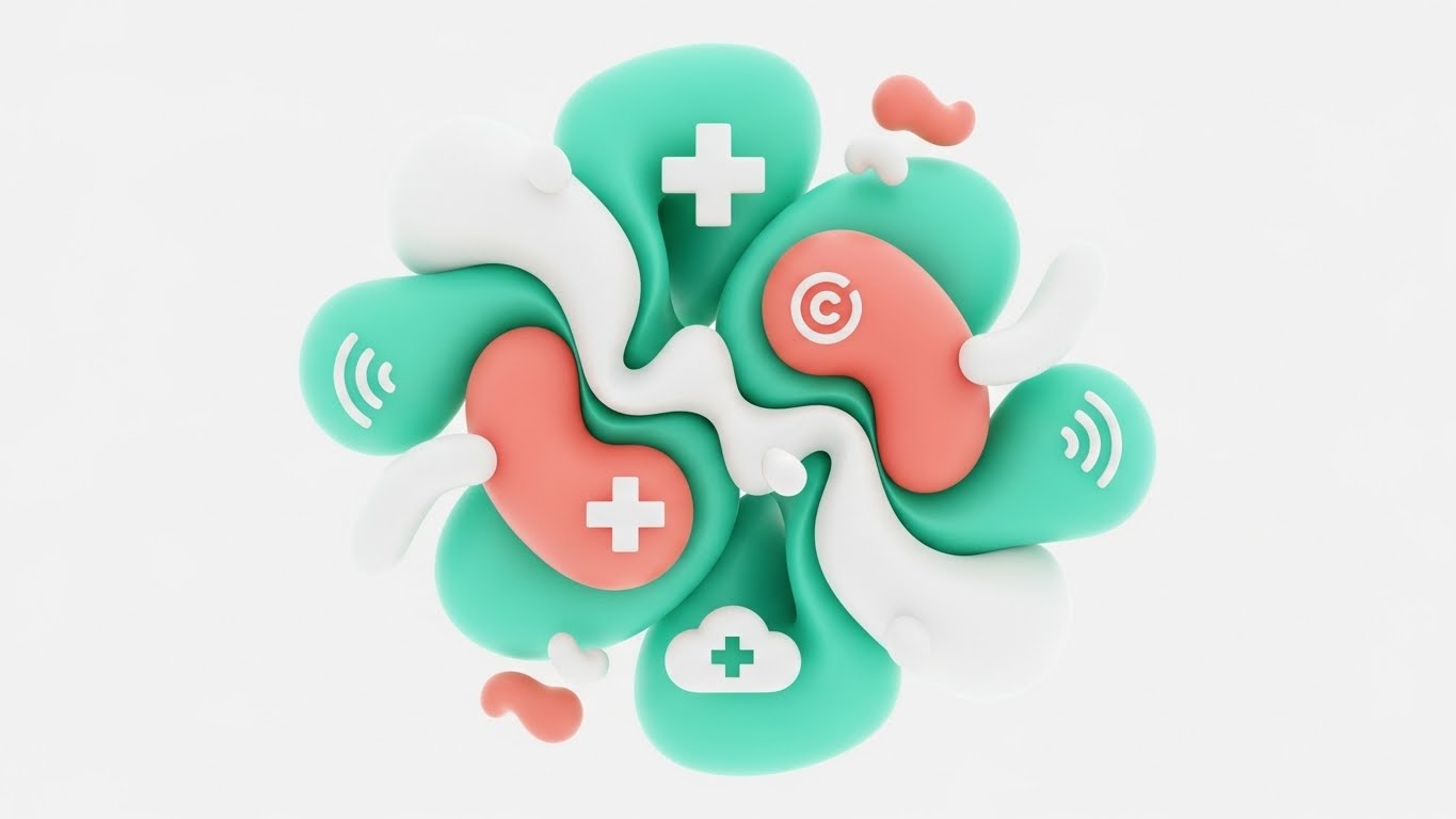
2. Abstract 2D Organic Modern
TOFU | Category Creation
The Visual & Narrative Approach
Soft, approachable, and undeniably modern. This style utilizes fluid, organic shapes in a soothing palette of mint green, soft coral, and pure white. The key mechanism here is morphing: smooth shapes seamlessly transition from medical crosses to digital cloud icons, visually proving the fusion of "Healthcare" and "Technology." The texture is sleek and polished, avoiding any visual noise or clutter.
Psychological Impact & KPI Focus
- Niche Psychology: It counters the "sterile" and "cold" reputation of medical software. The organic curves trigger a sense of ease and approachability, critical for reducing resistance among non-technical staff.
- Operational Impact: The continuous morphing motion implies Seamless Integration. It suggests that data can change state and move between departments without friction or "hard stops," supporting the narrative of a fluid care continuum.
Strategic Implementation & Trade-offs
- Best Use: Blog headers, "About Us" pages, or explainer videos focused on User Experience (UX) and culture.
- Duration: 30-60 Seconds.
- Trade-offs: The "soft" aesthetic might feel too casual for highly clinical or acute-care audiences (e.g., Neurosurgeons) who expect high-fidelity precision.
Companies using similar video content -
athenahealth – athenaOne – Focuses on fluid workflows and user experience.
Modernizing Medicine – ModMed EHR – Emphasizes ease of use and modern design.
Well Health – Patient Communications – Human-centric approach to patient engagement.
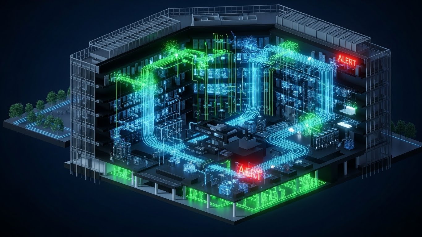
3. 3D X-Ray Visualization
TOFU | Market Education
The Visual & Narrative Approach
This style creates a direct link between the physical facility and digital infrastructure. A detailed 3D isometric render of a modern hospital building features transparent, glass-like walls. This reveals an internal "nervous system" of glowing blue (healthy) and red (alert) data streams flowing through the architecture like veins. It literally "looks inside" the walls, showing how servers and devices connect across floors.
Psychological Impact & KPI Focus
- Niche Psychology: Hospital administrators are obsessed with "Visibility." They fear what they can't see (bottlenecks, wait times). This style validates their desire for Omniscience over their facility.
- Operational Impact: It is the perfect visual metaphor for Infrastructure Monitoring and Asset Tracking. The red "alert" streams instantly communicate the platform's ability to detect and flag operational anomalies in real-time.
Strategic Implementation & Trade-offs
- Best Use: YouTube explainer videos explaining "How it Works" or Facility Management features.
- Duration: 60-90 Seconds.
- Trade-offs: This style is resource-intensive to produce, requiring high-fidelity 3D modeling. However, it offers high credibility by looking like a simulation.
Companies using similar video content -
Philips Healthcare – IntelliSpace – Visualizes connected medical devices and data flow.
GE Healthcare – Edison HealthLink – Infrastructure monitoring and data integration.
CenTrak – RTLS Solutions – Shows asset and patient flow in real-time.
4. Bold Kinetic Typography
TOFU | YouTube SEO

The Visual & Narrative Approach
Aggressive, high-energy, and impossible to ignore. This style eschews traditional imagery for large, 3D geometric block shapes in vivid orange, slate grey, and bold black. These shapes act as kinetic typography, rushing past the camera diagonally to create a sense of velocity and efficiency. The background is an abstract motion blur of digital noise, emphasizing speed.
Psychological Impact & KPI Focus
- Niche Psychology: In a slow-moving industry, Speed is a differentiator. This style appeals to the "Disruptor" persona who wants to shake up the status quo and eliminate latency.
- Operational Impact: The "Rushing" motion visualizes Rapid Deployment and Time-to-Value. It suggests that implementing this software won't take 18 months—it will happen now.
Strategic Implementation & Trade-offs
- Best Use: Short, punchy YouTube Bumper ads (6 seconds) or Intro hooks designed to stop the scroll.
- Duration: 6-10 Seconds.
- Trade-offs: It can be overwhelming. Use it to grab attention, then immediately switch to a calmer style to explain the details.
Companies using similar video content -
UiPath – Healthcare RPA – Emphasizes speed and efficiency of automation.
Automation Anywhere – Automation 360 for Healthcare – Rapid deployment for automated processes.
Notable Health – AI-powered Automation – Accelerates administrative tasks with speed.
5. Minimalist Flat 2D Vector
TOFU | Vertical Social

The Visual & Narrative Approach
Cleanliness is the ultimate virtue here. A top-down flat lay of simplified medical icons—a pill, a clipboard, a stethoscope—self-organizes into a neat central cloud shape on a solid pastel blue background. The lighting is even and shadowless, minimizing detail to focus purely on the concept of organization.
Psychological Impact & KPI Focus
- Niche Psychology: It addresses the anxiety of Chaos and Clutter. For a persona drowning in paperwork, a visual that "tidies itself up" provides an instant dopamine hit of relief.
- Operational Impact: This is the visual shorthand for Digitization and Consolidation. It shows disparate physical objects becoming a unified digital asset, perfect for mobile viewing.
Strategic Implementation & Trade-offs
- Best Use: TikTok or Instagram Reels (9:16). The simplicity works perfectly on small mobile screens.
- Duration: 15-30 Seconds.
- Trade-offs: It creates a "lightweight" impression. It is excellent for end-user engagement but may feel too playful for a serious board meeting.
Companies using similar video content -
Kareo – Kareo Clinical EHR – Provides simplified, organized EMR for practices.
Practice Fusion – EHR – Offers clean, intuitive interface for patient records.
Doximity – Physician Network – Consolidates digital tools for doctors.
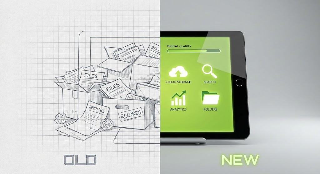
6. Wireframe to Reality
MOFU | Differentiation
The Visual & Narrative Approach
The classic "Before and After," elevated. A split-screen composition creates a stark contrast: the left side is a wireframe, blueprint-style render of a chaotic stack of paper files (the "Old" way), rendered in desaturated grey lines. The right side transforms seamlessly into a high-fidelity, glossy 3D render of a sleek tablet interface (the "New" way) in vivid lime green.
Psychological Impact & KPI Focus
- Niche Psychology: It validates the buyer's journey from Legacy Systems to Modern SaaS. It acknowledges the pain of the past (the mess) while promising the clarity of the future.
- Operational Impact: This is the strongest visual for Digital Transformation. It literally draws the line between "manual data entry" (cost center) and "digital interface" (efficiency).
Strategic Implementation & Trade-offs
- Best Use: Website Hero Sections or Sales Decks. It instantly answers the question, "Why do we need to upgrade?"
- Duration: 30-45 Seconds.
- Trade-offs: Ensure the "Old" side looks recognizable as the client's current reality to trigger the pain point effectively.
Companies using similar video content -
Epic Systems – Epic EHR – Transforms legacy systems to comprehensive EMR.
Oracle Health – Millennium – Upgrades older systems to modern digital health.
Veradigm – Sunrise EHR – Visualizes transition to fully integrated digital platform.
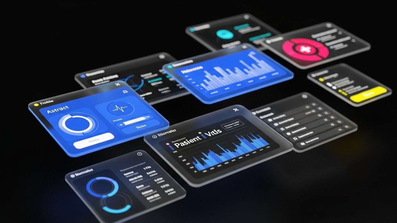
7. Rapid UI Feature Montage
MOFU | Feature Education
The Visual & Narrative Approach
"Glassmorphism" takes center stage. A dynamic 3D montage of floating UI widgets and glass panels drifts through Z-space. The elements—patient vitals, charts, lists—are rendered with frosted transparency and soft drop shadows, giving them a tactile, premium feel. The shallow depth of field keeps the focus sharp on the foreground data while the background remains a cool, abstract tech environment.
Psychological Impact & KPI Focus
- Niche Psychology: Buyers want to see the product, but real screen recordings are often boring. This style creates a "Hollywood UI" effect, making the software look more advanced and "expensive" than it might actually be.
- Operational Impact: The layering of multiple screens visualizes Multitasking and Comprehensive Data Sets. It suggests the platform can handle complex patient data without crashing.
Strategic Implementation & Trade-offs
- Best Use: Product Launch videos or targeted Ads.
- Duration: 45-60 Seconds.
- Trade-offs: Do not use this for "How-To" tutorials. The floating, angled perspective makes it hard to read specific text. Use it to sell the breadth of features.
Companies using similar video content -
Innovaccer – Data Activation Platform – Showcases breadth of data aggregation and insights.
Health Catalyst – DOS Platform – Displays various analytics and decision support tools.
Commure – Health Platform – Demonstrates comprehensive application ecosystem with layers.
8. Futuristic Neon/Dark Mode
MOFU | Building Trust

The Visual & Narrative Approach
A Cyberpunk-inspired journey into the server room. The palette is strictly "Dark Mode": deep blacks, cyberpunk purples, and electric blues. The one-point perspective draws the eye down a long row of server racks. Floating casually in front of them are glowing holographic padlocks. The floor is highly reflective, doubling the visual impact of the neon lights.
Psychological Impact & KPI Focus
- Niche Psychology: In 2025, Dark Mode signals "Developer-Grade" and "Modern." The neon aesthetics transfer associations of High Security and Encryption to the healthcare platform.
- Operational Impact: This effectively visualizes Compliance (HIPAA/GDPR) and Cybersecurity. It turns a boring checklist item (security) into a visual feature.
Strategic Implementation & Trade-offs
- Best Use: LinkedIn video posts targeting CTOs and IT Directors.
- Duration: 30-45 Seconds.
- Trade-offs: Avoid making it look too "Gamery." It must retain a sense of professional solidity.
Companies using similar video content -
Cynerio – Healthcare IoT Security – Emphasizes advanced cybersecurity and threat detection.
Imprivata – Digital Identity Platform – Ensures secure access and compliance.
Palo Alto Networks – Cortex XDR for Healthcare – Highlights advanced threat protection.
9. Isometric 2D Motion Design
MOFU | Brand Perception
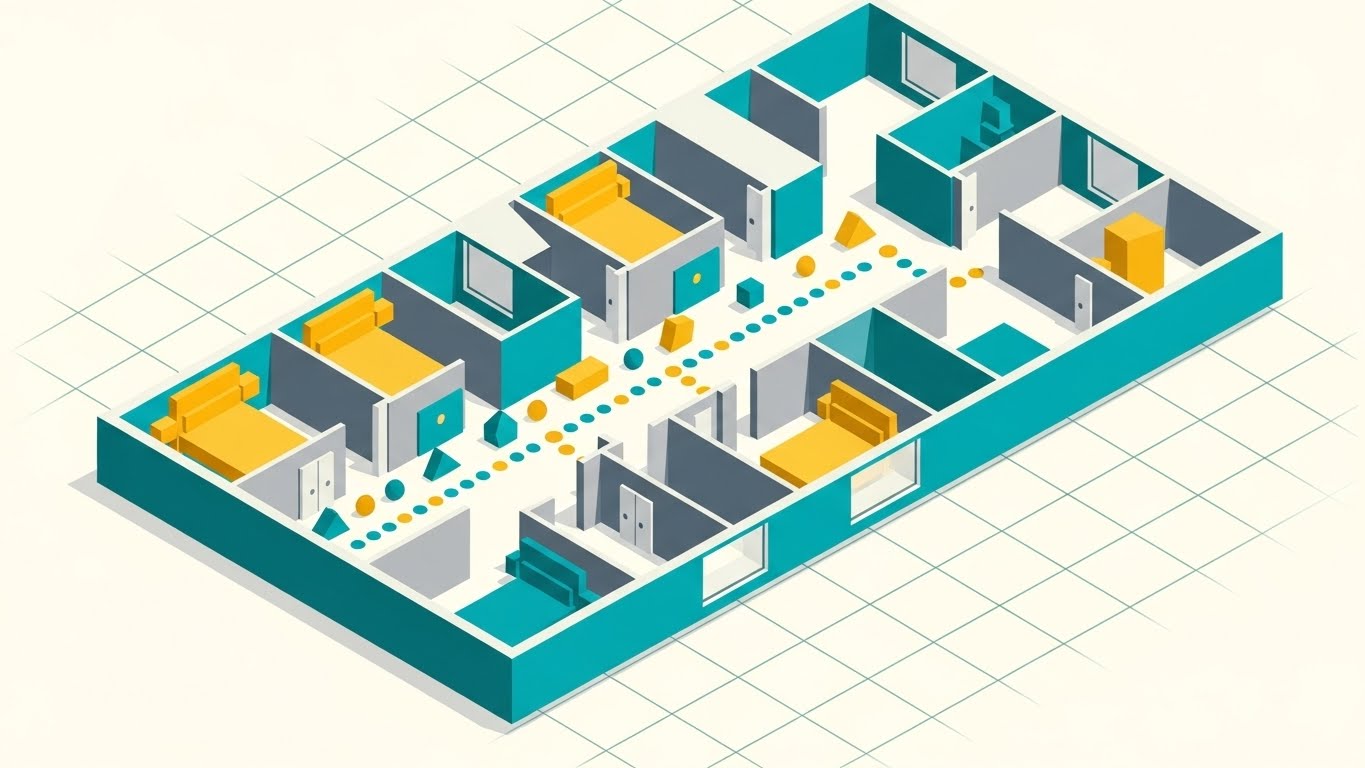
The Visual & Narrative Approach
Precision and logic rule this style. An isometric 2D vector illustration depicts a hospital floor plan in a sophisticated palette of teal, mustard yellow, and soft grey. Small, geometric shapes (dots/squares) move along the corridors like clockwork. The view is a classic 45-degree angle on a faint grid floor, emphasizing structure and order.
Psychological Impact & KPI Focus
- Niche Psychology: This appeals to the "COO" (Chief Operating Officer) persona who cares about Logistics and Flow. It says, "We understand the movement of people and things."
- Operational Impact: Perfect for visualizing Patient Throughput, Bed Management, and Workflow Efficiency. It turns the hospital into a solvable equation.
Strategic Implementation & Trade-offs
- Best Use: Website "Solutions" pages or case study videos.
- Duration: 40-60 Seconds.
- Trade-offs: It can feel "dry." Ensure the motion is snappy and rhythmic to keep engagement high.
Companies using similar video content -
LeanTaaS – iQueue for Operating Rooms – Visualizes workflow efficiency and patient throughput.
TeleTracking – Patient Flow Platform – Demonstrates optimized patient movement and bed management.
Qventus – AI-powered Operations – Shows hospital operations and resource allocation.
10. Dynamic Data Visualization
MOFU | Deep Feature

The Visual & Narrative Approach
Data as art. An abstract 3D sculpture focuses on a macro shot of spline curves transitioning from purple to pink. The lines flow smoothly, representing a dataset that is clean, continuous, and interpreted. The background is a sterile, blurred laboratory setting, grounding the abstract art in a clinical reality.
Psychological Impact & KPI Focus
- Niche Psychology: This speaks to the Researcher and Data Scientist persona. It elevates raw numbers into Insights. It suggests the platform doesn't just store data; it understands it.
- Operational Impact: The visual metaphor for Predictive Analytics and AI Modeling. The smooth curve implies "predictable outcomes," whereas a jagged line would imply volatility.
Strategic Implementation & Trade-offs
- Best Use: Whitepaper landing pages or background loops for keynote presentations.
- Duration: 60 Seconds.
- Trade-offs: Extremely abstract. It requires voiceover or overlay text to explain what data is being visualized.
Companies using similar video content -
Tableau – Tableau for Healthcare – Transforms raw healthcare data into predictive insights.
Qlik Sense – Qlik for Healthcare – Visualizes complex datasets for analytics and modeling.
Health Catalyst – DOS Platform – Presents data as art for predictive analytics.
11. 2D Animation & UI Comp**
MOFU | Objections
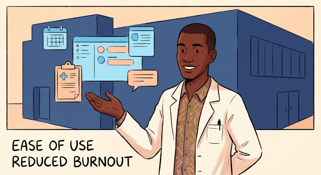
The Visual & Narrative Approach
This style directly addresses the "Human Factor" of healthcare. Using a friendly, hand-drawn "Cel-Shaded" illustration style, we see a doctor character with a relaxed demeanor, smiling comfortably. Floating next to them are simplified, stylized UI elements in a calming palette of sky blue and peach. The background is a clean, geometric navy blue clinic shape. The lighting is flat and soft, creating an aesthetic that feels "light" and manageable, sharply contrasting with the heavy, grey reality of legacy systems.
Psychological Impact & KPI Focus
- Niche Psychology: The #1 objection from medical staff is "More clicks = More burnout." This friendly, low-fidelity style signals Ease of Use and Human-Centric Design. It disarms the fear that new software will be a burden.
- Operational Impact: Visualizes Staff Retention and User Satisfaction. It reframes the software as a "Partner" that reduces administrative fatigue rather than adding to it.
Strategic Implementation & Trade-offs
- Best Use: Social Media ads (Facebook/Instagram) targeting nursing staff and physicians to build ground-up support.
- Duration: 15-30 Seconds.
- Trade-offs: The cartoonish style may lack "Enterprise Authority." Use it to discuss culture and workflow, not to explain complex surgical features.
Companies using similar video content -
Suki AI – AI Assistant for Clinicians – Shows reduced burnout and ease of use.
Augmedix – Medical Documentation Automation – Reduces administrative burden with human-centric design.
Phreesia – Patient Intake – Provides friendly visuals for patient experience.
12. Isometric 3D Workflow
BOFU | ROI Justification
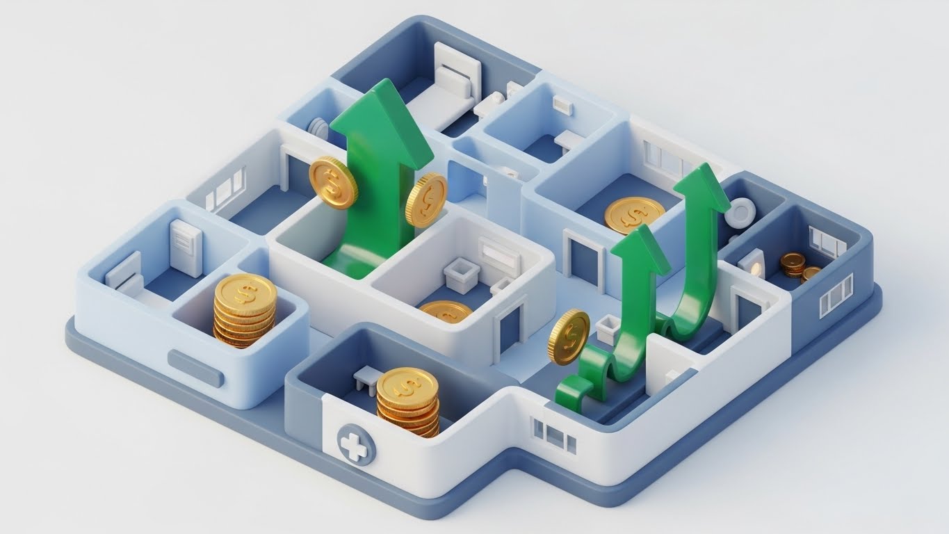
The Visual & Narrative Approach
This is the "Board Game" of profitability. A "Claymorphism" style 3D render presents a stylized, miniature hospital layout with soft, rounded edges. The narrative visualizes the flow of capital: gold coins and emerald green upward-pointing arrows physically move through the rooms, symbolizing the Revenue Cycle. The top-down bird's-eye view gives the viewer a sense of total control over the financial ecosystem.
Psychological Impact & KPI Focus
- Niche Psychology: The CFO is the ultimate gatekeeper. They need to see Monetization. This style turns abstract financial concepts (billing, claims, reimbursement) into tangible, tracking objects.
- Operational Impact: Directly visualizes Revenue Cycle Management (RCM) and Reduced Leakage. It shows that the platform doesn't just store health data; it captures lost revenue.
Strategic Implementation & Trade-offs
- Best Use: LinkedIn video ads targeting CFOs and Hospital Administrators; Slide 3 of the Investment Deck.
- Duration: 30-45 Seconds.
- Trade-offs: It abstracts the patient experience entirely. Ensure the voiceover clarifies that financial efficiency funds better patient care.
Companies using similar video content -
Waystar – Revenue Cycle Management – Visualizes flow of revenue and financial optimization.
R1 RCM – Revenue Cycle Management – Demonstrates financial efficiency and reduced leakage.
FinThrive – Revenue Management – Shows tangible financial outcomes in hospital.
13. Dark Mode UI Showcase
BOFU | Economic Buyer
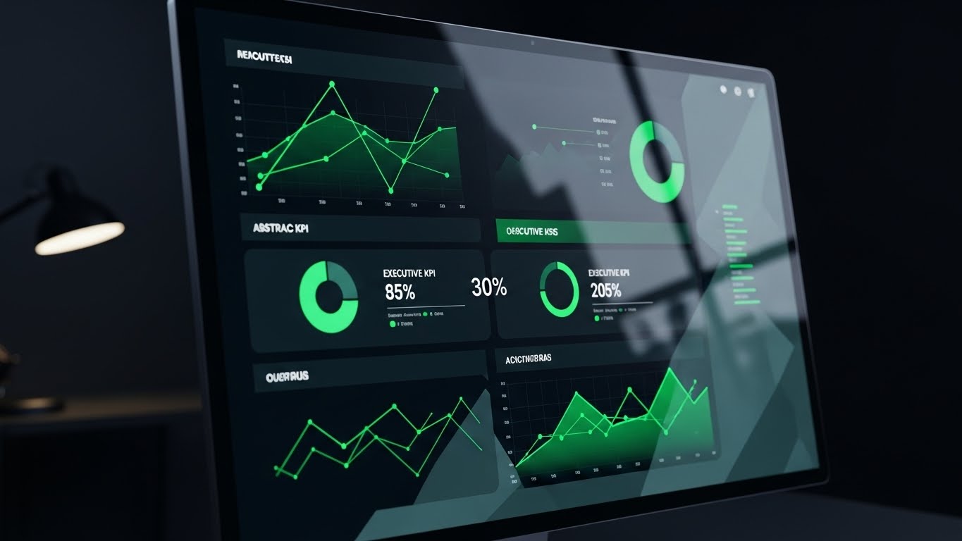
The Visual & Narrative Approach
Sophistication meets analytics. A photorealistic close-up focuses on a high-end monitor displaying a "Dark Mode" dashboard. The palette is serious: midnight blue backgrounds with electric green data points and slate grey text. The screen displays abstract executive KPIs, donut charts, and trend lines. A subtle reflection of a desk lamp on the glossy screen places the viewer in the "Executive Chair," reviewing the health of the organization late at night.
Psychological Impact & KPI Focus
- Niche Psychology: Executives associate Dark Mode with premium, professional-grade tools (like Bloomberg terminals). It signals that this is a "Command Center" for decision-makers, not just a data entry tool for staff.
- Operational Impact: Visualizes Executive Decision Support and Real-Time Visibility. It promises that the complex data of the hospital can be synthesized into a single, clear "Truth."
Strategic Implementation & Trade-offs
- Best Use: Sales Deck "Reporting Module" section; Case Study videos showcasing outcomes.
- Duration: 20-30 Seconds.
- Trade-offs: Dark interfaces can sometimes feel "intimidating" or technical. Ensure the data points shown are clear business metrics (e.g., "Occupancy Rate: 98%").
Companies using similar video content -
Epic Systems – Executive Dashboards – Provides high-level analytics for administrators.
Oracle Health – HealtheIntent – Offers sophisticated data insights for executive review.
Veeva Systems – Veeva CRM for Life Sciences – Delivers premium dashboards for executives.
14. Split Screen: Reality/UI
BOFU | Competitive
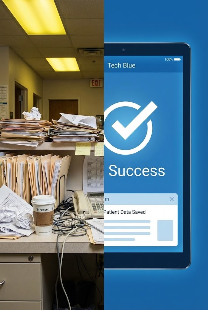
The Visual & Narrative Approach
The ultimate comparison engine. A split-screen composition creates a stark contrast. The left side (Reality) is a photorealistic, gritty image of a chaotic nurse station—stacks of beige folders, messy wires, and harsh yellow lighting. The right side (Solution) is a pristine, vector-style "Tech Blue" tablet interface displaying a "Success" checkmark with cool, even lighting. The visual story is instant: "Chaos vs. Clarity."
Psychological Impact & KPI Focus
- Niche Psychology: It validates the Pain of the Status Quo. It acknowledges the messy reality healthcare workers face and offers a clean escape. It answers "Why change?" without saying a word.
- Operational Impact: Visualizes Workflow Optimization and Paperless Transition. It creates a distinct "Before/After" mental model that is hard to unsee.
Strategic Implementation & Trade-offs
- Best Use: Retargeting Ads for users who visited the pricing page but didn't convert.
- Duration: 15 Seconds (Short and punchy).
- Trade-offs: Be careful not to make the "Reality" side look too incompetent, as it mirrors the client's current state. Frame it as "Systemic Overload," not "Staff Failure."
Companies using similar video content -
NextGen Healthcare – NextGen Enterprise EHR – Contrasts chaotic legacy systems with digital order.
eClinicalWorks – EHR Solution – Highlights transformation from paper to digital workflows.
Greenway Health – Intergy EHR – Shows benefits of upgrading to modern interface.
15. Low-Poly 3D Modeling
BOFU | Risk Mitigation

The Visual & Narrative Approach
Security visualized as architecture. A low-poly 3D render depicts a fortress structure built from interlocking faceted data blocks in steel blue, safety orange, and concrete grey. This digital citadel protects a glowing hospital symbol at its core. The high bird's-eye view reveals a surrounding terrain of jagged polygons, representing external threats. The "solid" nature of the blocks communicates impenetrability.
Psychological Impact & KPI Focus
- Niche Psychology: For the IT Director, Security is the primary anxiety. This style alleviates that fear by giving "Cybersecurity" a physical form—a wall. It feels robust and engineered.
- Operational Impact: Visualizes Data Integrity, Encryption, and Ransomware Protection. It turns an intangible feature (firewalls) into a tangible asset (a fortress).
Strategic Implementation & Trade-offs
- Best Use: Blog posts about HIPAA compliance; "Security" section of the website.
- Duration: 30-45 Seconds.
- Trade-offs: Low-poly is stylized. Ensure it doesn't look like a mobile game. The lighting must remain moody and serious to convey "Protection" rather than "Play."
Companies using similar video content -
Fortinet – FortiGate for Healthcare – Visualizes cybersecurity as a robust, impenetrable fortress.
CrowdStrike – Falcon for Healthcare – Ensures data integrity and ransomware protection.
Claroty – Medigate – Secures medical devices with strong visual metaphor.
16. Lifestyle Stock with UI
BOFU | Demo Requests

The Visual & Narrative Approach
Grounding the tech in the human moment. A cinematic, high-quality stock photo shows a doctor with grey hair (implying experience) from an over-the-shoulder perspective. They are holding a tablet overlaid with a crisp, glowing UI interface in hospital blue and silver. The background is a bustling hospital hallway rendered with deep bokeh (blur), keeping the focus entirely on the interaction between the clinician and the data.
Psychological Impact & KPI Focus
- Niche Psychology: Buyers need to see the tool "In the Wild." This style bridges the gap between software screenshots and real-life usage. It answers, "What does this look like in a doctor's hands?"
- Operational Impact: Visualizes Point-of-Care Access and Mobile Mobility. It demonstrates that the data travels with the physician, supporting the narrative of a "Hospital without Walls."
Strategic Implementation & Trade-offs
- Best Use: Landing Page headers for "Schedule a Demo"; Case Study thumbnails.
- Duration: Static Image or subtle Cinemagraph (5-10 seconds).
- Trade-offs: Stock footage can feel generic. The UI overlay must be high-fidelity and clearly branded to claim ownership of the image.
Companies using similar video content -
PointClickCare – EHR for Senior Care – Shows software in hands of caregivers.
Amwell – Telehealth Platform – Doctors interact with platform in clinical context.
Teladoc Health – Virtual Care – Clinicians use platform for mobile patient interactions.
17. Photorealistic 3D Renders
BOFU | Sales Cycle

The Visual & Narrative Approach
The "Product Reveal." A hyper-realistic 3D rendering places a modern medical tablet on a premium wooden desk. The screen displays the application interface in "Titanium Silver" and "Glass Blue," catching the reflection of softbox studio lighting. The environment is sterile but premium. This treats the software like a high-end physical product (like an iPhone), giving it weight, texture, and value.
Psychological Impact & KPI Focus
- Niche Psychology: Software is intangible, which makes high price tags hard to justify visually. Making it look like a Premium Object triggers a perception of high value and build quality.
- Operational Impact: Visualizes Readiness for Deployment and Hardware Agnostic capabilities. It suggests the product is polished, bug-free, and ready to unbox.
Strategic Implementation & Trade-offs
- Best Use: Email signatures for Sales Reps; "Features" page hero images.
- Duration: Static or Slow Pan (10-15 seconds).
- Trade-offs: It focuses on aesthetics over function. Use this to close the deal by looking "expensive" and trustworthy, not to explain workflows.
Companies using similar video content -
Siemens Healthineers – Teamplay Digital Health Platform – Presents software as high-end, polished product.
Zebra Technologies – Healthcare Solutions – Showcases mobile devices and software.
Capsule Technologies – Medical Device Information Platform – Emphasizes tangible value and readiness.
18. 2D Line Art Animation
Onboarding | Implementation

The Visual & Narrative Approach
The Architect's Blueprint. A precise, technical 2D animation uses thin continuous white lines to draw connections between server rack icons and hospital building icons against a "Blueprint Blue" background. The lines form elegant circuit-board patterns as they connect, devoid of fills or distractions. It looks like an engineering schematic or a drafted plan.
Psychological Impact & KPI Focus
- Niche Psychology: The Implementation Team (IT engineers) trusts Precision. They dislike marketing fluff. This style speaks their language: schematics, nodes, and connections. It promises an organized, logical installation process.
- Operational Impact: Visualizes Interoperability Standards (HL7/FHIR) and System Architecture. It reassures the technical team that the backend logic is sound and robust.
Strategic Implementation & Trade-offs
- Best Use: Technical implementation guides; "Integration" documentation pages.
- Duration: 45-60 Seconds.
- Trade-offs: It is dry and unemotional. Do not use this for marketing to doctors; use it exclusively for the technical stakeholders who need to sign off on the integration.
Companies using similar video content -
Redox – Interoperability Platform – Visualizes seamless data connections and architecture.
Health Gorilla – Health Interoperability – Schematically represents data exchange and integration.
Lyniate – Corepoint Integration Engine – Provides blueprint-style animation for technical integration.
19. Clean UI Workflow
Onboarding | Self-Serve
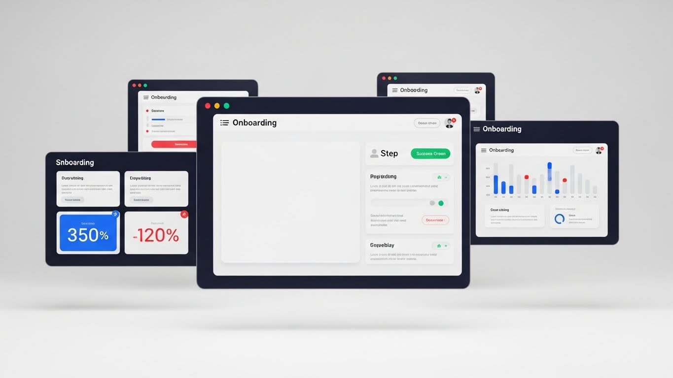
The Visual & Narrative Approach
The "Unboxing" of the user experience. A bright, high-key 3D render features floating UI screens in a stark white studio environment. The screens display a step-by-step onboarding wizard with ample whitespace, light grey text blocks, and "Success Green" progress indicators. The lighting is shadowless and soft. It screams "simplicity."
Psychological Impact & KPI Focus
- Niche Psychology: The fear of "Training Lag" is real. Administrators worry about weeks of downtime for training. This style visualizes Self-Serve Simplicity, suggesting that users can learn the system intuitively without a manual.
- Operational Impact: Visualizes Rapid Adoption and Low Training Overhead. It highlights the "Wizard" style interface that guides users, reducing the cognitive load of learning a new system.
Strategic Implementation & Trade-offs
- Best Use: "Getting Started" videos; Product Tour pop-ups within the app.
- Duration: 60-90 Seconds.
- Trade-offs: It can feel clinical. Ensure the motion is snappy to keep the energy up, otherwise, it risks becoming a boring tutorial.
Companies using similar video content -
athenahealth – athenaOne Onboarding – Demonstrates self-serve simplicity and intuitive learning.
eClinicalWorks – Training Modules – Offers frictionless onboarding and rapid adoption.
ModMed – Implementation Guides – Provides clean, step-by-step visuals for setup.
20. Holographic UI over 3D
Onboarding | TTV

The Visual & Narrative Approach
The future is now. A first-person POV shot places the viewer in the doctor's shoes. A hand reaches out to interact with a futuristic holographic interface floating in mid-air. The hologram glows in cyan and laser red against a darkened exam room backdrop. The UI elements are semi-transparent and light-based, using additive blending to create a "Touchless" effect.
Psychological Impact & KPI Focus
- Niche Psychology: It appeals to the Visionary aspect of the Medical Director. It validates their choice of platform as "Future-Proof." It says, "You bought the technology of tomorrow."
- Operational Impact: Visualizes Touchless Interfaces and Advanced Visualization. It suggests the platform is capable of evolving into AR/VR applications, ensuring long-term utility.
Strategic Implementation & Trade-offs
- Best Use: "What's New" feature updates; Keynote closers at user conferences.
- Duration: 15-20 Seconds.
- Trade-offs: It is aspirational. If the actual product doesn't have holographic capabilities, frame this clearly as "The Future of our Platform" to avoid misleading users.
Companies using similar video content -
Microsoft – HoloLens for Healthcare – Aspirational future of touchless interfaces and AR.
Augmedics – xvision Spine System – Real-world AR in surgery, hinting at future UI.
Intuitive Surgical – da Vinci System – Advanced visualization in robotic surgery.
21. 2D Character-Driven Support
Retention | Support
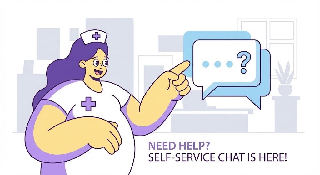
The Visual & Narrative Approach
Friendly, simplified, and disarming. This style adopts the "Corporate Memphis" or flat vector aesthetic often used by big tech to signal accessibility. A stylized nurse character—drawn with soft curves, oversized limbs, and a welcoming expression—points enthusiastically to a large, floating chat bubble icon containing a question mark. The palette is a calming mix of "Lavender," "Soft Yellow," and white. The background is a minimal, geometric suggestion of an office, removing all clutter to focus on the "Help" action.
Psychological Impact & KPI Focus
- Niche Psychology: Medical staff often hesitate to ask for help because they fear looking incompetent or wasting time on hold. This playful, low-stakes aesthetic removes the intimidation factor, encouraging them to engage with Self-Service Tools.
- Operational Impact: Directly targets Support Ticket Deflection. By visualizing the "Chat" or "Help Center" as a friendly first step, you reduce the volume of Level 1 support calls, saving IT resources.
Strategic Implementation & Trade-offs
- Best Use: Embedded within the "Help" section of the EMR dashboard or in "Welcome" emails.
- Duration: 15-30 Seconds.
- Trade-offs: It creates a casual tone. While great for support, it may feel too juvenile for serious clinical alerts. Keep it strictly for "How-To" and support context.
Companies using similar video content -
CipherHealth – Patient Engagement Solutions – Offers friendly support for patient and staff.
GetWellNetwork – Interactive Patient Care – Engages users with self-service tools.
Well Health – Patient Communications – Guides users through support with characters.
22. Macro UI Micro-Interactions
Retention | Knowledge Base

The Visual & Narrative Approach
An obsession with detail. This style utilizes extreme macro photography (or photorealistic 3D rendering) to showcase a single UI interaction. The camera focuses with razor-thin depth of field on a digital toggle switch transitioning from "Off" to "On." The switch glows in "Vivid Magenta" against a premium "Deep Indigo" brushed metal texture. The movement is slow, smooth, and satisfying, emphasizing the ease of configuring complex settings.
Psychological Impact & KPI Focus
- Niche Psychology: In a world of clunky legacy software, users crave Responsiveness. This style visually mimics the tactile satisfaction of high-end consumer electronics, signaling that the software is modern, responsive, and "bug-free."
- Operational Impact: Visualizes Automation and Customization. It suggests that powerful changes (like activating a new workflow rule) are as simple as a single flip of a switch, encouraging users to explore settings.
Strategic Implementation & Trade-offs
- Best Use: FAQ video libraries or "Feature Spotlight" clips in release notes.
- Duration: 5-10 Seconds (Looping).
- Trade-offs: It is abstract. Use it to highlight the feeling of the UX, but you must pair it with wider shots to show context.
Companies using similar video content -
Epic Systems – Customization Settings – Highlights tactile satisfaction of configuring features.
Oracle Health – Workflow Automation – Emphasizes frictionless configuration and responsiveness.
athenahealth – Feature Toggles – Focuses on ease of activating new functionalities.
23. 2D Graphics Over Live Action
Retention | Reducing Churn

The Visual & Narrative Approach
Bridging the real and the digital with joy. A standard photographic medium shot of a smiling nurse in a sunlit station is enhanced with animated 2D "doodles." Neon vector graphics—hearts, lightning bolts (efficiency), and checkmarks—pop into existence around her, tracking her movements. The contrast between the grounded reality of the photo and the energetic, glowing animations creates a vibe of "Magical Efficiency."
Psychological Impact & KPI Focus
- Niche Psychology: Healthcare can be thankless. This style visualizes User Appreciation and the "hidden joy" of a job well done. It validates the user's hard work and positions the software as a cheerleader, not a taskmaster.
- Operational Impact: Visualizes Staff Satisfaction and Positive Reinforcement. It is highly effective for internal communications aimed at boosting morale and reinforcing the adoption of new tools.
Strategic Implementation & Trade-offs
- Best Use: Customer newsletters, "Year in Review" videos, or internal adoption campaigns.
- Duration: 15-30 Seconds.
- Trade-offs: Can appear informal. Ensure the live-action footage is high quality (professional lighting/wardrobe) so the "doodles" look intentional, not amateur.
Companies using similar video content -
Lumeon – Care Pathway Management – Augments reality to show efficiency.
Notable Health – AI-powered Automation – Humanizes workflow with positive reinforcement.
Phreesia – Patient Intake – Shows enhanced satisfaction and positive experience.
24. Abstract 2D Motion Graphics
Retention | Re-engagement

The Visual & Narrative Approach
Hypnotic and evolutionary. This style abandons UI and characters for pure abstract motion. Fluid, liquid shapes in a gradient of "SaaS Blue," "Amber," and "Deep Navy" morph, swirl, and combine against a white void. The camera performs a slow, orbiting movement. The liquid nature represents data fluidity and the software's ability to adapt and change shape without breaking.
Psychological Impact & KPI Focus
- Niche Psychology: Users worry about software becoming "stale" or outdated. This style communicates Continuous Innovation. It says, "We are always evolving, always flowing," without needing to show a specific version number.
- Operational Impact: Perfect for visualizing Cloud Updates and Scalability. It suggests that the platform is a living ecosystem that grows with the hospital, re-engaging users who may have tuned out.
Strategic Implementation & Trade-offs
- Best Use: Background visuals for webinar waiting screens, social media "Status Update" posts, or app loading screens.
- Duration: 10-60 Seconds (Loopable).
- Trade-offs: Zero informational content. It is purely a "Brand Mood" setter. Do not use it when specific instruction is needed.
Companies using similar video content -
Salesforce Health Cloud – Platform Updates – Visualizes continuous innovation and cloud updates.
Veeva Systems – Product Evolution – Represents scalability and ongoing development.
Google Cloud – Healthcare Solutions – Shows cloud updates and data fluidity.
25. 3D Parallax UI Presentation
Expansion | Upsell
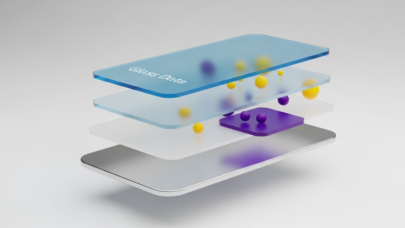
The Visual & Narrative Approach
Deconstructing value. A sleek 3D parallax composition shows a UI screen "exploding" into separate floating layers. The base layer is a metallic silver (foundation), the mid-layer is opaque white (interface), and the top layer is "Glass Blue" (data/analytics). Floating particles occupy the space between layers. The side-angle view emphasizes the "Stack" and the depth of the technology.
Psychological Impact & KPI Focus
- Niche Psychology: When asking clients to upgrade to a "Premium Tier," they need to see that they are getting more. This style visualizes Depth of Features. It implies that the premium version isn't just a switch; it's an added layer of architectural value.
- Operational Impact: Visualizes Modular Architecture and Add-on Modules. It clearly separates "Core Features" from "Advanced Analytics," making the upsell proposition tangible.
Strategic Implementation & Trade-offs
- Best Use: Upsell email campaigns (e.g., "Unlock the Analytics Layer") or product pages for premium modules.
- Duration: 10-15 Seconds.
- Trade-offs: Requires high-fidelity design assets. The UI shown must be accurate to the module being sold.
Companies using similar video content -
Innovaccer – Data Activation Platform Modules – Deconstructs value of add-on analytics layers.
Health Catalyst – DOS Platform Modules – Showcases modular architecture and premium features.
Commure – Platform Services – Visualizes depth of features and advanced analytics.
26. Hyper-lapse Stock + Data
Expansion | Advocacy

The Visual & Narrative Approach
Order within chaos. A long-exposure hyper-lapse photograph captures a hospital corridor. Doctors and nurses are blurred streaks of motion (red/white/yellow light trails), indicating a frantic, fast-paced environment. Superimposed over this blur is a static, razor-sharp, opaque UI widget displaying "Real-Time Analytics" in blue and white. The contrast is the story: the environment is chaotic, but the data is stable.
Psychological Impact & KPI Focus
- Niche Psychology: Hospital leaders know their environment is chaotic. They don't want a tool that adds to the noise; they want an anchor. This style visualizes the platform as the Source of Truth that remains steady regardless of operational velocity.
- Operational Impact: Visualizes Real-Time Monitoring and Stability. It proves that the software captures insights instantly, no matter how fast the patient flow is moving.
Strategic Implementation & Trade-offs
- Best Use: Case Study headers, Social Media ads targeting "Burnout" or "Efficiency."
- Duration: Static Image or Cinemagraph.
- Trade-offs: The UI must be large and legible. If the text is too small, it gets lost in the background noise.
Companies using similar video content -
TeleTracking – Real-Time Capacity Management – Provides static data clarity amidst chaos.
STANLEY Healthcare – RTLS Solutions – Ensures real-time monitoring and stability.
Qventus – Operational Intelligence – Anchors data in dynamic hospital setting.
27. Aspirational Stock Montage
Expansion | Champion

The Visual & Narrative Approach
The "Hero Shot" of the team. A high-key, cinematic stock photo features a diverse group of medical professionals (doctors, nurses, admin) standing in a modern, sunlit hospital atrium. They are looking upward and off-camera, smiling with genuine confidence. Lens flares and a warm color palette (white, green, navy) create a sense of optimism and future potential.
Psychological Impact & KPI Focus
- Niche Psychology: This appeals to the "Internal Champion"—the person at the hospital who advocated for your software. It validates their decision. It says, "This is what success looks like. You led your team to this."
- Operational Impact: Visualizes Cultural Transformation and Team Alignment. It moves the conversation from "Software functions" to "Organizational success," which is critical for contract renewal.
Strategic Implementation & Trade-offs
- Best Use: Slide decks for Quarterly Business Reviews (QBRs); "Success Stories" section on the website.
- Duration: Static Image.
- Trade-offs: Can feel generic ("Stock Photo Syndrome"). It works best when accompanied by specific quotes or metrics from that client to ground it in reality.
Companies using similar video content -
Epic Systems – Success Stories – Shows visionary success and team alignment.
athenahealth – Client Testimonials – Highlights cultural transformation and organizational success.
Meditech – Customer Spotlights – Celebrates internal champions and positive outcomes.
28. Generative AI Cinematic
Expansion | CTV Brand

The Visual & Narrative Approach
High stakes, high drama. Utilizing Generative AI to create a "Netflix-quality" scene, this style depicts a tense moment in an emergency room. The lighting is moody "Teal and Orange" with deep shadows. A doctor is intensely focused on a patient, but the hero of the shot is the high-tech monitor in the foreground, glowing with critical data. A Dutch angle and film grain add to the urgency.
Psychological Impact & KPI Focus
- Niche Psychology: Healthcare is a matter of life and death. This style elevates the brand from "Software Vendor" to "Critical Infrastructure." It resonates with the gravity of the medical profession, building deep emotional trust.
- Operational Impact: Visualizes Reliability and Mission-Critical Performance. It subtly communicates, "When every second counts, our platform is the one you trust."
Strategic Implementation & Trade-offs
- Best Use: Connected TV (CTV) spots, Conference Opener videos, Brand Awareness campaigns.
- Duration: 15-30 Seconds.
- Trade-offs: High production value (or advanced Gen AI prompting) is required. It must not look "uncanny." The tone is serious; avoid using it for administrative features.
Companies using similar video content -
GE Healthcare – Critical Care Solutions – Emphasizes reliability in emergency settings.
Philips Healthcare – Patient Monitoring – Portrays mission-critical performance cinematically.
Siemens Healthineers – Diagnostic Imaging – Builds brand authority through dramatic visuals.
29. AI Mixed Media Video
Expansion | ABM Awareness
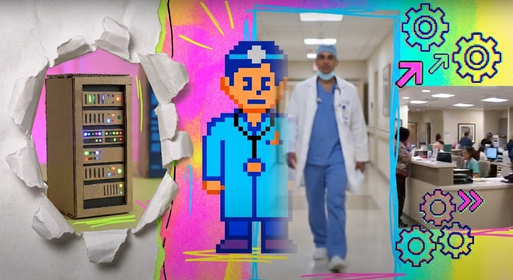
The Visual & Narrative Approach
The pattern interrupt. A dynamic, fast-paced collage style blending stop-motion paper textures, 8-bit pixel art, and realistic video footage. A "cardboard" server rack tears open to reveal a pixelated doctor, who then morphs into a real physician. The colors are electric (Neon Pink, Cyan, Yellow). It is chaotic, loud, and completely unlike traditional B2B medical marketing.
Psychological Impact & KPI Focus
- Niche Psychology: In a feed full of blue and white medical stock photos, this style screams "Different." It appeals to the "Disruptor" buyer who is tired of the status quo and wants a partner who breaks the mold.
- Operational Impact: Visualizes Digital Transformation as a creative, energetic force. It suggests that moving from legacy (cardboard/pixels) to modern (video) is an exciting journey, not a chore.
Strategic Implementation & Trade-offs
- Best Use: LinkedIn Feed Ads (Account-Based Marketing), retargeting campaigns for "Stalled" deals.
- Duration: 10-15 Seconds.
- Trade-offs: It is polarizing. Some conservative boards may find it "too loud." Use it to get attention, then switch to a calmer style to explain the details.
Companies using similar video content -
Olive AI – AI for Healthcare – Disrupts with energetic digital transformation.
Notable Health – AI-powered Automation – Creates energetic force for modernization.
Commure – Developer Platform – Highlights innovation and breaks status quo.
30. Gen AI Realistic Character
Expansion | Demo Request

The Visual & Narrative Approach
The ultimate social proof. A hyper-realistic, AI-generated video portrait of a Chief Medical Officer (CMO) in her 50s. She makes direct eye contact with the camera, conveying wisdom, calm, and satisfaction. The lighting is soft studio quality, and the background is a tasteful, blurred executive office. This is the "Digital Twin" of your ideal customer.
Psychological Impact & KPI Focus
- Niche Psychology: People buy from people. This style leverages Social Proof and Authority Bias. Even if the persona is synthetic (or a polished actor), the direct eye contact triggers a trust response in the viewer.
- Operational Impact: Visualizes Executive Endorsement. It represents the voice of the peer, reassuring the buyer that "people like you choose software like this."
Strategic Implementation & Trade-offs
- Best Use: Website "Testimonials" section (if using real actors) or "Persona" videos (if using AI avatars to represent user types).
- Duration: 30-60 Seconds.
- Trade-offs: Ethical transparency is key. If using AI, lip-sync and eye movement must be flawless. The "Uncanny Valley" will destroy trust instantly. Transparency is key.
The Strategic Knowledge Base: The Visual Operations Doctrine
The 30 styles above are not just aesthetic choices; they are business tools. However, a tool is only as good as the hand that wields it. To transform these visuals into a competitive moat for your Hospital EMR or SaaS platform, you must integrate them into a cohesive strategy.
This section synthesizes the insights from all 30 styles into three actionable strategic segments. This is your "Visual Operations Doctrine."
Strategic Alignment & Visual Architecture (The "Visual OS")
Before a single pixel is rendered, the "Clinical Innovation Architect" must define the rules of engagement. This phase ensures that your visual strategy reduces complexity rather than adding to it.
- The Cognitive Load Audit: Conduct a review of your current training materials. If a concept takes 3 paragraphs to explain, replace it with Style 3 (X-Ray) or Style 9 (Isometric). Measure success by the reduction in "Time to Comprehension."
- Role-Based Visual Mapping: Do not use the same visuals for everyone. Use Mobile/Flat styles (Style 5) for nurses who need quick, on-the-go checks, and Dark Mode/Data styles (Style 13) for administrators reviewing analytics on desktop monitors.
- The "Glanceability" Standard: In an ER, a doctor has milliseconds to process data. Your visuals for clinical alerts must pass the "Glance Test"—instant recognition without reading text, utilizing Style 7 (Rapid UI) principles (clear hierarchy, high contrast).
- Brand Voice Consistency: Your marketing videos (Style 1) and your support tutorials (Style 19) must feel like they come from the same family. Use a unified color palette and font hierarchy to build subconscious familiarity and trust.
- The Advids Strategic Audit: Partner with specialized agencies like Advids early in the process to define this "Visual Operating System." A fragmented visual identity signals a fragmented product to the market.
- Standardization vs. Customization: Use standardized, simplified icons (Style 5) for universal medical concepts (e.g., "Prescription," "Patient"), but invest in bespoke 3D modeling (Style 17) for your proprietary hardware or unique IP.
- The Cross-Departmental Bridge: Use visuals to align terminology. A Style 12 (Revenue Cycle) video helps the Clinical team understand why billing codes matter, bridging the gap between "Care" and "Finance."
- Legacy System Integration: Use Style 6 (Wireframe to Reality) not just for sales, but for internal change management. Show staff exactly how the new SaaS interface maps to the old legacy screens they know to reduce transition anxiety.
- Accessibility in Healthcare: Ensure all motion graphics (Style 4, Style 24) are WCAG compliant. Avoid flashing lights that trigger seizures and ensure color contrast supports color-blind users (e.g., distinct shapes for "Alerts," not just red colors).
- The Mobile-First Mandate: 60% of EMR interaction happens on tablets or mobile carts. Ensure all 30 styles are legible on a 6-inch screen. If Style 15 (Low Poly) is too detailed for mobile, simplify it.
Operational Adoption & Implementation (The "Workflow Embed")
Deployment is where software goes to die—unless it is visually supported. This segment focuses on embedding these styles directly into the hospital workflow to drive adoption.
- Overcoming "Big Brother" Anxiety: Staff fear AI and tracking. Use Style 2 (Organic Modern) and Style 11 (2D Animation) to explain features like "Staff Tracking" or "AI Monitoring" with empathy, framing them as "Safety" tools rather than "Surveillance."
- The Micro-Learning Shift: Doctors do not read manuals. Replace 50-page PDFs with a library of 30-second Style 19 (Clean UI) videos. Index them effectively so they appear exactly when the user is stuck.
- Just-in-Time Support: Embed Style 22 (Macro UI) loops directly into the software tooltips. When a user hovers over a complex "Config" switch, show them the video of what it does instantly.
- Gamification of Training: Use Style 4 (Kinetic Typography) and high-energy visuals to introduce "Training Leaderboards" or "Certification Badges." Make the learning process feel like progress, not homework.
- Reducing Support Ticket Volume: There is a direct correlation between the quality of your Style 21 (Self-Service) videos and the cost of your support center. Invest heavily here to deflect Tier 1 queries.
- Remote Onboarding: For hospital networks with multiple satellite clinics, use Style 3 (X-Ray) and Style 18 (Line Art) to visually demonstrate infrastructure setup remotely, reducing the need for expensive on-site travel.
- Standard Operating Procedures (SOPs): Transform text-based SOPs into Style 9 (Isometric Motion) flows. Visualizing the movement of patients through triage is infinitely more effective than reading a list of steps.
- Feedback Loops: Use interactive video elements (leveraging Style 23's engaging motion) to gather staff feedback on software usability. "Did this video help?" buttons provide data to refine your visual strategy.
- Scalable Localization: If your platform is global, use Style 5 (Minimalist Flat) and Style 1 (Abstract) which rely less on on-screen text and more on universal symbols, making localization cheaper and faster.
- Leadership Communication: When the CIO needs to explain a new strategy to the Board, provide them with Style 1 (Abstract 3D) and Style 12 (Revenue Cycle) assets. Empower your champion to sell your vision internally.
Measuring Impact & Future-Proofing (The "ROI & AI")
Finally, we must measure the results and look to the future. Visual strategy is an investment, and like any investment, it must yield a return.
- Beyond "Views": Do not measure video success by "Views." Measure it by "Time-to-Competency" (how fast a nurse learns a task) and "Feature Adoption Rate" (how many users try a new feature after watching the Style 7 video).
- The "Idle Time" Metric: Correlate the presence of embedded help videos (Style 22) with a reduction in "Idle Time" (time spent staring at a screen confused). Less idle time equals higher clinical efficiency.
- Compliance Velocity: Track how quickly staff adopt new regulatory protocols (e.g., new billing codes) when introduced via Style 8 (Neon Security) update videos. Speed of compliance is a competitive advantage.
- Retention and Churn: High-quality UX visualization (Style 25) reinforces the perception of value during renewal discussions. Clients are less likely to churn from a platform that "looks" and "feels" premium and supported.
- The AI Visual Frontier: Prepare for Generative AI. Soon, you will use Style 30 techniques to generate personalized patient education videos on the fly. Build your asset library now to feed these future models.
- Scalability of Assets: Build a "Visual Component Library." If you create a 3D model of a "Patient Bed" for Style 3, reuse that asset in Style 9 and Style 12. This reduces long-term production costs.
- The Advids Partnership: As your platform scales from one hospital to one hundred, your visual needs will explode. A partner like Advids ensures that your visual language evolves without losing consistency or quality.
- Benchmarking Success: Compare your "Visual ROI" against industry standards. If your "Support Ticket per User" ratio isn't dropping, your Style 21 videos need re-evaluating.
- The ROI of Safety: Quantify the reduction in medical errors or "Near Misses" after implementing visual SOPs (Style 9). This is the ultimate ROI for healthcare—patient safety.
- Final Call to Innovation: Treat video as Infrastructure, not content. In the Silent Hospital, visual clarity is the only voice you have. Make it clear, make it beautiful, and make it matter.
Companies using similar video content -
Merative – Executive Insights – Leverages social proof for executive endorsement.
Veeva Systems – Customer Testimonials – Provides realistic portrayal of satisfied executives.
Salesforce Health Cloud – Leadership Spotlights – Builds trust through peer endorsement.
Author & Editor Bio


