
Introduction: Visualizing the "Nervous System" of Modern Hospitality
The modern hotel is a paradox. To the guest, it is a physical sanctuary defined by thread counts, warm smiles, and lobby aesthetics. But to the "Operational Orchestrator"—the GM or Operations Director—the hotel is a complex, high-speed digital ecosystem. It is a network of APIs, inventory pools, and dynamic pricing algorithms. The challenge for Hospitality SaaS brands is unique: How do you visualize the invisible plumbing that keeps the hotel running?
The market is aggressively moving away from legacy, on-premise servers toward agile, cloud-native solutions. In fact, the global hotel and hospitality management software market size was valued at USD 6.29 billion in 2023, driven by a desperate need for connectivity. Hoteliers are no longer buying "software"; they are buying a nervous system. They need technology that connects the "Brain" (Revenue Management) to the "Hands" (Housekeeping) without a single dropped signal.
The stakes are high. Implementing these synchronized cloud-based systems can increase operational efficiency by 30%, liberating staff from the back office so they can return to the front desk. Yet, the complexity of these tools often scares potential buyers. They fear "Integration Hell" and "Staff Pushback."
This guide serves as a visual lexicon to bridge that gap. By leveraging these 30 distinct video styles, we can translate abstract code into tangible value. We will explore how to use Minimalist Vectors to calm the anxiety of fragmentation, Kinetic Typography to drive the urgency of occupancy, and Isometric Motion to give hoteliers a "God's Eye View" of their operations. These styles are not just aesthetic choices; they are strategic tools designed to reduce cognitive load and build trust in the digital future of hospitality.
1. Minimalist Flat 2D Vector
TOFU | Brand Awareness
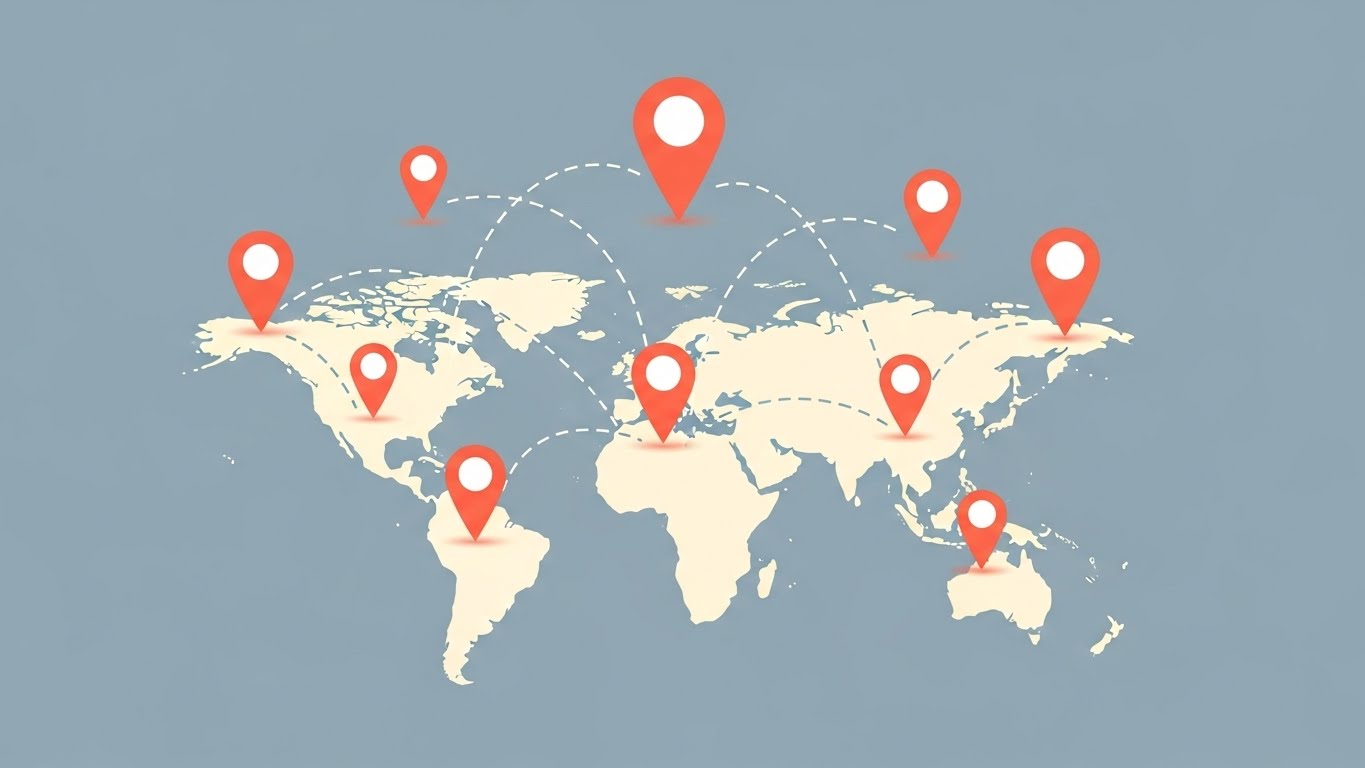
The Visual & Narrative Approach
Visualization Scenario: A Group CTO managing 50 properties needs to feel "Connected," not "Overwhelmed."
Execution: This style utilizes a "Clean Slate" philosophy. The composition features a stylized world map in soft cream, stripping away political borders to focus on the network. Vibrant coral-colored location pins pop up in sync, connected by curved dashed lines. The pale slate blue background ensures the data points remain the hero. It visualizes the abstract concept of "Multi-Property Connectivity" as a simple, elegant web.
Psychological Impact & KPI Focus
This style directly addresses the anxiety of Digital Fragmentation. By presenting the global portfolio as a unified, clean graphic, it lowers Cognitive Load. It signals Scalability and Uptime Reliability, reassuring the viewer that the software can handle enterprise-level complexity without looking "messy."
Strategic Implementation & Trade-offs
- Best Use Case: LinkedIn feeds to announce market expansion or "Enterprise" capabilities.
- Duration: 10-15 seconds (Loopable).
- Trade-off: It is highly abstract. It sells the concept of the network but fails to show how the connection actually works (e.g., specific dashboard features).
Companies using similar video content -
Shiji Group – Shiji Enterprise Platform – Centralized management for global hotel groups.
Amadeus Hospitality – Amadeus Central Reservations System – Connects global distribution channels.
2. Abstract 2D Flat Vector Organic Motion
TOFU | Market Education
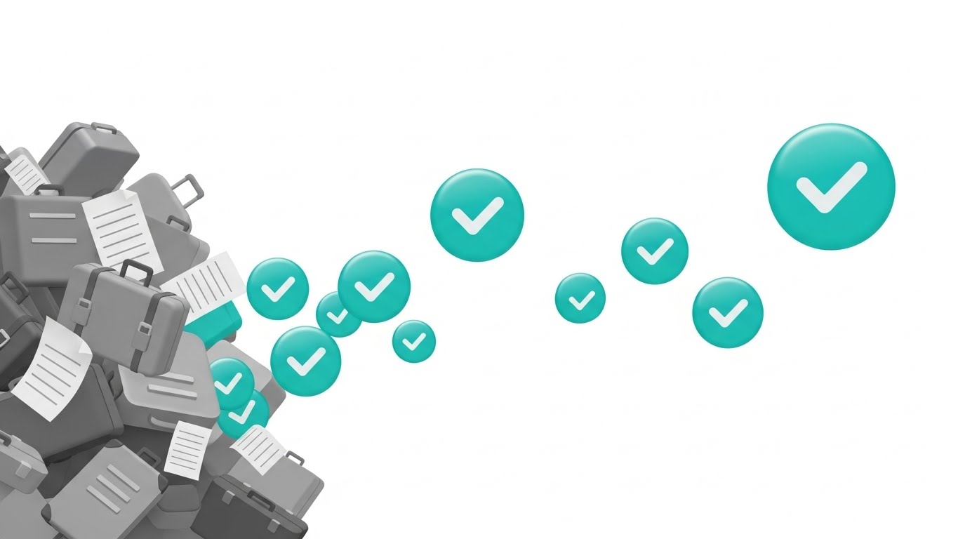
The Visual & Narrative Approach
Visualization Scenario: The "Before & After" story. A manager is drowning in paperwork and needs a lifeline.
Execution: We begin with a chaotic pile of muted grey abstract shapes (representing invoices, lost tags, manual logs). Through a fluid, glossy motion, these shapes are processed and transformed into an organized stream of teal checkmark icons. The background is stark white. It visually narrates the alchemy of automation: turning the lead of manual drudgery into the gold of completed tasks.
Psychological Impact & KPI Focus
This triggers a powerful "Relief" response. The Teal Checkmark is a universal dopamine trigger for "Task Complete." It targets the Operational Efficiency KPI, visualizing the removal of friction. It tells the viewer: "We handle the mess; you handle the guest."
Strategic Implementation & Trade-offs
- Best Use Case: Website Headers or "Pain Point" sections on Landing Pages.
- Duration: 15-20 seconds.
- Trade-off: It is metaphorical. Skeptical technical buyers may dismiss it as "marketing fluff" if not immediately followed by a shot of the actual UI.
Companies using similar video content -
Mews – Mews PMS – Streamlines hotel operations with automation.
ALICE Platform – ALICE Operations Platform – Automates staff task management.
3. Abstract 3D AI Visualization
TOFU | Category Creation
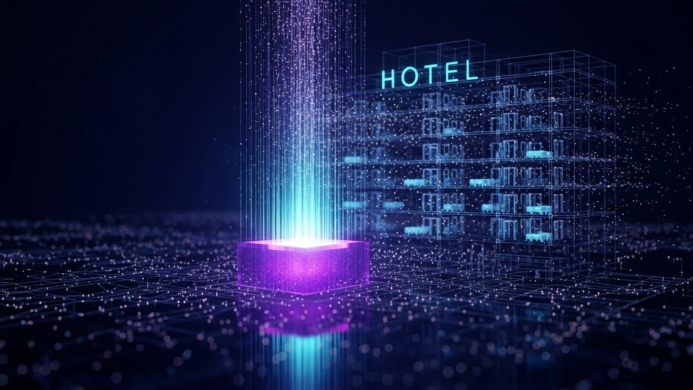
The Visual & Narrative Approach
Visualization Scenario: Introducing "AI Intelligence" or "Predictive Analytics."
Execution: The visual centers on a glowing violet and neon cyan node—the "Brain." Fiber-optic connections shoot out to form the wireframe outline of a hotel. Inside, particles of light (data) zip between rooms. The deep indigo background creates a futuristic, high-tech atmosphere. It visualizes the hotel not as a building, but as a living, thinking organism powered by your software.
Psychological Impact & KPI Focus
This appeals to the Innovator persona. It frames the software as an Intelligent Asset, not just a tool. It addresses the fear of obsolescence ("Am I falling behind?"). The glowing network implies Real-Time Data Interoperability—the holy grail of modern hotel tech stacks.
Strategic Implementation & Trade-offs
- Best Use Case: Brand Manifesto videos or Keynote openers.
- Duration: 45-60 seconds.
- Trade-off: High production cost. It creates a "Premium/Enterprise" perception which might intimidate smaller, independent hoteliers who just want a simple booking calendar.
Companies using similar video content -
IDeaS Revenue Solutions – IDeaS G3 RMS – AI-driven revenue management.
Duetto – GameChanger RMS – AI-powered pricing and demand forecasting.
4. Generative AI Cinematic Video
TOFU | Shaping Brand Perception
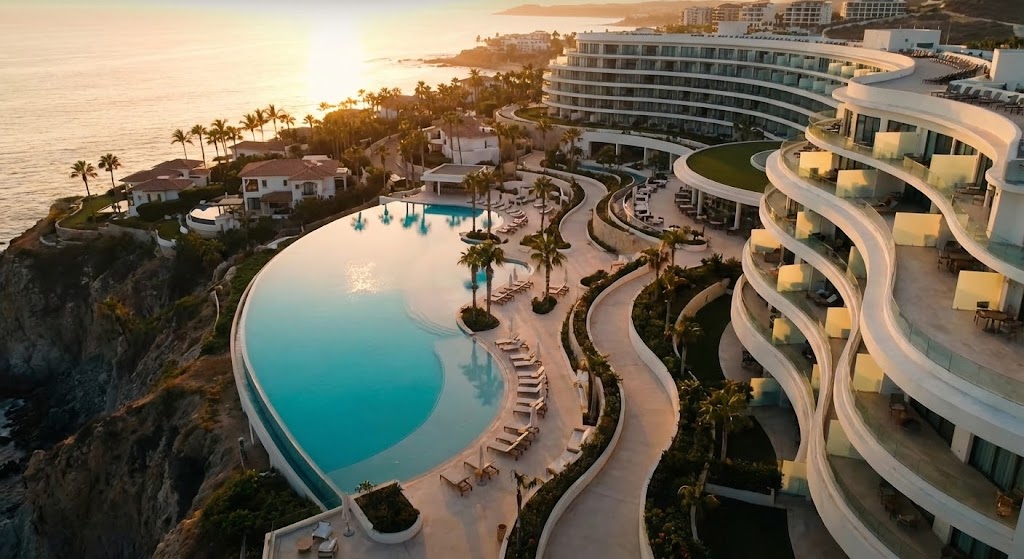
The Visual & Narrative Approach
Visualization Scenario: Selling the Outcome, not the Output.
Execution: A sweeping drone shot captures a luxury coastal resort at Golden Hour. The sun hits the turquoise infinity pool and white architectural curves. There is no UI, no text, no code. It connects the software brand to the ultimate goal of hospitality: Perfection. It implies, "Hotels that run on our OS look like this."
Psychological Impact & KPI Focus
This targets Brand Affinity and Guest Satisfaction (GSS). It reconnects the hotelier with their passion for travel and luxury. It acts as an emotional anchor, suggesting that your software is the silent partner behind the world's best guest experiences.
Strategic Implementation & Trade-offs
- Best Use Case: CTV (Connected TV) spots or Event Openers.
- Duration: 15-30 seconds.
- Trade-off: Zero Information Density. If the viewer doesn't know your brand, they might think it's an ad for a travel agency. Must be paired with a strong value proposition voiceover.
Companies using similar video content -
TrustYou – TrustYou Guest Experience Platform – Enhances guest satisfaction and reputation.
Cendyn – Cendyn CRM – Drives personalized guest journeys for luxury brands.
5. Bold Kinetic Typography (Visual)
TOFU | Vertical Social Organic
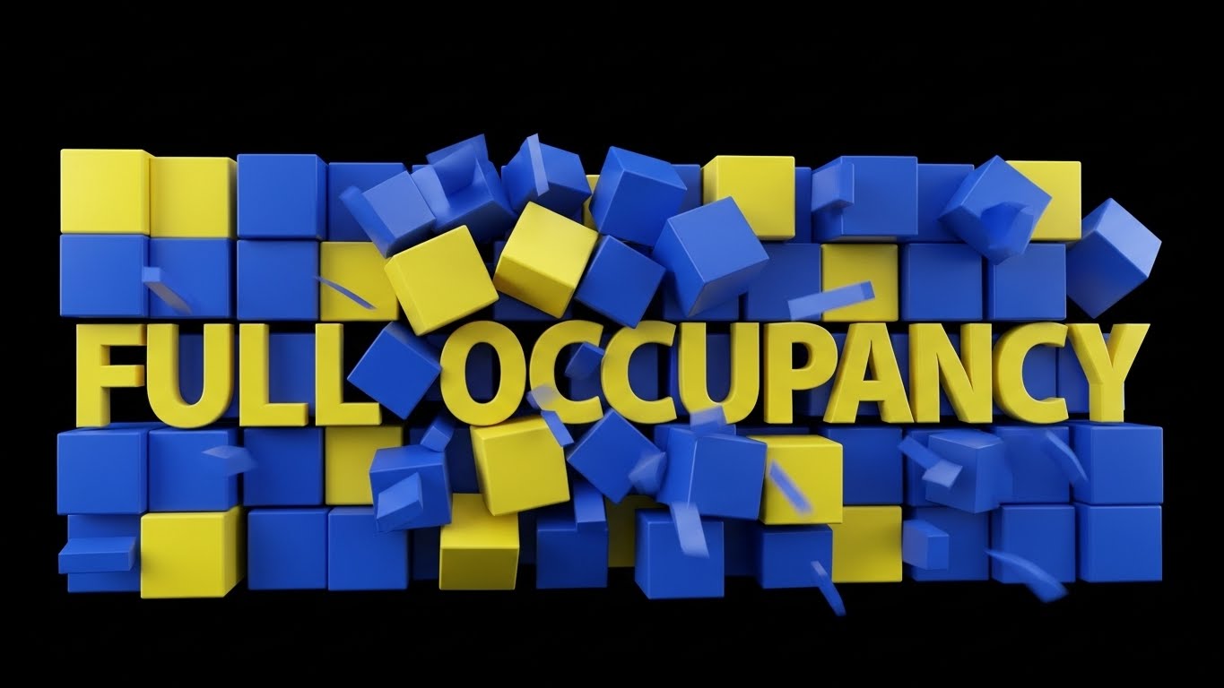
The Visual & Narrative Approach
Visualization Scenario: The "Pulse" of high demand.
Execution: Words and shapes collide. Electric blue and lemon yellow blocks stack rapidly to form a solid wall, spelling "FULL OCCUPANCY." The motion is percussive and fast. The matte black background forces the eye to focus on the colors. It visualizes the "Rush" of a sold-out night.
Psychological Impact & KPI Focus
Designed for the Revenue Manager, this triggers the excitement of Demand Generation. It uses the "Scarcity Principle" (filling up fast) to create urgency. It aligns your brand with the primary financial goal: RevPAR Maximization.
Strategic Implementation & Trade-offs
- Best Use Case: Instagram Reels or TikTok to hype a new feature or "Black Friday" deal.
- Duration: 5-10 seconds (Loopable).
- Trade-off: It is Substance-Light. It grabs attention but explains nothing about how the software helps achieve occupancy. It is purely a "Hook."
Companies using similar video content -
RateGain – RateGain D-EDGE – Maximizes revenue and distribution.
OTA Insight – Rate Insight – Real-time rate intelligence for demand.
6. Wireframe to Reality Transition
TOFU | Product Differentiation
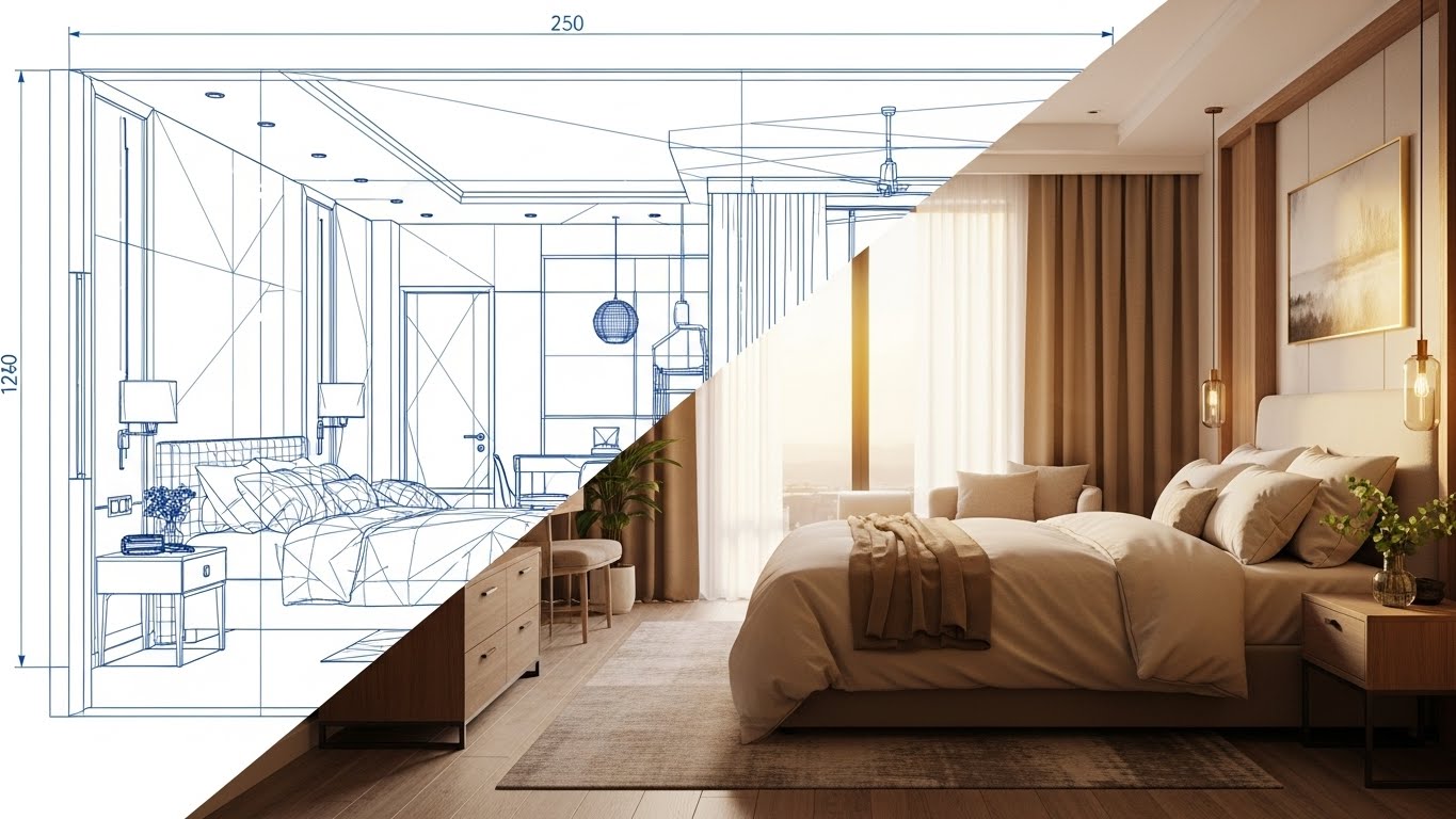
The Visual & Narrative Approach
Visualization Scenario: Bridging the "Back Office" to the "Front Office."
Execution: A split-screen composition. Left: Blueprint blue wireframe (The Plan). Right: Photorealistic warm wood/sunlight (The Reality). A sharp diagonal line wipes across, showing that the software's configuration directly creates the physical guest environment.
Psychological Impact & KPI Focus
This style validates the Operations Director. It proves that their "boring" back-office work (configuration, inventory setup) has a direct, beautiful impact on the guest. It reduces the Physical/Digital Divide anxiety, creating a sense of holistic control.
Strategic Implementation & Trade-offs
- Best Use Case: Product Demos for "Room Configuration" or "Renovation" modules.
- Duration: 20-30 seconds.
- Trade-off: Requires High-Fidelity Assets. If the "Reality" side looks fake or low-budget, the promise of quality is broken.
Companies using similar video content -
Cloudbeds – Cloudbeds PMS – Manages room inventory and guest experience.
RoomRaccoon – RoomRaccoon PMS – All-in-one solution for property management.
7. Isometric 2D Motion Design
MOFU | Demand Gen
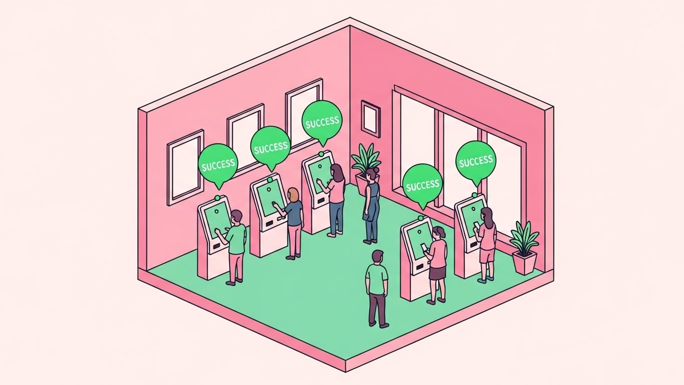
The Visual & Narrative Approach
Visualization Scenario: Visualizing "Flow" and "Throughput."
Execution: An isometric cross-section of a lobby with pastel pink walls and mint green floors. We see miniature figures using digital kiosks. Green "success" bubbles float up, indicating frictionless transactions. It gives the viewer a "God's Eye View" of a perfectly running lobby.
Psychological Impact & KPI Focus
This alleviates the fear of Staff Shortages and long queues. The "Success Bubbles" provide positive reinforcement, proving that automation works. It targets Guest Flow Efficiency and Check-in Speed, showing that technology can handle the volume.
Strategic Implementation & Trade-offs
- Best Use Case: Meta Ads explaining "Self-Check-In" or Kiosk features.
- Duration: 30 seconds.
- Trade-off: The "Cute" aesthetic might feel too casual for ultra-luxury or corporate brands. It works best for lifestyle, boutique, or mid-scale properties.
Companies using similar video content -
Ariane Systems – Ariane Kiosk Solutions – Self-check-in/out kiosks.
OpenKey – OpenKey Digital Key – Mobile key and guest experience.
8. Dynamic Data Visualization
MOFU | ROI Justification

The Visual & Narrative Approach
Visualization Scenario: Proving ROI to the Owner/CFO.
Execution: Literal growth. Stacks of gold coins and emerald green bars grow organically out of the 3D hotel roof. The clean grey background keeps it professional. It transforms the hotel from a "building" into a "financial asset."
Psychological Impact & KPI Focus
This speaks the language of Greed/Growth. It bypasses features to focus on Value Creation. It addresses the skepticism of "Is this software a cost or an investment?" by visually shouting "Investment." The focus is RevPAR and GOPPAR.
Strategic Implementation & Trade-offs
- Best Use Case: ROI Calculators or "Case Study" slides on LinkedIn.
- Duration: Static or Short Loop.
- Trade-off: It is Transactional. It ignores the human element of hospitality. Use it for the Finance team, not the Front Desk team.
Companies using similar video content -
ProfitSword – ProfitSword Business Intelligence – Financial and operational reporting.
STR – STR Benchmarking – Provides market data and performance insights.
9. Isometric 3D Workflow
MOFU | Feature Education
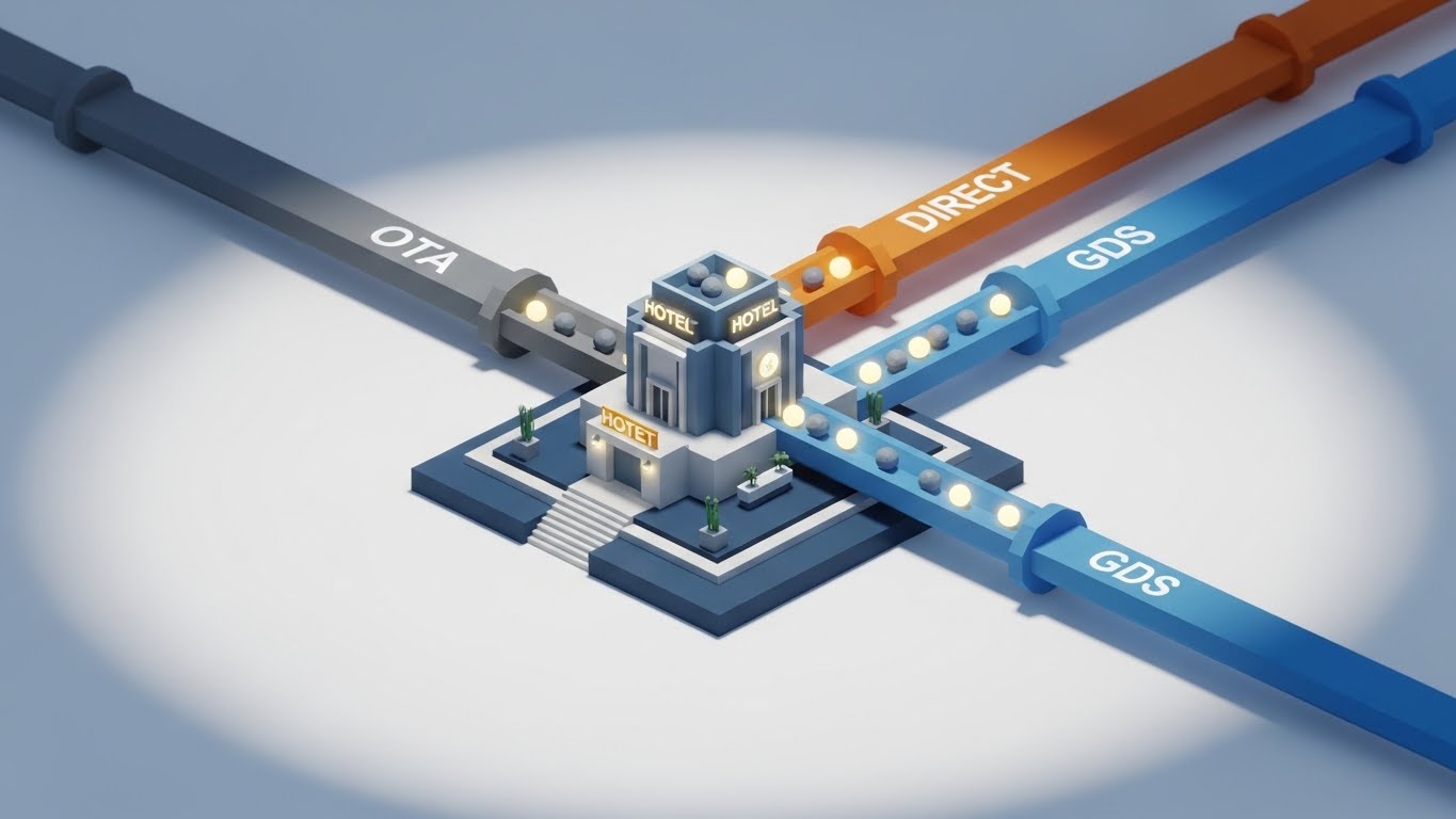
The Visual & Narrative Approach
Visualization Scenario: Explaining "Channel Management" (Distribution).
Execution: A mechanical metaphor. Three pipelines (Grey/OTA, Orange/Direct, Blue/GDS) feed glowing spheres (bookings) into the central hotel lobby. It visualizes the "Plumbing" of distribution—controlled, separate, and free-flowing.
Psychological Impact & KPI Focus
This calms the fear of Overbookings and Rate Disparity. The pipes imply a leak-proof infrastructure. It visualizes Inventory Parity—showing that the hotel controls the flow, not the other way around.
Strategic Implementation & Trade-offs
- Best Use Case: Feature pages for Channel Managers.
- Duration: 45-60 seconds.
- Trade-off: Can look Industrial. It treats guests as "spheres" in a pipe. Ensure voiceover maintains a hospitality tone ("Welcoming guests from all channels").
Companies using similar video content -
SiteMinder – SiteMinder Channel Manager – Connects hotels to global booking channels.
TravelClick – TravelClick Channel Management – Maximizes online bookings.
10. 2D Animation & UI Composition
MOFU | Feature Education
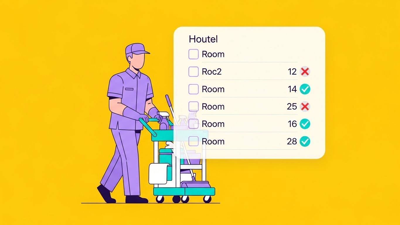
The Visual & Narrative Approach
Visualization Scenario: "Staff Empowerment" and "Ease of Use."
Execution: A character in a lavender uniform pushes a cart, accompanied by a floating UI Checklist. As they work, items turn from Red Crosses to Green Ticks. It humanizes the tech, showing it as a helpful assistant for the deskless worker.
Psychological Impact & KPI Focus
This lowers the Barrier to Entry for staff adoption. It addresses the anxiety of "Will my staff use this?" by showing how simple and gamified it is. It targets Staff Efficiency and Room Turnaround Time.
Strategic Implementation & Trade-offs
- Best Use Case: Training Videos or "Day in the Life" features.
- Duration: 60-90 seconds.
- Trade-off: Focuses on Tactics, not Strategy. It sells the "How," not the "Why." Essential for user buy-in, but less exciting for the owner.
Companies using similar video content -
Optii Solutions – Optii Housekeeping – Optimizes housekeeping operations.
Knowcross – Knowcross Task Management – Automates and tracks staff tasks.
11. Clean UI Workflow (Light Mode)**
MOFU | Feature Education
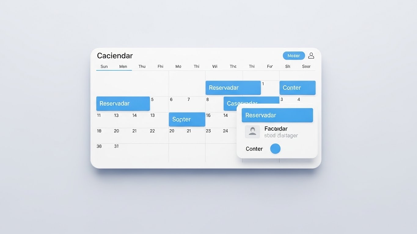
The Visual & Narrative Approach
Visualization Scenario: Demystifying the "Central Nervous System"—the Reservation Calendar.
Execution: This style utilizes a flat-lay view of a pristine, digital calendar interface. The aesthetic is clinical yet welcoming, utilizing a crisp arctic white background to ensure the sky blue reservation blocks are the absolute focus. Lines and blocks represent data without the visual noise of readable text, emphasizing structure over minutiae. The floating "pop-up" panel casts a subtle drop shadow, visualizing the ease of drag-and-drop adjustments.
Psychological Impact & KPI Focus
This aesthetic directly combats "Grid Fatigue." For a Front Desk Manager, a cluttered screen is a primary stressor. The generous whitespace and soft palette signal Cognitive Clarity and Ease of Use. It targets the Training Time KPI, suggesting that the software is so intuitive that new staff can master the booking engine in minutes, reducing onboarding costs.
Strategic Implementation & Trade-offs
- Best Use Case: Email Nurture Campaigns targeting Operations Managers who are evaluating usability.
- Duration: 45-60 seconds.
- Trade-off: It is Low-Energy. It lacks the excitement of kinetic motion or lifestyle imagery. It is purely functional, designed to educate a prospect who is already interested in the mechanics.
Companies using similar video content -
Oracle Hospitality – Opera Cloud PMS – Cloud-based property management.
ResNexus – ResNexus PMS – Online booking and property management.
12. Rapid UI Feature Montage
MOFU | Driving Demo Requests
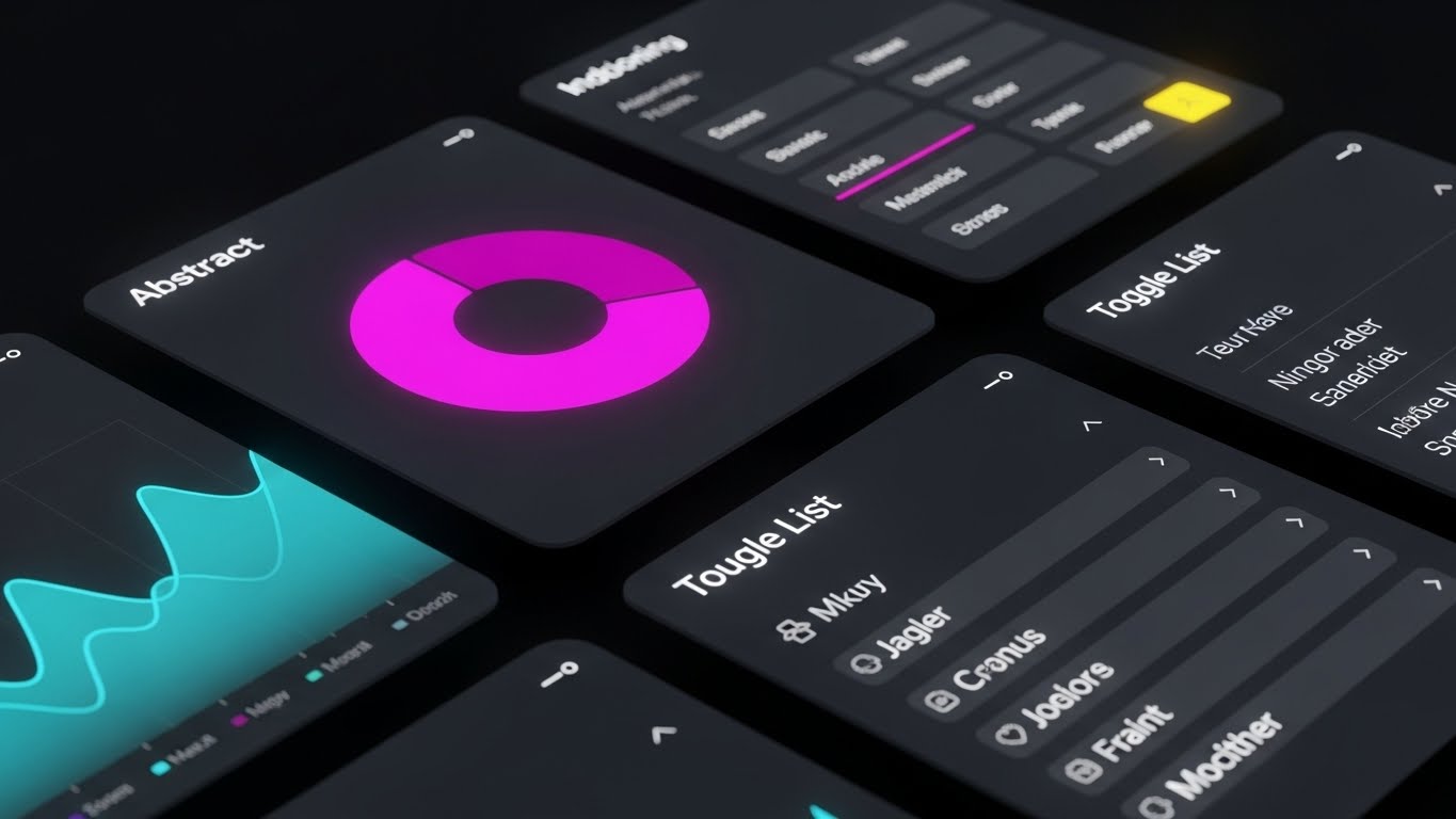
The Visual & Narrative Approach
Visualization Scenario: The "Power User" experience. Demonstrating the breadth of the platform in seconds.
Execution: A high-speed, dynamic montage of UI elements floating in a dark, modern void. We see angled slices of specific widgets: a vibrant magenta pie chart analyzing demographics, a cyan line graph tracking revenue trends, and a charcoal toggle list for rapid settings adjustments. The motion is snappy and rhythmic. It conveys the sheer volume of functionality available, wrapped in a "Dark Mode" aesthetic that implies modernity.
Psychological Impact & KPI Focus
This triggers a sense of Technological Sophistication. The dark mode aesthetic differentiates the brand from legacy, "beige" software. It targets Feature Adoption and Data Accessibility, visually promising that every critical metric—from housekeeping status to RevPAR—is just a click away.
Strategic Implementation & Trade-offs
- Best Use Case: YouTube Pre-Rolls or LinkedIn Video Ads where you have 5 seconds to hook the viewer.
- Duration: 15 seconds (Fast Paced).
- Trade-off: Information Overload. The viewer cannot read specific data points due to the speed. It creates an impression of capability but teaches nothing specific about the workflow.
Companies using similar video content -
Protel PMS – Protel PMS – Modular and comprehensive hotel management.
Infor Hospitality – Infor HMS – Integrated hotel management suite.
13. Hyper-lapse Stock Footage with Data
MOFU | Competitive Displacement
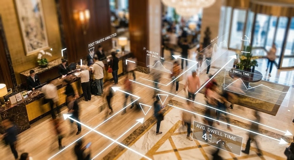
The Visual & Narrative Approach
Visualization Scenario: Seeing the "Matrix" behind the lobby.
Execution: We use high-quality hyper-lapse footage of a busy, upscale hotel lobby. Guests are blurred into streaks of light, emphasizing the speed and volume of physical operations. Superimposed on this reality are sharp, static white data lines and floating geometric markers. These graphics track foot traffic flow, visually demonstrating how the software extracts actionable intelligence (e.g., dwell time, peak hours) from physical chaos.
Psychological Impact & KPI Focus
This appeals to the Strategic General Manager. It validates their intuition with data. It bridges the Physical/Digital Divide, showing that the software understands the physical reality of the hotel floor. It targets Operational Intelligence and Guest Throughput Optimization.
Strategic Implementation & Trade-offs
- Best Use Case: LinkedIn Ads targeting GMs to prove you offer "more than just a PMS."
- Duration: 30-45 seconds.
- Trade-off: Reliance on Footage Quality. If the lobby stock footage looks generic or dated, the "Cutting Edge" message is undermined. The overlay must track perfectly to feel premium.
Companies using similar video content -
Trax Retail – Trax Retail Solutions – Analyzes in-store activity and foot traffic.
Xovis – Xovis People Counting Sensors – Provides real-time visitor flow data.
14. 2D Line Art Animation
MOFU | Building Trust
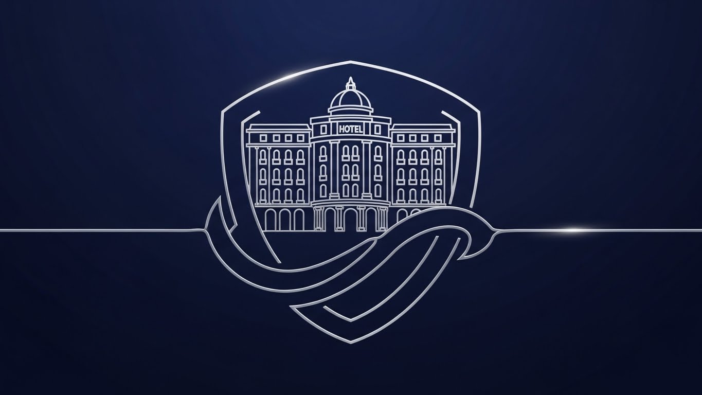
The Visual & Narrative Approach
Visualization Scenario: The concept of a "Safe Haven" for data.
Execution: A continuous, elegant metallic silver line draws itself against a deep navy blue background. It first forms the intricate outline of a grand hotel building, then seamlessly morphs into the shape of a protective shield encircling the structure. There are no flashing lights or complex codes—just a smooth, unbroken line representing the seamless security wrapping around the hotel's data.
Psychological Impact & KPI Focus
This style radiates Stability and Elegance. It addresses the fear of Data Breaches without using fear tactics or alarmist imagery. It frames security as a foundational, classy attribute of the brand. It targets Brand Trust and Reliability, appealing to traditional hoteliers who value permanence.
Strategic Implementation & Trade-offs
- Best Use Case: "Security" or "About Us" pages on the website.
- Duration: 15-20 seconds.
- Trade-off: It is Abstract. It doesn't explain how the security works (e.g., encryption standards, firewalls); it simply asserts that it exists via visual metaphor.
Companies using similar video content -
Trustwave – Trustwave Managed Security Services – Cybersecurity for hospitality.
Cloudflare – Cloudflare Security Solutions – Protects online hotel assets.
15. 3D X-Ray Visualization
BOFU | Risk Mitigation
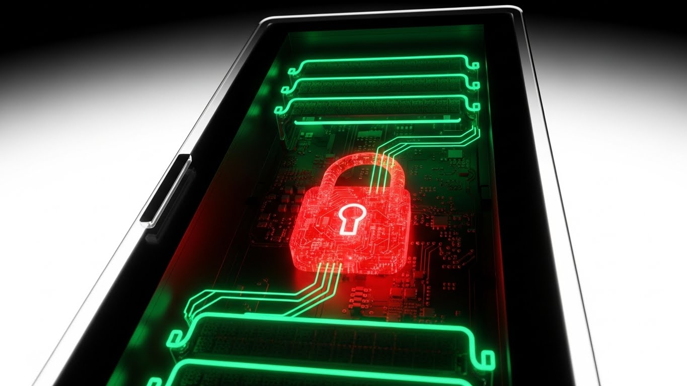
The Visual & Narrative Approach
Visualization Scenario: The "Under the Hood" audit.
Execution: We zoom into a sleek black server rack unit. The outer casing becomes semi-transparent (X-Ray view), revealing the internal architecture. Instead of standard circuit boards, we see a glowing red intricate padlock mechanism fused into the core. The background is a clean, clinical white to emphasize the hardware. This visualizes "Security by Design"—showing that protection is hardware-deep, not just a software patch.
Psychological Impact & KPI Focus
This is designed for the IT Director or Compliance Officer. It visualizes PCI Compliance and GDPR Adherence. The glowing lock provides a visceral sense of "Locked Down" safety, mitigating the risk of Cyber Liability. It answers technical due diligence questions before they are asked.
Strategic Implementation & Trade-offs
- Best Use Case: Technical Sales Decks or Security Whitepaper summaries.
- Duration: 20-30 seconds.
- Trade-off: Cold Aesthetic. It looks like a cybersecurity product, not hospitality. Use sparingly to prove technical competence, then switch back to guest-centric visuals.
Companies using similar video content -
LogicManager – LogicManager GRC Software – Manages governance, risk, and compliance.
OneTrust – OneTrust Privacy & Security – Automates privacy and compliance programs.
16. Photorealistic 3D Renders
BOFU | Economic Buyer
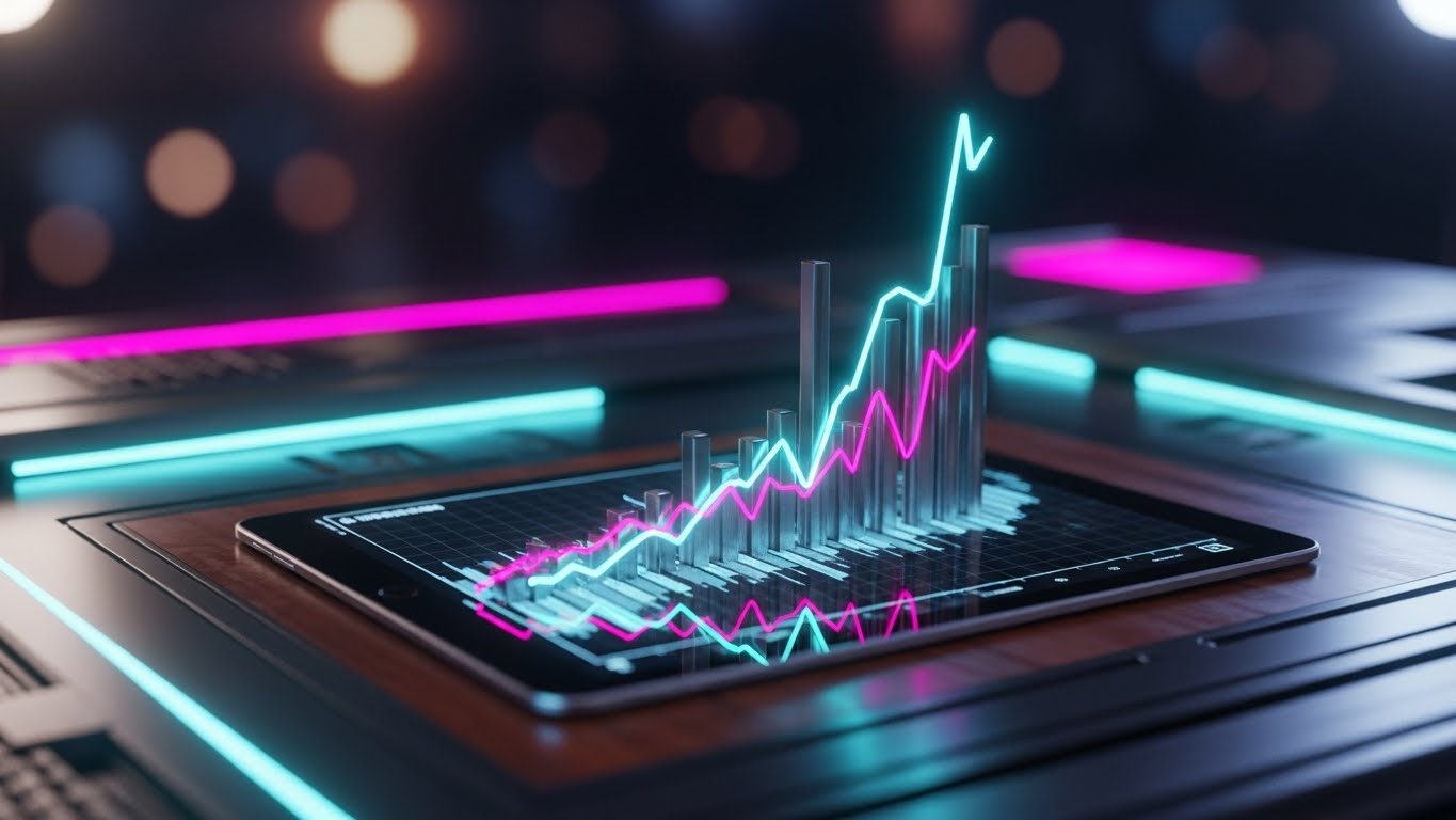
The Visual & Narrative Approach
Visualization Scenario: The "Owner's Perspective."
Execution: A close-up, photorealistic render of a rich mahogany executive desk. In the foreground, a high-end tablet displays a rising financial graph with gold fill. In the background, heavily blurred (bokeh), is the warm ambient lighting of a luxury hotel lobby. The focus is sharp on the tablet screen. It places the viewer in the seat of power, looking at the numbers that drive the business.
Psychological Impact & KPI Focus
This targets the Economic Buyer (Owner/CFO). It associates the software with Wealth and Control. It moves the conversation from "Functionality" to "Profitability." The rising graph triggers the desire for Asset Appreciation and EBITDA Growth.
Strategic Implementation & Trade-offs
- Best Use Case: Retargeting ads or Account-Based Marketing (ABM) for C-Suite decision-makers.
- Duration: Static Image or subtle Cinemagraph.
- Trade-off: High Production Cost. Achieving true photorealism is expensive. If it looks "gamey" or fake, it loses its premium authority.
Companies using similar video content -
M3 – M3 Hotel Accounting Software – Financial reporting and analysis for owners.
Sage Intacct – Sage Intacct Hospitality – Cloud financial management for hotels.
17. Hybrid: Abstract 3D AI + X-Ray
BOFU | Reducing Implementation Friction

The Visual & Narrative Approach
Visualization Scenario: The "Open API" Ecosystem.
Execution: A central, translucent sphere represents the Core PMS system. From all directions, glowing cyan plugs (representing 3rd party apps: POS, Door Locks, Spa) snap into the core with a satisfying magnetic connection. As they connect, the core pulses with light. The white void background emphasizes the cleanliness of the connections. It visualizes the end of "Integration Hell."
Psychological Impact & KPI Focus
This addresses the #1 fear of switching software: Downtime and Broken Integrations. The "Snap-in" animation visually promises Seamless Interoperability. It reassures the buyer that their existing tech stack will survive the migration. It targets Time to Value and System Uptime.
Strategic Implementation & Trade-offs
- Best Use Case: The "Integrations" page of your website or technical webinars.
- Duration: 15-20 seconds (Loopable).
- Trade-off: Highly Conceptual. It creates a feeling of ease but doesn't show the actual API documentation or configuration screens needed by developers.
Companies using similar video content -
Apaleo – Apaleo Open PMS – API-first platform for seamless integrations.
Impala – Impala Hotel API – Connects hotel systems with a single API.
18. Lifestyle Stock with UI Overlay
BOFU | Objection Handling
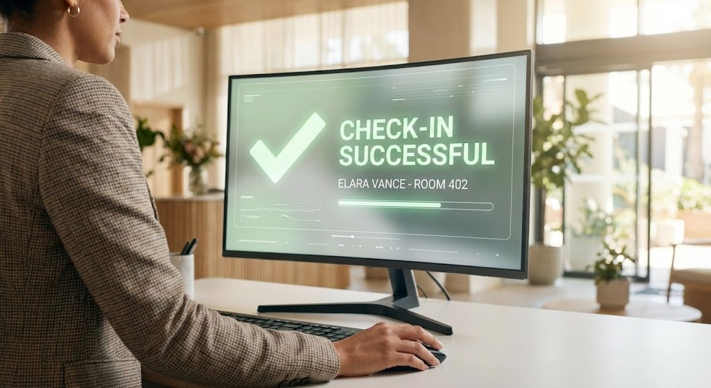
The Visual & Narrative Approach
Visualization Scenario: The "Hybrid Guest Journey."
Execution: An over-the-shoulder shot of a professional receptionist. We see natural skin tones and a blazer, with her hand resting on a mouse. On the monitor, a holographic, abstract UI overlay glows in soft green, indicating a successful "Check-In" process. It blends the warmth of human service with the precision of digital confirmation.
Psychological Impact & KPI Focus
This reassures the Front Office Manager. It visually proves that the technology Supports rather than Replaces the human element. The green "Success" message provides Positive Reinforcement, lowering the anxiety of "System Crashes" during check-in. It targets Guest Satisfaction Scores (GSS) and Check-In Efficiency.
Strategic Implementation & Trade-offs
- Best Use Case: Retargeting ads addressing "Ease of Use" objections.
- Duration: 15 seconds.
- Trade-off: Generic Risk. Over-the-shoulder shots are common. The holographic UI must look distinct and branded to avoid looking like a generic stock photo.
Companies using similar video content -
Clock PMS+ – Clock PMS+ – Streamlines front office operations.
Hotelogix – Hotelogix PMS – Cloud PMS for efficient front desk.
19. Split Screen: Optimized Reality and UI
BOFU | Functional Buyer
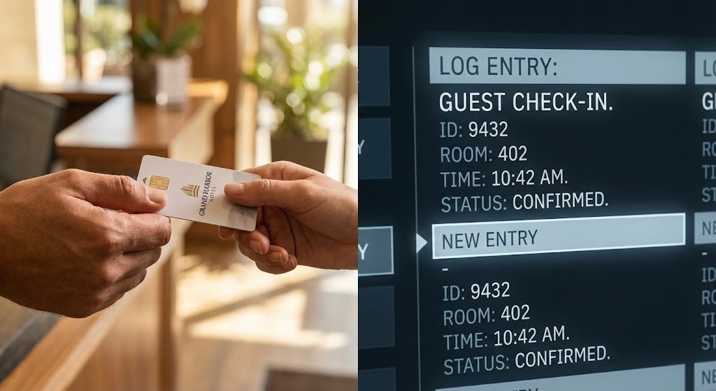
The Visual & Narrative Approach
Visualization Scenario: Cause and Effect.
Execution: A precise split-screen composition. Left: A realistic, warm-toned close-up of a hand handing a physical key card to a guest. Right: A cool-toned, clean UI log instantly updating: "Log Entry: Guest Check-In." The contrast highlights the bridge between the physical guest interaction and the digital record.
Psychological Impact & KPI Focus
This creates a sense of Total Visibility. It proves to the Operations Director that nothing happens in the hotel without being captured in the system. It targets Audit Accuracy and Operational Transparency, satisfying the need for control over the physical environment.
Strategic Implementation & Trade-offs
- Best Use Case: Detailed product demos or "Audit/Security" feature breakdowns.
- Duration: 10-15 seconds per sequence.
- Trade-off: Requires Tight Editing. The timing between the physical action and digital update must be perfect to convey "Real-Time" capability.
Companies using similar video content -
Stayntouch – Stayntouch PMS – Real-time operational insights.
Maestro PMS – Maestro PMS – Comprehensive audit and reporting.
20. AI generated mixed media video
BOFU | Sales Cycle Acceleration
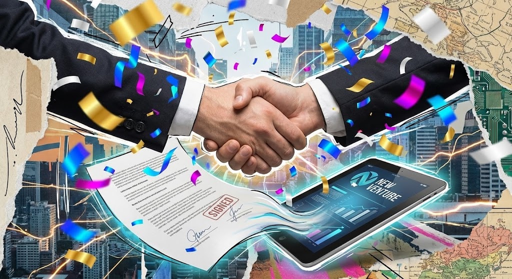
The Visual & Narrative Approach
Visualization Scenario: The "Signed Deal" dopamine hit.
Execution: A dynamic, collage-style visual bursting with energy. We see a realistic handshake cutout layered over a digital background. Gold and cyan digital confetti explodes as a document morphs into a glowing tablet displaying "New Venture." It visualizes the excitement of starting a new partnership, framing the software purchase not as a "cost" but as a "victory."
Psychological Impact & KPI Focus
This targets the Emotional Closure of the deal. It reframes the signing of the contract as the beginning of success. It leverages the Peak-End Rule, ensuring the sales process ends on a high, celebratory note. It targets Conversion Rate and Customer Sentiment.
Strategic Implementation & Trade-offs
- Best Use Case: The "Thank You" video sent immediately after a contract is signed, or in the final "Proposal" email.
- Duration: 10-15 seconds.
- Trade-off: Tone Sensitivity. It is overtly salesy. It must be used only when the relationship is warm and the deal is imminent; otherwise, it may feel presumptuous.
Companies using similar video content -
Salesforce – Salesforce for Hospitality – CRM for managing customer relationships.
HubSpot – HubSpot CRM – Sales and marketing platform for growth.
21. 2D Character-Driven Story**
Onboarding | Self-Serve Onboarding
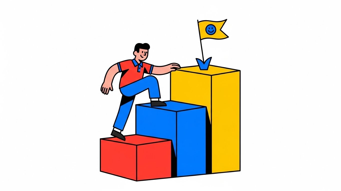
The Visual & Narrative Approach
Visualization Scenario: The "First Win." A new Front Desk agent feeling intimidated by the new software interface.
Execution: A friendly, stylized 2D character (the user avatar) wearing a casual polo shirt faces a set of three oversized, vibrant block steps (Red, Blue, Yellow). As the user completes setup tasks, the character physically climbs the steps with a bouncy, energetic animation. Upon reaching the top, they plant a flag with a smiley face. The background is a clean white to keep the focus on the journey. It gamifies the mundane process of "Profile Setup," transforming it into a level to be beaten.
Psychological Impact & KPI Focus
This leverages Gamification Psychology to reduce Time-to-Competency. By abstracting complex configuration into simple "Steps," it lowers Cognitive Friction. The "Flag Plant" triggers a dopamine hit, encouraging the user to continue. It targets Onboarding Completion Rates and User Activation.
Strategic Implementation & Trade-offs
- Best Use Case: "Welcome" screens inside the PMS or LMS (Learning Management System) modules.
- Duration: 10-15 seconds (Loopable).
- Trade-off: Tone Sensitivity. It creates a very casual, "tech-lite" vibe. It may feel too juvenile for ultra-luxury brands that prefer formal, photographic training materials.
Companies using similar video content -
Typsy – Typsy Hospitality Training – Online learning for hotel staff.
Flow Hospitality Training – Flow Hospitality Training – E-learning for hotel employees.
22. 2D Graphics Over Live Action
Onboarding | Accelerating TTV
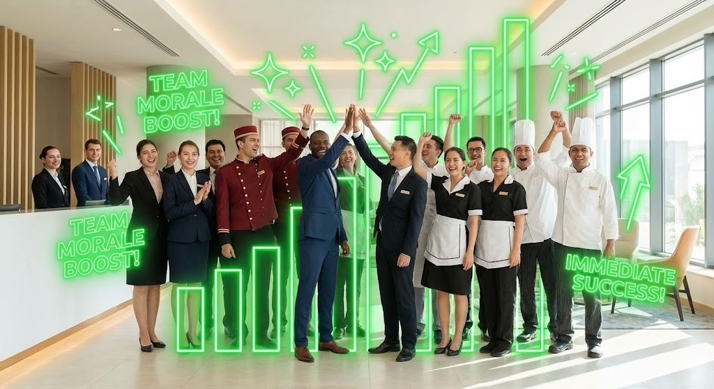
The Visual & Narrative Approach
Visualization Scenario: Validating the purchase decision for the entire team.
Execution: A wide photographic shot captures a diverse hotel team (Chefs, Doormen, Receptionists) high-fiving in a sunlit lobby. Superimposed over this human connection are rising neon green graphical bars and sparkling "Level Up" icons. The graphics track the team's energy, visually linking the software deployment to a boost in staff morale and operational success.
Psychological Impact & KPI Focus
This creates Social Proof and Internal Buy-In. It tells the staff, "This software is here to help you win," not to police you. The neon graphics act as a "Visual Hype Man." It targets User Adoption Rates and Employee Net Promoter Score (eNPS), aiming to reduce the friction often caused by changing systems.
Strategic Implementation & Trade-offs
- Best Use Case: Kick-off meeting videos or internal newsletters announcing the software launch.
- Duration: 30-45 seconds.
- Trade-off: Stock Footage Dependency. Finding stock footage that perfectly matches your specific hotel tier (e.g., uniform style, lobby design) can be difficult. Mismatched footage breaks immersion.
Companies using similar video content -
Connecteam – Connecteam Employee App – Improves team communication and engagement.
7shifts – 7shifts Staff Scheduling – Optimizes staff scheduling and communication.
23. Macro UI Micro-Interactions
Onboarding | Trial Activation
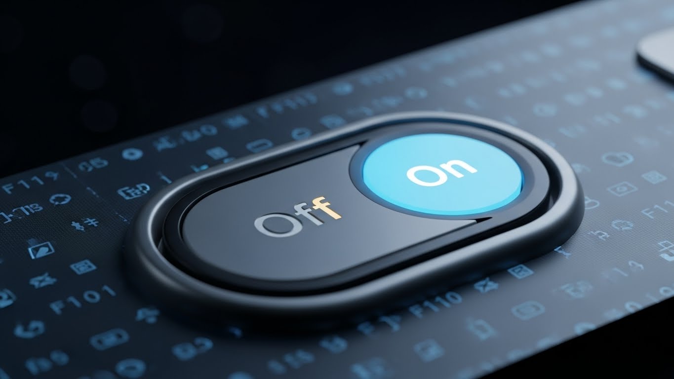
The Visual & Narrative Approach
Visualization Scenario: Overcoming the fear of "Breaking the System."
Execution: An extreme close-up (Macro) of a single UI element: a toggle switch. We see the tactile texture of the screen pixels. The switch slides smoothly from a dull grey "Off" to a vibrant, glowing neon green "On". The background is a deep, cinematic black, isolating this single action. It visualizes the simplicity of power: one click changes everything.
Psychological Impact & KPI Focus
This targets Cognitive Ease. It reduces "Dashboard Overwhelm" by focusing on a single micro-interaction. It builds User Confidence, showing that powerful features (like "Auto-Assign Rooms") are just a safe, simple toggle away. It targets Feature Activation Rate.
Strategic Implementation & Trade-offs
- Best Use Case: In-app tooltips (GIFs) hovering over complex settings or specific "New Feature" email announcements.
- Duration: 3-5 seconds (Loopable).
- Trade-off: Context Blindness. It shows the action but not the result. The viewer sees the switch turn on, but not the screen that follows. It must be paired with explanatory text.
Companies using similar video content -
Little Hotelier – Little Hotelier PMS – Simplifies small hotel operations.
eZee FrontDesk – eZee FrontDesk PMS – Manages reservations and guest services.
24. Abstract 2D Motion Graphics
Retention | Knowledge Base

The Visual & Narrative Approach
Visualization Scenario: The "Moment of Need." A user is stuck and frustrated.
Execution: A central "Search Bar" emits soft, gradient beams of light in purple and orange. Abstract "Question Mark" shapes float into the light and instantly transform into glowing Lightbulb Icons. The background is a calming deep violet. It visualizes the Help Center not as a library of boring text, but as a magical engine of answers.
Psychological Impact & KPI Focus
This lowers Frustration and Support Anxiety. The transformation from Question to Lightbulb is a universal metaphor for "Insight." It encourages users to self-serve rather than calling support. It targets Support Ticket Deflection and Customer Effort Score (CES).
Strategic Implementation & Trade-offs
- Best Use Case: Loading screens for the Knowledge Base or "Help" widget headers.
- Duration: 10-15 seconds (Loopable).
- Trade-off: Zero Technical Detail. It doesn't show how to search or what the results look like. It is purely an emotional reassurance tool.
Companies using similar video content -
Zendesk – Zendesk Guide – Knowledge base and self-service portal.
Freshdesk – Freshdesk Support Desk – Customer support and knowledge management.
25. 3D Parallax UI Presentation
Retention | Reducing Churn
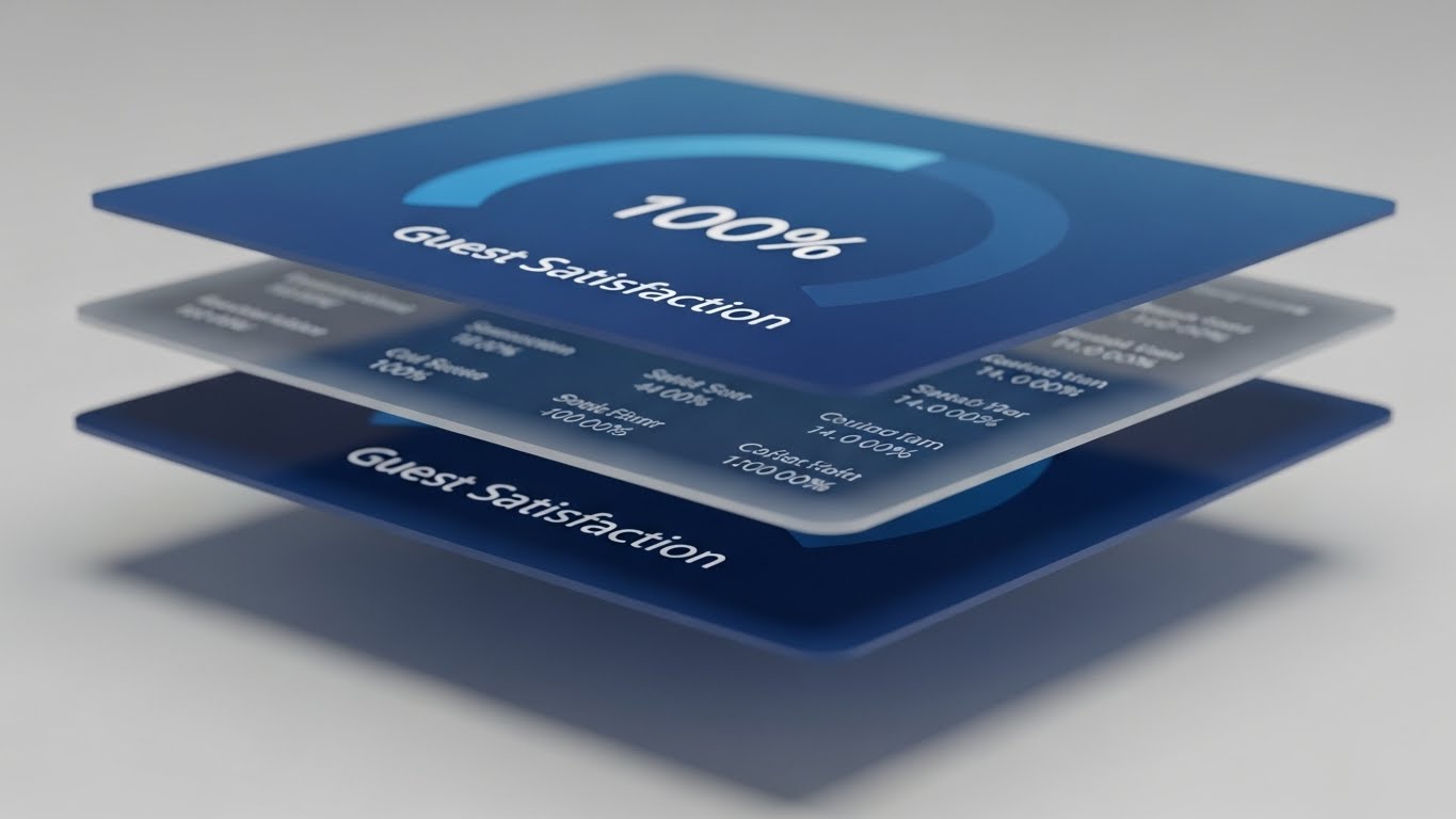
The Visual & Narrative Approach
Visualization Scenario: Proving value during a Quarterly Business Review (QBR).
Execution: Three distinct layers of UI screens float in a 3D space with a parallax effect. The hero layer in the front displays a "Guest Satisfaction" gauge at 100% in deep sea blue. Background layers show blurred streams of raw data. The camera tilts, revealing the separation and depth. It visualizes that your software isn't just a flat surface; it has deep, foundational data integrity supporting the top-line metrics.
Psychological Impact & KPI Focus
This projects Sophistication and Transparency. The "Depth" implies that there is substance behind the numbers. It appeals to the General Manager's need for a comprehensive overview. It targets Retention Rate by visually reinforcing the solidity of the partnership.
Strategic Implementation & Trade-offs
- Best Use Case: Background visuals for Keynote presentations or "Year in Review" videos.
- Duration: 20-30 seconds (Loopable).
- Trade-off: Legibility. The parallax movement and blurring of background layers mean detailed data cannot be read. It is for impression, not inspection.
Companies using similar video content -
Tableau – Tableau for Hospitality – Visual analytics for deep insights.
Looker – Looker Business Intelligence – Data exploration and reporting.
26. Futuristic Neon/Dark Mode
Expansion | Deep Feature Adoption
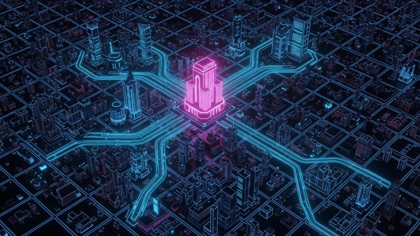
The Visual & Narrative Approach
Visualization Scenario: Scaling from one hotel to a chain.
Execution: A "Tron-like" top-down view of a dark city grid. The primary hotel is a glowing neon pink structure. From it, data lines race out along the streets to connect with other buildings in neon blue. It visually represents the "Multi-Property" management module, showing the hotel group as a conquered, connected network.
Psychological Impact & KPI Focus
This appeals to the Empire Builder persona (Hotel Group CEOs). It visualizes Scale and Centralization. It moves the conversation from "Managing a Hotel" to "Dominating a Market." It targets Expansion Revenue and Cross-Sell of enterprise features.
Strategic Implementation & Trade-offs
- Best Use Case: Product launches for "Group Operations" or "Cluster Management" features.
- Duration: 15-20 seconds.
- Trade-off: Aggressive Aesthetic. The dark, neon style is very "tech-heavy." It may alienate traditionalists who prefer warmth and hospitality imagery over "Cyberpunk" vibes.
Companies using similar video content -
Guestline – Guestline PMS – Comprehensive solutions for luxury properties.
Revinate – Revinate Marketing & CRM – Premium guest engagement and marketing.
27. Dark Mode UI Showcase
Expansion | Driving Upsell
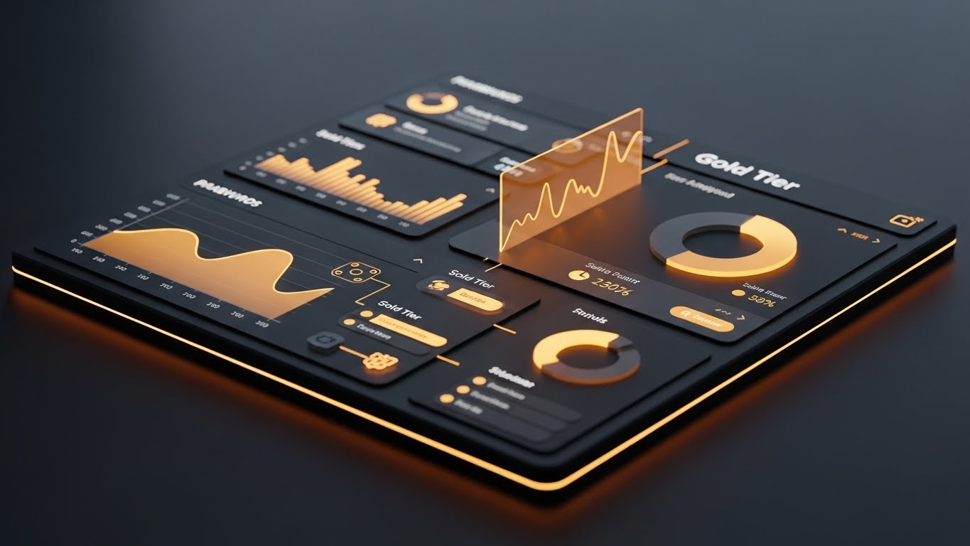
The Visual & Narrative Approach
Visualization Scenario: The allure of the "Pro" version.
Execution: A sleek, angled perspective of a dashboard in Dark Mode. The background is charcoal grey, but the data—charts, graphs, and KPIs—is rendered in glowing amber and gold. It looks expensive. It looks exclusive. It creates a visual distinction between the "Standard" (White/Blue) interface and this "Premium" (Dark/Gold) tier.
Psychological Impact & KPI Focus
This leverages the Exclusivity Heuristic. Gold is the universal code for "Premium." It triggers a desire for status and better tools. It targets Average Revenue Per User (ARPU) by making the upgrade look like a luxury operational necessity.
Strategic Implementation & Trade-offs
- Best Use Case: "Upgrade Now" paywalls or feature teaser videos inside the software.
- Duration: 10-15 seconds.
- Trade-off: Vaporware Risk. If the actual software doesn't have a high-contrast dark mode that looks this good, users will feel deceived. The render must be achievable in the actual UI.
Companies using similar video content -
IDeaS Revenue Solutions – IDeaS G3 RMS – Advanced revenue management features.
Duetto – GameChanger RMS – Sophisticated pricing and demand tools.
28. Low-Poly 3D Modeling
Expansion | Driving Referrals

The Visual & Narrative Approach
Visualization Scenario: The power of community and network effects.
Execution: A stylized, geometric globe made of low-poly facets in earth tones. White network lines connect continents. Small, playful low-poly envelopes travel along these lines, representing referrals flying between hoteliers. It’s light, global, and friendly.
Psychological Impact & KPI Focus
This frames the referral process as Altruistic and Global. It removes the transactional "sales" feel and replaces it with a "community building" vibe. It targets Net Promoter Score (NPS) and Referral Conversion Rate, encouraging users to "invite a friend" to the network.
Strategic Implementation & Trade-offs
- Best Use Case: "Refer a Friend" email campaigns or community newsletter headers.
- Duration: 15-20 seconds (Loopable).
- Trade-off: Generic visuals. Low-poly globes are common in tech. To make it stand out, the animation of the "envelopes" (or hotel icons) needs to be very characterful and branded.
Companies using similar video content -
ReferralCandy – ReferralCandy – Manages customer referral programs.
Ambassador – Ambassador Referral Marketing – Automates referral marketing.
29. Generative AI Realistic Character Video
Expansion | Thought Leadership
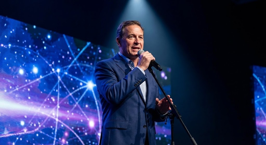
The Visual & Narrative Approach
Visualization Scenario: Establishing authority in the industry.
Execution: A photorealistic AI-generated video of a confident CEO figure (male, 50s) in a professional blue suit. He stands on a stage with dramatic spotlighting, speaking passionately. Behind him, a blurred screen shows abstract constellations, implying "Future Trends." It visualizes the brand not just as a software vendor, but as a Thought Leader.
Psychological Impact & KPI Focus
This builds Authority and Trust. Humans connect with faces. Seeing a leader (even a representative one) articulate a vision creates a personal connection. It targets Brand Sentiment and Share of Voice, positioning the company as an industry guide.
Strategic Implementation & Trade-offs
- Best Use Case: LinkedIn feeds discussing "The Future of AI in Hotels" or "2026 Hospitality Trends."
- Duration: 30-60 seconds (with captions).
- Trade-off: Uncanny Valley. If the AI lip-sync or movement is slightly off, it creates distrust. It requires high-quality generation tools (like Sora or Runway Gen-3) to be effective.
Companies using similar video content -
Accenture – Accenture Hospitality Consulting – Provides strategic industry insights.
Deloitte – Deloitte Hospitality Services – Offers industry analysis and future outlook.
30. Holographic UI over 3D Render
Expansion | Proactive Support
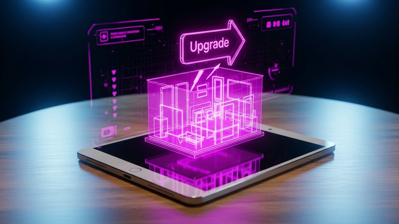
The Visual & Narrative Approach
Visualization Scenario: Showcasing "What's Next" (Innovation).
Execution: A realistic 3D render of a tablet on a wooden table. Projecting upwards from the screen is a semi-transparent, holographic blue 3D model of a hotel room. An "Upgrade" arrow icon bounces above it. The hologram creates a sense of "Breaking the Screen," suggesting that the software is transcending traditional 2D boundaries.
Psychological Impact & KPI Focus
This triggers Awe and Curiosity. It signals that the company is on the bleeding edge of tech (AR/VR). It targets Customer Lifetime Value (CLTV) by promising that the software will keep the hotelier ahead of the curve for years to come.
Strategic Implementation & Trade-offs
- Best Use Case: Teaser videos for major version updates (e.g., "Version 5.0") or trade show booth loops.
- Duration: 15-20 seconds.
- Trade-off: Over-Promising. If the actual feature isn't AR-enabled, this metaphor must be clearly framed as "Future Vision" to avoid misleading customers about current capabilities.
Strategic Knowledge Base: The Visual Operations Doctrine
To conclude this guide, we must synthesize these 30 styles into a cohesive business framework. A library of "cool videos" is useless without an implementation strategy. Below is the Advids Visual Operations Doctrine—a 3-segment framework designed to help Hospitality SaaS leaders transform these visual assets into tangible ROI, reduced churn, and market dominance.
STRATEGIC ALIGNMENT & VISUAL ARCHITECTURE
The "Pre-Production" Strategy. Defining the Why and Who before the How.
- The Cognitive Load Audit: Before commissioning a single video, audit your user roles. A Front Desk Agent handling a check-in every 2 minutes cannot digest a 60-second Cinematic AI video. They need Minimalist Vector (Style 1) or Macro UI (Style 23). Map the complexity of the visual style to the stress level of the viewer.
- Role-Based Visual Mapping: Differentiate your visual language. Use "High-Gloss" (Styles 4, 16) for the General Manager and Owners who buy on value. Use "High-Contrast/Simple" (Styles 2, 10, 21) for the operational staff who use the tool on utility.
- The "Glanceability" Standard: In a busy hotel lobby, information must be consumed in seconds. Adopt a "Glanceability Standard" for all support content—if the core message isn't understood in 5 seconds (without audio), the visual has failed (Refer to Style 5, Kinetic Type).
- Brand Voice Consistency: Your marketing videos (TOFU) often look nothing like your training videos (BOFU). This creates a "Brand Gap." Use a unifying element—like the Line Art from Style 14 or the Neon Palette from Style 26—to thread a consistent visual identity across the entire lifecycle.
- The Advids Strategic Audit: This is where a partner like Advids becomes critical. We don't just "make videos"; we help you define this "Visual Operating System," ensuring that every asset, from the Instagram Reel to the QBR presentation, speaks a unified strategic language.
- Standardization vs. Customization: For generic features (e.g., "Check-in"), use high-quality standardized assets to save budget. Save your bespoke, high-cost visualization (Style 3, 3D AI) for your unique differentiators (e.g., your proprietary AI algorithm).
- The Cross-Departmental Bridge: Sales sells a dream; Support fixes reality. Use Hybrid Styles (Style 17) to align these teams. When Sales uses accurate UI visuals (Style 11) instead of fake mockups, Support receives fewer tickets about "missing features."
- Legacy System Integration: The biggest fear is migration. Use Abstract Motion (Style 2) to visualize the "Bridge" between their old, dusty server and your new cloud system. Make the scary transition look like a fluid morph.
- Accessibility in Hospitality: Hotel staff are global and multilingual. Visuals must transcend language. Isometric Motion (Style 9) showing flow is universally understood, whereas text-heavy Kinetic Type (Style 5) requires localization.
- The Mobile-First Mandate: Housekeepers and Maintenance staff are "Deskless Workers." All training visuals (Style 10, 21) must be optimized for vertical, mobile consumption on personal devices, not just desktop monitors.
OPERATIONAL ADOPTION & IMPLEMENTATION
The "Deployment" Phase. Embedding visuals into the workflow.
- Overcoming "Big Brother" Anxiety: Staff often fear that performance software is just surveillance. Use Team Celebration visuals (Style 22) to frame data collection as "Empowerment" and "Recognition," not monitoring.
- The Micro-Learning Shift: Kill the PDF manual. Replace it with a library of 15-second Macro UI clips (Style 23) embedded directly in the dashboard. If a user hovers over "Night Audit," a looped video should show them how to do it instantly.
- Just-in-Time Support: Embed Abstract Support visuals (Style 24) in your 404 pages or loading screens. Turn moments of friction into moments of brand reinforcement.
- Gamification of Training: Use Character-Driven Story (Style 21) elements in your LMS (Learning Management System). Visual progress bars and "Level Up" animations increase staff certification completion rates by turning training into a game.
- Reducing Support Ticket Volume: There is a direct correlation between the quality of your Clean UI videos (Style 11) and the volume of "How-To" tickets. Invest in a "Video Knowledge Base" to deflect Tier-1 support calls.
- Remote Onboarding: For hotel chains expanding rapidly, you cannot send trainers to every site. Use 3D Parallax (Style 25) and Screen Recordings to create a "Virtual Academy" that scales infinitely without travel costs.
- Standard Operating Procedures (SOPs): Hotels run on SOPs. Transform text-heavy SOP binders into Isometric Workflow animations (Style 9) that visually demonstrate the flow of guests and data.
- Feedback Loops: Use interactive video overlays. At the end of a Feature Montage (Style 12), add a clickable "Did this help?" button. Use this data to refine your visual assets.
- Scalable Localization: When expanding to new markets (e.g., APAC, LATAM), simple 2D Vector styles (Style 1) are easier to localize (swap text layers) than complex Live Action video. Plan your assets for global scale from Day 1.
- Leadership Communication: When pitching a price increase or a major version update to the Hotel Group CEO, do not send an email. Send a Generative AI Vision video (Style 29) that sells the future value, mitigating pushback.
MEASURING IMPACT & FUTURE-PROOFING
The "ROI" Phase. Measuring success and looking ahead.
- Beyond "Views": In B2B, a "View" is a vanity metric. Measure Time-to-Competency. Did the Macro UI video (Style 23) reduce the time it takes a new user to complete their first booking? That is the real KPI.
- The "Idle Time" Metric: Monitor how long users spend "pausing" inside the software. High idle time often means confusion. Deploy Abstract Motion (Style 2) tooltips in these high-friction zones to reduce idle time.
- Compliance Velocity: When PCI or GDPR regulations change, speed is safety. Use 3D X-Ray visuals (Style 15) to rapidly educate IT Directors on how your patch ensures compliance, accelerating their sign-off.
- Retention and Churn: Use 3D Parallax visuals (Style 25) in your QBRs to visually stack up the value delivered. Clients who see the depth of their data usage are statistically less likely to churn.
- The AI Visual Frontier: Generative AI is changing content creation. Prepare for "Personalized Video" where the Character (Style 21) automatically wears the hotel's uniform colors. This level of personalization drives deep affinity.
- Scalability of Assets: Build a "Modular Asset Library." Don't bake text into your 3D renders. Keep them separate so you can update the UI screen (Style 30) without re-rendering the entire holographic scene.
- The Advids Partnership: This is where we thrive. As your platform evolves, your visual library must evolve. Advids acts as the custodian of your visual assets, ensuring that when you launch Version 4.0, your entire video ecosystem is updated seamlessly.
- Benchmarking Success: Compare your visual engagement against industry benchmarks. If your Kinetic Type reels (Style 5) are seeing 50% drop-off at 3 seconds, your hook is too slow. Iterate constantly.
- The ROI of Safety: For maintenance modules, effective Line Art animations (Style 14) that clarify safety protocols can directly reduce workplace accidents and insurance liability for the hotel.
- Final Call to Innovation: Stop treating video as "Marketing Content." Treat it as User Infrastructure. In the AI era, the interface is the video. The brands that win will be those that use these 30 styles not just to sell software, but to make the complex reality of hospitality feel simple, human, and magical.
Companies using similar video content -
Matterport – Matterport Digital Twins – Creates 3D digital twins of properties.
Varjo – Varjo XR Headsets – High-end VR/XR for professional use.
Author & Editor Bio


