
Introduction: Visualizing the High-Yield Guest Journey
The hospitality industry is currently navigating a pivotal shift from "room selling" to "experience retailing." As hotels strive to reclaim ownership of the guest relationship, the digital booking experience has become the new front desk. The opportunity for growth is quantifiable and significant: data reveals that hotel websites generated 60% more revenue per booking than OTAs in 2024. This statistic underscores a critical reality—when a guest lands on your direct channel, the potential for upselling, ancillary revenue, and brand loyalty is vastly superior to third-party platforms.
However, capturing this value requires more than just a functional booking engine; it requires a compelling visual narrative that bridges the gap between complex backend inventory management and a seamless, emotional guest experience. Hoteliers are recognizing this imperative, with reports indicating they expect to increase their investment in technology by an average of 16% over the coming 12 months. The challenge lies in communicating the value of these sophisticated tools to a decision-making audience that craves both operational stability and "sleep-at-night" reliability.
This guide provides a comprehensive visual framework for Booking Engine SaaS platforms. We have curated 30 distinct video styles, analyzing how each aesthetic—from high-fidelity UI demonstrations to abstract motion graphics—solves specific communication challenges. These examples are designed to help marketing teams and product leaders articulate the power of their software, reduce the cognitive load for prospective buyers, and ultimately, turn technical features into tangible business advantages.
1. Generative AI cinematic video
TOFU | Brand Awareness
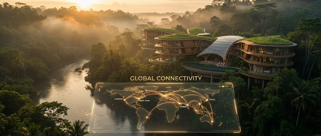
The Visualization Scenario
This style leverages high-production-value imagery to establish a sense of awe and possibility. The scene opens with a breathtaking, wide-angle shot of a futuristic, eco-friendly luxury resort nestled in a lush tropical valley at golden hour. The architecture is organic, seamlessly blending glass and nature. In the foreground, a sleek, transparent digital interface floats in mid-air, displaying a "Global Connectivity" map with glowing gold lines reaching out to cities worldwide. The camera movement is slow and sweeping, mimicking a high-end travel documentary.
Psychological Impact & KPI Focus
- Niche Psychology: Hotel owners often view their properties as their legacy. This style resonates by mirroring the premium quality of the hotels they own or aspire to manage. It elevates the software from a "utility" to a "visionary partner."
- Operational Impact: By visualizing the Global Connectivity map, the video abstractly addresses the challenge of distribution. It reassures the viewer that the system is robust enough to handle global traffic without localized failures.
Strategic Implementation & Trade-offs
- Optimal Duration: 60-90 seconds.
- Trade-off: This is a "Mood Setter." It is excellent for building brand prestige and broad awareness but lacks the specificity to explain how the inventory is managed. It should be used to open a keynote or headline a website.
Companies using similar video content -
Lighthouse – Connect AI – AI-driven market intelligence for future forecasting.
FLYR Hospitality – Revenue Operating System – AI-powered revenue optimization for growth.
Amadeus Hospitality – Central Reservations System – Global distribution and future-proof travel tech.
2. Minimalist Flat 2D Vector
TOFU | Category Creation
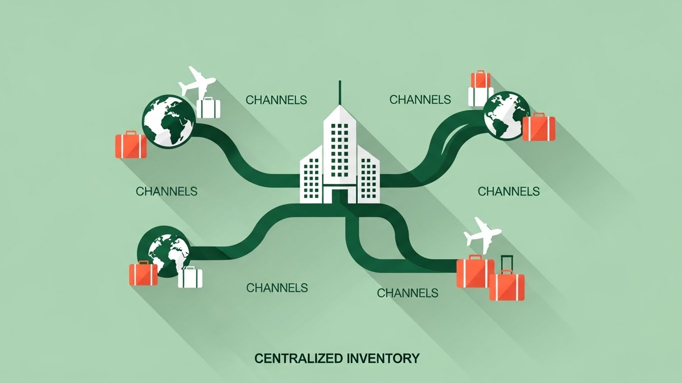
The Visualization Scenario
This style strips away all noise to focus on structural clarity. The composition centers on a stylized, geometric hotel building, rendered in deep forest green and crisp white against a calming pale mint green background. Smooth, flowing lines connect the hotel to various icons representing "Channels" (globes, airplanes, suitcases), all rendered in a flat, vector art style. Hard diagonal shadows create depth without the clutter of gradients. The motion is rhythmic; as a "booking" occurs on a channel, a pulse travels down the line to the central hotel, visually confirming the update.
Psychological Impact & KPI Focus
- Niche Psychology: The "mint green" palette is intentionally calming. Revenue managers are often stressed by the chaos of rate parity and overbookings. This visual style subconsciously promises order, organization, and a "clean slate."
- Operational Impact: This style effectively visualizes Centralized Inventory. It creates a mental model of the software as the "Brain" or "Hub" of the operation, reducing the fear of fragmented data across different OTAs.
Strategic Implementation & Trade-offs
- Optimal Duration: 30-45 seconds (Loopable).
- Trade-off: While excellent for explaining concepts (like 2-way XML connectivity), it can feel "low budget" if not animated with fluid precision. It risks being perceived as generic if the iconography isn't custom to the hospitality domain.
Companies using similar video content -
SiteMinder – Channel Manager – Centralized distribution for simplified control.
Cloudbeds – Platform – All-in-one hub for property management.
Beds24 – Channel Manager – Streamlined multi-channel distribution.
3. Abstract 2D flat vector organic...
TOFU | Market Education
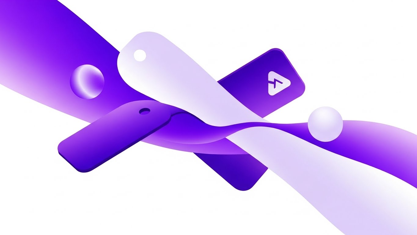
The Visualization Scenario
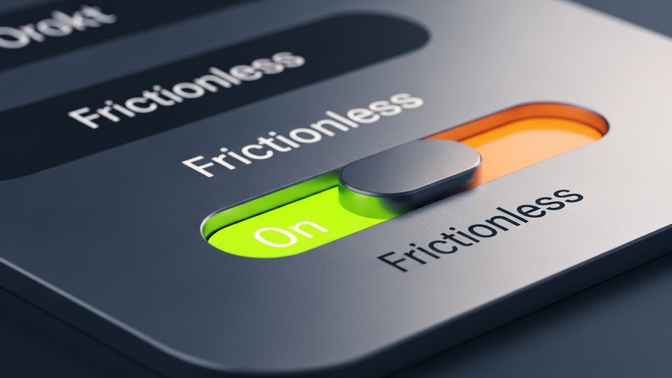
Moving beyond static icons, this style uses continuous, fluid motion to represent the intangible nature of software integration. Abstract shapes—resembling hotel key cards, luggage tags, and data packets—merge and morph into one another with a high-gloss, liquid finish. The palette uses sophisticated gradients of royal purple and electric lavender. The lighting effects simulate surface reflections, giving the flat vectors a tactile, premium feel. The animation never stops; it flows effortlessly, symbolizing an "always-on" system.
Psychological Impact & KPI Focus
- Niche Psychology: Friction is the enemy of hotel operations. This style visualizes the absence of friction. It appeals to the desire for a "seamless" life where technology works invisibly in the background.
- Operational Impact: It addresses API Integration fears. Instead of showing messy cables or server racks, it shows elegant fluid dynamics, suggesting that the Booking Engine integrates with the Property Management System (PMS) without resistance.
Strategic Implementation & Trade-offs
- Optimal Duration: 15-20 seconds (Background Hero Video).
- Trade-off: It is highly abstract. It sets a tone of "Modern Tech" but explains zero features. It works best as a visual anchor on a landing page to keep the user engaged while they read the headline.
Companies using similar video content -
Mews – PMS – Fluid integration across hotel operations.
Hotelogix – Cloud PMS – Seamless data flow for hotel management.
Exely – Management Software – Integrated platform for direct bookings.
4. Bold Kinetic Typography (Visual)
TOFU | Shaping Brand Perception
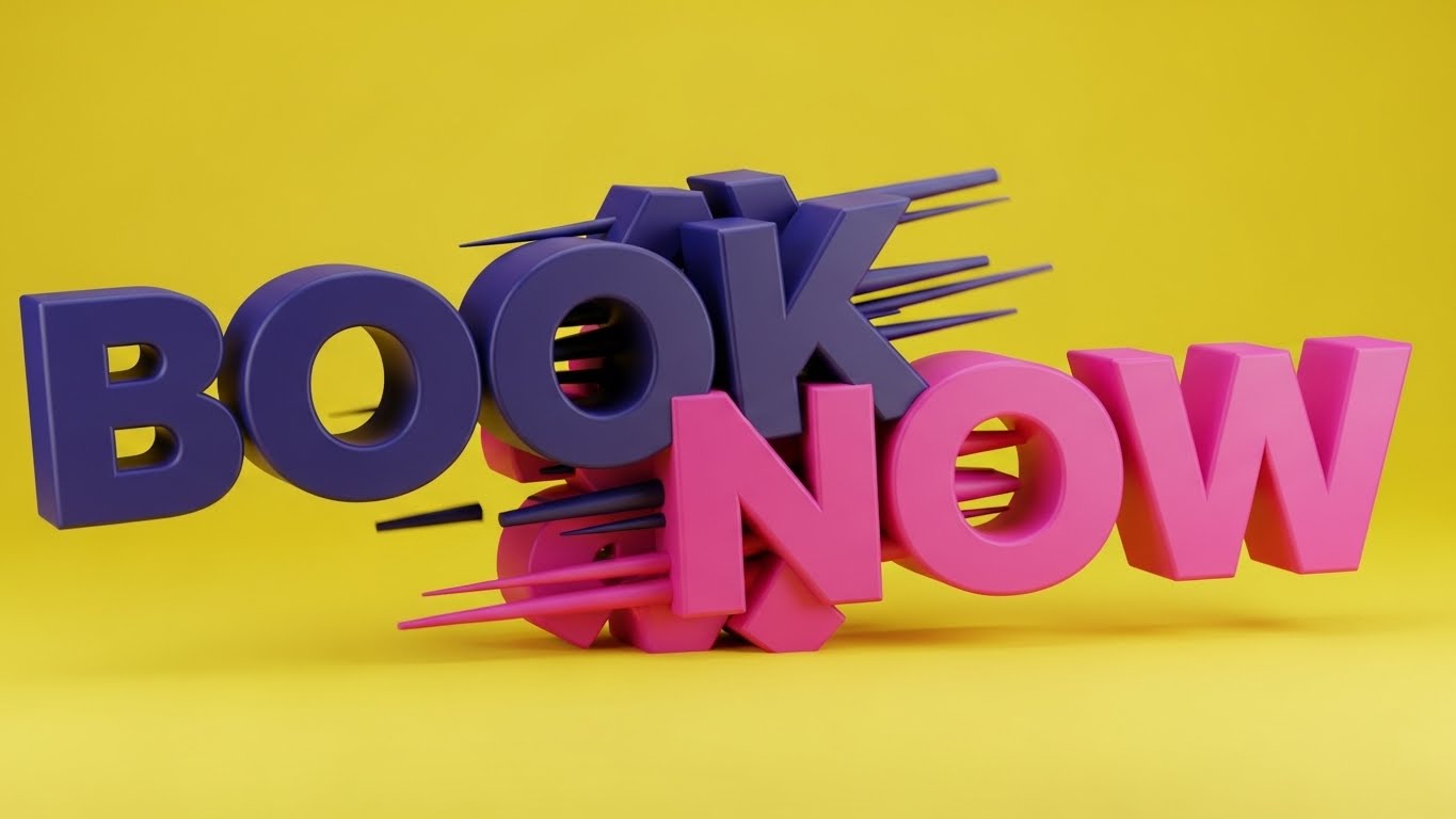
The Visualization Scenario
This style is pure energy, designed to disrupt the passive scrolling of a user. Massive, blocky geometric shapes form the abstract impression of the words "BOOK" and "NOW," colliding and fusing into a solid structure. The background is a vibrant electric lemon yellow, creating a high-contrast vibrating effect with the deep indigo and magenta letterforms. Motion blur lines accentuate the speed of the collision. There is no voiceover, just a rhythmic, percussive sound design that syncs with the text impact.
Psychological Impact & KPI Focus
- Niche Psychology: Speed is a proxy for conversion. Hoteliers know that every second of latency costs bookings. This style viscerally communicates Instant Confirmation and high-speed performance.
- Operational Impact: It targets the Conversion Rate anxiety. By emphasizing the word "NOW" and the speed of the visual assembly, it implies that the booking engine is optimized for the impulse-driven modern traveler.
Strategic Implementation & Trade-offs
- Optimal Duration: 6-10 seconds.
- Trade-off: It is aggressive. It works brilliantly as a "Wake Up" ad on social media but would be exhausting as a product explainer. It serves one purpose: to associate the brand with speed and action.
Companies using similar video content -
Hotelchamp – Booking Engine – Drives instant direct bookings and conversions.
Canary Technologies – Mobile Check-in – Speeds up guest arrival and service.
5. AI generated mixed media video
TOFU | Vertical Social Organic
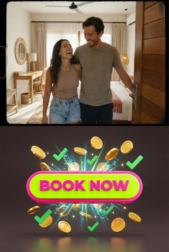
The Visualization Scenario
This style utilizes a vertical split-screen to connect the physical guest experience with the digital business result. The top half features high-energy, handheld footage of a happy couple entering a boutique hotel room—authentic, grainy, and emotional. The bottom half contrasts this with a crisp, 3D animated "Book Now" button that transforms into a shower of gold coins and green "Approved" checkmarks upon being clicked. The colors blend natural skin tones with synthetic neon lime and hot pink.
Psychological Impact & KPI Focus
- Niche Psychology: Hotel owners are often disconnected from the "moment of booking." This visual forces them to see the direct link: Happy Guest (Top) = Successful Transaction (Bottom). It validates the emotional payoff of their business.
- Operational Impact: It visualizes Revenue Capture. The "shower of coins" is a literal metaphor for the booking engine's primary job: collecting money. It reassures the viewer that the payment gateway is secure and effective.
Strategic Implementation & Trade-offs
- Optimal Duration: 15-30 seconds (TikTok/Reels/Shorts).
- Trade-off: It is highly stylized and informal. It fits perfectly on social media where "Edutainment" rules, but might seem too playful for a formal boardroom presentation.
Companies using similar video content -
RoomRaccoon – Booking Engine – Captures revenue with automated upsells.
GuestCentric – Booking Engine – Increases revenue with dynamic pricing.
6. Isometric 2D Motion Design
TOFU | Skippable Pre-Roll Ad
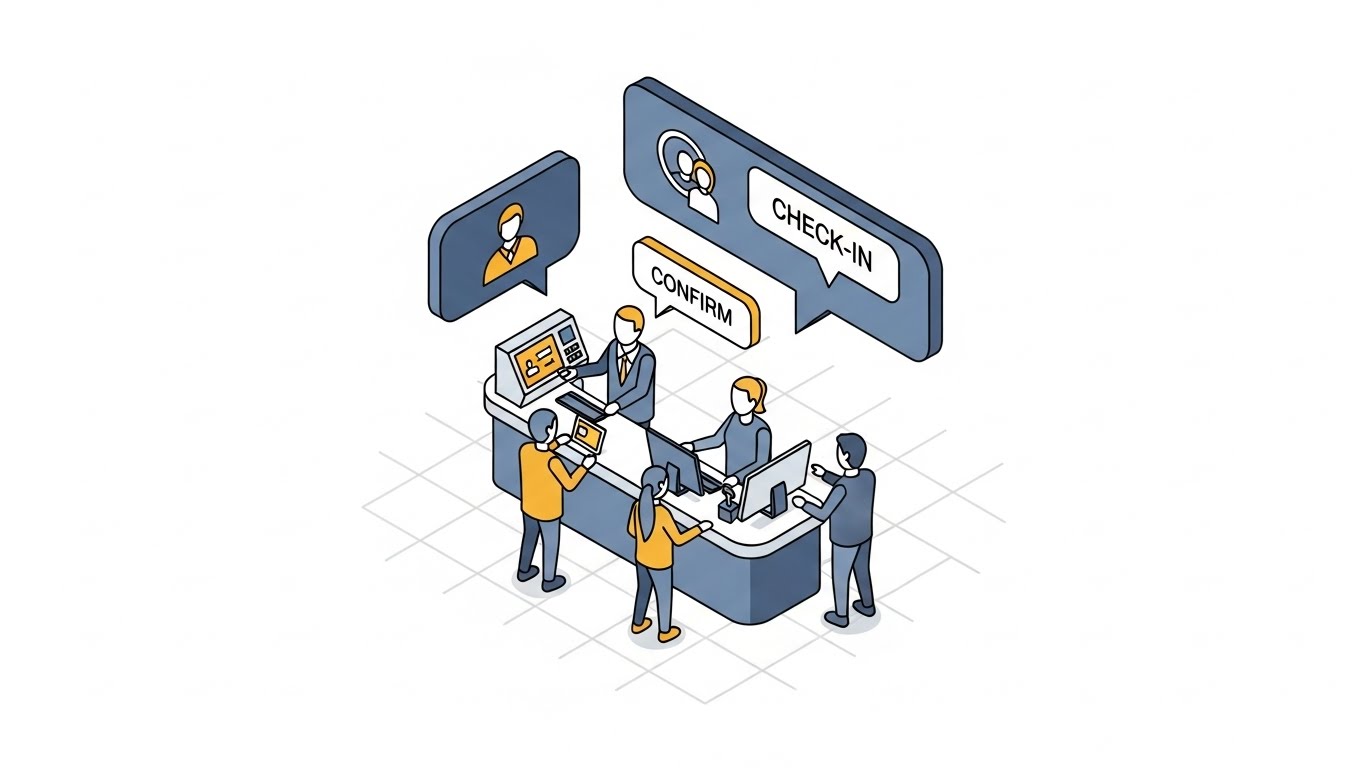
The Visualization Scenario
The isometric perspective offers a "God-eye view" of operations, perfect for demonstrating control. The scene is set on a clean white grid, featuring a miniature, stylized hotel front desk. Tiny faceless avatars move efficiently between a computer terminal and a guest. Floating above are isometric speech bubbles containing "Check-in" and "Confirm" icons. The strict tri-tone palette (Slate Blue, Mustard Yellow, Cloud White) keeps the focus on the workflow.
Psychological Impact & KPI Focus
- Niche Psychology: General Managers love "efficiency." They want to see a well-oiled machine. This style appeals to the desire for Operational Excellence and organized workflows.
- Operational Impact: It addresses Staff Efficiency. By showing the swift interaction between the avatar and the terminal, it suggests the software is easy for staff to use, reducing training time and check-in queues.
Strategic Implementation & Trade-offs
- Optimal Duration: 30 seconds.
- Trade-off: The "faceless avatar" look can feel impersonal. It is excellent for B2B logic but lacks the emotional warmth of live-action. It is best used to explain processes (e.g., how the channel manager updates the PMS).
Companies using similar video content -
WebRezPro – PMS – Organizes front desk and back office operations.
RoomKeyPMS – PMS – Streamlines front desk and reservation workflows.
7. Wireframe to Reality Transition
MOFU | Product/Solution Differentiation
The Visualization Scenario
This powerful visual metaphor showcases the transformative power of the software. A split-screen composition is divided by a glowing vertical laser. The left side displays a complex, technical blueprint wireframe of the booking engine backend—glowing nodes, cyan grid lines, and data streams. As the laser sweeps right, this wireframe seamlessly morphs into a photorealistic, sun-drenched view of a luxury hotel infinity pool. The contrast is sharp: the cold, precise logic of the code creates the warm, organic reality of the holiday.
Psychological Impact & KPI Focus
- Niche Psychology: It bridges the "IT vs. Marketing" divide. It tells the IT Director "We are robust (wireframe)" and the Marketing Director "We deliver the dream (pool)."
- Operational Impact: It visualizes Reliability. It implies that the solid technical foundation (the wireframe) is what sustains the guest experience. If the code fails, the pool doesn't exist (commercially).
Strategic Implementation & Trade-offs
- Optimal Duration: 15-30 seconds.
- Trade-off: High production cost to get the "morph" right. If the transition looks cheap, the metaphor fails. It requires perfect alignment between the 3D wireframe geometry and the live-action footage.
Companies using similar video content -
Oracle Hospitality OPERA – PMS – Robust backend supports personalized guest experiences.
Agilysys – PMS – Enterprise-grade system for luxury guest service.
8. Clean UI Workflow (Light Mode)
MOFU | Feature Education & Demonstration
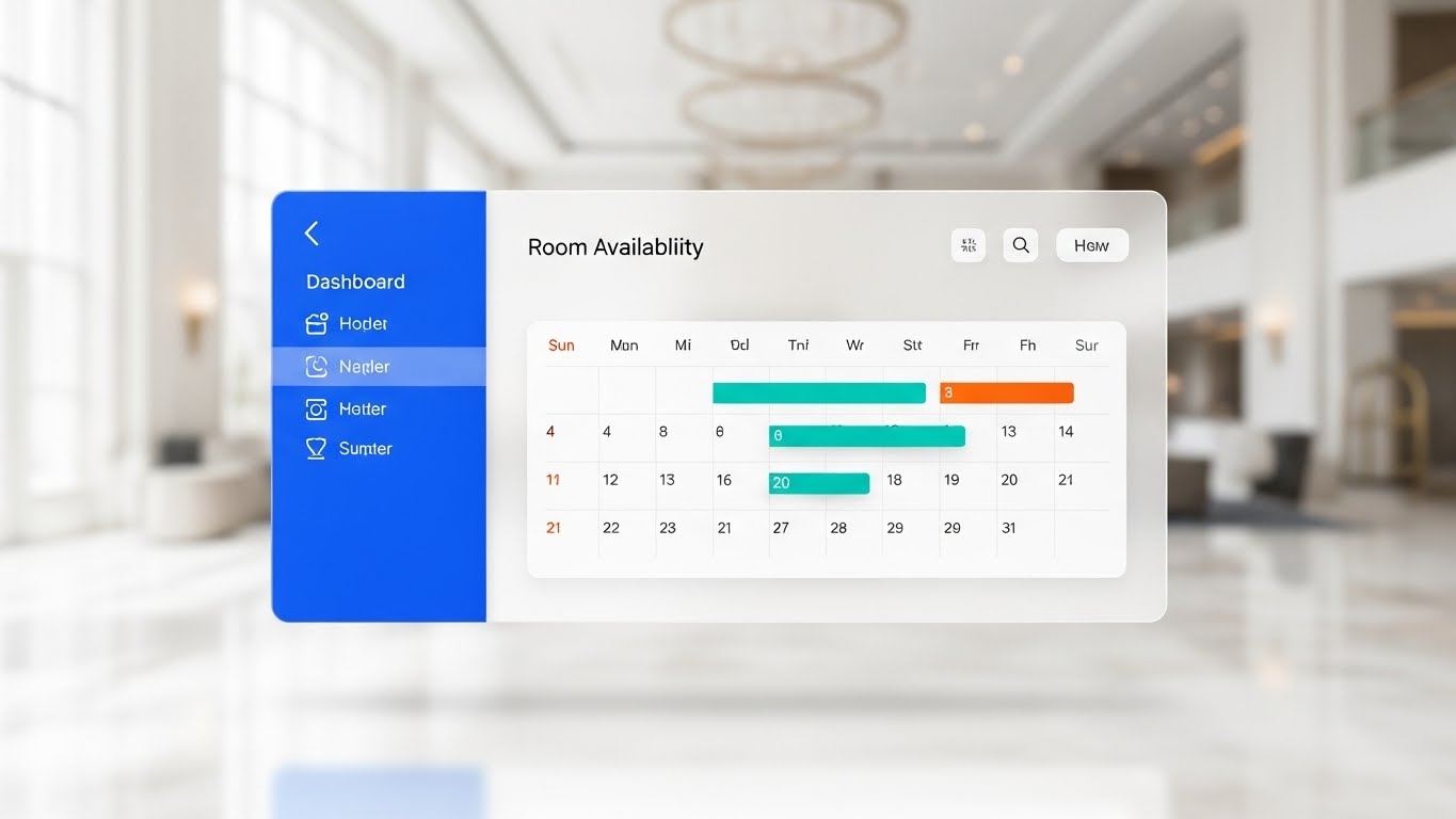
The Visualization Scenario
This style creates a "Hero" out of the interface itself. A high-fidelity UI card displaying "Room Availability" with a calendar grid floats in the center of the frame. The design is "Light Mode"—pristine white, soft drop shadows, and glass-morphic transparency. The background is a high-end hotel lobby, but deeply blurred to keep focus on the data. Key data points (availability dates) are highlighted in vivid teal and sunset orange. The mouse movements are smooth and deliberate.
Psychological Impact & KPI Focus
- Niche Psychology: Cognitive Load is a major issue for users of legacy hotel software. This aesthetic promises a "breath of fresh air." It looks like consumer tech (Apple/Airbnb), which implies ease of use.
- Operational Impact: It demonstrates Usability. It shows the potential buyer that their staff won't need a 300-page manual to figure out how to close out a date range.
Strategic Implementation & Trade-offs
- Optimal Duration: 60-90 seconds.
- Trade-off: It must be an accurate representation of the product. If the actual software looks worse than the video, the sales demo will be a disappointment. This style demands product truth.
Companies using similar video content -
SkyTouch Technology – PMS – Intuitive, user-friendly interface for operations.
eviivo – PMS – User-friendly interface for managing bookings.
9. Split Screen: Optimized Reality and UI
MOFU | Competitive Displacement
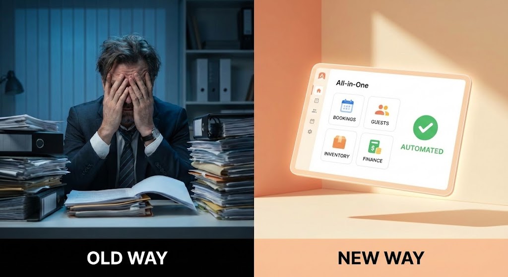
The Visualization Scenario
A classic "Problem/Solution" setup executed with cinematic lighting. The left side (The Old Way) is cool-toned and dimly lit, showing a stressed hotel manager buried under piles of paper. The right side (The New Way) is warm, peach and cream toned, featuring a bright, 3D render of a floating tablet displaying a simplified "All-in-One" automated dashboard. The dividing line is sharp. The visual narrative is about the feeling of the work: Burden vs. Freedom.
Psychological Impact & KPI Focus
- Niche Psychology: It targets Burnout. Many hoteliers feel trapped by manual admin. This visual empathizes with their pain and offers a technological exit route.
- Operational Impact: It visualizes Automation. The lack of paper and the clean dashboard on the right implies that the software handles the grunt work, freeing the manager to focus on guests.
Strategic Implementation & Trade-offs
- Optimal Duration: 30-45 seconds.
- Trade-off: It can be cliché if overacted. The "stressed manager" must look realistically tired, not comically frantic. The focus should be on the relief provided by the UI.
Companies using similar video content -
Connecteam – Employee App – Reduces operational stress through communication.
Nuvola – Guest Service Optimization – Centralizes communication for efficiency.
10. 2D Line Art Animation
MOFU | ABM Awareness

The Visualization Scenario
This is the most "Corporate Luxury" style of the set. Continuous, elegant gold lines draw the outline of a five-star hotel building on a matte white background. The lines are fluid; the hotel morphs into a globe, and then into a handshake icon. There are no fill colors, only the metallic sheen of the strokes. The animation is slow, deliberate, and perfectly smooth. It conveys a sense of high-end consultancy rather than just a software vendor.
Psychological Impact & KPI Focus
- Niche Psychology: It appeals to the Executive Ego. It speaks the visual language of high-finance and luxury branding. It positions the software vendor as a peer to the hotel owner, not a subordinate.
- Operational Impact: It represents Partnership. The handshake icon at the end emphasizes the B2B relationship—service, support, and long-term reliability—rather than just the functional features of the code.
Strategic Implementation & Trade-offs
- Optimal Duration: 15 seconds.
- Trade-off: It is very low on information density. It conveys "Trust" and "Quality" but says nothing about "Inventory" or "Rates." It is purely a brand-building tool for high-value accounts.
Companies using similar video content -
Cendyn – CRM – Builds trusted relationships and loyalty.
IDeaS – Revenue Management System – Strategic partnership for revenue growth.
11. Aspirational Stock Montage
MOFU | Building Trust & Credibility

The Visualization Scenario
This style bridges the gap between software and service, humanizing the technology. It utilizes a rhythmic collage of high-resolution photography featuring confident, diverse hotel staff—receptionists, concierges, and general managers—seamlessly using tablets to interact with smiling guests. The imagery is overlaid with semi-transparent, white geometric shapes representing "Security Shields" and "5-Star Ratings" that slide gently into place. The lighting is bright and natural, dominated by fresh whites, sky blues, and warm skin tones, evoking an immediate sense of hospitality and reliability.
Psychological Impact & KPI Focus
- Niche Psychology: Hospitality is ultimately a people-centric business. Hotel owners often fear that technology will depersonalize guest service. This style reassures them that the software enables better human connection rather than replacing it.
- Operational Impact: It visualizes Service Quality. By associating the software usage with smiling guests and staff, it subconsciously links the tool with higher Guest Satisfaction Scores (GSS) and positive Tripadvisor reviews.
Strategic Implementation & Trade-offs
- Optimal Duration: 45-60 seconds (Email Signatures / Social Proof).
- Trade-off: It relies heavily on stock imagery. To avoid feeling generic, the "Tech Overlay" (the shields and stars) must be animated with high-end motion graphics to brand the footage as proprietary rather than just a mood board.
Companies using similar video content -
PeopleVine – CRM – Enhances guest loyalty and engagement.
HotelRunner – PMS – Improves guest communication and satisfaction.
12. 3D Parallax UI Presentation
MOFU | The Functional Buyer
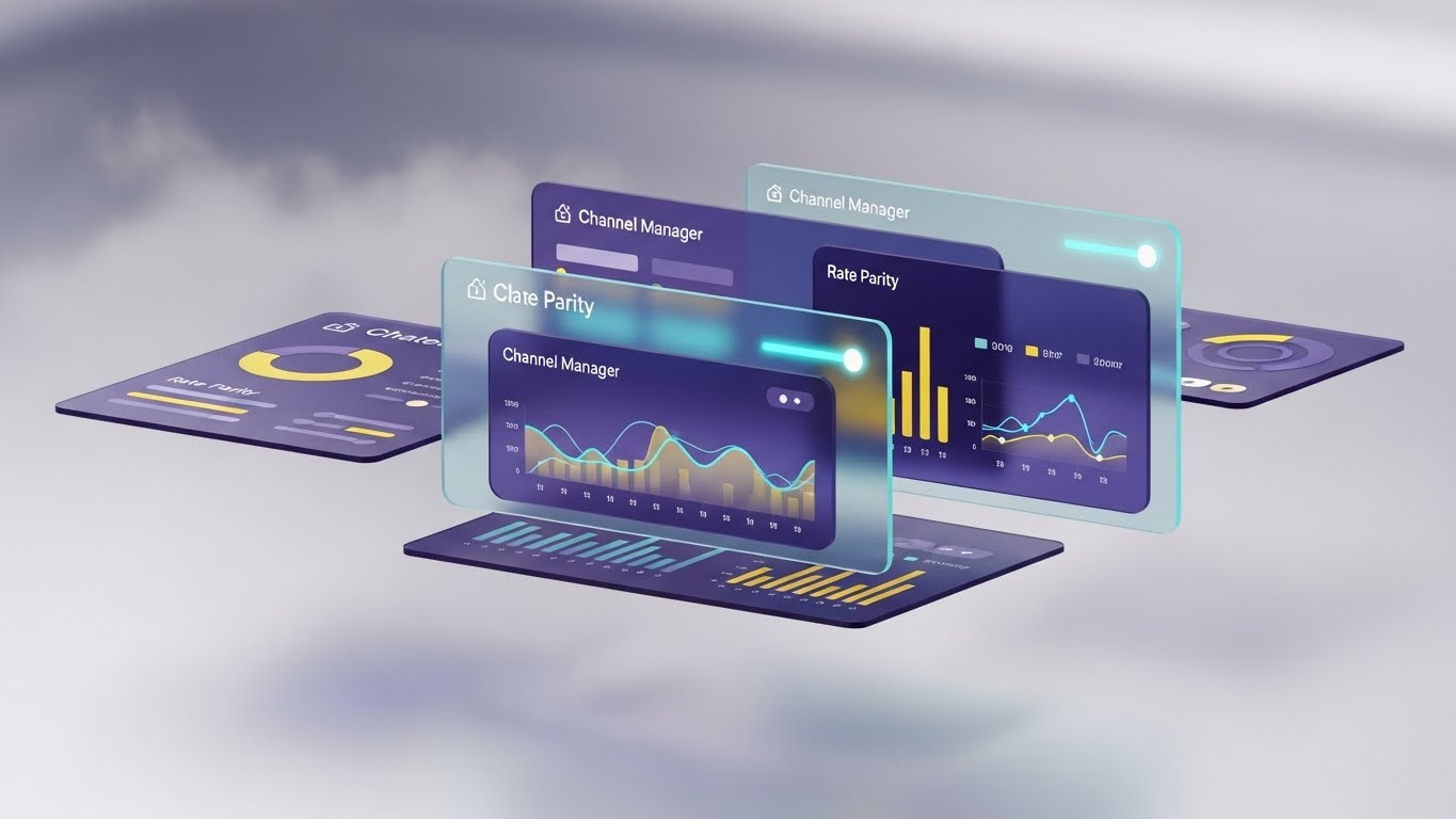
The Visualization Scenario
To demonstrate the depth and interconnectivity of the platform, this style places multiple translucent UI screens at different depth planes in a bright, airy void space. The screens display detailed "Channel Manager" controls and "Rate Parity" graphs. As the camera tracks slowly sideways, a parallax effect reveals the separation between the layers, making the interface feel volumetric and substantial. The background is a soft, gradient field of silver and misty white, while the UI elements glow with a subtle bioluminescent cyan light, emphasizing a high-tech, organized architecture.
Psychological Impact & KPI Focus
- Niche Psychology: Revenue Managers deal with multi-layered data (rates, availability, channels). This visual metaphor respects that complexity but presents it as manageable and elegant. It appeals to the Functional Buyer who needs to see that the system is robust.
- Operational Impact: It visualizes System Integration. The layering effect implies that different modules (booking engine, channel manager, PMS) are distinct yet perfectly aligned, suggesting a holistic "All-in-One" solution.
Strategic Implementation & Trade-offs
- Optimal Duration: 60 seconds (Website Product Page).
- Trade-off: It is stylized. While it looks beautiful, it distorts the actual user experience slightly for the sake of aesthetics. It is best used to sell the concept of the interface's power, rather than as a literal training tutorial.
Companies using similar video content -
Lighthouse – Platform Overview – Multi-layered data insights for control.
Duetto – GameChanger RMS – Comprehensive revenue strategy and control.
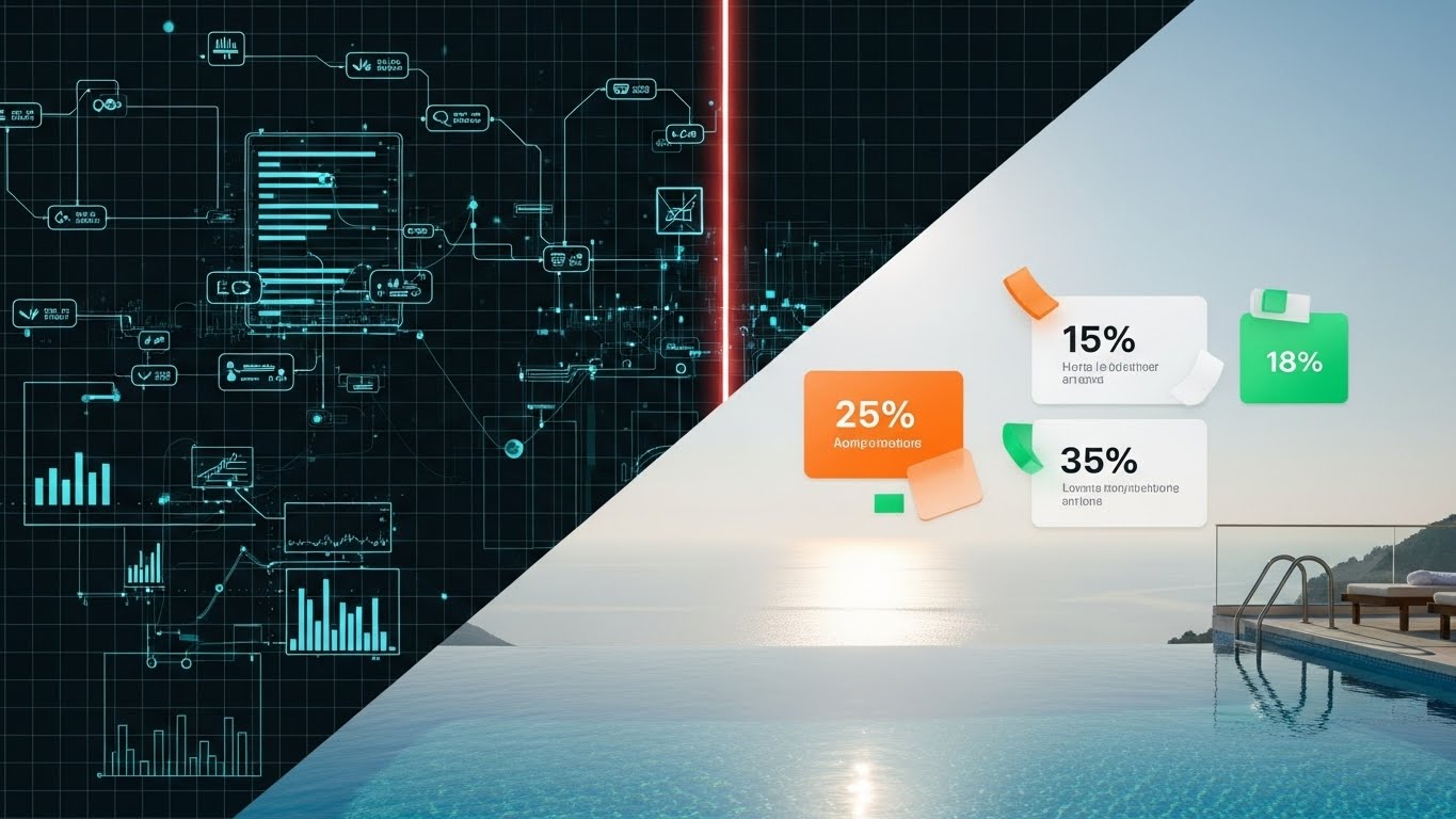
13. Dynamic Data Visualization
BOFU | ROI Justification

The Visualization Scenario
This style transforms abstract numbers into tangible assets. A central 3D bar chart rises aggressively upwards from a base resembling a hotel floor plan. The bars are not flat graphics but are rendered as crystalline, emerald green glass columns that refract light. Floating percentage signs ("+25%", "+40%") orbit the bars like satellites. The background is a clean, matte white studio setting with softbox lighting that creates beautiful caustics on the glass. It treats the data (Revenue Growth) as a physical, premium object that the hotelier can almost touch.
Psychological Impact & KPI Focus
- Niche Psychology: At the Bottom of the Funnel (BOFU), the conversation is purely financial. This style speaks the language of the CFO and the Investor. It validates the purchase by making the Return on Investment (ROI) look substantial and solid.
- Operational Impact: It targets Revenue Optimization. The aggressive upward trajectory of the glass bars visually confirms the promise of increased Direct Bookings and higher ADR (Average Daily Rate).
Strategic Implementation & Trade-offs
- Optimal Duration: 15-20 seconds (LinkedIn Video Ads / Remarketing).
- Trade-off: It is purely symbolic. It doesn't show how the revenue is generated, only the result. It must be paired with copy or voiceover that specifically claims "Increase Direct Bookings by 30%."
Companies using similar video content -
ampliphi – Revenue Optimization – Visualizes AI-driven revenue growth.
Blastness – Revenue Management – Optimizes revenue strategy for growth.
14. 3D X-Ray Visualization
BOFU | Risk Mitigation
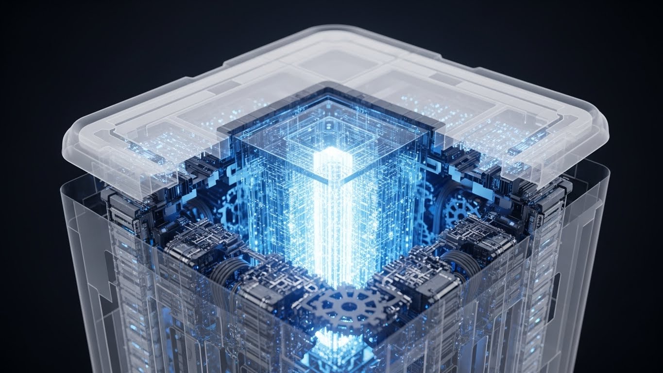
The Visualization Scenario
Security is often invisible, but this style brings it to the forefront. A stylized, opaque model of a hotel building is scanned by a beam of light, revealing a glowing, secure iron-cage structure underneath. Inside this cage, floating lock icons and data packets circulate safely, shielded from the outside. The outer shell is matte white, while the internal "X-Ray" elements glow in clean blue and distinct safety orange. This visualizes the "Data Security" and "Infrastructure Stability" that usually remains hidden in backend code.
Psychological Impact & KPI Focus
- Niche Psychology: For IT Directors and General Managers, Risk Mitigation is a "sleep-at-night" issue. They fear data breaches and downtime. This style visually demonstrates that the software has a "hardened core," alleviating anxiety about PCI compliance and GDPR.
- Operational Impact: It visualizes Uptime and Security. The solid, cage-like structure implies that the booking engine is bulletproof and resilient against crashes or cyber threats.
Strategic Implementation & Trade-offs
- Optimal Duration: 30 seconds.
- Trade-off: It is technical and abstract. It is not "sexy" from a marketing standpoint but is crucial for closing deals with enterprise clients where security questionnaires are a hurdle.
Companies using similar video content -
IBM Maximo Hospitality – Asset Management – Visualizes robust infrastructure and maintenance.
Sertifi by Flywire – Payments Processing – Secure and compliant payment infrastructure.
15. Rapid UI Feature Montage
BOFU | Sales Cycle Acceleration
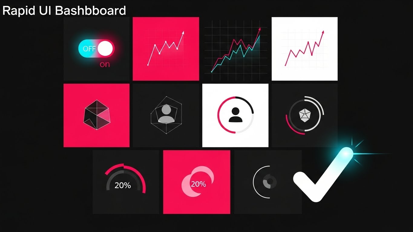
The Visualization Scenario
Designed for speed and comprehensiveness, this style uses a dynamic composition where multiple UI "cards" (representing Booking Engine, Housekeeping, Reports, etc.) fly into the frame from the Z-axis. They stack neatly into a cohesive dashboard grid, accompanied by a satisfying "click" sound effect. Motion blur indicates speed. The background is a radial gradient of soft blue and white, keeping the focus clean and airy. The UI cards are crisp white with color-coded headers (Red, Blue, Green) to distinguish the modules instantly. It visually proves the concept of "All tools coming together instantly."
Psychological Impact & KPI Focus
- Niche Psychology: Decision-makers are busy. They often wonder, "Does it do X? Does it do Y?" This style answers "Yes" to everything in seconds. It creates a sense of Completeness without requiring a long demo.
- Operational Impact: It visualizes the Ecosystem. By showing multiple distinct modules snapping together, it reinforces the value proposition of an integrated platform over disparate point solutions.
Strategic Implementation & Trade-offs
- Optimal Duration: 15-30 seconds (In-App / Email Marketing).
- Trade-off: It is too fast for detailed learning. Viewers won't be able to read the specific data on the cards. It serves as a "Feature Flash" to overwhelm the prospect with value quantity.
Companies using similar video content -
Cloudbeds – Platform – Showcases integrated PMS, Channel Manager, Booking Engine.
Hotelogix – All-in-One PMS – Displays diverse modules for hotel operations.
16. Lifestyle Stock with UI Overlay
BOFU | Driving Demo Requests
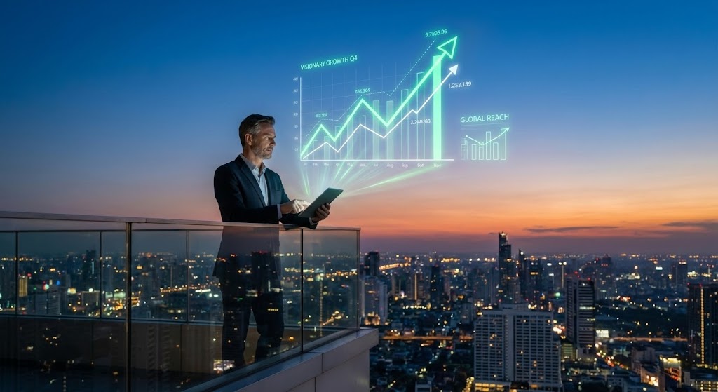
The Visualization Scenario
This style merges the physical reality of hotel leadership with digital foresight. A high-quality photo of a CEO-type figure stands on a hotel balcony overlooking a sprawling city skyline at dusk. He is looking at a tablet. Projected from the tablet are holographic, Augmented Reality (AR) graphs floating in the air, tracing upward trends into the sky. The photography is realistic and moody, while the UI overlay is sharp, bright neon green and white. The contrast emphasizes the "Visionary" aspect of using the software.
Psychological Impact & KPI Focus
- Niche Psychology: It appeals to the Ego and Ambition of the hotel owner. It positions them not just as a manager, but as a "Master of their Domain," overseeing their empire with advanced technology.
- Operational Impact: It visualizes Strategic Insight. The AR graphs floating over the city suggest that the software provides insights that go beyond the hotel walls—market trends, competitive sets, and future forecasting.
Strategic Implementation & Trade-offs
- Optimal Duration: 10-15 seconds (Email Header / Retargeting).
- Trade-off: It feels "Futuristic." If the actual software is a legacy system with a basic UI, this marketing style might overpromise the level of "Star Trek" technology available.
Companies using similar video content -
Lighthouse – Market Insight – Provides visionary market trend analysis.
FLYR Hospitality – Revenue Operating System – Offers strategic revenue insights.
17. Dark Mode UI Showcase
BOFU | The Economic Buyer
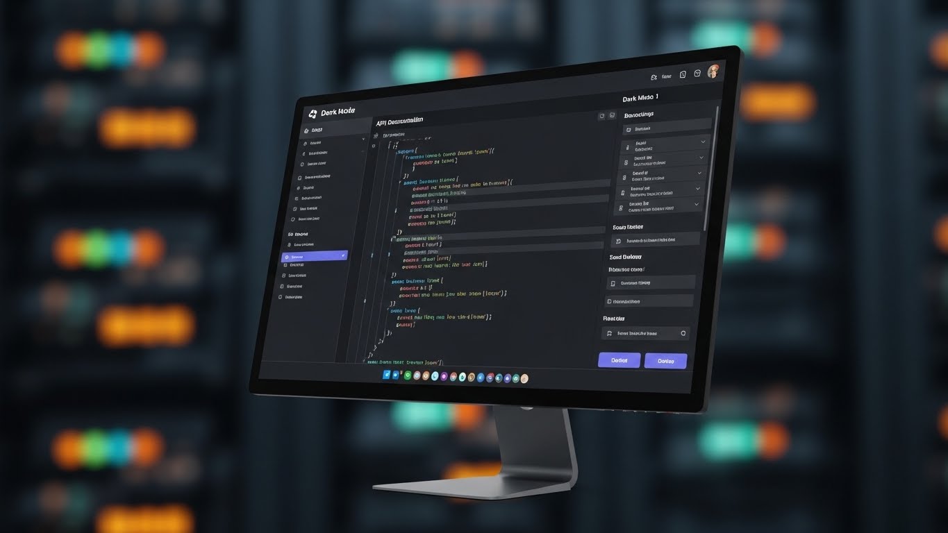
The Visualization Scenario
Targeting the technical gatekeepers, this style presents a sleek, developer-focused view of the API documentation and backend settings panel. The interface is strictly "Dark Mode"—dark grey/black backgrounds with syntax highlighting in pastel pink, blue, and green. The composition is a "Hero Shot" of the monitor slightly angled, with a background featuring the bokeh blur of a server room with blinking lights. This aesthetic appeals to IT directors by looking robust, code-ready, and easy on the eyes.
Psychological Impact & KPI Focus
- Niche Psychology: IT Directors and CTOs often view "Marketing" interfaces with suspicion. They prefer Dark Mode because it signifies a Professional Tool. This style signals that the platform is developer-friendly and built for power users.
- Operational Impact: It visualizes Customization and API Flexibility. It implies that the hotel can build custom integrations, connect proprietary apps, and have full control over the backend logic.
Strategic Implementation & Trade-offs
- Optimal Duration: 30-45 seconds (Technical Documentation Page).
- Trade-off: It is intimidating to non-technical users. A General Manager might see code or complex settings and fear the learning curve. This style must be segmented strictly for the technical audience.
Companies using similar video content -
QloApps – Open Source PMS – Highlights developer-friendly backend and APIs.
HotelDruid – Hotel Management Software – Flexible, open-source platform.
18. 2D Animation & UI Composition
BOFU | Objection Handling
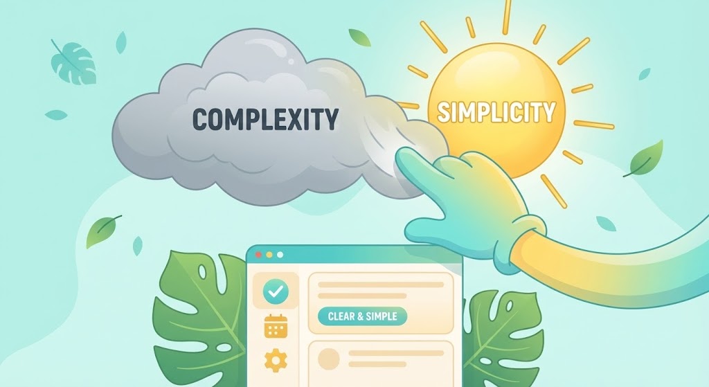
The Visualization Scenario
To address the barrier of complexity, this style uses a playful yet professional metaphor. A stylized, vector-art hand (wearing a glove or suit sleeve) enters the frame and literally swipes away a gray cloud labeled "Complexity," revealing a bright, shining sun labeled "Simplicity." Underneath this weather transition, a simplified UI screen sits comfortably on a tropical leaf. The colors are vibrant turquoise, sunny yellow, and leaf green. It visually promises that the software acts as a clearing mechanism for operational fog.
Psychological Impact & KPI Focus
- Niche Psychology: Change Management is a massive hurdle. Staff resist new software because they fear it will be hard to learn. This friendly, approachable style disarms that fear, promising a "sunny" and easy transition.
- Operational Impact: It visualizes Ease of Use. The literal removal of the "cloud" suggests that the software removes administrative burdens, allowing the staff to operate in a clear, organized environment.
Strategic Implementation & Trade-offs
- Optimal Duration: 15-20 seconds (Remarketing Display Ads).
- Trade-off: It is slightly cartoonish. It risks trivializing the software if the tone becomes too childish. It works best for "Objection Handling" ads rather than deep feature dives.
Companies using similar video content -
RoomPriceGenie – RMS – Simplifies complex pricing decisions.
RevControl – Revenue Management – Provides clear, actionable insights.
19. 2D Character-Driven Story
Onboarding | Objection Handling
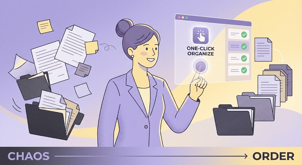
The Visualization Scenario
This style focuses on the protagonist of the story: The General Manager. A stylized, professional female character (e.g., with a bun and blazer) is shown surrounded by floating, chaotic papers. She clicks a single large button on a floating screen labeled "One-Click Organize." Instantly, the papers transform into neat digital stacks or file folders. She sighs with visible relief and satisfaction. The art style uses flat colors with texture overlays (grain) in a palette of calming lilac, soft yellow, and charcoal.
Psychological Impact & KPI Focus
- Niche Psychology: It validates the Emotional Journey of the user. It acknowledges their current pain (chaos) and offers a direct solution (order). Seeing a character "look relieved" triggers mirror neurons in the viewer who wants that same relief.
- Operational Impact: It visualizes Workflow Automation. It simplifies the complex reality of operations into a single action (the click), reinforcing the software's primary value: saving time and reducing stress.
Strategic Implementation & Trade-offs
- Optimal Duration: 60-90 seconds (YouTube Organic / Onboarding Intro).
- Trade-off: Narrative pacing is slower. You have to spend time setting up the "problem" before showing the product. It requires a good script to keep the viewer engaged through the story arc.
Companies using similar video content -
FlexKeeping – Operations Platform – Transforms housekeeping chaos into order.
UniFocus – Workforce Optimization – Streamlines staff management.
20. 2D Graphics Over Live Action
Onboarding | Accelerating Time-to-Value
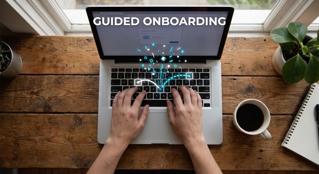
The Visualization Scenario
Bridging the gap between a tutorial and an ad, this style uses a top-down video shot of a person's hands typing on a laptop keyboard at a wooden coffee shop table (or hotel back office). Animated, white vector lines and dotted trails pop out of the screen, guiding the user's fingers to the next key or screen interaction, symbolizing "Guided Onboarding." Small, playful animated "Success" confetti bursts appear when a key is pressed. The lighting is cozy and natural, while the graphics are bright white and electric blue.
Psychological Impact & KPI Focus
- Niche Psychology: New users often feel abandoned after the sale. This style visually reassures them that they will be Supported. The animated guides imply that the software itself teaches you how to use it.
- Operational Impact: It targets Time-to-Value. By showing how quickly a user can navigate the system with guidance, it suggests that training times will be minimal and staff will be up and running immediately.
Strategic Implementation & Trade-offs
- Optimal Duration: 60-90 seconds (Tutorial Library / Welcome Email).
- Trade-off: It requires high-quality footage of hands/devices. If the live-action footage is poor quality, the "premium" feel of the software is diminished. The sync between the hands and the graphics must be perfect.
Companies using similar video content -
HotelKit – Communication & Task Tracking – Guides staff through daily tasks.
Logitix – Operations Software – Guides preventative maintenance workflows.
21. Macro UI Micro-Interactions
Onboarding | Reducing Implementation Friction
The Visualization Scenario
To combat the fear of complex setup, this style zooms in to the microscopic level of the user interface. The frame is filled entirely by a single, high-fidelity metallic toggle switch set against a matte Titanium Silver background. As an invisible cursor interacts with it, the switch slides smoothly to the "On" position, emitting a vibrant, glowing Electric Lime light. The texture is hyper-realistic—displaying brushed metal grain and soft light scattering. The motion is weighted and satisfying, accompanied by a crisp, high-quality audio "click."
Psychological Impact & KPI Focus
- Niche Psychology: Implementation is often feared as a heavy, clunky process. This visual style counters that anxiety by making the act of "turning on a feature" feel simple, physical, and instant. It triggers a dopamine response associated with control and completion.
- Operational Impact: It targets Feature Activation Rates. By glamorizing the interaction, it encourages users to explore the settings menu and enable advanced features (like "Auto-Inventory Sync" or "Dynamic Rate Rules") that they might otherwise ignore.
Strategic Implementation & Trade-offs
- Optimal Duration: 6-10 seconds (GIFs for Emails / In-App Tooltips).
- Trade-off: It is hyper-specific. It cannot explain what the feature does, only that enabling it is easy. It must be paired with clear, concise copy explaining the benefit of the toggle.
Companies using similar video content -
Canary Technologies – Upsell & Guest Messaging – Smooth activation of guest services.
Sertifi by Flywire – Payments Processing – Precise, secure payment activation.
22. Low-Poly 3D Modeling
Onboarding | Self-Serve Onboarding
The Visualization Scenario
To lower the barrier to entry for non-technical staff, this style adopts a charming, "gamified" aesthetic. The scene features a simplified, faceted landscape in bright, cheerful colors (Sky Blue, Grass Green, and Sun Yellow). Two low-poly geometric hotel buildings sit on floating islands. A small, folded paper airplane—representing a referral or a data packet—flies from one building to the other, trailing a heart symbol. The physics are bouncy and lighthearted. There are no complex textures, just clean, solid colors that make the ecosystem look like digital toys.
Psychological Impact & KPI Focus
- Niche Psychology: Onboarding can feel like homework. This style reframes the learning process as play. It reduces Performance Anxiety by creating a low-stakes, friendly visual environment where making mistakes feels impossible.
- Operational Impact: It visualizes Network Effects or Referral Programs. Ideally used for "Invite a Colleague" or "Multi-Property Setup" screens, it makes the expansion of the software account feel like building a digital village rather than configuring a database.
Strategic Implementation & Trade-offs
- Optimal Duration: 15-20 seconds.
- Trade-off: It can appear "childish" if used for serious financial reporting features. It is best reserved for "Community," "Referral," or "Basic Setup" modules where a welcoming tone is prioritized over technical precision.
Companies using similar video content -
Little Hotelier – PMS – Simplifies setup for small properties.
innRoad – PMS – Easy setup for independent hotels.
23. Isometric 3D Workflow
Retention | Reducing Support Overhead
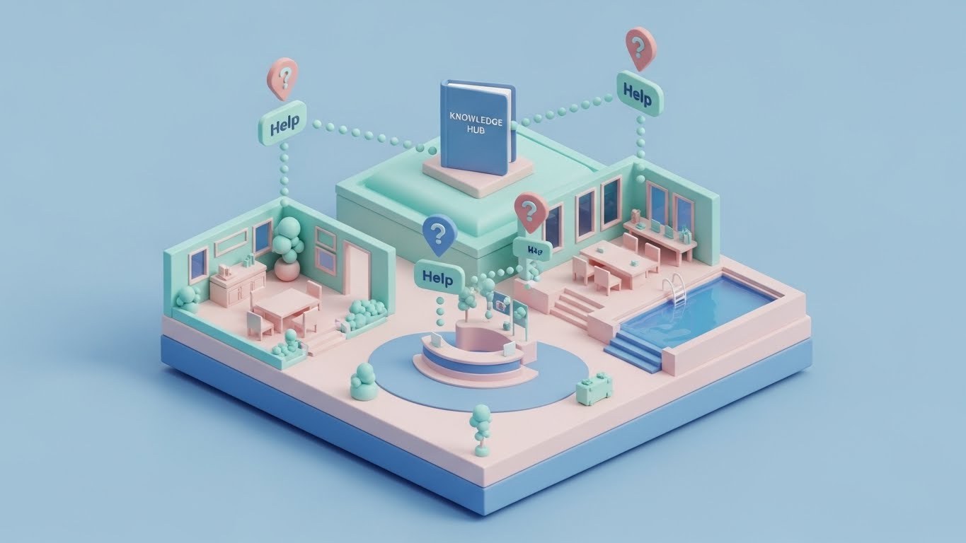
The Visualization Scenario
This style provides a map for the user, helping them navigate the support ecosystem. A detailed, miniature diorama of a hotel property sits on a pastel-colored floating island. Tiny, 3D "Help" icons (?) bounce gently above key areas: the Reception Desk, the Restaurant, and the Pool. Dotted data lines connect these distributed issues to a central, oversized "Knowledge Hub" book that sits atop the hotel. The lighting is soft and ambient, using a "Claymation" shader that makes the scene look like soft matte plastic. The palette is non-threatening: baby blue, pale pink, and mint.
Psychological Impact & KPI Focus
- Niche Psychology: When things break, users panic. This calming, organized visual acts as a "digital tranquilizer." It reassures the user that help is structured, accessible, and centralized, reducing the frustration of "not knowing where to look."
- Operational Impact: It targets Support Ticket Deflection. By visualizing the "Knowledge Hub" as the central brain connected to all operational areas, it subtly trains users to check the documentation (the Book) before calling the support hotline.
Strategic Implementation & Trade-offs
- Optimal Duration: 30-45 seconds (Help Center Welcome Video).
- Trade-off: It is static in nature. It works best as an establishing shot to orient the user before zooming in to specific screencast tutorials.
Companies using similar video content -
HotSOS – Maintenance & Housekeeping – Visualizes support for operational issues.
Click Maint CMMS – Maintenance Management – Organizes maintenance requests.
24. Generative AI Realistic Character video
Retention | Reducing Churn
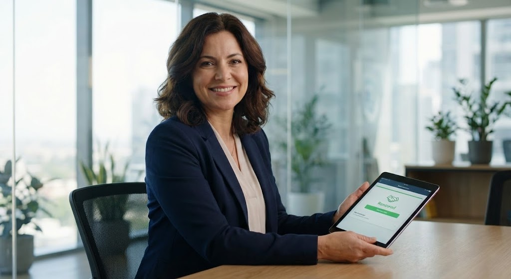
The Visualization Scenario
To humanize the renewal conversation, this style uses an ultra-realistic AI-generated avatar. A professional General Manager (a woman in her 40s with a warm, confident smile) sits in a sunlit, modern hotel office. She looks directly into the camera lens, breaking the fourth wall, establishing eye contact with the viewer. In her hands, she holds a tablet displaying a green "Renewed" notification with a handshake icon. The lighting is high-key commercial quality, highlighting realistic skin texture and hair. The background is blurred greenery and glass, suggesting prosperity and growth.
Psychological Impact & KPI Focus
- Niche Psychology: Churn often happens when the customer feels like "just a number." This style leverages the Face Advantage—humans are hardwired to trust other smiling humans. It mirrors the client's own identity, validating their success and partnership.
- Operational Impact: It targets Retention Rates. It subliminally reinforces the idea that "Successful GMs renew this software." It is a social proof mirror, designed to make the act of renewal feel like a professional achievement.
Strategic Implementation & Trade-offs
- Optimal Duration: 15-30 seconds (LinkedIn / Account Management Emails).
- Trade-off: The "Uncanny Valley" risk. The AI generation must be flawless. If the lip-sync or eye movement is unnatural, it becomes creepy and damages trust.
Companies using similar video content -
Cendyn – CRM – Fosters human connection and loyalty.
PeopleVine – Loyalty Platform – Builds trust for customer retention.
25. Hyper-lapse Stock Footage with Data
Retention | Website Visitor Re-engagement
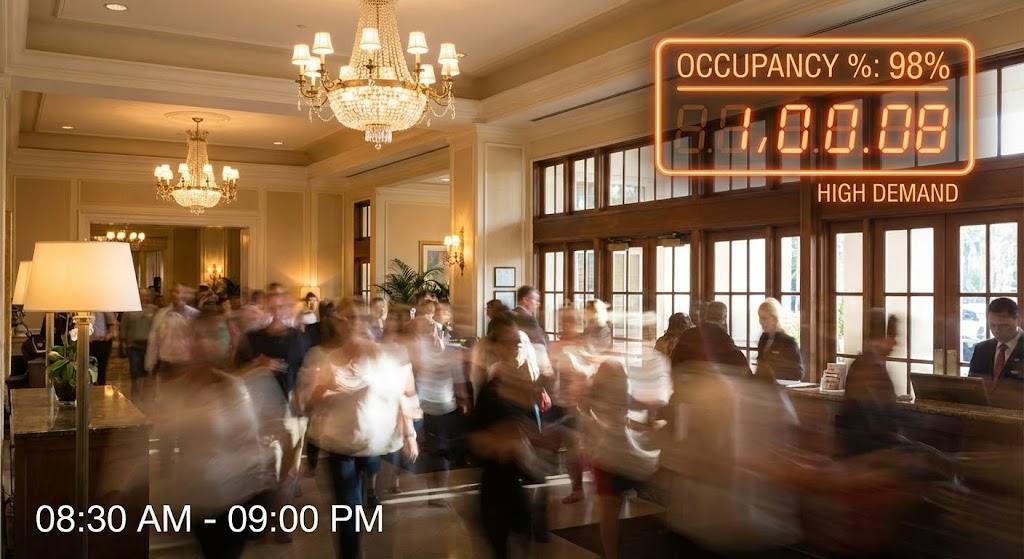
The Visualization Scenario
This style creates a sense of urgency and momentum. It features fast-motion hyper-lapse footage of a hotel lobby, blurring the movement of guests as they stream in from morning to night. Overlaid on this frenetic energy is a stable, glowing digital counter in neon orange, incrementing the "Occupancy %" rapidly from 60% to 98%. The contrast between the organic blur of the crowd and the sharp, precise digital numbers visually defines the software's value: bringing order and measurement to high-volume chaos.
Psychological Impact & KPI Focus
- Niche Psychology: Hoteliers are addicted to "Occupancy Rates." It is their heartbeat. This visual synchronizes with that pulse. It reminds them that their business is dynamic and that they need a tool that keeps up with the speed of their lobby.
- Operational Impact: It targets Re-engagement. For a user who has visited the site but not converted, this visual serves as a reminder of "Lost Opportunity." It visualizes the demand they might be missing out on by not using the optimal booking engine.
Strategic Implementation & Trade-offs
- Optimal Duration: 6-10 seconds (Remarketing / Display Ads).
- Trade-off: It is generic. Since it uses stock footage, it doesn't show the product UI. It is purely a "mood" ad to keep the brand top-of-mind.
Companies using similar video content -
SiteMinder – Revenue Management – Visualizes high demand and occupancy.
Hotelzify – Booking Engine – Boosts online visibility and demand.
26. Abstract 2D Motion Graphics
Retention | Knowledge Base & FAQ Videos
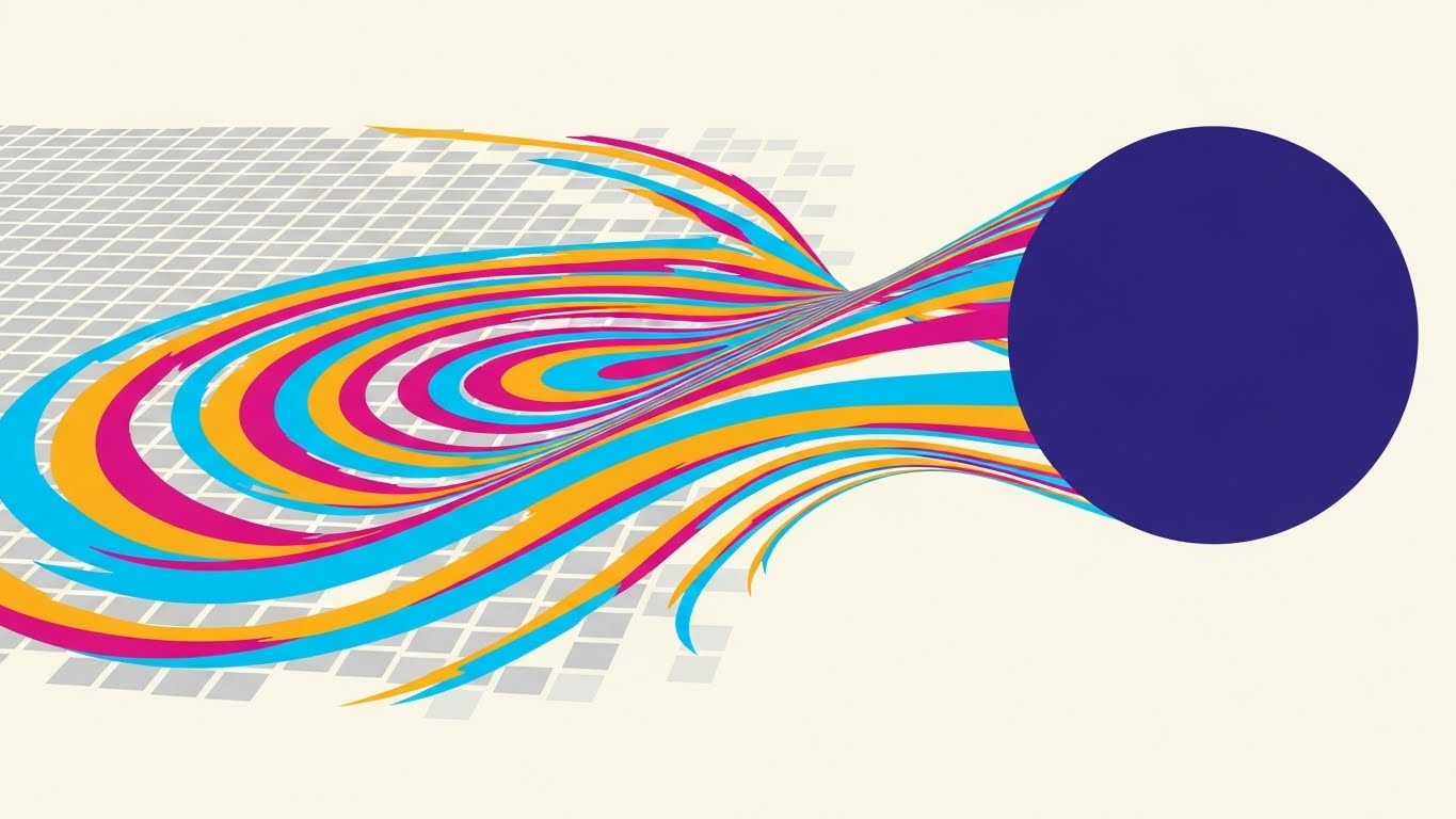
The Visualization Scenario
When communicating abstract concepts like "Cloud Updates" or "Algorithm Refreshes," literal imagery fails. This style uses geometric abstraction. A central circle (The Core System) releases flowing, ribbon-like waves of color (Cyan, Magenta, Gold) that wash over a grid of grey squares. As the waves pass, the squares flip and turn into bright white pixels. The motion is smooth and liquid, representing a "wash" of new data or features spreading across the network. The background is a clean, clinical off-white.
Psychological Impact & KPI Focus
- Niche Psychology: Users fear updates because they fear bugs or downtime. This style reframes the update process as a Cleansing and Refreshing event. The fluid motion suggests that the update is non-intrusive and flows naturally through the system.
- Operational Impact: It visualizes Continuous Improvement. It tells the customer, "We are constantly evolving," without boring them with patch notes. It builds confidence in the SaaS subscription model (you are paying for constant evolution).
Strategic Implementation & Trade-offs
- Optimal Duration: 10-15 seconds (In-App Modals / Update Notifications).
- Trade-off: It is completely open to interpretation. It requires a headline like "New Features are Here" to ground the abstract visual in reality.
Companies using similar video content -
Mews – PMS – Represents continuous platform updates and improvements.
Cloudbeds – Platform – Visualizes ongoing feature enhancements.
27. Holographic UI over 3D Render
Expansion | Driving Deep Feature Adoption
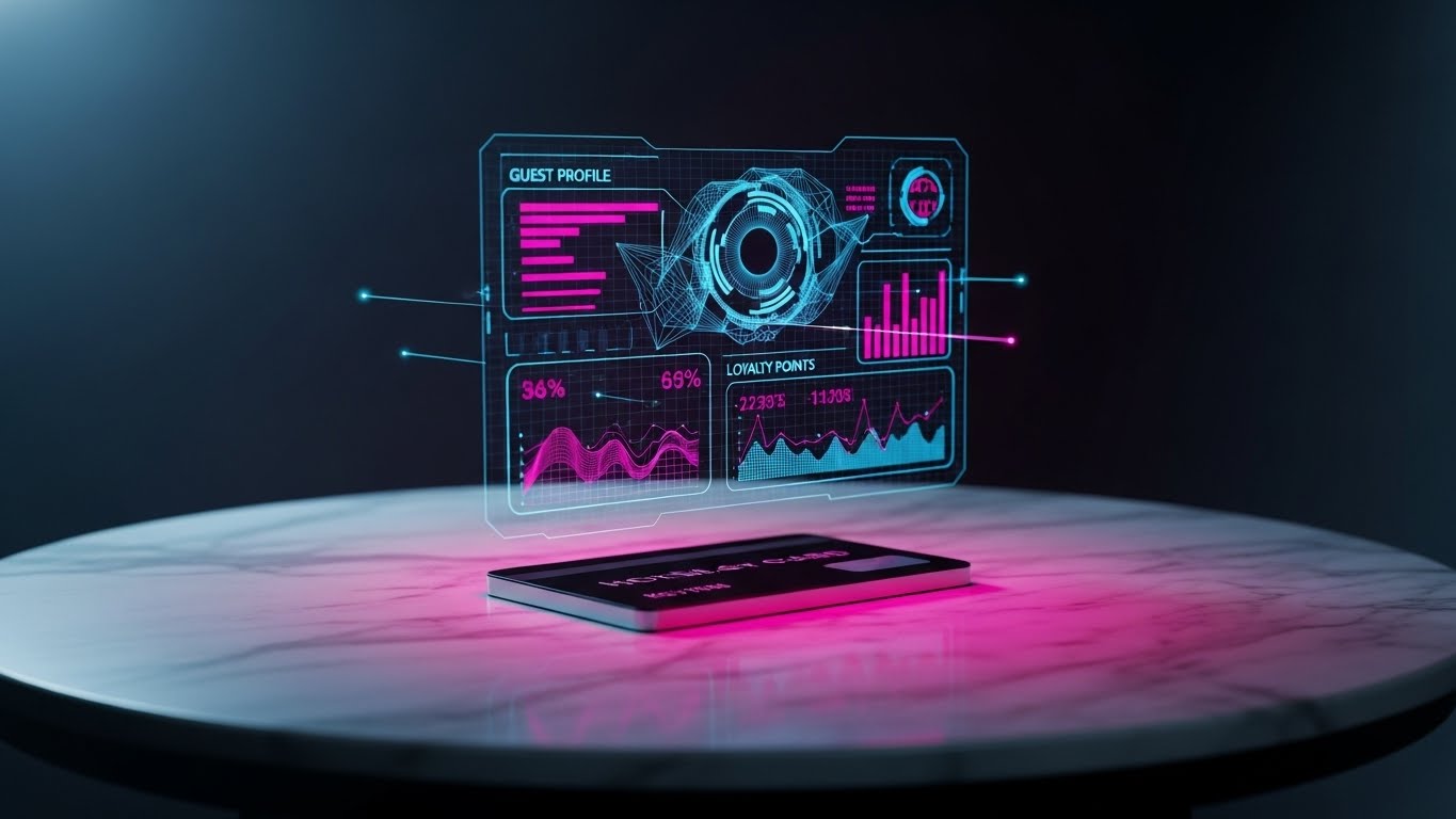
The Visualization Scenario
This style bridges the physical guest experience with hidden digital intelligence. A photorealistic 3D render of a black "Hotel Key Card" sits on a marble table. Hovering above it is a complex, futuristic holographic projection in laser-pink and electric-blue wireframe. The hologram displays "Guest Profile," "Loyalty Points," and "Spending History" charts that rotate slowly. The projection looks like Iron Man's HUD—sophisticated, layered, and incredibly smart. It visualizes the invisible data layer that exists on top of every physical guest interaction.
Psychological Impact & KPI Focus
- Niche Psychology: Hoteliers want to know their guests better. This style appeals to the desire for Omniscience. It promises that the software reveals the "hidden truth" about the guest, enabling personalized service that earns 5-star reviews.
- Operational Impact: It targets Upsell of CRM Modules. It visually demonstrates that the Booking Engine isn't just for reservations; it's a data mining tool that turns a plastic key card into a goldmine of guest intelligence.
Strategic Implementation & Trade-offs
- Optimal Duration: 20-30 seconds.
- Trade-off: It looks "Sci-Fi." It risks setting an expectation of AR capabilities that might not exist. It should be framed as "Data Intelligence" rather than a literal interface the front desk will see.
Companies using similar video content -
Agilysys – Guest Experience Solutions – Unlocks deep guest insights.
Cendyn – CRM – Provides comprehensive guest intelligence.
28. Photorealistic 3D Renders
Expansion | Driving Upsell/Cross-sell
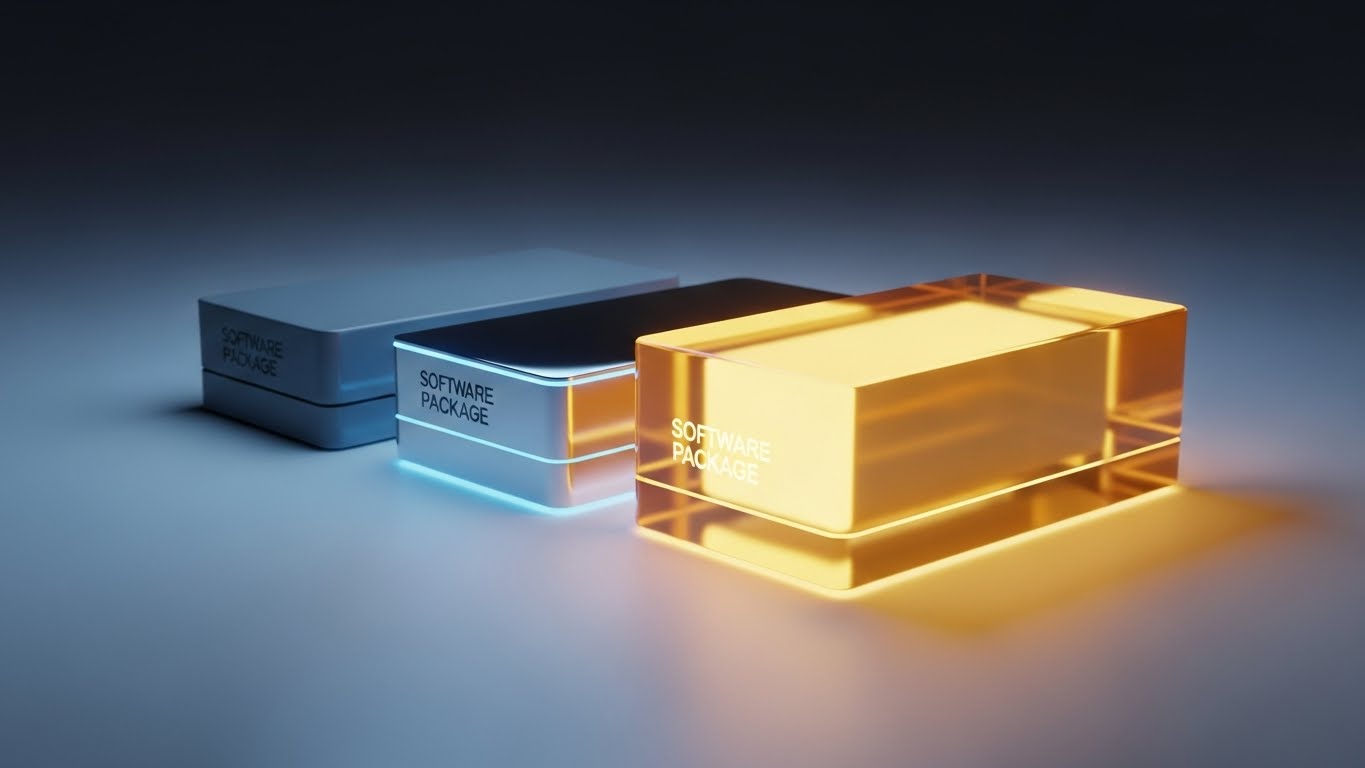
The Visualization Scenario
SaaS products are intangible, which makes "Upgrading" feel like paying for air. This style makes the software packages physical. Three distinct boxes sit on a studio surface. The first is a matte grey box (Basic), the second is metallic silver (Pro), and the third—placed prominently in front—is a glowing, translucent gold glass block (Enterprise). The gold box refracts light beautifully, looking heavy and expensive. The lighting is dramatic, rim-lighting the edges. This visualizes the "Premium Tier" as a precious object.
Psychological Impact & KPI Focus
- Niche Psychology: It leverages the Decoy Effect and material desire. By rendering the top tier as "Gold Glass," it subconsciously triggers a desire for status and quality. It makes the intangible subscription fee feel like a purchase of solid assets.
- Operational Impact: It targets Average Revenue Per User (ARPU). It visually justifies the price jump between tiers by showing a massive difference in "material quality" between the grey box and the gold block.
Strategic Implementation & Trade-offs
- Optimal Duration: Static Image or 5-second Loop.
- Trade-off: It is purely metaphorical. If the "Gold" package doesn't actually contain valuable features, the customer will feel cheated. The visual promise of "Gold" must be matched by feature density.
Companies using similar video content -
Oracle Hospitality – OPERA Cloud – Showcases premium enterprise solutions.
IBS Software – Hospitality Solutions – Presents high-value software packages.
29. Abstract 3D AI Visualization
Expansion | In-App Upsell

The Visualization Scenario
To visualize the "Alchemy" of AI pricing, this style uses a particle simulation. Thousands of tiny, glowing electric blue particles (representing raw market data, competitor rates, weather forecasts) swirl chaotically into a large funnel shape. As they are compressed at the bottom, they fuse together and emerge as a single, perfect, refractive diamond (The Optimal Room Rate). The background is a deep digital void. This represents the chaotic noise of the market being processed into a single, valuable point of clarity.
Psychological Impact & KPI Focus
- Niche Psychology: Revenue Managers are overwhelmed by data noise. They fear making the wrong pricing decision. This style promises Clarity and Precision. It shows that the AI takes the chaos and turns it into value (the diamond).
- Operational Impact: It targets the adoption of Dynamic Pricing Tools. It visually explains the value proposition: Data In (Chaos) -> AI Processing -> Value Out (Diamond).
Strategic Implementation & Trade-offs
- Optimal Duration: 15-20 seconds.
- Trade-off: It is highly abstract. It requires a voiceover or text overlay ("Turn Market Data into Gold") to ensure the viewer understands the metaphor of the funnel.
Companies using similar video content -
Pricepoint – AI-Powered Revenue Management – Transforms data into optimal rates.
Atomize – Dynamic Pricing – AI-driven pricing precision.
BEONx – RMS – Optimizes distribution with AI insights.
30. Futuristic Neon/Dark Mode
Expansion | Competitive Comparison/Switcher
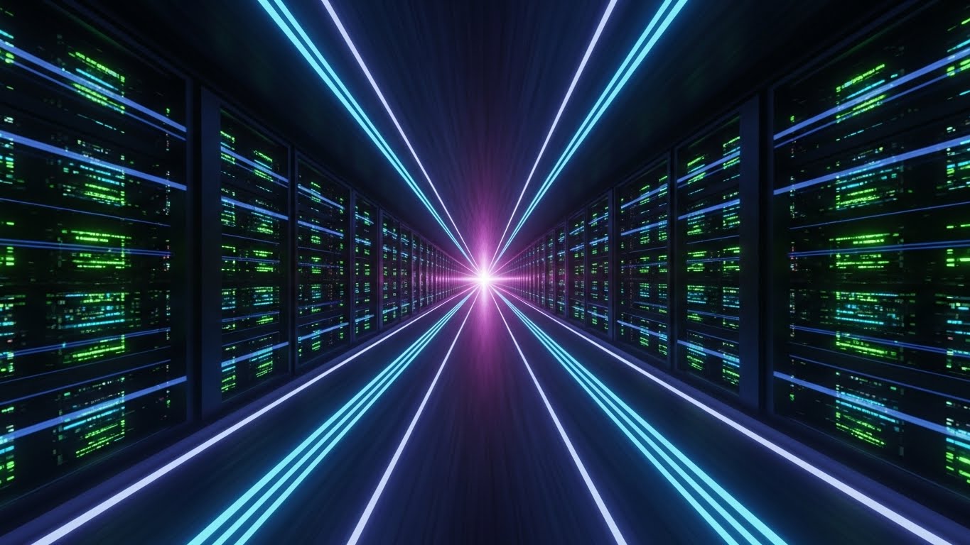
The Visualization Scenario
Targeting customers stuck on legacy platforms, this style visualizes the "Future." The camera flies rapidly down a digital corridor lined with towering, black server racks. But instead of standard lights, these servers pulse with Cyberpunk-inspired neon veins in Laser Grid Blue and Neon Purple. At the end of the tunnel is a blinding white light, representing the "Next Gen" destination. The sense of speed is palpable, with motion blur lines streaking past. It looks like the inside of a supercomputer, visualizing "High-Speed Infrastructure."
Psychological Impact & KPI Focus
- Niche Psychology: It appeals to the Fear of Obsolescence. No one wants to run their business on yesterday's tech. This style screams "Cutting Edge." It positions the competitor's software as the dusty past and this platform as the inevitable future.
- Operational Impact: It targets Switching. It emphasizes Performance and Scalability. It reassures the enterprise buyer that this infrastructure can handle millions of requests without blinking.
Strategic Implementation & Trade-offs
- Optimal Duration: 10-15 seconds (High-Intent Paid Ads).
- Trade-off: It can feel cold and aggressive. It is not "Hospitality" focused; it is "Tech" focused. It works best for the IT Director or CTO persona, not necessarily the Guest Relations Manager.
Strategic Knowledge Base: The Visual Operations Doctrine
To transform these 30 visual styles from a collection of marketing assets into a robust business advantage, we have synthesized a Visual Operations Doctrine. This framework aligns visual strategy with the specific operational realities of the hospitality industry, moving beyond aesthetics to drive measurable ROI, adoption, and efficiency.
Strategic Alignment & Visual Architecture
The "Pre-Production" Strategy – Why and Who.
- The Cognitive Load Audit: Hotel staff operate in high-interrupt environments. Before creating training videos (Styles 8, 20), audit the "Cognitive Cost" of the current workflow. If the booking engine interface is complex, the video style must be minimalist (Style 2, 18) to counterbalance the load, ensuring staff can learn without overwhelm.
- Role-Based Visual Mapping: Differentiate styles based on the user's role. A General Manager needs "Visionary" visuals (Style 16) on a desktop to understand revenue trends, while a Housekeeping Manager needs "Action-Oriented" visuals (Style 21) optimized for mobile devices.
- The "Glanceability" Standard: In a busy hotel lobby, a Front Desk agent cannot watch a 2-minute tutorial. Visuals for operational alerts (Style 26) must be "glanceable"—understood in under 5 seconds without audio. Use bold typography and high-contrast cues to pass the "Lobby Test."
- Brand Voice Consistency: Your booking engine is likely part of a fragmented tech stack (PMS, Channel Manager, CRM). Use a consistent visual "Golden Thread"—like a specific accent color or icon style—across all 30 styles to subconsciously unify these disparate modules in the user's mind.
- The Advids Strategic Audit: Partnering with a specialized agency like Advids allows for a comprehensive audit of your visual assets against your buyer personas. We help define a "Visual Operating System" that ensures your "Sales" videos speak the same visual language as your "Support" videos, creating a unified brand experience.
- Standardization vs. Customization: For core features (Check-in, Billing), use standardized "Clean UI" styles (Style 8) to reduce production costs. However, for brand-defining features (Loyalty, Guest Experience), invest in bespoke "Cinematic" or "Holographic" styles (Style 1, 27) to differentiate your platform from competitors.
- The Cross-Departmental Bridge: Use visuals to unify terminology between Sales, Ops, and Support. If Sales calls it "Upsell" and Ops calls it "Ancillary," a video showing a guest purchasing champagne (Style 5) creates a shared visual reality that aligns the teams.
- Legacy System Integration: Many hotels still run on legacy hardware. Use "Wireframe to Reality" (Style 7) visuals to demonstrate how your modern cloud software "wraps" around and modernizes their old infrastructure, reducing the fear of a complex "Rip and Replace" migration.
- Accessibility in Hospitality: Your user base is global. Designing motion graphics with universal symbols (Style 2, 22) rather than heavy on-screen text ensures that your training materials are accessible to a multi-lingual workforce without expensive re-shooting.
- The Mobile-First Mandate: Ensure that styles intended for operational staff (Maintenance, Housekeeping) are optimized for vertical screens (9:16). A landscape video is useless to a staff member who only uses a smartphone in the corridor.
Operational Adoption & Implementation
The "Deployment" Phase – Embedding Visuals into Workflow.
- Overcoming "Big Brother" Anxiety: When introducing AI or staff monitoring tools, use empathy-driven visuals (Style 11, 19) to frame the technology as a "Helper" rather than a "Monitor." This reduces internal resistance and facilitates smoother change management.
- The Micro-Learning Shift: Replace the 100-page PDF manual with a library of 30-second clips (Style 15, 21). Embed these directly into the software dashboard. New hires are far more likely to watch a 15-second "How-To" than read a document.
- Just-in-Time Support: Embed specific visual styles (Style 23 - Isometric Workflow) into the Help Center. Visualizing the connection between the problem and the solution empowers users to self-serve, reducing the volume of Level 1 support tickets.
- Gamification of Training: Use "Level Up" visuals (Style 5, 22) to celebrate training milestones. Visualizing staff progress with digital badges or progress bars taps into the competitive nature of hotel teams and boosts training completion rates.
- Reducing Support Ticket Volume: There is a direct correlation between proactive visual guides and reduced call center load. By deploying "Guided Onboarding" (Style 20) videos for the top 10 most common queries, you can deflect a significant percentage of support tickets.
- Remote Onboarding: For hotel groups expanding to new locations, use 3D Parallax (Style 12) and Screencasts to conduct "Virtual Seminars." This allows you to train a distributed team effectively without the high cost of flying trainers to every property.
- SOP Digitization: Transform text-based Standard Operating Procedures (SOPs) into visual process flows (Style 6). A visual animation of the "Night Audit" process ensures higher compliance and fewer errors than a checklist.
- Feedback Loops: Use interactive video elements at the end of "Update" videos (Style 26). Asking "Did this help?" provides immediate data on whether your features are being understood and adopted by the staff.
- Scalable Localization: Strategies for translating visual assets are critical for global chains. By keeping text layers separate from background animations (Style 2), you can localize 30 videos into 10 languages in a fraction of the time it takes to re-film.
- Leadership Communication: When a CTO needs to justify the software investment to the Board, provide them with high-end styles (Style 30, 13). These visuals help them sell the vision and future-proofing of the technology effectively to stakeholders.
Measuring Impact & Future-Proofing
The "ROI" Phase – Metrics and Evolution.
- Beyond "Views" - Actionable KPIs: Do not measure video success by "Views." Measure Time-to-Competency (how fast a new hire learns the system) and Feature Adoption Rate (do users activate the feature after watching the video?).
- The "Idle Time" Metric: A well-visualized UI (Style 8) should reduce the "Idle Time" users spend searching for buttons. Correlate video views with a reduction in average task duration to prove efficiency gains.
- Compliance Velocity: When new regulations (like GDPR or PCI) hit, use urgent visual styles (Style 4, 14) to disseminate updates. Measure how much faster the hotel achieves compliance via video compared to text memos.
- Retention and Churn (LTV): High-quality onboarding visuals (Style 22, 24) directly correlate with higher retention. A user who visually understands the value proposition in the first week is far less likely to churn.
- The AI Visual Frontier: Prepare for a future where visuals are generated in real-time. The "Diamond" visualization (Style 29) isn't just a marketing asset; it will become a live dashboard element, visualizing revenue potential instantly for the user.
- Scalability of Assets: Build a "Visual Lego Kit" of 3D assets (servers, globes, key cards) that can be reused across multiple styles. This reduces the marginal cost of creating new content as your platform grows.
- The Advids Partnership: Explicitly partner with Advids to act as the custodian of your visual library. As your software interface evolves, we ensure your entire video ecosystem updates in unison, preventing the "Visual Debt" of outdated tutorials.
- Benchmarking Success: Compare your visual maturity against competitors. If they are using static screenshots and you are using Kinetic Typography (Style 4) and Realistic Characters (Style 24), you win the "Perception of Innovation" battle.
- The ROI of Safety: Use "X-Ray" visuals (Style 14) to visualize security and stability. In enterprise sales, this visual can shorten the "Security Review" cycle by weeks, directly impacting deal velocity and revenue.
- Final Call to Innovation: Treat video as Infrastructure, not just content. The Booking Engine that is easiest to see and understand is the one that will win the market. By adopting this visual doctrine, you empower hoteliers to visualize—and achieve—their full potential.
Companies using similar video content -
Yanolja Cloud Solution – PMS – Represents next-gen cloud hospitality.
Skyware Hospitality Solutions – PMS – Modern, scalable solutions for large chains.
Actabl – Labor Management – Innovative solutions for operational efficiency.
Author & Editor Bio


