
Introduction: The Visualization Imperative in People Analytics
The era of "gut feeling" HR is officially over, but the era of "insight-driven" HR has hit a critical bottleneck. We are currently witnessing a massive divergence in the industry. On one hand, the investment in technology is accelerating at a breakneck pace; the workforce analytics market was valued at USD 2.07 billion in 2024. This surge reflects a universal C-suite mandate: workforce decisions must be as data-rigorous as financial ones.
However, purchasing the software is not the same as unlocking the value. A startling disconnect remains between data accumulation and decision-making utility. Recent industry research reveals that only 24% of HR functions are maximizing business value from their technology. This "Efficiency Gap" is rarely a failure of the algorithms; it is a failure of communication.
The Bridge Between Data and Action
For HR Analytics SaaS platforms, the challenge is no longer just processing the data—it is explaining it. The stakeholders consuming these insights—often busy C-level executives or non-technical line managers—do not have the bandwidth to decipher complex spreadsheets or static dashboards. They suffer from high cognitive load and "dashboard fatigue."
This guide presents a strategic framework for using video and advanced visualization to bridge that gap. By translating abstract metrics—like attrition risk, skills adjacency, and sentiment analysis—into intuitive, compelling visual narratives, you can transform your platform from a reporting tool into a strategic engine. The following 30 styles are not just aesthetic choices; they are functional communication tools designed to accelerate comprehension, build trust, and drive adoption across the global enterprise.
1. The Clarity Engine: Minimalist Flat 2D Vector
TOFU | Market Education
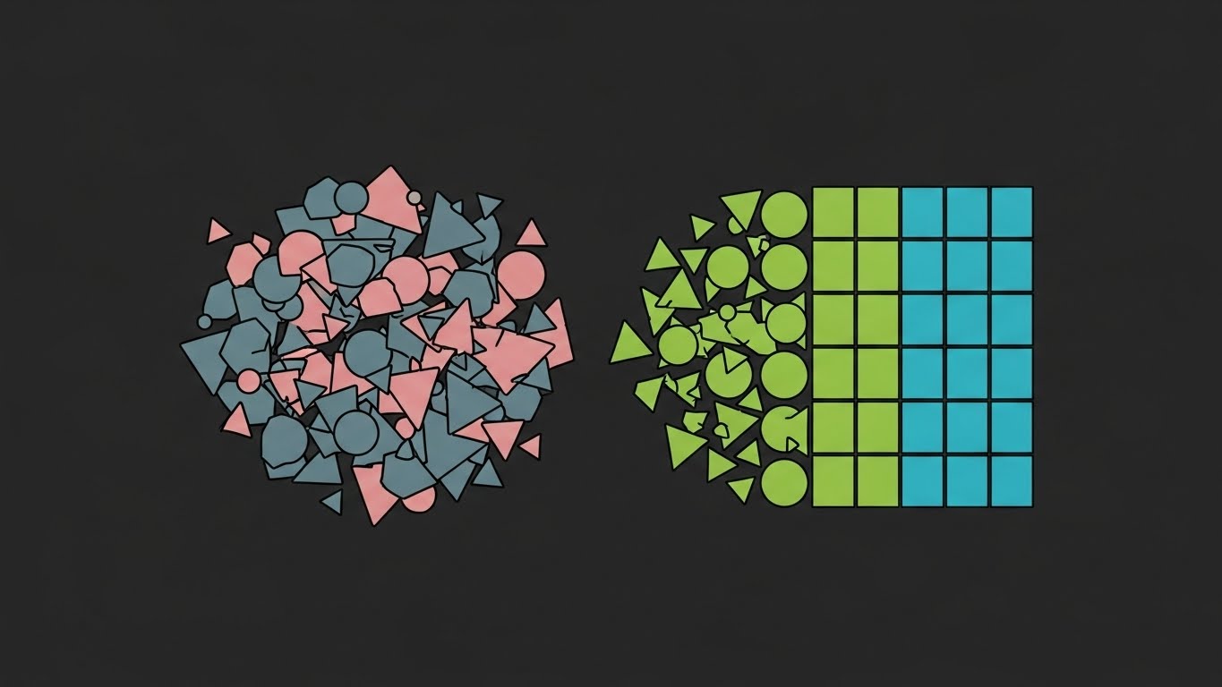
The Visual & Narrative Approach
This style utilizes a stark, clean contrast to visually define the core value proposition of analytics: Order from Chaos. The visual narrative begins with a disorganized cluster of "Muted Slate" and "Dusty Rose" shapes—representing raw, unstructured employee data (emails, surveys, payroll)—fragmented, confusing, and overwhelming. Without a visible hand, these shapes self-organize into a pristine, unified grid structure on the right, colored in "Vivid Lime Green" and "Bright Cyan." The motion is snappy and magnetic, suggesting that the software’s organizing power is effortless and instantaneous.
Psychological Impact & KPI Focus
Niche Psychology: HR leaders are often overwhelmed by "data swamp" anxiety—the fear that their data is too messy to use. This visual directly alleviates that anxiety by validating the mess (the chaotic cluster) and promising an automated, serene resolution (the grid).
Operational Impact: It visually demonstrates Data Sanitization Efficiency. It tells the viewer, "We handle the mess; you get the intelligence," significantly lowering the perceived barrier to entry for new software adoption.
Strategic Implementation & Trade-offs
- Best Use Case: 15-second pre-roll ads or social media hooks (LinkedIn/Twitter) where sound might be off and clarity is king.
- Duration: Short and punchy (15-30 seconds).
- Strategic Trade-off: While excellent for clarity, it lacks emotional depth. Avoid this style if you are trying to sell a solution based on culture, empathy, or employee well-being.
Companies using similar video content -
Visier – People Analytics – Transforms messy HR data into clear insights.
One Model – People Analytics Platform – Unifies disparate HR data sources for clarity.
2. The Cultural Harmonizer: Abstract 2D Organic Modern
TOFU | Brand Awareness

The Visual & Narrative Approach
HR is fundamentally about people, and people are not rigid boxes. This style captures that "soft" side using abstract, organic motion graphics. We see fluid, glossy shapes in "Electric Emerald" and "Soft Cream" morphing and blending like liquid mercury against a "Pale Mint" background. The lighting implies a soft, overhead softbox, creating gentle specular highlights that make the visuals feel premium and approachable. It symbolizes the seamless blending of different teams and cultures.
Psychological Impact & KPI Focus
Niche Psychology: This style reduces the anxiety associated with "cold" corporate software. It triggers a feeling of psychological safety and harmony. It counters the "cold" perception of data, reassuring stakeholders that the platform understands the human element of Human Resources.
Operational Impact: Aligns with KPIs related to Employee Experience (EX) and Retention, suggesting that the software facilitates a smooth, friction-free work environment rather than a rigid, controlling one.
Strategic Implementation & Trade-offs
- Best Use Case: High-level brand awareness videos on your website’s "Culture" or "About Us" page. Great for visualizing "Diversity & Inclusion" initiatives.
- Duration: Medium (30-60 seconds) to allow for a relaxed pacing.
- Strategic Trade-off: It is metaphorical, not literal. Avoid this style if you need to show specific dashboard features or hard metrics.
Companies using similar video content -
Culture Amp – Employee Experience Platform – Visualizes cultural health and engagement.
Glint (LinkedIn) – Employee Engagement Platform – Shows fluid connections in employee sentiment.
3. The Visionary Horizon: Gen AI Cinematic Video
TOFU | Shaping Perception

The Visual & Narrative Approach
This is where we sell the dream. The shot is a wide, heroic low-angle view of a futuristic glass-walled office at sunrise. "Warm Golden Hour" sunbeams cut through the space, illuminating floating streams of "Bioluminescent Teal" data particles. These particles hang in the air like dust motes, suggesting that intelligence is invisible but omnipresent. The camera pushes in slowly, creating a sense of momentum and inevitability.
Psychological Impact & KPI Focus
Niche Psychology: This style targets the aspirational identity of the C-Suite buyer. It says, "This is what the future of work looks like, and you can lead it." It moves the conversation from "efficiency" to "transformation."
Operational Impact: Shaping Perception of Innovation. It suggests that the platform is not just a tool for today, but a future-proof investment that integrates with the physical workspace.
Strategic Implementation & Trade-offs
- Best Use Case: YouTube pre-roll ads or keynote openers at industry conferences. It sets a high-tech tone before diving into the details.
- Duration: Cinematic (45-90 seconds).
- Strategic Trade-off: It sets very high expectations. Avoid this style if your actual software UI is dated or clunky, as the disconnect will be jarring for the user.
Companies using similar video content -
Eightfold AI – Talent Intelligence Platform – Presents a futuristic vision for talent acquisition.
Phenom – Intelligent Talent Experience – Showcases AI-driven future of talent experience.
4. The Neural Connector: Abstract 3D AI Visualization
TOFU | Category Creation

The Visual & Narrative Approach
To visualize the "Skills Graph" or the "AI Engine" behind your platform, we use a macro view of a neural network. Against a "Deep Void Violet" background, glowing nodes in "Metallic Silver" and "Neon Purple" pulse and connect via synaptic lines. The rendering style mimics high-end medical imaging, suggesting precision and organic complexity. It illustrates that your software understands the non-linear relationships between skills, roles, and people.
Psychological Impact & KPI Focus
Niche Psychology: This leverages authority bias. It visually asserts that your technology is sophisticated and "brain-like." It addresses the challenge of "Talent Fluidity," showing that you can map the complex web of human potential.
Operational Impact: Visualizes Organizational Network Analysis (ONA). It effectively demonstrates how the platform identifies hidden influencers, skills gaps, and communication bottlenecks that standard org charts miss.
Strategic Implementation & Trade-offs
- Best Use Case: LinkedIn feeds to stop the scroll with "deep tech" visuals. Perfect for announcing new AI capabilities or "Talent Intelligence" features.
- Duration: Short loops (10-20 seconds).
- Strategic Trade-off: It can feel cold or overly scientific. Avoid this style if your core value proposition is "human-centric support" or "simple payroll."
Companies using similar video content -
SkyHive – Quantum Labor Analysis – Visualizes skills and talent networks with AI.
Beamery – Talent Operating System – Connects talent data points like a neural network.
5. The Resilience Engine: Bold Kinetic Typography
TOFU | Vertical Social

The Visual & Narrative Approach
Designed for the TikTok/Reels generation, this style uses massive, blocky shapes (representing abstract letters/data) in "Hot Magenta." They crash down onto a "Jet Black" floor with a dynamic Dutch tilt camera angle. Crucially, they don't break; they bounce elastically. Motion blur accentuates the speed. This kinetic energy visualizes Workforce Resilience—the ability to take a hit and bounce back stronger.
Psychological Impact & KPI Focus
Niche Psychology: This appeals to the modern need for agility and speed. It creates a sense of urgency and excitement, countering the stereotype of HR as "slow."
Operational Impact: Visualizes Crisis Response & Agility. It communicates that the platform helps the organization bounce back from shocks (market changes, attrition spikes) quickly.
Strategic Implementation & Trade-offs
- Best Use Case: Vertical social media (TikTok, Instagram Reels, YouTube Shorts). Use it to punctuate punchy stats or rapid-fire feature lists.
- Duration: Very short (6-15 seconds).
- Strategic Trade-off: It is loud and aggressive. Avoid this style if your target audience is conservative (e.g., Legal or Compliance HR sectors).
Companies using similar video content -
Legion Technologies – Workforce Management – Emphasizes agile scheduling and labor optimization.
WorkForce Software – Workforce Management Suite – Highlights dynamic adaptation to workforce changes.
6. The Boardroom Standard: Dynamic Data Visualization
MOFU | Demand Gen

The Visual & Narrative Approach
This style speaks the language of the CFO. It resembles a high-end financial report cover come to life. A sweeping area chart in "Deep Navy" and "Metallic Gold" rises sharply from a textured "Premium Cream" paper stock background. The chart is extruded in 3D, giving it weight and substance. Floating abstract lines act as annotations, pointing to key peaks. It signals that HR data is financial data.
Psychological Impact & KPI Focus
Niche Psychology: HR directors often struggle to prove ROI to CFOs. This visual style mimics Financial Materiality. It subconsciously signals that "People Data is Financial Data," validating the investment in the software.
Operational Impact: Visualizes Strategic Growth. It links HR metrics (e.g., leadership pipeline health) directly to business outcomes, supporting the demand generation narrative.
Strategic Implementation & Trade-offs
- Best Use Case: Email marketing headers or mid-funnel landing pages for "Reporting & Analytics" features.
- Duration: Medium (30-45 seconds).
- Strategic Trade-off: It is very serious. Avoid this style if you are trying to showcase employee engagement games or wellness perks.
Companies using similar video content -
Workday – Human Capital Management – Presents HR data with financial rigor.
Oracle – Cloud HCM – Visualizes strategic HR metrics for executive review.
7. The Implementation Bridge: Wireframe to Reality
MOFU | Prod Differentiation
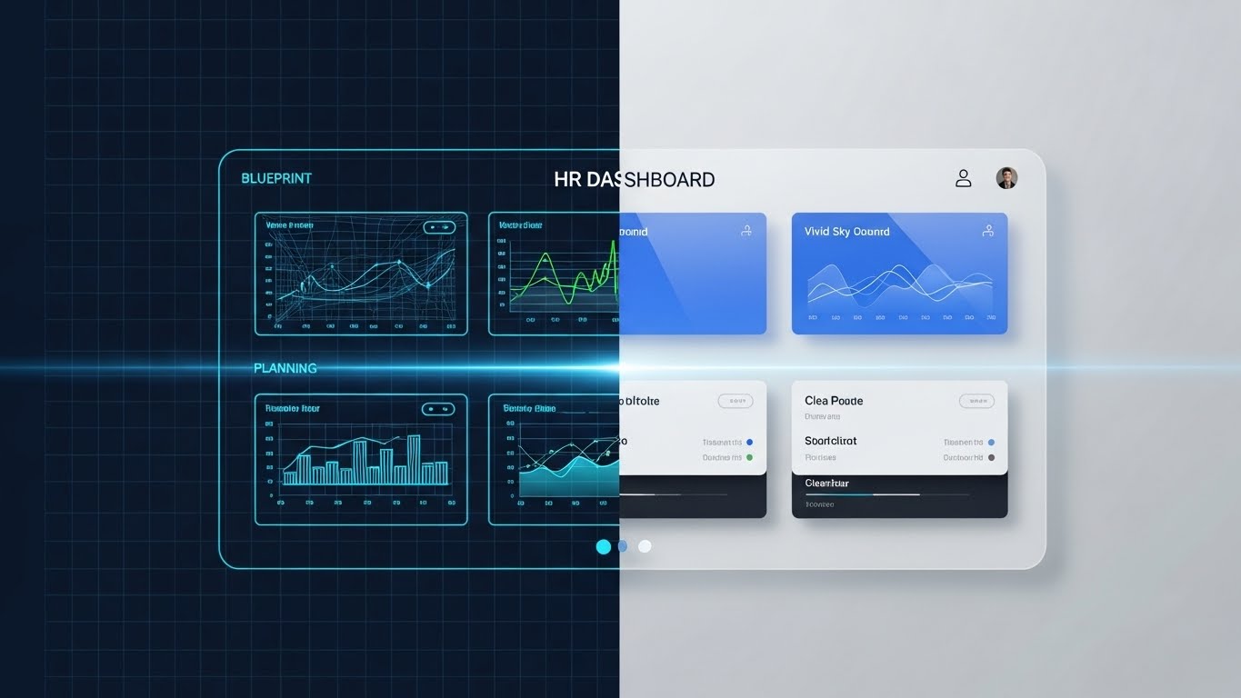
The Visual & Narrative Approach
One of the biggest blockers in B2B SaaS is the fear of complex implementation. This split-screen composition tackles that fear head-on. The left half shows a "Blueprint Blue" wireframe grid of an HR dashboard. A glowing scanning line moves across to the right, seamlessly transforming the wireframe into a photorealistic, high-gloss final render of the same dashboard in "Vivid Sky Blue" and "Clean White." It visualizes the journey from "plan" to "product."
Psychological Impact & KPI Focus
Niche Psychology: Buyers are skeptical of "Vaporware" (software that looks good but doesn't work). This style provides Tangible Proof of the product's existence and architectural soundness. It appeals to the logical, risk-averse side of the buyer.
Operational Impact: Visualizes Implementation Readiness. It implies that the planning (wireframe) effectively translates to reality (UI), suggesting a smooth implementation process.
Strategic Implementation & Trade-offs
- Best Use Case: Product pages and "How it Works" sections. It validates the engineering quality of the software.
- Duration: Medium (30-60 seconds).
- Strategic Trade-off: It is highly technical. Avoid this style if you are speaking to a non-technical end-user who just wants to know "is it easy to use?"
Companies using similar video content -
SAP SuccessFactors – HXM Suite – Shows seamless transition from planning to live HR processes.
Cornerstone OnDemand – Learning & Talent Experience – Visualizes the journey from setup to functional platform.
8. The Tactile Response: Macro UI Micro-Interactions
MOFU | Feature Education

The Visual & Narrative Approach
This style zooms in—extreme macro. We focus on a single, sleek pill-shaped button in "Vibrant Coral" on a "Soft Gray" interface. As the button is depressed, a ripple of "Neon Lime" light emanates from the click point. We can even see the faint texture of screen pixels. This visualizes the "tactile" satisfaction of using a responsive, well-designed tool.
Psychological Impact & KPI Focus
Niche Psychology: Complex enterprise software is often frustrating to use. This style promises Ease of Use and Satisfying UX. It lowers the cognitive load anxiety by showing that actions are simple, clear, and responsive.
Operational Impact: Visualizes User Adoption. High-quality UX creates higher adoption rates among line managers, which is a critical KPI for software renewal.
Strategic Implementation & Trade-offs
- Best Use Case: Social media carousels or feature highlight reels. Great for showing off a specific "One-Click" feature.
- Duration: Loopable (3-5 seconds).
- Strategic Trade-off: It lacks context. Avoid this style if you need to explain why the user is clicking the button; it only shows the how.
Companies using similar video content -
HiBob – HRIS – Focuses on intuitive, responsive employee experience.
BambooHR – HR Software – Highlights simple, satisfying UI interactions.
9. The Trust Vault: 3D X-Ray Visualization
MOFU | Building Trust

The Visual & Narrative Approach
Security is paramount in HR. This style uses a 3D X-ray effect to reveal the "secure core" of your infrastructure. We see a server rack or data block with a semi-transparent "Frosted Ice Blue" casing. Inside, "Pure White" data blocks glow safely, surrounded by a protective "Holographic Green" energy shield. The background is a dark, technical grid. It conveys transparency (we have nothing to hide) and absolute security.
Psychological Impact & KPI Focus
Niche Psychology: For the CIO and IT stakeholders involved in the purchase, Security is the number one blocker. This visual speaks their language, reassuring them that the data is not just stored, but defended.
Operational Impact: Visualizes Compliance & Governance. It helps HR leaders reassure their IT counterparts that the platform is enterprise-grade and GDPR/SOC2 compliant.
Strategic Implementation & Trade-offs
- Best Use Case: The "Security" or "Compliance" page of your website.
- Duration: Short (15-30 seconds).
- Strategic Trade-off: It is very functional. Avoid this style if you are trying to inspire creativity or collaboration.
Companies using similar video content -
NAVEX Global – Ethics & Compliance Software – Visualizes secure data handling and compliance.
Ceridian – Dayforce – Showcases robust data security for payroll and HR.
10. The Process Optimizer: Isometric 2D Motion Design
MOFU | Comp Displacement

The Visual & Narrative Approach
This style is perfect for showing "Old Way vs. New Way." On a "Slate Blue" background, we see a messy pile of "Paper White" documents on the left. On the right, a neat, isometric factory line processes these papers, instantly converting them into glowing "Orange" digital cubes. The flat style with hard shadows makes the process look clean, efficient, and automated.
Psychological Impact & KPI Focus
Niche Psychology: This leverages the Efficiency trigger. It validates the replacement of legacy manual processes with digital automation. It is highly effective for "Competitive Displacement" campaigns where you are replacing spreadsheets or paper files.
Operational Impact: Visualizes Digital Transformation. It clearly shows the transition from legacy, paper-based processes to modern, digital workflows, directly impacting efficiency KPIs.
Strategic Implementation & Trade-offs
- Best Use Case: LinkedIn ads targeting operational HR roles. "Stop drowning in paper" campaigns.
- Duration: Medium (30-45 seconds).
- Strategic Trade-off: It can look a bit "cartoonish." Avoid this style if you are targeting the very top-tier Enterprise C-Suite who expect photorealism.
Companies using similar video content -
ADP – Workforce Now – Illustrates streamlined payroll and HR processes.
Paylocity – HCM Platform – Shows efficient automation of HR workflows.
11. The Connectivity Thread: 2D Line Art Animation
MOFU | Overcoming Obj
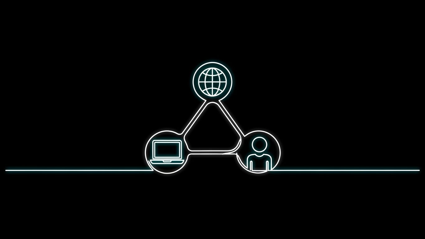
The Visual & Narrative Approach
To dismantle the common objection of "fragmented systems," this style utilizes a sophisticated, continuous line art animation. Against a "Stark Black" background, a single, glowing "White" line—pulsing with a faint "Cyan" aura—fluidly draws the outline of a connected HR ecosystem. It morphs seamlessly to connect a laptop (remote work), a globe (global compliance), and a person icon (talent) into a unified triangular structure. The line never breaks, visually reinforcing the concept of uninterrupted data flow and seamless integration.
Psychological Impact & KPI Focus
Niche Psychology: IT leaders and HR Operations managers often suffer from "Integration Anxiety"—the fear that a new tool will create data silos. This visual metaphor alleviates that fear by demonstrating Interoperability. It creates a sense of elegance and simplicity, assuring the viewer that the platform acts as the "connective tissue" for their tech stack.
Operational Impact: Visualizes Data Fluidity. It effectively communicates that the software ensures data integrity across borders and devices, directly impacting KPIs related to Reporting Accuracy and Admin Efficiency.
Strategic Implementation & Trade-offs
- Best Use Case: "Integrations" pages on your website or technical explainer videos sent to IT stakeholders.
- Duration: Short and fluid loops (15-20 seconds).
- Strategic Trade-off: It is abstract. Avoid this style if you need to show specific API capabilities or actual dashboard UI; it sells the concept of connection, not the code.
Companies using similar video content -
Rippling – HR, IT, & Finance Platform – Visualizes seamless integration across business functions.
Gusto – Payroll & HR Platform – Connects various HR services with simple lines.
12. The Value Materializer: Photorealistic 3D Renders
MOFU | ABM Awareness

The Visual & Narrative Approach
This style is designed to elevate the perceived value of your data for high-stakes Account-Based Marketing (ABM). We see a photorealistic 3D render of a prestigious award trophy sitting on a "White Marble" pedestal in a luxury office environment. Crucially, the trophy is not solid metal; it is formed from a dense, swirling cloud of floating "Gold Leaf" data points held together by an invisible magnetic force. The studio lighting captures the texture of every particle, symbolizing that scattered data points, when organized by your software, coalesce into a prize-winning asset.
Psychological Impact & KPI Focus
Niche Psychology: This appeals to the Status and Achievement motivations of C-Suite buyers. It positions the software not as a utility, but as a "Crown Jewel" of the enterprise. It visually validates the investment by treating employee data like gold.
Operational Impact: Visualizes Total Rewards Optimization. It transforms the abstract concept of "people analytics" into a tangible, high-value asset, reinforcing the narrative that better data leads to market leadership and premium employer branding.
Strategic Implementation & Trade-offs
- Best Use Case: ABM display ads targeting Fortune 500 CHROs or "Success Stories" headers.
- Duration: Static image or very slow cinematic pan (6-10 seconds).
- Strategic Trade-off: It is purely symbolic. Avoid this style for "How-to" guides or training materials where clarity is more important than prestige.
Companies using similar video content -
Qualtrics – EmployeeXM – Elevates employee feedback into high-value insights.
Medallia – Experience Cloud – Positions experience data as a strategic asset.
13. The ROI Vault: Isometric 3D Workflow
MOFU | ROI Justification

The Visual & Narrative Approach
When the conversation turns to budget, this style speaks the language of the CFO. We see a clean, isometric cutaway view of a stylized office floor plan with "Sage Green" walls. Inside, the workflow is literalized: tiny, stylized "Gold" coins flow through clear pneumatic tubes in the ceiling—representing optimized budget allocation—and drop directly into a central, secure vault. The "Clay Render" aesthetic with soft shadows makes the complex financial flow look managed, tangible, and secure.
Psychological Impact & KPI Focus
Niche Psychology: The economic buyer needs to see where the money goes. This style satisfies the need for Financial Materiality. It moves the HR conversation from "soft costs" (happiness) to "hard savings" (retention dollars saved), framing the software as a savings mechanism.
Operational Impact: Visualizes Cost Optimization. It demonstrates how the platform captures leaked value (e.g., from attrition or inefficient hiring) and redirects it back to the bottom line, providing visual evidence for the business case.
Strategic Implementation & Trade-offs
- Best Use Case: Pitch decks and ROI calculators. Essential for the "Business Case" presentation.
- Duration: Loopable background or medium animation (20-30 seconds).
- Strategic Trade-off: It is very transactional. Avoid this style if your primary message is about empathy, culture, or mental health support.
Companies using similar video content -
Anaplan – Connected Planning Platform – Visualizes financial impact of workforce decisions.
Pigment – Business Planning Platform – Shows optimized budget allocation and savings.
15. The Reality Check: Split Screen Optimized
MOFU | Comp Comparison

The Visual & Narrative Approach
To aggressively differentiate from legacy competitors, we use a stark visual contrast. A vertical crisp white line divides the screen. The left side (The Old Way) is desaturated, cool-toned, showing a stressed office worker buried in paper—visualizing chaos. The right side (The New Way) is vibrant, warm, and color-graded with "Saturated Blue" and "Red," showing the same worker relaxing with a tablet—visualizing control. The line slides to the left as the "New Way" takes over.
Psychological Impact & KPI Focus
Niche Psychology: This leverages the Contrast Principle. By placing the pain (stress) directly next to the solution (ease), the value proposition becomes undeniable. It triggers immediate empathy and offers a visual escape route from burnout.
Operational Impact: Visualizes Operational Efficiency & Employee Experience. It starkly contrasts the "Time to Value" of manual processes versus the automated platform, highlighting the reclamation of time and mental energy.
Strategic Implementation & Trade-offs
- Best Use Case: Retargeting ads on social media (Instagram/LinkedIn) for users who have visited competitor review sites.
- Duration: Static or short loop (3-6 seconds).
- Strategic Trade-off: It is binary and slightly reductive. Avoid this style for nuanced enterprise discussions involving complex hybrid workflows.
16. The Deep Dive: 3D Parallax UI Presentation
BOFU | Demo Requests
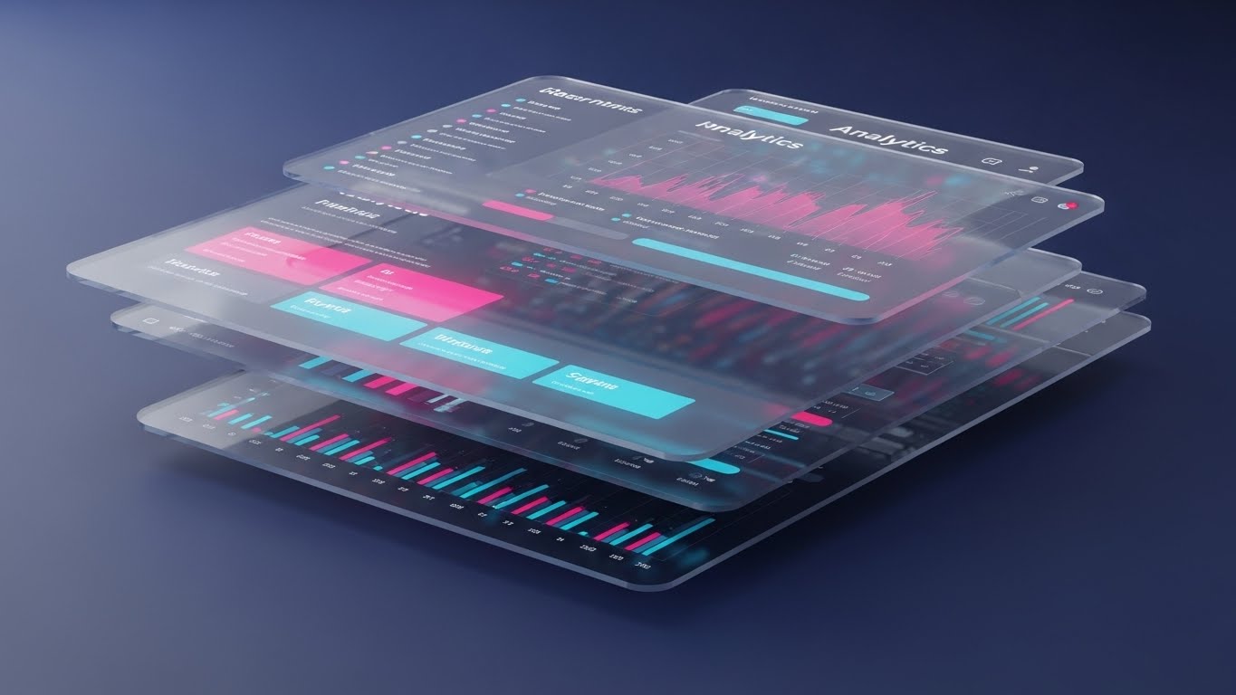
The Visual & Narrative Approach
At the Bottom of the Funnel (BOFU), buyers want to know if the tool is robust. This style explodes the UI into floating 3D layers in a "Deep Indigo" digital void. We see the dashboard screens not as flat images, but as glass panels with depth. Behind the top layer of "Neon Pink" and "Cyan" graphs, we see layers of raw data and sub-metrics. The camera floats through these layers, creating a sense of immersion and complexity.
Psychological Impact & KPI Focus
Niche Psychology: This signals Sophistication and Completeness. It reassures the analytical buyer (Data Scientist/HR Analyst) that the platform isn't just a pretty surface; it has deep data capabilities. It visually represents "Drill-Down" power.
Operational Impact: Visualizes Comprehensive Analytics. By showing multiple screens simultaneously in depth, it implies that the platform connects various data points (e.g., performance, pay, attendance) into a multi-dimensional insight engine.
Strategic Implementation & Trade-offs
- Best Use Case: The background video for a "Request a Demo" landing page or high-end product trailers.
- Duration: Slow, continuous motion (30-60 seconds).
- Strategic Trade-off: It can be overwhelming. Avoid this style for mobile users or audiences who need simple, linear explanations.
Companies using similar video content -
Factorial – HR Software – Contrasts manual HR with automated efficiency.
Personio – HR Software – Highlights the shift from administrative burden to strategic HR.
17. The Frictionless Flow: Clean UI Workflow (Light)
BOFU | Functional Buyer
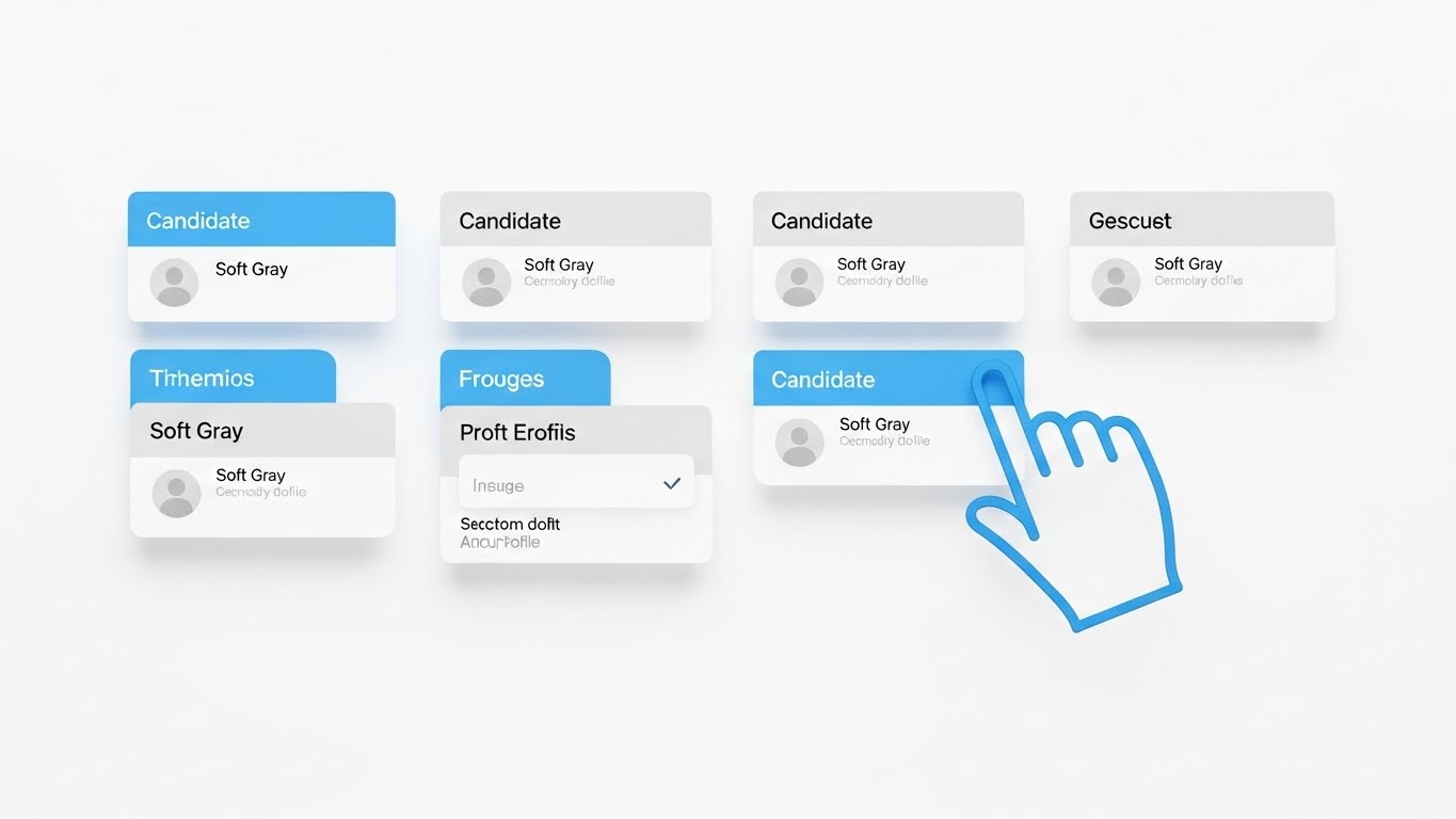
The Visual & Narrative Approach
For the functional buyer (the recruiter or HR generalist), the primary concern is "Is it easy?" This style uses a pristine, high-fidelity UI mockup on a "Pure White" background. We see "Sky Blue" headers and "Soft Gray" candidate cards. An abstract vector cursor hand smoothly drags a card from one column to another. Soft drop shadows provide just enough lift to make the elements feel tactile. The motion is buttery smooth, emphasizing the ease of the drag-and-drop interface.
Psychological Impact & KPI Focus
Niche Psychology: This addresses Cognitive Ease. It reduces the fear of a steep learning curve. The "clean" look subconsciously suggests that the work itself will become cleaner and more organized, removing the anxiety of clunky enterprise tools.
Operational Impact: Visualizes Time-to-Productivity. It demonstrates that new users can pick up the tool and start working immediately without extensive training, a key factor in software renewal.
Strategic Implementation & Trade-offs
- Best Use Case: "Features" pages, help center articles, and onboarding videos.
- Duration: Task-dependent (10-30 seconds).
- Strategic Trade-off: It is very tactical. Avoid this style for brand awareness campaigns where you need to generate hype; this is for closing the practical buyer.
Companies using similar video content -
Tableau – Analytics Platform – Showcases multi-dimensional data exploration.
Qlik Sense – Analytics Platform – Visualizes deep analytical capabilities with interactive UI.
18. The Strategic Overseer: Lifestyle Stock + UI Overlay
BOFU | Economic Buyer
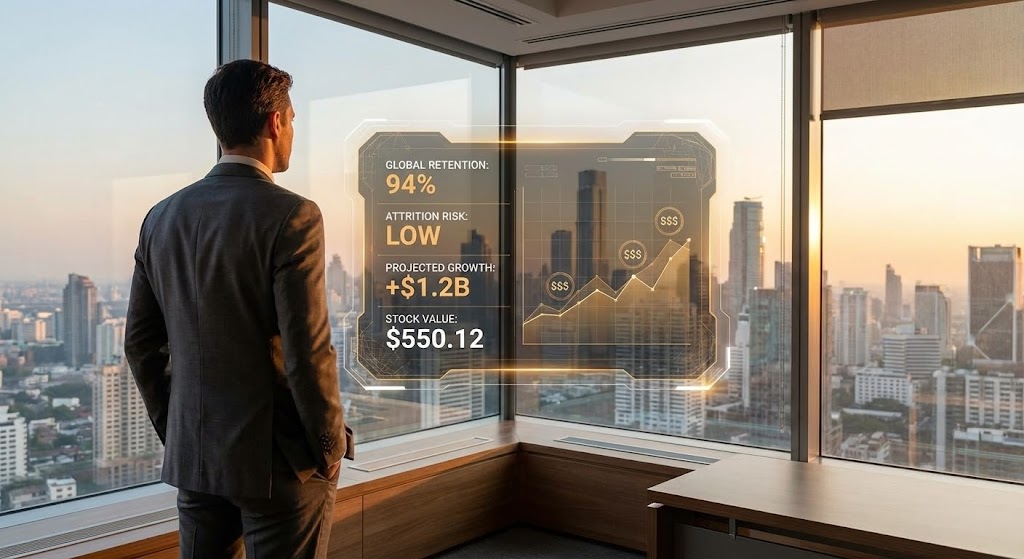
The Visual & Narrative Approach
This style puts the viewer in the shoes of the CEO. It features a high-quality, over-the-shoulder shot of a professional leader looking out at a city skyline. Floating in the air before the glass is a futuristic, semi-transparent "Amber" and "White" HUD (Heads Up Display). The overlay displays key high-level metrics: "Global Retention: 94%," "Attrition Risk: Low," and projected savings. It blends the physical world of leadership with the digital world of insight.
Psychological Impact & KPI Focus
Niche Psychology: This appeals to the Executive Ego and the desire for control. It frames the software as a "command center" that gives leaders superpowers to see the invisible forces shaping their organization and financial future.
Operational Impact: Visualizes Strategic Alignment. It moves the focus from "managing tasks" to "steering the ship," linking HR data directly to the health and growth of the enterprise.
Strategic Implementation & Trade-offs
- Best Use Case: Case study videos, executive summaries, and headers for "Solutions for Executives" pages.
- Duration: Cinematic (15-30 seconds).
- Strategic Trade-off: It feels staged. Avoid this style if your brand voice is "grassroots" or "employee-first," as it can feel too top-down/corporate.
Companies using similar video content -
Greenhouse – Applicant Tracking System – Demonstrates intuitive recruitment workflows.
Lever – Talent Acquisition Suite – Highlights easy-to-use candidate management.
19. The Sentinel Interface: Dark Mode UI Showcase
BOFU | Risk Mitigation
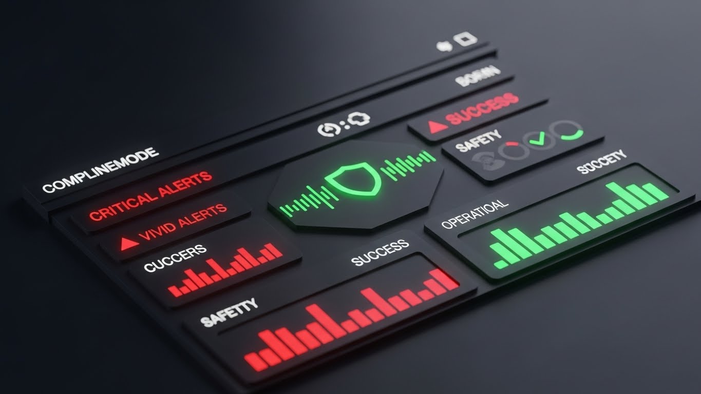
The Visual & Narrative Approach
When discussing compliance and risk, the tone must shift to serious vigilance. This style features a sleek Dark Mode UI on a "Matte Charcoal" background. Interface elements are "Dark Slate," making the critical alerts glowing in "Vivid Red" (for risks) and "Safety Green" (for resolved issues) pop intensely. A central shield icon pulses with a green glow. The aesthetic is technical and precise, resembling a high-tech security operations center.
Psychological Impact & KPI Focus
Niche Psychology: This targets the Fear of Non-Compliance (GDPR fines, lawsuits). It reassures the risk-averse buyer (Legal/IT) that the system is vigilant, even when they aren't. The dark mode suggests "always-on" monitoring and absolute security.
Operational Impact: Visualizes Risk Management. It demonstrates how the platform proactively flags compliance issues (e.g., certification expiries, labor law violations) before they become crises.
Strategic Implementation & Trade-offs
- Best Use Case: The "Compliance" module page or security documentation.
- Duration: Short and focused (10-20 seconds).
- Strategic Trade-off: It is intense. Avoid this style for "Employee Engagement" or "Wellness" features, as the dark/alert aesthetic clashes with positive cultural vibes.
Companies using similar video content -
UKG – Pro – Provides strategic oversight for executive decision-making.
Infor – HCM – Offers executive decision support with integrated HR data.
20. The Success Story: 2D Character-Driven Story
BOFU | Self-Serve Onboard
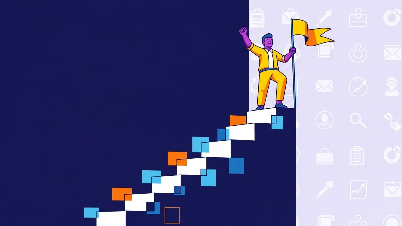
The Visual & Narrative Approach
To drive adoption among end-users (employees), we need to make the software about them, not the company. This style uses friendly, stylized 2D vector characters with "Purple" skin and "Yellow" clothing (brand colors). A character stands triumphantly at the top of a digital staircase, planting a flag. The steps represent milestones in the software. The background features a subtle pattern of abstract app icons in "Soft Lavender."
Psychological Impact & KPI Focus
Niche Psychology: This leverages Gamification and the need for Recognition. It combats "software fatigue" by making the user experience feel rewarding and human-centric. It reframes software training from a "chore" into a "level-up" opportunity.
Operational Impact: Visualizes Employee Engagement & Adoption. It shows that the platform is designed to encourage participation and self-service, which directly improves data quality and reduces the administrative burden on HR.
Strategic Implementation & Trade-offs
- Best Use Case: In-app onboarding screens, "Success" states after task completion, or internal launch videos.
- Duration: Loopable or short narrative (15-30 seconds).
- Strategic Trade-off: It is playful. Avoid this style for serious C-level presentations regarding financial analytics or layoffs.
Companies using similar video content -
Compli – Compliance Management Software – Showcases active monitoring for regulatory risks.
Ethico – Ethics & Compliance Platform – Visualizes vigilant risk mitigation in a dark UI.
21. The Integration Builder: Low-Poly 3D Modeling
BOFU | Objection Handling

The Visual & Narrative Approach
To address the technical complexity of system integration, we utilize a simplified, constructive "Low-Poly" aesthetic. The visual features two floating islands: one "Earthy Brown" (representing legacy systems) and one "Lego Red" (representing the new platform). Animated workers in blue overalls rapidly construct a bridge between them using interlocking bricks. The water below is stylized "Crystal Blue" triangles. This simplifies the abstract concept of API connectivity into a tangible, logical, and constructive narrative.
Psychological Impact & KPI Focus
Niche Psychology: IT stakeholders and HR Ops managers often fear data silos and broken integrations. This style utilizes Cognitive Simplification. By using a modular, toy-like aesthetic, it visually de-risks the integration process, framing it as a manageable assembly task rather than a coding nightmare.
Operational Impact: Visualizes Interoperability. It reassures the buyer that the platform fits into their existing ecosystem without friction, directly impacting the Time to Implementation KPI.
Strategic Implementation & Trade-offs
- Best Use Case: "Integration" web pages or technical documentation videos explaining API connectors.
- Duration: Short and process-oriented (15-20 seconds).
- Strategic Trade-off: It is playful and stylized. Avoid this style if you are trying to demonstrate high-fidelity data security features, as it may feel too casual for serious compliance topics.
Companies using similar video content -
Lattice – Performance Management – Guides users through goal achievement with friendly visuals.
15Five – Performance & Engagement – Uses character-driven narratives for user success.
22. The Value Accelerator: Rapid UI Feature Montage
Onboard | Accel TTV
The Visual & Narrative Approach
Speed is the primary driver of initial adoption. This style employs a high-energy montage designed to demonstrate platform readiness. Multiple UI widgets—a "Gauge" showing performance, a "List" of candidates, a "Pie Chart" of diversity metrics—fly into the frame from different angles in a "Multi-colored Vibrant" palette. They snap into place on a grid, accompanied by dynamic motion blur. The background is a clean radial gradient from "White" to "Light Gray," creating a sense of abundance and velocity.
Psychological Impact & KPI Focus
Niche Psychology: New users often feel "Dashboard Paralysis" or worry about the setup time. This style triggers Excitement and the Abundance Mindset. It showcases the breadth of the tool in seconds, promising that the user will have a fully functional "command center" at their fingertips immediately.
Operational Impact: Visualizes Feature Discovery. It rapidly exposes users to parts of the platform they might otherwise miss, driving Feature Adoption Rates during the critical first 30 days.
Strategic Implementation & Trade-offs
- Best Use Case: Welcome emails, onboarding kick-off videos, or product update trailers.
- Duration: Fast-paced (10-15 seconds).
- Strategic Trade-off: It emphasizes speed over detail. Avoid this style for detailed tutorials; it is designed for hype and awareness, not step-by-step instruction.
Companies using similar video content -
Workato – Integration Platform as a Service (iPaaS) – Simplifies complex system connections.
Boomi – Integration Platform – Visualizes building bridges between disparate applications.
23. The Frictionless Core: Holographic UI over 3D
Onboard | Reduce Friction

The Visual & Narrative Approach
This style visualizes the "invisible" quality of data flow. We see a realistic 3D render of a "Metallic Silver" database server cylinder in a clean, high-tech lab. Surrounding it, "Glowing Cyan" holographic pipes pass effortlessly through the solid metal walls. This visual metaphor illustrates that the software eliminates the "walls" between data sources, allowing information to permeate the organization securely but freely.
Psychological Impact & KPI Focus
Niche Psychology: HR Architects value Transparency and Fluidity. This visual addresses the fear of "Black Box" algorithms. It suggests that data flows freely and transparently through the system, building trust in the backend infrastructure.
Operational Impact: Visualizes Data Integrity. It reinforces the message that the platform handles complex data ingestion without error or bottleneck, supporting KPIs related to Reporting Accuracy.
Strategic Implementation & Trade-offs
- Best Use Case: Background visuals for webinars on "Data Architecture" or "People Analytics Infrastructure."
- Duration: Loopable (5-10 seconds).
- Strategic Trade-off: It is abstract. Avoid this style if you need to show the actual user interface; this is purely about the backend concept.
Companies using similar video content -
Zoho People – HR Software – Rapidly showcases a wide array of HR features.
Sage HR – HR & Payroll Software – Highlights quick access to various HR functionalities.
24. The Tenure Loop: Abstract 2D Motion Graphics
Retention | Reducing Churn

The Visual & Narrative Approach
Retention is a continuous cycle, not a destination. This style uses therapeutic, smooth motion graphics to visualize this continuity. A "Pastel Gradient" ribbon (morphing from Pink to Blue) loops infinitely in a figure-eight pattern against an "Off-White" background. The ribbon is knot-free and flows without resistance. This abstractly represents the ideal employee lifecycle: continuous, evolving, and unbroken by friction or burnout.
Psychological Impact & KPI Focus
Niche Psychology: HR is often stressful and turbulent. This style utilizes Calm Tech principles. It associates the software with peace, order, and stability. It subtly reinforces the goal of "keeping people," contrasting with the jagged, chaotic visuals of attrition.
Operational Impact: Visualizes Employee Lifecycle Management. It is a visual metaphor for the "hire-to-retire" journey, aligning with Retention Rate and Lifetime Value (LTV) KPIs.
Strategic Implementation & Trade-offs
- Best Use Case: Customer success emails, renewal reminders, or screensavers at HR conferences.
- Duration: Infinite loop.
- Strategic Trade-off: It is purely mood-based. Avoid this style for hard-hitting sales pitches; it is too passive for aggressive conversion goals.
Companies using similar video content -
Snowflake – Data Cloud – Visualizes seamless and transparent data flow.
Databricks – Data & AI Platform – Shows frictionless data movement and processing.
25. The Proactive Guide: 2D Animation & UI Comp
Retention | Knowledge Base

The Visual & Narrative Approach
Self-service support reduces frustration. This style introduces a friendly "mascot" element—a stylized robot in "Teal" and "White"—hovering next to a floating UI search bar. The robot points to the bar, and a "UI Help" bubble pops up. The background is a subtle pattern of question marks and lightbulbs in "Faint Gray." It humanizes the help desk, making the software feel like a partner rather than just a tool.
Psychological Impact & KPI Focus
Niche Psychology: Users dislike feeling stuck or dependent on IT. This style leverages the Guidance trigger. It reassures users that help is always available and friendly, reducing the anxiety of making mistakes in a complex system.
Operational Impact: Visualizes Support Efficiency. It promotes self-service behaviors, which can directly reduce Support Ticket Volume and increase User Satisfaction Scores (CSAT).
Strategic Implementation & Trade-offs
- Best Use Case: The "Help Center" landing page or "New Feature" walkthroughs.
- Duration: Short narrative (15-30 seconds).
- Strategic Trade-off: It is playful. Avoid this style for serious compliance warnings or executive financial reporting.
Companies using similar video content -
Quantum Workplace – Employee Engagement – Visualizes continuous employee journey and feedback.
Limeade – Well-being Platform – Shows an ongoing, fluid path to employee well-being.
26. The Network Pulse: Futuristic Neon/Dark Mode
Retention | Deep Feature Adopt

The Visual & Narrative Approach
To sell advanced features like Organizational Network Analysis (ONA), we need a "Data Science" aesthetic. Against a "Pitch Black" background, a complex web of nodes and connecting lines glows in "Neon Blue" and "Hot Pink." The nodes pulsate rhythmically, and little packets of light travel along the lines, visualizing communication flow. It looks like the dashboard of a sci-fi interface, implying deep, hidden intelligence.
Psychological Impact & KPI Focus
Niche Psychology: This appeals to the Analytical Ego. It makes the user feel like a "Data Wizard." It visualizes the complexity of human relationships in a way that looks managed and understandable, validating the sophistication of the software.
Operational Impact: Visualizes Talent Intelligence. It demonstrates the platform's ability to map invisible relationships (mentorship, silos), driving the adoption of high-value, sticky features.
Strategic Implementation & Trade-offs
- Best Use Case: Product pages for "ONA" or "Advanced Analytics" modules.
- Duration: Loopable or slow pan (10-20 seconds).
- Strategic Trade-off: It can feel cold. Avoid this style for modules related to "Employee Wellness" or "Benefits," which require a warmer touch.
Companies using similar video content -
WalkMe – Digital Adoption Platform – Provides proactive, guided assistance within applications.
Pendo – Product Experience Software – Offers in-app guidance and user support.
27. The Feedback Loop: 2D Graphics Over Live Action
Retention | Proactive Support

The Visual & Narrative Approach
This style blends the real world with the digital layer. We see a medium portrait of a smiling HR manager in a modern office. Floating around her head are 2D vector icons in "Bright Orange" and "Green"—checkmarks, stars, and notification bells—that track naturally with her movements. It suggests that the software augments her reality, providing real-time feedback and recognition without interrupting her day.
Psychological Impact & KPI Focus
Niche Psychology: This bridges the Physical/Digital Divide. It shows that the software is part of the real human workflow, not a distraction from it. It emphasizes "Augmentation" rather than "Automation," which is less threatening to employees.
Operational Impact: Visualizes Continuous Performance Management. It encourages the use of real-time feedback tools, driving KPIs related to Employee Engagement and Performance Review Completion Rates.
Strategic Implementation & Trade-offs
- Best Use Case: Social media ads (Instagram/LinkedIn) targeting Gen Z/Millennial managers.
- Duration: Short loops (6-10 seconds).
- Strategic Trade-off: It requires high-quality stock or custom footage. Avoid this style if you only have budget for stock photos that look generic.
Companies using similar video content -
TrustSphere – Organizational Network Analysis – Visualizes hidden communication patterns.
OrgMapper – ONA Software – Maps and illuminates organizational networks.
28. The AI Strategist: Generative AI Realistic Character
Expansion | Driving Upsell

The Visual & Narrative Approach
To upsell new AI modules, we use AI to sell AI. A photorealistic, AI-generated video shows a diverse female data scientist speaking passionately. She holds a glowing "Holographic Orb" in her hand. The lighting is dramatic "Rembrandt" style. The background is a blurred high-tech stage. The high fidelity of the character combined with the futuristic prop suggests that your AI features are both cutting-edge and human-controlled.
Psychological Impact & KPI Focus
Niche Psychology: This targets the Future-Ready aspiration. It alleviates the fear of "impersonal AI" by giving the AI a human face. It positions the upsell not as a tool, but as a "digital colleague" that enhances capability.
Operational Impact: Visualizes Predictive Analytics. It sells the value of "foresight"—using AI to predict retention or skills gaps—driving revenue expansion through module add-ons.
Strategic Implementation & Trade-offs
- Best Use Case: Keynote videos, "Vision" statements, or high-tier upsell emails.
- Duration: Cinematic (30-60 seconds).
- Strategic Trade-off: The "Uncanny Valley" Risk. Ensure the AI generation is top-tier; poorly lip-synced AI will destroy trust immediately.
Companies using similar video content -
Betterworks – Performance Management – Augments real-time feedback into daily work.
Workday Peakon Employee Voice – Employee Engagement – Provides real-time feedback overlays on employee experience.
29. The Cultural Zenith: Aspirational Stock Montage
Expansion | Referrals

The Visual & Narrative Approach
This is the "Happy Ending" visual. We see a wide, high-resolution shot of a diverse group of professionals working on a rooftop garden terrace. The lighting is "Golden Hour," creating a warm, inviting glow. The palette emphasizes natural greens and sky blues. There is no UI, no data—just happy people. This represents the ultimate result of using your software: a thriving, engaged culture.
Psychological Impact & KPI Focus
Niche Psychology: This appeals to the Idealist in every HR leader. It reminds them why they bought the software: to make work better for people. It is a powerful emotional hook for case studies and testimonials.
Operational Impact: Visualizes Employer Branding. It links the software directly to the company's ability to attract and retain top talent, supporting Net Promoter Score (NPS) and referral goals.
Strategic Implementation & Trade-offs
- Best Use Case: "Success Stories" pages, annual reports, or background visuals for client testimonials.
- Duration: Static or slow motion.
- Strategic Trade-off: It is generic. Avoid this style if you haven't established your technical credibility first; otherwise, it looks like fluff.
Companies using similar video content -
Paradox – Conversational AI for HR – Features AI assistants for talent acquisition.
Pymetrics – AI-Powered Talent Assessment – Showcases AI for predicting job fit.
30. The Macro Pulse: Hyper-lapse Stock Footage with Data
Expansion | Trial Activation

The Visual & Narrative Approach
For the largest enterprise deals, we zoom out to the city level. A night-time hyper-lapse shows a busy city with car lights forming streaks of "Red" and "White." Overlaid on the skyscrapers are giant, semi-transparent 3D bar charts growing upwards in "Neon Green" and "Blue." This implies that your software doesn't just manage a team; it powers the economy of the city/enterprise.
Psychological Impact & KPI Focus
Niche Psychology: This targets the Empire Builder mentality of the Global CHRO. It matches the scale of their responsibility. It visually confirms that the software is robust enough to handle data at a city-wide or global scale.
Operational Impact: Visualizes Macro-Workforce Trends. It suggests that the platform provides insights that go beyond the office walls, influencing market position and regional strategy.
Strategic Implementation & Trade-offs
- Best Use Case: Event backdrops for global conferences or the "Enterprise" section of your website.
- Duration: Energetic loop (10-20 seconds).
- Strategic Trade-off: It feels distant. Avoid this style for employee-facing communication; it feels too corporate and removed from the individual experience.
Strategic Knowledge Base: The Visual Operations Doctrine
To transform HR Analytics from a "purchased tool" into a "competitive advantage," organizations must move beyond ad-hoc video creation. The following three segments outline a strategic framework for embedding visual communication into the DNA of your HR operations.
Strategic Alignment & Visual Architecture
The "Pre-Production" Strategy. Why and Who.
- The Cognitive Load Audit: Before creating any visual asset, audit the "Cognitive Load" of the current text-based process. If a 10-page PDF on "Compensation Planning" causes anxiety, replace it with a Style 6 (Boardroom Standard) video. Measure the reduction in support queries.
- Role-Based Visual Mapping: Differentiate styles for different users. The CHRO requires Style 18 (Strategic Overseer)—high-level, clean, financial. The Line Manager requires Style 17 (Frictionless Flow)—tactical, quick, and task-oriented. Map your styles to your personas.
- The "Glanceability" Standard: In a busy HR Ops environment, information must be consumed in seconds. Adopt the "Glanceability" standard for all internal communication—using Style 1 (Clarity Engine) to simplify complex updates into 15-second visual bites.
- Brand Voice Consistency: Your internal HR brand is as important as your external consumer brand. Ensure that the visual language of your analytics training matches your corporate identity. A disjointed visual experience creates trust gaps.
- The Advids Strategic Audit: Partnering with a specialized agency like Advids allows you to define this "Visual Operating System" upfront. We help you create a "Visual Style Guide" specifically for your data, ensuring that every chart, graph, and video speaks the same language across the enterprise.
- Standardization vs. Customization: Use standardized templates (like Style 8) for recurring updates (e.g., Monthly Headcount). Reserve bespoke, high-end production (like Style 3) for annual strategic launches to maximize budget efficiency.
- The Cross-Departmental Bridge: HR data often confuses Finance and Ops. Use Style 13 (ROI Vault) visuals to "translate" HR metrics (like attrition) into Finance metrics (like lost revenue), creating a shared visual language for cross-functional alignment.
- Legacy System Integration: When introducing new software alongside old ERPs, use Style 21 (The Integration Architect) visuals to show how they connect. This reduces the "Rip and Replace" anxiety among IT and tenured staff.
- Accessibility in Workforce: Your workforce is diverse. Ensure all motion graphics (especially Style 5) are designed with high contrast and subtitles to meet WCAG accessibility standards, ensuring inclusivity for all employees.
- The Mobile-First Mandate: 70% of line managers access HR data on the go. Ensure all 30 styles are optimized for vertical viewing (9:16 aspect ratio) to meet the "mobile-first" consumption habits of the modern workforce.
Operational Adoption & Implementation
The "Deployment" Phase. How to embed visuals into the workflow.
- Overcoming "Big Brother" Anxiety: When rolling out monitoring or ONA tools, use Style 9 (Trust Vault). Visualizing the security and anonymity of the data is critical to overcoming employee resistance and fear of surveillance.
- The Micro-Learning Shift: Evolve beyond the 1-hour webinar. Replace it with a library of 30-second "Micro-Learning" clips using Style 17. Tag them contextually within the software so users learn while they work.
- Just-in-Time Support: Embed Style 25 (Proactive Guide) videos directly into your helpdesk chatbots. Providing a visual answer the moment a user gets stuck reduces frustration and increases "Self-Serve" resolution rates.
- Gamification of Training: Use Style 20 (Success Story) to visualize training progress. Award digital badges or visual "Level Ups" for mastering new analytics modules, tapping into the intrinsic motivation of your power users.
- Reducing Support Ticket Volume: There is a direct correlation between the quality of your visual onboarding and the volume of "How-to" tickets. Invest heavily in Style 2 (Cultural Harmonizer) during launch to preemptively answer common cultural and functional questions.
- Remote Onboarding: For distributed teams, use Style 7 (Implementation Bridge) to simulate the in-office training experience. High-fidelity visuals can bridge the distance gap, ensuring remote HR BPs feel as supported as HQ staff.
- Visual Standard Operating Procedures (SOPs): Text-based SOPs are rarely read. Transform critical processes (e.g., "How to terminate an employee in the system") into Style 10 (Process Optimizer) animations. This ensures compliance and reduces legal risk.
- Feedback Loops: Use interactive video elements (Style 27) to gather feedback. A simple "Thumps Up/Down" overlay on a training video provides instant data on content effectiveness.
- Scalable Localization: If you operate globally, separate on-screen text from the video animation. This allows you to swap languages easily without re-rendering the entire asset, a key efficiency strategy for Global HR.
- Leadership Communication: When the CHRO presents to the Board, equip them with Style 6 (Boardroom Standard) video loops that auto-play in their PowerPoint decks, making them look tech-savvy and data-driven.
Measuring Impact & Future-Proofing
The "ROI" Phase. Measuring success and looking ahead.
- Beyond "Views": Move beyond measuring "video views." Measure "Action." Did the viewer click the "Run Report" button after watching the Style 22 video? Define actionable KPIs for every visual asset.
- The "Time-to-Insight" Metric: Correlate better visualization with speed. If a Style 1 dashboard explanation reduces the time it takes a manager to find "Attrition Risk" from 5 minutes to 30 seconds, quantify that efficiency gain across the organization.
- Compliance Velocity: Measure how fast new regulations (e.g., Pay Transparency) are understood. Compare the adoption rate of regions trained via video (using Style 19) vs. regions trained via email. The delta is your "Visual ROI."
- Retention and Churn: High-quality UX visualization improves the "stickiness" of the software. Monitor the login frequency of users exposed to Style 24 (Tenure Loop) campaigns versus those who weren't.
- The AI Visual Frontier: Prepare for Generative AI. Soon, dashboards will generate Style 28 video summaries on the fly. Start building a "Visual Data Dictionary" now so your AI has a structured language to draw from.
- Scalability of Assets: Build a library, not a graveyard. Use "Atomic Design" principles for your video assets (separating background, UI, and text layers) so they can be easily updated when the software UI changes.
- The Advids Partnership: Visual trends evolve rapidly. Partnering with Advids ensures your asset library scales with your feature set. We act as the custodian of your visual brand, ensuring that as you add new AI modules, your visual narrative evolves without losing coherence.
- Benchmarking Success: "Good enough" visuals are a competitive risk. Regularly benchmark your onboarding videos against best-in-class SaaS players. If your visuals look dated, your software feels dated.
- The ROI of Culture: Quantify the unquantifiable. Use sentiment analysis to measure the impact of Style 29 (Aspirational) internal branding videos. A 5% lift in "Employee Pride" scores can be directly linked to your visual communication strategy.
- Final Call to Innovation: Treat video as Infrastructure, not content. It is the UI of the future. By investing in a robust, diverse visual language now, you are future-proofing your organization for an era where data is not just read, but watched, felt, and experienced.
Companies using similar video content -
Humu – Nudge Engine – Fosters employee well-being and positive culture.
Bonusly – Recognition & Rewards – Drives positive cultural reinforcement through recognition.
Author & Editor Bio


