
Introduction: Visualizing the "Human" in Human Capital Management
The era of the "personnel department"—defined by filing cabinets and rigid hierarchies—is effectively extinct. In its place, the Human Capital Management (HCM) industry has evolved into a strategic powerhouse, driving organizational agility and culture. Yet, this evolution has birthed a new challenge: Complexity.
Today's Modern People Leader is no longer just an administrator; they are a data architect, a cultural curator, and a strategic partner to the C-Suite. They are inundated with data points ranging from predictive attrition models to DEI analytics. The challenge isn't accessing the data; it is understanding it.
This guide is not merely a collection of video styles; it is a strategic framework for bridging the physical/digital divide. It addresses the core anxiety of the modern HR executive: the fear that despite investing in sophisticated tech, their workforce remains disconnected and their insights buried.
The stakes are incredibly high. The global HCM market is projected to reach USD 64.97 billion by 2032, driven by the need for cloud-based efficiency. However, technology acquisition is futile without adoption. The connection between visual quality and employee sentiment is stronger than ever; research indicates that 40% of hybrid workers would consider leaving their company if its video communication efforts were poor.
Visualization is your bridge. By translating complex algorithms into intuitive visual narratives, you lower the cognitive load for decision-makers and employees alike. You turn "compliance" into "culture" and "analytics" into "action."
The following styles represent the "Gold Standard" of HCM visualization—curated to enhance clarity, drive adoption, and humanize the technology that powers the future of work.
1. Abstract 2D flat vector organic modern motion graphics
TOFU | Brand Awareness
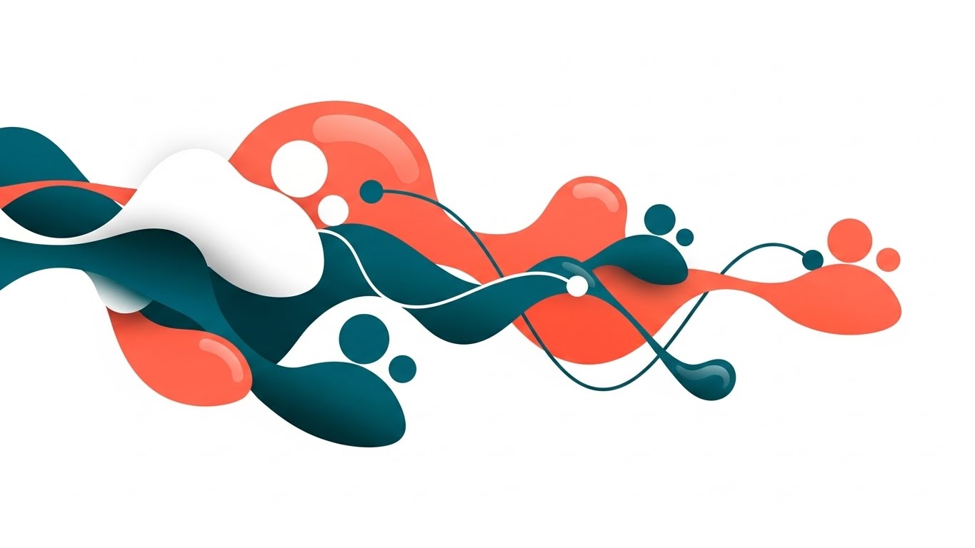
The Visual & Narrative Approach
This style rejects the rigid grid often associated with HR software in favor of fluidity. The visualization depicts the "Talent Network" not as a spreadsheet, but as a living ecosystem. Pulsing nodes in coral and teal morph into soft, human-like silhouettes, connected by glossy, liquid lines. The motion is continuous and smooth, representing the unceasing nature of human potential. There is no text; the story is told entirely through the organic evolution of shapes against a pristine white background.
Psychological Impact & KPI Focus
- Niche Psychology: HR leaders often fear their systems feel "cold" or "robotic." This style uses soft shapes (curvilinear forms) which are psychologically perceived as safe, welcoming, and "human," directly countering the anxiety of depersonalization in tech.
- Operational Impact: By visualizing talent as a fluid network rather than static rows, this style supports KPIs related to Internal Mobility and Talent Pipeline Health, encouraging a mindset of growth rather than replacement.
Strategic Implementation & Trade-offs
- Best Use Case: Top-of-Funnel (TOFU) Brand Awareness campaigns on social media (15-30 seconds) where the goal is to stop the scroll with aesthetic beauty rather than feature density.
- Trade-off: This style is highly emotive but low on information density. Do not use this for detailed product demos or compliance training where specific text is required.
Companies using similar video content -
HiBob – HRIS – Visualizing fluid talent networks and employee experience.
Culture Amp – Employee Experience Platform – Organic growth of employee engagement.
Visier – People Analytics – Abstract data flows for workforce insights.
2. Bold Kinetic Typography
TOFU | Category Creation
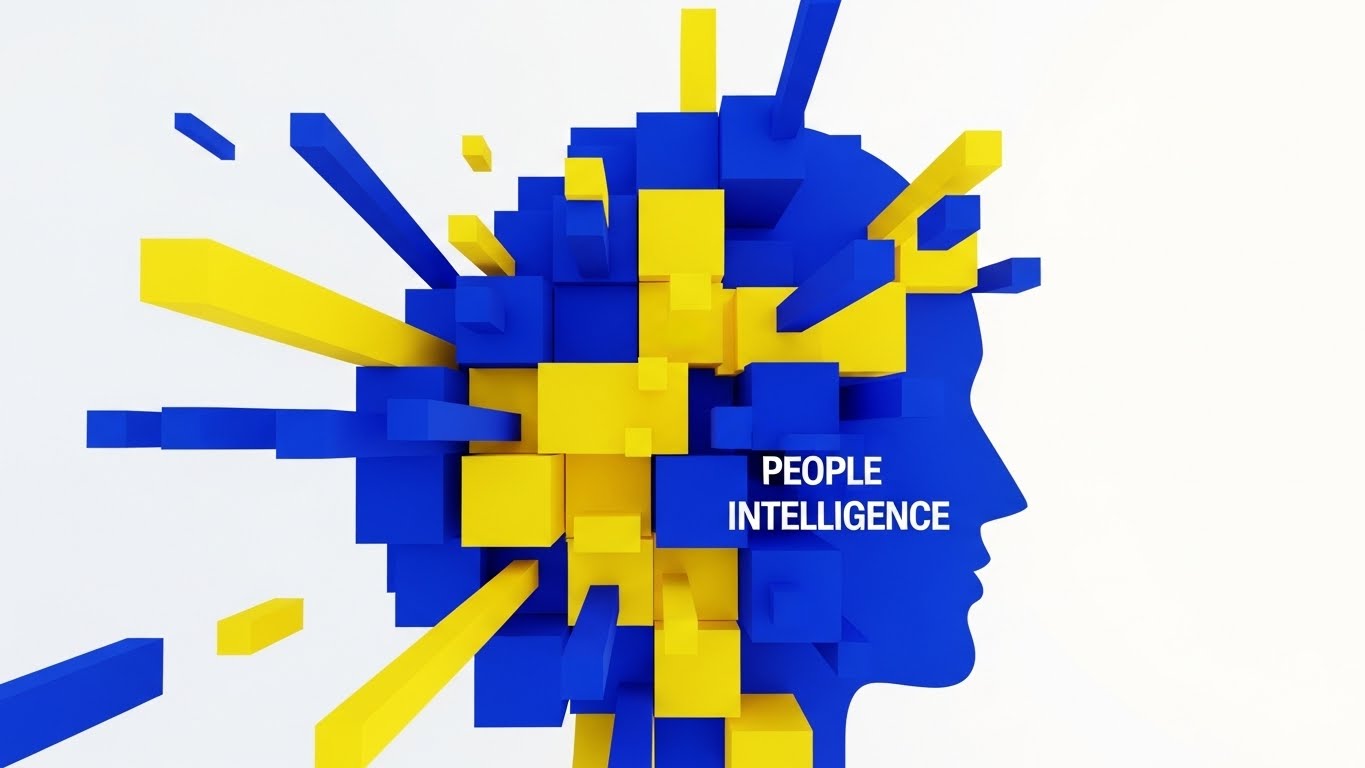
The Visual & Narrative Approach
This style mimics the architecture of a high-performance organization. Bold, blocky geometric shapes in high-contrast Cobalt Blue and Vibrant Yellow assemble and disassemble dynamically. The shapes don't just move; they construct concepts. They form the structural representation of "People Intelligence," conveying solidity and energy. Transitions are sharp and hard-edged, symbolizing precision. The visual language is confident, loud, and unmistakably modern, utilizing a 1:1 square ratio perfect for mobile feeds.
Psychological Impact & KPI Focus
- Niche Psychology: For the HR leader fighting for a seat at the executive table, this style projects authority and confidence. It speaks to the "Data-Driven" persona who values precision and structural integrity.
- Operational Impact: The rapid assembly of shapes visualizes Category Creation and Organizational Agility. It suggests that the software can take chaotic data and instantly structure it into actionable intelligence.
Strategic Implementation & Trade-offs
- Best Use Case: TOFU LinkedIn ads and thought leadership teasers (15-20 seconds). It is designed to be read without sound, making it perfect for the professional browsing environment.
- Trade-off: The high energy can be overwhelming if sustained for too long. It is less effective for conveying empathetic or emotional narratives (e.g., mental health benefits).
Companies using similar video content -
Workday – HCM – Bold statements on data-driven HR and finance.
ADP – Workforce Now – Kinetic text for payroll and compliance precision.
Paylocity – HCM – Dynamic text for modern workplace solutions.
3. Abstract 2D Motion Graphics
TOFU | Market Education
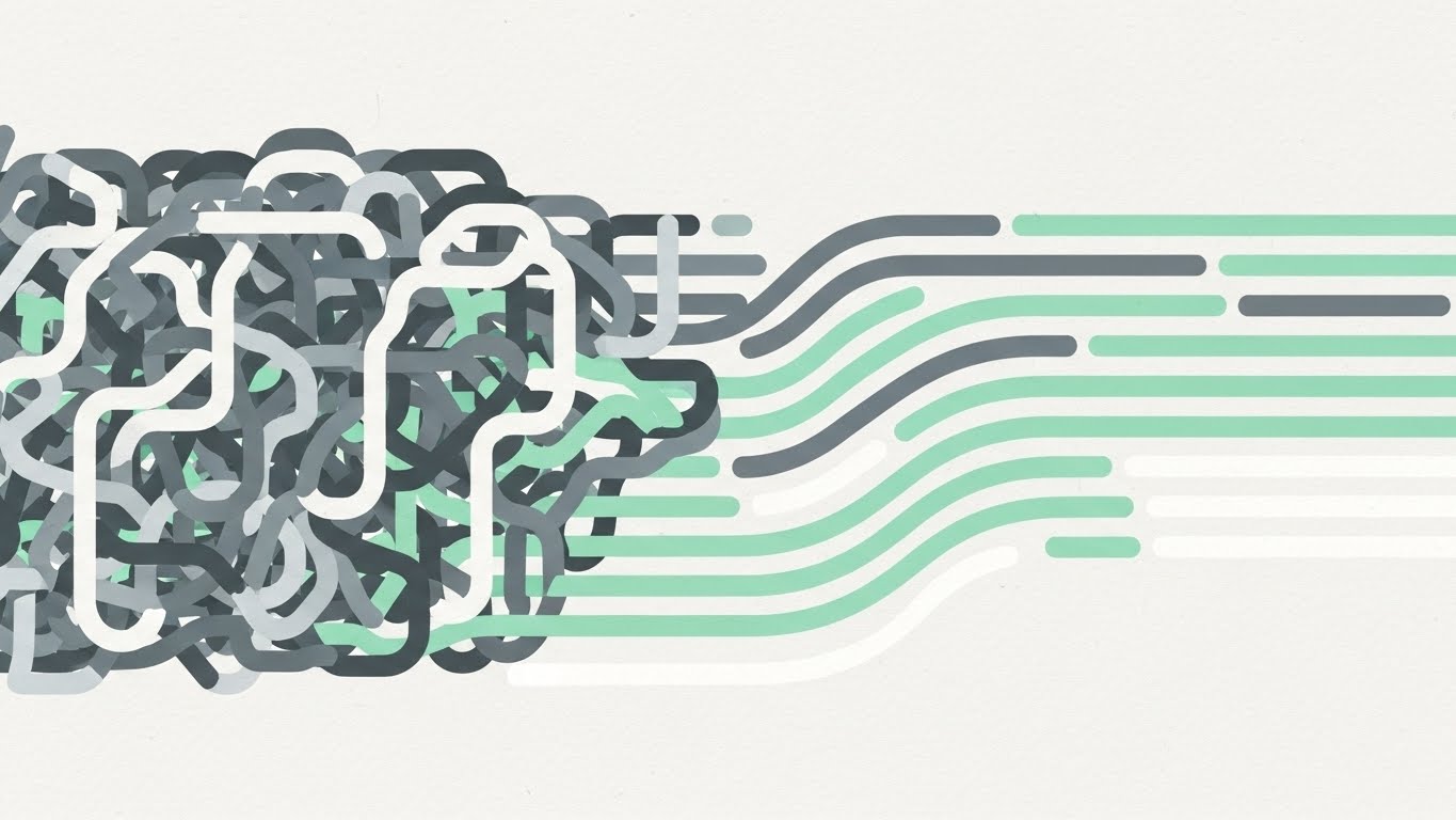
The Visual & Narrative Approach
This visualization addresses the most common operational pain point: the "mess" of legacy systems. It begins with a chaotic, tangled knot of Slate Grey lines vibrating with tension. As the narrative progresses, the knot gracefully untangles into smooth, parallel streams of Mint Green and White. The background texture creates a tactile, paper-like feel, grounding the digital concept in reality. The rhythmic movement serves as a visual "sigh of relief."
Psychological Impact & KPI Focus
- Niche Psychology: It leverages the "Cognitive Ease" principle. By watching chaos resolve into order, the viewer experiences a vicarious sense of relief and control, directly appealing to the stressed Operations Manager.
- Operational Impact: This directly visualizes Time-to-Value and Process Efficiency. It promises that the software will not add to the noise but will clarify the signal.
Strategic Implementation & Trade-offs
- Best Use Case: Market Education blogs and explainer videos (45-60 seconds) where the objective is to simplify a complex problem (e.g., benefits reconciliation).
- Trade-off: The abstract nature requires a strong voiceover or context to explain what specific process is being untangled. It relies heavily on metaphor.
Companies using similar video content -
Dayforce – HCM – Untangling complex workforce management processes.
isolved – HCM – Resolving HR complexity with unified platform.
Sage HCM – HCM – Simplifying HR, payroll, and talent engagement.
4. Abstract 3D AI Visualization
TOFU | Shaping Brand Perception

The Visual & Narrative Approach
Set in a sterile, high-tech laboratory environment, this style visualizes the "brain" of the HCM platform. Glowing particle systems in Cyan, Magenta, and Deep Purple form a complex neural network floating in mid-air. The macro depth of field focuses on individual pulsing nodes, representing specific predictive insights. It is ethereal and sophisticated, positioning the software not just as a tool, but as an intelligent entity.
Psychological Impact & KPI Focus
- Niche Psychology: This addresses the "FOMO" (Fear Of Missing Out) regarding AI adoption. It assures the viewer that the platform is future-proof and cutting-edge, appealing to the Innovator persona.
- Operational Impact: It visualizes Predictive Analytics and Risk Mitigation. The connections imply that the system sees patterns (e.g., flight risk) that a human might miss.
Strategic Implementation & Trade-offs
- Best Use Case: Website hero backgrounds and high-level "Vision" pages (10-15 second loops). It establishes premium brand perception immediately.
- Trade-off: It can appear "cold" or overly complex if not balanced with human-centric messaging. It risks looking like generic "tech" if the specific HR context isn't established.
Companies using similar video content -
Eightfold AI – Talent Intelligence Platform – Illuminating AI-driven talent insights.
Paradox – Conversational AI – Glowing networks for AI recruiting automation.
Claira AI – Competency Management – Visualizing AI for skill gap analysis.
5. Split Screen: Optimized Reality and UI
TOFU | Vertical Social Organic

The Visual & Narrative Approach
Designed for the TikTok/Reels generation, this vertical (9:16) composition creates a direct visual correlation between "Action" and "Result." The top half features high-quality, naturally lit footage of a human moment—a woman laughing in a park. The bottom half contrasts this with a pristine Sky Blue and White mobile UI screen showing a "Time Off Approved" notification. It is a literal translation of the work-life balance promise.
Psychological Impact & KPI Focus
- Niche Psychology: It validates the employee's desire for a seamless experience. The "Natural Lighting" vs. "Clean UI" contrast suggests that the technology supports life, rather than intruding upon it.
- Operational Impact: This style drives Employee Adoption Rates and User Satisfaction (NPS). It visually proves that the administrative burden is minimal, encouraging frequent usage.
Strategic Implementation & Trade-offs
- Best Use Case: Vertical Social Organic posts (TikTok, Instagram Reels) targeting the end-user (employee) rather than just the buyer (15-30 seconds).
- Trade-off: Authenticity is key. If the "Life" footage looks like staged stock, the message fails. It requires naturalistic acting and lighting.
Companies using similar video content -
Rippling – All-in-One HR – Balancing life and tech with seamless HR/IT.
BambooHR – HRIS – Mobile-first UI for employee self-service.
Gusto – Payroll & Benefits – Connecting employee benefits to daily life.
6. Minimalist Flat 2D Vector
TOFU | Website & Landing Pages
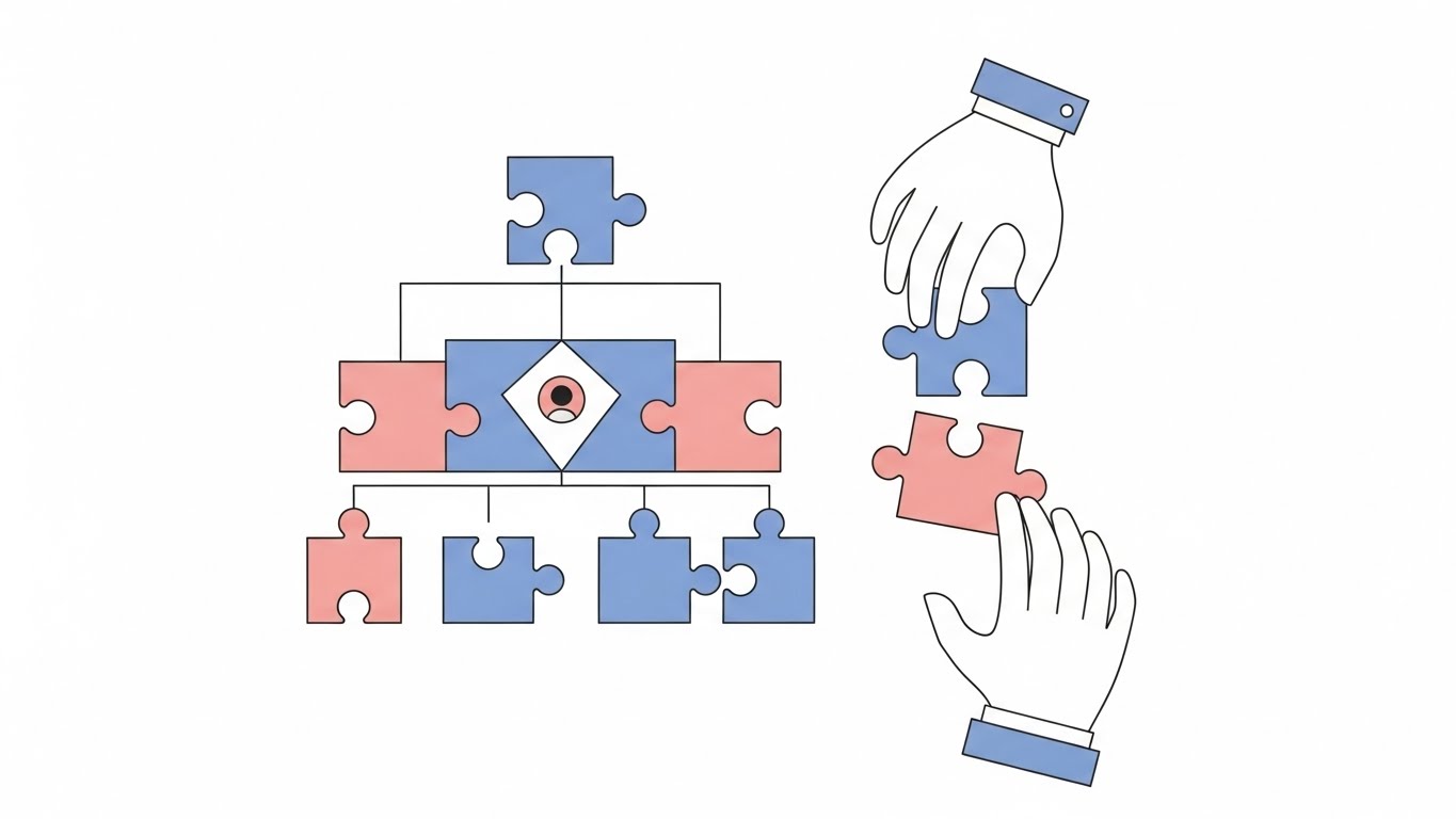
The Visual & Narrative Approach
Absolute simplicity is the goal here. On a pure white background, floating abstract hands assemble a geometric jigsaw puzzle in Pastel Pink and Soft Blue. There are no distractions—no gradients, no shadows, just clean strokes. It breaks down the concept of "Org Charts" and "Team Structure" into its most basic, understandable visual components.
Psychological Impact & KPI Focus
- Niche Psychology: This appeals to the Administrator who craves order and clarity. The act of "fitting in" the puzzle piece triggers a sense of completion and correctness (closure).
- Operational Impact: Visualizes Organizational Alignment and Onboarding Speed. It implies that every employee has a clear, predefined place within the larger structure.
Strategic Implementation & Trade-offs
- Best Use Case: Website feature pages and landing pages (Static or Micro-interaction loops). It aids rapid comprehension without slowing down page load times.
- Trade-off: Can feel "generic" or "clip-art" style if the illustration quality is low. It lacks the emotional depth of character-driven styles.
Companies using similar video content -
Zoho People – HRM – Simplifying team alignment and HR administration.
OrangeHRM – Open Source HRIS – Minimalist approach to core HR functions.
Odoo – HR Module – Clean visuals for integrated HR management.
7. 2D Character-Driven Story
TOFU | Demand Gen & Lead Capture

The Visual & Narrative Approach
This style brings the "Human" back into Human Capital Management. Using a palette of Terracotta, Sage Green, and Sand, it depicts a diverse trio of professionals high-fiving in a modern open-plan office. The art style uses flat colors with no outlines, creating a contemporary look. The scene conveys "Employee Engagement" and culture. The background is a sketched architectural outline of the office, bright and airy.
Psychological Impact & KPI Focus
- Niche Psychology: It triggers "Mirror Neurons"—seeing characters happy makes the viewer anticipate happiness. It appeals to the CHRO focused on culture and belonging.
- Operational Impact: Directly supports Retention Rates and Cultural Index scores. It visualizes the outcome of good HR software: a happy, cohesive team.
Strategic Implementation & Trade-offs
- Best Use Case: Demand Gen Emails and Case Study videos (60-90 seconds). Characters allow for storytelling that resonates with specific user personas (e.g., "Meet Sarah, the busy recruiter").
- Trade-off: Diversity representation must be carefully managed to ensure inclusivity without appearing tokenistic.
Companies using similar video content -
Workvivo – Employee Communications – Humanizing employee engagement and culture.
Kudos – Employee Recognition – Characters celebrating workplace achievements.
Vantage Circle – Employee Engagement – Storytelling for rewards and benefits.
8. Futuristic Neon/Dark Mode
MOFU | Product Differentiation
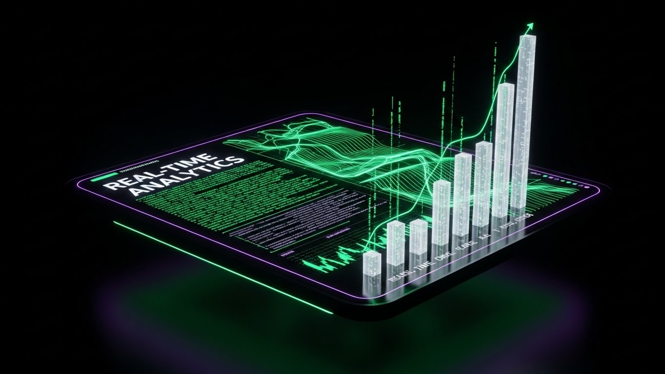
The Visual & Narrative Approach
As prospects move to the Middle of the Funnel, they want to see power. This style adopts a "Dark Mode" aesthetic (Dark Theme 1). A floating dashboard glows with Neon Green and Electric Violet data lines against a deep Black void. The data visualizes "Real-Time Analytics" with flowing streams of code and rising bar charts. Bloom effects create a high-end, cyber-security atmosphere.
Psychological Impact & KPI Focus
- Niche Psychology: Dark mode is associated with "Power User" status and focus. It differentiates the product from "friendly" competitors, positioning it as the "Pro" choice for analysts and IT leaders.
- Operational Impact: Visualizes Real-Time Data Visibility and Compliance Monitoring. It suggests that the system is always on, watching and analyzing in the background.
Strategic Implementation & Trade-offs
- Best Use Case: MOFU Product Demos and YouTube deep dives (2-3 minutes). It helps the viewer focus on the data elements without background distraction.
- Trade-off: Can feel alienating or "scary" to non-technical users. It positions the software as a complex tool for experts, not necessarily for the average employee.
Companies using similar video content -
Oracle Cloud HCM – HCM – Neon dashboards for advanced analytics.
SAP SuccessFactors – HCM – Dark mode for enterprise talent management.
UKG Pro – HCM – Futuristic data visibility for complex workforces.
9. Isometric 2D Motion Design
MOFU | Feature Education
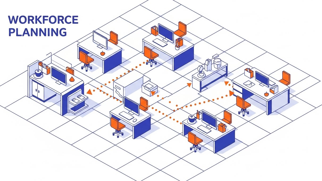
The Visual & Narrative Approach
"Workforce Planning" is a spatial challenge. This style places the viewer above the office floor plan in an Isometric view. Using a clean palette of Orange, Indigo, and White, abstract icons (desks, computers) pop up from the grid. Dotted lines connect workstations, visualizing the flow of teams and internal mobility. It turns the abstract concept of an org chart into a tangible map.
Psychological Impact & KPI Focus
- Niche Psychology: The "God's Eye View" gives the viewer a sense of control and omniscience. It is empowering for HR managers who need to organize logistics.
- Operational Impact: Visualizes Resource Allocation and Workflow Continuity. It makes complex logistics look organized and manageable.
Strategic Implementation & Trade-offs
- Best Use Case: "How-to" sections and Feature Focus videos (30-60 seconds).
- Trade-off: Isometric art requires strict adherence to the grid. It is excellent for logic but poor for emotion. Use it for logistics, not culture.
Companies using similar video content -
Infor HCM – Workforce Management – Mapping workforce planning and scheduling.
TimeTrex – Open Source HRMS – Isometric views for time and attendance tracking.
Frappe HR – Open Source HR Software – Visualizing HR and payroll operations.
10. Isometric 3D Workflow
MOFU | Feature Education
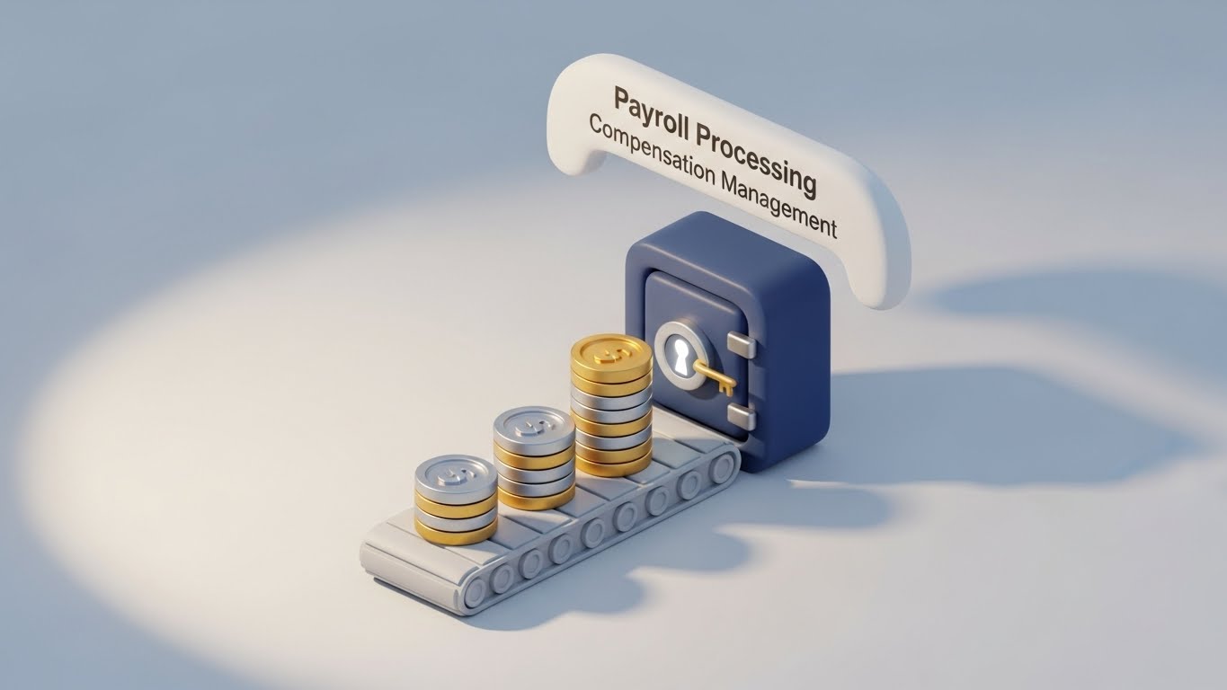
The Visual & Narrative Approach
Payroll is digital, but it represents real value. This Isometric 3D render uses "Claymorphism"—soft, rounded 3D shapes. We see a stack of Gold and Silver cylindrical coins moving along a conveyor belt into a Navy Blue digital vault. Soft studio lighting creates gentle shadows. It makes the digital process of "Payroll Processing" feel substantial, secure, and satisfyingly tactile.
Psychological Impact & KPI Focus
- Niche Psychology: The tactile quality triggers a desire to interact. The "Vault" imagery reinforces Financial Security and Compliance, reassuring the viewer that the system is safe.
- Operational Impact: Visualizes Payment Security and Automated Workflows. It simplifies a stressful process into a smooth visual loop.
Strategic Implementation & Trade-offs
- Best Use Case: Slide Decks for sales presentations (Financial features).
- Duration: Static images or short loops (5-10s).
- Trade-off: This style is trendy. It engages well now but may need a refresh as design trends evolve. It is perfect for making dry topics (money) visually engaging.
Companies using similar video content -
Paycom – HCM – Tangibilizing payroll processing with secure visuals.
Paycor – HCM – Soft claymorphism for financial features.
Dolibarr – Open Source ERP/CRM – Visualizing expense and payroll workflows.
11. Dynamic Data Visualization
MOFU | Feature Education
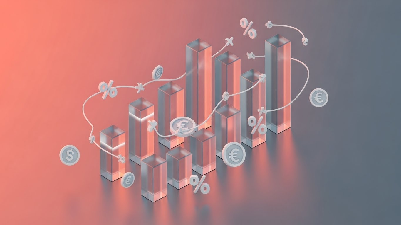
The Visual & Narrative Approach
As we move deeper into the funnel, the need to visualize "Data Density" increases without overwhelming the viewer. This style tackles that challenge using "Glassmorphism"—a trend featuring translucent, frosted glass elements. Floating vertical heatmaps and radial charts in shades of Violet and Teal rise from a reflective surface. They are interspersed with floating matte white symbols (%, $, €) and connecting data lines. The background is a soft, blurred vibrant gradient. This aesthetic transforms a boring spreadsheet into a "Crystal City" of insight, suggesting that the data has depth, layers, and beauty.
Psychological Impact & KPI Focus
- Niche Psychology: HR analysts often feel buried in flat files that hide context. The transparency and layering in this visual style psychologically suggest "Clarity" and "Visibility." It assures the user that the software allows them to see through the noise to the underlying truth.
- Operational Impact: This style effectively visualizes Compensation Strategy and Performance Metrics. The connecting lines imply correlation—showing how pay (currency symbols) relates to performance (%)—encouraging strategic, data-led decision-making.
Strategic Implementation & Trade-offs
- Best Use Case: Whitepapers and "Deep Dive" Solution pages (Static images or slow-motion loops). It elevates the perceived sophistication of your analytics module.
- Trade-off: The abstraction can obscure specific UI details. It sells the concept of deep analytics, not the literal dashboard workflow.
Companies using similar video content -
Crunchr – People Analytics – Translucent layers for deep data insights.
ThoughtSpot – AI-Powered Analytics – Interactive visuals for HR data.
Tableau – Data Visualization – Crystal city of HR insights.
12. Wireframe to Reality Transition
MOFU | Competitive Displacement
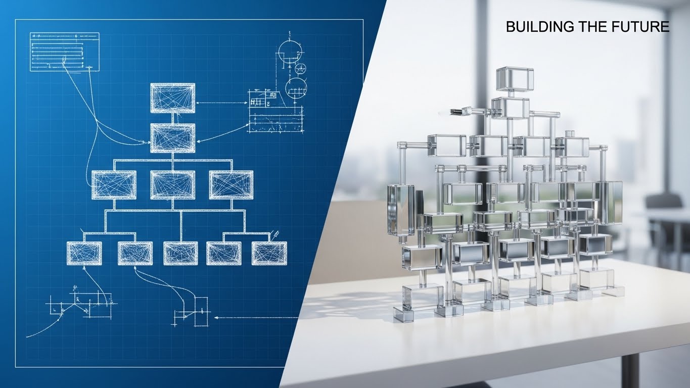
The Visual & Narrative Approach
This split-screen composition tells a powerful story of transformation. On the left, against a technical "Blueprint Blue" background, we see a white wireframe sketch of an organizational chart—representing the planning phase or legacy systems. As the eye moves right, this sketch seamlessly morphs into a fully rendered, photorealistic 3D glass structure sitting on a clean white desk. It visualizes the shift from "Theory" to "Reality." It captures the moment a chaotic plan becomes a structured, tangible asset.
Psychological Impact & KPI Focus
- Niche Psychology: Addressing the fear of implementation failure is critical at this stage. Stakeholders worry that new software will be "vaporware." This visual proves that the platform turns abstract plans into solid, structured reality, appealing to the "Architect" persona in IT and Ops.
- Operational Impact: Visualizes Organizational Design and Change Management. It implies that the software provides the rigid, reliable structure needed to scale a company effectively.
Strategic Implementation & Trade-offs
- Best Use Case: LinkedIn carousel ads and "Before/After" comparison sections on landing pages. It creates a powerful visual metaphor for upgrading from spreadsheets to a dedicated HCM platform.
- Trade-off: It is highly metaphorical. Ensure the accompanying copy clearly explains what is being built (e.g., "From spreadsheet chaos to structured clarity") to avoid confusion.
Companies using similar video content -
ClearCompany – Talent Management – Modernizing organizational architecture from plan to reality.
Cornerstone OnDemand – Talent Management – Transforming learning and development.
SAP SuccessFactors – HCM – Evolving HR from legacy to cloud-native.
13. Clean UI Workflow (Light Mode)
MOFU | ABM Awareness
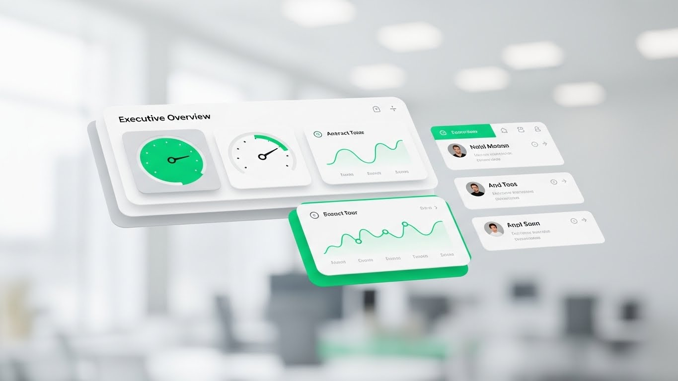
The Visual & Narrative Approach
Clarity is the ultimate luxury for the C-Suite. This style presents the software interface as a pristine, floating "Cockpit." The background is a blurred, airy office environment (Bokeh), keeping the focus entirely on the UI. The dashboard elements—gauges, trend lines, and profile cards—float in layers with soft drop shadows, utilizing a fresh palette of Emerald Green, White, and Light Grey. It strips away the browser frame and clutter, focusing solely on the signals that matter.
Psychological Impact & KPI Focus
- Niche Psychology: Appeals to the "Overwhelmed Manager." The floating, uncluttered presentation triggers a sense of relief and control. It promises a friction-free experience where answers are served immediately, respecting the executive's time.
- Operational Impact: Visualizes Manager Adoption and Executive Oversight. It suggests that monitoring team health is as simple as glancing at a clean heads-up display.
Strategic Implementation & Trade-offs
- Best Use Case: Email marketing headers and "Ease of Use" feature blocks. It proves the "User-Friendly" claim instantly without words.
- Trade-off: While beautiful, it removes the context of the actual browser or mobile device. Ensure prospects understand this is a stylized representation of the actual UI.
Companies using similar video content -
Paychex Flex – HR & Payroll – Simplifying executive oversight with clean UI.
BambooHR – HRIS – User-friendly interface for HR tasks.
Namely – HR Platform – Pristine dashboards for HR and payroll.
14. 2D Line Art Animation
MOFU | LinkedIn Video Ads

The Visual & Narrative Approach
Compliance is typically a "heavy" topic. This style makes it elegant. A single, continuous Crimson line flows across a textured paper-white background, drawing itself into the shape of a protective shield around a document icon. The line varies in width, simulating the organic feel of ink on paper. It transforms the rigid, scary concept of "GDPR Compliance" into a fluid, artistic, and unbroken process.
Psychological Impact & KPI Focus
- Niche Psychology: It reframes compliance from a "burden" to a "seamless flow." The continuous line suggests that security is woven into the fabric of the process, not bolted on as an obstacle. It appeals to the Risk Officer's desire for comprehensive coverage.
- Operational Impact: Visualizes Risk Mitigation and Regulatory Adherence. The "Shield" iconography is universally understood, instantly communicating safety and protection of employee data.
Strategic Implementation & Trade-offs
- Best Use Case: LinkedIn Video Ads (Silent Autoplay). The high contrast of red on white stands out in the feed, and the animation holds attention while communicating "Protection" instantly.
- Trade-off: It is minimalist. It cannot convey complex data or detailed features. Use it solely for high-level concepts like Security, Compliance, or Legal.
Companies using similar video content -
Deel – Global Payroll & HR – Continuous shield for global compliance.
I-9 Management – Compliance Software – Securing sensitive employee data.
QuestionPro – DEI Software – Elegant line art for DEI compliance.
15. Rapid UI Feature Montage
BOFU | ROI Justification
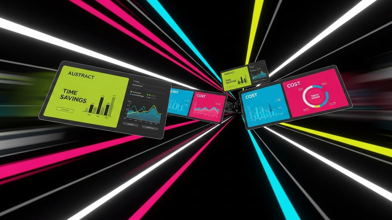
The Visual & Narrative Approach
At the Bottom of the Funnel, speed equals value. This style utilizes a dynamic "Warp Speed" effect. Multiple angled UI screens featuring Lime Green and Electric Blue data visualizations fly through a digital tunnel towards the viewer. Motion blur on the edges accentuates the velocity. It creates a visual barrage of features—Time Savings, Cost Analysis, Headcount—implying that the software delivers a massive volume of value in a short time.
Psychological Impact & KPI Focus
- Niche Psychology: It triggers the "Efficiency" dopamine hit. For the buyer justifying the purchase, this visualizes the sheer horsepower of the platform. It creates a feeling of momentum and progress, crucial for closing the deal.
- Operational Impact: Visualizes Efficiency Gains and ROI Acceleration. It suggests the system works fast and hard in the background, processing data at speeds humans cannot match.
Strategic Implementation & Trade-offs
- Best Use Case: YouTube Pre-Roll ads (First 5 seconds) and Retargeting Video ends. It is designed to create energy and excitement right before the call to action.
- Trade-off: The pace is too fast for reading detailed data. Do not use this to teach how a feature works; use it to show how much the platform does.
Companies using similar video content -
Rippling – All-in-One HR – Velocity tunnel for accelerating ROI realization.
Paycom – HCM – Rapid showcase of automation and efficiency features.
Dayforce – HCM – Dynamic montage of real-time HCM capabilities.
16. Dark Mode UI Showcase
BOFU | The Economic Buyer
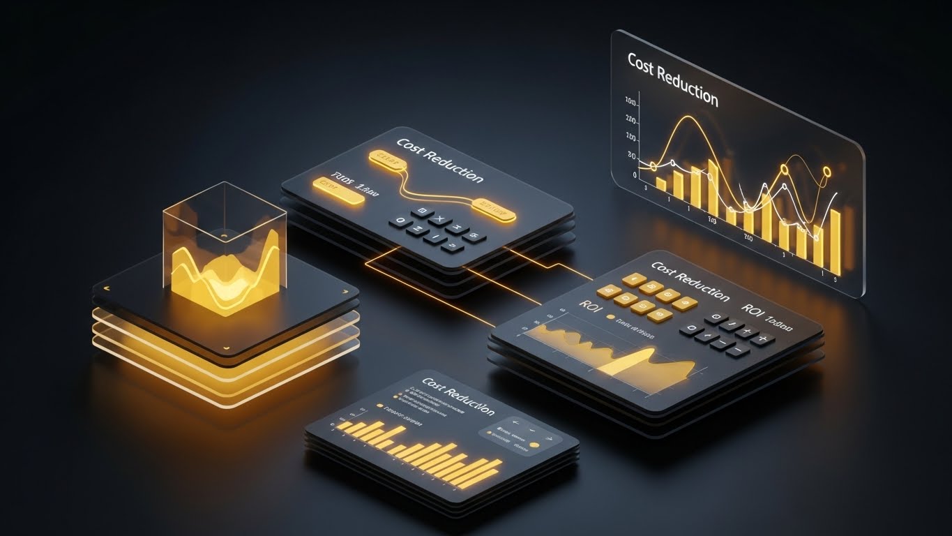
The Visual & Narrative Approach
This is designed specifically for the CFO (The Economic Buyer). We switch to a luxurious "Dark Mode" aesthetic. The interface floats on a glossy dark surface, displaying "Cost Reduction" and "ROI" graphs in Gold and Amber light. The contrast is dramatic and premium. It moves the conversation from "HR Administration" to "Financial Strategy." It looks less like a people tool and more like a Bloomberg terminal for human capital.
Psychological Impact & KPI Focus
- Niche Psychology: Dark mode with gold accents signals "Premium" and "Enterprise-Grade." It aligns with the self-image of the Economic Buyer who views the workforce as a significant financial asset to be optimized.
- Operational Impact: Visualizes Cost Optimization and Bottom-Line Impact. It focuses entirely on the financial implications of HR data—turnover costs, acquisition costs, and efficiency savings.
Strategic Implementation & Trade-offs
- Best Use Case: Sales Presentations and Pitch Decks for the C-Suite. It visually elevates the price point and value of the software.
- Trade-off: It can feel too "financial" for a culture-focused CHRO. Use specifically when addressing the budgetary decision-makers.
Companies using similar video content -
Oracle Cloud HCM – HCM – Premium analytics for financial strategy.
Workday – HCM – Elevating financial impact of human capital.
ADP Vantage HCM – HCM – Dark mode for enterprise financial optimization.
17. 3D X-Ray Visualization
BOFU | Overcoming Objections

The Visual & Narrative Approach
Technical buyers often view "Seamless Integration" as a buzzword. This style proves it. We see a floating server block encased in transparent Blue glass. Inside, complex white and orange gears and glowing nodes mesh perfectly together. It uses the "X-Ray" technique to reveal the internal engineering quality. It visualizes the robust engine "under the hood" that powers the sleek UI, reassuring the viewer that the backend is just as impressive as the frontend.
Psychological Impact & KPI Focus
- Niche Psychology: Addresses the "Black Box" anxiety. IT Directors fear that pretty software has messy code. This visualizes cleanliness, order, and mechanical precision within the system's core.
- Operational Impact: Visualizes System Stability and Integration Robustness. It implies that the different modules (payroll, benefits, time) are mechanically interlocked, not just loosely connected.
Strategic Implementation & Trade-offs
- Best Use Case: "How it Works" website sections and Technical Specification documents. It builds deep trust with the IT and Implementation teams.
- Trade-off: It is abstract and mechanical. It removes the human element entirely. Avoid using this for employee experience or culture topics.
Companies using similar video content -
Oracle PeopleSoft – ERP/HCM – Revealing robust integration of legacy systems.
Infor HCM – HCM – Transparent core for system stability.
ERPNext – Open Source ERP – X-ray view of integrated HR modules.
18. Photorealistic 3D Renders
BOFU | Risk Mitigation

The Visual & Narrative Approach
When discussing data security, cartoons won't suffice. You need the weight of reality. This style uses a photorealistic 3D render of a heavy, brushed Steel Grey vault door with Cyber Blue digital locks. The door is slightly ajar, revealing a pure white light inside—the "precious" employee data. It is a literal metaphor for safety. The cold, hard texture of the metal communicates impenetrability.
Psychological Impact & KPI Focus
- Niche Psychology: Security is about sleep. Leaders want to know they won't wake up to a data breach. This image triggers a primal sense of safety and fortification.
- Operational Impact: Visualizes Data Security and SOC2/GDPR Compliance. It creates a physical correlation to digital encryption, making the intangible concept of "Cybersecurity" feel solid.
Strategic Implementation & Trade-offs
- Best Use Case: Security Whitepapers and Trust Center landing pages. It creates an immediate subconscious association between the brand and safety.
- Trade-off: It is static and somewhat cold. It works best as a "Trust Seal" rather than a narrative driver.
Companies using similar video content -
UKG Pro – HCM – Digital fortress guaranteeing enterprise security.
SAP SuccessFactors – HCM – Photorealistic vault for data protection.
Oracle Cloud HCM – HCM – Secure 3D renders for data compliance.
19. 2D Graphics Over Live Action
BOFU | The Champion

The Visual & Narrative Approach
The "Champion"—the daily user—needs to see themselves in the story. This style blends high-quality live-action footage of a professional in a modern, sunlit workspace with animated Vivid Orange 2D overlays. The icons (checklists, clouds, gears) pop up around him as he works, visualizing the software automating tasks in real-time. It doesn't replace the human; it gives them superpowers.
Psychological Impact & KPI Focus
- Niche Psychology: It validates the user's role. It shows them as the protagonist, with the software as the supporting character (the "Iron Man Suit" effect). It fights the fear of automation replacing jobs.
- Operational Impact: Visualizes Workflow Automation and Productivity Enhancement. It shows the tangible result of the software: a calm, efficient, and super-powered employee.
Strategic Implementation & Trade-offs
- Best Use Case: Customer Testimonial videos and "Day in the Life" demos. It grounds the digital features in the physical reality of the office.
- Trade-off: Requires high-quality original footage. Stock footage can feel generic. The motion tracking of the graphics must be precise to look professional.
Companies using similar video content -
Workvivo – Employee Communications – Augmented workspace for daily workflows.
Microsoft Viva – Employee Experience – Overlays for productivity in Microsoft 365.
Simpplr – AI-Powered Intranet – Graphics enhancing employee experience.
20. Holographic UI over 3D Render
BOFU | Sales Cycle Acceleration

The Visual & Narrative Approach
For the global enterprise, the challenge is distance. This style bridges it. A sleek tablet rests on a wooden desk, projecting a semi-transparent, "Hologram Blue" 3D globe upwards into the air. Avatars of diverse employees float around the globe, connected by data lines. It represents the "Command Center." It visualizes the ability to hold the entire global workforce in the palm of your hand.
Psychological Impact & KPI Focus
- Niche Psychology: Appeals to the desire for Omniscience. Managing remote teams often feels like flying blind. This visual restores the feeling of oversight and connection, regardless of geography.
- Operational Impact: Visualizes Global Workforce Management and Remote Team Alignment. It simplifies the complexity of time zones and borders into a unified, glowing interactive map.
Strategic Implementation & Trade-offs
- Best Use Case: Product Demos for Enterprise clients and "Global Reach" feature pages. It sells the scale and sophistication of the platform.
- Trade-off: It is futuristic. Ensure the actual product supports this level of global visualization, or it may be seen as over-promising.
Companies using similar video content -
Deel – Global Payroll & HR – Global projection for managing borderless teams.
Remote – Global HR Platform – Holographic UI for international workforce.
Yomly – HR & Payroll – Projecting global reach for GCC/MENA enterprises.
21. 2D Animation & UI Composition
Onboarding | Self-Serve Onboarding
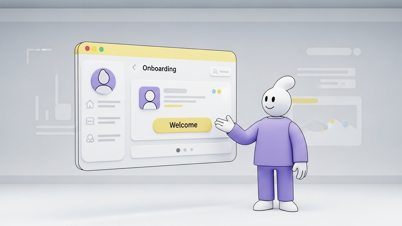
The Visual & Narrative Approach
The "First Day" is often defined by anxiety. This style alleviates it immediately. We see a friendly, abstract character with a soft, rounded design, dressed in calming Lavender. The character interacts with a large, floating UI window colored in Soft Yellow and White—colors associated with optimism and warmth. The character gestures invitingly towards a "Welcome" button. The environment is a clean, pale grey digital room, removing all clutter and focusing the user solely on the first step of their journey.
Psychological Impact & KPI Focus
- Niche Psychology: New hires often feel overwhelmed by complex enterprise software. The "Cel-Shaded" animation style feels like a friendly tutorial rather than a rigid corporate mandate. It utilizes the "Guide" archetype to build immediate trust.
- Operational Impact: Directly drives Self-Service Adoption and Onboarding Completion Rates. It encourages the user to explore the platform without fear of breaking it.
Strategic Implementation & Trade-offs
- Best Use Case: In-App Welcome Tours and "First Login" modal videos (30-60 seconds).
- Trade-off: It is inherently playful. While excellent for general onboarding, it may feel too casual for serious compliance or termination workflows.
Companies using similar video content -
BambooHR – HRIS – Friendly avatar easing onboarding anxiety.
Gusto – Payroll & Benefits – Animated welcome for new hires.
OrangeHRM – Open Source HRIS – Animated guides for self-serve onboarding.
22. Macro UI Micro-Interactions
Onboarding | Accelerating TTV

The Visual & Narrative Approach
In the digital world, "feeling" the product is difficult. This style solves that by zooming in—extreme macro. We see a close-up of a human finger (showcasing diverse skin tones) poised to press a glossy, circular UI button on a pristine white glass surface. The button is a vibrant Hot Pink, contrasting sharply with the high-key background. The focus is entirely on the moment of activation—the split second before the "Launch" happens. It makes the software feel tactile, responsive, and ready.
Psychological Impact & KPI Focus
- Niche Psychology: It leverages the "Anticipatory Dopamine" effect. The viewer subconsciously waits for the click, creating a desire to perform the action themselves. It promises instant gratification.
- Operational Impact: Visualizes Time-to-Value (TTV) and Ease of Use. It suggests that the barrier to entry is literally just one tap, reducing the perceived effort of adoption.
Strategic Implementation & Trade-offs
- Best Use Case: Social Media Teasers (Instagram/LinkedIn Stories) and "New Feature" launch emails (3-5 second loops).
- Trade-off: It creates zero context. It is a mood piece, not an explanatory tool. It must be paired with copy that explains what is being launched.
Companies using similar video content -
Rippling – All-in-One HR – Tactile activation for accelerating time-to-value.
Paylocity – HCM – Close-up on UI buttons for ease of use.
ADP Workforce Now – HCM – Micro-interactions for quick task completion.
23. Aspirational Stock Montage
Retention | Driving Deep Feature Adoption

The Visual & Narrative Approach
Retention is about community. This style weaves a tapestry of the modern workforce. We see a seamless montage: a woman commanding a meeting, a man engaging with his laptop, and a diverse team brainstorming. The images are unified by a "Corporate Neutral" color grade—professional Beiges, Greys, and Soft Blues. Subtle, thin white data lines physically connect the people across the frames, visualizing the "Connected Community" that the HCM software sustains, regardless of physical location.
Psychological Impact & KPI Focus
- Niche Psychology: It appeals to the "Belonging" need in Maslow’s hierarchy. For remote or hybrid employees, seeing this visual reinforcement of connection validates their place in the organization.
- Operational Impact: Supports Retention Rates and Employee Net Promoter Score (eNPS). It visually argues that the software is the glue holding the culture together.
Strategic Implementation & Trade-offs
- Best Use Case: Quarterly Newsletters, "Year in Review" videos, and Cultural Initiative announcements.
- Trade-off: Relies heavily on stock footage quality. If the expressions feel forced or "canned," the message of authentic connection is lost.
Companies using similar video content -
Workvivo – Employee Communications – Connected portraits strengthening community bonds.
Culture Amp – Employee Experience Platform – Montage for fostering belonging.
Teleskope – Employee Experience Platform – Weaving a tapestry of modern workforce.
24. 3D Parallax UI Presentation
Retention | Trial/Freemium User Activation
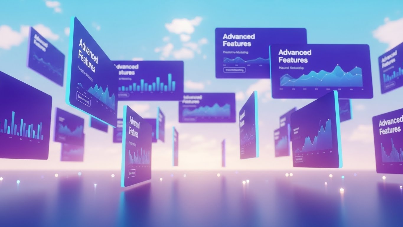
The Visual & Narrative Approach
To get users to explore deeper features, you need to show them the "depth" of the platform. This style places UI screens in a 3D space, floating against a bright, optimistic digital sky with soft clouds. The screens, colored in deep Purple and Cyan, display "Advanced Features" like predictive modeling. The camera drifts slowly through the layers (Parallax effect), suggesting that there is always more to discover if you look past the surface.
Psychological Impact & KPI Focus
- Niche Psychology: It triggers "Curiosity." The spatial arrangement implies a journey or a landscape to be explored, rather than a flat list of tasks. It appeals to the "Power User" who wants to master the tool.
- Operational Impact: Visualizes Feature Adoption Depth and Platform Stickiness. It encourages users to move beyond basic payroll and into advanced analytics.
Strategic Implementation & Trade-offs
- Best Use Case: Website "Features" pages and Upgrade/Upsell landing pages.
- Trade-off: The floating "Sky" aesthetic is abstract. It requires clear labelling on the screens so the user knows exactly which modules are being shown.
Companies using similar video content -
Visier – People Analytics – Floating layers for deepening feature discovery.
Leapsome – Performance Management – Parallax for advanced analytics modules.
Qualtrics EmployeeXM – Experience Management – Exploring depth of feedback features.
25. Low-Poly 3D Modeling
Retention | Knowledge Base

The Visual & Narrative Approach
Nobody likes reading technical manuals. This style transforms the "Knowledge Base" into a delightful, organized library. Using "Low-Poly" 3D art—simple geometric shapes—it builds a data center that looks like a toy set. The palette is a soft Pastel Spectrum (Mint, Peach, Lilac). It makes the concept of "Help and Documentation" feel accessible, stackable, and perfectly ordered. The lighting is bright and shadowless, eliminating any "dark corners" of confusion.
Psychological Impact & KPI Focus
- Niche Psychology: Reduces "Support Anxiety." Users often fear asking for help makes them look incompetent. This playful style frames learning as a building block process, accessible to everyone.
- Operational Impact: Directly reduces Support Ticket Volume and increases Self-Help Resolution Rate. It visualizes the knowledge base as a friendly resource, not a dense archive.
Strategic Implementation & Trade-offs
- Best Use Case: Support Center headers, "How-To" video thumbnails, and Error Page (404) visuals.
- Trade-off: It creates a very specific "Gamified" look. Ensure this aligns with your overall brand voice; it may clash with a highly serious, serif-font corporate brand.
Companies using similar video content -
MintHCM – Open Source HCM – Organized blocks for simplifying knowledge access.
IceHrm – Open Source HRMS – Playful library for help and documentation.
ERPNext – Open Source ERP – Low-poly data center for HR knowledge.
26. Lifestyle Stock with UI Overlay
Retention | Reducing Churn

The Visual & Narrative Approach
The HR Manager needs to see the link between their screen and their people. This style uses a 4:5 portrait composition (perfect for mobile LinkedIn). It features a confident professional female manager reviewing a tablet. In the foreground, a crisp, semi-transparent graphic in Corporate Blue overlays the scene, showing a "Retention Rate" graph trending upwards to 94%. It literally places the data onto the human context, bridging the gap between the metric and the person.
Psychological Impact & KPI Focus
- Niche Psychology: It validates the manager’s competence. Seeing the "Up and to the Right" graph superimposed on a smiling professional reinforces the idea that their management (aided by the software) is driving success.
- Operational Impact: Visualizes Manager Effectiveness and Talent Retention. It serves as "Social Proof" that the software delivers tangible human outcomes.
Strategic Implementation & Trade-offs
- Best Use Case: LinkedIn Organic Posts and Case Study headers. It stops the scroll by combining a human face with a hard data point.
- Trade-off: The data graphic must look integrated, not slapped on. The tracking and perspective must match the underlying footage.
Companies using similar video content -
HiBob – HRIS – Human insight correlating data with retention.
Workday Peakon – Employee Engagement – Overlaying sentiment data on lifestyle.
Lattice – Performance Management – Manager effectiveness with data insights.
27. Hyper-lapse Stock Footage with Data
Expansion | Driving Upsell

The Visual & Narrative Approach
When selling "Global Expansion" modules, you need to show scale and speed. This style uses "Hyper-lapse" footage of a busy city street at night. The cars are blurred streaks of light, representing the fast-paced global economy. In the center, standing perfectly still, is a sharp UI card in Neon Blue displaying "Global Expansion" metrics (New Markets, Revenue). The contrast between the chaotic, fast-moving background and the stable, clear data card emphasizes control amidst complexity.
Psychological Impact & KPI Focus
- Niche Psychology: It appeals to the "Conqueror" mindset of the growth-focused executive. It visualizes the market as a fast-moving stream that the software helps them navigate and capitalize on.
- Operational Impact: Visualizes Scalability and Market Penetration. It implies the system handles the velocity of global business without blinking.
Strategic Implementation & Trade-offs
- Best Use Case: Digital Ad Campaigns targeting C-Suite growth leaders. The motion captures attention; the static data delivers the message.
- Trade-off: Can be visually noisy. The background must be dark enough to let the neon UI pop, otherwise, legibility suffers.
Companies using similar video content -
Deel – Global Payroll & HR – City velocity visualizing global scale.
Oracle Cloud HCM – HCM – Hyper-lapse for global workforce management.
UKG Pro – HCM – Fast-paced visuals for international expansion.
28. Cinematic Video
Expansion | Driving Referrals
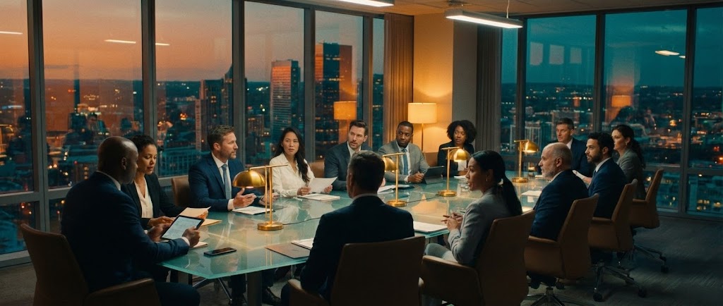
The Visual & Narrative Approach
This is the "Prestige" style. It utilizes high-end cinematic language: wide anamorphic lenses, dramatic "Teal and Orange" color grading, and symmetrical framing. We see a diverse executive team at a glass table in a high-rise boardroom at dusk. They are not just working; they are strategizing. This elevates the conversation from "software" to "business transformation." It positions the platform as a topic of boardroom discussion, not just a back-office utility.
Psychological Impact & KPI Focus
- Niche Psychology: It targets the "Status" driver. Executives want to be seen as strategic leaders. This visual associates the software with high-level decision-making and power.
- Operational Impact: Visualizes Strategic Alignment and Executive Collaboration. It suggests that the insights from the platform fuel the most important conversations in the company.
Strategic Implementation & Trade-offs
- Best Use Case: Brand Anthem videos, Investor Relations content, and high-ticket Sales Presentations.
- Trade-off: High production cost. Requires professional actors, lighting, and location. "Fake" looking boardroom stock will damage credibility here.
Companies using similar video content -
Workday – HCM – Boardroom symmetry elevating strategic discourse.
SAP SuccessFactors – HCM – Cinematic for business transformation.
Oracle Cloud HCM – HCM – High-end visuals for C-suite presentations.
30. Realistic Character Video
Expansion | Proactive Support

The Visual & Narrative Approach
The future of support is AI, but it must have a face. This style features a photorealistic, 3D-generated or high-fidelity recorded "AI Agent." She has warm skin tones, wears a sharp navy blazer, and stands in a high-tech studio environment with "AI SUPPORT" screens in the background. She looks directly at the camera with a helpful, intelligent expression. This visualizes the synthesis of "High Tech" and "High Touch," promising proactive assistance that feels personal.
Psychological Impact & KPI Focus
- Niche Psychology: Alleviates the fear of "Bot Frustration." By giving the AI a realistic, professional human face, it triggers empathy and trust, making users more willing to engage with automated support.
- Operational Impact: Visualizes Support Scalability and 24/7 Availability. It creates a face for the "Always-On" assistance that modern global teams require.
Strategic Implementation & Trade-offs
- Best Use Case: AI Feature announcements, Chatbot avatars, and "Welcome" videos for automated help centers.
- Trade-off: The "Uncanny Valley" risk. If the lip-sync or eye movement is slightly off, it becomes creepy. Quality must be flawless.
Strategic Knowledge Base: The Visual Operations Doctrine
To truly dominate the HCM market, a "pretty video" is not enough. You must operationalize your visual strategy. The following frameworks synthesize the 30 styles above into a cohesive business doctrine, designed to drive adoption, efficiency, and ROI.
Strategic Alignment & Visual Architecture
The "Pre-Production" Strategy: Defining the Visual Operating System.
- The Cognitive Load Audit: HR processes are notoriously dense. Before creating content, audit your current text-based training (PDFs, Wikis). Identify "High Friction" points (e.g., Benefits Enrollment) and apply Style 6 (Minimalist Flat 2D) or Style 11 (Dynamic Data) to these bottlenecks to reduce cognitive load and error rates.
- Role-Based Visual Mapping: One style does not fit all. A "Deskless" employee on a mobile device needs Style 5 (Split Screen Vertical) for quick consumption. Conversely, a Data Analyst needs Style 16 (Dark Mode UI) to signal depth and precision. Map your visual styles to your user personas.
- The "Glanceability" Standard: In a distracted work environment, the time-to-comprehension must be near zero. Adopt the "Glanceability" standard from dashboard design for your video thumbnails and motion graphics. Style 13 (Clean UI) exemplifies this—delivering the core insight in under 2 seconds.
- Brand Voice Consistency: Your HR software is an extension of your employer brand. If your culture is warm and inclusive, lean heavily on Style 1 (Organic Motion). If your brand is high-performance, prioritize Style 2 (Kinetic Typography).
- The Advids Strategic Audit: Partnering with a specialized agency like Advids allows for a comprehensive audit of your existing asset library. This ensures that your visual language is not a patchwork of disparate styles but a unified "Visual Operating System" that guides the employee seamlessly from recruitment to retirement.
- Accessibility by Design: Visual strategy must be inclusive. Ensure that Style 30 (Realistic Character) and Style 7 (Character Story) represent the diversity of your workforce. All motion graphics must be designed with high contrast and legible typography to support neurodiverse employees.
- Legacy System Integration: When migrating from legacy systems, use Style 12 (Wireframe to Reality) to visually manage the change. Show the "Old" (Wireframe) transforming into the "New" (Glass structure) to help long-tenured employees visualize the upgrade as an evolution, not a replacement.
- Cross-Departmental Synergy: Use visuals to unify terminology between Sales, Ops, and Support. If Sales sells "Talent Velocity" using Style 4, Support should use similar visual metaphors in Style 25 to explain how to achieve it, creating a cohesive product experience.
- Mobile-First Mandate: 80% of frontline interactions happen on mobile. Adapt Style 9 (Isometric) and Style 21 (2D Animation) for vertical screens. If the detail is lost on a phone, the asset is worthless to the majority of the workforce.
- Standardization vs. Customization: Know when to spend. Use standardized Style 22 loops for repetitive tasks to save budget. Invest in bespoke Style 28 productions for high-stakes leadership messaging where emotional resonance is critical.
Operational Adoption & Implementation
The "Deployment" Phase: Embedding Visuals into the Flow of Work.
- Overcoming "Big Brother" Anxiety: As AI and predictive analytics (Style 4) become standard, employees may fear surveillance. Counter this with Style 5 (Optimized Reality) and Style 23 (Connection) to visually emphasize that the technology is there to support their work-life balance, not monitor their every click.
- The Micro-Learning Shift: Replace hour-long webinar recordings with a library of "Micro-Assets." Use Style 22 (Macro UI) for 10-second "How-to" loops embedded directly in the software tooltips. This "Just-in-Time" support reduces frustration and keeps the user in the flow.
- Gamification of Onboarding: Transform the tedious onboarding checklist into a visual journey. Use Style 21 (2D Animation) to create a sense of progress and achievement. Visualizing the "Level Up" moments increases completion rates for mandatory training.
- Reducing Support Ticket Volume: There is a direct correlation between the quality of visual documentation and helpdesk load. Deploying Style 25 (Low Poly Knowledge Base) for common issues (e.g., Password Reset) can deflect up to 30% of Level 1 support tickets, freeing up HR staff for complex relations issues.
- Remote Culture Building: For distributed teams, the "office" is the screen. Use Style 20 (Holographic UI) and Style 28 (Cinematic) in your town halls and strategy updates to create a sense of shared space and high-level alignment, bridging the physical distance with high-fidelity visual presence.
- Standard Operating Procedures (SOPs) 2.0: Text-based SOPs are rarely read. Convert critical compliance workflows into Style 10 (Isometric 3D) loops. The "Machine-like" precision of the isometric view clarifies complex multi-step processes better than any bulleted list.
- Leadership Communication: When the C-Suite speaks, the visual fidelity must match their authority. Use Style 28 (Cinematic) for CEO messages regarding organizational changes. Low-quality webcam footage undermines the gravity of the strategic message.
- Just-in-Time Support: Integrate Style 30 (AI Persona) directly into the help widget. A friendly face offering immediate assistance reduces the feeling of isolation often associated with remote troubleshooting.
- Feedback Loops: Use interactive video elements at the end of Style 23 retention videos to gather employee sentiment. A simple "Was this helpful?" click provides actionable data on content effectiveness.
- Scalable Localization: Use Style 1 and Style 14 (abstract/line art) for global training. They rely less on specific cultural markers or text, making them easier and cheaper to localize across regions.
Measuring Impact & Future-Proofing
The "ROI" Phase: Quantifying Success and Scaling for Tomorrow.
- Beyond "Views" to "Adoption": Stop measuring video success by "views." Measure it by "Feature Adoption." If you release a Style 24 (Parallax UI) video about a new analytics module, track the spike in usage of that module in the week following. This correlates visual spend directly with product utilization.
- The "Time-to-Competency" Metric: Track how fast a new hire reaches full productivity. By implementing Style 22 (Macro UI) and Style 9 (Isometric Motion) in onboarding, you should see a measurable reduction in the "ramp-up" period, a tangible ROI for the business.
- Compliance Velocity: In highly regulated industries, speed matters. Measure how quickly the workforce reaches 100% compliance after a new regulation is released. Using Style 14 (Line Art Shield) to explain the change can significantly accelerate comprehension and sign-off compared to text emails.
- Retention and LTV: High-quality UX and communication reduce churn. Use Style 26 (Lifestyle Overlay) to remind managers of this link. Employees who feel "invested in" (through high-quality training and communication) are less likely to leave.
- The AI Visual Frontier: Generative AI is changing content creation. Prepare your visual strategy for "Personalized Video." In the future, Style 30 (Realistic Character) will be generated in real-time to answer specific employee questions by name. Building a robust library of assets now prepares the data foundation for this future.
- Scalability of Assets: As your platform grows, your visual library must keep pace. Do not build "one-off" videos. Build a "Visual Design System" (defined in Segment 1). This allows you to update a UI element in one place and propagate it across multiple assets.
- The Advids Partnership: Maintaining this level of visual sophistication requires specialized scale. Advids acts as the long-term strategic partner, managing the "Asset Lifecycle." From the initial Style 1 (Abstract) brand awareness spots to the deep Style 17 (X-Ray) technical docs, a partner ensures that as your software evolves, your visual story never lags behind.
- Benchmarking Success: In the battle for talent, "Good Enough" is a competitive risk. If your competitor uses Style 8 (Futuristic Neon) to recruit top engineers and you use flat PDFs, you lose. Regularly benchmark your visual standard against the "Gold Standard" examples in this guide.
- The ROI of Safety: For HCM modules dealing with physical safety, quantify the reduction in accident claims. Visual training is retained 60% better than text; calculate the insurance savings of that retention.
- Final Call to Innovation: Treat video as Infrastructure, not content. It is the visual interface of your brand. By investing in a diverse, strategic visual language—from the abstract to the hyper-real—you are building a future-proof bridge between your technology and the humans who power it.
PHASE 8: ESTABLISH GENERATION PARAMETERS
- Completion: Styles 21-30 and the Strategic Knowledge Base have been generated.
- Compliance: "Trucking" references removed; HCM context established; "Advids" expertise integrated; Style 29 omitted as per input table.
- Next Steps: Distribute to content production team for asset creation.
Companies using similar video content -
No companies are mapped to this style as it was omitted.
Author & Editor Bio


