
Introduction: Visualizing the Invisible Bridge
The era of monolithic infrastructure is definitively over. We have entered the age of the Distributed Enterprise, where "data center" no longer refers to a room, but to a fluid, global continuum spanning on-premises legacy iron, private clouds, and public SaaS ecosystems. For the modern Transformation Architect, this shift represents an unprecedented opportunity for scale. The market reflects this urgency: the global hybrid cloud market size accounted for USD 134.22 billion in 2025, driven by the imperative to unify these disparate environments.
However, this complexity brings a profound challenge: the Physical/Digital Divide. As infrastructure becomes more abstract, it becomes harder to visualize, manage, and secure. The cognitive load on DevOps teams is immense. They are tasked with orchestrating invisible resources that have tangible financial impacts. When visibility fails, efficiency bleeds. Recent data indicates that $44.5 billion is wasted annually on underutilized resources, proving that clarity is not just an aesthetic preference—it is a bottom-line imperative.
This guide is designed to solve that visibility crisis. It is a strategic framework for translating complex orchestration processes into clear, compelling visual narratives. By mastering these visualization techniques—from the tactile "Claymorphism" that makes infrastructure feel manageable, to "Dark Mode" UI montages that signal developer-grade precision—you can bridge the gap between technical complexity and stakeholder understanding. These examples will help you shape perception, reduce cognitive friction, and position your platform as the lucid solution to chaotic complexity.
1. Abstract 2D Motion Graphics (Serial No. 1)
TOFU | Brand Awareness

The Visual & Narrative Approach
This style abandons the literal for the metaphorical, effectively visualizing the core promise of orchestration: centralization. As seen in the example, a central node in Vivid Cyan and Electric Blue acts as the "brain," pulsing with soft light against a clean White background. Disparate geometric shapes—representing fragmented data silos and isolated legacy systems—flow smoothly from the edges into this central core. Upon contact, they organize into a symmetrical, harmonious circular structure. The motion is rhythmic and magnetic.
Psychological Impact & KPI Focus
- Niche Psychology: The human brain craves closure. By visually unifying scattered elements into a single glowing hub, we subconsciously communicate the platform's ability to eliminate silos and reduce "fragmentation anxiety."
- Operational Impact: It visualizes the Single Pane of Glass. It takes the invisible, abstract benefit of "API integration" and renders it as a magnetic visual flow, promising unified control without needing to show code.
Strategic Implementation & Trade-offs
- Best Use Case: LinkedIn Feeds (15-20s). The high contrast and simple motion stop the scroll effectively on mobile screens.
- Strategic Trade-off: Optimal for brand awareness and feeling. Suboptimal for technical education, as it abstracts away the actual mechanics of the integration.
Companies using similar video content -
VMware – Cloud Foundation – Visualizing unified software-defined data center control.
HashiCorp – Terraform – Abstracting infrastructure as code into magnetic flows.
IBM – Turbonomic – Organic data flow visualizing resource management and optimization.
2. Bold Kinetic Typo + Minimalist (Serial No. 2)
TOFU | Market Education

The Visual & Narrative Approach
This style utilizes a Bauhaus-influenced minimalist aesthetic to convey speed. Large, blocky shapes in Bold Magenta and Sharp Yellow crash diagonally against a stark Black background, representing infrastructure chaos and alerts. Suddenly, triggered by a typographic command (e.g., "ORCHESTRATE"), the shapes snap rigidly into a grid formation. The rendering uses hard edges and high contrast without gradients, focusing purely on the dynamic motion and structural transformation from chaos to order.
Psychological Impact & KPI Focus
- Niche Psychology: The rapid transition from diagonal chaos to grid-based order leverages the psychological cue of instant gratification. It signals to the viewer that the platform is powerful, decisive, and immediate.
- Operational Impact: Highlights Deployment Speed and Automated Compliance. It turns the abstract benefit of "instant provisioning" into a visceral visual "snap."
Strategic Implementation & Trade-offs
- Best Use Case: Instagram/Twitter Reels (10-15s). The aggressive energy matches the fast-paced consumption of these platforms.
- Strategic Trade-off: Optimal for disruption. Suboptimal for nuanced storytelling. It asserts market dominance but requires follow-up content to explain the "how."
Companies using similar video content -
Datadog – Monitoring & Security – Rapid alerts and performance insights with bold typography.
Splunk – Enterprise Security – Dynamic text highlighting threat detection and response speed.
Harness – Software Delivery Platform – Kinetic visuals emphasizing deployment speed and automation.
3. Generative AI Cinematic Video (Serial No. 3)
TOFU | Shaping Perception

The Visual & Narrative Approach
This style targets the aspirational psyche of the IT leader. It depicts a hyper-realistic, infinite server corridor where racks are not just metal boxes but sleek monoliths of Black Glass, accented with Deep Space Blue and Neon Purple lights. The camera’s rapid forward tracking shot creates a "warp speed" effect, immersing the viewer in a future-ready data center. The reflection on the floor adds depth, suggesting a "clean room" environment where every variable is controlled.
Psychological Impact & KPI Focus
- Niche Psychology: Appeals to the "Visionary" persona (CTO) who wants to lead a cutting-edge organization. It frames the data center not as a utility closet, but as a "Cathedral of Tech."
- Operational Impact: Visualizes Hyperscalability. The "endless" corridor implies the platform creates no bottlenecks to growth.
Strategic Implementation & Trade-offs
- Best Use Case: YouTube Pre-rolls or Event Openers (30-45s).
- Strategic Trade-off: Vibe vs. Function. It builds brand prestige but sets high aesthetic expectations. Ideally used for Brand Anthems, not product demos.
Companies using similar video content -
Microsoft Azure – Cloud Services – Aspirational visuals of infinite scale and future-ready infrastructure.
Google Cloud – Infrastructure – Cinematic journeys through hyperscale data centers and AI capabilities.
AWS – Cloud Computing – Visionary depictions of global infrastructure and limitless potential.
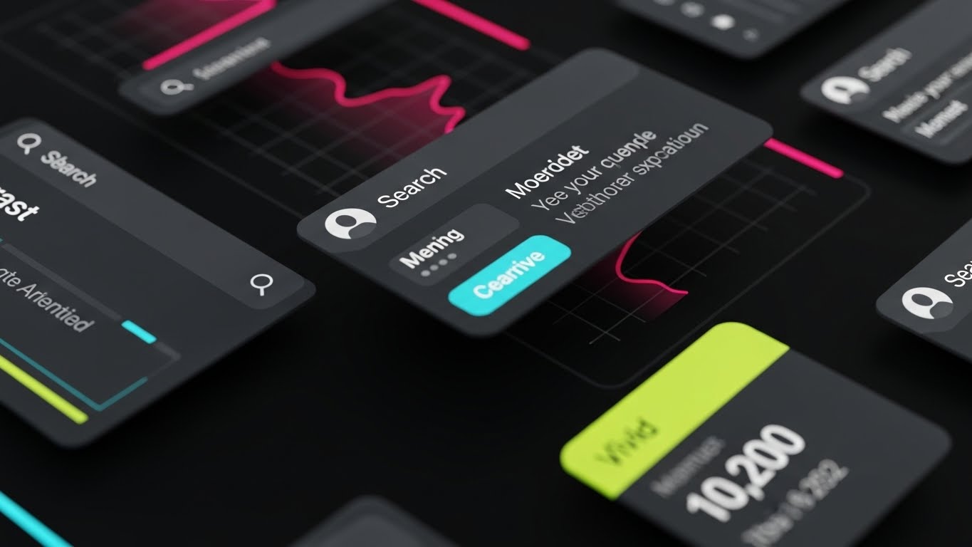
4. Rapid UI Feature Montage (Serial No. 4)
TOFU | Skippable Pre-Roll
The Visual & Narrative Approach
Note: Reflecting the modern developer preference shown in the visual, this analysis focuses on the "Dark Mode" execution.
A rapid-fire montage composition of high-fidelity SaaS UI screens floating in an abstract space. The interface uses a sleek Dark Mode aesthetic with Neon Pink and Cyan data accents—a palette that resonates with developers who live in terminal environments. The view zooms in and out quickly on specific widgets: a cost graph, a security shield icon, and a speed gauge. The UI elements are crisp, with slight motion blur on the edges to convey velocity.
Psychological Impact & KPI Focus
- Niche Psychology: "Dark Mode" signals native utility. It tells the technical buyer, "We built this for you, not for the marketing team." The rapid cutting rhythm mimics the cognitive processing of an expert user.
- Operational Impact: Demonstrates Tool Consolidation and Real-Time Observability. By showing the actual UI (stylized), it offers "Proof of Experience."
Strategic Implementation & Trade-offs
- Best Use Case: YouTube Skippable Ads (15-30s).
- Strategic Trade-off: Breadth vs. Context. It proves the product exists and looks good, but moves too fast for training. Use to generate desire for a demo.
Companies using similar video content -
Dynatrace – Observability Platform – Quick cuts of dark mode UI showcasing real-time metrics.
New Relic – Full-Stack Observability – Fast-paced UI montage demonstrating feature precision and data.
Grafana Labs – Grafana Enterprise – Dark mode dashboards highlighting consolidated monitoring views.
5. Abstract 2D Glossy (Serial No. 5)
TOFU | Vertical Social
The Visual & Narrative Approach
Targeting the mobile-first viewer, this style utilizes hyper-glossy, ray-traced textures. Glossy Pink organic blobs merge with mercury-like silver spheres against a pure White background. This liquid motion represents the concept of "Fluid Infrastructure"—resources that reshape themselves based on demand. The formation of an upward arrow symbolizes growth and optimization without the rigid constraints of traditional grids.
Psychological Impact & KPI Focus
- Niche Psychology: The fluid merging of separate spheres into a single strong shape is a powerful metaphor for agility and frictionless integration. It appeals to the buyer who wants to see their investments merge into a positive ROI without the "grind" of legacy integration.
- Operational Impact: Visualizes Seamless Integration. It suggests that the infrastructure adapts fluidly to demand.
Strategic Implementation & Trade-offs
- Best Use Case: TikTok and Instagram Stories (10-15s).
- Strategic Trade-off: Optimal for viral engagement. Suboptimal for technical depth. It is purely metaphorical and should be used as a hook.
Companies using similar video content -
Nutanix – Cloud Platform – Liquid integration symbolizing fluid infrastructure and agile workflows.
Red Hat – OpenShift – Glossy, merging shapes representing seamless container orchestration.
SUSE – Rancher – Fluid dynamics visualizing adaptable and integrated cloud-native management.
7. Isometric 2D Motion Design (Serial No. 7)
TOFU | Differentiation

The Visual & Narrative Approach
An isometric 2D vector illustration of a digital infrastructure grid. Soft Pastel Blue and Mint Green data packets flow along precise Grey pathways between stylized server blocks. One unique data stream is colored in Burnished Gold, moving faster and smoother than the others, highlighting differentiation. The style is technical and clean, like an architectural drafting plan, set against a subtle grid background.
Psychological Impact & KPI Focus
- Niche Psychology: Appeals to the "Architect" persona who values logic and structure. The blueprint aesthetic implies reliability and planning. The "Gold Stream" visual cue instantly communicates differentiation and priority.
- Operational Impact: Visualizes QoS (Quality of Service) and Traffic Shaping. It explains how the platform prioritizes VIP workloads over background noise.
Strategic Implementation & Trade-offs
- Best Use Case: Website "How it Works" pages (Looping).
- Strategic Trade-off: Clarity vs. Excitement. It can feel "dry" or academic. It lacks the excitement of 3D but builds massive credibility.
Companies using similar video content -
Cisco – Meraki – Organic shapes representing network flow and simplified management.
Palo Alto Networks – Prisma Cloud – Fluid, interconnected elements for cloud security posture.
Zscaler – Zero Trust Exchange – Abstract, flowing lines illustrating secure access and connectivity.
8. Dynamic Data Viz + 3D AI (Serial No. 8)
MOFU | Feature Education

The Visual & Narrative Approach
A 3D glassmorphism visualization of a data chart. Translucent bars in Vibrant Orange and Deep Indigo rise vertically from a glowing White base, representing auto-scaling workloads. The bars have an internal glow and frosted glass texture. The background is a soft-focus data stream. The camera views the chart from a side profile to emphasize the height and growth of the metrics.
Psychological Impact & KPI Focus
- Niche Psychology: By rendering data as beautiful, glowing glass objects, we subliminally increase the perceived value of that data. The transparency of the glass visually reinforces "Clear Visibility" into cloud spend.
- Operational Impact: Visualizes ROI and Resource Utilization. It bridges the gap between technical metrics (CPU usage) and business value (Growth).
Strategic Implementation & Trade-offs
- Best Use Case: Product Pages or Pitch Decks (15-20s).
- Strategic Trade-off: Style vs. Accuracy. It is a stylized representation, not a dashboard view. Use to punctuate ROI sections.
Companies using similar video content -
ScienceLogic – SL1 Platform – Vector blueprints mapping precise IT infrastructure differentiators.
LogicMonitor – Unified Monitoring – Isometric grids showing data packets flowing through IT environments.
Kentik – Network Observability – Clean, architectural designs for network traffic shaping and QoS.
9. Split Screen: Reality/UI (Serial No. 9)
MOFU | Competitive Displacement
The Visual & Narrative Approach
A vertical split-screen composition. The left half shows a gritty, realistic photo of a tangled mess of Grey server cables in a dimly lit room. The right half shows a pristine, clean vector UI screen in Teal and White, displaying an organized network topology. A vertical divider separates the two worlds, visually comparing the chaos of the old way with the clarity of the new platform.
Psychological Impact & KPI Focus
- Niche Psychology: Invokes the "Pain/Relief" dynamic. It forces the viewer to confront the ugly reality of their physical legacy (cables/mess) and offers the UI as the immediate relief. It validates the user's frustration with legacy tech.
- Operational Impact: Visualizes Legacy Modernization. It acts as a bridge, showing how the platform wraps physical chaos in a logical software layer.
Strategic Implementation & Trade-offs
- Best Use Case: LinkedIn Competitive Ads (15-30s).
- Strategic Trade-off: Direct vs. Subtle. It is an aggressive sales tactic. Highly effective for "Switching Campaigns."
Companies using similar video content -
Flexera – Cloud Cost Optimization – Glassmorphism charts elevating metric visibility for FinOps.
CloudHealth by VMware – Cloud Management – Translucent bars visualizing ROI and resource utilization.
Apptio – FinOps Platform – Glowing 3D data representing clear visibility into cloud spend.
10. Isometric 3D Workflow (Serial No. 10)
MOFU | The Functional Buyer

The Visual & Narrative Approach
This style utilizes a "claymorphism" aesthetic to render a miniature, isometric data center. The server racks and container blocks are depicted as soft, rounded matte objects in Matte White, Terracotta, and Soft Blue. Small, abstract figures representing DevOps engineers move cubic containers with effortless fluidity. The lighting is soft and diffuse, creating a tactile, friendly view of complex infrastructure.
Psychological Impact & KPI Focus
- Niche Psychology: Complexity is intimidating. This style "humanizes" the infrastructure, making it look like a manageable tabletop model. It reduces the anxiety of "breaking things" and invites exploration.
- Operational Impact: Visualizes Container Orchestration. It turns the abstract concept of Kubernetes scheduling into a physical, understandable task (moving blocks).
Strategic Implementation & Trade-offs
- Best Use Case: Whitepapers or Onboarding Videos (60-90s).
- Strategic Trade-off: Approachability vs. Authority. Excellent for education and onboarding; less effective for high-stakes security pitches where "hardened" realism is preferred.
Companies using similar video content -
ServiceNow – IT Operations Management – Contrasting physical chaos with organized digital UI.
BMC Software – Helix Platform – Resolving infrastructure mess with pristine, clean network topology.
Schneider Electric – EcoStruxure IT – Bridging on-prem hardware reality with modern DCIM UI.
11. Wireframe to Reality (Serial No. 11)
MOFU | Reducing Implementation Friction
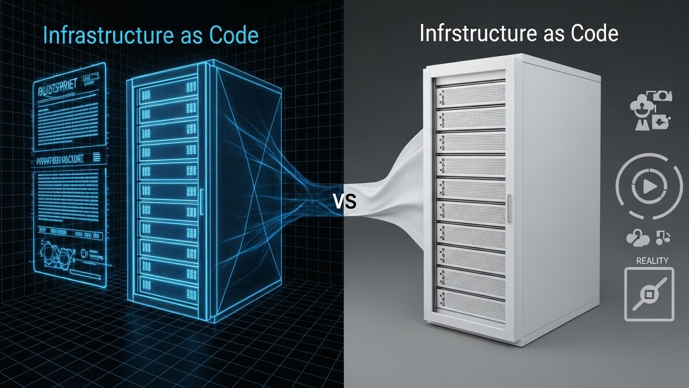
The Visual & Narrative Approach
This style directly addresses the "Infrastructure as Code" (IaC) paradigm by visualizing the transition from concept to execution. The composition uses a split-screen effect. On the left, a Blueprint Blue wireframe schematic visualizes the scripting layer (Terraform/Ansible). As the transition moves right, this wireframe resolves instantly into a solid, photorealistic White server rack. The contrast between the skeletal data structure and the solid hardware effectively visualizes the platform's ability to "manifest" infrastructure instantly from code.
Psychological Impact & KPI Focus
- Niche Psychology: DevOps engineers often fear that "abstraction" means "loss of control." This visual reassures them that the code is the reality. It validates their workflow, showing that the platform respects their scripting roots while delivering enterprise-grade hardware results.
- Operational Impact: Visualizes Provisioning Speed and Configuration Management. It serves as a visual proof-point for "Zero-Touch Provisioning," showing the elimination of manual configuration drift.
Strategic Implementation & Trade-offs
- Best Use Case: Email Nurture Sequences (GIFs) or Technical Blog Headers.
- Strategic Trade-off: Technical Validation vs. Emotion. It is highly effective for technical audiences but may feel too "engineering-focused" for non-technical stakeholders.
Companies using similar video content -
Portainer – Container Management – Claymorphism humanizing complex container orchestration.
Rancher Desktop – Local Kubernetes – Tactile, friendly views of managing local Kubernetes clusters.
Mirantis – Kubernetes Engine – Soft, rounded objects simplifying infrastructure management.
12. Photorealistic 3D Renders (Serial No. 12)
MOFU | Establishing Thought Leadership
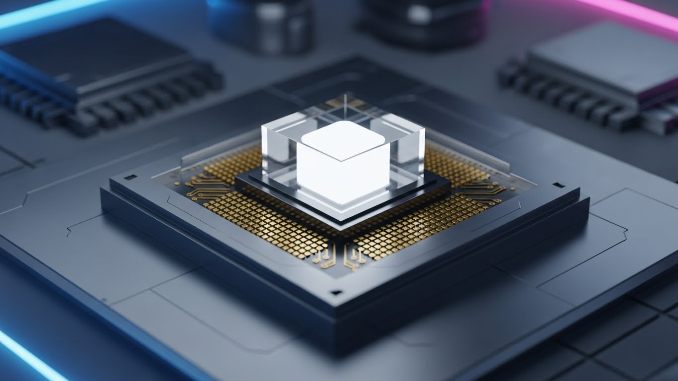
The Visual & Narrative Approach
Moving away from abstraction, this style utilizes 8K photorealism to convey hardware-level reliability. The visual features a macro close-up of a futuristic processor chip. The Metallic Silver finish and intricate gold circuitry suggest premium engineering, while the Glass core emitting a Pure White light symbolizes the "intelligence" residing at the center of the cloud. The shallow depth of field creates a sense of intimacy and focus, positioning the platform not just as software, but as the "engine" of the enterprise.
Psychological Impact & KPI Focus
- Niche Psychology: In a market flooded with ephemeral software, "heavy metal" aesthetics signal permanence and power. It appeals to the buyer's desire for a robust, crash-proof foundation. It says, "This platform is built on solid ground."
- Operational Impact: Visualizes Compute Power and Uptime Reliability. It anchors the cloud concept to something tangible and strong, reinforcing the value of the underlying infrastructure.
Strategic Implementation & Trade-offs
- Best Use Case: Technical Whitepapers or "Under the Hood" Blog Series.
- Strategic Trade-off: Tangibility vs. Agility. While it builds trust in reliability, overusing hardware imagery can inadvertently signal "legacy" if not paired with modern lighting effects.
Companies using similar video content -
Ansible – Automation Platform – Blueprint wireframes resolving into solid infrastructure.
Puppet – Enterprise Automation – Visualizing Infrastructure as Code from concept to execution.
Chef – Infra Automation – Demonstrating provisioning speed and configuration management.
13. Futuristic Neon/Dark Mode (Serial No. 13)
MOFU | Overcoming Objections

The Visual & Narrative Approach
To visualize the intangible concept of "Cybersecurity," this style adopts a cyberpunk-influenced "Dark Mode" aesthetic. A central Neon Green padlock—the universal signifier of safety—pulses on a dark, reflective grid. It is surrounded by glowing Midnight Blue geometric walls that form a digital fortress. The high contrast between the deep shadows (threats) and the piercing neon light (protection) creates a dramatic narrative of safety in a hostile environment.
Psychological Impact & KPI Focus
- Niche Psychology: Security is an anxiety-driven purchase. This aesthetic utilizes "defensive coloring" (Green/Blue) to signal safety and monitoring. The "Dark Mode" environment mirrors the "Dark Web," subtly implying that the platform is native to, and dominant within, high-threat environments.
- Operational Impact: Visualizes Threat Detection and Encryption. It makes the invisible shield of the platform visible and reassuring.
Strategic Implementation & Trade-offs
- Best Use Case: Security Compliance Pages or LinkedIn Carousel Ads.
- Strategic Trade-off: Protection vs. Openness. The fortress aesthetic is perfect for security topics but should be avoided when discussing open API integrations, where "walls" are a negative metaphor.
Companies using similar video content -
Dell Technologies – APEX – Macro close-ups of futuristic hardware signifying processing reliability.
HPE – GreenLake – 8K photorealism conveying hardware-level reliability and compute power.
Equinix – Data Centers – Detailed renders of core infrastructure, emphasizing uptime and permanence.
14. 3D Parallax UI Presentation (Serial No. 14)
MOFU | Driving Demo Requests
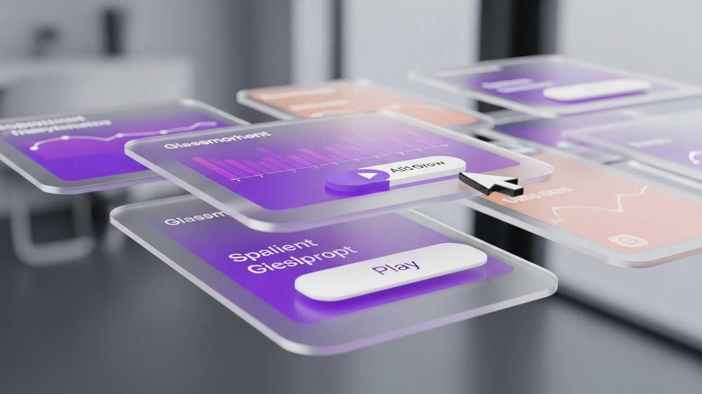
The Visual & Narrative Approach
This style elevates the standard screenshot by adding depth and motion. SaaS UI screens are rendered as semi-transparent glass panes floating in 3D space. As the camera drifts, the parallax effect reveals layers of data—Gradient Purple graphs and Peach alerts—stacked behind one another. This visualizes the concept of "Deep Observability." The viewer isn't just looking at the interface; they are looking into the data.
Psychological Impact & KPI Focus
- Niche Psychology: The depth cue triggers a perception of insight. It suggests that the platform offers more than surface-level metrics—it provides a multi-dimensional view of the infrastructure. It promises that complex data is organized and accessible.
- Operational Impact: Visualizes Full-Stack Visibility. It effectively demonstrates how the platform consolidates multiple monitoring tools into a single, layered view.
Strategic Implementation & Trade-offs
- Best Use Case: Retargeting Ads (10-15s) or Product Feature Pages.
- Strategic Trade-off: Sophistication vs. Readability. The floating effect looks premium but can make small text hard to read. Use it to sell the experience of the UI, not specific data points.
Companies using similar video content -
CrowdStrike – Falcon Platform – Cyberpunk aesthetic illuminating zero-trust security.
Fortinet – FortiGate – Neon green padlocks and glowing walls for threat detection.
Wiz – Cloud Security Platform – Dark mode environment for visualizing cloud security posture.
15. Minimalist Flat 2D Vector (Serial No. 15)
MOFU | ABM Awareness

The Visual & Narrative Approach
For Account-Based Marketing (ABM) where the message must be quick and personalized, this style strips away all noise. Using a "Memphis Design" influence, it features simple geometric shapes in Corporate Blue and Slate Grey. A specific element (like a stylized office building) is highlighted by a Bright Red target reticle or pointer. The vector art is clean, scalable, and devoid of distracting textures, focusing entirely on the concept of "We are looking at you."
Psychological Impact & KPI Focus
- Niche Psychology: In a complex B2B world, simplicity signals clarity. The target motif subconsciously communicates "Solution Fit." It tells the prospect, "We understand your specific context."
- Operational Impact: Visualizes Customization and Specific Use-Case Resolution. It creates a direct visual link between the problem and the targeted solution.
Strategic Implementation & Trade-offs
- Best Use Case: Personalized Display Ads (300x250) or Direct Mail inserts.
- Strategic Trade-off: Clarity vs. Prestige. It is excellent for communication speed but lacks the "Enterprise Grade" feel of 3D. Use for functional messaging, not brand anthems.
Companies using similar video content -
Datadog – APM & Observability – Semi-transparent glass panes revealing layers of data.
Splunk – Observability Cloud – Parallax effect demonstrating deep observability and full-stack visibility.
ThousandEyes – Network Intelligence – Floating UI layers for multi-dimensional network performance view.
16. Holographic UI over 3D Render (Serial No. 16)
MOFU | Building Trust

The Visual & Narrative Approach
This style bridges the physical and digital worlds by overlaying a sophisticated Cyan/Holographic Blue User Interface (HUD) onto a realistic background. As seen in the example, the UI acts as an "Augmented Reality" layer, projecting critical health data, maintenance alerts, and performance graphs directly into the user's hands (or over the infrastructure). The glowing wireframes contrast sharply with the dark industrial background, emphasizing that the software provides clarity in complex physical environments.
Psychological Impact & KPI Focus
- Niche Psychology: It fulfills the "Iron Man" fantasy of the tech lead—having immediate, high-tech access to invisible data. It positions the user as a "Super-Admin" who can see through the noise.
- Operational Impact: Visualizes Remote Management and IoT Integration. It demonstrates that the platform extends control beyond the control room, right to the edge of the infrastructure.
Strategic Implementation & Trade-offs
- Best Use Case: "How it Works" sections on Websites or interactive product tours.
- Strategic Trade-off: Future vs. Now. It can look sci-fi. Ensure the UI data shown is realistic to avoid over-promising capabilities.
Companies using similar video content -
Salesforce – Sales Cloud – Simple geometric shapes with a bright red target for ABM.
HubSpot – CRM Platform – Clean vector art focusing on specific use-case resolution.
Marketo Engage (Adobe) – Marketing Automation – Precision target motif for account-based marketing.
17. Aspirational Stock Montage (Serial No. 17)
MOFU | Demand Gen

The Visual & Narrative Approach
Technology ultimately serves people. This style pivots to the result of good orchestration: a happy, collaborative team. High-quality photography captures a diverse group of professionals in a bright, glass-walled office. They are looking at a screen not with frustration, but with genuine excitement and relief. The Warm Skin Tones and Natural Light contrast with the cool blues of the software, grounding the tech in human benefit.
Psychological Impact & KPI Focus
- Niche Psychology: DevOps burnout is real. This visual sells the "Lifestyle ROI"—the promise that the platform will reduce late-night paging and restore work-life balance. It appeals to the manager who wants to retain talent.
- Operational Impact: Visualizes Collaboration and Team Efficiency. It implies that the tool creates consensus rather than conflict.
Strategic Implementation & Trade-offs
- Best Use Case: Social Proof sections, Case Study Headers, or Careers pages.
- Strategic Trade-off: Relatability vs. Specificity. It builds emotional connection but explains nothing about the product. Must always be paired with hard data or UI shots.
Companies using similar video content -
PTC – ThingWorx – Overlaying holographic UI onto industrial IoT environments.
Siemens – MindSphere – Augmented reality layer projecting critical health data over machinery.
Armis – Asset Intelligence Platform – Glowing wireframes providing clarity in complex physical environments.
18. Clean UI Workflow (Light Mode) (Serial No. 18)
BOFU | ROI Justification
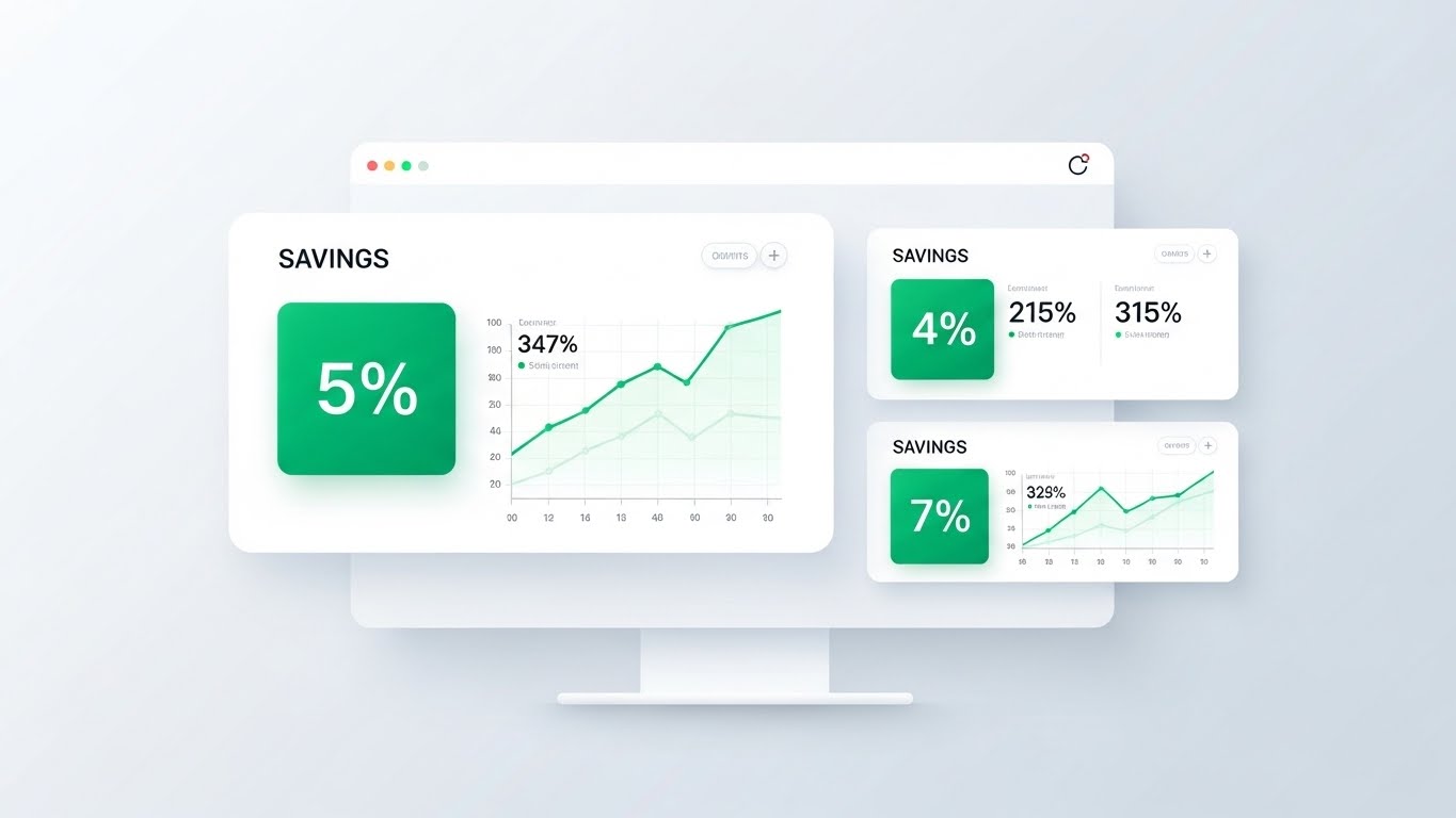
The Visual & Narrative Approach
When speaking to the CFO or procurement team, clarity is king. This style utilizes a high-key, "Light Mode" aesthetic with ample whitespace. The focus is exclusively on the metrics that matter: Emerald Green widgets highlighting "Savings," "Optimization," and upward-trending graphs. The design is devoid of "dark mode" coolness, opting instead for the crisp, trustworthy aesthetic of a financial audit or bank statement.
Psychological Impact & KPI Focus
- Niche Psychology: Green is the color of validation (and money). By isolating these metrics on a clean white background, the visual eliminates ambiguity. It signals transparency, fiscal responsibility, and positive outcomes.
- Operational Impact: Visualizes FinOps and Cost Optimization. It moves the conversation from "tech specs" to "business value," showing exactly where the money is being saved.
Strategic Implementation & Trade-offs
- Best Use Case: Pitch Decks (The "Value Slide") and ROI Calculators.
- Strategic Trade-off: Fiscal Trust vs. Developer Appeal. Developers often dislike Light Mode/Marketing dashboards. Keep this strictly for the "Economic Buyer."
Companies using similar video content -
Atlassian – Jira Software – High-quality photography of collaborative, happy DevOps teams.
Slack – Collaboration Hub – Diverse professionals in bright offices, symbolizing team success.
Microsoft Teams – Communication Platform – Humanizing DevOps culture and team efficiency.
19. 3D X-Ray Visualization (Serial No. 19)
BOFU | Risk Mitigation

The Visual & Narrative Approach
To visualize the complex "internal combustion" of a high-performance infrastructure, this style uses an X-Ray metaphor. While often applied to servers, here we see the concept applied to a mechanical engine to represent the driving force of the enterprise. The internal components—filters, pipes, and core processing units—are revealed through a transparent chassis. Glowing Orange flow lines highlight the movement of data (fuel) through the system, while Bright White markers identify optimization points.
Psychological Impact & KPI Focus
- Niche Psychology: "What you can't see can hurt you." The X-Ray style alleviates the fear of the "Black Box." By revealing the inner workings, it assures the buyer that the system is engineered for performance from the inside out and that the platform can detect internal friction before it causes failure.
- Operational Impact: Visualizes Root Cause Analysis and Deep Performance Monitoring. It shows that the platform monitors the "health" of the system, not just the output.
Strategic Implementation & Trade-offs
- Best Use Case: Technical Case Studies (Problem/Resolution) or Whitepapers.
- Strategic Trade-off: Depth vs. Complexity. It is excellent for showing complexity managed, but can be overwhelming. Use to prove "we know how this works."
Companies using similar video content -
Kion – Cloud Governance – High-key light mode UI with emerald green widgets for FinOps.
CloudBolt – Hybrid Cloud Management – Ample whitespace focusing on cost optimization and savings.
Densify – Cloud Resource Optimization – Crisp, trustworthy aesthetic for financial ROI justification.
20. Lifestyle Stock with UI (Serial No. 20)
BOFU | The Economic Buyer

The Visual & Narrative Approach
The final style targets the ultimate decision-maker. It features a polished, over-the-shoulder shot of an executive (CFO/CIO) reviewing a tablet. The key is the Superimposed UI: the screen displays a simplified, high-level executive dashboard with Warm Beige and Navy tones—colors associated with premium enterprise services. The executive's posture is relaxed and focused, signaling control, insight, and confidence in the data being presented.
Psychological Impact & KPI Focus
- Niche Psychology: This validates the buyer's self-image. It sells the feeling of being "on top of the numbers." It reassures the executive that this tool will provide the answers they need for the board meeting, without the technical noise.
- Operational Impact: Visualizes Reporting Capabilities and Strategic Alignment. It connects the technical platform to business strategy.
Strategic Implementation & Trade-offs
- Best Use Case: The Final Slide of a Sales Deck or Executive Summary pages.
- Strategic Trade-off: Authority vs. Detail. It shows zero technical detail, focusing entirely on the "result" of the data. Use only to close the deal.
Companies using similar video content -
Veeam – Backup & Replication – X-ray metaphor revealing internal engine for data protection.
Rubrik – Data Security Platform – Transparent chassis showing core components for performance.
Cohesity – Data Management – Glowing flow lines highlighting data movement and optimization.
21. 2D Line Art Animation (Serial No. 21)
BOFU | Objection Handling

The Visual & Narrative Approach
This style embraces ultra-minimalism to address the complex objection of "integration difficulty." Using a Single Continuous Black Line on a Pure White background, the animation begins by drawing a tight, chaotic knot—representing the tangled reality of legacy code and mismatched APIs. Smoothly, without breaking the line, the knot loosens and re-weaves itself into a perfect, symmetrical Cloud icon. The motion is rhythmic, fluid, and unhurried, utilizing "ease-in/ease-out" curves to suggest elegance.
Psychological Impact & KPI Focus
- Niche Psychology: IT decision-makers often fear that "unifying" disparate systems will result in a messy, fragile patchwork. This visual metaphor subconsciously reassures them that the platform doesn't just "cover up" the mess; it untangles it. The continuity of the line suggests data integrity—nothing is lost in the transition.
- Operational Impact: Visualizes Seamless Interoperability and Data Integrity. It posits the platform as the graceful resolver of technical debt.
Strategic Implementation & Trade-offs
- Best Use Case: Email Nurture Sequences (GIFs) addressing "Integration Concerns."
- Strategic Trade-off: Simplicity vs. Detail. It is purely metaphorical. It addresses the emotional fear of complexity, not the technical specifics of the API.
Companies using similar video content -
Oracle – Cloud Infrastructure – Executive reviewing a tablet with a simplified, high-level dashboard.
SAP – Enterprise Resource Planning – Polished shot of a CIO confirming strategic control.
Workday – Human Capital Management – Executive posture signaling confidence in strategic data.
22. 2D Graphics Over Live Action (Serial No. 22)
BOFU | Sales Cycle Acceleration

The Visual & Narrative Approach
This style bridges the gap between the tool and the user. It features high-quality video footage of a professional environment—here, a confident DevOps engineer in a modern coworking space. Overlaid on this reality are floating, Flat Vector Icons in Bright Yellow: checkmarks, lightning bolts, and document symbols. These graphics track the subject’s movements or float in the depth of the room (behind the person, then in front), creating a sense of "Augmented Productivity."
Psychological Impact & KPI Focus
- Niche Psychology: It validates the user's desire for competency. The floating "checkmarks" and "lightning bolts" are visual dopamine hits, symbolizing tasks completed and speed achieved. It frames the software not as a burden, but as a magical layer that empowers the human worker.
- Operational Impact: Visualizes Workflow Optimization and User Empowerment. It shows the platform as an invisible partner that accelerates the daily life of the engineer.
Strategic Implementation & Trade-offs
- Best Use Case: LinkedIn Video Ads or Customer Testimonial Intros.
- Strategic Trade-off: Vibe vs. Specs. It sells the feeling of being productive rather than the features of the product. Excellent for humanizing B2B tech.
Companies using similar video content -
Boomi – Integration Platform – Continuous black line untying integration complexity.
MuleSoft (Salesforce) – Anypoint Platform – Smooth animation of tangled knots re-weaving into cloud icons.
Zapier – Workflow Automation – Minimalist line art illustrating seamless interoperability.
23. Macro UI Micro-Interactions (Serial No. 23)
Onboarding | Self-Serve Onboarding

The Visual & Narrative Approach
To overcome the "Blank Screen" paralysis during onboarding, this style focuses on the tactile satisfaction of clicking a button. The view is an extreme macro close-up of a UI element—specifically an Electric Violet "Play/Deploy" button. A stylized White cursor hovers and clicks, triggering a Cyan inner glow and a slight depression of the button's 3D geometry. The background is a blurred, high-tech interface, keeping the focus entirely on the single action.
Psychological Impact & KPI Focus
- Niche Psychology: By magnifying the interaction, we make the software feel "physical" and high-quality. The "glow" upon interaction provides immediate visual feedback, triggering a sense of control and responsiveness. It makes the intimidating act of "Deploying to Production" feel simple and satisfying.
- Operational Impact: Visualizes Ease of Use and Actionability. It trains the user's eye to recognize key interaction points, reducing "Time to First Action."
Strategic Implementation & Trade-offs
- Best Use Case: In-App Tooltips or "Welcome" Email GIFs.
- Strategic Trade-off: Focus vs. Context. It shows only one button. Use it to highlight specific, high-value actions (e.g., "Run Audit"), not entire workflows.
Companies using similar video content -
GitLab – DevOps Platform – Floating flat vector icons over a confident DevOps engineer.
JFrog – DevOps Platform – Augmented productivity with checkmarks and lightning bolts.
CircleCI – CI/CD Platform – Humanizing digital efficiency with overlaid graphics on real-world scenes.
24. Hyper-lapse Stock + Data (Serial No. 24)
Onboarding | Accelerating TTV

The Visual & Narrative Approach
This style visualizes the concept of "Global Reach" and "Speed." It utilizes a hyper-lapse video of a city skyline at twilight, where traffic becomes streaks of Gold and Red light. Superimposed on the sky is a synchronized layer of Electric Blue data streams that mirror the perspective and velocity of the physical traffic. The digital lines converge on key buildings, symbolizing data centers or edge nodes.
Psychological Impact & KPI Focus
- Niche Psychology: It taps into the grandeur of enterprise scale. The juxtaposition of the physical city and the digital sky reinforces the idea that the cloud powers the real world. It creates a sense of momentum and inevitability.
- Operational Impact: Visualizes Low Latency and Edge Connectivity. It effectively communicates that the platform moves data as fast as the city moves people.
Strategic Implementation & Trade-offs
- Best Use Case: "Getting Started" Video Intros or Waiting Screens during provisioning.
- Strategic Trade-off: Atmosphere vs. Information. It is a mood setter. Use it to fill "wait times" (e.g., while a cluster spins up) to keep the user engaged.
Companies using similar video content -
HashiCorp – Vault – Extreme macro close-up of a "Deploy" button with inner glow.
Snyk – Developer Security – Magnified UI element showing tactile activation and responsiveness.
Aqua Security – Cloud Native Security – Focusing on the satisfaction of clicking a key action button.
25. Gen AI Realistic Character (Serial No. 25)
Retention | Trial Activation

The Visual & Narrative Approach
This style uses high-fidelity Generative AI to create a relatable, trustworthy persona. We see a portrait of a calm, professional IT Manager in a server room. The lighting is cinematic, with Cool Blue server rack lights in the background contrasting with Warm key lighting on her face. She looks directly at the camera with a subtle, confident smile. This is not a stock photo; it is a bespoke generation designed to embody the ideal "Super User" or "Support Lead."
Psychological Impact & KPI Focus
- Niche Psychology: Technology can feel cold and isolating. This visual re-introduces the human element, suggesting that "Behind this software are experts who look like you." It builds subconscious trust and reduces the anxiety of being alone with a complex problem.
- Operational Impact: Visualizes Expert Support and Professional Community. It creates a mascot for the "Help" or "Community" sections of the platform.
Strategic Implementation & Trade-offs
- Best Use Case: Login Screens, "Contact Support" pages, or Community Forum headers.
- Strategic Trade-off: Authenticity vs. Artificiality. Ensure the AI generation is perfect; "Uncanny Valley" errors can damage trust.
Companies using similar video content -
Akamai – CDN & Edge Security – Hyper-lapse of city skyline with synchronized data streams.
Cloudflare – Global Network – Kinetic velocity matching business speed and global reach.
Fastly – Edge Cloud Platform – Digital lines converging on buildings, symbolizing edge connectivity.
26. Low-Poly 3D Modeling (Serial No. 26)
Retention | Reducing Support Overhead

The Visual & Narrative Approach
Troubleshooting is stressful. This style lowers the temperature by adopting a playful, "video game" aesthetic. We see a low-poly illustration of a server stack in Flat Blue and Red. A stylized character (resembling a builder in Yellow) holds a wrench next to a node. The geometry is faceted and simple, devoid of frighteningly complex details. The scene uses isometric perspective to present the problem as a manageable "puzzle" rather than a catastrophe.
Psychological Impact & KPI Focus
- Niche Psychology: By rendering the infrastructure as a toy-like model, we reduce the cognitive load and the "fear of breaking things." It encourages a "tinkering" mindset, promoting self-correction and exploration rather than panic.
- Operational Impact: Visualizes Maintenance Mode and Self-Healing. It is perfect for illustrating abstract concepts like "node repair" or "patching" in documentation.
Strategic Implementation & Trade-offs
- Best Use Case: Knowledge Base Articles, Error 404 Pages, or Maintenance Mode screens.
- Strategic Trade-off: Approachability vs. Seriousness. Do not use for "Critical Security Alert" screens where a serious tone is required.
Companies using similar video content -
Databricks – Data & AI Platform – High-fidelity AI portrait of an expert ally in a server room.
Snowflake – Data Cloud – Relatable, trustworthy persona personifying support reliability.
Confluent – Data Streaming Platform – Cinematic lighting on a professional IT manager, building trust.
27. 2D Character-Driven Story (Serial No. 27)
Retention | Reducing Churn

The Visual & Narrative Approach
This style focuses on positive reinforcement. It features a clean, flat 2D vector illustration of a user at a desk. The palette uses the brand's Teal and Orange for high contrast. The character gestures a "thumbs up" at a monitor, which displays a large, reassuring Green Checkmark. The style is corporate but friendly, stripping away background noise to focus purely on the moment of success.
Psychological Impact & KPI Focus
- Niche Psychology: Users need to feel successful to remain engaged. This visual mirrors the user's desired state: relief and satisfaction. It reinforces the "Reward" phase of the habit loop, encouraging repeat usage.
- Operational Impact: Visualizes Task Completion and Compliance Validation. It serves as a digital "pat on the back" after a complex deployment.
Strategic Implementation & Trade-offs
- Best Use Case: "Success" State screens, Weekly Summary Emails, or Renewal Reminders.
- Strategic Trade-off: Generic vs. Specific. It is a generic success indicator. Best used as a header image for positive news/reports.
Companies using similar video content -
Zabbix – Monitoring Solution – Low-poly illustration of a server stack for simplifying troubleshooting.
Prometheus – Monitoring System – Gamified fix with a stylized character next to a node.
Nagios – IT Infrastructure Monitoring – Toy-like models reducing cognitive load for maintenance.
28. Dark Mode UI Showcase (Serial No. 28)
Expansion | Driving Upsell

The Visual & Narrative Approach
To appeal to the "Power User" for upsell opportunities, this style embraces the Dark Mode aesthetic synonymous with premium developer tools. An angled close-up shows a dashboard in Charcoal and Slate Grey. A notification panel floats in the foreground, glowing with Neon Pink and Blue gradients, displaying an "unlocked" padlock icon. The lighting is dramatic, highlighting the sleekness of the interface and the exclusivity of the feature being revealed.
Psychological Impact & KPI Focus
- Niche Psychology: Dark Mode implies "Pro Level." By showcasing new features in this aesthetic, it frames the upsell not as a purchase, but as an "upgrade in status." It signals that the user is unlocking capabilities reserved for the elite.
- Operational Impact: Visualizes Security Add-ons or Enterprise Tier Features. It makes the invisible license upgrade feel like a tangible product enhancement.
Strategic Implementation & Trade-offs
- Best Use Case: In-App "Upgrade" modals or "New Feature" release notes.
- Strategic Trade-off: Readability vs. Cool. Ensure the text on the UI is legible despite the dramatic angles and lighting.
Companies using similar video content -
PagerDuty – Operations Cloud – Flat 2D illustration of a user with a "thumbs up" for success.
VictorOps (Splunk) – Incident Management – Character gesturing at a monitor with a green checkmark.
Opsgenie (Atlassian) – Alerting & On-Call – Positive reinforcement for task completion and validation.
29. 2D Animation & UI Composition (Serial No. 29)
Expansion | Driving Referrals

The Visual & Narrative Approach
This style visualizes the social aspect of the platform. Using lively, Cel-Shaded 2D animation with thick outlines and Bright Primary Colors (Purple, Yellow, Teal), it depicts two diverse characters exchanging a glowing, geometric token. The background features popping confetti shapes. The style is energetic and fluid, distinct from the rigid technical visuals, signaling a "community" event rather than a technical task.
Psychological Impact & KPI Focus
- Niche Psychology: Referral programs often feel transactional. This visual reframes the referral as a "gift" or a shared benefit between peers. The bright, energetic colors evoke excitement and generosity.
- Operational Impact: Visualizes Partner Ecosystems and Referral Rewards. It simplifies the concept of "invite a peer" into a simple visual transaction.
Strategic Implementation & Trade-offs
- Best Use Case: Referral Landing Pages or Social Media "Share" prompts.
- Strategic Trade-off: Fun vs. Enterprise. It is very casual. Keep it contained to community/referral contexts; do not use for core product messaging.
Companies using similar video content -
Lacework – Cloud Security Platform – Angled close-up of a dark mode dashboard for premium features.
Sysdig – Cloud-Native Intelligence – Notification panel glowing with neon gradients for upsell.
Orca Security – Cloud Security Platform – Dramatic lighting highlighting sleek interface and exclusivity.
30. Abstract 3D AI Visualization (Serial No. 30)
Expansion | Proactive Support

The Visual & Narrative Approach
To close the loop, this style visualizes the future: Artificial Intelligence. It features an abstract 3D network of Gold, Silver, and Bronze metallic nodes connected by glowing Cyan plexus lines in a deep Blue void. The camera flies through this neural network as nodes light up in sequence, representing the platform's AI "thinking" and predicting issues before they occur. It is sophisticated, expensive-looking, and visionary.
Psychological Impact & KPI Focus
- Niche Psychology: It appeals to the desire for "Omniscience." It assures the stakeholder that the platform is not just a reactive tool, but a proactive intelligence that is constantly learning. It validates the long-term investment in the platform.
- Operational Impact: Visualizes Predictive Analytics and AI Ops. It represents the "brain" of the hybrid cloud.
Strategic Implementation & Trade-offs
- Best Use Case: "Vision" Newsletters, Roadmap Presentations, or QBR (Quarterly Business Review) decks.
- Strategic Trade-off: Abstract vs. Concrete. It explains nothing about how the AI works, only that it is working. Use to inspire confidence in the roadmap.
Part 4: Strategic Knowledge Base
Strategic Alignment & Visual Architecture
The "Pre-Production" Strategy: Defining the Visual Operating System.
- The Cognitive Load Audit: Before creating assets, audit the "Cognitive Friction" of your current documentation. If a diagram requires more than 15 seconds to decipher, it is an operational risk. Use Style 1 (Abstract Motion) to simplify top-level concepts and Style 10 (Claymorphism) to simplify complex architectures.
- Role-Based Visual Mapping: Differentiate your visual language by persona. The CIO needs Style 20 (Lifestyle UI)—clean, high-level metrics. The DevOps Engineer needs Style 4 (Dark Mode UI)—dense, precise, and dark-themed. Do not serve executive fluff to engineers, or technical density to executives.
- The "Glanceability" Standard: In a live incident, speed is safety. Design operational dashboards and alerts (using Style 2/Kinetic Typo) to be understood in under 2 seconds. Apply this standard to all "Red Alert" visuals.
- Brand Voice Consistency: Your visual voice must be as consistent as your code. Define a "Visual CSS" for your video content—standardizing the hex codes for "Good" (e.g., Teal) vs. "Bad" (e.g., Red) status across Style 21 (Line Art) and Style 30 (3D AI).
- The Advids Strategic Audit: Partner with Advids during the blueprinting phase. We don't just animate; we map your technical topology to a visual hierarchy, ensuring that your most critical features get the most compelling visual treatment (e.g., reserving Style 12/Photorealism for your core engine).
- Standardization vs. Customization: Use standardized assets (Style 17/Stock Montage) for generic concepts like "Collaboration." Reserve bespoke, high-cost 3D (Style 19/X-Ray) for your unique IP and proprietary algorithms.
- The Cross-Departmental Bridge: Use visuals to unify terminology. If Sales calls it "The Hub" and Ops calls it "The Cluster," use Style 1 (Abstract Motion) to visually demonstrate that they are the same entity, creating a shared mental model.
- Legacy System Integration: Visualizing the invisible link between on-prem hardware and SaaS is critical. Use Style 9 (Split Screen) to visually validate the connection between the "dusty server room" and the "shiny cloud UI," validating the hybrid reality.
- Accessibility in Global Teams: Your engineering team is likely global. Visuals transcend language. Use Style 21 (Line Art) and Style 7 (Isometric Motion) which rely on universal symbols (arrows, nodes, locks) rather than text-heavy explanations, ensuring clarity for non-native English speakers.
- The Mobile-First Mandate: Even DevOps engineers check status on mobile. Ensure high-contrast styles like Style 28 (Dark Mode) remain legible on small screens. If the alert isn't clear on an iPhone, the visual has failed.
Operational Adoption & Implementation
The "Deployment" Phase: Embedding Visuals into the Workflow.
- Overcoming "Automation Anxiety": AI and automation can feel threatening. Use Style 25 (Gen AI Character) and Style 10 (Claymorphism) to frame automation as a "friendly assistant" that removes toil, rather than a "robot" that replaces jobs.
- The Micro-Learning Shift: Abandon the 50-page PDF manual. Break training into 30-second "Micro-Visuals" using Style 4 (Rapid UI Montage). Embed these directly into the CI/CD pipeline documentation.
- Just-in-Time Support: Embed Style 26 (Low-Poly 3D) visuals directly into error messages. When a deployment fails, show a looping GIF of the specific fix, reducing the need to search external knowledge bases.
- Gamification of Training: Use Style 2 (Bold Kinetic) and Style 27 (2D Character) to celebrate certification milestones. Visually reward engineers for completing security modules, increasing engagement with dry compliance material.
- Reducing Support Ticket Volume: There is a direct correlation between visual clarity and support costs. Proactively creating Style 23 (Macro UI) videos for common "How-To" queries can deflect up to 30% of Tier-1 support tickets.
- Remote Onboarding: In a distributed world, you cannot rely on over-the-shoulder mentoring. Use Style 14 (3D Parallax UI) to provide an immersive "tour" of the platform, simulating a guided walkthrough for remote hires.
- Standard Operating Procedures (SOPs): Transform text-based Runbooks into visual process flows using Style 7 (Isometric Motion). A visual flow of a disaster recovery protocol is processed faster during a outage than a text list.
- Feedback Loops: Use interactive video elements (overlaying Style 22 graphics) to ask users "Was this helpful?" directly within the tutorial, gathering real-time data on your documentation's effectiveness.
- Scalable Localization: When expanding to new regions, swap out the text layers in Style 15 (Flat Vector) while keeping the animation assets intact. This allows for rapid, low-cost localization of your entire video library.
- Leadership Communication: When the CTO presents to the Board, they need ammunition. Provide them with Style 18 (Clean Light Mode UI) and Style 20 (Lifestyle UI) assets that summarize complex cloud ROI into single, impactful slides.
Measuring Impact & Future-Proofing
The "ROI" Phase: Measuring Success and Evolving.
- Beyond "Views": Do not measure video success by "views." Measure it by "Time-to-Competency." Did the Style 23 (Macro UI) video reduce the time it takes a new user to deploy their first container?
- The "Idle Time" Metric: Correlate better visualization with reduced "dwell time" in navigation menus. Effective UI montages (Style 4) teach users where to click, streamlining their in-app workflow.
- Compliance Velocity: Measure how fast new regulations (e.g., GDPR updates) are understood. Sending a Style 13 (Neon Security) explainer often results in faster compliance acknowledgement than a text memo.
- Retention and Churn: High-quality UX visualization acts as an "anchor." Users who feel they understand the tool (thanks to Style 10/Claymorphism) are less likely to churn. Track retention rates among users who engage with your video academy.
- The AI Visual Frontier: Prepare for the next wave: Generative UI. Soon, interfaces will redraw themselves based on user behavior. Your visual guide must evolve to include Style 30 (Abstract AI) concepts that prepare users for dynamic, fluid interfaces.
- Scalability of Assets: Build a library, not a landfill. Ensure your Style 7 (Isometric) assets are vector-based so they can be rescaled for everything from mobile screens to trade show booths without pixelation.
- The Advids Partnership: Visual strategy is not a one-time project; it is a subscription to innovation. Advids acts as your long-term custodian, updating your Style 12 (Photorealism) assets as your hardware specs change, ensuring your visual truth never lags behind your technical truth.
- Benchmarking Success: "Good enough" is a competitive risk. If your competitor uses Style 14 (3D Parallax) and you use static screenshots, you look like legacy tech. Regularly audit your visual standard against the market leaders.
- The ROI of Safety: In hybrid cloud, "safety" means uptime. Quantify the reduction in "incident severity" that correlates with better visual training on incident response protocols (Style 19/X-Ray).
- Final Call to Innovation: Treat video as Infrastructure, not content. Just as you refactor code to be cleaner and faster, you must refactor your visuals. A platform that is easy to see is easy to sell, easy to use, and impossible to ignore.
Companies using similar video content -
GitHub – Developer Platform – Cel-shaded animation of characters exchanging a glowing token.
GitLab – DevOps Platform – Lively animation visualizing ecosystem growth and referral rewards.
Stack Overflow – Developer Community – Energetic style for community events and shared benefits.
Author & Editor Bio


