
Introduction: Visualizing the Velocity of Now
The era of "blind" logistics is over. We have entered a new phase of the delivery economy where visibility equals value. For operations directors, product architects, and logistics leaders, the challenge is no longer just moving goods from point A to point B; it is about visually articulating the sophisticated orchestration that makes that movement possible. We stand at a pivotal moment where complex algorithms, fleet dynamics, and consumer expectations converge, creating a massive opportunity for brands to translate abstract operational efficiency into tangible trust.
The stakes for clear communication have never been higher. As operational complexity grows, so does the need for precision in how we present these solutions to stakeholders. Consider that last-mile delivery costs now account for 53% of total shipping costs in 2024. This statistic is not just a line item; it is the definitive barrier to profitability. When a platform can visually demonstrate—within seconds—how it mitigates these costs through intelligent routing or automated dispatch, it moves from being a vendor to a strategic partner.
Furthermore, the market is exploding. The global quick commerce sector is projected to grow at a CAGR of 23.63% through 2035. In this crowded landscape, the brands that succeed will be those that can "show" their speed and reliability rather than just claiming it. This guide explores 30 specific visual languages curated to help you navigate the physical-digital divide. From the kinetic energy of motion graphics to the serene precision of isometric data visualizations, we provide the strategic framework to turn your technical infrastructure into a compelling visual narrative.
1. The Kinetic Brand Pulse
TOFU | Brand Awareness

The Visual & Narrative Approach
This style abandons traditional delivery imagery to focus on the raw energy of logistics. Imagine massive, blocky geometric forms in Vivid Amber and Charcoal Grey—evoking asphalt, caution lights, and industrial precision—dominating the screen. These forms don't just sit; they physically collide with and propel stylized icons like scooters, thermal boxes, and location pins across the screen. The animation is percussive, syncing perfectly with a bass-heavy track. There is no voiceover; the "voice" is the rhythmic impact of words like "SPEED," "SCALE," and "NOW."
Psychological Impact & KPI Focus
Niche Psychology: For logistics leaders, "speed" is often a theoretical promise. This style makes speed visceral. It leverages the Isolation Effect, reducing the cognitive load of reading about "fast delivery" by letting the viewer feel the momentum.
Operational Impact: This style is engineered for Brand Awareness. By stripping away the visual noise of real-world footage, we create a strong memory association with the brand's energy, ensuring top-of-mind recall.
Strategic Implementation & Trade-offs
- Best Use Case: Website Hero Backgrounds or 15-second high-energy social ads.
- Duration: 10-15 Seconds.
- Trade-off: Excellent for capturing attention, but it offers low "informational density." Use it to open the door, not to explain the room.
Companies using similar video content -
GoPuff – Quick commerce delivery platform.
DoorDash – Food and grocery delivery services.
2. The Systemic Overview
TOFU | Category Creation

The Visual & Narrative Approach
We look down at a pristine, 45-degree isometric city grid rendered in Fresh Mint Green and Slate Blue. The city blocks are simple geometric shapes, but the focus is on the "invisible" layer: dotted Bright Coral Red lines draw themselves around specific zones, visualizing "geofencing perimeters." Small, abstract cubes (packages) glide smoothly along the grid lines, turning efficiently at intersections. The lighting is shadowless and even, presenting a world where traffic jams and errors do not exist.
Psychological Impact & KPI Focus
Niche Psychology: Operations Managers crave order amidst chaos. The isometric view provides a "God's Eye View," reinforcing the feeling of total Control and oversight. It satisfies the brain's desire for structure.
Operational Impact: It effectively visualizes Category Creation by illustrating abstract concepts like Zone Planning and Hub-and-Spoke logic without the visual noise of satellite imagery. It simplifies the complex web of the city into a managed circuit board.
Strategic Implementation & Trade-offs
- Best Use Case: LinkedIn organic posts explaining core infrastructure or "System Logic."
- Duration: 20-30 Seconds (Loopable).
- Trade-off: High Cognitive Clarity, but it can feel "clinical." It sells the system's logic, but lacks the human element needed for driver recruitment.
Companies using similar video content -
ORTEC – Route optimization and planning software.
PTV Group – Traffic and logistics simulation software.
3. The Connectivity Flow
TOFU | Market Education
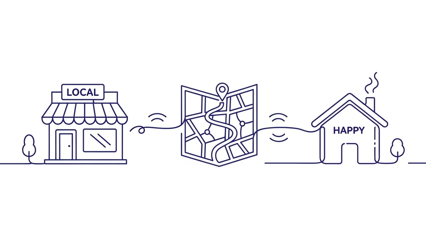
The Visual & Narrative Approach
Elegance meets efficiency. A single, continuous line in Electric Indigo flows across a Pure White canvas. It begins by outlining a local storefront, morphs fluidly into a winding path across a simplified map, and finally shapes itself into a "happy home" icon. The movement is liquid-like, with subtle ripples emanating outwards to represent "connectivity." There are no hard cuts—only smooth transformations that visually prove the ecosystem is integrated.
Psychological Impact & KPI Focus
Niche Psychology: This style addresses the fear of "Integration Friction." The continuous line serves as a powerful metaphor for Unbroken Connectivity, reassuring the viewer that the transition from merchant to rider to customer is seamless.
Operational Impact: It targets Market Education, explaining the platform's core value—how you connect the dots—without getting bogged down in technical UI details. It visually reduces the perceived complexity of adoption.
Strategic Implementation & Trade-offs
- Best Use Case: YouTube explainer intros or "How it Works" landing pages.
- Duration: 45-60 Seconds.
- Trade-off: Great for Simplicity, but the minimalist aesthetic may feel too "lightweight" for enterprise clients seeking robust, heavy-duty industrial solutions.
Companies using similar video content -
Tookan – Delivery management and dispatch software.
Onfleet – Last-mile delivery management platform.
4. The Epic Scale
TOFU | Shaping Brand Perception

The Visual & Narrative Approach
This style brings Hollywood scale to hyperlocal delivery. Using a breathtaking wide-angle drone shot, we see a sprawling metropolis at sunrise, bathed in Golden-Hour light. The focus isn't just the city, but the flow—a fleet of branded delivery riders weaving efficiently through the morning traffic. The high contrast and anamorphic lens flares elevate the job of a delivery rider from "gig worker" to "urban hero."
Psychological Impact & KPI Focus
Niche Psychology: It appeals to the founder's vision. It positions the company not just as a service, but as a vital part of the city's infrastructure. It leverages Social Proof at a macro scale.
Operational Impact: Validates the "Physical" side of the business. It builds trust that you have the Fleet Density and operational capacity to dominate a market.
Strategic Implementation & Trade-offs
- Best Use Case: Connected TV (CTV) spots or Investor Pitch Decks.
- Duration: 30-60 Seconds.
- Trade-off: High Emotional Impact, but low information density. It builds the myth of the brand, not the mechanic of the software.
Companies using similar video content -
Amazon Logistics – Global fulfillment and delivery network.
DHL – International shipping and logistics solutions.
5. The Fluid Agility
TOFU | Vertical Social Organic

The Visual & Narrative Approach
Designed for the vertical scroll, this style uses tactile, satisfying physics. Fluid, blob-like shapes in Hot Pink and Bright Cyan stretch and squeeze through rigid circular obstacles (representing traffic). The shapes have a high-gloss, plastic-like sheen with specular highlights. It visually metaphors Dynamic Routing—showing how your software flexibly adapts to bottlenecks without breaking flow.
Psychological Impact & KPI Focus
Niche Psychology: It utilizes ASMR-style satisfaction to retain attention on fast-moving social feeds. It portrays the algorithm as organic and responsive rather than rigid and brittle.
Operational Impact: Visually demonstrates Agility and Error Handling in a way that dry data charts cannot. It associates the brand with ease and adaptability.
Strategic Implementation & Trade-offs
- Best Use Case: TikTok or Instagram Reels to target younger logistics entrepreneurs.
- Duration: 15-20 Seconds.
- Trade-off: High Engagement, but requires text overlays to ensure the metaphor (Traffic = Obstacle) is clearly understood by the viewer.
Companies using similar video content -
OptimoRoute – Dynamic route planning and scheduling.
Routific – AI-powered route optimization for deliveries.
6. The Augmented Reality Overlay
TOFU | Skippable Pre-Roll Ad

The Visual & Narrative Approach
Real-world chaos meets digital order. We see a fast-paced hyper-lapse of a busy intersection; cars are blurred streaks of motion. Superimposed over this reality are crisp, stabilized abstract data visualizations in Traffic Red and Bright White: floating bars showing speed metrics and dynamic navigation arrows tracking traffic flow. The data is "locked" to the world, creating an Augmented Reality feel.
Psychological Impact & KPI Focus
Niche Psychology: It speaks directly to the anxiety of "blind spots." The data overlay reassures the viewer that your platform sees what they cannot. It creates a feeling of Omniscience.
Operational Impact: Highlights Real-Time Visibility and Predictive Analytics. It proves that your software extracts value (data) from the noise of the street.
Strategic Implementation & Trade-offs
- Best Use Case: YouTube Pre-roll ads (the first 5 seconds are critical).
- Duration: 15 Seconds (Punchy).
- Trade-off: Excellent for proving Tech Capability, but relies heavily on the quality of the match-moving (tracking). If the text "slips," the illusion of precision is broken.
Companies using similar video content -
Samsara – Fleet telematics and safety solutions.
Verizon Connect – GPS fleet tracking and management.
7. The Product Hero
TOFU | Connected TV
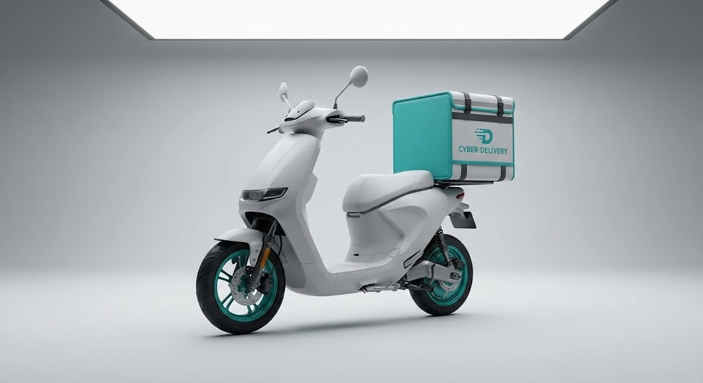
The Visual & Narrative Approach
When hardware is the product (e.g., cargo scooters), nothing beats photorealism. A sleek, white electric cargo scooter sits on a pristine Light Grey studio floor. Softbox lighting highlights the matte chassis and the thermal textures of the delivery box. Every detail—from the Teal rim accents to the texture of the seat—is rendered to perfection. It treats the delivery vehicle with the reverence of a luxury car commercial.
Psychological Impact & KPI Focus
Niche Psychology: High-quality rendering implies high-quality manufacturing. It builds subconscious Tangibility Bias, transferring the perceived quality of the vehicle to the brand as a whole.
Operational Impact: Showcases Asset Quality and readiness for deployment. It assures the buyer that the physical fleet is as robust as the software managing it.
Strategic Implementation & Trade-offs
- Best Use Case: Product Launch videos or Trade Show loops.
- Duration: 30-45 Seconds.
- Trade-off: High Perceived Value, but significantly higher production cost compared to 2D styles. It is static and product-focused.
Companies using similar video content -
Nuro – Autonomous delivery vehicles for local commerce.
Starship Technologies – Robotic last-mile delivery services.
8. The Neural Logistics Web
MOFU | Establishing Thought Leadership

The Visual & Narrative Approach
To visualize the invisible "Brain" of your AI, we use this mesmerizing abstract style. A complex network of glowing nodes and filaments in Deep Purple and Neon Blue floats in a white void. Pulses of light (data packets) travel rapidly between connections, representing millions of calculations per second. It is a visual metaphor for the "Neural Network" that powers your route optimization engine.
Psychological Impact & KPI Focus
Niche Psychology: It signals Sophistication. It appeals to the CTO who wants to know the platform is built on advanced AI architecture, not just simple scripts. It gives form to the invisible.
Operational Impact: Visualizes Computational Power and Network Density. It answers the question, "How smart is your system?" without needing lines of code.
Strategic Implementation & Trade-offs
- Best Use Case: LinkedIn Thought Leadership articles or Whitepaper headers.
- Duration: 15-20 Seconds (Loop).
- Trade-off: Profound Authority, but can be too abstract for operational staff who need to see the actual user interface to understand the workflow.
Companies using similar video content -
Blue Yonder – AI-driven supply chain optimization.
IBM Sterling Supply Chain – AI optimization for logistics.
9. The Engineering Truth
MOFU | Product Differentiation
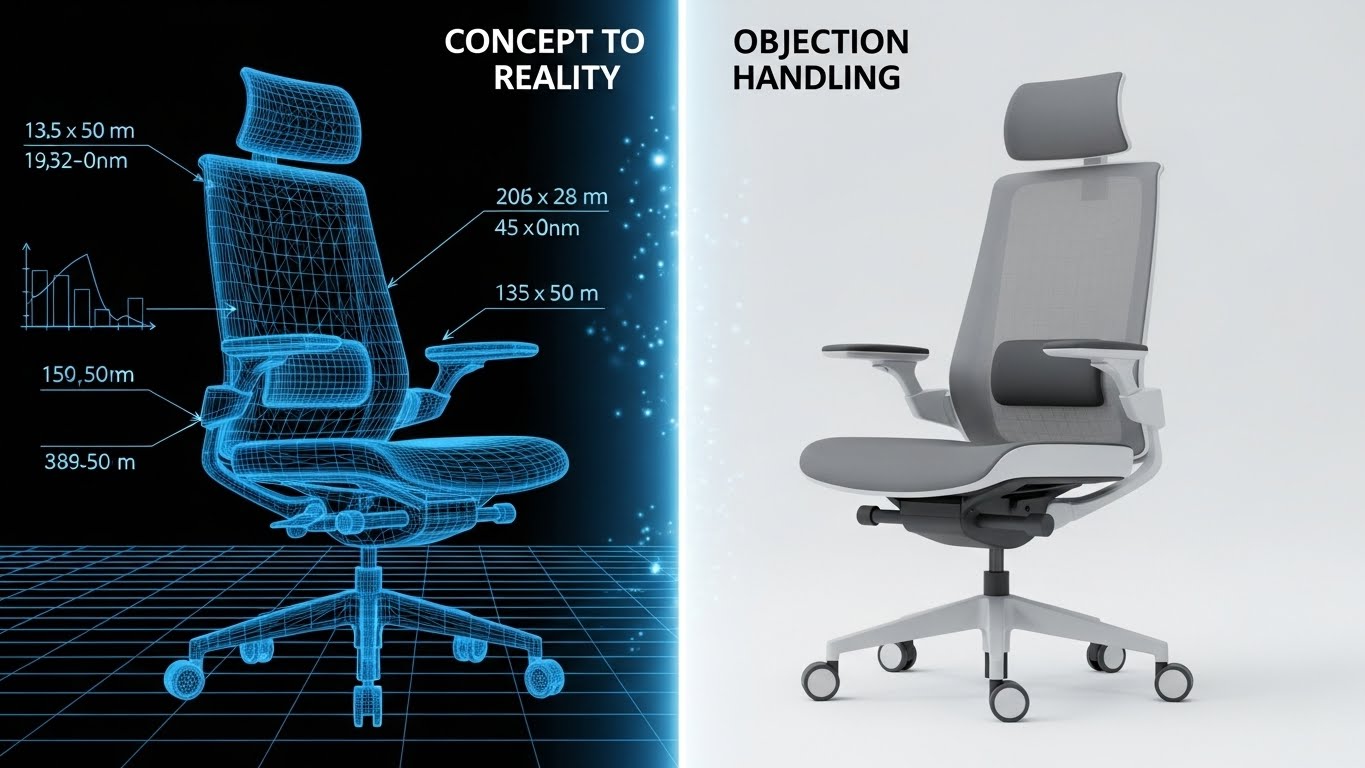
The Visual & Narrative Approach
Note: The visual example above demonstrates this stylistic transition using a product chair; for this application, the subject is a delivery drone.
This style bridges the gap between engineering and operation. A vertical split-screen divides the frame: the left side displays a technical Blue-and-White wireframe blueprint of a delivery drone, exposing its grid lines and geometry. As the eye moves to the right, the image seamlessly transitions into a fully rendered, photorealistic image of the drone in flight against a bright Blue Sky.
Psychological Impact & KPI Focus
Niche Psychology: It validates the "Digital Twin" concept. It proves that the physical execution matches the digital plan perfectly. It leverages the Transparency Effect, showing the rigor behind the product.
Operational Impact: Demonstrates Precision Engineering and reduces the fear of "vaporware." It separates serious hardware players from concept-only startups.
Strategic Implementation & Trade-offs
- Best Use Case: Website "Technology" pages or Technical Specification sheets.
- Duration: 10-15 Seconds.
- Trade-off: Great for Validation, but requires perfect alignment between the CAD model and the render. Any misalignment breaks the illusion.
Companies using similar video content -
Zipline – Drone delivery systems for critical goods.
Drone Delivery Canada – Commercial drone logistics technology.
10. The Interface Tactility
MOFU | Feature Education

The Visual & Narrative Approach
Sometimes, the biggest selling point is a small detail. This style zooms in extremely close on a single interface element: a rounded "Accept Order" button. The palette is High-Key White with Vivid Lime Green accents. As an invisible finger interacts with the button, it depresses with a satisfying, physics-based animation, and a ripple of green light expands outward.
Psychological Impact & KPI Focus
Niche Psychology: Driver retention is a critical issue. If the app feels clunky, riders leave. This style promises a Frictionless UX, appealing to Operations Managers worried about workforce satisfaction.
Operational Impact: Highlights Ease of Use and reduced training time. It visually proves that the tool is intuitive and delightful to use.
Strategic Implementation & Trade-offs
- Best Use Case: Feature highlight videos, App Store preview clips, or Rider Onboarding modules.
- Duration: 5-10 Seconds per interaction.
- Trade-off: High UX Clarity, but lacks the context of the broader workflow. It works best as a "detail shot" within a larger video.
Companies using similar video content -
Motive – KeepTruckin – Driver workflow and compliance solutions.
Fleetio – Fleet management software for operations.
11. Split Screen: Optimized Reality and UI**
MOFU | Overcoming Objections
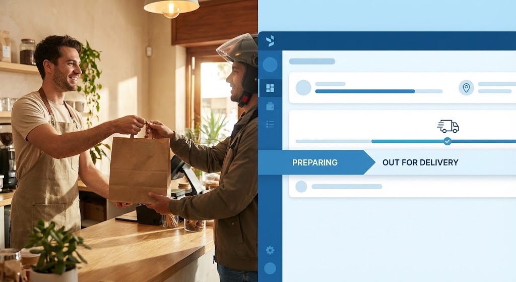
The Visual & Narrative Approach
This style visually bridges the physical and digital worlds to dismantle skepticism. A horizontal Split Screen divides the frame. On the left, high-quality cinematic footage shows a barista in a warm, Beige-toned cafe handing a package to a rider. On the right, we see the corresponding digital reality: a clean, Cool Blue UI dashboard where the status bar instantly updates from "Preparing" to "Out for Delivery." The motion is perfectly synchronized—as the physical bag crosses the counter, the digital status bar fills.
Psychological Impact & KPI Focus
Niche Psychology: One of the deepest anxieties for Operations Directors is Integration Latency—the fear that the software lags behind reality. This style leverages Visual Concordance to eliminate that fear.
Operational Impact: It proves Real-Time Synchronization. It visually validates that your webhook triggers and API updates happen instantly, reassuring the buyer that their dispatchers are seeing the truth, not delayed data.
Strategic Implementation & Trade-offs
- Best Use Case: Sales Decks (Slide 3 or 4) or "Features" page sections addressing API reliability.
- Duration: 10-15 Seconds.
- Trade-off: High Trust Building, but requires precise editing. If the sync is off by even a few frames, it suggests lag rather than speed.
Companies using similar video content -
Bringg – Delivery orchestration and management platform.
DispatchTrack – Last-mile delivery and tracking software.
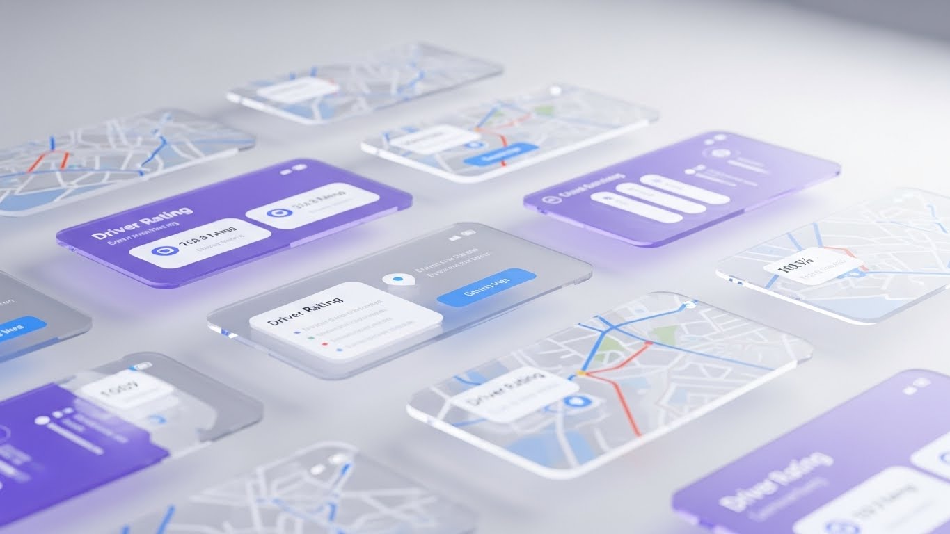
12. 3D Parallax UI Presentation
MOFU | Driving Demo Requests
The Visual & Narrative Approach
To showcase the depth of your platform without overwhelming the viewer, we use a 3D Parallax effect. Multiple translucent, "frosted glass" UI screens float in a bright White abstract space. The camera glides through these layers, creating a sense of three-dimensional depth. As we pass through a "Driver Rating" widget in Soft Pastel Lilac, we reveal the "Route Map" layer behind it in Sky Blue. The floating elements suggest a lightweight, cloud-native architecture.
Psychological Impact & KPI Focus
Niche Psychology: IT buyers often worry about "Bloatware." This aesthetic uses Glassmorphism and floating elements to make a dense feature set feel Lightweight and Modern. It suggests that the software is powerful but not heavy.
Operational Impact: Visualizes Ecosystem Depth. It allows you to show that your platform handles multiple modules (Driver Management, Routing, Analytics) simultaneously, implying a unified, holistic solution.
Strategic Implementation & Trade-offs
- Best Use Case: Landing Page headers or "Platform Overview" videos.
- Duration: 20-30 Seconds.
- Trade-off: Excellent for Aesthetics, but the floating screens are abstract. It sells the "feel" of the UI, not the specific workflow steps.
Companies using similar video content -
Manhattan Associates – Supply chain commerce solutions.
SAP – SCM – Integrated supply chain management software.
13. Dark Mode UI Showcase
MOFU | ABM Awareness

The Visual & Narrative Approach
This style speaks the language of the power user. The environment is Deep Navy (almost black), allowing critical data to pop in Neon Green and Electric Blue. We pan slowly across a high-density dashboard where real-time tracking dots pulse on a dark map. The aesthetic is reminiscent of air traffic control or financial trading terminals. It creates an atmosphere of serious, 24/7 operational vigilance.
Psychological Impact & KPI Focus
Niche Psychology: "Dark Mode" is a signal of Professional Grade software. It appeals to the Dispatch Manager who works the night shift or the CTO who values reduced eye strain and battery efficiency. It signals "Pro Tool" rather than "Consumer App."
Operational Impact: Highlights Critical Alerting and Data Visibility. The high contrast draws the eye immediately to exceptions and alerts, proving the system helps operators spot issues faster.
Strategic Implementation & Trade-offs
- Best Use Case: Display Ads targeting IT decision-makers or LinkedIn posts about "24/7 Support."
- Duration: 15 Seconds.
- Trade-off: High Technical Credibility, but can feel "intimidating" to non-technical users. Avoid this style for merchant-facing or rider-facing app marketing.
Companies using similar video content -
Geotab – Telematics and fleet analytics platform.
Trimble Transportation – Fleet management and logistics solutions.
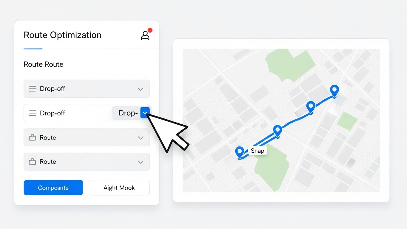
14. Clean UI Workflow (Light Mode)
MOFU | LinkedIn Video Ads
The Visual & Narrative Approach
Simplicity is the ultimate sophistication. This style is a direct, screen-recording style animation set against a Stark White background. A crisp cursor moves efficiently, dragging a "drop-off" point to a new location in a list. Instantly, the map on the right snaps to a new, optimized route. The primary buttons are Corporate Blue. The movement is accelerated slightly to emphasize speed, showing a "Route Optimization" task taking mere seconds.
Psychological Impact & KPI Focus
Niche Psychology: Operations teams fear "Click Fatigue." They want to know that complex tasks can be done quickly. This style provides Cognitive Ease, visually proving that the workflow is intuitive and requires minimal inputs.
Operational Impact: Demonstrates Efficiency and UX Logic. It is the most direct way to prove "Ease of Use" claims, directly addressing the barrier of high training costs.
Strategic Implementation & Trade-offs
- Best Use Case: LinkedIn Video Ads (Vertical 4:5) or Help Center tutorials.
- Duration: 15-45 Seconds.
- Trade-off: High Clarity, low "excitement." It is functional and educational, not aspirational. It works best when the viewer is already interested in the solution.
Companies using similar video content -
Postmates – Delivery platform for local businesses.
Instacart – Grocery delivery and personal shopper app.
15. Lifestyle Stock with UI Overlay
BOFU | Building Trust

The Visual & Narrative Approach
Technology serves people, not the other way around. This style features a candid, medium shot of a diverse delivery rider sitting on a park bench, smiling at their phone. The natural sunlight creates a warm, authentic atmosphere. Floating next to the phone is a semi-transparent, holographic UI panel showing an "Earnings Goal Reached" graph in Gold and Green. It visually connects the app's performance with the human result: a satisfied, successful worker.
Psychological Impact & KPI Focus
Niche Psychology: With the gig economy under scrutiny, Ethical Supply Chain management is a priority. This style appeals to brands that want to position themselves as rider-centric. It builds Social Proof and humanizes the algorithm.
Operational Impact: Addresses Rider Retention. It subtly communicates that the platform helps riders earn more and work easier, which is a key selling point for fleets struggling with turnover.
Strategic Implementation & Trade-offs
- Best Use Case: "About Us" website sections, Careers pages, or CSR reports.
- Duration: 10-20 Seconds (Looping).
- Trade-off: High Emotional Resonance, but low technical detail. It sells the outcome of the culture, not the mechanics of the software.
Companies using similar video content -
Shipt – Same-day delivery service for groceries.
HelloFresh – Meal kit delivery service.
16. Dynamic Data Visualization
BOFU | ROI Justification

The Visual & Narrative Approach
When speaking to the CFO, money talks. This style abandons maps and trucks for pure data. In a clean, White infinite studio space, 3D bar charts and line graphs rise rapidly from a flat grid. The bars are rendered in Metallic Emerald Green (Growth) and Gold (Value). The camera glides through this "forest" of rising data, emphasizing the upward trajectory. The animation is smooth but forceful, suggesting inevitable growth.
Psychological Impact & KPI Focus
Niche Psychology: Financial decision-makers are skeptical of "efficiency" until it is translated into currency. This style triggers Gain Anticipation. The metallic textures subconsciously associate the data with wealth and solidity.
Operational Impact: Visualizes Profitability and Scale. It is the visual equivalent of a strong Q4 report. It shifts the conversation from "cost of software" to "revenue generated."
Strategic Implementation & Trade-offs
- Best Use Case: Sales Decks (The "ROI" Slide) or Investor Updates.
- Duration: 10-15 Seconds.
- Trade-off: High Financial Persuasion, but abstract. It must be paired with specific metrics (e.g., "20% Cost Reduction") to be effective.
Companies using similar video content -
Descartes Systems Group – Logistics and supply chain technology.
UPS – Global shipping and logistics services.
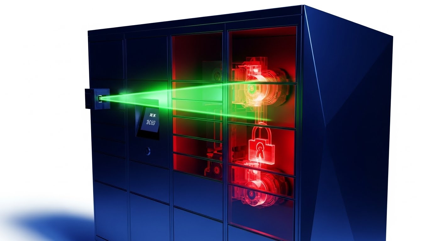
17. 3D X-Ray Visualization
BOFU | Risk Mitigation
The Visual & Narrative Approach
For platforms involving hardware (smart lockers, IoT sensors), trust requires transparency. This style presents a technical render of a smart delivery locker against a White background. A "scanning beam" of light moves across the unit, revealing an X-Ray view of the internal components. We see the precision solenoids and locking mechanisms highlighted in Laser Red against a Metallic Silver chassis, visually proving the robustness of the build.
Psychological Impact & KPI Focus
Niche Psychology: The fear of Asset Failure or theft is high. This style leverages the Transparency Effect, showing that the build quality goes deeper than the surface. It reassures the buyer that the hardware is industrial-grade.
Operational Impact: Highlights Security and Durability. It effectively visualizes the "invisible" reliability features that justify a higher price point compared to cheaper competitors.
Strategic Implementation & Trade-offs
- Best Use Case: Hardware Product Pages or Technical Specification PDFs.
- Duration: 15-20 Seconds.
- Trade-off: High Technical Authority, but very niche. Only applicable if your solution includes physical hardware components.
Companies using similar video content -
Quadient – Smart parcel locker solutions.
Luxer One – Package locker systems for properties.
19. Holographic UI over 3D Render
BOFU | Sales Cycle Acceleration

The Visual & Narrative Approach
This style projects the "God Mode" fantasy into a corporate setting. We are looking at a wooden conference table in a sun-lit office. Projected onto the surface is a stunning, volumetric Blue hologram of a city map. 3D buildings rise from the table, and tiny points of light (representing the fleet) move through the holographic streets. The hologram has a "bloom" effect but remains distinct against the natural daylight, blending high-tech dominance with executive reality.
Psychological Impact & KPI Focus
Niche Psychology: This speaks to the Ego and Ambition of the leadership team. It visualizes their city as a conquerable board game. It positions the software as the ultimate strategic command center.
Operational Impact: Visualizes Market Dominance and fleet density. It suggests that the platform gives you a level of oversight and control that competitors lack.
Strategic Implementation & Trade-offs
- Best Use Case: Direct Email campaigns to C-Level executives or Account-Based Marketing (ABM).
- Duration: 10-15 Seconds (Loop).
- Trade-off: Extremely High Perceived Value, but can feel "sci-fi." It sells the vision of control rather than the specific UI features.
Companies using similar video content -
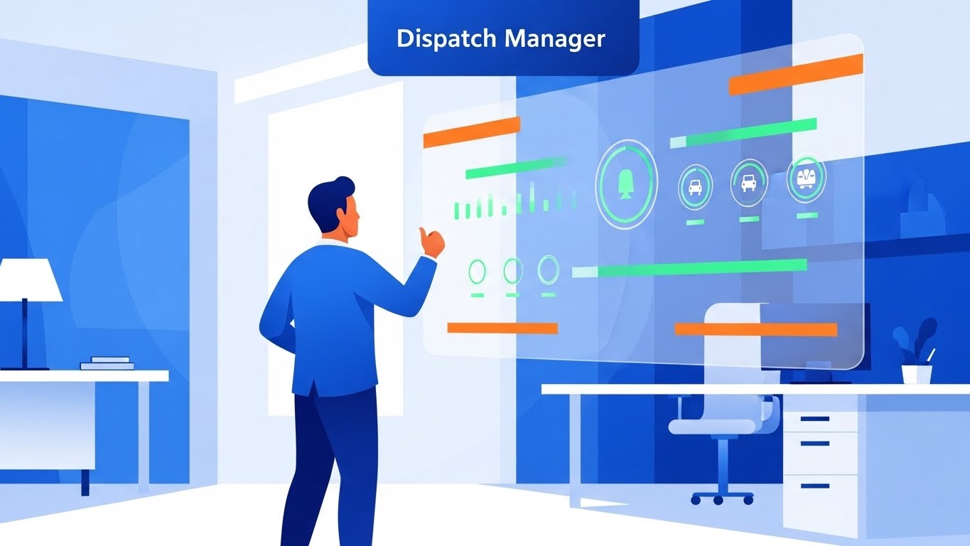
20. 2D Character-Driven Story
BOFU | Objection Handling
The Visual & Narrative Approach
Sometimes, you need to simplify the narrative to close the deal. This style uses clean, modern vector illustrations (Corporate Blue palette, no outlines). We see a "Dispatch Manager" character in a stylized office. He looks at a large screen showing all green indicators and gives a confident "thumbs up." The scene is calm, organized, and positive. It strips away the complex details to focus on the emotional result of using the software: a good day at work.
Psychological Impact & KPI Focus
Niche Psychology: Implementation anxiety is real. Buyers worry that new software will be stressful. This style uses Narrative Transportation to show a stress-free future self. It reassures the buyer that "success looks like this."
Operational Impact: Focuses on User Adoption and satisfaction. It suggests that the software supports the human worker rather than replacing or complicating their job.
Strategic Implementation & Trade-offs
- Best Use Case: "Thank You" pages, Onboarding emails, or implementation guides.
- Duration: 15-20 Seconds.
- Trade-off: High Relatability, but low technical detail. It works best when the technical vetting is already done, and the buyer needs emotional reassurance to sign.
Companies using similar video content -
HERE Technologies – Location data and mapping technology.
Gatik – Autonomous middle-mile logistics solutions.
21. Low-Poly 3D Modeling
BOFU | The Economic Buyer

The Visual & Narrative Approach
To close the deal with the "Economic Buyer" (CFO or Procurement Head), we need to make the complex feel manageable. We use a Low-Poly 3D style, rendering the city as a charming, miniature architectural model. Buildings and trees are simple geometric shapes in Pastel blocks (Mint, Peach, Lavender). A "tilt-shift" camera effect blurs the edges, creating a shallow depth of field. Tiny, toy-like delivery trucks chug along dotted lines on a clean grid. The aesthetic creates a sense of total oversight—organized, contained, and completely under control.
Psychological Impact & KPI Focus
Niche Psychology: High costs and operational sprawl are intimidating. This style exerts a Psychological Downsizing effect. By making the city look like a toy set, we subconsciously signal that the problem is solvable and the system is easy to govern.
Operational Impact: Targets Cost Modeling and resource allocation. It visualizes the "Total Addressable Market" (TAM) coverage without the messy visual noise of real-world traffic, allowing the buyer to focus on the economics of scale.
Strategic Implementation & Trade-offs
- Best Use Case: Budget approval presentations, Investor Decks, or "Scalability" sections in proposals.
- Duration: 20-30 Seconds.
- Trade-off: High Approachability, but low technical fidelity. Do not use this to show specific UI features; use it to sell the "Big Picture."
Companies using similar video content -
Udelv – Autonomous delivery vehicles and services.
Swyft – Robotics for last-mile delivery.
22. 2D Animation & UI Composition
Onboard | Self-Serve Onboarding

The Visual & Narrative Approach
The moment after the sale is critical. We use a vibrant Purple and Yellow palette to inject energy into the onboarding process. A stylized 2D character (representing the new user) physically interacts with a giant, floating UI panel. They playfully drag a "profile photo" into a circle, which pops with a satisfying "bouncy" elastic animation. The background is an abstract light gradient. It transforms a mundane setup task into a tactile, game-like interaction.
Psychological Impact & KPI Focus
Niche Psychology: New users often feel "Setup Anxiety"—the fear of breaking the system or getting stuck. This style utilizes Gamification principles to lower the barrier to entry. The playful physics make the software feel forgiving and fun, rather than rigid.
Operational Impact: Directly impacts Time-to-First-Value. By visually guiding the user through the "First Run Experience" (FRE) with engaging motion, you reduce drop-offs during the setup phase and minimize support tickets.
Strategic Implementation & Trade-offs
- Best Use Case: In-App "Welcome" Modals or "Getting Started" email sequences.
- Duration: 10-15 Seconds.
- Trade-off: High Engagement, but the stylized character design implies a "lighter" tone. Ensure it aligns with your brand's voice for serious enterprise clients.
Companies using similar video content -
Körber Supply Chain – Warehouse automation and software.
GreyOrange – Robotic fulfillment and automation systems.
23. Isometric 3D Workflow
Onboard | Reducing Friction
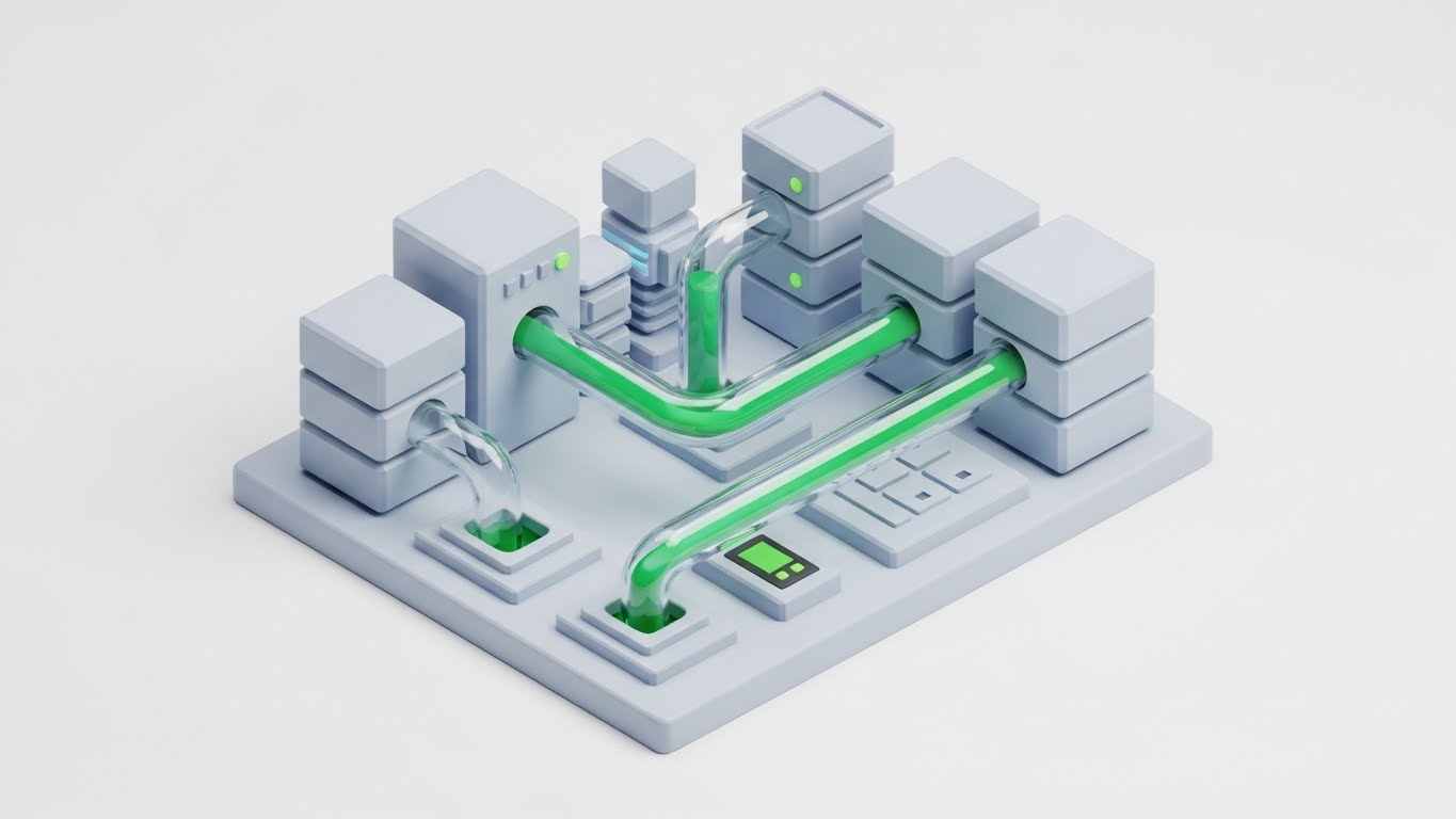
The Visual & Narrative Approach
For a SaaS platform, the "workflow" is often invisible data movement. This style renders that invisible layer as a physical machine. We see an isometric cluster of pristine White servers and storage blocks. Connecting them are translucent glass pipes carrying a glowing Emerald Green liquid (representing data). The fluid moves smoothly from a "Client ERP" block to the "Dispatch Engine" block, navigating bends without resistance. It visually metaphors the stability and fluidity of your API integrations.
Psychological Impact & KPI Focus
Niche Psychology: Technical implementation teams fear "Data Silos" and messy integrations. This aesthetic provides Structural Reassurance. It visualizes the system as a clean, closed-loop circuit where no data is lost or leaked.
Operational Impact: Visualizes Integration Architecture. It explains complex backend processes (like webhook triggers or inventory syncing) in a way that non-technical stakeholders can instantly grasp, reducing implementation friction.
Strategic Implementation & Trade-offs
- Best Use Case: Support Portal articles on "Integrations" or API Documentation headers.
- Duration: 15-20 Seconds (Loop).
- Trade-off: High Technical Clarity, but abstract. It explains how the data moves, not what the user needs to click on the screen.
Companies using similar video content -
Locus Robotics – Autonomous mobile robots for warehouses.
Zebra Technologies – Mobile computing and data capture.
24. Rapid UI Feature Montage
Onboard | Trial/Freemium User Activation
The Visual & Narrative Approach
For users on a free trial, you need to show value fast. This style is a high-energy montage of full-screen UI close-ups. The editing is rhythmic and rapid. We see quick cuts: an abstract search bar typing, a toggle switch flipping ON in Neon Cyan, a map zooming, a notification popping. The palette is high-contrast RGB on White. It creates a "sizzle reel" of the platform's capabilities, suggesting unlimited power at your fingertips.
Psychological Impact & KPI Focus
Niche Psychology: Trial users often only scratch the surface. This style triggers FOMO (Fear Of Missing Out) regarding the platform's full potential. It visually overwhelms the viewer with "possibility," urging them to explore deeper.
Operational Impact: Drives Feature Discovery and activation. It serves as a visual checklist of "what you can do," prompting the user to try features they haven't touched yet (e.g., "Heatmaps" or "Auto-Assign").
Strategic Implementation & Trade-offs
- Best Use Case: Drip Email Campaigns (Day 3 of Trial) or Login Screen loops.
- Duration: 15 Seconds (Fast & Furious).
- Trade-off: High Excitement, low retention. The cuts are too fast to teach how to use the features; it only alerts the user that they exist.
Companies using similar video content -
Oracle – SCM – Supply chain management cloud.
Cleveron – Parcel robots and locker solutions.
25. Abstract 2D Motion Graphics
Retention | Driving Deep Feature Adoption
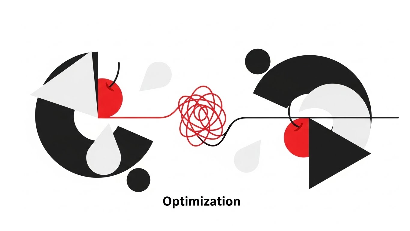
The Visual & Narrative Approach
To explain the abstract concept of "Optimization," we turn to Minimalism. Inspired by Swiss Design, this animation uses only Black, White, and a single accent of Cherry Red. Geometric shapes (circles, triangles) rotate and slot into place with mechanical perfection. A tangled red line (chaos) flows through a simple filter and emerges as a straight, efficient black line (order). It is intellectual, clean, and deeply satisfying to watch.
Psychological Impact & KPI Focus
Niche Psychology: Logistics planners value order. This sophisticated aesthetic appeals to the Analytical Mind. It reinforces the idea that the software brings mathematical perfection to their chaotic reality.
Operational Impact: Supports Deep Adoption. It visualizes the "invisible value" of the algorithm, justifying the use of automated dispatch over manual planning by showing the logic of "straightening the line."
Strategic Implementation & Trade-offs
- Best Use Case: In-App Tooltips, "New Feature" announcements, or loading screens.
- Duration: 5-10 Seconds (Loop).
- Trade-off: High Aesthetic Authority, but completely abstract. It requires context (text overlays) to ensure the user understands what the shapes represent.
Companies using similar video content -
Wing – Drone delivery service.
Flytrex – Drone delivery systems for retail.
26. Generative AI Realistic Character Video
Retention | Reducing Support Overhead

The Visual & Narrative Approach
Automated support often feels cold. We bridge this with a Generative AI Avatar. We see a medium close-up of a friendly, professional support agent with a headset. She looks directly at the camera, offering a warm smile. The rendering is 8K photorealistic, avoiding uncanny valley artifacts. The background is a soft-focus modern office. She articulates the answer to a common FAQ (e.g., "How to reset your driver pin").
Psychological Impact & KPI Focus
Niche Psychology: When things go wrong, users want a human, not a bot. This style leverages the Face-to-Face Connection to de-escalate frustration. It mimics the experience of a personal account manager without the headcount cost.
Operational Impact: Directly reduces Support Ticket Volume. By providing video answers that feel personal, you resolve issues faster and increase the "Self-Service Rate" of your help center.
Strategic Implementation & Trade-offs
- Best Use Case: Help Center Video Headers, Chatbot responses, or specific Error Message pop-ups.
- Duration: 30-90 Seconds.
- Trade-off: High Scalability, but requires careful quality control. The lip-sync and voice modulation must be perfect, or it risks eroding trust.
Companies using similar video content -
Manna Drone Delivery – Drone food delivery service.
XPO Logistics – Global transportation and logistics.
27. Futuristic Neon/Dark Mode
Retention | Reducing Churn

The Visual & Narrative Approach
To retain enterprise clients, you must sell security. This style uses a Cyberpunk/Dark Mode aesthetic. Against a deep void background, a glowing holographic shield in Cyan and Laser Red materializes. It actively blocks and deflects incoming "data debris," while a clean stream of binary code flows uninterrupted behind it. The visual is aggressive and high-tech, symbolizing impenetrable defense and data integrity.
Psychological Impact & KPI Focus
Niche Psychology: For CTOs, the biggest nightmare is a data breach or downtime. This style leverages Loss Aversion. It visualizes the "Protection" they are paying for, which is usually invisible.
Operational Impact: Targets Churn Reduction. It reinforces the value of the subscription by highlighting the "backend" features (Security, Uptime, Firewall) that justify the renewal cost.
Strategic Implementation & Trade-offs
- Best Use Case: Quarterly Business Review (QBR) presentations, "Security Update" newsletters, or System Status pages.
- Duration: 10-15 Seconds.
- Trade-off: High Technical Authority, but can feel "aggressive." Use it specifically when discussing security, compliance, or infrastructure upgrades.
Companies using similar video content -
Motive – KeepTruckin – AI-powered driver coaching.
Samsara – AI dash cams and safety programs.
28. 2D Graphics Over Live Action
Retention | Website Visitor Re-engagement
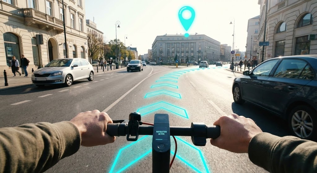
The Visual & Narrative Approach
This style puts the viewer in the driver's seat—literally. We see a Point-of-View (POV) shot from the perspective of a rider holding electric scooter handlebars. The footage is crisp, real-world 4k video. Overlaid on the road ahead are bright, animated 2D arrows in Cyan, guiding the path. A bouncing location pin highlights the destination. It’s a "Video Game HUD" brought to life, showing exactly how the app augments the rider's reality.
Psychological Impact & KPI Focus
Niche Psychology: It triggers Mirror Neurons. The viewer "becomes" the rider. It reminds the operations manager of the real-world support they are providing to their workforce, making the job look easy and futuristic.
Operational Impact: Visualizes Usability in Motion. It proves that the driver app is safe and easy to read while moving, addressing a key safety concern for fleet managers.
Strategic Implementation & Trade-offs
- Best Use Case: Retargeting Ads (Facebook/Instagram) or "New Feature" announcements for the Driver App.
- Duration: 15-20 Seconds.
- Trade-off: High Immersive Quality, but relies on high-quality stock footage. The tracking of the 2D elements must be perfect to maintain the illusion.
Companies using similar video content -
Geotab – Fleet security and compliance.
Trimble Transportation – Data security for logistics.
29. Aspirational Stock Montage
Expansion | Driving Upsell/Cross-sell

The Visual & Narrative Approach
When asking a client to upgrade, you sell the result, not the feature. This style uses high-end Corporate Photography. We see a low-angle "hero shot" of a confident business owner in a hard hat and suit, standing before a modern warehouse. A fleet of pristine vans lines the background. The sky is a vivid Sunny Blue. The person points outward, visualizing expansion. It is the classic image of "Business Success."
Psychological Impact & KPI Focus
Niche Psychology: Every business owner wants to see themselves as the conqueror of their market. This style appeals to Aspiration and Status. It links the software upgrade directly to their personal and professional growth.
Operational Impact: Drives Account Expansion (Upsell). It shifts the conversation from "efficiency" to "growth," positioning the platform as the engine of their expansion into new territories.
Strategic Implementation & Trade-offs
- Best Use Case: Email campaigns for "Tier Upgrades," Case Study headers, or Year-End Reviews.
- Duration: Static Image or Slow Pan Video (10 Seconds).
- Trade-off: High Emotional Resonance, but can feel generic. It must be paired with specific copy (e.g., "Ready to launch in a new city?") to be effective.
Companies using similar video content -
Waymo – Autonomous driving visualization.
Cruise – Self-driving vehicle technology.
30. Minimalist Flat 2D Vector
Expansion | Driving Referrals

The Visual & Narrative Approach
Referrals are built on trust, and trust is simple. We use a Minimalist Flat Vector style. A solid Black hand shakes a White outlined hand against a matte Mustard Yellow background. As they touch, a simple network of nodes spreads out, symbolizing the network effect. The design is stark, bold, and iconic. It removes all noise to focus on the single concept of Partnership.
Psychological Impact & KPI Focus
Niche Psychology: A referral request is a personal transaction. "Flashy" visuals can feel transactional or desperate. This minimalist style feels Honest and Direct, respecting the existing relationship between the brand and the advocate.
Operational Impact: Drives Referral Programs. The clean visual doesn't distract from the primary Call-to-Action ("Refer a Friend"). It serves as a visual anchor for the text.
Strategic Implementation & Trade-offs
- Best Use Case: In-App Referral Pop-ups, "Invite a Colleague" modals, or Footer graphics.
- Duration: Static or Micro-animation (3 seconds).
- Trade-off: High Clarity, low "wow factor." It functions purely as a signpost, not a storyteller.
Strategic Knowledge Base: The Visual Operations Doctrine
Drawing from the 30 visual styles analyzed in this guide, we synthesize a comprehensive "Visual Operations Doctrine." This is not merely about design; it is a strategic framework for using visualization to drive operational efficiency, user adoption, and financial ROI in the hyperlocal delivery sector.
STRATEGIC ALIGNMENT & VISUAL ARCHITECTURE
The "Pre-Production" Strategy: Defining Your Visual Operating System
Before a single pixel is rendered, a strategic foundation must be laid. Most logistics platforms fail at visualization because they treat it as "marketing content" rather than "operational infrastructure."
- The Cognitive Load Audit: Begin by auditing your current training materials and UI. Identify high-friction points where text-heavy explanations are causing "Cognitive Overload" for dispatchers or drivers. Replace these friction points with "Glanceable" visual styles (e.g., Style 2: The Systemic Overview or Style 23: Isometric 3D Workflow) to reduce processing time.
- Role-Based Visual Mapping: Do not use a "one-size-fits-all" visual language. Drivers on mobile devices need high-contrast, simple visuals (like Style 5: The Fluid Agility) that are readable in sunlight. Conversely, Fleet Managers on desktop dashboards require dense, data-rich aesthetics (like Style 13: Dark Mode UI Showcase) to monitor complex networks.
- The "Glanceability" Standard: In logistics, attention is scarce. Visuals must pass the "Glanceability" test. Can the viewer understand the primary message (e.g., "Turn Left" or "Urgent Alert") within 1.5 seconds? Styles 6 (AR Overlay) and 15 (Clean UI) are engineered for this specific speed.
- Brand Voice Consistency: Your marketing videos (Style 1: Kinetic Pulse) and your support videos (Style 26: AI Avatar) must feel like they come from the same company. Establish a unified color palette and motion behavior guide to bridge the gap between "Cool Marketing" and "Boring Support."
- The Advids Strategic Audit: Partnering with an expert agency like Advids allows you to define a "Visual Taxonomy" that scales. This ensures that a motion graphic used in Sales (Style 4) shares the same visual DNA as an onboarding video used in Support (Style 22), creating a unified brand experience across the entire customer lifecycle.
- Standardization vs. Customization: For generic trucking scenarios (backing into a bay), use high-quality Stock/3D (Style 21). For your proprietary software interface, use custom Motion Graphics (Style 14). Don't waste budget customizing generic concepts.
- The Cross-Departmental Bridge: Use visuals to unify terminology between Sales, Ops, and Support. If Sales calls it "Dynamic Routing" (Style 5) but Support calls it "Smart Dispatch" (Style 8), you create friction. A single visual metaphor used across both departments aligns the company language.
- Legacy System Integration: Visualizing the connection between old on-prem hardware and new SaaS interfaces is difficult. Use "X-Ray" styles (Style 17) or "Wireframe to Reality" (Style 9) to visually demonstrate how your new SaaS layer integrates with or replaces existing physical infrastructure, reducing the "Integration Anxiety" of IT directors.
- Accessibility in Trucking: Your fleet is likely diverse and multi-lingual. Relying on voiceovers or text is a strategic risk. Prioritize visual-first styles (like Style 10: The Interface Tactility) that convey meaning through motion and action, making your training materials universally understood regardless of language barriers.
- The Mobile-First Mandate: 80% of your users (drivers/merchants) are on mobile. Adapting all 30 styles for mobile consumption is critical. Vertical formatting (Style 5) is not an option; it is a requirement for any driver-facing visual.
OPERATIONAL ADOPTION & IMPLEMENTATION
The "Deployment" Phase: Embedding Visuals into the Workflow
The best video in the world is useless if it sits unwatched on a YouTube channel. This segment focuses on embedding visual assets directly into the operational workflow to drive adoption.
- Overcoming "Big Brother" Anxiety: The introduction of AI monitoring can cause unrest among drivers. Use empathy-driven visuals (like Style 15: Lifestyle Stock) to explain driver monitoring AI. Frame it as "protection" (proving they did their job) rather than surveillance, using soft lighting and human-centric framing.
- The Micro-Learning Shift: Replace 50-page PDF manuals with 30-second clips (referencing shorter Styles like Style 24: Rapid UI). Deliver these "Micro-Learning" moments via push notification before a shift begins.
- Just-in-Time Support: Embed specific visual styles into the helpdesk or cab tablets. When a driver triggers an "Error," the app should immediately play a "Troubleshooting" loop (Style 23), providing the solution at the exact moment of need.
- Gamification of Training: Visualize driver scorecards and safety bonuses to boost engagement. Use Style 22: 2D Animation to celebrate "Level Ups" or "Safety Streaks," turning compliance into a competitive, rewarding game.
- Reducing Support Ticket Volume: There is a direct correlation between proactive visual guides and reduced call center load. Releasing a "New Feature" explainer (Style 14) alongside a software update preempts the "How do I...?" questions that clog support lines.
- Remote Onboarding: Leverage 3D (Style 2) and Screencasts to train distributed fleets without physical seminars. You can onboard a driver in a new city entirely through the app using a structured video playlist.
- Standard Operating Procedures (SOPs): Transform text-based SOPs into visual process flows. A "Low Poly" animation (Style 21) of a loading procedure is less ambiguous and more memorable than a text document, ensuring higher compliance.
- Feedback Loops: Use interactive video elements. After a training video (Style 25), pop up a simple "Thumbs Up/Down" icon. This data provides immediate feedback to your Product team on whether the feature (and the explanation) is landing effectively.
- Scalable Localization: Strategies for translating visual assets for global fleets are essential. Separate text layers from animation (as seen in Style 1) so you can swap English for Spanish or Hindi in minutes without re-rendering the complex background elements.
- Leadership Communication: Use high-end styles (Style 29: Aspirational Stock) to communicate fleet strategy to stakeholders. When pitching a new vision, the visual quality must match the ambition of the strategy.
MEASURING IMPACT & FUTURE-PROOFING
The "ROI" Phase: Measuring Success and Looking Ahead
To secure budget for high-quality visualization, you must prove its return on investment. This segment outlines how to measure the impact of your visual strategy and prepare for the future.
- Beyond "Views": Define actionable KPIs. Stop counting views; measure "Time-to-Competency" (how fast a new driver reaches full productivity) and "Feature Adoption Rate" (usage spikes after video release).
- The "Idle Time" Metric: Correlate better visualization with reduced software navigation time. If a "Clean UI" video (Style 14) teaches a shortcut that saves 10 seconds per order, that accumulates to thousands of fleet hours saved annually.
- Compliance Velocity: Measure how fast new regulations (e.g., ELD mandates) are understood via video versus text. Visuals accelerate compliance, reducing the window of liability risk.
- Retention and Churn: The impact of high-quality UX visualization on customer retention (LTV) is significant. Clients who feel the software is "slick" and "easy" (reinforced by Style 10: Interface Tactility) are less likely to churn to a competitor.
- The AI Visual Frontier: Prepare for generative video. Soon, you will use "AI Avatars" (Style 26) to generate real-time, personalized daily briefings for every driver by name. Building a robust visual architecture now prepares you for this future.
- Scalability of Assets: Build a library that grows with the feature set. Organize your source files so that a 3D truck model used in Marketing (Style 7) can be reused in Training (Style 28), maximizing the ROI of every asset.
- The Advids Partnership: Explicitly, this is where Advids serves as a long-term partner. We act as the custodian of your visual assets, ensuring they evolve in lockstep with your software updates and preventing "asset decay."
- Benchmarking Success: "Good enough" visuals are a competitive risk. If your competitor uses "Holographic 3D" (Style 19) to sell their vision and you use simple screenshots, you look outdated. Benchmark your visual quality against market leaders, not past efforts.
- The ROI of Safety: Quantify insurance cost reduction through better visual safety training. If Style 28 (POV AR) helps reduce accident rates by even 1%, the financial savings far outweigh the production costs.
- Final Call to Innovation: Treat video as infrastructure, not content. In the hyperlocal delivery economy, visibility is the product. The brands that pave the road with clear, inspiring, and functional visuals will be the ones that own the last mile.
Companies using similar video content -
FedEx – Shipping and business solutions.
DHL – International shipping and logistics.
Author & Editor Bio


