
Visualizing the Invisible: The Currency of Digital Trust
In the modern enterprise, the castle-and-moat security model is obsolete. Identity is the new perimeter. For CISOs and Identity Architects, the challenge is no longer just securing access—it is communicating the value of that security to a board that demands efficiency and a workforce that demands speed. Identity Management software operates in the abstract; it is a silent layer of permissions, tokens, and governance. The core marketing challenge lies in bridging the physical/digital divide: How do you visualize "Zero Trust" without resorting to dystopian clichés or generic code screens?
The stakes for effective communication have never been higher. According to the 2024 IBM Cost of a Data Breach Report, the global average cost of a data breach reached a staggering USD 4.88 million. This financial reality creates a compelling business case for modernization. More importantly, it highlights a massive opportunity for optimization; the same report notes that organizations extensively using security AI and automation saved USD 2.2 million per breach compared to those that did not. This statistic transforms the narrative from one of "cost" to one of "strategic savings."
Video is the strategic lever to tell this story. It transforms complex backend protocols into tangible assets, proving that "robust security" and "seamless experience" are not mutually exclusive. This guide provides a "Gold Standard" framework for visualizing Identity Management. We have curated high-performing visual styles designed to lower cognitive load, build immediate trust, and accelerate the buyer’s journey from skepticism to adoption.
1. Abstract 2D Motion Graphics
TOFU | Brand Awareness

The Visual & Narrative Approach
This style utilizes Abstract 2D Motion Graphics to solve the primary problem of IAM marketing: invisibility. The scene features a stream of glowing Electric Cyan spheres, representing individual digital identities. These spheres do not move chaotically; they flow rhythmically through a series of Deep Navy geometric arches, representing security gateways. The background is a clean, matte White digital void, removing all distraction. The aesthetic is fluid and modern, utilizing soft drop shadows to create layers of depth without clutter.
Psychological Impact & KPI Focus
- Niche Psychology: Identity buyers are often anxious about "latency"—the fear that security slows down business. This visual metaphor directly addresses that anxiety by demonstrating secure speed. The "flow" suggests that verification happens instantly.
- Operational Impact: The synchronization of elements visually reinforces the concept of Orchestration. It proves that complex validation processes (the arches) can happen in the background without impeding the user's journey (the spheres).
Strategic Implementation & Trade-offs
- Best Use Case: High-level Brand Awareness campaigns on Social Ads (9:16). It stops the scroll with satisfying motion.
- Trade-offs: This style is excellent for "feeling" but poor for "feature" education. It creates a mood of sophisticated security but does not explain how the authentication works (e.g., SAML vs. OIDC).
- Duration: 10-15 seconds.
Companies using similar video content -
Okta – Workforce Identity Cloud – Orchestrating seamless, secure access for employees.
Ping Identity – PingOne – Delivering fluid, adaptive identity experiences.
2. Bold Kinetic Typography (Visual)
TOFU | Market Education

The Visual & Narrative Approach
Here, text and meaning are physically constructed through motion. Large, blocky geometric shapes imply the weight and structure of text without using actual letters initially. The shapes are colored in Vibrant Orange and Slate Grey, interlocking dynamically to form the distinct silhouette of a padlock snapping shut. The background is a textured abstract White surface. The composition uses a dynamic diagonal tilt to imply speed and impact, suggesting a solution that is active, not passive.
Psychological Impact & KPI Focus
- Niche Psychology: In a saturated market, "boldness" signals authority. The heavy, blocky aesthetic appeals to the CISO's desire for a "solid" foundation in their IT infrastructure.
- Operational Impact: This style effectively visualizes the concept of Infrastructure Hardening. It reduces the cognitive load of understanding "encryption" by using the universal symbol of the padlock, built from the ground up to show structural integrity.
Strategic Implementation & Trade-offs
- Best Use Case: LinkedIn (1:1) feed ads. The bold visuals work perfectly with sound-off autoplay, delivering the message of "Security" instantly.
- Trade-offs: The aggression of the style can be polarizing. It works well for "Security-First" messaging but may feel too heavy for "User-Experience-First" campaigns.
- Duration: 6-10 seconds.
Companies using similar video content -
CyberArk – Privileged Access Manager – Securing critical access to enterprise systems.
Delinea – Secret Server – Protecting privileged credentials and sessions.
3. Abstract 3D AI Visualization
TOFU | Category Creation

The Visual & Narrative Approach
This visualization depicts a "Trust Network" as a living, breathing organism. Translucent, glowing nodes in Neon Purple are connected by thin, pulsating filaments in a bright, clean White environment. The rendering focuses on depth of field, with foreground nodes sharp and background nodes creating a bokeh effect. This arrangement suggests a neural network that is self-healing and intelligent, constantly monitoring for anomalies.
Psychological Impact & KPI Focus
- Niche Psychology: Buyers are looking for AI-driven solutions. This visual style validates the claim of advanced machine learning and "Risk-Based Authentication" without needing to show a single line of code.
- Operational Impact: It visually represents Zero Trust not as a wall, but as a continuous verification fabric. It simulates how the software creates granular visibility into specific user behaviors (the nodes) across a vast enterprise.
Strategic Implementation & Trade-offs
- Best Use Case: Blog (16:9) headers or "Vision" sections on the website. It elevates the brand to a "Future-Ready" status.
- Trade-offs: High production cost (render time). If the animation is too complex, it can look like generic "sci-fi" stock footage, losing its specific connection to identity management.
- Duration: 15-30 seconds (Loop).
Companies using similar video content -
Saviynt – Enterprise Identity Cloud – Governing identities with AI-driven intelligence.
Exabeam – Fusion SIEM – Detecting advanced threats with behavioral analytics.
5. 2D Graphics Over Live Action
TOFU | Vertical Social Organic

The Visual & Narrative Approach
This style bridges the gap between the digital and physical worlds. A high-quality vertical photo shows a young professional woman looking at her smartphone in a sunlit modern cafe. Integrated into the scene are floating 2D vector icons in Gold and White: a shield and a checkmark, hovering protectively around the phone. The lighting is natural and warm, blending the real world with the digital overlay.
Psychological Impact & KPI Focus
- Niche Psychology: It addresses the fear of Shadow IT and unsecured remote endpoints. The visual overlay reassures the viewer that security travels with the user, regardless of their location.
- Operational Impact: This style is essential for humanizing the technology. It shifts the focus from "server protection" to "people protection," aligning with modern Identity-Centric Security models.
Strategic Implementation & Trade-offs
- Best Use Case: Reels (9:16) and TikTok for employer branding and end-user awareness campaigns (e.g., "Security that follows you").
- Trade-offs: Reliance on stock footage can dilute the brand if not carefully curated. The tracking of the 2D elements must be flawless, or it breaks the immersion.
- Duration: 15-30 seconds.
6. 2D Animation & UI Composition
TOFU | Skippable Pre-Roll Ad

The Visual & Narrative Approach
A stylized 2D animation scene in Pastel Blue and White. A flat-vector character (side profile) reaches out to "high five" a floating, animated UI window. The window displays a simple, abstract "Success" confetti animation with geometric shapes. The background is a minimalist abstract office environment. The lines are clean, and the mood is celebratory, focusing on the joy of access rather than the fear of denial.
Psychological Impact & KPI Focus
- Niche Psychology: Identity management is often associated with "Access Denied." This style flips the script to Access Granted. It targets the "User Experience" anxiety—proving the tool is an enabler, not a blocker.
- Operational Impact: It simplifies the concept of Automated Provisioning. Instead of showing complex backend scripts, it shows the result: a happy user and a responsive system.
Strategic Implementation & Trade-offs
- Best Use Case: YouTube (16:9) Skippable Pre-Roll ads. The positive energy is designed to reduce the "boredom" factor of B2B software ads in the first 5 seconds.
- Trade-offs: It can appear "too simple" for enterprise-grade security products. It risks trivializing the complexity of the security backend if not paired with deeper content.
- Duration: 6-15 seconds.
Companies using similar video content -
Duo Security (Cisco) – Duo Mobile – Verifying user identities for secure remote access.
JumpCloud – Directory Platform – Managing user identities and device access.
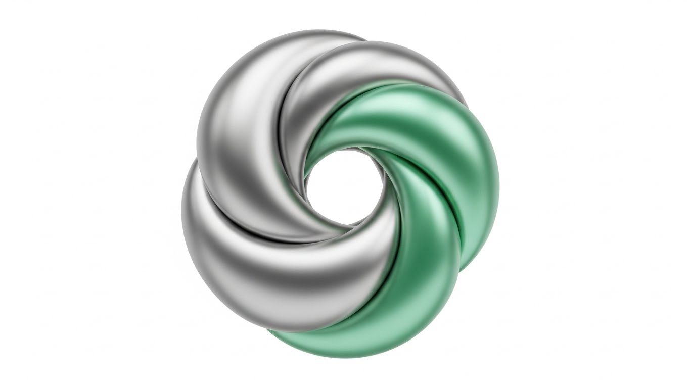
7. Abstract 2D flat vector organic
TOFU | Demand Gen
The Visual & Narrative Approach
Abstract 2D flat vector organic motion graphics with glossy textures. Liquid, blob-like shapes in Silver and Mint Green merge smoothly in the center of the frame to form a perfect, secure circle. The background is a stark White canvas. The shapes have high-contrast glossy reflections, giving them a liquid metal appearance. This suggests a system that is malleable yet impenetrable.
Psychological Impact & KPI Focus
- Niche Psychology: Targets the fear of Integration Nightmares. The fluidity reassures the viewer that this solution won't break their current tech stack; it will flow into it.
- Operational Impact: Visually represents Unified Identity or Single Sign-On (SSO). The merging of distinct colors (Silver/Green) into a single form represents the consolidation of multiple identities into one secure profile.
Strategic Implementation & Trade-offs
- Best Use Case: Display Ads (1:1) and retargeting banners. The high contrast and simple shape read well at small sizes.
- Trade-offs: Extremely abstract. Without copy, it could represent anything from finance to biology. It requires strong accompanying text to anchor the meaning to "Identity."
- Duration: 5-10 seconds (Loop).
Companies using similar video content -
Auth0 (Okta) – Customer Identity Cloud – Enabling frictionless, secure customer login experiences.
OneLogin – Trusted Experience Platform – Simplifying access for employees and customers.
8. Isometric 2D Motion Design
MOFU | Product Differentiation
The Visual & Narrative Approach
An isometric 2D vector illustration of a modern office floor plan viewed from a 45-degree angle. Areas of the office are highlighted in Soft Green (safe zones) while others are Soft Grey. Small, abstract geometric avatars move along white lines between the zones. The style is clean, architectural, and precise, utilizing a palette of White, Grey, and Green.
Psychological Impact & KPI Focus
- Niche Psychology: Control is the primary desire here. The isometric perspective gives the viewer a sense of Total Oversight, countering the feeling of chaos in complex networks.
- Operational Impact: This is the best style for explaining Network Segmentation and Role-Based Access Control (RBAC). It clearly shows that if an identity enters one zone, they cannot necessarily jump to another without a path (permission).
Strategic Implementation & Trade-offs
- Best Use Case: Website (16:9) "How it Works" section. It serves as a visual map for complex architectures like Zero Trust.
- Trade-offs: Can feel clinical and dry. It lacks emotional resonance, trading "excitement" for "clarity." It appeals to the architect, not the visionary.
- Duration: 60-90 seconds.
Companies using similar video content -
SailPoint – Identity Platform – Unifying identity governance across the enterprise.
HashiCorp – Vault – Securing, storing, and tightly controlling access to tokens.
9. Rapid UI Feature Montage
MOFU | Feature Education
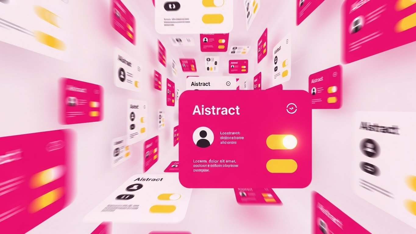
The Visual & Narrative Approach
A composition designed for a rapid montage. Multiple abstract UI cards are arranged in a dynamic perspective tunnel, flying towards the viewer. The cards feature simplified representations of user profiles and toggle switches. Colors are Vibrant Magenta and Yellow. Motion blur is applied to the edges to suggest high-speed processing and automation against a White background.
Psychological Impact & KPI Focus
- Niche Psychology: Addresses the Scalability concern. Can this handle 10,000 users? The volume of cards flying by visually screams "Yes."
- Operational Impact: Represents Automated Lifecycle Management. It shows the system handling thousands of requests simultaneously, reducing the perception of manual administrative burden.
Strategic Implementation & Trade-offs
- Best Use Case: Email (4:5) marketing GIFs or webinar intro loops. It creates energy and implies a robust, enterprise-ready engine.
- Trade-offs: The specific details of the UI are lost. It sells the idea of the interface, not the interface itself. Not suitable for detailed tutorials.
- Duration: 10-15 seconds.
Companies using similar video content -
Illumio – Zero Trust Segmentation – Preventing breaches by segmenting network access.
AppGate – SDP – Dynamically creating secure, contextual access to resources.
10. Wireframe to Reality Transition
MOFU | Competitive Displacement
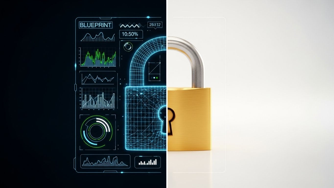
The Visual & Narrative Approach
A vertical split-screen composition. The left side displays a technical "Blueprint Blue" wireframe schematic of a padlock. The right side transitions seamlessly into a photorealistic, solid Gold padlock, gleaming under studio lighting. A sharp white line divides the two styles. The visual metaphor contrasts the planning phase with the solid, secure reality.
Psychological Impact & KPI Focus
- Niche Psychology: Skepticism about Vaporware. Many security tools promise the world but fail in deployment. This visual proves the transition from "Plan" to "Protection" is tangible and high-quality.
- Operational Impact: Visualizes Compliance Auditing. The wireframe represents the policy (the rule), and the gold padlock represents the enforcement (the reality). It aligns with the need to prove to auditors that controls are in place.
Strategic Implementation & Trade-offs
- Best Use Case: LinkedIn (16:9) case study videos or "Before/After" competitive comparison content.
- Trade-offs: Requires high-end 3D rendering for the "Real" side to look convincing. If the gold padlock looks fake, the metaphor of "solid quality" collapses.
- Duration: 15-30 seconds.
Companies using similar video content -
Microsoft Entra ID – Identity Governance – Automating identity lifecycle and access reviews.
SecureAuth – Identity Platform – Delivering adaptive, risk-based authentication.
11. Dark Mode UI Showcase
MOFU | ABM Awareness
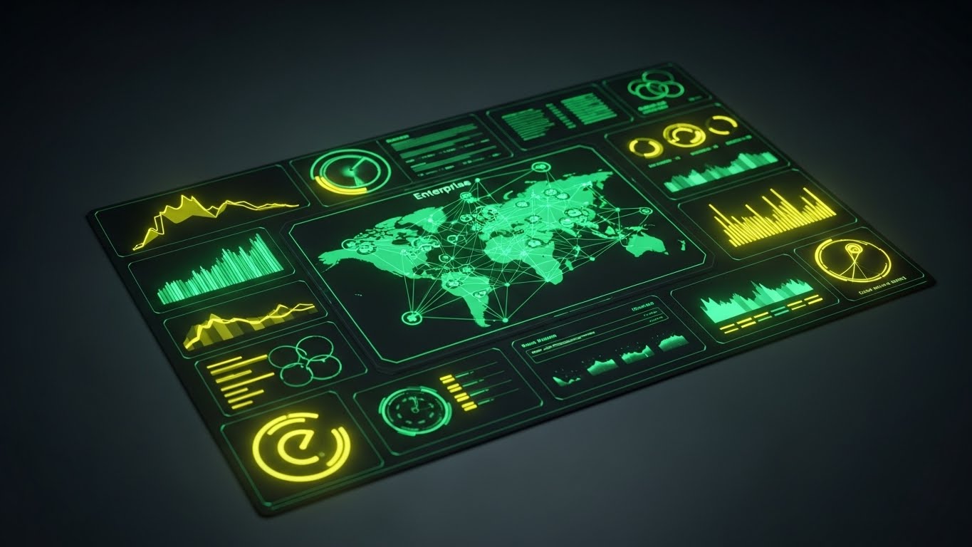
The Visual & Narrative Approach
This style adopts the aesthetic of a high-end Security Operations Center (SOC). We present a top-down view of a Charcoal Grey high-fidelity UI dashboard, specifically designed in "Dark Mode" to reduce eye strain for power users. The central feature is a global map with connection lines glowing in Neon Green, visualizing active sessions across the enterprise. Abstract data widgets surround the map, pulsating gently. The lighting is subtle and moody, mimicking the ambient glow of a secure server room.
Psychological Impact & KPI Focus
- Niche Psychology: Security analysts and CISOs live in dark mode. This aesthetic signals Professional Utility and aligns with the environment where the software will actually be used. It subconsciously suggests that this tool is built for serious, 24/7 monitoring.
- Operational Impact: It visualizes Real-Time Threat Intelligence. By highlighting active connections in neon against a dark background, the visual emphasizes the system's ability to spot anomalies instantly amidst the noise of global traffic.
Strategic Implementation & Trade-offs
- Best Use Case: Account-Based Marketing (ABM) Ads (1:1) targeting specific enterprise accounts. It creates a "Command Center" vibe that appeals to decision-makers looking for total oversight.
- Trade-offs: The dark aesthetic can feel "intimidating" or overly technical to non-technical stakeholders (e.g., HR Directors involved in buying). It is strictly a "Power User" visual.
- Duration: 15-20 seconds.
Companies using similar video content -
Thales – CipherTrust Data Security Platform – Protecting sensitive data with encryption.
Entrust – Identity as a Service – Providing trusted identities for digital interactions.
12. Photorealistic 3D Renders
MOFU | Building Trust

The Visual & Narrative Approach
Trust is abstract, but this style makes it tangible. We feature a pristine glass shield floating in the center of a blurred, bright server room rendered in White and Silver tones. The shield is made of thick, refractive glass, bending the light of the server LEDs behind it. The lighting is cool and clinical, emphasizing the purity and flawlessness of the material. The camera moves slowly, allowing the viewer to appreciate the solidity and transparency of the object.
Psychological Impact & KPI Focus
- Niche Psychology: Buyers are wary of "black box" security solutions. They want protection that is robust yet transparent. The glass metaphor perfectly balances Strength (the shield) with Auditability (the transparency).
- Operational Impact: This style is powerful for visualizing Compliance & Governance. It suggests that while the security is impenetrable, the logic behind it is clear and visible to auditors, addressing the "fear of the unknown."
Strategic Implementation & Trade-offs
- Best Use Case: Case Study Videos (16:9) and "About Us" pages. It serves as a visual anchor for testimonials about reliability and uptime.
- Trade-offs: It is static and metaphorical. It does not show the software in action. If used too frequently, it can feel like generic high-end stock imagery rather than a representation of the product.
- Duration: 5-10 seconds (B-Roll).
Companies using similar video content -
Splunk – Enterprise Security – Monitoring security operations with real-time threat intelligence.
Palo Alto Networks – Cortex XSOAR – Orchestrating security workflows and incident response.
13. Clean UI Workflow (Light)
MOFU | The Functional Buyer
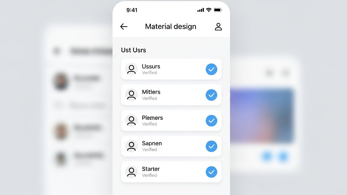
The Visual & Narrative Approach
Contrasting the dark "Command Center" style, this visual speaks to the daily administrator. It presents a front-facing, Light Mode UI screen with a clean White background and soft grey shadows (Material Design). The interface displays a list of users, where each row features a satisfying, bright Light Blue checkmark indicating "Verified" status. The layout is spacious, organized, and free of clutter. The background is a soft, out-of-focus gradient to keep attention on the "Verified" status.
Psychological Impact & KPI Focus
- Niche Psychology: Identity administration is often viewed as a tedious, messy chore. This visual promises Administrative Ease. It targets the "Functional Buyer" (IT Manager) who wants to know that their daily workflow will be organized and stress-free.
- Operational Impact: Effectively demonstrates Centralized Administration. The clean list view implies that managing thousands of identities is as simple as scrolling through a playlist, directly addressing the pain point of "dashboard fatigue."
Strategic Implementation & Trade-offs
- Best Use Case: Sales Decks (16:9) and product demo videos. It is the visual proof of "Usability" claims.
- Trade-offs: It lacks the "cool factor" of the dark mode or 3D visuals. It is utilitarian. It won't excite a CISO, but it will reassure the person who has to use the tool every day.
- Duration: 30-60 seconds.
Companies using similar video content -
YubiKey – Security Keys – Providing strong, hardware-based multi-factor authentication.
Infineon – TPM Solutions – Embedding hardware root of trust for devices.
14. 3D X-Ray Visualization
MOFU | Risk Mitigation

The Visual & Narrative Approach
To prove depth of security, we look inside the machine. This style features a 3D X-Ray visualization of a laptop computer. The outer shell is rendered in Translucent Blue plastic, revealing the internal motherboard and components. A specific security chip glows with an intense White light, pulsing gently. The background is a neutral Studio Grey. The camera zooms in on the chip, signifying that the security is embedded at the foundational level, not just a surface application.
Psychological Impact & KPI Focus
- Niche Psychology: Sophisticated buyers know that software-only security has vulnerabilities. This visual appeals to the desire for Root of Trust. It reassures the viewer that the protection goes down to the bare metal.
- Operational Impact: Visualizes Endpoint Security and Hardware Integration. It demonstrates that the Identity Management solution integrates with the physical device hardware (like TPM chips) for unshakeable authentication.
Strategic Implementation & Trade-offs
- Best Use Case: Technical Whitepapers (4:3) and deep-dive feature pages. It supports complex arguments about architecture and resilience.
- Trade-offs: Highly technical. It may alienate non-technical stakeholders who don't understand the significance of hardware-level security. Requires precise modeling to look accurate to engineers.
- Duration: 10-20 seconds.
Companies using similar video content -
ManageEngine – ADManager Plus – Simplifying Active Directory management and reporting.
Omada – IdentityPROCESS+ – Streamlining identity governance and administration processes.
15. Futuristic Neon/Dark Mode
MOFU | The Technical Buyer

The Visual & Narrative Approach
This is the "Cyberpunk" aesthetic of digital defense. We see a futuristic abstract visualization of a firewall where vertical lines of code in Red and Cyan descend like a "digital rain." However, they are abruptly blocked by a solid, horizontal glowing barrier. The perspective is a wide landscape grid on a deep Black background. The contrast between the chaotic falling code and the stable barrier creates a dramatic sense of conflict and resolution.
Psychological Impact & KPI Focus
- Niche Psychology: It taps into the "Hacker" aesthetic that resonates with security engineers. It dramatizes the constant state of cyber warfare, positioning the software as the Heroic Defender against an onslaught of threats.
- Operational Impact: Visualizes Active Defense and Intrusion Prevention. Unlike the static shield, this shows the software actively repelling dynamic threats in real-time, emphasizing speed and responsiveness.
Strategic Implementation & Trade-offs
- Best Use Case: Technical Documentation (16:9) headers or background loops for trade show booths. It draws the eye and signals "High-Tech."
- Trade-offs: Can look a bit cliché ("The Matrix" effect). If overused, it can make the brand look like a gaming company rather than an enterprise B2B partner.
- Duration: 10-15 seconds (Loop).
Companies using similar video content -
SentinelOne – Singularity Identity – Protecting endpoints and identities from advanced threats.
CrowdStrike – Falcon Identity Protection – Detecting and preventing identity-based attacks.
16. Generative AI Cinematic Video
MOFU | Thought Leadership

The Visual & Narrative Approach
A sweeping, cinematic vision of the future. This style uses a wide aerial shot of a futuristic smart city bathed in clear, sunny daylight. Streams of Amber and Blue light connect the skyscrapers, visualizing a city-wide secure network. The rendering is photorealistic, evoking a sense of scale and ubiquitous connectivity. Unlike the dark "cyberpunk" style, this is bright, optimistic, and clean, suggesting a society running smoothly on secure digital infrastructure.
Psychological Impact & KPI Focus
- Niche Psychology: Executives want to buy into a Vision. This style elevates the conversation from "managing passwords" to "enabling the connected economy." It positions the vendor as a strategic partner for the future, not just a utility provider.
- Operational Impact: Visualizes IoT Identity and Scalability. It shows that the identity platform can handle millions of connections—from traffic lights to banking servers—without latency or failure.
Strategic Implementation & Trade-offs
- Best Use Case: Webinar Intros (16:9) and keynote presentation openers. It sets a grand stage for the detailed content that follows.
- Trade-offs: It is "Visionary" content, not "Product" content. It sets a mood but explains nothing. It must be followed by concrete details to avoid being labeled as "fluff."
- Duration: 30-45 seconds.
Companies using similar video content -
Zscaler – Zero Trust Exchange – Securing access to applications and data.
Cloudflare – Zero Trust – Protecting users, devices, and applications everywhere.
17. Holographic UI over 3D Render
BOFU | Sales Cycle Acceleration

The Visual & Narrative Approach
This style merges the physical tool with its global impact. A realistic 3D render shows a sleek tablet lying on a white conference table. Projecting upwards from the screen is a volumetric, Holographic Blue globe. Small padlock icons orbit the globe, representing secured endpoints worldwide. The lighting is bright and airy, coming from large office windows. The visual suggests that advanced, global security capabilities are available at a simple touch.
Psychological Impact & KPI Focus
- Niche Psychology: The "God View." Executives desire the feeling of Total Control accessible from anywhere. This visual creates a sense of power and simplicity—complex global security managed from a single, elegant device.
- Operational Impact: Visualizes Remote Governance and Global Reach. It demonstrates that the CISO can manage identities in Tokyo, London, and New York instantly, without leaving the boardroom.
Strategic Implementation & Trade-offs
- Best Use Case: Email Marketing (16:9) and BOFU nurture campaigns. It serves as a compelling "closer" image that summarizes the value proposition.
- Trade-offs: The hologram must look high-quality. If the VFX look cheap, the promise of "advanced technology" is broken.
- Duration: 10-15 seconds.
Companies using similar video content -
IBM Security – Verify – Modernizing identity and access management.
AWS – IoT Core – Connecting billions of IoT devices to the cloud.
18. Dynamic Data Visualization
BOFU | The Economic Buyer

The Visual & Narrative Approach
When talking to the CFO, we speak the language of growth. This style features abstract 3D vertical bar charts rendered as growing crystalline structures in Forest Green and Gold. They spiral upwards into a white infinity space. The aesthetic is clean, expensive, and solid. The crystals refract light, adding a premium feel that differentiates it from standard Excel charts.
Psychological Impact & KPI Focus
- Niche Psychology: The Economic Buyer cares about Value and Longevity. The use of "crystal" and "gold" subliminally communicates durability and wealth. The upward spiral represents not just cost savings, but continuous value generation.
- Operational Impact: Visualizes ROI and Efficiency Gains. It transforms boring metrics (like "reduced helpdesk tickets") into a beautiful, growing asset. It frames security spend as an investment, not a sunk cost.
Strategic Implementation & Trade-offs
- Best Use Case: Pitch Decks (16:9) and "ROI Calculator" landing pages. It provides a visual break from text-heavy financial slides while reinforcing the message of growth.
- Trade-offs: It is purely symbolic. It needs clear text labels (e.g., "$2M Saved") to ground the abstract visual in financial reality.
- Duration: 5-10 seconds (Loop).
Companies using similar video content -
Forcepoint – DLP – Preventing sensitive data from leaving the organization.
Netskope – Security Cloud – Securing cloud data and applications.
19. Minimalist Flat 2D Vector
BOFU | ROI Justification
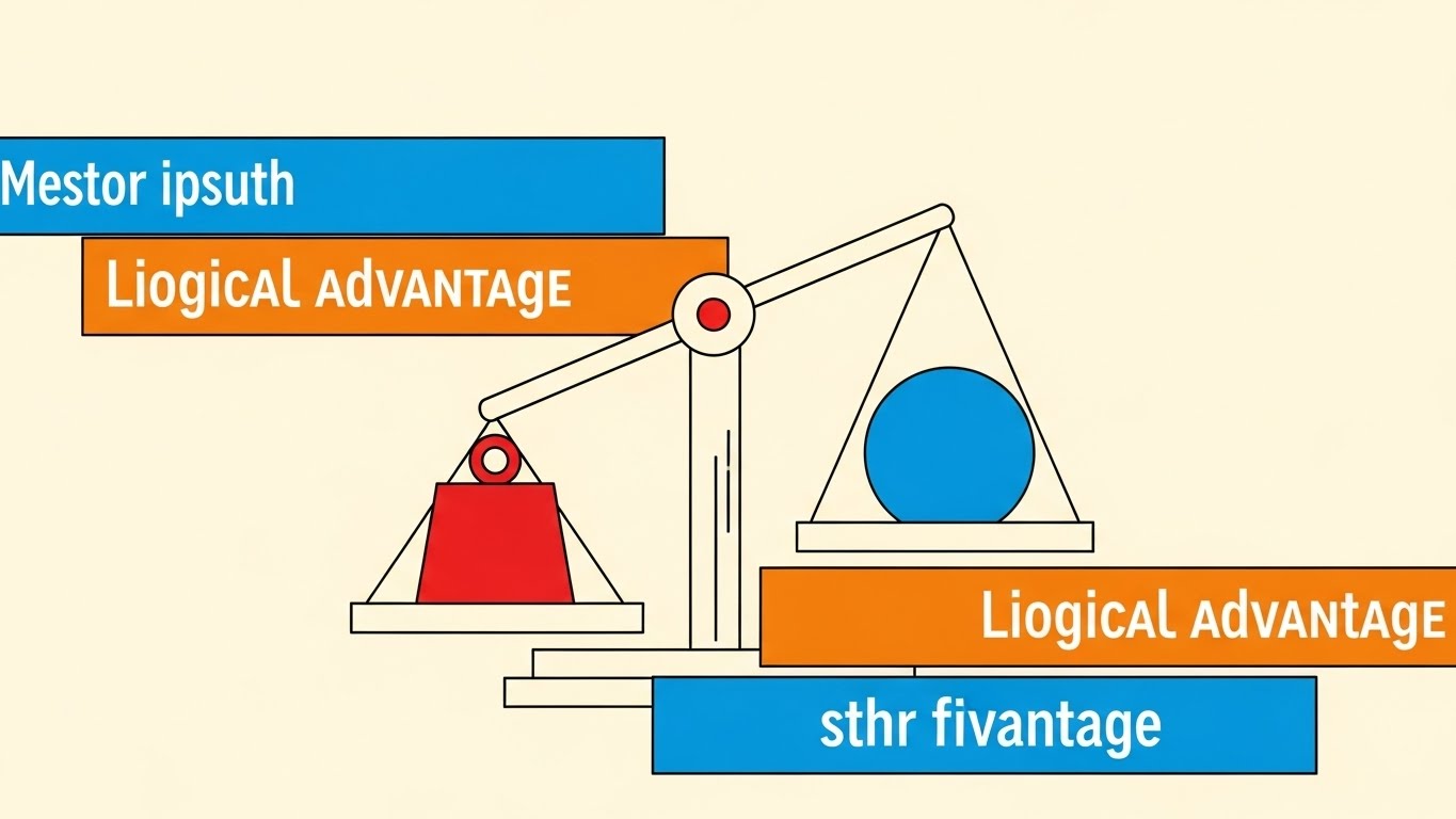
The Visual & Narrative Approach
Sometimes, the simplest argument is the strongest. This style utilizes a Swiss Style poster design. Simple geometric shapes—a red square (Cost/Risk) and a blue circle (Value/Security)—are balanced on a stylized scale. The scale tips heavily towards the Blue Circle, visually demonstrating the outweighing benefit. The background is a solid Cream color for a retro-modern, intellectual feel. The composition is strictly geometric.
Psychological Impact & KPI Focus
- Niche Psychology: In the final stages of a deal, the brain seeks Logic and Validation. This stripped-back visual removes all emotional clutter and presents a pure "logical argument." It appeals to the rational decision-maker.
- Operational Impact: Visualizes Competitive Displacement or Cost-Benefit Analysis. It simplifies complex comparisons into a binary choice: "Our solution weighs more in value."
Strategic Implementation & Trade-offs
- Best Use Case: Social Media (1:1) and retargeting ads for decision-makers who have visited the pricing page. It reinforces the "smart choice."
- Trade-offs: It can feel "low budget" if not executed with perfect design balance. It relies entirely on the strength of the accompanying copy.
- Duration: Static Image or 3-second animation.
Companies using similar video content -
Proofpoint – Information Protection – Protecting sensitive data and preventing insider threats.
LexisNexis Risk Solutions – ThreatMetrix – Detecting fraud and authenticating users.
20. Isometric 3D Workflow
BOFU | Objection Handling
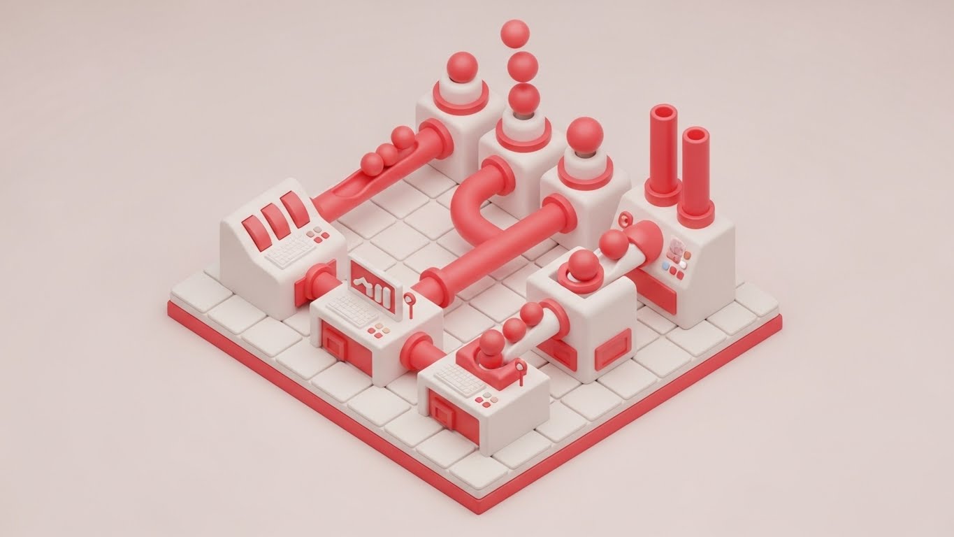
The Visual & Narrative Approach
To handle objections about complexity, we use the "toy-like" approachability of Claymorphism. This is an isometric 3D render of a miniature factory setup with soft, rounded edges in Clay White and Soft Red. Pipes connect different stations, with small spheres (representing data/identities) flowing smoothly through the system without bottlenecks. The look is clean, tactile, and friendly.
Psychological Impact & KPI Focus
- Niche Psychology: Implementation fear is real. "Will this break my workflow?" This friendly, soft aesthetic disarms that fear. It makes the complex backend process of identity orchestration look like a smooth, well-oiled, and Manageable Machine.
- Operational Impact: Visualizes Workflow Orchestration and Automated Provisioning. It shows that the "sausage making" of identity management is actually a clean, linear, and automated process, reducing the fear of operational chaos.
Strategic Implementation & Trade-offs
- Best Use Case: Website (16:9) "Integration" sections or technical objection-handling videos. It invites the user to lean in and understand the process without feeling overwhelmed.
- Trade-offs: It is highly stylized. It simplifies the process to the point of abstraction. It is excellent for "concept" but poor for "training."
- Duration: 15-30 seconds (Loop).
Companies using similar video content -
Transmit Security – Identity Experience Platform – Delivering frictionless, passwordless authentication.
ID.me – Identity Verification – Verifying digital identity for government and businesses.
21. Macro UI Micro-Interactions
BOFU | Driving Demo Requests

The Visual & Narrative Approach
We zoom in—extremely close. This style utilizes Macro Photography aesthetics applied to 3D UI elements to create a sense of tactile reality. The frame is filled by a single, high-fidelity toggle switch. We witness the exact moment of activation: the switch slides smoothly from left to right, transitioning from a dormant grey to a glowing Emerald Green. The background is a sterile, clean White, ensuring that the green glow is the undisputed focal point. The depth of field is shallow, blurring the edges to focus attention entirely on the action.
Psychological Impact & KPI Focus
- Niche Psychology: At the bottom of the funnel, the buyer is tired of "theory." They crave Tangibility. This visual triggers a dopamine response associated with "turning things on" and completing tasks. It suggests that the complex implementation discussed in sales meetings ultimately boils down to a simple, satisfying switch flip.
- Operational Impact: Visualizes Ease of Deployment. It asserts that activating a critical feature (like MFA or SSO) is not a month-long coding project, but a configured setting. It sells the "Turnkey" nature of the solution, directly addressing deployment anxiety.
Strategic Implementation & Trade-offs
- Best Use Case: Website (16:9) Pricing or Feature pages, specifically near "Get Started" or "Request Demo" buttons. It subconsciously primes the user to take action.
- Trade-offs: It is hyper-specific. It tells you nothing about the architecture or features. It is a purely visceral, emotional trigger designed to close the deal.
- Duration: 3-5 seconds (Loop).
Companies using similar video content -
Keycloak – Open Source IAM – Managing identities and access for applications.
Gluu – Identity Platform – Providing open source identity and access management.
22. 2D Line Art Animation
Onboarding | Reducing Friction

The Visual & Narrative Approach
Simplicity is the ultimate sophistication. This style uses a continuous, fluid Black line on a textured White paper background. The line draws itself into the shape of a stylized electrical plug, which connects effortlessly into a Blue socket. Without breaking the line, the stroke continues to form a simple, reassuring smiley face. The motion is elegant, unbroken, and rhythmic, suggesting a process that lacks interruption or friction.
Psychological Impact & KPI Focus
- Niche Psychology: The "Implementation Dip"—the period of frustration after purchase—is a critical churn risk. This visual combats Integration Anxiety. The continuous line subliminally communicates that the journey from "Plug" to "Happy" is unbroken and direct.
- Operational Impact: Visualizes Pre-built Connectors and API integrations. It reassures the technical team that this software plays well with others (HRIS, CRM) and "just works" out of the box, validating the "Plug and Play" promise without showing complex code.
Strategic Implementation & Trade-offs
- Best Use Case: Onboarding Guides (16:9) and "Welcome" emails. It sets a calm, cooperative tone for the implementation project.
- Trade-offs: It is very low-fidelity. It risks looking "cute" rather than "enterprise." It should be used for welcome messaging, not for explaining technical architecture.
- Duration: 5-10 seconds.
Companies using similar video content -
Okta Verify – MFA App – Approving secure logins with a tap.
Duo Mobile – Push Authentication – Authenticating users with secure push notifications.
23. Lifestyle Stock with UI Overlay
Onboarding | Accel Time-to-Value

The Visual & Narrative Approach
Identity lives where the user lives. This style uses a First-Person POV shot. We see a user's hand resting on a coffee shop table, holding a warm cup of coffee. Sunlight streams in. Next to the coffee, a laptop screen is visible. Superimposed over the screen is a semi-transparent, clean White "Checkmark" icon and a "Verified" badge. The visual blends the warmth of the physical world with the assurance of digital security.
Psychological Impact & KPI Focus
- Niche Psychology: For the end-user, security is often seen as a barrier to their freedom. This visual reframes security as a Silent Partner. It validates the "Work from Anywhere" lifestyle, proving that security protocols won't chain them to a desk or interrupt their coffee break.
- Operational Impact: Visualizes Context-Aware Access. It shows that the system can verify identity based on device and behavior (the laptop, the location) without invasive friction, accelerating user adoption and reducing "Shadow IT" behavior.
Strategic Implementation & Trade-offs
- Best Use Case: Email Nurture (16:9) campaigns targeting end-users (e.g., "Welcome to your new Secure Portal"). It humanizes the IT rollout.
- Trade-offs: Reliance on stock footage. It must be graded perfectly to match the brand palette; otherwise, it looks like a generic "digital nomad" ad.
- Duration: 6-10 seconds.
Companies using similar video content -
OpenZiti – Zero Trust Network – Building secure, performant application networks.
Pomerium – Access Proxy – Securing internal applications with identity-aware access.
24. 3D Parallax UI Presentation
Onboarding | Self-Serve Onboarding

The Visual & Narrative Approach
Clarity is kindness. This style breaks down complex setup tasks into bite-sized pieces. Three glossy, rounded rectangular cards float in a 3D space, labeled "Step 1," "Step 2," and "Step 3." They are colored in a gradient from Navy to Gold. The camera uses a parallax movement, panning slightly to reveal the depth and separation between the steps. The background is a soft, blurred Ocean Blue, keeping the focus strictly on the instructional cards.
Psychological Impact & KPI Focus
- Niche Psychology: Users fear "Documentation Overload"—the 50-page PDF manual. This visual promises Cognitive Ease. By visually breaking the process into three distinct, floating chunks, it convinces the brain that the task is manageable and finite.
- Operational Impact: Visualizes Self-Service Workflows. It is the visual counterpart to "Password Reset" or "MFA Setup" wizards, designed to reduce Helpdesk tickets by encouraging users to help themselves.
Strategic Implementation & Trade-offs
- Best Use Case: In-App Tooltips (16:9) and "Getting Started" video overlays. It functions as a visual map for the user's immediate next actions.
- Trade-offs: It is abstract. The text "Step 1" is a placeholder. To be effective, the actual video must contain the specific micro-copy of the task (e.g., "Scan QR Code").
- Duration: 10-15 seconds.
Companies using similar video content -
LastPass – Business – Securing employee passwords and access.
Google Cloud Identity – Identity Platform – Managing identities and access in Google Cloud.
25. 2D Character-Driven Story
Onboarding | Trial Activation

The Visual & Narrative Approach
Sometimes, you need a mirror. This style features a flat vector illustration of a diverse female professional dressed in Earth Tones (Burnt Orange/Olive). She is framed in a medium shot, looking at an off-camera screen with a genuine smile of relief and satisfaction. The background is a simplified, abstract office workspace in Cream and Beige. The style is clean, modern, and inclusive, focusing entirely on the emotion of the user experience.
Psychological Impact & KPI Focus
- Niche Psychology: Empathy is the driver here. This visual validates the user's feelings. It says, "We know technology can be frustrating, but with us, it's a happy experience." It builds a Relational Bond with the software.
- Operational Impact: Visualizes User Satisfaction (CSAT). It represents the successful outcome of a friction-free login or a seamlessly granted access request, reinforcing the value of the software to the daily worker.
Strategic Implementation & Trade-offs
- Best Use Case: Social Media (1:1) and Customer Success stories. It works well for "soft" messaging about culture and employee experience (EX).
- Trade-offs: It is not technical. It cannot be used to sell to the CISO, who cares about architecture. It is strictly for the User/HR persona or for humanizing the brand.
- Duration: 15-30 seconds.
Companies using similar video content -
Salesforce – Identity – Connecting users to apps with single sign-on.
Oracle – Identity Cloud Service – Providing cloud-native identity and access management.
26. Low-Poly 3D Modeling
Retention | Knowledge Base
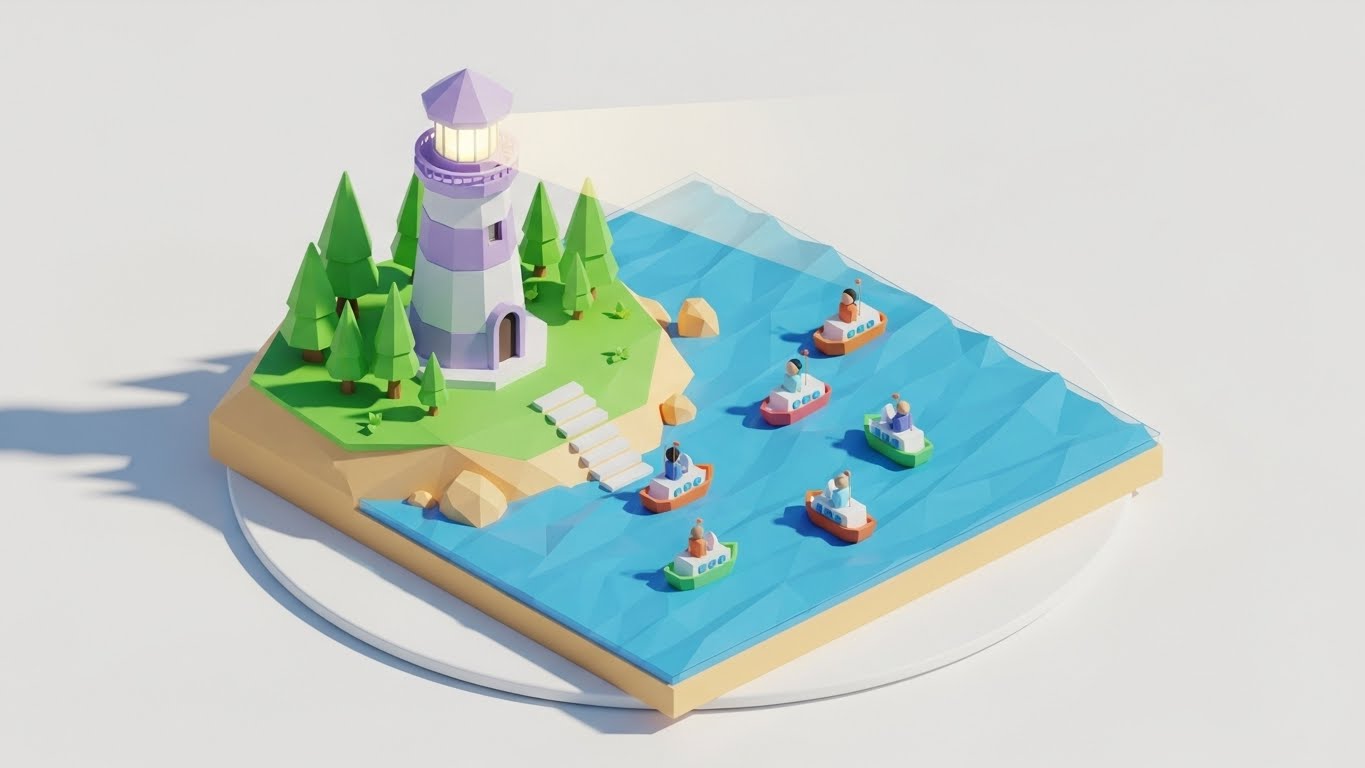
The Visual & Narrative Approach
Support is a journey. This style uses Low-Poly 3D art—a style defined by geometric, faceted shapes—to create a charming, approachable metaphor. A stylized Lighthouse in Pastel Purple and White stands on a geometric island. A beam of light cuts through the darkness, guiding small, blocky ships (representing users) safely to the shore. The entire scene rotates slowly on a white turntable background.
Psychological Impact & KPI Focus
- Niche Psychology: When things break, users panic. This calming, toy-like aesthetic lowers cortisol levels. It reframes "Support" not as a crisis, but as Guidance. The lighthouse is a universal symbol of safety and direction.
- Operational Impact: Visualizes Knowledge Base & Support. It encourages users to seek out the "light" (documentation/tutorials) rather than drifting aimlessly or calling for help immediately, supporting Ticket Deflection strategies.
Strategic Implementation & Trade-offs
- Best Use Case: Support Portal (16:9) headers and "Help Center" videos. It makes the help center feel inviting rather than punitive.
- Trade-offs: It can feel juvenile. It must be executed with sophisticated lighting and color palettes (pastels, soft shadows) to avoid looking like a video game for children.
- Duration: 10-20 seconds (Loop).
Companies using similar video content -
Imprivata – Single Sign-On – Enabling fast, secure access for healthcare.
Veriff – Identity Verification – Automating identity verification with AI.
27. Aspirational Stock Montage
Retention | Reducing Churn

The Visual & Narrative Approach
To retain a customer, remind them of the human success they are achieving. This style uses high-end cinematic stock footage. We see a low-angle shot of a diverse corporate team standing in a glass-walled atrium. They are high-fiving and looking up, bathed in Golden Hour sunlight. The team wears modern business attire (Navy/Grey). The vibe is one of unity, victory, and unencumbered collaboration.
Psychological Impact & KPI Focus
- Niche Psychology: Executives renew contracts when they feel the software contributes to Organizational Health. This visual connects the software (Identity Management) to the ultimate business goal: a team that works together seamlessly and securely.
- Operational Impact: Visualizes Collaboration & Productivity. It implies that because identity security is handled (by your software), the team is free to focus on winning, innovation, and growth.
Strategic Implementation & Trade-offs
- Best Use Case: Quarterly Business Review (QBR) Decks (16:9) and Newsletters. It serves as an emotional anchor during renewal discussions.
- Trade-offs: Generic corporate stock is a risk. It must be paired with specific data overlays (e.g., "100% Uptime") to ground the "feel-good" visual in reality.
- Duration: 15-30 seconds.
Companies using similar video content -
FreeIPA – Identity Management – Centralized authentication, authorization, and account information.
OpenText – Identity & Access Management – Securing digital identities and access.
28. Hyper-lapse Stock Footage
Expansion | Feature Adoption

The Visual & Narrative Approach
Growth is dynamic. This style uses a high-speed Hyper-lapse of a busy city intersection in broad daylight. The cars and people blur into streams of motion. Overlaid on this chaotic reality are sharp, glowing Cyan data lines that connect the moving vehicles and buildings. The lines snap into place, creating a grid of order over the chaos of the city.
Psychological Impact & KPI Focus
- Niche Psychology: As companies grow, they fear losing control. This visual demonstrates Orchestrated Chaos. It reassures the client that as they expand (more users, more traffic), the underlying grid of identity management will hold firm and keep everything connected.
- Operational Impact: Visualizes Scalability and IoT Identity. It suggests the software is ready to manage not just employees, but millions of customer identities (CIAM) and devices without latency.
Strategic Implementation & Trade-offs
- Best Use Case: Social Media Ads (9:16) and Expansion campaigns. The high energy captures attention and signals "Enterprise Grade."
- Trade-offs: The motion can be dizzying if too fast. The data overlays must be tracked perfectly to the footage, or the illusion of control is broken.
- Duration: 6-10 seconds.
Companies using similar video content -
Cisco Secure – Security Cloud – Unifying security across users, endpoints, and networks.
Fortinet – FortiGate – Providing integrated, high-performance network security.
29. Split Screen: Opt Reality
Expansion | Driving Upsell

The Visual & Narrative Approach
The choice is clear. This style uses a classic Split Screen composition. The left side is desaturated (Greyscale/Sepia) and shows a messy desk cluttered with paper files, sticky notes (passwords), and a spilled coffee cup. The right side is vivid, bright, and clean, showing a hand holding a sleek tablet with a modern, colorful UI. A sharp vertical line divides the two worlds. The visual forces a comparison between the "Old Way" (Manual) and the "New Way" (Automated).
Psychological Impact & KPI Focus
- Niche Psychology: Fear of Missing Out (FOMO) and the desire for modernization. It taps into the frustration of Legacy Debt. The viewer instantly identifies with the pain of the left and desires the clarity of the right.
- Operational Impact: Visualizes Digital Transformation. It effectively sells the upgrade from "Basic Identity" (spreadsheets/manual AD) to "Advanced Governance" (Automated, Tablet-based).
Strategic Implementation & Trade-offs
- Best Use Case: Promotional Videos (16:9) and upsell emails. It provides a binary choice that is hard to argue with.
- Trade-offs: It can feel a bit "infomercial" if the "Before" side is too exaggerated. The contrast should be realistic—clutter vs. clean, not disaster vs. paradise.
- Duration: 10-15 seconds.
Companies using similar video content -
SAP Customer Data Cloud (Gigya) – CIAM – Managing customer identities and consent.
OneSpan – Trusted Identity – Securing digital agreements and transactions.
30. Gen AI Realistic Character
Expansion | Driving Referrals

The Visual & Narrative Approach
Trust is human. This style utilizes a high-end Gen AI Realistic Character (Unreal Engine Metahuman quality). A professional man in his 40s, with a trustworthy face and a smart-casual blazer, speaks directly to the camera. He is situated in a blurred, high-tech office hub with soft Blue and White bokeh lighting. His expression is confident, calm, and approving. He acts as a surrogate for a peer or a consultant recommending the solution.
Psychological Impact & KPI Focus
- Niche Psychology: B2B buyers trust their peers more than brands. This visual creates a Social Proof proxy. Even though the character is AI, the realistic "Eye Contact" triggers a trust response that abstract graphics cannot achieve.
- Operational Impact: Visualizes Testimonial and Advocacy. It personalizes the brand, giving a "face" to the software partner that guides the client through their expansion journey.
Strategic Implementation & Trade-offs
- Best Use Case: Case Study Intros (16:9) or personalized video messages for account expansion.
- Trade-offs: The "Uncanny Valley" risk. If the lip-sync or eye movement is slightly off, trust is destroyed instantly. It requires top-tier generation tools.
- Duration: 15-45 seconds.
Strategic Knowledge Base: The Visual Operations Doctrine
This section synthesizes the visual strategies of all 30 styles into a cohesive business framework. It bridges the gap between "making it look good" and "making it work" for Identity Management professionals, elevating these visual assets from "creative content" to "critical infrastructure."
Strategic Alignment & Visual Architecture
The "Pre-Production" Strategy. Defining the Visual Operating System for Identity Security.
- The Cognitive Load Audit (Security Fatigue): Before designing a single asset, audit the complexity of your current security training. If explaining MFA takes 500 words of text, use Style 21 (Macro UI) or Style 6 (2D Animation) to reduce that load to 5 seconds of visual intake. Visuals must subtract complexity from the user's day, not decorate it.
- Role-Based Visual Mapping (RBVM): Stop using one visual style for everyone. Map styles to personas:
- End-Users: Use "High-Empathy" styles like Style 23 (Lifestyle Overlay) and Style 25 (Character Story) that emphasize ease, lifestyle, and freedom.
- Admins/CISOs: Use "High-Data" styles like Style 11 (Dark Mode) and Style 18 (Data Visualization) that emphasize control, visibility, and depth.
- The "Glanceability" Standard: In a SOC (Security Operations Center), analysts have milliseconds to spot threats. Your product UI and marketing visuals must pass the "Squint Test." Can the system status (Safe vs. Breach) be understood in blurred peripheral vision? Use High-Contrast styles (Style 15) to train this rapid recognition.
- Brand Voice Consistency: Identity platforms often consist of acquired modules (IGA, PAM, AM). Use a unified visual language (e.g., the "Glass/Shield" motif of Style 12) across all 30 styles to visually stitch a fragmented product suite into a cohesive story during the sales cycle.
- The Advids Strategic Audit: Advids specializes in defining this "Visual Operating System" before production begins. We analyze your technical architecture to ensure your visual metaphors (e.g., "The Shield" vs. "The Network") accurately reflect your specific security philosophy (Perimeter vs. Zero Trust).
- Standardization vs. Customization: For core concepts like "SSO," use standardized visual metaphors (Style 7, Merging Liquids) to leverage existing market understanding. Reserve bespoke, high-cost visualizations (Style 3, AI Nodes) for your unique proprietary differentiators to maximize budget efficiency.
- The Cross-Departmental Bridge: Use visuals to align Sales and Engineering. If Engineering builds "Zero Trust," but Sales sells "Firewalls," you have a disconnect. Create a "Visual Dictionary" using Style 8 (Isometric Map) that both teams use to describe the solution to clients.
- Legacy System Integration: Visualizing the invisible link between on-premise Legacy AD and Cloud IdP is critical. Use Style 22 (Line Art) or Style 29 (Split Screen) to show the bridge, reducing the fear that modernizing identity will break legacy applications.
- Accessibility in Identity: Your workforce is global and diverse. Visuals like Style 25 (Diverse Characters) and Style 2 (Universal Symbols) bypass language barriers, ensuring security training is effective across all regions without expensive text translation.
- The Mobile-First Mandate: Most authentication happens on mobile (Push Notifications). Ensure all visual assets, especially onboarding styles (Style 23), are optimized for vertical consumption (9:16) to mirror the actual end-user experience on their device.
Operational Adoption & Implementation
The "Deployment" Phase. Embedding visuals into the Identity Lifecycle.
- Overcoming "Big Brother" Anxiety: Users fear monitoring. Use Style 5 (2D Graphics Over Live Action) to visually frame security agents as "Protectors" (Shields) rather than "Watchers" (Cameras). This subtle visual framing is critical for cultural buy-in and reducing resistance.
- The Micro-Learning Shift: Replace the 40-page "New Hire Security PDF" with a playlist of 10-second loops (Style 21, 24). Users will watch a 5-second video on how to reset a password; they will not read a paragraph about it.
- Just-in-Time Support: Embed specific visual styles into the error messages. If a user gets "Access Denied," show a Style 26 (Lighthouse) animation guiding them to the request portal, turning a frustration point into a guided workflow.
- Gamification of Security: Use Style 13 (Clean UI Lists) and Style 25 (Success Stories) to visualize "Security Scores" or "Verification Badges." Visualizing compliance as an achievement rather than a chore boosts proactive adoption.
- Reducing Helpdesk Ticket Volume: There is a direct correlation between the clarity of "Self-Service" visuals (Style 24) and the reduction of Tier 1 password reset tickets. Invest heavily in "How-To" visuals for common friction points to deflect tickets.
- Remote Onboarding: For distributed workforces who never visit an office, the "Welcome Video" (Style 22, 23) is the office culture. Use high-warmth visuals to build trust and connection where physical presence is impossible.
- Visualizing SOPs (Standard Operating Procedures): Transform text-based Access Policy documents into visual logic flows (Style 8, Isometric). An Admin can spot a logic gap in a visual map instantly, whereas it might be buried in page 10 of a text document.
- Feedback Loops: Use interactive video elements (Style 6, UI High Five) to solicit immediate feedback after a security workflow. "Did this video help?" inputs allow you to refine your visual strategy based on actual user utility.
- Scalable Localization: Global enterprises have global compliance needs. By relying on abstract motion graphics (Style 1, 7) rather than text-heavy videos, you reduce the cost and complexity of localizing assets for different regions (GDPR vs. CCPA).
- Leadership Communication: When the CISO presents to the Board, they cannot use console screenshots. They need "Board-Ready" visuals (Style 16, 18) that translate "Uptime" and "Risk Mitigation" into "Financial Growth" and "City-Scale Stability."
Measuring Impact & Future-Proofing
The "ROI" Phase. Measuring success and evolving the visual strategy.
- Beyond "Views": Stop measuring video success by "Views." Measure it by Actionable KPIs: Did the "MFA Setup" video reduce the "MFA Failure" rate? Did the "Feature Teaser" (Style 9) increase feature activation? Connect visuals to logs.
- The "Idle Time" Metric: Measure how long users spend "stuck" on a login screen. Better visualization (Style 24) should correlate directly with reduced "Idle Time" and faster successful authentication events.
- Compliance Velocity: How fast can you get the organization to 100% compliance on a new policy? Visual campaigns (Style 10, Wireframe to Reality) spread understanding faster than emails, accelerating the "Time-to-Compliance."
- Retention and Churn: High-quality UX visualization (Style 25) contributes to the perception of a "Premium" product. Customers churn from "clunky" tools; they retain "slick" ones. Visual polish is a retention feature.
- The AI Visual Frontier: Prepare for Generative UI. Future Identity systems will generate interfaces on the fly. Your visual guidelines (Style 3, 30) must be robust enough to govern AI-generated content to ensure it remains on-brand.
- Scalability of Assets: Build a "Visual Component Library." Don't create one-off videos. Create a library of reusable assets (The Shield, The Node, The User) that can be reassembled into new narratives as your platform evolves.
- The Advids Partnership: As your platform scales, your visual needs will outpace your internal design capacity. Advids acts as your long-term scalable partner, maintaining your "Visual Source of Truth" and ensuring that your Year 5 assets visually align with your Year 1 assets, preserving brand equity.
- Benchmarking Success: "Good enough" visuals are a security risk. If your phishing simulation videos look cheap, users will ignore them. Benchmarking your visuals against the "Gold Standard" (Style 12, 16) is essential for maintaining authority.
- The ROI of Safety: Quantify the "Cost of a Breach" vs. the "Cost of Visualization." If a $10k video series prevents a single $4.88M breach by better training users on phishing, the ROI is 48,000%. Frame your visual budget as Risk Insurance.
- Final Call to Innovation: Treat video not as "Content Marketing," but as Visual Infrastructure. In the Identity domain, where trust is the product, the quality of your visualization is the quality of your trust. Invest in it, optimize it, and let it carry the weight of your digital reputation.
Companies using similar video content -
Broadcom – Symantec DLP – Protecting sensitive data from loss and theft.
BeyondTrust – Universal Privilege Management – Eliminating privilege risks across the enterprise.
Author & Editor Bio


