
 /home/wwwroot/advids.co/design/index.php on line 425
Introduction: Bridging the Physical/Digital Divide
The industrial waste management sector is currently navigating a profound structural shift. We are moving from a linear "take-make-dispose" model to a circular ecosystem where waste is re-classified as a data-rich resource. However, for many Directors of Operations and Sustainability Officers, this transition is hindered by a massive disconnect. While physical operations are heavy, continuous, and hazardous, the digital tools used to track them are often fragmented and retrospective.
This "Physical/Digital Divide" creates operational friction—manual manifests, unverified pickups, and compliance reporting that lags behind reality. The solution is not just better software, but better visualization of that software. To capture the opportunity in a digital waste management solution market projected to reach USD 10.12 billion by 2034, SaaS platforms must prove they can bridge this gap.
The stakes are high. The broader industrial waste management market size is estimated to reach USD 400.78 billion by 2030. To claim a share of this growth, your visual messaging must do more than look good; it must reduce cognitive load, build trust, and articulate complex "Cradle-to-Grave" tracking concepts instantly.
This guide presents 30 expert-curated visualization styles designed to solve these specific communication challenges. From the clarity of Minimalist Vectors to the precision of Digital Twins, these styles are engineered to bridge the gap between the factory floor and the boardroom.
1. Minimalist Flat 2D Vector
TOFU | Brand Awareness

The Visual & Narrative Approach
This style utilizes a "Less is More" philosophy to cut through the cognitive noise of the factory floor. By restricting the color palette to vivid Lime Green and Charcoal Gray, the visual creates a high-contrast environment where every element pops. The symmetrical, mandala-like arrangement of gears and chemical drums implies a system in perfect balance—a subconscious signal of "Compliance" and "Harmony." The animation is rhythmic and clockwork-like, suggesting that your platform brings order to entropy.
Psychological Impact & KPI Focus
- Niche Psychology: Industrial professionals are often overwhelmed by complexity. This style offers visual relief, signaling that your solution is Simple and User-Friendly.
- Operational Impact: It reduces Cognitive Load, allowing the core message of "Sustainability meets Industry" to be absorbed instantly in a fast-scrolling feed.
Strategic Implementation & Trade-offs
- Use Case: 6-10 second social media ads (LinkedIn/Instagram) designed to disrupt the feed.
- Trade-off: It is symbolic. It cannot convey the technical depth required for feature education or hardware integration.
Companies using similar video content -
Scrapp – AI-powered waste stream insights for compliance.
Milesight – IoT sensor data visualization for smart bins.
RTS Holding, Inc. – Streamlined waste collection and monitoring.
2. Hybrid Isometric Low Poly
TOFU | Category Creation

The Visual & Narrative Approach
This style reframes the narrative from "Disposal" to "Alchemy." By using a Low-Poly aesthetic, we abstract the messy reality of waste into clean, crystalline geometric shapes. The isometric angle provides a "God’s Eye View" of the facility, offering a sense of total oversight. The transformation of gray polygonal rocks into glowing amber energy shards visualizes the Circular Economy—turning a liability (waste) into an asset (resource/energy).
Psychological Impact & KPI Focus
- Niche Psychology: It appeals to the aspiration of the Sustainability Officer who wants to be seen as a value creator, not just a waste manager.
- Operational Impact: It visually supports the Category Creation goal, positioning the platform as a next-generation "Resource Management" tool rather than a legacy "Hauling Tracker."
Strategic Implementation & Trade-offs
- Use Case: "Vision" videos or Explainer content introducing new Waste-to-Energy modules.
- Trade-off: The "game-like" aesthetic might feel too playful for highly conservative sectors like Hazardous Waste management.
Companies using similar video content -
Reworld – Transforming waste into valuable energy resources.
Umicore – Advanced battery recycling for circular economy.
REMONDIS – Metals recycling and material recovery solutions.
3. Abstract Glossy Vector
TOFU | Market Education

The Visual & Narrative Approach
This style uses "Organic Motion Graphics" to tackle the challenge of liquid and continuous waste streams. As seen in the visual, the fluid, organic shapes (representing sludge, leachate, or chemicals) flow from left to right, seamlessly morphing into structured, rigid rings and digital pipelines. The glossy, high-specular texture implies a "clean" handling of "dirty" materials. The transition from chaos to structure perfectly illustrates the platform's ability to Capture and Digitize unruly data.
Psychological Impact & KPI Focus
- Niche Psychology: It alleviates the anxiety of "untrackable" fluids. The structured morphing suggests containment and control.
- Operational Impact: This style supports Market Education, helping stakeholders visualize the intangible concept of "Data Liquidity" and seamless integration.
Strategic Implementation & Trade-offs
- Use Case: YouTube Pre-roll ads or website headers for "Liquid Waste" or "Chemical" solution pages.
- Trade-off: It is highly metaphorical. It must be paired with concrete voiceover to anchor the abstract visuals to business reality.
Companies using similar video content -
Locus Technologies – Fluid digitization of complex environmental data.
Bridgera – IoT data flow for smart waste systems.
1NCE – Seamless IoT connectivity for waste management.
4. Bold Kinetic Typography (Visual)
TOFU | LinkedIn Organic

The Visual & Narrative Approach
This style adopts the visual vernacular of the factory floor: Safety Orange, heavy barriers, and caution tape. The "Kinetic Geometry" uses blocky, heavy shapes that slam into place on a diagonal axis, conveying weight and impact. These heavy shapes are then bound together by sleek, thin digital lines. The visual rhythm is percussive and authoritative, shouting "Compliance," "Safety," and "Robustness" without using a single word.
Psychological Impact & KPI Focus
- Niche Psychology: In heavy industry, weight equals reliability. This style builds Trust by looking as sturdy as the equipment it tracks.
- Operational Impact: It acts as a Pattern Interrupt on LinkedIn, signaling "Industrial Grade" software to EHS professionals scanning for safety content.
Strategic Implementation & Trade-offs
- Use Case: High-impact social posts designed to be effective with sound off.
- Trade-off: It is aggressive. Use it for "Hard Compliance" messaging (Risk, Fines, Safety), not for "Green/Sustainability" messaging.
Companies using similar video content -
SafetyCulture – Robust EHS compliance and safety messaging.
Safe Fleet – FleetLink – Heavy industry fleet safety and compliance.
5. AI Generated Mixed Media Video
TOFU | Skippable Pre-Roll
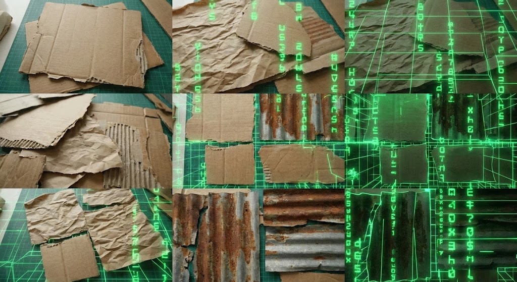
The Visual & Narrative Approach
This style is a literal bridge between the physical and digital worlds. By using scanned textures of real-world materials (cardboard, metal, paper), it validates the user's daily reality. The overlay of glowing green code snippets and wireframes creates a "Digital Skin" effect, showing how the software organizes the physical chaos. The stop-motion aesthetic adds a raw, authentic texture that feels "boots on the ground" rather than "ivory tower."
Psychological Impact & KPI Focus
- Niche Psychology: It builds Empathy. It tells the Plant Manager, "We know your world is messy, and our software fits right in."
- Operational Impact: It effectively communicates Ease of Adoption, suggesting that the digital tool integrates naturally with existing physical workflows.
Strategic Implementation & Trade-offs
- Use Case: YouTube Skippable Ads (first 5 seconds) to hook the viewer with a unique, non-corporate visual texture.
- Trade-off: Requires high artistic control to ensure the "trash" textures look intentional and designed, not messy.
Companies using similar video content -
GFL Environmental – Bridging physical material recovery with digital AI.
Waste Connections – Advanced C&D recycling with integrated tech.
6. Abstract 3D AI Visualization
TOFU | Brand Perception

The Visual & Narrative Approach
This visualization scales the conversation to the enterprise level. The high-fidelity 3D globe, dotted with glowing particle nodes and arcing data lines, represents the "Control Tower" view. The "Plexus" effect (interconnected dots and lines) visualizes the invisible web of logistics and data transfer between multiple sites. The focus is on the central, bright cluster, symbolizing centralized intelligence and global visibility.
Psychological Impact & KPI Focus
- Niche Psychology: For the C-Suite, the priority is Scalability. This visual reassures them that the platform can handle global complexity.
- Operational Impact: It elevates Brand Perception, positioning the provider as an enterprise infrastructure partner rather than a local tool.
Strategic Implementation & Trade-offs
- Use Case: Homepage Hero Backgrounds and Investor Pitch Decks.
- Trade-off: It is a high-level abstraction. It sells the vision of connectivity, not the specific functionality of the dashboard.
Companies using similar video content -
Sphera – Global sustainability and networked operational risk intelligence.
IBM Corporation – AI and IoT for waste management optimization.
7. Wireframe to Reality Transition
MOFU | Demand Gen
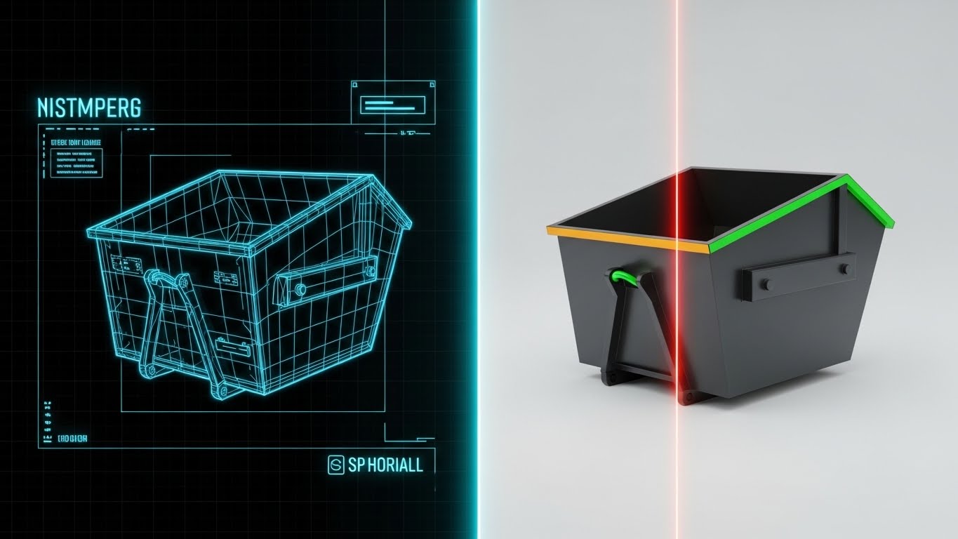
The Visual & Narrative Approach
This "Split-Screen" technique is the definitive visual for the "Digital Twin" concept. The left side reveals the technical wireframe data of a roll-off dumpster, while the right side shows the photorealistic physical asset. The glowing laser scan line acts as the sync mechanism. This visual proves that the digital record in the software matches the physical reality on the ground 1:1, demystifying the technology.
Psychological Impact & KPI Focus
- Niche Psychology: Skepticism about data accuracy is a major barrier. This visual builds Trust by showing the "skeleton" of the data matching the "skin" of the reality.
- Operational Impact: It directly supports Asset Utilization narratives, showing that better data leads to better physical management.
Strategic Implementation & Trade-offs
- Use Case: Retargeting Display Ads and Product Feature pages.
- Trade-off: It requires accurate 3D models of specific industry equipment to look authentic to the buyer.
Companies using similar video content -
Compology – Digital twin for waste compactors, verifiable accuracy.
ZenRobotics – AI-powered waste sorting, digital representation.
8. 2D Line Art Animation
MOFU | Product Differentiation

The Visual & Narrative Approach
This style uses a single, continuous gold line to trace the lifecycle of waste. The unbroken line is a powerful visual metaphor for the "Chain of Custody"—ensuring there are no gaps in the data where liability could slip through. The minimalist, white-space-heavy aesthetic conveys Precision and Sophistication, differentiating the brand as a "Premium" partner in a noisy market.
Psychological Impact & KPI Focus
- Niche Psychology: EHS Managers fear "gaps" in their reporting. The continuous line subliminally reassures them of Process Integrity.
- Operational Impact: It effectively visualizes Cradle-to-Grave tracking without complex flowcharts, reducing cognitive load.
Strategic Implementation & Trade-offs
- Use Case: "Our Methodology" web pages and email signatures.
- Trade-off: It is very subtle. It works best for audiences who already understand the basics and are looking for quality and reliability.
Companies using similar video content -
SUEZ Environmental Services – Continuous chain of custody for waste streams.
Veolia Environnement – Lifecycle tracking for water, waste, energy.
9. Isometric 3D Workflow
MOFU | Feature Education

The Visual & Narrative Approach
This "Sim City" style allows us to visualize the Augmented Reality of SaaS integration. By creating a miniature, clean 3D facility, we can place UI bubbles (data points) directly over the physical assets (tanks, pipes) they monitor. This contextualizes the data, showing the user exactly where the information is coming from. The soft lighting and clean textures make complex facility management look manageable and organized.
Psychological Impact & KPI Focus
- Niche Psychology: It gives the Operations Manager a sense of "God-Mode" Control, reducing the intimidation factor of managing a sprawling plant.
- Operational Impact: It is the best style for Feature Education, vividly explaining IoT sensor integration and remote monitoring workflows.
Strategic Implementation & Trade-offs
- Use Case: Product Tour videos and Deep-Dive webinars.
- Trade-off: Can become cluttered if too many data points are shown. Requires strict visual hierarchy.
Companies using similar video content -
AMCS Platform – Facility overview with IoT visibility at scale.
Nordsense – Nordsense Platform – 3D topology maps for smart waste.
10. Rapid UI Feature Montage
MOFU | Competitive Displacement
The Visual & Narrative Approach
This style is designed to communicate Speed and Power. The diagonal composition and motion blur create a sense of high-velocity movement. We see flashes of modern, dark-mode UI screens—dashboards, graphs, maps—flying past the viewer. This aggressively positions the software as a "High-Performance" tool, contrasting sharply with the slow, clunky legacy systems often found in the industry.
Psychological Impact & KPI Focus
- Niche Psychology: It appeals to the user's desire for efficiency and modern tools. It promises a Frictionless Experience.
- Operational Impact: It supports Competitive Displacement by making the incumbent software look obsolete and slow by comparison.
Strategic Implementation & Trade-offs
- Use Case: Social Media Retargeting (Instagram/TikTok) and Hype Reels.
- Trade-off: The pace is too fast for detailed reading. It sells the feeling of the UI, not the specific function.
Companies using similar video content -
Routeware – High-speed operational control for waste fleet management.
OptimoRoute – Rapid route optimization for waste collection.
11. Photorealistic 3D Renders
MOFU | ABM Awareness

The Visual & Narrative Approach
This style brings the SaaS platform out of the cloud and onto the concrete floor. By placing the digital dashboard (displayed on a ruggedized, high-tech tablet) directly into a high-quality, photorealistic rendering of a warehouse, we ground the data in reality. The "Bokeh" effect—blurring the background drums and shelving—directs sharp focus to the electric green and silver metrics on the screen. This visual hierarchy asserts that while the environment is complex, the data is clear, sharp, and under control.
Psychological Impact & KPI Focus
- Niche Psychology: It combats the "Ivory Tower" syndrome. It proves to the Operations Director that this tool is designed for the grit of the warehouse, not just the safety of the boardroom.
- Operational Impact: It visually reinforces Contextual Utility, demonstrating that data capture happens at the source (the waste generation point), ensuring 100% manifest accuracy.
Strategic Implementation & Trade-offs
- Use Case: Website Hero sections and "Solutions by Industry" pages.
- Trade-off: High production cost. It requires top-tier rendering to avoid the "Uncanny Valley," where poor 3D textures look cheap and erode trust.
Companies using similar video content -
Bigbelly Solar – Ruggedized smart bins, tangible field data capture.
Pepperl+Fuchs SE – Industrial sensors in realistic waste settings.
12. Lifestyle Stock with UI Overlay
MOFU | Website Hero
The Visual & Narrative Approach
Technology alone doesn't ensure safety; people do. This style blends the human element with digital assurance. By overlaying a clean, semi-transparent "Compliance Verified" UI shield onto a high-quality image of a confident Plant Manager in PPE, we visually marry human expertise with software validation. The bright, professional lighting and the mint green UI accents signal a clean, controlled environment, repositioning the user from "waste handler" to "compliance leader."
Psychological Impact & KPI Focus
- Niche Psychology: It addresses the fear of non-compliance and audits. The relaxed, confident expression of the manager implies that the software has removed the stress of regulatory reporting.
- Operational Impact: It highlights Risk Mitigation, associating the software with the peace of mind that comes from a "Verified" status.
Strategic Implementation & Trade-offs
- Use Case: Email Nurture Campaigns (Case Studies), "About Us" pages, and Testimonials.
- Trade-off: Reliance on stock footage can feel generic. The UI overlay must be custom-designed and seamlessly integrated to maintain brand authenticity.
Companies using similar video content -
WasteHero – Human competence and verified compliance assurance.
Jobber – Field service management with integrated mobile UI.
13. Dynamic Data Visualization
BOFU | Building Trust

The Visual & Narrative Approach
When speaking to the CFO, waste needs to look like a resource. This style transforms abstract numbers into tangible volume. We visualize financial growth not just with lines, but with stacks of stylized "waste cubes" (in Coral and Slate Blue) forming a rising bar chart. The clean, matte plastic texture and polished reflective floor elevate the aesthetic, turning the concept of "trash tracking" into "asset management" and financial gain.
Psychological Impact & KPI Focus
- Niche Psychology: It reframes the conversation from "Cost Center" to "Profit Center." Seeing waste cubes stack up as value activates the Resource Recovery mindset.
- Operational Impact: It explicitly visualizes ROI and Diversion Rates, making it easier for internal champions to justify the software investment to finance teams.
Strategic Implementation & Trade-offs
- Use Case: Investor Presentations, Quarterly Business Review (QBR) decks, and Pricing pages.
- Trade-off: It is purely analytical. It lacks the emotional urgency of safety-focused visuals but excels at logical persuasion.
Companies using similar video content -
Republic Services – Waste-to-value metrics, tangible ROI from diversion.
WM (Waste Management, Inc) – Landfill gas capture, recycling ROI.
14. 2D Character-Driven Story
BOFU | ROI Justification
The Visual & Narrative Approach
Implementation anxiety is a major barrier to sale. This style uses the friendly, approachable "Corporate Memphis" aesthetic to promise a frictionless experience. The exaggerated, flowing limbs and relaxed posture of the character suggest that managing digital files is effortless. By depicting the user "sorting" floating digital files into virtual bins, we create a metaphor for Intuitive Workflow—implying that the transition from paper to digital requires no heavy lifting.
Psychological Impact & KPI Focus
- Niche Psychology: It disarms the user. The playful, soft aesthetic lowers defenses and signals that the platform is User-Friendly and requires minimal training.
- Operational Impact: It supports narratives around Change Management, reassuring teams that the switch to digital will be smooth and stress-free.
Strategic Implementation & Trade-offs
- Use Case: "How it Works" videos, Onboarding teasers, and Customer Success stories.
- Trade-off: Can be perceived as too casual for high-risk sectors (e.g., nuclear or bio-hazard). Use selectively for administrative workflows, not safety protocols.
Companies using similar video content -
Flectra – Open-source ERP workflow, easing user adoption anxiety.
QField – Intuitive field data collection and mapping.
15. 3D X-Ray Visualization
BOFU | Overcoming Objections
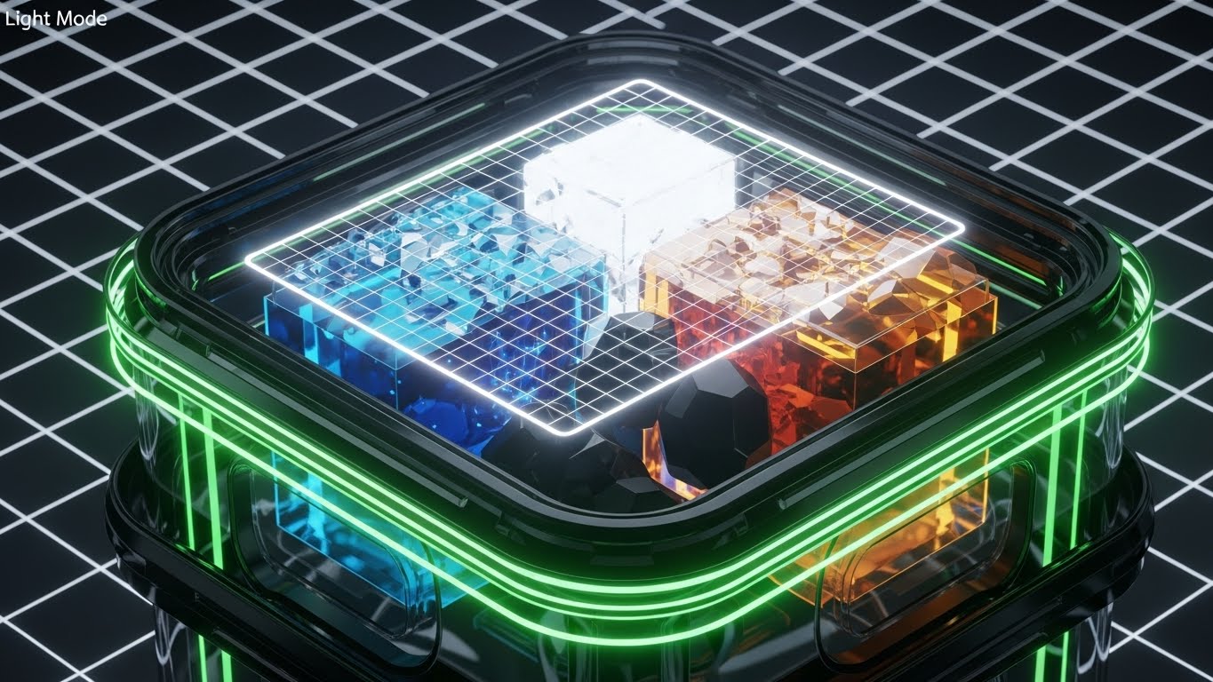
The Visual & Narrative Approach
For hazardous waste, what you can't see is what kills you. This "X-Ray" style provides absolute transparency. By rendering the container as semi-transparent glass, we reveal the stabilized, separated layers of hazardous materials (blue and amber liquids/solids) inside. The glowing white scanning grid represents the software's deep analysis and characterization capabilities. It visualizes the concept of "Knowing Your Waste" down to the molecular level.
Psychological Impact & KPI Focus
- Niche Psychology: It appeals to the paranoia of the Compliance Officer. It visually guarantees that there are no hidden surprises or incompatible mixtures.
- Operational Impact: It effectively communicates Risk Mitigation and Profiling Accuracy, critical for preventing fines, accidents, and environmental breaches.
Strategic Implementation & Trade-offs
- Use Case: Hazardous Waste (RCRA) Module pages, Safety Protocol deep-dives, and Compliance Whitepapers.
- Trade-off: Requires high technical accuracy. If the chemicals depicted look like they are reacting unsafely, it destroys credibility.
Companies using similar video content -
Clean Harbors – Safety-Kleen – Deep transparency for hazardous waste mitigation.
RED Industries – Hazardous and non-hazardous waste transparency.
16. Split Screen: Optimized Reality and UI
BOFU | Risk Mitigation
The Visual & Narrative Approach
This is the classic "Before and After" technique, elevated for B2B. The sharp contrast between the desaturated, chaotic pile of paper manifests on the left and the saturated, sleek digital dashboard on the right creates an immediate emotional reaction. It visualizes the Transformation the buyer desires: from stress, clutter, and "Paperwork Purgatory" to clarity, control, and efficiency.
Psychological Impact & KPI Focus
- Niche Psychology: Every Operations Manager hates the administrative burden. This visual validates their pain and immediately offers the cure.
- Operational Impact: It drives Demo Requests by tangibly showing the efficiency gain—replacing hours of paper sorting with a single dashboard view.
Strategic Implementation & Trade-offs
- Use Case: High-conversion Landing Pages, Retargeting Ads, and Sales Decks (The "Problem/Solution" slide).
- Trade-off: It is a binary comparison. It doesn't explain how you get there, just that you will get there.
Companies using similar video content -
Wastebits – Transforming chaotic paper manifests to digital order.
Energy Star Portfolio Manager – Before/after commercial waste data management.
17. 2D Graphics Over Live Action
BOFU | Demo Requests

The Visual & Narrative Approach
To close the deal, you must unite the Sustainability Officer and the CFO. This style places the core value proposition—Profit meeting Planet—literally in the center of the boardroom. The floating hologram of a Dollar Sign intertwined with a Recycling Loop visualizes the Circular Economy business case. The dramatic lighting and upward gaze of the executives suggest consensus, strategic alignment, and admiration for the solution.
Psychological Impact & KPI Focus
- Niche Psychology: It validates the buyer's status. It shows them delivering a "Win-Win" solution to their leadership team, boosting their internal political capital.
- Operational Impact: It targets the Economic Buyer, linking waste management metrics directly to corporate financial goals and sustainability mandates (ESG).
Strategic Implementation & Trade-offs
- Use Case: ABM (Account-Based Marketing) campaigns targeting C-Suite decision-makers and LinkedIn Thought Leadership.
- Trade-off: High production value is needed to make the hologram look integrated, not pasted on.
Companies using similar video content -
Veolia Environnement – Boardroom alignment for circular economy ROI.
Schneider Electric – Digital transformation in real-world industrial settings.
18. Clean UI Workflow (Light Mode)
BOFU | Economic Buyer

The Visual & Narrative Approach
Once the deal is signed, the fear shifts to "Deployment Hell." This style counters that fear with radical simplicity. The "Neumorphic" design—soft shadows, pale gray background, and bright green checkmarks—makes the onboarding process look like a breeze. It strips away all industrial grit, presenting the software as a modern, consumer-grade app that anyone can master in minutes. The focus is purely on Progress and Completion.
Psychological Impact & KPI Focus
- Niche Psychology: It reassures the administrator that they won't be fielding "how do I use this?" calls all day. It promises Autonomy.
- Operational Impact: It directly supports Self-Serve Onboarding and rapid adoption, reducing the burden on customer success teams and support tickets.
Strategic Implementation & Trade-offs
- Use Case: Welcome Emails, In-App Walkthroughs, Help Center articles, and "Getting Started" guides.
- Trade-off: It is idealized. Real industrial workflows are rarely this linear, but for onboarding, the illusion of simplicity is necessary to encourage the first step.
Companies using similar video content -
Waste Logics – Frictionless onboarding for intuitive waste management.
Trash Flow – Simple, intuitive interface for waste operations.
19. Holographic UI over 3D Render
Onboarding | Self-Serve Onboarding
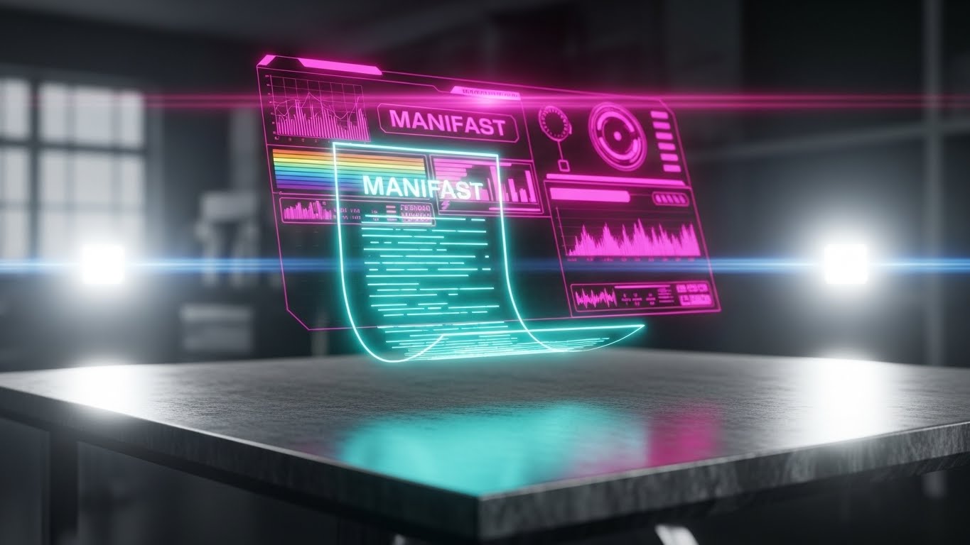
The Visual & Narrative Approach
This style is about the future. By projecting a glowing Cyan and Magenta holographic manifest over a brushed metal desk, we signal that this is Next-Gen technology. The "Iron Man" aesthetic implies speed, precision, and advanced intelligence. It suggests that by using this platform, the customer is future-proofing their operations against upcoming regulations and technology shifts. The data appears fluid and alive, unlike static paper.
Psychological Impact & KPI Focus
- Niche Psychology: It appeals to the user's desire to be on the cutting edge. It validates their decision to buy a premium tool rather than a legacy patch.
- Operational Impact: It accelerates Time to Value (TTV) perception, suggesting that the software works instantly and intelligently to digitize physical documents.
Strategic Implementation & Trade-offs
- Use Case: "What's New" feature announcements, Product Launch videos, and Advanced Module up-sells.
- Trade-off: Use sparingly. If the actual UI isn't this futuristic, it can create a gap between expectation and reality. Use it to sell the power of the engine, not the look of the buttons.
Companies using similar video content -
IBM Corporation – Future-proof AI/IoT for waste optimization.
Sensoneo – Futuristic data projection for smart waste.
20. Augmented Reality (AR) Site Overlay
Onboarding | Accelerating TTV
The Visual & Narrative Approach
This style closes the loop by showing the ultimate convergence of physical and digital. It visualizes Augmented Reality (AR), where the software identifies waste streams just by looking at them. The FPV perspective puts the viewer in the shoes of the "Super-Worker," equipped with x-ray vision for logistics. It represents the pinnacle of the "Physical/Digital Bridge," where the screen becomes a transparent layer of intelligence over the real world.
Psychological Impact & KPI Focus
- Niche Psychology: It inspires Pride and excitement. It positions the waste management role as a high-tech profession, helping with talent retention and recruitment.
- Operational Impact: It visualizes Error Reduction and Operational Velocity, showing how technology can eliminate manual identification errors entirely.
Strategic Implementation & Trade-offs
- Use Case: Keynote Vision presentations, "Future Roadmap" webinars, and retention-focused newsletters.
- Trade-off: It is aspirational. If the feature doesn't exist yet, it must be clearly labeled as "Vision" to avoid misleading current customers.
Companies using similar video content -
Sensoneo – Contextual intelligence for future field waste work.
Machinex – AI vision, AR for material recovery sorting.
21. 2D Animation & UI Composition
Onboarding | Reducing Implementation Friction

The Visual & Narrative Approach
Onboarding is where excitement often turns to frustration. This style combats that drop-off by visually simplifying the mundane task of data entry. Using a vibrant "Squash and Stretch" animation principle, we visualize the drag-and-drop action as a folder entering a swirling "cloud" portal and instantly transforming into a gold star. The vivid Purple and Yellow palette breaks the monotony of corporate software, injecting a dopamine hit into the learning process. It metaphorically suggests that the software handles the heavy lifting (the portal), turning raw input into immediate value (the star).
Psychological Impact & KPI Focus
- Niche Psychology: It lowers the barrier to entry. By making the interface feel tactile, responsive, and magical, it reduces the intimidation of learning a new system.
- Operational Impact: It directly targets Implementation Speed. If users enjoy the interaction, they complete training modules faster, accelerating the timeline to full deployment.
Strategic Implementation & Trade-offs
- Use Case: "First Login" tutorials, Data Import Wizards, and Empty State screens (when no data is present yet).
- Trade-off: It is playful. It works excellently for administrative onboarding but should be avoided for serious compliance warnings where gravitas is required.
Companies using similar video content -
Scrapp – Gamifying data migration, turning input into value.
Bin-e – Intuitive interactions for smart waste sorting.
22. Low-Poly 3D Modeling
Onboarding | Knowledge Base

The Visual & Narrative Approach
When a user is stuck, they are frustrated. They don't need complex visuals; they need clarity. This Minimalist Low-Poly style strips away all noise. The transformation of a simple green geometric question mark into a glowing yellow lightbulb is the universal symbol of "Resolution." The clean, shadowless lighting and soft pastel green background create a calming, clinical atmosphere, reassuring the user that the answer is simple, structured, and readily available.
Psychological Impact & KPI Focus
- Niche Psychology: It acts as a visual de-escalator. The soft, toy-like aesthetic counters the stress of an operational error or software blocker.
- Operational Impact: It enhances the Self-Serve Rate. By making help content look approachable and simple, you encourage users to fix issues themselves rather than opening a support ticket.
Strategic Implementation & Trade-offs
- Use Case: Help Center thumbnails, FAQ header images, and "Did You Know?" tooltips.
- Trade-off: The simplicity restricts detail. It is symbolic, not representational, so it cannot show specific UI buttons or complex machinery.
Companies using similar video content -
Bin-e – Instant illumination for accessible smart bin support.
GreenQ – Simple, clear support visuals for waste optimization.
23. Macro UI Micro-Interactions
Retention | Reducing Support Overhead

The Visual & Narrative Approach
This style zooms in—way in. By focusing on the extreme macro detail of a single toggle switch turning from gray to Electric Blue, we celebrate the power of a single click. The visible sub-pixel texture adds a layer of hyper-reality, emphasizing the quality of the software engineering. It visually communicates that the platform is responsive, decisive, and robust. The soft glow confirms the action is "live" and effective immediately.
Psychological Impact & KPI Focus
- Niche Psychology: It satisfies the need for control. For a Fleet Manager, turning a setting "On" is a command decision. This visual validates that authority.
- Operational Impact: It reduces Support Overhead by clarifying system states. Visualizing exactly what "Enabled" looks like removes ambiguity from configuration guides, preventing user error.
Strategic Implementation & Trade-offs
- Use Case: Feature Release emails (focusing on a single new setting) and patch note visuals.
- Trade-off: It lacks context. It shows what happens, but not why it matters. It must be accompanied by text explaining the function.
Companies using similar video content -
Geotab – Precision control for fleet tracking settings.
Samsara – Detailed micro-interactions for fleet management.
24. Abstract 2D Motion Graphics
Retention | Reducing Churn

The Visual & Narrative Approach
Churn happens when customers lose sight of value. This abstract style visualizes the invisible, ongoing value of the platform: connectivity. The organic lines flowing through the static grid represent the continuous optimization of waste streams. The gradient from Orange to Pink adds warmth and energy to the cool Navy Blue background (representing the stable infrastructure). It reminds the user that even when they aren't looking, the software is connecting dots and keeping their operations fluid.
Psychological Impact & KPI Focus
- Niche Psychology: It reinforces Reliability. The smooth, unbroken flow suggests a system that never sleeps and never breaks.
- Operational Impact: It supports Retention narratives by visualizing the "Network Effect"—showing that the more they use the platform, the more connected and efficient their ecosystem becomes.
Strategic Implementation & Trade-offs
- Use Case: In-App loading screens (to reduce perceived wait time) and Year-In-Review videos.
- Trade-off: It is purely decorative and atmospheric. It builds brand affinity but educates on zero features.
Companies using similar video content -
1NCE – Seamless IoT connectivity, visualizing continuous data flow.
Bridgera – Abstract data flow for smart waste systems.
25. Futuristic Neon/Dark Mode
Retention | Visitor Re-engagement

The Visual & Narrative Approach
This is the "Dark Mode" aesthetic designed to wake up a dormant user. It taps into the visual language of Cyberpunk and Sci-Fi Command Centers. The matte black background makes the Neon Green data lines and reticles pop aggressively. This isn't just a dashboard; it's a "Mission Control." It reframes the boring task of waste management as a high-tech, tactical operation, appealing to the user's inner "gamer" or tech enthusiast.
Psychological Impact & KPI Focus
- Niche Psychology: It triggers Novelty and excitement. It signals that the platform is evolving and becoming more advanced (even if the core features are the same).
- Operational Impact: It drives Re-engagement. The striking contrast acts as a pattern interrupt in retargeting ads, drawing inactive users back to see "what's new."
Strategic Implementation & Trade-offs
- Use Case: Retargeting display ads, "Dark Mode Available" announcements, and "Pro Feature" teasers.
- Trade-off: Legibility can be lower than light mode. Use it for hype and impressions, not for detailed reading or long-form tutorials.
Companies using similar video content -
Evreka – Command center aesthetics, re-engaging power users.
Route4Me – Futuristic dark mode for route optimization.
26. Generative AI Realistic Character Video
Retention | Proactive Support

The Visual & Narrative Approach
Sometimes, users just want to see a human face. This style uses high-fidelity Generative AI to create a "Customer Success Agent" avatar. The warm, natural lighting and direct eye contact simulate a 1:1 video call, fostering a sense of personal connection and empathy. Even though it is an AI representation, the "Human-in-the-Loop" aesthetic reassures the user that they are supported by real people, not just algorithms.
Psychological Impact & KPI Focus
- Niche Psychology: It combats the feeling of isolation in SaaS. It builds Trust and rapport, suggesting that the company is accessible and caring.
- Operational Impact: It enables Proactive Support. You can generate personalized "check-in" videos at scale without burning out your actual support team, reducing churn risk.
Strategic Implementation & Trade-offs
- Use Case: Automated "Check-in" emails, renewal reminders, and apology videos for service outages.
- Trade-off: The "Uncanny Valley" risk is real. The AI generation must be top-tier; if the lip-sync or eye movement is off, it feels creepy rather than helpful.
Companies using similar video content -
EcoHedge – Human connection for scalable environmental support.
Cority – Realistic character for EHS software support.
27. 3D Parallax UI Presentation
Expansion | Driving Deep Feature Adoption
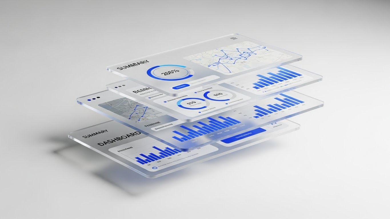
The Visual & Narrative Approach
To upsell, you must show that there is "more beneath the surface." This 3D Parallax style literally deconstructs the UI into layers. By floating the summary dashboard in front and revealing the complex analytics and maps on semi-transparent planes behind it, we visualize Depth. It implies that the user is currently only scratching the surface and that deeper, more valuable insights are waiting to be unlocked in the Enterprise tier.
Psychological Impact & KPI Focus
- Niche Psychology: It appeals to Curiosity and the desire for mastery. It suggests that the platform is a deep well of intelligence, justifying a higher price point.
- Operational Impact: It drives Feature Adoption by visually separating "Basic" (front layer) from "Advanced" (back layers), clarifying the value of upgrading.
Strategic Implementation & Trade-offs
- Use Case: "Enterprise Edition" landing pages, Upsell Webinars, and Module Comparison sheets.
- Trade-off: It is abstract. It doesn't show the workflow between the layers, only the existence of the layers.
Companies using similar video content -
SAP SE – Depth of functionality, unpacking enterprise software value.
Intelex – Layered presentation of compliance features.
28. Dark Mode UI Showcase
Expansion | Driving Upsell
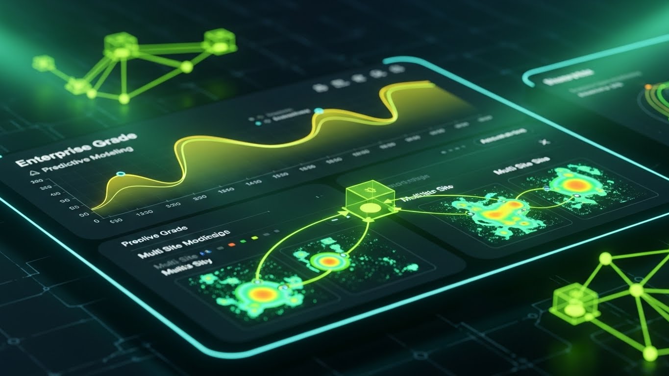
The Visual & Narrative Approach
This is the second "Dark Mode" style, but with a specific focus on Exclusivity. The palette shifts to deep Navy and Neon Cyan, signaling "Enterprise Grade" analytics. The complexity of the curves and heat maps displayed suggests high-level predictive modeling—features typically reserved for the top tier. It positions the Dark Mode interface not just as a color preference, but as the cockpit for the "Power User" who manages multi-site logistics.
Psychological Impact & KPI Focus
- Niche Psychology: It leverages Status. Dark mode is often associated with pro tools and developer environments. Using it makes the user feel like an expert.
- Operational Impact: It drives Upsell. By associating this premium look with advanced features (predictive modeling), you create a visual distinction between the "Standard" and "Pro" product.
Strategic Implementation & Trade-offs
- Use Case: Quarterly Business Reviews (QBRs) to show roadmap features and "Pro Tier" marketing emails.
- Trade-off: It can be intimidating to less technical users. Use targeted segmentation to ensure this only reaches power users/Admins.
Companies using similar video content -
Intelex – Premium aesthetics, exclusive intelligence for compliance.
TRUX Haul-IT – Dark mode for power users in waste logistics.
29. Aspirational Stock Montage
Expansion | Driving Referrals

The Visual & Narrative Approach
Referrals are driven by happy communities, not just software features. This style steps back from the UI to focus on the Result: a happy, cohesive team. The "Golden Hour" lighting and genuine laughter evoke a sense of victory and relief—the feeling of a job well done. The faint white network lines subtly suggest that this success is shared and connected. It asks the user: "Don't you want your peers to feel this good?"
Psychological Impact & KPI Focus
- Niche Psychology: It taps into Social Proof and professional pride. It validates that using this software puts you in a "winning club" of modern, efficient operators.
- Operational Impact: It increases Net Promoter Score (NPS) and referrals. It emotionalizes the B2B relationship, making the user feel good about sharing the solution with their network.
Strategic Implementation & Trade-offs
- Use Case: Referral Program landing pages, "Thank You" screens after a high NPS rating, and Community Newsletters.
- Trade-off: It is generic. Without the UI overlay or specific branding, it could be an ad for anything. It relies heavily on the accompanying copy.
Companies using similar video content -
Achilles – Community success, driving referrals for sustainable supply chains.
Innovando – Aspirational visuals for sustainable waste innovation.
30. Hyper-lapse Stock Footage with Data
Expansion | Competitive Comparison

The Visual & Narrative Approach
To beat the competition, you must prove you handle chaos better. This style juxtaposes the frantic, blurry motion of a hyper-lapse shipping yard (representing the industry/competitors) with the rock-steady, sharp clarity of your data graph in the foreground. It sends a powerful visual message: "The world is fast and chaotic; our platform is calm and controlled." It implies that while others are scrambling (motion blur), your users have perfect visibility.
Psychological Impact & KPI Focus
- Niche Psychology: It provides Cognitive Relief. The stable foreground anchors the viewer, subconsciously signaling that the software is a "Safe Harbor" in a storm.
- Operational Impact: It supports Competitive Displacement. It visually differentiates your modern, stable platform from laggy, reactive legacy systems.
Strategic Implementation & Trade-offs
- Use Case: Competitor Comparison pages ("Us vs. Them"), Trade Show booth background loops, and Hero Banners.
- Trade-off: Requires high-quality stock footage. If the background footage is low-res, the contrast fails.
Strategic Knowledge Base: The Visual Operations Doctrine
To bridge the gap between "looking good" and "working well," this section synthesizes the 30 styles into a cohesive business framework. This is not a summary; it is your implementation manual for a Visual Operating System.
Strategic Alignment & Visual Architecture
Pre-Production Strategy | The "Why" and "Who"
Before a single pixel is rendered, the visual strategy must be aligned with operational reality. A "pretty" dashboard that confuses a truck driver is a liability, not an asset.
- The Cognitive Load Audit: Before approving a visual style (like Style 10: Rapid UI), audit the complexity of the task it represents. High-risk tasks (Hazardous Waste Profiling) demand Style 15 (X-Ray) clarity, not motion-blur excitement.
- Role-Based Visual Mapping: Drivers on mobile devices need Style 1 (Minimalist Vector)—high contrast, big buttons, zero fluff. Fleet Managers on desktop need Style 9 (Isometric Workflow)—context, density, and "God-Mode" views. Do not use the same visual language for both.
- The "Glanceability" Standard: In logistics, attention is a scarce resource. Adhere to a "2-Second Rule" for all operational visuals. If the driver cannot understand the Style 20 (AR Overlay) warning in under 2 seconds, the visual has failed safety standards.
- Brand Voice Consistency: Your platform likely has multiple modules (Billing, Dispatch, Compliance). Use Style 8 (2D Line Art) as a unifying thread in icons and headers to ensure that jumping between modules feels like staying in the same room.
- The Advids Strategic Audit: This is where we start. We don't just make videos; we audit your user journeys to define this "Visual Operating System," ensuring that Style 26 (Gen AI) isn't used where Style 2 (Low Poly) would be more effective.
- Standardization vs. Customization: For generic workflows (Reset Password), use Style 18 (Clean UI) to save budget. For your core differentiator (e.g., Waste-to-Energy tracking), invest in bespoke Style 2 (Hybrid Isometric) to own the category.
- The Cross-Departmental Bridge: Sales sells "Vision" (Style 6: Abstract 3D), but Support supports "Reality" (Style 22: Low Poly). Ensure your visual asset library tags content by department so Sales doesn't promise a UI that Support can't deliver.
- Legacy System Integration: You will likely replace or integrate with old hardware. Use Style 5 (Mixed Media) to visually honor the legacy equipment (cardboard/metal textures) while overlaying the new digital value, reducing friction with veteran staff.
- Accessibility in Trucking: Your user base is diverse. Visuals like Style 4 (Kinetic Typography) must rely on shape and color (Safety Orange), not just text, to communicate warnings to non-native speakers.
- The Mobile-First Mandate: 60% of your users are not at a desk. Every style from 1-30 must be vetted for legibility on a 5-inch cracked smartphone screen. If Style 25 (Neon Dark Mode) is unreadable in sunlight, it gets cut.
Operational Adoption & Implementation
The Deployment Phase | Embedding Visuals into Workflow
The best software fails if users refuse to adopt it. Visuals are your primary change management tool to reduce resistance and accelerate competency.
- Overcoming "Big Brother" Anxiety: Drivers often view tracking with skepticism. Use Style 14 (2D Character) and Style 12 (Lifestyle Overlay) to frame tracking as "Safety" and "Protection," not surveillance. Show the driver being helped, not watched.
- The Micro-Learning Shift: Nobody reads the manual. Replace 50-page PDFs with 30-second clips using Style 21 (2D Animation) for quick "How-To" wins. Embed these directly into the app.
- Just-in-Time Support: Context is King. When a user hovers over a complex compliance field, trigger a Style 22 (Low Poly) tooltip video. Solve the problem in situ, preventing a support ticket.
- Gamification of Training: Use Style 13 (Dynamic Data Viz) to show drivers their "Safety Score" or "Efficiency Rating" as a growing bar chart. Visual progress bars trigger the psychological desire to "complete the level."
- Reducing Support Ticket Volume: There is a direct correlation between the quality of your Style 23 (Macro UI) videos and the volume of "How do I...?" tickets. Invest here to lower OpEx.
- Remote Onboarding: You cannot fly trainers to every site. Use Style 9 (Isometric 3D) and screencasts to create a virtual "Ride-Along" experience, training distributed fleets consistently at scale.
- Standard Operating Procedures (SOPs): Text SOPs are ignored. Convert critical safety SOPs into Style 15 (X-Ray) visualizations. Seeing the chemical reaction is far more memorable than reading about it.
- Feedback Loops: Use interactive video elements (Style 23) to ask "Was this helpful?" immediately after a tutorial. Use this data to iterate on your visual strategy.
- Scalable Localization: Operations are global. Style 1 (Minimalist Vector) and Style 3 (Abstract Glossy) are culturally neutral and require no text translation, making them perfect for global rollouts.
- Leadership Communication: When explaining fleet strategy to the Board, drop the operational grit. Use Style 17 (Live Action Overlay) to project the "Profit + Planet" hologram, speaking the language of the C-Suite.
Measuring Impact & Future-Proofing
The ROI Phase | Measuring Success & Looking Ahead
Visuals are not decoration; they are infrastructure. You must measure their performance and prepare them for the AI-driven future of waste management.
- Beyond "Views": Do not measure video success by "Views." Measure it by "Time-to-Competency" (how fast a new hire works alone) and "Feature Adoption Rate" (did the Style 27 video increase clicks on the Pro feature?).
- The "Idle Time" Metric: In logistics, time is money. Correlate better visualization (Style 20: AR Overlay) with reduced "Truck Idle Time" at weighbridges. If the driver identifies the waste faster, the truck moves faster.
- Compliance Velocity: When a new regulation (e.g., ELD mandate) hits, how fast can you update the fleet? Video updates via Style 4 (Bold Kinetic) propagate faster than memos. Measure the speed of compliance adoption.
- Retention and Churn: Good UX is sticky. Use Style 24 (Abstract Motion) to create a calming, high-end feel during loading times. Measure the correlation between UX sentiment and renewal rates (LTV).
- The AI Visual Frontier: Prepare for Generative UI. Soon, the dashboard will build itself based on user needs. Your visual assets must be modular (Style 7: Wireframe) to adapt to real-time data overlays.
- Scalability of Assets: Build a library, not a landfill. Ensure your Style 11 (Photorealistic 3D) assets are built on reusable models so you can easily swap out a chemical drum for a recycling bin without re-shooting.
- The Advids Partnership: This is where we ensure longevity. We act as the curator of your visual library, ensuring that as your software evolves (v2.0, v3.0), your visual assets (Style 25: Dark Mode) evolve with it, maintaining brand integrity.
- Benchmarking Success: "Good enough" visuals are a competitive risk. If your competitor uses Style 30 (Hyper-lapse) to show speed and you use static screenshots, you lose the perception war. Regularly benchmark your visual standard against the market leaders.
- The ROI of Safety: Accidents cost millions. Quantify the reduction in insurance premiums and accident rates achieved by using high-clarity Style 15 (X-Ray) safety training. This is your strongest ROI argument.
- Final Call to Innovation: Treat video as Visual Infrastructure. It is the fiber-optic cable that carries understanding from your code to your customer's brain. Invest in it, optimize it, and it will become your most powerful operational asset.
Companies using similar video content -
Track-POD – Stability in chaos, efficiency advantage in logistics.
Eagle Eye Tracking – Hyper-lapse data for fleet efficiency.
Author & Editor Bio


