
Introduction: Visualizing the Digital Pulse of Modern Logistics
The inland dry port is no longer just a physical junction of rail, road, and storage; it is a sophisticated data node where every container move triggers a cascade of digital events. For Operations Directors and Logistics Managers, the challenge has shifted from simply managing throughput to orchestrating the invisible synchronization between heavy machinery and the Terminal Operating System (TOS). This is the "Digital Twin Gap"—the disconnect between the gritty reality of the yard and the pristine logic of the software that controls it.
The industry is rapidly pivoting to address this. The global inland terminal operations market reached a valuation of USD 36.2 billion in 2024, signaling a massive scale of physical assets that now require intelligent orchestration. However, the software alone is not the differentiator; adoption is. The true hurdle lies in convincing stakeholders that a new API integration or automated gate system will genuinely reduce Turnaround Time (TAT) rather than adding administrative friction.
This is where strategic visualization becomes a critical Go-To-Market lever. A standard screen recording of a dashboard fails to capture the operational impact of reach stacker optimization. To truly shape brand perception and drive adoption, we must visualize the outcome of the technology, not just the interface.
With the Digital Twin in logistics market reaching USD 6.5 billion in 2024, the opportunity for SaaS platforms to claim market share is immense. But to win, your visual communication must be as precise as your engineering. This guide presents a curated framework of visualization styles designed to bridge the physical/digital divide, reducing cognitive load for your buyers and demonstrating exactly how your platform turns chaotic data into streamlined logistics.
1. Isometric 2D Motion Design
TOFU | Brand Awareness

The Visual & Narrative Approach
This style employs a "God’s Eye View" to demystify the complexity of terminal layout and traffic flow. The scenario depicts a pristine, isometric dry port where the chaos of a real yard is distilled into a rhythmic, clockwork loop. Stylized drayage trucks enter through automated gates, and containers are transferred to rail spurs with seamless precision. The palette of Vivid Cyan and Bright Tangerine against a clean white background strips away the grime of the yard, focusing entirely on the logic of the operation.
Psychological Impact & KPI Focus
For the Operational Visionary, this style validates the aspiration of "perfect order." It addresses the anxiety of bottlenecks by visually proving that the software creates a predictable, manageable ecosystem. The visual removal of perspective distortion implies honesty and technical accuracy, directly appealing to engineers and planners who value logic over fluff.
- Core KPI: Yard Density Optimization and Traffic Flow Efficiency.
Strategic Implementation & Trade-offs
- Best Use Case: LinkedIn Organic feeds where sound-off clarity is essential. Perfect for demonstrating "Pattern of Life" analyses or new yard planning modules.
- Trade-off: While excellent for showing flow, it lacks the emotional weight of cinematic styles. It is cerebral, not visceral.
- Duration: 15-20 Seconds (Loopable).
Companies using similar video content -
Navis – N4 Terminal Operating System – Orchestrating terminal layout and traffic flow.
Tideworks Technology – Mainsail 10 – Optimizing yard density and operational efficiency.
2. Abstract 2D Flat Vector Organic Modern Motion Graphics
TOFU | Category Creation
The Visual & Narrative Approach
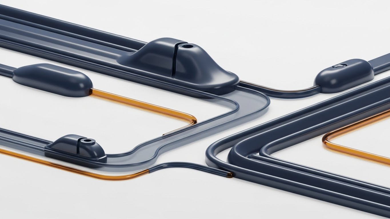
Here, we abstract the logistics process into its purest form: the flow of information. The image utilizes fluid, glossy shapes in Deep Indigo and Glossy Amber to represent data streams connecting abstract nodes. Instead of showing physical trucks, we show the intelligence moving between them—the API calls, the EDI status updates, and the handshakes between systems. The motion is liquid and continuous, suggesting an unbreakable chain of custody.
Psychological Impact & KPI Focus
This style targets "Category Creation" by elevating the conversation above hardware. It comforts the CTO who fears data silos by visually connecting disparate elements (rail, truck, gate) into a single, cohesive organism. It reduces cognitive load by removing the distraction of physical machinery, focusing purely on connectivity and integration.
- Core KPI: System Uptime and API Connectivity Speed.
Strategic Implementation & Trade-offs
- Best Use Case: Website Headers and high-level brand positioning. It signals "Modern Tech Company" rather than "Industrial Hardware Supplier."
- Trade-off: It is too abstract for explaining specific operational features. It establishes a "vibe" of intelligence but doesn't demonstrate utility.
- Duration: 10-15 Seconds.
Companies using similar video content -
FourKites – Real-Time Visibility Platform – Visualizing data streams and supply chain connectivity.
Project44 – Movement by project44 – Connecting disparate logistics data elements seamlessly.
3. 2D Line Art Animation
TOFU | Market Education

The Visual & Narrative Approach
This aesthetic borrows the visual language of CAD drawings and engineering blueprints. Against a Deep Indigo background, precise Neon Lime and Bright White lines trace the mechanical ghost of a reach stacker. The animation focuses on the mechanics of the lift and the data nodes that glow at articulation points. It feels sophisticated, minimalist, and deeply technical, conveying that the software is built with the same precision as the machinery it controls.
Psychological Impact & KPI Focus
This style builds massive credibility with technical buyers. It says, "We understand the engineering behind the operation." By stripping away textures, it forces the viewer to focus on the mechanics of the intermodal transfer. It implies safety, accuracy, and a deep understanding of the physical constraints of the yard.
- Core KPI: Handling Precision and Equipment Utilization Rates.
Strategic Implementation & Trade-offs
- Best Use Case: YouTube Explainer videos where you need to break down complex algorithms or "black box" technologies without overwhelming the viewer.
- Trade-off: It can feel cold or overly clinical. It is best used for technical deep dives rather than emotional brand building.
- Duration: 45-60 Seconds.
Companies using similar video content -
Konecranes – TOS Solutions – Detailing mechanics of intermodal transfer precision.
Kalmar (Cargotec) – SmartPort Solutions – Conveying engineering rigor in equipment handling.
4. Low-Poly 3D Modeling
TOFU | Shaping Brand Perception

The Visual & Narrative Approach
Low-poly art transforms the heavy, industrial nature of logistics into a modern, digital art form. The scene depicts a busy logistics hub, but the trucks and trains are rendered as faceted, geometric shapes in Soft Grey on an Electric Violet ground. The dynamic lighting casts sharp shadows, emphasizing the "facets" of the operation. It captures the hustle of a terminal but freezes it in a clean, manageable aesthetic.
Psychological Impact & KPI Focus
This style is about "Shaping Brand Perception." It makes the terminal operations look futuristic and agile. It appeals to the younger demographic of logistics managers who are digital natives. It suggests that the platform is transforming heavy, legacy operations into something lightweight and modern.
- Core KPI: Modernization Index and User Adoption Rates.
Strategic Implementation & Trade-offs
- Best Use Case: Instagram and social feeds where stopping the scroll is the priority. The vibrant violet floor stands out against the usual grey/blue of logistics content.
- Trade-off: The simplified geometry may not be suitable for showing specific hardware compatibility or detailed safety protocols.
- Duration: 15-30 Seconds.
Companies using similar video content -
ZPMC – Smart Terminal Solutions – Modernizing heavy industrial operations digitally.
Identec Solutions – Container Tracking – Shaping perception of agile terminal management.
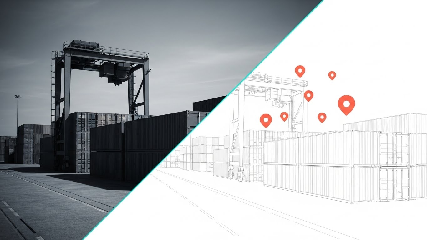
5. Split Screen: Optimized Reality and UI
TOFU | Product Differentiation
The Visual & Narrative Approach
This is the most direct visualization of the "Digital Twin" concept. The screen is sliced diagonally. One side shows the gritty reality of a container yard (desaturated, photographic). The other side shows the exact same geometry but wireframed in Bright Coral and White, with floating data points. As the camera moves, the dividing line sweeps across, revealing the digital intelligence "hidden" within the physical stack.
Psychological Impact & KPI Focus
This style directly addresses the skepticism regarding ROI. It visually proves the connection between the software (the vector side) and the real world (the photo side). It anchors the abstract software concepts in physical reality, making the value proposition tangible. It answers the question, "How does this code move that box?"
- Core KPI: Inventory Accuracy and Real-time Visibility.
Strategic Implementation & Trade-offs
- Best Use Case: Landing Pages and Product Demos. It is the definitive visual for "Digital Twin" technology.
- Trade-off: Requires high-quality footage of the client's actual operations to match with the motion graphics, which can be production-intensive.
- Duration: 30-45 Seconds.
Companies using similar video content -
Siemens Digital Industries – Digital Twin for Logistics – Bridging physical reality and data insights.
PTC – ThingWorx Digital Twin – Demonstrating software connection to real-world assets.
6. Bold Kinetic Typography (Visual)
TOFU | Vertical Social Organic

The Visual & Narrative Approach
This style eschews traditional imagery for the raw power of motion. Massive, blocky geometric shapes in Stark White and Safety Orange collide and stack like shipping containers. The motion is heavy and impactful, with motion blur indicating speed. The aesthetic is brutalist yet clean, symbolizing the robust nature of terminal operations.
Psychological Impact & KPI Focus
This appeals to the visceral nature of logistics. It captures the energy and noise of a port without the mess. It creates a sense of urgency and momentum, perfect for disrupting the usually slow-paced B2B feed. It symbolizes the robustness of the system—software that is "built tough" for the industry.
- Core KPI: Throughput Velocity and System Robustness.
Strategic Implementation & Trade-offs
- Best Use Case: TikTok and Reels (Vertical 9:16). It is designed for mobile-first consumption where audio might be off, relying on visual impact.
- Trade-off: It conveys "Energy" and "Brand" but explains zero features. Strictly a top-of-funnel attention grabber.
- Duration: 9-15 Seconds.
Companies using similar video content -
Transporeon – Real-Time Visibility – Visualizing throughput velocity and system robustness.
Shippeo – Real-Time Transportation Visibility – Capturing energy and momentum of freight.
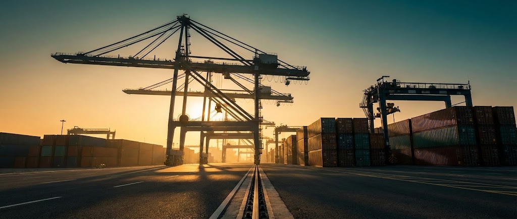
8. Generative AI Cinematic Video
TOFU | Establishing Thought Leadership
The Visual & Narrative Approach
This style aims for the "Hero Shot." A wide, heroic low-angle shot of a modern inland terminal at sunrise. The lighting is dramatic "Golden Hour" amber, casting long silhouettes of gantry cranes against a cinematic Teal sky. The asphalt is unrealistically clean, and the containers are perfectly stacked. It invokes a sense of awe and industrial beauty, elevating the mundane yard into a cathedral of commerce.
Psychological Impact & KPI Focus
This creates "Thought Leadership." It positions the brand not just as a software vendor, but as a visionary leader in the global supply chain. It appeals to the emotional pride of the target persona—reminding them of the grandeur and importance of their industry.
- Core KPI: Brand Sentiment and Long-term Vision Alignment.
Strategic Implementation & Trade-offs
- Best Use Case: YouTube Brand channels and Keynote openers. It sets the emotional tone before the technical sales pitch begins.
- Trade-off: It is aspirational, not documentary. Skeptical buyers may view it as "marketing fluff" if not quickly followed by substantial technical content.
- Duration: 30-60 Seconds.
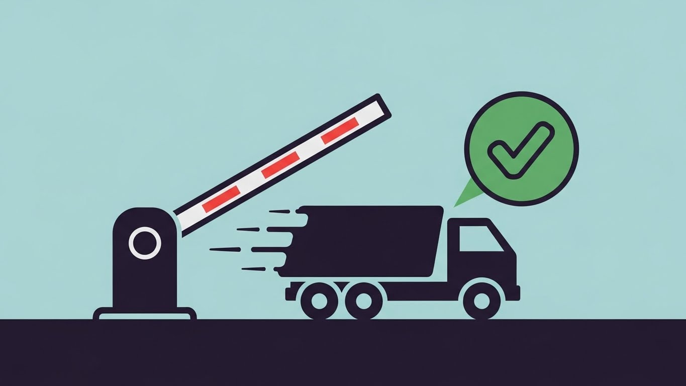
9. Minimalist Flat 2D Vector
MOFU | ABM Awareness
The Visual & Narrative Approach
As we move to the Middle of the Funnel, the goal shifts to explaining specific benefits quickly. This style uses flat, icon-based illustrations in Pastel Blue and Deep Charcoal. A gate barrier lifts, a truck zips through, and a bright Green checkmark appears. There are no distracting textures or shadows. It is the visual equivalent of a "Fast Pass."
Psychological Impact & KPI Focus
This reduces the "fear of complexity." Implementation of new gate systems is often feared for the disruption it causes. This style promises frictionless, instant adoption. It visually asserts that the software works "like magic" in the background, reinforcing the binary success of a cleared gate transaction.
- Core KPI: Gate Turn Time and Driver Processing Speed.
Strategic Implementation & Trade-offs
- Best Use Case: LinkedIn Ads and Retargeting. The simple visuals work well on small mobile screens.
- Trade-off: It lacks the "Enterprise" feel of 3D styles. It is tactical, not strategic. Best for communicating simple, high-value benefits.
- Duration: 6-10 Seconds.
Companies using similar video content -
NVIDIA – Omniverse for Logistics – Establishing thought leadership in advanced visualization.
Dassault Systèmes – 3DEXPERIENCE Platform – Visionary leadership in global supply chain.
10. Isometric 3D Workflow
MOFU | Feature Education
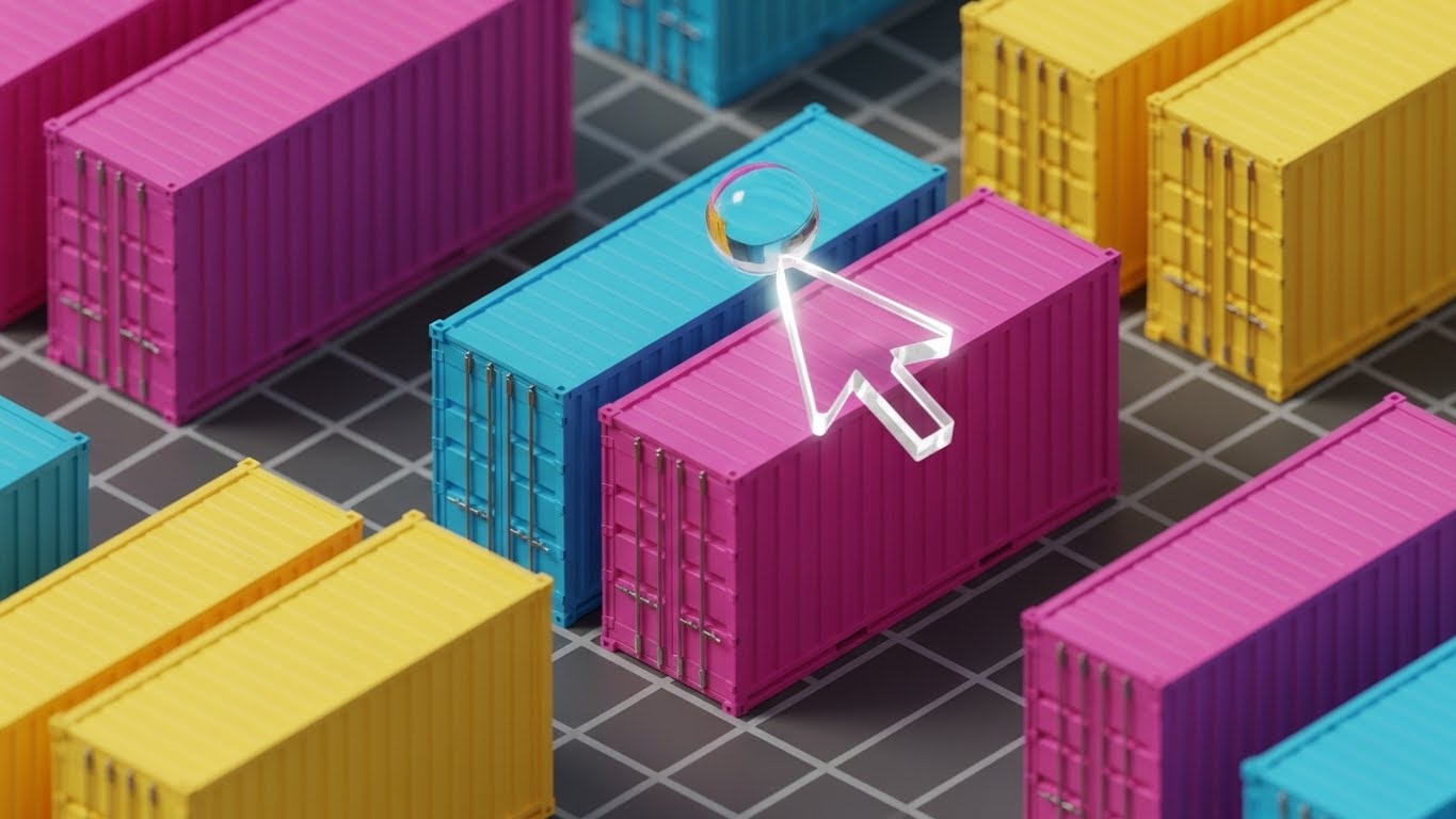
The Visual & Narrative Approach
This style renders the container yard as a high-fidelity, "gamified" miniature world. The containers look like matte plastic toys in Vivid Magenta, Cyan, and Yellow. A transparent "glass" cursor interacts with them, highlighting it with a glow. The lighting is soft studio lighting. It suggests that managing a complex terminal is as intuitive as playing a simulation game.
Psychological Impact & KPI Focus
This directly addresses "User Experience" (UX) anxiety. Legacy TOS interfaces are notoriously clunky. This visual promises a modern, drag-and-drop experience. It empowers the user, suggesting control and ease of use. It makes the job of a yard planner look satisfying and organized.
- Core KPI: User Onboarding Time and Operational Error Reduction.
Strategic Implementation & Trade-offs
- Best Use Case: Website Feature Pages and Product Tours. It bridges the gap between the physical yard and the software interface.
- Trade-off: It requires high-quality 3D assets and animation time, making it more expensive to produce than 2D screen recordings.
- Duration: 45-90 Seconds.
Companies using similar video content -
Camco Technologies – Gate Automation – Visualizing frictionless entry and speed.
Visy Oy – Gate Operating System – Communicating simple, high-value gate benefits.
11. Wireframe to Reality Transition**
MOFU | Feature Education
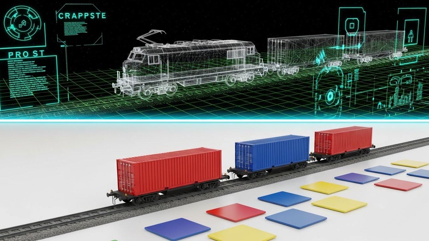
The Visual & Narrative Approach
This style creates a mesmerizing bridge between the physical and digital worlds. The screen is split or transitions horizontally: one side reveals the "Ghost" of the operation—a translucent white wireframe on a green grid showing the structural data of a rail spur. As the scan line passes, it resolves into a solid, realistic 3D render of the train loaded with Red and Blue containers. It visually narrates the process of "ingesting" physical assets into the Terminal Operating System (TOS).
Psychological Impact & KPI Focus
For the Rail Logistics Manager, this visualizes "Integration." It alleviates the fear that physical assets will get "lost" in the system. By showing the wireframe structure underlying the realistic train, we subtly communicate that the software understands the physics of the rail load plan—weight distribution, spur length, and coupling sequence—not just the administrative data.
- Core KPI: Rail Load Factor and Data Accuracy.
Strategic Implementation & Trade-offs
- Best Use Case: LinkedIn Carousels and Feature Pages focusing on Rail/Intermodal modules. It works perfectly as a loop to stop the scroll.
- Trade-off: It is highly stylized. It focuses on the concept of digitization rather than the specific user interface of the rail planning module.
- Duration: 15-20 Seconds (Loopable).
Companies using similar video content -
Manhattan Associates – Yard Management – Gamified logic for user control and planning.
Blue Yonder – Luminate Logistics – Visualizing intuitive terminal management experience.
12. Dynamic Data Visualization
MOFU | Feature Education

The Visual & Narrative Approach
Here, we strip away the machinery entirely to focus on the "Pulse" of the terminal. Rising from a dark, Deep Navy foundation are glowing, translucent glass bars and pie charts in "Data Blue" and Neon Cyan. These aren't static reports; they are alive. Particles of light flow between the charts, symbolizing the real-time connectivity between gate, yard, and billing data. The composition is symmetrical and stable, suggesting a "Single Source of Truth."
Psychological Impact & KPI Focus
This targets the CFO and CIO. It creates a sense of "Financial Visibility." The clean, glowing aesthetics imply that the data is pure, accurate, and untainted by manual entry errors. It transforms the messy complexity of terminal throughput into a serene, manageable dashboard of intelligence.
- Core KPI: Reporting Accuracy and Real-time Decision Latency.
Strategic Implementation & Trade-offs
- Best Use Case: Webinar Backgrounds and Investor Decks. It provides a sophisticated backdrop that implies high-tech capability without distracting from the speaker.
- Trade-off: It is symbolic. It doesn't show the actual "Report Builder" UI, so it sells the value of the data, not the tool itself.
- Duration: 30-45 Seconds (Ambient Loop).
Companies using similar video content -
Wabtec (GE Transportation) – RailConnect – Visualizing asset digitization for rail logistics.
Railinc – Rail Management System – Showing integration of physical rail assets into TOS.
13. Aspirational Stock Montage
MOFU | Building Trust

The Visual & Narrative Approach
In a sea of digital avatars and wireframes, this style reintroduces humanity. We use high-key, sunlit photography featuring a diverse group of logistics professionals in safety vests and hard hats. They stand confidently in a clean container yard, looking toward the horizon. A subtle, thin white geometric network overlay connects them, suggesting that while people run the terminal, the software empowers their connection. The lighting is soft, warm, and optimistic.
Psychological Impact & KPI Focus
This builds "Trust." Technology implementation is often feared as a replacement for people. This visual narrative asserts that the platform supports the workforce rather than replacing it. It appeals to the Director of Operations who values their team and wants to empower them with better tools, not obsolete them.
- Core KPI: Employee Satisfaction and Change Management Success.
Strategic Implementation & Trade-offs
- Best Use Case: Email Headers and "About Us" pages. It warms up the brand image in cold outreach sequences.
- Trade-off: It can feel generic if the "Network Overlay" isn't branded correctly. It risks looking like a standard stock photo without the subtle tech integration.
- Duration: Static Image.
Companies using similar video content -
Qlik – Sense for Logistics – Visualizing real-time intelligence and financial visibility.
Tableau – Logistics Dashboards – Presenting living metrics for informed decision-making.
14. Rapid UI Feature Montage
MOFU | Driving Demo Requests
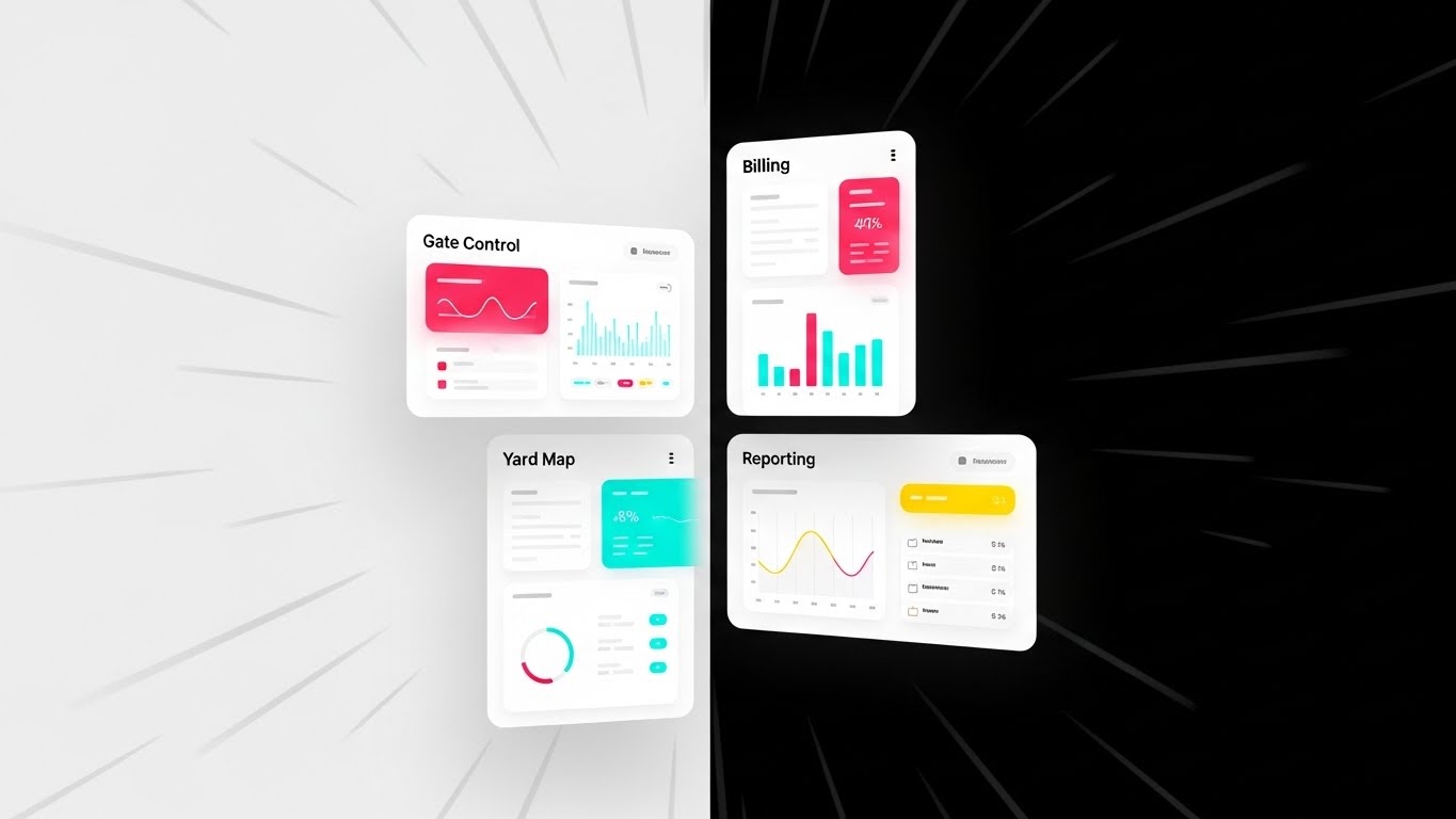
The Visual & Narrative Approach
This style is designed for speed. A dynamic grid of floating UI screens—representing Gate Control, Billing, Yard Maps, and Reporting—is angled aggressively towards a central vanishing point. Speed lines and high-contrast color blocks (Vivid Red, Cyan, Yellow) radiate energy. The composition implies that these disparate modules are hurtling forward together, offering a comprehensive, fast-paced ecosystem of control.
Psychological Impact & KPI Focus
This triggers "FOMO" (Fear Of Missing Out) and visualizes "Velocity." It combats the perception that Enterprise SaaS is slow or clunky. By showing multiple high-fidelity screens simultaneously, it creates an impression of a robust, all-encompassing platform that moves as fast as the physical operation.
- Core KPI: Feature Adoption Rate and Platform Stickiness.
Strategic Implementation & Trade-offs
- Best Use Case: Instagram Stories and Retargeting Ads (Vertical 9:16). It is designed to overwhelm the viewer with value in a split second.
- Trade-off: The screens are too fast to read in detail. It sells the "Breadth" of the platform, not the specific "Depth" of any single feature.
- Duration: 6-10 Seconds.
Companies using similar video content -
E2open – Global Trade Management – Building trust and partnership in supply chain.
Descartes Systems Group – Logistics Technology – Reintroducing humanity and team empowerment.
15. 2D Graphics Over Live Action
MOFU | ROI Justification

The Visual & Narrative Approach
This style grounds the abstract concept of "ROI" in the physical reality of the yard. A high-quality photo shows a Yard Manager using a tablet. Exploding from the screen are vibrant 2D flat vector graphics: upward-trending green arrows, currency signs, and "+" symbols. The sharp contrast between the realistic photography and the bright, flat vector elements emphasizes that the software adds a layer of value to the physical work.
Psychological Impact & KPI Focus
This validates the "Business Case." It visually answers the question: "What do I get for this investment?" By literally showing money and growth metrics springing from the device, it links the daily task of the yard manager directly to the financial success of the terminal.
- Core KPI: Return on Investment (ROI) and Revenue per TEU.
Strategic Implementation & Trade-offs
- Best Use Case: Case Study PDFs and Whitepaper covers. It serves as a visual hook for heavy, text-based ROI analyses.
- Trade-off: It is a metaphor. It requires supporting text to explain how that money is generated (e.g., via faster gate moves or better stacking).
- Duration: Static Image.
Companies using similar video content -
Oracle Transportation Management (OTM) – Cloud – Visualizing comprehensive control and ecosystem speed.
SAP Logistics Business Network – LBN – Showing breadth of platform features rapidly.
16. 3D X-Ray Visualization
BOFU | Risk Mitigation

The Visual & Narrative Approach
To visualize the invisible fortress of security and reliability, we utilize a "Superman Vision" aesthetic. The subject—a critical engine or infrastructure component—is rendered with a transparent glass casing. Inside, glowing blue and orange internal components and data streams pulse with activity. The visualization highlights specific nodes in "Alert Orange," demonstrating the software's ability to detect internal stress points or faults before they cause a breakdown.
Psychological Impact & KPI Focus
This mitigates "Risk" and "Downtime Anxiety." For the Maintenance Director and CTO, the biggest fear is a hidden failure. This style visually demonstrates that the system provides deep, X-ray level visibility into the health of the operation. It turns the abstract concept of "Predictive Maintenance" and "System Health" into a tangible, observable mechanism.
- Core KPI: Asset Uptime and Mean Time Between Failures (MTBF).
Strategic Implementation & Trade-offs
- Best Use Case: Security/Reliability sections of the website and Technical Documentation. It builds confidence in the platform's architectural depth.
- Trade-off: It is highly technical. It appeals to engineering and IT buyers but may be overkill for generalist audiences.
- Duration: 15-30 Seconds (Loopable).
Companies using similar video content -
Infor EAM – Asset Management – Visualizing immediate ROI for maintenance operations.
IBM Maximo – Application Suite – Grounding ROI in physical reality of asset management.
17. Photorealistic 3D Renders
BOFU | Reducing Friction
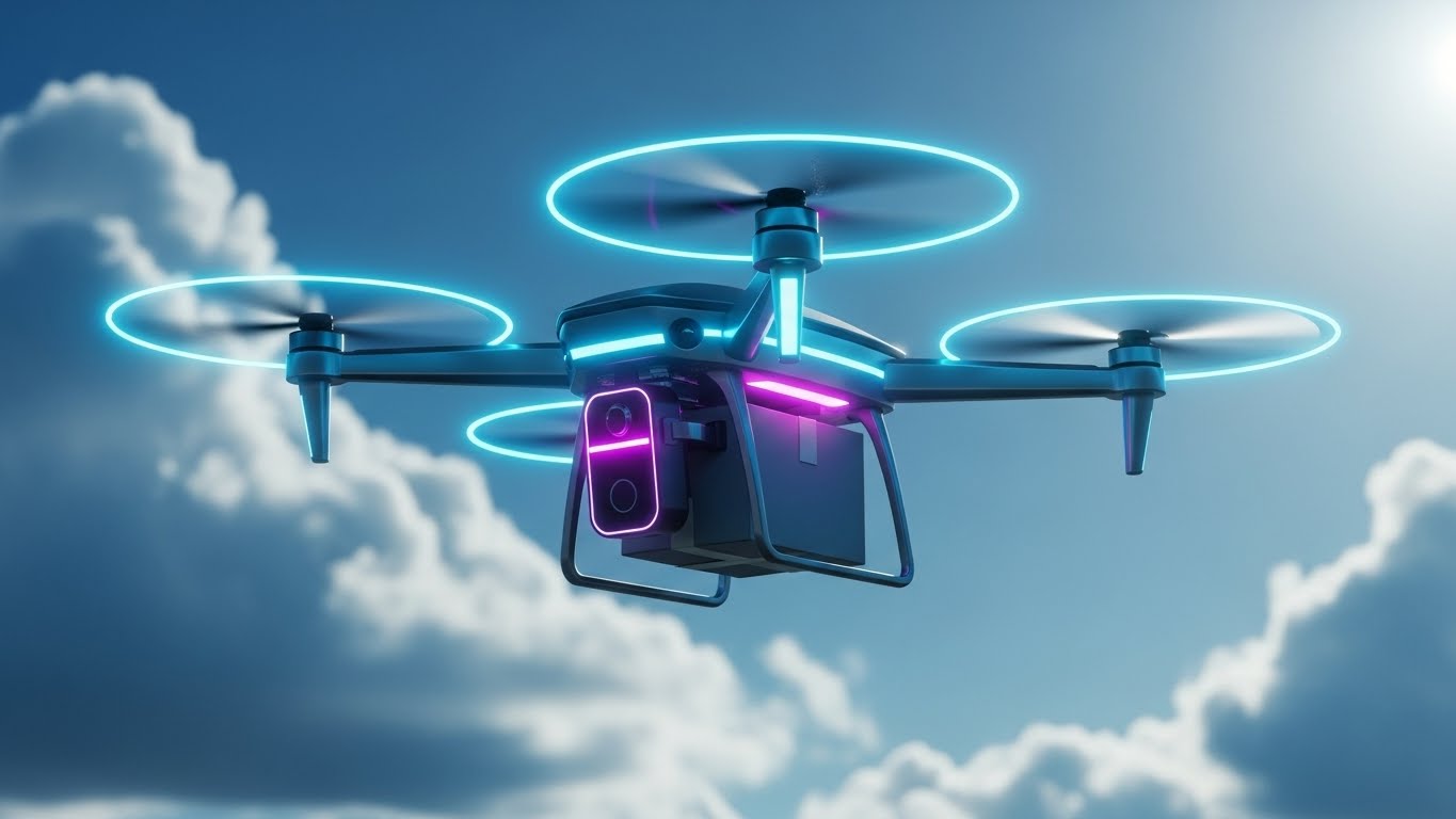
The Visual & Narrative Approach
At the Bottom of the Funnel, the buyer wants to see the future of their operation. This style uses hyper-realistic 3D rendering to showcase a "Frictionless" scenario. A delivery drone, sleek and equipped with neon accents, hovers mid-flight against a perfect blue sky, carrying a package. The lighting is bright and optimistic. It represents the ultimate goal of the software: to elevate operations above the gridlock of the yard, achieving automated, error-free transfer.
Psychological Impact & KPI Focus
This reduces "Friction." It appeals to the desire for innovation and perfection. By visualizing an autonomous, airborne asset, we subliminally suggest that the software removes the "drag" of manual labor and traffic, resulting in a smooth, futuristic operation. It moves the brand perception from "Legacy Industrial" to "Future Logistics."
- Core KPI: Innovation Index and Last-Mile Efficiency.
Strategic Implementation & Trade-offs
- Best Use Case: Vision Brochures and Trade Show Booths. High-resolution realism signals high-quality product engineering.
- Trade-off: It is aspirational. If the client's current reality is manual paper processes, this image serves as a "North Star" rather than a depiction of Day 1.
- Duration: Static Image.
Companies using similar video content -
Uptake – Fleet & Asset Performance – Visualizing predictive reliability and system health.
Senseye (now Siemens) – Predictive Maintenance – Demonstrating deep visibility into asset health.
18. Hyper-lapse Stock Footage with Data
BOFU | Economic Buyer Focus
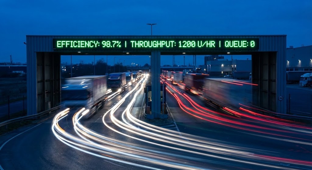
The Visual & Narrative Approach
This style fuses the kinetic energy of the gate with the precision of data. We see a long-exposure hyper-lapse of trucks streamlining through a terminal gate, rendered as streaks of Red and White light against a Twilight Blue sky. Floating crisply above the gate is a static, digital counter displaying "Efficiency: 98.7%" and "Queue: 0". The contrast between the blurred, fast-moving trucks and the sharp, stable data proves that the system controls the speed.
Psychological Impact & KPI Focus
This targets the "Economic Buyer" focused on throughput. It visually proves that "Speed = Data." The light trails evoke a sense of continuous, unblocked flow—the Holy Grail of terminal operations. The specific metrics in the overlay anchor the visual in hard KPIs, validating the investment.
- Core KPI: Gate Throughput and Queue Wait Times.
Strategic Implementation & Trade-offs
- Best Use Case: LinkedIn Video Ads and Case Study headers. It captures attention immediately through motion contrast.
- Trade-off: Requires stock footage that matches the client's specific gate configuration, or custom shooting which increases cost.
- Duration: 15-30 Seconds.
Companies using similar video content -
AnyLogic – Simulation Software – Showcasing frictionless scale and future operations.
Cosmo Tech – Simulation Digital Twin – Visualizing autonomous, error-free transfers.
19. Realistic Character Video
BOFU | Functional Buyer Focus

The Visual & Narrative Approach
Trust is ultimately human. This style places a realistic "Peer" front and center. A professional female Yard Planner stands in a glass-walled control tower, bathed in professional studio lighting with a rim light. The busy terminal blurs in the background. She looks directly at the viewer with a calm, confident expression. This isn't a model; she represents the competent, empowered user of your software.
Psychological Impact & KPI Focus
This creates "Peer Validation." The Functional Buyer (the person who will actually use the software) needs to see themselves in the marketing. This image says, "People like you succeed with this tool." It humanizes the B2B transaction and builds a subconscious emotional connection.
- Core KPI: User Adoption and Net Promoter Score (NPS).
Strategic Implementation & Trade-offs
- Best Use Case: Website Testimonial Sections and "Meet the Team" videos. It anchors the abstract software in human competence.
- Trade-off: The casting is critical. The actor must look like a genuine industry professional, not a generic corporate model.
- Duration: 60-90 Seconds (Scripted Testimonial).
Companies using similar video content -
C3 Solutions – Yard Management System – Visualizing gate efficiency and measured velocity.
PINC Solutions – YMS & RTLS – Proving speed with data overlay for gate throughput.
20. Clean UI Workflow (Light Mode)
Onboarding | Trial Activation
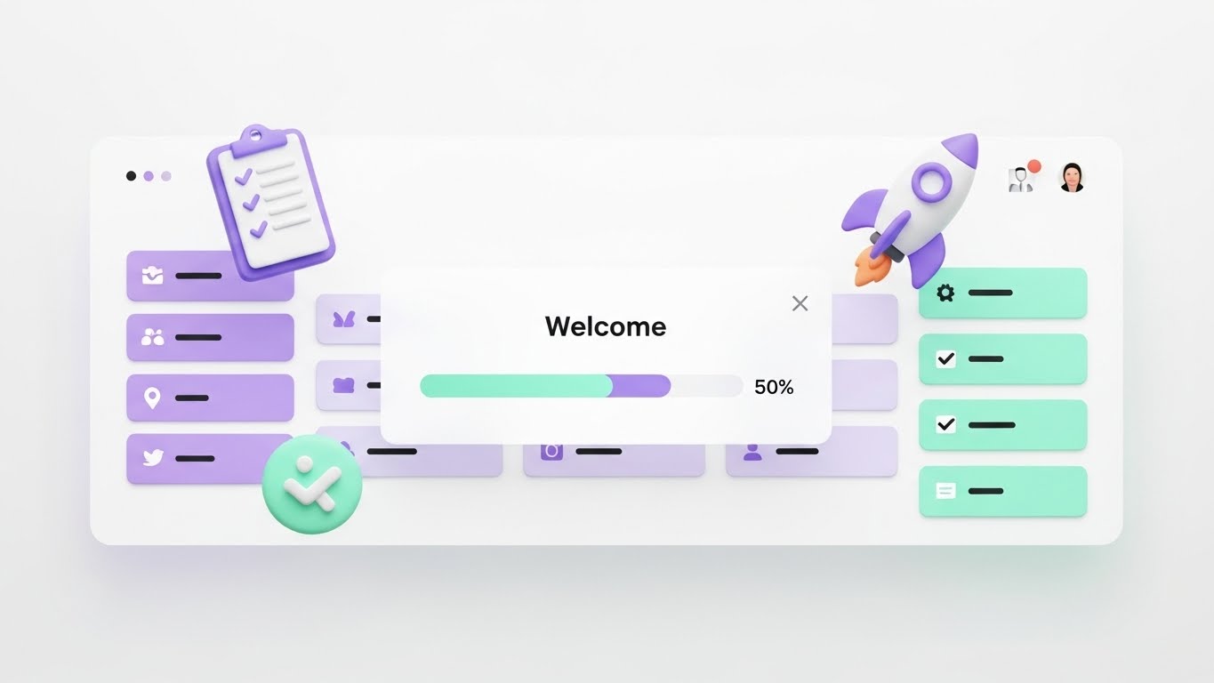
The Visual & Narrative Approach
The final hurdle is the "Day One" experience. This style showcases a pristine, welcoming UI dashboard on a clean White background. Soft, clay-style 3D icons (a checklist, a rocket ship) float gently around a "Welcome" modal. The palette uses calming Pastel Purple and Mint Green. It is specifically designed to look non-threatening, easy, and inviting—the antithesis of the complex, grey spreadsheets the user is used to.
Psychological Impact & KPI Focus
This lowers the "Barrier to Entry." It addresses the anxiety of "Is this going to be hard to learn?" The soft aesthetics and gamified icons (Rocket) suggest that onboarding will be a guided, positive experience. It reframes software training from a chore into a launchpad.
- Core KPI: Time-to-Value (TTV) and Onboarding Completion Rate.
Strategic Implementation & Trade-offs
- Best Use Case: In-App Welcome Screens, Free Trial Landing Pages, and "Getting Started" emails.
- Trade-off: It is "Cute." It works for onboarding but should not be used for high-density data operations where high-contrast dark mode might be preferred.
- Duration: Static or simple fade-in animation.
Companies using similar video content -
Trimble Transportation – Fleet Management – Visualizing peer validation and empowered users.
Samsara – Connected Operations Cloud – Humanizing B2B transactions with competent users.
21. 2D Animation & UI Composition
Onboarding | Self-Serve Onboarding
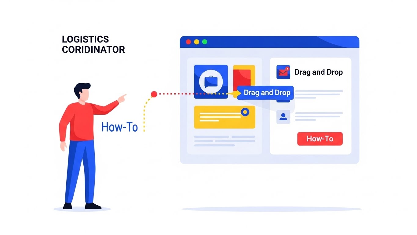
The Visual & Narrative Approach
This style bridges the gap between the user and the code. We utilize a flat 2D vector scene featuring a stylized logistics coordinator character standing next to a giant, floating UI panel. The palette is crisp and instructional: Bright Blue, Red, and Yellow on a clean White background. Dotted "action lines" trace the movement of the character's hand to a specific "Drag and Drop" element on the UI, visually exaggerating the ease of the action and decoding the workflow.
Psychological Impact & KPI Focus
This targets "Competency Anxiety." New users often feel overwhelmed by complex TOS interfaces. By breaking down interactions into simple, stylized cartoons, we reduce the intimidation factor. It visually reinforces that the software is intuitive and "self-serve," encouraging users to explore features without calling support.
- Core KPI: Time-to-Competency and Support Ticket Deflection.
Strategic Implementation & Trade-offs
- Best Use Case: Knowledge Base articles and "in-app" tooltip videos. It replaces dense PDF manuals with quick, digestible visual cues.
- Trade-off: It is instructional, not promotional. It is too tactical for executive presentations but invaluable for user retention.
- Duration: 15-30 Seconds.
Companies using similar video content -
Logiwa – WMS & Fulfillment – Visualizing frictionless launch and easy activation.
NetSuite – ERP for Logistics – Lowering barrier to entry for new users.
22. 2D Character-Driven Story
Onboarding | Knowledge Base

The Visual & Narrative Approach
We step back from the software interface to address the human experience of the transition. The scene utilizes a storybook-style flat vector illustration in Warm Yellow and Slate Grey. A yard worker scratches their head in confusion while looking at a paper clipboard (the "Old Way"), while a colleague steps in, pointing confidently to a glowing holographic tablet representation (the "New Way"). The style is illustrative and warm, focusing on the emotional relief of solving a problem.
Psychological Impact & KPI Focus
This style builds "Empathy" and "Cultural Buy-in." Change management is the hardest part of TOS implementation. This visual validates the user's struggle with legacy paper processes and positions the new software not as a mandate from above, but as a helpful colleague that makes their specific job easier.
- Core KPI: Digital Adoption Rate and User Sentiment.
Strategic Implementation & Trade-offs
- Best Use Case: Help Center "Philosophy" videos and Internal Training Kick-offs. It helps win the hearts and minds of the workforce.
- Trade-off: It depicts the "Why," not the "How." It is excellent for motivation but doesn't teach specific software mechanics.
- Duration: 45-60 Seconds.
Companies using similar video content -
Motive (formerly KeepTruckin) – Fleet Management – Guided mastery for digital literacy in ELD.
Geotab – Telematics Solutions – Breaking down complex interactions into simple visuals.
23. Macro UI Micro-Interactions
Retention | Accelerating TTV

The Visual & Narrative Approach
This style zooms in—extreme macro. We see a close-up of a single UI button, pill-shaped and gradient-filled in Vivid Pink to Purple. A mouse cursor hovers and clicks, generating a satisfying, subtle ripple effect. The background is a blurred "bokeh" of data, keeping the focus entirely on the interaction. It turns a mundane click into a tactile, sensory event, emphasizing the responsiveness and polish of the platform.
Psychological Impact & KPI Focus
This reinforces "Quality Perception." In the retention phase, users judge software by how it feels to use. This visual style communicates that the system is responsive, modern, and built with attention to detail. It subliminally assures the user that every interaction has been engineered for speed and satisfaction.
- Core KPI: Feature Usage Frequency and User Satisfaction Score (CSAT).
Strategic Implementation & Trade-offs
- Best Use Case: "Feature Release" emails and Social Media "Pro-Tips." It highlights specific UI improvements or new buttons.
- Trade-off: It is hyper-focused. It gives no context to the broader workflow, serving only to highlight specific interaction design.
- Duration: 3-5 Seconds (Loopable GIF).
Companies using similar video content -
Zebra Technologies – Savanna Platform – Building empathy for transition from old to new ways.
Körber (HighJump) – Supply Chain Solutions – Visualizing the solution to common operational problems.
24. Abstract 2D Motion Graphics
Retention | Reducing Churn
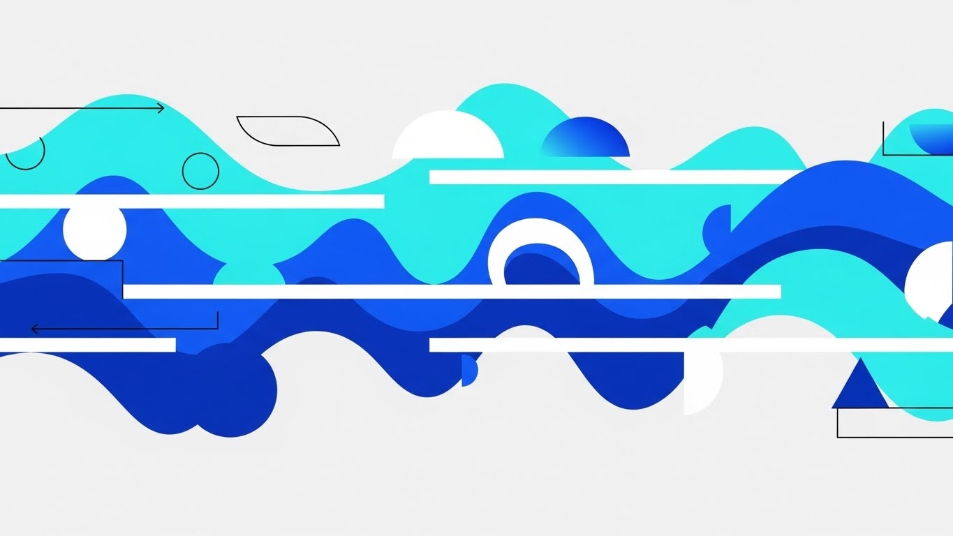
The Visual & Narrative Approach
Here, we visualize the feeling of a well-optimized terminal. Fluid, wave-like gradients in Turquoise and Royal Blue flow horizontally across the screen, effortlessly merging with and smoothing out rigid white geometric lines. This abstractly represents the software "ironing out" the kinks in a logistics workflow. The motion is calm, continuous, and rhythmic, set against a light grey background.
Psychological Impact & KPI Focus
This style targets "Operational Anxiety." It is designed to be calming and reassuring. For a customer who might be experiencing friction or bugs, this visual re-establishes the promise of stability and flow. It communicates that the platform is a harmonizing force that turns chaos into order.
- Core KPI: Churn Rate Reduction and Customer Health Score.
Strategic Implementation & Trade-offs
- Best Use Case: Customer Success Newsletters, System Update screens, and "We're Scaling with You" communications.
- Trade-off: It is purely atmospheric. It conveys a mood of stability but offers no concrete information about features or fixes.
- Duration: 10-15 Seconds.
Companies using similar video content -
Microsoft Dynamics 365 – Supply Chain Management – Reinforcing quality perception through tactile precision.
Salesforce – Service Cloud for Logistics – Visualizing instant gratification of UI responsiveness.
25. 3D Parallax UI Presentation
Retention | Visitor Re-engagement
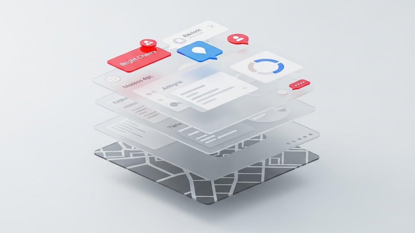
The Visual & Narrative Approach
To show that the platform is more than just a surface-level tool, we deconstruct the dashboard. The view is isometric, with the UI separated into floating glass layers in Z-space. The base layer is the terminal map, the middle is data widgets, and the top is notification bubbles. Elements on the top layer pop in Bright Cherry Red and Electric Blue against a grayscale depth map. It visually argues that the software has "depth" and underlying intelligence.
Psychological Impact & KPI Focus
This combats "Feature Blindness." Long-term users often only use 10% of a platform's capabilities. This visual metaphor exposes the layers of functionality they might be missing, encouraging them to dig deeper. It suggests that the value of the software runs deep, anchoring the subscription cost.
- Core KPI: Feature Adoption Depth and Session Duration.
Strategic Implementation & Trade-offs
- Best Use Case: Retargeting Ads for existing customers and "Did You Know?" login prompts. It creates curiosity about hidden features.
- Trade-off: It distorts the actual user interface for artistic effect. It is a marketing representation, not a training tool.
- Duration: 6-10 Seconds.
Companies using similar video content -
AWS – IoT TwinMaker – Visualizing stability and flow state in cloud operations.
Google Cloud – Supply Chain Twin – Reassuring customers of operational harmony.
26. Futuristic Neon/Dark Mode
Expansion | Deep Feature Adoption

The Visual & Narrative Approach
This style embraces the "Cool Factor." We see a digital landscape where server towers rise like skyscrapers from a dark, reflective grid. Neon Blue and Hot Pink data lines zip between them, culminating in a glowing digital cloud above. It borrows the aesthetic of sci-fi and cyberpunk to frame the logistics platform as cutting-edge, high-velocity technology.
Psychological Impact & KPI Focus
This drives "Excitement" and "Upgrades." It appeals to the customer's desire to be on the bleeding edge of technology. By framing new features (like AI or Cloud scaling) in this high-energy, futuristic aesthetic, it makes the upsell feel like a ticket to the future, not just a contract amendment.
- Core KPI: Expansion Revenue and Upgrade Conversion Rate.
Strategic Implementation & Trade-offs
- Best Use Case: Product Launch Teasers and Keynote Backgrounds. It generates hype and energy around technical backend updates.
- Trade-off: It is stylized fiction. It risks over-promising if the actual UI is a standard white-and-grey spreadsheet style.
- Duration: 15-20 Seconds.
Companies using similar video content -
Splunk – Logistics Data Analytics – Visualizing multi-layered value and depth of intelligence.
Datadog – Monitoring for Logistics – Combating feature blindness by exposing layers of functionality.
27. Holographic UI over 3D Render
Expansion | Driving Upsell
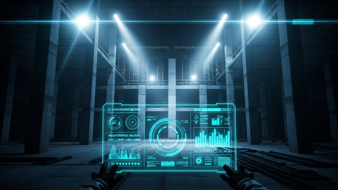
The Visual & Narrative Approach
This puts the viewer in the seat of power. A realistic wooden boardroom table sits in the foreground. Projected onto it is a glowing, semi-transparent Blue hologram of the container terminal. Small red warning lights blink on specific containers, indicating predictive issues. The background is a blurred modern office. This visualizes the "God View" that executives crave—total visibility and control from the comfort of the boardroom.
Psychological Impact & KPI Focus
This targets the "Executive Buyer" for upsells. It shifts the conversation from operational execution (moving boxes) to strategic oversight (managing assets). It visualizes the software as a Command & Control center, justifying a higher price tier for enterprise visibility modules.
- Core KPI: Average Revenue Per Account (ARPA) and Executive Engagement.
Strategic Implementation & Trade-offs
- Best Use Case: Sales Decks for Enterprise tiers and Account Review meetings. It sells the vision of total control.
- Trade-off: It implies a level of sci-fi interactivity (holograms) that doesn't exist. It must be framed as a metaphor for data visibility.
- Duration: Static Image or subtle loop.
Companies using similar video content -
Cognizant – Digital Supply Chain – Visualizing next-gen tech and driving excitement for upgrades.
Accenture – Intelligent Operations – Framing new features in a high-energy, futuristic aesthetic.
28. Lifestyle Stock with UI Overlay
Expansion | Driving Referrals
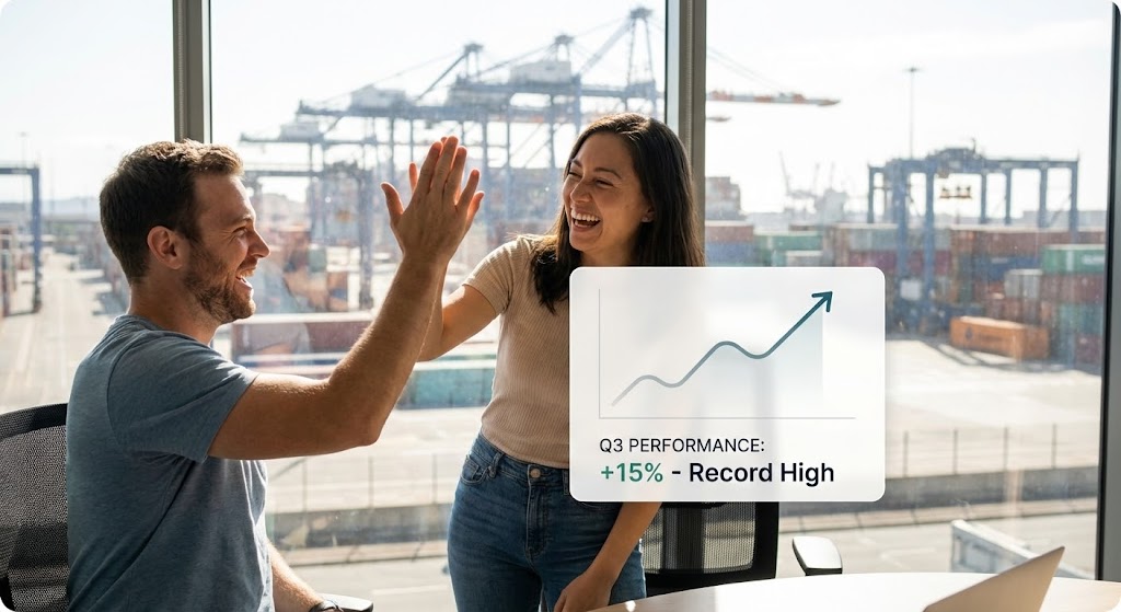
The Visual & Narrative Approach
Referrals are built on human relationships. This style features a candid, high-quality photo of two colleagues high-fiving in a modern office overlooking a terminal. Overlaid is a sleek, semi-transparent White UI card showing a rising trend graph ("Efficiency +15%"). The lighting is natural and celebratory. It connects the software's data output directly to the human joy of a job well done.
Psychological Impact & KPI Focus
This leverages "Social Proof." It suggests that using this platform leads to professional success and team camaraderie. It encourages existing happy customers to share their success stories. It moves the brand from a "Tool" to a "Partner in Success."
- Core KPI: Net Promoter Score (NPS) and Referral Leads.
Strategic Implementation & Trade-offs
- Best Use Case: Case Studies, "Refer a Friend" landing pages, and Social Media success stories.
- Trade-off: It relies on stock photography which can feel generic if not carefully selected to match the industry aesthetic.
- Duration: Static Image.
Companies using similar video content -
HERE Technologies – Logistics & Supply Chain – Visualizing strategic control from a command center.
Microsoft – Azure Digital Twins – Selling the vision of total visibility for executives.
29. Abstract 3D AI Visualization
Expansion | Proactive Support

The Visual & Narrative Approach
To visualize the invisible hand of AI support, we use an abstract 3D network. Glowing fiber optic strands in Gold and Platinum weave together to form a brain-like node structure against a Deep Purple background. Sparks of light travel along the strands, symbolizing data processing and proactive problem solving. It represents the AI "thinking" on behalf of the user to prevent issues before they occur.
Psychological Impact & KPI Focus
This builds "Confidence" in automation. Customers are often skeptical of AI "black boxes." This aesthetic makes the AI look sophisticated, precious (Gold/Platinum), and organic. It reassures the client that the premium support package includes a living, breathing intelligence that protects their operation.
- Core KPI: Proactive Resolution Rate and Support Cost Reduction.
Strategic Implementation & Trade-offs
- Best Use Case: Newsletters announcing AI features and Premium Support landing pages. It justifies the cost of advanced algorithmic modules.
- Trade-off: It is completely abstract. It explains nothing about what the AI actually does (e.g., route optimization vs. predictive maintenance).
- Duration: 10-15 Seconds (Loopable).
Companies using similar video content -
GXO Logistics – Supply Chain Solutions – Visualizing shared success and partnership.
C.H. Robinson – Navisphere Platform – Leveraging social proof for professional success.
30. Dark Mode UI Showcase
Expansion | Sales Cycle Acceleration

The Visual & Narrative Approach
For the final expansion push, we present the "Enterprise Tier" aesthetic. A sleek, high-contrast Dark Mode UI is shown from a low, monolithic angle. The background is Matte Black. The panels are Dark Charcoal with thin Gold borders, and data elements glow in Neon Gold and Green. It looks like the interface of a high-frequency trading desk. It screams "Premium," "Professional," and "Serious."
Psychological Impact & KPI Focus
This signals "Exclusivity" and "Power." Dark mode is often associated with pro-level tools. This visual differentiates the Enterprise tier from the standard version. It appeals to the heavy-duty user who stares at screens all night and wants a tool that looks as serious as their job.
- Core KPI: Enterprise Contract Value (ACV) and Tier Migration.
Strategic Implementation & Trade-offs
- Best Use Case: Enterprise Pricing Pages and Executive Briefing Decks. It visually separates the "Pro" tool from the "Standard" tool.
- Trade-off: Dark mode must actually be a feature of the software. If not, this is misleading.
- Duration: 15-30 Seconds.
Strategic Knowledge Base: The Visual Operations Doctrine
To bridge the gap between "pretty pictures" and "profitable logistics," we have synthesized the 30 visual styles into three actionable strategic frameworks. These segments outline not just what to create, but how to deploy visual assets to drive adoption, reduce operational friction, and secure long-term ROI.
Strategic Alignment & Visual Architecture (Pre-Production)
The foundational phase where visual strategy meets business logic.
- The Cognitive Load Audit: Before commissioning a single video, audit your current training materials. If a PDF manual takes 15 minutes to read, the goal is a 60-second Isometric 3D Workflow (Style 10) video. Measure the "Cognitive Savings" as a primary KPI.
- Role-Based Visual Mapping: A "One-size-fits-all" video strategy fails in logistics. Drivers on mobile devices need Bold Kinetic Typography (Style 6) or Minimalist Flat 2D (Style 9) for sound-off, high-contrast viewing. Yard Planners on desktop need Clean UI Workflow (Style 20). Map styles to devices and personas explicitly.
- The "Glanceability" Standard: In a busy terminal, attention spans are measured in milliseconds. Adopt a "Glanceability Standard" for all operational visuals—if the core message isn't understood within 3 seconds (like Style 23), the asset fails.
- Brand Voice Consistency: Your marketing visuals (Generative AI Cinematic - Style 8) and your training visuals (Line Art - Style 3) must share a DNA. Use a consistent color palette (e.g., Safety Orange for alerts, Teal for data) to create a unified "Visual Operating System" across the buyer's journey.
- The Advids Strategic Audit: We recommend starting with a visual audit of your current assets. Advids specializes in identifying "Visual Gaps"—areas where text-heavy content is causing churn or confusion—and prescribing the exact style code to bridge that gap.
- Standardization vs. Customization: For general safety training, use Low-Poly 3D (Style 4) to keep costs low. For high-stakes, specific terminal layouts, invest in Photorealistic 3D (Style 17) to ensure the visual matches the physical reality perfectly.
- The Cross-Departmental Bridge: Use Abstract 2D Motion (Style 2) to unify terminology. When Sales says "Optimization" and Ops says "Throughput," a shared visual language ensures both departments visualize the same outcome.
- Legacy System Integration: Visualizing the invisible link between old hardware and new SaaS is critical. Use Wireframe to Reality (Style 11) to visually demonstrate how your modern software wraps around and digitizes their legacy physical assets.
- Accessibility in Trucking: The logistics workforce is global and multilingual. Prioritize Visual-First styles (like Style 21) that rely on iconography and gesture rather than voiceover or text, ensuring your training scales across language barriers.
- The Mobile-First Mandate: 70% of logistics consumption happens on mobile. Ensure all 30 styles are optimized for vertical (9:16) or square (1:1) framing. A 16:9 cinematic video is useless to a driver in a cab holding a phone vertically.
Operational Adoption & Implementation (Deployment)
The tactical phase of embedding visuals into the daily workflow.
- Overcoming "Big Brother" Anxiety: Driver monitoring and AI can feel invasive. Use 2D Character-Driven Stories (Style 22) to frame these technologies as safety assistants rather than surveillance tools, focusing on the driver's benefit.
- The Micro-Learning Shift: Dismantle your "University" style hour-long courses. Break them into a library of 30-second Macro UI (Style 23) clips. This allows users to search for the exact "micro-skill" they need in the moment of crisis.
- Just-in-Time Support: Embed 2D Animation (Style 21) directly into the SaaS dashboard. When a user hovers over a complex feature, a floating video tooltip should demonstrate the action instantly, deflecting a support ticket.
- Gamification of Training: Use Isometric 3D (Style 10) to visualize performance scorecards. When drivers see their efficiency stats presented like a game interface, engagement and voluntary training completion rates increase.
- Reducing Support Ticket Volume: There is a direct correlation between proactive visual guides and reduced call center load. Deploy Clean UI (Style 20) videos for password resets and basic troubleshooting to automate Tier 1 support.
- Remote Onboarding: For distributed fleets, physical seminars are impossible. Use Split Screen (Style 5) videos to conduct "virtual ride-alongs," showing the driver exactly how the app correlates to their physical surroundings.
- Visualizing SOPs: Transform text-based Standard Operating Procedures into Line Art (Style 3) animations. A visual flow of a safety check is retained 60% better than a checklist on a clipboard.
- Feedback Loops: Use interactive video elements where drivers can "click" on the video to confirm understanding. This data feeds back into your Customer Health Score, identifying users who might need extra help.
- Scalable Localization: By separating text layers from the animation in styles like Style 9, you can rapidly localize training content for different regions (e.g., Spanish, French) without re-animating the core asset.
- Leadership Communication: When rolling out a new fleet strategy, do not send an email. Use Aspirational Stock (Style 13) or Gen AI Cinematic (Style 8) to create a "Vision Video" that excites stakeholders and aligns the organization.
Measuring Impact & Future-Proofing (ROI)
The analytical phase of proving value and planning for the next horizon.
- Beyond "Views": Vanity metrics are useless in B2B. Measure Time-to-Competency (how fast a new user reaches full productivity) and Feature Adoption Rate (how many users activate a feature after watching the video).
- The "Idle Time" Metric: Correlate the deployment of Style 15 (2D Over Live) training with a reduction in "Yard Idle Time." If the video teaches a faster gate process, the ROI is found in the seconds saved per truck.
- Compliance Velocity: How fast can you get the fleet compliant with a new ELD mandate? Measure the speed of adoption when using Kinetic Typography (Style 6) alerts versus standard email memos.
- Retention and Churn: High-quality UX visualization (Style 24) reduces user frustration. Track the Net Revenue Retention (NRR) of cohorts exposed to premium visual onboarding versus those who were not.
- The AI Visual Frontier: Prepare for the future where Abstract 3D AI (Style 29) isn't just a marketing graphic but a real-time data overlay on the windshield. Visual strategy today prepares the data structure for tomorrow's augmented reality.
- Scalability of Assets: Build a "Visual Component Library." If you have a 3D model of a crane for Style 17, reuse that asset for Style 10 and Style 4. This reduces the cost-per-minute of video production over time.
- The Advids Partnership: Visual communication is not a project; it is a program. Advids serves as the long-term partner to maintain your "Visual Source of Truth," ensuring that as your software evolves, your visual library scales efficiently without version conflicts.
- Benchmarking Success: Do not just compare against your past performance. Benchmark your Visual Experience against consumer apps (Uber, Amazon). Your users expect that level of visual fluidity, even in a B2B terminal tool.
- The ROI of Safety: Safety incidents are costly. Quantify the reduction in accidents or insurance premiums achieved after implementing Line Art (Style 3) safety simulations. This is often the strongest argument for the video budget.
- Final Call to Innovation: Treat video as infrastructure, not content. Just as you invest in servers for speed, invest in Visual Intelligence for comprehension. The companies that bridge the "Digital Twin Gap" with clear, strategic visuals will win the race for logistics efficiency.
Companies using similar video content -
Coupa – Supply Chain Design & Planning – Visualizing proactive intelligence and confidence in automation.
Verusen – AI for Inventory Optimization – Building confidence in sophisticated, organic AI.
Author & Editor Bio


