
Introduction: The Interface is the Advantage
The institutional brokerage landscape is undergoing a tectonic shift. We are moving from an era of "Infrastructure Dominance"—defined by fiber cables and server proximity—to an era of Interface Intelligence. For the modern Head of Trading or CTO, the competitive edge is no longer just about how fast an order is executed, but how clearly that execution is communicated to the human decision-maker.
The stakes are quantifiable. The global algorithmic trading market is projected to reach USD 21.89 billion in 2025. This growth is driven largely by heavy hitters, with institutional investors commanding 61% of the algorithmic trading market share. These sophisticated stakeholders do not respond to "retail-style" marketing. They operate in a high-stakes, low-latency environment where "clarity" is a risk management tool and "design" is a proxy for engineering quality.
However, a "Physical/Digital Divide" exists. Complex backend architectures—Smart Order Routers, Dark Pool Aggregators, and Risk Engines—are often invisible, making them difficult to sell. This guide provides a strategic framework to bridge that divide. By utilizing these 30 distinct visual styles, you can translate abstract code into tangible assets, reducing cognitive load and positioning your platform as the "Gold Standard" of institutional finance.
1. Abstract 3D + Isometric
TOFU | Brand Awareness

(Abstract 3D + Isometric): Sapphire Light Grid + Institutional Structural Precision
The Visual & Narrative Approach
Visualization Scenario: Imagine a pristine white void where the chaotic noise of the market is silenced. In this space, an isometric grid of thousands of polished silver and glass spheres stretches infinitely. These nodes represent the global financial network. Pulsing streams of vivid sapphire blue light shoot through the connections, symbolizing high-speed data transmission. The camera glides diagonally, emphasizing the perfect alignment and infinite scale of the grid.
Narration Style: No voiceover. A soundscape of "digital precision"—a low-end hum of server efficiency overlayed with crisp, crystalline data-transfer sounds.
Psychological Impact & KPI Focus
- Niche Psychology: Institutional clients crave Order. The isometric perspective (where parallel lines never converge) subconsciously signals stability, scalability, and control. It presents the market not as a chaotic gamble, but as a structured, engineered lattice.
- Operational Impact: This style effectively visualizes Network Latency and Global Reach. It turns the invisible concept of "connectivity" into a tangible, beautiful machine.
Strategic Implementation & Trade-offs
- Best Use Case: Website Hero Backgrounds (Looping) or Event "Wait Screens."
- Duration: 10-15 seconds (Looping).
- Trade-off: It is purely atmospheric. It builds "Brand Prestige" but explains zero functional features. Use it to set the mood, not to close the sale.
Companies using similar video content -
Goldman Sachs – Marquee – Visualizing global market insights and execution.
CWAN – Unified investment management platform with embedded AI.
LSEG – Global FX trading ecosystem and connectivity.
2. Dynamic Data Visualization
TOFU | Market Education

(Dynamic Data Visualization): Electric Fluid Streams + Taming Market Liquidity
The Visual & Narrative Approach
Visualization Scenario: We visualize "Liquidity Fragmentation" as a chaotic swirl of fluid, silk-like ribbons in electric violet and bright teal. These ribbons whip around wildly until they encounter a central, solid platinum pillar (your platform). Upon contact, the chaotic fluids are smoothed into streamlined, organized flows. The background is a clean, pale light gray, making the colors pop with vector-sharp definition.
Narration Style: "In a fragmented market, chaos is the default. We provide the anchor." A calm, authoritative voice that contrasts with the visual motion.
Psychological Impact & KPI Focus
- Niche Psychology: Traders fear "slippage" and "bad fills" caused by fragmentation. This style offers a visual release of that tension. The platinum pillar serves as a psychological anchor, positioning your brand as the stabilizing force in a volatile market.
- Operational Impact: It visually narrates the benefit of Liquidity Aggregation and Smart Order Routing. It shows the "Before" (Chaos) and "After" (Order) in a matter of seconds.
Strategic Implementation & Trade-offs
- Best Use Case: LinkedIn Organic Posts (Vertical 4:5) to explain market concepts.
- Duration: 15-30 seconds.
- Trade-off: Abstract data art requires context. Without a caption or voiceover, it can be interpreted as just "pretty colors." It needs a strong headline to anchor the meaning.
Companies using similar video content -
FlexTrade – FlexTRADER EMS – Taming market liquidity with advanced execution.
Quod Financial – Smart Order Router – Visualizing AI-driven order routing optimization.
Overbond – AI-powered fixed income trading automation.
3. Minimalist Flat + Line Art
TOFU | Shaping Brand Perception
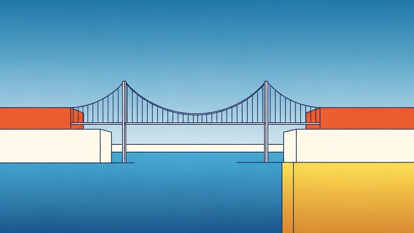
(Minimalist Flat + Line Art): Geometric Trading Bridge + Architectural Stability Assurance
The Visual & Narrative Approach
Visualization Scenario: A minimalist, architectural blueprint comes to life. We see two solid landmasses (representing buy-side and sell-side) in soft cream and gold. A fine navy blue line draws itself rapidly across the gap, forming a precise, geometric bridge. The sky is a gradient of calming azure. There is no excess texture—just pure, structural geometry.
Narration Style: Minimalist sound design—the scratch of a drafting pen, the confident "thud" of a stamp.
Psychological Impact & KPI Focus
- Niche Psychology: For the "Institutional Architect" persona, simplicity equals reliability. This style eschews flashiness for Engineering Integrity. It suggests that the platform is robust, essential, and structurally sound.
- Operational Impact: It is the visual definition of "Infrastructure." It works perfectly to explain foundational concepts like Connectivity Bridges or API Integration.
Strategic Implementation & Trade-offs
- Best Use Case: YouTube Thumbnails, Explainer Video Intros, or Whitepaper illustrations.
- Duration: Static or Micro-motion (3-5 seconds).
- Trade-off: It lacks the "High-Tech" wow factor of 3D. It signals reliability, not necessarily "cutting-edge innovation."
Companies using similar video content -
Alpaca – Developer-first API for seamless trading integration.
IEX Cloud – Transparent market data API for developers.
Tradier – Brokerage API for commission-free stock and options.
4. Bold Kinetic Typography (Visual)
TOFU | Product Differentiation

(Bold Kinetic Typography): Interlocking Kinetic Blocks + Visualizing Execution Velocity
The Visual & Narrative Approach
Visualization Scenario: The screen is stark white. Suddenly, massive blocky shapes in International Orange and Slate Grey slam into the center from opposite sides. They collide with visible "speed lines" and motion blur, fusing instantly into a perfect interlocking fit. The visual rhythm mimics the heartbeat of a high-frequency trading desk. The shapes themselves form abstract letters or words like "EXECUTE."
Narration Style: Aggressive, percussive audio. Fast tempo.
Psychological Impact & KPI Focus
- Niche Psychology: Speed is the currency of trading. This style uses "Visual Velocity" to trigger an adrenaline response. It aligns your brand with the energy of the market. The orange color is chosen for its association with high-visibility safety and urgency.
- Operational Impact: It visualizes Low Latency. It answers the question, "Can you keep up?" with a resounding visual "Yes."
Strategic Implementation & Trade-offs
- Best Use Case: Social Ads (Instagram/LinkedIn) where you have 3 seconds to stop the scroll.
- Duration: 6-10 seconds.
- Trade-off: High fatigue. It is too aggressive for long-form content. Use it as a "Sprint," not a "Marathon."
Companies using similar video content -
Virtu Financial – High-frequency trading and market making.
B2BITS – Smart Order Router – High-speed order routing for HFT.
Orthogone Technologies – Ultra-low latency solutions for HFT.
5. Aspirational Stock Montage
TOFU | LinkedIn Organic

(Aspirational Stock Montage): Confident Professional Team + Humanizing Institutional Success
The Visual & Narrative Approach
Visualization Scenario: High-key, cinematic slow-motion footage of diverse professionals in a sun-drenched glass atrium. They are not stressed; they are confident and smiling, looking upward. Overlaid on the footage are subtle cyan and silver geometric lines that connect the people, symbolizing the digital network that empowers them.
Narration Style: Warm, empathetic, and grand. "Technology doesn't replace the trader. It elevates them."
Psychological Impact & KPI Focus
- Niche Psychology: Institutional clients are people first. They want to feel successful, connected, and modern. This style mirrors their Self-Actualization needs. It says, "This is who you become when you use our platform."
- Operational Impact: It builds Brand Affinity and Trust. It bridges the Physical/Digital divide by showing the human result of digital excellence.
Strategic Implementation & Trade-offs
- Best Use Case: Display Ads and Recruitment/Culture videos (1.91:1).
- Duration: Static or Slow Pan (10-20 seconds).
- Trade-off: Generic stock footage is the enemy. The "Geometric Overlay" is critical to branding the footage and preventing it from looking like a bank commercial.
Companies using similar video content -
Eze Investment Suite – Elevating investment management for financial institutions.
Charles River Development – Investment Management Solution – Empowering asset managers globally.
SS&C Advent – Moxy – Assisting investment firms with robust solutions.
6. Abstract 3D AI Visualization
TOFU | ABM Awareness

(Abstract 3D AI Visualization): Glowing Neural Nodes + Visualizing Algorithmic Intelligence
The Visual & Narrative Approach
Visualization Scenario: A macro lens view of a crystalline neural network. Inside, glowing golden nodes are suspended in a web of connections. We see beams of intense white light firing between them—synaptic events representing algorithmic decisions. The background is a blurred, futuristic laboratory.
Narration Style: Sophisticated, "Tech-Whisperer" tone. "Intelligence is not random. It is engineered."
Psychological Impact & KPI Focus
- Niche Psychology: AI is often feared as a "Black Box." This style reframes it as a "Jewel Box"—precious, structured, and valuable. The gold and crystal textures connote value and rarity.
- Operational Impact: It visualizes Algorithmic Complexity and Alpha Generation. It gives a face to the code.
Strategic Implementation & Trade-offs
- Best Use Case: Programmatic Ads and Product Launch Teasers (16:9).
- Duration: 15-20 seconds.
- Trade-off: Highly abstract. If the viewer is a fundamental trader who distrusts "black boxes," this imagery might alienate them. It must be paired with copy that emphasizes control and oversight.
Companies using similar video content -
LevelFields – AI-powered institutional trading insights.
Nvestiq – AI-powered no-code algorithmic trading.
StrategyQuant – Generating algo strategies with machine learning.
7. Generative AI Cinematic Video
TOFU | Category Creation

(Generative AI Cinematic): Emerald City Streams + Envisioning Financial Ecosystems
The Visual & Narrative Approach
Visualization Scenario: A sweeping aerial shot of a utopian financial district. Buildings are white marble and glass. Instead of roads, streams of liquid emerald light flow between the towers. It is a frictionless, optimized world.
Narration Style: Epic, visionary. "Imagine a market without friction."
Psychological Impact & KPI Focus
- Niche Psychology: Appeals to the "Empire Builder" persona. It validates their ambition to build the future of finance.
- Operational Impact: Visualizes Ecosystem Integration. It shows the market as a cohesive whole, not disparate parts.
Strategic Implementation & Trade-offs
- Best Use Case: YouTube Pre-roll or Homepage Background (16:9).
- Duration: 20-30 seconds.
- Trade-off: High production barrier (GenAI mastery). Sets a very high visual standard for the brand.
Companies using similar video content -
CWAN – Envisioning frictionless financial ecosystems with GenAI.
BlackRock – Aladdin – Shaping the future of portfolio management.
Murex – MX.3 – Integrated cross-asset platform for capital markets.
8. Isometric 3D Workflow
MOFU | Feature Education

(Isometric 3D Workflow): Ruby and Emerald Orbs + Demystifying Order Routing
The Visual & Narrative Approach
Visualization Scenario: A "digital diorama" that explains the complex logic of Smart Order Routing (SOR). Miniature server racks and glass tubes physically demonstrate the path of buy (green) and sell (red) orders as they pass through a central aluminum processor. The matte white plastic finish keeps the aesthetic clean and approachable.
Narration Style: Instructional, step-by-step.
Psychological Impact & KPI Focus
- Niche Psychology: Visualizing data flow as physical objects moving through tubes leverages our innate understanding of physics, drastically reducing the cognitive load required to understand "routing logic."
- Operational Impact: Highly effective for Feature Education, as it proves the platform's efficiency without requiring the viewer to read lines of code.
Strategic Implementation & Trade-offs
- Best Use Case: Website Product Pages and Explainer Videos (16:9).
- Duration: 30-45 seconds.
- Trade-off: Can look "toylike" if not rendered with high-quality textures. It simplifies reality, so it must be clear that this is a schematic representation, not the actual UI.
Companies using similar video content -
FlexTrade – FlexONE OEMS – Demystifying complex order routing logic.
B2BROKER – Institutional-grade liquidity and infrastructure solutions.
Broadridge Financial Solutions – Advanced Smart Order Routing capabilities.
9. Clean UI Workflow (Light Mode)
MOFU | Feature Education

(Clean UI Workflow): Glass Pane Dashboard + Visualizing Cognitive Ease
The Visual & Narrative Approach
Visualization Scenario: The product itself is the hero. The dashboard is presented on a floating glass pane in a high-key, light-mode environment. The data is abstracted into clean coral and slate blue charts, focusing on the layout and clarity rather than specific data points. The angled perspective adds depth.
Narration Style: Professional, focused on "Ease of Use."
Psychological Impact & KPI Focus
- Niche Psychology: For a trader, the UI is their cockpit. Showing a clean, organized interface directly addresses the pain point of "cluttered legacy screens." It signals Usability.
- Operational Impact: Drives Demo Requests by creating a "what you see is what you get" promise.
Strategic Implementation & Trade-offs
- Best Use Case: Demo Request Landing Pages and Product Decks (16:9).
- Duration: 15-20 seconds.
- Trade-off: "Light mode" can sometimes be perceived as "retail" by institutional traders who prefer "dark mode" for low-light trading floors.
Companies using similar video content -
Bloomberg Terminal – Clean, organized interface for comprehensive data.
OANDA – Intuitive FX trading platform with institutional pricing.
MetaTrader 5 – Multi-asset platform with professional technical indicators.
10. Low Poly + X-Ray
MOFU | Building Trust

(Low Poly + X-Ray): Crystal Shield Lock + Visualizing Transparent Security
The Visual & Narrative Approach
Visualization Scenario: Compliance and security are visualized dynamically using a crystal shield. The "X-Ray" effect reveals a glowing golden lock inside, symbolizing that the security mechanism is robust and intricate, yet the process is transparent to the user. Jagged grey shapes (threats) bounce off the faceted surface.
Narration Style: Reassuring, strong. "Protection you can see."
Psychological Impact & KPI Focus
- Niche Psychology: The transparency of the crystal suggests that the platform has "nothing to hide" regarding its compliance protocols, while the golden lock implies value and strength.
- Operational Impact: Powerful for Building Trust with Risk Officers and Compliance Heads who need assurance that safety mechanisms are intrinsic to the system.
Strategic Implementation & Trade-offs
- Best Use Case: Security/Compliance Pages and Whitepaper Downloads (4:5).
- Duration: 10-15 seconds.
- Trade-off: This is a metaphorical style. It does not replace the need for technical documentation or certifications (SOC2, ISO).
Companies using similar video content -
COMPLY – Hedge fund compliance with transparent security.
Allvue Systems – AI-ready investment compliance solutions.
Linedata – Linedata Compliance – Automated investment compliance software.
11. Wireframe to Reality Transition
MOFU | Competitive Displacement

(Wireframe to Reality): Chrome Engine Metamorphosis + Visualizing Tech Modernization
The Visual & Narrative Approach
Visualization Scenario: A split-screen composition divides the past from the future. On the left, we see a "Legacy Architecture"—a chaotic, rough black ink sketch on white paper, representing the tangled spaghetti code of older systems. A glowing vertical beam of cyan light scans across the screen. As it passes to the right, the sketch is instantly forged into a photorealistic, polished chrome engine. The messy lines resolve into precision-milled components, humming with power.
Narration Style: A sound design transition from "static/white noise" to a "high-fidelity, futuristic hum." Voiceover: "Stop patching the past. Engineer the future."
Psychological Impact & KPI Focus
- Niche Psychology: CTOs often struggle with "Sunk Cost Fallacy" regarding their legacy builds. This visual validates that struggle (the messy sketch) while offering an irresistible, tangible alternative. It positions the competitor as a "draft" and your platform as the "finished product."
- Operational Impact: Visualizes Tech Stack Modernization. It provides a clear "Old vs. New" comparison that justifies the switching cost by highlighting the leap in structural integrity and robustness.
Strategic Implementation & Trade-offs
- Best Use Case: Non-Skippable Pre-Roll Ads (15s) targeting competitor keywords or "Migration" focused landing pages.
- Duration: 15 seconds.
- Trade-off: It is aggressive. It directly attacks the "status quo." Ensure the "after" state looks significantly more advanced, or the comparison falls flat.
Companies using similar video content -
Iress – Modernizing institutional trading software and connectivity.
ION Solutions – Replacing legacy FX systems with unified platforms.
SoftClub – Migrating banking and finance legacy systems.
12. X-Ray + Line Art
MOFU | Overcoming Objections

(X-Ray + Line Art): Transparent Cube Structure + API Integration Clarity
The Visual & Narrative Approach
Visualization Scenario: To combat the fear of "Black Box" technology, we use an X-Ray view. A complex cube structure (the API module) is rendered in transparent glass, revealing a neatly organized internal mechanism of copper and steel gears. Overlaid on this is precise 2D white line art that traces the connection points. The deep royal blue background ensures the metallic details and white lines pop with clinical precision.
Narration Style: Analytical and calm. "Open architecture. Zero secrets."
Psychological Impact & KPI Focus
- Niche Psychology: "Interoperability" is a primary objection. Heads of Trading worry that a new tool won't talk to their existing OMS/EMS. This style visually proves Integration Readiness. The "X-Ray" metaphor implies transparency and honesty.
- Operational Impact: It effectively explains API Connectivity and Modular Architecture. It shows that while the internal logic is complex (gears), the connection points are simple and standardized (white lines).
Strategic Implementation & Trade-offs
- Best Use Case: Email Marketing Headers or Technical Documentation (1:1 aspect ratio).
- Duration: Static or Micro-loop (5 seconds).
- Trade-off: It appeals primarily to technical buyers (CTOs, Developers). It may feel too "mechanical" for a purely financial buyer focused solely on returns.
Companies using similar video content -
Alpaca – Transparent API architecture for trading applications.
Polygon.io – Clear API access to real-time market data.
Plaid – Secure financial API integrations for banking data.
13. 3D Parallax UI Presentation
MOFU | Website
(3D Parallax UI): Floating Mint Screens + Deepening Market Perspective
The Visual & Narrative Approach
Visualization Scenario: We break the flat screen barrier. Multiple translucent UI screens float in a 3D space, arranged with a parallax effect. The screens display institutional trading metrics in a fresh palette of mint green, dark forest green, and white. As the "camera" moves, the background screens blur (depth of field), while the foreground data remains crisp. Floating dust particles in the bright digital void add atmosphere.
Narration Style: Sophisticated, ambient electronic music. No voiceover needed; the depth speaks for itself.
Psychological Impact & KPI Focus
- Niche Psychology: Investors want to feel they have a "Command Center" view of the market. The parallax effect subconsciously suggests Depth of Analysis and Control. It implies the platform offers deeper insights than a standard 2D spreadsheet.
- Operational Impact: Visualizes Data Depth and Multi-Screen Workflows. It demonstrates that the platform can handle complex, multi-layered information without clutter.
Strategic Implementation & Trade-offs
- Best Use Case: Website Hero Sections or Product Tour intros (16:9).
- Duration: 10-20 seconds (Looping).
- Trade-off: This is a "glamour shot" of the UI. It establishes premium quality but shouldn't replace the actual, functional walkthroughs required later in the sales cycle.
Companies using similar video content -
Goldman Sachs – Marquee – Deepening market perspective with visual analytics.
Imagine Software – Imagine Financial Platform – Real-time portfolio and risk management.
FIS – Cross-Asset Trading and Risk Platform – Multi-layered data visualization.
15. Lifestyle Stock with UI Overlay
MOFU | Functional Buyer Focus

(Lifestyle Stock + UI Overlay): Holographic Trader Focus + Human-Centric Tech
The Visual & Narrative Approach
Visualization Scenario: We focus on the user, not just the code. A professional male trader with silver hair sits in a sun-lit, modern office. He is focused, looking at a space where his monitor would be. Instead of a screen, we superimpose a holographic, floating UI overlay featuring radial gauges and waterfall charts in vibrant magenta and cyan. The background is artfully blurred (bokeh), emphasizing his expression of impressed focus.
Narration Style: Testimonial-style or empathetic. "Tools that think like you do."
Psychological Impact & KPI Focus
- Niche Psychology: This addresses the "User Experience" (UX) concern. It validates the trader's expertise, positioning the software as an extension of their mind, not a replacement. The "Silver Hair" casting subtly signals experience and seniority.
- Operational Impact: Visualizes Ergonomics and Cognitive Ease. It bridges the Physical/Digital divide by showing the human reaction to the digital tool.
Strategic Implementation & Trade-offs
- Best Use Case: LinkedIn Organic Posts and Case Study Headers (16:9).
- Duration: Static or Cinemagraph.
- Trade-off: Using stock photography risks looking generic. The quality of the "Holographic Overlay" is the differentiator—it must look integrated, not just slapped on top.
Companies using similar video content -
First Derivatives – KX – Real-time continuous intelligence and data insights.
ICE Trading Platform – Bridging data, technology, and expertise.
Bloomberg Terminal – Visualizing extensive market data and analytics.
16. Dark Mode UI Showcase
BOFU | ROI Justification
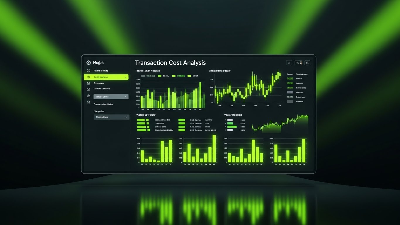
(Dark Mode UI): Neon Lime Analytics + Professional Trading Environment
The Visual & Narrative Approach
Visualization Scenario: We enter the trading floor environment. A sleek, high-fidelity UI showcase set in "Dark Mode"—the preference of 90% of institutional traders. The background is deep charcoal. The data pops in glowing neon lime green and bright white, highlighting "Transaction Cost Analysis" (TCA) graphs. The screen reflects elegantly on a glossy black surface, emphasizing the "premium" build quality.
Narration Style: Intense, focused, and rhythmic. "Precision in the dark. Clarity in the chaos."
Psychological Impact & KPI Focus
- Niche Psychology: Dark mode is a shibboleth in trading; it signals "Pro Tool." This style respects the user's daily reality (long hours, multiple screens) and reduces eye strain. The "Lime Green" serves as a subconscious "Go/Profit" signal.
- Operational Impact: Visualizes TCA and Execution Quality. It allows the viewer to scrutinize the density of data, proving the platform is "Enterprise Grade."
Strategic Implementation & Trade-offs
- Best Use Case: Remarketing Ads and Sales Decks (16:9).
- Duration: 15-30 seconds.
- Trade-off: High data density can be overwhelming to non-users. This is strictly for the "Functional Buyer" who knows what they are looking at.
Companies using similar video content -
Iress – Humanizing institutional trading with intuitive software.
OANDA – Trader-focused FX platform with advanced tools.
FlexTrade – Empowering traders with adaptable technology.
17. Photorealistic 3D Renders
BOFU | Risk Mitigation

(Photorealistic 3D): Titanium Vault Door + Tangible Security Assurance
The Visual & Narrative Approach
Visualization Scenario: Security is abstract, so we make it physical. A heavy, circular bank vault door, rendered in hyper-realistic brushed titanium and gold, dominates the frame. It stands slightly ajar. From within, instead of cash, a pure, blinding white light emanates—representing the value of the data and assets protected. The surrounding white concrete walls emphasize the sterility and impenetrability of the environment.
Narration Style: Heavy, reassuring sound effects—the "clunk" of a massive lock, the hum of a shield. "Fortress-level custody."
Psychological Impact & KPI Focus
- Niche Psychology: Institutional investors are paranoid about security breaches. This style leverages Skeuomorphism to trigger a primal sense of safety. The heavy metal textures subconsciously communicate "impenetrability."
- Operational Impact: Visualizes Custody Solutions and Cybersecurity Protocols. It turns a line item in a contract ("SOC2 Compliant") into a visceral feeling of safety.
Strategic Implementation & Trade-offs
- Best Use Case: Sales Decks (Risk Section) and Trust Center Landing Pages (16:9).
- Duration: Static or Slow Zoom (5-10 seconds).
- Trade-off: It is purely metaphorical. It builds emotional trust but must be backed immediately by technical specs to satisfy the CISO (Chief Information Security Officer).
Companies using similar video content -
FlexTrade – FlexTRADER EMS – Professional TCA and execution quality.
Trading Technologies – Professional derivatives trading platform.
QuantConnect – LEAN engine – High-fidelity algorithmic trading environment.
18. Abstract Glossy Vector
BOFU | Economic Buyer Focus

(Abstract Glossy Vector): Gold Coin Transformation + Visualizing Capital Efficiency
The Visual & Narrative Approach
Visualization Scenario: A visual metaphor for "Optimization." We see a stack of stylized gold coins that are fluidly morphing and stretching. They transform into a streamlined, aerodynamic arrow shape pointing upward. The texture is polished plastic/glossy, and the background is a soft peach-to-white gradient. This creates a clean, modern feeling of wealth management without the "stuffy" old-bank aesthetic.
Narration Style: Upbeat, light "ding" or "swoosh" sounds associated with success.
Psychological Impact & KPI Focus
- Niche Psychology: For the CFO or Economic Buyer, the goal is Capital Efficiency. This style visualizes the concept of "Making money move faster." The transformation from "static stack" to "dynamic arrow" implies active management and growth.
- Operational Impact: Visualizes Liquidity Optimization and ROI. It answers the question, "How does this platform improve my bottom line?"
Strategic Implementation & Trade-offs
- Best Use Case: Email Footers and "Pricing/ROI" One-pagers (4:5).
- Duration: Static.
- Trade-off: It is highly stylized and abstract. It works best as a supporting visual element next to hard numbers/pricing.
Companies using similar video content -
COMPLY – Tangible security assurance for hedge funds.
Allvue Systems – Fortress-level investment compliance and security.
Linedata – Robust and flexible compliance for asset managers.
19. Split Screen: Optimized Reality
BOFU | Sales Cycle Acceleration

(Split Screen): Sepia Chaos vs. Sky Blue Clarity + The Operational Shift
The Visual & Narrative Approach
Visualization Scenario: The ultimate "Before and After." The screen is split down the middle. Left Side: A sepia-toned, grainy photo of a stressed professional buried under paper files and phones—the "Manual Past." Right Side: A crisp, full-color shot of a hand calmly resting on a mouse, interacting with a clean sky blue and white SaaS interface. The contrast is stark, emphasizing the emotional and operational shift from chaos to clarity.
Narration Style: Voiceover: "Leave the noise behind."
Psychological Impact & KPI Focus
- Niche Psychology: This triggers the desire for Order and Peace. It validates the pain of the current manual workflow (left) and offers the solution (right) in a single glance. It personalizes the ROI—not just in dollars, but in stress reduction.
- Operational Impact: Visualizes Workflow Automation. It directly compares the "Cost of Status Quo" with the "Value of Implementation."
Strategic Implementation & Trade-offs
- Best Use Case: Pre-Roll Ads (YouTube) and Sales Enablement Case Studies (16:9).
- Duration: 15-30 seconds.
- Trade-off: It is a classic marketing trope. To work in 2025, the execution (lighting, color grading) must be premium. Avoid cheesy "infomercial" acting.
Companies using similar video content -
Dynamo Software – Visualizing capital efficiency in hedge fund management.
SS&C Technologies – Tradeware GlobalX – Streamlining financial operations for growth.
B2BROKER – Optimizing liquidity and trading infrastructure.
20. Isometric 2D Motion Design
BOFU | Demand Gen

(Isometric 2D Motion): Indigo Document Block + The Knowledge Asset
The Visual & Narrative Approach
Visualization Scenario: To sell "intellectual property" (like whitepapers or reports), we use stylized motion design. A document is represented as a 3D block with "lines" of text. It floats in the center, surrounded by orbiting icons: charts, globes, and shields. The palette is strictly indigo and white on a light blue background. The motion is smooth and bouncing, making the content feel "alive" and valuable.
Narration Style: Light, informative pops and clicks.
Psychological Impact & KPI Focus
- Niche Psychology: Institutional buyers value Intelligence. This style packages your content (a PDF) as a substantial "Asset" (a 3D block). It increases the perceived value of the download.
- Operational Impact: Visualizes Reporting Capabilities and Thought Leadership. It is a tactical asset designed to convert traffic into leads (Demand Gen).
Strategic Implementation & Trade-offs
- Best Use Case: Landing Page "Download" Sections and LinkedIn Document Ads (1:1).
- Duration: Micro-loop (3-5 seconds).
- Trade-off: It is illustrative, not realistic. It sells the "idea" of the report, not the software itself. Use it specifically for content marketing.
Companies using similar video content -
ION Solutions – Operational shift from manual to automated FX.
CWAN – Transforming investment management workflows.
Iress – Streamlining trading operations for efficiency.
21. Holographic UI over 3D Render
BOFU | Driving Demo Requests

(Holographic UI over 3D): Floating Command Globe + Centralizing Global Market Control
The Visual & Narrative Approach
Visualization Scenario: We enter the "Command Center" of the future. A realistic, high-end executive desk is shrouded in a dim, focus-inducing atmosphere (Dark Theme). Floating just above the surface is a complex, semi-transparent holographic globe. It glows with electric blue and purple heatmaps, displaying live market volatility across continents. Connection lines arc gracefully between financial hubs. The details are sharp, intricate, and suspended in 3D space, suggesting a level of oversight that transcends a flat screen.
Narration Style: Deep, cinematic, and empowering. "See the world as it is: one interconnected organism."
Psychological Impact & KPI Focus
- Niche Psychology: Institutional investors operate on a global scale. This visual triggers the "God View" archetype—the desire for total oversight and control. It positions the platform not just as a tool, but as a strategic weapon for global dominance.
- Operational Impact: Visualizes Global Macro Strategy and Multi-Asset Coverage. It demonstrates that the platform is built for complex, cross-border execution, directly increasing Demo Request Conversions.
Strategic Implementation & Trade-offs
- Best Use Case: High-Ticket Sales Decks and Executive Briefings (16:9).
- Duration: 10-15 seconds (Looping).
- Trade-off: This is a "Vision" sell. It is less about specific button clicks and more about the feeling of power. It works best when closing the Economic Buyer (CEO/CIO).
Companies using similar video content -
Linedata – Packaging thought leadership and reporting capabilities.
Allvue Systems – Showcasing compliance management insights.
COMPLY – Presenting regulatory resources as valuable assets.
22. 2D Animation & UI Composition
Onboarding | Self-Serve Onboarding

(2D Animation & UI Composition): Friendly Guide & Checkmark + Frictionless Onboarding
The Visual & Narrative Approach
Visualization Scenario: A shift to approachability. A friendly, vector-style female character (non-cartoony, professional attire) points to a floating, simplified UI panel. The panel features a large "Checkmark" button in bright green, symbolizing a completed compliance step. Dotted lines connect her hand to the button, guiding the eye. The background is a soft, geometric pattern of yellows and whites, creating a warm, welcoming atmosphere.
Narration Style: Warm, encouraging, and instructional. "Setup is simple. Let's get you trading."
Psychological Impact & KPI Focus
- Niche Psychology: The "Implementation Dip" is real. New users often feel overwhelmed by complex institutional software. This style uses Friendly Guidance to lower the anxiety barrier. It signals that help is available and the process is intuitive.
- Operational Impact: Visualizes Self-Serve Capability. It is designed to reduce the burden on the Customer Success team by encouraging users to complete the setup independently, improving Time-to-Value (TTV).
Strategic Implementation & Trade-offs
- Best Use Case: Welcome Emails and In-App Onboarding Wizards (16:9).
- Duration: 30-60 seconds.
- Trade-off: The "flat vector" style can feel "retail" if not executed with a sophisticated color palette. Avoid primary colors; stick to brand-aligned institutional tones.
Companies using similar video content -
Goldman Sachs – Marquee – Centralizing global market control.
BlackRock – Aladdin – Command center for portfolio and risk.
Murex – MX.3 – Envisioning comprehensive capital markets oversight.
23. Hyper-lapse Stock Footage with Data
Onboarding | Accelerating TTV

(Hyper-lapse Stock Footage): Urban Data Streams + Accelerating Time-to-Value
The Visual & Narrative Approach
Visualization Scenario: The energy of the city meets the speed of data. We see a hyper-lapse (long exposure) of a busy city highway at night. Car lights form streaking rivers of red and white light. Overlaid on the sky is a stark white vector grid and data points that match the perspective and velocity of the traffic. The data moves as fast as the physical world.
Narration Style: Fast-paced, rhythmic. Audio of traffic whooshes blended with digital data "zips."
Psychological Impact & KPI Focus
- Niche Psychology: Traders are adrenaline junkies. They respect Velocity. This visual metaphor aligns the platform's processing speed with the pulse of the real economy. It suggests that the software keeps pace with the physical market.
- Operational Impact: Visualizes Real-Time Data Processing and Low Latency. It reinforces the promise that the user can go from "login" to "execution" at the speed of the market.
Strategic Implementation & Trade-offs
- Best Use Case: Knowledge Base Intros and "Getting Started" Video Headers (16:9).
- Duration: 10-15 seconds.
- Trade-off: Stock footage is common. The differentiator is the quality of the Motion Tracking—the data grid must look like it is physically embedded in the scene, not just floating on top.
Companies using similar video content -
Alpaca – Guiding developers through API integration.
QuantConnect – Simplifying algorithmic strategy development.
Nvestiq – Frictionless onboarding for no-code algo trading.
24. 2D Character-Driven Story
Onboarding | Reducing Friction

(2D Character-Driven Story): Seamless Puzzle Integration + Humanizing API Connectivity
The Visual & Narrative Approach
Visualization Scenario: Integration is often a headache, so we make it a satisfying story. Two professionals (vector style) are seen fitting together two giant puzzle pieces. One piece is labeled "Server" (the client's legacy system), and the other "SaaS" (your platform). They click together with a satisfying "snap," and the characters shake hands. The palette is professional teal and grey.
Narration Style: Problem-Solution structure. "Your systems, our engine. A perfect fit."
Psychological Impact & KPI Focus
- Niche Psychology: "Interoperability" is a technical term, but "Harmony" is an emotional one. This style addresses the stress of Technical Integration. It visually promises that the new software will play nice with the old, reducing the fear of system conflict.
- Operational Impact: Visualizes API Integration and Partnership. It is highly effective for reducing friction during the technical onboarding phase.
Strategic Implementation & Trade-offs
- Best Use Case: Implementation Guides and Technical Support Videos (16:9).
- Duration: 45-60 seconds.
- Trade-off: Character animation takes time to produce. Ensure the characters represent your diverse user base to maintain inclusivity.
Companies using similar video content -
Virtu Financial – Accelerating time-to-value in HFT.
Orthogone Technologies – Visualizing ultra-low latency data processing.
B2BITS – Real-time order routing velocity.
25. Minimalist Flat 2D Vector
Retention | Reducing Churn

(Minimalist Flat 2D Vector): Unbroken Green Line + Visualizing 99.99% Uptime
The Visual & Narrative Approach
Visualization Scenario: Stability is the ultimate retention tool. We see a minimalist chart on a pale mint background. A single, vivid green line stretches horizontally across the screen. It is perfectly straight, unbroken, and steady. Small nodes represent days or weeks, all connected without a dip. It is the visual definition of "Reliability."
Narration Style: Silence or a steady, calming hum. "Consistency is the only currency."
Psychological Impact & KPI Focus
- Niche Psychology: In institutional finance, downtime is a career-ending event. This style appeals to the Risk Averse mindset. It is boring, and that is exactly the point. It signals that the platform is a "non-event"—it just works.
- Operational Impact: Visualizes Uptime and System Stability. It acts as a subconscious reassurance to existing clients that they are on solid ground.
Strategic Implementation & Trade-offs
- Best Use Case: System Status Pages, Email Footers, and Renewal Decks (1:1).
- Duration: Static or Micro-loop.
- Trade-off: It is not exciting. Do not use this for acquisition. It is strictly a "Trust Reinforcement" asset for existing customers.
Companies using similar video content -
Plaid – Humanizing financial API integration.
ClearBank – Seamless BaaS integration for fintechs.
Solarisbank – Connecting core banking functionalities.
26. Macro UI Micro-Interactions
Retention | Proactive Support
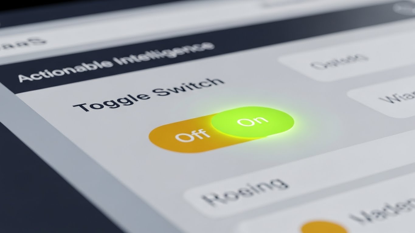
(Macro UI Micro-Interactions): Tactile Toggle Activation + Reinforcing User Control
The Visual & Narrative Approach
Visualization Scenario: We zoom in—extreme macro. A specific UI toggle switch is centered. We see the texture of the digital button. It flips from a dull gray to a glowing, intense "Active" blue. The background is blurred (shallow depth of field), focusing all attention on this single moment of decision.
Narration Style: A crisp, high-quality "Click" sound effect.
Psychological Impact & KPI Focus
- Niche Psychology: Mastery is built in the details. Showing the "Micro-Interactions" (the clicks, the toggles, the hovers) signals Design Quality and Responsiveness. It makes the software feel tactile and responsive, which builds subconscious affection for the tool.
- Operational Impact: Visualizes Smart Alerts and Feature Activation. It reminds users of the power they have at their fingertips, encouraging deeper feature adoption.
Strategic Implementation & Trade-offs
- Best Use Case: "Did You Know?" Email GIFs and Re-engagement Campaigns (1:1).
- Duration: 3-5 seconds (Looping).
- Trade-off: Requires high-resolution capture. Standard screen recording won't look "macro" enough. It often requires re-creating the UI in 3D to get the depth of field effect.
Companies using similar video content -
Alpaca – Visualizing 99.99% system uptime and reliability.
Iress – Demonstrating robust and stable trading software.
LSEG – Consistent performance of FX trading ecosystem.
27. Rapid UI Feature Montage
Retention | Driving Feature Adoption
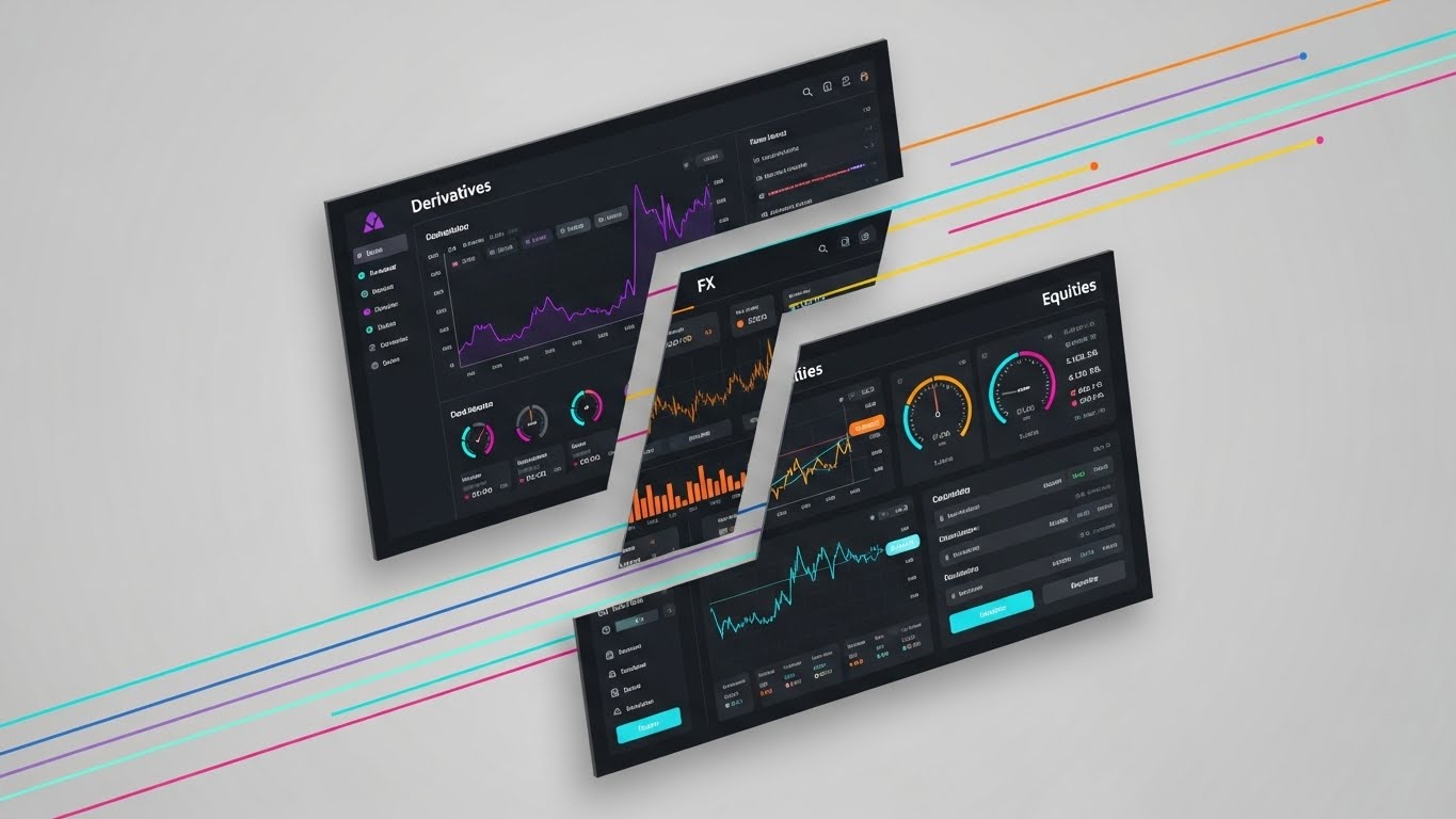
(Rapid UI Feature Montage): Multi-Asset Slicing + Demonstrating Platform Agility
The Visual & Narrative Approach
Visualization Scenario: A high-energy collage. Segments of three different UI screens—Derivatives (Purple), FX (Orange), and Equities (Blue)—are sliced diagonally and arranged together. Speed lines traverse the composition as the slices slide and replace each other. It visually communicates that the platform handles multiple asset classes simultaneously and seamlessly.
Narration Style: Fast, upbeat tempo. "Equities. FX. Derivatives. One engine."
Psychological Impact & KPI Focus
- Niche Psychology: Institutional funds are often Multi-Asset. They hate toggling between different systems for different desks. This style validates their need for Consolidation. It shows agility and breadth in a single frame.
- Operational Impact: Visualizes Multi-Asset Coverage and Cross-Margining. It encourages existing users to explore modules they might not be currently using (Upsell).
Strategic Implementation & Trade-offs
- Best Use Case: LinkedIn Product Updates and "New Feature" Announcements (16:9).
- Duration: 10-15 seconds.
- Trade-off: It moves fast. Avoid putting heavy text on these screens. The goal is to show "Variety," not detailed data.
Companies using similar video content -
Bloomberg Terminal – Reinforcing user control in data navigation.
FlexTrade – Highlighting precise execution management features.
OANDA – Tactile interaction with FX trading tools.
28. Futuristic Neon/Dark Mode (Bright)
Expansion | Driving Upsell

(Futuristic Neon/Dark Mode): Global Network Expansion + Visualizing Ecosystem Growth
The Visual & Narrative Approach
Visualization Scenario: A "Bright Neon" twist on the dark mode aesthetic. A white, glowing wireframe globe sits in a high-key, overexposed white environment. Beams of intense neon pink and cyan light shoot out from the globe to orbiting satellites. The contrast between the sterile white background and the vibrant neon beams symbolizes the explosive energy of expansion.
Narration Style: Futuristic, expansive. "Your reach: Unlimited."
Psychological Impact & KPI Focus
- Niche Psychology: Expansion is about vision. This style appeals to the "Empire Builder" persona—the CEO who wants to expand into new regions. The "Bright Neon" signals Innovation and Future-Proofing.
- Operational Impact: Visualizes Global Connectivity and Satellite/Cloud Infrastructure. It is used to justify the cost of upgrading to Enterprise or Global tiers.
Strategic Implementation & Trade-offs
- Best Use Case: Keynote Backgrounds and Annual Review Videos (16:9).
- Duration: 15-20 seconds.
- Trade-off: It is very stylized. It doesn't look like the actual UI, so use it only for "Vision Selling," not "Feature Selling."
Companies using similar video content -
FlexTrade – FlexTRADER EMS – Demonstrating multi-asset trading agility.
Eze Investment Suite – Showcasing integrated front-to-back capabilities.
Trading Technologies – Rapid feature display for derivatives.
29. 2D Graphics Over Live Action
Expansion | Driving Referrals

(2D Graphics Over Live Action): Augmented Partnership + Bridging Human Trust and Tech
The Visual & Narrative Approach
Visualization Scenario: Validating human trust with digital proof. A classic black and white close-up photo of a handshake between two executives. Overlaid on the hands are bright, colorful 2D vector nodes and network lines in orange and blue. These lines branch out from the hands, symbolizing the digital network effect created by the partnership.
Narration Style: Testimonial voiceover. "Real relationships. Powered by real tech."
Psychological Impact & KPI Focus
- Niche Psychology: Institutional finance is still a handshake business. This style respects the tradition (B&W photo) while modernizing it (Vector overlay). It suggests that the software enhances, rather than replaces, human relationships.
- Operational Impact: Visualizes Network Effects and Referral Value. It is a powerful visual for Case Studies and Testimonials intended to drive peer-to-peer referrals.
Strategic Implementation & Trade-offs
- Best Use Case: LinkedIn Organic Success Stories and Partner Case Studies (4:5).
- Duration: Static or Cinemagraph.
- Trade-off: The "Handshake" is the ultimate stock cliché. The Vector Overlay must be high-design and dynamic to save it from mediocrity.
Companies using similar video content -
CWAN – Visualizing ecosystem growth and innovation.
Goldman Sachs – Marquee – Global network expansion and future vision.
Railsr – Envisioning BaaS platform scalability.
30. Generative AI Realistic Character
Expansion | Category Creation

(Generative AI Realistic Character): The Quantum Trader + Envisioning the Future of Alpha
The Visual & Narrative Approach
Visualization Scenario: We visualize the "Trader of 2030." A medium shot of a confident, futuristic female trader in a pristine, minimalist office. She interacts with an invisible, air-touch interface. As she taps the air, ripples of distortion and light appear. The lighting is cinematic, simulating a lens flare. The aesthetic is "Quantum Finance"—ultra-advanced, serene, and frictionless.
Narration Style: Visionary. "The interface is you."
Psychological Impact & KPI Focus
- Niche Psychology: This is about Aspiration. It answers the question, "Where is this industry going?" It positions your brand not just as a vendor, but as the Architect of the Future. It appeals to the vanity and ambition of top-tier executives.
- Operational Impact: Visualizes Next-Gen UX and AI Integration. It sets the stage for "Category Creation," defining your platform as the first of a new generation.
Strategic Implementation & Trade-offs
- Best Use Case: Website Homepages and Brand Manifestos (16:9).
- Duration: 10-15 seconds.
- Trade-off: This is pure brand marketing. It explains nothing about how the software works today. It is a "North Star" visual to build valuation and brand equity.
The Visual Operations Doctrine: Strategic Knowledge Base
Expert Insight by Advids:
Having analyzed over 25,000 operational videos, we know that "Style" is not just aesthetic—it is a functional language. The following framework synthesizes the 30 styles above into a cohesive operational doctrine for Institutional Brokerage Platforms.
Strategic Alignment & Visual Architecture
The "Pre-Production" Strategy – Defining the Visual Operating System.
- The "Cognitive Load" Audit: Before commissioning a single pixel, audit your current training materials. If a manual takes 10 minutes to read, can a Style 8 (Isometric Workflow) video explain it in 30 seconds? Your visual strategy must be an efficiency strategy.
- Role-Based Visual Mapping: Different stakeholders need different visual dialects. Use High-Fidelity UI (Style 16) for the Head of Trading who needs to see the data density, but use Abstract 3D (Style 1) for the Investor Relations deck where "mood" matters more than metrics.
- The "Glanceability" Standard: In a high-frequency environment, clarity is safety. Establish a "Glanceability" standard for all visual assets—if the core message isn't understood in 1.5 seconds (the time it takes to scan a Bloomberg terminal), the visual is too complex.
- Brand Voice Consistency: Your platform likely consists of multiple modules (EMS, OMS, PMS). Use a unifying visual element—like the Platinum Pillar (Style 2) or a specific Neon Accent (Style 16)—to visually tie these disparate modules into a cohesive ecosystem.
- The Advids Strategic Audit: A "Style Guide" is not a PDF; it is a living system. Partner with Advids to conduct a comprehensive audit of your visual touchpoints, ensuring that your external marketing (TOFU) promises match your internal product reality (BOFU).
- Standardization vs. Customization: For general market concepts (Smart Order Routing), use high-end Stock/Abstract (Style 6) to save budget. Save your custom animation budget for your unique value propositions (Proprietary Algos), using Abstract 3D (Style 18) to make them shine.
- The Cross-Departmental Bridge: Sales, Ops, and Support often use different terminology. A Visual Style Guide forces alignment. When Sales shows a "Bridge" (Style 3) and Support explains a "Bridge," the customer sees the same visual metaphor, reducing confusion.
- Legacy System Integration: Visualizing the connection between on-prem hardware and SaaS is difficult. Use Wireframe-to-Reality (Style 11) visuals to validate the client's past investment while excitedly bridging them to the future.
- Accessibility in Trading Floors: Trading floors are noisy, chaotic environments. All video assets must be designed to work Sound-Off. Use Kinetic Typography (Style 4) and clear visual cues so the message lands even when the volume is mute.
- Multi-Monitor/Mobile Parity: Institutional traders use 6-screen setups but check risk on mobile. Ensure your visual styles, especially Clean UI (Style 9), are adapted for both the "Wall of Screens" and the "Handheld" experience.
Operational Adoption & Implementation
The "Deployment" Phase – Embedding Visuals into the Workflow.
- Overcoming "Black Box" Anxiety: Skepticism is high regarding AI. Use Style 6 (Abstract AI) and Style 12 (X-Ray) to demystify the algorithm. Showing the "gears" creates the psychological safety required for adoption.
- The Micro-Learning Shift: Replace the 50-page PDF "User Manual" with a library of 30-second Macro UI (Style 26) loops. Embed these directly into the software's "Help" section to reduce learning curves.
- Just-in-Time Support: When a user encounters an error, don't show a text code. Trigger a pop-up using Style 26 (Macro UI) or Style 9 (Clean UI) that visually demonstrates the fix.
- Gamification of Training: Use Style 25 (Minimalist Flat) to visualize progress bars and "Certification" achievements for traders learning the new system. Visual progress drives completion.
- Reducing Support Ticket Volume: There is a direct correlation between proactive visual guides and reduced call center load. Deploy Style 24 (Character Story) for common FAQs (e.g., "How to reset MFA") to deflect Tier-1 tickets.
- Remote Onboarding: For distributed trading teams, physical seminars are impossible. Use Style 21 (Holographic UI) and Style 13 (Parallax) in webinars to create an immersive "virtual showroom" experience.
- Standard Operating Procedures (SOPs): Transform static text SOPs into dynamic visual process flows using Style 8 (Isometric Workflow). This ensures compliance protocols are watched, not just signed.
- Feedback Loops: Use interactive video elements (based on Style 26) to gather user feedback. A visual "Thumbs Up/Down" on a feature update yields higher response rates than a survey link.
- Scalable Localization: Global platforms need global assets. Styles like 1, 2, 6, and 12 are text-agnostic. They rely on universal visual metaphors, drastically reducing localization costs for global expansion.
- Leadership Communication: When pitching a roadmap to the Board, do not use bullet points. Use Style 7 (GenAI Cinematic) and Style 30 (Future Trader) to sell the vision and emotional upside of the investment.
Measuring Impact & Future-Proofing
The "ROI" Phase – Measuring Success and Looking Ahead.
- Beyond "Views": Vanity metrics don't matter. Measure "Time-to-Competency" (how fast a trader masters the UI) and "Feature Adoption Rate" (how many users engage with a tool after seeing the visual).
- The "Idle Time" Metric: Correlate better visualization with reduced software navigation time. If Style 9 (Clean UI) is effective, traders should spend less time searching and more time executing.
- Compliance Velocity: Measure how fast new regulations (e.g., T+1 Settlement) are understood across the organization when communicated via Style 20 (Motion Doc) versus email text.
- Retention and Churn (LTV): High-quality UX visualization (Style 25 - Uptime) directly impacts trust. Track Churn Rates in cohorts exposed to proactive visual communication vs. those who are not.
- The AI Visual Frontier: Prepare for the next wave where Style 30 (GenAI) becomes real-time. The ability to generate bespoke, personalized explanatory videos for every client query is the near future.
- Scalability of Assets: Build a library, not a graveyard. Ensure source files for Styles 3, 5, and 19 are organized so they can be updated as the UI evolves, protecting your asset investment.
- The Advids Partnership: Scale is the enemy of quality. As you expand from 10 to 100 assets, partner with Advids to maintain the "Visual Doctrine" across all styles, ensuring that asset #100 is as on-brand as asset #1.
- Benchmarking Success: In institutional finance, "good enough" is a competitive risk. Regularly benchmark your visual standard against the top 5 global fintech leaders using this 30-style framework as the scorecard.
- The ROI of Safety: For Risk Managers, the ROI is found in prevention. Quantify the insurance or settlement cost reductions achieved by using Style 17 (Vault) and Style 10 (Shield) to enforce better security hygiene.
- Final Call to Innovation: Treat video and visualization not as "Marketing Content," but as Digital Infrastructure. Just as you invest in servers for speed, invest in Interface Intelligence for clarity. The future belongs to the platforms that are easiest to understand.
Companies using similar video content -
COMPLY – Bridging human trust and tech in compliance.
Plaid – Validating financial API partnerships.
Iress – Augmenting client relationships with technology.
Author & Editor Bio


