
Introduction: Visualizing the "Touchless" Future
The insurance industry is navigating its most significant operational shift in a century: the transition from reactive, paper-heavy claims handling to proactive, "Touchless Automation." For Claims Directors and Transformation Architects, the goal is clear—reduce the "Loss Adjustment Expense" (LAE) while improving customer retention. However, the path to this future is often obscured by complex technical jargon and "black box" algorithms that stakeholders struggle to trust.
The challenge for software platforms is not just to process data, but to communicate competence. How do you visualize the invisible speed of an API call? How do you make a fraud detection algorithm feel tangible and reliable? The answers lie in strategic visual communication.
The market drivers are undeniable. The global claims processing software market was valued at USD 43.58 billion in 2024, signaling a massive migration toward digital infrastructure. Yet, the pressure on the bottom line remains. Leading analysis by Bain & Company suggests that deploying generative AI in claims handling could reduce loss-adjusting expenses by 20% to 25%.
This guide provides a "Gold Standard" framework for visualizing your solution. We have curated 30 distinct visual styles (Part 1 covers Styles 1-9) designed to bridge the gap between legacy friction and digital fluidity. These styles are calibrated to lower cognitive load, build executive trust, and visually articulate the value of Straight-Through Processing (STP).
1. Abstract 2D Flat Vector Organic Modern Motion Graphics
TOFU | Brand Awareness
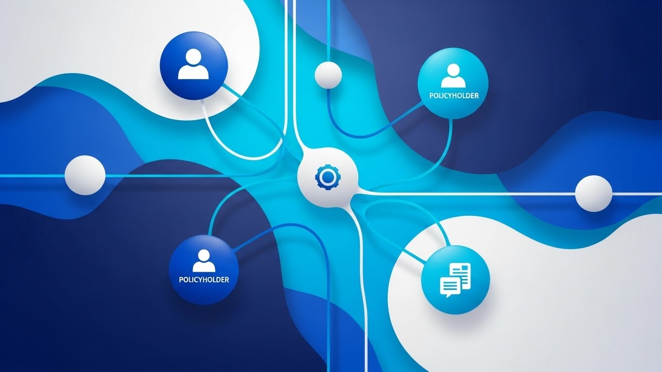
The Visual & Narrative Approach
Visualization Scenario: This style abandons rigid corporate grids for fluid, organic motion. A central network of deep sapphire and cyan nodes—representing insurers, policyholders, and data providers—pulses gently. Connections between them flow like liquid, utilizing glossy textures to imply a premium, friction-free exchange of data. The composition creates a "living ecosystem" where data finds its own way without hitting walls.
Narration Style: The voiceover should be calm, sophisticated, and fluid—reminiscent of a high-end tech documentary. "The ecosystem is alive. Your data flows seamlessly."
Psychological Impact & KPI Focus
- Niche Psychology: Claims leaders fear "integration hell" and rigid systems that break under pressure. This organic visual subconsciously reassures them that the system is adaptive, flexible, and resilient.
- Operational Impact: Directly supports Brand Recall (Framework 1.1) by establishing a sophisticated, high-tech visual identity that stands out in a feed of stock photography.
Strategic Implementation & Trade-offs
- Best Use Case: High-level Brand Anthem videos (15-30s) on LinkedIn.
- Trade-off: It is purely emotive. Do not use this to explain specific features (like FNOL intake), as it lacks the necessary detail.
Companies using similar video content -
Socotra – Cloud-Native Core System – Visualizes fluid, scalable insurance operations.
Multimodal – AgentFlow Platform – Connects AI agents for seamless data flow.
IBM – Cloud for Insurance – Represents dynamic, interconnected cloud infrastructure.
2. 2D Line Art Animation
TOFU | Market Education
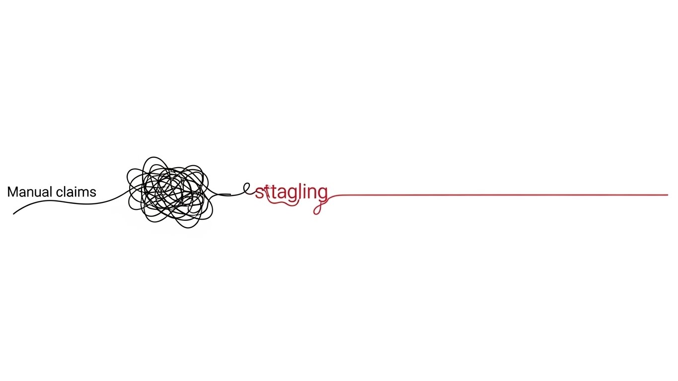
The Visual & Narrative Approach
Visualization Scenario: A masterclass in minimalism. On a stark white background, a continuous black line forms a chaotic, tangled knot on the left (Manual Claims). As the line travels right, a red accent highlights the "untangling" moment, resolving into a perfectly straight, precise line (Automated Resolution). It visually creates order out of chaos.
Narration Style: Clinical, precise, and objective. Short, rhythmic sentences. "Complexity, resolved. Friction, removed."
Psychological Impact & KPI Focus
- Niche Psychology: This leverages the Zeigarnik Effect (desire for closure). The visual resolution of the knot provides a dopamine hit of satisfaction, validating the software's core promise: removing friction from the claims journey.
- Operational Impact: A perfect visual metaphor for Straight-Through Processing (STP). It simplifies a complex backend process into a universally understood symbol of efficiency.
Strategic Implementation & Trade-offs
- Best Use Case: "What is STP?" explainer videos (45-60s) for educational blog posts.
- Trade-off: Can feel "low budget" if the animation isn't silky smooth. It appeals to the logical brain, not the emotional one.
Companies using similar video content -
FlowForma – No-Code Claims Management – Untangles complex claims workflows simply.
Claimable – Claims Management Software – Resolves claims friction with clarity.
Pipefy – Workflow Automation – Creates order from process chaos.
3. Bold Kinetic Typography (Visual)
TOFU | Vertical Social Organic
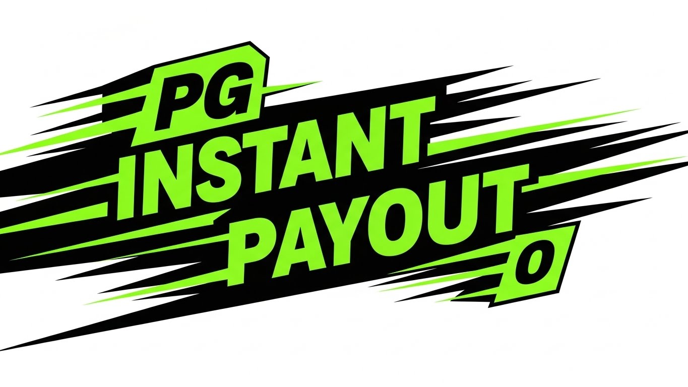
The Visual & Narrative Approach
Visualization Scenario: Speed is the feature. Heavy, blocky geometric shapes in electric lime green and black careen diagonally across the screen. They simulate the physical presence of "Fast Text" without needing to be legible. Motion blur and hard cuts create a visceral sense of velocity, mimicking the speed of an instant payout.
Tone: Urgent, disruptive, and confident. "Don't blink. Claim paid."
Psychological Impact & KPI Focus
- Niche Psychology: In a slow industry, speed is status. This style triggers a "Pattern Interrupt," grabbing attention by breaking the mold of conservative insurance aesthetics.
- Operational Impact: Optimized for View-Through Rate (VTR) on short ads (6s). It sells the feeling of a 3-second claim settlement, directly addressing the "Time to Settle" KPI.
Strategic Implementation & Trade-offs
- Best Use Case: YouTube Bumper Ads or Instagram Stories.
- Trade-off: High energy, low information. Use it to hook the audience, then retarget them with substantive content.
Companies using similar video content -
Snapsheet – Virtual Claims Platform – Delivers instant payouts with speed.
Pega – Claims for Insurance – Accelerates high-volume claims processing.
Multimodal – Agentic AI – Drives rapid P&C claims processing.
4. Abstract 3D AI Visualization
TOFU | Skippable Pre-Roll Ad

The Visual & Narrative Approach
Visualization Scenario: Visualizing the "Brain." A complex particle system in deep purple and neon blue forms a central, glowing neural network. Nodes connect with beams of light to analyze floating, translucent documents (claims data). The volumetric lighting gives it a cinematic, "sci-fi" quality, suggesting deep analysis is happening in the void.
Tone: Futuristic, intelligent, and premium. "The power to think at scale."
Psychological Impact & KPI Focus
- Niche Psychology: Insurers are skeptical of "black box" AI. This visual gives the AI a form—structured, beautiful, and organized—which builds subconscious trust in its decision-making capabilities (Adjudication).
- Operational Impact: Positions the brand as a Thought Leader. It suggests that the platform is not just a database, but a cognitive engine capable of complex risk analysis.
Strategic Implementation & Trade-offs
- Best Use Case: Website Hero Backgrounds or Keynote Openers.
- Trade-off: High production cost. It sets a very high expectation for the product's actual UI.
Companies using similar video content -
Majesco – Intelligent Core Suite – Powers deep analysis with embedded AI.
Nanonets – Document Processing AI – Visualizes cognitive data extraction.
Docsumo – AI-Driven Platform – Shows intelligent document processing in action.
5. Lifestyle Stock with UI Overlay
TOFU | Shaping Brand Perception

The Visual & Narrative Approach
Visualization Scenario: Humanizing the tech. A young claims adjuster sits in a sunlit coffee shop, smiling at her tablet. Floating in the air are sleek, holographic UI elements—green checkmarks and progress bars—indicating work is being completed automatically. The warm tones of the coffee shop contrast with the cool, precise digital overlays.
Tone: Empathetic, warm, and liberating. "Work from anywhere. We handle the rest."
Psychological Impact & KPI Focus
- Niche Psychology: Addresses the "Talent Crunch" and burnout. It visualizes the software as a tool for employee empowerment and work-life balance, not just productivity.
- Operational Impact: High Engagement Rate on social platforms. It connects the technical feature (automation) with the human benefit (relief).
Strategic Implementation & Trade-offs
- Best Use Case: Recruitment videos or social ads targeting end-users (adjusters).
- Trade-off: Stock footage can look generic. The holographic UI must be tracked perfectly to look integrated and premium.
Companies using similar video content -
VCA – Claims Management Software – Empowers adjusters with mobile efficiency.
BriteCore – BriteApps – Humanizes policyholder self-service experience.
Jenesis Software – Agency Management System – Connects users with intuitive client portals.
6. Minimalist Flat 2D Vector
TOFU | Meta & General Social Ads
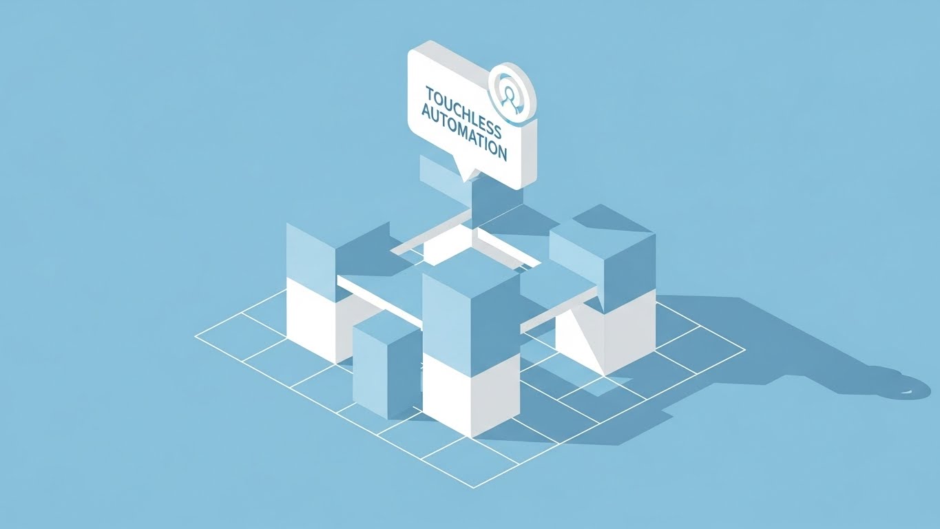
The Visual & Narrative Approach
Visualization Scenario: The "Blueprint." On an isometric grid, simple sky-blue and white blocks assemble to form a solid structure. A "Touchless Automation" icon sits at the apex. No shadows, no gradients—just pure structural logic. It implies that the software is built on a flawless code foundation.
Tone: Foundational, clear, and architecturally sound. "Built for the future. Engineered for scale."
Psychological Impact & KPI Focus
- Niche Psychology: Appeals to the "Architect" persona (CTO). The clean lines and grid layout suggest code quality, modularity, and stability.
- Operational Impact: Ideal for Category Creation. It helps explain how a new technology stack is built without getting distracted by flashy effects.
Strategic Implementation & Trade-offs
- Best Use Case: Whitepaper explanatory graphics or "Architecture" slide decks.
- Trade-off: Can feel cold. Use it to explain logic, not to build emotional connection.
Companies using similar video content -
Guidewire – InsuranceSuite – Showcases robust, modular core architecture.
Insurity – P&C Software Solutions – Presents foundational, scalable insurance platforms.
Sapiens – Insurance Platform – Illustrates structural integrity for core systems.
7. Split Screen: Optimized Reality and UI
TOFU | Category Creation
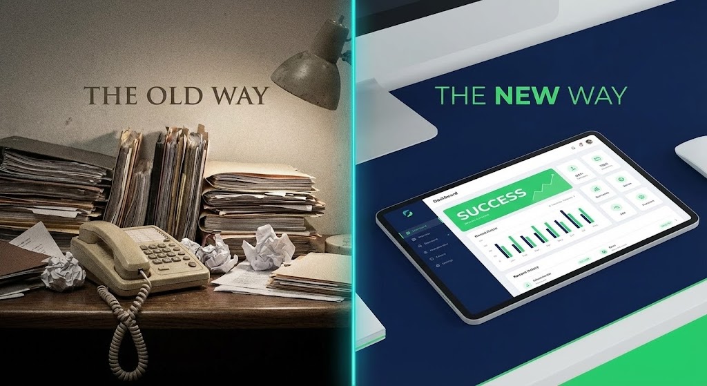
The Visual & Narrative Approach
Visualization Scenario: The "Contrast." Left side: Grainy, desaturated footage of a messy desk and paper files (The Old Way). Right side: Sharp, vivid 4K render of a sleek tablet dashboard (The New Way). A glowing line divides them, moving left to "erase" the old way as the video progresses, visually replacing the clutter with clarity.
Tone: Transformational. "Leave the paper behind. Step into the light."
Psychological Impact & KPI Focus
- Niche Psychology: Triggers "Loss Aversion." It validates the pain of the current manual process while offering a clear, bright alternative.
- Operational Impact: Drives Conversion. It is the most effective way to visualize the ROI of modernization on a landing page by showing the "Before & After" state.
Strategic Implementation & Trade-offs
- Best Use Case: "Why Switch?" landing pages.
- Trade-off: Avoid making the "Old Way" look like a cartoon; it should look like a realistic struggle to generate empathy.
Companies using similar video content -
Duck Creek – Claims SaaS – Contrasts old manual processes with digital clarity.
Damco Solutions – InsureEdge – Transforms legacy systems to modern efficiency.
SimpleSolve – SimpleINSPIRE – Modernizes policy lifecycles from legacy friction.
8. Clean UI Workflow (Light Mode)
MOFU | Product/Solution Differentiation
The Visual & Narrative Approach
Visualization Scenario: The "Happy Path." Floating UI cards on a soft grey background show a First Notice of Loss workflow. Invisible cursors fill fields and progress bars zip to completion. The aesthetic is airy and "Apple-esque," stripping away the clutter of browser windows to focus purely on the workflow steps.
Tone: Effortless and modern. "Intake in seconds. Zero friction."
Psychological Impact & KPI Focus
- Niche Psychology: Reduces "Implementation Anxiety." It proves that the enterprise software is user-friendly and won't require months of training.
- Operational Impact: Supports Feature Adoption. It visualizes the ease of data entry and workflow management, crucial for user buy-in.
Strategic Implementation & Trade-offs
- Best Use Case: Product pages and feature walkthroughs.
- Trade-off: Abstracts data details. Sells the experience of the UI, not the specific fields.
Companies using similar video content -
Yorosis – YoroClaims – Demonstrates frictionless claims intake workflow.
Kissflow – Workflow Management – Simplifies process steps with clean UI.
BriteCore – Policyholder App – Offers effortless, intuitive claims submission.
9. Photorealistic 3D Renders
MOFU | Feature Education

The Visual & Narrative Approach
Visualization Scenario: The "Boardroom." A metallic, abstract chess piece sits on a polished table, reflecting a background of gold risk curves. Lighting is cinematic and dramatic. This isn't about software features; it's about the strategic advantage the software provides in the market.
Tone: Authoritative and strategic. "Master the risk. Own the market."
Psychological Impact & KPI Focus
- Niche Psychology: Appeals to the ego of the C-Suite. It frames the software purchase as a strategic power move, not just an IT upgrade.
- Operational Impact: Establishes Market Dominance. Signals that the vendor is a premium, enterprise-grade partner capable of handling complex risk.
Strategic Implementation & Trade-offs
- Best Use Case: Whitepaper covers and Executive Summaries.
- Trade-off: Static and metaphorical. Use it to open the door, then use UI visuals to close the deal.
Companies using similar video content -
LogicManager – ERM Software – Visualizes strategic risk management advantage.
Origami Risk – Integrated SaaS – Represents strategic insights for risk.
Resolver – ERM Software – Commands attention for enterprise risk strategy.
11. Wireframe to Reality Transition
MOFU | Competitive Displacement
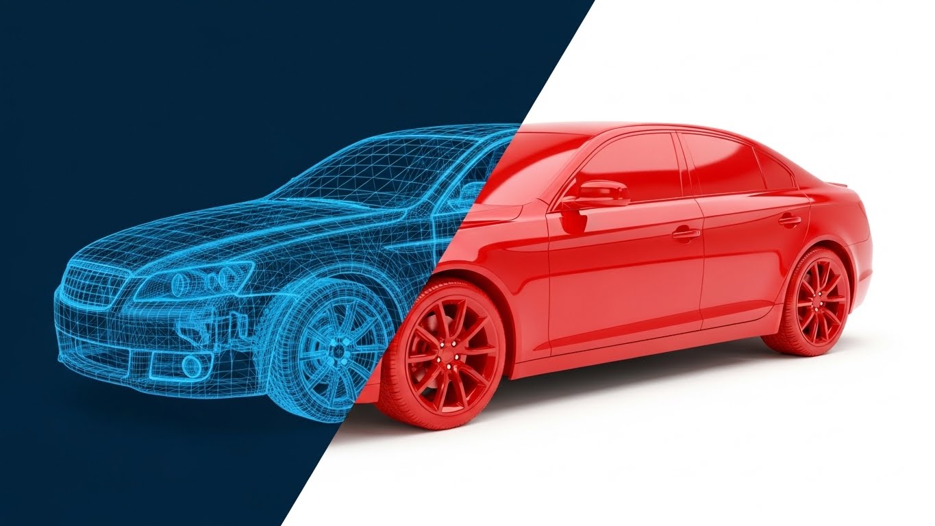
The Visual & Narrative Approach
Visualization Scenario: The "Proof of Structure." The screen is split diagonally. On the left, against a deep navy technical grid, a vehicle is depicted as a complex, cyan-blue wireframe mesh. This represents the raw, unstructured data (telematics, sensor inputs) at the moment of FNOL. A glowing "scan" line sweeps across to the right, instantly transforming the wireframe into a gleaming, solid red vehicle on a stark white background. This visualizes the software’s ability to take fragmented inputs and reconstruct a complete, resolved claim file.
Narration Style: Technical, transformative, and assured. "From raw signals to a resolution. We build the complete picture."
Psychological Impact & KPI Focus
- Niche Psychology: Claims technical leads often worry about data integrity and "loss of fidelity" during ingestion. This style uses the visual language of engineering (CAD/Wireframes) to signal precision, accuracy, and robust data handling.
- Operational Impact: Visualizes Data Enrichment. It proves the platform doesn't just store data; it interprets and solidifies it, reducing the need for manual fact-checking.
Strategic Implementation & Trade-offs
- Best Use Case: LinkedIn Video Ads targeting technical buyers (CTOs/IT Directors).
- Trade-off: It is highly technical. It appeals less to the emotional "Customer Success" buyer and more to the "System Integrity" buyer who values code quality.
Companies using similar video content -
Astera – ReportMiner – Transforms raw data into structured claims files.
SortSpoke – Insurance Automation – Reconstructs fragmented inputs into complete data.
Exdion – CSRdigit – Solidifies unstructured data into policy insights.
12. Aspirational Stock Montage
MOFU | Building Trust & Credibility

The Visual & Narrative Approach
Visualization Scenario: The "Human Outcome." We leave the software interface to focus on the real-world result. A warm, sunlit scene shows a relieved family shaking hands with a field appraiser outside their modern home. The lighting is "Golden Hour"—soft and backlit—contrasting with the cool blues of typical tech marketing. The focus is on the human connection—the handshake, the genuine smiles—visualizing the successful, friction-free settlement of a claim.
Narration Style: Empathetic, human-centric, and warm. "Technology that restores lives, not just files."
Psychological Impact & KPI Focus
- Niche Psychology: Insurers are ultimately in the business of trust. This style reminds buyers that the ultimate KPI is Customer Satisfaction (CSAT) and retention, not just processing speed.
- Operational Impact: Increases Brand Affinity. It connects the back-end efficiency of the software to the front-end brand promise of the insurance carrier: protection and restoration.
Strategic Implementation & Trade-offs
- Best Use Case: Case Study pages and "Our Mission" videos.
- Trade-off: Can feel generic if overused. It must be paired with specific metrics (e.g., "Claims settled 30% faster") to ground the emotion in fact.
Companies using similar video content -
Applied Systems – Applied Epic – Builds trust through enhanced client relationships.
EIS Group – Core Transformation Platform – Focuses on customer-centric outcomes.
OneShield – Insurance Solutions – Elevates customer experience and loyalty.
13. Rapid UI Feature Montage
MOFU | Driving Demo Requests
The Visual & Narrative Approach
Visualization Scenario: The "Arsenal." A high-energy 3D composition where translucent, glass-like UI screens fly toward the camera through a magenta and cyan void. Each screen highlights a specific micro-feature: a "Fraud Alert" toggle, a "Payment" button, a "Risk Score" chart. The motion is rapid and rhythmic, creating a sense of depth and abundance, suggesting the platform is packed with powerful tools ready for deployment.
Narration Style: Fast-paced, rhythmic, and exciting. "Analyze. Detect. Settle. Everything you need, moving at the speed of risk."
Psychological Impact & KPI Focus
- Niche Psychology: Combatting "Feature FOMO." This style overwhelms the viewer (positively) with the sheer volume of capabilities, signaling that this is a comprehensive Enterprise solution, not a point solution.
- Operational Impact: Drives Demo Requests. By flashing features quickly, it creates curiosity—the viewer wants to pause and see more, prompting them to book a demo for a closer look.
Strategic Implementation & Trade-offs
- Best Use Case: Retargeting Ads (Remarketing) for users who visited the pricing page.
- Trade-off: Sacrifices clarity for energy. It doesn't teach how to use the features, only that they exist and are abundant.
Companies using similar video content -
Guidewire – InsuranceSuite – Showcases comprehensive features with high energy.
Majesco – P&C Intelligent Core Suite – Flashes abundant, powerful platform tools.
Insurity – Sure Suite – Highlights extensive capabilities for P&C.
14. Abstract 2D Motion Graphics
MOFU | Programmatic & ABM Display

The Visual & Narrative Approach
Visualization Scenario: The "Engine." Swirling, concentric rings of neon pink and indigo data packets spiral into a central vortex on a clean white background. It represents the high-speed ingestion of millions of data points—telematics, police reports, weather data—into a single core engine. The movement is hypnotic, constant, and precise, suggesting infinite processing capacity.
Narration Style: Minimalist and sound-design driven. A hum of processing power. "Infinite scale. Zero lag."
Psychological Impact & KPI Focus
- Niche Psychology: Appeals to the anxiety of "System Overload" during catastrophe (CAT) events. The vortex implies the system can handle infinite volume without crashing or slowing down.
- Operational Impact: High Click-Through Rate (CTR) in display advertising. The bold colors and spiraling motion act as a "Pattern Interrupt" to stop the scroll on text-heavy industry news sites.
Strategic Implementation & Trade-offs
- Best Use Case: Programmatic Display Banners and Sidebar Video Ads.
- Trade-off: Completely abstract. It requires strong accompanying copy (e.g., "Handle CAT Events with Ease") to make the business case clear.
Companies using similar video content -
IBM – Cloud for Insurance – Visualizes high-volume data ingestion and processing.
360Globalnet – Claims Management – Represents infinite processing capacity.
Bolttech – Policy Lifecycle Management – Shows dynamic data flow and scale.
15. 2D Character-Driven Story
MOFU | Website Visitor Re-engagement

The Visual & Narrative Approach
Visualization Scenario: The "Peace of Mind." A stylized, friendly 2D character (soft pinks and blues) sits back in their chair, hands behind their head, looking at a large green checkmark on their monitor. The aesthetic is soft and inviting, contrasting with the high-stress reality of claims handling. It visualizes the feeling of a "zero-touch" claim where the adjuster doesn't need to intervene.
Narration Style: Light, friendly, and relieving. "The best claim is the one you don't have to touch. Done."
Psychological Impact & KPI Focus
- Niche Psychology: Directly addresses Adjuster Burnout. Instead of showing more work or complex dashboards, it sells the absence of work—the relief of automation and a clear queue.
- Operational Impact: Effective for Visitor Re-engagement. It reminds prospects of the emotional benefit (less stress) rather than just the technical benefit (efficiency).
Strategic Implementation & Trade-offs
- Best Use Case: Facebook/Instagram Retargeting and "Thank You" pages.
- Trade-off: Can appear "too playful" for conservative enterprise buyers if not balanced with professional copy. Avoid cartoony sound effects.
Companies using similar video content -
VCA – Claims Management Software – Illustrates automated relief for adjusters.
FlowForma – No-Code Claims Management – Depicts peace of mind through automation.
Aclaimant – Claims Management – Visualizes simplified, stress-free claims.
16. Dynamic Data Visualization
BOFU | ROI Justification

The Visual & Narrative Approach
Visualization Scenario: The "ROI Proof." Set in a pristine 3D studio, glowing emerald green bars rise triumphantly (Savings/Efficiency) while dark grey obsidian blocks shrink and recede (Operational Costs). Glowing data lines connect the peaks, emphasizing the diverging trajectory. It is a literal visualization of the "Jaws of Profit"—widening the gap between cost and revenue.
Narration Style: Financial, factual, and punchy. "Costs down. Efficiency up. The math is simple."
Psychological Impact & KPI Focus
- Niche Psychology: Targeted at the CFO. It strips away the "tech" and focuses purely on the P&L statement. It validates the investment by visualizing the Loss Adjustment Expense (LAE) reduction.
- Operational Impact: Crucial for Sales Enablement. This visual provides the "ammunition" internal champions need to justify the budget to their finance teams.
Strategic Implementation & Trade-offs
- Best Use Case: Sales Decks (ROI Slide) and Bottom-of-Funnel email campaigns.
- Trade-off: Dry. It appeals to the logical brain exclusively. Do not use this for brand awareness; use it to close the deal.
Companies using similar video content -
Riskonnect – Claims Management – Visualizes reduced LAE and cost savings.
Quantivate – ERM Solution – Shows financial impact of risk mitigation.
MetricStream – ERM and GRC – Displays clear ROI for risk compliance.
17. 3D X-Ray Visualization
BOFU | Risk Mitigation

The Visual & Narrative Approach
Visualization Scenario: The "Deep Scan." A translucent, glass-like rendering of a vehicle engine block sits in a dark void. As a scanner passes over it, a specific internal gear glows with a pulsating red core—representing a detected anomaly or potential fraud ring. The X-ray effect creates a sense of "superpower vision," seeing risks that are invisible to the naked eye.
Narration Style: Serious, protective, and forensic. "See what others miss. Stop leakage before it starts."
Psychological Impact & KPI Focus
- Niche Psychology: Plays on the fear of Claims Leakage and undetected fraud. It positions the software as a vigilant guardian that protects the bottom line from "invisible" threats.
- Operational Impact: Validates the Security/Risk value proposition. It effectively visualizes AI-driven fraud detection without showing boring lines of code.
Strategic Implementation & Trade-offs
- Best Use Case: Product Pages (Security Section) and Fraud Prevention Whitepapers.
- Trade-off: Very technical. It requires a specific context (Fraud/Risk) and may confuse users if used to explain general workflow.
Companies using similar video content -
LexisNexis – Claims Solutions – Detects fraud with "superpower vision."
Multimodal – Agentic AI – Reveals hidden risks for fraud detection.
A1 Tracker – Claims Management – Scans for anomalies in risk data.
18. Isometric 2D Motion Design
BOFU | The Economic Buyer
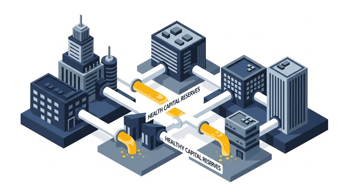
The Visual & Narrative Approach
Visualization Scenario: The "Enterprise View." An isometric cityscape of corporate buildings connected by pipelines. Instead of water, these pipes carry a golden fluid representing "Capital Reserves." We see the flow being optimized—diverted efficiently from "Reserved" to "Liquid"—visualizing the release of trapped capital back into the business. The style is clean, precise, and authoritative.
Narration Style: Strategic, high-level, and corporate. "Optimize your reserves. Unlock your capital. Fuel your growth."
Psychological Impact & KPI Focus
- Niche Psychology: Specifically designed for the CEO/CFO. It moves the conversation from "processing claims" to "capital management" and solvency, elevating the vendor to a strategic partner level.
- Operational Impact: Supports Executive Summary presentations. It visualizes the impact of accurate reserving on the company's overall financial health.
Strategic Implementation & Trade-offs
- Best Use Case: Executive Summaries and Annual Report visualizations.
- Trade-off: Too high-level for end-users. An adjuster won't care about capital reserves, so keep this for the boardroom.
Companies using similar video content -
Majesco – P&C Intelligent Core Suite – Optimizes capital reserves for growth.
Quantivate – ERM Solution – Visualizes strategic capital management.
LogicGate – Risk Cloud – Orchestrates enterprise risk for financial health.
19. Isometric 3D Workflow
BOFU | The Functional Buyer

The Visual & Narrative Approach
Visualization Scenario: The "Factory Floor." A charming, claymation-style 3D render shows a perfectly organized conveyor belt. Abstract, uniform figures (representing the claims team) work in perfect sync, moving digital blocks (claims) along the line. There are no bottlenecks, no pile-ups—just a smooth, continuous flow. Soft lighting and shadows give it a tactile, premium feel.
Narration Style: Organized, rhythmic, and process-focused. "Orchestration, not chaos. Every claim, in its place, on time."
Psychological Impact & KPI Focus
- Niche Psychology: Appeals to the VP of Claims who struggles with operational chaos and bottlenecks. This visual promises order, predictability, and control over the workforce.
- Operational Impact: Visualizes Cycle Time Reduction. It creates a satisfying sense of "flow," validating the efficiency gains of the proposed workflow.
Strategic Implementation & Trade-offs
- Best Use Case: Solutions Pages (Workflow Management) and Implementation Guides.
- Trade-off: The "toy-like" aesthetic must be executed perfectly to look premium, not childish. It serves to simplify complexity, not to trivialize the work.
Companies using similar video content -
ProcessMaker – Workflow Automation – Orchestrates claims processes efficiently.
Appian – Low-Code Platform – Visualizes organized, continuous claims flow.
JW Software – PolicyHandler Enterprise – Streamlines workers' comp policy workflows.
20. Low-Poly 3D Modeling
BOFU | Reducing Implementation Friction
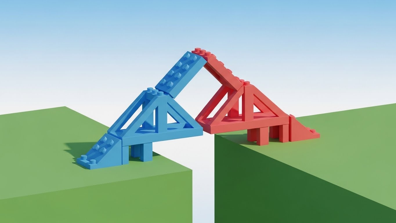
The Visual & Narrative Approach
Visualization Scenario: The "Bridge." Two separate landmasses (representing Legacy Systems and Modern Tech) are joined by a self-assembling bridge made of simple, vibrant geometric blocks (red and blue). The blocks click into place effortlessly. The low-poly style keeps the visual simple and accessible, suggesting that "integration" is just a matter of connecting the right building blocks.
Narration Style: Encouraging, simple, and direct. "Bridge the gap. Connect your legacy systems. Painless integration."
Psychological Impact & KPI Focus
- Niche Psychology: deeply addresses Implementation Anxiety. "Rip and replace" is a terrifying phrase in insurance. This visual calms that fear by suggesting a modular, constructive approach to modernization.
- Operational Impact: Reduces Sales Friction. It visualizes the API connectivity layer as a simple, sturdy bridge, making the technical migration feel manageable.
Strategic Implementation & Trade-offs
- Best Use Case: Implementation Guides and "Onboarding" section of the proposal.
- Trade-off: It is metaphorical. It doesn't show actual API code, so it must be supported by technical documentation for the IT team.
Companies using similar video content -
Socotra – Cloud-Native Core System – Bridges legacy systems with modern tech.
Damco Solutions – InsureEdge – Connects systems with painless integration.
Total Systems – bluescape – Assembles digital insurance platforms modularly.
21. Generative AI Realistic Character Video
BOFU | Sales Cycle Acceleration

The Visual & Narrative Approach
Visualization Scenario: The "Face of the Machine." We move beyond abstract shapes to hyper-realistic representation. A composed, professional female claims director stands in a high-tech control center. Behind her, blurred server racks and digital maps glow softly. She looks slightly off-camera with a knowing, confident smile. The lighting is cinematic portrait style—high contrast yet warm. This isn't a stock photo; it's a generated video avatar that speaks with perfect lip-sync, embodying the competence of the software.
Narration Style: Personal, direct, and sophisticated. "It’s not just about data. It’s about decision confidence. We empower the people who protect the policyholder."
Psychological Impact & KPI Focus
- Niche Psychology: Addresses the "Dehumanization" of insurance. Stakeholders worry that automation removes the human judgment essential for complex claims. This visual reintroduces the "Human in the Loop," suggesting the AI empowers the professional rather than replacing them.
- Operational Impact: Accelerates Deal Velocity. By putting a "face" to the software, you build subconscious rapport and trust that pure UI screenshots cannot achieve.
Strategic Implementation & Trade-offs
- Best Use Case: LinkedIn Video Ads or personalized video messages in sales emails.
- Trade-off: Requires high-quality generation models to avoid the "Uncanny Valley." Authenticity is key; if the avatar looks robotic, trust is lost.
Companies using similar video content -
Practo Insura – AI Virtual Agent – Embodies professional trust and decision confidence.
Multimodal – Conversational AI – Provides human-like interaction for support.
Oracle – Digital Insurance Platform – Presents advanced AI capabilities confidently.
22. 2D Animation & UI Composition
BOFU | Objection Handling
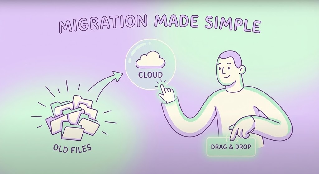
The Visual & Narrative Approach
Visualization Scenario: The "Easy Lift." A friendly, lilac-toned 2D character interacts with a floating, semi-transparent interface. They casually drag a messy stack of "Old Files" icons toward a glowing, clean "Cloud" orb. The action is smooth and elastic—a satisfying "pop" occurs as the files are absorbed and organized instantly. The background is a calming gradient, stripping away the complexity of server rooms or code.
Narration Style: Light, breezy, and reassuring. "Drag. Drop. Done. Migration has never been this light."
Psychological Impact & KPI Focus
- Niche Psychology: Dismantles Change Resistance. The number one blocker to closing a deal is the fear of a painful, multi-year migration project. This visual makes the process look as easy as organizing a desktop folder.
- Operational Impact: Directly combats Stalled Opportunities by visually trivializing the effort required to switch platforms.
Strategic Implementation & Trade-offs
- Best Use Case: Email nurture campaigns targeting prospects who have gone quiet (Objection Handling).
- Trade-off: It oversimplifies the backend engineering. Use it to sell the outcome, not the process.
Companies using similar video content -
SimpleSolve – SimpleINSPIRE – Simplifies migration to modern policy systems.
InsuredHQ – Insurance Infrastructure – Visualizes easy, cloud-based transition.
KGiSL – n-sure – Makes complex insurance management effortless.
23. Macro UI Micro-Interactions
Onboarding | Self-Serve Onboarding

The Visual & Narrative Approach
Visualization Scenario: The "Touchpoint." An extreme close-up (macro) shot of a smartphone screen. The focus is razor-sharp on a single teal pill-shaped button labeled "One-Click." We see the subtle sub-pixel glow. A finger presses it, and the button reacts with a satisfying physical depression and a ripple of light, indicating an instant command execution. It turns digital work into a tactile, satisfying event.
Narration Style: Focused, sensory, and brief. "One tap. Claim resolved. Next."
Psychological Impact & KPI Focus
- Niche Psychology: Leveraging Haptic Visualization. It triggers a mirror neuron response—the viewer "feels" the ease of use. It promises a system that is responsive and tangible, not laggy or abstract.
- Operational Impact: Critical for User Adoption. It sets the expectation that the mobile app is intuitive and requires zero training, encouraging self-service.
Strategic Implementation & Trade-offs
- Best Use Case: App Store Preview videos and Welcome Screens inside the mobile app.
- Trade-off: Extremely narrow focus. It sells usability, not functionality.
Companies using similar video content -
VCA – Claims Management Software – Highlights tactile, instant mobile resolution.
BriteCore – BriteApps – Showcases intuitive, one-click user experience.
Jenesis Software – Client Portal – Emphasizes effortless client interactions.
24. 2D Graphics Over Live Action
Onboarding | Accelerating Time-to-Value
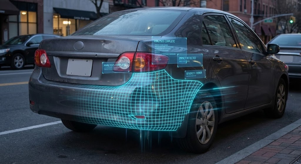
The Visual & Narrative Approach
Visualization Scenario: The "Augmented Truth." Handheld, gritty live-action footage shows a real car with a dented bumper. Suddenly, a pristine, neon-blue wireframe grid snaps over the damage, conforming perfectly to the contours. Floating text boxes pop up: "Impact Detected," "Severity: Minor," "Est: $450." It blends the messy reality of a crash with the precision of digital analysis.
Narration Style: Tech-forward and immediate. "See the damage. Know the cost. Instantly."
Psychological Impact & KPI Focus
- Niche Psychology: Validates Accuracy. By showing the grid locking onto the physical car, it proves the software "sees" reality and isn't just guessing. It builds trust in automated estimates.
- Operational Impact: Accelerating Time-to-Value. It shows new users exactly how the photo-based appraisal tool works in the real world, reducing error rates in photo submission.
Strategic Implementation & Trade-offs
- Best Use Case: Onboarding tutorial videos for policyholders or field adjusters.
- Trade-off: Production requires matching camera tracking perfectly. If the grid "slips," the illusion of accuracy is broken.
Companies using similar video content -
Snapsheet – Virtual Estimating – Augments real damage with digital analysis.
Hover – 3D Property Measurement – Overlays precise digital scans on reality.
Encircle – Property Documentation – Blends physical reality with digital insights.
25. Hybrid: Minimalist Flat + Line Art
Retention | Reducing Support Overhead

The Visual & Narrative Approach
Visualization Scenario: The "Solution." A stark white background features a fluid, continuous black line drawing. It starts as a "Question Mark," untangles itself, and morphs elegantly into a bold yellow "Checkmark." There is no background noise, no distractions—just the pure geometry of a problem being solved.
Narration Style: Instructional and crisp. "Questions turned into answers. Support made simple."
Psychological Impact & KPI Focus
- Niche Psychology: Calms Cognitive Overload. When a user visits a help center, they are likely frustrated. This ultra-clean style lowers their heart rate and signals that the answer is simple and direct.
- Operational Impact: Reduces Support Ticket Volume. By using clear, simple visuals for FAQs, users solve problems themselves rather than calling the helpdesk.
Strategic Implementation & Trade-offs
- Best Use Case: Knowledge Base headers and "Help Center" explainer thumbnails.
- Trade-off: Too abstract for complex technical debugging. Use it for high-level concept resolution.
Companies using similar video content -
Claimable – Claims Management Software – Clarifies problem resolution simply.
FlowForma – No-Code Claims Management – Guides users to clear answers.
Kissflow – Workflow Management – Simplifies complex processes visually.
26. Hyper-lapse Stock Footage with Data
Retention | Knowledge Base & FAQ Videos

The Visual & Narrative Approach
Visualization Scenario: The "Flow." A nighttime hyper-lapse of a massive city intersection. Car headlights form long red and white streaks, moving frantically. Superimposed over this chaos is a calm, static cyan data structure—nodes and lines connecting the moving vehicles. The contrast is the story: the city is chaotic, but the software (the overlay) is stable, monitoring millions of events without blinking.
Narration Style: Grandiose and observant. "Let the world move fast. We capture every signal."
Psychological Impact & KPI Focus
- Niche Psychology: Reassures regarding Scalability. It visually demonstrates that the platform sits above the chaos of daily claims traffic, providing a layer of order and control.
- Operational Impact: Reinforces Platform Reliability. It suggests the system is "always on" and capable of handling massive spikes in FNOL volume.
Strategic Implementation & Trade-offs
- Best Use Case: "System Status" pages or background videos for quarterly review presentations.
- Trade-off: The stock footage must be high quality (4K) to look premium.
Companies using similar video content -
Socotra – Cloud-Native Core System – Demonstrates scalable, reliable data processing.
IBM – Cloud for Insurance – Manages high-volume traffic with stability.
Insly – P&C Software – Visualizes high-volume policy throughput.
27. Generative AI Cinematic Video
Retention | Proactive Support/Announcements

The Visual & Narrative Approach
Visualization Scenario: The "Hero Shot." A dramatic, movie-like wide shot of a field adjuster standing on a coastline. Dark storm clouds gather (Teal/Orange contrast), and the wind whips their jacket. They hold a rugged tablet that glows warmly, illuminating their determined face. They look calm. This visualizes the software as the essential tool that empowers the adjuster to work in the toughest conditions (Catastrophe Response).
Narration Style: Epic, resilient, and inspiring. "When the storm hits, we are ready. Are you?"
Psychological Impact & KPI Focus
- Niche Psychology: Taps into the Hero Archetype. Adjusters see themselves as first responders in financial recovery. This style validates that identity and positions the software as their "shield and sword."
- Operational Impact: Strengthens Brand Loyalty. It connects the vendor emotionally to the mission of the insurance carrier.
Strategic Implementation & Trade-offs
- Best Use Case: Product Launch events for new mobile features or "Thank You" videos to claims staff after a major CAT event.
- Trade-off: Must be labeled as "AI Generated" or stylized enough to not be mistaken for real news footage.
Companies using similar video content -
VCA – Claims Management Software – Empowers adjusters in tough CAT conditions.
FINEOS – Claims Management – Visualizes resilience during major events.
Vertafore – AMS360 – Equips agencies for challenging scenarios.
28. Futuristic Neon/Dark Mode
Expansion | Driving Upsell/Cross-sell

The Visual & Narrative Approach
Visualization Scenario: The "Unlock." In a deep black void, a crystalline, neon-edged badge floats. It glows with electric magenta and cyan light. Inside, the word "PREMIUM" (or "ANALYTICS+") is rendered in dimensional glass. Light refracts through the edges. It looks like a high-end gaming achievement or a luxury credit card. It screams exclusivity and power.
Narration Style: Seductive and exclusive. "Power. Precision. Prestige. Unlock the ultimate tier."
Psychological Impact & KPI Focus
- Niche Psychology: Triggers FOMO (Fear Of Missing Out) and status seeking. The "Dark Mode" aesthetic is associated with "Pro" tools and developer-grade power. It makes the upgrade feel like a status symbol.
- Operational Impact: Drives Average Revenue Per User (ARPU). It visually differentiates the "Basic" tier from the "Enterprise" tier, making the upgrade feel tangible and valuable.
Strategic Implementation & Trade-offs
- Best Use Case: In-app modals prompting users to upgrade or "Feature Locked" screens.
- Trade-off: Can look "gamer-y" if not refined. Keep the fonts elegant.
Companies using similar video content -
Insurity – Insurity Pro Suite – Signals exclusive, premium feature unlock.
Majesco – P&C Intelligent Core Suite – Highlights advanced analytics and power.
FileHandler Enterprise – Claims Management – Showcases advanced, exclusive capabilities.
29. 3D Parallax UI Presentation
Expansion | Driving Deep Feature Adoption
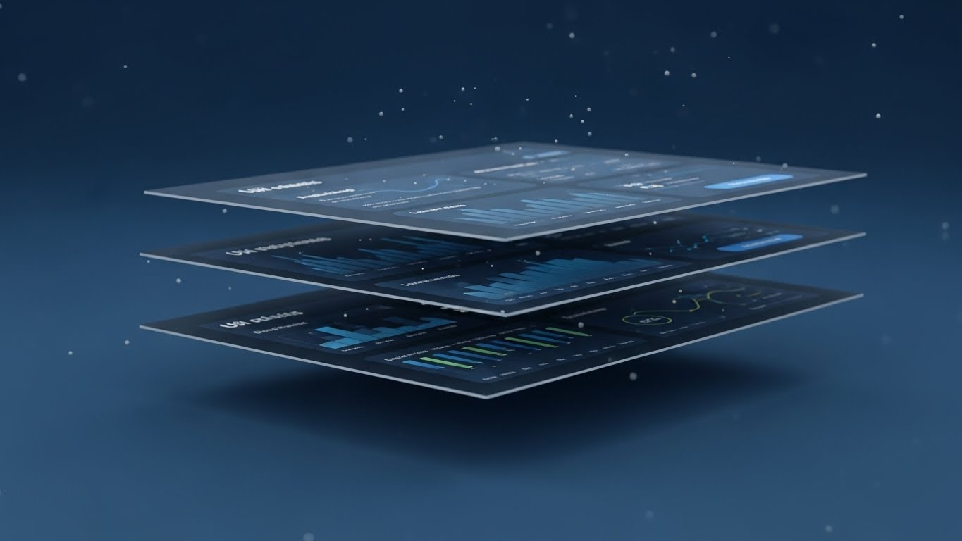
The Visual & Narrative Approach
Visualization Scenario: The "Stack." We see a standard UI dashboard, but then the camera tilts, and the screen splits into three floating layers in 3D space. The top layer is the interface, the middle is the analytics, and the bottom is the raw data code. This "exploded view" reveals the depth and complexity hidden behind the simple screen. Floating particles add atmosphere.
Narration Style: Analytical and deep. "Look beneath the surface. Deep insights, waiting to be found."
Psychological Impact & KPI Focus
- Niche Psychology: Appeals to the Curiosity Gap. Users often only use 20% of a software's features. This visual hints that there is "more to discover" beneath the surface, prompting exploration.
- Operational Impact: Increases Feature Utilization Rates. It visually explains that the dashboard isn't just a display; it's a multi-layered tool for deep analysis.
Strategic Implementation & Trade-offs
- Best Use Case: Feature Spotlight emails or "Did You Know?" tooltips.
- Trade-off: Requires high-fidelity UI assets. Blurry text ruins the effect.
Companies using similar video content -
Guidewire – InsuranceSuite – Reveals deep insights beneath the surface.
Riskonnect – Integrated SaaS – Explores multi-layered data for analysis.
Archipelago Analytics – AI-Driven Data Management – Uncovers deep risk intelligence.
30. Dark Mode UI Showcase
Expansion | In-App Upsell
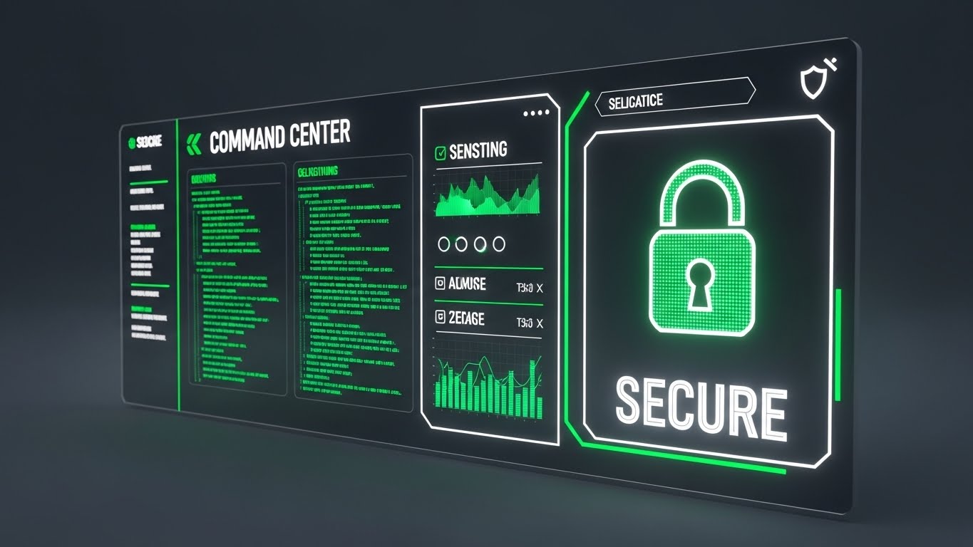
The Visual & Narrative Approach
Visualization Scenario: The "Admin View." A sleek, angled shot of a "Command Center" dashboard in dark mode. High-contrast neon green elements highlight "Security Protocols" and "API Health." Scrolling code streams on the left suggest real-time activity. A large "SECURE" lock icon anchors the composition. This is not for the adjuster; this is for the CIO and the Security Architect.
Narration Style: Secure, technical, and firm. "Total control. Zero compromise. Security built in."
Psychological Impact & KPI Focus
- Niche Psychology: Addresses Security Anxiety. For the technical buyer, "pretty" software is suspicious. "Dark Mode" and code streams signal robustness, security, and developer-centric design.
- Operational Impact: Facilitates Technical Sign-off. It gives the IT team the visual assurance that the platform is enterprise-grade and secure.
Strategic Implementation & Trade-offs
- Best Use Case: Developer Portals, API Documentation headers, and Security Whitepapers.
- Trade-off: Alienating to non-technical users. Keep this strictly for the IT/Admin audience.
STRATEGIC KNOWLEDGE BASE: The Visual Operations Doctrine
Synthesizing Visual Style into Business Outcomes
The 30 styles above are not merely aesthetic choices; they are functional tools for business transformation. To maximize ROI, Claims Directors and Transformation Architects must apply these visuals strategically across the insurance lifecycle. We have organized these strategies into three core operational segments.
STRATEGIC ALIGNMENT & VISUAL ARCHITECTURE
- The "Pre-Production" Strategy – Aligning Visuals with Claims Logic.*
- The Cognitive Load Audit: Before creating training videos, audit your current claims screens. If a screen has 50 fields, do not use a "Screen Recording" (Style 15). Use Abstract Motion (Style 1) to conceptualize the workflow first, reducing the "shock" of complexity for new adjusters.
- Role-Based Visual Mapping: Differentiate your visual language. Use Touchless/Mobile styles (Styles 5, 23) for Field Adjusters who need speed and simplicity. Use Dark Mode/Data Density styles (Styles 16, 26) for Desk Adjusters and Fraud Analysts who need to feel like they are in a "Command Center."
- The "Glanceability" Standard: In high-stress environments (e.g., CAT response), information must be consumed in seconds. Adopt the Kinetic Typography (Style 3) approach for internal alerts—big, bold, and reading-free.
- Brand Voice Consistency: Your "Claim Denied" letter is cold; your "Claim Paid" email is happy. Your visuals must match. Use Soft 2D Animation (Style 2) for sensitive communications to soften the blow, and Bold Motion (Style 3) for payment confirmations to amplify the positive moment.
- The Advids Strategic Audit: We recommend a "Visual Audit" of your entire content library. Often, insurers have disjointed visuals—stock photos on the blog, grainy screenshots in the help center. Advids helps unify this into a cohesive "Visual Operating System" that builds trust at every touchpoint.
- Standardization vs. Customization: For core FNOL processes, use standardized Clean UI (Style 8) to ensure consistency. For specialized claims (e.g., Commercial Marine), use Custom 3D (Style 9) to show you understand the specific nuances of that risk.
- The Cross-Departmental Bridge: Sales sells "Magic," Ops deals with "Reality." Bridge this gap using Wireframe Transitions (Style 11). Show the "Magic" (Result) but transition from the "Wireframe" (Technical Reality) to manage expectations and validate the engineering.
- Legacy System Integration: Visualizing the connection between a 30-year-old mainframe and a new SaaS UI is hard. Use Low-Poly Bridges (Style 20) or Connection Nodes (Style 1) to abstract the complexity and focus on the flow of data, not the ugly terminal screens.
- Accessibility in Claims: Your workforce is diverse. Kinetic Typography (Style 3) and Icon-Based Motion (Style 25) transcend language barriers, making them essential for global claims teams or multi-lingual support centers.
- The Mobile-First Mandate: 60% of interaction happens on mobile. Ensure all styles—even complex 3D Parallax (Style 29)—are legible on a vertical 9:16 screen. If it doesn't work on a phone, it doesn't work for the field adjuster.
OPERATIONAL ADOPTION & IMPLEMENTATION
- The "Deployment" Phase – Embedding Visuals into the Workflow.*
- Overcoming "Black Box" Anxiety: Adjusters often distrust AI. Use Glass/X-Ray 3D (Style 17) to show inside the algorithm. Visualizing the "Neural Core" (Style 4) makes the AI feel like a transparent tool they can trust, rather than a mystery box replacing them.
- The Micro-Learning Shift: Kill the 100-page PDF manual. Replace it with a library of 30-second Macro UI (Style 23) clips. Embed these directly into the software tooltips. "How to subrogate?" -> Click -> Watch 15s video -> Do.
- Just-in-Time Support: During a CAT event, support lines get jammed. Proactively push Kinetic Typography (Style 3) videos to adjusters' tablets with "Storm Protocol Reminders." This reduces inbound calls to the helpdesk.
- Gamification of Training: Use Futuristic/Neon styles (Style 13) to visualize adjuster performance metrics. Transform "Cycle Time" from a boring spreadsheet into a "High Score" visual to boost engagement and competition.
- Reducing Support Ticket Volume: There is a direct correlation between the quality of your Help Center Visuals (Style 25) and ticket volume. If the visual is clear (Question -> Checkmark), the user solves the problem themselves.
- Remote Onboarding: You can't fly everyone to HQ for training. Use Generative AI Presenters (Style 21) to deliver consistent, high-quality "Welcome" seminars to remote staff, ensuring every employee gets the same high-touch introduction.
- Standard Operating Procedures (SOPs): Text-based SOPs are ignored. Convert critical SOPs (e.g., "Fraud Escalation") into Isometric Workflow (Style 19) animations. The spatial visualization helps staff remember the "path" of the process better than text.
- Feedback Loops: Use Interactive Video elements. After a Feature Montage (Style 13) plays, pop up a quick "Did this help?" button. Use this data to refine your visual assets.
- Scalable Localization: If you operate globally, avoid text-heavy videos. Use Abstract Motion (Style 1) and Iconography (Style 25) where the meaning is carried by symbols, not voiceovers. This saves thousands in translation costs.
- Leadership Communication: When the VP of Claims presents a new strategy, don't use bullet points. Use Photorealistic 3D (Style 9) metaphors (e.g., the Chess Piece) to command attention and signal the weight of the initiative.
MEASURING IMPACT & FUTURE-PROOFING
- The "ROI" Phase – Measuring Success and Looking Ahead.*
- Beyond "Views": Metric: "Time-to-Competency." Measure how much faster a new adjuster handles their first claim after watching a Simulation Video (Style 10) vs. reading a manual. This is your ROI.
- The "Idle Time" Metric: Correlate specific UI Walkthroughs (Style 8) with a reduction in "Idle Time" inside the app. If users stop getting stuck on a screen, your video did its job.
- Compliance Velocity: When new regulations hit, speed is safety. Measure how quickly 100% of your staff watches the Kinetic Compliance Update (Style 3). Video allows for tracking audit trails that PDFs cannot.
- Retention and Churn: For SaaS vendors, User Delight (Style 5) correlates with retention. Tracking the consumption of "Advanced Feature" videos (Style 29) can predict which customers are "power users" and less likely to churn.
- The AI Visual Frontier: Generative Video (Style 21) is moving fast. Soon, you will be able to generate personalized "Claim Status" videos for every policyholder automatically. Start building the data infrastructure for this now.
- Scalability of Assets: Don't build "One-off" videos. Build a "Visual System" (Assets, Palettes, Motion Rules). This is where Advids excels—creating a library of assets that can be remixed and scaled as your software version updates.
- The Advids Partnership: Software updates weekly; your video library must keep up. Partnering with an agile agency like Advids ensures your UI Montages (Style 13) are always reflecting the current version, preventing "Version Confusion."
- Benchmarking Success: Compare your "Visual Density" against competitors. If they use High-End 3D (Style 4) and you use static screenshots, you are losing the "Perception of Innovation" battle before the demo even starts.
- The ROI of Safety (Fraud): Quantify the value of Fraud Detection Visualization (Style 17). If visually explaining the "Fraud Flags" helps analysts catch 1% more fraud, the video pays for itself 100x over.
- Final Call to Innovation: Treat video as Infrastructure, not marketing. In a "Touchless" insurance world, the Visual Interface is the relationship. Invest in it with the same rigor you invest in your code.
Companies using similar video content -
Multimodal – AgentFlow Platform – Showcases secure, developer-centric command center.
Quantivate – ERM Solution – Visualizes robust security and control.
Ventiv Technology – ERM and Risk Management – Highlights secure, enterprise-grade administration.
Author & Editor Bio


