
Introduction: Visualizing the Invisible Trust Protocol
The insurance industry is currently navigating its most profound shift in a century: the transition from reactive protection to predictive prevention. For the "Architects of Trust"—the CTOs, Product Leads, and Innovators driving this change—the challenge is no longer just technical; it is communicative. You are building sophisticated engines of certainty (AI underwriting, parametric triggers, automated claims), but you are selling them to a market deeply entrenched in legacy skepticism.
The "Physical/Digital Divide" remains the primary friction point. How do you prove that a cloud-based dashboard actually protects a physical asset? How do you visualize the robustness of an invisible API? In an operational landscape where 66% of firms still juggle over 10 disconnected data sources to manage premiums, the complexity of the backend often obscures the value of the solution. The cognitive load required to understand modern insurtech is immense, and traditional "talking head" videos are failing to bridge the gap.
Strategic visualization is the lever that turns this complexity into a competitive advantage. It is not about dumbing down the technology; it is about reducing the cognitive friction of understanding it. With AI-driven automation having reduced by 75% the time required for claims resolution in leading firms, the efficiency is real—but it must be seen to be believed.
This guide provides a strategic framework for that visualization. We have curated 30 distinct video styles, mapped specifically to the insurtech customer journey. From "Category Creation" visuals that define new risk models to "Implementation" transitions that lower deployment anxiety, each style is a tool designed to solve a specific psychological barrier to adoption.
1. Abstract 2D flat vector organic modern motion graphics
TOFU | Category Creation

The Visual & Narrative Approach
This style excels at making the invisible visible. The visual narrative begins with a chaotic flow of "Vivid Coral" organic blobs, representing the unpredictable and fluid nature of risk (e.g., market volatility, natural disasters). As these shapes move across the screen, they encounter the software's logic, instantly morphing into rigid, structured "Soft White" geometric shields. The transition is smooth and liquid, suggesting that the software handles risk effortlessly, transforming chaos into order without friction.
Psychological Impact & KPI Focus
For an audience of underwriters and risk managers, "chaos" is the enemy. This style leverages Cognitive Ease by simplifying complex risk mitigation processes into a binary state change: Unprotected (Chaos) Protected (Order). The "Glossy" aesthetic implies modernity and polish, subconsciously reassuring the viewer that the platform is robust and state-of-the-art.
- Operational Impact: Supports Category Creation (Framework 1.2). It bypasses technical details to sell the concept of stability.
Strategic Implementation & Trade-offs
- Best Use Case: Top-of-Funnel (TOFU) brand films on LinkedIn where sound-off autoplay requires strong visual storytelling.
- Duration: 15-30 seconds.
- Trade-off: This style is highly metaphorical. While excellent for emotion and concept, it is suboptimal for showing specific UI workflows or technical features. Use it to sell the vision, not the button.
Companies using similar video content -
Socotra – Connected Core Platform – Fluidly integrates insurance products.
EIS – Core Insurance Suite – Visualizing seamless data flow across modules.
2. Generative AI Realistic Character video
TOFU | Shaping Brand Perception

The Visual & Narrative Approach
This style leverages the latest in Generative AI to create a "hyper-competent" persona. We see a medium shot of a diverse insurance professional in a glass-walled, futuristic headquarters. The lighting is cinematic and optimistic. The key element is the prop: a transparent, holographic tablet displaying Navy Blue and Gold policy data. This visualizes the "Physical/Digital Bridge"—the human agent enhanced, not replaced, by your technology.
Psychological Impact & KPI Focus
Insurtech often suffers from a "cold" perception. This style re-injects humanity. By showing a confident, smiling professional using the tool, you trigger Social Proof—agents and brokers watching this imagine themselves feeling that confident and empowered. It anchors your brand as a partner to the industry's workforce, alleviating fears of AI displacement.
- Operational Impact: Targets Shaping Brand Perception (Framework 1.5). It humanizes the tech stack.
Strategic Implementation & Trade-offs
- Best Use Case: Vision videos and "Day in the Life" use cases targeting agency owners.
- Duration: 60-90 seconds.
- Trade-off: While visually stunning, Gen AI video requires meticulous quality control to avoid the "Uncanny Valley." It is powerful for mood but can lack the pixel-perfect precision needed for detailed software tutorials.
Companies using similar video content -
Gradient AI – AI Underwriting Platform – Humanizing AI's role in risk assessment.
Tractable – AI Solutions for Visual Assessment – AI agents assisting claims adjusters.
3. Bold Kinetic Typography (Visual)
TOFU | YouTube

The Visual & Narrative Approach
This is visualization at the speed of thought. Abstract geometric blocks representing keywords like "SPEED," "CLAIM," and "PAY" crash together in a high-energy collision. The palette is aggressive—Electric Lime and Black—utilizing heavy motion blur and canted angles to convey velocity. There is no voiceover; the typography is the audio-visual sync. The words do not just appear; they impact the screen, mimicking the instant nature of modern claims adjudication.
Psychological Impact & KPI Focus
The "Lizard Brain" craves speed. In the context of claims processing, "slow" equals "expensive." This style visceralizes the concept of Instant Settlement. It bypasses the logical brain (which wants to read specs) and hits the emotional brain (which wants results). It creates a feeling of momentum and inevitability around your solution.
- Operational Impact: Optimized for YouTube Organic Search (Framework 3.3). High retention rates signal relevance to algorithms.
Strategic Implementation & Trade-offs
- Best Use Case: Hype reels, event openers, and short YouTube ads targeting keywords like "Instant Claims Payout."
- Duration: 10-15 seconds.
- Trade-off: Extremely high energy but low information density. It grabs attention but cannot hold it for a complex explanation. Use it as a "scroll stopper."
Companies using similar video content -
Snapsheet – Claims Management Platform – Emphasizing speed in claims processing.
Shift Technology – Fraud Detection Solutions – Highlighting rapid fraud identification.
5. Minimalist Flat 2D Vector
TOFU | Brand Awareness
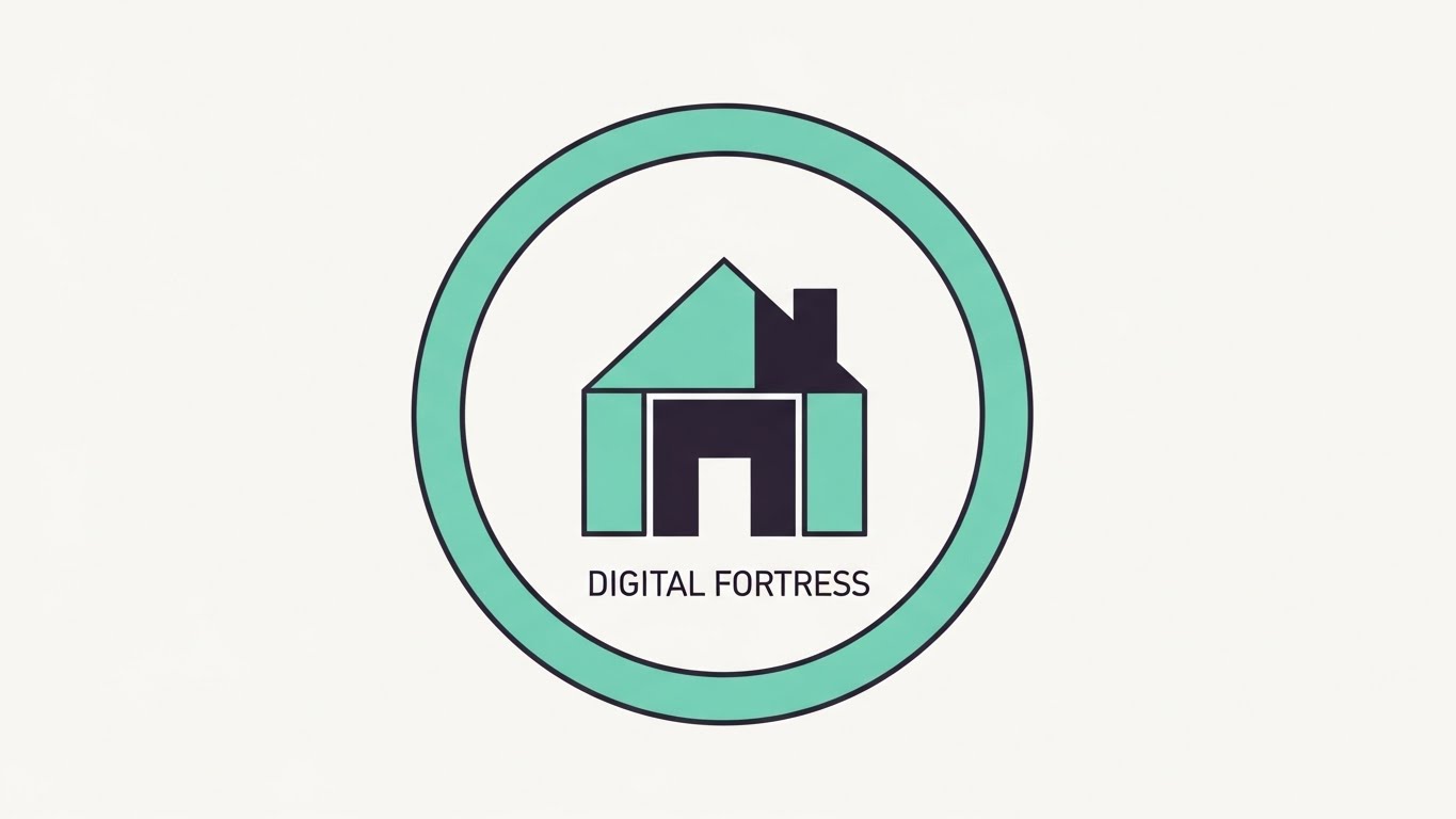
The Visual & Narrative Approach
Precision and symmetry define this style. A simple, iconographic house is enclosed within a circular "Digital Fortress" line. The colors are restricted to Pastel Teal and Charcoal against a stark white field. The motion is subtle—perhaps the circle draws itself to enclose the home. It creates a visual stamp of security, stripping away all noise to focus on the core promise: "We protect the asset."
Psychological Impact & KPI Focus
In a noisy social feed, simplicity is a disruptor. This style leverages Processing Fluency—the psychological principle that we prefer things that are easy to process. By reducing the visual elements to a single, clear icon, you signal that your software simplifies the complex world of insurance. It builds subconscious trust through clarity.
- Operational Impact: Ideal for Brand Awareness (Framework 1.1) in Display Ads.
Strategic Implementation & Trade-offs
- Best Use Case: Retargeting display ads and social media static/looping visuals.
- Duration: 5-10 seconds (Loop).
- Trade-off: It is static and symbolic. It cannot convey workflow or motion. It serves as a visual anchor or logo animation, not a product demo.
Companies using similar video content -
Lemonade – Insurance Platform – Simple icons for policy coverage and protection.
Hippo Insurance – Home Insurance Platform – Clean visuals for smart home protection.
6. Abstract 2D Motion Graphics
TOFU | Market Education

The Visual & Narrative Approach
This visualization tackles the "Data Highway" concept. We see a wide panoramic view of chaotic, tangled lines in Orange (representing raw, unstructured applicant data) flowing from left to right. As they pass through an invisible "filter" (your software's processing engine), they self-organize into straight, orderly parallel rows in Violet. The background is clean white, emphasizing the clarity of the result.
Psychological Impact & KPI Focus
This is the definitive visual metaphor for Underwriting Efficiency. Every insurer struggles with "dirty data." Seeing the visual transformation from "Tangle" to "Straight Lines" provides immediate cognitive relief. It promises that your software produces order, which implies compliance, accuracy, and speed—the three pillars of underwriting KPIs.
- Operational Impact: Perfect for Market Education (Framework 1.3). It explains "middleware" value instantly.
Strategic Implementation & Trade-offs
- Best Use Case: Website hero backgrounds and the "Problem/Solution" section of your pitch deck.
- Duration: 15-20 seconds (Loop).
- Trade-off: Highly abstract. It requires a headline or voiceover to contextualize what data is being processed. Without context, it's just pretty lines.
Companies using similar video content -
Planck – AI Data Platform – Streamlining unstructured data for underwriting.
Verisk – Data Exchange – Visualizing data alignment for insurance insights.
7. Isometric 2D Motion Design
MOFU | Product Differentiation
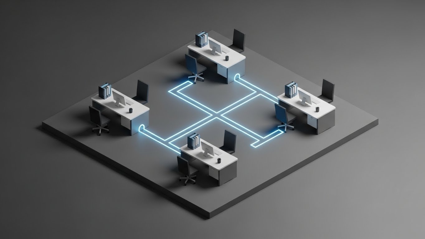
The Visual & Narrative Approach
The isometric angle (45 degrees) allows us to see the "floorplan" of a digital insurance agency. Minimalist desks are connected not by wires, but by glowing "workflow pipes" in Sky Blue against a technical Steel Gray background. We see a "packet" of information leave one desk and instantly arrive at another. It turns the abstract concept of "connectivity" into a schematic diagram.
Psychological Impact & KPI Focus
This style appeals to the "Builder" mindset of a CTO or Operations Manager. It looks like a blueprint. It visually validates the claim of Seamless Integration. By showing the whole "office" at once, it demonstrates ecosystem control, reassuring the viewer that your software connects the silos rather than creating new ones.
- Operational Impact: Supports Product Differentiation (Framework 1.7) by visualizing ecosystem value.
Strategic Implementation & Trade-offs
- Best Use Case: "How it Works" pages and integration explainer videos.
- Duration: 45-60 seconds.
- Trade-off: Can feel detached or "game-like." It’s great for showing flow, but lacks the human element of the Gen AI style or the specific detail of the UI montage.
Companies using similar video content -
Applied Systems – Epic Agency Management System – Mapping operational connectivity for agencies.
Vertafore – AMS360 – Visualizing integrated workflows for insurance brokers.
8. Rapid UI Feature Montage
MOFU | Feature Education
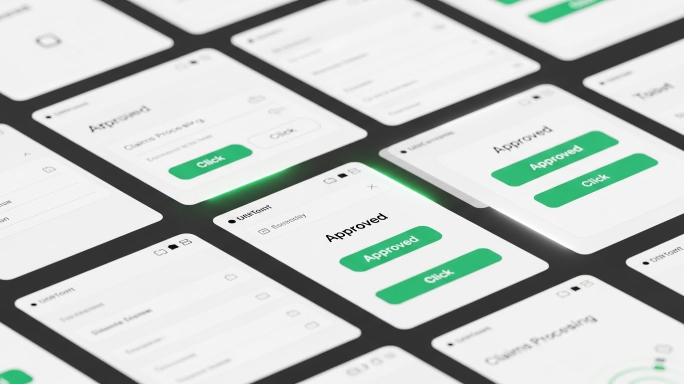
The Visual & Narrative Approach
Here, we zoom in. The screen is filled with high-fidelity UI mockups. The camera cuts rapidly between screens, focusing solely on "Success Actions"—clicking "Approve," seeing a green checkmark, watching a progress bar hit 100%. The palette features Emerald Green for success indicators against a crisp White UI. It is a rhythm-based montage that mimics the heartbeat of a high-performance team.
Psychological Impact & KPI Focus
This style triggers a "Dopamine Loop." Every "click" and "green check" gives the viewer a small sense of completion and victory. For an Operations Director, this visualizes Productivity. It answers the question, "What does it look like to get work done fast?" It proves the UI is clean, modern, and user-friendly without needing a 10-minute demo.
- Operational Impact: Drives Feature Education (Framework 1.8) and UI familiarity.
Strategic Implementation & Trade-offs
- Best Use Case: Feature launch announcements and retargeting ads for users who visited your pricing page.
- Duration: 15-30 seconds.
- Trade-off: It moves too fast for deep learning. Viewers won't remember how to find the button, but they will remember that the software feels fast.
Companies using similar video content -
Majesco – P&C Core Suite – Showcasing rapid UI interactions for policy management.
Sapiens – CoreSuite for P&C – Highlighting quick actions in policy administration.
9. Wireframe to Reality Transition
MOFU | Reducing Implementation
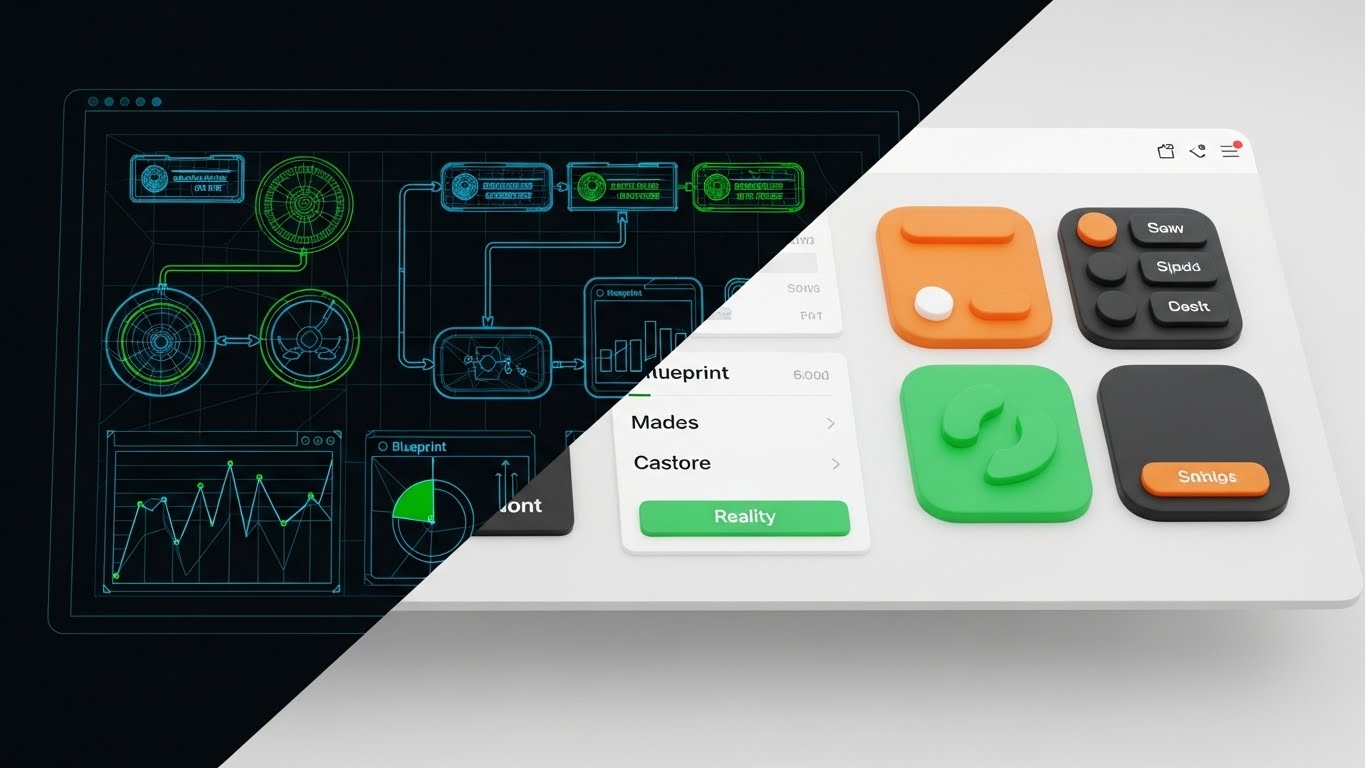
The Visual & Narrative Approach
A split-screen composition divides the frame. The left side displays a technical wireframe blueprint of a workflow in Blueprint Blue. The right side shows the finished, polished software interface in realistic colors. A "scanner" or slider moves across, revealing the transition. The frontal view emphasizes the direct correlation between the architecture (the plan) and the reality (the product).
Psychological Impact & KPI Focus
This style directly addresses Implementation Anxiety. It visually proves that the structural integrity (the blueprint) is directly linked to the user experience. It suggests that your software is not just a pretty face; it’s built on solid engineering. It validates the "low-code" promise by showing how easily logic translates to interface.
- Operational Impact: Critical for Reducing Implementation Friction (Framework 1.16).
Strategic Implementation & Trade-offs
- Best Use Case: Middle-of-funnel emails to technical stakeholders and "Implementation" webinar intros.
- Duration: 20-40 seconds.
- Trade-off: It is a comparative style. It requires you to have strong UI design. If your actual UI is cluttered, this transition will highlight the mess rather than the polish.
Companies using similar video content -
OneShield – Enterprise Platform – Blueprinting system architecture to functional interface.
BriteCore – Core Insurance Platform – Demonstrating low-code configuration to live UI.
10. Lifestyle Stock with UI Overlay
MOFU | Driving Demo Requests

The Visual & Narrative Approach
This style grounds the software in the real world. A high-resolution photograph (or cinemagraph) shows a professional woman working on a laptop in a modern coffee shop. An over-the-shoulder shot reveals a glowing, floating UI overlay displaying a "Broker Portal" dashboard. The lighting blends warm natural skin tones with the cool Neon Blue of the holographic interface. The mood is productive and mobile.
Psychological Impact & KPI Focus
This visualizes Mobility and Freedom. For the Broker persona, the value proposition isn't just data; it's the ability to work from anywhere. This style sells a lifestyle upgrade. It implies that your software is cloud-native and un-tethered from the legacy on-premise servers that keep them chained to a desk.
- Operational Impact: Drives Demo Requests (Framework 2.1) by selling the "Anywhere Office" dream.
Strategic Implementation & Trade-offs
- Best Use Case: Social proof ads and case study headers targeting independent brokers and agencies.
- Duration: Static or 5-second Cinemagraph.
- Trade-off: The holographic UI is "fantasy UI." You must ensure your actual mobile experience is good enough that this doesn't feel like false advertising. It sells the dream of mobility.
Companies using similar video content -
Novidea – Agency Management Platform – Empowering remote brokers with mobile dashboards.
EZLynx – Rating Engine – Visualizing agents working flexibly with integrated tools.
11. 2D Line Art Animation
MOFU | Demand Gen

The Visual & Narrative Approach
This style embraces sophisticated minimalism to visualize the "moment of truth." We see a macro close-up of a stylized pen tip moving across a textured "Cream" paper background. A single, continuous line of "Deep Black" ink flows from the pen, forming a seamless, elegant digital signature that morphs into a final "Approved" stamp. The motion is liquid and unbroken, contrasting sharply with the mental image of clunky, multi-step PDF forms. It visualizes "Digital Binding" as an act of grace rather than administration.
Psychological Impact & KPI Focus
For the Digital Architect, the "Last Mile" of policy issuance is a critical friction point. This style leverages Processing Fluency—the aesthetic implies that the underlying process is as smooth as the animation. It subconsciously communicates that your platform removes the "stops and starts" of legacy workflows, promising a higher conversion rate.
- Operational Impact: Supports Demand Generation (Framework 1.6) by visualizing the ease of onboarding, reducing "Not Taken Up" (NTU) rates.
Strategic Implementation & Trade-offs
- Best Use Case: Covers of downloadable whitepapers (e.g., "The Future of Digital Onboarding") and email signature GIFs.
- Duration: 5-10 seconds (Loop).
- Trade-off: It is symbolic. It conveys the feeling of the process but does not show the actual UI or legal mechanics.
Companies using similar video content -
DocuSign – eSignature Solutions – Frictionless digital binding for policy agreements.
Adobe Acrobat Sign – Electronic Signatures – Continuous ink flow for digital document signing.
12. Split Screen: Optimized Reality
MOFU | Competitive Displacement
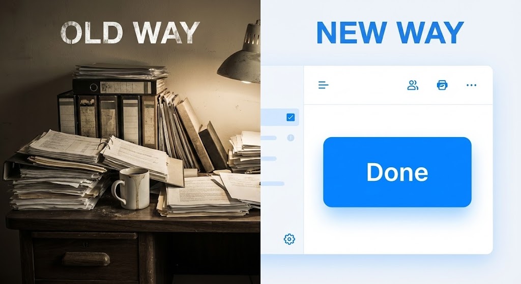
The Visual & Narrative Approach
This is a visual confrontation. The screen is bisected vertically. The left side ("Old Way") features a gritty, slightly desaturated photograph of a chaotic desk: stacks of paper, dusty binders, and harsh shadows. The right side ("New Way") is a pristine, high-contrast render of your software interface, dominated by white space and a single, vibrant "Done" button in Electric Blue. As the timeline progresses, the left side remains static and cluttered, while the right side completes the task in a single pulse, physically wiping the clutter away.
Psychological Impact & KPI Focus
This style weaponizes Cognitive Contrast. By placing the pain (clutter) directly next to the cure (clarity), you trigger Loss Aversion. The viewer instinctively wants to move away from the stress of the left side. It validates the "Digital Architect's" desire to rip and replace legacy systems by making the status quo look not just slow, but obsolete.
- Operational Impact: Critical for Competitive Displacement (Framework 1.13) in sales decks and "Switching" campaigns.
Strategic Implementation & Trade-offs
- Best Use Case: "Why Us" comparison pages and retargeting ads for users stuck on legacy platforms.
- Duration: 15-20 seconds.
- Trade-off: It can feel aggressive. Ensure the "Old Way" is a realistic depiction of their struggle, not a mocking caricature, to maintain empathy.
Companies using similar video content -
Guidewire – Cloud Platform – Contrasting legacy systems with modern cloud solutions.
Duck Creek Technologies – OnDemand Platform – Highlighting efficiency over traditional insurance software.
13. Photorealistic 3D Renders
BOFU | Building Trust

The Visual & Narrative Approach
Trust in insurance is heavy; it requires substance. This style uses cinema-quality 3D rendering to construct a metallic shield from interlocking "Secure Nodes." The materials are premium—polished Gold, brushed Silver, and heavy Obsidian. The lighting is "High-Key" studio quality, catching reflections to emphasize solidity. The camera performs a slow, low-angle "Hero Shot," conveying that this security architecture is impenetrable and expensive.
Psychological Impact & KPI Focus
Security is often invisible, which creates anxiety. This style utilizes the Tangibility Bias—we trust things we can "feel." By giving cybersecurity a physical weight and premium texture, you signal Institutional Credibility. It reassures the risk-averse stakeholder that your data sovereignty protocols are robust and "enterprise-grade," not "vaporware."
- Operational Impact: Anchors Building Trust (Framework 1.9) regarding compliance and data safety.
Strategic Implementation & Trade-offs
- Best Use Case: Website "Security" headers and background visuals for compliance webinars.
- Duration: Static or Slow-Motion Loop.
- Trade-off: High production cost. If the render looks "plastic" or cheap, it will have the opposite effect. It must look like luxury engineering.
Companies using similar video content -
CyberCube – Cyber Risk Analytics – Solidifying institutional trust in cybersecurity.
SecurityScorecard – Cybersecurity Ratings – Metallic shields representing robust digital defense.
14. Dynamic Data Visualization
BOFU | ROI Justification
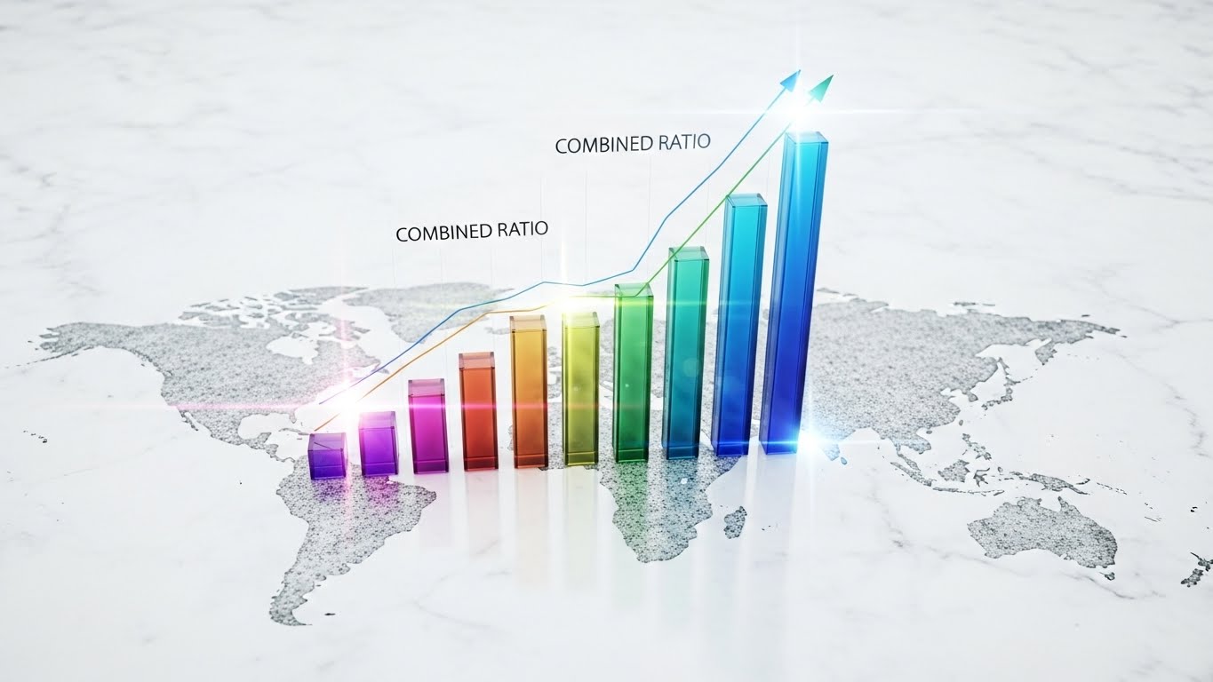
The Visual & Narrative Approach
To sell to the CFO, you must visualize the "Combined Ratio" as a physical asset. We see a bird's-eye view of a clean, white marble global map. Rising from the map are translucent, glass-textured 3D bar charts representing growth. The bars glow with vibrant multi-color gradients (Teal to Violet) as they ascend. It turns a spreadsheet metric into a majestic, transparent architectural structure, implying clarity and upward momentum.
Psychological Impact & KPI Focus
This appeals to the Analytical Brain. It leverages Data Reification—turning abstract numbers into concrete objects. Seeing the ROI "grow" physically on a map triggers a stronger sense of reality than a 2D Excel chart. The transparency of the glass bars subconsciously suggests "reporting transparency," a key value for financial officers.
- Operational Impact: Essential for ROI Justification (Framework 1.10) in the final investment pitch.
Strategic Implementation & Trade-offs
- Best Use Case: The "Financial Impact" slide in pitch decks and case study videos.
- Duration: 15-30 seconds.
- Trade-off: Requires context. Beautiful bars mean nothing without clear labeling. Ensure the axis and metrics are legible.
Companies using similar video content -
Quantexa – Contextual Decision Intelligence – Validating global ROI through data growth.
Palantir Foundry – Data Integration Platform – Visualizing growth pillars from complex datasets.
15. Generative AI Cinematic Video
BOFU | The Economic Buyer

The Visual & Narrative Approach
This style creates an aspirational mirror for the C-Suite buyer. Using a cinematic "Dolly Zoom" (Vertigo effect), we focus on a CEO figure standing in a high-rise office. The backdrop is a city skyline at sunrise, bathed in "Deep Navy" and "Warm Amber" light. The figure looks out at the horizon, not at a screen. It visualizes the state of "Market Command" that your software enables.
Psychological Impact & KPI Focus
This targets Ego and Identity. The Economic Buyer doesn't just want a tool; they want a legacy. This style connects your brand with the concept of Strategic Foresight. It allows the viewer to project themselves into the role of the visionary leader who successfully modernized the company.
- Operational Impact: Targets The Economic Buyer (Framework 7.1) by aligning with their self-image.
Strategic Implementation & Trade-offs
- Best Use Case: Connected TV (CTV) spots, event openers, and brand anthem videos.
- Duration: 30-60 seconds.
- Trade-off: Purely emotional. It contains no product information. It must be supported by technical content elsewhere in the funnel.
Companies using similar video content -
Swiss Re – Digital Solutions – Anchoring market leadership with a visionary outlook.
Munich Re – Innovation Lab – Cinematic vision for the future of reinsurance.
16. Isometric 3D Workflow
BOFU | Objection Handling
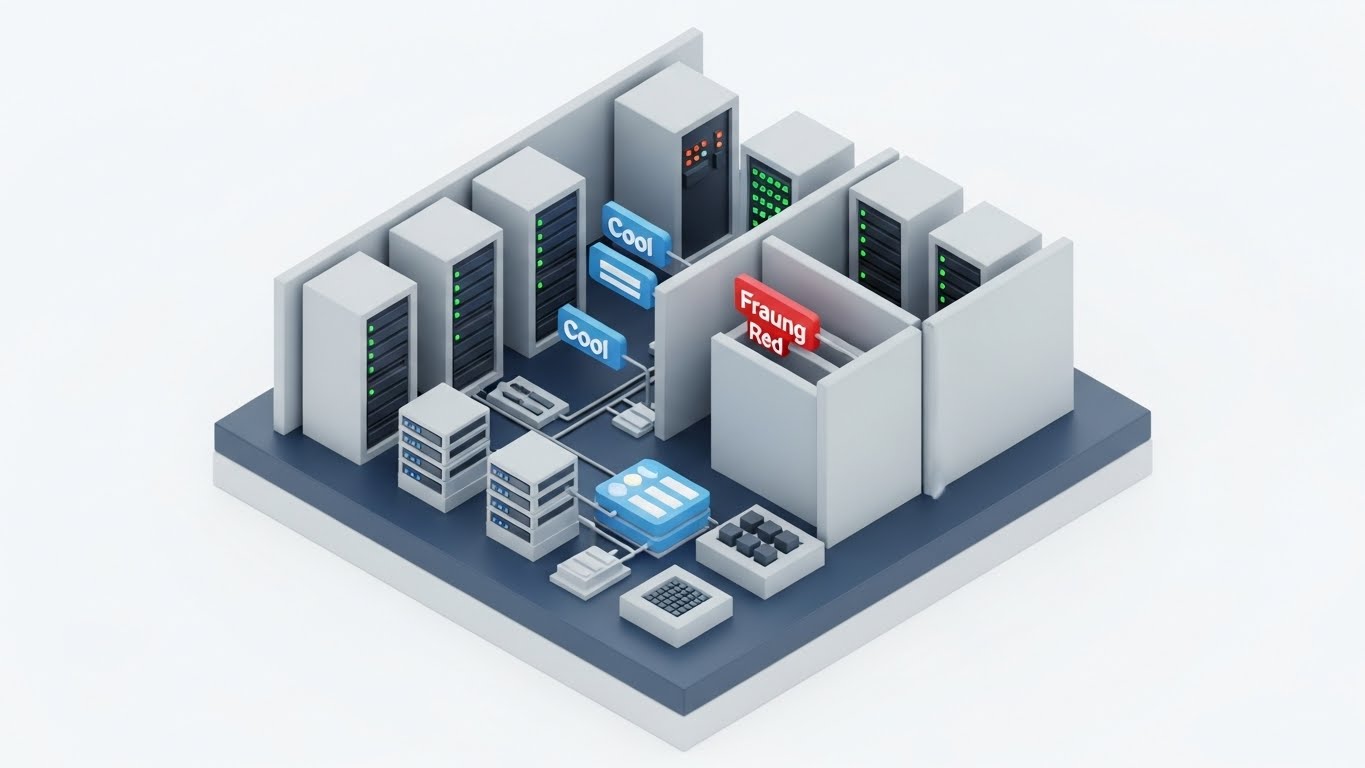
The Visual & Narrative Approach
Complex fraud detection logic is simplified into a "Toy Model." An isometric diorama of a server room shows data flowing through "Cool Grey" architecture. A malicious node labeled "Fraud" in "Warning Red" attempts to enter the workflow but is physically blocked by rising security walls. It makes the invisible algorithms of risk mitigation visible and mechanical. The clean, clay-like aesthetic reduces the anxiety of the threat.
Psychological Impact & KPI Focus
This addresses Security Anxiety through simplification. It provides Cognitive Closure by showing the threat being neutralized. It reassures the Risk Officer that the system is active and vigilant. The clear color coding (Red vs. Blue/Grey) leverages pre-attentive processing for instant understanding.
- Operational Impact: Powerful for Objection Handling (Framework 5.2) regarding automated decision-making.
Strategic Implementation & Trade-offs
- Best Use Case: Product pages detailed "Fraud Prevention" sections and technical explainer videos.
- Duration: 20-40 seconds.
- Trade-off: The "toy" aesthetic can seem trivial to deep technical experts. Use it to explain the concept, not the code.
Companies using similar video content -
FRISS – AI-Powered Fraud Detection – Visualizing active defense against fraud threats.
Shift Technology – Fraud Detection Solutions – Threat blockade in claims processing.
17. 3D X-Ray Visualization
BOFU | Risk Mitigation

The Visual & Narrative Approach
To prove your system isn't a "Black Box," you show the inside. This style uses an X-Ray effect to dissolve the outer shell of a server rack. Inside, we reveal a glowing, "Mint Green" crystalline core labeled "COMPLIANCE." The surrounding environment is a sterile, white lab. This visualizes that compliance is not a wrapper or an afterthought—it is the central, glowing engine of the architecture.
Psychological Impact & KPI Focus
For the "Digital Architect," legacy systems are scary because they hide data. This style leverages Radical Transparency. By visually "opening the box," you signal that you have nothing to hide. It validates Structural Integrity, reassuring the Compliance Officer that the platform is built on a foundation of regulatory adherence.
- Operational Impact: Visualizes Risk Mitigation (Framework 1.12) and audit readiness.
Strategic Implementation & Trade-offs
- Best Use Case: Security whitepapers and the "Architecture" section of your technical documentation.
- Duration: 10-20 seconds.
- Trade-off: Highly technical appeal. It creates trust with the CTO but may be boring to a sales-focused CEO.
Companies using similar video content -
MetricStream – GRC Platform – Revealing structural integrity of compliance core.
Archer – Integrated Risk Management – X-raying internal controls for regulatory adherence.
18. 2D Graphics Over Live Action
BOFU | The Champion

The Visual & Narrative Approach
Technology is useless without adoption. This style overlays vibrant "Pop" style 2D vector icons (lightbulbs, shields, charts) onto high-quality live-action footage of a team collaborating. As they speak, the icons appear above their heads, visualizing the flow of ideas and data. It bridges the gap between the "Tool" and the "Talent," showing an augmented workforce.
Psychological Impact & KPI Focus
This targets the Internal Champion who fears user resistance. It visualizes Empowerment. It reframes the software not as a replacement for people, but as a superpower for them. The bright, energetic graphics lower the "fear factor" of new tech, suggesting a culture of innovation and ease.
- Operational Impact: Supports The Champion (Framework 7.4) in driving internal adoption.
Strategic Implementation & Trade-offs
- Best Use Case: "Culture" videos, recruitment pages, and internal rollout presentations.
- Duration: 30-45 seconds.
- Trade-off: Requires authentic, high-quality footage. Generic stock footage will make this look like a cheesy HR video.
Companies using similar video content -
Salesforce – Financial Services Cloud – Augmenting human intelligence in client interactions.
Pega Systems – Intelligent Automation – Pop icons over teams collaborating on workflows.
19. Aspirational Stock Montage
BOFU | ROI Hook

The Visual & Narrative Approach
The ultimate symbol of B2B success. A macro close-up captures a firm handshake between two professionals. The background is a bokeh-blurred financial district bathed in "Warm Sunlight" and lens flare. It focuses on the texture of the suits and the strength of the grip. It humanizes the transaction, visualizing the "Deal" that every broker and carrier strives for.
Psychological Impact & KPI Focus
This triggers Social Belonging and trust. It grounds the high-tech software sale in a traditional, high-trust business ritual. For the Sales VP, this image reinforces the "Why"—the technology exists to enable this moment of agreement. It creates a subconscious association between your brand and commercial success.
- Operational Impact: A strong ROI Hook (Framework 8.1) for retargeting decision-makers.
Strategic Implementation & Trade-offs
- Best Use Case: The final "Call to Action" slide in a pitch deck and LinkedIn retargeting ads.
- Duration: Static Image.
- Trade-off: It is generic. It relies entirely on the accompanying headline to have meaning. Use it to reinforce a feeling, not to explain a feature.
Companies using similar video content -
Accenture – Insurance Consulting – Sealing partnerships for digital transformation.
Deloitte – Insurance Services – The handshake symbolizing successful client engagements.
20. Hyper-lapse Stock Footage
BOFU | Sales Cycle Acceleration

The Visual & Narrative Approach
We end with velocity. An aerial hyper-lapse shows a city highway at twilight, with traffic streaking in "Red and White" lines. Overlaying this physical chaos are faster, smoother "Neon Blue" digital data lines and text ("CLAIMS VOLUME," "VELOCITY") that move even faster. The digital layer zips past the physical cars, visually proving that your data processing outpaces the physical world.
Psychological Impact & KPI Focus
This visualizes Operational Scalability. It acknowledges that the physical world (accidents, claims) is messy and high-volume, but proves your system is built for speed. It addresses the anxiety of "surge events," reassuring the Operations Director that the platform won't crash under pressure.
- Operational Impact: Drives Sales Cycle Acceleration (Framework 1.14) by proving readiness for enterprise scale.
Strategic Implementation & Trade-offs
- Best Use Case: Backgrounds for "Performance" sections on websites and social media story ads.
- Duration: 10-15 seconds (Loop).
- Trade-off: It is atmospheric. It conveys "Speed" but doesn't explain "How." Use it to generate energy, not understanding.
Companies using similar video content -
CCC Intelligent Solutions – Claims Management Platform – Outpacing physical constraints with data velocity.
Octo Telematics – Telematics Solutions – Visualizing data speed in connected car insurance.
21. Clean UI Workflow (Light Mode)
Onboarding | Self-Serve Onboarding
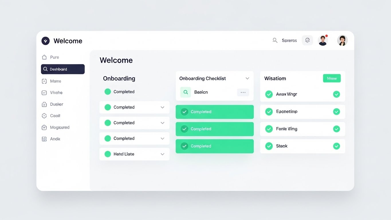
The Visual & Narrative Approach
The "Empty State" is the most dangerous screen in software; it is where user abandonment peaks. This style combats that friction with a pristine, "High-Key" presentation of the onboarding dashboard. The background is a soft, shadowless Pure White. The focus is entirely on the "Onboarding Checklist." As the user progresses, we see satisfying animations of empty circles transforming into bright Mint Green checkmarks. The motion is snappy and responsive, visually rewarding every step of the setup process.
Psychological Impact & KPI Focus
This leverages the Goal Gradient Effect—users are more motivated to complete a task if they can see their progress. By visually celebrating small wins (the green checks), you reduce the Cognitive Load of setup. It reassures the agency administrator that "getting started" is not a 6-month integration project, but a series of simple, achievable clicks.
- Operational Impact: Directly targets Time-to-Value (TTV) (Framework 2.4). The faster a user sees a "green check," the less likely they are to churn early.
Strategic Implementation & Trade-offs
- Best Use Case: Welcome emails, in-app "Getting Started" wizards, and help center intros.
- Duration: 15-30 seconds.
- Trade-off: It is functional, not emotional. It’s excellent for instruction but lacks the "wow" factor of high-end 3D. Keep it practical.
Companies using similar video content -
Insurity – Sure Underwriting – Mint checkmarks for streamlined policy setup.
Vitech Systems Group – V3locity Platform – Accelerating time-to-value with clean onboarding.
22. 2D Animation & UI Composition
Onboarding | Accelerating TTV

The Visual & Narrative Approach
Data migration is typically the "Elephant in the Room" for any CTO. This style re-frames it as effortless play. Using a stylized "Purple and Yellow" palette, we see a 2D character effortlessly lifting a floating 3D box labeled with a database icon. They slide it from a "Cloud" on the left to a UI window on the right. The physics are floaty and magical. It metaphorically represents the "Lift and Shift" of legacy data into your new system without the heavy lifting.
Psychological Impact & KPI Focus
This targets Migration Anxiety. The playful, gravity-defying physics signal that your platform handles the technical burden. It uses Affect Heuristic, associating positive, lighthearted emotions with a typically stressful technical task. It tells the Data Architect: "We have built the bridges so you don't have to."
- Operational Impact: Supports Churn Reduction (Framework 1.15) during the critical implementation phase, often the biggest bottleneck to revenue recognition.
Strategic Implementation & Trade-offs
- Best Use Case: "Switching" campaigns, implementation kick-off emails, and technical support guides.
- Duration: 30-45 seconds.
- Trade-off: The stylized character can feel "unprofessional" to very conservative enterprise clients. Use it for the process, not the product result.
Companies using similar video content -
EXL – Digital Transformation Solutions – Playful migration of legacy data to new systems.
Genasys – Core Insurance Platform – Easing data transition for platform switching.
23. 2D Character-Driven Story
Onboarding | Knowledge Base
The Visual & Narrative Approach
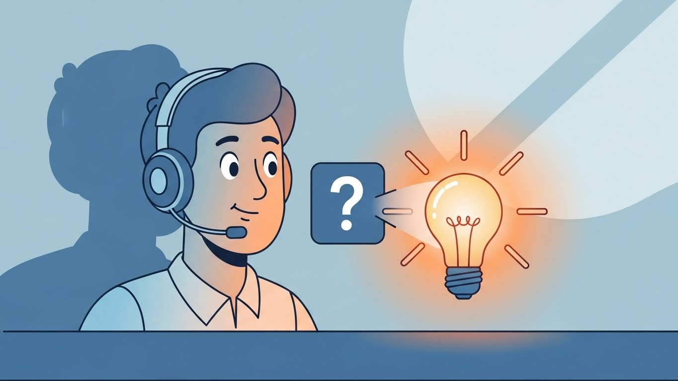
When users get stuck, they feel isolated. This style introduces a "Support Avatar"—a friendly, vector-illustrated character in "Soft Blue" and "Orange." We see them in a medium shot at a stylized support desk. A floating "Question Mark" icon appears, representing user confusion. The character smiles, taps a key, and the icon transforms into a glowing "Warm Yellow" lightbulb. It transforms the concept of "Help" from a ticket queue to an instant illumination.
Psychological Impact & KPI Focus
This builds Emotional Safety. It humanizes the help center, making the user feel supported even when interacting with a bot or a FAQ. The transformation from "Question" to "Lightbulb" leverages Processing Fluency, suggesting that answers are intuitive and readily available. It encourages users to seek answers rather than giving up.
- Operational Impact: Critical for Ticket Deflection (Framework 9.1). If users feel the Knowledge Base is friendly, they use it instead of emailing support.
Strategic Implementation & Trade-offs
- Best Use Case: Support portal headers, "No Results Found" pages, and educational email newsletters.
- Duration: 10-15 seconds (Loop).
- Trade-off: It’s generic. It doesn't solve the specific problem, but it sets the right mood for the user to solve it themselves.
Companies using similar video content -
Zendesk – Customer Service Software – Humanizing self-service with support heroes.
Freshworks – Customer Engagement Suite – Friendly characters guiding users through help articles.
24. Abstract 3D AI Visualization
Retention | Reducing Churn

The Visual & Narrative Approach
Retention is about proving that your software is the "central nervous system" of the business. This style utilizes a particle system in a macro depth of field. Glowing nodes in "Neon Cyan" connect to form a dense, unbreakable network against a white digital ether. As the camera pans, the connections multiply. It doesn't show a specific feature; it shows the density of value and the interconnectedness of the user's data within your platform.
Psychological Impact & KPI Focus
This visualizes Network Effects. For the decision-maker considering a switch to a competitor, this image subconsciously screams "Entanglement." It reminds them that their business is deeply woven into your fabric. It validates the Sunk Cost Bias in a positive way—showing the beautiful complexity they have built and would lose if they left.
- Operational Impact: Visualizes Retention (Framework 1.19) and the cost of switching.
Strategic Implementation & Trade-offs
- Best Use Case: Login screens, annual review presentations, and "Year in Review" videos.
- Duration: Slow-motion loop.
- Trade-off: Completely abstract. It creates a feeling of value but does not articulate specific features. It is a "brand texture."
Companies using similar video content -
DataRobot – AI Platform – Reinforcing ecosystem stickiness with interconnected AI models.
H2O.ai – AI Cloud – Cyan network visualizing complex machine learning ecosystems.
25. Futuristic Neon/Dark Mode
Retention | Visitor Re-engagement
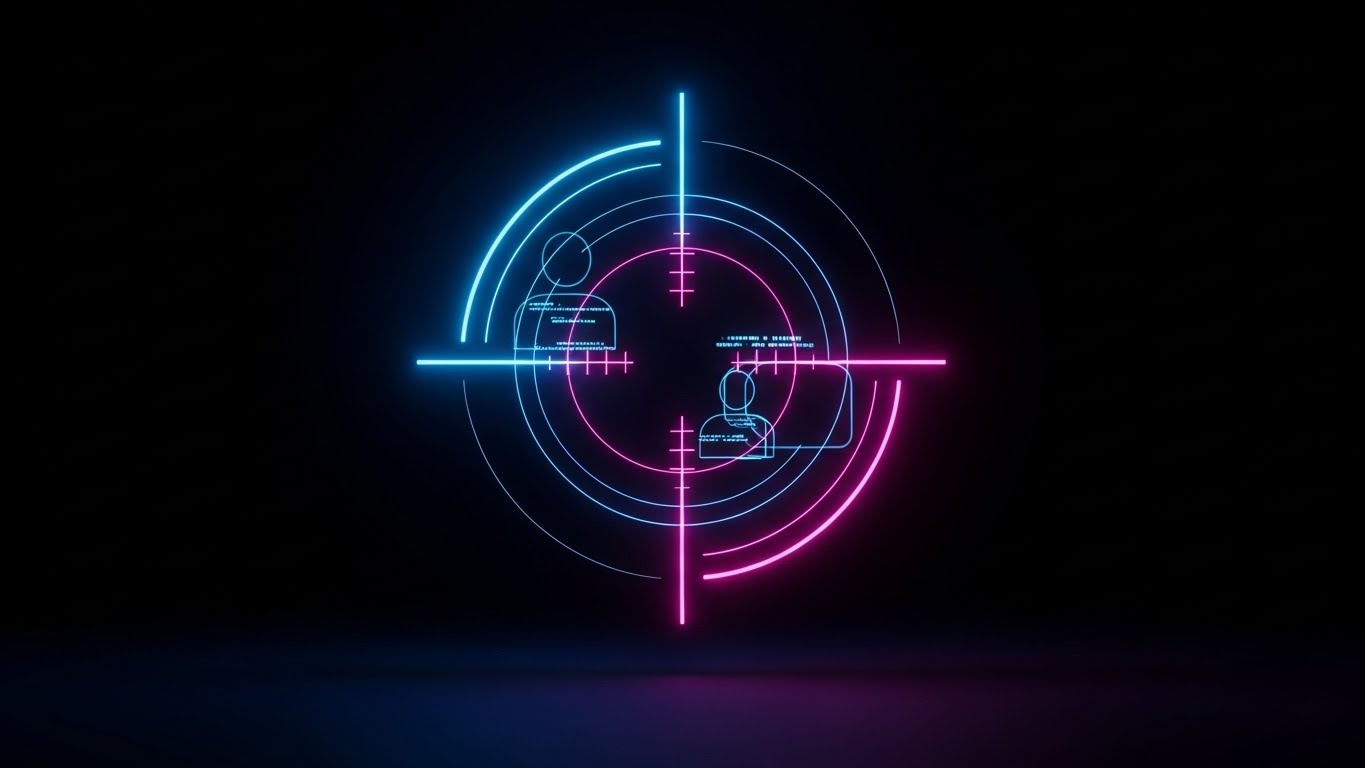
The Visual & Narrative Approach
Sometimes users drift away. This style is a "Wake Up Call." In a high-contrast Dark Mode environment, neon lines in "Electric Blue" and "Pink" rapidly draw a digital targeting reticle. It locks onto a silhouette of a user or a data point. The aesthetic is aggressive, precise, and high-tech. It suggests precision targeting and the power of data re-activation.
Psychological Impact & KPI Focus
This leverages Salience. The high contrast and neon colors cut through "banner blindness." It signals urgency and precision. For a lapsed user, it communicates: "We see you, and we have something specific for you." It suggests that your platform has new, powerful capabilities that they are missing out on.
- Operational Impact: Drives Visitor Re-engagement (Framework 5.1) in remarketing campaigns.
Strategic Implementation & Trade-offs
- Best Use Case: Remarketing display ads and "We Miss You" email headers.
- Duration: 5-10 seconds.
- Trade-off: Can feel "Cyberpunk" or gaming-oriented. Ensure it aligns with your brand's level of seriousness. It grabs attention but must be followed by substance.
Companies using similar video content -
Coalition – Cyber Insurance & Security – Precision user re-engagement for security alerts.
At-Bay – Cyber Insurance – Digital reticle for targeted risk management.
26. Low-Poly 3D Modeling
Retention | Proactive Support

The Visual & Narrative Approach
Your platform is not static; it is growing. This style uses a charming "Low-Poly" aesthetic to show a digital city. Faceted buildings in soft "Pastel" colors (Yellow, Blue, Coral) pop up from the ground one by one, expanding the city limits. Each new building represents a new feature or module. An isometric view allows us to see the infrastructure connecting the old with the new.
Psychological Impact & KPI Focus
This utilizes the Endowment Effect. Users value things more when they see them growing and improving. It visualizes Continuous Delivery. It reassures the customer that their subscription fee is funding constant innovation. The "toy-like" quality makes the complexity of new features seem manageable and fun to explore.
- Operational Impact: Communicates Proactive Support and value addition (Framework 9.2).
Strategic Implementation & Trade-offs
- Best Use Case: Product update emails (e.g., "Q3 Release Notes") and roadmap visualization.
- Duration: 15-30 seconds.
- Trade-off: The "Low-Poly" look is distinct. It works well for "growth" metaphors but less well for showing high-fidelity UI details.
Companies using similar video content -
Socotra – Connected Core Platform – Visualizing platform expansion with new features.
OneShield – Enterprise Platform – Growing city metaphor for module additions.
27. Macro UI Micro-Interactions
Expansion | Deep Feature Adoption

The Visual & Narrative Approach
To sell a specific feature, you need to show the specific interaction. This style uses an extreme macro close-up. We see the screen pixels in "White" and "Blue" as a mouse cursor hovers over a crucial button (e.g., "Submit Claim" or "Generate Report"). We witness the subtle hover state change, the click, and the immediate ripple of reaction. It focuses entirely on the tactile feel of the software.
Psychological Impact & KPI Focus
This triggers Mirror Neurons. Watching the action makes the viewer mentally "practice" it. It reduces the perceived effort of using a new feature. By magnifying the quality of the UI (the pixels, the smooth gradients), you signal Craftsmanship and attention to detail, which builds confidence in the tool's reliability.
- Operational Impact: Drives Deep Feature Adoption (Framework 1.17) by making usage look satisfying.
Strategic Implementation & Trade-offs
- Best Use Case: "Feature of the Month" spotlights and tooltips within the software.
- Duration: 3-5 seconds (Loop).
- Trade-off: Extremely narrow focus. It shows one button. You need a library of these to cover a full workflow.
Companies using similar video content -
Tarmika – Commercial Lines Rater – Deepening feature adoption with tactile click feedback.
Indio – Digital Application & Renewal – Showcasing satisfying micro-interactions for form completion.
28. 3D Parallax UI Presentation
Expansion | Driving Upsell
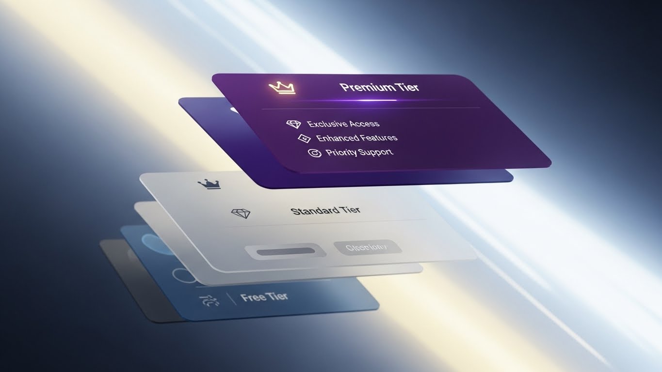
The Visual & Narrative Approach
Upselling requires differentiation. This style breaks the 2D screen into 3D space. We see the UI explode into floating layers. The base layer ("Standard") is at the bottom in grey. Floating above it, glowing in "Deep Purple" and "Gold," is the "Premium Tier" feature set. The camera pans dynamically, revealing the depth and the "gap" between what the user has and what they could have.
Psychological Impact & KPI Focus
This visualizes Hierarchy and Status. It leverages Contrast to make the premium features look literally "elevated." The use of gold and purple cues luxury and exclusivity. It creates a desire to "level up." It transforms the upsell from a cost into an upgrade in capability and power.
- Operational Impact: Drives Upsell Conversion (Framework 1.20) by visualizing the value gap.
Strategic Implementation & Trade-offs
- Best Use Case: Pricing pages, "Upgrade to Pro" modals, and quarterly business review decks.
- Duration: 10-20 seconds.
- Trade-off: Can look gimmicky if overused. Reserve it for the moment you are asking for more money.
Companies using similar video content -
Guidewire – Cloud Platform – Incentivizing premium upgrades with tiered features.
Duck Creek Technologies – OnDemand Platform – Visualizing value gap for advanced modules.
29. Dark Mode UI Showcase
Expansion | In-App Upsell
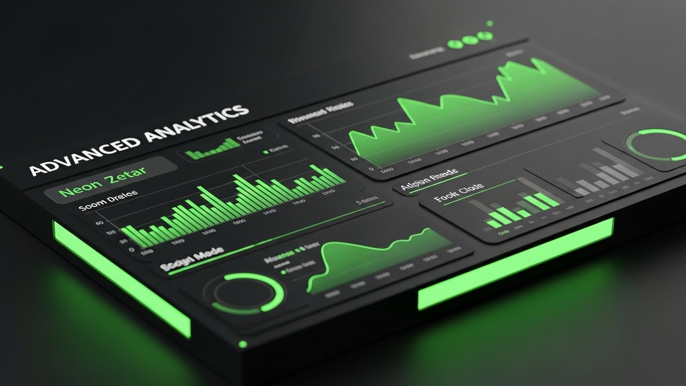
The Visual & Narrative Approach
Power users live in the data. This style showcases the "Advanced Analytics" module in a sleek, matte black Dark Mode. The interface is viewed from a tilted perspective, reminiscent of a trading desk or control room. Graphs and data points glow in "Neon Green" and "Dark Grey." It looks serious, professional, and intense. It sells the idea of "Command and Control."
Psychological Impact & KPI Focus
This appeals to Competence. It makes the user feel like a master of their domain. The "Dark Mode" aesthetic is often associated with pro-level tools (coding IDEs, video editors). Showing your analytics in this light suggests depth, precision, and high-performance, justifying the additional cost of the module.
- Operational Impact: Supports In-App Upsell (Framework 2.5) for advanced modules.
Strategic Implementation & Trade-offs
- Best Use Case: Paywalls for analytics features and "Pro" user targeted ads.
- Duration: 15-20 seconds.
- Trade-off: Dark mode can be harder to read if not designed perfectly. Ensure the contrast ratios are accessible.
Companies using similar video content -
CyberCube – Cyber Risk Analytics – Empowering power users with advanced analytics dashboards.
SecurityScorecard – Cybersecurity Ratings – Sleek dark mode for professional risk assessment.
30. Holographic UI over 3D Render
Expansion | Driving Referrals

The Visual & Narrative Approach
The final stage is advocacy. This style connects the local user to the global industry. A realistic 3D globe rotates in a sunlit glass atrium. Overlaying it is a "Holographic Blue" UI ring that connects continents with light beams. It visualizes the "Referral Network" or the global reach of the ecosystem. It is grand, optimistic, and expansive.
Psychological Impact & KPI Focus
This triggers Social Proof on a macro scale. It validates the user's choice by showing they are part of a global movement. It inspires them to invite partners or other branches into the ecosystem. The "Glass and Light" aesthetic suggests transparency and a bright future, aligning with the "Digital Architect's" aspiration to build a borderless insurance infrastructure.
- Operational Impact: Drives Referrals (Framework 1.21) and partner ecosystem growth.
Strategic Implementation & Trade-offs
- Best Use Case: Partner program pages, "Become an Affiliate" videos, and global summits.
- Duration: 20-30 seconds (Loop).
- Trade-off: Very high level. It sells the brand, not the feature. Use it to close the loop on the vision.
VISUAL OPERATIONS DOCTRINE: THE STRATEGIC KNOWLEDGE BASE
The 30 visual styles above are not merely "marketing assets"; they are operational tools. When deployed correctly, they function as a Visual Operating System that bridges the gap between the complex logic of Insurtech and the human reality of the user.
To transition from "creating videos" to "driving outcomes," the Advids Expert Team recommends implementing the following three-segment strategic framework.
STRATEGIC ALIGNMENT & VISUAL ARCHITECTURE
The "Pre-Production" Strategy. Why and Who.
- The Cognitive Load Audit: Before commissioning a pixel, audit your current training materials. If a claims process takes 15 text-heavy slides to explain, it is a prime candidate for Style 6 (Abstract Motion) or Style 10 (Isometric 3D).
- Role-Based Visual Mapping: Do not use the same visuals for the CTO and the Claims Adjuster. Use Style 26 (Wireframe Transition) for the CTO (Architecture) and Style 19 (Rapid UI) for the Adjuster (Speed/Efficiency).
- The "Glanceability" Standard: In high-stress environments (e.g., a call center handling catastrophe claims), visuals must be understood in <2 seconds. Prioritize Style 1 (Minimalist Flat) for operational cues.
- Brand Voice Consistency: Your marketing videos (TOFU) and your training videos (BOFU) often look like they come from different companies. Use a unified "Visual Language" (color palette, icon set) to reduce friction as the user moves down the funnel.
- The Advids Strategic Audit: Defining this "Visual Operating System" is complex. Advids partners with Insurtech leaders to map these styles against specific user journeys before production begins, ensuring every asset has a strategic purpose.
- Standardization vs. Customization: For core underwriting logic, use bespoke, high-end visuals (Style 30). For generic admin tasks (password reset), use efficient, standardized assets (Style 21).
- The Cross-Departmental Bridge: Use visuals to unify terminology. If Sales calls it "AI Processing" and Ops calls it "Algorithmic Filtering," use Style 8 (Abstract Motion) to visually define that they are the same thing.
- Legacy System Integration: The biggest objection is "Will this break my mainframe?" Use Style 3 (Isometric 2D) to visually demonstrate how your API wraps around the legacy system, protecting rather than replacing it.
- Accessibility in Insurance: Your users are diverse. Ensure motion graphics (especially Style 4 Kinetic Typography) meet WCAG contrast standards and are readable for older agents with varying eyesight.
- The Mobile-First Mandate: Agents are in the field. Ensure all 30 styles, especially Style 20 (Lifestyle Overlay), are legible on a mobile screen. If it doesn't work on an iPhone, it doesn't work for the field.
OPERATIONAL ADOPTION & IMPLEMENTATION
The "Deployment" Phase. How to embed visuals into the workflow.
- Overcoming "Black Box" Anxiety: Underwriters fear AI they can't see. Use Style 14 (3D X-Ray) to visually "open the box" and show the compliance logic inside the algorithm.
- The Micro-Learning Shift: Stop sending 40-page PDFs for policy updates. Replace them with 30-second clips using Style 7 (Abstract 2D) to conceptually explain the change.
- Just-in-Time Support: Embed Style 27 (Macro UI) GIFs directly into the software tooltips. When a user hovers over "Parametric Trigger," show them exactly what happens.
- Gamification of Training: Use Style 21 (Clean UI) visuals to show progress bars and "Level Ups" in your agent training portal. Visualizing progress drives completion rates.
- Reducing Support Ticket Volume: There is a direct correlation between the presence of Style 23 (2D Character) videos in the help center and a reduction in "How-To" support tickets.
- Remote Onboarding: You cannot fly trainers to every agency. Use Style 12 (Photorealistic 3D) and screencasts to create a "Virtual Academy" that scales indefinitely.
- Standard Operating Procedures (SOPs): Transform text-based SOPs into visual process flows using Style 3 (Isometric 2D). A visual map of a workflow is referenced 5x more often than a text list.
- Feedback Loops: Use interactive video elements (branching scenarios) to test agent knowledge. If they click the wrong "risk" option, show a visual consequence, not just an error message.
- Scalable Localization: Insurance is global. When using Style 4 (Kinetic Typography), ensure the source files are built for easy translation into Spanish, French, or German without re-animating the whole asset.
- Leadership Communication: When the CEO announces a digital transformation, don't use a talking head. Use Style 15 (Gen AI Cinematic) to visually project the future state of the company.
MEASURING IMPACT & FUTURE-PROOFING
The "ROI" Phase. Measuring success and looking ahead.
- Beyond "Views": Do not measure video success by "views." Measure it by Time-to-Competency. How much faster does an agent issue a policy after watching the video?
- The "Idle Time" Metric: Correlate better visualization (e.g., Style 19 Rapid UI) with reduced "idle time" in the software. Good visuals make users hesitate less.
- Compliance Velocity: How fast can you get the entire organization to acknowledge a new regulatory standard? Use high-impact Style 13 (Photorealistic 3D) to signal the importance of the update.
- Retention and Churn: High-quality UX visualization (Style 24 Abstract AI) reduces the "grass is greener" effect. It reminds clients of the sophisticated network they are part of.
- The AI Visual Frontier: Prepare for real-time generative video. Soon, the "Welcome" video (Style 30) will be custom-generated for each individual broker by AI.
- Scalability of Assets: Build a library, not a folder. Organize your source files so that when the UI updates, you can re-render Style 26 (Wireframe) assets in minutes, not days.
- The Advids Partnership: Building a scalable, future-proof visual library is not a one-time project. Advids acts as the long-term guardian of your visual assets, ensuring they evolve as your software (and the market) evolves.
- Benchmarking Success: "Good enough" visuals are a competitive risk. If your competitor uses Style 2 (2D Line Art) to make onboarding look effortless, and you use a grainy screen recording, you will lose the deal on "Ease of Use."
- The ROI of Safety: In Cyber Insurance, better visualization of risk (Style 16 Isometric 3D) can actually reduce claims by educating the insured on better security practices.
- Final Call to Innovation: Treat video as infrastructure. It is as vital to your stack as your code. In the age of AI and short attention spans, the company that explains itself the clearest, wins.
PHASE 8: GENERATION COMPLETE
Companies using similar video content -
Capgemini – Intelligent Industry Solutions – Incentivizing partner referrals with global ecosystem.
IBM – Watson for Insurance – Global orbit visualizing interconnected AI solutions.
Author & Editor Bio


