
Introduction: Visualizing the Invisible Thread of Care
The healthcare industry is currently navigating a profound shift from reactive, fragmented episodes of care to a proactive, continuous ecosystem driven by Value-Based Care (VBC). For the architects and leaders of Integrated Care Management platforms, this transition presents a massive opportunity—but also a formidable communication challenge. You are no longer just selling software; you are selling the "connective tissue" that holds the entire health system together.
The primary friction point today is not just interoperability; it is comprehensibility. Healthcare executives and care teams are drowning in data but starving for insights. A recent report revealed that 47% of clinicians still cannot quickly find important patient information from outside organizations, highlighting a persistent "blind spot" in the care continuum. To win in this market, software vendors must do more than claim connectivity; they must visualize the seamless flow of data in a way that creates instant cognitive relief for the buyer.
The stakes are high. The global care management solutions market is projected to reach USD 60.11 billion by 2034. The winners in this space will be the brands that can translate complex HL7/FHIR integrations and risk stratification algorithms into intuitive, human-centric visual narratives.
This guide serves as your strategic framework. We have curated 30 distinct visual styles—ranging from high-energy kinetic typography to empathetic character-driven stories—mapped specifically to the healthcare buyer's journey. These examples are designed to dismantle skepticism, reduce cognitive load, and position your platform as the "Single Source of Truth" that modern healthcare desperately needs.
Let us explore the visual language of integrated care.
1. Minimalist Flat 2D Vector
TOFU | Brand Awareness
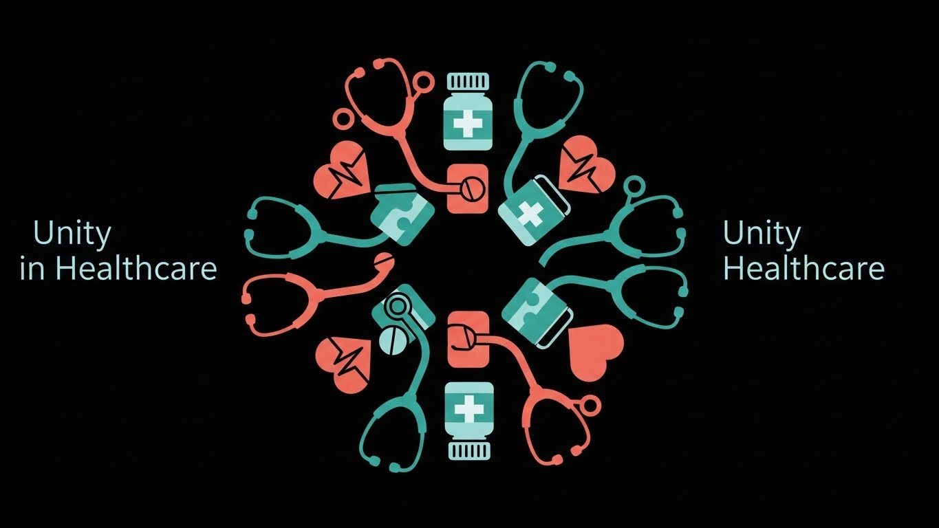
The Visual & Narrative Approach
Visualization Scenario: This style utilizes a "Mandala of Care" approach, where disparate elements—stethoscopes, medication, and cardiac symbols—interlock to form a perfect, cohesive circle. The absence of gradients and shadows flattens the visual hierarchy, suggesting that every component of the healthcare ecosystem is equally critical. The narrative here is one of effortless integration; it visualizes a state of being where interoperability is the default, not the exception.
Narration Style: Calm, authoritative, and focused on clarity. "Complexity, harmonized."
Psychological Impact & KPI Focus
- Niche Psychology: Healthcare decision-makers suffer from "System Fatigue." They are constantly patching together disparate tools. This style offers a psychological reward: a vision of perfect order and compatibility. It triggers the "Simplicity Bias," suggesting that your platform is the antidote to their chaotic tech stack.
- Operational Impact: Drives Brand Recall. The distinct, uncluttered imagery sticks in the memory, associating your brand with clarity and organization.
Strategic Implementation & Trade-offs
- Best Use Case: High-level brand awareness ads on LinkedIn or website hero headers (10-15 seconds).
- Trade-off: It is purely conceptual. It lacks the fidelity to explain how the integration works, so it must be followed up with deeper content.
Companies using similar video content -
Innovaccer – Data Activation Platform – Unifies patient data for integrated care.
WellSky – Care Coordination – Connects post-acute care providers seamlessly.
Health Gorilla – Health Interoperability Platform – Connects disparate health systems effortlessly.
2. Abstract 2D flat vector organic
TOFU | Market Education

The Visual & Narrative Approach
Visualization Scenario: Healthcare is rarely rigid; it is a fluid journey. This style uses organic, "blob-like" motion to visualize the often messy reality of patient transitions. The Mint Green and Slate Blue shapes morph from one form to another, representing the patient moving from "Hospital" to "Home." The lack of hard edges implies that with your software, there are no hard stops or data cliffs—only a continuous flow of care.
Narration Style: Soothing and continuity-focused. "Care doesn't stop at the exit door."
Psychological Impact & KPI Focus
- Niche Psychology: One of the biggest fears in care management is "Patient Leakage"—the loss of contact during handoffs. This fluid animation visually assuages that fear by showing a leak-proof, continuous connection.
- Operational Impact: Supports Market Education. It effectively explains the abstract concept of the "Continuum of Care" without getting bogged down in technical architecture diagrams.
Strategic Implementation & Trade-offs
- Best Use Case: Blog headers regarding "Care Continuity" or background loops for webinar waiting screens.
- Trade-off: Technical buyers (CTOs) might find it too vague. It sells the feeling of the workflow, not the mechanics.
Companies using similar video content -
Lyniate – Rhapsody Integration Engine – Facilitates fluid data exchange across systems.
Redox – Interoperability Platform – Seamlessly connects health tech applications.
Smile Digital Health – FHIR-native Data Fabric – Creates a continuous flow of health data.
3. Generative AI Cinematic Video
TOFU | Shaping Brand Perception

The Visual & Narrative Approach
Visualization Scenario: We utilize an Arri Alexa aesthetic to elevate the brand perception to "Enterprise Grade." The focus is on the human element—a confident female doctor—rather than just the software. Standing in a futuristic, glass-walled corridor, she looks at a glowing, transparent tablet. The "Cinematic Blue" color grade signals premium technology, while the warm lighting on her face emphasizes human empowerment. The narrative is clear: the software is the superpower that gives the clinician clarity.
Narration Style: Inspiring and premium. "The future of care is in your hands."
Psychological Impact & KPI Focus
- Niche Psychology: Clinicians are burnt out. They view new software as a burden. This style flips the script, presenting the software as a tool that makes them look and feel capable, modern, and in control.
- Operational Impact: Heavily targets Brand Sentiment. It positions the platform as a tool for "Clinical Leadership," suitable for Board-level presentations.
Strategic Implementation & Trade-offs
- Best Use Case: Homepage "Vision" videos or high-stakes trade show intros (HIMSS/ViVE).
- Trade-off: High production perception comes with high expectations. If the actual software UI is clunky, this high-gloss video can create an "Expectation Gap."
Companies using similar video content -
Philips Healthcare – HealthSuite Digital Platform – Elevates digital health solutions with AI.
Siemens Healthineers – AI-Rad Companion – Enhances clinical decision-making with AI.
GE HealthCare – Edison Health Services – Powers intelligent healthcare operations.
4. Bold Kinetic Typography (Visual)
TOFU | Category Creation

The Visual & Narrative Approach
Visualization Scenario: Aggressive, energetic, and disruptive. This style visualizes the industry's biggest pain point: Data Silos. The clashing blocks of Electric Blue and Safety Orange represent the friction of incompatible legacy systems. The "break" reveals a clean, white, streamlined core structure, symbolizing your platform as the liberator of data. The high motion blur conveys urgency—implying that the time to modernize is now.
Narration Style: Punchy, rhythmic, and disruptive. "Break the barriers. Free the insight."
Psychological Impact & KPI Focus
- Niche Psychology: It validates the frustration IT leaders feel about legacy infrastructure. The "breaking" action is cathartic and signals that your company is a disruptor, not just another vendor.
- Operational Impact: Ideal for Social Ads (Stop Ratio). The chaotic motion disrupts the usually sterile feed of healthcare ads, grabbing attention instantly.
Strategic Implementation & Trade-offs
- Best Use Case: 15-second disruptive social ads targeting CTOs and CIOs.
- Trade-off: It is aggressive. Overuse can lead to viewer fatigue. It should be used as a "hook," not the entire "story."
Companies using similar video content -
Health Catalyst – Data Operating System (DOS) – Breaks down data silos for insights.
Arcadia – Arcadia Analytics – Disrupts traditional data aggregation.
Qventus – AI for Hospital Operations – Rapidly optimizes patient flow.
5. Isometric 2D Motion Design
TOFU | Product Differentiation

The Visual & Narrative Approach
Visualization Scenario: The "God's Eye View." Isometric design is perfect for showing scale and connection. The city grid metaphor moves the conversation beyond the hospital walls and into the community (SDoH). The dotted lines visualizing "Patient Transitions" turn the abstract concept of care coordination into a tangible logistics map, showing exactly how your software tracks patients across the care continuum.
Narration Style: Structural and omniscient. "See the whole patient. See the whole population."
Psychological Impact & KPI Focus
- Niche Psychology: Administrators need to see the "Big Picture." They manage populations, not just individuals. This style appeals to their need for oversight and comprehensive management.
- Operational Impact: Focused on Product Differentiation. It visually explains how the platform connects the wider ecosystem, making "Care Coordination" tangible.
Strategic Implementation & Trade-offs
- Best Use Case: "How it Works" pages and capabilities decks.
- Trade-off: Can feel slightly "gamified." Care must be taken to ensure the icons look professional and not like a mobile game.
Companies using similar video content -
Unite Us – Social Care Coordination Platform – Maps community resources and referrals.
ZeOmega – Jiva Platform – Coordinates care across the entire population.
Lightbeam Health Solutions – Population Health Management – Visualizes patient journeys across settings.
6. Abstract 2D Motion Graphics
TOFU | Vertical Social Organic

The Visual & Narrative Approach
Visualization Scenario: Designed for the vertical mobile experience, this style visualizes "Data Synthesis." Streams of digital particles in Neon Purple, Hot Pink, and Cyan rush inward, converging to form a cohesive heart shape. It represents the aggregation of fragmented data (labs, claims, SDOH) into a complete patient profile. The aesthetic is energetic and modern.
Narration Style: Fast, modern, and energetic. "From chaos to clarity in milliseconds."
Psychological Impact & KPI Focus
- Niche Psychology: The "Mobile-First" generation of healthcare workers lives on their phones. This neon aesthetic resonates with a modern workflow and breaks the boredom of traditional B2B aesthetics.
- Operational Impact: Optimized for Social Sharing. It is highly shareable content that reinforces the brand's modernity and technical sophistication.
Strategic Implementation & Trade-offs
- Best Use Case: TikTok, Instagram Reels, and YouTube Shorts.
- Trade-off: The neon palette is aggressive. Best kept to top-of-funnel social channels rather than the corporate website.
Companies using similar video content -
Innovaccer – Data Activation Platform – Synthesizes fragmented data into unified profiles.
Apixio – AI-powered Insights – Aggregates and analyzes clinical data.
Clarify Health – Clarify Insights – Transforms complex data into actionable intelligence.
7. AI generated mixed media video
TOFU | Skippable Pre-Roll Ad
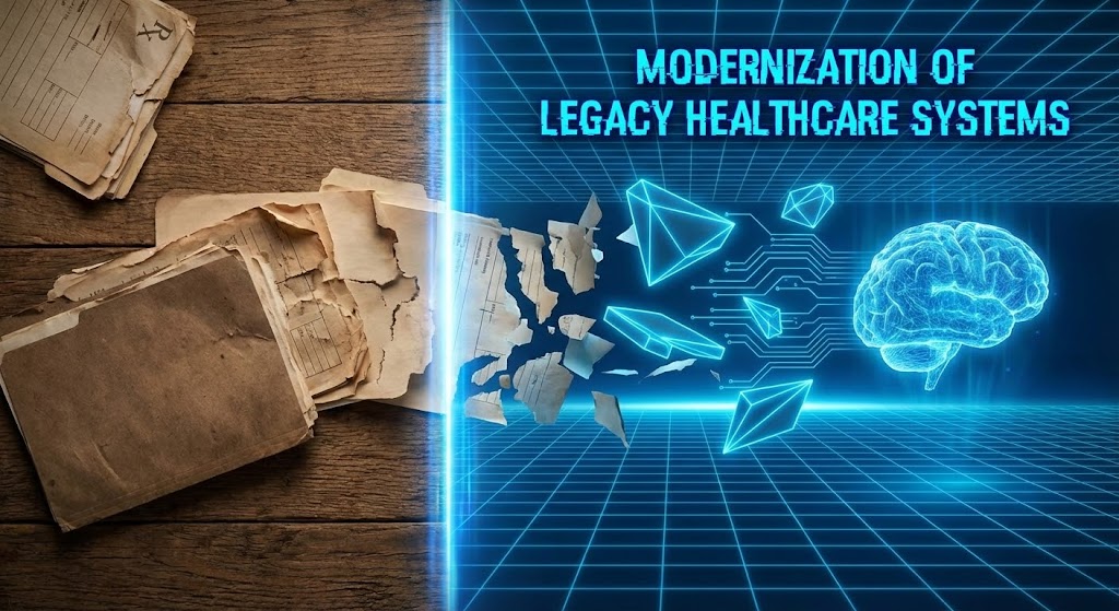
The Visual & Narrative Approach
Visualization Scenario: This is the "Before and After" story told in a single frame. The contrast between the crumbling, sepia-toned paper (Left) and the sleek, neon-blue polygons (Right) creates a visceral representation of Digital Transformation. The "Scanner Light Beam" acts as the catalyst—representing your software. It effectively dramatizes the transition from legacy obsolescence to future-proof efficiency.
Narration Style: Transformational and urgent. "Stop shuffling paper. Start shaping care."
Psychological Impact & KPI Focus
- Niche Psychology: It leverages "Loss Aversion" (fear of the crumbling past) and "Innovation Bias" (desire for the sleek future). It makes the legacy status quo look dangerous and the future look secure.
- Operational Impact: Perfect for Pre-Roll Ads. The visual trickery captures attention immediately without needing audio to understand the value proposition.
Strategic Implementation & Trade-offs
- Best Use Case: YouTube TrueView ads and trade show booth loops.
- Trade-off: Requires high-quality texture rendering. If the "paper" looks fake, the contrast loses its power.
Companies using similar video content -
Notable Health – AI-powered Automation – Automates administrative tasks, digitizing workflows.
Veradigm – Practice Management – Modernizes legacy practice operations.
athenahealth – athenaOne – Streamlines clinical and administrative processes.
8. 2D Character-Driven Story
TOFU | YouTube

The Visual & Narrative Approach
Visualization Scenario: In an industry obsessed with data, this style brings the focus back to people. Hand-drawn characters—a nurse with a messy bun, an elderly patient—interact in a warm yellow clinic. Floating icons (heart, checkmark) symbolize successful "Care Coordination" happening in the background. The imperfect lines make the brand feel accessible and empathetic.
Narration Style: Empathetic, warm, and story-driven. "Technology that cares as much as you do."
Psychological Impact & KPI Focus
- Niche Psychology: "Compassion Fatigue" is real. This style reminds buyers of the core mission: helping people. It builds an emotional connection that sterile UI shots cannot achieve.
- Operational Impact: Drives Viewer Retention. Stories retain viewers longer than abstract graphics, making this excellent for case studies.
Strategic Implementation & Trade-offs
- Best Use Case: Patient success stories and "Soft Skills" training videos.
- Trade-off: Can be perceived as "childish" if not executed with a sophisticated voiceover. Use it to win over the clinical staff, not the CFO.
Companies using similar video content -
Teladoc Health – Virtual Care Platform – Connects patients with empathetic virtual care.
Amwell – Digital Care Delivery – Provides accessible, human-centric telehealth.
CipherHealth – Patient Engagement Solutions – Improves patient experience through communication.
9. Clean UI Workflow (Light Mode)
MOFU | Feature Education
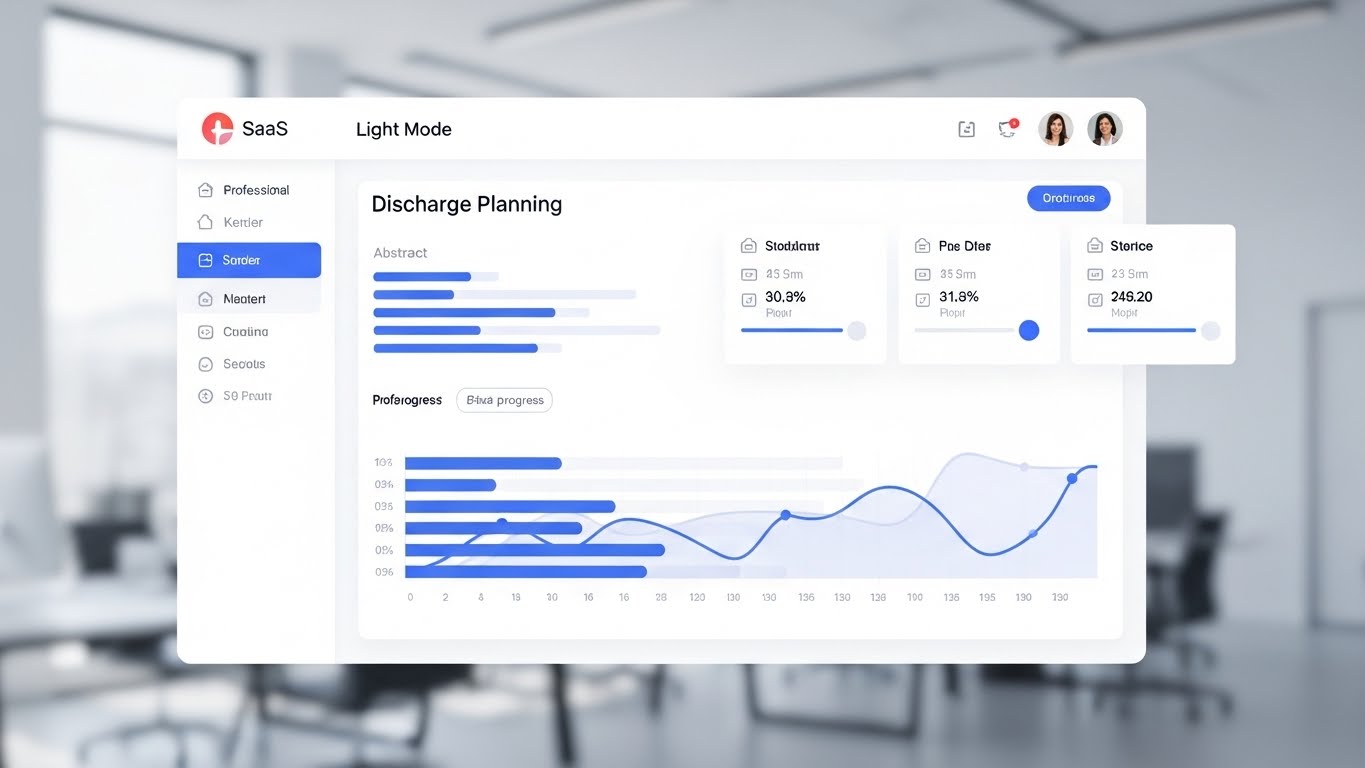
The Visual & Narrative Approach
Visualization Scenario: This is where the rubber meets the road. In the MOFU stage, buyers want to see the product. This style features a "High-Fidelity UI Mockup" that abstracts the specific data (lines instead of text) to focus on the Structure and Workflow. The use of "Light Mode" with "Professional Blue" accents conveys clinical sterility, precision, and clarity. It promises that the software will organize the user's chaotic reality.
Narration Style: Professional, precise, and instructional. "Efficiency is in the details."
Psychological Impact & KPI Focus
- Niche Psychology: Cognitive ease. Care managers are used to clutter; a clean interface triggers a desire for that level of organization in their own work lives. It promises a "frictionless" day.
- Operational Impact: Targets Conversion. By showing the actual workflow, you validate that the software is real and usable.
Strategic Implementation & Trade-offs
- Best Use Case: Landing pages, feature highlights, and sales decks.
- Trade-off: Abstracting the text prevents showing specific data capabilities. It must be balanced with high-res screenshots where actual data is visible for detailed inspection.
Companies using similar video content -
NextGen Healthcare – NextGen Enterprise EHR – Presents clear, organized clinical workflows.
eClinicalWorks – EHR Solution – Offers an intuitive, clean user interface.
Meditech – Expanse EHR – Provides a streamlined, modern user experience.
10. Lifestyle Stock with UI Overlay
MOFU | Building Trust

The Visual & Narrative Approach
Visualization Scenario: This style bridges the gap between "Stock Photography" and "SaaS Product Shots." The "Over-the-Shoulder" angle places the viewer in the shoes of the colleague or supervisor, witnessing the software in action. The "Glowing UI Overlay" of the Risk Stratification gauge highlights the Augmented Intelligence aspect—the software isn't replacing the Care Manager; it is giving him superpowers.
Narration Style: Integrated and collaborative. "Expertise, enhanced."
Psychological Impact & KPI Focus
- Niche Psychology: Trust. Pure screenshots feel cold; pure stock photos feel generic. This combination validates that real professionals use this tool to make high-stakes decisions.
- Operational Impact: Builds Credibility. It humanizes the technology, making it feel accessible and integrated into daily life.
Strategic Implementation & Trade-offs
- Best Use Case: Website "Solutions" pages and white paper covers.
- Trade-off: The "Tracking" of the UI must be perfect. If it slides or jitters, it looks like a cheap after-effect.
Companies using similar video content -
Validic – Inform Platform – Integrates remote patient data with clinical context.
Current Health – Remote Patient Monitoring – Empowers clinicians with real-time patient data.
BioIntelliSense – BioSticker/BioButton – Provides continuous health monitoring for insights.
11. Split Screen: Optimized Reality**
MOFU | Competitive Displacement

The Visual & Narrative Approach
Visualization Scenario: This style utilizes a stark, vertical "Split Screen" composition to force a comparison between the "Status Quo" and the "Future State." On the left (The Problem), we see a desaturated, grayscale scene of a clinician buried under chaotic paperwork, representing administrative burnout. On the right (The Solution), separated by a sharp white divider, the same clinician is depicted in vibrant Cyan and Magenta lighting, calmly using a tablet. This visual dichotomy acts as a portal, inviting the viewer to step out of the gray fog of legacy systems and into the clarity of digital integration.
Narration Style: Comparative, decisive, and solution-oriented. "Leave the chaos behind. Step into clarity."
Psychological Impact & KPI Focus
- Niche Psychology: It targets "Change Inertia." Healthcare stakeholders often stick to broken systems because change feels risky. This visual validates their current pain (the grayscale stress) while offering an immediate, colorful reward, effectively visualizing the concept of "Cognitive Relief."
- Operational Impact: Drives Competitive Displacement. It visually argues that sticking with manual processes is an active choice for stress, whereas your platform is the choice for workforce retention and efficiency.
Strategic Implementation & Trade-offs
- Best Use Case: LinkedIn carousel ads or retargeting campaigns targeting users of legacy systems.
- Trade-off: It is a binary simplification. While powerful for emotional connection, it creates a "black and white" narrative that must be substantiated with deeper technical content to avoid seeming reductive.
Companies using similar video content -
R1 RCM – Revenue Cycle Management – Contrasts manual billing with automated efficiency.
Waystar – Platform – Transforms complex RCM into simplified processes.
Imprivata – Identity and Access Management – Secures access, reducing login friction.
12. Rapid UI Feature Montage
MOFU | Driving Demo Requests
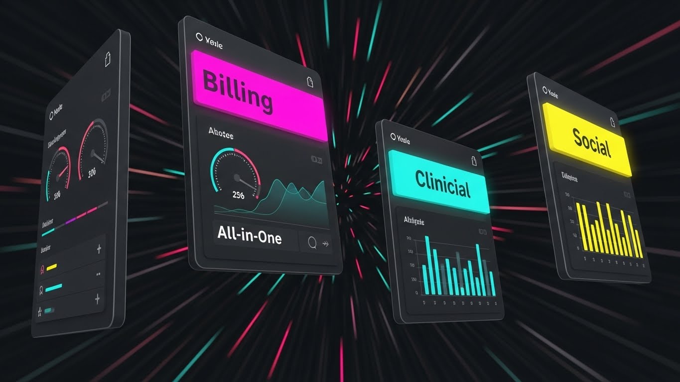
The Visual & Narrative Approach
Visualization Scenario: Speed is the currency here. This style uses a "Wormhole" effect where sleek, dark-mode UI panels—color-coded in Magenta for "Billing," Cyan for "Clinical," and Yellow for "Social"—fly toward the viewer through a digital tunnel. The motion blur lines radiate outward, creating a sense of high velocity. This is not about reading every data point; it is about feeling the completeness of the suite. It communicates that your platform is an "All-in-One" engine that propels the organization forward.
Narration Style: Fast-paced, rhythmic, and energetic. "Billing. Clinical. Social. All synchronized. All instant."
Psychological Impact & KPI Focus
- Niche Psychology: Executives often fear "Feature Bloat" or disjointed modules (the "Toggle Tax"). This unified visual motion creates a "Gestalt" effect—showing that the sum of the parts creates a powerful, cohesive whole. It triggers a feeling of momentum.
- Operational Impact: Drives Demo Requests. By flashing the breadth of the platform (RCM + EHR + SDoH) in seconds, it piques curiosity about how these distinct functions actually integrate.
Strategic Implementation & Trade-offs
- Best Use Case: 15-second retargeting video ads and event hype reels.
- Trade-off: The pace is too fast for detailed learning. It creates an impression of capability but sacrifices the clarity of specific features.
Companies using similar video content -
Epic Systems – Epic EHR Modules – Showcases breadth of integrated clinical and administrative features.
Oracle Health – Cerner Millennium – Highlights comprehensive suite of healthcare solutions.
Allscripts – Veradigm Platform – Displays integrated solutions for health systems.
13. Generative AI Realistic Character video
MOFU | ABM Awareness
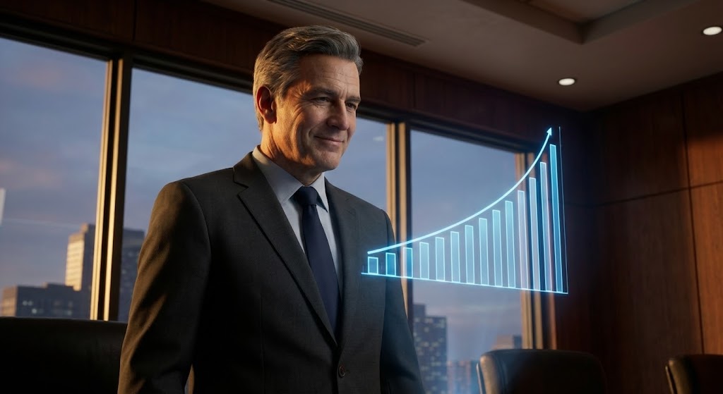
The Visual & Narrative Approach
Visualization Scenario: Targeting the C-Suite requires mirroring their world. This style features a hyper-realistic, AI-generated CEO figure in a charcoal suit, standing in a premium boardroom. He looks confidently at a floating holographic projection of a rising graph. The lighting is "Corporate Cinematic"—warm skin tones balanced with cool "Enterprise Blue" ambient light. The visual narrative is one of Command and Control. It suggests that your software provides the strategic visibility required to lead a health system to growth.
Narration Style: Sophisticated, measured, and strategic. "Leadership requires visibility. See further."
Psychological Impact & KPI Focus
- Niche Psychology: This appeals to the "Ego" and "Aspiration" of the decision-maker. It positions the software not just as a utility for staff, but as a strategic asset that empowers the executive to deliver results (the rising graph).
- Operational Impact: Supports Account-Based Marketing (ABM). When targeting Hospital CEOs or VPs of Population Health, this high-end aesthetic signals that you are a serious enterprise partner, not a budget vendor.
Strategic Implementation & Trade-offs
- Best Use Case: LinkedIn Thought Leader ads or personalized ABM landing pages.
- Trade-off: The "Uncanny Valley" effect is a risk. The rendering must be flawless; if the character looks like a video game avatar, it diminishes the brand's authority.
Companies using similar video content -
Optum – Population Health Solutions – Positions executives as strategic leaders.
Evolent Health – Value-Based Care Solutions – Empowers health plan and provider leadership.
Lumeris – Population Health Operating System – Guides health system executives to success.
14. 2D Animation & UI Composition
MOFU | Accelerating TTV
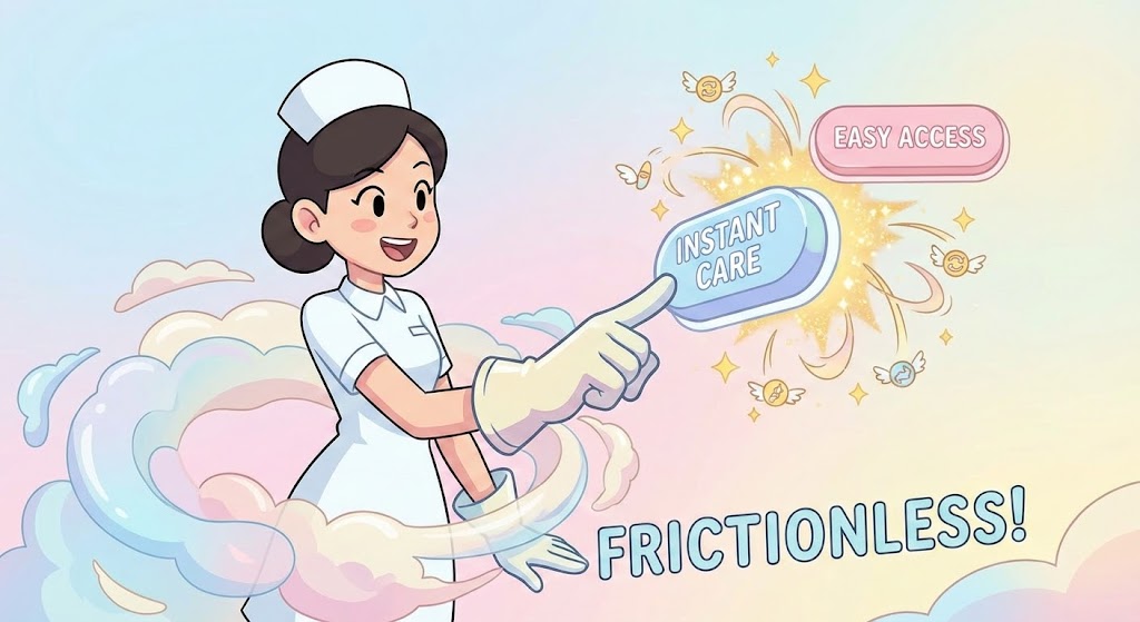
The Visual & Narrative Approach
Visualization Scenario: Complexity scares off users. This style counters that fear with "Radical Softness." A stylized, 2D cartoon nurse interacts with large, tactile "pill-shaped" buttons labeled "Instant Care" and "Easy Access." The palette is Pastel Blue and Soft Pink, with sparkles emphasizing the "click." It visualizes the concept of Time-to-Value (TTV)—suggesting that the learning curve is non-existent and the user experience is delightful, almost gamified.
Narration Style: Friendly, light, and encouraging. "Powerful software that's actually a joy to use."
Psychological Impact & KPI Focus
- Niche Psychology: Tackles the "Implementation Fear" held by Clinical Directors who dread training their staff on clunky legacy EHRs. This style promises a "Frictionless" experience that won't require weeks of training.
- Operational Impact: Accelerates User Adoption. It signals that the platform is modern, intuitive, and designed with the user's mental bandwidth in mind.
Strategic Implementation & Trade-offs
- Best Use Case: Onboarding emails, "Ease of Use" featurettes, and internal stakeholder buy-in presentations.
- Trade-off: Can be perceived as "Lightweight" by IT security teams. It focuses on UX, so it must be paired with technical specs to satisfy the CIO.
Companies using similar video content -
Lumeon – Care Pathway Management – Simplifies complex patient journeys for users.
GetWellNetwork – Patient Engagement Platform – Makes patient interaction intuitive and engaging.
Glooko – Diabetes Management Platform – Offers an easy-to-use interface for patients.
15. Isometric 3D Workflow
MOFU | The Functional Buyer
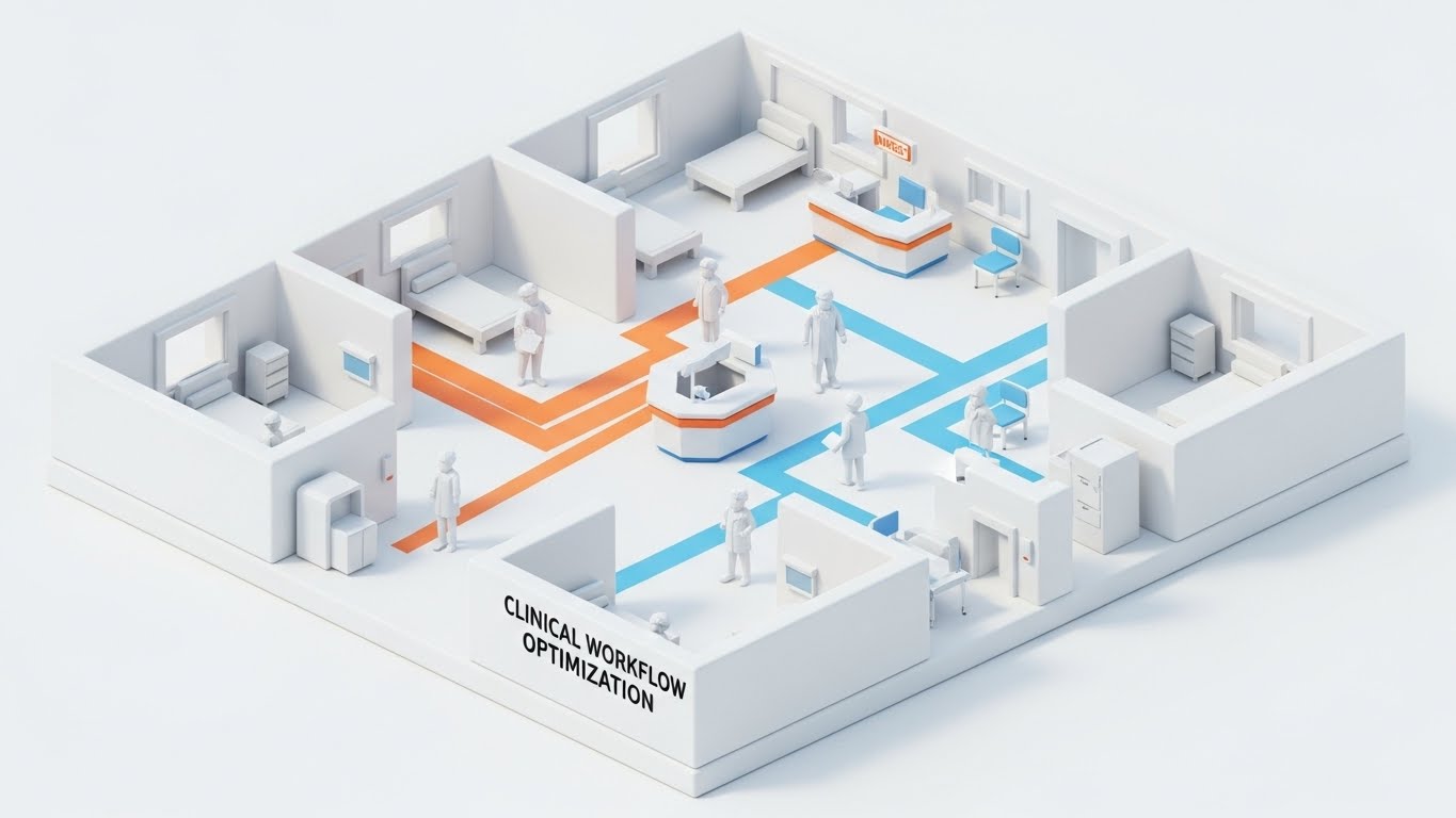
The Visual & Narrative Approach
Visualization Scenario: Functionality requires precision. This style uses a clean, white "Clay Render" of a hospital floor to visualize Clinical Workflow Optimization. Colored paths (Orange and Blue) trace the movement of doctors and patients through the facility. This "Dollhouse View" removes the noise of the real world to reveal the logic of the process. It visually demonstrates how your software optimizes traffic, reduces bottlenecks, and streamlines the physical movement of care.
Narration Style: Analytical, clear, and process-oriented. "Optimizing the path of care, step by step."
Psychological Impact & KPI Focus
- Niche Psychology: Operations Managers love logic. They want to see how the system works. This style satisfies the "Need for Order" by presenting the hospital as a perfectly optimizable machine.
- Operational Impact: Validates Operational Efficiency. It creates a visual link between the software's logic and the physical efficiency of the clinic (e.g., reduced wait times, faster discharge).
Strategic Implementation & Trade-offs
- Best Use Case: "Solutions" web pages, pitch decks for Operations Directors, and white papers.
- Trade-off: It is abstract. It doesn't show the actual UI screens, so it explains the concept of the workflow rather than the execution of the task.
Companies using similar video content -
TeleTracking Technologies – Patient Flow Management – Optimizes patient movement within hospitals.
Central Logic – Transfer Center Solution – Streamlines patient transfers and logistics.
Vocera Communications – Clinical Communication & Workflow – Improves staff coordination and efficiency.
16. Futuristic Neon/Dark Mode
MOFU | The Technical Buyer
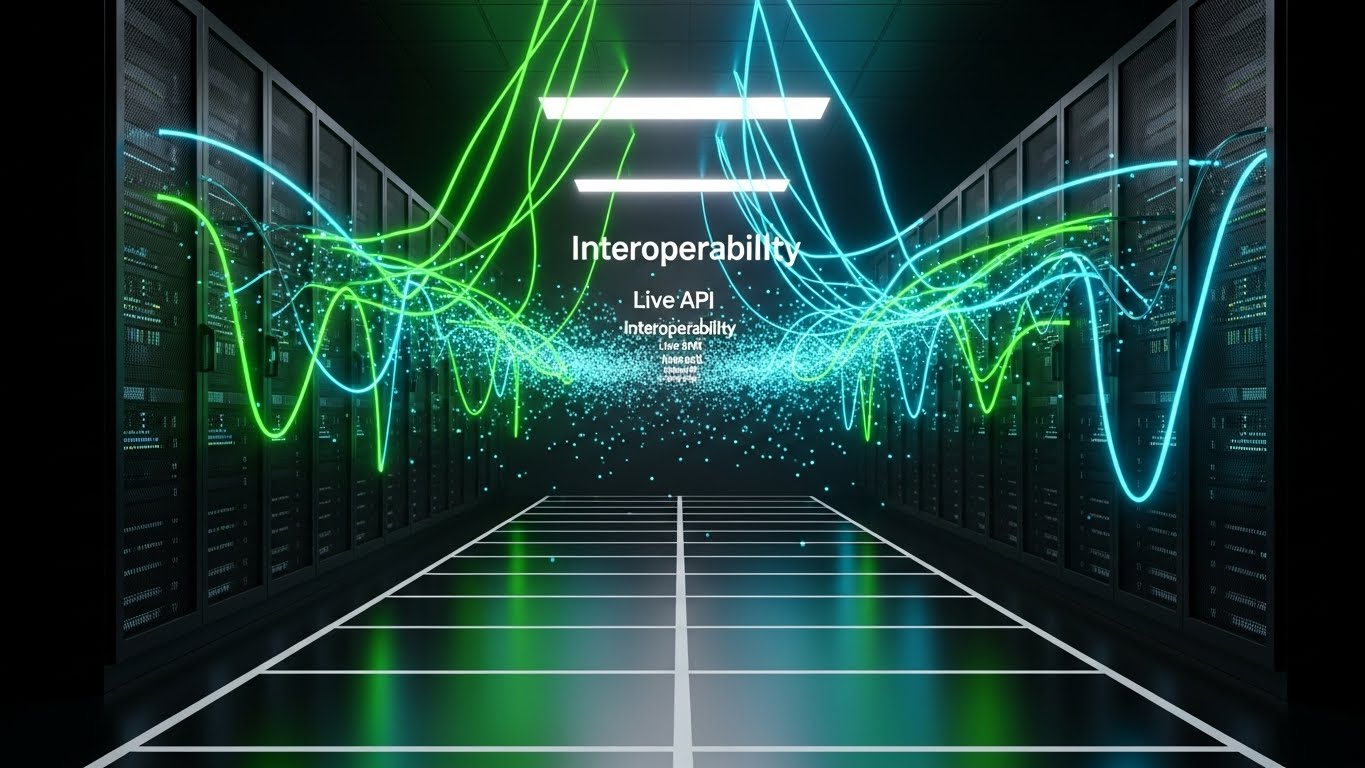
The Visual & Narrative Approach
Visualization Scenario: For the CIO, the beauty is in the architecture. This style utilizes a "Dark Mode" server room aesthetic with glowing Neon Green and Cyan cables to visualize Interoperability. The text "Interoperability" and "Live API" hangs in the digital air. It treats the data center as a place of power and security. The pulsing lights represent the heartbeat of real-time data exchange (FHIR/HL7) happening securely "under the hood."
Narration Style: Technical, secure, and robust. "The backbone of connected care."
Psychological Impact & KPI Focus
- Niche Psychology: IT buyers are skeptical of "Vaporware." They want to know the infrastructure is solid. This "Cyber-Tech" aesthetic signals robust architecture, high availability, and modern tech stacks.
- Operational Impact: Builds Technical Trust. It reassures technical stakeholders that the platform can handle complex integrations and massive data loads without latency.
Strategic Implementation & Trade-offs
- Best Use Case: Technical documentation pages, security overviews, and CIO-focused LinkedIn ads.
- Trade-off: It can feel cold and impersonal to clinical buyers. Use strictly for the technical audience or segments discussing infrastructure.
Companies using similar video content -
Lyniate – Rhapsody Integration Engine – Visualizes secure, real-time data exchange.
Redox – Interoperability Platform – Showcases robust API infrastructure.
InterSystems – HealthShare – Highlights secure, high-performance data fabric.
17. Dynamic Data Visualization
BOFU | ROI Justification

The Visual & Narrative Approach
Visualization Scenario: At the bottom of the funnel, the conversation turns to value. This style elevates the standard bar chart into a piece of premium art using "Glassmorphism." Translucent Emerald Green bars rise on a clean stage, reflecting gold light. The upward-trending arrow signifies Financial Growth and ROI. This is not just data; it is "Wealth" and "Value" visualized. It tells the CFO that this purchase is an investment that will appreciate.
Narration Style: Premium, confident, and results-driven. "Turn insights into value."
Psychological Impact & KPI Focus
- Niche Psychology: CFOs view software as a cost center. This aesthetic reframes it as a value generator. The "Jewel-like" quality of the data implies precision, high value, and transparency.
- Operational Impact: Justifies Budget Allocation. It provides the visual "proof" of ROI required to get the signature on the contract.
Strategic Implementation & Trade-offs
- Best Use Case: Sales decks (ROI slide), pricing pages, and investor presentations.
- Trade-off: It is symbolic. Actual numbers are not legible. It sets the mood for the financial discussion but must be supported by a real Excel model or case study.
Companies using similar video content -
Cedar Gate Technologies – Value-Based Care Analytics – Visualizes financial performance and ROI.
Health Catalyst – Financial Analytics – Transforms cost data into actionable insights.
Innovaccer – Financial Performance Management – Drives revenue growth through data.
18. Abstract 3D AI Visualization
BOFU | Overcoming Objections

The Visual & Narrative Approach
Visualization Scenario: How do you visualize a population of a million patients? This style uses an abstract "Neural Network" of glowing nodes (Silver and Electric Blue) connected by intricate Violet lines. It represents Population Health Management at scale. The complexity is beautiful, not overwhelming, suggesting that the AI engine can identify patterns (the "At-Risk" patient) within the massive galaxy of data points.
Narration Style: Intelligent, vast, and capable. "Seeing the pattern in the population."
Psychological Impact & KPI Focus
- Niche Psychology: Addresses the fear of "Data Overload." It reassures the buyer that the platform's AI is sophisticated enough to handle the complexity of their entire patient population without crashing.
- Operational Impact: Validates Scalability. It demonstrates that the solution is enterprise-ready and capable of managing complex risk stratification algorithms.
Strategic Implementation & Trade-offs
- Best Use Case: Website "Technology" pages and answers to RFP questions regarding scalability.
- Trade-off: It is highly abstract. Avoid using this when explaining specific features; use it only to represent the brain of the system.
Companies using similar video content -
ZeOmega – Jiva Platform – Manages complex population health at scale.
Lightbeam Health Solutions – Population Health Management – Identifies at-risk patient populations.
Apixio – AI-powered Risk Adjustment – Analyzes vast datasets for risk stratification.
19. Dark Mode UI Showcase
BOFU | Risk Mitigation

The Visual & Narrative Approach
Visualization Scenario: Security is non-negotiable. This style uses a dramatic, high-contrast "Cybersecurity" aesthetic. We see an extreme close-up of a digital lock mechanism in Dark Navy and Crimson. A glowing shield icon pulses protectively over a patient record folder. The dramatic lighting casts sharp shadows, emphasizing the solidity of the defense. It visualizes Zero-Trust Security and HIPAA compliance as an active, impenetrable force field.
Narration Style: Serious, protective, and final. "Your data, fortified. Your trust, secured."
Psychological Impact & KPI Focus
- Niche Psychology: Fear of data breaches is a primary blocker for cloud adoption in healthcare. This visual acts as a "Safety Signal," assuaging the anxiety of the Compliance Officer and Risk Manager.
- Operational Impact: Addresses Compliance Risk. It visually confirms that security is not an afterthought, but a core architectural pillar.
Strategic Implementation & Trade-offs
- Best Use Case: The "Security & Compliance" section of the proposal or website trust center.
- Trade-off: It can look aggressive. It is necessary for the security conversation but should not be the face of the brand for the clinical user.
Companies using similar video content -
ClearDATA – Healthcare Cloud Security – Fortifies patient data with robust compliance.
MedStack – Control Platform – Ensures HIPAA compliance for digital health apps.
Protenus – Patient Privacy Monitoring – Detects and prevents data breaches.
20. 2D Graphics Over Live Action
BOFU | Sales Cycle Acceleration

The Visual & Narrative Approach
Visualization Scenario: Finally, we bring the software back to the real world. This style overlays "Augmented Reality" graphics onto live-action footage of a diverse team in a meeting room. Floating "Digital Blue" charts and graphs hover above the conference table as the team points and discusses. It represents the ultimate goal: Data-Driven Decision Making happening in real-time collaboration. It bridges the gap between the software and the people who use it.
Narration Style: Collaborative, human, and results-oriented. "Better decisions, made together."
Psychological Impact & KPI Focus
- Niche Psychology: Ultimately, software is bought by committees. This style mirrors the buying committee back to themselves, showing them functioning efficiently and happily with the new tool. It validates the "Social Proof" of the purchase.
- Operational Impact: Visualizes Workflow Integration. It shows that the software doesn't isolate people behind screens; it brings them together to solve problems.
Strategic Implementation & Trade-offs
- Best Use Case: Case study videos and the closing frames of the brand anthem.
- Trade-off: Requires high-quality stock footage. If the acting feels wooden, the credibility of the "collaboration" is lost.
Companies using similar video content -
Microsoft Cloud for Healthcare – Teams Integration – Enhances collaborative decision-making.
Google Cloud Healthcare API – Data Analytics – Facilitates real-time data-driven collaboration.
TigerConnect – Clinical Collaboration Platform – Improves team communication and coordination.
21. Photorealistic 3D Renders**
BOFU | The Economic Buyer

The Visual & Narrative Approach
Visualization Scenario: To speak to the CFO, we must speak the language of value. This style utilizes ray-traced "Photorealistic 3D" to render a physical Gold coin balancing on its edge on a marble executive desk. In the background, slightly out of focus, a tablet displays a sharp, upward-trending financial graph. The lighting is rich and atmospheric, creating realistic reflections that scream "Premium" and "Solidity." This visual metaphor transforms abstract software savings into tangible, physical wealth.
Narration Style: Authoritative, financial, and value-focused. "Tangible returns. Realized growth."
Psychological Impact & KPI Focus
- Niche Psychology: The Economic Buyer (CFO) is often detached from the clinical utility. They care about the bottom line. This style triggers the "Endowment Effect"—making the ROI feel like a physical asset they already possess.
- Operational Impact: Supports Budget Approval. It visually justifies the high contract value by associating the software with wealth generation rather than cost.
Strategic Implementation & Trade-offs
- Best Use Case: Account-Based Marketing (ABM) ads targeting CFOs and the "Pricing/ROI" section of the final proposal.
- Trade-off: It is highly symbolic. It must be paired with hard data (Excel sheets, calculators) to avoid looking like "fluff."
Companies using similar video content -
Evolent Health – Total Cost of Care Management – Quantifies financial savings for health systems.
Lumeris – Value-Based Care Solutions – Demonstrates tangible financial returns.
R1 RCM – Revenue Cycle Management – Visualizes financial optimization and growth.
22. Wireframe to Reality Transition
BOFU | Objection Handling
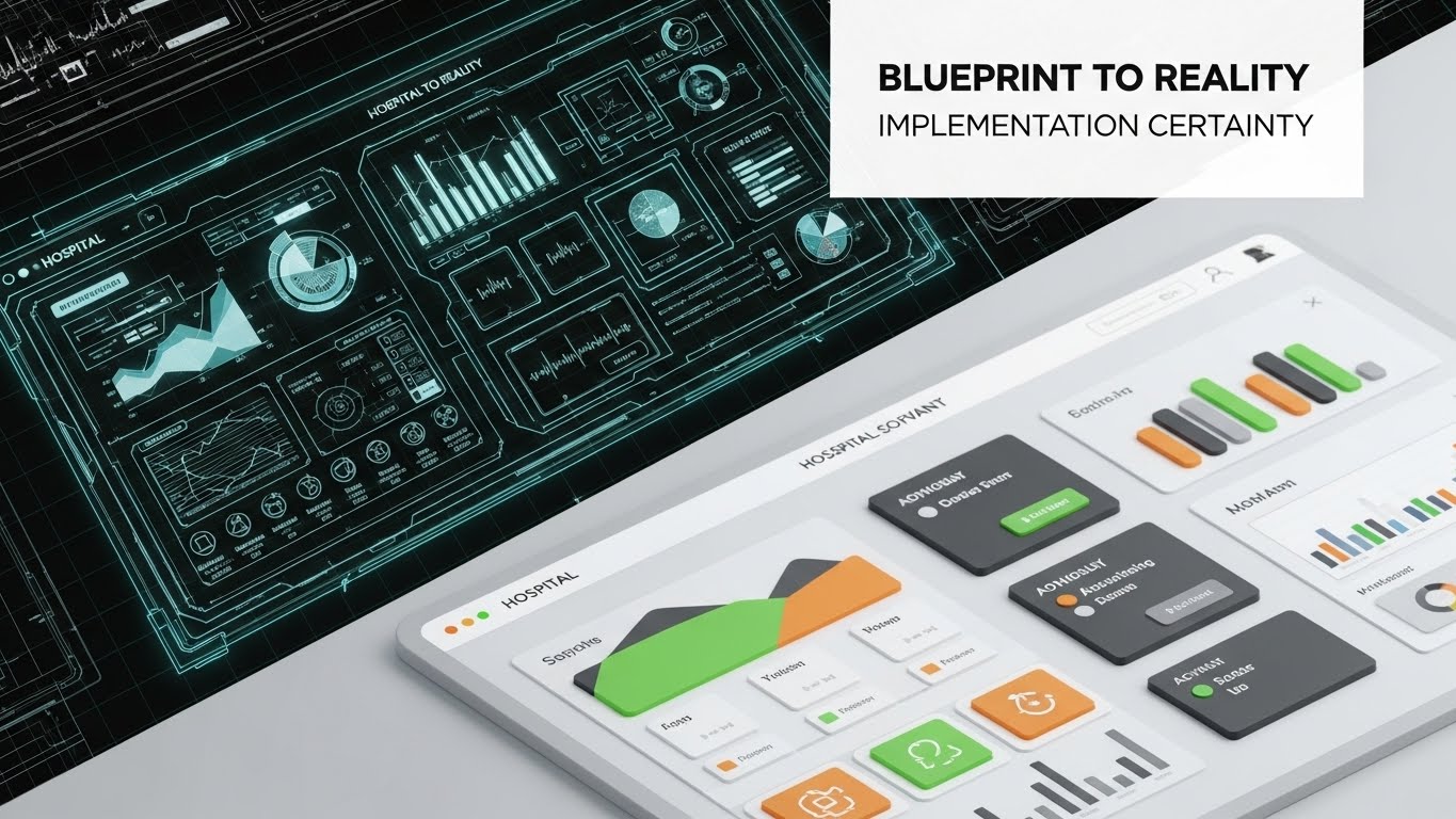
The Visual & Narrative Approach
Visualization Scenario: Implementation failure is a massive fear. This style addresses it with a diagonal split-screen. The top left shows the "Blueprint"—a technical, wireframe schematic of the hospital software interface. The bottom right reveals the "Reality"—the fully rendered, polished UI with vibrant data visualization. The visual narrative demonstrates the journey from Plan to Product. It reassures the buyer that the complex architecture discussed in the sales process translates perfectly into a usable, beautiful reality.
Narration Style: Architectural and reassuring. "From robust architecture to seamless reality."
Psychological Impact & KPI Focus
- Niche Psychology: IT Directors fear "Vaporware"—software that looks good in a demo but fails in architecture. This style utilizes "Process Transparency" to show that the glossy front-end is built on a solid, engineered foundation.
- Operational Impact: Mitigation of Implementation Risk. It visually bridges the gap between the engineering team's requirements and the clinical team's user experience.
Strategic Implementation & Trade-offs
- Best Use Case: Bottom-of-funnel emails to technical committees and "Implementation Process" guides.
- Trade-off: It appeals more to the logical/technical brain than the emotional one. It works best as a "Proof point," not a hook.
Companies using similar video content -
NextGen Connect – Mirth Connect – Shows integration engine blueprint to live data flow.
Smile Digital Health – FHIR Implementation – Guides from architectural plan to deployed solution.
Redox – API Integration – Illustrates seamless transition from design to live connection.
23. 2D Line Art Animation
Onboard | Self-Serve Onboarding
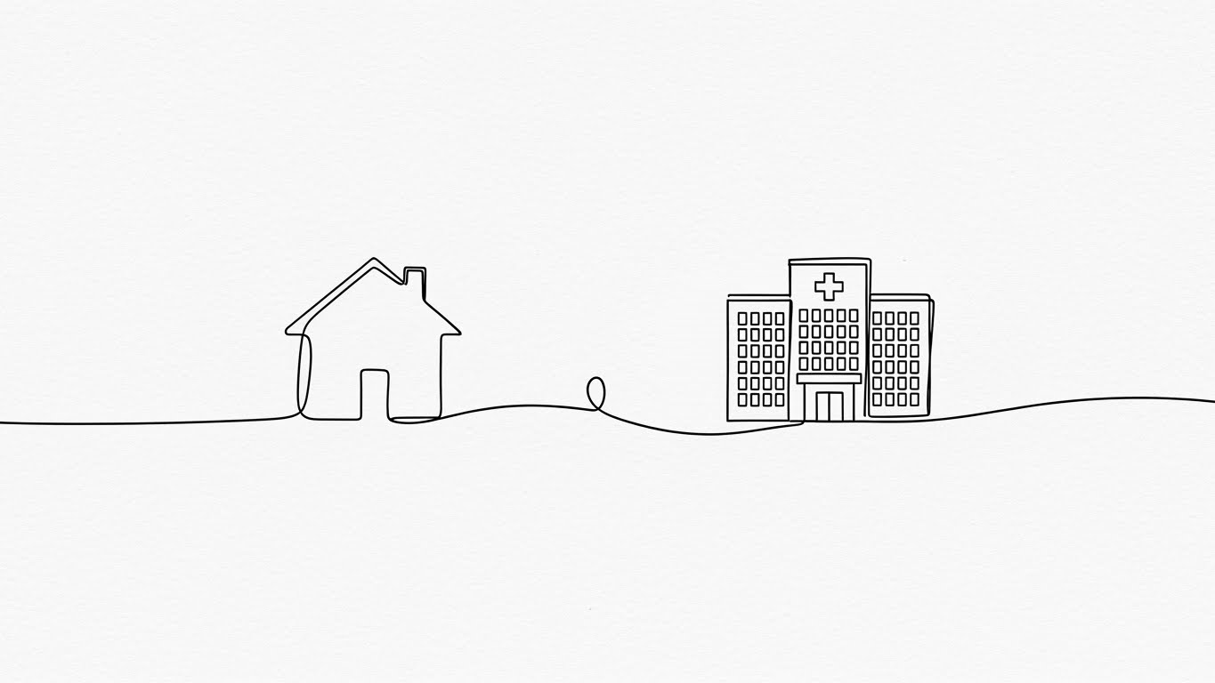
The Visual & Narrative Approach
Visualization Scenario: Simplicity is the ultimate sophistication in onboarding. This style uses a single, continuous black ink line that draws itself across a textured white paper background. The line morphs effortlessly from a residential home to a hospital building, physically connecting them. This minimalist aesthetic visualizes the Patient Journey stripping away the noise of the interface to focus purely on the logic of the connection. It tells the user, "This is simple. Point A connects to Point B."
Narration Style: Minimalist, instructional, and fluid. "Connect the care settings. Close the loop."
Psychological Impact & KPI Focus
- Niche Psychology: New users are often overwhelmed by "Interface Shock." This radical simplicity lowers the Cognitive Load, allowing them to understand the concept of the workflow before they have to click the buttons.
- Operational Impact: Accelerates Time-to-Competency. By understanding the high-level logic first, users navigate the actual complex UI with greater confidence.
Strategic Implementation & Trade-offs
- Best Use Case: In-app "Welcome" screens and high-level concept explainer videos during orientation.
- Trade-off: It lacks detail. It cannot be used to teach specific button clicks, only general concepts and workflows.
Companies using similar video content -
WellSky – Care Coordination – Maps patient journey from hospital to home.
Unite Us – Social Care Coordination Platform – Connects social services seamlessly.
CarePort Health – Care Transitions – Visualizes continuous patient movement.
24. Low-Poly 3D Modeling
Onboard | Reducing Friction
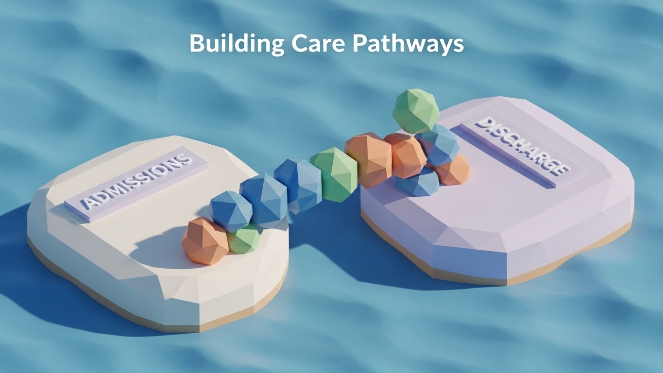
The Visual & Narrative Approach
Visualization Scenario: Configuration can feel like a chore. This style gamifies it. We use soft, pastel-colored Low-Poly 3D blocks that self-assemble to build a bridge between two islands labeled "Admissions" and "Discharge." The aesthetic is reminiscent of digital toys or building blocks, suggesting that configuring the platform is a creative, modular process rather than a tedious administrative task. It visualizes Modular Configuration—showing that the user can build their own workflows easily.
Narration Style: Playful, constructive, and simple. "Build the path. Bridge the gap."
Psychological Impact & KPI Focus
- Niche Psychology: It taps into the "IKEA Effect"—users value what they build themselves. By making the "building" process look fun and easy, it encourages deeper engagement with the configuration tools.
- Operational Impact: Increases Feature Adoption. Users who customize their workflows are stickier and less likely to churn.
Strategic Implementation & Trade-offs
- Best Use Case: "Setup Wizard" guides and "Admin Training" modules.
- Trade-off: The "Toy-like" aesthetic must be balanced. It works for the process of building, but not for representing serious clinical data.
Companies using similar video content -
Lumeon – Care Pathway Management – Allows modular configuration of patient journeys.
HealthSnap – Remote Patient Monitoring – Simplifies building personalized care plans.
Glooko – Diabetes Management Platform – Enables easy customization of health programs.
25. Macro UI Micro-Interactions
Onboard | Trial User Activation

The Visual & Narrative Approach
Visualization Scenario: The "Aha!" moment often happens with a single click. This style uses an extreme macro close-up of a UI element—a finger hovering over a glowing, Lime Green button labeled "Activate." The focus is razor-sharp, highlighting the pixel texture and the anticipation of the action. It visualizes the Moment of Commitment. It transforms a digital click into a physical, tactile event, emphasizing the power the user has to initiate change.
Narration Style: Anticipatory and decisive. "One click. Full power."
Psychological Impact & KPI Focus
- Niche Psychology: It leverages "Tactile Imaging." Research shows that seeing a hand interact with an object increases the viewer's desire to interact with it themselves. It triggers the impulse to "Start."
- Operational Impact: Drives Activation Rates in free trials. It focuses the user's attention on the single most important action they need to take next.
Strategic Implementation & Trade-offs
- Best Use Case: "Get Started" emails and nudge notifications for inactive users.
- Trade-off: It is hyper-specific. It only works for singular, binary actions (on/off, start/stop), not for complex data entry.
Companies using similar video content -
Validic – Inform Platform – Highlights key actions for data activation.
Current Health – Remote Patient Monitoring – Focuses on critical user interactions.
BioIntelliSense – BioCloud Platform – Emphasizes single-click data access.
26. Aspirational Stock Montage
Retain | Reducing Churn

The Visual & Narrative Approach
Visualization Scenario: After the sale, clients need to be reminded of the mission. This style leaves the UI behind entirely to focus on the Patient Outcome. A cinematic slow-motion shot shows a middle-aged man on a park bench, checking his phone and smiling with relief, bathed in warm, natural sunlight. In the background, life goes on. This image serves as a powerful reminder that effective care management software isn't about charts; it's about giving patients their lives back.
Narration Style: Warm, human, and outcome-focused. "The result of good data is a good life."
Psychological Impact & KPI Focus
- Niche Psychology: "Mission Alignment." Healthcare professionals are motivated by patient well-being. Connecting the software to this emotional reward reinforces their loyalty to the brand.
- Operational Impact: Reduces Churn. Clients who feel emotionally connected to the brand's mission are more forgiving of technical hiccups and more likely to renew.
Strategic Implementation & Trade-offs
- Best Use Case: Customer newsletters, quarterly business review (QBR) intros, and holiday brand messages.
- Trade-off: It's generic. Without the brand's context, it could be an ad for anything. It relies heavily on the accompanying copy to make the connection to the software.
Companies using similar video content -
Teladoc Health – Virtual Care Platform – Showcases positive patient health outcomes.
Amwell – Digital Care Delivery – Focuses on improved patient well-being.
GetWellNetwork – Patient Engagement Platform – Highlights patient satisfaction and recovery.
27. Hyper-lapse Stock Footage
Retain | Reducing Support

The Visual & Narrative Approach
Visualization Scenario: Healthcare never sleeps. This style uses a Hyper-lapse of a hospital exterior at night. While the city traffic blurs into streaks of red and white light (representing chaos/speed), the hospital building remains rock-steady and bright (representing stability). A digital billboard on the building subtly displays "Always On." This visualizes System Uptime and Reliability. It reassures the client that while they work the night shift, the platform is awake and watching over them.
Narration Style: Constant, steady, and reliable. "While the city rushes, we remain."
Psychological Impact & KPI Focus
- Niche Psychology: The "3 AM Panic." Clinicians worry about system failure during critical night shifts. This visual is a "Security Blanket," projecting stability and endurance.
- Operational Impact: builds Trust in SLA. It visually reinforces the Service Level Agreement guarantees of 99.9% uptime without using a boring chart.
Strategic Implementation & Trade-offs
- Best Use Case: Support portal login screens and "System Status" pages.
- Trade-off: It is atmospheric. It doesn't solve a support issue, but it sets a calm tone that can de-escalate frustration during maintenance windows.
Companies using similar video content -
InterSystems – HealthShare – Emphasizes continuous data availability and uptime.
Lyniate – Integration Engines – Guarantees constant, reliable data flow.
Redox – Interoperability Platform – Ensures always-on connectivity for health data.
28. 3D Parallax UI Presentation
Expand | Driving Upsell
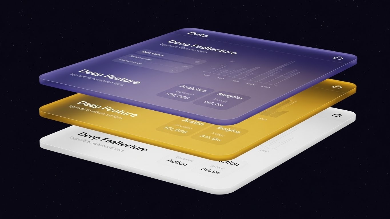
The Visual & Narrative Approach
Visualization Scenario: How do you sell a "Premium Tier"? By showing that there is more beneath the surface. This style uses a 3D Parallax effect where the UI is exploded into floating layers. The bottom layer (White) is "Basic Action," the middle (Yellow) is "Analytics," and the top (Deep Purple) is "Predictive AI." The camera angles reveal that the basic user is only seeing the top layer, implying that upgrading unlocks the deeper, more powerful infrastructure. It visualizes Deep Feature Architecture.
Narration Style: Dimensional and revelatory. "Go deeper. See what you're missing."
Psychological Impact & KPI Focus
- Niche Psychology: "FOMO" (Fear Of Missing Out) applied to features. Seeing the "hidden" layers creates curiosity and a desire to access the full potential of the tool they already use.
- Operational Impact: Drives Upsell/Cross-sell. It visually explains the difference between "Standard" and "Enterprise" editions without a boring comparison table.
Strategic Implementation & Trade-offs
- Best Use Case: In-app "Feature Locked" screens and upgrade prompt videos.
- Trade-off: It is abstract. Users need to clearly understand what the purple layer actually does (e.g., "AI Prediction") for the visual to be effective.
Companies using similar video content -
Health Catalyst – Data Operating System (DOS) – Reveals deeper analytics and insights.
Innovaccer – Data Activation Platform – Showcases advanced modules and capabilities.
Arcadia – Arcadia Analytics – Unlocks layered population health intelligence.
29. Holographic UI over 3D Render
Expand | Driving Deep Adoption
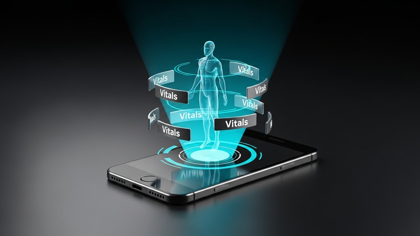
The Visual & Narrative Approach
Visualization Scenario: To sell the future, we use Sci-Fi aesthetics. A sleek mobile device lies flat, projecting a rotating, translucent Cyan hologram of a human body upwards. Floating "Vitals" widgets orbit the figure. This isn't just a screen; it's a command center. This style visualizes Remote Patient Monitoring (RPM) and the "Digital Twin" concept. It positions the platform as a futuristic tool that transcends the physical device.
Narration Style: Futuristic, innovative, and limitless. "Care beyond the screen."
Psychological Impact & KPI Focus
- Niche Psychology: The desire for "Innovation Status." Healthcare systems want to be seen as cutting-edge. This aesthetic appeals to the "Innovator" persona who wants to adopt the latest tech (RPM, AI).
- Operational Impact: Drives Adoption of Advanced Modules. It makes new, complex features like RPM feel exciting and accessible rather than daunting.
Strategic Implementation & Trade-offs
- Best Use Case: Webinars launching new modules and "Future Roadmap" presentations.
- Trade-off: It promises a very high-tech experience. The actual mobile app UI must be modern enough to not feel disappointing after this hologram intro.
Companies using similar video content -
Philips Healthcare – IntelliSpace Portal – Projects advanced imaging and patient data.
Siemens Healthineers – AI-Pathway Companion – Visualizes patient pathways with holographic data.
Medtronic – Integrated Health Solutions – Displays remote device monitoring with futuristic UI.
30. 3D X-Ray Visualization
Expand | Driving Referrals
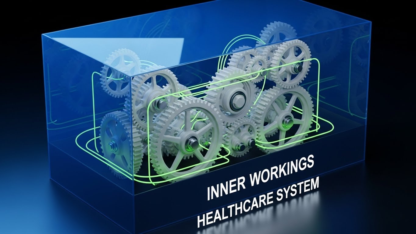
The Visual & Narrative Approach
Visualization Scenario: Trust is built on transparency. This style uses a 3D "X-Ray" effect to look inside a semi-transparent blue box representing the "Healthcare System." Inside, Bone White gears turn in perfect synchronization—no grinding, no friction. It visualizes the Partner Ecosystem. It suggests that referring a partner or integrating a new vendor into this platform results in mechanical perfection. It effectively communicates "We play well with others."
Narration Style: Transparent, mechanical, and harmonious. "Precision engineering for the care ecosystem."
Psychological Impact & KPI Focus
- Niche Psychology: "Integration Anxiety." Partners and referrals worry about technical friction. This visual soothes that anxiety by showing a frictionless, perfectly oiled machine.
- Operational Impact: Drives Partner Referrals. It visually demonstrates that the platform is a stable hub for a connected health ecosystem.
Strategic Implementation & Trade-offs
- Best Use Case: Partner program landing pages and API documentation covers.
- Trade-off: It is a metaphor. It represents the concept of integration, not the code itself.
Strategic Knowledge Base: The Visual Operations Doctrine
To transition from "Buying Software" to "Leading Transformation," we must move beyond aesthetics. The following framework synthesizes the 30 visual styles into a cohesive operational doctrine. This is your blueprint for using visualization not just to sell, but to solve the systemic friction of Integrated Care.
Strategic Alignment & Visual Architecture
The "Pre-Production" Strategy. Defining the Visual Operating System.
- The Cognitive Load Audit: Before creating a single asset, audit the "Mental Bandwidth" of your target persona. A stressed ER Nurse needs "Glanceable" visuals (Style 1 - Minimalist), while a Population Health Director needs "Deep Data" (Style 18 - Abstract AI). Match the visual density to the stress level of the role.
- Role-Based Visual Mapping: Do not use one style for all. Create a "Visual Matrix." Use Mobile/Simple styles (Style 6, 29) for frontline clinicians who consume content on the go. Use Desktop/Data-Rich styles (Style 17, 21) for administrators who sit at desks analyzing risk stratification.
- The "Glanceability" Standard: In healthcare, seconds matter. Adopt a "3-Second Rule" for all operational visuals. If a clinician cannot understand the status (Red/Green/Yellow) within 3 seconds, the visual has failed. Use High-Contrast styles (Style 4) for alerts.
- Brand Voice Consistency: Your platform likely consists of disparate modules (EHR, Billing, Telehealth). Use a unified visual language (e.g., the specific "Mint Green" from Style 2) across all video assets to create a subconscious sense of integration.
- The Advids Strategic Audit: Partner with Advids during the blueprinting phase. We don't just animate; we map your software's complex architecture to these 30 styles, ensuring that your "Billing" module doesn't look like it came from a different company than your "Clinical" module.
- Standardization vs. Customization: For core training, use standardized Clean UI (Style 9) to ensure compliance. For marketing and vision, use bespoke Cinematic AI (Style 3). Know when to scale with templates and when to invest in art.
- The Cross-Departmental Bridge: Sales talks "Revenue," Clinical talks "Outcomes," IT talks "Security." Use Split Screen (Style 11) visuals to physically show how a Clinical action on the left leads to a Revenue outcome on the right, unifying the internal language.
- Legacy System Integration: Visualizing the invisible link between old on-prem servers and your new SaaS is crucial. Use Neon Tech (Style 16) to glorify the API layer, making the "backend plumbing" look like a modern competitive advantage.
- Accessibility in Care: Healthcare workforces are diverse. Ensure all motion graphics (especially Styles 8 & 14) are designed with high-contrast text and are localizable for multi-lingual support staff.
- The Mobile-First Mandate: 80% of clinical staff are not at a desk. Optimize all 30 styles for vertical consumption. A Particle Vortex (Style 6) works better on a nurse's smartphone break than a wide-screen cinematic video.
Operational Adoption & Implementation
The "Deployment" Phase. Embedding visuals into the clinical workflow.
- Overcoming "Big Brother" Anxiety: Clinicians fear software is monitoring their speed. Use Empathetic Character Stories (Style 8) to reframe analytics as "Support," not "Surveillance." Show the data helping the nurse, not reporting them to management.
- The Micro-Learning Shift: Doctors do not read manuals. Replace 50-page PDFs with a library of 30-second Rapid UI Montages (Style 12). Deliver "Just-in-Time" learning at the point of care.
- Just-in-Time Support: Embed Wireframe Transitions (Style 23) directly into the help menu. When a user is stuck on a claim form, a 10-second animation showing the path A-to-B is more effective than a text tooltip.
- Gamification of Care Gaps: Use Low-Poly Building Blocks (Style 24) to visualize "Care Gap Closure." Let care managers "build" a complete patient record. Visual progress bars increase dopamine and task completion rates.
- Reducing Support Ticket Volume: There is a direct correlation between the quality of Self-Serve Onboarding (Style 23) and reduced helpdesk calls. Invest in "Pre-emptive" visualization—answering the "How do I?" question before a ticket is filed.
- Remote Onboarding: For distributed care teams (Home Health, Telehealth), physical seminars are impossible. Use Holographic UI (Style 29) concepts to make remote training feel immersive and high-tech, fostering connection without presence.
- Visual SOPs: Standard Operating Procedures are often ignored text documents. Transform them into Isometric Workflow (Style 15) animations. Visualizing the traffic flow of a patient through a clinic makes the SOP memorable and actionable.
- Feedback Loops: Use interactive video elements. After a Feature Education (Style 9) video, ask for a "Thumbs Up/Down." This data helps you iterate on both the software and the training materials.
- Scalable Localization: Global health systems need global assets. Design Text-Free Abstract Motion (Style 2) layers so that voiceovers and on-screen text can be swapped for Spanish, French, or German without re-rendering the 3D assets.
- Leadership Communication: When the CIO presents to the Board, they need more than screenshots. Equip them with Photorealistic ROI (Style 21) and Cinematic AI (Style 13) videos. Empower your champion to look like a visionary leader.
Measuring Impact & Future-Proofing
The "ROI" Phase. Measuring success and looking ahead.
- Beyond "Views": Do not measure video success by "Views." Measure by Time-to-Competency. Did the Line Art (Style 23) video reduce the time it takes a new nurse to admit a patient? That is the only metric that matters.
- The "Pajama Time" Metric: In healthcare, "Pajama Time" (doctors charting at home after hours) is a major burnout indicator. Correlate the use of Clean UI (Style 9) training videos with a reduction in after-hours logging. Prove your software gives clinicians their evenings back.
- Compliance Velocity: When a new mandate (like a new CMS rule) drops, how fast does the organization adapt? Use Kinetic Typography (Style 4) to disseminate regulatory updates instantly. Measure the speed of compliance adoption.
- Retention and Churn: User Experience (UX) is the new loyalty. High-quality Aspirational Montages (Style 26) remind users of the value of the platform during renewal discussions, directly impacting Lifetime Value (LTV).
- The AI Visual Frontier: Generative AI is changing healthcare. Prepare for Real-Time Data Overlays. Future versions of Style 29 will not be pre-rendered; they will be generated live from the patient's EHR data. Build your visual foundation now to support this future.
- Scalability of Assets: As your platform grows, your asset library must grow. Do not build "One-off" videos. Build a "Visual Design System." Advids specializes in creating these scalable libraries that grow with your feature set.
- The Advids Partnership: You need a long-term partner, not a vendor. Advids acts as the custodian of your visual brand, ensuring that as you acquire new companies or launch new modules, the visual narrative remains cohesive and powerful.
- Benchmarking Success: "Good enough" visuals are a competitive risk. If your competitor uses Cinematic AI (Style 3) and you use static screenshots, you lose the perception war before the demo starts. Regularly benchmark your visual standard against the top 10% of SaaS.
- The ROI of Safety: For clinical decision support, clarity equals safety. Quantify the reduction in "Sentinel Events" or medical errors that correlates with better visual training tools. Safety is the ultimate ROI in healthcare.
- Final Call to Innovation: Treat video as Infrastructure, not content. In the AI era, the interface is the instruction. The brands that win will be those that blur the line between the software and the story, creating a seamless, intuitive, and visually empowering experience for the care teams who save lives.
Companies using similar video content -
Capsule Technologies – Medical Device Information System – Visualizes seamless device integration.
Validic – Connect Platform – Shows internal mechanics of device data flow.
TigerConnect – Clinical Collaboration Platform – Illustrates the interconnectedness of care teams.
Author & Editor Bio


