
Introduction: Making the Invisible Flow
In the physical world, a bottleneck is obvious: inventory piles up on the factory floor. In the digital world of SaaS and software development, work is invisible. Code commits, API integrations, and backend refactoring don't occupy physical space, yet they clog workflows just as tangible inventory does. For the modern "Efficiency Architect," the challenge is not just to manage the work, but to see it.
The transition from physical whiteboards to digital platforms was necessary for scale, but it often came at the cost of tactile intuition. Effective visualization helps bridge this gap. It translates abstract metrics—Velocity, Cycle Time, WIP—into a visual language that stakeholders instantly comprehend. It turns the "black box" of development into a glass house, reducing cognitive load and aligning distributed teams around a single source of truth.
The operational impact of this visibility is measurable. Recent industry data reveals that teams that enforce WIP limits improve delivery times by up to 37%. This isn't just about speed; it's about predictability. Furthermore, organizations that embed this level of transparency and agility see an increased commercial performance of 237%.
This guide presents 30 specific visualization styles designed to communicate the value of Kanban and SaaS platforms. Moving beyond generic screen recordings, these styles leverage motion, metaphor, and high-fidelity design to make the viewer feel the efficiency your platform delivers.
1. Bold Kinetic Typography (Visual)
TOFU | Brand Awareness

The Visual & Narrative Approach
This style abandons the "explainer" format for a visceral, rhythmic visual experience. We see abstract, geometric blocks in Electric Blue and Hot Pink—resembling Tetris bricks—shifting and sliding mechanically to construct a solid structure against a matte background. The motion is punchy and synchronized; every "snap" helps visualize the concept of chaotic tasks assembling into perfect order. The focus is on the architectural build-up of shapes rather than readable text, creating a feeling of stability.
Psychological Impact & KPI Focus
Psychologically, this style leverages the brain's desire for pattern completion (Gestalt psychology). The chaotic falling blocks creating a solid wall triggers a subconscious sense of relief and control. For a Top-of-Funnel audience, this addresses the anxiety of "project collapse." The primary KPI here is Ad Recall; the high-contrast visuals are designed to stop the scroll and imprint the brand's feeling of "structured speed."
Strategic Implementation & Trade-offs
- Best Use Case: High-tempo social ads (Instagram Reels/TikTok) where sound-off intelligibility is crucial.
- Duration: 10-15 Seconds (Loopable).
- Trade-off: This style is purely emotional. It builds brand affinity but explains zero features. It works best as a hook to retarget with more educational content later.
Companies using similar video content -
Datadog – Monitoring & Security Platform – Visualizing complex infrastructure assembly.
Dynatrace – Software Intelligence Platform – Kinetic representation of system components connecting.
2. Abstract 2D flat vector organic
TOFU | Category Creation
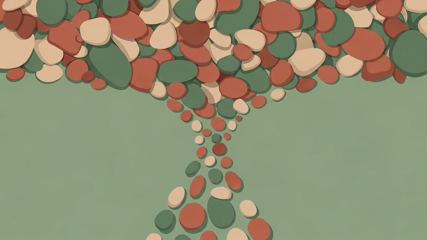
The Visual & Narrative Approach
This style softens the typically rigid tech aesthetic with organic, fluid shapes. A top-down view shows a chaotic pile of jagged, mismatched pebbles in varied earth tones transforming into a streamlined, organized river of smooth stones flowing in a single direction. The palette features Sage Green, Terracotta, and Sand. The composition emphasizes the transition from clutter to a clear path, utilizing shadowless clean lines and soft curves to visualize "Flow Efficiency."
Psychological Impact & KPI Focus
This targets the "Category Creation" goal by framing the software as a philosophy of work (Kaizen) rather than just a tool. The transition from "jagged" to "smooth" metaphorically addresses the stress of friction in a workflow. It positions the platform as a therapeutic solution to operational chaos, aiming to increase Time on Page and deepen brand engagement.
Strategic Implementation & Trade-offs
- Best Use Case: Blog headers, "About Us" pages, or Manifesto videos.
- Duration: 15-20 Seconds.
- Trade-off: The "softness" of the style might feel too casual for enterprise-grade security pitching. It creates approachability but may sacrifice "high-tech" authority.
Companies using similar video content -
Miro – Online Collaborative Whiteboard – Organic flow for brainstorming and ideation.
Lucidchart – Intelligent Diagramming – Fluid process mapping and workflow visualization.
3. 2D Line Art Animation
TOFU | Market Education
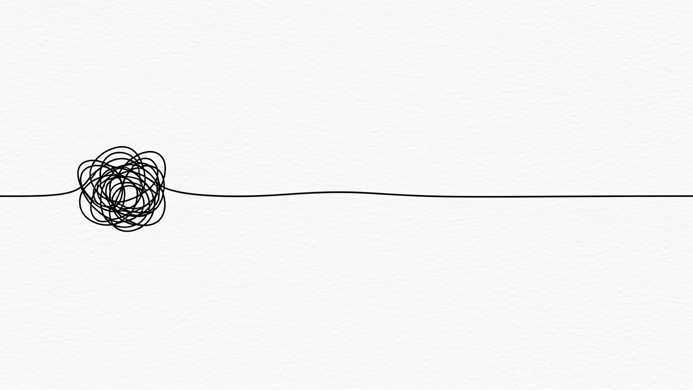
The Visual & Narrative Approach
Minimalism is the ultimate sophistication here. A continuous 2D line art animation in stark Black on a textured White paper background forms a tangled, chaotic knot—representing a bottleneck. It then fluidly unravels into a perfectly straight, smooth trajectory. The style is sophisticated and minimal, symbolizing the simplification of complex processes. The motion is slow and deliberate, suggesting that the solution is already there; it just needs to be untangled.
Psychological Impact & KPI Focus
This style appeals to the "Cognitive Miser"—the brain's tendency to prefer simple solutions to complex problems. It is highly effective for Market Education, as it simplifies abstract concepts (like dependency management) into a universally understood physical interaction. It targets the Share Rate on professional networks like LinkedIn, positioning the brand as a thoughtful industry leader.
Strategic Implementation & Trade-offs
- Best Use Case: LinkedIn feeds where professional, sophisticated aesthetics perform better than loud, colorful ads.
- Duration: 6-10 Seconds (GIF-like).
- Trade-off: Extremely minimalist. If the animation quality isn't fluid, it looks cheap. It relies entirely on the quality of the motion curve.
Companies using similar video content -
Linear – Issue Tracking for High-Performance Teams – Untangling complex project dependencies.
Shortcut – Project Management for Software Teams – Simplifying development workflows.
4. Abstract 2D Motion Graphics
TOFU | Shaping Brand Perception

The Visual & Narrative Approach
We enter a dark digital void to visualize the enterprise ecosystem. Abstract 2D motion graphics feature a network of glowing nodes in Deep Violet and Neon Lime, connected by thin, pulsing data streams. The camera focus uses a shallow depth of field, blurring the background nodes while keeping the central hub structure sharp. The visual represents a secure, high-tech collaborative network where data travels instantly between stakeholders.
Psychological Impact & KPI Focus
This style leverages "High-Tech Signifiers" (dark mode, neon, glowing nodes) to establish authority and security. It appeals to the CTO persona who worries about data integrity and system architecture. The shallow depth of field mimics high-end photography, adding a layer of premium polish that shapes brand perception. It reduces the Bounce Rate on website hero sections by setting a serious, capable tone.
Strategic Implementation & Trade-offs
- Best Use Case: Website Hero sections (background video) or Event backdrops.
- Duration: 20-30 Seconds (Looping ambient).
- Trade-off: It is highly abstract. It conveys "Advanced Technology" but doesn't explain what the technology does. It must be overlaid with a strong value proposition headline.
Companies using similar video content -
Palo Alto Networks – Cybersecurity Platform – Visualizing secure network connectivity.
CrowdStrike – Endpoint Protection – Abstract representation of threat detection networks.
5. 2D Animation & UI Composition
TOFU | Vertical Social Organic

The Visual & Narrative Approach
Tailored for the mobile-first workforce, this style features a stylized 2D illustration of a young professional in a Pastel Yellow hoodie. The character swipes a giant, floating "Task Card" (resembling a smartphone screen) from left to right. The background is a pattern of abstract Sky Blue geometric shapes. The style is energetic and playful, capturing the ease and "gamification" of mobile task management using the familiar "swipe" gesture.
Psychological Impact & KPI Focus
This targets Viral Engagement and User Adoption. It reframes work—often seen as tedious—as a series of quick, satisfying dopamine hits. By using a human character and a recognizable social media gesture (the swipe), it makes the software feel accessible and "for me," not just "for the company." It directly addresses the anxiety that mobile work is clumsy or difficult.
Strategic Implementation & Trade-offs
- Best Use Case: TikTok/Instagram Reels/Shorts.
- Duration: 10-15 Seconds.
- Trade-off: Too informal for a boardroom presentation. This is strictly for user acquisition and community building, not enterprise sales.
Companies using similar video content -
Monday.com – Work OS – Playful mobile task management and team collaboration.
ClickUp – One App to Replace Them All – Gamified task completion and productivity.
6. AI generated mixed media video
TOFU | Skippable Pre-Roll Ad

The Visual & Narrative Approach
This style acts as a bridge between the analog and digital worlds. A dynamic panning shot moves across a modern wooden desk surface. Physical yellow sticky notes with rough edges magically morph into glowing, holographic glass panels in Charcoal and Paper White. The visual blends realistic photography with high-end 3D digital effects, symbolizing the transformation from manual methods to digital workflows without losing the tactile context.
Psychological Impact & KPI Focus
This is the "Bridge" visualization. It directly addresses the "Physical/Digital Divide" (Key Finding 3). Many users are reluctant to give up paper because of its tactility. This style validates the paper (it was real) but shows the digital version as an evolution, not a replacement. It drives Click-Through Rates by showing a magical solution to a mundane problem.
Strategic Implementation & Trade-offs
- Best Use Case: YouTube Pre-roll ads targeting keywords like "Kanban board" or "Office organization."
- Duration: 15 Seconds.
- Trade-off: Requires high-quality execution to blend the real footage and 3D effects seamlessly. If done poorly, the transition looks jarring.
Companies using similar video content -
ServiceNow – Digital Workflow Platform – Modernizing manual IT and business workflows.
UiPath – Robotic Process Automation – Transforming paper-based processes to digital.
7. Generative AI cinematic video
TOFU | Connected TV
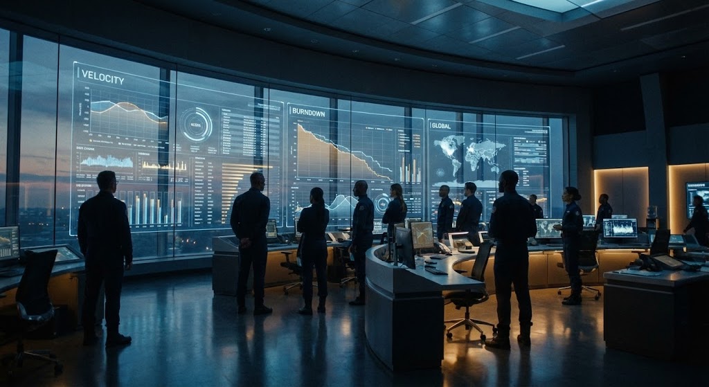
The Visual & Narrative Approach
Cinematic grandeur defines this style. A wide establishing shot reveals a futuristic mission control center. A diverse team of professionals stands before a massive glass wall displaying complex "Velocity" graphs and "Burndown" charts in Steel Blue and Amber. The lighting is dramatic, with cool cinematic tones and subtle film grain. It conveys enterprise-scale operations and serious efficiency—the software as the central nervous system of the company.
Psychological Impact & KPI Focus
This appeals to the "Ego" and "Aspiration" of the C-Suite. It reframes project management from "admin work" to "mission-critical operations." It visualizes the concept of "Total Visibility," promising that with this platform, leadership can see everything. It builds Brand Authority and Trust for high-ticket enterprise deals.
Strategic Implementation & Trade-offs
- Best Use Case: CTV (Connected TV) ads or keynote openers at major tech conferences.
- Duration: 30-60 Seconds.
- Trade-off: High production value perception is required. It sets a very high expectation for the actual product's analytics capabilities.
Companies using similar video content -
SAP – Business Technology Platform – Orchestrating macro-level enterprise operations.
Oracle – Cloud Infrastructure – Cinematic view of large-scale data and application management.
8. Isometric 2D Motion Design
TOFU | Instant Gratification

The Visual & Narrative Approach
An isometric 2D design shows a chaotic scattering of Cyan and Vivid Orange cubes on an infinite white grid floor. The cubes are depicted in mid-motion, snapping magnetically into neat, organized slots within a defined 3-column grid structure. The aesthetic is clean, technical, and precise, visualizing the instant organization of a messy workflow. Lighting is even and shadowless.
Psychological Impact & KPI Focus
This leverages "Spatial Order." The isometric view provides a "God-view" of the process, giving the viewer a sense of control. The "snapping" motion visualizes Instant Gratification—the promise that the software will do the organizing for you. It addresses the fear of "messy data" by showing that every input has a perfect, pre-destined home.
Strategic Implementation & Trade-offs
- Best Use Case: Instagram/Facebook feeds (Square 1:1 format).
- Duration: 6-12 Seconds (Looping).
- Trade-off: Very abstract. It explains the feeling of organization but tells the user nothing about the actual interface or features.
Companies using similar video content -
Asana – Work Management Platform – Instant organization of tasks into structured projects.
Wrike – Project Management Software – Grid alignment for visualizing project structure.
9. Clean UI Workflow (Light Mode)
MOFU | Demand Gen & Lead Capture
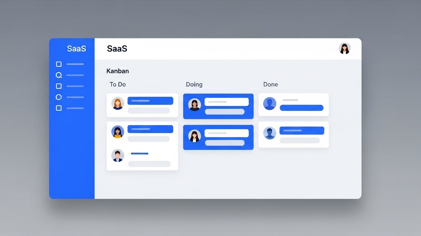
The Visual & Narrative Approach
Moving from metaphor to reality, this style presents a high-fidelity, photorealistic mockup of the actual SaaS UI screen. The interface is clean and modern (Light Mode), displaying a Kanban board with "To Do", "Doing", and "Done" columns. User avatars and task tags are rendered in Royal Blue and Pure White. The view is straight-on with a slight tilt, casting a soft drop shadow on a neutral grey gradient background. The focus is on the clarity and structure of the interface.
Psychological Impact & KPI Focus
This targets Trust and Reduction of Anxiety. After the abstract hooks of TOFU, the MOFU buyer wants to know: "What does it actually look like?" The Light Mode signifies openness and clarity. The realistic drop shadows and physics bridge the Physical/Digital divide, making the UI feel like a tangible object that is pleasant to use. The KPI is Conversion Rate (Sign-ups/Demos).
Strategic Implementation & Trade-offs
- Best Use Case: Landing pages, Feature pages, and Email Nurture sequences.
- Duration: 30-90 Seconds.
- Trade-off: It must be pixel-perfect. If the UI text is unreadable or the layout is cluttered, it backfires. It requires a "sanitized" version of the UI (dummy data) to look best.
Companies using similar video content -
Jira Software – Issue and Project Tracking – Showcasing clear, structured agile workflows.
Kanbanize – Lean-Kanban Software – Demonstrating clean, intuitive Kanban board UI.
10. Minimalist Flat 2D Vector
MOFU | Product/Solution Differentiation
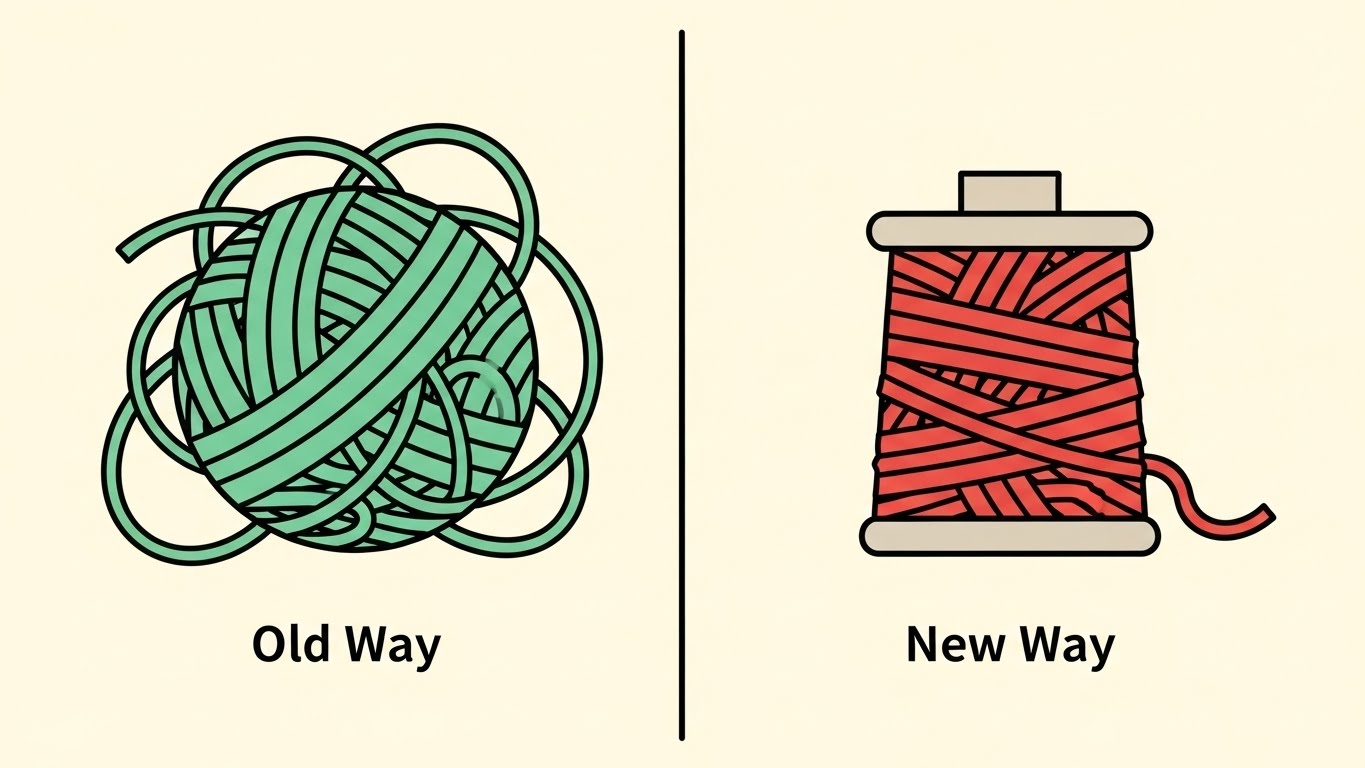
The Visual & Narrative Approach
A minimalist flat vector illustration uses a split composition. On the left, a tangled ball of yarn in Mint Green represents the "Old Way." On the right, the yarn is neatly spooled and organized in Coral Red, representing the "New Way." The background is a solid pale cream. The style implies simplified geometry and clear visual contrast without gradients or textures.
Psychological Impact & KPI Focus
This uses Binary Contrast to force a decision. The brain is wired to compare. By presenting two states side-by-side, we force the viewer to identify with the "Old Way" (their current pain) and aspire to the "New Way." It simplifies the value proposition down to its absolute core: Mess vs. Tidy. It is highly effective for Champion Enablement in slide decks.
Strategic Implementation & Trade-offs
- Best Use Case: Sales Decks (Slide 3 or 4 - The Problem/Solution slide) or static Display Ads.
- Duration: Static Image or 5-second Micro-animation.
- Trade-off: It lacks nuance. It frames the competition/status quo as "garbage," which is effective but aggressive.
Companies using similar video content -
Celonis – Process Mining Software – Highlighting efficiency gains from process optimization.
Process Street – Checklist and Workflow Software – Simplifying complex operational procedures.
11. Isometric 3D Workflow
MOFU | Feature Education

The Visual & Narrative Approach
This style embraces the "Claymorphism" trend to make complex data structures feel approachable and friendly. We see an isometric macro view of a Kanban board where columns are raised, soft-edged platforms in Teal, and tasks are rendered as pill-shaped, tactile objects in Tangerine. The lighting is soft and diffuse, creating deep, marshmallow-like shadows. It mimics the look of a high-end physical model, suggesting that the tasks are easy to pick up and move.
Psychological Impact & KPI Focus
The primary psychological barrier to new software adoption is the fear of complexity (Technophobia). By using soft, rounded, and tactile aesthetics, we lower the "Intimidation Factor." It signals that the platform is forgiving and easy to manipulate. This directly targets User Adoption Rates by making the interface look "fun" to use rather than like a rigid spreadsheet, appealing to the end-users who will actually be in the tool daily.
Strategic Implementation & Trade-offs
- Best Use Case: Feature highlight videos on product pages or onboarding welcome sequences.
- Duration: 15-20 Seconds (Looping).
- Trade-off: The stylized "toy-like" aesthetic may lack the data density required for power users. It sells ease of use, not complex analytics.
Companies using similar video content -
Notion – All-in-one Workspace – Tactile, friendly interface for diverse workflows.
Coda – Doc that brings it all together – Approachable, modular document and workflow building.
12. Split Screen: Optimized Reality and UI
MOFU | Competitive Displacement
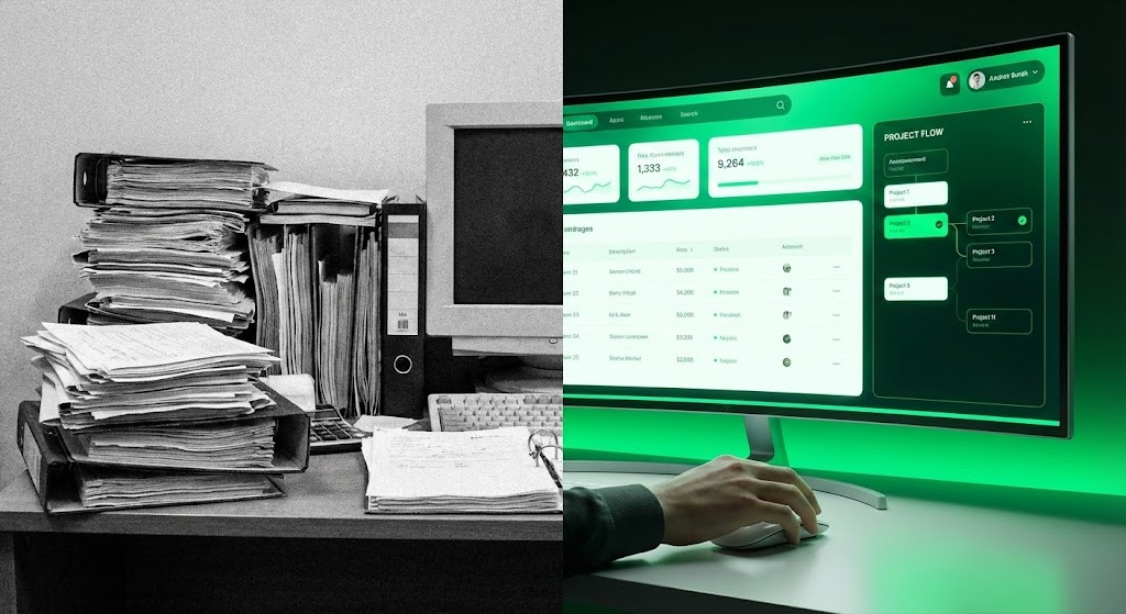
The Visual & Narrative Approach
This visualization uses a stark split-screen composition to force a comparison. The left half depicts the "Old World": a desaturated, grainy, black-and-white photograph of a cluttered desk overwhelmed by towering piles of paper and dusty binders. The right half bursts with the "New World": a sleek, high-resolution render of the SaaS interface on a curved monitor, glowing in Vivid Green and White. The visual narrative is immediate—we are upgrading from static chaos to dynamic clarity.
Psychological Impact & KPI Focus
This targets Competitive Displacement and the "Status Quo Bias." Humans often stick to messy processes because they are familiar. This image visualizes the psychological weight of that mess (the heavy papers) versus the weightlessness of the digital solution. It aims to trigger Action, driving prospects to migrate from legacy systems (or spreadsheets) to your platform.
Strategic Implementation & Trade-offs
- Best Use Case: Instagram/LinkedIn retargeting ads comparing "The Old Way" vs. "The New Way."
- Duration: 6-10 Seconds (Static or subtle cinemagraph).
- Trade-off: It is aggressive. It frames the prospect's current reality as "bad," which works well for disruption but requires tact to ensure the prospect doesn't feel insulted.
Companies using similar video content -
Adobe Workfront – Work Management Platform – Contrasting manual work with digital efficiency.
Teamwork.com – Project Management Software – Visualizing the upgrade from chaos to clarity.
13. Rapid UI Feature Montage
MOFU | Driving Demo Requests
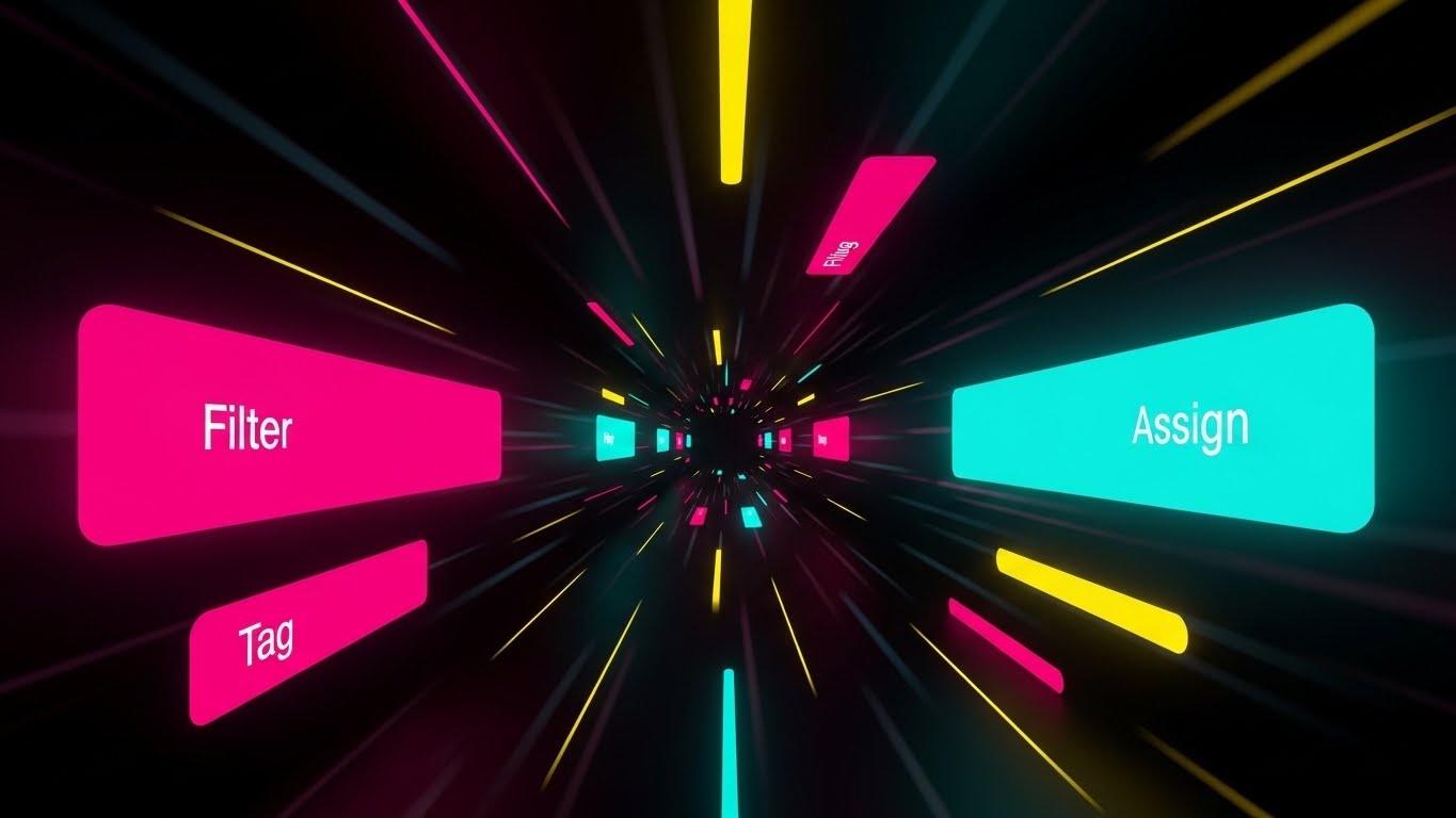
The Visual & Narrative Approach
To visualize speed, we abandon static screens for a high-velocity motion tunnel. Floating UI buttons—"Filter", "Tag", "Assign"—in Magenta and Bright Cyan fly toward the viewer, driven by converging speed lines in a dark void. The composition mimics a "warp speed" effect. It doesn't show a specific workflow; rather, it simulates the sensation of a power user executing commands instantly.
Psychological Impact & KPI Focus
This appeals to the "Power User" persona who values efficiency above all else. It answers the question: "Will this slow me down?" with a resounding "No." The visual metaphor suggests that the software anticipates your moves. The primary KPI is Click-Through Rate (CTR) on demo requests, enticing users to experience this speed firsthand.
Strategic Implementation & Trade-offs
- Best Use Case: GIF embeds in cold outreach emails or fast-paced social stories.
- Duration: 3-5 Seconds (Looping GIF).
- Trade-off: High energy, low detail. It conveys speed but teaches nothing about how to filter or tag. It is purely a sensation-based hook.
Companies using similar video content -
Azure DevOps – Developer Services – Visualizing rapid feature execution and deployment.
GitLab – DevOps Platform – Accelerating perception of CI/CD pipeline speed.
14. Dynamic Data Visualization
MOFU | LinkedIn Organic

The Visual & Narrative Approach
This style elevates charts from boring spreadsheets to premium art objects. We see a glossy 3D bar chart set against a professional Deep Navy studio background. The bars are rendered in reflective Navy Blue, while a soaring trend arrow cuts across them in Metallic Gold. The text "THROUGHPUT" anchors the visual. It treats data like a luxury product, implying that the metrics derived from this platform are valuable assets.
Psychological Impact & KPI Focus
This targets Social Proof and Professional Validation. By presenting data with the aesthetic of a high-end financial report, it signals to leadership that this platform handles "serious business." It is designed for LinkedIn, where professional success is the currency. The goal is to drive Engagement (Likes/Comments) from decision-makers who want to be associated with this trajectory of success.
Strategic Implementation & Trade-offs
- Best Use Case: LinkedIn organic posts discussing "Velocity," "Efficiency," or "Q4 Goals."
- Duration: 10-15 Seconds.
- Trade-off: It is generic. Without specific context (e.g., a case study caption), it can look like stock art. It needs strong copy to ground the visual in reality.
Companies using similar video content -
Tableau – Analytics Platform – Elevating data into valuable, glossy insights.
Power BI – Business Intelligence Service – Professional validation of success metrics.
15. Lifestyle Stock with UI Overlay
MOFU | LinkedIn Video Ads

The Visual & Narrative Approach
This style bridges the gap between the tool and the human user. We see a professional woman in a modern office, filmed with high production value. Superimposed over her tablet is a glowing, semi-transparent Augmented Reality (AR) Kanban board in Warm Beige and Virtual Blue. The UI floats in the physical space, suggesting that the software is an extension of her mind, not just an app on a screen.
Psychological Impact & KPI Focus
This humanizes the SaaS product. Pure UI can feel cold; this style inserts the human element, allowing the viewer to project themselves into the scene ("That could be me managing my team"). It addresses the anxiety of "disconnection" by showing the software integrated into a bright, human workspace. It drives Brand Affinity and consideration.
Strategic Implementation & Trade-offs
- Best Use Case: LinkedIn Video Ads or "Life at [Company]" branding videos.
- Duration: 10-15 Seconds.
- Trade-off: Requires high-quality stock footage or a custom shoot. Poor compositing (where the UI looks "pasted on") breaks the immersion instantly.
Companies using similar video content -
Microsoft Teams – Collaboration Platform – AR overlay for contextual work management.
Zoom – Video Conferencing – Integrating UI into a human-centric workspace.
16. Wireframe to Reality Transition
MOFU | Competitive Comparison/Switcher
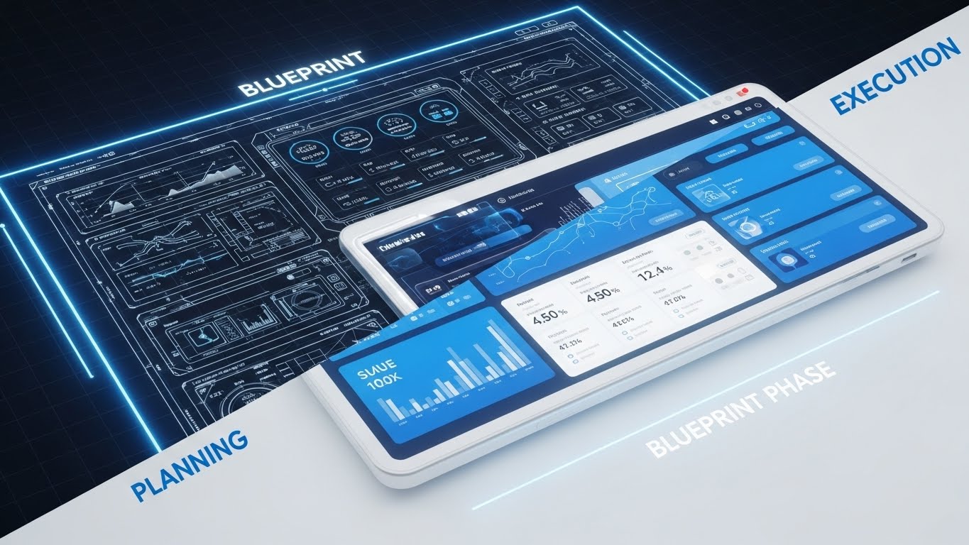
The Visual & Narrative Approach
This style visualizes the journey from idea to product. A diagonal split separates a technical white wireframe/blueprint on a dark grid (Left: "PLANNING") from a fully rendered, glossy 3D tablet interface in Blueprint Blue (Right: "EXECUTION"). The transition implies that the software is the catalyst that turns abstract plans into concrete, shipped reality.
Psychological Impact & KPI Focus
This appeals to Product Managers and Engineers who live in the gap between "what we planned" and "what we shipped." It validates the planning phase while emphasizing the execution. It positions the platform as the bridge that ensures fidelity between the roadmap and the release. The goal is Conversion—targeting users stuck in the planning phase.
Strategic Implementation & Trade-offs
- Best Use Case: Retargeting ads for users who visited the "Roadmap" feature page.
- Duration: 6-10 Seconds (Sliding transition).
- Trade-off: Can appear too technical for non-product audiences (e.g., HR or Marketing users) who may not relate to "wireframes."
Companies using similar video content -
Aha! – Product Roadmapping Software – Visualizing the journey from product plan to execution.
Productboard – Product Management System – Transitioning ideas from wireframe to shipped reality.
17. Generative AI Realistic Character Video
BOFU | Establishing Thought Leadership

The Visual & Narrative Approach
Here, we leverage the power of a human face to build trust. A photorealistic, AI-generated video features a confident CEO-type figure in a Corporate Grey suit, speaking directly to the viewer in a high-end office setting. He gestures toward a laptop, explaining a strategic concept. The lighting is natural and premium. This isn't about the UI; it's about the people behind the UI and the philosophy they espouse.
Psychological Impact & KPI Focus
People buy from people. At the BOFU stage, trust is the primary currency. This style alleviates the fear of buying "vaporware" by presenting a mature, authoritative face of the company. It suggests stability, wisdom, and partnership. The KPI is Webinar Sign-ups or Whitepaper Downloads, positioning the brand as a thought leader, not just a vendor.
Strategic Implementation & Trade-offs
- Best Use Case: Webinar invitations, "Message from the CEO," or high-level strategic advice videos.
- Duration: 30-60 Seconds.
- Trade-off: The "Uncanny Valley." AI video generation must be top-tier; otherwise, unnatural lip-sync or eye movement will destroy trust immediately.
Companies using similar video content -
Salesforce – CRM Platform – Executive persona establishing strategic trust and vision.
Workday – Enterprise Cloud Applications – Visionary leadership for HR and finance solutions.
18. Aspirational Stock Montage
BOFU | Building Trust & Credibility

The Visual & Narrative Approach
We shift focus from the screen to the outcome. A high-energy shot captures a diverse team in a glass-walled office, jumping and high-fiving in celebration. Confetti falls through the air, catching the Golden Hour sunlight. In the background, a whiteboard with sticky notes suggests a project just completed. This visualizes the feeling of shipping a project on time—the relief, the camaraderie, and the success.
Psychological Impact & KPI Focus
This sells the emotional benefit of the software. Efficiency isn't just about speed; it's about team morale. By showing a happy, cohesive team, we subconsciously link the software to a better work culture. This is powerful for Champion Enablement—giving your internal advocate the visual ammunition to say, "This tool will make our team happier."
Strategic Implementation & Trade-offs
- Best Use Case: Case study headers, "Success Stories" pages, or end-of-year wrap-up videos.
- Duration: 5-10 Seconds (Slow motion).
- Trade-off: It can feel cliché ("cheesy stock photo"). It works best when paired with a hard statistic (e.g., "Reduce burnout by 20%").
Companies using similar video content -
Trello – Visual Collaboration Tool – Visualizing team triumph and project completion.
Smartsheet – Dynamic Workspace – Celebrating collective success and team morale.
19. Photorealistic 3D Renders
BOFU | ROI Justification

The Visual & Narrative Approach
For the CFO, efficiency equals money. This style literalizes that equation. On a polished mahogany executive desk, stacks of silver and gold coins are arranged precisely to mimic a rising bar chart. The lighting is cinematic, highlighting the metal textures. It is a serious, weighty image that communicates fiscal responsibility and growth. It strips away the tech jargon and speaks the language of finance.
Psychological Impact & KPI Focus
This addresses the "Cost Objection." It reframes the software purchase from an "expense" to an "investment" with a measurable return. The visual solidity of the coins implies that the ROI is real and tangible, not theoretical. It is designed to close the deal, specifically targeting the Proposal Acceptance Rate.
Strategic Implementation & Trade-offs
- Best Use Case: Sales proposals, pricing pages, or ROI calculator landing pages.
- Duration: Static Image.
- Trade-off: It is very literal. It lacks the excitement of the tech but is essential for the "rational" part of the buying brain in the final stages.
Companies using similar video content -
Coupa – Business Spend Management – Photorealistic ROI for financial justification.
Anaplan – Connected Planning Platform – Visualizing tangible financial growth and investment.
20. 3D X-Ray Visualization
BOFU | Risk Mitigation

The Visual & Narrative Approach
Security is invisible, so we must give it form. We use a 3D "X-Ray" cutaway view of a sleek black server tower. Inside, instead of standard components, we see a glowing, translucent Green shield icon protecting a core of data cubes. The background is a technical wireframe grid. It visualizes the robust architecture and "military-grade" protection that underpins the platform, making safety look active and impregnable.
Psychological Impact & KPI Focus
This targets the Fear of Data Loss or breaches, a primary concern for Enterprise IT buyers. By visualizing security as a physical shield within the hardware, it provides a sense of containment and safety. It answers the "Is it safe?" objection before it is voiced, reducing friction in the Security Review phase of the sales cycle.
Strategic Implementation & Trade-offs
- Best Use Case: Security compliance pages, Trust Center, or IT-focused sales decks.
- Duration: 10-15 Seconds (Looping shield pulse).
- Trade-off: Highly technical. It is boring to the creative user but essential for the gatekeeper (IT Director). It validates the infrastructure, not the workflow.
Companies using similar video content -
Varonis – Data Security Platform – X-ray view of internal data fortification.
Rubrik – Data Security & Resilience – Visualizing impregnable data protection.
21. Holographic UI over 3D Render
BOFU | ABM Awareness
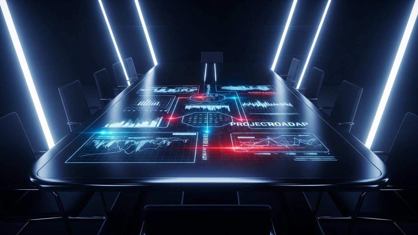
The Visual & Narrative Approach
This style radiates executive exclusivity. In a dimly lit, high-end conference room, we look down at a polished table. A luminous Hologram Blue and Laser Red projection erupts from the surface, mapping out a complex project roadmap in three-dimensional space. The camera glides slowly, emphasizing the depth and interconnectivity of the timeline. It visualizes the data not as a flat spreadsheet, but as a tangible, living architecture of the company's future.
Psychological Impact & KPI Focus
This is designed for the "Economic Buyer" and C-Suite stakeholders. It utilizes the "Cool Factor" of futuristic tech to suggest that the vendor is visionary. Psychologically, the holographic display represents transparency and foresight—showing the "big picture" in a way that feels inevitable and secure. The primary KPI is Meeting Acceptance Rate for high-value target accounts.
Strategic Implementation & Trade-offs
- Best Use Case: High-touch ABM campaigns (e.g., embedded in a physical video brochure sent to CEO/CTOs).
- Duration: 15-20 Seconds (Looping).
- Trade-off: High production cost. It creates a "premium" expectation that the actual flat UI of the software cannot literally match, so it must be framed as a "Strategic View."
Companies using similar video content -
Siemens Digital Industries Software – Teamcenter – Holographic projection for strategic PLM.
PTC – ThingWorx – Mapping future state with AR/holographic industrial IoT data.
22. Hyper-lapse Stock Footage with Data
BOFU | The Economic Buyer

The Visual & Narrative Approach
This style captures the pulse of a modern enterprise. We use hyper-lapse footage of a bustling, open-plan office; employees are blurred streaks of motion, emphasizing speed and activity. Superimposed over this chaotic reality are steady, sharp lines of code and data streams in City Lights colors (Cyan, Magenta, Amber). The data remains rock-solid while the physical world rushes by, symbolizing the software's ability to maintain order amidst high-velocity growth.
Psychological Impact & KPI Focus
This addresses the fear of "Scaling Chaos." For a decision-maker at a growing company, the blur of activity can feel overwhelming. The steady data overlay provides a psychological anchor—a promise that the platform provides stability regardless of how fast the team moves. It builds Confidence in the platform's scalability and infrastructure.
Strategic Implementation & Trade-offs
- Best Use Case: Homepage Hero background or "About Us" company vision video.
- Duration: 10-20 Seconds (Looping).
- Trade-off: Relying on stock footage carries a risk of looking generic. The motion tracking of the data lines must be flawless to feel "integrated" rather than just "pasted on."
Companies using similar video content -
Splunk – Security & Observability Platform – Stabilizing rapid data streams in a busy enterprise.
Elastic (ELK Stack) – Search, Observe, Protect – Visualizing data velocity amidst operational chaos.
23. 2D Character-Driven Story
Onboarding | Self-Serve Onboarding
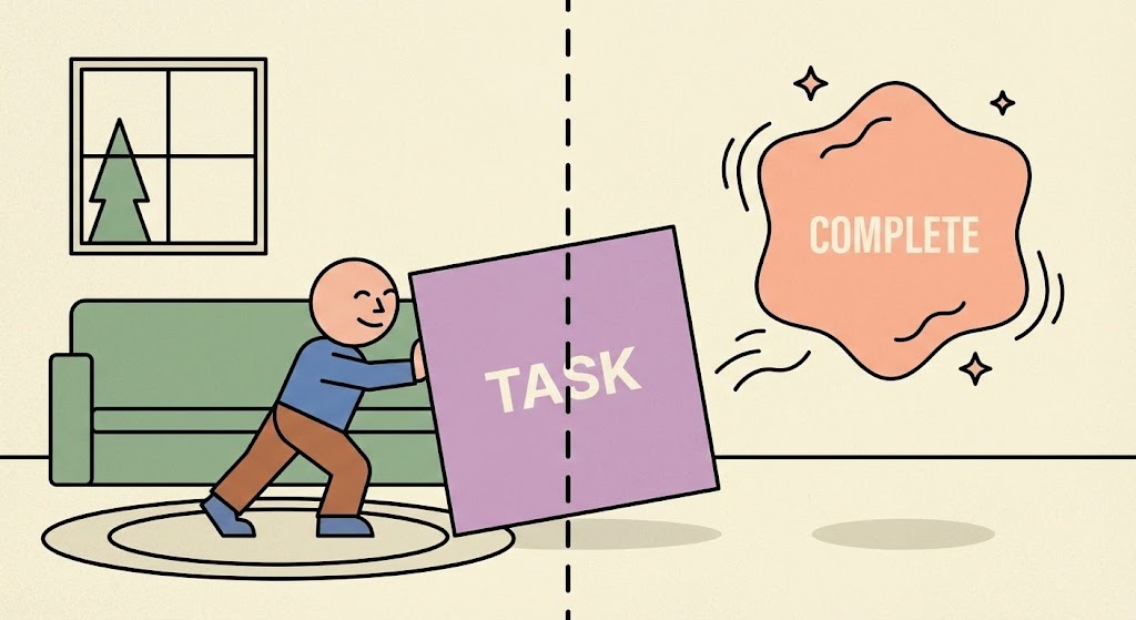
The Visual & Narrative Approach
To reduce onboarding friction, we use a friendly, relatable metaphor. A flat 2D vector character in a simplified home/office setting pushes a heavy Lilac square block labeled "TASK." The moment the block crosses a dotted threshold line, it transforms into a weightless, floating Soft Peach shape labeled "COMPLETE," surrounded by "sparkles." The struggle is physical; the resolution is magical.
Psychological Impact & KPI Focus
This targets User Activation. The "Sisyphus" metaphor (pushing the rock) acknowledges that starting work is hard. The visual transformation validates the user's effort and promises a "lightness" at the end of the workflow. It uses Empathy to encourage users to complete their first setup tasks, directly impacting the Activation Rate (percentage of users who complete a core action).
Strategic Implementation & Trade-offs
- Best Use Case: Empty State screens (e.g., "You have no tasks yet") or the "First Task" tutorial.
- Duration: 5-8 Seconds (Looping GIF).
- Trade-off: The "cartoon" style may feel too juvenile for some serious enterprise cultures. It works best for the end-user, not the buyer.
Companies using similar video content -
Basecamp – Project Management & Team Communication – Visualizing simple, satisfying task workflows.
Zoho Projects – Project Management Software – Effortless momentum in task management.
24. Macro UI Micro-Interactions
Onboarding | Trial/Freemium User Activation

The Visual & Narrative Approach
We zoom in—extreme macro. The screen is no longer just pixels; it’s a tactile surface. We see the mouse cursor hover over a pill-shaped button labeled "Complete Sprint." As the cursor lands, the button glows with an Electric Purple aura and physically depresses. The click is visualized with a subtle shockwave. This style fetishizes the moment of action, making the UI feel responsive, premium, and satisfying.
Psychological Impact & KPI Focus
This leverages the "Dopamine Loop." By highlighting the micro-interactions, we train the user's brain to anticipate pleasure from clicking the button. It turns a mundane admin task into a satisfying digital event. This is crucial for Feature Adoption, specifically encouraging users to interact with key buttons that drive value.
Strategic Implementation & Trade-offs
- Best Use Case: Tooltips, "What's New" pop-ups, or feature highlight reels.
- Duration: 3-5 Seconds.
- Trade-off: It requires the UI design to actually be good. If the real product is clunky, this marketing asset will feel deceptive.
Companies using similar video content -
Figma – Collaborative Interface Design Tool – Macro focus on tactile UI interactions.
Adobe XD – UI/UX Design Tool – Gamifying design workflow with satisfying micro-interactions.
25. 3D Parallax UI Presentation
Onboarding | Accelerating Time-to-Value

The Visual & Narrative Approach
To explain a multi-step setup process without overwhelming the user, we use a 3D parallax composition. Floating UI panels (e.g., "Sign Up," "Invite Team," "Create Board") are arranged in deep space against a clean white studio void. The camera pans sideways, and the panels move at different speeds (parallax), creating a sense of depth and sequence. The palette uses Gradient Orange and Blue. It visually breaks down a complex process into distinct, manageable layers.
Psychological Impact & KPI Focus
This combats "Cognitive Overload." By separating steps in 3D space, the brain perceives them as individual, conquerable milestones rather than a wall of text. It visually organizes the user's journey, making the path forward look clear and achievable. The goal is to accelerate Time-to-Value by getting the user through the setup phase quickly.
Strategic Implementation & Trade-offs
- Best Use Case: Welcome emails or the introductory video of an LMS course.
- Duration: 10-15 Seconds.
- Trade-off: It is abstract. Users can't "read" the panels in detail; they only get the concept of the sequence.
Companies using similar video content -
Mendix – Low-Code Application Development – Layered onboarding for complex app development.
OutSystems – High-Performance Low-Code – Simplifying the learning curve for platform setup.
26. Futuristic Neon/Dark Mode
Retention | Driving Deep Feature Adoption
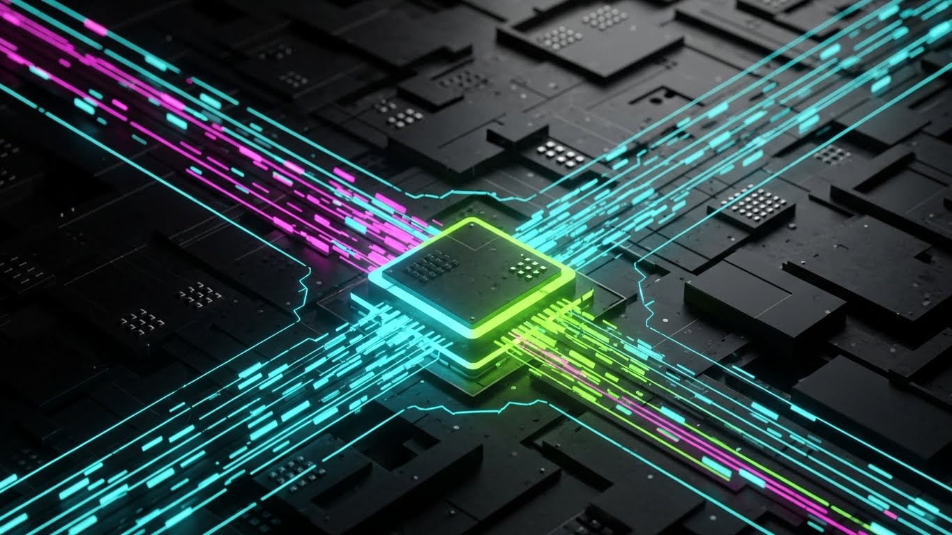
The Visual & Narrative Approach
This style speaks the language of the developer. A top-down view of a stylized circuit board glows in Neon Pink and Cyber Blue. Data packets travel along black pathways, converging at a central processor (the "Task"). This is an abstract representation of backend automation, dependencies, and API integrations. It embraces a "Dark Mode" aesthetic that signals high-performance computing.
Psychological Impact & KPI Focus
This targets the technical stakeholder (DevOps, Engineering Leads) who influences retention. It validates their preference for dark mode and complex architectures. It suggests that the platform is not just a "to-do list" but a powerful engine capable of handling complex logic. It drives Deep Feature Adoption (e.g., API usage, Automation rules).
Strategic Implementation & Trade-offs
- Best Use Case: Developer documentation, API release notes, or "Power User" tips.
- Duration: 10-15 Seconds (Looping).
- Trade-off: It alienates non-technical users (Marketing/Sales) who may find the "Cyberpunk" look intimidating or irrelevant.
Companies using similar video content -
HashiCorp – Vault – Neon circuitry for backend security and secrets management.
Confluent – Data Streaming Platform – Visualizing backend intelligence for real-time data.
27. Dark Mode UI Showcase
Retention | Reducing Support Overhead
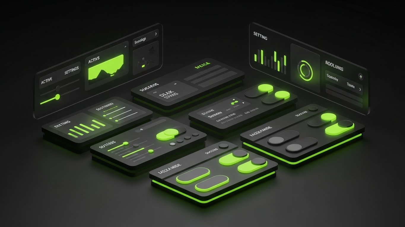
The Visual & Narrative Approach
Complementing the abstract circuit style, this is the literal "Dark Mode" UI showcase. We see a sleek, matte dark grey dashboard with high-contrast elements. Lime Green accents pop vividly against the dark background to indicate "Active" states, toggles, and success metrics. The lighting is subtle, highlighting the edges of the UI cards. It emphasizes clarity, focus, and reduced eye strain for long work sessions.
Psychological Impact & KPI Focus
Dark mode is often a requested feature for ergonomics and focus. Visualizing it signals that the platform respects the user's working environment and health. The high contrast of the green accents guides the eye specifically to the "How-To" elements, which is effective for educational content. This helps Reduce Support Tickets by making instructions crystal clear.
Strategic Implementation & Trade-offs
- Best Use Case: Help Center articles, "Pro Tips" videos, or changelogs.
- Duration: 15-30 Seconds.
- Trade-off: It must accurately reflect the product. If the actual dark mode has low contrast text, this marketing asset will highlight the product's flaws.
Companies using similar video content -
GitHub – Developer Platform – High-contrast dark mode for code repositories.
VS Code (Microsoft) – Code Editor – Showcasing clear, focused dark mode interface.
28. Low-Poly 3D Modeling
Retention | Reducing Churn

The Visual & Narrative Approach
To visualize the concept of "maintenance" and "continuous improvement," we use a low-poly 3D aesthetic. A yellow excavator works on a faceted, geometric terrain, digging a foundation or clearing a pile of brown "backlog" rocks. The surrounding landscape is a stylized Forest Green. The style is charming but industrious. It metaphorically represents the software helping the team "dig out" of technical debt and build a solid path forward.
Psychological Impact & KPI Focus
Churn often happens when users feel overwhelmed by backlog. This visual reframes the backlog not as a failure, but as a construction site—a work in progress. It promotes the idea of Kaizen (continuous improvement). By making the work look toy-like and manageable, it reduces the anxiety of "messy data" and encourages the user to keep building. The goal is Retention.
Strategic Implementation & Trade-offs
- Best Use Case: Customer Success newsletters (e.g., "Spring Cleaning your Board") or Re-engagement emails.
- Duration: 10-15 Seconds (Looping).
- Trade-off: The "construction" metaphor is specific. It works well for product teams but might not resonate with marketing or HR teams using the board.
Companies using similar video content -
Jira Software – Issue and Project Tracking – Digital excavation for clearing backlog.
Targetprocess – Agile at Scale – Low-poly modeling for constructing long-term stability.
29. Abstract 3D AI Visualization
Expansion | Driving Upsell/Cross-sell

The Visual & Narrative Approach
To sell the "Premium" AI features, we visualize the brain of the system. Glowing nodes in Deep Space Blue and Starlight White float in a cosmic void, connected by thin, pulsing lines to form a vast, undulating grid. The camera flies through this neural network. It represents the "Invisible Intelligence"—predictive analytics, auto-scheduling, and anomaly detection—that comes with the enterprise tier.
Psychological Impact & KPI Focus
This appeals to the desire for "Superpowers." It suggests that upgrading unlocks a level of intelligence that human management alone cannot achieve. It positions the AI not as a replacement, but as a cosmic support system. The primary KPI is Upsell Conversion, convincing existing users that the premium tier offers exponential value.
Strategic Implementation & Trade-offs
- Best Use Case: "Upgrade to Enterprise" landing pages or inside the "AI Insights" feature tab.
- Duration: 15-20 Seconds (Ambient background).
- Trade-off: It is purely conceptual. It builds hype but doesn't show how the AI actually works or what the UI looks like.
Companies using similar video content -
DataRobot – AI Platform – Neural constellation for visualizing AI intelligence.
H2O.ai – AI Cloud – Abstract 3D for predictive analytics and machine learning.
30. 2D Graphics Over Live Action
Expansion | Proactive Support/Announcements

The Visual & Narrative Approach
We end with the human element. A Point-of-View (POV) shot shows a hand holding a smartphone against a blurred city street background. The screen is alive—erupting with hand-drawn 2D confetti, stars, and checkmarks in Vivid Red, Yellow, and Blue. These doodle-like graphics overlay the realistic footage, creating a festive, mixed-media celebration of a job well done (or a new feature launch).
Psychological Impact & KPI Focus
This targets Advocacy and Viral Sharing. The "Doodle" style feels personal, authentic, and enthusiastic—like a friend annotating a video. It captures the emotional high of shipping a product or hitting a goal. It encourages users to share their own wins, driving Word of Mouth and Brand Sentiment.
Strategic Implementation & Trade-offs
- Best Use Case: Instagram Stories, TikTok announcements, or "Year in Review" personalized videos.
- Duration: 10-15 Seconds.
- Trade-off: It is very casual. It works for community building but is likely too informal for serious crisis communication or technical updates.
THE ADVIDS STRATEGIC KNOWLEDGE BASE
Synthesis & Implementation Framework
The 30 visual styles outlined above are not merely "creative assets"; they are functional tools in the revenue engine. However, a library of assets is useless without a doctrine for deployment. This section synthesizes the analysis into three actionable strategic segments, designed to bridge the gap between visual aesthetics and business outcomes.
STRATEGIC ALIGNMENT & VISUAL ARCHITECTURE
The "Pre-Production" Strategy: Defining the Visual Operating System
Before a single pixel is rendered, the "Efficiency Architect" must define the rules of engagement. Inconsistent visualization creates cognitive friction, whereas a unified "Visual Operating System" accelerates comprehension across the enterprise.
- The Cognitive Load Audit: Do not choose a style based on "coolness." Choose it based on the complexity of the message. Use Linear/Minimalist styles (Style 3, 10) for complex dependency training, and Rich/Immersive styles (Style 11, 24) for motivation and engagement. Advids recommends auditing your current training materials: if the text density is high, the visual abstraction must be low (simple vectors).
- Role-Based Visual Mapping: Different stakeholders process information differently. The "Driver" (End-User) needs mobile-optimized, tactile visuals (Style 5, 23) that emphasize speed and ease. The "Fleet Manager" (CTO/Exec) needs macro-level, data-dense visuals (Style 7, 21) that emphasize stability and scale. Map your assets to the viewer's role, not just the funnel stage.
- The "Glanceability" Standard: In a high-velocity SaaS environment, users don't "watch" videos; they glance at them. Assets—especially in-app tooltips (Style 24)—must communicate the core value proposition in under 3 seconds. If the viewer needs to turn on sound to understand, the visual has failed.
- Brand Voice Consistency: Your visual language must match your brand voice. If you sell "Enterprise Security," you cannot use "Cartoon Doodle" styles (Style 30) for your core product demos. Conversely, if you sell "Creative Freedom," rigid "Blueprint" styles (Style 16) will feel stifling. Use the Advids Style Mapping Table to ensure the mood of the visual aligns with the promise of the product.
- Standardization vs. Customization: For high-volume content (Help Centers), use scalable, templated styles (Style 9, 27). For high-stakes moments (ABM Pitches, Keynotes), invest in bespoke, high-fidelity styles (Style 4, 19). Don't burn your budget on high-end 3D for a password reset tutorial.
- The Cross-Departmental Bridge: Use visuals to unify terminology. If Sales calls it a "Roadmap" (Style 21) but Support calls it a "Timeline" (Style 3), confusion ensues. Establish a "Visual Dictionary" where specific icons and metaphors are consistent across all departments.
- Legacy System Integration: Many enterprises are migrating from physical boards. Use "Bridge" styles (Style 6, 12) that explicitly show the transition from paper to pixel. This validates the user's past experience while guiding them to the future.
- Accessibility as a Default: Visual efficiency includes accessibility. Ensure high contrast in your motion graphics (Style 1, 10) for visually impaired users. Motion should be smooth, not flashing, to accommodate neurodiverse users.
- The Mobile-First Mandate: Even B2B software is consumed on mobile (LinkedIn, Email). Ensure all 16:9 assets have a 1:1 or 9:16 variant (Style 5, 8) where text is legible on a small screen.
- The Advids Strategic Audit: Partnering with a specialized agency like Advids ensures that this architecture is built before production begins, saving thousands in revision costs and ensuring that every asset serves a specific business function.
OPERATIONAL ADOPTION & IMPLEMENTATION
The "Deployment" Phase: Embedding Visuals into the Workflow
A video sitting on YouTube is passive. A visual strategy embedded in the workflow is active. This segment focuses on how to operationalize the styles to drive adoption and reduce friction.
- Overcoming "Big Brother" Anxiety: When introducing analytics features (Velocity, Cycle Time), users often fear surveillance. Use empathetic, team-centric visuals (Style 18, 23) to frame these metrics as "Team Health" tools rather than "Employee Monitoring" tools.
- The Micro-Learning Shift: Replace the 40-page PDF manual with a library of 30-second looping GIFs (Style 13, 24). Embed these directly into the UI (e.g., hover over a column to see a "WIP Limit" animation). This delivers "Just-in-Time" learning exactly when the user needs it.
- Gamification of Training: Use "Level Up" visuals (Style 23, 28) in your LMS. Award visual badges or celebratory animations (Style 30) when a user completes a certification. This taps into intrinsic motivation and increases training completion rates.
- Reducing Support Ticket Volume: There is a direct correlation between the clarity of your visual documentation and your support costs. Proactively deploy "Dark Mode/High Contrast" guides (Style 27) for common friction points. If users keep asking "How do I filter?", place a Style 9 GIF right next to the filter button.
- Remote Onboarding: For distributed teams, you cannot rely on in-person seminars. Use "Parallax Depth" (Style 25) and "Holographic" (Style 21) videos to create a sense of presence and immersion that flat text lacks.
- Standard Operating Procedures (SOPs): Transform text-based SOPs into "Wireframe to Reality" animations (Style 16). Visualizing the process flow reduces errors and ensures that everyone interprets the SOP in the same way.
- Feedback Loops: Use interactive video elements. At the end of a "Feature Update" video (Style 26), include a one-click emoji poll. This turns passive viewing into active feedback, alerting Product teams to user sentiment.
- Scalable Localization: If you serve a global market, avoid embedding heavy text inside the animation (Style 1). Use icon-driven or abstract styles (Style 2, 8) where the voiceover can be swapped without re-rendering the video.
- Leadership Communication: When the CTO presents the quarterly review, replace the spreadsheet with a "Cinematic Data" video (Style 7, 14). This elevates the conversation from "admin update" to "strategic vision," securing buy-in for future initiatives.
- The "Trojan Horse" Strategy: Use "Lifestyle" and "Social" content (Style 15, 30) to humanize the brand on LinkedIn. Once the prospect is engaged by the culture, retarget them with the product visuals (Style 9, 12).
MEASURING IMPACT & FUTURE-PROOFING
The "ROI" Phase: Quantifying Success and Looking Ahead
How do you prove the value of "better visualization"? This segment defines the metrics that matter and prepares your strategy for the next wave of technology.
- Beyond "Views": Vanity metrics (views/likes) are irrelevant to the CFO. Measure Time-to-Competency (how much faster a user learns with video vs. text) and Feature Adoption Rate (did usage of the feature spike after the video release?).
- The "Idle Time" Metric: In Kanban, "Wait Time" is waste. Measure if better visualization (e.g., clear "Blocked" column indicators) reduces the time tasks spend sitting idle. This directly links visual strategy to operational efficiency.
- Compliance Velocity: For enterprise clients, measure how quickly the workforce adopts new governance rules (e.g., "Always tag tickets"). High-quality "Constraint" visuals (Style 1, 8) should correlate with faster compliance.
- Retention and Churn Impact: Track the behavior of users who consume your "Success" content (Style 28, 29). Do they have a higher Net Dollar Retention (NDR)? Often, educated users are stickier users.
- The AI Visual Frontier: Prepare for Generative UI. Soon, interfaces will adapt visually to the user. Your library of "AI" styles (Style 29) sets the expectation that your platform is ready for this future.
- Scalability of Assets: Build a component library. If you use a specific "User Character" (Style 5) or "3D Token" (Style 11), save these assets. When you launch a new feature, you can assemble a new video in hours, not weeks.
- The Advids Partnership: As your feature set grows, your visual library risks becoming fragmented. A long-term partner like Advids acts as the "Brand Guardian," ensuring that the asset you build in Year 3 still matches the visual language of Year 1, protecting your brand equity.
- Benchmarking Success: Don't just compare against your past self; compare against the consumer standard. Your users watch Netflix and play high-end video games. If your B2B visuals look like 1990s clip art, you lose credibility. The "Standard" is now broadcast quality (Style 7, 19).
- The ROI of Safety: In software, "Safety" means data integrity. Quantify the value of preventing a data breach or a major bug. If a "Security Architecture" video (Style 20) helps close one enterprise deal by satisfying the CISO, the ROI of that video is infinite.
- Final Call to Innovation: Treat video as Infrastructure, not content. A bridge connects two points; a visual strategy connects the User to the Value. Invest in it with the same rigor you apply to your code. By adopting these 30 styles and this strategic framework, you transform your platform from a "tool" into a "vision," securing your place as a leader in the Efficiency Economy.
Companies using similar video content -
Slack – Channel-based Messaging Platform – Augmented celebration for team wins and announcements.
Microsoft Teams – Collaboration Platform – Socializing success with 2D graphics over live action.
Author & Editor Bio


