
Introduction: Visualizing Value in the Era of Efficiency
The marketing landscape has shifted fundamentally. We have moved from an era of data scarcity to one of overwhelming density. Today, the challenge for the "ROI Architect"—the modern CMO or Head of Analytics—is not gathering intelligence, but articulating it. The market acknowledges this value, with the global marketing analytics software sector projected to reach USD 16.32 Billion by 2032. Yet, this growth collides with a harsh economic reality: marketing budgets have dropped to just 7.7% of overall company revenue in 2024.
This "Growth-Budget Paradox" creates a critical mandate for software providers: your platform must do more than just report numbers. It must tell a story of efficiency, clarity, and immediate value. Stakeholders no longer have the bandwidth for "Black Box" analytics; they require instant, visual proof of performance.
This guide presents 30 expert-curated visualization styles designed to bridge the physical/digital divide. These are not merely aesthetic choices; they are functional tools to reduce cognitive load, build trust in AI, and demonstrate how your software transforms chaotic data streams into revenue-generating insights.
1. Lifestyle Stock with UI Overlay
TOFU | Brand Awareness

The Visual & Narrative Approach
This style anchors the abstract concept of analytics in the physical reality of the user. We see a confident marketing manager in a sunlit, glass-walled office, holding a tablet. Vivid Coral and Turquoise UI elements—representing attribution streams and live metrics—float organically in the air around her, appearing as an extension of her own intuition. The lighting is natural and optimistic, positioning the software not as a replacement for the human marketer, but as their superpower.
Psychological Impact & KPI Focus
- Niche Psychology: Addresses "AI Anxiety" by visualizing the "Human-in-the-Loop." It reassures the user that they remain the protagonist of the story.
- Operational Impact: Visualizes Mobile Intelligence, showing that critical data is accessible anywhere, breaking the tether to the desktop spreadsheet.
Strategic Implementation & Trade-offs
- Duration: 15-20 Seconds.
- Trade-off: Excellent for emotional connection and brand affinity, but suboptimal for detailed feature training as the UI is stylized.
Transition: Once the human connection is established, we must demonstrate the structural clarity of the platform...
Companies using similar video content -
Adjust – Mobile Measurement Partner – Visualizing mobile intelligence on the go.
Kochava – Mobile Attribution Platform – Showing mobile data accessible anywhere.
2. Clean UI Workflow (Light Mode)
TOFU | Category Creation
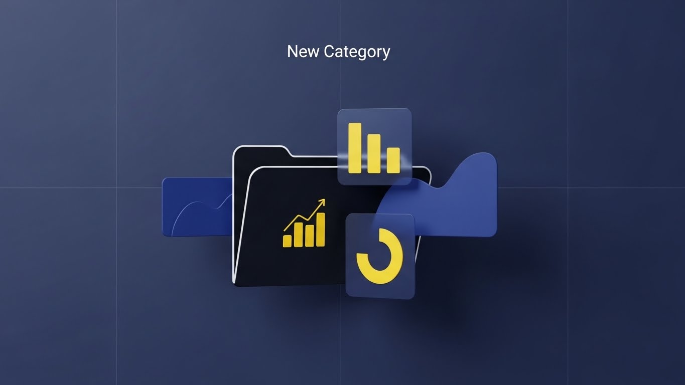
The Visual & Narrative Approach
Order emerges from chaos. This style utilizes a pristine, vector-based flat lay on a Deep Navy Blue background. A "New Category" folder icon unfolds with mechanical precision to reveal Electric Yellow charts and file structures. There is no clutter, no noise—only the satisfying geometry of organization. The high contrast ensures that the viewer's eye is guided instantly to the growth metrics.
Psychological Impact & KPI Focus
- Niche Psychology: Targets the "Disorganized Data" pain point. The clean lines and grid layout leverage Gestalt Principles to imply that the software automatically imposes order on messy marketing data.
- Operational Impact: Demonstrating Ease of Setup, reducing the perceived friction of migrating to a new platform.
Strategic Implementation & Trade-offs
- Duration: 30-45 Seconds.
- Trade-off: The flat aesthetic is incredibly clear but can feel impersonal; best used for logic-driven "How it Works" segments.
Transition: Moving from structure to intelligence, we visualize the invisible "brain" of the software...
Companies using similar video content -
Amplitude – Product Analytics – Streamlined user journey organization.
Funnel.io – Marketing Data Warehousing – Imposing order on messy marketing data.
Matomo – Web Analytics – Pristine, vector-based flat lay for web data.
3. Abstract 3D AI Visualization
TOFU | Market Education

The Visual & Narrative Approach
How do you film an algorithm? You visualize the connections. This style features a 3D neural network brain composed of glowing nodes in Bright Magenta and Cyan. Floating in a zero-gravity white void, the connecting lines pulse with light, representing the processing of millions of customer touchpoints. It transforms the "Black Box" of AI into a beautiful, tangible object of intelligence.
Psychological Impact & KPI Focus
- Niche Psychology: Marketers are skeptical of "AI Washing." This visual metaphor builds trust by showing the complexity and sophistication of the backend processing.
- Operational Impact: Visualizes Predictive Analytics, showing how the software connects disparate data points to find patterns invisible to the human eye.
Strategic Implementation & Trade-offs
- Duration: 15-20 Seconds (Loopable).
- Trade-off: Purely metaphorical. It creates authority but must be paired with voiceover explaining the specific business benefit (e.g., Churn Prediction).
Transition: Having established intelligence, we must contrast it against the pain of the status quo...
Companies using similar video content -
DataRobot – Automated Machine Learning – Visualizing complex AI model processing.
Persado – AI-powered Creative Generation – Showing the sophistication of AI for content.
Optimove – CRM Marketing – Tangible market intelligence from AI optimization.
4. Split Screen: Optimized Reality and UI
TOFU | Shaping Brand Perception
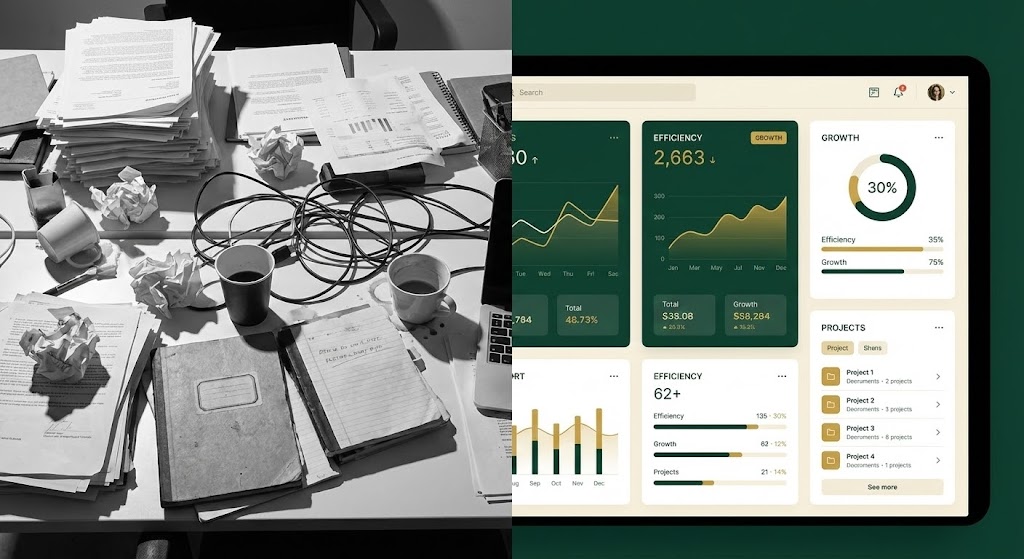
The Visual & Narrative Approach
A study in contrast. The left side creates a visceral reaction with a black-and-white image of a chaotic, paper-cluttered desk. The right side offers immediate relief with a pristine Forest Green and Gold UI dashboard. The synchronization is key: as a paper crinkles on the left, a data point resolves smoothly on the right, creating a direct "Problem/Solution" narrative link.
Psychological Impact & KPI Focus
- Niche Psychology: Leverages the Contrast Principle. It validates the user's current stress (the mess) while subconsciously associating the software (the UI) with calm and growth (Green/Gold).
- Operational Impact: Directly addresses Operational Efficiency, proving that the tool cleans up the administrative burden of marketing ops.
Strategic Implementation & Trade-offs
- Duration: 15-30 Seconds.
- Trade-off: High impact for ads, but subtlety is difficult; ensure the "After" state looks attainable, not fantasy.
Transition: From the binary contrast, we blend worlds to show how data fuels the creative process...
Companies using similar video content -
Workfront (Adobe) – Work Management – Contrasting chaotic marketing ops with streamlined UI.
Allocadia (BrandMaker) – Marketing Performance Management – Showing efficiency upgrade from manual budgeting.
5. 2D Graphics Over Live Action
TOFU | YouTube

The Visual & Narrative Approach
Marketing is art and science combined. This style visualizes that intersection. A Creative Director is shown in a realistic studio setting, looking at a monitor. Playful, hand-drawn 2D doodles—search bars, magnifying glasses, sparks—in Royal Purple and Lavender float over the scene. These animations illustrate the "invisible" thoughts and search intent discoveries happening in the marketer's mind.
Psychological Impact & KPI Focus
- Niche Psychology: Appeals to the "Creative Strategist" who fears analytics will kill creativity. This style invites them in, showing that data sparks ideas.
- Operational Impact: Reduces Intimidation Factor for non-technical users, positioning the tool as an approachable partner in the creative workflow.
Strategic Implementation & Trade-offs
- Duration: 30-45 Seconds.
- Trade-off: The "doodle" aesthetic is friendly but may not signal "Enterprise Security"; use for discovery and ideation features.
Transition: To accelerate the narrative, we strip away the environment and focus on pure speed...
Companies using similar video content -
Contentsquare – Digital Experience Analytics – Annotating user behavior on live website footage.
ThoughtSpot – AI-Powered Analytics – Illustrating intuitive insight discovery over data.
6. Abstract 2D flat vector organic modern motion graphics
TOFU | Skippable Pre-Roll Ad

The Visual & Narrative Approach
Speed is the ultimate benefit. This style uses organic, fluid shapes in Burnt Orange and Teal that morph seamlessly from a "Play" button into a growth graph and then a pipeline. The continuous, diagonal motion suggests forward momentum and friction-free data ingestion. The glossy textures give the flat vector shapes a modern, tactile weight.
Psychological Impact & KPI Focus
- Niche Psychology: The constant motion triggers Pre-attentive Processing, holding attention during the critical first 5 seconds of an ad. It communicates "Agility."
- Operational Impact: Ideal for visualizing Real-Time Data Pipelines, implying that the software processes information instantly without latency.
Strategic Implementation & Trade-offs
- Duration: 6-10 Seconds.
- Trade-off: High engagement, low information density. Best for brand recall, not education.
Transition: Slowing down the motion, we zoom in to find the single most important metric...
Companies using similar video content -
Adverity – Marketing Data Integration – Fluid motion pipelines for accelerated data ingestion.
Supermetrics – Marketing Data Connectors – Seamless morphing for friction-free data flow.
7. Dynamic Data Visualization
MOFU | Product/Solution Differentiation

The Visual & Narrative Approach
Focus is luxury. This style uses geometric precision to isolate a single data story: a Vivid Lime Green spike rising above a Sky Blue baseline. The camera uses leading lines to force the viewer's eye to this anomaly. The background is a subtle digital mesh, providing context without distraction. It says: "We find the needle in the haystack."
Psychological Impact & KPI Focus
- Niche Psychology: Appeals to the "Optimizer" who fears missing a critical trend. It represents the "Eureka Moment" of finding an outlier.
- Operational Impact: Demonstrates Anomaly Detection capabilities, distinguishing the platform from generic dashboards that just show flat tables.
Strategic Implementation & Trade-offs
- Duration: 20-30 Seconds.
- Trade-off: Must be mathematically accurate. If the chart looks fake, credibility is lost with data scientists.
Transition: Diving deeper into the platform, we reveal the complex architecture powering these insights...
Companies using similar video content -
Tableau (Salesforce) – Data Visualization – Geometric precision for performance spikes.
Qlik Sense – Data Analytics – Isolating single data stories and outlier trends.
8. Futuristic Neon/Dark Mode
MOFU | Feature Education & Demonstration

The Visual & Narrative Approach
This is the "Command Center" view. We use an isometric angle to reveal a holographic stack of features floating in a Dark Mode void. Neon Green accents define the layers, representing different modules (Attribution, CRM, Ad Tech) working in unison. It visualizes the depth and architectural integrity of the software.
Psychological Impact & KPI Focus
- Niche Psychology: Dark mode signals "Pro Tool" and reduces eye strain for analysts working long hours. It validates the user's technical expertise.
- Operational Impact: Visualizes Tech Stack Integration, showing how the platform serves as the foundational layer of the marketing ecosystem.
Strategic Implementation & Trade-offs
- Duration: 45-60 Seconds.
- Trade-off: Can look intimidating to non-technical users; reserved for "Power User" demos and technical deep dives.
Transition: From technical depth, we shift to the critical pillar of trust and security...
Companies using similar video content -
Looker (Google Cloud) – Business Intelligence – Stacked isometric interface for deep feature granularity.
MicroStrategy – Enterprise Analytics – Command center view of complex reporting.
9. Photorealistic 3D Renders
MOFU | Building Trust & Credibility

The Visual & Narrative Approach
Security is often abstract; here, we make it tangible. A glass padlock icon, rendered with photorealistic refraction, sits on a white server shelf. The Pastel Pink and Mint Green accents make it feel modern and approachable. The low-angle "Hero Shot" gives the object weight and importance, while the glass material implies transparency in data usage.
Psychological Impact & KPI Focus
- Niche Psychology: Combats the fear of data breaches and GDPR non-compliance. It leverages the Aesthetic-Usability Effect to imply that the security infrastructure is premium and robust.
- Operational Impact: visually confirms Enterprise-Grade Compliance without using dry text or scary "hacker" imagery.
Strategic Implementation & Trade-offs
- Duration: 10-15 Seconds (Loop).
- Trade-off: High production cost; best used as a trust signal on pricing or security pages.
Transition: Finally, we focus on the active defense mechanisms that keep the data clean...
Companies using similar video content -
Piwik PRO – Analytics Suite – Refractive glass security for GDPR compliance.
InfoSum – Secure Data Collaboration – Transparent data protection for clean rooms.
10. Dark Mode UI Showcase
MOFU | Overcoming Objections

The Visual & Narrative Approach
Protection in action. A macro close-up of a Dark Mode UI focuses on a "Shield" icon. Glowing Violet energy pulses as it actively deflects abstract particles representing "dirty data" or fraud. The shallow depth of field keeps the focus strictly on the defensive mechanism, blurring the periphery.
Psychological Impact & KPI Focus
- Niche Psychology: Addresses the fear of "Ad Fraud" and budget wastage. It visualizes the software as a proactive guardian, not just a passive reporter.
- Operational Impact: Demonstrates Real-Time Hygiene, showing that the system is working 24/7 to protect the integrity of the marketing data.
Strategic Implementation & Trade-offs
- Duration: 15-20 Seconds.
- Trade-off: Very specific imagery; creates a strong niche visual for security features but less applicable to general reporting.
Companies using similar video content -
Datadog – Monitoring & Security Platform – Particle deflection shield for active threat mitigation.
Littledata – E-commerce Analytics Connections – Glowing violet energy for data hygiene.
11. Isometric 3D Workflow
MOFU | Competitive Displacement

The Visual & Narrative Approach
To compel a switch, we must visualize the cost of the status quo. This style utilizes a clean isometric grid to stage a direct comparison. On the right, we see the "Legacy System"—a rusted, clunky blue machine representing manual spreadsheets and disjointed tools. On the left, it is physically replaced by a sleek, Mustard Yellow and Navy automated unit. The visual metaphor is clear: we are swapping a liability for an asset. The clay-like rendering gives the upgrade a sense of tangible weight and value.
Psychological Impact & KPI Focus
- Niche Psychology: Targets the Sunk Cost Fallacy. By visualizing the legacy system as "rusty" and archaic, we subtly encourage the user to let go of their current, inefficient tools without needing to verbally attack them.
- Operational Impact: Visualizes Tech Stack Modernization, demonstrating that the new software slots perfectly into the existing "floor plan" of the business but delivers superior output.
Strategic Implementation & Trade-offs
- Duration: 30-45 Seconds.
- Trade-off: Heavily metaphorical. It effectively communicates "New vs. Old" but requires voiceover to map the visual elements to specific software benefits (e.g., "Retire your spreadsheets").
Transition: Once the operational upgrade is visualized, we focus on the crucial moment of commitment...
Companies using similar video content -
Alteryx – Analytics Automation – Legacy process replacement with automated units.
Marketo Engage (Adobe) – Marketing Automation – Operational efficiency upgrade for complex campaigns.
Impact.com – Partnership Automation – Visualizing interconnected partner ecosystems.
12. Wireframe to Reality Transition
MOFU | Driving Demo Requests

The Visual & Narrative Approach
Implementation is a journey from plan to performance. This style captures that metamorphosis. We start with a technical wireframe blueprint of a "Book Demo" interaction. As the camera tracks, the sketch fills with mass and texture, transforming into a glossy, tangible 3D object in Olive Green and Terracotta. It symbolizes the software turning a marketing strategy (the blueprint) into a tangible lead generation asset.
Psychological Impact & KPI Focus
- Niche Psychology: Appeals to the Cognitive Completion instinct. The viewer watches the object resolve from a sketch to reality, subconsciously mirroring their own desire to see their marketing plans materialize into results.
- Operational Impact: Visualizes Conversion Rate Optimization (CRO), focusing on the tactical elements that drive user action and reduce implementation anxiety.
Strategic Implementation & Trade-offs
- Duration: 10-15 Seconds.
- Trade-off: Very specific visual metaphor. Best used on landing pages near the actual Call-to-Action (CTA) to subliminally encourage clicking.
Transition: From the mechanics of conversion, we pivot to the human expertise driving the insights...
Companies using similar video content -
Retention.com – Identify Anonymous Visitors – Blueprint materialization for lead generation.
Pardot (Salesforce) – B2B Marketing Automation – Strategic implementation of lead nurturing.
13. Generative AI Realistic Character video
MOFU | LinkedIn Organic

The Visual & Narrative Approach
People buy from experts. This style utilizes high-fidelity generative video to create a "Chief Data Officer" persona. The character, professional and credible, stands in a cinematic office environment bathed in Electric Blue and Hot Pink accent lighting. She engages directly with the viewer, explaining a complex attribution concept with human warmth. It bridges the gap between cold data and human decision-making.
Psychological Impact & KPI Focus
- Niche Psychology: Mitigates the "Impersonal Tech" perception. It suggests that the software is built and supported by top-tier data scientists who understand the marketer's daily challenges, building Social Trust.
- Operational Impact: Enhances Brand Authority, positioning the company not just as a software vendor, but as a strategic consultant.
Strategic Implementation & Trade-offs
- Duration: 45-60 Seconds.
- Trade-off: The "Uncanny Valley" risk is real. The voice synchronization and rendering must be flawless, or trust will be damaged immediately.
Transition: Moving from the office to the market, we visualize the scale of data being analyzed...
Companies using similar video content -
Blueshift – Customer Data Platform – Data scientist persona explaining AI engagement.
Emarsys (SAP) – Customer Engagement Platform – Expert thought leadership on AI-driven customer lifecycle.
14. Hyper-lapse Stock Footage with Data
MOFU | Website Visitor Re-engagement

The Visual & Narrative Approach
Marketing happens in the real world, at high speed. This style overlays a hyper-lapse of a bustling city skyline with fast-moving data streams in Canary Yellow and Slate Grey. The streaks of traffic light mirror the flow of customer data. Floating metrics track "Engagement" and "Live Users" in real-time, creating a sense of urgency and pulse. It visually claims: "We capture the heartbeat of the market."
Psychological Impact & KPI Focus
- Niche Psychology: Triggers the Cocktail Party Effect—the ability to focus on a single relevant stream amidst noise. It assures the marketer that they can find their ideal customer in the chaos of the web.
- Operational Impact: Visualizes Real-Time Traffic Analysis, demonstrating the platform's ability to handle high-volume data without latency.
Strategic Implementation & Trade-offs
- Duration: 15-20 Seconds (Loopable).
- Trade-off: Generic city footage can feel like "stock." The quality of the motion graphics overlay is what elevates it to a premium brand asset.
Transition: We zoom in from the macro city view to the micro-moment of value generation...
Companies using similar video content -
Tealium – Customer Data Platform – Urban data streams visualizing market velocity.
Geckoboard – Real-time Dashboards – Fast-moving data streams over bustling cityscapes.
15. Macro UI Micro-Interactions
BOFU | ROI Justification

The Visual & Narrative Approach
The ultimate goal of marketing analytics is revenue. This style focuses entirely on that decisive moment. We see an extreme macro close-up of a cursor hovering over a button labeled "Generate Revenue." The lighting is tactile, highlighting the texture of the digital surface in Teal and Peach. The click is weighty and satisfying, implying that the software makes revenue generation as simple as a single action.
Psychological Impact & KPI Focus
- Niche Psychology: Leverages Haptic Imagery. By making the digital interaction look "touchable," it makes the result (Revenue) feel more tangible and attainable.
- Operational Impact: Visualizes Actionability. It counters the objection that analytics tools are "just for looking" by emphasizing the "doing" and "earning."
Strategic Implementation & Trade-offs
- Duration: 5-8 Seconds.
- Trade-off: Highly conceptual. It works best as a "punctuation mark" at the end of a longer demo video or as a retargeting gif.
Transition: To explain how we get to that revenue, we simplify the complex customer journey...
Companies using similar video content -
Heap – Product Analytics – Conversion click for tangible revenue realization.
FullStory – Digital Experience Intelligence – Focusing on decisive user actions.
17. 2D Line Art Animation
BOFU | Sales Cycle Acceleration

The Visual & Narrative Approach
The modern B2B sales cycle is messy; we make it look elegant. This style uses a continuous, fluid line in Sunset Orange and Deep Violet to visualize the customer journey. The line loops, accelerates, and threads through a "needle's eye," representing the successful navigation of complex deal stages. The motion is smooth and hypnotic, suggesting that the software removes friction and straightens the path to purchase.
Psychological Impact & KPI Focus
- Niche Psychology: Appeals to the "Process Optimizer." The elegance of the line art calms the anxiety of chaotic pipelines and implies a seamless, predictable flow state.
- Operational Impact: Visualizes Pipeline Velocity, showing how the software identifies bottlenecks and accelerates deal progression.
Strategic Implementation & Trade-offs
- Duration: 15-30 Seconds.
- Trade-off: Abstract. It requires voiceover to connect the "line" to specific business processes like "Lead Scoring" or "Nurture Sequences."
Transition: Now, we open the "Black Box" to reveal the engine driving this acceleration...
Companies using similar video content -
Exponea (Bloomreach) – Customer Data Platform – Visualizing customer lifecycle paths.
Simon Data – Customer Data Platform – Mapping personalized engagement journeys.
18. 3D X-Ray Visualization
BOFU | Objection Handling & Friction Reduction

The Visual & Narrative Approach
Marketers often distrust what they can't see. This style uses an X-Ray view to reveal the internal mechanics of the "Attribution Engine." Modeled as a complex transmission, we see Cobalt Blue gears (data inputs) meshing perfectly with Bright Red gears (revenue outputs). The semi-transparent glass housing proves there are no hidden tricks—just precision engineering optimizing the transfer of marketing energy.
Psychological Impact & KPI Focus
- Niche Psychology: Addresses Algorithm Aversion. By showing the "inside," you offer transparency, validating the accuracy and logic of your attribution modeling.
- Operational Impact: Visualizes Multi-Touch Attribution, using the gears to metaphorically explain how credit is assigned to different channels working in unison.
Strategic Implementation & Trade-offs
- Duration: 20-30 Seconds.
- Trade-off: A mechanical metaphor for software can be confusing if not framed correctly. Use terms like "The Engine of Growth" to make the connection clear.
Transition: From the engine room, we move to the executive boardroom for the final report...
Companies using similar video content -
Branch – Mobile Linking & Attribution – Frictionless funnel flow for mobile journeys.
PathFactory – Content Intelligence – Accelerated cycle time for buyer journey optimization.
Iterable – Customer Engagement Platform – Elegant line art for customer lifecycle.
19. Rapid UI Feature Montage
BOFU | The Economic Buyer
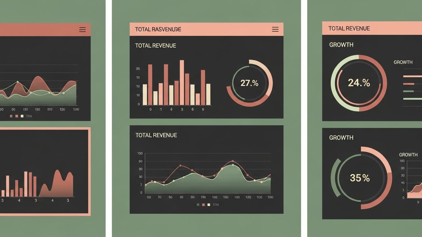
The Visual & Narrative Approach
Executives don't need details; they need summaries. This style respects their time with a rapid-fire montage of high-level dashboards. We see "Total Revenue," "Growth," and "ROI" charts flashing in a clean, storyboard layout. The palette is sophisticated Sage Green and Dusty Rose, signaling financial health and stability. It conveys a narrative of success in seconds, designed specifically for the C-Suite review.
Psychological Impact & KPI Focus
- Niche Psychology: Targets the Executive Time Famine. It eliminates the noise of operational metrics (clicks, impressions) to focus strictly on financial outcomes.
- Operational Impact: Visualizes Executive Reporting, demonstrating that the platform provides "Board-Ready" insights instantly, without manual data prep.
Strategic Implementation & Trade-offs
- Duration: 10-15 Seconds.
- Trade-off: Too fast for training, perfect for the "Closing Argument." It assumes the viewer knows the basics and just wants the result.
Transition: We conclude by visualizing the cumulative effect of these insights over time...
Companies using similar video content -
Singular – Marketing Attribution – Revealing the internal mechanics of the attribution engine.
Bizible (Adobe) – B2B Marketing Attribution – Transparent algorithmic logic for credit assignment.
20. Isometric 2D Motion Design
BOFU | ROI Justification Hook

The Visual & Narrative Approach
Growth is a building process. This style utilizes a satisfying isometric animation of Chocolate Brown blocks (representing revenue units) stacking rapidly on a grid. Sky Blue accents highlight the stability of the structure. It transforms the abstract concept of "Compounding ROI" into a physical tower of value. The motion is rhythmic and upward, leaving the viewer with a final, lingering impression of accumulation and wealth.
Psychological Impact & KPI Focus
- Niche Psychology: Leverages the Accumulation Instinct. It visually proves that small optimizations (visualized in previous styles) stack up to massive long-term gains.
- Operational Impact: Visualizes Customer Lifetime Value (CLTV), showing how sustained analytics usage builds a robust revenue fortress over time.
Strategic Implementation & Trade-offs
- Duration: 10-15 Seconds.
- Trade-off: Simple and abstract. It serves as a powerful visual "period" at the end of a campaign, summarizing the total value proposition.
Companies using similar video content -
Datorama (Salesforce) – Marketing Intelligence – Executive snapshot for high-level growth validation.
Domo – Business Intelligence – Rapid-fire montage of key performance dashboards.
21. 3D Parallax UI Presentation
Onboarding | Accelerating Time-to-Value

The Visual & Narrative Approach
The "Aha!" moment must happen fast. This style deconstructs the onboarding experience using a 3D parallax effect. We see the software interface split into floating layers in a void. The foreground layer features a stylized clock with hands spinning rapidly, while the background layers—representing data processing—blur slightly to create depth. The palette of Vibrant Orange and Chartreuse pops against the dark background, visually communicating that the journey from "Login" to "Insight" is instantaneous.
Psychological Impact & KPI Focus
- Niche Psychology: Combats "Implementation Fatigue." New users often fear a month-long setup process. This visual compresses time, promising speed and immediate gratification.
- Operational Impact: Visualizes Rapid Deployment, assuring the user that the platform is plug-and-play, not a heavy IT project.
Strategic Implementation & Trade-offs
- Duration: 10-15 Seconds.
- Trade-off: High production value required for the parallax effect. If the layering is clumsy, it looks like a glitch rather than a feature.
Transition: Once the system is live, we need to empower the user to explore it confidently...
Companies using similar video content -
Rockerbox – Marketing Mix Modeling – Revenue stack visualizing compounding ROI growth.
Ometria – AI-powered Retail CRM – Building a robust revenue fortress over time.
23. 2D Character-Driven Story
Onboarding | Self-Serve Onboarding

The Visual & Narrative Approach
Technology needs a human face. This style introduces a relatable protagonist—a modern marketing analyst—rendered in a clean, corporate vector art style. We see him sitting at a desk, giving a confident "thumbs up" as his screen glows with positive results. The scene is framed with abstract geometric shapes in Aquamarine and Tangerine, creating a supportive and energetic environment. It creates a mirror for the user, showing them exactly who they will be when they use the software: happy, competent, and in control.
Psychological Impact & KPI Focus
- Niche Psychology: Targets "Imposter Syndrome." By showing a calm, successful user, it reassures the viewer that they are smart enough to master this tool without extensive training.
- Operational Impact: Enhances User Adoption Rates in Product-Led Growth (PLG) models by making the learning curve appear friendly and surmountable.
Strategic Implementation & Trade-offs
- Duration: 30-60 Seconds.
- Trade-off: The character design must be neutral enough to be relatable to a diverse global audience but specific enough to have personality.
Transition: From the user's confidence, we visualize the platform's first major win...
Companies using similar video content -
PTC ThingWorx – IoT Platform – Layered depth for accelerated value realization in IoT.
AWS IoT Analytics – Managed IoT Analytics Service – Deconstructing onboarding for rapid deployment.
24. 2D Animation & UI Composition
Onboarding | Trial/Freemium User Activation

The Visual & Narrative Approach
Activation is a launch event. This style combines the literal with the metaphorical. We see a cel-shaded 2D animation of a rocket ship blasting off, superimposed over floating 3D UI panels displaying "Campaign Active" metrics. The Violet and Bright Yellow color scheme suggests creativity and energy. The composition uses a "Picture-in-Picture" effect, linking the action of the launch directly to the data spikes on the dashboard. It celebrates the user's first successful campaign execution.
Psychological Impact & KPI Focus
- Niche Psychology: Leverages the Endowed Progress Effect. It visually rewards the user for completing the setup, making them feel they have already achieved momentum.
- Operational Impact: Drives Activation Rate, encouraging users to move from passive setup to active usage (launching a report or campaign).
Strategic Implementation & Trade-offs
- Duration: 10-15 Seconds.
- Trade-off: Can feel "gamified." Ensure it is used for celebration moments (first launch) rather than serious analytical deep dives.
Transition: Even with a successful launch, users eventually hit roadblocks. Here is how we support them...
Companies using similar video content -
Pendo – Product Analytics – Guiding users through feature adoption.
WalkMe – Digital Adoption Platform – Interactive walkthroughs for software.
25. Abstract 2D Motion Graphics
Retention | Reducing Support Overhead

The Visual & Narrative Approach
Support should feel like magic, not a queue. This style uses fluid morphing animation to visualize problem resolution. A "Life Ring" icon smoothly transforms into a "Chat Bubble," which then resolves into a satisfying "Checkmark." The motion is circular and continuous, radiating from the center in calming Azure Blue and Copper. It communicates that help is always available and that issues are resolved efficiently within the ecosystem.
Psychological Impact & KPI Focus
- Niche Psychology: Alleviates "Support Anxiety"—the fear of being stuck with a technical error. The fluid motion suggests that obstacles are temporary and easily overcome.
- Operational Impact: Visualizes Self-Service Resolution, subtly encouraging users to use chat/bots before logging a ticket, thus reducing support costs.
Strategic Implementation & Trade-offs
- Duration: 6-10 Seconds (Loop).
- Trade-off: Highly abstract. It builds a feeling of safety but doesn't explain how to solve a specific problem.
Transition: Support keeps them happy; now we must ensure they never leave...
Companies using similar video content -
Klaviyo – E-commerce CRM – Relatable protagonist for customer segmentation.
ActiveCampaign – Marketing Automation – Empowered user for intuitive self-service.
26. Low-Poly 3D Modeling
Retention | Reducing Churn

The Visual & Narrative Approach
Churn is the enemy. This style visualizes the software as a formidable barrier against loss. We see a low-poly 3D model of a sturdy dam, rendered in Ruby Red (Alert) and Emerald Green (Safe). The dam holds back a volume of water (revenue/customers), preventing it from flowing away. The sharp facets of the low-poly style give the structure a sense of unshakeable strength. It is a powerful metaphor for the platform's "Churn Prediction" and "Retention" modules.
Psychological Impact & KPI Focus
- Niche Psychology: Targets the "Leaky Bucket" fear. Every marketer hates losing hard-won customers. This visual reassures them that the software creates a structural defense against attrition.
- Operational Impact: Visualizes Customer Health Scoring, implying that the system proactively identifies and blocks churn risks before they breach.
Strategic Implementation & Trade-offs
- Duration: 15-20 Seconds.
- Trade-off: The "Dam" metaphor is defensive. It focuses on saving rather than gaining, which is perfect for retention but less exciting for acquisition.
Transition: To maintain this defense, users need deep, accessible knowledge...
Companies using similar video content -
MoEngage – Customer Engagement – Launch event for gamified user activation.
Braze – Customer Engagement Platform – Celebrating first successful campaign execution.
27. Holographic UI over 3D Render
Retention | Knowledge Base & FAQ Videos

The Visual & Narrative Approach
Documentation is usually dry; we make it look like sci-fi. A photorealistic 3D meeting table sits in a dimly lit room. Above it, a glowing, translucent holographic book hovers and opens, projecting Lemon Yellow charts and Periwinkle text into the air. It elevates the concept of a "Help Center" to a "Strategic Command Archive." It suggests that the answers aren't just in a manual—they are part of the platform's living intelligence.
Psychological Impact & KPI Focus
- Niche Psychology: Addresses the "RTFM (Read The Manual) Resistance." By making the information look futuristic and accessible, it encourages users to engage with educational content.
- Operational Impact: Increases Feature Adoption, as users are more likely to explore complex capabilities if the learning resources look premium and inviting.
Strategic Implementation & Trade-offs
- Duration: 10-15 Seconds (Loop).
- Trade-off: High conceptual overhead. Use this as a header for the Knowledge Base to set a premium tone, rather than for every single tutorial video.
Transition: Education leads to mastery, and mastery leads to the desire for more power...
Companies using similar video content -
Countly – Open Source Product Analytics – Resolution loop for frictionless support.
Grafana – Open Source Analytics & Monitoring – Fluid morphing for efficient issue resolution.
28. Minimalist Flat 2D Vector
Expansion | Driving Deep Feature Adoption

The Visual & Narrative Approach
In a complex platform, the most valuable features must stand out. This style uses extreme minimalism. A vast white void centers on a single, beautifully cut gemstone illustration in Dark Teal and Salmon Pink. There is no background noise, no UI clutter—just the jewel. It visually isolates a specific "Premium Feature" (e.g., Predictive Modeling) and presents it as a rare, high-value asset that the user must unlock.
Psychological Impact & KPI Focus
- Niche Psychology: Leverages the Isolation Effect. By removing all context, the viewer attributes higher value and scarcity to the featured object.
- Operational Impact: Drives Upsell Awareness. It creates a "velvet rope" feeling around advanced features, making them desirable upgrades rather than just "more buttons."
Strategic Implementation & Trade-offs
- Duration: 5-8 Seconds.
- Trade-off: Lacks context. It says "This is valuable" but doesn't say "How it works." Must be paired with copy explaining the specific benefit.
Transition: From the allure of the gem, we move to the explicit call to upgrade...
Companies using similar video content -
Custify – Customer Success Platform – Retention dam for value preservation and churn prevention.
6sense – Account Engagement Platform – Sturdy dam against customer loss.
29. Bold Kinetic Typography (Visual)
Expansion | Driving Upsell/Cross-sell

The Visual & Narrative Approach
Status matters. This style visualizes the upgrade as a physical elevation. Using heavy, sans-serif 3D typography, the word "PRO" rises physically out of a cluster of smaller, generic text blocks. The "PRO" text is rendered in Metallic Gold and Silver, contrasting with the matte grey of the standard text. It creates a literal hierarchy, showing that the "Pro Tier" stands head and shoulders above the standard offering.
Psychological Impact & KPI Focus
- Niche Psychology: Appeals to Social Status and the desire for "Power User" designation. It frames the upsell not as a cost, but as a promotion in rank.
- Operational Impact: Visualizes Tier Differentiation, making it instantly clear that the higher tier offers weightier, more substantial capabilities.
Strategic Implementation & Trade-offs
- Duration: 5-10 Seconds.
- Trade-off: Purely promotional. It works best inside the app (e.g., on a locked feature modal) to prompt an immediate click.
Transition: Finally, we show the ultimate destination of the "Pro" user...
Companies using similar video content -
Segment – Customer Data Platform – Knowledge hologram for accessible intelligence.
Tealium – Customer Data Platform – Strategic command archive for CDP documentation.
30. Aspirational Stock Montage
Expansion | In-App Upsell

The Visual & Narrative Approach
The software is the vehicle; the user is the driver. This final style focuses on the destination. We see a silhouette of a business leader standing in a high-rise office, looking out at a sunlit city skyline. Crimson Red trend lines overlay the window, matching the rise of the skyscrapers. It connects the use of the software with personal career success and executive vision. It is no longer about "clicks"—it is about "legacy."
Psychological Impact & KPI Focus
- Niche Psychology: Targets Self-Actualization. It moves beyond functional benefits to emotional benefits: "If I use this tool, I become the visionary leader who drives the company forward."
- Operational Impact: Reinforces Long-Term Loyalty. It aligns the software with the user's career trajectory, making it an indispensable partner in their professional growth.
Strategic Implementation & Trade-offs
- Duration: 15-20 Seconds.
- Trade-off: Can feel generic if not branded carefully. The overlay of specific data visualization elements is crucial to tie the stock footage back to the product.
Strategic Knowledge Base: The Visual Operations Doctrine
Strategic Alignment & Visual Architecture (Pre-Production)
The Foundation of "Visual Intelligence" in Marketing Analytics
Creating a video style guide is not an aesthetic exercise; it is a strategic audit of how your platform communicates value. In the marketing analytics sector, where data density is high and user attention is low, the "Visual Architecture" determines adoption.
-
The Cognitive Load Audit: Before animating, audit your UI. A complex dashboard requires a Simplification Style (like Style 2 - Clean UI Workflow). Do not replicate the UI's density in the video; reduce it to the "Minimum Viable Visual" to ensure the viewer grasps the insight, not the clutter.
-
Role-Based Visual Mapping: Different stakeholders process visuals differently.
-
The "Driver" (Analyst): Needs detail. Use Clean UI Workflow (Style 2) and Macro UI Micro-Interactions (Style 15) to show how to execute tasks.
-
The "Fleet Manager" (CMO/VP): Needs outcomes. Use Rapid UI Feature Montage (Style 19) and Aspirational Stock (Style 30) to show results and velocity.
-
The "Glanceability" Standard: In a busy marketing ops environment, a video asset must communicate its core message in <5 seconds (sound-off). Test your Abstract 2D Motion (Style 25) and Kinetic Typography (Style 29) against this standard. If the value isn't clear at a glance, the asset fails.
-
Brand Voice Consistency: Your visual styles must share a DNA. If your UI is "Dark Mode," your animated explainer cannot be a bright pastel cartoon. Inconsistency breeds distrust in the platform's stability.
-
The Advids Strategic Audit: This is where an external partner like Advids adds critical value. By auditing your current visual assets against market best practices, we define a "Visual Operating System" that ensures every video—from a 6-second ad to a 60-minute webinar—speaks the same visual language, building cumulative brand equity.
-
Legacy System Integration: Many analytics platforms integrate with legacy CRMs. Use Isometric 3D Workflow (Style 11) to visually dignify the "Old vs. New" transition, positioning your tool as the modern bridge rather than an alien replacement.
-
Standardization vs. Customization: Know when to spend. Use standardized stock assets for broad, top-of-funnel concepts (Style 1) to save budget. Reserve bespoke, high-cost visualization for your core intellectual property (like Style 18 X-Ray) for your unique algorithm.
-
The Cross-Departmental Bridge: Marketing, Sales, and Product often use different terminology. A unified visual style (e.g., Style 18 X-Ray) forces all departments to agree on a single mental model of how the "Attribution Engine" works.
-
Accessibility in Analytics: Marketing teams are diverse. Ensure your motion graphics (especially Style 29) meet accessibility standards for contrast and readability. A "cool" video that is unreadable to a color-blind analyst is a failed asset.
-
The Mobile-First Mandate: CMOs review data on phones. Ensure high-level summary styles (like Style 19) are legible on mobile screens. A dashboard that looks unreadable in a video on a mobile device signals "Legacy Tech" to a modern buyer.
Operational Adoption & Implementation (Deployment)
Embedding Visuals into the Marketing Workflow
Production is only half the battle; deployment is where ROI is realized. The "Visual Operations Doctrine" mandates that video assets are not just "marketing content" but functional tools embedded in the user journey.
- Overcoming "Black Box" Anxiety: Marketers inherently distrust AI they can't see. Use 3D X-Ray Visualization (Style 18) and Abstract 3D AI (Style 3) to "open the box." Visualizing the logic (nodes, connections, gears) builds trust in the algorithm's output.
- The Micro-Learning Shift: Static manuals often go unread. Replace your text-based Knowledge Base with a library of Macro UI Micro-Interactions (Style 15) and Clean UI Workflows (Style 2). These 10-30 second clips should be embedded directly in the software (Contextual Help) to solve problems in real-time.
- Gamification of Marketing Ops: Use 2D Animation & UI Composition (Style 24) to celebrate user milestones (e.g., "First Campaign Linked," "Data Hygiene Score > 90%"). Visualizing these wins creates dopamine loops that drive deeper feature adoption.
- Just-in-Time Support: Reduce Level 1 support tickets by deploying Abstract 2D Motion Graphics (Style 25) in your chat bots. A 5-second loop showing "How to Reset Filters" is faster than a text explanation and friendlier than a manual.
- Standard Operating Procedures (SOPs): Transform dry SOPs into Isometric 3D Workflow (Style 11) animations. Visualizing the flow of data between teams (Sales to Marketing) clarifies responsibilities and reduces friction in RevOps alignment.
- Feedback Loops: Use interactive video elements. After a Feature Education video (Style 8), prompt a "Was this helpful?" interaction. This data informs your product team which features are confusing and need better UI or better explanation.
- Remote Onboarding: For distributed teams, the 3D Parallax UI (Style 21) creates a sense of immersion that static slides cannot. It simulates the feeling of "diving in," making remote onboarding feel like a premium event.
- Reducing Support Ticket Volume: There is a direct correlation between the quality of your visual onboarding (Style 21) and the volume of "Level 1" support tickets. Invest in the former to decimate the latter.
- Scalable Localization: If you sell globally, avoid on-screen text in complex styles. Use Style 6 (Abstract Vector) where the narrative is driven by universal symbols (arrows, graphs), reducing the cost of translating assets for different regions.
- Leadership Communication: When a Head of Analytics presents to the Board, give them the tools to shine. Provide downloadable Rapid UI Feature Montage (Style 19) clips they can embed in their decks. You help them look good; they keep buying your software.
Measuring Impact & Future-Proofing (ROI)
Quantifying the Value of Visual Assets
To justify the budget for high-end visualization, you must measure its impact on business outcomes, not just vanity metrics.
- Beyond "Views": Stop measuring views. Measure Time-to-Competency. Does watching the Clean UI Workflow (Style 2) video reduce the time a new user takes to launch their first report? That is the ROI of video.
- The "Idle Time" Metric: Correlate video consumption with software navigation speed. Effective visuals (Style 15) should reduce the "idle time" users spend searching for buttons, directly improving their operational efficiency.
- Compliance Velocity: When privacy laws (GDPR) change, use Photorealistic 3D Renders (Style 9 - Security) to rapidly educate the user base. Measure how fast users update their settings post-video release compared to text-email release.
- Retention and Churn: Use Low-Poly 3D Modeling (Style 26) assets in your "At-Risk" email flows. Visualizing the protection of their data/revenue can act as a psychological pattern interrupt, reducing churn intent.
- The AI Visual Frontier: Prepare for Generative UI. Your visual style guide today (colors, motion behaviors) will become the training data for tomorrow's GenAI video tools. Establishing a strong 3D Abstract identity (Style 3) now ensures your future AI-generated content remains on-brand.
- Scalability of Assets: Build a "Visual Lego Kit." Elements from Isometric 2D Motion (Style 20) should be reusable in Bold Kinetic Typography (Style 29). This modular approach reduces the marginal cost of creating new assets as your feature set grows.
- The Advids Partnership: Scale is the ultimate challenge. As your platform expands from 10 to 100 modules, internal teams struggle to maintain visual consistency. Advids serves as the "Visual Guardian," ensuring that Style 30 (Upsell) feels visually connected to Style 1 (Awareness), protecting brand integrity at scale.
- Benchmarking Success: Compare your "Visual Velocity" against competitors. If they use static screenshots and you use Style 7 (Dynamic Data Viz), you are winning the "Perception War" before the demo even starts.
- The ROI of Safety: For data-sensitive industries, trust is revenue. Quantify the reduction in security questionnaire delays by proactively sending Style 10 (Dark Mode Shield) assets to InfoSec teams during the sales cycle.
- Final Call to Innovation: Treat video not as "content" but as infrastructure. Just as you invest in server stability, invest in visual clarity. In the Era of Efficiency, the software that tells the best story—visually, instantly, and emotionally—wins the market.
Companies using similar video content -
EverString – Predictive Analytics for B2B – Hidden gem for premium feature discovery.
Demandbase – Account-Based Marketing – Isolating high-value ABM features.
Author & Editor Bio


