
Introduction: The Architecture of Digital Consistency
In the high-velocity world of global marketing, the disconnect between strategic intent and operational reality is the silent killer of brand equity. We are no longer simply "managing files"; we are orchestrating the entire visual voice of the enterprise. For Marketing Directors and CMOs, the challenge has shifted from storage to complex, automated orchestration—building a bridge where the "physical" weight of brand strategy translates instantly into effortless "digital" execution.
The opportunity for transformation is immense, yet the friction of the status quo remains a costly barrier. Current industry data reveals a startling inefficiency: 83% of employees recreate assets simply because they cannot locate existing versions. This isn't just an operational nuisance; it is a structural failure that creates brand dilution and slows speed-to-market. Conversely, the market recognizes this urgency, with the digital asset management sector projected to reach USD 16.18 billion by 2032. This surge underscores a critical reality: asset management is no longer a utility, but a growth engine.
This guide is designed to solve that visibility gap. By visualizing the abstract mechanics of Marketing Asset Management (MAM)—from taxonomy to distribution—we transform technical features into compelling strategic narratives. The following visual examples serve as a blueprint for communicating value, reducing cognitive load, and proving ROI to stakeholders who demand both innovation and control.
1. Bold Kinetic Typography (Visual)
TOFU | Brand Awareness

The Visual & Narrative Approach
Visualization Scenario: We visualize the concept of "Brand Consistency" not as a static state, but as an active, forceful assembly. Massive, heavy geometric block shapes—rendered in striking Industrial Yellow and Slate Black—are depicted colliding and fusing together. These blocks, resembling fragments of bold letterforms or raw data, slam shut to form a solid, unbreakable wall against a grid background.
Narration Tone: The narrative is punchy and rhythmic, mimicking the impact of the blocks. It emphasizes strength, solidity, and the "impenetrable" nature of a well-managed brand ecosystem.
Psychological Impact & KPI Focus
- Niche Psychology: Marketing leaders fear fragmentation. This style directly addresses the anxiety of "brand drift" by visualizing the platform as a rigid, reliable enforcer of standards.
- Operational Impact: The visual metaphor of "fusing" illustrates the bridge between scattered creative ideas (the flying blocks) and the finalized, compliant asset (the solid wall).
Strategic Implementation & Trade-offs
- Ideal Duration: 6–10 Seconds.
- Trade-off: The high-impact, aggressive motion captures attention instantly but may lack the nuance required for explaining complex technical workflows.
Companies using similar video content -
Brandfolder – Enforces brand governance and consistency with impactful visuals.
Frontify – Structures brand guidelines and design systems precisely.
censhare – Content hub solidifying brand consistency and control.
2. Abstract 2D flat vector organic
TOFU | Market Education

The Visual & Narrative Approach
Visualization Scenario: To explain the fluid nature of digital asset distribution, we use abstract, organic motion graphics. Glossy, blob-like shapes in Mint Green and Lavender morph, merge, and separate like the wax in a lava lamp. This non-rigid movement visualizes how assets must adapt to different channels—flowing effortlessly from a central hub to social media, web, and print without losing their essence.
Narration Tone: The tone is soothing, sophisticated, and educational. It positions the software not as a rigid container, but as a living ecosystem that breathes and adapts.
Psychological Impact & KPI Focus
- Niche Psychology: Modern marketers are overwhelmed by rigidity. This style appeals to the desire for agility and flexibility. It reduces the cognitive load associated with complex taxonomy.
- Operational Impact: The merging shapes symbolize the seamless integration of disparate teams and workflows, visualizing the "Digital Bridge" where collaboration happens without friction.
Strategic Implementation & Trade-offs
- Ideal Duration: 10–15 Seconds (Looping).
- Trade-off: While visually pleasing, the abstraction can be too vague for technical buyers who need to see the actual interface or specific features.
Companies using similar video content -
Bynder – Fluidly distributes assets across diverse channels.
MediaValet – Adapts and flows assets effortlessly for agile marketing.
Razuna – Open-source DAM for fluid asset distribution.
3. Abstract 3D AI Visualization
TOFU | Shaping Brand Perception

The Visual & Narrative Approach
Visualization Scenario: A "High-Key" aesthetic renders a complex high-tech data tunnel. Thousands of glowing nodes (assets) and connecting filaments (metadata) in Cyber Yellow and Slate Grey form a sophisticated network structure. The camera rushes forward through this tunnel, visualizing the sheer speed and interconnectivity of an AI-driven asset engine.
Narration Tone: The narrative is futuristic and fast-paced, using terms like "neural networks," "smart tagging," and "instant retrieval." It conveys a sense of cutting-edge innovation.
Psychological Impact & KPI Focus
- Niche Psychology: This style targets the fear of obsolescence. It reassures the viewer that the platform is future-proof and powered by the latest AI technology.
- Operational Impact: The visual complexity of the network demonstrates the platform's ability to handle massive scale—bridging the gap between a chaotic library and an organized, intelligent retrieval system.
Strategic Implementation & Trade-offs
- Ideal Duration: 15–30 Seconds.
- Trade-off: The high production value and abstract nature suggest a premium price point. It is less effective for demonstrating ease-of-use for non-technical users.
Companies using similar video content -
Adobe Experience Manager Assets – AI-driven smart tagging and content intelligence.
Cloudinary – Future-proof AI for dynamic media management.
Contentstack – Headless CMS with AI for future-proof intelligence.
5. Minimalist Flat 2D Vector
TOFU | Vertical Social Organic
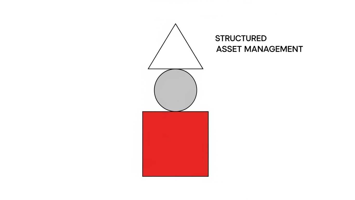
The Visual & Narrative Approach
Visualization Scenario: Drawing from Bauhaus architecture, this style uses pure geometric simplicity. A Red Square (foundation), Grey Circle (process), and White Triangle (output) are arranged in a perfectly balanced vertical stack. This visualizes "Structured Asset Management"—where every element has a precise place, and stability is paramount. The composition is symmetrical and centered.
Narration Tone: Minimalist, direct, and efficient. The audio might use precise clicks and snaps to emphasize the "locking in" of the structure.
Psychological Impact & KPI Focus
- Niche Psychology: It appeals to the Operational Head's desire for order and logic. The clean lines and lack of clutter signal a platform that eliminates noise and focuses on essential functionality.
- Operational Impact: The "stack" metaphor reinforces the importance of a solid foundation (taxonomy) supporting the entire marketing operation.
Strategic Implementation & Trade-offs
- Ideal Duration: 9–12 Seconds.
- Trade-off: The extreme simplicity may oversimplify the capabilities of an enterprise-grade platform, potentially underselling its feature depth.
Companies using similar video content -
N/A – No style description provided.
6. Wireframe to Reality Transition
TOFU | Category Creation
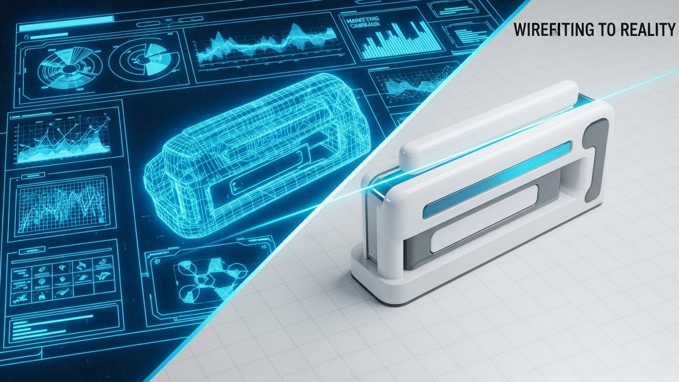
The Visual & Narrative Approach
Visualization Scenario: A split-screen composition captures the journey from "Idea to Asset." The left side displays a complex, blueprint-style 3D wireframe of a marketing campaign structure in Neon Blue on a dark grid. A glowing scanning line sweeps across to the right, revealing the fully rendered, Glossy White final output.
Narration Tone: The narrative focuses on "realization" and "execution." It tells the story of how the software turns abstract plans into tangible, market-ready assets.
Psychological Impact & KPI Focus
- Niche Psychology: This directly addresses the "Physical/Digital Bridge." It visualizes the transformation of a mental model (strategy) into a digital reality (asset), validating the platform's role as the essential catalyst.
- Operational Impact: It highlights the precision of the rendering and approval process, reassuring stakeholders that the final output will match their initial vision perfectly.
Strategic Implementation & Trade-offs
- Ideal Duration: 15–20 Seconds.
- Trade-off: Requires high-quality assets for both the wireframe and the render. If the transition isn't seamless, the metaphor of "effortless execution" fails.
Companies using similar video content -
Canto – Organizes assets with clean, structured simplicity.
Image Relay – Provides simple, structured asset management.
Strapi – Headless CMS for structured asset management.
7. Low-Poly 3D Modeling
MOFU | Product Differentiation

The Visual & Narrative Approach
Visualization Scenario: We treat the global marketing ecosystem as a miniature digital landscape. Faceted mountains (regional markets) and valleys in Matte Coral and Low-Poly Gold create a "Global Marketing Terrain." Small data packets (cubes) flow along the rivers, representing the distribution of assets across borders.
Narration Tone: The tone is playful yet strategic, emphasizing "global reach" and "local flow." It makes the daunting task of global distribution feel manageable and gamified.
Psychological Impact & KPI Focus
- Niche Psychology: For global teams, the complexity of regional compliance is a major stressor. This toy-like aesthetic reduces the anxiety of scale, making global operations look organized and accessible.
- Operational Impact: The "river" flow visualizes the automated workflows that carry assets to local teams, highlighting the removal of manual bottlenecks.
Strategic Implementation & Trade-offs
- Ideal Duration: Loop (5–8 Seconds).
- Trade-off: The "toy-like" aesthetic must be balanced carefully to avoid looking unprofessional. It works best for differentiation, not for technical deep-dives.
Companies using similar video content -
Aprimo – Transforms marketing strategy blueprints into executed campaigns.
Lytho – Converts creative concepts into polished, final assets.
Workfront (Adobe) – Manages creative projects from ideation to delivery.
8. Abstract 2D Motion Graphics
MOFU | Competitive Displacement
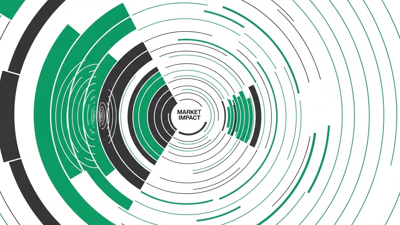
The Visual & Narrative Approach
Visualization Scenario: To visualize "Market Impact," we use sharp, vector-based geometry. Concentric rings and expanding radar-like waves in Emerald Green and Charcoal pulse rhythmically from a center point. This represents the ripple effect of a well-launched campaign, originating from the central DAM and expanding into the market.
Narration Tone: Urgent, confident, and results-oriented. The focus is on "reach," "penetration," and "visibility."
Psychological Impact & KPI Focus
- Niche Psychology: CMOs are driven by results. This style visualizes the invisible metric of "impact," satisfying the need to see the ROI of asset distribution.
- Operational Impact: The symmetry and precision suggest a highly controlled distribution mechanism, reinforcing the idea that the platform ensures consistent impact across all channels.
Strategic Implementation & Trade-offs
- Ideal Duration: 10–12 Seconds.
- Trade-off: It is purely metaphorical. It relies heavily on the accompanying copy to explain what is causing the impact (the software).
Companies using similar video content -
Pimcore – Visualizes global data flow and regional distribution.
Salsify – Distributes product content across diverse digital landscapes.
Akeneo – PIM with DAM, global terrain for product data.
9. Futuristic Neon/Dark Mode
MOFU | Thought Leadership

The Visual & Narrative Approach
Visualization Scenario: A "worm's eye" view looks up at towering monoliths resembling server racks, illuminated by glowing strips of Neon Purple and Laser Blue. The perspective is a dramatic low-angle, looking up at the imposing structures to convey scale and power. The floor is reflective, creating a mirror image of the neon lights. The atmosphere is hazy and cyberpunk, visualizing "Enterprise Infrastructure."
Narration Tone: Deep, authoritative, and serious. It speaks to "robustness," "security," and "enterprise-grade architecture."
Psychological Impact & KPI Focus
- Niche Psychology: IT stakeholders and CIOs prioritize security and scalability. This aesthetic signals that the platform is not a lightweight tool, but a serious piece of enterprise infrastructure.
- Operational Impact: The "towering" visual conveys the capacity to house millions of assets without performance degradation, addressing the fear of system crashes or slow retrieval.
Strategic Implementation & Trade-offs
- Ideal Duration: 30–60 Seconds.
- Trade-off: Can feel cold or distant to creative users who prefer a lighter, more inviting aesthetic.
Companies using similar video content -
CELUM – Creates market impact through efficient asset distribution.
Sitecore DAM – Drives market impact with dynamic, personalized experiences.
inRiver – PIM with DAM, market impact for product content.
10. Isometric 2D Motion Design
MOFU | Feature Education

The Visual & Narrative Approach
Visualization Scenario: An isometric "factory line" is set against a Burnt Orange and Cream grid. Geometric shapes enter the frame as rough, wireframe sketches. They pass through a stylized "Smart Gate" (the software's templating engine) and emerge instantly as polished, solid 3D forms. This visualizes the "Smart Template" creation process.
Narration Tone: Educational and process-driven. It breaks down the "creation" workflow into a clear input-process-output sequence.
Psychological Impact & KPI Focus
- Niche Psychology: Operational teams value efficiency and automation. This visual proves that the software automates the tedious part of design (polishing/formatting), allowing creatives to focus on the "sketch" (concept).
- Operational Impact: It perfectly illustrates the "Smart Template" feature, bridging the gap between a non-designer's input and a brand-compliant output.
Strategic Implementation & Trade-offs
- Ideal Duration: 20–40 Seconds.
- Trade-off: The isometric style is common in SaaS. To stand out, the animation must be exceptionally smooth and the color palette (Orange/Cream) strictly adhered to.
Companies using similar video content -
Hyland Nuxeo Platform – Enterprise content services with robust, high-tech infrastructure.
MerlinOne – High-performance DAM for powerful, secure media management.
Quark – Content automation, conveying enterprise power.
11. 3D X-Ray Visualization**
MOFU | Feature Education

The Visual & Narrative Approach
Visualization Scenario: To demystify the abstract concept of "Metadata Search," we utilize a medical-grade 3D X-Ray aesthetic. A complex cube with a shell of Translucent Teal glass floats in a pristine grey space. As the viewer watches, the shell becomes transparent, revealing an intricate, synchronized internal mechanism of gears and connecting rods rendered in Bone White. This internal machinery visualizes the "Metadata Search Engine" actively processing queries beneath the surface.
Narration Tone: Analytical, precise, and revelatory. The narrative invites the viewer to "look inside" the black box, using terms like "granular discovery," "deep-indexing," and "structural integrity."
Psychological Impact & KPI Focus
- Niche Psychology: Marketing Technologists and Librarians often distrust "black box" search bars. They need to know how it works. This X-Ray style satisfies that intellectual curiosity, suggesting that the search is engineered, not accidental.
- Operational Impact: It visually validates the precision of asset retrieval. The interlocking gears symbolize that every piece of metadata drives the search result, ensuring no asset is ever lost in the "digital abyss."
Strategic Implementation & Trade-offs
- Ideal Duration: 15–20 Seconds.
- Trade-off: This is a highly technical aesthetic. It is powerful for the "Feature Education" phase but may feel too mechanical for a creative audience focused on aesthetics over logic.
Companies using similar video content -
WoodWing Assets – Streamlines content creation and publishing workflows efficiently.
inMotionNow – Manages creative workflows through structured processes.
Esko – Packaging DAM, visualizing process efficiency.
12. 2D Line Art Animation
MOFU | Implementation Friction
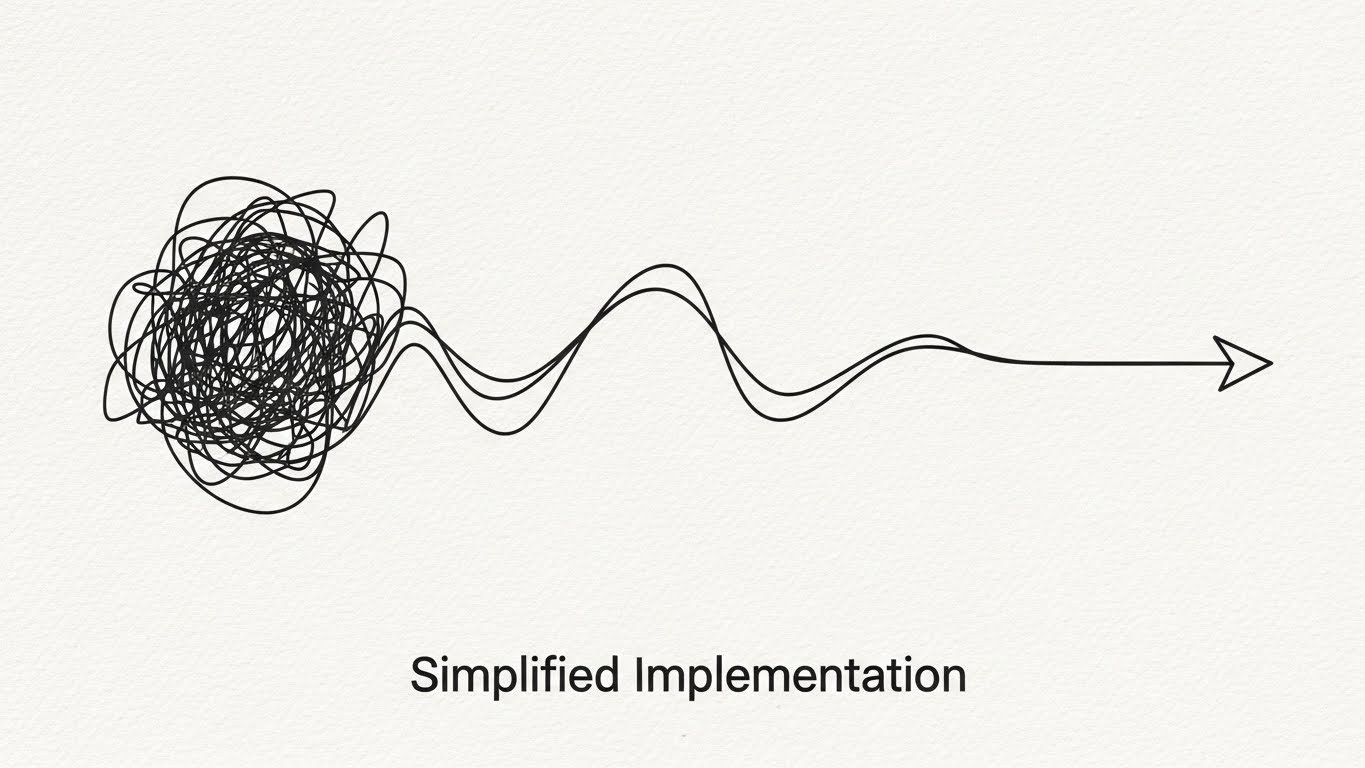
The Visual & Narrative Approach
Visualization Scenario: To counter the fear of complex implementation, we use the ultimate visual metaphor for simplicity. A single, continuous elegant line in Charcoal draws itself across a textured Paper White background. On the left, the line creates a chaotic, tangled scribble (representing the current state or migration process). As it flows right, it untangles effortlessly, smoothing out into a perfect, streamlined arrow pointing forward.
Narration Tone: Empathetic, reassuring, and calm. The voiceover acknowledges the complexity of change but focuses on the "smoothness" and "clarity" of the transition.
Psychological Impact & KPI Focus
- Niche Psychology: "Implementation friction" is a primary objection. Stakeholders fear months of downtime. This minimalist style visually promises a "frictionless" experience, lowering the anxiety barrier to entry.
- Operational Impact: The continuous line suggests an uninterrupted workflow. It implies that the software untangles the mess for you, rather than adding a new layer of complexity to your stack.
Strategic Implementation & Trade-offs
- Ideal Duration: 10–15 Seconds.
- Trade-off: Its extreme simplicity means it cannot show specific features. It is purely an emotional reassurance tool, best used to support a broader conversation about Customer Success and onboarding.
Companies using similar video content -
Veeva Vault PromoMats – Provides deep insight into regulated content metadata.
OpenText Media Management – Reveals complex metadata and search engine mechanisms.
Stylelabs (Sitecore Content Hub) – Deep internal mechanisms for content.
13. Generative AI Cinematic Video
MOFU | Demo Requests

The Visual & Narrative Approach
Visualization Scenario: We leverage high-end cinematic aesthetics to position the platform as a premium "success partner." The camera moves slowly through a luxurious, abstract corporate lobby with walls of White Marble and Gold accents. Beams of sunlight filter through architectural slats, illuminating floating dust motes. The camera pushes slowly toward a glowing, Golden Focal Point in the distance—symbolizing the "Ultimate Solution" or the "Single Source of Truth."
Narration Tone: Inspiring, visionary, and prestigious. The focus is on "elevation," "gold standards," and "arriving" at a state of marketing excellence.
Psychological Impact & KPI Focus
- Niche Psychology: This speaks to the ambition of the CMO. It frames the purchase not as buying software, but as acquiring a status symbol of operational excellence. It creates a "halo effect" of quality around the brand.
- Operational Impact: While abstract, the "Golden Source" metaphor strongly reinforces the concept of a centralized, pristine asset library that serves as the crown jewel of the marketing operation.
Strategic Implementation & Trade-offs
- Ideal Duration: 30–45 Seconds.
- Trade-off: High production value sets high expectations. The actual software experience must feel premium to match this promise, or the brand risks a disconnect between marketing and reality.
Companies using similar video content -
ResourceSpace – Highlights simple, frictionless implementation and onboarding.
Phraseanet – Open-source DAM, explaining processes with clear line art.
14. Dynamic Data Visualization
MOFU | ROI Justification

The Visual & Narrative Approach
Visualization Scenario: To speak the language of the CFO, we turn data into physical objects. Floating 3D charts and graphs, constructed from refractive Glass and light, orbit a central core in a bright white virtual space. The bars and pie segments use Vibrant Lime (growth) and Grey (baseline) to clearly denote value. The camera orbits the cluster, showing that the data is robust and multi-dimensional.
Narration Tone: Factual, financial, and results-driven. Key phrases include "asset utilization rates," "cost-per-retrieval," and "measurable efficiency gains."
Psychological Impact & KPI Focus
- Niche Psychology: Economic buyers do not care about "brand consistency" as much as they care about "waste reduction." This style visualizes the software as a financial instrument that generates clear, hard data.
- Operational Impact: The transparency of the glass elements symbolizes "Data Transparency." It assures the buyer that the platform provides clear visibility into how the marketing budget is being consumed and utilized.
Strategic Implementation & Trade-offs
- Ideal Duration: 15–30 Seconds.
- Trade-off: Can appear dry to creative users. This style is strictly for the "Justification" phase of the buying cycle, designed to arm the champion with the data needed to sign the check.
Companies using similar video content -
Aprimo – Conveys strategic marketing excellence with aspirational visuals.
Adobe Experience Manager Assets – Positions as a premium, aspirational content solution.
15. Dark Mode UI Showcase
MOFU | Risk Mitigation
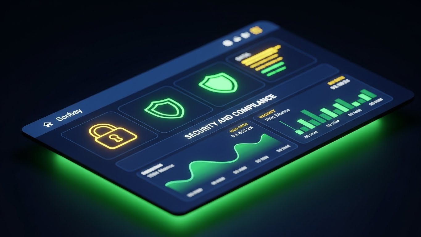
The Visual & Narrative Approach
Visualization Scenario: Addressing the IT Director's concerns, we present the interface in a sleek, high-contrast Dark Mode. The background is Midnight Blue, creating a secure, command-center atmosphere. Neon Green data accents, glowing lock icons, and shield symbols stand out sharply, visualizing active "Security and Compliance" protocols. The screen emits a soft, controlled glow, suggesting a system that is always on and always watching.
Narration Tone: Serious, protective, and secure. The narrative emphasizes "encryption," "rights management," and "enterprise-grade compliance."
Psychological Impact & KPI Focus
- Niche Psychology: For IT and Legal, the nightmare is a data breach or copyright lawsuit. This aesthetic triggers a feeling of safety. The "Dark Mode" is associated with professional developer tools and high-security environments.
- Operational Impact: It highlights the platform's role as a "Gatekeeper." It visually demonstrates that assets are locked down and only accessible to authorized personnel, mitigating the risk of misuse.
Strategic Implementation & Trade-offs
- Ideal Duration: 20–30 Seconds.
- Trade-off: The "security" focus can feel restrictive to creatives who want freedom. It is essential to balance this with messages about how security enables safe sharing, rather than preventing it.
Companies using similar video content -
Widen Collective – Visualizes asset utilization and performance data.
Digizuite – Provides tangible ROI visualization through dynamic data.
monday.com – Work OS, visualizing data for resource management.
16. Split Screen: Optimized Reality
BOFU | Economic Buyer
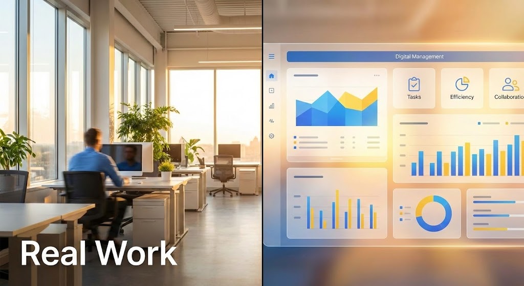
The Visual & Narrative Approach
Visualization Scenario: A vertical line divides the screen. The left side displays a high-quality photo of a real-world, sunlit modern office with a blurred professional working—the "Physical Reality." The right side mirrors this with a clean, abstract UI dashboard in Sunlight Yellow and Sky Blue—the "Digital Management" layer. The lighting matches perfectly across the divide, creating a seamless visual bridge between the employee working and the data being tracked.
Narration Tone: Pragmatic and integrative. It connects the dots: "Your team creates (left), we organize (right)."
Psychological Impact & KPI Focus
- Niche Psychology: Executives often struggle to see the connection between a software subscription and actual office productivity. This split-screen technique forces that connection, visually proving that the software is the digital twin of their physical operation.
- Operational Impact: It effectively visualizes "Real-time Visibility." As the figure on the left moves, the data on the right updates, proving that the MAM platform is pulse-checked to the rhythm of the business.
Strategic Implementation & Trade-offs
- Ideal Duration: 10–15 Seconds.
- Trade-off: Requires excellent stock photography that matches the brand's aesthetic. If the "Real World" side looks cheap, the "Digital" side loses credibility.
Companies using similar video content -
Hyland Nuxeo Platform – Assures enterprise security and compliance with dark UI.
OpenText Media Management – Focuses on robust rights management and security.
FotoWare – DAM, emphasizing enterprise security assurance.
17. Holographic UI over 3D Render
BOFU | Building Trust

The Visual & Narrative Approach
Visualization Scenario: To build trust in the platform's technological longevity, we use a futuristic aesthetic. A photorealistic white desk serves as the base. Hovering above it is a semi-transparent, Holographic Silver and Glass user interface. The UI elements cast faint, colored shadows onto the physical desk below, grounding the hologram in reality. The background is blurred in high-key white tones to keep focus on the interface.
Narration Tone: Innovative, sharp, and forward-looking. The audio might feature subtle sci-fi "humming" or "activation" sounds to enhance the high-tech feel.
Psychological Impact & KPI Focus
- Niche Psychology: Buyers want to invest in a platform that will still be relevant in 5 years. This holographic style signals "Next-Gen" technology, assuring them that they are buying into the future, not a legacy system.
- Operational Impact: The transparency of the UI metaphorically suggests that the software doesn't obscure the work; it layers intelligence over it. It represents an "Augmented" workflow rather than a replacement.
Strategic Implementation & Trade-offs
- Ideal Duration: 15–20 Seconds.
- Trade-off: It is an exaggeration of the actual UI. It must be clearly framed as a "conceptual visualization" of the technology's power, lest users feel misled when the actual interface isn't a floating hologram.
Companies using similar video content -
Bynder – Bridges physical team reality with digital platform efficiency.
Brandfolder – Integrates digital management with real-world operations.
18. Isometric 3D Workflow
BOFU | Functional Buyer

The Visual & Narrative Approach
Visualization Scenario: We visualize the "Perfect Process." An isometric, toy-like office floor plan shows the journey of an asset. Tiny, abstract figures (cylinders with spherical heads) sit at desks colored in Terracotta and Steel Blue. Glowing blue cables on the floor connect their stations, visualizing the flow of data. The scene is lit with soft studio lighting, making the office look like a perfectly organized, humming machine.
Narration Tone: Organized, process-oriented, and satisfying. The narrative tracks the asset: "From request... to approval... to distribution."
Psychological Impact & KPI Focus
- Niche Psychology: Operational managers crave order. This isometric view gives them a "God-like" perspective of their department, showing it running without errors. It satisfies the desire for control and visibility.
- Operational Impact: It clearly visualizes "Collaboration." The glowing cables show that no team member is an island; the software physically connects them, ensuring handoffs are automated and error-free.
Strategic Implementation & Trade-offs
- Ideal Duration: 30–60 Seconds (Looping sections).
- Trade-off: The stylized characters must remain abstract to avoid distraction. The focus must be on the connections (cables/flow), not the people.
Companies using similar video content -
Cloudinary – Showcases future-proof media technology with advanced UI.
CoreMedia – Content experience platform, innovative UI concepts.
Magnolia – DXP with DAM, future-proof technology.
19. Rapid UI Feature Montage
BOFU | Sales Cycle Acceleration
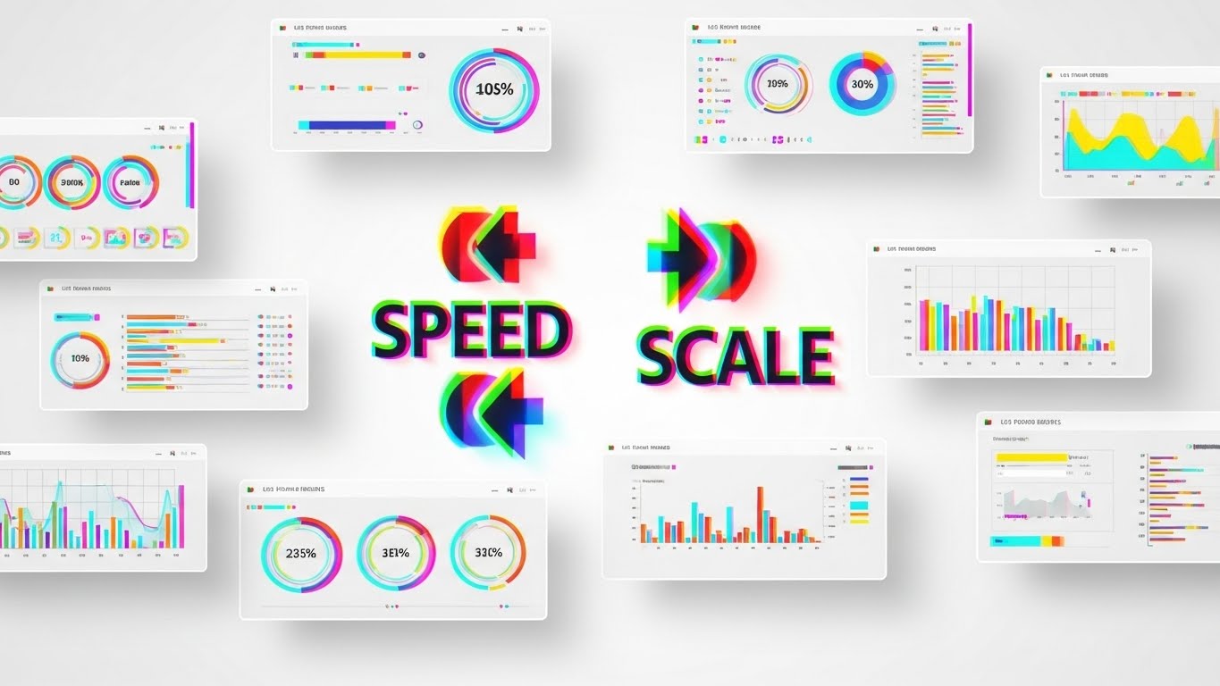
The Visual & Narrative Approach
Visualization Scenario: To overcome the "slow software" objection, we deploy a high-energy montage. Multiple UI screens slide rapidly from right to left, creating a "motion blur" effect. The color palette utilizes a RGB Glitch aesthetic (Red/Green/Blue shift) on a clean White background to convey digital speed. In the center, sharp, unblurred abstract symbols and text—"SPEED" and "SCALE"—lock into place, anchoring the chaos.
Narration Tone: Fast, rhythmic, and energetic. The pacing matches the visual velocity, listing features in rapid succession: "Tag. Search. Share. Done."
Psychological Impact & KPI Focus
- Niche Psychology: In a high-volume environment, speed is the ultimate currency. This style visually proves that the platform can keep up with the fastest teams. It combats the fear of "laggy" enterprise software.
- Operational Impact: It emphasizes "Scalability." The endless stream of screens implies that the system can handle thousands of users and millions of assets without slowing down.
Strategic Implementation & Trade-offs
- Ideal Duration: 6–10 Seconds (Bumper Ad).
- Trade-off: This is pure "feeling." It is too fast for actual feature learning. It serves purely to create an impression of performance and is best used as a retargeting reminder.
Companies using similar video content -
RoboHead – Visualizes operational efficiency in miniature office workflows.
Optimizely – Content Cloud, showing operational efficiency overview.
20. 2D Animation & UI Composition
BOFU | Objection Handling

The Visual & Narrative Approach
Visualization Scenario: Addressing the "User Adoption" hurdle, we use the friendly "Corporate Memphis" flat design style. A stylized character—a young professional woman in a Pastel Pink blazer and Navy trousers—is shown smiling. She effortlessly drags a large, simplified "File" icon into an open "Folder" icon. Floating checkmarks and cloud symbols surround her. The background is a soft Cream, making the scene feel warm and inviting.
Narration Tone: Cheerful, simple, and encouraging. The message is simple: "It just works. No training manual required."
Psychological Impact & KPI Focus
- Niche Psychology: The biggest barrier to ROI is employees refusing to use the tool. This approachable style disarms that resistance. It frames the software not as a "tool you must learn," but as a "helper that makes life easier."
- Operational Impact: It visualizes "Low Cognitive Load." The oversized icons and simple drag-and-drop action demonstrate that the complex taxonomy happens in the background, leaving the user with a simple, intuitive task.
Strategic Implementation & Trade-offs
- Ideal Duration: 15–20 Seconds.
- Trade-off: This style can feel "lightweight" to IT buyers who want "heavy" features. It is best targeted specifically at end-users or change management leaders, not the CIO.
Companies using similar video content -
MediaValet – Highlights high-velocity performance and scalability.
Canto – Showcases rapid search, share, and organization features.
Contentstack – Rapid UI for high-velocity performance.
21. Clean UI Workflow (Light Mode)**
Onboarding | Self-Serve Onboarding
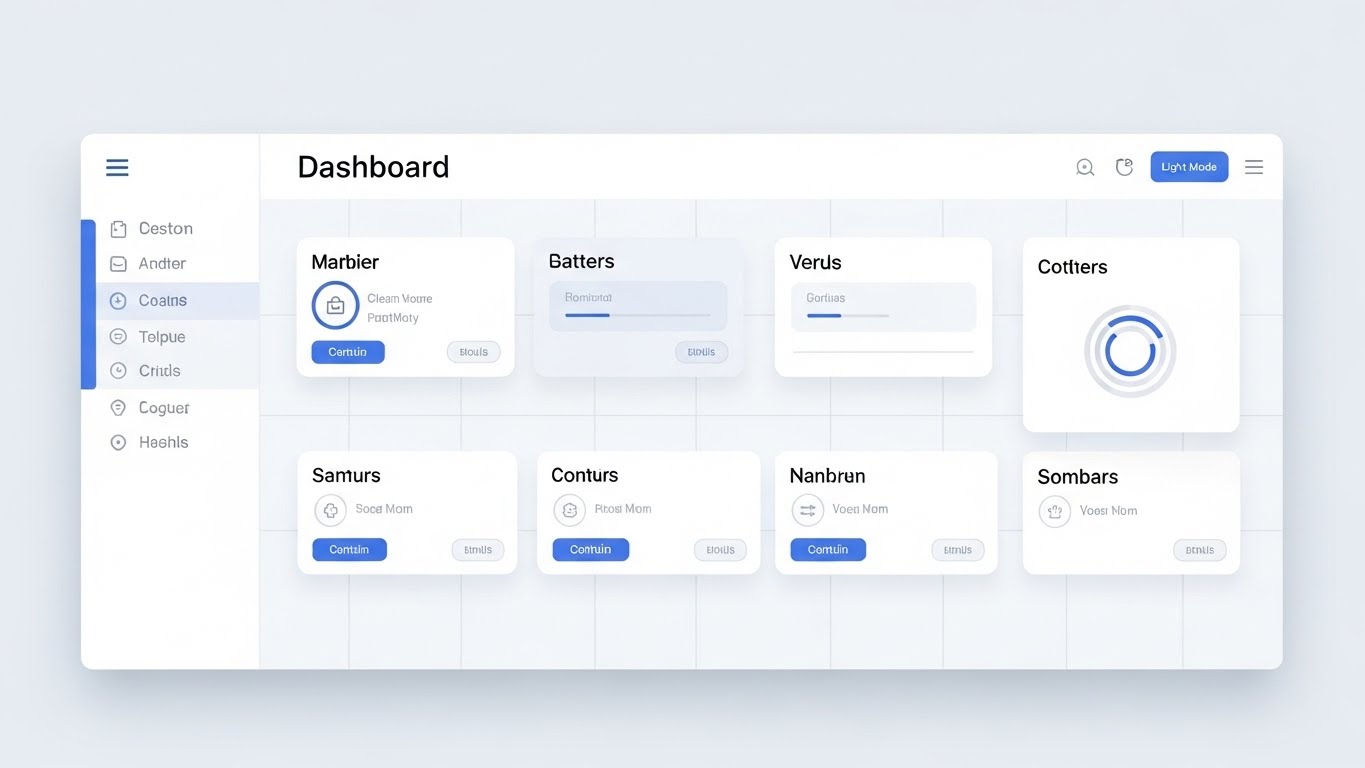
The Visual & Narrative Approach
Visualization Scenario: To combat "New Software Anxiety," we present the interface in its most pristine, accessible form. A straight-on, undistorted view of the dashboard uses a Clean White, Soft Blue, and Grey palette. Soft drop shadows give the UI cards a slight lift, creating a sense of hierarchy without clutter. The layout is perfectly gridded, visualizing "Clarity and Simplicity."
Narration Tone: Welcoming, clear, and paced. The audio guides the user gently: "Here is your command center. Everything you need, exactly where you expect it."
Psychological Impact & KPI Focus
- Niche Psychology: New users often feel overwhelmed by enterprise interfaces. This "Light Mode" aesthetic utilizes negative space to lower cognitive load, making the platform feel approachable and easy to master immediately.
- Operational Impact: It promotes Self-Sufficiency. By visually highlighting the logical layout, it encourages users to explore the tool independently, reducing the burden on training teams.
Strategic Implementation & Trade-offs
- Ideal Duration: 15–20 Seconds.
- Trade-off: While excellent for onboarding, it may lack the "dramatic flair" needed for top-of-funnel marketing. It is a functional style designed for clarity, not hype.
Companies using similar video content -
Image Relay – Promotes effortless adoption with friendly, animated visuals.
ResourceSpace – Uses simple animations for ease of use and adoption.
Strapi – User interaction for effortless adoption.
22. Macro UI Micro-Interactions
Onboarding | Trial User Activation

The Visual & Narrative Approach
Visualization Scenario: We zoom in—extreme macro—on a single, critical moment: the click. A "Publish" button, rendered in brushed Silver metal with a subtle lens flare, is depressed. A warm, satisfying Gold Glow emits from beneath it, signaling activation. This hyper-focused visual celebrates the "Moment of Action"—the split second where work becomes a result.
Narration Tone: Satisfying and punchy. A sound design-heavy approach emphasizes the "click" and the subsequent "whoosh" of data being released.
Psychological Impact & KPI Focus
- Niche Psychology: This triggers a dopamine response. It gamifies the mundane task of clicking a button, making the software feel tactile, responsive, and rewarding to use.
- Operational Impact: It drives Feature Activation. By making the key action (Publishing/Approving) look physically satisfying, it subtly encourages trial users to perform that specific action.
Strategic Implementation & Trade-offs
- Ideal Duration: 3–5 Seconds (Loop).
- Trade-off: It provides zero context about the wider workflow. It is a tactical asset meant to trigger a specific micro-behavior, not explain a process.
Companies using similar video content -
Frontify – Emphasizes a clear, simple interface for brand assets.
Acquia DAM – Provides pristine dashboard for cognitive clarity.
Kontent.ai – Headless CMS with clean UI workflow.
23. Hyper-lapse Stock Footage with Data
Onboarding | Time-to-Value

The Visual & Narrative Approach
Visualization Scenario: We contrast the chaotic speed of the modern world with the stability of the platform. A hyper-lapse background shows a city street in a blur of Motion streaks, while a sharp, semi-transparent smartphone frame hovers in the foreground. On the screen, a Bright Green "Campaign Launched" success message remains static and clear. This visualizes "Mobile Access" amidst a fast-paced environment.
Narration Tone: Dynamic and empowering. "The world moves fast. Your assets move faster. Control from anywhere."
Psychological Impact & KPI Focus
- Niche Psychology: Marketing managers fear being "out of the loop" when away from their desks. This style reassures them that they retain command and control via mobile, regardless of the chaos around them.
- Operational Impact: It highlights Remote Productivity. It proves that the approval chain doesn't break just because a stakeholder is commuting or traveling.
Strategic Implementation & Trade-offs
- Ideal Duration: 6–10 Seconds.
- Trade-off: The background footage must be carefully selected to ensure it doesn't distract from the UI overlay. If the background is too chaotic, the message gets lost.
Companies using similar video content -
Brandfolder – Celebrates tactile actions and moments of success.
Digizuite – Tactile action for success moments.
24. 2D Character-Driven Story
Retention | Knowledge Base

The Visual & Narrative Approach
Visualization Scenario: To humanize technical support, we use a friendly, flat vector illustration style. Two professionals in Warm Beige and Forest Green stand next to a giant question mark that transforms into a glowing lightbulb. They high-five, symbolizing a "Problem Solved" moment. The setting is a stylized, comfortable co-working space, creating a relaxed atmosphere.
Narration Tone: Empathetic, helpful, and friendly. "Stuck? We've got you. Find answers instantly and get back to creating."
Psychological Impact & KPI Focus
- Niche Psychology: Frustration with software errors leads to churn. This gentle, human-centric style lowers cortisol levels. It reframes a "problem" as a momentary pause before a solution, maintaining positive sentiment.
- Operational Impact: It promotes Self-Correction. By making the knowledge base look inviting rather than technical, it encourages users to seek answers there first, reducing support ticket volume.
Strategic Implementation & Trade-offs
- Ideal Duration: 15–30 Seconds.
- Trade-off: This style can feel "juvenile" if not executed with corporate polish. It is strictly for support and retention, not for selling high-ticket enterprise deals.
Companies using similar video content -
Brightcove – Video platform, mobile control amidst city velocity.
Vimeo Enterprise – Video platform, mobile access in fast-paced environments.
monday.com – City velocity, mobile control for work.
25. 2D Graphics Over Live Action
Retention | Support Overhead

The Visual & Narrative Approach
Visualization Scenario: We blend the physical and digital worlds to show real collaboration. A photo of a diverse team huddled around a laptop is overlaid with floating, Vivid Orange and Blue vector icons—checkmarks, speech bubbles, and sharing arrows. These graphics appear to interact with the people, visualizing the invisible flow of digital communication occurring between them.
Narration Tone: Collaborative and spirited. "Keep the conversation flowing. Annotate, approve, and move forward together."
Psychological Impact & KPI Focus
- Niche Psychology: Teams want to feel connected. This style validates the human element of marketing, showing that the software doesn't replace conversation—it enhances it.
- Operational Impact: It visualizes Collaborative Efficiency. The floating checkmarks suggest that approvals happen in real-time during the conversation, eliminating the "follow-up email" lag.
Strategic Implementation & Trade-offs
- Ideal Duration: 10–15 Seconds.
- Trade-off: Requires casting that perfectly reflects the target demographic's diversity and professionalism. Poor acting in the stock footage destroys credibility.
Companies using similar video content -
Storyblok – Headless CMS, uses friendly characters for solution discovery.
Contentful – Content platform, character-driven stories for empathetic support.
CoreMedia – DXP, solution discovery.
26. 3D Parallax UI Presentation
Retention | Reducing Churn

The Visual & Narrative Approach
Visualization Scenario: To remind existing customers of the platform's depth, we deconstruct the UI. Interface screens float in a 3D space, separated into layers (background, buttons, text, data) with significant Z-depth. The camera pans sideways, revealing the "stack" of technology in Depth Blue and White. The background is a soft, abstract office bokeh, suggesting the software is deeply integrated into the workspace.
Narration Tone: Sophisticated and reminder-focused. "Look deeper. Discover the power layers you haven't unlocked yet."
Psychological Impact & KPI Focus
- Niche Psychology: Customers churn when they feel they've "outgrown" a tool. This style visually suggests there is more beneath the surface—more features, more power, more value waiting to be utilized.
- Operational Impact: It visualizes Robust Architecture. It subtly communicates that the platform is not just a surface-level skin, but a deep, engineered solution capable of handling complex scaling.
Strategic Implementation & Trade-offs
- Ideal Duration: 20–30 Seconds.
- Trade-off: It is abstract. It doesn't teach how to use a feature, but rather sells the concept of the feature's depth.
Companies using similar video content -
Bynder – Enhances human collaboration with digital overlays.
Widen Collective – Visualizes human collaboration enhanced by digital tools.
27. Photorealistic 3D Renders
Expansion | Deep Feature Adoption

The Visual & Narrative Approach
Visualization Scenario: We re-imagine the software as a physical, premium object. A glowing, crystalline "Jewel Case" or server blade sits on a pristine white turntable. It is lit with high-key studio lighting, with Silver, White, and Blue LED accents. This metaphor elevates the software from "code" to "asset," visualizing the "Premium Value" of the platform.
Narration Tone: Luxurious, appreciative, and high-value. "The crown jewel of your marketing stack. Polished, powerful, and ready for more."
Psychological Impact & KPI Focus
- Niche Psychology: This appeals to the buyer's pride. It frames the software as a high-end possession, reinforcing the decision to renew or upgrade. It looks expensive, justifying the enterprise price tag.
- Operational Impact: The "sealed unit" visual implies security and integrity. It suggests a self-contained, perfect system that protects the brand's most valuable assets.
Strategic Implementation & Trade-offs
- Ideal Duration: 10–15 Seconds (Loop).
- Trade-off: It creates distance. It is an object to be admired, not used. It works best for high-level branding or expansion campaigns, not for functional training.
Companies using similar video content -
Adobe Experience Manager Assets – Showcases feature depth through deconstructed UI layers.
OpenText Media Management – Reveals robust architecture and feature depth.
Quark – Deconstructed layers, revealing feature depth.
28. Aspirational Stock Montage
Expansion | Driving Upsell

The Visual & Narrative Approach
Visualization Scenario: We sell the dream of scale. A cinematic shot captures a hiker reaching a mountain peak at sunrise, bathed in Golden light. Subtly overlaid in the sky is a white wireframe network graph connecting stars, visualizing "Unlimited Potential." The image evokes triumph, vision, and the expansive future that awaits the client.
Narration Tone: Triumphant, visionary, and expansive. "You've reached the summit. Now, look at the horizon. Let's go further."
Psychological Impact & KPI Focus
- Niche Psychology: Executives are motivated by growth. This visual metaphor connects the software platform to their personal and professional ascent. It aligns the vendor with the client's success.
- Operational Impact: It visualizes Scalability. The vast sky and network graph suggest that there are no limits to how big the network (and the company) can grow with this platform.
Strategic Implementation & Trade-offs
- Ideal Duration: 15–20 Seconds.
- Trade-off: It is pure pathos. If the accompanying case study data isn't strong, this visual will feel like empty marketing fluff. It requires substance to back the emotion.
Companies using similar video content -
Aprimo – Positions platform as a premium, digital jewel.
Northplains – DAM provider, conveying premium value.
censhare – Digital jewel, representing premium value.
29. Lifestyle Stock with UI Overlay
Expansion | Referrals

The Visual & Narrative Approach
Visualization Scenario: We showcase the platform in the real world. A professional woman with Warm Skin Tones sits in a bright, glass-walled conference room, genuinely smiling at her tablet. A subtle, abstract white line UI surrounds the device, indicating she is interacting with the platform. The background is soft office bokeh. This visualizes "Effortless Utility" in a human context.
Narration Tone: Authentic, testimonial-style, and trustworthy. "See how easy it is? Your network will thank you for sharing this."
Psychological Impact & KPI Focus
- Niche Psychology: Referrals are driven by social capital. Users only recommend tools that make them look good. This stylish, professional image creates a "halo effect," suggesting that using this tool is a sign of a modern, savvy professional.
- Operational Impact: It visualizes Adoption. The relaxed posture and genuine smile suggest that the software is a pleasure to use, not a burden, which is the strongest selling point for peer-to-peer recommendations.
Strategic Implementation & Trade-offs
- Ideal Duration: Static Image or 5 Second subtle motion.
- Trade-off: Requires high-end photography. Generic "people pointing at screens" stock photos will damage the brand's authenticity.
Companies using similar video content -
Optimizely – Content Cloud, inspiring unlimited potential and growth.
Crownpeak – DXP, focusing on visionary aspects of digital experience.
Magnolia – DXP with DAM, summit reach, unlimited potential.
30. Generative AI Realistic Character video
Expansion | Proactive Support

The Visual & Narrative Approach
Visualization Scenario: We utilize cutting-edge Generative AI to create a hyper-realistic "Success Manager." A professional man in a Navy blazer looks directly into the lens, simulating a video call. The lighting is flattering and high-end. He engages the viewer with helpful, trustworthy body language. This visualizes "Proactive Support"—a dedicated guide anticipating the user's needs.
Narration Tone: Personal, direct, and conversational. "Hi [Name], I noticed you're scaling up. Here are three ways to optimize your new workflow."
Psychological Impact & KPI Focus
- Niche Psychology: In a digital-first world, the "human touch" is a premium differentiator. This style scales that intimacy. It makes the customer feel personally attended to, increasing loyalty and openness to upsell suggestions.
- Operational Impact: It visualizes Automated Personalization. It demonstrates that the company uses advanced tech not just to manage assets, but to manage relationships at scale.
Strategic Implementation & Trade-offs
- Ideal Duration: 30–60 Seconds.
- Trade-off: The "Uncanny Valley" risk is high. The AI generation must be flawless. If the lip-sync or eye movement is off, it becomes creepy rather than helpful.
Strategic Knowledge Base: The Visual Operations Doctrine
This section synthesizes the 30 visual examples into a cohesive operational framework. We move beyond "style" to "strategy," defining how Marketing Asset Management (MAM) leaders can deploy these visuals to drive Adoption, Efficiency, and ROI.
Strategic Alignment & Visual Architecture
The "Pre-Production" Strategy: Defining the Visual Operating System
Before a single pixel is rendered, the visual architecture of your MAM platform must be aligned with the cognitive needs of your user base. This is not about decoration; it is about designing for comprehension.
-
1. The Cognitive Load Audit: Conduct a "Visual Audit" of your current training materials. If your text-to-visual ratio is higher than 3:1, you are creating friction. Replace dense PDFs with Style 21 (Clean UI Workflow) for onboarding to reduce the "intimidating" nature of enterprise software.
-
2. Role-Based Visual Mapping: Different users process information differently.
-
The Creators (Designers): Respond to Style 2 (Abstract Organic) and Style 13 (Cinematic). They need to see flexibility and beauty.
-
The Controllers (Admins/IT): Respond to Style 9 (Neon/Dark Mode) and Style 11 (X-Ray). They need to see structure, security, and data integrity.
-
3. The "Glanceability" Standard: In high-velocity marketing teams, users don't read; they scan. Adopt Style 5 (Minimalist Vector) for critical alerts and status updates. If a user cannot understand the asset status (Approved/Rejected) in under 1.5 seconds, the visual design has failed.
-
4. Brand Voice Consistency: Your DAM is the "Single Source of Truth." Its internal visuals must reflect the brand's external standards. Use Style 1 (Bold Kinetic Typography) within the portal to reinforce brand guidelines, ensuring the medium (the software) is the message (the brand).
-
5. The Advids Strategic Audit: Partner with a specialized visual agency to audit your "Visual Taxonomy." Just as you organize metadata, you must organize your visual communication types to ensure they are scalable and consistent across the entire user lifecycle.
-
6. Standardization vs. Customization: Use standardized Style 18 (Isometric Workflow) to explain fixed processes (e.g., "The Approval Loop") that apply to everyone. Reserve high-cost Style 30 (Gen AI) for high-value, personalized touchpoints like Account Renewal or Crisis Management.
-
7. The Cross-Departmental Bridge: Sales and Marketing often speak different languages. Use Style 16 (Split Screen) to visually demonstrate how a Marketing Asset (Left Screen) translates into a Sales Enablement Tool (Right Screen), visually proving the alignment between departments.
-
8. Legacy System Integration: When migrating from legacy servers, use Style 6 (Wireframe to Reality) to visualize the transition. Show the "Old World" as a static wireframe and the "New World" as a rendered reality to psychologically prepare users for the upgrade.
-
9. Accessibility in Global Ops: For multi-lingual global teams, rely on Style 2 (Abstract Organic) and Style 10 (Isometric). These styles rely on shape and motion rather than heavy on-screen text, reducing localization costs and ensuring universal comprehension.
-
10. The Mobile-First Mandate: Marketing happens on the go. Ensure that all instructional visuals, especially Style 23 (Hyper-lapse), are optimized for vertical viewing (9:16). If your training videos don't play well on a smartphone, you are ignoring the reality of the modern workflow.
Operational Adoption & Implementation
The "Deployment" Phase: Embedding Visuals into the Workflow
A platform is only as valuable as its adoption rate. This segment details how to use visual content to grease the gears of implementation and daily use.
- 11. Overcoming "Big Brother" Anxiety: Creative teams often fear MAM is a surveillance tool. Use Style 25 (Graphics Over Live Action) to visually reframe the software as a "Helper" that handles the boring admin work, freeing them to create.
- 12. The Micro-Learning Shift: Move from "Training Days" to "Training Moments." Embed Style 22 (Macro UI) GIFs directly into the software tooltips. Users learn the function exactly when they are trying to use it.
- 13. Just-in-Time Support: Integrate Style 24 (2D Character Story) into your helpdesk. A friendly, animated troubleshooting guide can de-escalate frustration faster than a text-based FAQ, turning a negative moment into a positive support interaction.
- 14. Gamification of Training: Use Style 1 (Kinetic Typography) visuals to celebrate training milestones. Turning "Certification" into a high-energy visual achievement encourages adoption through status and recognition rather than mandate.
- 15. Reducing Support Ticket Volume: There is a direct correlation between proactive visual guides and reduced support costs. A well-placed Style 20 (2D Animation) video addressing "Common Login Issues" can deflect thousands of Level 1 support tickets annually.
- 16. Remote Onboarding: For distributed marketing teams, you cannot rely on physical seminars. Use Style 26 (3D Parallax) to create an immersive, depth-filled "tour" of the platform that feels substantial and engaging for remote employees.
- 17. Visual SOPs (Standard Operating Procedures): Transform boring text SOPs into Style 10 (Isometric Factory) animations. Visualizing the "Assembly Line" of an asset helps users understand where their file goes after they click "Upload," increasing compliance.
- 18. Feedback Loops: Use Style 29 (Lifestyle UI) visuals in your user feedback surveys. Showing a happy, successful user acts as a subtle prompt, encouraging positive feedback and reinforcing the "Ideal User State."
- 19. Scalable Localization: Design your Style 19 (Rapid Montage) assets with separate text layers. This allows you to rapidly swap languages for different regional markets without re-rendering the complex background animations.
- 20. Leadership Communication: When presenting roadmap updates to the Board, do not use spreadsheets. Use Style 28 (Aspirational Montage) and Style 3 (Abstract AI) to sell the vision of the future. High-fidelity visuals prove that the platform is an evolving asset, not a stagnant cost.
Measuring Impact & Future-Proofing
The "ROI" Phase: Measuring Success and Looking Ahead
Visuals are an investment. This segment focuses on how to measure the return on that investment and prepare for the next generation of asset management.
- 21. Beyond "Views": Do not measure video success by "views." Measure Time-to-Competency. How much faster does a new user upload their first asset after watching a Style 21 (Clean UI) video? That time delta is your efficiency ROI.
- 22. The "Idle Time" Metric: High idle time on a dashboard indicates confusion. Correlate the deployment of Style 22 (Macro UI) guides with a reduction in user idle time. Good visuals propel users forward.
- 23. Compliance Velocity: In regulated industries, speed is safety. Use Style 15 (Dark Mode) to visualize Rights Management protocols. Measure the speed at which the organization achieves 100% compliance after a visual rollout versus a text email.
- 24. Retention and Churn: Visual quality impacts perceived value. Regular exposure to premium Style 27 (Photorealistic Jewel) assets reinforces the "Enterprise Grade" status of your tool, subtly defending against churn to cheaper, lower-fidelity competitors.
- 25. The AI Visual Frontier: Generative AI is changing the interface. Start using Style 30 (Gen AI Character) today to accustom your users to interacting with AI avatars. This "future-proofs" your user base for the coming wave of AI-driven conversational interfaces.
- 26. Scalability of Assets: Build a library that grows. Style 5 (Minimalist Vector) is highly scalable; you can add new icon assets easily as features are added. Avoid styles that rely on custom-shot footage that is impossible to replicate later.
- 27. The Advids Partnership: As your platform evolves, your visual library will decay. Advids acts as your long-term partner, ensuring that your visual assets evolve in lockstep with your software updates, preventing the "Visual Debt" of outdated training materials.
- 28. Benchmarking Success: Compare your visual strategy to the market. Top-performing SaaS companies use video for 80% of their knowledge base. If you are relying on text, you are competitively disadvantaged.
- 29. The ROI of Brand Safety: In MAM, "Safety" means preventing copyright lawsuits. Quantify the cost of a wrong asset going live. If Style 11 (X-Ray) helps users understand expiration dates, the ROI is the absence of legal costs.
- 30. Final Call to Innovation: Treat your video and visual strategy as Critical Infrastructure, not "marketing content." In a digital-first world, your visual guide is your headquarters. Invest in it with the same rigor you apply to your software code. A well-visualized platform is a used platform, and a used platform is a profitable one.
Companies using similar video content -
Frontify – Showcases effortless utility in a human context.
Kontent.ai – Headless CMS with DAM, seamless utility in lifestyle.
Author & Editor Bio


