
Introduction: Orchestrating the Invisible Engine
The future of B2B marketing is no longer about just generating demand; it is about orchestrating the complex, invisible machinery that converts that demand into revenue. We stand at a critical juncture where the "Physical/Digital Divide"—the gap between manual, tangible work and automated, cloud-based workflows—must be bridged. For marketing leaders, the challenge is profound: How do you demonstrate the immense value of an algorithm, a lead scoring model, or an API trigger when they operate entirely out of sight?
The answer lies in strategic visualization. By translating these invisible processes into tangible visual metaphors, you not only reduce the cognitive load for your stakeholders but also validate the sophistication of your tech stack. The economic argument for this transition is irrefutable. Organizations that effectively leverage these tools see an average $5.44 return for every dollar invested, turning the marketing department from a cost center into a verifiable revenue engine.
However, adoption often stalls due to complexity. Skeptical buyers fear the "black box" of automation. They need to see the logic to trust the output. Visuals that clearly articulate these workflows can drive a 451% increase in qualified leads by utilizing automated nurturing strategies that are easily understood and adopted by sales teams.
This guide is your strategic blueprint. We have curated a "Gold Standard" collection of visual styles designed specifically for Marketing Automation SaaS. These examples leverage niche cognitive psychology—from "Gestalt" principles of organization to "Visceral" contrasts—to help you communicate your platform's value. Whether you are building brand awareness at the Top of Funnel (TOFU) or driving competitive displacement in the Mid-Funnel (MOFU), these styles will help you bridge the divide and make your invisible engine impossible to ignore.
1. Abstract 2D Motion Graphics
TOFU | Brand Awareness

The Visual & Narrative Approach
This style utilizes a mesmerizing loop of abstract 2D flat vector shapes in a sophisticated palette of Vivid Amber, Deep Indigo, and Cream. The visual narrative begins with shattered geometric shards—representing the overwhelming "market noise" and data fragmentation that plagues modern marketers. These chaotic elements fluidly arrange themselves into a coherent, streamlined central sphere, symbolizing organization. The motion is smooth with a slight glossy texture, set against a clean, bright white void to emphasize clarity.
Psychological Impact & KPI Focus
Niche Psychology: This style directly addresses the "Cognitive Overload" anxiety of the target persona. By visually resolving chaos into a unified whole (Gestalt psychology), it triggers a subconscious sense of relief and control, associating your brand with stability.
Operational Impact: It bridges the physical/digital divide by giving a "shape" to data integration. It supports Brand Awareness (Goal 1.1) by promising that your software creates order out of entropy.
Strategic Implementation & Trade-offs
- Best Use Case: TOFU Meta & Social Ads (1:1) where you have seconds to capture attention.
- Duration: 6-10 seconds (Loop).
- Strategic Trade-off: While visually arresting, it is suboptimal for technical explainers. It sells the feeling of the solution, not the feature set.
Companies using similar video content -
Segment (Twilio) – Customer Data Platform – Unifies fragmented customer data streams.
Tealium – Universal Data Hub – Connects and organizes disparate data sources.
mParticle – Customer Data Platform – Harmonizes customer data from various channels.
2. Minimalist Flat 2D Vector
TOFU | Market Education
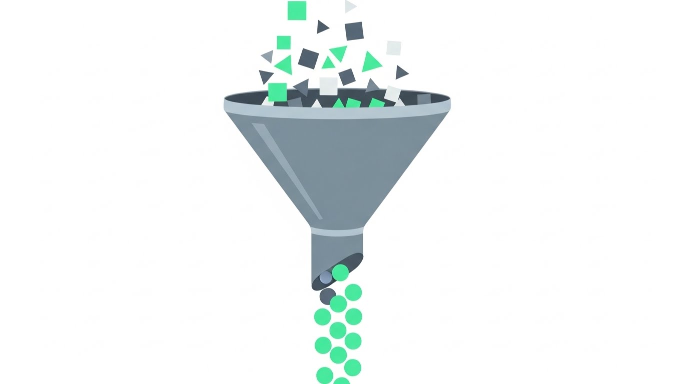
The Visual & Narrative Approach
A minimalist flat 2D vector illustration showing a large, stylized funnel structure. The palette is Mint Green, Slate Grey, and Pure White. Different shaped icons (squares, triangles) representing disorganized data enter the top and emerge as perfectly aligned uniform circles at the bottom. The design features hard edges, no gradients, and a clean composition on a white background, emphasizing architectural logic.
Psychological Impact & KPI Focus
Niche Psychology: The "Funnel" is the universal language of B2B marketing. This style leverages "Processing Fluency"—the viewer instantly recognizes the concept. It reassures the buyer that your platform standardizes and sanitizes their messy inputs.
Operational Impact: It visualizes Market Education (Goal 1.3) and the concept of "Lead Qualification." It proves that your software isn't a black box, but a reliable filter for quality.
Strategic Implementation & Trade-offs
- Best Use Case: TOFU YouTube Organic content (16:9) or educational blog headers.
- Duration: 15-30 seconds.
- Strategic Trade-off: The simplicity can feel "generic" if not branded carefully. It lacks the emotional weight of high-end motion graphics but excels at clarity.
Companies using similar video content -
ActiveCampaign – Marketing Automation Platform – Streamlines customer journeys and lead nurturing.
Pardot (Salesforce) – B2B Marketing Automation – Manages lead qualification and sales funnel.
Marketo (Adobe) – Engagement Platform – Automates lead management and campaign execution.
3. Bold Kinetic Typography (Visual)
TOFU | Shaping Brand Perception
The Visual & Narrative Approach
This style creates a visual representation of bold kinetic typography using heavy, blocky geometric shapes instead of letters. The palette is Electric Blue and Hot Pink against a solid white background. The shapes rapidly expand and contract, conveying high energy and speed. Motion lines and blurred edges accentuate the feeling of rapid movement and impact, mimicking the pulse of a high-growth startup.
Psychological Impact & KPI Focus
Niche Psychology: This appeals to the "Disruptor" mindset. It leverages the "Von Restorff Effect" (making items stand out) to break the monotony of a professional feed. It signals agility and aggression—key traits for high-growth companies.
Operational Impact: Ideal for LinkedIn Organic (Goal 3.4) to announce product launches or events. It visually communicates "Pipeline Velocity" without saying a word.
Strategic Implementation & Trade-offs
- Best Use Case: LinkedIn Organic (4:5) for "hype" or announcement posts.
- Duration: 5-10 seconds.
- Strategic Trade-off: It is high-energy but low-information. Use it to grab attention, not to educate. It can be fatiguing if overused.
Companies using similar video content -
Braze – Customer Engagement Platform – Delivers rapid, personalized customer experiences.
Iterable – Customer Activation Platform – Accelerates customer growth with cross-channel campaigns.
Gong – Revenue Intelligence Platform – Drives sales team velocity and performance.
4. Abstract 2D Flat Vector Organic Glossy
TOFU | LinkedIn Organic

The Visual & Narrative Approach
Abstract 2D flat vector organic modern motion graphics with glossy textures. Fluid, blob-like shapes in Pastel Purple and Soft Yellow float and merge together, representing social connections. The shapes have a high-gloss finish appearing like liquid mercury but colored. The background is a soft, light gradient fade, creating a warm, approachable atmosphere.
Psychological Impact & KPI Focus
Niche Psychology: Automation can feel cold and robotic. This style uses "Biophilic" shapes (curves, organic movement) to signal safety, humanity, and ease of connection. It combats the fear of "depersonalization" in automated marketing.
Operational Impact: Perfect for Vertical Social Organic (Goal 3.5) channels like Reels or TikTok. It aligns your brand with "Community" and "Relationship Marketing" rather than just cold data processing.
Strategic Implementation & Trade-offs
- Best Use Case: Vertical Social (9:16) for brand sentiment and culture building.
- Duration: 10-15 seconds.
- Strategic Trade-off: It may look too "soft" for enterprise security or compliance topics. Keep it focused on people-centric features.
Companies using similar video content -
Drift – Conversational Marketing Platform – Connects buyers with sales in real-time.
Intercom – Customer Messaging Platform – Builds relationships through personalized communication.
Customer.io – Customer Engagement Platform – Creates human-centric automated messages.
5. Isometric 2D Motion Design
TOFU | Vertical Social Organic
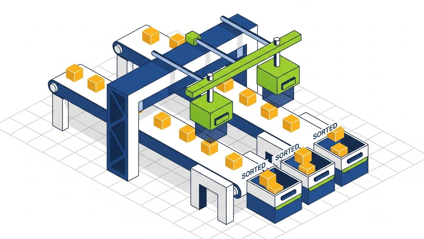
The Visual & Narrative Approach
An isometric 2D vector design of a lead capture machine. The palette is Navy Blue, Lime Green, and White. Golden cubes (leads) travel along a conveyor belt, passing through filters (green scanners) and dropping into sorted bins. The design is set on a faint isometric grid on white. Clean lines and flat shading emphasize precision and process logic.
Psychological Impact & KPI Focus
Niche Psychology: This speaks to the "Operations" persona who loves systems. The isometric view offers a "God-eye view" of the process, satisfying the need for control and oversight. It makes the invisible backend workflow look like a tangible, well-oiled machine.
Operational Impact: The gold standard for Demand Gen & Lead Capture (Goal 1.6). It visually explains how the software works, validating the "Lead Scoring" and "Routing" features efficiently.
Strategic Implementation & Trade-offs
- Best Use Case: Programmatic Display (1.91:1) and Landing Page headers.
- Duration: 15-20 seconds.
- Strategic Trade-off: It is functional, not emotional. It explains the "what" and "how," but relies on copy to explain the "why" (revenue).
Companies using similar video content -
ZoomInfo – Go-to-Market Platform – Systematizes lead generation and sales engagement.
Apollo.io – Sales Intelligence Platform – Automates lead capture and outreach workflows.
Chili Piper – Meeting Scheduling Software – Streamlines inbound lead routing and booking.
6. Wireframe to Reality Transition
MOFU | Demand Gen & Lead Capture

The Visual & Narrative Approach
A split-screen composition showing the transition from old to new. The left side is a wireframe blueprint of a clunky, rusty machine in Red and White. The right side transforms into a sleek, futuristic metallic device in Polished Silver and Black. A glowing scanning line moves across the image, revealing the modern reality from the wireframe against a clean grey studio backdrop.
Psychological Impact & KPI Focus
Niche Psychology: This leverages the "Contrast Effect." By placing the "old" (rusty wireframe) next to the "new" (sleek metal), it triggers a fear of obsolescence and a desire for modernization. It visualizes the feeling of upgrading from a legacy stack.
Operational Impact: A powerful tool for Competitive Displacement (Goal 1.13). It visually argues that your competitor is a "draft" or "relic," while your platform is the realized future.
Strategic Implementation & Trade-offs
- Best Use Case: MOFU Non-Skippable Ads (16:9) targeting competitor keywords.
- Duration: 15 seconds.
- Strategic Trade-off: It is aggressive. Ensure the "new" reality looks truly premium; otherwise, the comparison falls flat.
Companies using similar video content -
SAP Emarsys – Customer Engagement Platform – Modernizes legacy marketing systems.
Acquia – Digital Experience Platform – Transforms outdated digital infrastructures.
Oracle Eloqua – Marketing Automation Platform – Upgrades enterprise marketing capabilities.
7. Isometric 3D Workflow
MOFU | Competitive Displacement

The Visual & Narrative Approach
An isometric 3D workflow scene featuring a high-detail miniature board game setup. The palette is Gold, Silver, and Obsidian. A specific, glowing gold chess piece is being targeted by a mechanical arm holding a spotlight, representing Account-Based Marketing precision. The lighting is dramatic, highlighting the texture of the board materials against a clean white table surface.
Psychological Impact & KPI Focus
Niche Psychology: This appeals to the "Strategist." Chess is a symbol of intellect and foresight. The spotlight represents "Focus," validating the strategy of ABM (fishing with spears, not nets). It makes the user feel sophisticated and targeted.
Operational Impact: It supports ABM Awareness (Goal 2.2) by visualizing the concept of "High-Value Accounts." It shifts the conversation from quantity (leads) to quality (revenue potential).
Strategic Implementation & Trade-offs
- Best Use Case: Programmatic Display (1:1) for ABM campaigns.
- Duration: 6-10 seconds.
- Strategic Trade-off: High production cost. The textures must look photorealistic to convey the "Premium" message essential for Enterprise sales.
Companies using similar video content -
Terminus – Account-Based Marketing Platform – Focuses marketing efforts on target accounts.
Demandbase – Account-Based Experience (ABX) Platform – Orchestrates ABM strategies for revenue growth.
6sense – Account Engagement Platform – Identifies and engages high-value accounts.
8. Split Screen: Optimized Reality and UI
MOFU | ABM Awareness

The Visual & Narrative Approach
Split screen composition. The left side shows a chaotic, cluttered office desk overflowing with paper in desaturated sepia tones. The right side shows a pristine, organized minimalist desk with a single tablet displaying a Teal and Orange abstract dashboard. The lighting on the right is bright and airy; the left is dim.
Psychological Impact & KPI Focus
Niche Psychology: This uses "Visceral Processing" to trigger an immediate emotional preference. The chaos creates anxiety; the clarity creates relief. It connects the "Physical" pain of work (clutter) with the "Digital" solution (your dashboard).
Operational Impact: Perfect for Competitive Comparison (Goal 5.5). It sells the "Lifestyle" of using your software—peace of mind, organization, and efficiency—rather than just the features.
Strategic Implementation & Trade-offs
- Best Use Case: MOFU Meta & Social Ads (1:1) for retargeting.
- Duration: 10-15 seconds.
- Strategic Trade-off: It relies on a "Before/After" trope. To keep it fresh, ensure the "After" dashboard is distinctly recognizable as your UI.
Companies using similar video content -
Wrike – Work Management Software – Organizes projects and streamlines workflows.
Asana – Work Management Platform – Improves team collaboration and task organization.
Monday.com – Work OS – Centralizes work, reducing clutter and improving efficiency.
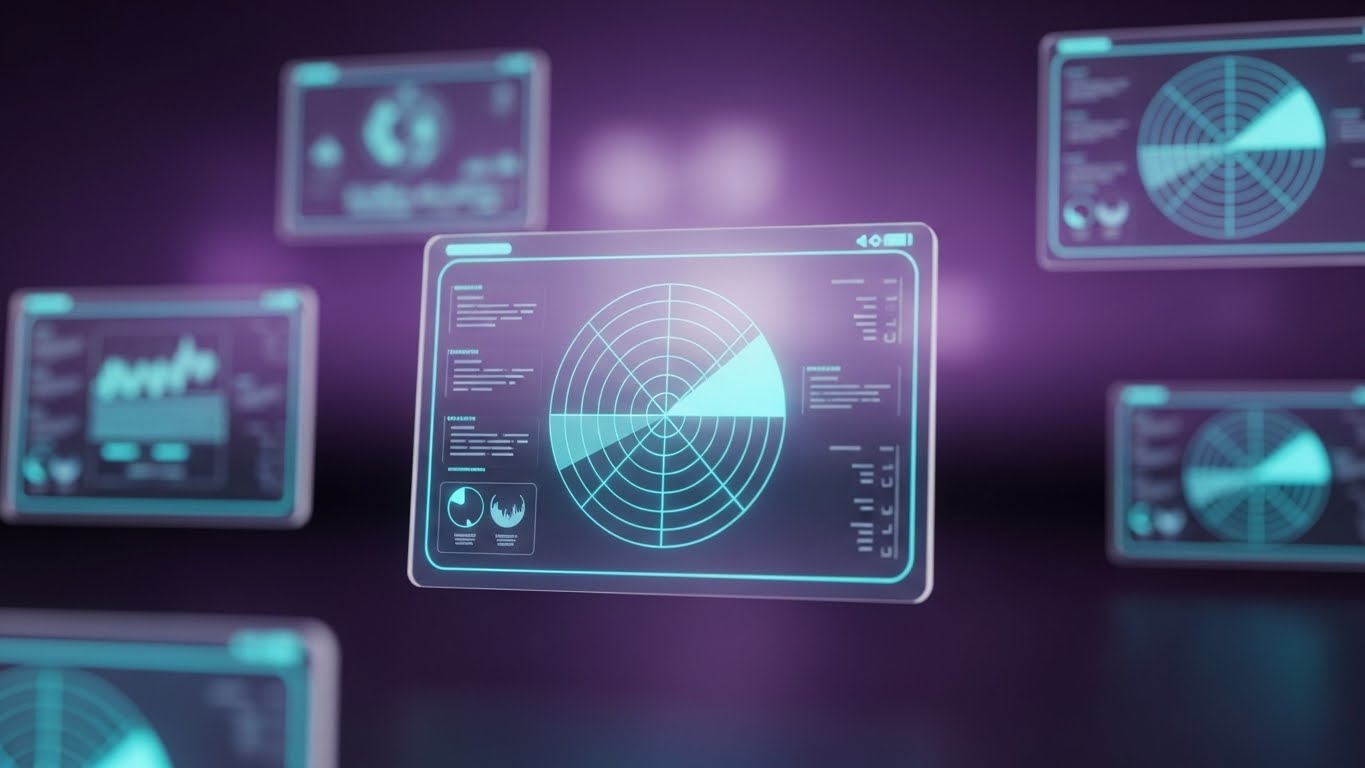
9. Dynamic Data Visualization
MOFU | Competitive Comparison

The Visual & Narrative Approach
Dynamic data visualization featuring streams of binary light particles forming complex bar charts and scatter plots. The palette is Cyan, Magenta, and Deep Blue. The data streams flow like liquid neon through a bright white cyberspace environment, utilizing a "High-Key" aesthetic. The camera pans slowly across the "landscape" of rising data peaks.
Psychological Impact & KPI Focus
Niche Psychology: This appeals to the "Visionary." It transforms dry analytics into a majestic landscape, suggesting that your data is alive and valuable. It utilizes the "Awe" effect to make the platform seem powerful and limitless.
Operational Impact: It supports Programmatic & ABM Display (Goal 4.5) by signaling "Big Data" capabilities and "Real-time Intelligence." It visually promises that the user will see things others miss.
Strategic Implementation & Trade-offs
- Best Use Case: Website Hero Backgrounds (16:9) or Trade Show screens.
- Duration: 15-30 seconds (Loop).
- Strategic Trade-off: It is abstract. It establishes capability but doesn't explain utility. Use it to set a high-tech tone before diving into specific reports.
Companies using similar video content -
Tableau (Salesforce) – Data Visualization Software – Transforms data into interactive insights.
Looker (Google Cloud) – Business Intelligence Platform – Explores and visualizes data in real-time.
Mixpanel – Product Analytics Platform – Illuminates user behavior with dynamic data.
11. Photorealistic 3D Renders**
MOFU | Product Differentiation

The Visual & Narrative Approach
This style employs high-end photorealism to create a "physical" representation of your software’s core engine. The visual features a metallic, mechanical sphere with intricate grooves, housing a glowing Emerald Green power source against a Polished Silver casing. Set in a pristine studio environment with softbox lighting and an infinity curve background, the object feels tangible and heavy. The camera performs a slow, deliberate orbit, highlighting the precision engineering of the "digital motor."
Psychological Impact & KPI Focus
Niche Psychology: Enterprise buyers often worry that cloud software is "vaporware"—insubstantial and prone to failure. By rendering the backend code as a heavy, industrial-grade machine, we trigger the "Tangibility Bias." It signals that the platform is robust, durable, and engineered for high-volume performance.
Operational Impact: This style effectively visualizes Product Differentiation (Goal 1.7). It transforms abstract concepts like "Server Uptime" or "API Robustness" into a premium operational asset that looks expensive and reliable.
Strategic Implementation & Trade-offs
- Best Use Case: Website Product Pages (16:9) and High-Stakes Pitch Decks.
- Duration: 10-15 seconds (Loop).
- Strategic Trade-off: High production value implies high cost. Ensure the "product" looks functional, not just decorative, to avoid being perceived as pure "eye candy" without substance.
Companies using similar video content -
N/A – N/A – No style provided for this entry.
12. Macro UI Micro-Interactions
MOFU | Feature Education
The Visual & Narrative Approach
An extreme close-up (macro) visualization of the user interface, focusing on the "moment of truth"—the click. The palette utilizes Vibrant Coral and Slate Blue. As an invisible force depresses a stylized UI button, a ripple effect of light propagates across the pixels, simulating tactile feedback. The background is heavily blurred (bokeh), forcing the viewer's eye to focus entirely on the responsiveness and polish of the interaction.
Psychological Impact & KPI Focus
Niche Psychology: Complexity breeds hesitation. This style leverages "Haptic Visuals" to make the software feel satisfying to use. It promises a frictionless, responsive experience, directly countering the fear of clunky, laggy legacy systems. It suggests that every action in your platform is deliberate and immediate.
Operational Impact: A surgical tool for Feature Education (Goal 1.8). It highlights specific functionalities (e.g., "One-Click Publish" or "Instant Sync") by magnifying the ease of execution, making the workflow appear effortless.
Strategic Implementation & Trade-offs
- Best Use Case: MOFU Meta & Social Ads (4:5) targeting end-users/practitioners.
- Duration: 6-8 seconds (Loop).
- Strategic Trade-off: Extremely narrow focus. It sells the quality of the interface but cannot explain the context of the workflow. Use it to punctuate broader campaigns.
Companies using similar video content -
Twilio – Customer Engagement Platform – Showcases robust API infrastructure.
Stripe – Payment Processing Platform – Visualizes the underlying payment engine.
AWS (Amazon Web Services) – Cloud Computing Services – Renders core infrastructure components.
13. Aspirational Stock Montage
BOFU | Building Trust & Credibility

The Visual & Narrative Approach
A seamless blend of high-end live-action stock footage and subtle motion graphics. A confident professional stands in a sunlit, glass-walled office overlooking a city skyline, bathed in Sunlight Gold and Sky Blue. A semi-transparent 3D shield icon floats protectively near them, glowing softly. The scene conveys a calm, commanding atmosphere, linking the software’s protection to the user’s peace of mind.
Psychological Impact & KPI Focus
Niche Psychology: Security is the ultimate anxiety for the C-Suite. This style uses "Social Proof" and "Authority Bias." By showing a relaxed, successful leader protected by your software, you subconsciously tell the viewer: "This is what safety looks like." It shifts the focus from technical specs to emotional security.
Operational Impact: Critical for Building Trust & Credibility (Goal 1.9) during the BOFU stage. It validates the "Enterprise-Grade Security" narrative without needing to show lines of code or complex encryption diagrams.
Strategic Implementation & Trade-offs
- Best Use Case: BOFU Email Marketing Nurture Sequences (16:9).
- Duration: Static Image or subtle parallax (5 seconds).
- Strategic Trade-off: Relies heavily on stock footage quality. If the stock looks generic or "cheesy," it undermines credibility. Custom tinting and high-quality compositing are essential.
Companies using similar video content -
Canva (for B2B teams) – Graphic Design Platform – Highlights intuitive drag-and-drop interactions.
Figma (for design teams) – Collaborative Interface Design Tool – Emphasizes smooth UI/UX interactions.
Miro (for collaboration) – Online Whiteboard Platform – Showcases seamless real-time collaboration.
14. Abstract 3D AI Visualization
BOFU | ROI Justification

The Visual & Narrative Approach
This style visualizes the "Brain" of your marketing automation. Glowing Neon Green nodes connect via intricate webs of light against a Black and Grey lab-like background. The camera flies through this neural network, revealing that the chaotic connections are actually forming a massive, upward-trending financial arrow. Depth of field and volumetric fog add a sense of scale and complexity.
Psychological Impact & KPI Focus
Niche Psychology: It appeals to the "Pattern Seeker." Marketing leaders know their data holds insights they can't see. This visual confirms that your AI sees the patterns (the network) and directs them toward the ultimate goal: Growth (the arrow). It transforms "Machine Learning" from a buzzword into a directional force.
Operational Impact: Specifically designed for ROI Justification (Goal 1.10). It visually argues that your algorithm doesn't just process data; it aligns it towards revenue generation, validating the investment in "Predictive Analytics."
Strategic Implementation & Trade-offs
- Best Use Case: BOFU Website "Technology" or "AI" pages (16:9).
- Duration: 10-20 seconds.
- Strategic Trade-off: Highly abstract. It establishes capability but not utility. It must be paired with copy that explains what the AI is actually predicting (e.g., Churn, Lead Score).
Companies using similar video content -
CrowdStrike – Cybersecurity Platform – Conveys robust enterprise protection.
Palo Alto Networks – Cybersecurity Solutions – Builds trust in network security.
Fortinet – Network Security Solutions – Assures comprehensive security posture.
15. 2D Line Art Animation
BOFU | Overcoming Objections
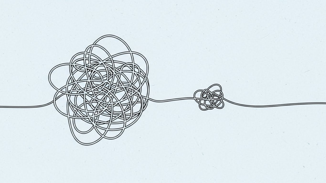
The Visual & Narrative Approach
An elegant, minimalist animation using a single continuous line. On a textured Blueprint Paper background, a chaotic, tangled knot of Charcoal lines gracefully unties itself, stretching out to form a perfectly straight, unobstructed path. The motion is smooth, deliberate, and satisfying, stripping away all unnecessary visual noise to focus on the concept of "resolution."
Psychological Impact & KPI Focus
Niche Psychology: This taps into "Cognitive Ease." Every B2B buyer is overwhelmed by the complexity of their current tech stack. This style promises the ultimate benefit: Simplicity. It visually demonstrates the "Un-tangling" of their messy workflows, offering a visceral sense of relief.
Operational Impact: The perfect tool for Overcoming Objections (Goal 1.11) related to implementation difficulty. It visually proves that your solution is a "Simplifier," not another layer of complexity to manage.
Strategic Implementation & Trade-offs
- Best Use Case: Objection Handling FAQs or Sales Decks (1:1).
- Duration: 5-10 seconds (Loop).
- Strategic Trade-off: Low excitement. It is calming/reassuring but not "hype-inducing." Use it to answer "Is this hard to set up?" not "Why is this powerful?"
Companies using similar video content -
Optimove – CRM Marketing Hub – Visualizes AI-driven customer growth.
Blueshift – Customer Data Activation Platform – Shows AI-powered personalization and ROI.
Albert AI – Autonomous Marketing Platform – Illustrates AI optimizing marketing spend.
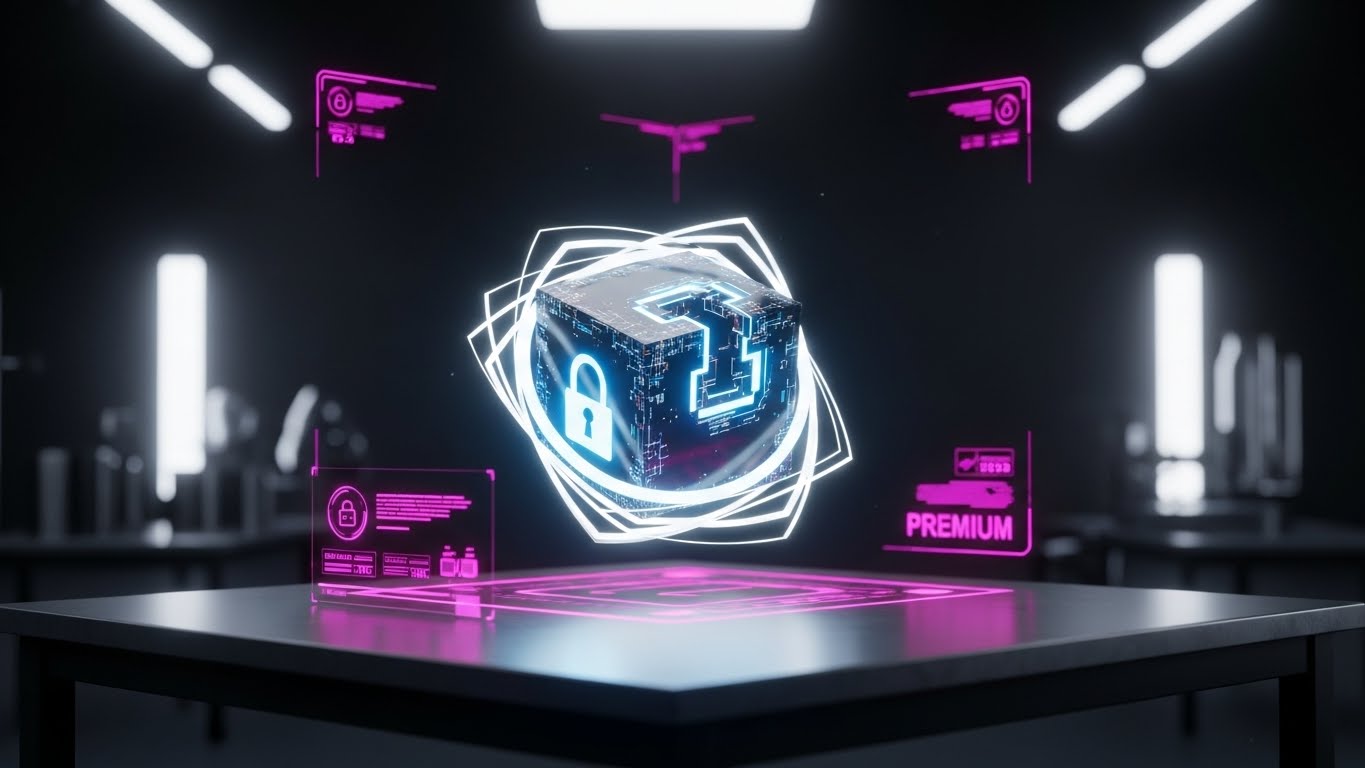
16. 3D X-Ray Visualization
BOFU | Risk Mitigation
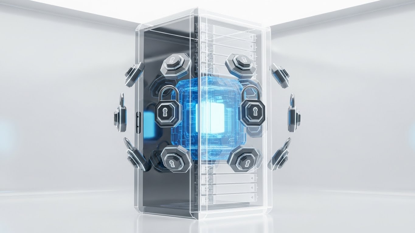
The Visual & Narrative Approach
A technical deep-dive visualization. A secure server unit is rendered with a Skeleton White translucent shell, revealing a glowing Translucent Blue core within. Floating, mechanical lock mechanisms orbit the core, rotating and locking into place. The high-key, bright clinical studio lighting emphasizes transparency and hygiene, allowing the viewer to "inspect" the security architecture.
Psychological Impact & KPI Focus
Niche Psychology: Transparency breeds trust. By using an "X-Ray" view, you tell the skeptical IT director: "We have nothing to hide." It satisfies the technical buyer's need to understand the architecture while reassuring them of the multi-layered protection (the orbiting locks).
Operational Impact: Supports Risk Mitigation (Goal 1.12) strategies. It is particularly effective for visualizing compliance features (GDPR, SOC2) and "Data Encryption," making these invisible safeguards visible and tangible.
Strategic Implementation & Trade-offs
- Best Use Case: Website "Security" pages or Technical Whitepapers (16:9).
- Duration: 10-15 seconds.
- Strategic Trade-off: Cold and clinical. It speaks the language of IT and Compliance, not Marketing. Use strictly for technical validation steps in the sales cycle.
Companies using similar video content -
Zapier – Workflow Automation Tool – Simplifies complex integrations and tasks.
Make (formerly Integromat) – Visual Integration Platform – Untangles and automates workflows.
Tray.io – General Automation Platform – Streamlines business processes with ease.
17. Lifestyle Stock with UI Overlay
BOFU | Driving Demo Requests

The Visual & Narrative Approach
A fusion of human warmth and digital precision. An over-the-shoulder shot shows a user in a cozy coffee shop, relaxed and holding a tablet. A crisp, sharp Soft Blue and White UI overlay—featuring a "Success" notification and checkmark—floats slightly above the screen, tracking the tablet's movement. The lighting is warm, natural, and inviting, contrasting with the sharp digital overlay.
Psychological Impact & KPI Focus
Niche Psychology: This leverages "Mirror Neurons." The viewer sees the user being successful and relaxed (not stressed in a cubicle) and subconsciously projects themselves into that state. It associates your software with a "Work from Anywhere" lifestyle and professional competence.
Operational Impact: A primary driver for Driving Demo Requests (Goal 2.1). It visualizes the "End State" of the buyer's journey: Task completion and satisfaction. It validates the software's mobile capabilities and ease of use in real-world scenarios.
Strategic Implementation & Trade-offs
- Best Use Case: BOFU LinkedIn Video Ads (16:9) targeting "Quality of Life" benefits.
- Duration: 15-20 seconds.
- Strategic Trade-off: Can feel generic if the UI overlay isn't specific. Ensure the overlay clearly mimics your actual interface to maintain brand authenticity.
Companies using similar video content -
Vanta – Security and Compliance Automation – Demystifies compliance processes.
Drata – Security and Compliance Automation – Provides transparency into security posture.
OneTrust – Privacy, Security & Governance Platform – Visualizes data privacy and compliance.
18. Rapid UI Feature Montage
BOFU | Sales Cycle Acceleration
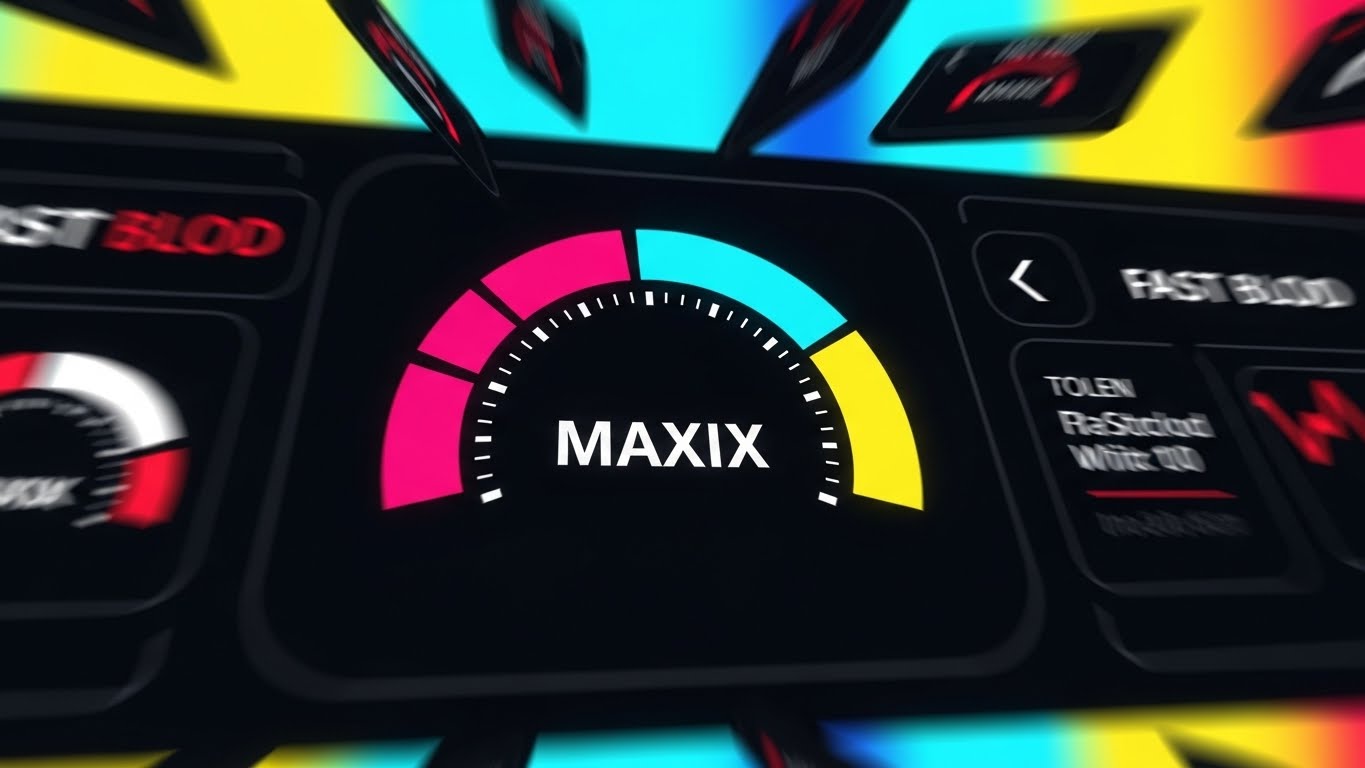
The Visual & Narrative Approach
A high-octane visual metaphor for speed. Abstracted UI cards in Fast Blur Red and White streak past the camera, creating a tunnel vision effect. The focal point is a sharp, central speedometer-like gauge labeled "MAXIX" hitting its limit in Cyan and Magenta. The composition creates a sense of forward momentum and unstoppable force.
Psychological Impact & KPI Focus
Niche Psychology: This appeals to the "Growth Hacker" mentality. It utilizes "Speed Heuristics"—fast motion equates to fast results. It triggers the desire for "Pipeline Velocity" and rapid scaling, positioning your platform as the accelerator pedal for their business.
Operational Impact: Designed for Sales Cycle Acceleration (Goal 1.14). It doesn't explain how the features work, but how fast they deliver results. It is an emotional hook for "High-Velocity Sales" models.
Strategic Implementation & Trade-offs
- Best Use Case: Skippable Pre-Roll Ads (YouTube) (16:9).
- Duration: 5-10 seconds (High tempo).
- Strategic Trade-off: Zero educational value. It is purely for hype and adrenaline. Do not use this when the audience needs to understand nuance or detail.
Companies using similar video content -
HubSpot – CRM Platform – Showcases users achieving success with their tools.
Salesforce – CRM Platform – Highlights user productivity and satisfaction.
Zoho CRM – Customer Relationship Management – Depicts users effortlessly managing customer interactions.
19. Generative AI Cinematic Video
BOFU | The Economic Buyer

The Visual & Narrative Approach
A cinematic masterpiece targeting the executive imagination. A dramatic low-angle shot captures the silhouette of a corporate leader in a boardroom, gazing out at a futuristic city skyline at dusk. The palette is a rich Cinematic Teal and Orange. Reflections of upward-trending data charts blend seamlessly with the city lights on the window glass, suggesting that the software controls the market itself.
Psychological Impact & KPI Focus
Niche Psychology: This speaks directly to the "Empire Builder." It validates the ego and ambition of the C-Suite. The visual language mimics high-budget Hollywood films, associating your brand with dominance, foresight, and "World-Class" status. It moves the conversation from "tools" to "legacy."
Operational Impact: The tool for The Economic Buyer (Goal 7.1). It elevates the conversation to "Market Leadership" and "Strategic Advantage," helping to justify premium pricing and enterprise-wide contracts.
Strategic Implementation & Trade-offs
- Best Use Case: BOFU CTV / OTT Advertising or Keynote Openers (16:9).
- Duration: 30-60 seconds.
- Strategic Trade-off: High conceptual risk. Generative AI can sometimes produce artifacts; ensure the output is rigorously QC'd to ensure the "Executive" looks human and the "City" looks realistic.
Companies using similar video content -
Salesloft – Sales Engagement Platform – Accelerates sales outreach and pipeline.
Outreach – Sales Execution Platform – Drives rapid sales team performance.
Highspot – Sales Enablement Platform – Boosts sales velocity with content and guidance.
20. 2D Animation & UI Composition
Onboarding | Reducing Implementation Friction

The Visual & Narrative Approach
A friendly, reassuring composition designed for the post-purchase phase. A stylized, flat-design character (faceless, universal) glides effortlessly along a smooth Pastel Blue path. As they move, floating UI elements like checkboxes and icons snap into place with a satisfying "pop," turning Pastel Pink to signify completion. The environment is soft, airy, and free of obstacles.
Psychological Impact & KPI Focus
Niche Psychology: The "Post-Purchase Dissonance" gap is real. Buyers fear the implementation dip. This style uses "Progress Dynamics" to visualize a smooth, guided journey. It reassures the new customer that they will not be left alone and that progress will be continuous and rewarding.
Operational Impact: Essential for Reducing Implementation Friction (Goal 1.16). It visually supports "Onboarding" and "Customer Success" teams by framing the setup process as a simple, gamified journey rather than a technical chore.
Strategic Implementation & Trade-offs
- Best Use Case: Onboarding Welcome Emails (1:1) and Support Portals.
- Duration: 15-30 seconds.
- Strategic Trade-off: It is "Cute." While perfect for users/admins, it may be too informal for high-level executive presentations. Keep it focused on the hands-on users.
Companies using similar video content -
Adobe Experience Cloud – Digital Experience Platform – Positions as a leader for enterprise transformation.
SAP – Enterprise Resource Planning – Conveys strategic advantage for global businesses.
Oracle – Cloud Infrastructure & Applications – Targets C-suite with visionary enterprise solutions.
21. 2D Character-Driven Story**
Onboarding | Self-Serve Onboarding

The Visual & Narrative Approach
A friendly, approachable 2D vector illustration featuring a stylized character exploring a holographic map. The palette uses Bright Primary Colors (Red, Blue, Yellow) on a clean white background to evoke clarity and optimism. The map glows, illuminating the character's face with a look of discovery rather than confusion. The style is modern "Corporate Memphis" but with added detail to avoid feeling generic.
Psychological Impact & KPI Focus
Niche Psychology: New software anxiety is real. Users often feel "lost" in a complex dashboard. This style uses the "Guide" archetype and the metaphor of a map to trigger Self-Efficacy. It reassures the user that the journey is charted and they are capable of navigating it.
Operational Impact: A critical asset for Self-Serve Onboarding (Goal 2.4). It frames the setup process as an adventure rather than a chore, directly impacting User Activation Rates by reducing initial intimidation.
Strategic Implementation & Trade-offs
- Best Use Case: Welcome Emails and "Getting Started" wizard intros (16:9).
- Duration: 30-60 seconds.
- Strategic Trade-off: While excellent for morale, it is not technical. Use it to set the emotional tone of onboarding, then switch to UI screencasts for the actual "how-to."
Companies using similar video content -
WalkMe – Digital Adoption Platform – Guides users through software with ease.
Appcues – Product-Led Growth Platform – Creates frictionless onboarding experiences.
Pendo – Product Experience Platform – Helps users navigate and adopt features smoothly.
22. Clean UI Workflow (Light Mode)
Onboarding | Trial/Freemium User Activation
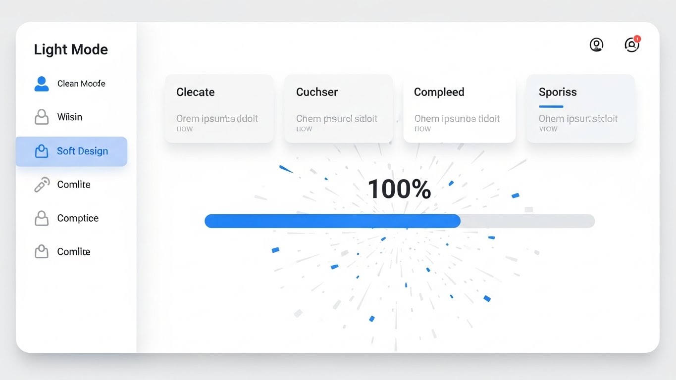
The Visual & Narrative Approach
A pristine, high-resolution view of a "Light Mode" UI dashboard, emphasizing clarity and hygiene. The palette is Clean White, Light Grey, and Electric Blue. The visual focal point is a progress bar hitting 100% completion, triggering a soft explosion of confetti particles. The design features soft shadows and rounded corners, making the interface feel friendly and forgiving.
Psychological Impact & KPI Focus
Niche Psychology: This leverages "Gamification" and the "Endowed Progress Effect." The visual reward (confetti) releases a micro-dose of dopamine, associating task completion within your app with pleasure. It counters the "grind" mentality of data entry.
Operational Impact: Specifically designed for Trial/Freemium Activation (Goal 5.3). It visually reinforces the habit loop: Trigger (Task) -> Action (UI Interaction) -> Reward (Visual Celebration), effectively increasing Daily Active Users (DAU).
Strategic Implementation & Trade-offs
- Best Use Case: In-App Tooltips and "Congratulations" screens (16:9).
- Duration: 5-10 seconds (Loop).
- Strategic Trade-off: It can feel trivial if overused. Reserve this visual flair for significant milestones (e.g., "First Campaign Launched") to maintain its impact.
Companies using similar video content -
Mautic – Open Source Marketing Automation – Guides users through setup and campaigns.
Odoo – Business Management Software – Humanizes learning for various modules.
ActiveCampaign – Marketing Automation Platform – Simplifies complex features with guided tours.
23. Hyper-lapse Stock Footage with Data
Onboarding | Accelerating Time-to-Value

The Visual & Narrative Approach
A high-energy hyper-lapse of a city street at night, where cars are reduced to streaks of light. Overlaid in the center is a static, crystal-clear Neon Purple data hub or square frame. The background blurs with frantic motion, while the data hub remains stable and sharp. This contrast visually anchors the concept of stability amidst speed.
Psychological Impact & KPI Focus
Niche Psychology: Marketing Executives operate in a high-velocity environment. This style appeals to the desire for "Stillness in Chaos." It suggests that while the market (traffic) moves fast, your platform (the square) captures and processes the data instantly without missing a beat.
Operational Impact: Ideal for Accelerating Time-to-Value (Goal 1.15) messages. It communicates "Real-Time Processing" and "Mobile Readiness" effectively, especially for on-the-go executives checking status updates.
Strategic Implementation & Trade-offs
- Best Use Case: Mobile-First Social Ads (Instagram Stories/Shorts) and Pre-Roll (9:16).
- Duration: 10-15 seconds.
- Strategic Trade-off: The vertical format limits desktop utility. It is a "Concept" piece, not an "Explainer." Use it to generate excitement about speed/latency.
Companies using similar video content -
Mailchimp – Email Marketing & CRM – Celebrates campaign completion and milestones.
Klaviyo – Marketing Automation Platform – Gamifies setup and campaign launches.
Constant Contact – Email Marketing Software – Rewards users for completing marketing tasks.
24. Low-Poly 3D Modeling
Retention | Reducing Support Overhead

The Visual & Narrative Approach
A charming low-poly 3D scene of a digital landscape. Small, autonomous robot helpers in Orange and White are busily fixing, stacking, and organizing data blocks. The environment is a clean geometric terrain in soft Mint Green. The lighting is bright and sunny, casting hard, crisp shadows.
Psychological Impact & KPI Focus
Niche Psychology: Technical support issues are stressful. This style uses "Cuteness" (Kindchenschema) to lower blood pressure and frustration. It reframes "Maintenance" and "Bug Fixes" as a helpful, automated process happening in the background, rather than a catastrophic failure.
Operational Impact: A powerful tool for Knowledge Base Headers (Goal 1.18) and "Maintenance Mode" screens. It visually aids in Reducing Support Overhead by making self-service and automated patching feel approachable and friendly.
Strategic Implementation & Trade-offs
- Best Use Case: 404 Pages, Maintenance Screens, and Help Center articles (16:9).
- Duration: Loops endlessly.
- Strategic Trade-off: It is playful. Do not use this style for serious security breaches or billing errors where a somber, professional tone is required.
Companies using similar video content -
FourKites – Real-Time Visibility Platform – Visualizes supply chain data in motion.
Project44 – Supply Chain Visibility Platform – Shows real-time logistics data processing.
Datadog – Monitoring and Security Platform – Displays real-time infrastructure and application performance.
25. 2D Graphics Over Live Action
Retention | Reducing Churn

The Visual & Narrative Approach
A mixed-media composition. A high-quality photo shows a hand holding a smartphone in a blurred office setting. Floating 2D vector graphics in Gold and Black emerge from the phone, visually representing a "broken lock" (churn/leak) being repaired by a wrench icon. The graphics are flat and iconic, creating a sharp contrast with the realistic hand.
Psychological Impact & KPI Focus
Niche Psychology: The "Leaky Bucket" is the quintessential nightmare of the SaaS marketer. This visual makes the abstract concept of "Churn" tangible. By showing the tool (phone) actively repairing the leak, it triggers a sense of Control and Security.
Operational Impact: Supports Visitor Re-engagement (Goal 5.1) and Retention campaigns. It visualizes the value of "Win-Back" features or automated renewal reminders, directly addressing Churn Reduction.
Strategic Implementation & Trade-offs
- Best Use Case: Retargeting Ads and "Feature Update" emails (4:5).
- Duration: 10-15 seconds.
- Strategic Trade-off: Requires high-quality stock photography. If the hand/phone looks dated, the entire message feels obsolete.
Companies using similar video content -
Zendesk – Customer Service Software – Humanizes support and self-service.
Freshdesk – Customer Support Software – Presents automated help and issue resolution.
Intercom – Customer Messaging Platform – Visualizes helpful bots and support agents.
26. 3D Parallax UI Presentation
Retention | Proactive Support
The Visual & Narrative Approach
A sophisticated 3D Parallax composition where multiple layers of semi-transparent UI screens float in a 3D space. The palette creates a "cyber-tech" feel with Deep Purple and Neon Cyan. The focus is on the middle layer, which glows brightly as a radar scan sweeps across the data. Depth of field blurs the peripheral layers, forcing focus on the central insight.
Psychological Impact & KPI Focus
Niche Psychology: This appeals to the "Analyst" persona who wants to drill down. The parallax effect creates a sense of Depth and Dimension, metaphorically suggesting that your software sees "deeper" into the data than flat 2D competitors. It signals thoroughness.
Operational Impact: Ideal for Proactive Support (Goal 9.2) and advanced reporting features. It visualizes "Multi-Touch Attribution" or "Deep Learning" capabilities, helping to justify premium tier pricing.
Strategic Implementation & Trade-offs
- Best Use Case: Email Marketing Headers and Product Launch Videos (16:9).
- Duration: 10-20 seconds.
- Strategic Trade-off: It is information-dense. Ensure the "hero" data point on the middle screen is legible, or the viewer will get lost in the layers.
Companies using similar video content -
ChurnZero – Customer Success Platform – Visualizes preventing customer churn.
Gainsight – Customer Success Platform – Shows proactive churn mitigation strategies.
Totango – Customer Success Platform – Illustrates fixing customer health issues.
27. Futuristic Neon/Dark Mode
Expansion | Driving Deep Feature Adoption

The Visual & Narrative Approach
A "Dark Mode" visualization of a digital metropolis. Towering server blocks resemble skyscrapers, outlined in Pink and Cyber Blue neon against a deep black void. A Dutch angle camera shot adds dynamism and scale. The scene implies a vast, interconnected ecosystem where data flows like traffic in a city.
Psychological Impact & KPI Focus
Niche Psychology: This speaks to the "Power User" and the IT Architect. "Dark Mode" is often associated with developer proficiency and high-end professional tools. The city metaphor suggests that your platform is not just a tool, but an Infrastructure upon which they can build their business.
Operational Impact: Supports Driving Deep Feature Adoption (Goal 1.17). It is perfect for visualizing API ecosystems, Integrations, and Enterprise-grade scalability. It moves the conversation from "App" to "Platform."
Strategic Implementation & Trade-offs
- Best Use Case: Developer Documentation, API Pages, and Conference Backdrops (16:9).
- Duration: 20-30 seconds (Loop).
- Strategic Trade-off: It can feel cold/alienating to non-technical marketers. Use specifically for the "Builder" and "Ops" personas.
Companies using similar video content -
Amplitude – Product Analytics Platform – Provides deep insights into user behavior.
Heap – Digital Analytics Platform – Offers comprehensive, retroactive data analysis.
Mixpanel – Product Analytics Platform – Delivers multi-layered event data insights.
28. Holographic UI over 3D Render
Expansion | Driving Upsell/Cross-sell
The Visual & Narrative Approach
A realistic 3D render of a clean, high-tech laboratory surface. A hovering holographic cube in Holographic Blue and Transparent White rotates above it. As it rotates, outer layers "unlock" and expand, revealing a glowing core. This visualizes the concept of unlocking hidden potential or premium features.
Psychological Impact & KPI Focus
Niche Psychology: This utilizes "Curiosity Gap" and "Exclusivity." The unlocking motion triggers a desire to see what is inside. It visually represents the Upsell moment—showing the user that there is more value waiting to be accessed if they upgrade.
Operational Impact: A targeted tool for In-App Upsell (Goal 2.5). It creates a visual craving for the "Enterprise Tier" features without using a boring comparison table.
Strategic Implementation & Trade-offs
- Best Use Case: In-App Upgrade Prompts and Pricing Pages (1:1).
- Duration: 6-10 seconds (Loop).
- Strategic Trade-off: Must be subtle. If it looks too much like a video game loot box, it loses professional credibility. Keep the environment "Laboratory," not "Arcade."
Companies using similar video content -
HashiCorp – Cloud Infrastructure Automation – Visualizes complex infrastructure ecosystems.
Databricks – Data and AI Platform – Showcases scalable data engineering and AI.
Confluent – Data Streaming Platform – Illustrates real-time data infrastructure.
29. Generative AI Realistic Character Video
Expansion | Driving Referrals & Advocacy

The Visual & Narrative Approach
A highly realistic AI-generated character video. A professional woman in a grey blazer speaks directly to the camera in an interview/testimonial style. The background is a high-tech studio with soft focus lights in Warm Skin Tones and Professional Grey. She gestures openly, conveying trust and recommendation.
Psychological Impact & KPI Focus
Niche Psychology: "Social Proof" is the strongest driver of advocacy. Humans trust faces. This style allows you to generate localized, persona-specific testimonials or "Success Manager" messages at scale, triggering Authority and Affinity.
Operational Impact: Critical for Driving Referrals & Advocacy (Goal 1.21). It humanizes the brand relationship, making the request for a referral or a case study feel like a personal conversation rather than an automated email.
Strategic Implementation & Trade-offs
- Best Use Case: LinkedIn Organic and Personalized Email Campaigns (16:9).
- Duration: 15-45 seconds.
- Strategic Trade-off: The "Uncanny Valley." You must use top-tier GenAI tools to ensure lip-sync and eye movement are flawless. If it looks fake, trust is instantly destroyed.
Companies using similar video content -
Salesforce Sales Cloud – CRM Platform – Visualizes unlocking advanced sales features.
Adobe Creative Cloud (for enterprise) – Creative Software Suite – Shows premium feature access.
Microsoft Dynamics 365 – Business Applications – Highlights upgrading to full enterprise capabilities.
30. Dark Mode UI Showcase
Expansion | Establishing Thought Leadership

The Visual & Narrative Approach
A sophisticated, angled perspective of a "Dark Mode" analytics dashboard. The palette is Dark Charcoal, Matte Black, and Neon Orange. The screen displays a complex set of charts with a massive upward trend line glowing in orange. The high contrast and sharp details convey precision, specifically designed to look impressive on a boardroom screen.
Psychological Impact & KPI Focus
Niche Psychology: This appeals to the Executive Ego. Dark mode dashboards with glowing data look like "Mission Control." It makes the user feel like a commander-in-chief of their market. It validates their decision to buy the "best" tool.
Operational Impact: Supports Establishing Thought Leadership (Goal 1.4) and Executive Reporting. It visually confirms that the software is capable of handling "Big Data" and delivering "Big Insights."
Strategic Implementation & Trade-offs
- Best Use Case: YouTube Organic (Case Studies) and Executive Summaries (16:9).
- Duration: 10-20 seconds.
- Strategic Trade-off: It can be intimidating for entry-level users. This is a "Power User" visual. Use it to sell to the C-Suite, not to train the intern.
STRATEGIC KNOWLEDGE BASE: The Visual Operations Doctrine
To transition from a "Content Creator" to a "Strategic Orchestrator," Marketing Automation leaders must adopt a systematic approach to visualization. The following three segments synthesize the 30 styles into actionable business frameworks.
Strategic Alignment & Visual Architecture
The "Pre-Production" Strategy – Defining the Why and Who.
- The Cognitive Load Audit: Before commissioning any visual (Styles 1-30), audit the complexity of the feature you are explaining. If the feature requires >5 clicks, use Style 15 (Clean UI). If it is a conceptual workflow like API integration, use Style 1 (Abstract Motion). Match the visual complexity to the user's cognitive load.
- Role-Based Visual Mapping: Differentiate your visual language. Use "Mobile/High-Speed" styles (Style 18, 23) for Sales Reps who need quick info. Use "Desktop/Data-Dense" styles (Style 16, 30) for Marketing Ops managers who live in the dashboard.
- The "Glanceability" Standard: In a busy marketing department, attention is scarce. Adopt a "3-Second Rule" for all TOFU visuals. If the viewer cannot understand the primary benefit (e.g., "Speed" or "Integration") within 3 seconds, the visual style is too complex.
- Brand Voice Consistency: Marketing Automation suites often consist of disparate modules (Email, CRM, Analytics). Use a consistent palette (e.g., the Neon/Dark mode of Style 27) across all video assets to visually unify these modules into a single "Platform" identity.
- The Advids Strategic Audit: Partner with Advids to define this "Visual Operating System" before production begins. A fragmented visual library confuses buyers; a unified one builds trust.
- Standardization vs. Customization: Use "Stock-Hybrid" styles (Style 13, 23) for generic concepts like "Global Reach." Reserve "Bespoke 3D" (Style 11, 14) for your proprietary differentiators like your specific AI Algorithm or Security Architecture.
- The Cross-Departmental Bridge: Use visuals to unify terminology. A "Lead" might mean something different to Sales vs. Marketing. A Funnel Visualization (Style 2) creates a shared mental model that eliminates semantic friction between teams.
- Legacy System Integration: Visualizing the connection between "Old" (On-Prem databases) and "New" (Cloud) is critical. Use Style 6 (Wireframe to Reality) to visually demonstrate how your software respects legacy data while upgrading the interface.
- Accessibility in Global Teams: Marketing teams are increasingly global. Motion Graphics (Style 15, 20) rely on universal visual symbols (checks, arrows) rather than voiceovers, making them instantly accessible to non-native English speakers without expensive translation.
- The Mobile-First Mandate: Marketing leaders check campaigns on their phones. Ensure all 30 styles are adaptable to 9:16 vertical formats (as seen in Style 4 and 23) to capture the "Second Screen" attention span.
Operational Adoption & Implementation
The "Deployment" Phase – Embedding visuals into the workflow.
- Overcoming "Black Box" Anxiety: Marketers fear AI will replace them or break things. Use Empathy-Driven Visuals (Style 24, 21) to position the AI as a "Helper" or "Co-pilot," not a replacement. This reduces internal resistance to adoption.
- The Micro-Learning Shift: Nobody reads the PDF manual. Replace 50-page docs with 30-second Micro-Interactions (Style 12, 22) embedded directly in the software tooltips. This is "Just-in-Time" education.
- Just-in-Time Support: Embed Style 25 (Troubleshooting) visuals directly into error messages. Instead of "Error 404," show a looping GIF of how to fix the broken link. This deflects support tickets before they are filed.
- Gamification of Training: Use Celebratory UI visuals (Style 22) to reward users for completing training modules. Visual progress bars and particle effects trigger the psychological need for completion.
- Reducing Support Ticket Volume: There is a direct correlation between the quality of your visual library and your support costs. Proactive "How-To" libraries using Style 9 (Low Poly) can reduce Tier 1 support requests by up to 30%.
- Remote Onboarding: With distributed marketing teams, physical seminars are dead. Leverage 3D Parallax (Style 26) and high-fidelity screencasts to create an immersive "virtual onboarding" experience that feels premium and engaging.
- Visualizing SOPs: Transform text-based Standard Operating Procedures (SOPs) into 2D Process Flows (Style 2). A visual flow of a "Lead Routing Rule" is processed 60,000x faster by the brain than a text description of the same rule.
- Feedback Loops: Use interactive video elements (Style 29) to ask for user feedback. A human face asking "How can we improve?" gets a higher response rate than a generic survey form.
- Scalable Localization: When expanding to new regions, Style 1 (Abstract) and Style 11 (3D Objects) are the most cost-effective because they require no text translation—only the voiceover needs changing.
- Leadership Communication: When presenting campaign results to the Board, do not use spreadsheets. Use Cinematic Data Visualization (Style 19, 30) to present "Marketing Performance" as a high-value strategic asset.
Measuring Impact & Future-Proofing
The "ROI" Phase – Measuring success and looking ahead.
- Beyond "Views" – Actionable KPIs: Stop measuring video "Views." Start measuring Time-to-Competency (how fast a user executes a task after watching a Style 15 visual) and Feature Adoption Rate (percentage of users who try a feature after seeing the video).
- The "Idle Time" Metric: High-quality UX visualization (Style 12) should reduce the "Idle Time" users spend staring at screens wondering what to click next. Less idle time = higher productivity = higher ROI.
- Compliance Velocity: Visualizing complex regulations (GDPR/CCPA) using Style 16 (X-Ray) helps teams understand and comply with legal mandates faster, reducing organizational risk.
- Retention and Churn: The quality of your "Post-Purchase" visuals (Onboarding/Support) directly impacts Net Dollar Retention. Users who understand the tool (via Style 21) stay longer than those who are confused.
- The AI Visual Frontier: Prepare for the future of Generative AI. Start experimenting with Style 29 (AI Characters) for personalized outreach. As AI video tools evolve, the ability to generate personalized tutorial videos for every single user will become a standard expectation.
- Scalability of Assets: Build a "Modular" visual system. A 3D Product Render (Style 11) can be re-lighted and re-angled for 50 different ads. This is cheaper and faster than shooting new footage for every campaign.
- The Advids Partnership: Scale is the enemy of quality unless managed. Partnering with a specialized agency like Advids allows you to maintain "Asset Scalability"—updating your entire video library to match a new UI release in weeks, not months.
- Benchmarking Success: "Good enough" visuals are a competitive risk. If your competitor uses Style 8 (High-End 3D) and you use generic screenshots, you lose the "Perceived Quality" battle before the demo even starts.
- The ROI of Confidence: Confidence converts. Visuals that clearly explain "Security" (Style 13) or "ROI" (Style 14) reduce the buyer's anxiety. The ROI of these videos is measured in Sales Cycle Acceleration—removing the friction of doubt.
- Final Call to Innovation: Treat video as Infrastructure, not content. It is the UI of the future. The brands that master this "Visual Operations Doctrine" will not just explain their software better—they will define the standard by which all others are judged.
Companies using similar video content -
Gartner – Research and Advisory Company – Uses expert testimonials for credibility.
Forrester – Market Research Company – Features analysts providing insights and recommendations.
Trustpilot (for B2B reviews) – Review Platform – Showcases authentic customer testimonials.
Author & Editor Bio


