
Introduction: The Visualization of Culinary Intelligence
The global food service industry is currently navigating a profound "Physical/Digital Divide." For SaaS founders and marketing leaders in the meal planning space, the challenge is no longer just about building superior algorithms; it is about translating that invisible logic into a visual language that resonates with the chaotic, sensory reality of a commercial kitchen.
The market opportunity is aggressive. The AI-driven meal planning apps market is projected to reach $1.98 billion by 2029, driven by a desperate need for efficiency in low-margin environments. Yet, in this crowded landscape, adoption often stalls due to skepticism. Culinary directors and operations leads fear "vaporware"—software that looks good in a pitch deck but fails in the heat of service. They need proof that your digital tools can deliver tangible physical results, such as the $318 million in 2023 saved in food waste by industry leaders utilizing advanced tracking features.
To capture this market, your video strategy must do more than show screen recordings. It must visualize competence. It must show how a line of code protects a margin, how an API reduces waste, and how a digital plan becomes a perfect plate.
This guide provides a "Gold Standard" framework of 30 video styles, curated to dismantle objection and accelerate trust at every stage of the funnel. These visuals are designed to reduce cognitive load, articulate complex value propositions, and prove that your software is the operating system the modern kitchen has been waiting for.
1. Minimalist Flat 2D Vector
TOFU | Brand Awareness

The Visual & Narrative Approach
This style visualizes the primary promise of your software: Order from Entropy. The composition is stark and clinical—a shadowless pale gray background. A vibrant lime green citrus fruit (representing raw, organic inventory) sits in the center. In a seamless, sharp-edged animation, the fruit morphs into a segmented data pie chart. The transformation is instant and precise. The narrative is one of synthesis: "We translate the organic world of food into the structured world of business intelligence."
Psychological Impact & KPI Focus
Niche Psychology: Decision-makers in food service are often overwhelmed by the "messiness" of their data (variable weights, spoilage). This minimalist style leverages the Aesthetic-Usability Effect, signaling that your platform is a tool of clarity and precision. It reduces Cognitive Load immediately.
Operational Impact: It visually separates your brand from the chaos of the kitchen, positioning you as the "Clean Data" solution.
Strategic Implementation & Trade-offs
- Best Use Case: Website Hero Sections, High-Level Brand Intros.
- Duration: 15 Seconds.
- Trade-off: Excellent for conceptual clarity, but lacks the emotional "appetite appeal" of food photography. Do not use this to sell culinary creativity; use it to sell operational control.
Companies using similar video content -
Nory – AI-powered Restaurant Management – Synthesizing operational data for efficiency.
MarginEdge – Restaurant Management – Transforming raw financial data into insights.
2. Abstract Organic Vector
TOFU | Market Education
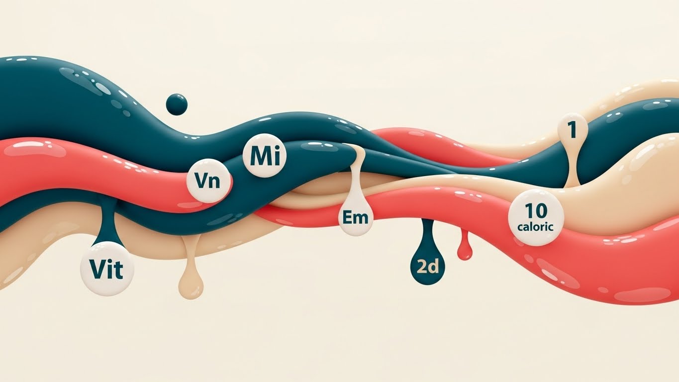
The Visual & Narrative Approach
Here, we visualize the Ecosystem of Nutrition. Data is not static; it flows. Deep teal and coral pink shapes move horizontally across the screen like a liquid stream. Suspended within this fluid are simplified white icons representing vitamins, minerals, and caloric units. The "glossy" texture and fluid motion suggest a premium, seamless integration. It looks less like a spreadsheet and more like a living biological process.
Psychological Impact & KPI Focus
Niche Psychology: Operations Managers fear rigidity—software that breaks when a supplier changes an ingredient. This fluid style reassures them of Adaptability. It suggests your software manages the continuous, living stream of supply chain data without friction.
Operational Impact: It visualizes Traceability and Integration—showing that nutritional data travels with the ingredient from procurement to plating.
Strategic Implementation & Trade-offs
- Best Use Case: LinkedIn Feeds, Educational content on "Nutritional Compliance."
- Duration: 30 Seconds.
- Trade-off: The abstract nature can be vague. It requires strong copy to ground the visuals in specific benefits like "Real-time Macro Tracking."
Companies using similar video content -
Nutritics – Food Data Management Software – Visualizing nutrient flow and allergen data.
myfood24 – Nutritional Analysis Software – Tracking and analyzing dietary intake.
3. Bold Kinetic Typography (Visual)
TOFU | Category Creation

The Visual & Narrative Approach
This style is designed to Disrupt the Scroll. It visualizes the "Heavy Lifting" your software performs. Large, architectural blocks in electric blue and vibrant orange crash into the frame, stacking to form words like "PLAN" and "PREP." The diagonal axis and motion blur convey high velocity and industrial strength. It feels robust, fast, and essential.
Psychological Impact & KPI Focus
Niche Psychology: Kitchens run on speed. This style mirrors the Operational Velocity of a high-volume line. It appeals to the "Category Creator" mindset—leaders who want to modernize their operations aggressively. It projects confidence and power.
Operational Impact: It visualizes Efficiency and Throughput, positioning the software as an engine of growth rather than a passive utility.
Strategic Implementation & Trade-offs
- Best Use Case: High-energy social ads (Instagram/Facebook) and Event Teasers.
- Duration: 10 Seconds.
- Trade-off: It is loud and aggressive. Avoid using this for delicate topics like "Patient Safety" or "Allergen Management," where precision is more valued than speed.
Companies using similar video content -
7shifts – Employee Scheduling Software – Accelerating workforce planning and communication.
Jolt – Operations Management Software – Driving operational speed and accountability.
MakeShift – Employee Scheduling Software – Boosting team planning and efficiency.
4. Wireframe to Reality Transition
TOFU | Product Differentiation
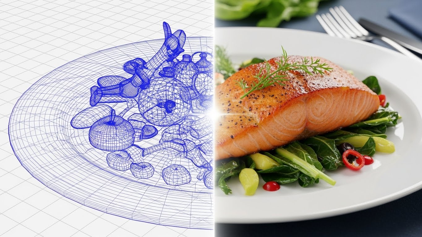
The Visual & Narrative Approach
This split-screen style visualizes the Promise of Fidelity. On the left, a technical blue wireframe blueprint of a meal sits on a grid. A glowing scanner line moves across to the right, revealing the photorealistic, appetizing final dish. It connects the "Digital Plan" directly to the "Physical Result."
Psychological Impact & KPI Focus
Niche Psychology: This directly addresses the "Scale Gap"—the fear that the plan won't match the reality. It uses Confirmation Bias to prove that your software’s engineering leads to perfect culinary execution. It builds massive trust with Executive Chefs.
Operational Impact: It visualizes Recipe Standardization and Yield Management—showing that the software ensures the 1,000th plate looks identical to the 1st.
Strategic Implementation & Trade-offs
- Best Use Case: Product Feature Pages ("Recipe Costing" or "Plating Guides").
- Duration: 20 Seconds.
- Trade-off: Requires high-quality food assets. If the "Reality" side looks unappetizing, the metaphor fails.
Companies using similar video content -
Fourth – Recipe Management Software – Connecting recipe plans to consistent execution.
Apicbase – Recipe Management Platform – Ensuring recipe fidelity from plan to plate.
5. Rapid UI Montage
TOFU | Vertical Social Organic
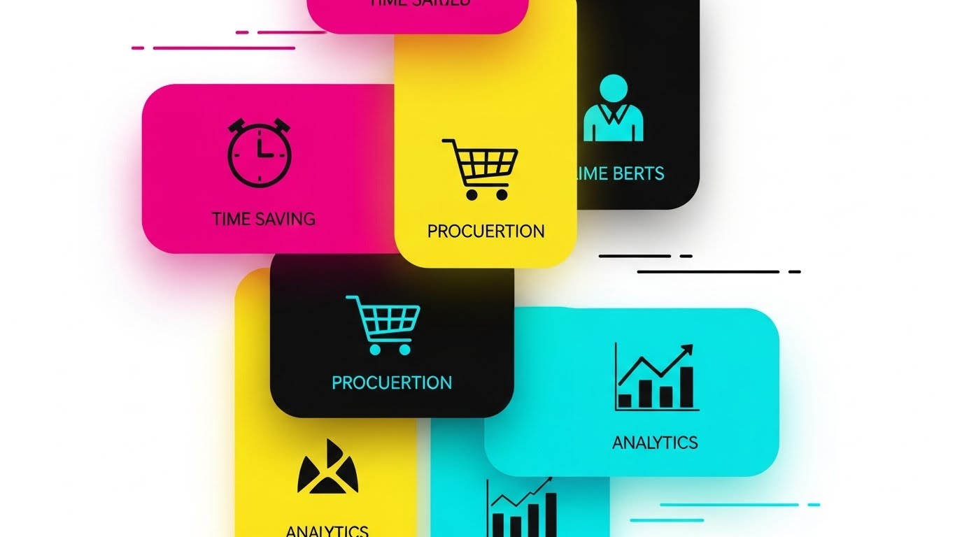
The Visual & Narrative Approach
Designed for the Mobile-First Workforce, this style uses a vertical aspect ratio. Rounded-corner interface cards (Cyan, Magenta, Yellow) slide into a grid with a snappy, satisfying rhythm. Each card highlights a micro-benefit icon: Clock (Time), Cart (Buying), Chart (Data). It mimics the UX of popular consumer apps.
Psychological Impact & KPI Focus
Niche Psychology: It reduces Adoption Anxiety. Kitchen staff are often resistant to "clunky" enterprise software. This style signals that your tool is modern, user-friendly, and fits in their pocket. It leverages Fluency to make the complex seem simple.
Operational Impact: It showcases the Breadth of the platform (Procurement, Analytics, Scheduling) in a bite-sized format.
Strategic Implementation & Trade-offs
- Best Use Case: TikTok, Instagram Reels, YouTube Shorts.
- Duration: 15 Seconds (Looping).
- Trade-off: It sacrifices depth for speed. It generates interest but cannot explain complex workflows or compliance details.
Companies using similar video content -
Toast – Restaurant POS System – Showcasing user-friendly features for quick adoption.
Lightspeed Restaurant – POS System – Highlighting mobile-first features for quick service.
Preoday – Online Ordering Platform – Streamlining customer ordering experience.
Epos Now – POS System – Presenting essential POS features rapidly.
Poster POS – POS System for Restaurants – Displaying quick and efficient POS functions.
6. Abstract 2D Motion Graphics
TOFU | Skippable Pre-Roll Ad

The Visual & Narrative Approach
The narrative arc is Chaos to Order. We start with a scattered mess of multi-colored geometric confetti (inventory chaos) on the left. As the camera pans, these shapes magnetically snap into a rigid, soothing mint-green grid structure. The transition is instant and visually resolving.
Psychological Impact & KPI Focus
Niche Psychology: This scratches the "organizational itch" of every Operations Director. It provides a vicarious sense of Relief and control. It visually promises that your software will tame the anarchy of the back-of-house.
Operational Impact: It abstracts Inventory Management and Cost Control into a simple binary: Mess vs. Managed.
Strategic Implementation & Trade-offs
- Best Use Case: YouTube Pre-Roll Ads (First 5 seconds).
- Duration: 20 Seconds.
- Trade-off: It is highly abstract. It sells the feeling of organization, but must be followed by a clear Value Proposition to explain what the software actually does.
Companies using similar video content -
MarketMan – Restaurant Inventory Management – Bringing order to inventory chaos.
COGS-Well – Restaurant Inventory Management – Streamlining inventory for cost control.
7. 2D Line Art Animation
MOFU | Demand Gen & Lead Capture
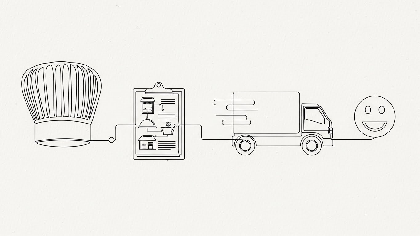
The Visual & Narrative Approach
This style visualizes the Unbroken Chain of Custody. A single, continuous thin black line draws the entire journey: from Chef's Hat Clipboard Delivery Truck Smiley Face. The aesthetic is precise, architectural, and sophisticated, set on a textured off-white background.
Psychological Impact & KPI Focus
Niche Psychology: It appeals to the Systemizer—the logical buyer who values process over flash. It implies reliability, connectivity, and "end-to-end" visibility. It looks like a patent or a blueprint, building authority.
Operational Impact: It highlights Interoperability and Workflow Integration, essential for enterprise clients managing complex logistics.
Strategic Implementation & Trade-offs
- Best Use Case: LinkedIn Video Ads, Explainer Videos for Logistics.
- Duration: 45 Seconds.
- Trade-off: Can feel "dry" or emotionless. It relies on the elegance of the motion to hold attention.
Companies using similar video content -
Supplynote – Procurement Management Suite – Mapping end-to-end supply chain logistics.
NetSuite – ERP for Restaurants – Visualizing integrated supply chain and operations.
8. Abstract 3D AI Visualization
MOFU | Shaping Brand Perception

The Visual & Narrative Approach
To visualize Artificial Intelligence, we enter a sterile, high-tech environment. Glowing white nodes (ingredients) are connected by translucent blue lines (data relationships) in a 3D space. Floating data particles and depth-of-field effects create a sense of deep computation and "brain-like" activity.
Psychological Impact & KPI Focus
Niche Psychology: This positions your brand as the Technological Leader. It creates "FOMO" (Fear of Missing Out) regarding AI adoption. It suggests that your platform helps chefs make "smarter" decisions, not just "faster" ones.
Operational Impact: It visualizes Computational Gastronomy—the backend algorithms that calculate costs, allergens, and substitutions in real-time.
Strategic Implementation & Trade-offs
- Best Use Case: "Technology" Page, Investor Decks.
- Duration: 30 Seconds (Background Loop).
- Trade-off: High production cost. Also, avoid using this if your software is a simple database; it creates an expectation of advanced AI that must be met by the product.
Companies using similar video content -
Oracle Simphony – Restaurant POS & Management – Projecting advanced AI for operational intelligence.
Restroworks – Restaurant Management Platform – Visualizing AI-driven insights for multi-unit operations.
Silverware – Hospitality Platform – Showcasing intelligent system capabilities.
9. Clean UI Workflow (Light Mode)
MOFU | Driving Freemium/Trials
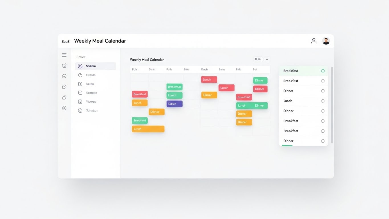
The Visual & Narrative Approach
This is the Transparent Product Demo. A pristine, high-key render of the actual SaaS interface. The "Weekly Meal Calendar" is clean, white, and organized. Pill-shaped meal blocks (Breakfast, Lunch) are dragged and dropped with smooth motion. Soft shadows lift the active elements. It looks inviting and easy to use.
Psychological Impact & KPI Focus
Niche Psychology: It overcomes the Fear of Complexity. By showing a "Light Mode" aesthetic with ample whitespace, it signals that the tool is modern and won't require weeks of training. It proves usability before the sign-up.
Operational Impact: It focuses on the core daily task—Menu Planning—showing it as a stress-free, drag-and-drop activity.
Strategic Implementation & Trade-offs
- Best Use Case: Pricing Page, "How It Works" Section.
- Duration: 60 Seconds.
- Trade-off: It must be accurate. You cannot "fake" the UI here; it must reflect the actual user experience to avoid churn later.
Companies using similar video content -
Restaurant365 – Restaurant Management Software – Demonstrating intuitive menu and labor planning.
Kafoodle – Healthcare & Hospital Catering Software – Streamlining menu planning and allergen management.
Tableo – Online Booking Software – Simplifying reservation management.
10. Isometric 2D Motion Design
MOFU | Feature Education

The Visual & Narrative Approach
Scaling is a math problem; Isometric design is the visual solution. On a grid, a single meal tray sits in the center. Indicators flash, and the tray multiplies outward into a perfect 10x10 formation of 100 identical trays. The pastel palette keeps it friendly, but the geometric precision is undeniable.
Psychological Impact & KPI Focus
Niche Psychology: This addresses the anxiety of Batch Consistency. It visualizes the "One-Click Scale" promise—that the software can instantly calculate the requirements for 100 meals as easily as for one. It provides a feeling of "God-like" control over the operation.
Operational Impact: It visualizes Yield Management and Mass Production Logistics, critical for catering and institutional food service.
Strategic Implementation & Trade-offs
- Best Use Case: Blog Posts on "Scaling" or "Efficiency," Help Center.
- Duration: 40 Seconds.
- Trade-off: Isometric art can feel "corporate." Ensure the specific props (trays, food items) look relevant to the food industry to maintain connection.
Companies using similar video content -
SynergySuite – Multi-unit Restaurant Management – Demonstrating scalable operations and consistency.
Operandio – Restaurant Operations Management – Visualizing standardized processes across multiple locations.
Gofrugal – POS & ERP for Restaurants – Illustrating scalable business processes.
11. Macro UI Micro-Interactions
MOFU | Feature Education
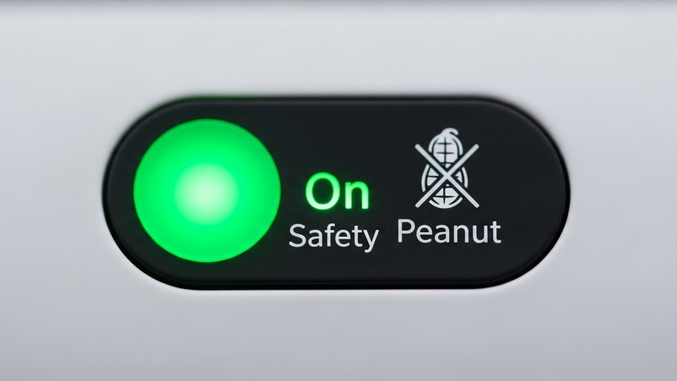
The Visual & Narrative Approach
This style zooms in to the molecular level of user interaction—the "Micro-Interaction." The frame is filled entirely by a single, high-fidelity toggle switch. As it slides to the "On" position, it emits a reassuring, vivid "Safety Green" glow. Next to it, a crisp "No Peanut" icon illuminates. The background is a soft-focus matte white, ensuring the viewer's eye is locked solely on this critical binary decision.
Psychological Impact & KPI Focus
Niche Psychology: For Hospital Food Service Directors, "Allergen Management" is a source of constant, low-grade anxiety. A single mistake can be fatal. This ultra-close-up style leverages Focal Point Bias to create a sense of absolute control. It visually screams: "We have handled the details."
Operational Impact: It visualizes Risk Mitigation and Compliance, showing that the software provides clear, unambiguous safeguards against dietary errors.
Strategic Implementation & Trade-offs
- Best Use Case: Feature highlight reels on Social Ads (Instagram/LinkedIn), "Safety" section of the website.
- Duration: 6 Seconds (Loop).
- Trade-off: It is hyper-specific. While powerful for safety features, it cannot communicate broad workflows or holistic platform value.
Companies using similar video content -
FoodDocs – Food Safety Management Software – Highlighting critical food safety controls.
CMX1 – Restaurant Compliance Software – Visualizing precise control over compliance checks.
12. 3D Parallax UI Presentation
MOFU | Reducing Friction
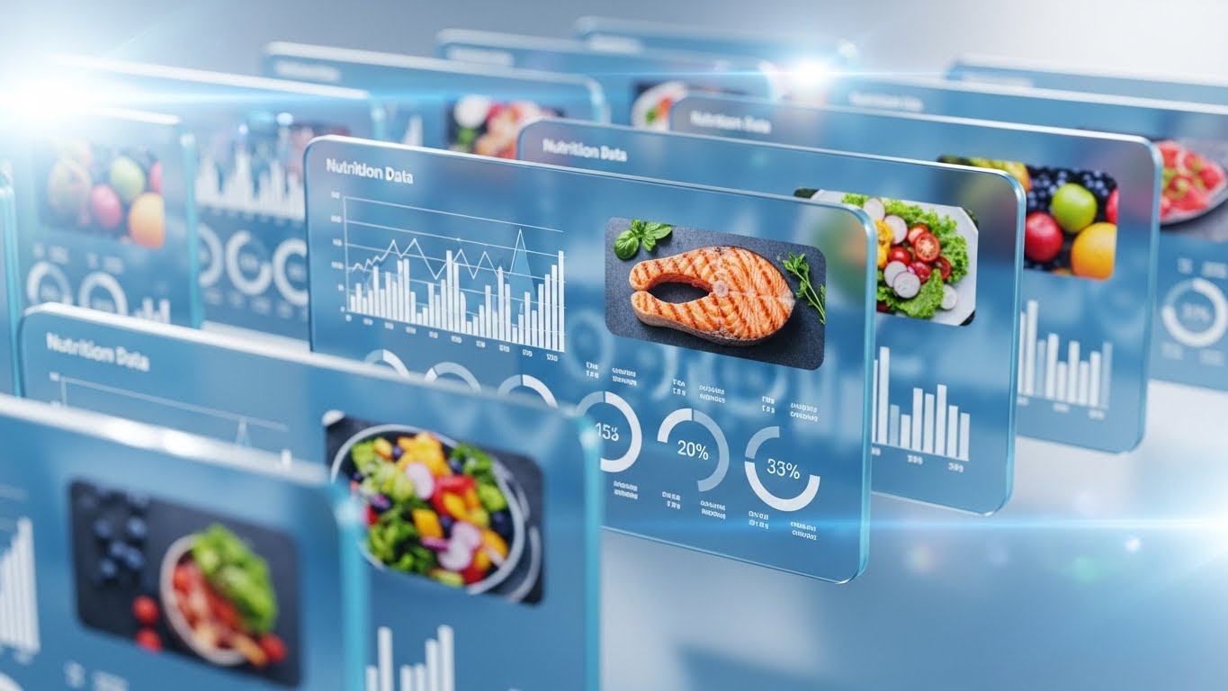
The Visual & Narrative Approach
To visualize the depth of data available without overwhelming the viewer, we use Parallax Layering. Semi-transparent "glass" interface panels float in a 3D space. The front panel displays a high-res food image, while rear panels (slightly blurred) show the underlying nutritional histograms and cost data. As the camera drifts, the layers shift at different speeds, creating a rich, immersive sense of depth and connectivity.
Psychological Impact & KPI Focus
Niche Psychology: Culinary leaders often feel that software "flattens" their work, reducing food to mere numbers. This style adds dimensionality back into the digital experience. It suggests that while the interface is simple (front layer), the intelligence (rear layers) is deep and robust.
Operational Impact: It visualizes Data Granularity—showing that users can access high-level views or drill down into the macros without losing context.
Strategic Implementation & Trade-offs
- Best Use Case: Website Headers, Product Tour Videos.
- Duration: 15 Seconds.
- Trade-off: The "glass" aesthetic is very tech-forward. Ensure the data shown on the panels is legible and relevant to kitchen operations to avoid looking like generic sci-fi.
Companies using similar video content -
Nory – AI-powered Restaurant Management – Presenting layered data for deep operational context.
MarginEdge – Restaurant Management – Showing depth of financial and operational data.
13. 2D Animation & UI Composition
MOFU | Overcoming Objections

The Visual & Narrative Approach
This style introduces the Human Element. A flat, geometric illustration of a smiling food service professional stands confidently amidst floating, self-organizing UI panels. The palette is warm (mustard, navy, terracotta), contrasting with the sterile "tech blues" of competitors. The narrative shows the software serving the human, not replacing them—the panels float effortlessly into place around the user.
Psychological Impact & KPI Focus
Niche Psychology: There is a pervasive fear that automation removes the "soul" of hospitality. This style uses Social Cues (the smile, the confident posture) to frame the software as a supportive partner. It reduces the fear of Technological Displacement.
Operational Impact: It visualizes User Empowerment and Ease of Use, suggesting that the software handles the tedious organization so the staff can focus on the customer.
Strategic Implementation & Trade-offs
- Best Use Case: YouTube Explainer Videos, "About Us" page.
- Duration: 45 Seconds.
- Trade-off: It feels less "Enterprise-Grade" than 3D styles. It builds emotional connection but may not convince a CFO looking for hardcore data capabilities.
Companies using similar video content -
Connecteam – Employee Management App – Humanizing workforce management and communication.
When I Work – Employee Scheduling Software – Visualizing a positive and efficient staff experience.
TastyIgniter – Open Source Restaurant Management – Illustrating user-friendly management.
14. Split Screen: Optimized Reality and UI
MOFU | Competitive Displacement
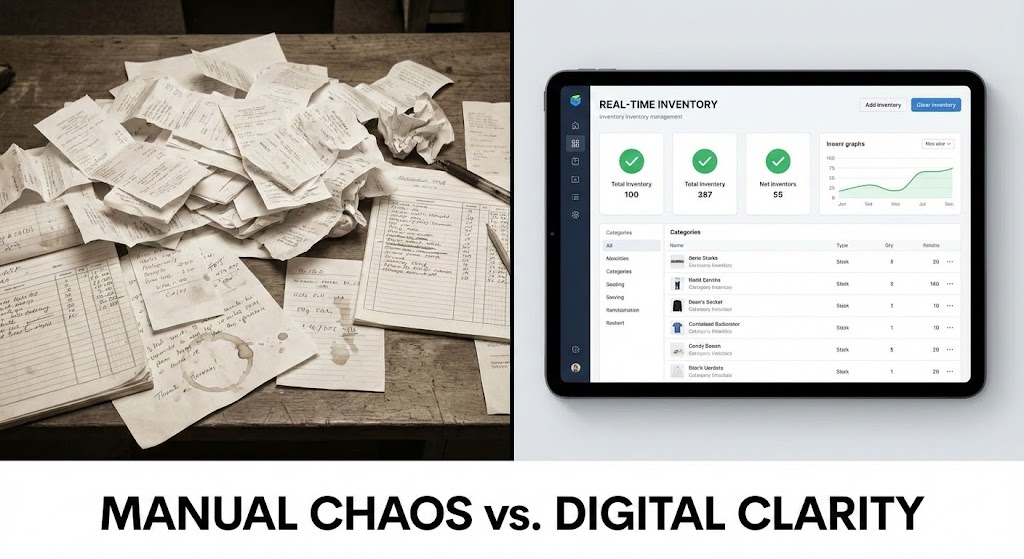
The Visual & Narrative Approach
This is the classic Before & After, elevated. The left half of the screen displays a desaturated, gritty photo of a "Manual Chaos" desk—crumpled receipts, coffee stains, and frantic handwritten notes. The right half is a pristine, high-contrast render of your software on a tablet, displaying a "Real-Time Inventory" dashboard with green "Success" checks. The divider line slides across, physically wiping away the mess.
Psychological Impact & KPI Focus
Niche Psychology: It triggers Pain Agitation. Every chef recognizes the desk on the left; it represents their late nights and stress. The right side offers immediate Cognitive Closure—a solution to the visual noise. It frames the purchase as buying "peace of mind."
Operational Impact: It visualizes Administrative Efficiency and the elimination of Manual Entry Errors, directly attacking the status quo of spreadsheets and binders.
Strategic Implementation & Trade-offs
- Best Use Case: Instagram/Facebook Retargeting Ads, Sales Decks.
- Duration: 15 Seconds.
- Trade-off: It’s a direct attack on legacy methods. Ensure the "Chaos" side isn't so exaggerated that it feels insulting to the prospect's current reality.
Companies using similar video content -
Xenia – Restaurant Operations Platform – Contrasting manual chaos with digital organization.
GoAudits – Restaurant Analytics App – Showing transformation from messy audits to structured data.
15. Low-Poly 3D Modeling
MOFU | ABM Awareness
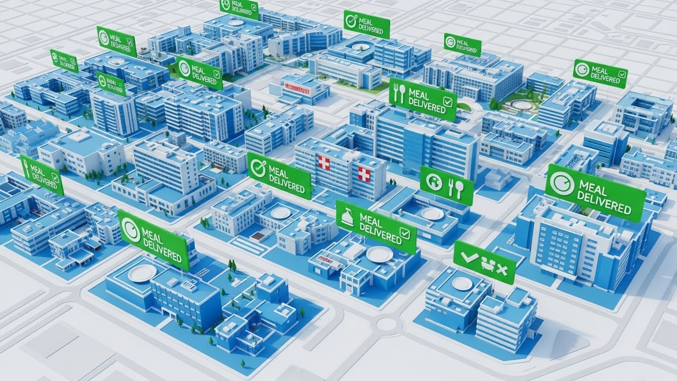
The Visual & Narrative Approach
To visualize Scale, we zoom out to a "God-Mode" view. A stylized, low-poly 3D map depicts a large hospital or university campus. Buildings are rendered in clean corporate blues. Bright green notification bubbles ("Meal Delivered") pop up across the map in real-time synchronization. It looks like a well-managed simulation game, conveying a sense of total, effortless oversight.
Psychological Impact & KPI Focus
Niche Psychology: Logistics Directors at multi-site facilities fear Fragmentation—losing track of what's happening in Building C while they are in Building A. This style satisfies the need for Centralized Control. It makes a massive operation look manageable and "gamified."
Operational Impact: It visualizes Multi-Site Management and Last-Mile Logistics, proving the software can handle the complexity of institutional feeding.
Strategic Implementation & Trade-offs
- Best Use Case: Display Ads targeting Enterprise accounts, Logistics Feature Pages.
- Duration: 20 Seconds.
- Trade-off: Low-poly is an abstraction. It sells the concept of management, but doesn't show the details of the food. Not for selling culinary quality.
Companies using similar video content -
Banquet Health – Hospital Food Service Software – Managing patient meal logistics across a campus.
MatrixCare MealTracker – Nutrition Management Software – Overseeing meal delivery in healthcare facilities.
16. 3D X-Ray Visualization
MOFU | Risk Mitigation

The Visual & Narrative Approach
Security is invisible, so we must make it physical. We see a sleek, white server rack. The camera engages "X-Ray Mode," making the casing transparent to reveal a glowing, solid gold padlock at the core. Streams of silver binary data flow securely through the lock, untouched. The aesthetic is high-tech, clean, and impenetrable.
Psychological Impact & KPI Focus
Niche Psychology: With patient data (HIPAA) and payment info at stake, IT Directors are the "Gatekeepers" of the sale. This style addresses Trust Assurance. It uses the metaphor of physical strength (gold, metal) to represent digital fortitude.
Operational Impact: It visualizes Data Encryption and Enterprise Security, checking the box for the technical review committee before they even ask the question.
Strategic Implementation & Trade-offs
- Best Use Case: "Security & Compliance" Website Section, IT Review Documentation.
- Duration: 10 Seconds (Loop).
- Trade-off: It is purely functional. It excites the CTO, not the Chef. Use it selectively in the sales cycle.
Companies using similar video content -
Cronometer Pro – Nutrition Tracking Tool – Highlighting HIPAA-compliant data security.
Healthie – EHR & Practice Growth Software – Visualizing secure client data management.
17. Isometric 3D Workflow
BOFU | The Functional Buyer
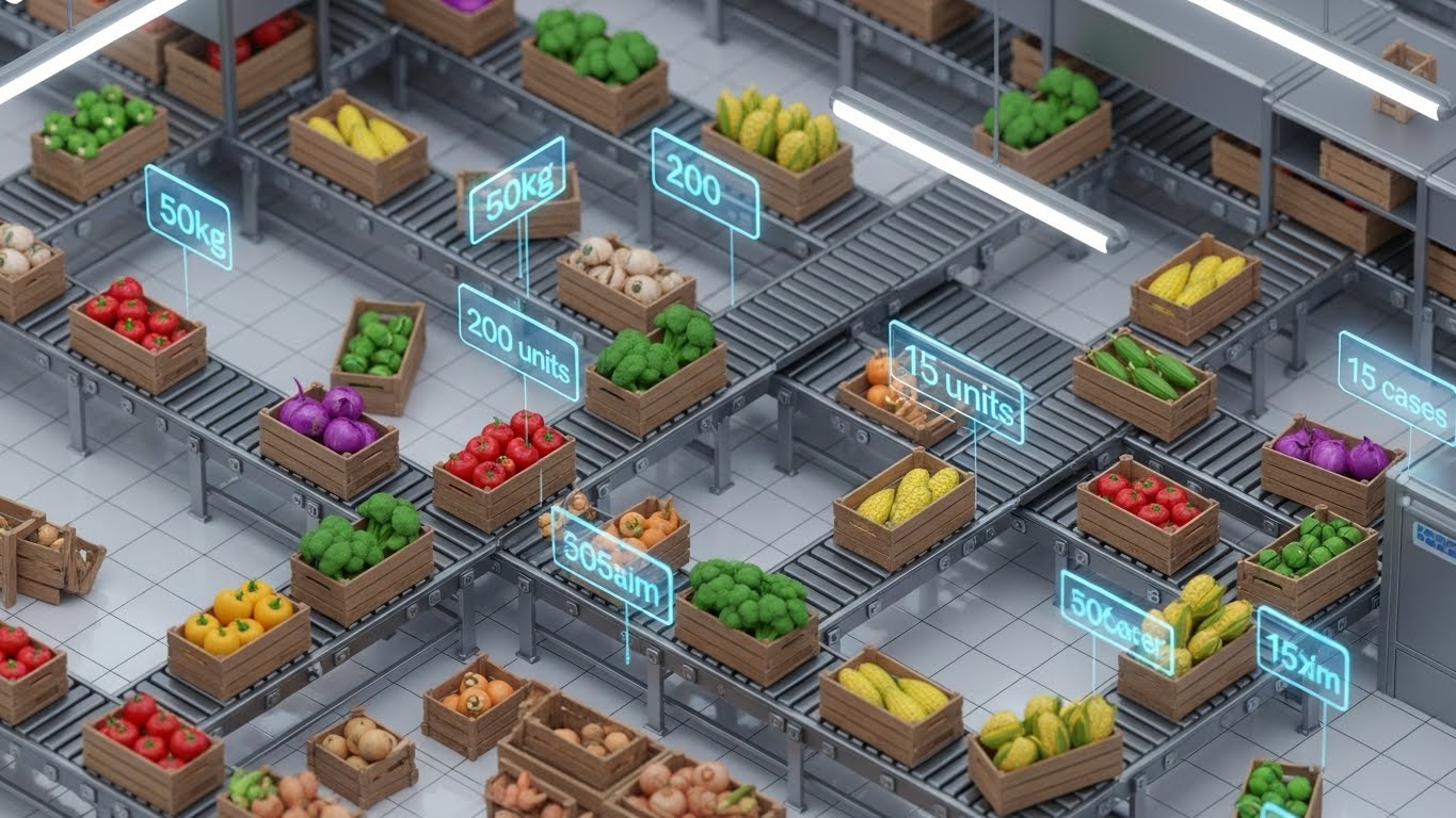
The Visual & Narrative Approach
This style visualizes the Engine of Efficiency. In a detailed isometric view, we see a stylized conveyor belt system. Crates of raw ingredients (colorful, distinct) move along the belt. As they pass a checkpoint, floating holographic tags appear: "50kg," "Reorder Point Met." The motion is rhythmic and hypnotic, symbolizing a perfectly tuned machine.
Psychological Impact & KPI Focus
Niche Psychology: The "Functional Buyer" (e.g., Procurement Manager) cares about Process Integrity. They want to see that the software tracks every gram. This style validates their desire for order and precision. It visualizes the absence of friction.
Operational Impact: It visualizes Automated Procurement and Perpetual Inventory Tracking, showing exactly how the software catches low stock levels before they become a crisis.
Strategic Implementation & Trade-offs
- Best Use Case: Deep-Dive Presentations, Product Demos for Operations Teams.
- Duration: 45 Seconds.
- Trade-off: Isometric views can feel detached. Ensure the "ingredients" look recognizable to maintain the link to the food industry.
Companies using similar video content -
Craftable – F&B Management Suite – Visualizing automated inventory and procurement workflows.
Fourth – Recipe & Menu Engineering Software – Tracking ingredients and costs through a streamlined process.
18. Dynamic Data Visualization
BOFU | ROI Justification
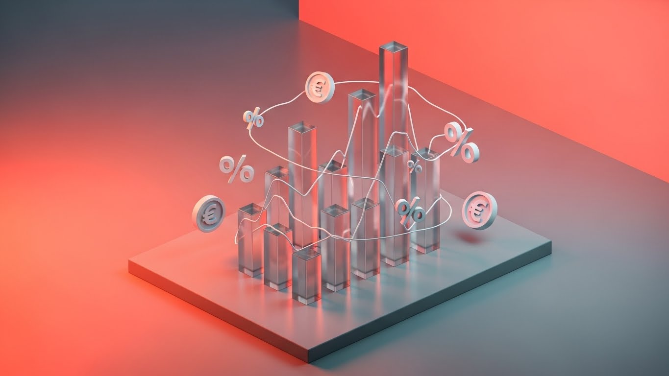
The Visual & Narrative Approach
Here, we visualize the Financial Argument. In a sleek, abstract studio setting, transparent glass bar charts rise aggressively from a metallic base. Floating around the bars are glowing currency symbols (Euros/Dollars) and percentage indicators. The transparency of the glass implies "clear visibility" into finances, while the upward motion communicates undeniable growth and savings.
Psychological Impact & KPI Focus
Niche Psychology: The CFO needs proof, not promises. This style speaks the language of Profitability. By stripping away the food and focusing on the financial structure, it separates the "emotion" of cooking from the "business" of saving money.
Operational Impact: It visualizes Cost Control, Margin Analysis, and ROI, providing the "Visual Evidence" needed to sign the contract.
Strategic Implementation & Trade-offs
- Best Use Case: Investor Decks, Proposal Summaries, LinkedIn Ads targeting CFOs.
- Duration: 15 Seconds.
- Trade-off: It is cold and corporate. It works for the Economic Buyer but may alienate the creative culinary team if used exclusively.
Companies using similar video content -
MenuSano – Recipe Costing Software – Projecting financial growth through optimized menu costs.
EZchef Software – Menu Costing Software – Visualizing profit margin improvements.
19. Photorealistic 3D Renders
BOFU | The Economic Buyer
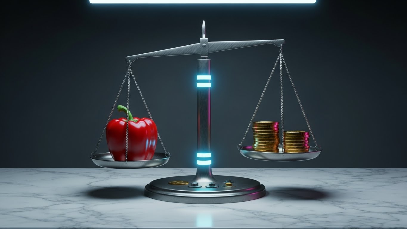
The Visual & Narrative Approach
This style acts as a Visual Metaphor for Value. A vintage brass balance scale sits on a marble countertop, rendered with photorealistic perfection. On one side, a vibrant, fresh red bell pepper (representing quality); on the other, a stack of gold coins. They are perfectly balanced. The lighting highlights the texture of the vegetable skin and the sheen of the metal, screaming "Premium."
Psychological Impact & KPI Focus
Niche Psychology: The ultimate struggle in food service is balancing Quality vs. Cost. This visual validates that struggle and offers a solution: your software allows them to maintain culinary standards without breaking the bank. It resolves the "Quality Compromise" anxiety.
Operational Impact: It visualizes Menu Engineering and Cost-Benefit Analysis, positioning the software as the tool that maintains this delicate equilibrium.
Strategic Implementation & Trade-offs
- Best Use Case: Pricing Page, Case Study Headers.
- Duration: Static Image or Slow Motion Panning Video (10 Seconds).
- Trade-off: High production value is mandatory. If the render looks fake, the "Quality" message is undermined.
Companies using similar video content -
Apicbase – Food Management Platform – Balancing quality ingredients with cost efficiency.
Nutritics – Food Data Management Software – Visualizing the balance of nutrition, cost, and safety.
20. Lifestyle Stock with UI Overlay
BOFU | Sales Cycle Acceleration

The Visual & Narrative Approach
This style grounds the software in Professional Reality. We see a high-quality, cinematic shot of a dietitian or chef in their actual work environment—wearing a lab coat or whites, in a sunlit office. Superimposed on their tablet screen (via motion tracking) is a crisp, vector UI showing a "Patient Success" graph ticking upwards. The human is focused and calm; the data is green and positive.
Psychological Impact & KPI Focus
Niche Psychology: Buyers want to envision themselves succeeding. This style leverages Mirror Neurons—the prospect sees a professional like themselves using the tool effectively and feels a subconscious "identity alignment." It moves the decision from "logic" to "identity."
Operational Impact: It visualizes Workflow Integration and Professional Empowerment, showing that the software fits naturally into the daily life of a high-performing professional.
Strategic Implementation & Trade-offs
- Best Use Case: Email Signatures, Case Study Video Thumbnails, "Success Stories."
- Duration: 15 Seconds.
- Trade-off: Requires excellent casting. The model must look like a genuine industry professional, not a generic "stock photo office worker."
Companies using similar video content -
NutriAdmin – CRM for Nutritionists – Showing dietitians successfully managing client plans.
Practice Better – EHR & Practice Growth Software – Professionals using the platform for client care.
Macrostax Team – Nutrition Management Platform – Empowering fitness professionals with nutrition plans.
21. 2D Graphics Over Live Action
BOFU | Accelerating Time-to-Value

The Visual & Narrative Approach
This style bridges the gap between the digital plan and the physical purchase. We utilize a dynamic First-Person Point-of-View (POV) shot, moving briskly through a well-lit grocery aisle or wholesale depot. As the camera tracks past specific products—a carton of milk, a bag of spinach—large, bright green 2D vector "Checkmark" icons pop into existence over them. The motion is snappy and slight motion blur conveys speed. It visually confirms: "What you planned is exactly what you are buying."
Psychological Impact & KPI Focus
Niche Psychology: Purchasing managers and personal chefs constantly worry about Procurement Drift—the costly error of buying off-list. This "Augmented Reality" style triggers a sense of validation. It reassures the buyer that the software acts as a vigilant guide in the real world, preventing waste before it enters the kitchen.
Operational Impact: It visualizes Inventory Accuracy and Smart Procurement, demonstrating that the software controls the supply chain at the source.
Strategic Implementation & Trade-offs
- Best Use Case: Social Media Ads (Instagram/TikTok), Feature Announcements for Mobile Apps.
- Duration: 15 Seconds.
- Trade-off: Requires live-action footage. Keep the products shown generic (fresh produce) to avoid dating the video if packaging designs change.
Companies using similar video content -
Supplynote – Procurement Management Suite – Augmenting real-world purchasing with digital verification.
MarketMan – Restaurant Inventory Management – Overlaying inventory checks on live procurement.
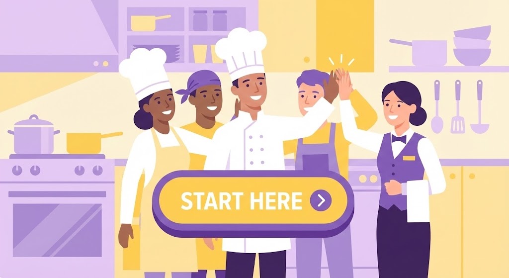
22. 2D Character-Driven Story
Onboarding | Self-Serve Onboarding

The Visual & Narrative Approach
To combat the "coldness" of a new software rollout, we use warm, character-driven storytelling. A flat, vector illustration depicts a diverse team of kitchen staff (Chef, Prep Cook, Server) sharing a high-five in a pastel-colored kitchen environment. Floating prominently in the foreground is a large, inviting "Start Here" button that pulses gently. The scene is static but alive with subtle movements—steam rising, eyes blinking. It frames the onboarding process not as "training," but as joining a winning team.
Psychological Impact & KPI Focus
Niche Psychology: High turnover rates mean new staff are constantly facing Performance Anxiety. This friendly, non-threatening aesthetic lowers the emotional barrier to entry. It signals that the software is inclusive, easy, and designed for people, not just accountants.
Operational Impact: It visualizes Cultural Buy-in and Onboarding Velocity, encouraging staff to take the first step without fear of breaking the system.
Strategic Implementation & Trade-offs
- Best Use Case: In-App "Welcome" Screen, First-Run Wizard, Internal Launch Emails.
- Duration: 10 Seconds (Loop).
- Trade-off: It is playful. While excellent for staff engagement, it may feel too casual for a Board of Directors presentation.
Companies using similar video content -
Jolt – Operations Management Software – Gamifying onboarding for kitchen staff.
7shifts – Employee Scheduling Software – Creating engaging onboarding for new hires.
23. Dark Mode UI Showcase
Retention | Reducing Implementation Friction
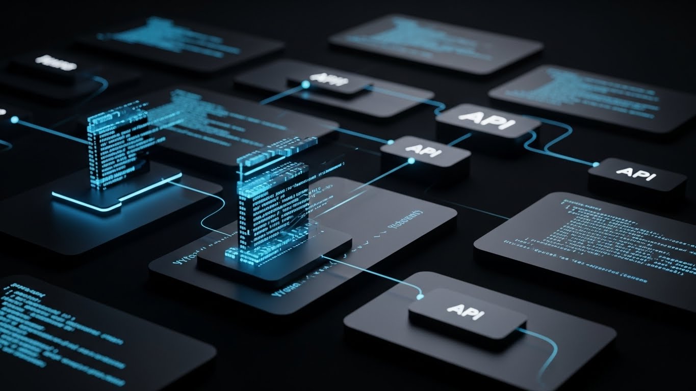
The Visual & Narrative Approach
Targeting the technical stakeholder, this style utilizes a sleek "Dark Mode" aesthetic—the preferred environment for developers. Against a deep obsidian background, dark gray interface cards float, displaying neon blue code snippets. Thin, glowing connection lines extend from the code to abstract 3D nodes in the background, representing API integrations (POS, Suppliers, Accounting). It looks like the nerve center of a futuristic operation.
Psychological Impact & KPI Focus
Niche Psychology: CTOs and IT Managers fear Siloed Data. They need to know your software plays nicely with their existing tech stack. This style leverages the Aesthetic-Usability Effect within a developer context—dark mode implies "Pro Tool." It communicates stability, security, and deep connectivity.
Operational Impact: It visualizes Interoperability and Headless Architecture, proving the platform can function as the central brain of a connected kitchen ecosystem.
Strategic Implementation & Trade-offs
- Best Use Case: Developer Portal, API Documentation, "Integrations" Page.
- Duration: 20 Seconds.
- Trade-off: It is unintelligible to the average chef. Use this strictly for technical audiences or to demonstrate "power" to executives.
Companies using similar video content -
Restroworks – Cloud Kitchen Software – Showcasing robust API integrations for cloud kitchens.
Oracle Simphony – Restaurant POS & Management – Visualizing deep system integrations.
24. Holographic UI over 3D Render
Retention | Driving Deep Feature Adoption

The Visual & Narrative Approach
To visualize the "Science of Food," we place a photorealistic red apple in a sterile, white laboratory setting. A rotating, cyan holographic wireframe sphere surrounds the fruit, analyzing it in real-time. Chemical structures and micronutrient percentages (Vitamin C, Fiber) float in the air, glowing faintly. It treats a simple ingredient with the reverence of a medical breakthrough.
Psychological Impact & KPI Focus
Niche Psychology: Dietitians and Clinical Nutrition Managers need absolute Precision. They aren't just feeding people; they are treating them. This style validates their scientific approach. It suggests that your software sees "deeper" than competitors, understanding the molecular composition of the menu.
Operational Impact: It visualizes Nutritional Analysis and Clinical Compliance, positioning the tool as a medical-grade solution for healthcare food service.
Strategic Implementation & Trade-offs
- Best Use Case: Feature pages for "Clinical Nutrition" or "Allergen Tracking."
- Duration: 15 Seconds (Loop).
- Trade-off: High conceptual load. It requires the viewer to accept the metaphor that the software has "X-Ray Vision" into the food's data.
Companies using similar video content -
Foodworks Online – Nutrition Analysis Software – Revealing detailed nutritional composition of food.
myfood24 – Nutritional Analysis Software – Displaying in-depth nutrient analysis.
FineDine Menu – Digital Menu Software – Presenting detailed allergen and nutritional data.
25. Hyper-lapse Stock Footage with Data
Retention | Email Marketing
The Visual & Narrative Approach
This style brings energy to the inbox. We see a top-down, hyper-lapse video of a meal prep container being filled layer by layer—brown rice, grilled chicken, broccoli. The action is sped up, creating a satisfying sense of progress. Overlaid on this footage is a crisp, static white data graph tracking a key metric (e.g., "Protein Count" or "Cost per Portion") rising in sync with the food.
Psychological Impact & KPI Focus
Niche Psychology: It appeals to the Optimizer. The combination of fast physical action and real-time data feedback creates a "Pavlovian" response of satisfaction. It reinforces the link between the act of cooking and the data of management.
Operational Impact: It visualizes Real-Time Tracking and Portion Control, reminding users that every scoop of ingredients has a measurable data impact.
Strategic Implementation & Trade-offs
- Best Use Case: Customer Newsletters, "Weekly Stats" Emails.
- Duration: 6 Seconds (GIF/Loop).
- Trade-off: Requires high-quality, perfectly lit footage. Amateur footage will make the brand look cheap.
Companies using similar video content -
MenuSano – Nutrition Analysis Software – Quantifying efficiency in meal prep with data overlays.
EZchef Software – Menu Costing Software – Tracking portion control and cost during food preparation.
26. Futuristic Neon/Dark Mode
Retention | Reducing Churn

The Visual & Narrative Approach
This abstract style visualizes Hyper-Personalization. A double-helix DNA strand rotates in a dark void, rendered in glowing neon lime green. Upon closer inspection, the "rungs" of the DNA are not proteins, but tiny, glowing icons of cutlery and menu items. It suggests that the software tailors the meal plan to the very genetic makeup of the user or patient.
Psychological Impact & KPI Focus
Niche Psychology: As the industry moves toward "Food as Medicine," providers fear being left behind by generic solutions. This style promises Future-Readiness. It implies that your platform is capable of handling the next generation of genomic nutrition requests.
Operational Impact: It visualizes Advanced Algorithms and Patient-Specific Planning, crucial for retaining high-value healthcare and elite athletic clients.
Strategic Implementation & Trade-offs
- Best Use Case: App Loading Screens, "Future Roadmap" Presentations.
- Duration: 10 Seconds.
- Trade-off: Abstract and conceptual. It sells a vision, not a specific workflow. Use it to reinforce brand vibe, not to teach.
Companies using similar video content -
NutritioApp – Nutritional Analysis Platform – Visualizing personalized diet plans.
DietMaster Pro – Nutrition Analysis Solution – Showcasing tailored meal planning.
27. Aspirational Stock Montage
Retention | Knowledge Base & FAQ

The Visual & Narrative Approach
Sometimes, the best UI is no UI. This style uses a bright, high-key photograph of a commercial kitchen team gathered around a stainless steel table, looking at a laptop. They are smiling, pointing, and engaged. The lighting is airy and washed out. There are no overlays, no graphics—just the pure representation of a team that has "figured it out."
Psychological Impact & KPI Focus
Niche Psychology: Frustrated users browsing a Help Center are in a state of Negative Affect. They are annoyed. This calm, human image acts as a Visual De-escalator. It subconsciously reminds them of the goal: a happy, functioning team. It reframes the technical issue as a temporary hurdle to this ideal state.
Operational Impact: It visualizes Team Collaboration and Problem Resolution, subtly encouraging the user to stay calm and find the solution.
Strategic Implementation & Trade-offs
- Best Use Case: Help Center Headers, "Contact Support" Page.
- Duration: Static Image.
- Trade-off: Can feel like generic stock photography if the casting isn't authentic. The team must look like real kitchen staff, not models.
Companies using similar video content -
Restaurant365 – Restaurant Management Software – Portraying a harmonious and efficient kitchen team.
SynergySuite – Multi-unit Restaurant Management – Showing collaborative team problem-solving.
28. Generative AI Cinematic Video
Expansion | Driving Upsell/Cross-sell

The Visual & Narrative Approach
To sell premium features (e.g., "Gourmet Event Planning" module), we use cinematic luxury. A slow-motion, anamorphic close-up shows a master chef's hand placing a final micro-green garnish on an exquisite dish using tweezers. Steam rises gently. The background is a creamy bokeh. It screams "Michelin Star."
Psychological Impact & KPI Focus
Niche Psychology: Every chef, regardless of whether they work in a cafeteria or a bistro, aspires to Culinary Excellence. This style appeals to their vanity and ambition. It associates your software with the highest tier of the craft, validating the upsell as an investment in quality.
Operational Impact: It visualizes Premium Quality and Attention to Detail, signaling that the software is sophisticated enough to handle high-end, complex menu requirements.
Strategic Implementation & Trade-offs
- Best Use Case: Upsell Video Ads, "Premium Tier" Landing Pages.
- Duration: 15 Seconds.
- Trade-off: It creates a very high aesthetic expectation. If the software UI is ugly, this video will create a jarring dissonance.
Companies using similar video content -
Truffle Systems – Cloud Kitchen Management – Elevating the presentation of ghost kitchen output.
Delivety – Cloud Kitchen POS Software – Showcasing high-quality food presentation for delivery.
30. Generative AI Realistic Character Video
Expansion | Establishing Thought Leadership

The Visual & Narrative Approach
We use a photorealistic AI-generated character to deliver the "Founder's Vision." A middle-aged professional woman with glasses (coded as a Head of Nutrition) speaks passionately to the camera in a sunlit, high-tech glass office. She gestures as she explains a complex concept. The aesthetic is "TED Talk" meets "Documentary"—authoritative, intelligent, and human.
Psychological Impact & KPI Focus
Niche Psychology: People buy from experts. This style establishes Domain Authority. It mimics the intimacy of a face-to-face consultation, building trust that the people behind the software understand the industry deeply.
Operational Impact: It visualizes Strategic Partnership and Industry Expertise, moving the relationship from "Vendor" to "Trusted Advisor."
Strategic Implementation & Trade-offs
- Best Use Case: YouTube Thought Leadership Series, Webinar Intros.
- Duration: 60 Seconds.
- Trade-off: AI lip-sync technology must be flawless. If it hits the "Uncanny Valley," trust will be instantly destroyed.
Strategic Knowledge Base: The Visual Operations Doctrine
This section synthesizes the 30 visual styles into a cohesive strategic framework. It moves beyond "making videos" to building a Visual Operating System that drives adoption, efficiency, and ROI in the commercial kitchen.
Strategic Alignment & Visual Architecture
The "Pre-Production" Strategy — Why and Who.
- The Cognitive Load Audit: The kitchen is a high-stress environment. Before creating a video, audit the "Mental Bandwidth" of the viewer. Use Minimalist Flat 2D (Style 1) for stressed Line Cooks who need instant clarity, and Deep 3D Visualization (Style 12) for Dietitians who have the time to analyze data.
- Role-Based Visual Mapping: Do not use a "one-size-fits-all" style. Drivers and Procurement staff need mobile-first, high-contrast visuals (Style 21). Office-based Ops Directors require dense, data-rich dashboards (Style 18). Map your styles to the Device and the Role.
- The "Glanceability" Standard: In a kitchen, a screen is often viewed from 3 feet away through steam. Design UI close-ups (Style 11) with exaggerated contrast and size. If it can't be understood in a 2-second glance, it fails the "Service Test."
- Brand Voice Consistency: Your Marketing visuals (Style 3) and your Training visuals (Style 22) must speak the same language. If marketing is "Cyber-Punk" but training is "Corporate Beige," you create a brand disconnect. Establishing a unified "Visual Lexicon" builds trust.
- The Advids Strategic Audit: Partnering with an expert team like Advids allows you to define this "Visual Operating System" early. We help identify which of the 30 styles aligns best with your specific legacy code and future roadmap before you commit to production.
- Standardization vs. Customization: For core features (Inventory), use standardized "Stock" elements (Style 10) to keep costs low. For your "Secret Sauce" (e.g., AI prediction), invest in bespoke, high-end 3D (Style 8) to differentiate value.
- The Cross-Departmental Bridge: Use visuals to unify terminology. If Sales calls it "Yield Management" but Support calls it "Waste Tracking," confusion ensues. A single "Explainer" video (Style 7) serves as the source of truth for the entire company.
- Legacy System Integration: Visualizing the connection between old hardware (scales, printers) and new software is critical. Use Wireframe to Reality (Style 4) to show how your modern tool layers on top of their existing physical infrastructure.
- Accessibility in the Kitchen: Kitchens are multilingual. Motion graphics should rely on Visual Icons and Action (Style 5), not heavy text or voiceover. A visual cue of a "Red X" is universal; a paragraph of text is a barrier.
- The Mobile-First Mandate: 80% of your users are standing up. Ensure all 30 styles—even the complex ones—are legible when cropped to 9:16 for TikTok or mobile training modules.
Operational Adoption & Implementation
The "Deployment" Phase — Embedding visuals into the workflow.
- Overcoming "Big Brother" Anxiety: Staff often fear that inventory software is just a way to spy on them. Use Empathy-Driven Animation (Style 13) to frame the software as a "Helper" that saves them time, not a "Tracker" that judges their performance.
- The Micro-Learning Shift: Nobody reads the manual. Replace the 50-page PDF with a library of 30-second Rapid UI Montages (Style 5). Embed these videos directly into the software (e.g., a "Watch How" tooltip) for Just-in-Time learning.
- Just-in-Time Support: When a chef is stuck during prep, they need an answer now. "How-to" videos (Style 9) must be searchable and load instantly on kitchen tablets. This reduces the "frustration friction" that leads to abandoning the software.
- Gamification of Training: Use Character-Driven Stories (Style 22) to turn onboarding into a game. Visualizing "Level Ups" or "Team Streaks" for consistent logging can transform data entry from a chore into a competitive team activity.
- Reducing Support Ticket Volume: There is a direct correlation between the quality of your visual training and your support costs. Proactive, clear Macro UI Interaction videos (Style 11) answer the question before the ticket is filed.
- Remote Onboarding: For large chains, flying trainers to every site is impossible. Use Low-Poly Maps (Style 15) to provide a "God-Mode" view of the process, allowing you to train distributed teams consistently and remotely.
- Visual SOPs: Transform text-based Standard Operating Procedures into 2D Line Art Animations (Style 7). A visual flow of "Receive -> Scan -> Store" is infinitely more memorable and enforceable than a checklist on a clipboard.
- Feedback Loops: Use interactive video elements. After a Feature Education video (Style 10), prompt the user with a simple "Did this help?" smiley face. This data helps you refine your visual strategy continuously.
- Scalable Localization: Strategies for translating visual assets for global fleets. When expanding globally, visual-heavy styles (Style 1) are cheaper to localize. You only need to swap the UI text, not re-record a voiceover.
- Leadership Communication: To get budget for fleet-wide software, you need to sell the vision. Use Generative AI Cinematic styles (Style 30) in your Executive Quarterly Reviews to communicate the high-level strategy and future roadmap to stakeholders.
Measuring Impact & Future-Proofing
The "ROI" Phase — Measuring success and looking ahead.
- Beyond "Views": A video with 100 views that saves a Hospital System $100k in waste is a success. Measure Time-to-Competency: How much faster does a user master the "Ordering" feature after watching the video (Style 21)?
- The "Idle Time" Metric: In logistics, time is money. Correlate better visualization (Style 3) with reduced "Software Navigation Time." If visuals help a manager find a report in 10 seconds instead of 60, that efficiency scales across the enterprise.
- Compliance Velocity: When a new allergen regulation drops, how fast can you retrain the fleet? Track the speed of adoption for new features introduced via Micro-Interaction videos (Style 11). Visuals accelerate compliance.
- Retention and Churn: High-quality UX visualization (Style 9) reduces "Usage Friction," which is a leading cause of churn. Track the Lifetime Value (LTV) of cohorts exposed to the "Premium" visual onboarding series vs. those who were not.
- The AI Visual Frontier: Prepare for the future where video is generated in real-time. Soon, your software will generate a Personalized Data Recap video (Style 18) for every client automatically every Monday morning.
- Scalability of Assets: Build a visual library, not just one-off videos. An "Icon Pack" or "3D Model Library" created for Style 15 can be reused for Style 25. This reduces the marginal cost of production over time.
- The Advids Partnership: This is where a long-term partner shines. Advids ensures that as your software evolves, your visual assets evolve with it. We help you transition from "Stock" to "Bespoke" and from "Manual" to "Generative" without breaking brand consistency.
- Benchmarking Success: "Good enough" visuals are a competitive risk. If your competitor uses Holographic 3D (Style 24) to sell their nutrition engine and you use a static spreadsheet screenshot, you lose the "Perception War" before the demo starts.
- The ROI of Safety: For hospital food service, safety is paramount. Quantify the reduction in "Allergen Incidents" or "Dietary Errors" in units that utilize the Safety Toggle Visualization (Style 11). This is your strongest sales argument.
- Final Call to Innovation: Treat video as Infrastructure, not content. In the AI-driven future of meal planning, the software that communicates its value the fastest will win. The code matters, but the visualization of the code is what sells, trains, and retains.
Companies using similar video content -
Nory – AI-powered Restaurant Management – Establishing thought leadership in AI for restaurants.
FoodDocs – Food Safety Management Software – Presenting expert guidance on food safety and compliance.
Author & Editor Bio


