
 /home/wwwroot/advids.co/design/index.php on line 425
Introduction: The Visibility Imperative in a $1 Trillion Economy
The media planning landscape is facing a paradox of scale. While global advertising revenues are projected to surpass $1 trillion, the operational machinery driving this spend remains dangerously opaque. For the modern VP of Media Operations, the core challenge is no longer just strategy—it is visibility.
A profound "Physical/Digital Divide" exists in the industry. Strategic plans are often born in static spreadsheets and emails, yet they must be executed in dynamic, millisecond-driven programmatic environments. This disconnect creates friction, error, and massive inefficiency. Recent industry audits reveal that $22 billion in waste occurs annually in the programmatic supply chain due to a lack of transparency and data fragmentation. Even more concerning, studies indicate that only 30% of ad spend effectively reaches the publisher, with the vast majority absorbed by opaque intermediaries and tech fees.
The Strategic Shift: Visualization as Intelligence
This guide serves as a bridge across that divide. By leveraging advanced visualization strategies—from abstract motion graphics that simplify data fragmentation to kinetic typography that emphasizes infrastructure stability—media planning software can transform opaque metrics into intuitive, actionable intelligence.
These 30 visual examples are not merely aesthetic choices; they are functional tools designed to reduce cognitive load. They translate the invisible physics of algorithms, bidding, and attribution into a visual language that stakeholders—from the Ad Ops trader to the CMO—can instantly understand and trust.
1. The Unified Ecosystem
TOFU | Brand Awareness

The Visual & Narrative Approach
Visualization Scenario: The frame opens on a clean, soft grey void representing the "fragmented" status quo. From the periphery, vibrant liquid blobs in Cyan and Magenta—symbolizing siloed channels like Social, Search, and TV—drift aimlessly. Driven by an invisible intelligence, they accelerate toward the center, swirling and fusing into a single, perfect, glossy Pure White sphere.
Narration Tone: The tone is smooth, rhythmic, and aspirational. It speaks to the relief of "bringing it all together," emphasizing the transition from scattered data to a unified source of truth.
Psychological Impact & KPI Focus
Niche Psychology: Media planners suffer from "Tab Fatigue" and disconnected systems. This fluid animation triggers a sense of Gestalt—the brain's reward for seeing parts form a whole. It subliminally promises that your software will reduce their mental workload.
Operational Impact: Directly visualizes Omnichannel Orchestration. It simplifies the complex technical process of API integrations into a beautiful, effortless merger, representing Data Normalization.
Strategic Implementation & Trade-offs
Use Case: Ideal for 15-second Social Ads (Instagram/LinkedIn) to stop the scroll.
Strategic Trade-off: High Emotion, Low Detail. It creates a premium, modern feel but is too abstract to explain specific features. Use it to build the brand aura, not to demo the product.
Companies using similar video content -
Mediaocean – Prisma – Unifies planning, buying, analytics across all channels.
Adform – Adform FLOW – Open architecture for modern marketing solutions.
Google – Display & Video 360 – Integrates media buying across display, video, CTV.
2. The Clarity Engine
TOFU | Category Creation
The Visual & Narrative Approach
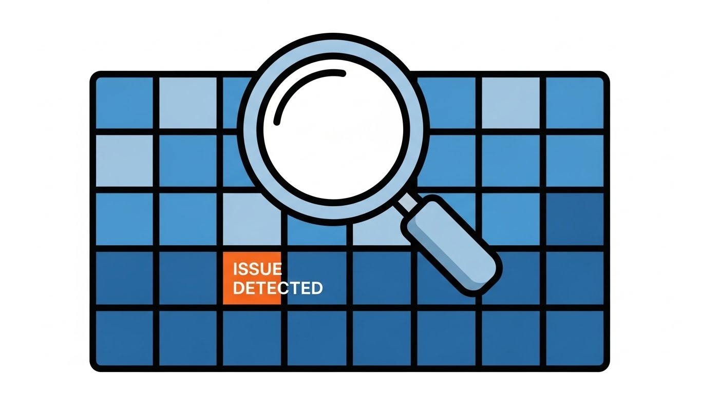
Visualization Scenario: A split composition visualizes the "Audit" capability. On the left, a chaotic pile of mismatched geometric shapes (triangles, squares) in Burnt Orange and Charcoal represents unorganized inventory. On the right, these shapes are snapped into a pristine, symmetrical Cool Grey grid. A magnifying glass glides over the grid, instantly highlighting a block labeled "ISSUE DETECTED."
Narration Tone: The voiceover is crisp, analytical, and direct. It frames the software as a "System of Record" that enforces taxonomy and hygiene.
Psychological Impact & KPI Focus
Niche Psychology: Appeals to the "Architect" persona who craves order. The hard edges and zero-gradient style communicate precision, signaling that this is a serious tool for serious data problems.
Operational Impact: Visualizes Risk Mitigation and Standardization. It shows the viewer that the platform proactively cleans data, a critical value prop for enterprise adoption.
Strategic Implementation & Trade-offs
Use Case: Website Headers or "Why Us" explainer videos (16:9).
Strategic Trade-off: Clarity vs. Warmth. It clearly explains "what we do" (organize chaos), but the minimalist style can feel clinical. It builds trust in function, but may feel impersonal.
Companies using similar video content -
Basis Technologies – Basis Platform – Unifies media buying, workflow automation, cross-channel campaigns.
Salesforce – Audience Studio – Unifies customer data, real-time segmentation, audience activation.
Lotame – Panorama ID – Privacy-first identity solution for audience targeting and measurement.
3. The Blueprint Activation
TOFU | Market Education
The Visual & Narrative Approach
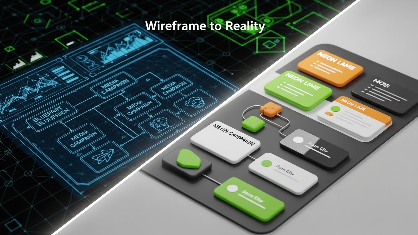
Visualization Scenario: This style dramatizes the "Go Live" moment. The screen is split diagonally. The left side shows a technical wireframe of a media plan (white lines on Blueprint Blue). As a glowing "activation line" sweeps across, the wireframe instantly transforms into a lush, 3D rendered environment in Neon Lime and Glossy White. The static chart becomes a living, pulsing campaign.
Narration Tone: The narrative focuses on "Bridging the Gap." It emphasizes that what you plan is exactly what you buy—eliminating the discrepancy between strategy and execution.
Psychological Impact & KPI Focus
Niche Psychology: Planners often fear that their strategy gets lost in translation during the buying process. This visual validates their work, showing that the platform honors the fidelity of their original plan.
Operational Impact: Visualizes Campaign Activation and Fidelity. It positions the software as the direct link between the boardroom strategy and the DSP.
Strategic Implementation & Trade-offs
Use Case: Blog posts discussing "Campaign Activation" or "Programmatic Workflow."
Strategic Trade-off: High Production Requirement. It requires high-quality 3D assets to avoid looking "gimmicky." If the transition isn't seamless, the metaphor fails.
Companies using similar video content -
The Trade Desk – Platform – Facilitates marketers in reaching a larger audience with transparency.
Adobe – Advertising Cloud – Omnichannel programmatic DSP supporting various campaigns.
StackAdapt – Platform – Self-serve, AI-powered DSP for creating, managing, optimizing campaigns.
4. The Kinetic Impact
TOFU | Skippable Pre-Roll Ad

The Visual & Narrative Approach
Visualization Scenario: To capture attention in a noisy feed, we use visual weight. Massive, heavy 3D blocks (abstractly representing data) in Impact Red and Kinetic Yellow slam down onto a concrete surface. The impact creates visible shockwaves and dust. The camera angle is low, looking up, emphasizing the scale.
Narration Tone: The audio is percussive—heavy thuds and bass drops. The message is simple and urgent: "STOP. WASTING. BUDGET."
Psychological Impact & KPI Focus
Niche Psychology: Disrupts the "corporate boring" filter. It appeals to the ambitious leader who wants to make a "heavy" impact on the market.
Operational Impact: Visualizes Scale and Power. It implies that the platform is robust enough to handle millions in spend without flinching.
Strategic Implementation & Trade-offs
Use Case: YouTube Pre-Roll (first 5 seconds).
Strategic Trade-off: Attention vs. Education. It stops the scroll effectively, but offers zero educational value. It is purely a hook to get them to the next stage.
Companies using similar video content -
Amazon – Amazon DSP – Programmatically buys display, video, audio ads on and off Amazon.
Google – Google Ad Manager – Massive programmatic advertising platform for publishers.
PubMatic – Platform – Comprehensive solutions for publishers and marketers.
7. The Velocity Tunnel
MOFU | Demand Gen & Lead Capture

The Visual & Narrative Approach
Visualization Scenario: A first-person perspective flying through a bright white void. Sleek, tapered lines in Violet and Hot Pink race past the camera toward a central focal point, creating a "warp speed" tunnel effect. These lines represent the intake of real-time bid data or leads.
Narration Tone: Fast-paced and energetic. Words like "Instant," "Real-Time," and "Flow" dominate the script.
Psychological Impact & KPI Focus
Niche Psychology: Alleviates the anxiety of "Data Lag." The visual speed reassures the user that they are working with live data, not last week's report.
Operational Impact: Visualizes Speed of Insight. It positions the platform as a high-frequency trading tool for media, capable of handling massive throughput.
Strategic Implementation & Trade-offs
Use Case: Display Ads or background visuals for webinar waiting screens.
Strategic Trade-off: Abstract nature. It generates a "feeling" of speed but communicates zero specific features. It works best as a mood setter.
Companies using similar video content -
Quantcast – Quantcast Platform – AI-powered DSP that anticipates audiences and refines campaigns.
Moloco – Moloco DSP – Focuses on real-time bidding and optimization.
SmartyAds – Programmatic Platform – Full stack of services for advertisers and publishers.
8. The Operational Contrast
MOFU | Product/Solution Differentiation
The Visual & Narrative Approach
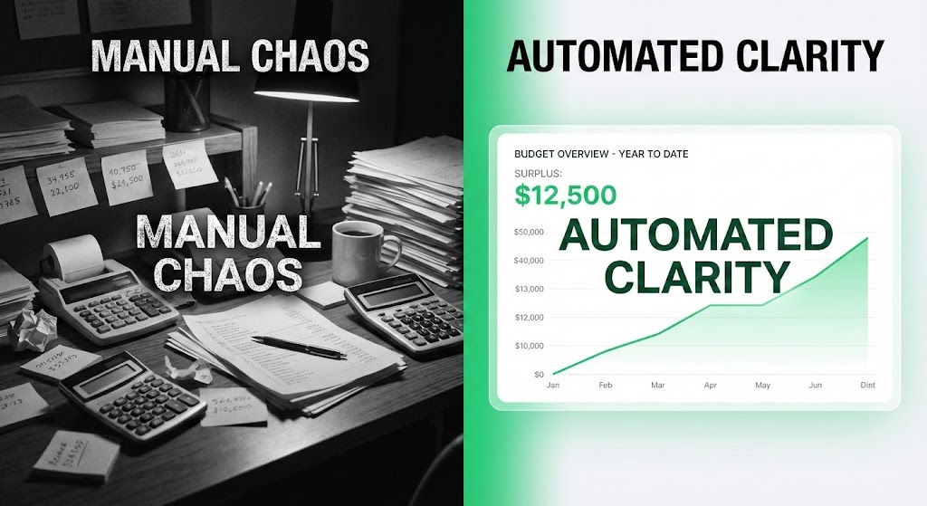
Visualization Scenario: A stark split-screen comparison. The left ("Manual Chaos") is a grainy, black-and-white photo of a messy desk with sticky notes and calculators. The right ("Automated Clarity") is a pristine, bright UI dashboard in Vivid Green showing a rising budget graph.
Narration Tone: The voiceover contrasts the stress of the old way ("Guesswork") with the confidence of the new way ("Precision").
Psychological Impact & KPI Focus
Niche Psychology: Validates the user's pain points. They recognize the messy desk; they aspire to the clean dashboard. It leverages the "Contrast Principle" to build trust.
Operational Impact: Visualizes Efficiency Gains. It offers the most direct visual proof of ROI and quality-of-life improvement for the planner.
Strategic Implementation & Trade-offs
Use Case: Landing Pages. When a user is considering a demo, this visual validates their desire to switch from spreadsheets to software.
Strategic Trade-off: Binary Argument. It assumes the user is currently in "chaos." If their current process is okay, this might feel hyperbolic.
Companies using similar video content -
Basis Technologies – Basis Platform – Improves omnichannel marketing performance by unifying programmatic.
Mediaocean – Prisma – Facilitates global management and coordination of the entire advertising process.
Skai – Skai Platform – Assists brands and agencies in managing extensive, omnichannel digital campaigns.
9. The Feature Blitz
MOFU | Feature Education
The Visual & Narrative Approach
Visualization Scenario: A high-energy montage of UI elements arranged in a dynamic diagonal flow. Extreme close-ups of buttons ("Launch"), toggles ("Optimize"), and graphs fly past the camera in High Contrast Black and Neon Green. Motion blur emphasizes the speed of the workflow.
Narration Tone: Staccato and feature-focused. "Plan. Buy. Optimize. Analytics."
Psychological Impact & KPI Focus
Niche Psychology: Reassures the technical buyer that the platform is "Feature Complete." The density of visuals suggests a robust, enterprise-grade ecosystem.
Operational Impact: Visualizes Platform Depth. It shows that the tool is comprehensive without boring the viewer with a 10-minute demo.
Strategic Implementation & Trade-offs
Use Case: Email Nurture Campaigns. It serves as a "teaser trailer" for the platform's capabilities.
Strategic Trade-off: Overwhelming Pace. Ensure the specific text on the buttons is legible even at high speed. It impresses but doesn't teach.
Companies using similar video content -
Adobe – Advertising Cloud – Offers inventory management, personalized marketing, search management.
Sprinklr – Marketing – Streamlines campaign planning, content production, execution, collaboration.
HubSpot – Marketing Hub – Comprehensive marketing automation platform.
10. The Elegant Untangling
MOFU | Competitive Displacement

The Visual & Narrative Approach
Visualization Scenario: An elegant, continuous line art illustration in Navy Blue ink on a textured Paper White background. A single line draws a complex, tangled knot that smoothly unties itself into a straight, ascending arrow.
Narration Tone: Sophisticated, intellectual, and calm. "Complexity... simplified." A minimalist piano score accompanies the untangling.
Psychological Impact & KPI Focus
Niche Psychology: Appeals to the senior decision-maker who values Elegance and Simplicity. It frames the software as a strategic partner that clarifies thinking, rather than just a utility.
Operational Impact: Visualizes Workflow Simplification and Strategic Clarity. It implies that the software removes the friction and "knots" inherent in legacy processes.
Strategic Implementation & Trade-offs
Use Case: Social Ads targeting C-Suite executives (LinkedIn).
Strategic Trade-off: Lacks Tech Appeal. It feels more like a consultancy brand than a SaaS platform. Use this to sell the philosophy of the solution, not the interface.
Companies using similar video content -
Choozle – Platform – Self-service programmatic advertising platform.
Simpli.fi – Platform – Localized programmatic advertising.
Lotame – DMP – Enables marketers, agencies, and publishers to collect first-party data.
11. The Strategic Architecture**
MOFU | ABM Awareness
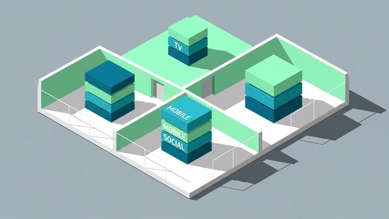
The Visual & Narrative Approach
Visualization Scenario: We adopt a "Strategy Game" aesthetic using a clean isometric perspective. The visual depicts an architectural floor plan where media channels are physical zones. Mint Green and Teal blocks labeled "TV," "Mobile," and "Social" are stacked neatly in their designated rooms, representing allocated budget. As the animation plays, these blocks shift and re-balance effortlessly, visualizing the fluidity of budget reallocation.
Narration Tone: The narrative is tactical and composed. It sounds like a master architect explaining a blueprint, focusing on "Structure," "Balance," and "Allocation."
Psychological Impact & KPI Focus
Niche Psychology: Media planning often feels like a house of cards—one move collapses the whole plan. This isometric style provides a psychological anchor of Stability. It appeals to the planner’s desire to see their strategy as a solid, engineered structure rather than a chaotic list of line items.
Operational Impact: Visualizes Channel Allocation and Inventory Management. It demonstrates that the software treats media assets as tangible, manageable inventory, allowing for precise Account-Based Marketing (ABM) targeting without the mess.
Strategic Implementation & Trade-offs
Use Case: LinkedIn Sponsored Content targeting specific accounts (ABM). "Build your strategy like you build your business."
Strategic Trade-off: Structure vs. Dynamism. The rigid architectural style conveys stability, excellent for planning, but may feel too static for explaining real-time programmatic bidding.
Companies using similar video content -
Xandr – Invest DSP – Known for powerful data marketplace and video ad capabilities.
CIENCE GO Digital – Platform – B2B DSP with precise targeting and configurable options.
RollWorks – AdRoll ABM – Generates B2B pipeline with account-based marketing.
12. The Augmented Planner
MOFU | LinkedIn Organic

The Visual & Narrative Approach
Visualization Scenario: A high-quality lifestyle shot focuses on the human element—a professional planner smiling while interacting with a tablet in a sun-lit office. The "magic" is revealed through floating, semi-transparent Electric Blue UI widgets hovering in the air. These holographic charts show upward trends and pie charts, blending the physical reality of the office with the digital insight of the platform.
Narration Tone: Warm, empowering, and human-centric. The script emphasizes "Partnership" between the human strategist and the machine intelligence. "You bring the creativity; we bring the clarity."
Psychological Impact & KPI Focus
Niche Psychology: Addresses the fear of AI Replacement. By centering a happy, relaxed human professional, the visual reassures the user that the software is an enhancement tool (Iron Man suit), not a replacement (Terminator). It promises a reduction in burnout.
Operational Impact: Visualizes Ease of Use and Accessibility. It suggests that complex data analysis is accessible anywhere—even on a tablet—liberating the planner from their desk-bound command center.
Strategic Implementation & Trade-offs
Use Case: Social Media (LinkedIn/Instagram) organic posts focused on "Company Culture" or "Planner Wellbeing."
Strategic Trade-off: Relatability vs. Detail. It builds strong emotional connection and brand affinity but obscures the actual UI details. It sells the feeling of using the software, not the feature set.
Companies using similar video content -
AdRoll – Platform – AI-powered advertising platform for brands and agencies.
Albert.ai – Platform – AI marketing platform for digital advertising.
NextRoll – AdRoll – Empowers businesses to drive sustainable growth with AI and data expertise.
13. The Gamified Success
MOFU | Website Visitor Re-engagement
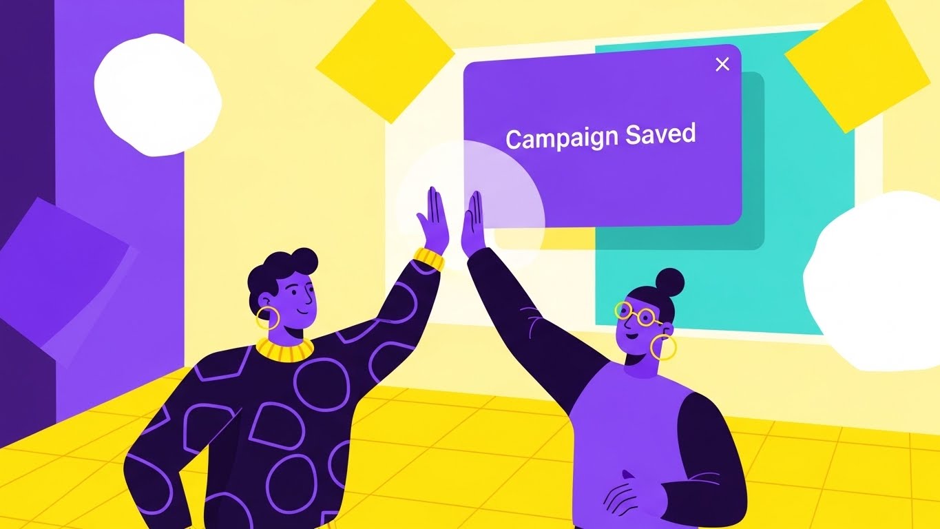
The Visual & Narrative Approach
Visualization Scenario: To re-engage visitors who left the site, we inject dopamine. The scene is a vibrant, flat vector animation featuring stylized characters (trendy purple skin tones) high-fiving. They interact directly with a floating UI card displaying a massive "Campaign Saved" notification. Geometric shapes in Yellow and Teal float in the background, creating a festive, celebratory atmosphere.
Narration Tone: Upbeat, lighthearted, and rewarding. "That feeling when the campaign optimizes itself."
Psychological Impact & KPI Focus
Niche Psychology: Media operations is a high-stress, low-reward environment. This style leverages Gamification psychology, associating the software with the relief and joy of a "win." It visually validates the user's desire for recognition and success.
Operational Impact: Visualizes Automated Optimization and Team Collaboration. It highlights the specific moment where the software intervenes to save time or budget, turning a potential crisis into a celebration.
Strategic Implementation & Trade-offs
Use Case: Retargeting Display Ads. When a user abandons a demo request, show them this visual to remind them of the relief they are missing.
Strategic Trade-off: Playfulness vs. Gravitas. This style is strictly for engagement and retargeting. It is too casual for the boardroom or a serious implementation review.
Companies using similar video content -
Optimizely – Platform – Optimization platform for experimentation and personalization.
Playablemaker – Platform – No-code playable ads creation for mobile games.
Anatics – Platform – Provides marketing analytics and insights.
14. The Integration Hologram
MOFU | Overcoming Objections
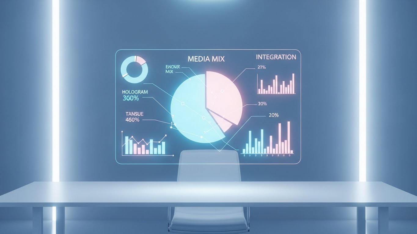
The Visual & Narrative Approach
Visualization Scenario: Addressing the objection of "complex integration," this visual utilizes a pristine, photorealistic 3D render of a minimalist white desk. Hovering above it is a futuristic, translucent holographic projection of a "Media Mix" pie chart. The hologram glows in Hologram Blue and Pale Pink, showing data points for "Integration" and "Search." The environment is sterile and controlled.
Narration Tone: Futuristic yet grounded. "Your entire stack. One projection. Zero clutter." It emphasizes the seamless merging of disparate data sources.
Psychological Impact & KPI Focus
Niche Psychology: Planners deal with "Dashboard Sprawl"—logging into five different DSPs. The single holographic display on an empty desk serves as a powerful metaphor for Centralized Command. It promises that the software acts as the single pane of glass they have been craving.
Operational Impact: Visualizes Tech Stack Integration and Data Unification. It demonstrates that the software sits above the clutter, synthesizing data from various sources (TV, Social, Programmatic) into one clean view.
Strategic Implementation & Trade-offs
Use Case: "Integration" feature pages on the website.
Strategic Trade-off: Conceptual vs. Literal. It beautifully illustrates the concept of integration but doesn't show the literal API configuration. It works best to sell the vision of a unified workflow.
Companies using similar video content -
Mediaocean – Prisma – Integrates media providers, data providers, ad servers, and third-party technologies.
Salesforce – Marketing Cloud – Unifies marketing stack, runs campaigns across various channels.
Oracle – BlueKai – Combines third-party data marketplace with enterprise-grade data management.
15. The Value Crystal
BOFU | ROI Justification

The Visual & Narrative Approach
Visualization Scenario: As we move to the Bottom of Funnel (BOFU), we talk money. We treat data like precious gems. 3D vertical bar charts made of Refractive Gold, Emerald Green, and Sapphire Blue glass rise sharply from a reflective white floor. Floating percentage signs orbit the bars. The lighting is exquisite, catching the caustics of the glass, making the growth metrics look tangibly valuable.
Narration Tone: Premium, concise, and financial. "Crystal clear attribution. Solid growth."
Psychological Impact & KPI Focus
Niche Psychology: CFOs and Investment Directors view media spend as an abstraction. By rendering charts as solid, refractive crystal, we subliminally signal that the data is Hard, Valuable, and Transparent. It removes the "fuzziness" of digital metrics.
Operational Impact: Visualizes ROAS (Return on Ad Spend) and Financial Reporting. It elevates a standard bar chart into a "Trophy," implying that the results generated by this platform are worth showing off in the boardroom.
Strategic Implementation & Trade-offs
Use Case: Pitch Decks and Quarterly Business Review (QBR) templates.
Strategic Trade-off: Aesthetics vs. Data Density. The 3D glass effect limits how much data you can show. Use it for the "Hero Metric" slide, not for granular data tables.
Companies using similar video content -
HockeyStack – Platform – Marketing attribution software for understanding revenue drivers.
Adobe – Analytics – Enterprise analytics for campaign results and key metrics.
Google – Analytics 360 – Enterprise analytics for detailed campaign analysis and audience segmentation.
16. The Data Haven
BOFU | Building Trust & Credibility

The Visual & Narrative Approach
Visualization Scenario: Trust is the currency of the BOFU stage. The visual depicts a sterile, high-security server environment. In the center, a Gold and Silver Shield rests against a glowing blue cube labeled "CORE DATA." The environment is rendered with photorealistic precision—sharp reflections, cool 6500K lighting—conveying an impenetrable fortress.
Narration Tone: Serious, secure, and reassuring. "Enterprise-grade security. ISO certified. Your proprietary data stays yours."
Psychological Impact & KPI Focus
Niche Psychology: Addressing the IT and Legal buyer personas. With First-Party Data becoming critical, the fear of data leakage is high. This clinical visual triggers the Safety instinct. It signals that the platform is not just a creative tool, but a secure infrastructure choice.
Operational Impact: Visualizes Data Governance and Privacy Compliance (GDPR/CCPA). It physically manifests the abstract concept of "security" as a heavy, metallic shield, making the protection tangible.
Strategic Implementation & Trade-offs
Use Case: "Security" or "Enterprise" section of the website; Whitepapers on Data Privacy.
Strategic Trade-off: Coldness. The style is intentionally clinical and cold to convey precision. Do not use this for user-engagement or creative features; keep it strictly for the risk-assessment buyer.
Companies using similar video content -
SAS – Data Management – Enterprise data management for data governance, quality, and security.
Nielsen – DMP – Collects, organizes, and leverages data effectively with advanced segmentation.
Permutive – DMP – Focuses on privacy-safe data activation for publishers and advertisers.
17. The Launch Moment
BOFU | Sales Cycle Acceleration
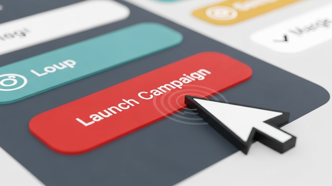
The Visual & Narrative Approach
Visualization Scenario: To accelerate the deal, we focus on the moment of power. The camera zooms in to an extreme macro level on a UI button labeled "Launch Campaign." The button is a glossy Crimson Red. A mouse cursor clicks it, generating a visible ripple effect across the button surface. The shallow depth of field blurs the rest of the interface, forcing total focus on the action.
Narration Tone: Decisive and final. "Ready. Set. Launch." The sound design features a satisfying "click" and a "whoosh" of data transmission.
Psychological Impact & KPI Focus
Niche Psychology: The "Launch" button is the media planner's trigger. It represents the culmination of weeks of work. This visual amplifies the Tactile Satisfaction of execution. It creates a craving to push the button and see the results.
Operational Impact: Visualizes Ease of Execution and Workflow Finality. It simplifies the complex backend processes of DSP syncing into a single, satisfying click, promising a friction-free go-to-market.
Strategic Implementation & Trade-offs
Use Case: Email signatures or final "Call to Action" in sales emails ("Ready to launch?").
Strategic Trade-off: Scope. It shows only one button. It is a powerful emotional trigger but explains nothing about the platform's features. It is purely a closer.
Companies using similar video content -
Google – Campaign Manager 360 – Centralized platform for managing digital ad campaigns.
Adform – Adform FLOW – Emphasizes user experience and scalable design for campaign execution.
Basis Technologies – Basis Platform – Improves omnichannel marketing performance by unifying programmatic.
18. The Aligned Boardroom
BOFU | The Economic Buyer

The Visual & Narrative Approach
Visualization Scenario: Selling software is often about selling organizational harmony. We see a low-angle, cinematic shot of a diverse executive team standing in a glass-walled boardroom. They are all looking in the same direction at a large screen (implied), smiling with genuine confidence. The lighting is warm sunlight, contrasting with the cool blues of the suits, symbolizing a "bright future."
Narration Tone: Leadership-focused. "Align your teams. Unify your vision. Scale your impact."
Psychological Impact & KPI Focus
Niche Psychology: The biggest pain point for the Economic Buyer (C-Suite) is misalignment between teams. This image sells the Outcome of the software: a team that agrees, understands the data, and is moving forward together. It sells consensus.
Operational Impact: Visualizes Stakeholder Alignment and Reporting Clarity. It implies that the software's reports are so clear that they eliminate confusion and argument in the boardroom.
Strategic Implementation & Trade-offs
Use Case: The final slide of a Sales Pitch Deck. Leave this image on screen during the Q&A session.
Strategic Trade-off: Generic nature. Without the context of the software (which is off-screen), this is just a stock photo. It must be paired with a narrative about organizational clarity to be effective.
Companies using similar video content -
Mediaocean – Prisma – Amalgamates various solutions into a single core, unifying data.
Skai – Skai Platform – Equips marketers with actionable insights and trustworthy data.
Sprinklr – Marketing – Streamlines campaign planning, content production, execution, collaboration.
19. The Deep Sync
BOFU | Risk Mitigation
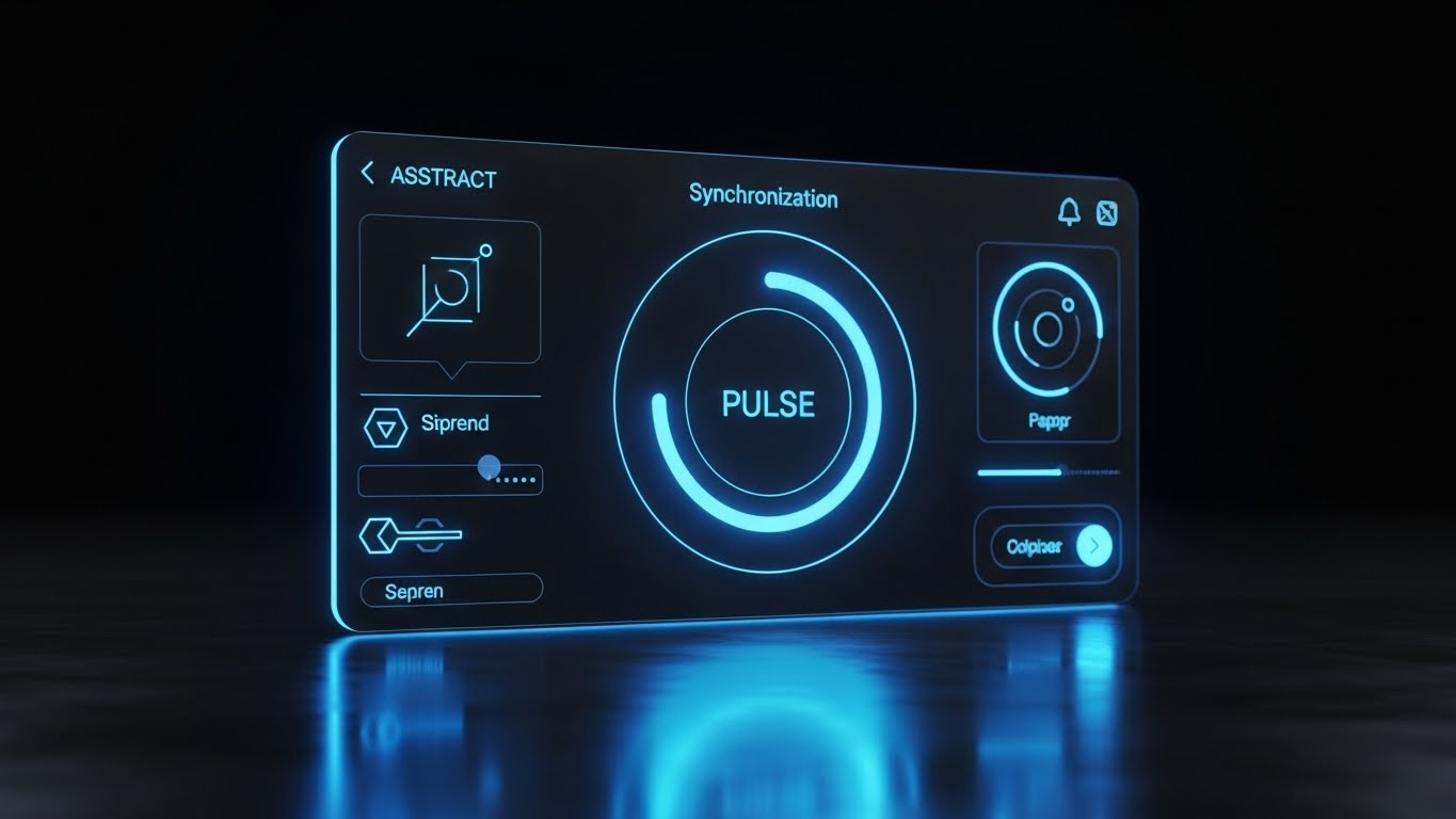
The Visual & Narrative Approach
Visualization Scenario: For the technical user who lives in the platform, we show the "Night Mode" cockpit. The interface is sleek Deep Charcoal and Neon Blue. The center of the screen features a "Synchronization" dial and a "PULSE" monitor, surrounded by toggles for "Siprend" (Spend) and "Cipher" (Encryption). It looks like the dashboard of a stealth fighter or a cybersecurity tool.
Narration Tone: Technical, quiet, and intense. "Precision control. Deep diagnostics. Total visibility."
Psychological Impact & KPI Focus
Niche Psychology: Power users and Ad Ops directors often distrust "pretty" white interfaces. Dark mode signals Professional Grade tools (like coding environments or trading terminals). It implies that this is where the real work happens, free from distraction.
Operational Impact: Visualizes System Health, Real-Time Bidding (RTB) Monitoring, and Granular Control. It reassures the technical buyer that the platform has the depth required for complex optimizations.
Strategic Implementation & Trade-offs
Use Case: Technical Whitepapers or the "Advanced Features" section of a proposal.
Strategic Trade-off: Intimidation Factor. While power users love it, the complexity might intimidate a casual marketing manager. Use targeted distribution.
Companies using similar video content -
FreeWheel – Beeswax BaaS Platform – Bidder-as-a-Service platform for comprehensive control.
BidTheatre – Platform – Programmatic advertising platform with advanced features.
Amobee – Platform – End-to-end solutions for brands and agencies.
20. The Traffic Stream
BOFU | ROI Justification Hook

The Visual & Narrative Approach
Visualization Scenario: We return to the real world to ground the data. A hyper-lapse video shows a city at night, with car headlights creating long streaks of Purple and Orange light. Overlaid on this organic chaos are crisp Green vector lines and data tags ("FLOW: 92%", "DENSITY: 78%") that track the traffic.
Narration Tone: Observational and analytical. "Traffic is traffic. Whether on the highway or the server. We optimize the flow."
Psychological Impact & KPI Focus
Niche Psychology: Bridging the gap between "web traffic" and the real world. This metaphor makes the concept of latency and throughput tangible. It validates the complexity of the ecosystem the client is operating in.
Operational Impact: Visualizes Real-Time Optimization and Load Balancing. It demonstrates that the software imposes order (the green lines) on the chaos of the open web (the traffic), ensuring efficient delivery of the ad payload.
Strategic Implementation & Trade-offs
Use Case: A high-energy closing video for a webinar or a background loop for a trade show booth.
Strategic Trade-off: Metaphorical limit. It is a powerful analogy, but don't let the metaphor overtake the product. Ensure the data tags use terminology relevant to media (e.g., CPM, CTR) to ground the visual.
Companies using similar video content -
PropellerAds – Platform – Multi-source advertising platform providing user acquisition and ad optimization.
InMobi – InMobi Exchange – Mobile advertising platform.
Digital Turbine – Platform – Seamless solution for mobile app advertising.
21. The Hybrid Workflow**
BOFU | Driving Demo Requests

The Visual & Narrative Approach
Visualization Scenario: We bridge the physical office and the digital platform. A high-angle shot shows a diverse media planning team collaborating around a table. Superimposed over the footage are glowing Electric Yellow and Cyan vector lines connecting the people to their devices. Floating icons of "Currency" and "Charts" travel along these lines, visualizing the invisible flow of data during a strategy session.
Narration Tone: Collaborative and integrative. "Your team brings the strategy. We provide the connection. Seamless collaboration, from the whiteboard to the dashboard."
Psychological Impact & KPI Focus
Niche Psychology: Media planning is inherently social but often hampered by siloed tools. This style validates the Human Element of the business. It reassures the buyer that the software facilitates, rather than replaces, their team's creative workflow.
Operational Impact: Visualizes Workflow Integration and Collaborative Efficiency. It demonstrates how the software captures offline discussions and instantly translates them into digital action items.
Strategic Implementation & Trade-offs
Use Case: Social Media Ads (LinkedIn) targeting Team Leads and Directors.
Strategic Trade-off: Generic Start. Live action stock can look generic. The quality of the motion graphics overlay is critical to brand the footage as "tech-forward" rather than just "corporate stock."
Companies using similar video content -
Mediaocean – Prisma – Amalgamates various solutions into a single core, enabling high-performing solutions.
Sprinklr – Marketing – Streamlines campaign planning, content production, execution, collaboration.
HubSpot – Marketing Hub – Comprehensive marketing automation platform with collaboration features.
22. The Welcoming Gateway
Onboard | Self-Serve Onboarding

The Visual & Narrative Approach
Visualization Scenario: The first interaction defines retention. This visual showcases a pristine, "Light Mode" UI screen on a Pure White background. A soft, inviting "Welcome" modal floats in the center. Three checklist items turn Vivid Green in rapid succession, accompanied by satisfying "pop" sound effects. The aesthetic is airy, uncluttered, and friendly.
Narration Tone: Encouraging and simple. "Welcome aboard. Three steps to your first campaign. Let's grow."
Psychological Impact & KPI Focus
Niche Psychology: "Software Anxiety" is a major barrier to adoption. New users fear breaking the system. This clean, high-key visual triggers a sense of Safety and Simplicity. It frames the complex setup process as a simple checklist.
Operational Impact: Visualizes Time-to-Value and Ease of Setup. It directly combats the objection that enterprise software takes months to configure, promising an immediate start.
Strategic Implementation & Trade-offs
Use Case: The first "Welcome" email in the onboarding sequence or the login screen background.
Strategic Trade-off: Simplicity vs. Power. It makes the tool look easy, which is great for new users, but ensure you don't alienate power users who want deep configuration options immediately.
Companies using similar video content -
AdRoll – Platform – User-friendly interface for multi-channel ad campaigns.
StackAdapt – Platform – User-friendly UI for creating, managing, and optimizing online ad campaigns.
Choozle – Platform – Self-service programmatic advertising platform designed for ease of use.
23. The Victory Lap
Onboard | Accelerating Time-to-Value

The Visual & Narrative Approach
Visualization Scenario: To maintain momentum, we visualize the "First Win." A flat, stylized 2D vector character (representing the user) sprints across a laptop screen, bursting through a "Finish Line" tape. The palette is energetic—Teal, Orange, and White. Confetti explodes as they cross the line. The motion is bouncy and fluid.
Narration Tone: Celebratory and motivating. "That was fast. You just launched your first optimized plan. This is just the beginning."
Psychological Impact & KPI Focus
Niche Psychology: Leveraging the Endowed Progress Effect. By celebrating the first milestone (setup or first launch), we increase the user's commitment to the platform. It associates the software with the feeling of achievement.
Operational Impact: Visualizes Adoption Velocity. It reinforces the narrative that the platform is designed for speed, encouraging the user to move to the next task immediately.
Strategic Implementation & Trade-offs
Use Case: Milestone emails (e.g., "Congratulations on your first launch") sent via the CRM.
Strategic Trade-off: Tone Sensitivity. This style is playful. It works wonders for user encouragement but should not be used for serious system alerts or billing communications.
Companies using similar video content -
Optimizely – Platform – Optimization platform for experimentation and personalization.
Playablemaker – Platform – No-code playable ads creation, emphasizing quick results.
Anatics – Platform – Provides marketing analytics and insights, showing quick wins.
24. The Plug-and-Play Architecture
Onboard | Reducing Implementation Friction
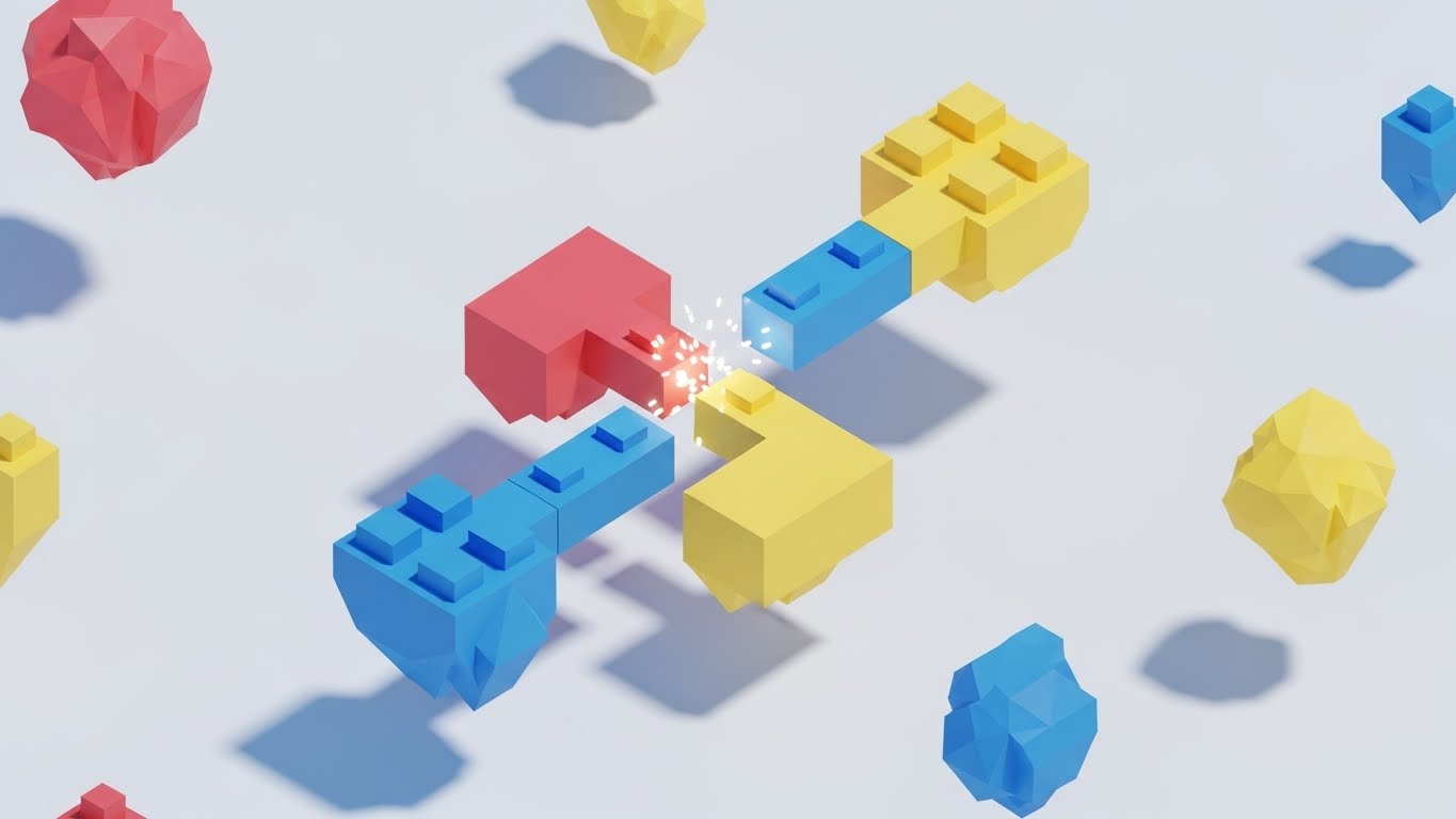
The Visual & Narrative Approach
Visualization Scenario: Integration can be technical, so we make it tactile. In a clean white void, floating low-poly geometric blocks in Primary Colors (Red, Blue, Yellow) drift together. They snap into place with a magnetic force, creating a small spark of light upon connection. It resembles digital LEGO bricks assembling themselves into a cohesive structure.
Narration Tone: Constructive and logical. "Connect your stack. Snap in your DSPs. Build your ecosystem."
Psychological Impact & KPI Focus
Niche Psychology: IT teams and Ad Ops fear "Integration Hell." The toy-like, low-poly aesthetic utilizes the Play Principle, making the daunting task of API configuration look as simple and satisfying as snapping building blocks together.
Operational Impact: Visualizes Interoperability and Modular Architecture. It demonstrates that the software plays well with others, acting as the central hub that connects disparate tools without friction.
Strategic Implementation & Trade-offs
Use Case: Implementation Guides and "Integrations" section of the Knowledge Base.
Strategic Trade-off: Abstract Representation. It conceptualizes integration perfectly but doesn't show the actual API keys or code. Pair this with technical documentation for the developer persona.
Companies using similar video content -
Kevel – Ad Serving API – Provides APIs for custom ad serving solutions.
Revive Adserver – Platform – Self-hosted ad serving solution with wealth of features.
1plusX – Platform – Real-time data management, data clean room, and CTV solutions.
25. The Depth of Knowledge
Retain | Knowledge Base & FAQ Videos
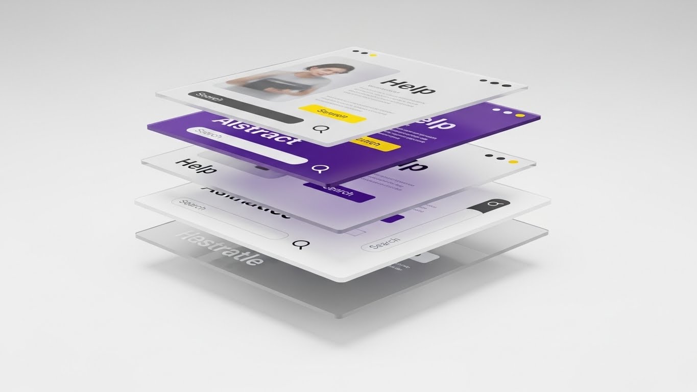
The Visual & Narrative Approach
Visualization Scenario: Support content needs to feel accessible yet deep. We use a 3D parallax effect where layers of semi-transparent glass UI screens float in a Cloud White void. The screens are separated in depth (Z-axis), displaying abstract "Help" articles and "Search" bars. As the camera tilts, the parallax movement reveals that the answer is always just one layer away.
Narration Tone: Helpful and calm. "Answers at your fingertips. Deep knowledge, instantly accessible."
Psychological Impact & KPI Focus
Niche Psychology: Users hate searching for help. The translucent, layered design suggests Transparency and Depth. It implies that the solution isn't hidden in a black box but is readily available within the clear, organized layers of the system.
Operational Impact: Visualizes Self-Service Support and Resource Accessibility. It promotes the Knowledge Base as a modern, easy-to-navigate tool, reducing the likelihood of users opening a support ticket.
Strategic Implementation & Trade-offs
Use Case: The header video for the "Help Center" or "Academy" portal.
Strategic Trade-off: Aesthetic over Information. The text on the floating screens is often abstract. This sells the quality of the support resources, not a specific answer.
Companies using similar video content -
Adobe – Analytics – Provides deep insights and detailed reports.
Google – Analytics 360 – Offers comprehensive analytics and reporting.
Skai – Skai Platform – Equips marketers with actionable insights and trustworthy data.
26. The Support Engine
Retain | Reducing Support Overhead

The Visual & Narrative Approach
Visualization Scenario: We visualize the "Service Level Agreement" (SLA) via a charming isometric factory. Miniature white robots zip around a clean white floor, sorting tickets into Green (Resolved) and Red (Urgent) chutes. The lighting is bright studio lighting. The animation loops perfectly, showing a continuous, orderly process of issue resolution.
Narration Tone: Efficient and reassuring. "Always on. Always sorting. Issues resolved before you even notice them."
Psychological Impact & KPI Focus
Niche Psychology: Clients worry about being ignored when things break. This "Support Factory" visualizes an Active System. Even if a human isn't replying instantly, the robots imply that a process is underway. It builds trust in the support infrastructure.
Operational Impact: Visualizes Automated Triage and Support Efficiency. It positions the support function not as a call center, but as an engineered, automated extension of the product.
Strategic Implementation & Trade-offs
Use Case: The "Contact Support" page or automated email receipts for ticket submission.
Strategic Trade-off: Whimsy vs. Urgency. If a user is facing a critical outage, cute robots might feel dismissive. Use this for general reassurance, not for "System Down" alerts.
Companies using similar video content -
SAS – Data Management – Enterprise data management for data governance, quality, and security.
Nielsen – DMP – Collects, organizes, and leverages data effectively with advanced segmentation.
Permutive – DMP – Focuses on privacy-safe data activation for publishers and advertisers.
27. The Evolving Brain
Retain | Reducing Churn

The Visual & Narrative Approach
Visualization Scenario: To retain customers, we show them the future value. A cluster of Iridescent Pearl and Silver nodes floats in a white void, connected by thin glass filaments. As the animation progresses, new connections form, and the cluster grows denser and brighter. It represents the AI "learning" from the client's data over time.
Narration Tone: Visionary and forward-looking. "The longer you stay, the smarter it gets. Your data fuels its evolution."
Psychological Impact & KPI Focus
Niche Psychology: This combats Churn. It utilizes the Sunk Cost/Investment Model positively—showing the user that their historical data has built an asset (the brain) that they would lose if they left. It visualizes the compounding value of retention.
Operational Impact: Visualizes Machine Learning Optimization and Algorithm Maturity. It explains that the software is not static; it is an evolving partner that improves its recommendations based on tenure.
Strategic Implementation & Trade-offs
Use Case: Quarterly Business Reviews (QBRs) and renewal reminder emails.
Strategic Trade-off: Intangibility. It is a metaphor for "better data," not a specific feature. It works best to reinforce the long-term partnership vision.
Companies using similar video content -
Quantcast – Quantcast Platform – AI-powered DSP that anticipates audiences.
Albert.ai – Platform – AI marketing platform for digital advertising.
The Trade Desk – Platform – Uses machine learning optimization for smarter campaigns.
28. The Developer's Matrix
Expand | Driving Deep Feature Adoption

The Visual & Narrative Approach
Visualization Scenario: To expand into the client's tech stack, we appeal to their developers. The view shifts to a perspective grid of glowing Neon Purple lines vanishing into a black horizon. Floating code snippets and syntax in Cyan and Pink hover above the grid, organizing themselves into logical stacks. It looks like a "cyber-space" visualization of the API documentation.
Narration Tone: Sophisticated and "Hacker-Chic." "Open API. Infinite extensibility. Build your own reality."
Psychological Impact & KPI Focus
Niche Psychology: Developers are key influencers in expansion deals. They value Control and Documentation. This visual style speaks their language (Dark Mode, Syntax Highlighting), signaling that the platform is "Dev-Friendly" and robust enough for custom builds.
Operational Impact: Visualizes Extensibility and Customization. It demonstrates that the platform is not a walled garden, but a foundation upon which the client can build their own proprietary tools.
Strategic Implementation & Trade-offs
Use Case: Developer Portal, API Documentation headers, and Technical Webinars.
Strategic Trade-off: Niche Appeal. This aesthetic is alienating to non-technical marketers. Keep it strictly contained within technical channels.
Companies using similar video content -
Kevel – Ad Serving API – Provides flexible APIs for custom ad serving.
FreeWheel – Beeswax BaaS Platform – Bidder-as-a-Service platform for media buyers.
Revive Adserver – Platform – Open source ad serving system.
29. The Enterprise Core
Expand | Driving Upsell/Cross-sell

The Visual & Narrative Approach
Visualization Scenario: When upselling to the Enterprise tier, we show what's "under the hood." A complex machine (the software) is rendered in White Plastic and Frosted Glass. The outer shell becomes transparent (X-Ray view), revealing a glowing, spinning Gold core engine. This core represents the premium features (Advanced Attribution, Predictive Modeling) locked behind the upgrade.
Narration Tone: Exclusive and premium. "Unlock the core. Power your enterprise with the engine reserved for the elite."
Psychological Impact & KPI Focus
Niche Psychology: Executives want to know what they are paying for. The X-Ray metaphor visualizes Hidden Value. It suggests that the standard version is good, but the "Gold" version has the real power. It creates a desire to access the "inner circle" of functionality.
Operational Impact: Visualizes Advanced Capabilities and Infrastructure Scale. It justifies the higher price point by revealing the complexity and power of the backend technology that isn't visible in the standard UI.
Strategic Implementation & Trade-offs
Use Case: "Upgrade to Enterprise" landing pages and sales decks for contract renewals.
Strategic Trade-off: Complexity. Ensure the "Core" looks powerful, not confusing. It should look like a Ferrari engine: complex but beautifully engineered.
Companies using similar video content -
Google – Display & Video 360 – Enterprise-grade DSP with deep integration into Google Marketing Platform.
Adobe – Advertising Cloud – Enterprise omnichannel programmatic DSP.
Mediaocean – Prisma – Omnichannel media planning software tailored to large corporations.
30. The Voice of Advocacy
Expand | Driving Referrals & Advocacy

The Visual & Narrative Approach
Visualization Scenario: The ultimate expansion tool is word-of-mouth. We use a photorealistic AI-generated video of a confident professional (Target Persona: VP of Media) in a Navy suit. He stands in a soft-focus modern office, speaking directly to the camera with genuine enthusiasm. The lighting is warm and flattering. He shares a concise success story.
Narration Tone: Authentic, peer-to-peer, and trustworthy. "We cut waste by 20% in the first quarter. It just works."
Psychological Impact & KPI Focus
Niche Psychology: B2B buyers trust their peers more than brands. This style leverages Social Proof. Even if generated, the realistic human face triggers the brain's trust centers (fusiform face area), validating the decision to use the software.
Operational Impact: Visualizes Customer Satisfaction and Market Leadership. It transforms a static case study into a persuasive, human narrative that can be easily shared to influence new buyers or internal stakeholders.
Strategic Implementation & Trade-offs
Use Case: Case Study pages, Video Testimonials, and LinkedIn Social Proof ads.
Strategic Trade-off: Uncanny Valley. The generative quality must be top-tier. If the lip-sync or eye movement is off, trust is instantly destroyed. Use with high quality control.
Strategic Knowledge Base: The Visual Operations Doctrine
To transform these 30 visual styles from "aesthetic choices" into "business assets," we must apply a strategic framework. This section outlines the Visual Operations Doctrine—a three-segment guide to implementing this visual language to drive adoption, efficiency, and ROI.
STRATEGIC ALIGNMENT & VISUAL ARCHITECTURE
The "Pre-Production" Strategy. Defining Why and Who before designing What.
- The Cognitive Load Audit: Before requesting a video, audit the complexity of the task. If a feature requires >5 clicks, use Style 2 (Clean Line Art) to simplify the concept first. Do not use high-fidelity 3D for simple tasks; it adds unnecessary noise.
- Role-Based Visual Mapping: Differentiate your visual language. Use Mobile-Optimized/Bold Styles (Style 4) for "Drivers" (Ad Ops Traders) who need quick alerts. Use Data-Dense/Desktop Styles (Style 6) for "Fleet Managers" (VPs/CFOs) who need deep analysis.
- The "Glanceability" Standard: In high-stress media environments, information must be understood in <3 seconds. Test every visual asset against the "Squint Test"—if you squint, can you still understand the trend line or alert status?
- Brand Voice Consistency: Your visual language must be the connective tissue between disparate modules (DSP, DMP, CMP). Establish a "Visual API"—a set of rules (e.g., "Spend is always Green, Risk is always Red") that applies across all 30 styles.
- The Advids Strategic Audit: Partnering with specialized agencies like Advids helps define this "Visual Operating System" before production begins. This ensures that assets created for Marketing (TOFU) share the same DNA as assets created for Support (Retain), creating a seamless customer journey.
- Standardization vs. Customization: Use standardized Stock/Template Styles (Style 12) for universal concepts like "Cloud Storage." Reserve bespoke High-Fidelity 3D (Style 15) for your unique proprietary differentiators (e.g., your specific algorithm).
- The Cross-Departmental Bridge: Use visuals to unify terminology. If Sales calls it "Optimization" but Product calls it "Refinement," use a Style 1 (Unified Ecosystem) video to visually demonstrate that these are the same process, reducing internal friction.
- Legacy System Integration: When replacing old tools (Excel/Legacy Software), use Style 8 (Operational Contrast) to visually validate the transition. Show the "Old Way" fading into the "New Way" to respect the user's past efforts while guiding them forward.
- Accessibility in Operations: Designing motion graphics isn't just about style; it's about inclusion. Ensure high contrast in Style 19 (Dark Mode) and use clear typography in Style 23 (2D Character) to support a diverse, global workforce.
- The Mobile-First Mandate: 40% of media approvals happen on mobile devices. Ensure all 30 styles, especially Style 21 (Hybrid Workflow), are legible on a vertical 9:16 screen to capture the executive in transit.
OPERATIONAL ADOPTION & IMPLEMENTATION
The "Deployment" Phase. Embedding visuals into the daily workflow.
- Overcoming "Big Brother" Anxiety: When introducing AI monitoring features, avoid aggressive "Red Alert" visuals. Use Style 26 (Support Robots) or Style 12 (Augmented Planner) to frame the technology as a helper that has the user's back, not a surveillance tool.
- The Micro-Learning Shift: Replace 50-page PDF manuals with a library of 30-second clips using Style 22 (Clean UI). Users retain 95% of a message when they watch it in a video compared to 10% when reading it in text.
- Just-in-Time Support: Embed specific visual styles directly into the software's dashboard. A Style 25 (Parallax UI) video should pop up exactly when a user hovers over a complex feature, providing context without leaving the page.
- Gamification of Training: Use Style 23 (Victory Lap) visuals in your Learning Management System (LMS). Award digital badges or visual celebrations when a team member completes a certification, driving engagement through dopamine loops.
- Reducing Support Ticket Volume: There is a direct correlation between proactive visual guides and reduced call center load. Deploy Style 2 (Clarity Engine) videos in the FAQ section to answer "How-To" questions before a ticket is created.
- Remote Onboarding: For distributed teams, physical seminars are impossible. Leverage Style 21 (Hybrid Workflow) and Style 24 (Plug and Play) to conduct "Virtual Onboarding" that feels as tangible and personal as an in-person session.
- Standard Operating Procedures (SOPs): Transform text-based SOPs into visual process flows using Style 3 (Blueprint Activation). This ensures that complex bidding protocols are followed with engineering precision, reducing human error.
- Feedback Loops: Use interactive video elements. At the end of a Style 9 (Feature Blitz) update video, include a one-click poll ("Love it" / "Confused"). This gathers real-time user sentiment on new features.
- Scalable Localization: Strategies for global teams. When using Style 30 (Gen AI Character) or text-heavy styles, design the assets with separate "Text Layers" so they can be easily translated into Spanish, French, or Japanese without re-rendering the background animation.
- Leadership Communication: Use high-end Style 15 (Value Crystal) visuals for Quarterly Business Reviews. When VPs communicate strategy to the C-Suite, they need visuals that look "expensive" and authoritative to secure budget.
MEASURING IMPACT & FUTURE-PROOFING
The "ROI" Phase. Quantifying success and preparing for the next evolution.
- Beyond "Views": Stop measuring "Video Views." Define actionable KPIs. For Style 22 (Onboarding), measure "Time-to-Competency." For Style 29 (Upsell), measure "Feature Adoption Rate." Connect the visual to a business metric.
- The "Idle Time" Metric: Correlate better visualization with reduced software navigation time. If a Style 17 (Launch Moment) video reduces the time it takes to set up a campaign by 15%, quantify that efficiency gain in dollar terms ($ saved in labor).
- Compliance Velocity: In a regulated industry, measuring how fast new regulations (e.g., GDPR updates) are understood is critical. Use Style 16 (Data Haven) videos to disseminate compliance info and track "Completion Rates" as a legal safeguard.
- Retention and Churn: High-quality UX visualization directly impacts Customer Lifetime Value (LTV). A user who "feels" the product is modern (via Style 27 Evolving Brain) is less likely to churn than one stuck in a stagnant interface.
- The AI Visual Frontier: Prepare for the future where dashboards generate their own visuals. The styles defined here (especially Style 28 Developer's Matrix) lay the groundwork for "Generative UI," where the software builds charts in real-time based on user queries.
- Scalability of Assets: Build a "Visual Component Library." Ensure the 3D assets used in Style 24 (Lego Blocks) are saved and reusable. This drastically reduces the cost of future video production as your feature set grows.
- The Advids Partnership: Long-term consistency requires a dedicated guardian of the visual brand. Advids acts as this partner, ensuring that as your software evolves from Version 1.0 to 5.0, your visual assets scale without losing their strategic core.
- Benchmarking Success: "Good enough" visuals are a competitive risk. Regularly audit your competitors. If they are using Style 30 (Gen AI) and you are still using static screenshots, you are losing the "Perception War" before the demo even starts.
- The ROI of Safety: For media buying, "Safety" means brand safety. Quantify how Style 2 (Clarity Engine) visuals help traders avoid "unsafe" inventory. The ROI here isn't just efficiency; it's the prevention of reputation damage.
- Final Call to Innovation: Treat video as Infrastructure, not content. In a $1 Trillion economy, the interface is the business. By adopting these 30 styles, you are not just making videos; you are building a superior operating system for the human mind.
Companies using similar video content -
AdRoll – Platform – Trusted by 110,000+ brands around the world.
Basis Technologies – Basis Platform – Global provider of programmatic advertising and media automation software.
The Trade Desk – Platform – Highly-rated programmatic advertising platform.
Author & Editor Bio


