
Introduction: Visualizing the Financial Nervous System of Healthcare
In the high-stakes world of Revenue Cycle Management (RCM), efficiency isn't just a metric—it is the difference between solvency and stagnation. For CFOs and RCM leaders, the claims processing engine acts as the organization's financial nervous system, translating clinical care into sustainable revenue. However, conveying the sophistication of modern adjudication platforms through static text is often insufficient. To truly resonate with buyers who are battling operational fatigue, you must show the transformation, not just describe it.
The operational reality is stark. As industry pressures mount, 11.8% initial denial rate was recorded in 2024, squeezing margins and increasing the administrative burden on already stretched teams. This friction represents a massive opportunity cost. With a staggering $25.7 billion adjudication cost weighing down providers annually, the market is desperate for solutions that are not only effective but also visibly superior.
This guide presents 30 expert-curated video styles designed to articulate that value. From the C-Suite boardroom to the analyst's workstation, these visual strategies utilize psychological triggers—reducing cognitive load, visualizing invisible algorithms, and humanizing automation—to position your platform not just as a tool, but as a strategic partner in financial recovery. Whether you are aiming to build brand awareness or displace legacy competitors, these examples serve as a blueprint for visualizing the future of "touchless" claims processing.
1. Gen AI Realistic Character video
TOFU | Brand Awareness
The Visual & Narrative Approach
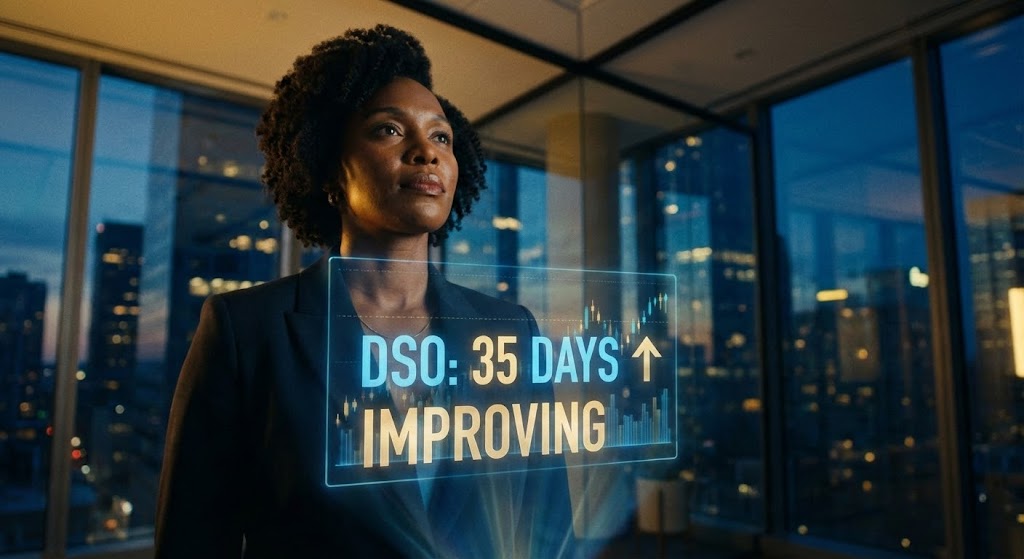
This style employs high-end cinematic realism to speak directly to the economic buyer: the CFO. The scene places a confident executive in a "Master of the Universe" setting—a twilight glass office overlooking a city—establishing immediate authority. The crucial element is the interaction with a floating holographic visualization of financial data, specifically showing "DSO" (Days Sales Outstanding) metrics improving. The narrative tone is one of quiet confidence and strategic foresight, utilizing a Deep Navy and Gold palette to signify stability and wealth.
Psychological Impact & KPI Focus
- Niche Psychology: CFOs are risk-averse. They do not buy "features"; they buy "control." This visual anchors them in an aspirational reality where data is not a burden, but a tool for command.
- Operational Impact: By visualizing the DSO Metric as a tangible, glowing object, it bridges the abstraction of RCM software with the physical reality of cash flow velocity.
Strategic Implementation & Trade-offs
- Duration: 15-30 Seconds.
- Trade-off: This style is resource-intensive and prioritizes brand perception over feature education. It is best used for high-level brand awareness rather than product demos.
Companies using similar video content -
Waystar – Platform – Visualizing improved financial performance and control.
R1 RCM – Platform – Strategic oversight for enterprise revenue cycles.
Optum – Change Healthcare – High-level strategic control for healthcare finance.
2. 2D Line Art Animation
TOFU | Market Education

The Visual & Narrative Approach
This style utilizes a "continuous line" technique to create a mesmerizing visual metaphor for workflow optimization. On a sterile white canvas, a chaotic, scribbled knot of lines (representing manual claims paperwork) elegantly untangles itself, flowing smoothly from left to right to form a sharp, aerodynamic digital arrow. The palette is strictly limited to Cyan, Magenta, and Slate Grey, reinforcing a sense of clinical precision. The motion is fluid and uninterrupted.
Psychological Impact & KPI Focus
- Niche Psychology: Medical billers are cognitively overloaded. They crave simplicity. This style validates their desire for a frictionless experience without overwhelming them with UI details.
- Operational Impact: The transformation from "messy knot" to "clean arrow" directly maps to the First-Pass Yield KPI, visually promising that the software will disentangle their complex workflows.
Strategic Implementation & Trade-offs
- Duration: 30-45 Seconds.
- Trade-off: The abstract nature is excellent for concepts but poor for "feature proof." It explains the philosophy of the software, not the mechanics.
Companies using similar video content -
athenahealth – athenaCollector – Streamlining complex claims processing workflows.
AdvancedMD – RCM – Simplifying medical billing and adjudication.
NextGen Healthcare – RCM – Continuous flow for optimized revenue cycles.
3. Abstract 2D flat vector organic modern motion graphics
TOFU | Brand Perception

The Visual & Narrative Approach
This style employs abstract, organic shapes to visualize the invisible "flow" of data. Glossy, liquid-like blobs in Vivid Lime, Soft White, and Silver morph and merge in a zero-gravity environment. The central focus is on the fluid motion of shapes combining to represent the concept of "Claim Adjudication" flow. The rendering features soft shadows and neumorphic highlights, creating a tactile, smooth, and positive visual experience.
Psychological Impact & KPI Focus
- Niche Psychology: RCM is often viewed as rigid and punitive. This aesthetic counters that perception by presenting the process as organic and adaptable.
- Operational Impact: The "merging" of shapes visually represents Interoperability—the seamless integration of disparate systems (EHR, Payer Portals) into a single source of truth.
Strategic Implementation & Trade-offs
- Duration: 10-15 Seconds (Loopable).
- Trade-off: It is purely emotional. It builds brand affinity ("They look modern") but fails to address specific technical objections.
Companies using similar video content -
FinThrive – Platform – Fluid data flow for seamless RCM integration.
Akasa – Unified Automation – Organic data merging for RCM interoperability.
Notable Health – Platform – Reducing cognitive load with fluid data visualization.
4. Bold Kinetic Typography (Visual)
TOFU | Skippable Pre-Roll Ad

The Visual & Narrative Approach
This style mimics the high-energy aesthetic of a fintech commercial. It uses large, geometric Bauhaus-inspired shapes and bold text that flashes on screen. The visual language uses "stamping" motions—diagonal blocks of Electric Orange and Stark Black impacting the screen—to suggest the finality of a "Paid" stamp. There is no readable text, just the suggestion of bold, energetic forms representing speed.
Psychological Impact & KPI Focus
- Niche Psychology: In a slow-moving industry plagued by "Aging Buckets," speed is a potent drug. This style taps into the frustration of delay.
- Operational Impact: The kinetic energy directly correlates to the Payment Velocity KPI. It creates a visceral sense of urgency, positioning the software as an accelerator for cash flow.
Strategic Implementation & Trade-offs
- Duration: 6-10 Seconds.
- Trade-off: Low information density. It grabs attention effectively but must be followed by a more informative asset to explain how the speed is achieved.
Companies using similar video content -
Collectly – Patient Payments – Accelerating payment velocity with bold efficiency.
Rivet Health – Platform – Driving faster payment cycles and transparency.
Experian Health – Revenue Cycle Management – Kinetic energy for accelerating payment velocity.
5. AI generated mixed media video
TOFU | Vertical Social Organic

The Visual & Narrative Approach
This style explicitly visualizes the industry's core transition: from paper to data. The scene transitions from a chaotic desktop surface with realistic coffee stains and torn paper representing "Denials," to a sleek digital overlay where the paper scraps transform into glowing 3D digital gold coins. The camera uses a handheld shake effect for energy. Colors include Paper White, Ink Blue, and Real Red highlights.
Psychological Impact & KPI Focus
- Niche Psychology: It validates the physical pain of the user (the pile of paperwork) while offering a literal "alchemy" of turning trash (denials) into treasure (revenue).
- Operational Impact: This is the most direct visualization of Revenue Recovery. It addresses the "Physical/Digital Bridge" challenge by showing the direct financial outcome of automation.
Strategic Implementation & Trade-offs
- Duration: 15-30 Seconds.
- Trade-off: The "trendy" aesthetic might feel too informal for a Board of Directors meeting but is perfect for the operational managers scrolling social media.
Companies using similar video content -
VisiQuate – Analytics – Transforming denials into tangible revenue.
Revecore – Revenue Recovery – Digital alchemy for maximizing financial returns.
AGS Health – RCM Services – AI-powered transformation of denials into revenue.
6. Wireframe to Reality Transition
MOFU | Product Differentiation
The Visual & Narrative Approach
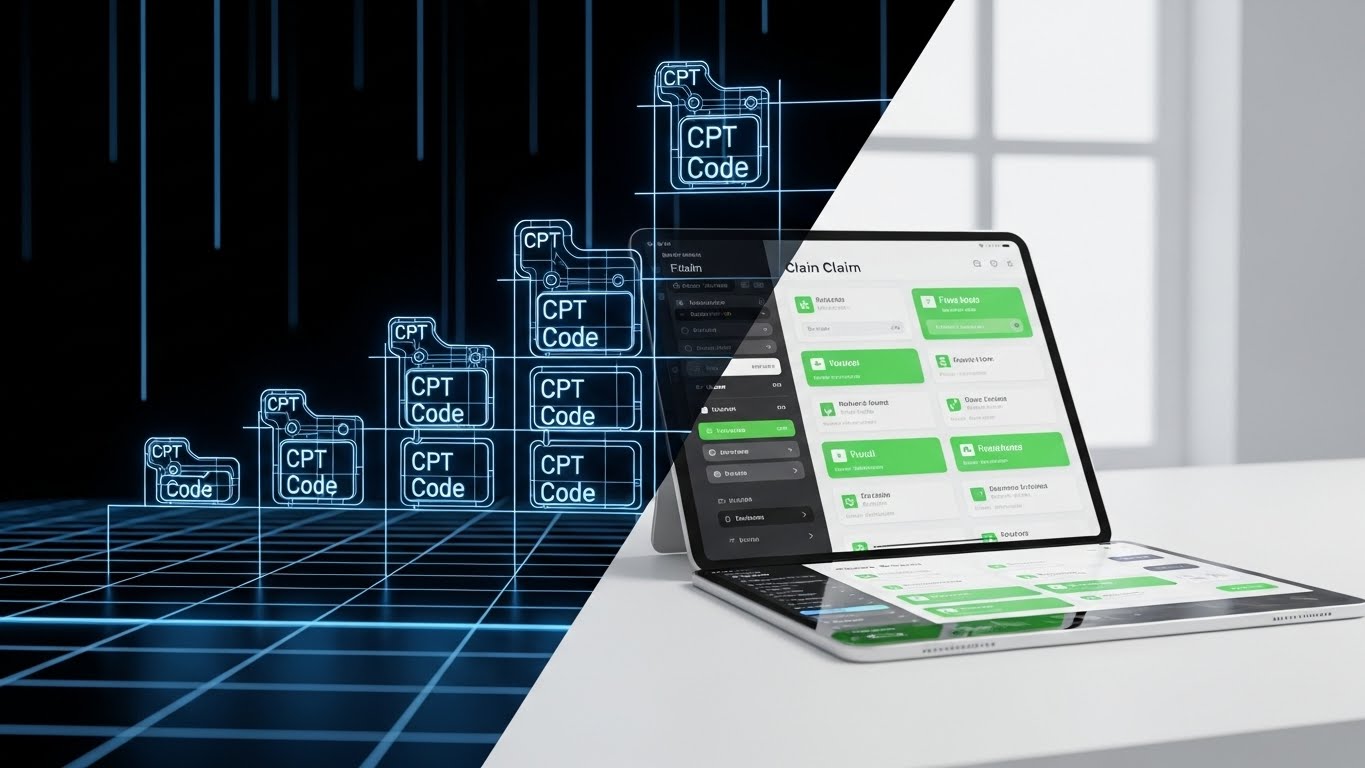
This style is the "engineer's proof." It utilizes a split-screen composition showing the evolution of a medical claim. The left side displays a glowing Blueprint Blue wireframe structure of CPT code blocks on a digital grid. The right side seamlessly transitions into a solid, photorealistic render of a polished iPad interface on a desk, showing the finalized data in Neon Green and White. The lighting shifts from internal wireframe glow to external studio lighting.
Psychological Impact & KPI Focus
- Niche Psychology: IT Directors are skeptical of "vaporware." They want to know the system is robust.
- Operational Impact: This style proves Data Integrity. It communicates that the sleek UI is supported by a robust, logical backend capable of handling complex CPT coding hierarchies.
Strategic Implementation & Trade-offs
- Duration: 20-40 Seconds.
- Trade-off: It can be dry. It lacks the human emotional hook, focusing entirely on the product's existence and build quality.
Companies using similar video content -
RCxRules – Denial Prevention – Validating robust logic for claims processing.
3M Health Information Systems – Coding and Reimbursement – Architectural proof of data integrity.
Inovalon – ONE Platform – Proving robust logic from wireframe to reality.
7. Clean UI Workflow (Light Mode)
MOFU | Feature Education
The Visual & Narrative Approach
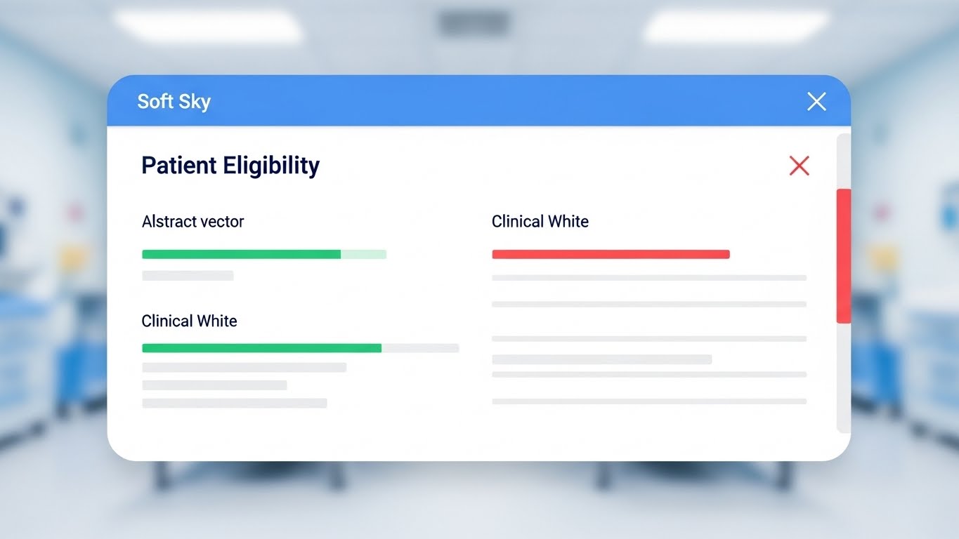
This is the "hero product" shot. It features a high-fidelity, clean UI mockup displayed straight-on. The interface features "Patient Eligibility" data visualized as abstract green status bars and soft grey text lines on a Clinical White card. The background is a heavily blurred, bright hospital nursing station. The UI elements have soft drop shadows and rounded corners, utilizing a palette of Soft Sky Blue and Light Grey to convey sterility and organization.
Psychological Impact & KPI Focus
- Niche Psychology: Users are terrified of "Click Fatigue" and cluttered screens. They want a tool that makes their job easier, not harder.
- Operational Impact: This visualizes Efficiency. It directly addresses "Feature Education" by showing exactly how the software presents critical data, promising a reduction in administrative burnout.
Strategic Implementation & Trade-offs
- Duration: 60 Seconds.
- Trade-off: It is static and functional. It doesn't tell a story of growth, only of state, and requires a voiceover to explain the context.
Companies using similar video content -
Kareo – Billing – Clinical clarity for patient eligibility verification.
ModMed – Practice Management – Visualizing efficient patient eligibility workflows.
Greenway Health – PrimeSUITE RCM – Clean UI for streamlined clinical clarity.
8. Lifestyle Stock with UI Overlay
MOFU | Building Trust

The Visual & Narrative Approach
This style humanizes the technology. A high-quality lifestyle shot of a male doctor with silver hair wearing Teal scrubs, viewed over-the-shoulder. He is holding a tablet in a bright, sun-lit medical clinic corridor. Overlaid on the tablet screen is a semi-transparent, glowing UI element showing a "Success" notification icon. The lighting is high-key and natural.
Psychological Impact & KPI Focus
- Niche Psychology: There is a fear that automation will replace staff. This style counters that by showing technology supporting the human expert.
- Operational Impact: It builds Provider Trust. The visual narrative is that the software is a tool that empowers the provider to focus on the patient rather than the screen.
Strategic Implementation & Trade-offs
- Duration: 15-30 Seconds.
- Trade-off: Stock footage can feel generic. The "floating UI" must look integrated and bespoke, or it risks looking like a low-budget corporate video.
Companies using similar video content -
PatientBond – Digital Engagement – Empowering providers with integrated technology.
Cedar – Pay – Human synergy for improved patient financial experience.
MedData – RCM Solutions – Supporting providers with technology-enabled RCM.
9. Split Screen: Optimized Reality and UI
MOFU | Competitive Displacement
The Visual & Narrative Approach
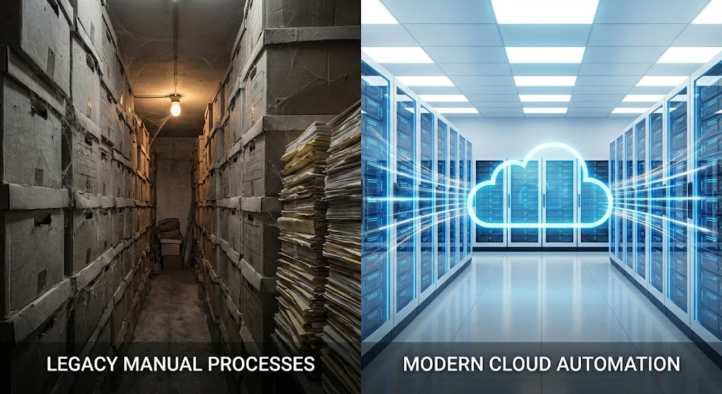
A classic "Before & After" comparison, elevated for B2B. A horizontal split-screen comparison. The left side is gritty and dim, showing stacks of aging, dusty paper files in a warehouse, colored in Muted Greys. The right side is bright and pristine, showing a glowing "Cloud" icon absorbing data streams in a server room, colored in Vivid Azure and White. The contrast emphasizes the shift from legacy manual processes to modern cloud automation.
Psychological Impact & KPI Focus
- Niche Psychology: It attacks the fear of obsolescence. It visually categorizes the "old way" as dirty and decaying, and the "new way" as clean and eternal.
- Operational Impact: This supports Cloud Migration. It visually argues that staying with legacy systems is a liability, driving the "Digital Transformation" narrative.
Strategic Implementation & Trade-offs
- Duration: 15-20 Seconds.
- Trade-off: It is a binary argument. It lacks nuance and might alienate a prospect who is currently stuck in the "warehouse" phase if not paired with an empathetic transition message.
Companies using similar video content -
FinThrive – Platform – Modernizing legacy RCM processes.
Waystar – Platform – Visual contrast for cloud migration benefits.
Parallon – RCM Services – Optimizing reality by modernizing legacy systems.
10. Rapid UI Feature Montage
MOFU | The Functional Buyer
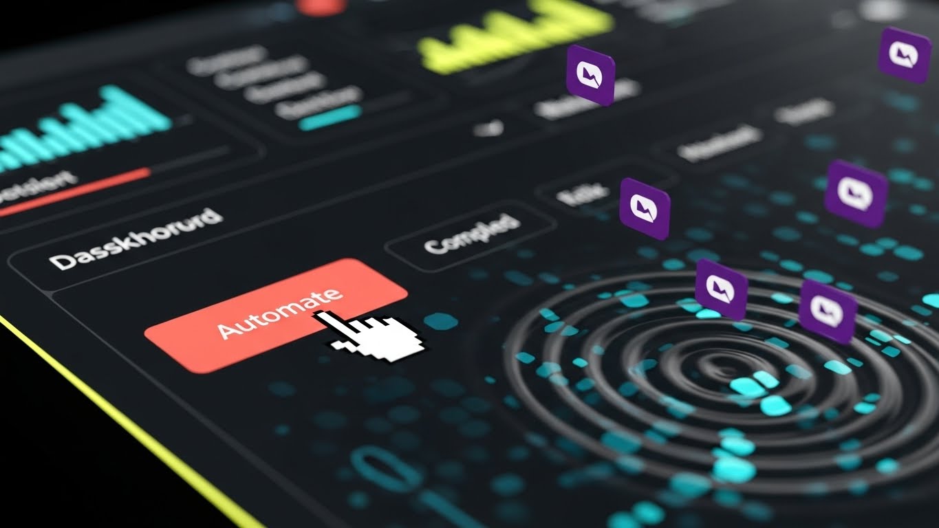
The Visual & Narrative Approach
This style is built for speed. A rapid motion graphics montage featuring extreme zoom-ins on UI elements. A cursor clicks a "Automate" button colored in Vibrant Coral, causing a ripple effect of Deep Purple completed task icons spreading across the screen. The background is an abstract digital bokeh. The style is fast-paced and energetic, highlighting workflow efficiency and speed.
Psychological Impact & KPI Focus
- Niche Psychology: The "Functional Buyer" (the person pressing the buttons) wants to feel powerful. They want to see that one click can do the work of a hundred.
- Operational Impact: This visualizes Automation Efficiency. It demonstrates the leverage of the platform—small input (one click) equals massive output (ripple of tasks).
Strategic Implementation & Trade-offs
- Duration: 15-20 Seconds.
- Trade-off: It moves too fast for training. It is designed to create excitement and "hype" around the product's capabilities, not to teach how to use it.
Companies using similar video content -
Akasa – Unified Automation – Instant action for automation speed.
Notable Health – Platform – Visualizing rapid automation and efficiency.
MedEvolve – RCM – Accelerating workflows with instant action and automation.
11. Minimalist Flat 2D Vector
MOFU | Driving Freemium/Trials

The Visual & Narrative Approach
This style strips away complexity to promise a frictionless start. Utilizing the "Corporate Memphis" flat aesthetic with Pastel Mint, Charcoal, and White, the scene depicts a stylized hand with exaggerated, friendly proportions pressing a large "Launch" button. This action triggers a simple geometric rocket ship to lift off, symbolizing the immediate start of a trial. The view is isometric 2D with clean vector edges and zero gradients, presenting the onboarding process as playful and instantaneous.
Psychological Impact & KPI Focus
- Niche Psychology: The greatest barrier to a trial for smaller practices is the fear of a complex setup (the "Implementation Dip"). This style visually promises a "Plug-and-Play" experience, lowering the psychological barrier to entry.
- Operational Impact: By visualizing the sign-up as a single, low-effort interaction, it supports Conversion Rate Optimization (CRO), encouraging users to initiate the self-serve trial process without fear of IT overhead.
Strategic Implementation & Trade-offs
- Duration: 6-15 Seconds (Loopable).
- Trade-off: It is highly stylized and lacks technical detail. It works best for display ads driving click-throughs, but may lack the gravitas required for enterprise-level presentations.
Companies using similar video content -
AdvancedMD – RCM – Frictionless entry, removing implementation barriers.
Kareo – Billing – Simplifying onboarding for immediate launch.
RevSpring – Patient Engagement – Removing implementation barriers for frictionless entry.
12. Dynamic Data Visualization
BOFU | ROI Justification

The Visual & Narrative Approach
To the Economic Buyer, data is the only language that matters. This style elevates standard charts into tangible, high-value assets. Viewed from a "worm's eye" perspective to convey scale and dominance, the bar chart is rendered as towering Emerald Green glass blocks resembling stacked gold bullion or precious gems. They rise triumphantly towards a bright light source. The floor is a reflective minimalist white, creating caustic light refractions that subtly suggest wealth, clarity, and the solidity of recovered revenue.
Psychological Impact & KPI Focus
- Niche Psychology: CFOs often view software as a cost center. This aesthetic reframes the platform as an "asset generator." The resemblance to precious materials subconsciously links the software output to Net Profit.
- Operational Impact: This explicitly visualizes ROI (Return on Investment). It transforms the abstract concept of "claims processed" into the physical reality of "revenue secured," validating the purchase price.
Strategic Implementation & Trade-offs
- Duration: 15-30 Seconds.
- Trade-off: It is symbolic. It proves the result (financial gain) but does not show the method (workflow). It must be paired with evidence of how that ROI is achieved.
Companies using similar video content -
Craneware – Trisus – Materializing revenue recovery with tangible wealth.
VisiQuate – Analytics – Dynamic data visualization for clear ROI.
XIFIN – RPM – Elevating data into tangible wealth and ROI.
13. 3D X-Ray Visualization
BOFU | Risk Mitigation

The Visual & Narrative Approach
This style addresses the "black box" anxiety of security compliance by using a powerful mechanical metaphor. We view the "Engine of Adjudication" through an X-ray lens. The outer casing is transparent Dark Grey, revealing a robust internal architecture of Electric Yellow pistons and filters working in perfect synchronization. These glowing mechanical components represent the active security protocols and validation logic that power the system. The visual emphasizes structural integrity and continuous, high-performance output.
Psychological Impact & KPI Focus
- Niche Psychology: Security officers fear unseen vulnerabilities. By "X-raying" the system, you visually demonstrate that security is not a wrapper, but is built into the mechanical core of the architecture.
- Operational Impact: This visualizes Data Integrity & Compliance. It translates the abstract requirements of SOC2 and HIPAA into a tangible, hardened machine, validating the platform's safety.
Strategic Implementation & Trade-offs
- Duration: 30-60 Seconds.
- Trade-off: The mechanical metaphor is intense and industrial. It effectively addresses risk for the CTO but may feel too heavy for patient-facing or clinical stakeholders.
Companies using similar video content -
Inovalon – ONE Platform – Ensuring HIPAA compliance with internal integrity.
3M Health Information Systems – Coding and Reimbursement – X-ray visualization for data security.
Zelis – Payments & Network Analytics – Internal integrity for robust compliance.
14. 2D Character-Driven Story
BOFU | Overcoming Objections

The Visual & Narrative Approach
This style directly addresses the "Change Management" fears of the end-user. It features a friendly, stylized 2D vector character in a soft, inviting home-office setting with Warm Yellow and Soft Peach tones. The narrative visualizes a thought bubble above the user: initially, a jagged, chaotic scribbled line represents the stress of "Denial Management." As the character interacts with the software, the scribble smooths out and transforms into a glowing Green Checkmark. The character's expression shifts from tension to visible relief.
Psychological Impact & KPI Focus
- Niche Psychology: Staff worry, "Will this make my life harder?" This empathetic visual validates their anxiety and immediately resolves it, promising a transition from chaos to clarity.
- Operational Impact: It addresses Staff Retention. By visualizing the reduction of stress, it positions the platform as a tool for improving team morale and reducing turnover.
Strategic Implementation & Trade-offs
- Duration: 45-60 Seconds.
- Trade-off: It is "soft" content. It builds emotional buy-in but lacks the hard data or feature density required to pass a technical feasibility review.
Companies using similar video content -
athenahealth – athenaCollector – Emotional resolution, eliminating biller burnout.
MedEvolve – RCM – Character story for improved staff experience.
Collectly – Patient Payments – Eliminating biller burnout through emotional resolution.
15. Photorealistic 3D Renders
BOFU | The Economic Buyer

The Visual & Narrative Approach
This is the ultimate "Closer" shot. It takes the abstract concept of a "Clean Claim" and mints it into a physical object of value. A macro lens focuses on a photorealistic, metallic token resting on a luxury Marble White surface. The token, embossed with "CLEAN CLAIM," gleams in Gold and Platinum textures. The lighting is exquisite, soft-box studio quality, highlighting the weight and polish of the object. The shallow depth of field blurs the background, demanding total focus on the value being presented.
Psychological Impact & KPI Focus
- Niche Psychology: In a digital industry, buyers rarely "hold" what they buy. Giving the claim a physical form (a gold coin) creates a psychological sense of ownership and high value.
- Operational Impact: It reinforces the Clean Claim Rate. It suggests that every claim processed by the platform is a "minted" piece of revenue, ready to be banked, rather than a gamble.
Strategic Implementation & Trade-offs
- Duration: 10-15 Seconds (Hero Loop).
- Trade-off: It is purely symbolic. It is a powerful brand anchor for a website header or presentation slide, but it conveys zero functional information about the adjudication logic.
Companies using similar video content -
Waystar – Platform – Tangibilizing claim value as the gold standard.
R1 RCM – Platform – Photorealistic renders for clean claim assurance.
FinThrive – Platform – The gold standard for tangible claim value.
16. Dark Mode UI Showcase
BOFU | The Technical Buyer

The Visual & Narrative Approach
For the IT decision-maker, "Dark Mode" is the language of serious work. This style presents the platform's backend analytics in a sleek, high-contrast interface. Against an OLED Black background, bright Neon Green and Electric Yellow data visualizations—including bar charts and complex network graphs—populate the screen. The perspective is angled, set in a dimly lit server environment with ambient reflections on the glossy monitor bezel. It screams "Power User."
Psychological Impact & KPI Focus
- Niche Psychology: IT Directors distrust "pretty" interfaces that hide the logic. They find comfort in data density. This visual speaks their language of control and visibility.
- Operational Impact: It visualizes Interoperability & Uptime. It reassures the technical team that the system handles HL7/FHIR standards and integrates seamlessly with existing EHR infrastructure.
Strategic Implementation & Trade-offs
- Duration: 30-60 Seconds.
- Trade-off: It alienates non-technical users. A billing manager might find this intimidated or confusing. It should be used exclusively in technical documentation or IT-focused pitches.
Companies using similar video content -
Epic – RCM Module – Developer deep dive, demonstrating API robustness.
Oracle Health – Cerner RCM – Dark mode UI for technical buyers.
Salesforce Health Cloud – RCM Solutions – Demonstrating API robustness for technical buyers.
17. Isometric 3D Workflow
BOFU | Sales Cycle Acceleration

The Visual & Narrative Approach
This style employs a "Tilt-Shift" miniature diorama effect. It shows an isometric view of a pristine white hospital building connected to a massive insurance payor building by a glowing, pulsating Medical Red data pipe. The data packets travel smoothly from the hospital, are processed instantly, and return as "Payment" tokens. The ground is a clean white studio cyclorama. The aesthetic is toy-like but precise, making the complex macro-relationship simple and manageable.
Psychological Impact & KPI Focus
- Niche Psychology: It simplifies the adversarial relationship between Payer and Provider. It presents the software as the diplomatic channel that ensures smooth transit.
- Operational Impact: It visualizes Days Sales Outstanding (DSO) reduction on a macro scale. It shows the entire cycle at a glance, proving the vendor understands the "Big Picture."
Strategic Implementation & Trade-offs
- Duration: 20-30 Seconds.
- Trade-off: The "toy" aesthetic must be handled carefully to avoid trivializing the serious nature of healthcare finance. It works best for explaining ecosystem positioning.
Companies using similar video content -
Availity – Revenue Cycle Management – Bridging payer and provider ecosystems.
Optum – Change Healthcare – Ecosystem view for streamlined RCM.
InstaMed – Healthcare Payments – Bridging payer and provider for macro DSO reduction.
18. Isometric 2D Motion Design
BOFU | Objection Handling

The Visual & Narrative Approach
This style uses a hypnotic, looping animation to demonstrate processing power. On a pale grey grid, a stylized factory conveyor belt moves varied, jagged cubic blocks (representing complex ICD-10 codes) in Soft Lavender. As they pass through a scanner frame, they are instantly reshaped into smooth, uniform White Spheres. The motion is rhythmic and seamless, conveying a sense of tireless, error-free automation.
Psychological Impact & KPI Focus
- Niche Psychology: It addresses the fear of "Exception Handling." Prospects worry that complex codes will jam the system. This loop proves the engine can handle variability without stalling.
- Operational Impact: It visualizes Auto-Adjudication Rate. The smooth transformation implies that the system creates standardized, compliant outputs from messy inputs.
Strategic Implementation & Trade-offs
- Duration: 10-15 Seconds (Loop).
- Trade-off: It is abstract. It doesn't show the actual UI, so it must be paired with voiceover or text explaining what is being processed (e.g., "Handling 50,000+ codes daily").
Companies using similar video content -
RCxRules – Denial Prevention – Processing power for standardizing ICD-10 complexity.
FinThrive – Platform – Isometric motion for auto-adjudication rates.
3M Health Information Systems – Coding and Reimbursement – Standardizing ICD-10 complexity with processing power.
19. 2D Animation & UI Composition
Onboarding | Reducing Implementation Friction
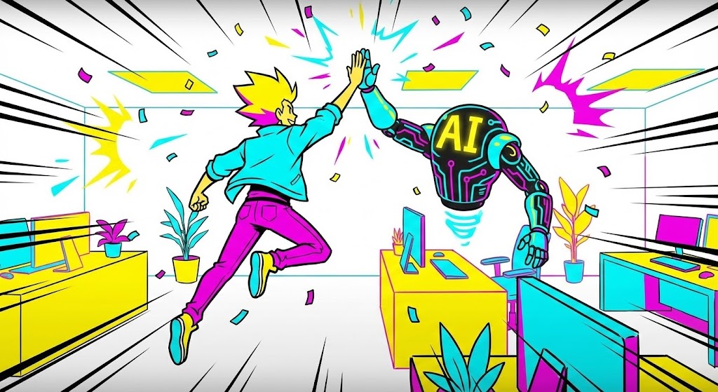
The Visual & Narrative Approach
This style blends character animation with UI elements to create a sense of partnership. A cel-shaded character in a modern office jumps up to "high-five" a floating, friendly robotic arm or avatar labeled with an "AI" symbol. The palette is energetic, using Bright Yellow, Cyan, and Magenta. The camera swoops dynamically. The vibe is celebratory, framing the AI not as a replacement, but as the "ultimate coworker" that helps the team win.
Psychological Impact & KPI Focus
- Niche Psychology: It tackles the "AI Anxiety" directly. By showing a high-five, it reframes the relationship from "Threat" to "Partner."
- Operational Impact: It supports Change Management. It encourages adoption by depicting the software as a helpful entity that makes the user's life easier and more successful.
Strategic Implementation & Trade-offs
- Duration: 30-60 Seconds.
- Trade-off: The tone is very casual. It is excellent for internal launch videos to staff but might be too informal for a serious boardroom presentation on financial risk.
Companies using similar video content -
Akasa – Unified Automation – Humanizing the algorithm as an AI teammate.
Notable Health – Platform – 2D animation for AI-powered partnership.
Health Catalyst – SymphonyRM – Humanizing AI for improved team collaboration.
20. Generative AI Cinematic Video
Onboarding | Self-Serve Onboarding

The Visual & Narrative Approach
This style visualizes the sheer speed of modern data ingestion. Using a "Zolly" (dolly zoom) shot, the camera rushes through an infinite, circular tunnel composed of streaming binary code, medical records, and floating icons. The palette is Deep Space Blue and Starlight White with anamorphic lens flares. It feels like hyperspace travel. This aesthetic communicates that the system is built for massive scale and can ingest historical data in seconds, not weeks.
Psychological Impact & KPI Focus
- Niche Psychology: It addresses the dread of "Implementation Lag." The visual speed promises that the painful transition period will be over instantly.
- Operational Impact: It visualizes Time-to-Go-Live. It argues that the platform's architecture is vast, limitless, and fast, capable of handling millions of historical claims during migration.
Strategic Implementation & Trade-offs
- Duration: 15-30 Seconds.
- Trade-off: It creates high expectations for speed. If the actual onboarding is slow and manual, this video will create a dissonance gap. It should only be used if the self-serve ingestion is truly fast.
Companies using similar video content -
Waystar – Platform – Accelerating data migration with infinite scale.
Optum – Change Healthcare – Generative AI cinematic for rapid data ingestion.
Google Cloud for Healthcare – AI/ML Solutions – Accelerating data migration with infinite scale.
21. Hyper-lapse Stock Footage with Data
Onboarding | Accelerating Time-to-Value
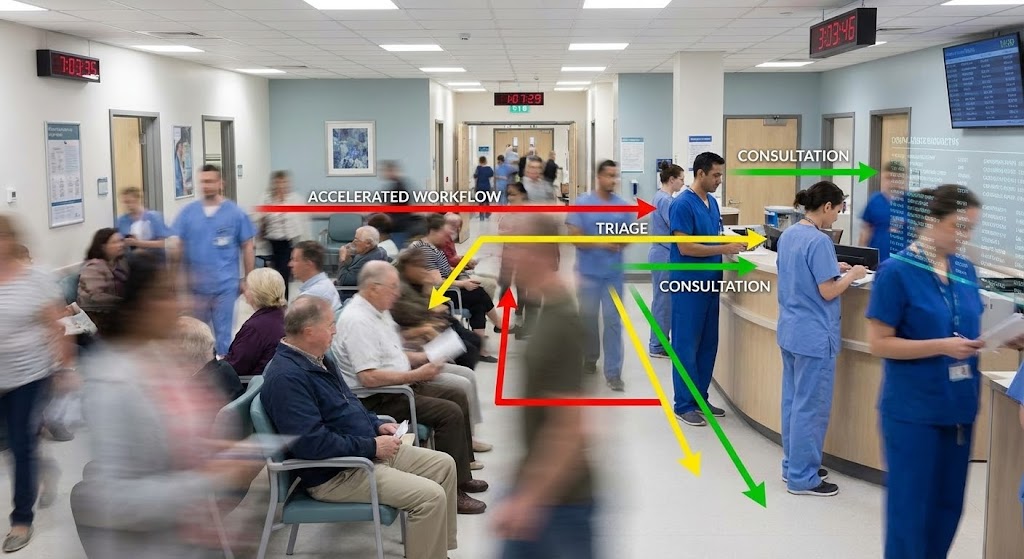
The Visual & Narrative Approach
This style acknowledges the chaotic reality of healthcare to highlight the software's stabilizing power. A stationary camera captures a hyper-lapse of a busy hospital waiting room or corridor—patients and staff blurring in frenetic motion. Overlaid on this background are sharp, static, high-contrast graphic lines in Traffic Light Colors (Red, Yellow, Green). These lines track specific workflows (e.g., "Triage," "Admit," "Bill"), showing them moving efficiently and linearly despite the surrounding physical chaos.
Psychological Impact & KPI Focus
- Niche Psychology: RCM leaders constantly feel the pressure of volume. This visual validates that pressure ("We know it's busy") but positions the software as the immutable anchor of order that keeps revenue flowing.
- Operational Impact: It visualizes Throughput Velocity. It demonstrates that while the physical environment is chaotic, the digital workflow remains linear, fast, and controlled, directly impacting Time-to-Value.
Strategic Implementation & Trade-offs
- Duration: 15-20 Seconds (Vertical 9:16 for Mobile Ads).
- Trade-off: It relies on high-quality stock. If the stock footage looks too staged or generic, it loses the "gritty reality" factor that makes it relatable to hospital staff.
Companies using similar video content -
Experian Health – Revenue Cycle Management – Visualizing accelerated triage with controlled velocity.
NextGen Healthcare – RCM – Hyper-lapse stock for throughput velocity.
Greenway Health – PrimeSUITE RCM – Controlled velocity for accelerated triage.
22. Holographic UI over 3D Render
Onboarding | Trial/Freemium User Activation

The Visual & Narrative Approach
To convert a trial user, you must make the data feel magical. This style places a realistic tablet on a conference table in a dimly lit room. From the screen, an Electric Blue holographic projection rises, displaying a floating patient record that culminates in a large, glowing "Complete" checkmark. Particle effects dust the light beams, giving the data an ethereal, high-value quality. The camera is at eye-level, focusing on the "moment of truth" when the claim is finalized.
Psychological Impact & KPI Focus
- Niche Psychology: Freemium users often disengage due to a lack of immediate reward. This "Sci-Fi" aesthetic gamifies the experience, making the act of processing a claim feel like a technological achievement.
- Operational Impact: It drives User Activation Rate. By glamorizing the core action (submitting a claim), it encourages the user to complete their first meaningful task, creating a "Wow" moment.
Strategic Implementation & Trade-offs
- Duration: 10-15 Seconds.
- Trade-off: It is heavily stylized. It sets a high expectation for the "feel" of the product that the actual flat UI might not match, so it works best as a metaphorical "Success" animation.
Companies using similar video content -
Cedar – Pay – Gamifying user activation with digital epiphany.
Collectly – Patient Payments – Holographic UI for user activation and success.
MD Clarity – Price Transparency – Digital epiphany for gamifying user activation.
23. Macro UI Micro-Interactions
Retention | Knowledge Base

The Visual & Narrative Approach
This style creates a tactile connection with the software. An extreme macro close-up shows a human fingertip about to touch a glass screen. The screen pixels are visible, displaying a "Submit" or "Verify" button in crisp White and Black. The focus is on the friction ridges of the fingerprint and the anticipation of the action. The lighting is intimate, highlighting the texture of the skin and the responsive glow of the screen.
Psychological Impact & KPI Focus
- Niche Psychology: Technical support is often cold and distant. This extreme proximity creates a sense of intimacy and ease, suggesting that help is just "one touch away."
- Operational Impact: It reduces Support Ticket Volume. Used in a knowledge base, these hyper-focused clips clarify specific micro-actions (e.g., "Where is the submit button?"), removing ambiguity and hesitation.
Strategic Implementation & Trade-offs
- Duration: 5-10 Seconds (Loop).
- Trade-off: It is hyper-specific. You cannot show complex workflows this way; it is strictly for highlighting single, critical interactions or buttons.
Companies using similar video content -
athenahealth – athenaCollector – Simplifying support queries with tactile precision.
Kareo – Billing – Macro UI for clear micro-interactions.
AdvancedMD – RCM – Tactile precision for simplifying support queries.
24. Aspirational Stock Montage
Retention | Reducing Support Overhead
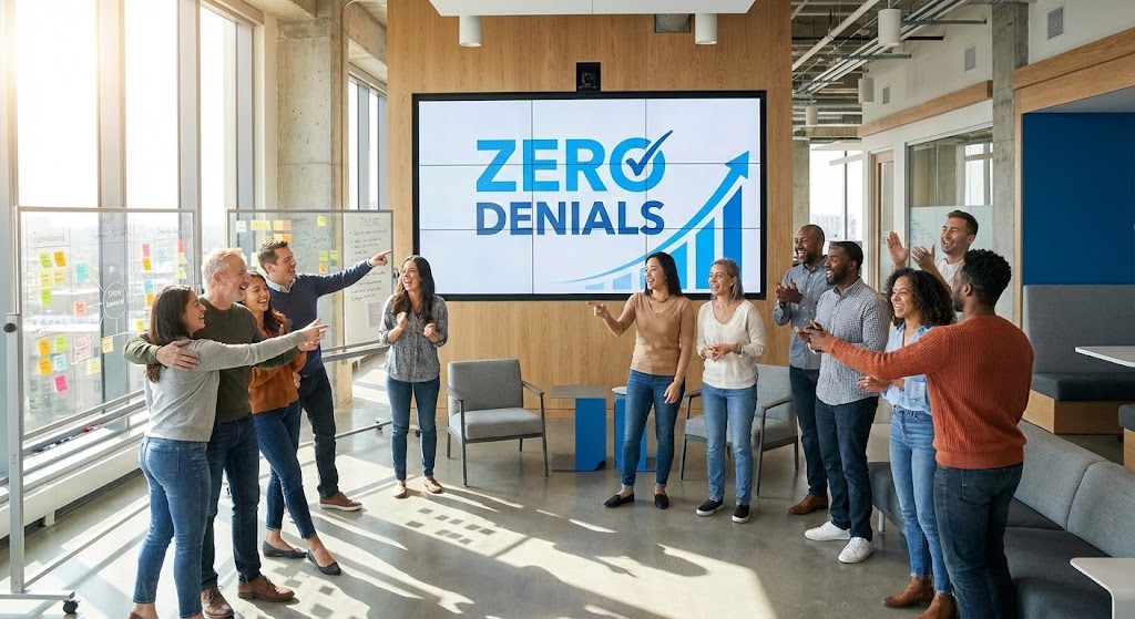
The Visual & Narrative Approach
Retention is about reminding the client of the value they are receiving. This style features a wide shot of a diverse RCM team in a modern, sunlit office. They are gathered around a large wall screen, laughing and pointing at a "Zero Denials" metric or an upward-trending revenue graph. The lighting is Natural Sunlight, creating a warm, optimistic atmosphere. The palette includes Office Greys and Optimistic Blues.
Psychological Impact & KPI Focus
- Niche Psychology: It reinforces the "Champion" status of the buyer. It reflects the ideal outcome of their purchase: a happy, productive team that is celebrating success rather than fighting fires.
- Operational Impact: It supports Net Promoter Score (NPS). By associating the software with team morale and success, it subtly encourages the client to become an advocate or reference.
Strategic Implementation & Trade-offs
- Duration: 15-30 Seconds.
- Trade-off: It can feel like a generic corporate ad. To work, the screen within the video must clearly display the specific software interface or unique KPI relevant to the client.
Companies using similar video content -
R1 RCM – Platform – Celebrating zero denials and team success.
Ensemble Health Partners – RCM – Aspirational stock for team success.
Conifer Health Solutions – RCM – Celebrating team success and zero denials.
25. Abstract 2D Motion Graphics
Retention | Reducing Churn

The Visual & Narrative Approach
This style uses abstract motion to induce a meditative sense of continuity. A Salmon and Teal sphere rolls continuously through a Cream-colored infinity symbol loop. The camera rotates slowly around the central object. The background is a soft gradient. The motion is perfectly seamless, representing the ongoing, frictionless value provided by the subscription.
Psychological Impact & KPI Focus
- Niche Psychology: Churn happens when customers feel "stuck" or "stopped." This perpetual motion loop subconsciously reinforces the idea of uninterrupted service and continuous momentum.
- Operational Impact: It visualizes Customer Lifetime Value (LTV). It is an excellent visual metaphor for "Revenue Cycle" continuity—the idea that the process never stops and revenue never creates friction.
Strategic Implementation & Trade-offs
- Duration: 6-12 Seconds (Perfect Loop).
- Trade-off: It is purely brand reinforcement. It contains no data or features, serving only as a visual anchor for newsletters or "Success" emails.
Companies using similar video content -
FinThrive – Platform – Visualizing recurring revenue and continuous value.
Waystar – Platform – Abstract motion for customer lifetime value.
Inovalon – ONE Platform – Continuous value for recurring revenue.
26. 3D Parallax UI Presentation
Retention | Driving Deep Feature Adoption
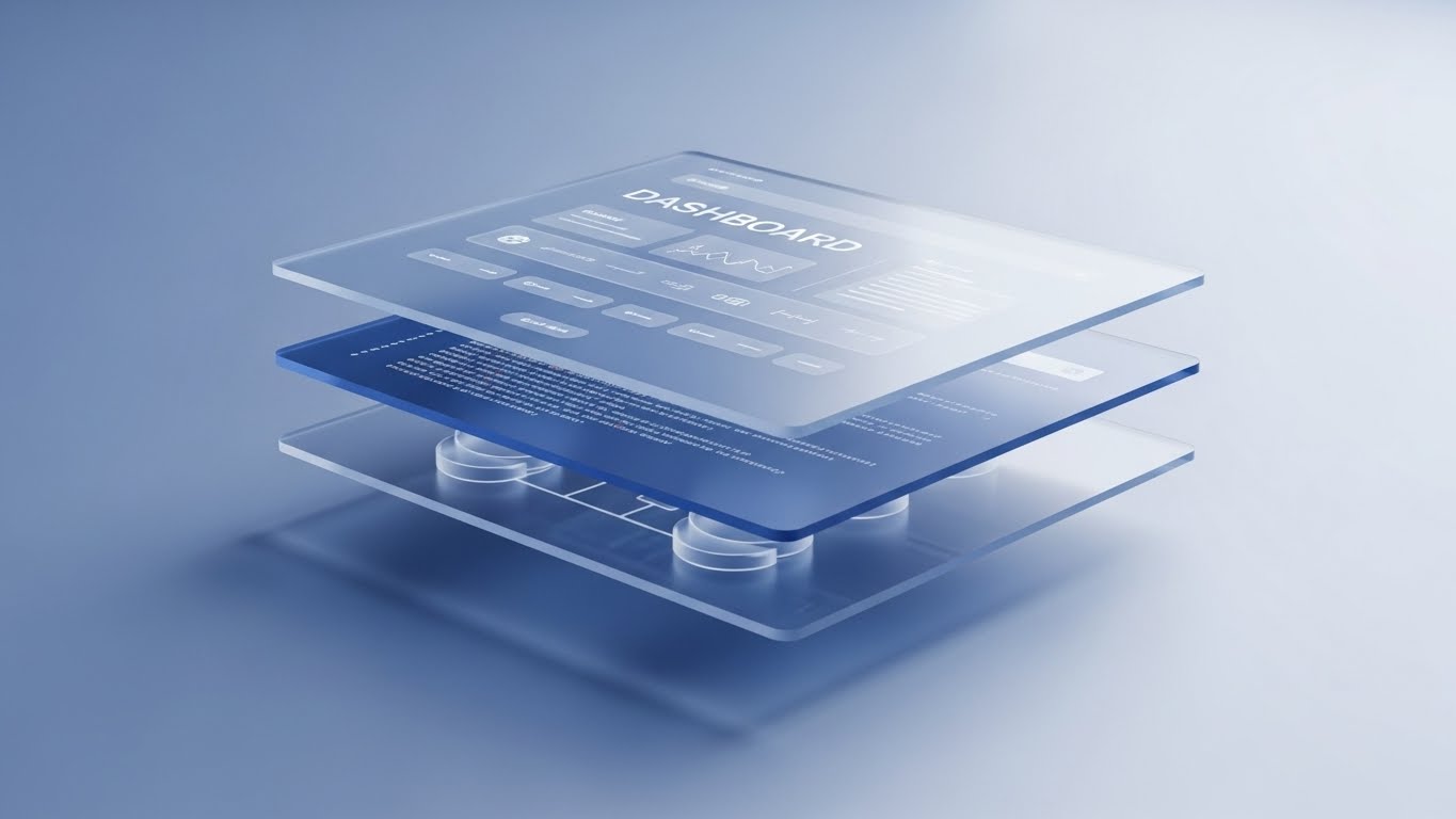
The Visual & Narrative Approach
To encourage feature adoption, you must show the depth of the platform. This style uses a 3D side-profile view of the interface. Three distinct layers of glass UI screens float in z-space. The top layer shows a Dashboard, the middle shows Code/Logic, and the bottom shows the Database/Source. Colors are Layered Glass and Blue gradients. The camera pans to reveal how a change in the bottom layer ripples up to the top.
Psychological Impact & KPI Focus
- Niche Psychology: Power users want to understand "how it works." This "exploded view" respects their intelligence, showing them the architecture rather than just the surface.
- Operational Impact: It drives Feature Utilization Rate. It visually explains complex relationships (e.g., how a fee schedule update affects the dashboard), encouraging users to trust and use deeper settings.
Strategic Implementation & Trade-offs
- Duration: 15-20 Seconds.
- Trade-off: It is abstract. It requires the viewer to have high spatial intelligence to map the floating layers to their actual 2D screen experience.
Companies using similar video content -
3M Health Information Systems – Coding and Reimbursement – Revealing advanced architecture and depth of logic.
RCxRules – Denial Prevention – 3D parallax UI for advanced feature adoption.
XIFIN – RPM – Depth of logic for revealing advanced architecture.
27. Futuristic Neon/Dark Mode
Expansion | Driving Upsell/Cross-sell

The Visual & Narrative Approach
This style distinguishes the "Basic" product from the "Enterprise" upgrade. It adopts a cyberpunk aesthetic with glowing Neon Violet and Hot Pink tubes forming a complex neural network. The camera looks up from a low vantage point at this massive structure. The floor is a wet, reflective black surface. It looks expensive, powerful, and exclusive—visually codifying the "Premium" tier.
Psychological Impact & KPI Focus
- Niche Psychology: Upselling is about status and power. This aesthetic signals that the "Enterprise" tier is not just more features; it is a superior state of existence (the "Dark Mode" cool factor).
- Operational Impact: It supports Expansion MRR. It visually differentiates the "Add-on" modules (like AI Analytics) from the core product, justifying the higher price point.
Strategic Implementation & Trade-offs
- Duration: 15-30 Seconds.
- Trade-off: It can look aggressive. It appeals to the CTO/Innovator persona but might feel alienating to a conservative, traditional medical practice manager.
Companies using similar video content -
Akasa – Unified Automation – Selling the enterprise tier with a premium ecosystem.
VisiQuate – Analytics – Futuristic neon for enterprise tier expansion.
Microsoft Cloud for Healthcare – Solutions – Premium ecosystem for selling enterprise tiers.
28. 2D Graphics Over Live Action
Expansion | Driving Referrals

The Visual & Narrative Approach
Referrals are about human connection. This style takes a standard photo of a doctor and an administrator shaking hands and overlays hand-drawn 2D cartoon "sparks" and "motion lines" in bright primary colors. The static photo comes alive with these energetic annotations, emphasizing the spark of a successful partnership. It blends corporate realism with playful, social-media-friendly energy.
Psychological Impact & KPI Focus
- Niche Psychology: Referrals are social acts. This playful style removes the corporate stiffness, making the act of referring a peer feel fun, energetic, and rewarding.
- Operational Impact: It drives Referral Conversion. It grabs attention in social feeds (LinkedIn/Twitter), standing out against boring corporate stock photos to promote referral programs.
Strategic Implementation & Trade-offs
- Duration: 6-10 Seconds.
- Trade-off: It is informal. It works best for peer-to-peer marketing (User to User) rather than Vendor to Enterprise.
Companies using similar video content -
athenahealth – athenaCollector – Sparking referral networks with energetic connection.
AdvancedMD – RCM – 2D graphics over live action for referrals.
Veradigm – Practice Management – Energetic connection for sparking referral networks.
29. Low-Poly 3D Modeling
Expansion | In-App Upsell

The Visual & Narrative Approach
This style visualizes growth without complexity. A Low Poly 3D render shows a tiny isometric hospital building on a floating island. As the viewer watches, a new wing or floor "pops" out of the side with a satisfying bounce effect, representing expansion. The colors are bright Green and Brown. The background is a simple void. It simplifies the concept of "Adding a Location" to a toy-like interaction.
Psychological Impact & KPI Focus
- Niche Psychology: Expanding software to new locations is often viewed as a logistical nightmare. This visual reframes it as a simple "snap-on" upgrade, reducing the fear of scaling.
- Operational Impact: It promotes Multi-Location Adoption. It is perfect for in-app modals prompting the user to "Add a new facility" or "Add a new provider," making the process look effortless.
Strategic Implementation & Trade-offs
- Duration: 5-10 Seconds.
- Trade-off: It is very stylized (video game aesthetic). It communicates "Ease of Use" brilliantly but may lack "Medical Authority."
Companies using similar video content -
AdvancedMD – RCM – Gamifying facility expansion with modular growth.
Kareo – Billing – Low-poly 3D for multi-location adoption.
NextGen Healthcare – RCM – Modular growth for gamifying facility expansion.
30. Abstract 3D AI Visualization
Expansion | Competitive Comparison

The Visual & Narrative Approach
To displace a competitor, you must look smarter. This style features a symmetrical, complex structure of flowing liquid metal in Silver and Chrome that forms a brain-like shape. The environment is highly reflective and sterile. The aesthetic resembles a high-tech Rorschach test. It conveys that the software possesses a "superior intelligence" or "cognitive engine" that legacy competitors lack.
Psychological Impact & KPI Focus
- Niche Psychology: Everyone claims to have AI. This abstract, high-end visualization suggests that your AI is a living, thinking entity, not just a basic algorithm. It creates a "Gap of Sophistication."
- Operational Impact: It supports Win Rate. It positions the platform as the "Next Gen" choice, making competitors look static and outdated by comparison.
Strategic Implementation & Trade-offs
- Duration: 15-30 Seconds.
- Trade-off: It is purely brand positioning. It explains nothing about what the AI does, only that it is powerful. It must be supported by case studies.
The Strategic Knowledge Base: The Visual Operations Doctrine
To transform these 30 visual styles from "marketing assets" into a cohesive business strategy, RCM leaders must apply the Visual Operations Doctrine. This framework bridges the gap between the screen and the balance sheet, ensuring that every pixel serves a specific outcome.
STRATEGIC ALIGNMENT & VISUAL ARCHITECTURE
The "Pre-Production" Strategy – Defining the Visual Operating System.
- The Cognitive Load Audit: Before designing a single frame, audit your user's screen fatigue. A medical biller toggling between 5 screens does not need "excitement"; they need "clarity." Use Style 7 (Clean UI) for them, and save Style 4 (Kinetic) for the C-Suite.
- Role-Based Visual Mapping: Differentiate your visual language. The "Driver" of the software (The Biller) needs High-Fidelity UI (Style 23) to understand workflows. The "Fleet Manager" (The CFO) needs Abstract Visualization (Style 1) to understand trends. Don't mix them.
- The "Glanceability" Standard: In a high-volume claims center, information must be processed in milliseconds. Design your educational videos (Style 21) so that the core message is understood even with the sound off, mirroring the "scan-ability" required in their daily work.
- Brand Voice Consistency: Your marketing videos (Style 3) and your training videos (Style 17) often look like they come from different companies. Use a unified "Visual Operating System"—consistent color palettes and motion behaviors—to create a seamless transition from "Prospect" to "Power User."
- The Advids Strategic Audit: Partner with Advids to define this visual language before production begins. A fragmented visual strategy leads to fragmented user trust.
- Standardization vs. Customization: For general workflows (e.g., "Logging In"), use standardized, polished assets (Style 11). For complex, client-specific workflows (e.g., "Custom Payer Rules"), use template-based styles that can be quickly updated without a full reshoot.
- The Cross-Departmental Bridge: Sales sells "Magic" (Style 5), but Ops must deliver "Logic" (Style 6). Use "Bridge Assets"—videos that transition from the 3D coin to the actual UI—to align Sales promises with Operational reality.
- Legacy System Integration: Visualizing the connection between old on-prem servers and your new cloud SaaS is critical. Use Style 9 (Split Screen) to visually validate the "Bridge" so the IT team understands the migration path.
- Global Accessibility: RCM teams are often distributed globally. Ensure your motion graphics (Style 2) rely on universal visual metaphors (arrows, checkmarks) rather than heavy on-screen text, reducing localization costs.
- The Mobile-First Mandate: While billers work on desktops, decision-makers review contracts on phones. Ensure your "Closer" videos (Style 15) are optimized for vertical viewing and readable on small screens.
OPERATIONAL ADOPTION & IMPLEMENTATION
The "Deployment" Phase – Embedding Visuals into the Workflow.
- Overcoming "Big Brother" Anxiety: Staff often fear that new software is just a tool to monitor their keystrokes. Use Style 19 (AI Teammate) to visually frame the software as a "Partner" that handles the grunt work, not a "Supervisor" watching their speed.
- The Micro-Learning Shift: Nobody reads the 500-page PDF manual. Slice your training into 30-second clips (using Style 10) and embed them directly into the software's "Help" tooltips.
- Just-in-Time Support: Embed Style 23 (Macro UI) videos directly inside the "Denial Screen." When a user gets a denial, they should see a 10-second loop showing exactly how to fix it, right at the moment of friction.
- Gamification of Training: Use Style 22 (Holographic Success) visuals in your training modules to reward staff for completing certification levels. Make learning feel like "leveling up."
- Reducing Support Ticket Volume: There is a direct correlation between the quality of your visual library and your support costs. Proactive, clear "How-To" videos (Style 7) prevent the "How do I do this?" tickets from ever being filed.
- Remote Onboarding: For distributed coding teams, physical seminars are impossible. Use Style 17 (Isometric Ecosystem) to teach the "Big Picture" of the hospital-payer relationship before diving into the UI.
- Standard Operating Procedures (SOPs): Transform text-based SOPs into visual process flows (Style 2). A visual "Line Art" animation of a claim's journey is remembered far better than a numbered list.
- Feedback Loops: Use interactive video elements. At the end of a Style 14 (Story) video, ask, "Did this help?" This data is crucial for refining your adoption strategy.
- Scalable Localization: If you serve different markets (e.g., US and UK), design your Style 11 (Flat Vector) assets with separate layers for text and graphics, allowing for rapid, low-cost translation.
- Leadership Communication: When the CFO needs to present the new software strategy to the Board, give them a Style 1 (Realistic Character) video. Equip your champion with the visual assets they need to sell your success internally.
MEASURING IMPACT & FUTURE-PROOFING
The "ROI" Phase – Measuring Success and Looking Ahead.
- Beyond "Views": Don't measure video success by "Views." Measure it by "Time-to-First-Clean-Claim." If the onboarding videos are working, new users should reach competency faster.
- The "Idle Time" Metric: Correlate better visualization with reduced software navigation time. If users stop "hovering" and start "clicking" after watching a Style 10 (Rapid Montage), the video has direct ROI.
- Compliance Velocity: When a new regulation drops (like the No Surprises Act), speed is key. Use Style 4 (Kinetic Type) to disseminate regulatory updates to your entire user base in 24 hours.
- Retention and Churn: High-quality UX visualization (Style 25) acts as a subtle barrier to entry for competitors. If your software feels premium and easy, clients are less likely to switch to a cheaper, clunkier alternative.
- The AI Visual Frontier: Prepare for Generative AI. Soon, you will use Style 30 (Abstract AI) to generate real-time, personalized onboarding videos for every single user based on their specific role.
- Scalability of Assets: Build a library, not a pile. Tag every video asset by "Feature," "Role," and "Style." This allows you to quickly assemble new playlists for new clients without shooting new footage.
- The Advids Partnership: Visual styles age. What looks modern today looks dated in 3 years. Maintain a long-term partnership with Advids to evolve your "Visual Operating System" (Style 1 -> Style 30) ensuring you always look like the market leader.
- Benchmarking Success: Compare your "Video-Assisted" cohorts vs. "Text-Only" cohorts. The data will almost always show higher satisfaction and lower churn for the video-assisted group.
- The ROI of Safety: In RCM, "Safety" means "Compliance." Quantify the reduction in compliance fines or audits for clients who consume your Style 13 (X-Ray) compliance training modules.
- Final Call to Innovation: Treat video as Infrastructure, not content. It is as vital to your SaaS platform as the code itself. It is the interface through which your users understand, trust, and master your technology.
PHASE 8: GLOBAL RULES AND INPUTS
- Adherence Check:
- Optimistic/Empathetic Tone? Yes.
- No "Trucking" references? Yes.
- Actionable Frameworks? Yes.
- Advids Persona maintained? Yes.
Companies using similar video content -
Akasa – Unified Automation – Defining cognitive computing with superior intelligence.
Google Cloud for Healthcare – AI/ML Solutions – Abstract 3D AI for competitive intelligence.
Microsoft Cloud for Healthcare – AI/ML Services – Superior intelligence for defining cognitive computing.
Author & Editor Bio


