
Introduction: Bridging the Physical-Digital Divide
The field service industry is navigating its most significant evolutionary leap in decades. We are moving from a reactive, break-fix model to a predictive, data-driven ecosystem where the "office" and the "field" are no longer separate entities, but a single, synchronized organism. For Operations Directors and CTOs, the challenge is no longer just about adopting technology; it is about articulating the value of that technology to a workforce that prides itself on hands-on expertise.
The opportunity for transformation is immense. The global field service management market is witnessing significant growth, projected to reach USD 9.17 billion by 2030. However, simply buying the software is not enough. The differentiator lies in execution and adoption. Best-in-class companies that successfully leverage these digital tools are seeing an 89% first-time fix rate, a metric that directly correlates with customer loyalty and profitability.
Visual communication plays a critical role in bridging this gap. To convince a veteran technician to trade their clipboard for a tablet, or to show a CFO the ROI of predictive maintenance, you cannot rely on abstract jargon. You must show the efficiency. You need to visualize the seamless flow of data from the dispatch console to the mobile app, and finally to the customer’s invoice.
This guide explores 30 distinct video visualization styles tailored specifically for the Mobile Field Service Software domain. We have curated these examples to help you reduce the cognitive load of complex technical explanations and accelerate digital transformation across your stakeholder base. From the boardroom to the service van, these visual strategies are designed to turn skepticism into adoption and features into measurable operational advantages.
1. Minimalist Flat 2D Vector
TOFU | Brand Awareness
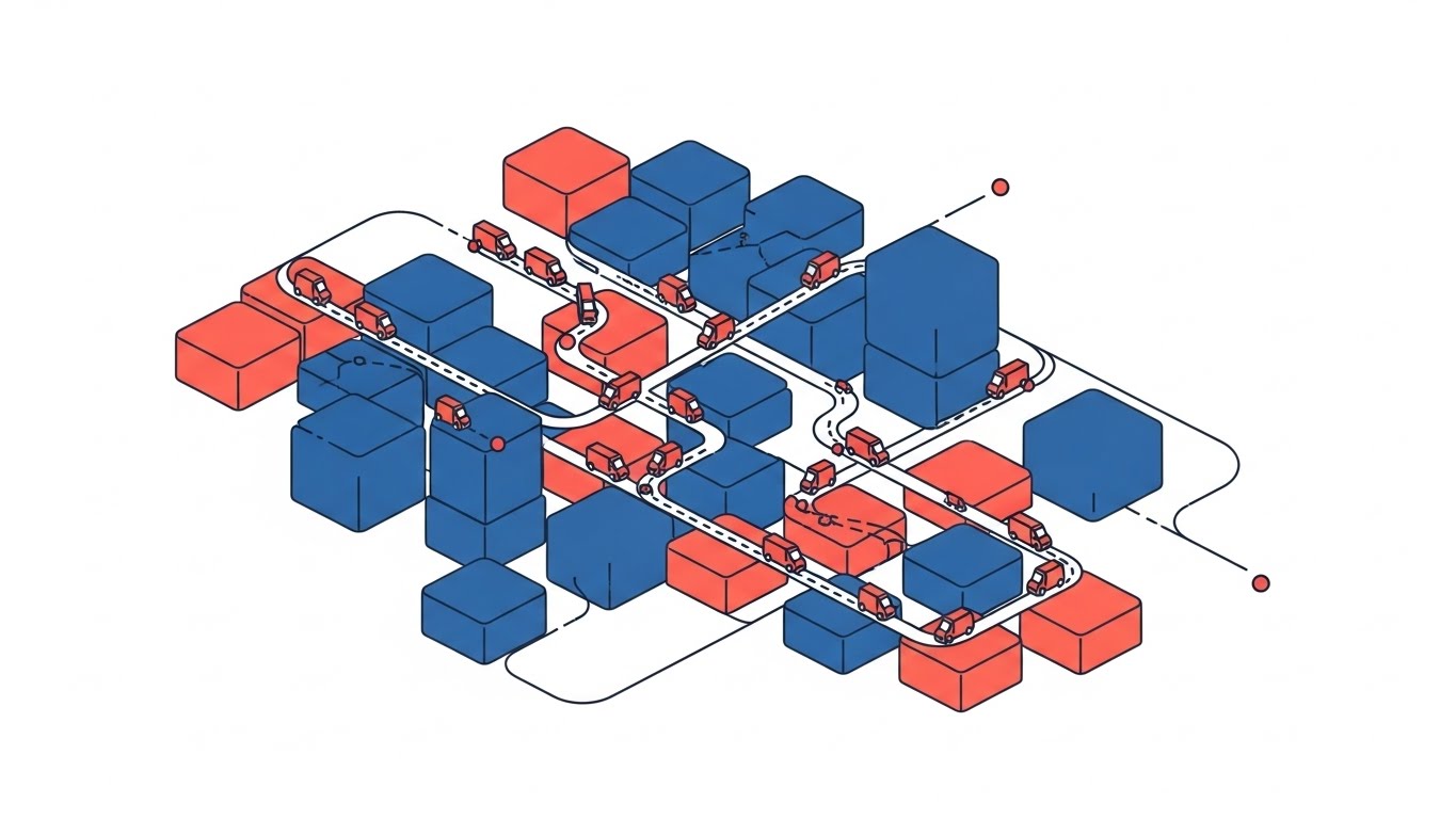
The Visual & Narrative Approach
This style utilizes a stylized perspective to simplify the inherent complexity of city logistics. The visual scenario presents a clean grid where chaotic city blocks are abstracted into structured Red and Blue cubic zones. Thin, precise lines connect these zones, representing optimized routes rather than messy roads. The "vans" are simplified to efficient moving elements, navigating the grid without friction. The narrative tone is calm and authoritative, emphasizing "oversight" and "territory mastery."
Psychological Impact & KPI Focus
For a Dispatch Manager, the city is usually a source of anxiety—traffic, dead zones, and lost drivers. This visual style alleviates that cognitive load by presenting the territory as a solvable, orderly puzzle. It directly addresses Operational Opacity, offering a "God’s Eye View" that implies total control. It supports KPIs related to Route Optimization and Coverage Density, visually promising that the software turns chaos into a navigable circuit board.
Strategic Implementation & Trade-offs
- Ideal Duration: 10-15 seconds (Looping).
- Trade-off: The high level of abstraction means it cannot communicate specific features. It sells the result of optimization (order), not the method (the algorithm).
Companies using similar video content -
IFS – Field Service Management – Optimized route density, territory mastery.
Skedulo – Mobile Workforce Management – Streamlined scheduling, resource allocation.
ServicePower – Field Service Management – AI scheduling, optimal technician matching.
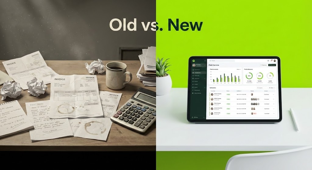
2. 2D Line Art Animation
TOFU | Market Education
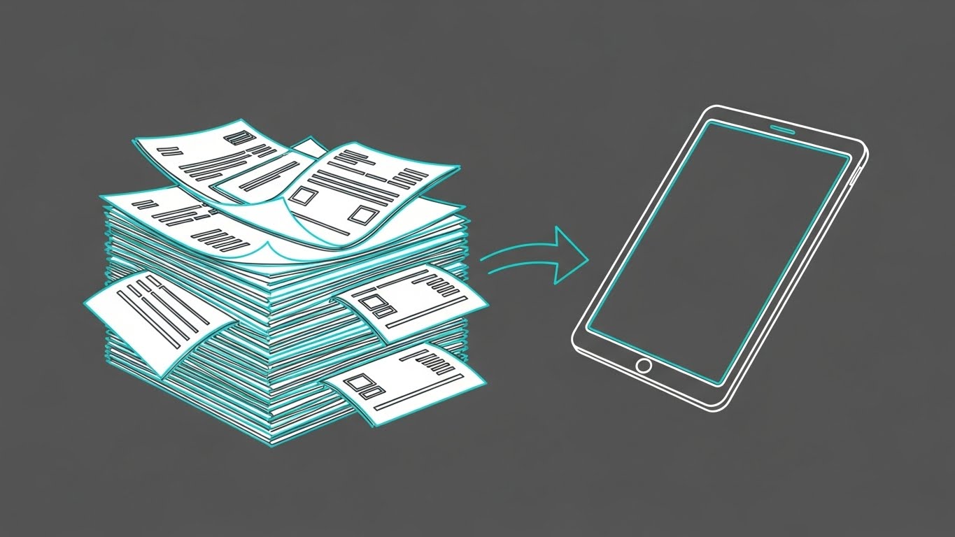
The Visual & Narrative Approach
This style creates a powerful visual metaphor for Digital Transformation. The animation features a continuous, monoline style in Cyan and White against a Deep Grey background. It visualizes the journey from a messy, unstable stack of paper invoices on the left to a sleek, unified digital tablet on the right. The transition is fluid, suggesting that the shift to digital is not a disruption, but a natural evolution. The arrow acts as the catalyst, driving the eye from problem to solution.
Psychological Impact & KPI Focus
This targets the "Paper Fatigue" deeply felt by back-office staff. It validates the user's struggle with manual administration (the messy stack) and immediately offers a clean, digital alternative. It speaks directly to Administrative Efficiency and Billing Cycle Reduction. The precise line work conveys technical accuracy, reassuring the viewer that no data is lost in the transition.
Strategic Implementation & Trade-offs
- Ideal Duration: 15 seconds.
- Trade-off: While elegant, line art is highly abstract. It is excellent for concept education but does not show what the actual software interface looks like, which is needed later in the funnel.
Companies using similar video content -
ServiceTitan – Field Service Software – Digital transformation from paper to tablet.
Jobber – Field Service Software – Simplifying administrative tasks.
Workiz – Field Service Software – Clean, intuitive interface for workflows.
3. Bold Kinetic Typography (Visual)
TOFU | Shaping Perception

The Visual & Narrative Approach
This brutalist aesthetic abandons traditional "soft" software imagery for raw industrial energy. Using abstract geometric shapes in Electric Lime and Black, the design mimics the heavy, interlocking rhythm of machinery and gears. The motion is aggressive and fast, utilizing motion blur to suggest high-velocity processing. It visualizes the software not as a delicate app, but as a heavy-duty engine capable of driving complex, large-scale operations.
Psychological Impact & KPI Focus
Field service is often a "heavy" industry (Construction, HVAC, Utilities). This style resonates with the "Builder" archetype who values robustness over sleekness. It builds Brand Authority by speaking the visual language of the industry. It subliminally assures the viewer that the platform is Enterprise-Grade and can handle high-volume work orders without breaking.
Strategic Implementation & Trade-offs
- Ideal Duration: 6-10 seconds.
- Trade-off: This is purely a brand-building style. It offers zero educational value regarding features. It is designed to stop the scroll and establish a bold personality.
Companies using similar video content -
ServiceMax – Field Service Management – Robust operational power, enterprise-grade.
IBM Maximo – Application Suite – Heavy-duty asset management engine.
Fieldproxy – Field Service Management – Conveying robust operational power.
4. Abstract 2D Organic
TOFU | Category Creation
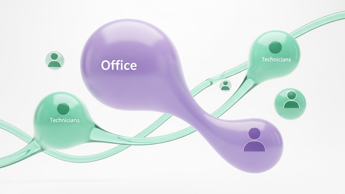
The Visual & Narrative Approach
Moving away from rigid grids, this style uses fluid, organic shapes to represent the human element of field service. A large Purple blob ("Office") and smaller Mint blobs ("Technicians") float in a white void, connected by stretching, elastic strands. This visualizes communication as a living, breathing ecosystem rather than a series of rigid data points. The glossy, glass-like texture evokes a modern, premium SaaS feel.
Psychological Impact & KPI Focus
One of the biggest anxieties in FSM is the "disconnect" between the back office and the field. This style visualizes Collaborative Harmony. It soothes the fear of silos by showing an unbreakable, fluid bond between teams. It is particularly effective for promoting Technician Retention and Employee Satisfaction, framing the software as a tool for connection.
Strategic Implementation & Trade-offs
- Ideal Duration: 30-45 seconds.
- Trade-off: The abstract nature can be too "soft" for pragmatic buyers focused solely on hard ROI. It works best when selling the partnership aspect of the SaaS.
Companies using similar video content -
IFS – Field Service Management – Unified team communication, collaborative harmony.
Comarch FSM – Field Service Management – Fluid ecosystem nodes, IoT integration.
Udext – Mobile Workforce Management – Streamlining communication with frontline workers.
6. Abstract 2D Motion Graphics
TOFU | Skippable Ad
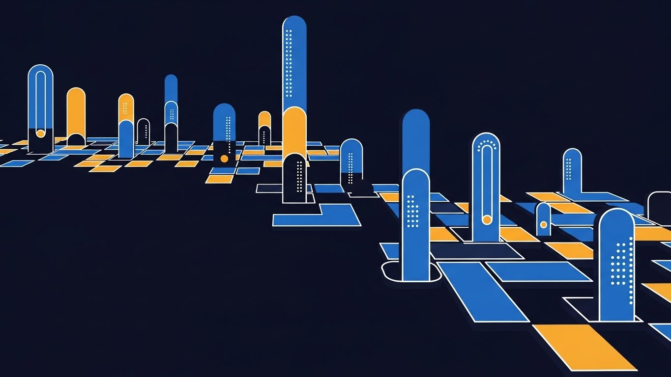
The Visual & Narrative Approach
This style embraces a high-tech "Cybernetic" aesthetic. We fly through a digital void populated by a grid of glowing Cyber Blue and Yellow/Orange nodes (representing assets). As the camera moves, these nodes light up in sequence, symbolizing assets "waking up" and connecting to the central network. The deep black background and neon accents create a futuristic, data-rich environment that suggests infinite scalability.
Psychological Impact & KPI Focus
This appeals to the CTO or IT Director who is concerned with Infrastructure Scalability and IoT Connectivity. It visualizes the invisible data layer that powers modern service. By showing assets "lighting up," it effectively metaphors Asset Uptime and Real-Time Visibility. It promises that the software will illuminate the dark corners of their operation.
Strategic Implementation & Trade-offs
- Ideal Duration: 5-10 seconds (Intro Hook).
- Trade-off: It can feel impersonal. It represents the network, not the people doing the work. Ideally used as an intro sequence to a live-action or UI-heavy video.
Companies using similar video content -
MSI Data – Service Pro – Customizable data visualization, KPI tracking.
FieldEquip – Field Service Management – Reporting software, actionable insights.
Service Dynamics – Field Service Reporting – Real-time analytics, Power BI integration.
7. Isometric 2D Motion Design
TOFU | Demand Gen
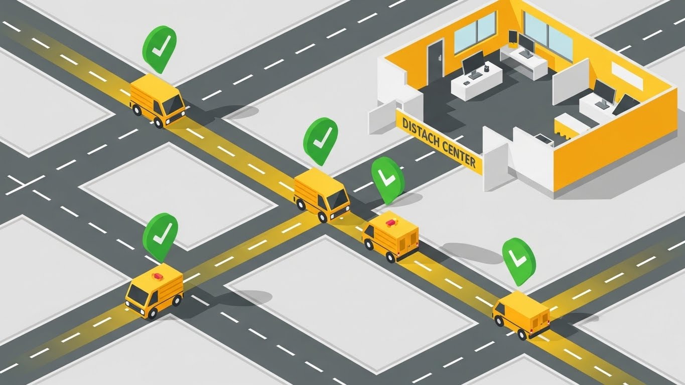
The Visual & Narrative Approach
The isometric perspective offers a structured, logic-driven view of operations. We look down at a 45-degree angle on a stylized Yellow Dispatch Center connected to a road network. Miniature vans travel along these roads, and floating green checkmarks pop up as they reach their destinations. This literal connection between the "Inside" (Office) and "Outside" (Road) is the core narrative of Field Service Management.
Psychological Impact & KPI Focus
This style satisfies the Operations Manager’s need for Control and Predictability. It places them in the position of the "Master Controller," overseeing the entire operation from a safe distance. It strongly reinforces Workflow Optimization and SLA Compliance, visually proving that the software closes the loop on every job.
Strategic Implementation & Trade-offs
- Ideal Duration: 15-20 seconds.
- Trade-off: Isometric art is common in B2B tech. To stand out, the animation must be smooth, and the color palette (Safety Yellow/Grey) must be strictly adhered to for professional credibility.
Companies using similar video content -
Salesforce Field Service – Field Service – IoT connectivity, asset visibility.
Oracle Field Service Cloud – Field Service Cloud – Illuminating field assets online.
Samsara – Connected Operations Cloud – IoT platform, asset monitoring.
8. Split Screen: Optimized Reality and UI
MOFU | Differentiation
The Visual & Narrative Approach
This composition uses a hard vertical divide to force a comparison. The left side (The Old Way) is graded in desaturated, sepia tones, depicting a cluttered desk with paper invoices and coffee stains. The right side (The New Way) is bright and vivid, displaying a pristine tablet with the software's UI in Lime Green. The visual storytelling is instant: "Chaos vs. Control." The eye is naturally drawn to the brighter, cleaner right side.
Psychological Impact & KPI Focus
This triggers Loss Aversion—reminding the viewer of the pain of their current situation—while simultaneously offering the aspirational future. It is highly effective for convincing "Late Majority" buyers who are skeptical of change. It visually quantifies the ROI of Digitization without needing a spreadsheet.
Strategic Implementation & Trade-offs
- Ideal Duration: 15-30 seconds.
- Trade-off: It can be seen as aggressive. The "Old" side must feel realistic (a messy desk), not a caricature, to avoid insulting the potential customer who still operates that way.
Companies using similar video content -
Microsoft Dynamics 365 Field Service – Field Service – Dispatch control tower, operational visibility.
BuildOps – Field Service Software – Visual scheduling, workflow optimization.
Fieldcode – Field Service Management – Smart scheduling, real-time dispatching.
9. Rapid UI Feature Montage
MOFU | Feature Education
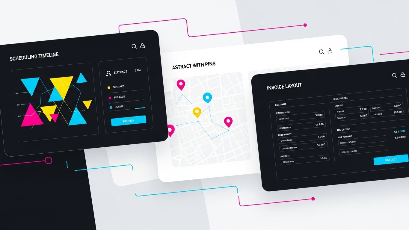
The Visual & Narrative Approach
This style is about volume and capability. We see a flat-lay arrangement of three distinct UI screens on a background, utilizing a Dark Mode aesthetic with vibrant Cyan and Magenta accents. Speed lines and quick cuts transition our focus from a "Scheduling Timeline" to a "Map with Pins" to an "Invoice Layout." The design is abstracted but recognizable, suggesting a robust, feature-rich platform.
Psychological Impact & KPI Focus
This visual reduces Purchase Anxiety by showing the product's substance. Buyers want to know, "Does it do X? Does it do Y?" This montage answers "Yes" to multiple questions simultaneously. It reduces the Time to Value perception by showing that all necessary tools are integrated into one suite. It targets Feature Education without getting bogged down in a slow tutorial.
Strategic Implementation & Trade-offs
- Ideal Duration: 10-20 seconds.
- Trade-off: It moves too fast for detailed learning. It creates an impression of capability, not an understanding of workflow. Do not use this for tutorials.
Companies using similar video content -
ServiceTitan – Field Service Software – Highlighting instant efficiency gains.
Jobber – Field Service Software – Old vs. New, chaos vs. control.
mHelpDesk – Field Service Software – Transition from manual to digital.
10. Clean UI Workflow (Light Mode)
MOFU | Demo Requests
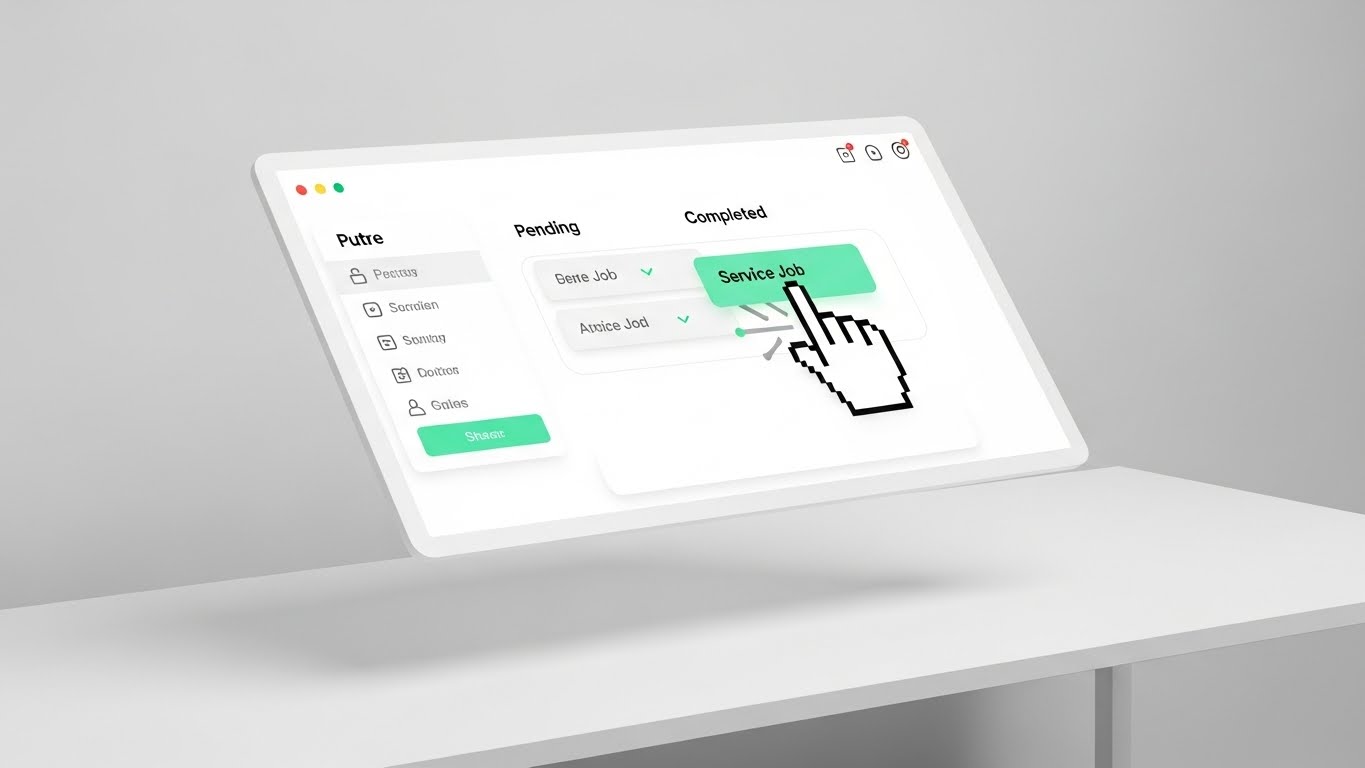
The Visual & Narrative Approach
This is the "Hero Shot" of the user experience. We see a floating, angled UI screen in a pristine, high-key environment (Mint Green/White). A stylized cursor hand gracefully drags a "Service Job" block from a "Pending" column to a "Completed" column. The movement is slow and deliberate. This is not about abstract concepts; it is a literal demonstration of the Ease of Use.
Psychological Impact & KPI Focus
The #1 barrier to software adoption is Usability Friction ("My technicians won't use this"). This visual dismantles that fear. It simulates the UX, proving that managing the workflow is as easy as moving a digital block. It directly supports Demo Requests by making the software look inviting and learnable.
Strategic Implementation & Trade-offs
- Ideal Duration: 15-30 seconds.
- Trade-off: It simplifies the process significantly. Real-world workflows are rarely one drag-and-drop action, so this must be framed as a "highlight" of the experience.
Companies using similar video content -
Salesforce Field Service – Field Service – Showcasing feature depth quickly.
FieldEdge – Field Service Software – Sleek dark mode, robust features.
Service Fusion – Field Service Management – Volume and capability showcase.
11. Wireframe to Reality Transition
MOFU | Competitive
The Visual & Narrative Approach
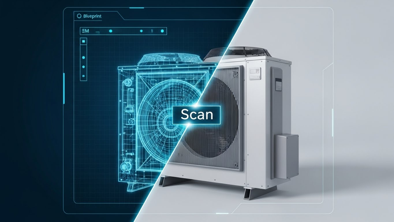
This style creates a direct bridge between engineering data and field execution, serving as a powerful visual metaphor for "Verification." The composition utilizes a split-screen sliding effect. On the left, a white wireframe blueprint of an industrial HVAC unit sits on a Blueprint Blue background, representing the engineering specs. A glowing "Scan" line moves across the object, revealing the photorealistic, metallic reality on the right. The narrative demonstrates the software’s ability to overlay digital intelligence onto physical assets with 100% fidelity.
Psychological Impact & KPI Focus
For Technical Directors and Quality Assurance leads, the gap between "As-Designed" and "As-Maintained" is a constant source of risk. This visual bridges that gap, offering Data Integrity assurance. It visually proves the concept of the Digital Twin, reducing anxiety about compliance and asset history. It directly supports KPIs related to First-Time Fix Rate and Audit Compliance, showing that the field technician sees the complete picture before they even open the panel.
Strategic Implementation & Trade-offs
- Ideal Duration: 15-20 seconds.
- Trade-off: This is a high-concept visual. It requires high-quality 3D assets to look convincing. If the "Reality" side looks fake, the promise of accuracy is undermined.
Companies using similar video content -
ServiceTitan – Field Service Software – Drag-and-drop demo, effortless usability.
Jobber – Field Service Software – Proving ease of use.
FieldPulse – Business Hub – Simple, learnable interface.
12. Dynamic Data Visualization
MOFU | ABM Display

The Visual & Narrative Approach
Moving beyond flat spreadsheets, this style treats data as a tangible, high-value asset. We see translucent, glass-like 3D bar charts rising from a digital map surface, glowing in Violet, Magenta, and Dark Blue against a premium dark backdrop. The perspective is elevated and angled, looking down at the "landscape" of performance. The narrative is one of transparency and growth, suggesting that the software elevates raw numbers into actionable, visible insights.
Psychological Impact & KPI Focus
This appeals to the "Achiever" persona in management—leaders who want to visualize their success. By making the data look beautiful and substantial, it frames Performance Monitoring not as a chore, but as a strategic advantage. It reinforces Operational Transparency and Revenue Growth, making the backend analytics feel like a futuristic command center rather than a reporting burden.
Strategic Implementation & Trade-offs
- Ideal Duration: 6-10 seconds (Looping).
- Trade-off: It is highly stylized and does not show the actual dashboard UI. It works best for retargeting ads where the user already knows the brand but needs a reminder of the value of the data.
Companies using similar video content -
IBM Maximo – Application Suite – Validating the digital twin, engineering data.
Accruent – Predictive Maintenance – Bridging design and maintenance.
PTC – ThingWorx – Overlaying digital intelligence onto physical assets.
13. Aspirational Stock Montage
MOFU | Building Trust

The Visual & Narrative Approach
Amidst the abstract 3D and UI graphics, it is crucial to return to the human element. This style uses high-quality, sun-drenched cinematography featuring a confident technician on a rooftop or job site. They are not struggling with paper; they are smiling, holding a tablet with a clean UI overlay. The lens flares and Gold and Sky Blue palette evoke optimism. The narrative shifts from "efficiency" to "empowerment," framing the software as a tool that makes the technician’s life easier, not harder.
Psychological Impact & KPI Focus
Field teams often fear that new software is a "big brother" tracking tool. This style counters that resistance by visualizing Employee Satisfaction and Professional Pride. It sells the vision of the "Modern Tradesperson." For the buyer, it addresses the fear of low adoption rates by showing the software as a desirable upgrade for their workforce, supporting Retention goals.
Strategic Implementation & Trade-offs
- Ideal Duration: 30-45 seconds.
- Trade-off: Reliance on stock footage can feel generic if not carefully curated. Custom shooting is preferred to ensure the uniforms and environments match your specific industry vertical (e.g., HVAC vs. IT).
Companies using similar video content -
IFS – Field Service Management – Elevating performance metrics.
Zuper – Field Service Management – Tangible, high-value data assets.
ServicePower – Field Service Management – Visualizing success and growth.
14. Isometric 3D Workflow
MOFU | Functional Buyer
The Visual & Narrative Approach
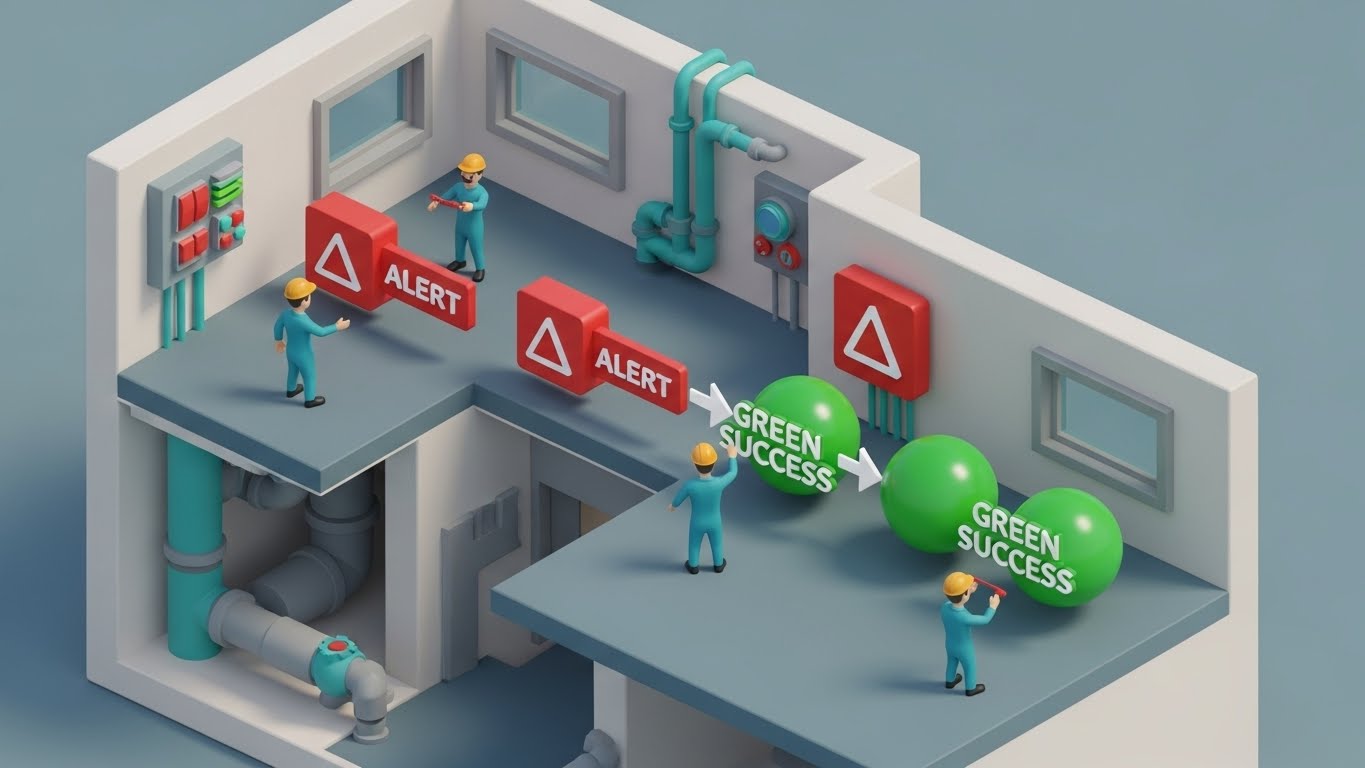
This style uses a "dollhouse" or cutaway effect to visualize the hidden complexity of a service environment. We see into the walls of a multi-story building, revealing the internal plumbing and wiring. Rendered in a matte Clay White with Soft Orange and Teal accents, miniature technicians interact with "Red Alert" icons, transforming them into "Green Success" spheres. It tells a story of total systemic health and proactive resolution.
Psychological Impact & KPI Focus
This speaks to the Functional Buyer’s need for Comprehensive Coverage. It visually demonstrates that the software catches issues that are "behind the walls" or easily missed. It relieves the anxiety of "silent failures" in the infrastructure. The transformation from Red to Green triggers a dopamine response associated with Task Completion and SLA Compliance.
Strategic Implementation & Trade-offs
- Ideal Duration: 20-30 seconds.
- Trade-off: The "toy-like" aesthetic must be balanced with professional narration to avoid appearing too juvenile for enterprise clients. It is best used to explain complex, multi-stage workflows logic.
Companies using similar video content -
Totalmobile – Enterprise Asset Management – Empowered technician, humanizing tech.
FieldEdge – Field Service Software – Employee satisfaction, professional pride.
Workstatus – Workforce Management – Modern tradesperson vision.
15. Photorealistic 3D Renders
BOFU | Sales Acceleration
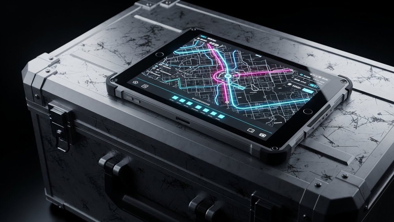
The Visual & Narrative Approach
This style grounds the digital product in the harsh physical reality of field work. We see a close-up, photorealistic render of a ruggedized tablet resting on a scratched Gunmetal Grey toolbox or the dashboard of a van. The lighting is dramatic, highlighting the textures of Steel and Amber. The screen glows brightly with the software’s map interface. The message is implicit but powerful: "This software belongs in the van, not just the office."
Psychological Impact & KPI Focus
This overcomes the "Ivory Tower" objection—the belief that software designers don't understand the field. By placing the UI in a rugged context, it signals Reliability and Field-Readiness. It builds confidence that the solution is a practical tool, akin to a wrench or a multimeter, directly supporting Tool Adoption and Field Efficiency.
Strategic Implementation & Trade-offs
- Ideal Duration: Static Image or 5-second subtle motion loop.
- Trade-off: High render costs. It is strictly a brand/trust play and does not explain features. Use it in sales decks to establish "street cred" before diving into the demo.
Companies using similar video content -
Microsoft Dynamics 365 Field Service – Field Service – Systems cutaway, revealing internal health.
LLumin – CMMS+ – Comprehensive coverage, proactive resolution.
Fiix Software – CMMS – Multi-stage workflow logic.
16. 2D Character-Driven Story
BOFU | ROI Justification
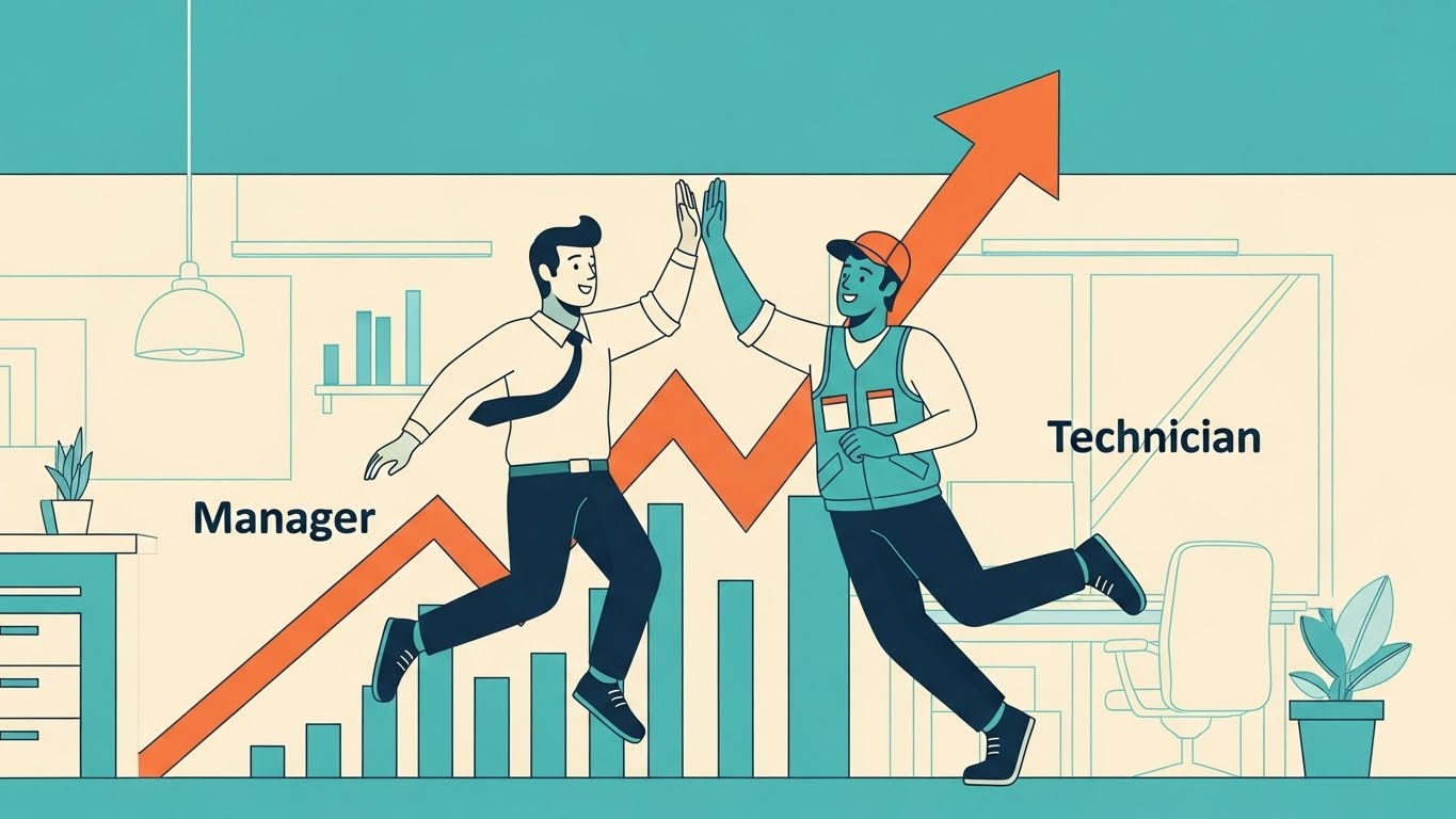
The Visual & Narrative Approach
Sometimes the best way to explain ROI is through a simple story of human connection. This style uses clean, flat vector characters in Teal, Orange, and Cream. We see a "Manager" character and a "Technician" character high-fiving in front of a rising profit graph. The animation is fluid and expressive. The narrative focuses on "Alignment"—showing how the software removes friction between the back office and the field, leading to mutual wins.
Psychological Impact & KPI Focus
This directly addresses the "Us vs. Them" cultural divide often present in service companies. It visualizes Team Cohesion and Incentive Alignment. For the decision-maker, it promises that the software will be a cultural unifier rather than a point of contention, supporting KPIs related to Technician Retention and Profitability.
Strategic Implementation & Trade-offs
- Ideal Duration: 60-90 seconds.
- Trade-off: This style is less "premium" than 3D or cinematic video. It is best used for internal rollout videos or detailed ROI explainers where storytelling matters more than "flash."
Companies using similar video content -
Tyler Technologies – Enterprise Asset Management – Rugged context, software for the real world.
MobileFrame – Enterprise Asset Management – Field-readiness, practical tool.
Acty – Remote Visual Support – Grounding digital product in physical reality.
17. 3D X-Ray Visualization
BOFU | Risk Mitigation
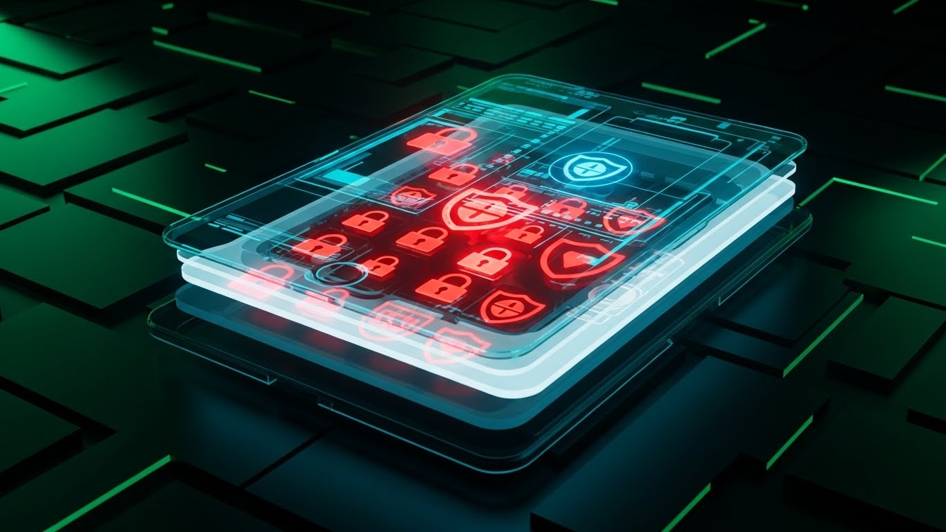
The Visual & Narrative Approach
Security is often invisible, making it hard to sell. This style makes it visible by turning the device transparent. We see an "X-Ray" view of a tablet, revealing layers of glowing Red lock icons and encryption shields floating within a Translucent Blue structure. The aesthetic is technical and precise. The narrative emphasizes that security is "built-in," not "bolted-on," protecting customer data at every layer of the interaction.
Psychological Impact & KPI Focus
For the IT Director or Compliance Officer, this alleviates Data Breach Anxiety. It visualizes Risk Mitigation and GDPR/HIPAA Compliance as a structural component of the platform. It provides the visual evidence needed to check the "Security" box during the procurement process, confirming Enterprise Readiness.
Strategic Implementation & Trade-offs
- Ideal Duration: 10-15 seconds.
- Trade-off: It is purely metaphorical. It doesn't explain how the encryption works, only that it exists. Use it to punctuate the security section of a landing page.
Companies using similar video content -
Fieldproxy – Field Service Management – Alignment high-five, celebrating shared success.
ServiceTitan – Field Service Software – Human connection, team cohesion.
Jobber – Field Service Software – Explaining ROI through simple stories.
18. Hyper-lapse Stock Footage with Data
BOFU | Economic Buyer

The Visual & Narrative Approach
This style captures the frantic energy of a service business and organizes it. We use hyper-lapse footage of a city at twilight, with car trails turning into streaks of Red and Car Trail Red/Purple light. Overlaid on this kinetic background are crisp, floating data tags tracking specific vehicles or jobs. The narrative is about Velocity—showing how the software keeps pace with the real-time demands of the city, ensuring every minute of travel is accounted for and billed.
Psychological Impact & KPI Focus
This appeals to the Economic Buyer focused on Cash Flow and Billable Utilization. The fast-paced visual implies a high-tempo, efficient operation. It visually correlates "movement" with "revenue," suggesting that the software eliminates the "dead air" and idle time that kills profitability.
Strategic Implementation & Trade-offs
- Ideal Duration: 15-20 seconds.
- Trade-off: Requires high-quality footage. The motion tracking of the data tags must be perfect, or it will look "slapped on" and cheap.
Companies using similar video content -
IBM Maximo – Application Suite – Encrypted core, visualizing data security.
Accruent – Predictive Maintenance – Risk mitigation, compliance assurance.
AspenTech – Asset Performance Management – Built-in security, protecting data.
19. Low-Poly 3D Modeling
BOFU | Objection Handling
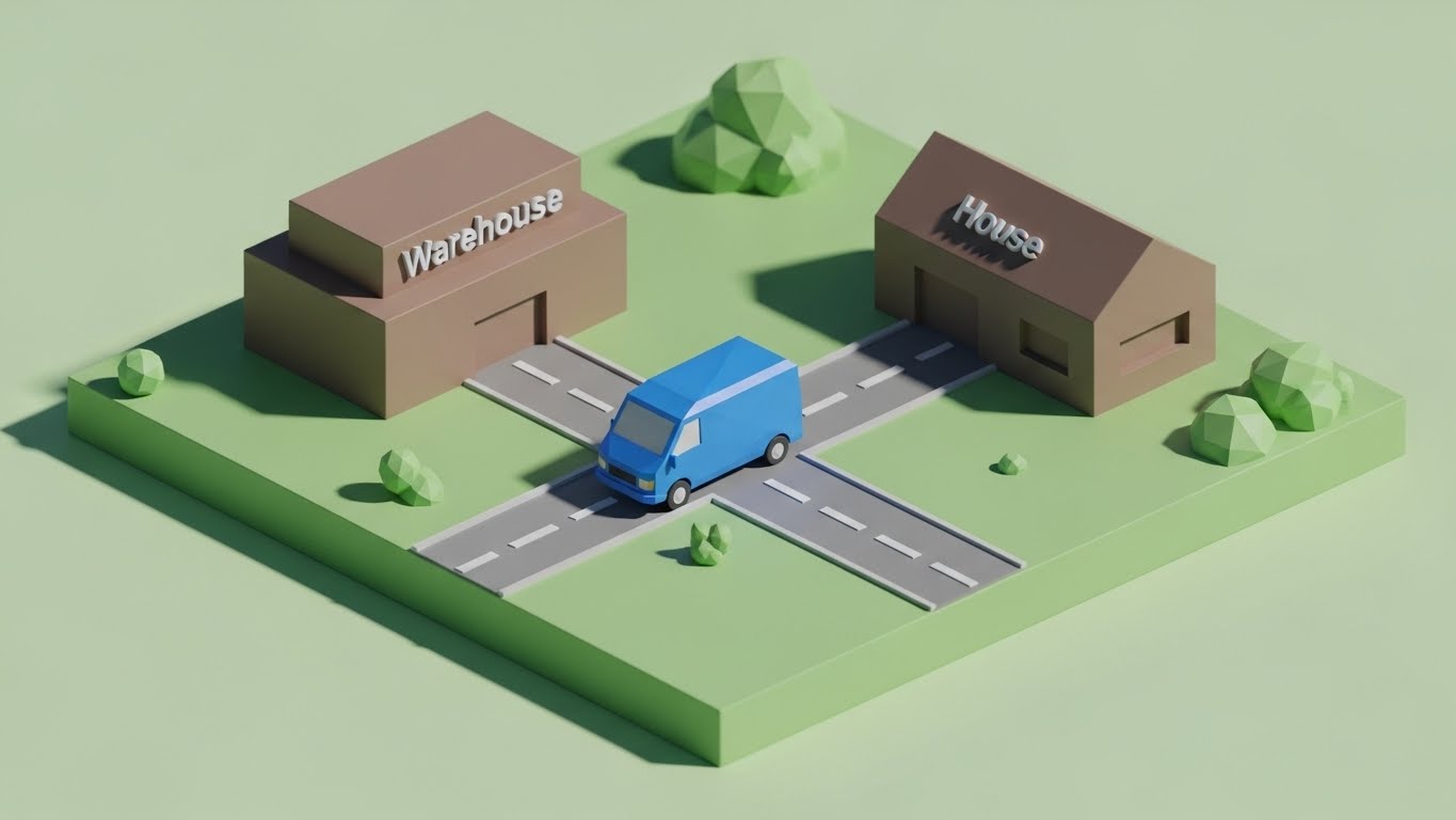
The Visual & Narrative Approach
When overcoming objections about complexity, simplicity is the weapon. This style uses a charming, low-poly aesthetic with soft lighting in Green and Brown. We see a miniature diorama where a faceted blue van travels a straight, unobstructed road from a "Warehouse" block to a "House" block. There is no clutter, no traffic, just a clear path. The narrative is: "It’s just this simple."
Psychological Impact & KPI Focus
This reduces Implementation Anxiety. By stripping away the realistic details, it presents the core workflow as manageable and linear. It effectively counters the objection that "software complicates things." It visualizes Workflow Simplification and Ease of Adoption, reassuring the buyer that the transition will be smooth.
Strategic Implementation & Trade-offs
- Ideal Duration: 10-15 seconds (GIF format for Email).
- Trade-off: It is stylized and playful. It works best for "nudging" a prospect who is stalling, rather than for the initial "hard sell" of enterprise features.
Companies using similar video content -
Skedulo – Mobile Workforce Management – Velocity of service, tracking revenue.
Samsara – Connected Operations Cloud – Organizing frantic energy of service business.
Verizon Connect – Fleet Management – Correlating movement with revenue.
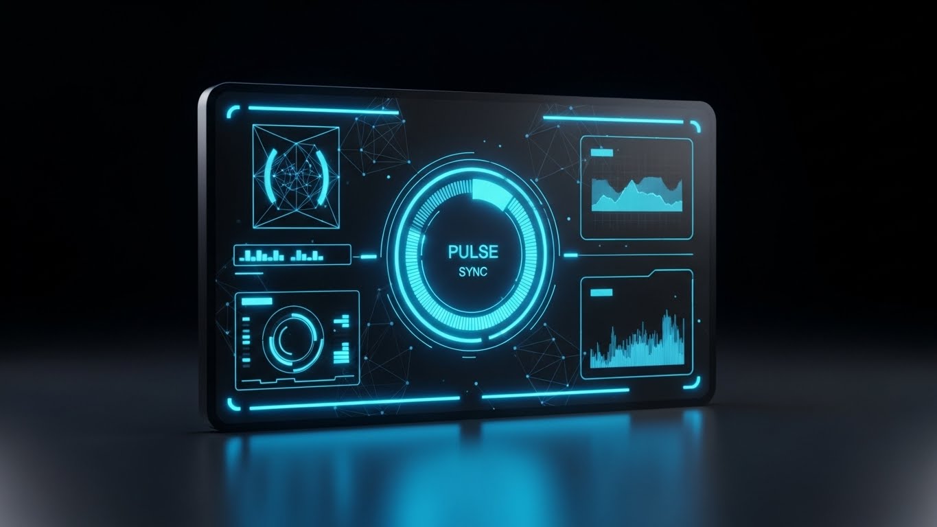
20. Abstract 3D AI Visualization
BOFU | Implementation

The Visual & Narrative Approach
Implementation is often feared as a rigid, painful process. This style re-frames it as fluid and adaptive. We use a simulation of Iridescent Pearl and Silver liquid pouring smoothly into a mold, instantly forming a perfect "Gear" shape. The movement is smooth and satisfying. The narrative suggests that the software is malleable—it adapts to your business processes, rather than forcing you to break your business to fit the software.
Psychological Impact & KPI Focus
This addresses Change Management Fatigue. It visualizes Flexibility and Seamless Integration. It promises the buyer that the software will fill the gaps in their operation perfectly, without the friction of a "square peg in a round hole." It supports the promise of a rapid Time-to-Value.
Strategic Implementation & Trade-offs
- Ideal Duration: 10-15 seconds.
- Trade-off: Extremely abstract. It requires accompanying copy to make the point clear ("Molds to your business"). Without the text, it is just a satisfying animation.
Companies using similar video content -
Fiix Software – CMMS – Direct path, simplifying the service journey.
UpKeep – EAM – Reducing implementation anxiety, core workflow.
Coast – Predictive Maintenance – Simplifying complex processes.
21. 2D Animation & UI Composition
Onboarding | Self-Serve

The Visual & Narrative Approach
Onboarding is where the user relationship is solidified or lost. This style bridges the gap between a cold interface and human guidance. We see a stylized, cel-shaded character in Hot Pink and Purple pointing enthusiastically at a floating, pulsing UI button. The character’s thick outlines and inviting expression create a friendly, supportive atmosphere. The background is a solid, vibrant color, ensuring the viewer’s eye is drawn exclusively to the interaction. The narrative is one of "Personalized Assistance," acting as a digital concierge.
Psychological Impact & KPI Focus
New users often feel Performance Anxiety when facing a complex dashboard. This friendly, human-centric approach reduces intimidation and lowers the cognitive barrier to entry. It encourages Self-Sufficiency, directly impacting Support Ticket Volume by proactively guiding users to solve problems themselves rather than calling the helpdesk. It fosters a sense of "safe exploration."
Strategic Implementation & Trade-offs
- Ideal Duration: 15-30 seconds (Module intro).
- Trade-off: The character design must be universally appealing. If it feels too juvenile, it may alienate veteran technicians who pride themselves on seriousness.
Companies using similar video content -
IFS – Field Service Management – Liquid adaptation, frictionless integration.
Microsoft Dynamics 365 Field Service – Field Service – Fluid and adaptive implementation.
Zuper – Field Service Management – Malleable software, adapting to business processes.
22. 2D Graphics Over Live Action
Onboarding | Time-to-Value
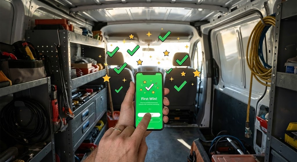
The Visual & Narrative Approach
To validate the user's decision to adopt the software, this style layers digital delight over physical reality. We use a POV shot of a technician’s hand holding a smartphone inside a service van. As they complete a task on screen, 2D motion graphics—sparkling stars and Green checkmarks—burst out of the phone into the "real world." It visually celebrates the "First Win," anchoring the digital action to a positive emotional response within the actual work environment.
Psychological Impact & KPI Focus
Technicians need to feel that the software is adding value, not just adding work. This style triggers a Dopamine Reward Response. By visually externalizing the success of a digital task, it accelerates the perceived Time-to-Value. It is critical for Habit Formation in the early stages of rollout, reinforcing that the app is a partner in their daily success.
Strategic Implementation & Trade-offs
- Ideal Duration: 10-15 seconds.
- Trade-off: Requires high-quality, stabilized footage of the phone. If the tracking of the graphics slips, the illusion breaks, and it looks amateurish.
Companies using similar video content -
Workiz – Field Service Software – Digital guide, gamifying learning curve.
Connecteam – Mobile Workforce Management – Friendly, human-centric approach.
mHelpDesk – Field Service Software – Personalized assistance, self-sufficiency.
23. Macro UI Micro-Interactions
Onboarding | User Activation

The Visual & Narrative Approach
Trust is built in the details. This style utilizes an Extreme Close-Up (Macro) perspective. We focus intensely on the tip of a finger pressing a glass screen, capturing the exact moment a glowing Electric Blue "Submit" button depresses. The background is a deep, premium Indigo. The narrative is purely sensory: it conveys responsiveness, speed, and the satisfying "click" of a well-engineered tool.
Psychological Impact & KPI Focus
This targets the subconscious desire for Control and Responsiveness. A common complaint with field software is "lag" or "clunkiness." This visual proves the opposite—that the interface is snappy and precise. It drives User Activation by making the interaction feel tangible and rewarding, reducing the friction of data entry.
Strategic Implementation & Trade-offs
- Ideal Duration: 3-5 seconds (Looping GIF).
- Trade-off: This is a hyper-specific visual. It is not for explaining workflows, but for feeling the quality of the UX. Use it as a transition or a "loading" state visualization.
Companies using similar video content -
Salesforce Field Service – Field Service – The first win, visualizing instant success.
ServiceTitan – Field Service Software – Dopamine reward response, habit formation.
Fieldcode – Field Service Management – Digital delight over physical reality.
24. 3D Parallax UI Presentation
Retention | Knowledge Base

The Visual & Narrative Approach
When a user is stuck, they need to know help is available and organized. This style uses 3D Parallax to arrange multiple "Help Article" cards floating in a clean, Soft Grey and White studio space. As the camera drifts, the depth of the layers is revealed by soft, long shadows. It visualizes the Knowledge Base not as a flat list of text, but as a substantial, structured library of resources ready to be accessed.
Psychological Impact & KPI Focus
This addresses Abandonment Anxiety. Users churn when they feel unsupported. By visualizing the volume and organization of support content, you reassure them that they are backed by a robust infrastructure. It encourages Self-Service, reducing the burden on live support agents and increasing Customer Satisfaction (CSAT).
Strategic Implementation & Trade-offs
- Ideal Duration: 10-20 seconds (Header Video).
- Trade-off: It is abstract. It doesn't answer a specific question, but rather sells the concept that answers are available. It builds confidence in the platform's ecosystem.
Companies using similar video content -
Totalmobile – Enterprise Asset Management – Tactile touch, sensing digital connection.
UpKeep – EAM – Extreme close-up on responsiveness.
Tyler Technologies – Enterprise Asset Management – Quality of UX, precise interaction.
25. Futuristic Neon/Dark Mode
Retention | Support Overhead
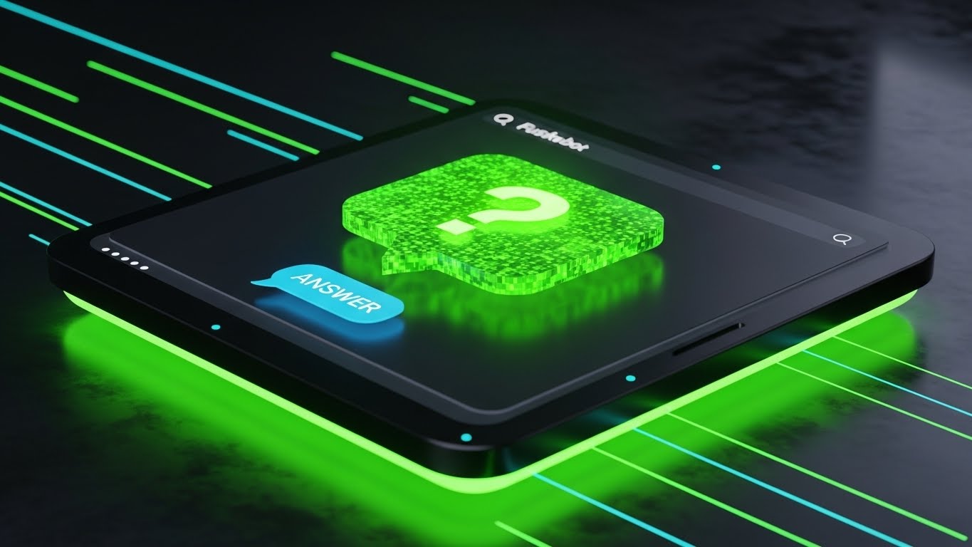
The Visual & Narrative Approach
Field service doesn't stop at 5 PM. This style uses a Dark Mode aesthetic with Neon Green accents to represent the "always-on" nature of automated support. A glowing chatbot interface floats in a dark, moody environment, with a "Question" icon instantly transforming into an "Answer" icon. The lighting spills onto the surface, grounding the digital element. The narrative promises that the system is awake and ready, even when the office is closed.
Psychological Impact & KPI Focus
For fleet managers and night-shift dispatchers, the fear of being stranded without help is real. This visual alleviates Operational Isolation. It positions the AI or Chatbot not as a barrier, but as a futuristic, capable assistant. It directly impacts Support Overhead metrics by promoting the reliability of automated assistance over human calls.
Strategic Implementation & Trade-offs
- Ideal Duration: 6-10 seconds.
- Trade-off: The "Cyberpunk" look must align with your brand. If your brand is traditional and warm, this might feel too cold. Use specifically for "After-Hours Support" messaging.
Companies using similar video content -
Salesforce Field Service – Field Service – Depth of knowledge, visualizing support resources.
Oracle Field Service Cloud – Field Service Cloud – Structured library of resources.
Prometheus Group – Mobile Workforce Management – Volume and organization of support content.
26. Generative AI Realistic Character Video
Retention | Reducing Churn

The Visual & Narrative Approach
Retention is about relationship. This style uses high-end Generative AI to create a photorealistic scene of an Operations Director in a modern office. The focus is on her expression—a genuine smile of relief as she looks at her monitor. The lighting is warm and cinematic, blurring the busy office background. The narrative is emotional: "We understand the pressure you are under, and we are the reason you can finally relax."
Psychological Impact & KPI Focus
This targets Churn Reduction by reminding the stakeholder of the emotional ROI—peace of mind. It validates their hard work and positions the software as their partner in success. It moves the conversation from "features" to "feelings," which is often the deciding factor in renewal discussions.
Strategic Implementation & Trade-offs
- Ideal Duration: Static Image or subtle "Cinemagraph" motion.
- Trade-off: Generative AI for video is evolving. The lip-sync and micro-expressions must be flawless; otherwise, it enters the "Uncanny Valley" and erodes trust.
Companies using similar video content -
Salesforce Field Service – Field Service – Always-on assistant, 24/7 support.
Zuper – Field Service Management – Automated support, operational isolation.
Fieldproxy – Field Service Management – Futuristic, capable assistant.
27. Dark Mode UI Showcase
Expansion | Feature Adoption
The Visual & Narrative Approach
To upsell, you must appeal to the user's desire for mastery. This style presents a sleek, high-density analytics dashboard in Charcoal, Gold, and Slate. The view is symmetrical and authoritative. Gold data lines glow against the matte black background, highlighting advanced metrics that are only available in the "Pro" or "Enterprise" tier. The narrative is: "You are ready for the next level of control."
Psychological Impact & KPI Focus
This appeals to the "Power User" persona. It frames the upgrade not as a cost, but as a tool for elite performance. It drives Feature Adoption and Expansion Revenue by making the higher-tier features look visually superior to the standard view. It visualizes the "Pro" experience.
Strategic Implementation & Trade-offs
- Ideal Duration: 10-15 seconds.
- Trade-off: It relies on the UI actually having a dark mode or a high-density view. Do not advertise a UI fidelity that does not exist in the product.
Companies using similar video content -
Salesforce Field Service – Field Service – Relieved director, mirroring emotional resonance.
Microsoft Dynamics 365 Field Service – Field Service – Emotional ROI, peace of mind.
28. Holographic UI over 3D Render
Expansion | Upsell
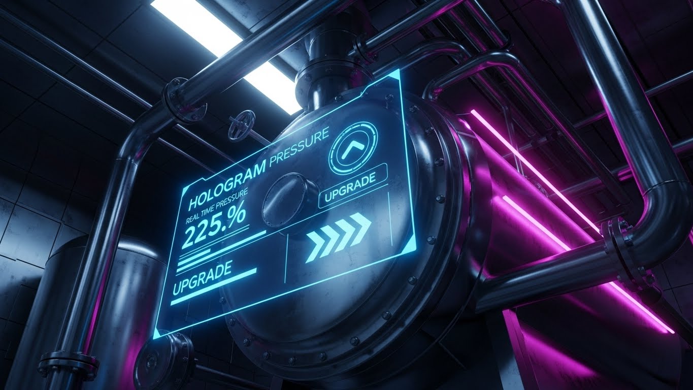
The Visual & Narrative Approach
This style sells the future roadmap. We see a low-angle, cinematic 3D render of heavy industrial equipment (a boiler or generator). Projected from the pipes is a Hologram Blue menu interface, displaying real-time pressure stats and "Upgrade" options. It blends the physical grit of the machinery with the ethereal promise of IoT and Augmented Reality. The narrative is: "Your physical assets have digital potential waiting to be unlocked."
Psychological Impact & KPI Focus
This targets the Visionary Buyer (CTO/CIO). It helps them visualize the Long-Term Value (LTV) of the partnership. It suggests that the software is future-proof and ready for the next wave of industrial transformation. It is a powerful tool for Upselling IoT modules or predictive maintenance packages.
Strategic Implementation & Trade-offs
- Ideal Duration: 15-20 seconds.
- Trade-off: High production value is required. This is a "Concept Car" approach—it sells the vision, even if the feature is currently in beta.
Companies using similar video content -
IFS – Field Service Management – Command center, unlocking power user status.
Microsoft Dynamics 365 Field Service – Field Service – Sleek, high-density analytics dashboard.
Service Dynamics – Field Service Reporting – Advanced metrics, pro experience.
30. Lifestyle Stock with UI Overlay
Expansion | Thought Leadership
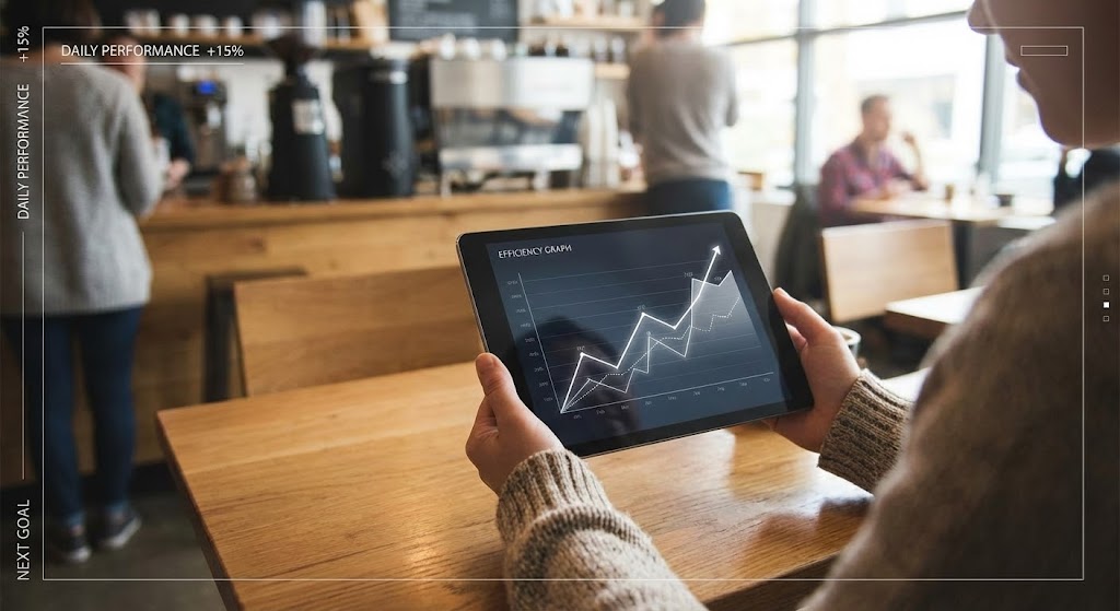
The Visual & Narrative Approach
The final style connects the software to personal freedom. We see an over-the-shoulder shot of a person in a coffee shop, relaxed, looking at a tablet. The tablet screen reflects a complex "Efficiency Graph" in white. The lighting mixes Natural Window Light with Warm Wood tones. The narrative shifts from "Work Harder" to "Work Smarter." It visualizes the ultimate benefit of the software: the freedom to manage the fleet from anywhere.
Psychological Impact & KPI Focus
This builds Brand Affinity and Thought Leadership. It appeals to the lifestyle aspirations of the leadership class. It reinforces the "Mobile-First" philosophy and positions the vendor not just as a software provider, but as a partner in the user's professional success and work-life balance.
Strategic Implementation & Trade-offs
- Ideal Duration: Static Image or Cinemagraph.
- Trade-off: Can feel generic if the UI overlay isn't perfectly composited. The reflection and perspective must be photorealistic to sell the integration.
Strategic Knowledge Base: The Visual Operations Doctrine
To truly transform a Mobile Field Service operation, you cannot simply "make videos." You must deploy a visual strategy that permeates every layer of the business, from the technician’s van to the boardroom. Based on the 30 styles analyzed, we have synthesized a 3-part framework to guide your implementation. This is your blueprint for moving from "content" to "infrastructure."
Strategic Alignment & Visual Architecture
The "Pre-Production" Strategy: Defining the Why and Who.
1. The Cognitive Load Audit
Before selecting a style (e.g., Style 1 vs. Style 15), conduct a "Cognitive Load Audit." Assess the complexity of the task. If the workflow is complex (multi-stage invoicing), use high-abstraction styles to strip away noise. If the task is physical (hardware repair), use high-fidelity styles (3D Renders) to ensure accuracy. Match the visual density to the information density.
2. Role-Based Visual Mapping
Your workforce is not a monolith. A driver on a mobile device has different visual needs than a dispatcher on a desktop.
- For Drivers (Mobile): Prioritize Style 21 (2D Animation) and Style 23 (Macro UI). They need high-contrast, large-element visuals that are legible in sunlight and require zero decoding time.
- For Managers (Desktop): Leverage Style 7 (Isometric 2D) and Style 12 (Dynamic Data). They have the screen real estate and the cognitive bandwidth to process complex, data-rich ecosystem views.
3. The "Glanceability" Standard
In Mobile Field Service, safety is paramount. Visuals used for onboarding drivers must pass the "Glanceability" test. Can the core message be understood in 1.5 seconds? Advids recommends establishing a "Visual Safety Standard" where all driver-facing training content mimics the simplicity of road signs, not textbooks.
4. The Advids Strategic Audit
Production without strategy is waste. Before commissioning 30 assets, engage in a strategic audit to define your Visual Operating System. This involves standardizing your iconography (e.g., does a "Blue Gear" always mean "Settings"?) and your motion language. This consistency reduces the learning curve for users as they move from Marketing videos to Training modules.
5. Standardization vs. Customization
When to use stock? Style 13 (Aspirational Stock) is excellent for mood setting but fails at instruction. Use customized visualization (like Style 11: Wireframe to Reality) for your core differentiators—the features that only you have. Don't spend budget animating a generic login screen; save your custom 3D budget for your unique "Digital Twin" technology.
6. Legacy System Integration
One of the hardest things to sell is the bridge between "Old" hardware and "New" software. Use Style 28 (Holographic UI) explicitly for this. Visualizing the connection between a 20-year-old boiler and a modern iPad creates a "Visual Bridge" that reassures conservative buyers that their legacy assets won't be left behind.
7. Accessibility in Trucking
Your workforce is likely diverse and multi-lingual. Relying on voiceovers or text-heavy videos is a barrier. Shift towards Style 2 (Line Art Animation) and Style 16 (Character Story) which rely on visual pantomime rather than language. A well-designed visual workflow transcends language barriers, enabling you to scale training across global fleets.
8. The Mobile-First Mandate
Every style selected in this guide—from Style 1 to Style 30—must be audit-checked for mobile verticality. Even if the original asset is 16:9, ensure the focal point is center-weighted. Your technicians are watching these on phones, often in portrait mode. Design for the "Thumb Zone."
9. The Cross-Departmental Bridge
Visuals are the only language spoken fluently by Sales, Ops, and Support. Use Style 29 (Mixed Reality) to create a shared vision of the future. When Sales promises "innovation," and Ops asks "how," they should all be looking at the same visual. This unifies internal terminology and aligns expectations.
10. Future-Proofing Assets
Software UIs change. If you record live-action screen captures, your video is obsolete the next time you push an update. Instead, use Style 9 (Rapid UI Montage) or Style 25 (Neon UI) which rely on abstracted UI representations. By stylizing the interface (removing dates, version numbers), you extend the shelf-life of your video assets.
Operational Adoption & Implementation
The "Deployment" Phase: Embedding visuals into the workflow.
11. Overcoming "Big Brother" Anxiety
Driver monitoring and GPS tracking trigger resistance. If you market these features using "Control Tower" visuals (Style 7), you alienate the driver. Instead, use Style 16 (Character Story) or Style 13 (Aspirational Stock) to frame these features as "Safety" and "Protection." Visual empathy turns a surveillance tool into a guardian angel.
12. The Micro-Learning Shift
No technician reads a 50-page PDF manual. Pivot to "Micro-Learning" using Style 21 (2D Animation). Break your training into 30-second visual chunks: "How to Clock In," "How to Scan a Part." These bite-sized assets should be accessible directly within the app, delivering knowledge at the exact moment of need.
13. Just-in-Time Support
Embed Style 23 (Macro UI) GIFs directly into your error messages. If a user gets a "Sync Failed" error, don't just show text. Show a 3-second loop of the specific button they need to press to retry. Visualizing the solution inside the problem reduces support calls.
14. Gamification of Training
Use Style 22 (Graphics Over Live Action) to visualize the rewards of proper software usage. If your software creates a "Driver Scorecard," visualize the connection between a high score and a tangible reward. Visualizing the win state motivates adoption more effectively than mandating compliance.
15. Reducing Support Ticket Volume
Analyze your top 10 support tickets. Create a specific video using Style 10 (Clean UI) for each one. If "Password Reset" is #1, a clear, slow-paced visual guide placed on the login screen can reduce those tickets by 40%. Treat video as a "Deflection Shield" for your support team.
16. Remote Onboarding
For distributed fleets, physical seminars are impossible. Use Style 26 (AI Character) and Style 24 (Parallax Presentation) to create a "Virtual Orientation." A realistic AI avatar can welcome new hires by name (via dynamic rendering) and guide them through the basics, providing a consistent experience without travel costs.
17. Visualizing SOPs
Standard Operating Procedures (SOPs) are critical for safety. Convert text-based SOPs into Style 14 (Isometric 3D Workflow) animations. Seeing a "Red Alert" turn into a "Green Success" sphere in a 3D cutaway builds a stronger mental model of the process than a checklist ever could.
18. Feedback Loops
Use interactive video elements. After a Style 9 (Rapid UI) feature announcement, include a "Reaction" button overlay. Did this video help? Visual feedback mechanisms allow you to iterate on your content strategy based on what the field is actually finding useful.
19. Scalable Localization
When deploying globally, separate on-screen text from the background video. Using Style 2 (Line Art) or Style 1 (Minimalist Flat) allows you to easily swap out text layers for different languages without re-animating the core visual. This is essential for cost-effective global scaling.
20. Leadership Communication
When rolling out major strategic shifts, do not send an email. Use Style 30 (Lifestyle) or Style 15 (Photorealistic 3D) in a video message from the CEO. High-production value visuals signal to the company that this initiative is a priority. It adds weight and "Gravitas" to the message.
Measuring Impact & Future-Proofing
The "ROI" Phase: Measuring success and looking ahead.
21. Beyond "Views": Defining Actionable KPIs
Stop measuring "Views." Measure "Time-to-Competency." How much faster does a new hire reach full productivity after watching the Style 21 onboarding series? Measure "Feature Adoption Rate." Did the usage of the "Analytics Module" spike after you emailed the Style 27 showcase? Connect visuals to operational metrics.
22. The "Idle Time" Metric
In field service, idle time is lost revenue. Correlate the implementation of Style 10 (Clean UI) training videos with a reduction in "App Idle Time" (time spent staring at the screen). Better visualization leads to faster interaction, which leads to more jobs per day.
23. Compliance Velocity
When a new regulation (like ELD mandates) hits, speed matters. Measure "Compliance Velocity"—how weeks did it take for 100% of the fleet to become compliant? Visual communication (especially Style 19: Low-Poly) usually accelerates this curve significantly compared to text memos.
24. Retention and Churn (LTV)
High-quality UX visualization (Style 23, Style 25) contributes to the perception of a premium product. Track the correlation between users who engage with your visual Knowledge Base and their Renewal Rates. Educated customers who know how to use the tool are far less likely to churn.
25. The AI Visual Frontier
Prepare for Generative UI. Soon, interfaces will adapt to the user. Your visual style guide needs to be flexible enough to accommodate Real-Time Data Overlays (as seen in Style 29). The content you create today should be the training data for the AI support bots of tomorrow.
26. Scalability of Assets
Build a "Modular Asset Library." Don't render a 2-minute video as one block. Render it as twenty 6-second clips. This allows you to remix and reassemble these blocks (Intro from Style 6, Body from Style 10) for different channels and audiences, maximizing the ROI of every frame produced.
27. The Advids Partnership
Scalability requires a partner, not just a vendor. Advids functions as the custodian of your visual language. By maintaining the source files and the "Visual Operations Doctrine," we ensure that as your software evolves from Version 4.0 to 5.0, your visual assets can be updated incrementally rather than rebuilt from scratch.
28. Benchmarking Success
Don't just compare your visuals to your past; compare them to consumer apps. Your drivers use Instagram and Uber in their personal lives. If your enterprise software looks ancient by comparison, adoption will suffer. Use Style 3 and Style 22 to match the visual fidelity of the apps they love, reducing the "Enterprise UX Gap."
29. The ROI of Safety
Safety incidents are expensive. Quantify the reduction in accidents or safety violations after implementing Style 11 (Wireframe to Reality). If better visualization prevents one catastrophic failure or one lost client, the ROI of the entire video program is positive.
30. Final Call to Innovation
Treat video as Infrastructure, not Content. In the physical-digital ecosystem of Mobile Field Service, visual communication is the fiber-optic cable that connects the office to the field. It is not a "nice to have"; it is the operational layer that makes the software usable. Invest in it with the same rigor you invest in your code.
Companies using similar video content -
PTC – ThingWorx – Augmented asset, visualizing future potential.
IBM Maximo – Application Suite – IoT and AR, digital potential.
Acty – Remote Visual Support – Blending physical grit with ethereal promise.
Author & Editor Bio


