
Introduction: The Digital Renaissance of Roadside Hospitality
The roadside motel is an enduring icon of travel, but for the operators behind the front desk, the reality is often less romantic and more frantic. The "physical-digital divide"—where a chaotic desk of paper registration cards meets the instant demands of online booking engines—is the single greatest barrier to growth for independent operators. The industry is standing on the precipice of a massive shift: moving from the era of the "night audit binder" to the age of the "cloud ecosystem."
For SaaS platforms, the challenge is not just technical; it is psychological. Motel owners are pragmatic essentialists. They are skeptical of "flashy" tech that promises the moon but delivers complexity. They don't need another tool to manage; they need a partner that simplifies their existence. They need to see that technology can be as reliable as a brass key.
The opportunity for displacement is quantifiable. Recent market data indicates that 41% of independent hotels shifting to cloud-based systems are doing so specifically to regain control over their inventory and operations. This is a massive migration moment. Furthermore, adopting these tools is not just about keeping up; it is about guest satisfaction. Properties using automated management tools report a 30% reduction in guest complaints, proving that the efficiency of the back office directly impacts the smile at the front desk.
This guide provides a visual playbook to bridge that gap. We have curated 30 distinct video styles, ranging from minimalist metaphors that ease the anxiety of migration to photorealistic 3D renders that visualize the hidden ROI of smart infrastructure. Each style is analyzed to lower cognitive load, build trust, and articulate the specific value of your platform to the modern motel operator.
1. Simplifying the Analog-to-Digital Leap
TOFU | Brand Awareness

The Visualization Scenario
The video opens on a pristine white background with a single focal point: a vintage brass motel key with a heavy, diamond-shaped plastic fob. It is an object every motel owner has handled thousands of times. Slowly, the hard edges of the brass soften. The key fluidly morphs, dissolving its physical form to reshape into a sleek, "Slate Blue" digital cloud icon. The transition is not a replacement, but an evolution—a visual metaphor for retaining the soul of hospitality while upgrading the medium.
Psychological & Operational Impact
- Niche Psychology: This style directly addresses the anxiety of Legacy Migration. Operators often fear that "going digital" means losing their tangible connection to the property. By visually linking the brass key (Safety/Access) to the Cloud (Efficiency), we reduce the Cognitive Load of the transition.
- Operational Impact: It positions the software as a natural next step rather than a disruption, validating their past while inviting them into the future.
Strategic Implementation & Trade-offs
- Best Use Case: TOFU Social Ads (Instagram/Facebook) targeting "Small Business Owners."
- Duration: 6-10 Seconds (Looping).
- Trade-off: This style is purely conceptual. It builds brand affinity but does not educate on specific features like Folio Management or Invoicing.
Companies using similar video content -
Sirvoy – Sirvoy PMS – Simple cloud PMS for small properties.
Little Hotelier – Little Hotelier – All-in-one platform for independent hotels.
2. Visualizing Order from Chaos
TOFU | Market Education
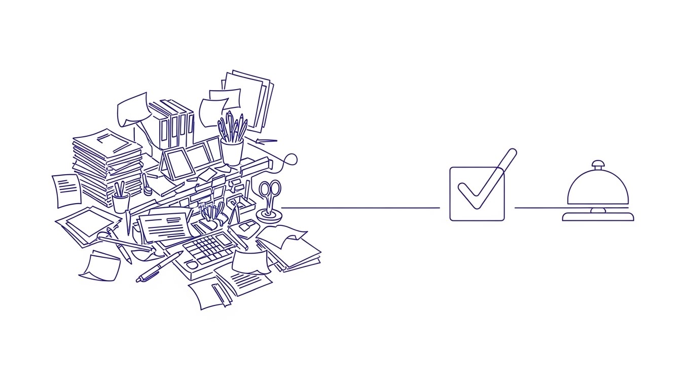
The Visualization Scenario
A single continuous line in "Electric Indigo" frantically sketches the outline of a disorganized front desk—stacks of paper, a ringing analog phone, and scattered pens. The line vibrates with tension, mimicking the stress of a busy check-in hour. Suddenly, the line sweeps across the screen, "ironing" out the jitters. It settles into a smooth, straight horizontal path that loops elegantly to form a verified check-mark and a digital service bell. The audio shifts from chaotic noise to a satisfying "ping."
Psychological & Operational Impact
- Niche Psychology: This visual triggers a sense of relief. It acknowledges the Operational Pain of the target persona (the cluttered desk) and visually offers the solution (streamlining).
- Operational Impact: It appeals to the operator's desire for a quieter, more organized life, positioning the platform as the "calming agent" in their daily grind without needing complex screenshots.
Strategic Implementation & Trade-offs
- Best Use Case: LinkedIn Feed or Website Hero Background.
- Duration: 10-15 Seconds.
- Trade-off: The abstract nature relies on the viewer identifying with the "messy desk" metaphor. It lacks human connection.
Companies using similar video content -
RoomRaccoon – RoomRaccoon PMS – Streamlines hotel operations and bookings.
eviivo – eviivo Suite – Simplifies online bookings and property management.
3. Energized Revenue Momentum
TOFU | Shaping Brand Perception
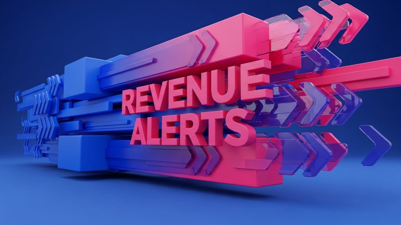
The Visualization Scenario
Heavy geometric blocks slam into frame on a dynamic diagonal axis. They aren't just flat colors; they are textured with "weathered metal" and unlit neon tubes, evoking the tactile reality of roadside signage. The blocks lock together to form abstract representations of words like "BOOKED" or "GROWTH." The palette of "Mustard Yellow" and "Charcoal Gray" feels industrial and robust. The kinetic motion suggests speed, urgency, and the rapid pace of high-occupancy weekends.
Psychological & Operational Impact
- Niche Psychology: This style targets Brand Perception. It speaks to the "Revenue Manager" side of the operator—the entrepreneur who wants to see the "No Vacancy" sign lit up.
- Operational Impact: The textures bridge the gap between their physical asset (the sign) and the digital tool (the software), driving urgency around Yield Management and high turnover.
Strategic Implementation & Trade-offs
- Best Use Case: Instagram Stories or TikTok (Vertical). High visual disruption.
- Duration: 6-9 Seconds.
- Trade-off: Zero educational value. It creates "hype" and brand vibrancy but requires follow-up content to explain the how.
Companies using similar video content -
RateGain – RateGain – Maximizes revenue with pricing intelligence.
Duetto – GameChanger – Dynamic pricing for optimal occupancy.
4. The "God-Mode" Property View
TOFU | Driving Freemium/Trials
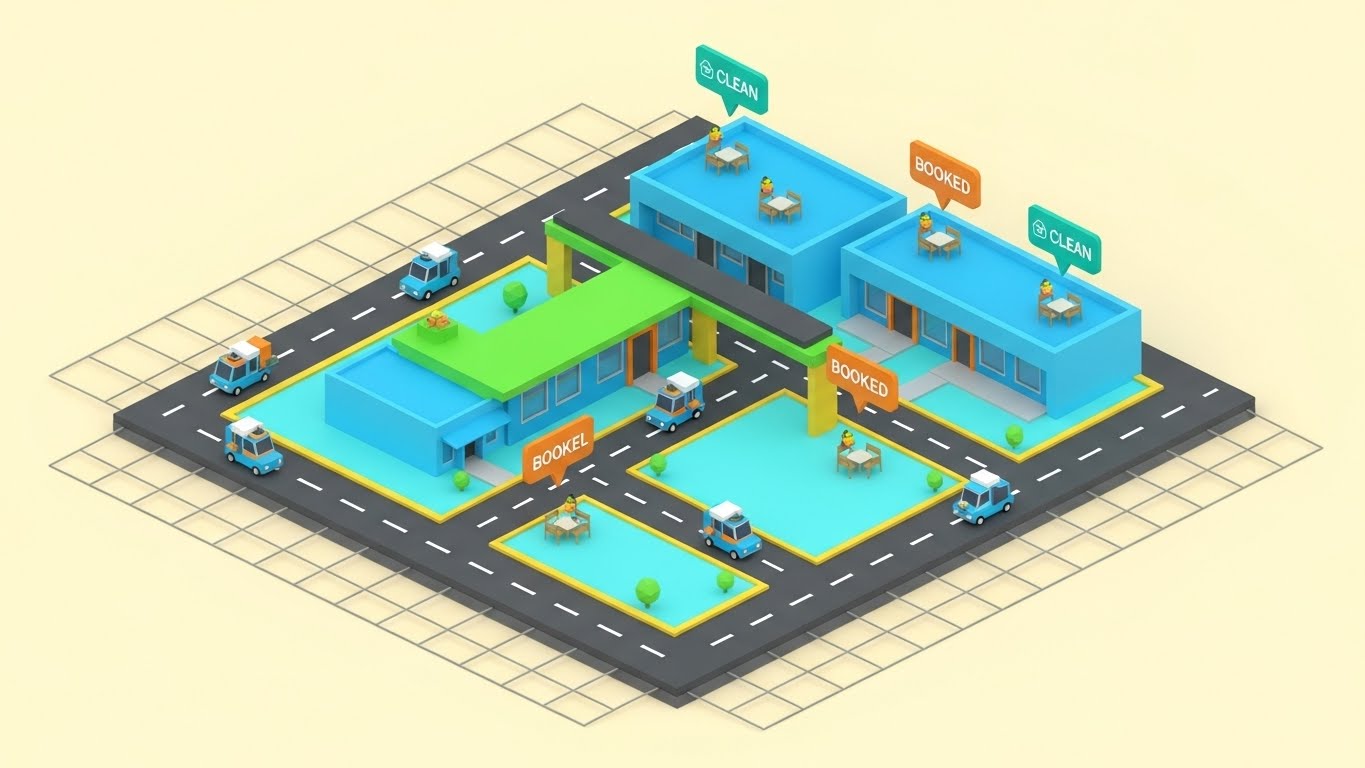
The Visualization Scenario
An isometric view of a stylized motel property is laid out on a clean grid. We see the entire operation at once: miniature housekeeping carts gliding along the walkways, cars pulling into spots, and guests entering rooms. Floating "Teal" and "Orange" bubbles pop up above specific units, signaling "Clean" or "Booked" status. The motion is clockwork-like and rhythmic. It simulates a perfectly optimized property where every movement is tracked.
Psychological & Operational Impact
- Niche Psychology: This style appeals to the need for Control. Independent operators often feel they need to be everywhere at once. This "God-Mode" perspective visually promises Centralized Management.
- Operational Impact: It gamifies the mundane tasks of Housekeeping Status tracking, making the work feel manageable and organized.
Strategic Implementation & Trade-offs
- Best Use Case: Website "Features" page or Product Tour intro.
- Duration: 20-30 Seconds.
- Trade-off: Can appear too "game-like." It is crucial to label the bubbles with serious metrics (e.g., RevPAR) to maintain professional credibility.
Companies using similar video content -
Cloudbeds – Cloudbeds Platform – Unified hospitality management platform.
RMS Cloud – RMS Cloud PMS – Comprehensive property management and operations.
5. Fluid Data Ecosystems
TOFU | Category Creation

The Visualization Scenario
Abstract, glossy shapes in "Mint Green" and "Soft Silver" move with liquid fluidity against a white background. These "blobs" represent data streams—guest profiles, room inventory, and payment details. They merge, separate, and flow without friction, visualizing the invisible process of API Synchronization. Unlike rigid spreadsheets, this data is alive and adaptable. The motion is hypnotic and smooth, suggesting an effortless backend experience.
Psychological & Operational Impact
- Niche Psychology: This style addresses the fear of Data Silos and "clunky" integrations. It visually answers the question, "Does it play nice with my other tools?" by showing seamless merging.
- Operational Impact: It elevates the brand category from a "database" to a "fluid ecosystem," appealing to operators looking for a modern, "frictionless" solution to Channel Management.
Strategic Implementation & Trade-offs
- Best Use Case: YouTube Pre-roll ads (Category Creation).
- Duration: 10-15 Seconds.
- Trade-off: Highly abstract. Requires a strong voiceover to anchor the visuals to the concept of "Sync" or "Integration."
Companies using similar video content -
SiteMinder – SiteMinder Platform – Seamless online distribution and booking.
MyAllocator – MyAllocator – Connects properties to global booking channels.
6. Bridging Generations
TOFU | Vertical Social Organic
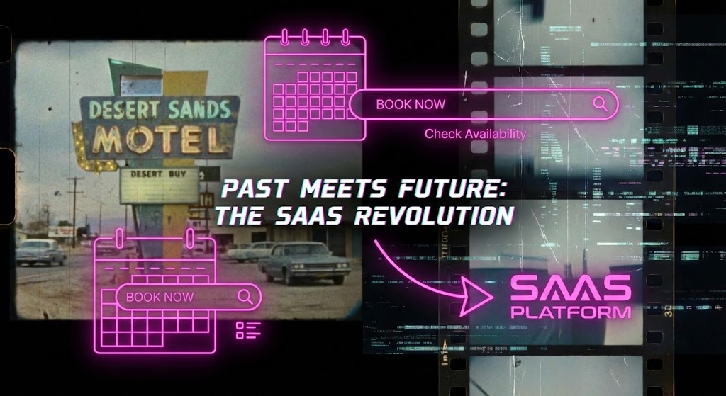
The Visualization Scenario
A high-energy collage that crashes the past into the future. The background is grainy, vintage 8mm film footage of a classic motel sign flickering at twilight. Overlaid on this are sharp, "Neon Pink" vector graphics of a modern booking interface and a digital calendar. The edit is fast, cutting on the beat. It visually acknowledges the romantic history of the road trip while aggressively inserting the efficiency of modern SaaS tools.
Psychological & Operational Impact
- Niche Psychology: This style targets the Next-Gen Operator—the son or daughter taking over the family business. It validates the property's heritage (the film) while asserting that survival requires modernization (the neon vectors).
- Operational Impact: It positions the software as the bridge between "Old School Hospitality" and "New School Efficiency," creating a cool, culturally relevant vibe for Vertical Social Organic channels.
Strategic Implementation & Trade-offs
- Best Use Case: TikTok or Instagram Reels.
- Duration: 15-20 Seconds.
- Trade-off: The "glitch/collage" aesthetic may alienate older, more conservative owners who prefer a polished, corporate look.
Companies using similar video content -
WebRezPro – WebRezPro PMS – Modern cloud PMS for hotels.
innRoad – innRoad PMS – Cloud-based solution for independent hotels.
7. The Zen of a Clean Dashboard
MOFU | Feature Education
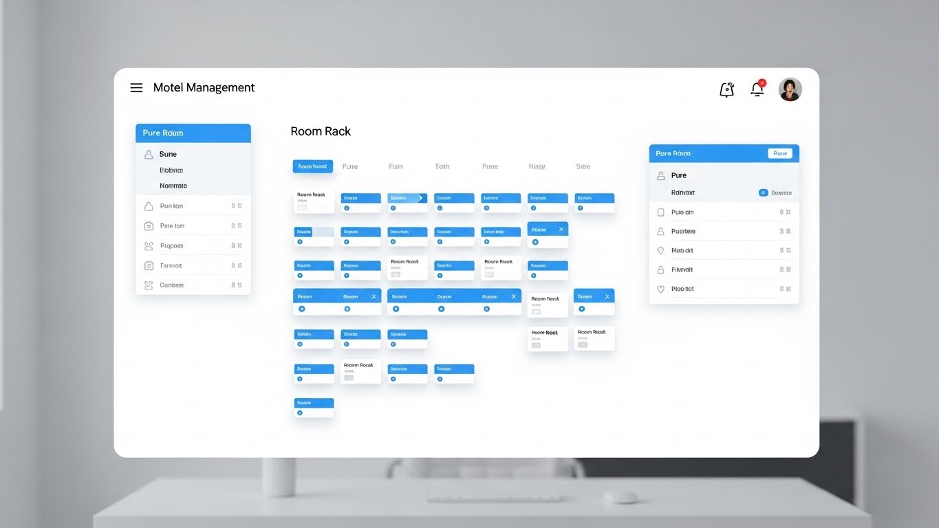
The Visualization Scenario
A static, high-fidelity mockup of the "Room Rack" dashboard is presented straight-on. The UI is simplified for clarity, using a "Sky Blue" and "Pure White" palette. Soft drop shadows lift the active cards off the screen. The background is a blurred, high-key office desk, providing professional context. A cursor moves deliberately, dragging a guest card from "Pending" to "Checked In." It demonstrates the Drag-and-Drop functionality without clutter or confusion.
Psychological & Operational Impact
- Niche Psychology: This style builds Trust. For the skeptic, seeing the actual interface is non-negotiable. The clean, airy design reduces Cognitive Load, proving that the software is intuitive and easy to learn.
- Operational Impact: It counters the fear of "bloatware" by showing a focused, actionable screen. It allows the viewer to mentally "test drive" the Check-in Process.
Strategic Implementation & Trade-offs
- Best Use Case: Product Page or Pricing Page (MOFU).
- Duration: 30-45 Seconds.
- Trade-off: It is functional, not emotional. It is essential for conversion but weak for initial attention-grabbing.
Companies using similar video content -
Mews – Mews PMS – Intuitive property management system.
StayNTouch – StayNTouch PMS – Mobile-first cloud PMS.
8. Real-World Mobile Utility
MOFU | Feature Education
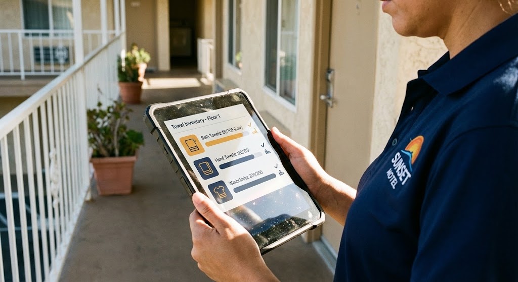
The Visualization Scenario
An over-the-shoulder shot of a housekeeping staff member standing on a sunlit exterior corridor. They hold a rugged tablet. The screen displays a crisp UI overlay of a "Towel Inventory" checklist in "Warm Amber" and "Cool Navy." The sunlight glints off the screen, grounding the tech in the physical reality of the motel environment. The staff member taps a button, and a "Complete" animation plays.
Psychological & Operational Impact
- Niche Psychology: This style proves Mobility. It answers the operator's fear: "Is this just for the front desk?" It validates the housekeeping staff as key users, empowering them with tools that work "in the wild."
- Operational Impact: It visually sells the benefit of real-time communication and Remote Management, showing that the business can run smoothly even when the manager isn't in the office.
Strategic Implementation & Trade-offs
- Best Use Case: LinkedIn Video Ads or Case Studies.
- Duration: 20-30 Seconds.
- Trade-off: Requires high-quality stock footage to ensure the UI overlay looks integrated and realistic, not like a cheap sticker.
Companies using similar video content -
Optii – Optii Solutions – AI-powered hotel operations and housekeeping.
RoomChecking – RoomChecking – Mobile app for housekeeping management.
9. Visualizing the Invisible Infrastructure
MOFU | Product Differentiation
The Visualization Scenario
A matte, clay-like 3D render of a single motel room unit. The walls are cut away to reveal the interior. Floating icons represent the "Invisible Tech": a WiFi signal pulsing above the router, a Smart Lock icon on the door, and an HVAC sensor. Thin white data lines connect these icons to a central node. The colors are earthy "Terracotta" and "Steel Gray." It looks like an architectural model of the future.
Psychological & Operational Impact
- Niche Psychology: This style appeals to the Tech-Forward buyer. It visualizes IoT Integration, showing that the software manages the physical asset, not just the reservation.
- Operational Impact: It creates a sense of depth and sophistication, differentiating the platform as a comprehensive "Infrastructure" solution rather than a simple app.
Strategic Implementation & Trade-offs
- Best Use Case: Landing Pages for "Enterprise" or "Pro" features.
- Duration: 15-20 Seconds.
- Trade-off: High production cost. Best reserved for explaining complex, high-value features.
Companies using similar video content -
Operto – Operto Connect – Smart property automation and access.
Lynx Automation – Lynx Automation – IoT solutions for hotel operations.
10. The Blueprint for Profit
MOFU | Competitive Displacement
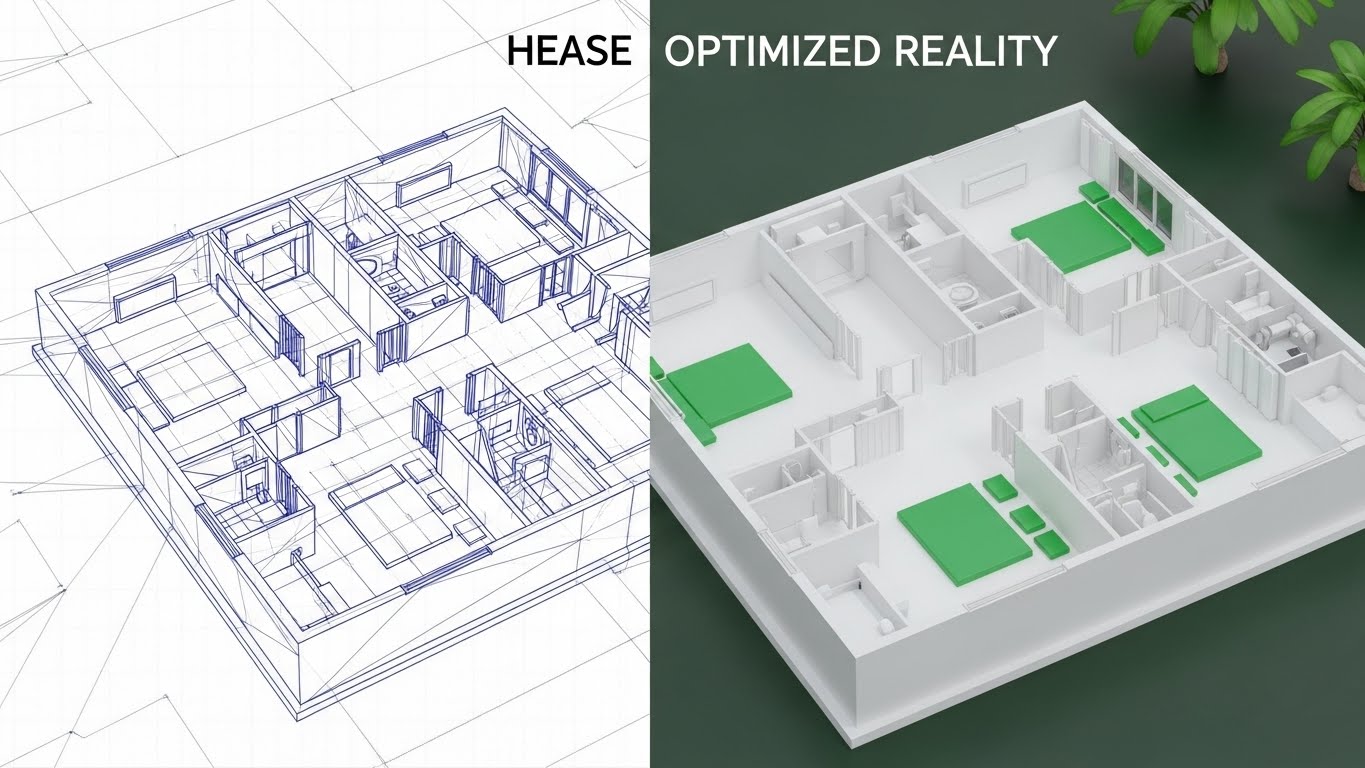
The Visualization Scenario
The screen is split vertically. The left side displays a technical "Blueprint Blue" wireframe of a motel layout—static and planning-focused. A scanner line moves across the screen. As it passes, the wireframe transforms into a photorealistic, "Pristine White and Green" 3D render. The transition symbolizes the shift from "Planning" to "Optimized Reality." The green accents subtly suggest revenue and growth.
Psychological & Operational Impact
- Niche Psychology: This is a powerful Competitive Displacement metaphor. It frames the "old way" (or competitor software) as merely a plan/wireframe, while your platform delivers the "reality."
- Operational Impact: It visualizes the ROI of the software, linking the subscription to the tangible success of a finished, thriving property.
Strategic Implementation & Trade-offs
- Best Use Case: Display Ads (Retargeting).
- Duration: Static or simple 5-second wipe.
- Trade-off: The visual contrast must be sharp. If the "After" state doesn't look significantly better, the metaphor fails.
Companies using similar video content -
IDeaS – IDeaS RMS – Revenue management for profit optimization.
Lighthouse – Lighthouse – Market intelligence for revenue growth.
11. The Architecture of Revenue Heights**
MOFU | Demand Gen & Lead Capture
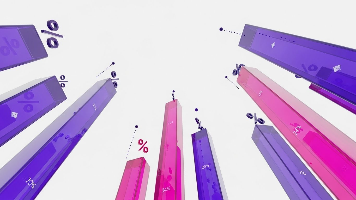
The Visualization Scenario
We adopt a dramatic "worm's-eye view," looking straight up at towering 3D bar charts that rise like skyscrapers against a pristine white sky. The bars are rendered in translucent "Violet" and "Magenta" glass, suggesting modern, high-value infrastructure. As they ascend, floating percentage symbols and data points pop into existence near the peaks. The camera slowly rotates around the base, emphasizing the sheer scale of the financial growth. It feels less like a spreadsheet and more like a cityscape of success.
Psychological & Operational Impact
- Niche Psychology: This style targets the Growth Mindset. Independent operators often view revenue as flat or seasonal. This perspective visually re-frames their income potential as something limitless and towering, triggering a desire for Scalability.
- Operational Impact: It abstracts the complex metrics of RevPAR (Revenue Per Available Room) and ADR (Average Daily Rate) into a singular, impressive structure, validating the software’s ability to drive pricing power.
Strategic Implementation & Trade-offs
- Best Use Case: LinkedIn Newsfeed (MOFU) or Investor Decks.
- Duration: 10-15 Seconds.
- Trade-off: The lack of X/Y axis labels means it conveys "Growth" generally, rather than specific data. It is an emotional appeal to financial ambition.
Companies using similar video content -
Beyond Pricing – Beyond Pricing – Revenue management for short-term rentals.
Atomize – Atomize RMS – Real-time pricing and revenue management.
12. Harmonizing Heritage with Innovation
MOFU | Thought Leadership
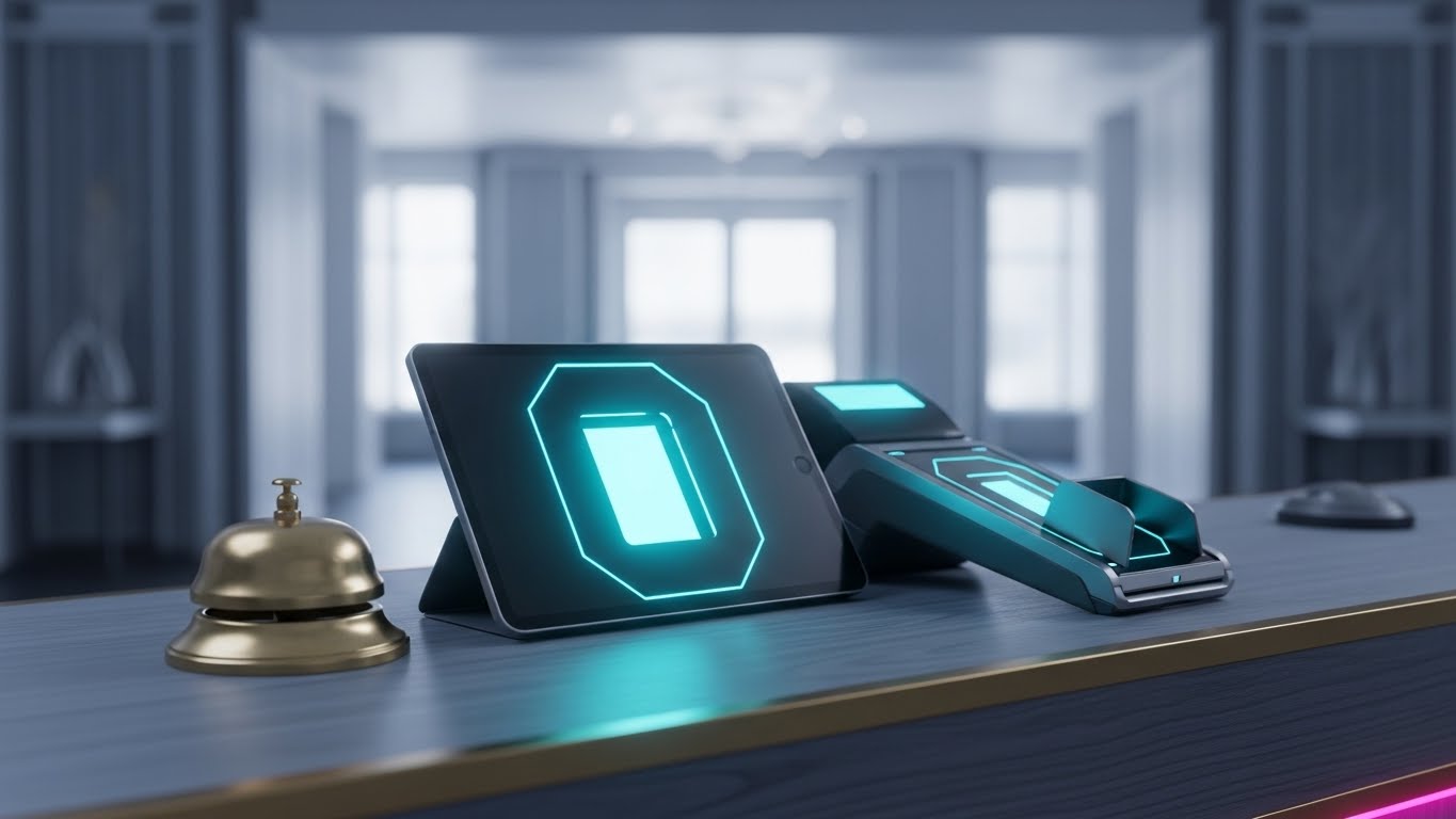
The Visualization Scenario
A stunningly photorealistic close-up of a front desk surface. The texture of the "Walnut Wood" is palpable. Sitting side-by-side are two objects: a traditional, tarnished brass service bell and a sleek, modern iPad POS terminal displaying a glowing "0" (Zero Friction) logo. The background is a soft, warm bokeh of a sunlit lobby. The lighting highlights the material contrast—the heritage of the brass and the precision of the digital glass. It is a still life that honors the past while equipping the future.
Psychological & Operational Impact
- Niche Psychology: This style builds Brand Trust with traditionalists. It addresses the fear that technology will sterilize the "warmth" of hospitality. By placing the tech alongside the bell, it positions the software as a respectful partner to tradition, not a destroyer of it.
- Operational Impact: It visually anchors the Point of Sale (POS) interface in the physical reality of the front desk, making the transition to tablets feel premium and inevitable.
Strategic Implementation & Trade-offs
- Best Use Case: Whitepaper Covers or "About Us" Website Sections.
- Duration: Static Image or subtle 5-second cinemagraph (dust motes dancing).
- Trade-off: High rendering costs for photorealism. If the lighting is off, it can look uncanny.
Companies using similar video content -
Maestro PMS – Maestro PMS – Integrates traditional hospitality with modern tech.
Springer-Miller Systems – *SMS\
13. The "Unchained" Operator
MOFU | Overcoming Objections
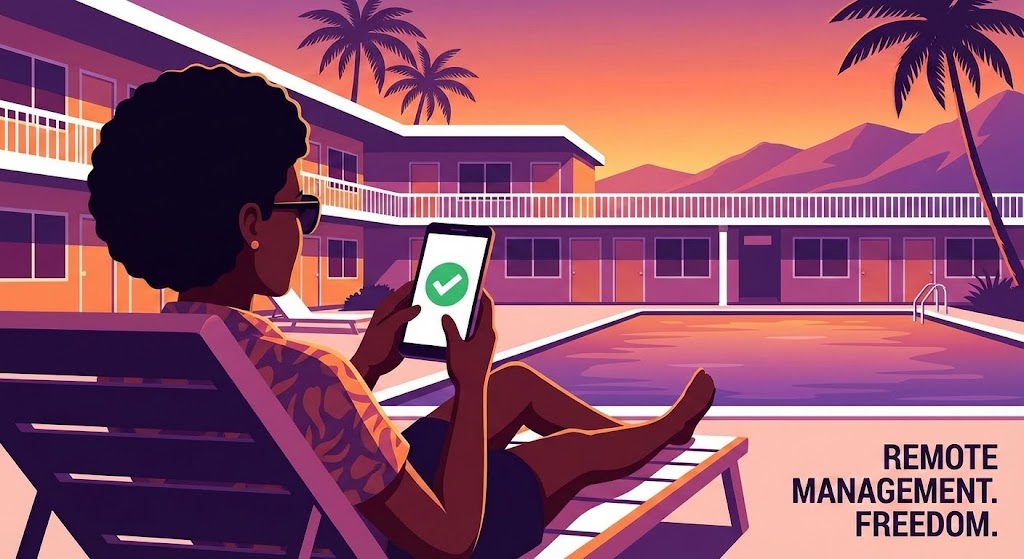
The Visualization Scenario
A stylized, flat 2D illustration captures a moment of pure relief. A motel owner is reclined on a lounge chair by the pool, bathed in a "Sunset Orange" and "Purple" gradient. They are not working; they are relaxing. In their hand, a smartphone displays a large, reassuring "Green Checkmark." Rim lighting defines the character against the warm background. The scene breathes slowly, emphasizing calm. It visualizes the ultimate promise of SaaS: the ability to leave the front desk without the business falling apart.
Psychological & Operational Impact
- Niche Psychology: This taps into the deep desire for Work-Life Balance. Many owners feel chained to the property 24/7. This visual sells "Freedom" and Peace of Mind more effectively than a feature list ever could.
- Operational Impact: It demonstrates the reliability of the Mobile App and cloud syncing. The "Green Checkmark" is a powerful symbol that operations are running smoothly remotely.
Strategic Implementation & Trade-offs
- Best Use Case: YouTube Ads (Mid-roll) or Retargeting Campaigns.
- Duration: 15-20 Seconds.
- Trade-off: Must be careful not to depict the owner as negligent. The key is "Remote Control," not "Abandonment."
Companies using similar video content -
ResNexus – ResNexus – Cloud PMS for remote property management.
Hotelogix – Hotelogix PMS – Cloud-based PMS for operational freedom.
14. Visualizing Liquidity and ROI
BOFU | ROI Justification
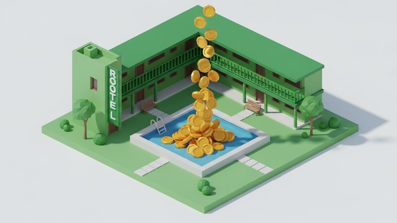
The Visualization Scenario
A playful, low-poly 3D scene set on a clean white plane. A miniature, geometric motel structure sits next to a rectangular swimming pool. Suddenly, a faucet in the sky opens, and instead of water, oversized gold coins tumble down. They fill the pool with a satisfying physics simulation, piling up and spilling over onto the "Emerald Green" courtyard. The shadows are sharp and directional, giving the coins weight. It turns the abstract concept of "increased bookings" into a literal pool of money.
Psychological & Operational Impact
- Niche Psychology: This style addresses ROI Justification. It is a direct, almost primal visualization of value accumulation. It gamifies the concept of revenue, making the software feel like a money-generating machine.
- Operational Impact: It connects Yield Management features (like dynamic pricing) to the tangible result of cash flow, simplifying the complex argument of "Why pay for software?"
Strategic Implementation & Trade-offs
- Best Use Case: Sales Decks (Closing Slides) or Pricing Pages.
- Duration: 6-10 Seconds (Looping).
- Trade-off: Can feel a bit "cartoonish" for enterprise clients. Best for the independent/budget motel segment.
Companies using similar video content -
KWHotel – KWHotel – Affordable PMS driving direct bookings.
Octorate – Octorate – Booking engine and channel manager for revenue.
15. Transparency in Data Security
BOFU | Risk Mitigation

The Visualization Scenario
We see a 3D render of a physical front desk lockbox or safe. The outer shell is made of "Translucent Cyan" glass. As we look through the casing, we see the internal mechanism is not gears, but a glowing "White" digital shield floating in the center. Concentric data lines rotate around it, forming a protective barrier. The background is a sterile, clean laboratory white. It makes the invisible concept of Data Encryption look like a physical fortress.
Psychological & Operational Impact
- Niche Psychology: This style mitigates Risk Aversion. Security is often a scary topic (breaches, hacks). This visual flips the script, showing security as a beautiful, robust, and modern "core" feature of the platform.
- Operational Impact: It visually explains PCI Compliance and guest data protection without using scary terminology, reassuring the operator that their guest records are safer here than in a paper binder.
Strategic Implementation & Trade-offs
- Best Use Case: "Security" Feature Page or Trust Center.
- Duration: 10-15 Seconds.
- Trade-off: Requires high-fidelity rendering to ensure the "glass" texture looks premium and protective, not fragile.
Companies using similar video content -
Shiji Group – Shiji Enterprise Platform – Secure and integrated hospitality solutions.
Amadeus Hospitality – Amadeus PMS – Robust data security for hotel operations.
16. The Human Face of Hospitality
BOFU | Building Trust
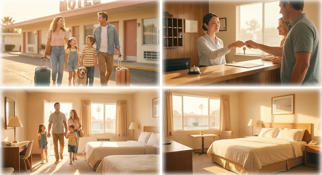
The Visualization Scenario
A heartwarming montage of photographic stills, blended with soft edges. We see a family wheeling suitcases across a sun-drenched parking lot, a smiling front desk agent handing over a key with eye contact, and a pristine, sunlit room. The lighting is exclusively "Golden Hour"—warm ambers and soft whites. It evokes the feeling of a perfect stay. This is not about the software; it is about what the software enables: a stress-free host and a happy guest.
Psychological & Operational Impact
- Niche Psychology: This style builds Emotional Connection. Operators entered this industry to host people, not manage databases. This reminds them that efficiency leads to better hospitality.
- Operational Impact: It implicitly sells Guest Experience Management. The smooth arrival suggests that the reservation was correct, the room was ready (Housekeeping App), and the check-in was fast (PMS).
Strategic Implementation & Trade-offs
- Best Use Case: Email Newsletters or Welcome Sequences.
- Duration: Static Collage or Slow Slide.
- Trade-off: Generic stock footage can hurt credibility. The images must look authentic to the "Roadside Motel" aesthetic, not a luxury high-rise.
Companies using similar video content -
Revinate – Revinate CRM – Enhances guest experience and loyalty.
TrustYou – TrustYou – Manages guest feedback and online reputation.
17. Accelerating Operational Velocity
BOFU | Sales Cycle Acceleration
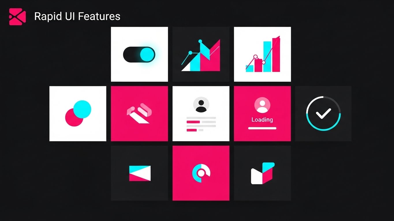
The Visualization Scenario
A high-octane motion graphic sequence. Abstract representations of UI screens—tilted on a dynamic angle—fly past the camera. They are high-contrast "Electric Lime" and "Black." We catch glimpses of widgets: "Night Audit," "Check-In," "Billing." Motion blur streaks emanate from the edges, creating a "warp speed" effect against a dark void. It feels fast, precise, and cutting-edge. It visually simulates the speed at which a proficient user can navigate the system.
Psychological & Operational Impact
- Niche Psychology: This style appeals to the need for Efficiency. It answers the objection: "Will this slow me down?" with a resounding "No, it will speed you up."
- Operational Impact: It highlights Workflow Optimization, suggesting that tasks which used to take hours (like the Night Audit) now happen in seconds.
Strategic Implementation & Trade-offs
- Best Use Case: Instagram Reels or short Video Ads (BOFU).
- Duration: 6-10 Seconds.
- Trade-off: The details of the UI are lost in the blur. It creates a "feeling" of speed but does not teach the interface.
Companies using similar video content -
Frontdesk Anywhere – Frontdesk Anywhere – Speeds up front desk operations.
AutoClerk – AutoClerk PMS – Streamlined property management for efficiency.
18. The Gamification of Onboarding
Onboarding | Self-Serve Onboarding
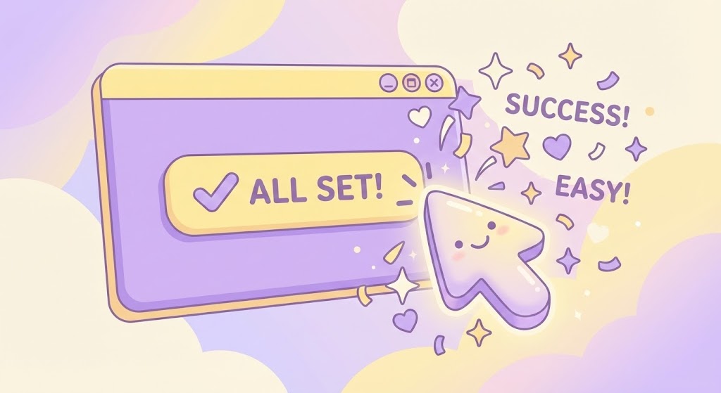
The Visualization Scenario
A soft, approachable 2D animation designed to lower blood pressure. A stylized, oversized mouse cursor floats over a pastel "Lavender" and "Soft Yellow" UI window. It clicks a button labeled "All Set!" Instantly, confetti and sparkles pop out from the cursor, and the window bounces happily. The background is a fluffy cloudscape. It treats the software setup not as a technical chore, but as a delightful, rewarding interaction.
Psychological & Operational Impact
- Niche Psychology: This style targets Implementation Anxiety. The biggest barrier to purchase is the fear of a difficult setup. This visual promises a Frictionless Onboarding experience that is as easy as a mobile game.
- Operational Impact: It visually supports the Self-Service model, encouraging users to complete the setup themselves without needing a support call.
Strategic Implementation & Trade-offs
- Best Use Case: In-App Welcome Screen or "Getting Started" Email.
- Duration: 5-8 Seconds.
- Trade-off: Can appear too juvenile for larger hotel chains. Perfect for the "Mom and Pop" segment.
Companies using similar video content -
Sirvoy – Sirvoy PMS – Easy self-onboarding for small properties.
Little Hotelier – Little Hotelier – Quick and intuitive setup process.
19. Celebrating the "Time-to-Value" Moment
Onboarding | Accelerating Time-to-Value
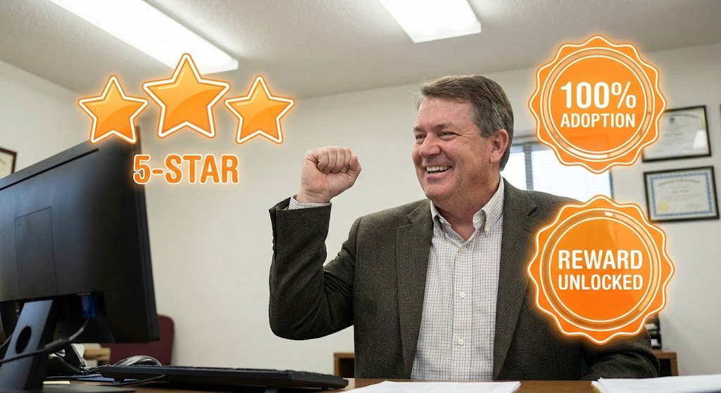
The Visualization Scenario
A medium shot of a real human—a professional-looking manager in a bright office—pumping their fist in a genuine moment of victory. Overlaying this photo are vibrant "Orange" vector graphics: a "5-Star" rating popping up and a badge reading "100% Adoption." The graphics glow, blending the realism of the job with the digital rewards of the software. It visualizes that specific feeling of nailing a busy weekend or getting a perfect review.
Psychological & Operational Impact
- Niche Psychology: This style leverages Social Proof and validation. It mirrors the user's aspiration to be a successful, modern operator. It visualizes the Emotional ROI of doing a good job.
- Operational Impact: It connects the software usage directly to business outcomes (Reviews, Adoption), reinforcing the idea that the platform is a tool for Reputation Management.
Strategic Implementation & Trade-offs
- Best Use Case: Case Study Emails or Testimonial Videos.
- Duration: Static Image or 10-second Motion Overlay.
- Trade-off: The "Live Action" talent must look relatable—not like a stock model, but like a real business owner.
Companies using similar video content -
GuestRevu – GuestRevu – Collects guest feedback to validate staff.
Local Measure – Local Measure – Real-time guest insights for staff success.
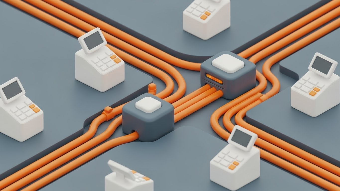
20. Frictionless Infrastructure Integration
Onboarding | Reducing Implementation Friction

The Visualization Scenario
A clean, abstract animation featuring thick, geometric lines resembling pipes or conduits in "Deep Purple." They snake across a white background, moving with purpose. They approach a central junction and snap together with a satisfying, glowing white flash. The connection is watertight and smooth. There are no leaks, no gaps—just a perfect, seamless circuit being completed.
Psychological & Operational Impact
- Niche Psychology: This style addresses the fear of Technical Debt and "clunky" systems. It reassures the viewer that this software "fits" perfectly into their existing world.
- Operational Impact: It visualizes Integration (e.g., connecting the PMS to the Channel Manager or Electronic Door Locks) as a seamless, plug-and-play event, reducing the perceived barrier to entry.
Strategic Implementation & Trade-offs
- Best Use Case: Help Center Articles or "Integrations" Page.
- Duration: 10-15 Seconds (Looping).
- Trade-off: Highly abstract. It requires accompanying text to explain what is being connected (e.g., "Connects to Booking.com instantly").
Companies using similar video content -
D-EDGE – D-EDGE Connectivity Hub – Seamlessly integrates hotel systems.
M3 – M3 Hotel Accounting – Integrates financial data across properties.
21. Refining the Micro-Experience**
Retention | Knowledge Base

The Visualization Scenario
The camera mimics a high-end macro photography lens, focusing intensely on a digital interface. The depth of field is razor-thin, blurring the surrounding dashboard into soft bokeh. The focus is locked on a single, pixelated "Red Warning" icon on a "White" background. It pulses gently. As the cursor hovers over it, the icon sharpens and resolves into a clear, high-resolution notification: "Rate Parity Alert." The texture of the screen—the RGB sub-pixels—is visible, emphasizing that the software grants granular control over every minute detail.
Psychological & Operational Impact
- Niche Psychology: This style targets the Perfectionist Operator or Revenue Manager. It addresses the fear of "glitches" or missed details in pricing. It visually reinforces that the system is watching the smallest details so the manager doesn't have to.
- Operational Impact: It highlights System Fidelity and the precision of error handling. It assures the user that the "Knowledge Base" and alert systems are robust, preventing small errors (like incorrect OTA rates) from becoming expensive problems.
Strategic Implementation & Trade-offs
- Best Use Case: Support Portals or "Feature Update" Emails.
- Duration: 6-8 Seconds (Looping).
- Trade-off: Extreme close-ups can feel claustrophobic if overused. It works best as a punctuation mark to emphasize precision, not for general overviews.
Companies using similar video content -
Pace – Pace Revenue – Precision pricing and demand forecasting.
Atomize – Atomize RMS – Granular control over pricing and alerts.
22. The Night Auditor’s Companion
Retention | Driving Deep Feature Adoption
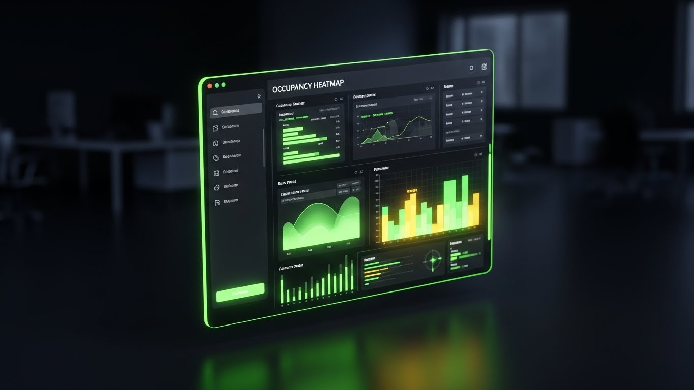
The Visualization Scenario
The scene is set in a low-light environment, acknowledging the reality of the "Night Audit." We see a sleek UI floating in a dark, blurred office space. The interface is in "Dark Mode"—utilizing "Dark Slate" backgrounds with vibrant "Neon Green" data accents. A complex "Occupancy Heatmap" glows on the screen, showing high-traffic areas. The screen is angled, catching a subtle reflection. It feels sophisticated, restful on the eyes, and technically advanced.
Psychological & Operational Impact
- Niche Psychology: This style builds Empathy with the power user who works late hours. It visually respects their working environment. The "Dark Mode" aesthetic also signals "Pro-Level" software, differentiating it from basic, dated tools.
- Operational Impact: It drives Deep Feature Adoption by making complex data analysis (like heatmaps or historical occupancy) look appealing and accessible. It positions the platform as a tool for serious business intelligence.
Strategic Implementation & Trade-offs
- Best Use Case: In-App "New Feature" Pop-ups or Power User Webinars.
- Duration: 10-15 Seconds.
- Trade-off: Dark interfaces can sometimes obscure readability if the contrast ratios aren't perfect. The neon accents must be sharp to ensure data is legible.
Companies using similar video content -
Protel – Protel PMS – Advanced features for night audit efficiency.
Newhotel – Newhotel PMS – Comprehensive solution for hotel operations.
23. The Promise of "Always On"
Retention | Reducing Support Overhead
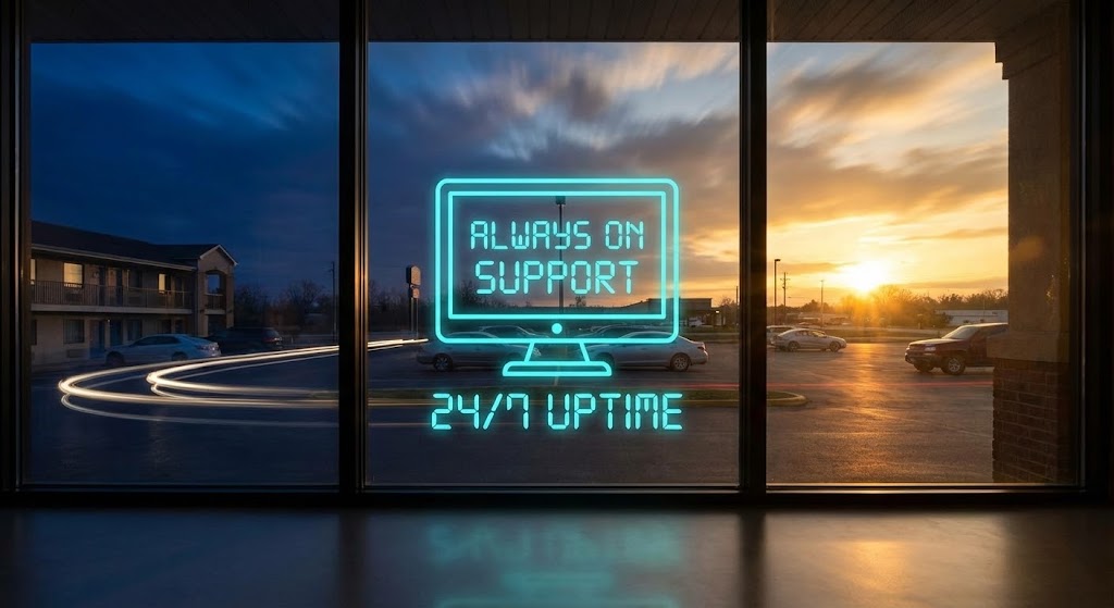
The Visualization Scenario
A static wide shot looks out from inside a motel lobby window toward the parking lot and the highway beyond. Through a hyper-lapse technique, we see the world speed up: night turns to dawn, cars streak by as trails of light, and the sun rises. Throughout this temporal shift, a steady, glowing "Cyan" digital overlay remains perfectly still in the center of the frame: "System Status: Online." It is a beacon of stability in a fast-moving world.
Psychological & Operational Impact
- Niche Psychology: This style addresses the deep-seated fear of System Downtime. For a 24/7 business like a motel, a crash is a disaster. This visual creates a subconscious association between the software and the rising sun—inevitable, reliable, and constant.
- Operational Impact: It supports Retention by reinforcing the value of "Invisible Uptime." It reminds the customer that while they sleep, the software is still working, processing bookings and syncing channels.
Strategic Implementation & Trade-offs
- Best Use Case: Chatbot Headers or "System Status" Pages.
- Duration: 5-8 Seconds (Looping).
- Trade-off: It is atmospheric rather than instructional. It builds confidence but explains nothing about functionality.
Companies using similar video content -
SkyTouch Technology – SkyTouch PMS – Reliable 24/7 cloud property management.
WebRezPro – WebRezPro PMS – Dependable online booking and management.
24. The Partner in Profit
Retention | Reducing Churn
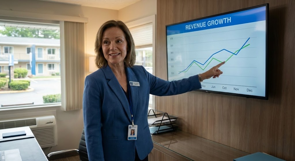
The Visualization Scenario
A high-fidelity, realistic video featuring a professional motel manager—a woman in her 40s with a warm, confident expression. She stands in a renovated, modern back office. She isn't struggling with paper; she is smiling and pointing to a large wall-mounted monitor displaying a "Revenue Growth" chart with a sharp upward trend. The lighting is natural and aspirational. The palette focuses on "Corporate Blue" and "Skin Tones," reinforcing a human connection. She looks like the successful operator every client wants to be.
Psychological & Operational Impact
- Niche Psychology: This style targets Churn Reduction by humanizing the success. It suggests that using this platform makes you a better, happier manager. It shifts the relationship from "Vendor-Client" to "Partner-Success Story."
- Operational Impact: It visualizes the Outcome of the software (growth) rather than the mechanism. It is powerful for reassuring customers that they have made the right choice for their long-term career.
Strategic Implementation & Trade-offs
- Best Use Case: Email Newsletters (Customer Success Stories) or Quarterly Business Reviews.
- Duration: 15-20 Seconds.
- Trade-off: The "Uncanny Valley" effect is a risk with AI characters. The motion and expression must be flawless, or it will damage trust.
Companies using similar video content -
Cloudbeds – Cloudbeds Platform – Partnering for hospitality business growth.
Mews – Mews PMS – Drives success through innovative hospitality tech.
25. Re-Engaging the Visionary
Retention | Website Visitor Re-engagement
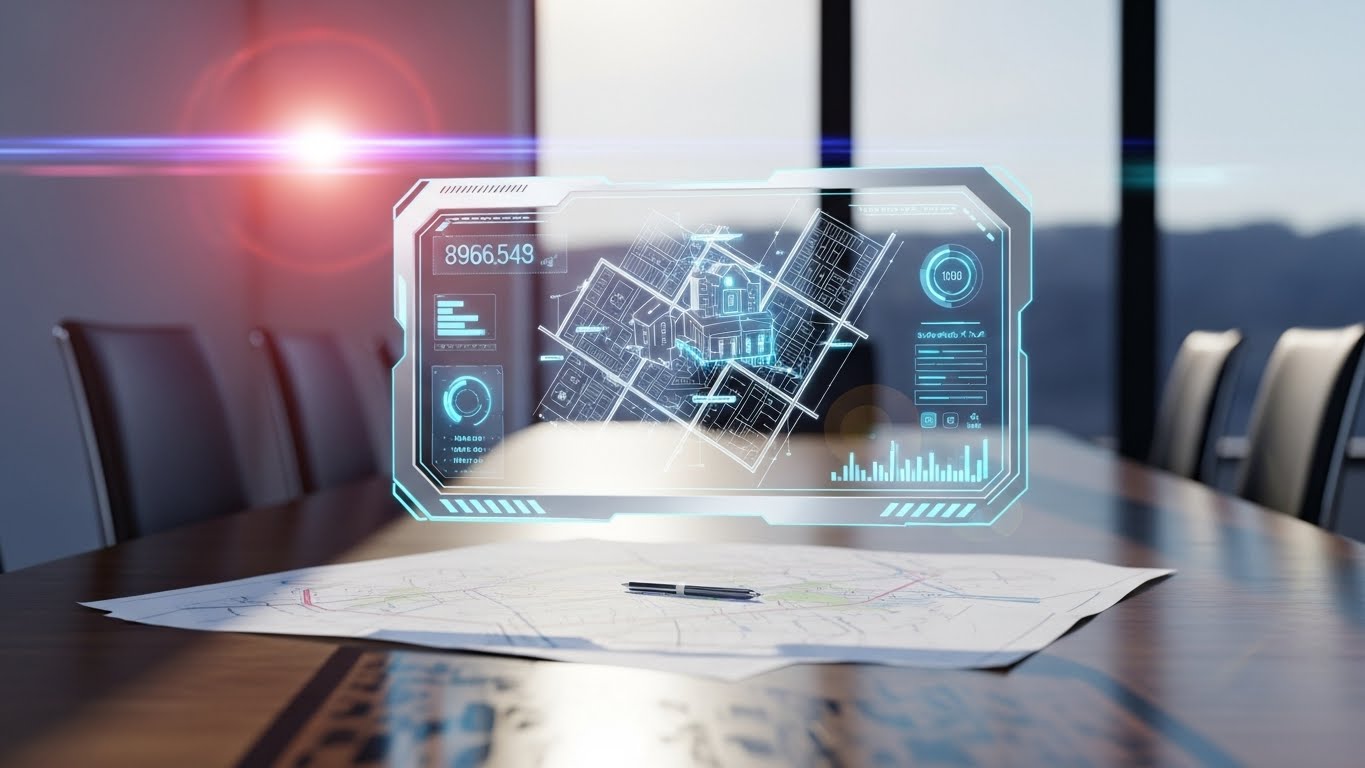
The Visualization Scenario
We see a realistic 3D render of a sun-drenched meeting room table. On the table lies a physical paper map. Suddenly, a "Holographic Silver and Blue" UI projection beams upwards from the paper, creating an Augmented Reality (AR) overlay. The hologram constructs a 3D model of a multi-property motel complex, complete with floating data widgets showing "Renovation Status" and "Projected Yield." It blends the tactile reality of the table with the futuristic promise of the software.
Psychological & Operational Impact
- Niche Psychology: This style is designed for Re-engagement. It captures the attention of the "stalled" buyer or the tech-enthusiast owner. It signals that the platform is innovative and constantly evolving, preventing them from looking at competitors.
- Operational Impact: It visualizes Expansion Planning. By showing a bird's-eye view of a complex property, it suggests the software is capable of handling major renovations or multi-site management.
Strategic Implementation & Trade-offs
- Best Use Case: Retargeting Ads or Website "Roadmap" Section.
- Duration: 10-15 Seconds.
- Trade-off: It promises a futuristic interface that the actual software may not possess. It should be framed as "Planning" or "Analytics" visualization, not the daily UI.
Companies using similar video content -
Shiji Group – Shiji Enterprise Platform – Future-ready hospitality technology solutions.
Amadeus Hospitality – Amadeus PMS – Strategic planning and property management.
26. The Networked Franchise
Expansion | Driving Upsell - Multi-property

The Visualization Scenario
An abstract, sophisticated visualization of a globe rendered in "Pale Grey." Glowing "Silver" and "White" particle lines arc across the surface, connecting distinct points. These aren't just flight paths; they represent the networking of disparate motel locations into a single, centralized command center. The camera pans slowly, emphasizing the reach and stability of the network. It feels expansive, corporate, and powerful.
Psychological & Operational Impact
- Niche Psychology: This style appeals to the Franchise Owner or Portfolio Manager. It addresses the pain point of "Fragmented Operations." The visual promise is Centralization—control over 10 or 100 properties from one screen.
- Operational Impact: It elevates the conversation from "managing a desk" to Enterprise Scalability. It is the visual argument for upgrading to the "Pro" or "Enterprise" tier of the SaaS product.
Strategic Implementation & Trade-offs
- Best Use Case: Email Campaigns targeting "High Value Accounts" or Franchise Pitch Decks.
- Duration: 10-15 Seconds.
- Trade-off: It is too high-level for a single-property owner. It risks feeling "too big" or "impersonal" for the Mom-and-Pop segment.
Companies using similar video content -
RMS Cloud – RMS Cloud PMS – Manages multiple properties from one platform.
Maestro PMS – Maestro PMS – Scalable solution for multi-property operations.
27. The Data Fortress
Expansion | Driving Upsell - Revenue Mgmt

The Visualization Scenario
A stylized cityscape at night, where the buildings are not concrete, but "Data Fortresses." They glow with "Cyberpunk Pink" and "Electric Blue" edges. Streams of light zip between the buildings along grid-like roads, representing the real-time flow of revenue and guest data between properties in a portfolio. The vibe is sleek, dark, and powerful. It implies that the user who controls this city controls the market.
Psychological & Operational Impact
- Niche Psychology: This style leverages Gamification aesthetics to appeal to the "Empire Builder." It transforms the dry task of revenue management into a high-stakes, high-reward environment.
- Operational Impact: It visualizes Interconnectivity and the robust nature of the backend database. It reinforces the idea that the platform is a secure, powerful engine driving the business's financial ecosystem.
Strategic Implementation & Trade-offs
- Best Use Case: Landing Pages for "Enterprise Revenue Management" features.
- Duration: 15-20 Seconds.
- Trade-off: The aesthetic is very "Tech-Heavy." It may not resonate with operators who prefer a "Hospitality-First" (warmer) brand image.
Companies using similar video content -
IDeaS – IDeaS RMS – Enterprise-grade revenue management and forecasting.
Duetto – GameChanger – Market-leading revenue strategy for portfolios.
28. Harmony of the Hybrid Model
Expansion | Driving Referrals & Advocacy
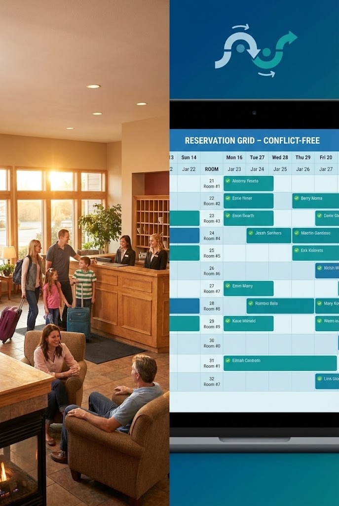
The Visualization Scenario
A vertical split-screen designed for mobile consumption. The top half shows a warm, inviting photo of a busy motel lobby: a family checking in, smiles everywhere, golden lighting. The bottom half shows a cool, organized abstract UI: a "Reservation Grid" where blocks slot perfectly into place with no conflicts. An arrow loops between the two halves, visually connecting the "Happy Guest" (Top) with the "Organized Grid" (Bottom).
Psychological & Operational Impact
- Niche Psychology: This style drives Advocacy. It perfectly encapsulates the user's goal: a thriving business run on a calm system. It validates that the "backend" work is what enables the "frontend" magic.
- Operational Impact: It is a perfect summary of Front Desk Efficiency. It shows that when the grid is organized (no overbookings), the lobby experience is flawless.
Strategic Implementation & Trade-offs
- Best Use Case: Instagram Reels, TikTok, or YouTube Shorts.
- Duration: 15-30 Seconds (Looping).
- Trade-off: Requires excellent color grading to ensure the "Warm" top and "Cool" bottom complement rather than clash.
Companies using similar video content -
eviivo – eviivo Suite – Harmonizes guest experience with backend efficiency.
RoomRaccoon – RoomRaccoon PMS – Creates operational harmony and guest satisfaction.
29. Dominating the Market
Expansion | Competitive Comparison
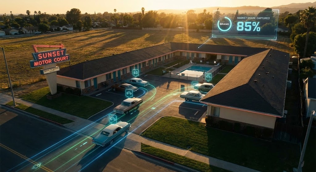
The Visualization Scenario
A cinematic aerial drone shot sweeps over a classic U-shaped motel court at sunset. The lighting is dramatic "Gold" and deep "Shadows," evoking a high-end film. As the camera flies over, sleek digital overlays track cars entering the lot. A HUD (Heads Up Display) in the corner ticks upward: "Market Share: Captured." It positions the property not just as a building, but as a territory that has been won.
Psychological & Operational Impact
- Niche Psychology: This style is pure Competitive Displacement. It appeals to the competitive nature of business owners who want to beat the motel down the street. It frames the software as the "Secret Weapon" for market dominance.
- Operational Impact: It connects the software to Marketing ROI and occupancy rates. It suggests that this platform gives you the visibility and intelligence needed to outmaneuver competitors.
Strategic Implementation & Trade-offs
- Best Use Case: YouTube Brand Anthem Ads or Homepage Hero Video.
- Duration: 15-20 Seconds.
- Trade-off: High production value expectation. If the drone footage looks shaky or the tracking looks cheap, the "Premium" effect is lost.
Companies using similar video content -
SiteMinder – SiteMinder Platform – Dominates market share through distribution.
RateGain – RateGain – Provides competitive intelligence for market dominance.
30. The Economic Truth
Expansion | The Economic Buyer
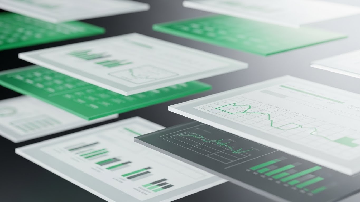
The Visualization Scenario
A sophisticated 3D parallax composition. Multiple layers of UI screens float in a void. These aren't operational screens; they are "Financial Reports" and "Portfolio Growth" charts in "Deep Navy" and "Bright White." The camera moves sideways, creating a parallax effect where the foreground layers move faster than the background. This depth visualizes the ability to "see through" the data to the bottom line. It is clean, airy, and mathematically beautiful.
Psychological & Operational Impact
- Niche Psychology: This style targets the Economic Buyer (CFO or Owner-Investor). It focuses on Financial Transparency. It removes the clutter of daily operations to focus purely on the metrics that matter for valuation and profit.
- Operational Impact: It highlights the Reporting Engine. It visually argues that the platform turns raw data into clear, layered insights, enabling smarter financial decisions.
Strategic Implementation & Trade-offs
- Best Use Case: Pitch Decks for investors or "Reports" Feature Page.
- Duration: 10-20 Seconds.
- Trade-off: It is cold and analytical. It lacks the "hospitality" warmth, but that is intentional to signal financial seriousness.
The Visual Operations Doctrine: A Strategic Knowledge Base
The 30 visual styles analyzed above are not merely "marketing assets"; they are the components of a Visual Operating System for modern hospitality. To bridge the physical-digital divide effectively, SaaS platforms must move beyond "explaining features" to "visualizing success." The following three strategic segments synthesize these styles into an actionable framework for implementation, adoption, and growth.
STRATEGIC ALIGNMENT & VISUAL ARCHITECTURE
The "Pre-Production" Strategy. Defining Why and Who before designing What.
- The Cognitive Load Audit: Independent motel operators often perform multiple roles—front desk, maintenance, and revenue manager. Visuals must respect this scarcity of attention. Audit your current training materials. If a concept takes 3 paragraphs to explain, replace it with Style 17 (Rapid UI) or Style 21 (Micro-Interactions). The goal is "Glanceability"—information understood in under 5 seconds.
- Role-Based Visual Mapping: Differentiate your visual language. "Drivers" (Housekeeping/Maintenance) require mobile-first, daylight-visible visuals (Style 8). "Fleet Managers" (General Managers) require desktop-optimized, data-rich dashboards (Style 30).
- The "Glanceability" Standard: In the chaotic environment of a motel lobby, information must be consumed in milliseconds. Visuals should be designed so that status (Clean/Dirty, Paid/Unpaid) is understood instantly, without reading text.
- Brand Voice Consistency: Whether it’s a marketing ad or a password reset screen, the visual language must be unified. Disconnected styles create "Trust Friction." A playful cartoon ad (Style 13) shouldn't lead to a sterile, intimidating spreadsheet UI.
- The Advids Strategic Audit: Partnering with specialized agencies like Advids helps define this "Visual Operating System" early. We map the entire user journey to ensure that the visual cues used in Sales are consistent with those found in Onboarding and Support.
- Standardization vs. Customization: For training cleaning staff, generic "Stock" visuals of beds and towels are sufficient (Style 16). However, for proprietary features like a unique "Booking Engine," bespoke visualization (Style 7) is mandatory to avoid confusion.
- The Cross-Departmental Bridge: Use visuals to unify terminology. If Sales calls it "Yield Management" but Support calls it "Rate Adjustment," confusion ensues. A shared visual dictionary ensures everyone speaks the same language.
- Legacy System Integration: Visualizing the connection between old hardware (Key Card Encoders, PBX Phones) and the new Cloud Interface is critical (Style 12). Visuals must show these worlds connecting, not colliding.
- Accessibility in Hospitality: Your workforce is diverse and often multilingual. Motion graphics that rely on visual cues (Icons, Color Coding) rather than heavy text (Style 2) ensure effective training for non-native speakers.
- The Mobile-First Mandate: 80% of property staff are not behind a desk. All 30 styles must be legible on a 6-inch smartphone screen to be truly operationally valid (Style 13).
OPERATIONAL ADOPTION & IMPLEMENTATION
The "Deployment" Phase. Embedding visuals into the daily workflow to drive usage.
- Overcoming "Big Brother" Anxiety: Staff often fear new software is just for surveillance. Use empathy-driven visuals (Style 19) to frame the software as a tool for recognition and reward (e.g., "fastest check-in"), not just monitoring.
- The Micro-Learning Shift: Front desk turnover is high. Replace 50-page PDF manuals with 30-second visual clips (Style 17). A new hire should be able to watch a "How to Check-In" loop and perform the task immediately.
- Just-in-Time Support: Embed specific visual styles directly into the software's "Help" widgets. If a Night Auditor gets a rate error, a 5-second "Pixelated Warning" style clip (Style 21) can guide them to the fix instantly.
- Gamification of Training: Visualizing "Success Streaks" or "100% Profile Completion" (Style 18) taps into the human desire for achievement, making the mundane task of data entry feel rewarding.
- Reducing Support Ticket Volume: There is a direct correlation between proactive visual guides and reduced call center load. If the "End of Day" process is visualized clearly (Style 22), users won't need to call support to run it.
- Remote Onboarding: For multi-property chains, flying trainers to every site is impossible. Leverage 3D renders and screencasts (Style 4) to conduct immersive, virtual training sessions that feel high-touch.
- Standard Operating Procedures (SOPs): Transform text-based SOP binders into visual process flows (Style 2). A visual "Blueprint" of the check-in flow is remembered; a paragraph of text is forgotten.
- Feedback Loops: Use interactive video elements to gather staff feedback. A "Thumbs Up/Down" overlay on a training video provides immediate data on whether a feature is intuitive or confusing.
- Scalable Localization: When expanding globally, visuals are cheaper to localize than voiceovers. A "Green Checkmark" (Style 13) means "Success" in almost every language, reducing translation costs.
- Leadership Communication: Use high-end, cinematic styles (Style 29) when communicating strategy to franchise owners. It signals that the HQ is investing in premium tools and future growth.
MEASURING IMPACT & FUTURE-PROOFING
The "ROI" Phase. Quantifying the value of visual strategy and preparing for the next evolution.
- Beyond "Views": Vanity metrics don't matter. Define actionable KPIs: "Time-to-Competency" for new hires and "Feature Adoption Rate" for new updates. Visuals must drive these numbers.
- The "Idle Time" Metric: High-quality UX visualization reduces the time staff spends "hunting" for buttons. Correlate cleaner visuals (Style 7) with reduced check-in times and higher guest eye-contact.
- Compliance Velocity: Regulations (like PCI Compliance or local tax laws) change. Measure how fast the network adopts new protocols when they are explained via video (Style 15) versus text memos.
- Retention and Churn: Customers leave when they feel "stuck." High-quality, empathetic support visuals (Style 23) reduce frustration, directly impacting Customer Lifetime Value (LTV).
- The AI Visual Frontier: Prepare for the era of Generative AI. Soon, support videos will be generated in real-time, personalized to the specific user's property name and data (Style 24).
- Scalability of Assets: Build a visual library that grows. The "Coin" asset from Style 14 can be reused in Marketing, Sales, and Investor Relations, maximizing the ROI of production.
- The Advids Partnership: Scalability requires a long-term view. Advids acts as the custodian of your visual assets, ensuring that as your software evolves from V1.0 to V5.0, your visual language evolves without losing brand equity.
- Benchmarking Success: "Good enough" visuals are a competitive risk. If your competitor uses "Cinematic Drone Shots" (Style 29) and you use "Grainy Screenshots," you lose the perception war before the demo even starts.
- The ROI of Safety: In the post-pandemic era, "Cleanliness" is the new "Luxury." Quantify the value of visualizing hygiene protocols (Style 8) in terms of increased guest trust and higher review scores.
- Final Call to Innovation: Treat video not as "Content," but as "Infrastructure." Just as you invest in servers and code, invest in the visual layer that translates that code into human understanding. It is the ultimate bridge to adoption.
Companies using similar video content -
M3 – M3 Hotel Accounting – Provides clear financial reports for hotels.
Sage Intacct – Sage Intacct – Cloud financial management for hospitality.
Author & Editor Bio


