
Introduction: Visualizing the Velocity of Capital
The architecture of modern finance is no longer built from brick and mortar; it is constructed from code, latency, and liquidity. For the architects of this new world—the CTOs, Head Traders, and Product Managers—the challenge is not just building superior technology, but making that technology intelligible to the market.
In a sector where a millisecond of latency determines profitability, your competitive advantage is often invisible. How do you film an algorithm? How do you visualize the robustness of a matching engine? This is the core paradox of B2B FinTech marketing: you are selling invisible power.
The opportunity for platforms that can bridge this "Physical/Digital Divide" is immense. With the algorithmic trading market valued at USD 19.27 Billion in 2025, the demand for sophisticated, automated solutions is exploding. Yet, complexity remains the primary barrier to adoption. Institutional buyers are drowning in data. To cut through the noise, platforms must leverage "Cognitive Ease"—using visualization to make complex systems feel intuitive and reliable.
Furthermore, as the online trading platform market is projected to reach USD 16.71 billion by 2032, the visual language of the industry is shifting. It is moving away from the dense, intimidating "Bloomberg Terminal" aesthetic toward clean, airy, and narrative-driven interfaces.
This guide provides a strategic framework to achieve exactly that. We have curated 30 distinctive visual styles, specifically designed to communicate operational efficiency, build institutional trust, and accelerate adoption in a globally competitive market.
1. The Kinetic Impact: Selling Infrastructure Without Wires
TOFU | Brand Awareness

(Bold Kinetic Typography): Geometric Impact Signals Power
The Visual & Narrative Approach
This style abandons subtlety for raw, visceral impact. We utilize massive, brutalist 3D geometric structures—resembling heavy architectural forms—colliding in a pristine white void. The "Arctic White" and "Neon Blue" palette creates a clinical yet energetic aesthetic. The narrative here is non-verbal; it relies on the physics of the collision and the resulting shockwave to convey the sheer weight and robustness of your trading engine.
Psychological Impact & KPI Focus
- Niche Psychology: Institutional investors respect "Infrastructure." They fear fragility. By giving digital concepts (like "Matching Engine" or "Core Ledger") physical mass and weight, you subconsciously signal Reliability. The impact proves the system can handle high-volume stress without buckling.
- Operational Impact: This bridges the gap between "Invisible Code" and "Tangible Asset." It creates a "Heavy" brand presence that feels too big to fail.
Strategic Implementation & Trade-offs
- Best Use Case: 6-10 second TOFU social ads (LinkedIn/Instagram) designed to stop the scroll with visual noise.
- Trade-off: It conveys power, not function. Use this to announce your presence, not to explain your features.
Companies using similar video content -
Exegy – TICKERPLANT – Delivers ultra-low latency market data.
2. The Infinite Network: Visualizing Global Liquidity
TOFU | Category Creation

(Abstract 3D AI Visualization): Network Nodes Visualize Global Connectivity
The Visual & Narrative Approach
Here, we visualize the "Global Liquidity Network" as a vast constellation of polished nodes floating in a deep digital space. As seen in the image, the nodes are connected by thin, glowing filaments of blue light, representing API connectivity and data transfer. The camera uses a wide orbital angle to emphasize the scale of the ecosystem, suggesting that your platform connects to every corner of the market simultaneously.
Psychological Impact & KPI Focus
- Niche Psychology: Fragmentation is a primary pain point. Traders want a "Unified View." This visual soothes that anxiety by presenting a cohesive, interconnected universe. The glowing filaments imply active and live connections, reinforcing the promise of real-time access.
- Operational Impact: It creates a "Category" for your platform—not just a tool, but a Network. It visually elevates the platform from a standalone software to a market ecosystem.
Strategic Implementation & Trade-offs
- Best Use Case: Website Hero Backgrounds. It sets a futuristic, high-tech tone immediately upon arrival.
- Trade-off: Ensure the nodes look organized, not chaotic. The goal is to show connectivity, not clutter.
Companies using similar video content -
LMAX Exchange – Global FX Liquidity – Connects global FX markets with deep liquidity.
3. The Flow State: Defining Continuous Liquidity
TOFU | Market Education

(Abstract 2D Motion Graphics): Fluid Ribbons Illustrate Seamless Liquidity
The Visual & Narrative Approach
This style features fluid, ribbon-like vector shapes in Coral, Teal, and Cream flowing horizontally across the screen. The key here is the smoothness of the motion; the ribbons morph and merge without friction, representing "Continuous Liquidity" and "Smart Order Routing." The lack of hard edges and the use of modern, flat colors convey simplicity and ease of use, directly countering the industry's reputation for clunky complexity.
Psychological Impact & KPI Focus
- Niche Psychology: Traders fear friction—slippage, rejected orders, stuck trades. This visual metaphor promises a "Frictionless" experience. It induces Cognitive Ease, making the viewer feel that using your platform will be smooth and effortless.
- Operational Impact: Excellent for explaining process flows (like Trade Settlement or STP) without overwhelming the viewer with technical diagrams.
Strategic Implementation & Trade-offs
- Best Use Case: "How it Works" videos on YouTube where clarity and retention are paramount.
- Trade-off: It is stylistically "flat." It feels friendlier and more approachable, which is great for education but less effective for asserting "Institutional Dominance."
Companies using similar video content -
FlexTrade – FlexTRADER EMS – Offers seamless order routing and execution.
Itiviti (Broadridge) – FIX Engine – Ensures smooth, high-performance trade connectivity.
4. The Organic Filter: Simplifying Asset Diversification
TOFU | Shaping Brand Perception
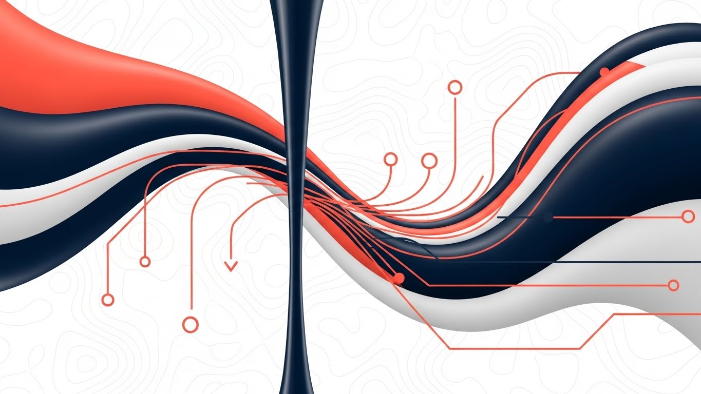
(Abstract 2D Flat Vector): Organic Data Streams Soften Complexity
The Visual & Narrative Approach
We move into a glossy, organic aesthetic. As shown in the reference, streams of data (represented by colored tubes) flow through a central, structured pinch-point or filter. This represents "Asset Diversification"—the ability to handle various asset classes (Crypto, FX, Equities) through a single, organized pipeline. The plastic-like sheen and soft lighting give it a premium, tactile feel.
Psychological Impact & KPI Focus
- Niche Psychology: This style targets the desire for Flexibility. It suggests that the platform is malleable and can adapt to different data types, rather than being a rigid, legacy monolith.
- Operational Impact: It visualizes the concept of "Normalization"—taking chaotic market data and streamlining it into a clean, usable feed.
Strategic Implementation & Trade-offs
- Best Use Case: Mobile-first content (Instagram Reels, LinkedIn Stories) to build a "Modern FinTech" brand image.
- Trade-off: Can appear "too soft" for highly aggressive HFT audiences. Use it to show UX innovation, not raw speed.
Companies using similar video content -
FactSet – Multi-Asset Solutions – Streamlines diverse asset class data.
SimCorp – Dimension – Manages multi-asset investment operations seamlessly.
5. The Technical Blueprint: Building the Ecosystem
TOFU | YouTube
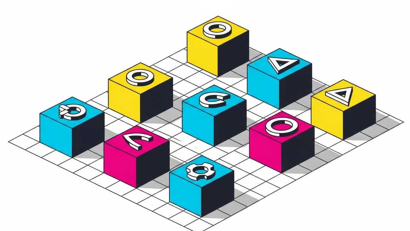
(Isometric 2D Motion Design): Modular Cubes Define Structured Ecosystem
The Visual & Narrative Approach
This is the "Engineer's View." An isometric 2D illustration places perfectly cubed blocks in Cyan, Magenta, and Yellow on a precise white grid. Each cube bears a symbol (triangle, circle), representing a module of your ecosystem (e.g., Risk, KYC, Execution). The composition is orderly and balanced. It looks like a technical blueprint, appealing to the logical mindset of a CTO.
Psychological Impact & KPI Focus
- Niche Psychology: Institutional Architects value Modularity. They want to know that your stack is clean and the parts fit together perfectly. This style validates that need for order and structural integrity.
- Operational Impact: It effectively visualizes "API Integrations" and "Stack Architecture." It answers the question: "How does this fit into my existing system?"
Strategic Implementation & Trade-offs
- Best Use Case: Technical documentation videos or "Product Architecture" deep dives.
- Trade-off: It is functional, not emotional. It builds trust through logic, not awe.
Companies using similar video content -
Alpaca Markets – Trading API – Provides modular building blocks for trading apps.
Genesis Global – Low-Code Platform – Enables rapid construction of financial applications.
7. The Data Cathedral: Promoting Low Latency
TOFU | Skippable Pre-Roll Ad

(Generative AI Cinematic): Server Monoliths Evoke Institutional Trust
The Visual & Narrative Approach
A sweeping drone shot flies through a futuristic "Data Cathedral." The room is entirely white, lined with towering server monoliths made of ceramic and frosted glass. Beams of pure white light shoot through fiber optic cables on the floor, racing the camera. This is the visual definition of "Low Latency." The high-key lighting conveys institutional purity and the "Holy Grail" of zero-lag execution.
Psychological Impact & KPI Focus
- Niche Psychology: This leverages the Sanctity of Speed. It elevates the server room from a utility to a place of worship. It assures the client that their trades are handled in a pristine, state-of-the-art environment.
- Operational Impact: Visualizing "Latency" is hard; this style does it by showing light traveling through a clean path. It implies "Zero Friction."
Strategic Implementation & Trade-offs
- Best Use Case: High-budget Brand Anthem videos or Pre-Roll ads intended to impress the C-Suite.
- Trade-off: High production value is mandatory. "Cheap" CGI will destroy trust here.
Companies using similar video content -
Arista Networks – 7130 Series – Delivers ultra-low latency network solutions.
Enyx – FPGA Solutions – Accelerates trading with hardware-based low latency.
8. The Transparent Profit: Glassmorphic Data
MOFU | Demand Gen & Lead Capture

(Dynamic Data Visualization): Translucent Glass Bars Clarify Profit
The Visual & Narrative Approach
We focus on the result: Profit. This style uses 3D glassmorphic bars in Emerald Green rising from a reflective white floor. The transparency of the glass is key—it suggests "Transparent Reporting" and clarity. The bars distort the light, making the data feel precious and tangible. The camera focus is shallow, guiding the eye to the growth metric.
Psychological Impact & KPI Focus
- Niche Psychology: In an industry of opaque fees, Transparency is a major selling point. Glass implies you have nothing to hide. The "Green" triggers the desire for growth and alpha.
- Operational Impact: It elevates boring analytics into a desirable asset. It makes the act of checking a dashboard feel rewarding.
Strategic Implementation & Trade-offs
- Best Use Case: Landing pages, specifically next to "Request Demo" forms. It visualizes the value the user will get.
- Trade-off: Prioritizes form over precise data readability. Use it to sell the concept of analytics, not the specific numbers.
Companies using similar video content -
Koyfin – Financial Data Terminal – Visualizes financial data with clarity.
BlackRock – Aladdin – Provides comprehensive investment and risk analytics.
9. The Digital Order: Chaos vs. Control
MOFU | Product/Solution Differentiation

(Split Screen): Visualizing The Shift From Chaos To Order
The Visual & Narrative Approach
A split-screen composition creates a stark binary contrast. The left side (Black & White) shows a messy, chaotic desk covered in papers—the "Old Way." The right side (Color) shows a pristine minimalist desk with a single monitor displaying your clean UI—the "New Way." This visual metaphor highlights the transition from "Chaos" to "Digital Order."
Psychological Impact & KPI Focus
- Niche Psychology: It triggers the Pain of Inefficiency. Every operations manager recognizes the desk on the left. The image offers immediate visual relief on the right, positioning your product as the cure for their stress.
- Operational Impact: It demonstrates the tangible lifestyle benefit of the software: a cleaner, more organized workflow.
Strategic Implementation & Trade-offs
- Best Use Case: "Solutions" pages or Sales Decks addressing operational friction.
- Trade-off: Can feel cliché if the "Chaos" is too exaggerated. Keep it realistic to the industry context.
Companies using similar video content -
SS&C Advent – Geneva – Brings order to complex investment operations.
Broadridge – Post-Trade Solutions – Transforms chaotic back-office processes.
10. The Dashboard Zen: Feature Education
MOFU | Feature Education
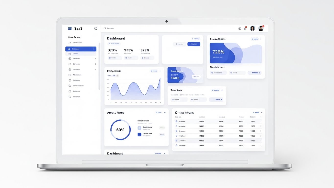
(Clean UI Workflow): High-Fidelity Dashboard Proves Usability
The Visual & Narrative Approach
Finally, we show the product in its ideal state. A frontal, flat-lay view of a high-fidelity SaaS dashboard. The design is airy, with ample whitespace and Soft Blue accents. Abstract charts are visible, but no text is legible—this focuses the viewer on the layout and the logic of the interface rather than the data points.
Psychological Impact & KPI Focus
- Niche Psychology: This targets Cognitive Load Reduction. Traders stare at screens for 12 hours. A clean, "Light Mode" UI promises a less exhausting workday. It validates the UX quality.
- Operational Impact: It serves as Proof of Concept. It shows that the platform is modern, intuitive, and ready for deployment.
Strategic Implementation & Trade-offs
- Best Use Case: Email onboarding sequences or "New Feature" announcements.
- Trade-off: It leaves nothing to the imagination. It must be paired with copy explaining why this workflow is superior.
Companies using similar video content -
TradingView – Charting Platform – Offers clean, intuitive financial charting.
Interactive Brokers – Trader Workstation – Provides a comprehensive, customizable trading interface.
11. The Modular Stack: Constructing Stability
MOFU | Competitive Displacement

(Low-Poly 3D Modeling): Stacking Modules Form Stable Portfolio
The Visual & Narrative Approach
This style creates a visual metaphor for "Portfolio Construction" and "Stack Modularity." Using a Low-Poly 3D aesthetic, we see pastel-colored blocks (Pink, Blue, Yellow) stacking with satisfying precision to form a solid, vertical tower against a white void. The soft ambient lighting and matte, clay-like finish give the structure a tangible, approachable feel. It suggests that building a custom trading solution with your API is as intuitive and stable as stacking physical blocks.
Psychological Impact & KPI Focus
- Niche Psychology: Legacy systems are often viewed as "Monoliths"—rigid, heavy, and hard to change. This visual counters that perception by highlighting Composability. It appeals to the CTO who wants to swap out a "Risk Module" or "Execution Algo" without rebuilding the entire system.
- Operational Impact: It simplifies the complexity of microservices architecture. It visually proves that your platform allows for a customized, stable build, reducing the fear of integration headaches.
Strategic Implementation & Trade-offs
- Best Use Case: Retargeting ads for users who have visited your API documentation. It reinforces the ease of integration.
- Trade-off: The "toy-like" aesthetic can feel too playful for some ultra-conservative banks. Ensure the copy reinforces "Enterprise-Grade Stability."
Companies using similar video content -
Digital Asset – DAML – Enables modular, interoperable blockchain solutions.
R3 – Corda – Builds distributed ledger technology with modular components.
12. The Developer’s Canvas: Visualizing Alpha
MOFU | ABM Awareness
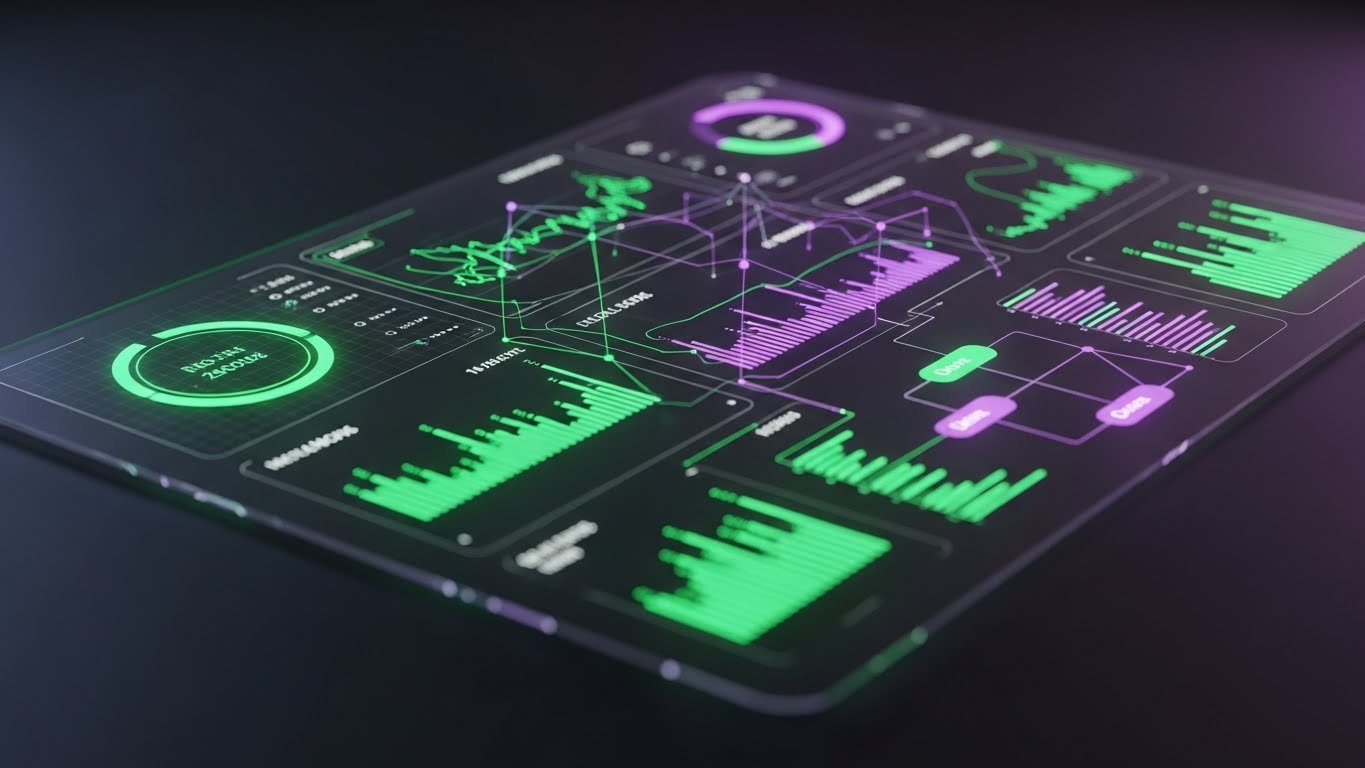
(Dark Mode UI Showcase): Neon Analytics Highlight Developer Precision
The Visual & Narrative Approach
We step into the "Quant's Habitat." This style features a close-up, angled view of a high-end dashboard in "Dark Mode." The Deep Charcoal background lets the Neon Green and Electric Violet data lines pop with high contrast. The interface has a glass-like translucency, suggesting depth and sophistication. This is not just a UI; it is a command center designed for low-light, high-intensity trading environments.
Psychological Impact & KPI Focus
- Niche Psychology: Developers and high-frequency traders prefer Dark Mode—it reduces eye strain during 14-hour shifts and signals "Pro-Level" software. This visual signals that you understand their working environment. It speaks the language of Ergonomics and Precision.
- Operational Impact: It highlights data visibility. The high contrast implies that "Alpha" (profit opportunities) will be instantly visible against the background noise.
Strategic Implementation & Trade-offs
- Best Use Case: Account-Based Marketing (ABM) display ads targeting technical decision-makers (Head of Quant, CTO).
- Trade-off: It can feel cold or intimidating to non-technical users. Reserve this for your technical audience segments.
Companies using similar video content -
QuantConnect – LEAN Algorithmic Trading Engine – Provides a dark mode environment for quant development.
Deltix – QuantOffice – Offers a powerful dark-themed quant research platform.
13. The Holographic Depth: Clarifying Market Orders
MOFU | The Functional Buyer
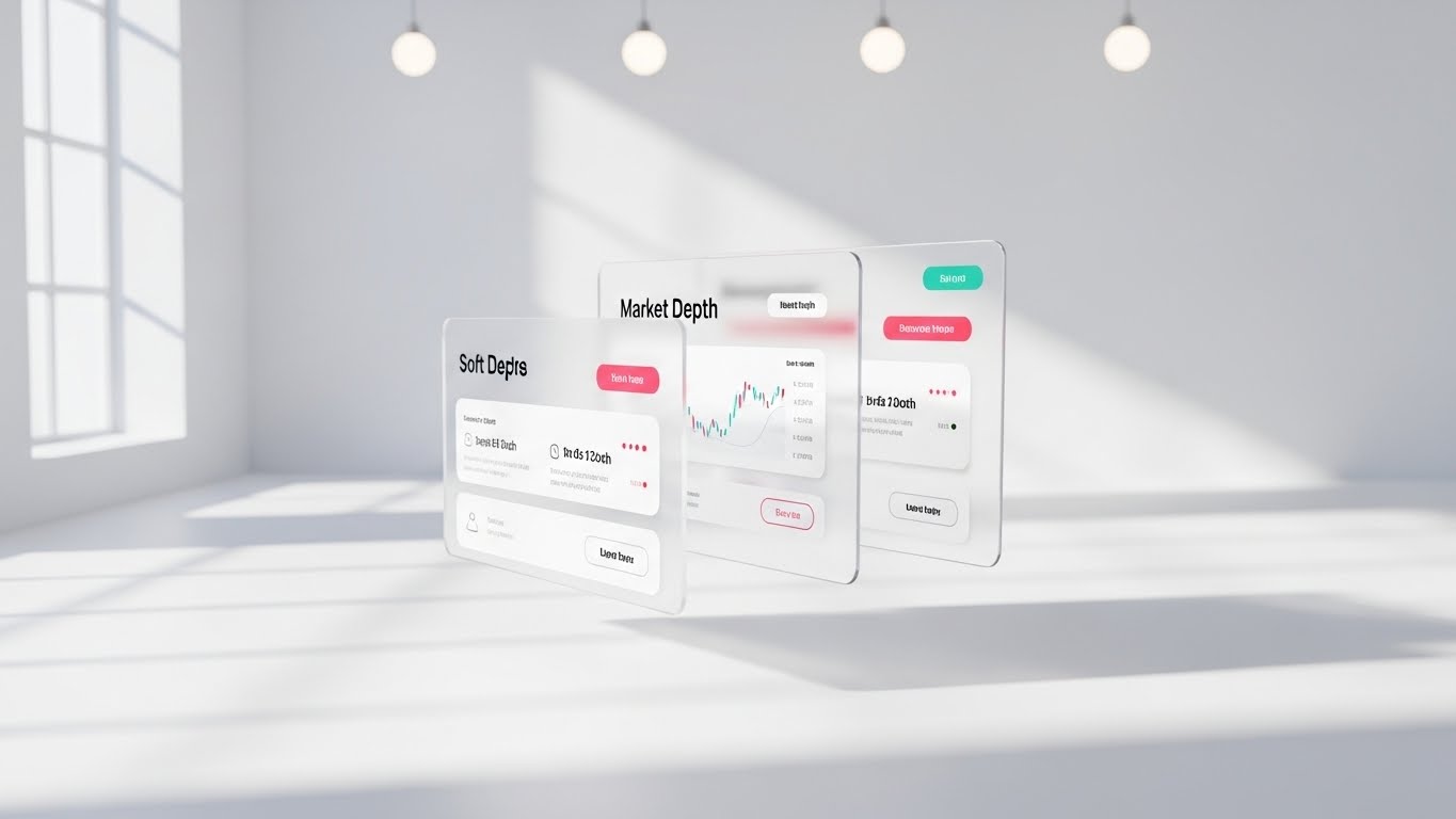
(3D Parallax UI): Layered Depth Clarifies Market Liquidity
The Visual & Narrative Approach
To visualize "Market Depth" (Level 2 or Level 3 data), we use a 3D parallax composition. Multiple UI screens, rendered in semi-transparent frosted glass with Soft Pink and White interface elements, float in a bright, airy void. The camera creates a parallax effect, revealing that the screens are layered. This visually explains that your platform allows traders to see behind the top-of-book price, revealing the liquidity layers underneath.
Psychological Impact & KPI Focus
- Niche Psychology: Traders are terrified of "hidden liquidity" and slippage. By using transparency and depth, you visually promise Insight. You are showing them that your platform offers a deeper, more transparent view of the market.
- Operational Impact: It effectively communicates "Multi-Screen Workflows" or "Drill-Down Capabilities" without needing a complex demo. It implies a rich, multi-dimensional user experience.
Strategic Implementation & Trade-offs
- Best Use Case: Feature pages on your website, specifically for "Execution" or "Analytics" modules.
- Trade-off: The floating screens are abstract. Ensure the UI elements shown (charts, order books) are recognizable enough to anchor the concept in reality.
Companies using similar video content -
OneMarketData – OneTick – Visualizes market depth and historical data.
Cboe Global Markets – Market Data – Provides deep insights into market liquidity.
14. The Pure Trend: Distilling Market Signal
MOFU | Establishing Thought Leadership
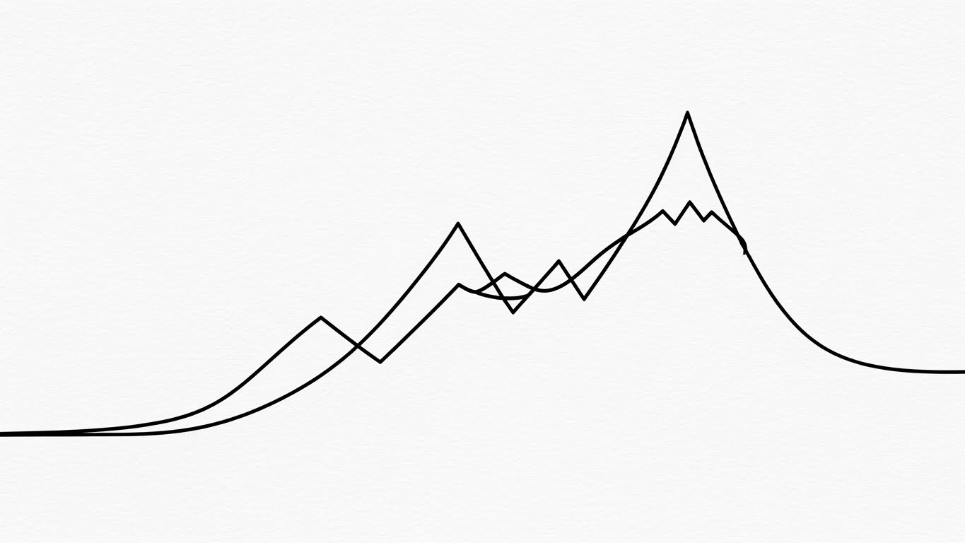
(2D Line Art Animation): Elegant Curves Define Thought Leadership
The Visual & Narrative Approach
In an industry screaming with flashing numbers, silence stands out. This style uses a single, continuous Black ink line on a textured white paper background. The line elegantly loops to form a rising graph that morphs into a mountain peak. There is no color, no clutter—only the essential trend. This represents "Signal Processing" and the ability of your algorithms to find the true trend amidst market noise.
Psychological Impact & KPI Focus
- Niche Psychology: This appeals to the Intellectual Investor. It suggests that your platform helps them think clearly. It associates your brand with wisdom, clarity, and fundamental truth rather than just raw speed.
- Operational Impact: Perfect for visualizing "Smart Order Routing" logic or "Historical Trend Analysis." It simplifies complex math into a beautiful, traceable path.
Strategic Implementation & Trade-offs
- Best Use Case: Supporting visuals for Whitepapers, "Manifesto" videos, or high-level philosophical brand content.
- Trade-off: It lacks "Tech" appeal. It sells the philosophy of the algorithm, not the hardware specs.
Companies using similar video content -
Aiera – AI Platform – Distills market intelligence from noise.
Boosted.ai – Boosted Insights – Identifies pure trends using AI.
15. The Organic Yield: Visualizing ROI
BOFU | ROI Justification

(Minimalist Flat 2D Vector): Organic Growth Illustrates ROI Potential
The Visual & Narrative Approach
For discussing ROI, Staking Rewards, or Dividend Compounding, we use a clean, minimalist metaphor. A flat vector icon shows a stylized plant growing directly out of a coin. The Forest Green and White palette creates a fresh, positive association. The absence of gradients or shadows focuses the eye entirely on the concept: Growth.
Psychological Impact & KPI Focus
- Niche Psychology: "Yield" can often feel abstract or speculative. Associating it with organic plant growth makes it feel Natural and Sustainable. It subconsciously reassures the investor that the returns are grounded and healthy.
- Operational Impact: This is the visual shorthand for "Profitability." It is essential for "Cost Benefit Analysis" slides in sales presentations.
Strategic Implementation & Trade-offs
- Best Use Case: Sales decks and pricing pages. It provides a visual break from heavy data tables while reinforcing the ultimate benefit.
- Trade-off: It is very generic. It must be paired with specific hard numbers (e.g., "15% APY") to carry weight.
Companies using similar video content -
Copper.co – Custody & Staking – Visualizes growth from digital asset yield.
Fidelity Digital Assets – Institutional Offerings – Highlights potential for digital asset growth.
16. The Compliance Shield: Humanizing Risk Controls
BOFU | Overcoming Objections

(2D Animation & UI Composition): Digital Shield Reinforces Platform Security
The Visual & Narrative Approach
Risk management is often viewed as a "blocker." We reframe it as a "Guardian." This style uses "Corporate Memphis" flat 2D characters with exaggerated proportions in Blue and Orange. A character stands confidently next to a floating UI panel, pointing to a "Shield" icon. The clean, abstract office background keeps the focus on the interaction. This visualizes the user turning on safety features like "2FA" or "Risk Limits."
Psychological Impact & KPI Focus
- Niche Psychology: Users, especially compliance officers, view security software as a burden. This style makes compliance look Friendly and Manageable. It puts the human in control of the machine, reducing the anxiety of automated lockouts.
- Operational Impact: It demonstrates the "User-Friendliness" of your admin panel. It shows that setting up complex risk parameters is as easy as clicking a button.
Strategic Implementation & Trade-offs
- Best Use Case: "Security" or "Compliance" pages on your website. It softens the intimidating nature of regulatory tech.
- Trade-off: The cartoonish style can undermine "Serious" security messaging if used for catastrophic risk topics (like hacks). Use it for preventative features/settings.
Companies using similar video content -
NICE Actimize – Financial Crime Solutions – Makes compliance feel proactive and manageable.
ComplyAdvantage – AML Platform – Simplifies complex anti-money laundering processes.
17. The Cryptographic Core: Visualizing Custody
BOFU | Risk Mitigation

(3D X-Ray Visualization): Gold Key Proves Core Encryption
The Visual & Narrative Approach
To sell "Institutional Custody" or "Encryption," we need to show what is hidden. We use a 3D X-Ray visualization where a white ceramic sphere is rendered semi-transparently. Inside, we see a solid Gold geometric key mechanism floating securely with green digital accents. The clinical, bright lighting suggests a laboratory environment. This represents the "Black Box" security of your core ledger or MPC (Multi-Party Computation) wallet.
Psychological Impact & KPI Focus
- Niche Psychology: Security is about "Depth of Defense." By showing layers (the ceramic shell protecting the gold core), you visually demonstrate Impenetrability. The Gold implies that the data being protected is precious.
- Operational Impact: It visualizes concepts like "Hardware Security Modules (HSM)" or "Cold Storage" without showing boring server racks.
Strategic Implementation & Trade-offs
- Best Use Case: Technical security whitepapers (PDFs) or "Trust Center" web pages.
- Trade-off: It is static. It conveys state (secure), not action (defending).
Companies using similar video content -
Fireblocks – MPC Wallet – Visualizes secure multi-party computation.
Anchorage Digital – Institutional Custody – Showcases secure digital asset storage.
18. The Execution Engine: Speed of Action
BOFU | Sales Cycle Acceleration
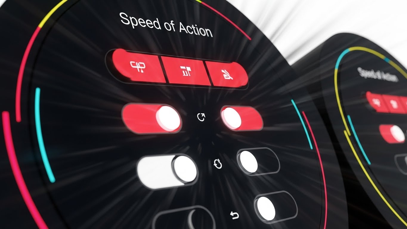
(Rapid UI Feature Montage): Motion Blur Signifies Execution Speed
The Visual & Narrative Approach
This style visualizes "Velocity." We use a dynamic montage of circular close-ups of UI elements—specifically Red and White buttons and toggle switches. A radial motion blur radiates from the center, suggesting a fast zoom or the "tunnel vision" focus of a trader in the zone. This represents "Speed of Action"—the ability to execute, cancel, or liquidate in milliseconds.
Psychological Impact & KPI Focus
- Niche Psychology: In moments of market volatility, traders need Responsiveness. The motion blur triggers a sense of urgency and speed. The "Red" buttons signify critical actions (Stop Loss, Sell), reassuring the trader that these controls are instantly accessible.
- Operational Impact: It sells the "UX Latency"—the speed at which a human can interact with the software.
Strategic Implementation & Trade-offs
- Best Use Case: Email headers for product updates regarding "Performance Improvements" or "New Execution Features."
- Trade-off: It is intense. Overuse can cause visual fatigue. Use it sparingly to highlight speed updates.
Companies using similar video content -
Virtu Financial – Execution Services – Emphasizes rapid, precise trade execution.
Portware (FactSet) – EMS – Delivers high-velocity order execution.
19. The Visionary Outcome: Embodying Success
BOFU | The Economic Buyer

(Gen AI Realistic Character): Visionary Leadership Builds Institutional Trust
The Visual & Narrative Approach
We pivot from the software to the result of the software. This cinematic video style features a confident CEO standing in a sun-drenched corner office, looking out at a hazy city skyline. An anamorphic lens flare adds a premium, movie-like quality. The executive’s expression is one of calm authority. This is the "Economic Buyer"—the person who signed the check for your platform and is now reaping the rewards of market leadership.
Psychological Impact & KPI Focus
- Niche Psychology: This targets Aspiration. Every decision-maker wants to be the person in that office—calm, successful, and in control. It associates your platform with "Making it to the top."
- Operational Impact: It builds "Brand Equity." It suggests that your platform is the secret weapon of the industry's elite.
Strategic Implementation & Trade-offs
- Best Use Case: LinkedIn Thought Leadership posts or "Success Story" case study covers.
- Trade-off: It is purely emotional. It provides no information about the product, only the feeling of the brand.
Companies using similar video content -
Fidelity Institutional – Wealth Management – Inspires success for financial advisors.
20. The Deployment Reality: Tangible Performance
BOFU | The Technical Buyer

(Photorealistic 3D Renders): Tangible Deployment Validates Technical Fit
The Visual & Narrative Approach
Finally, we ground the software in physical reality. A photorealistic Octane render shows a premium brushed platinum laptop resting on a clean white executive desk. The screen displays your trading platform in high fidelity (Light Mode). The reflection on the desk adds to the realism. This answers the question: "What does this actually look like on my desk?"
Psychological Impact & KPI Focus
- Niche Psychology: This appeals to the Materialist. It treats the software as a luxury good. It confirms that the interface is beautiful enough to be displayed on high-end hardware in a client-facing meeting.
- Operational Impact: It serves as the ultimate "Product Shot." It is the most honest representation of the end-user experience.
Strategic Implementation & Trade-offs
- Best Use Case: Technical Documentation headers, "Download" pages, or the final slide of a sales deck.
- Trade-off: It is static. It relies entirely on the quality of the UI design displayed on the screen.
Companies using similar video content -
Enfusion – Cloud-Native Platform – Showcases its modern, integrated UI.
Orion Advisor Solutions – Wealth Management Platform – Displays its sleek advisor dashboard.
21. The Remote Command: Lifestyle Integration
BOFU | Driving Demo Requests

(Lifestyle Stock with UI Overlay): Mobile Context Proves Platform Agility
The Visual & Narrative Approach
This style bridges the gap between the "Digital Tool" and the "Physical Lifestyle." We utilize a high-quality lifestyle image of a professional in a relaxed, sunlit coffee shop environment. The critical element is the overlay: a crisp, vector-perfect UI graphic in Teal and White is composited onto the tablet screen, replacing the original content. This technique grounds your abstract SaaS platform in a relatable human moment, visually proving that "institutional power" can fit in a backpack.
Psychological Impact & KPI Focus
- Niche Psychology: Modern traders and portfolio managers value Autonomy. They fear being tethered to a desk. This visual sells the dream of "Anywhere Access" without compromising on data fidelity. It suggests that your platform supports a flexible, high-performance lifestyle.
- Operational Impact: It visualizes "Cross-Device Compatibility" and "Cloud Sync" capabilities effectively, reassuring the prospect that the mobile experience is not a watered-down version of the desktop app.
Strategic Implementation & Trade-offs
- Best Use Case: Bottom-of-Funnel (BOFU) retargeting ads. It creates an emotional connection ("This could be my work life") that drives the final click to "Request Demo."
- Trade-off: Reliance on stock photography can risk feeling generic. The quality of the UI compositing must be flawless to maintain premium brand perception.
Companies using similar video content -
TradeStation – Mobile App – Integrates trading into a flexible lifestyle.
Saxo Bank – SaxoTraderGO – Offers powerful trading on the go.
22. The Deployment Bridge: From Wireframe to Reality
Onboarding | Accelerating Time-to-Value
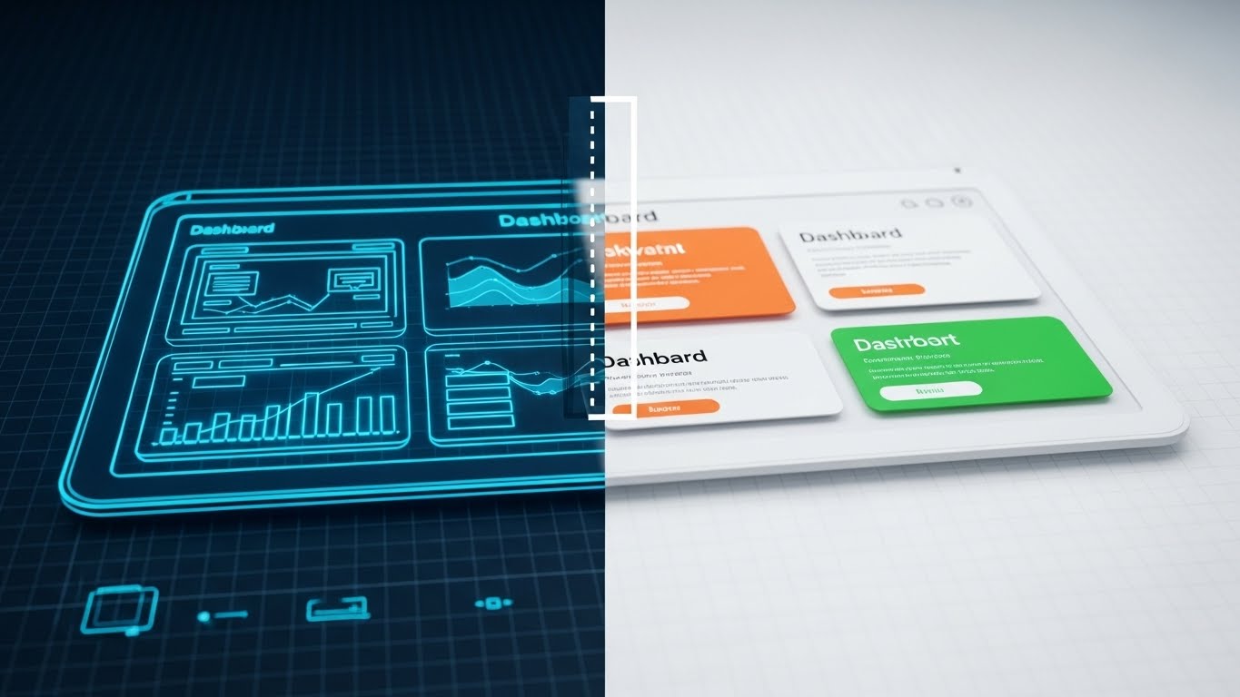
(Wireframe to Reality Transition): Rapid Build Visualizes Velocity
The Visual & Narrative Approach
This style is a dynamic "Before and After" visualization. A split-screen effect (or a sliding "wipe") reveals the transition from a Blueprint Blue wireframe grid on the left to a solid, high-fidelity White and Grey software render on the right. This motion graphic literally "builds" the dashboard before the viewer's eyes. It visualizes the journey from "Concept" to "Live Deployment."
Psychological Impact & KPI Focus
- Niche Psychology: CTOs often associate new software implementations with "Vaporware" or endless delays. This visual counteracts that anxiety by demonstrating Tangibility. It visually proves that the architecture is robust and the path to a live environment is short and direct.
- Operational Impact: It is the perfect visual metaphor for "Rapid Deployment" and "Pre-Configured Templates." It tells the user: "We have already done the heavy lifting; you just need to switch it on."
Strategic Implementation & Trade-offs
- Best Use Case: "Welcome" emails or onboarding intro videos. It reassures new users that they made the right choice and that value is imminent.
- Trade-off: It is a functional style. It appeals to the logical buyer (Implementation Manager) rather than the emotional buyer.
Companies using similar video content -
Google Cloud – Financial Services Solutions – Visualizes rapid deployment of cloud infrastructure.
Microsoft Azure – FinTech Solutions – Shows quick transition from concept to cloud.
23. The Data Factory: Organizing Ingestion
Onboarding | Reducing Implementation Friction
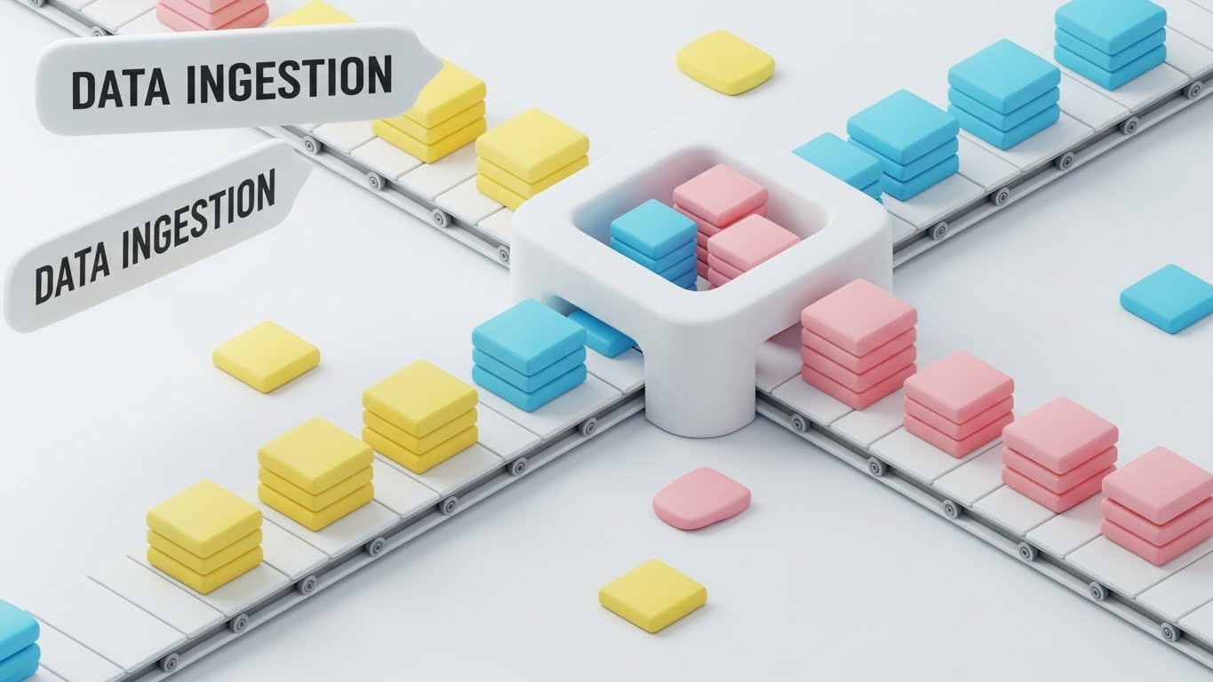
(Isometric 3D Workflow): Modular Sorting Simplifies Data Ingestion
The Visual & Narrative Approach
To explain the messy process of "Data Ingestion," we use a clean "Claymorphism" aesthetic. Soft, matte 3D blocks in Pastel Yellow, Blue, and Pink travel along a white conveyor belt into a central hub, where they are automatically sorted into neat, organized stacks. The style is satisfying, orderly, and frictionless. It transforms a complex technical headache (API mapping) into a smooth, automated mechanical process.
Psychological Impact & KPI Focus
- Niche Psychology: Data fragmentation is a primary pain point for Operations Managers. This visual offers Therapeutic Order. It promises that your platform acts as a "Sanitizing Filter," turning the chaos of raw market data into clean, usable assets.
- Operational Impact: It simplifies "ETL Processes" (Extract, Transform, Load). It visually explains that the system handles the complexity of formatting, allowing the user to focus on analysis.
Strategic Implementation & Trade-offs
- Best Use Case: Technical documentation or "Integration" help articles. It reduces the perceived difficulty of setting up new data feeds.
- Trade-off: The "toy-like" aesthetic creates a sense of ease but should not be used to represent "High-Stakes" features like trade execution, where a more serious look is required.
Companies using similar video content -
Snowflake – Financial Services Data Cloud – Organizes and processes vast data streams.
Xignite – Market Data APIs – Simplifies complex data ingestion and delivery.
24. The Success Moment: Humanizing the Win
Onboarding | Self-Serve Onboarding

(2D Character-Driven Story): User Satisfaction Reinforces Ease of Use
The Visual & Narrative Approach
We introduce a human element to the interface. A flat 2D vector character in Yellow and Grey sits at a desk, smiling as a "Success" checkmark bubble floats above their monitor. The environment is a clean, modern open-plan office. This style shifts focus from the software to the user's emotion. It validates that the task (e.g., "Report Generated") has been completed successfully and effortlessly.
Psychological Impact & KPI Focus
- Niche Psychology: New users often feel "Imposter Syndrome" when learning complex financial tools. This friendly, affirmative visual provides Positive Reinforcement. It tells the user, "You are doing this right," which is crucial for habit formation.
- Operational Impact: It increases "Feature Adoption Rates." By associating task completion with a positive visual cue, you encourage users to repeat the action.
Strategic Implementation & Trade-offs
- Best Use Case: "Empty States" (screens with no data yet) or "Success Modals" (pop-ups after a task). It keeps the mood light and encouraging.
- Trade-off: Use sparingly. If used too often, it can feel patronizing to experienced senior traders.
Companies using similar video content -
K3 (K3 Software) – Trading Solutions – Celebrates user success with intuitive workflows.
MetaTrader – Platform – Provides positive feedback for successful trades.
25. The Global Palm: Mobile Power
Onboarding | Trial/Freemium User Activation

(Holographic UI over 3D Render): Holographic Projection Visualizes Global Access
The Visual & Narrative Approach
To elevate the perception of your mobile app, we use a futuristic "Holographic" style. A realistic 3D render of a smartphone projects a translucent, glowing Blue wireframe globe upwards from its screen. This visual metaphor suggests that the phone is not just a passive display, but a projector of global market influence. It implies that the user holds the entire world economy in their hand.
Psychological Impact & KPI Focus
- Niche Psychology: This targets the desire for Omniscience. Traders want to feel connected to the global pulse at all times. The hologram suggests a "Command Center" capability, elevating the app from a utility to a weapon of market dominance.
- Operational Impact: It effectively promotes "Global Market Access" or "24/7 Connectivity." It is particularly powerful for converting Freemium users who are on the fence about the mobile add-on.
Strategic Implementation & Trade-offs
- Best Use Case: Email campaigns targeting inactive mobile users. "The world is moving. Are you watching?"
- Trade-off: It is highly stylized. Ensure the actual app UI is shown elsewhere so users don't expect actual holograms.
Companies using similar video content -
Binance Institutional – Mobile App – Projects global crypto market influence.
Kraken Institutional – Trading App – Offers global market access from mobile.
26. The Green Switch: The Micro-Moment of Activation
Retention | Driving Deep Feature Adoption

(Macro UI Micro-Interactions): Vivid Toggle Highlights Feature Activation
The Visual & Narrative Approach
We zoom in—extreme macro. A single digital toggle switch is flipped to the "On" position, glowing in Vivid Lime Green against a textured white background. The depth of field is shallow, focusing all attention on this single interaction. This is the visual celebration of "Activation." It makes the act of enabling a feature (like "Auto-Hedging") feel significant, tactile, and decisive.
Psychological Impact & KPI Focus
- Niche Psychology: Great software is defined by its "Micro-Interactions." This visual triggers a dopamine response associated with Control. It gives the user a sense of tactile satisfaction, reinforcing the feeling that the system is responsive and alive.
- Operational Impact: It draws attention to specific, underused settings. It visually screams: "Turn this on for immediate value."
Strategic Implementation & Trade-offs
- Best Use Case: In-app tooltips or "New Feature" update cards. It creates a focal point that demands interaction.
- Trade-off: It is abstract. It must be accompanied by text explaining what is being turned on.
Companies using similar video content -
AlgoTrader – Algorithmic Trading Platform – Highlights activation of automated strategies.
cTrader – Platform – Emphasizes precise control over trading features.
27. The Hybrid Helper: Reducing Support Friction
Retention | Reducing Support Overhead

(2D Graphics Over Live Action): Augmented Icons Contextualize Human Support
The Visual & Narrative Approach
This style blends the human and the graphical. A real person is shown working at a desk, but they are surrounded by floating, flat 2D vector icons (Question Mark, Lightbulb, Life Preserver) in Cyan and Orange. The icons interact with the person, popping up as if offering help. This visualizes "Hybrid Support"—the combination of human expertise and automated AI assistance.
Psychological Impact & KPI Focus
- Niche Psychology: Users hate contacting support because they expect long wait times. This visual makes support look Proactive and Integrated. It suggests that help is always floating nearby, ready to be grabbed, rather than hidden behind a phone tree.
- Operational Impact: It builds trust in "Self-Serve" resources. It frames the Help Center not as a dusty library, but as an active, helpful layer of the experience.
Strategic Implementation & Trade-offs
- Best Use Case: The main landing page of your Knowledge Base or "Contact Support" modal.
- Trade-off: Keep the live-action footage high quality. Low-budget video with cartoons on top looks amateurish.
Companies using similar video content -
Zendesk – Support Suite – Blends human and AI support for users.
Intercom – Conversational Support – Offers integrated, proactive customer assistance.
28. The Winning Team: Validating Retention
Retention | Reducing Churn

(Aspirational Stock Montage): Collective Success Builds Brand Loyalty
The Visual & Narrative Approach
To combat churn, we remind the client of the ultimate goal: Team Success. We use a high-key, sun-drenched stock photo of a diverse team celebrating in a glass-walled conference room. They are high-fiving; the energy is infectious. This is not about the software; it is about the culture that the software enables. It associates your brand with optimism, collaboration, and winning.
Psychological Impact & KPI Focus
- Niche Psychology: Decision-makers want to be heroes to their teams. This visual reinforces the idea that choosing your platform makes the entire team happier and more productive. It targets Social Proof and Belonging.
- Operational Impact: It strengthens "Brand Loyalty." It moves the conversation from "Cost per Seat" to "Value to Culture."
Strategic Implementation & Trade-offs
- Best Use Case: Quarterly Business Review (QBR) presentations or "Year in Review" emails.
- Trade-off: It is the most generic style. It works only when you have already established a strong technical trust. It is the emotional wrapper, not the core product.
Companies using similar video content -
Bloomberg – Terminal – Fosters a culture of collective market success.
LSEG (London Stock Exchange Group) – Workspace – Promotes team collaboration and success.
29. The Pro Tier: Visualizing the Upgrade
Expansion | Driving Upsell

(Futuristic Neon/Dark Mode): Synthwave Aesthetics Signal Premium Access
The Visual & Narrative Approach
When asking for an upsell, you must offer "Status." We use a Synthwave-inspired aesthetic: a glowing Neon Purple grid floor stretching into a deep black void, with a central "Pro Badge" or "Block" glowing in Laser Blue. This is the "Gamer" or "Hacker" aesthetic—visual shorthand for "Elite Performance." It looks exclusive, powerful, and distinctly different from the standard "Light Mode" interface.
Psychological Impact & KPI Focus
- Niche Psychology: This taps into the Ego of the power user. It signals that the "Pro Tier" is not just more features; it is a different realm of trading. It makes the upgrade feel like unlocking a superpower.
- Operational Impact: It visually distinguishes "Enterprise" or "Pro" features from the standard set, justifying the price jump through distinct visual coding.
Strategic Implementation & Trade-offs
- Best Use Case: In-app paywalls or "Unlock Premium" screens.
- Trade-off: It is aggressive. Ensure it aligns with your brand guidelines. It works best for "Trading" modules, less so for "Compliance" modules.
Companies using similar video content -
TradingView – Premium Plans – Signals elite access with advanced features.
QuantConnect – Organization Plans – Offers pro-level tools for advanced quants.
30. The Viral City: The Network Effect
Expansion | Driving Referrals

(Hyper-lapse Stock Footage): Connected Cityscape Illustrates Referral Networks
The Visual & Narrative Approach
Our final style visualizes the "Ecosystem." A hyper-lapse video still shows a city skyline at sunrise, with traffic streaking through the streets. Overlaid on this organic energy are white digital lines connecting buildings, visualizing a "Referral Network" or "Liquidity Mesh." The aesthetic is fast, urban, and infinite. It suggests that by joining your platform, the user plugs into a living, breathing city of liquidity.
Psychological Impact & KPI Focus
- Niche Psychology: No one wants to trade on a ghost town platform. This visual proves Critical Mass. It leverages FOMO (Fear Of Missing Out), suggesting that the market is alive and happening here, on your platform.
- Operational Impact: It supports "Network Effect" messaging. It implies that the platform gets stronger as more users join (liquidity begets liquidity).
Strategic Implementation & Trade-offs
- Best Use Case: "Invite a Colleague" pages or social campaigns highlighting total trade volume.
- Trade-off: It is broad. Use it to sell the scale of the community, not specific features.
STRATEGIC KNOWLEDGE BASE: The Visual Operations Doctrine
To transform these 30 visual styles from a "Design Catalog" into a "Business Asset," we must apply a strategic framework. This section provides the "Visual Operations Doctrine"—a guide for CTOs and Heads of Growth on how to deploy these assets to drive alignment, adoption, and ROI.
Strategic Alignment & Visual Architecture
The "Pre-Production" Strategy: Why & Who
- The Cognitive Load Audit: Before commissioning a single pixel, audit your current user training. Where are users stalling? If "Risk Management" has the highest ticket volume, deploy Style 16 (The Compliance Shield). Map visual complexity to the complexity of the problem.
- Role-Based Visual Mapping: Do not show the same visuals to a Day Trader as you do to a Risk Manager. Use Style 1 (Kinetic Impact) for the Trader who craves speed, but Style 5 (Technical Blueprint) for the CTO who needs stability. Segmentation increases conversion.
- The "Glanceability" Standard: In high-stress trading, comprehension must be instant. Test your visuals. If a user cannot identify the primary value proposition of an image (e.g., "Profit" in Style 8) within 1.5 seconds, the design has failed.
- Brand Voice Consistency: Your "Dark Mode" trading engine (Style 12) and your "Light Mode" compliance portal (Style 10) must feel like siblings. Use a unified accent color (e.g., Teal or Electric Blue) to thread disparate software modules into a cohesive brand.
- The Advids Strategic Audit: Developing a "Visual Operating System" is complex. Partnering with a specialized agency like Advids allows you to audit your entire visual funnel before production, ensuring that every asset (from Style 1 to 30) serves a specific business KPI.
- Standardization vs. Customization: Use "Stock-based" styles (Style 21, 28) for broad, emotional concepts like "Lifestyle" or "Team." Reserve expensive "Bespoke 3D" (Style 7, 17) for your core differentiators like "Latency" or "Custody." Spend budget where it differentiates you.
- The Cross-Departmental Bridge: Sales talks about "Speed," Ops talks about "Efficiency." Use Style 18 (Execution Engine) to unify them. When both teams use the same visual metaphor, your external messaging becomes consistent.
- Legacy System Integration: Visualizing the link between old hardware and new SaaS is critical. Use Style 9 (Digital Order) to respect the client's past (the chaotic desk) while selling the future. Never mock the legacy system; visual improvement is the argument.
- Accessibility in Finance: Finance is global. Ensure your Motion Graphics (Style 3) use universal symbols (arrows, shields, coins) rather than text-heavy explanations, allowing your assets to work across borders without expensive re-versioning.
- The Mobile-First Mandate: 40% of institutional research now happens on mobile. All 30 styles, especially complex charts like Style 13, must be legible on a 6-inch screen. If it doesn't work on mobile, it doesn't work for the modern executive.
Operational Adoption & Implementation
The "Deployment" Phase: Embedding Visuals into Workflow
- Overcoming "Black Box" Anxiety: Traders trust what they can't see. Use Style 13 (Holographic Depth) and Style 17 (Cryptographic Core) to visually "open the box." Showing the inner workings (even abstractly) builds the trust required for high-value asset adoption.
- The Micro-Learning Shift: Kill the 50-page PDF manual. Replace it with a library of 15-second clips using Style 18 (Execution Engine - Rapid UI Montage). Users learn features 60% faster when the visual is isolated and dynamic.
- Just-in-Time Support: Embed Style 26 (Macro UI) GIFs directly into your tooltips. When a user hovers over a complex setting, show them the toggle in action. This reduces "Context Switching" (leaving the app to find help).
- Gamification of Training: Use Style 24 (2D Character) to reward users for completing onboarding steps. A "High Five" animation for setting up 2FA creates a positive emotional association with a boring compliance task.
- Reducing Support Ticket Volume: There is a direct correlation between proactive visualization and support costs. If you launch a new "Yield" feature, accompany it with Style 15 (Organic Yield) in the announcement email. Pre-answering visual questions prevents tickets.
- Remote Onboarding: You cannot fly trainers to every client. Use Style 2 (Infinite Network) and Style 22 (Wireframe to Reality) in your webinar backgrounds to project an image of global infrastructure and rapid deployment, simulating the "Big Room" experience remotely.
- Visualizing SOPs: Standard Operating Procedures are ignored when text-heavy. Convert your "Trade Settlement" SOP into a Style 3 (Flow State) loop. Motion makes the process flow easy to memorize and hard to deviate from.
- Feedback Loops: Use interactive video elements. If a user watches a Style 10 (Dashboard Zen) tutorial, pop up a "Was this helpful?" query. Use the data to refine which visual styles effectively teach your users.
- Scalable Localization: By separating text layers from the visual render (as seen in Style 23), you can swap languages for the text bubbles without re-rendering the 3D assets. This is crucial for global SaaS scaling.
- Leadership Communication: When presenting the roadmap to the Board, do not use spreadsheets. Use Style 11 (Modular Stack) to show how you are building the "Stack." Visualizing the architecture secures budget faster than listing features.
Measuring Impact & Future-Proofing
The "ROI" Phase: Metrics & Evolution
- Beyond "Views": Do not measure video success by "Views." Measure "Time-to-Competency." Did the user who watched the Style 22 onboarding video activate the feature faster than the one who didn't? That is your ROI.
- The "Idle Time" Metric: High-quality UX visualization (Style 10) should reduce the time a user spends "thinking" or "searching" on a screen. Reduced idle time = higher trading velocity = more platform revenue.
- Compliance Velocity: How fast does your user base adapt to a new regulation (e.g., T+1 Settlement)? A well-timed Style 16 (Compliance Shield) campaign can cut adoption time in half, reducing your regulatory risk exposure.
- Retention and LTV: Users churn when they feel "Stuck" or "Unsuccessful." The "Success Moment" visuals (Style 24, 28) are retention tools. They reinforce the value proposition daily, increasing Lifetime Value (LTV).
- The AI Visual Frontier: Be ready for Generative UI. Soon, interfaces will adapt to the user. Your library of "Visual Components" (Style 11) must be tagged and ready for AI to assemble custom dashboards on the fly.
- Scalability of Assets: Build a "Visual Design System," not just ad-hoc videos. If you change your "Buy Button" color, it should ripple through your Style 18 and Style 26 assets automatically.
- The Advids Partnership: Creating a library of 30 distinct yet cohesive styles is a massive operational lift. A long-term partner like Advids ensures that as your product evolves from V1 to V2, your visual assets scale with you, preventing "Visual Debt" (outdated tutorials).
- Benchmarking Success: Compare your visual "Freshness" to competitors. If they are still using static screenshots and you are using Style 7 (Data Cathedral), you win the "Perception of Innovation" battle before the demo even starts.
- The ROI of Safety: In high-stakes trading, a "Fat Finger" error costs millions. Clear, high-contrast visuals (Style 12, Style 26) are safety features. Quantify the reduction in "User Error" as a direct financial benefit of your design investment.
- Final Call to Innovation: Treat video and visualization not as "Content Marketing," but as "Digital Infrastructure." In a world of invisible code, your visual style is the only thing the customer ever truly sees. Make it count.
Companies using similar video content -
Interactive Brokers – Referral Program – Visualizes a growing network of traders.
Liquidnet – Institutional Trading Network – Connects a vast network of institutional liquidity.
Author & Editor Bio


