
Introduction: Visualizing the Era of Unified Commerce
The digital landscape has shifted from "multichannel" complexity to "unified" simplicity. For leaders in the Omnichannel Experience and SaaS sectors, the challenge is no longer just connecting systems—it is communicating that connection. The "Phygital Divide"—the operational gap between physical stores and digital touchpoints—often feels abstract and intangible to stakeholders. The most successful platforms today use advanced visualization not just to market features, but to prove architectural capability.
The opportunity for growth is mathematically clear. Recent industry data indicates that retailers who deployed unified commerce platforms saw up to 15% revenue growth within just 18 months. However, achieving this requires more than just backend integration; it requires a customer experience that feels effortless. Companies that successfully bridge this gap reap immense rewards, with strong omnichannel engagement strategies driving a massive ability to retain 89% of customers.
This guide serves as your strategic visual blueprint. We explore 30 distinct video styles designed to translate complex API integrations, headless architectures, and data workflows into compelling visual narratives. From abstract motion graphics that simplify market education to photorealistic AI generations that drive Account-Based Marketing (ABM), these examples are curated to help you reduce cognitive load and accelerate the "Time-to-Understanding" for your buyers.
Let us explore how to visualize the invisible architecture of modern commerce.
1. Abstract 2D Flat Vector Organic
TOFU | Brand Awareness

The Visual & Narrative Approach
This style utilizes a sophisticated "liquid intelligence" aesthetic. We see scattered, fluid shapes in vivid coral, pure white, and deep teal drifting across a clean cream background. These "blobs"—representing disparate data silos—magnetically glide toward the center, morphing and smoothing into a perfect, interlocking ring. The texture is glossy and liquid-like, suggesting that the integration process is frictionless and natural, rather than mechanical.
Psychological Impact & KPI Focus
- Niche Psychology: The animation leverages the Gestalt principle of closure. It psychologically reassures the viewer that the platform creates wholeness from fragmentation, reducing the anxiety of "tech sprawl."
- Operational Impact: Drives Brand Recall. The soothing, resolving motion creates a positive emotional association with the brand identity.
Strategic Implementation & Trade-offs
- Best Use Case: High-velocity social feeds (Instagram/LinkedIn) where capturing attention without audio is critical.
- Duration: 15-20 Seconds (Loopable).
- Trade-off: Purely conceptual. It builds emotional connection but does not explain how the software works.
Companies using similar video content -
Workato – Integration Platform – Fluidly connects disparate business applications.
Tealium – Customer Data Platform – Unifies fragmented customer data streams.
Boomi – Integration Platform – Seamlessly integrates cloud and on-premise systems.
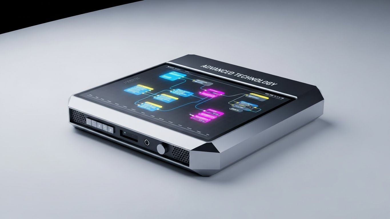
2. Abstract 3D AI Visualization
TOFU | Category Creation

The Visual & Narrative Approach
To visualize "Category Creation," this style enters a deep cyan void populated by thousands of electric blue and silver glowing orbs. These particles, representing raw unstructured data, are pulled by an invisible force toward a central core, snapping into a structured, pulsing neural network. The volumetric lighting and ethereal atmosphere communicate that the platform is not just processing data, but synthesizing intelligence.
Psychological Impact & KPI Focus
- Niche Psychology: The complex particle system signals "Enterprise-Grade" capability. It positions the platform as a visionary leader in AI, appealing to the aspiration of C-level executives.
- Operational Impact: Increases Perceived Value. It visually justifies a premium price point by associating the software with cutting-edge complexity and power.
Strategic Implementation & Trade-offs
- Best Use Case: YouTube pre-rolls or website "Hero" backgrounds to establish market dominance.
- Duration: 30-45 Seconds.
- Trade-off: High production cost. If the rendering is low-quality, it can look like a generic screensaver rather than a proprietary technology.
Companies using similar video content -
Databricks – Data Intelligence Platform – Synthesizes raw data into actionable insights.
Snowflake – Data Cloud – Structures vast amounts of enterprise data.
Bloomreach – Engagement Platform – AI-driven personalization from unstructured data.
3. Abstract 2D Motion Graphics
TOFU | Market Education

The Visual & Narrative Approach
Precision is the hero here. The screen is split between a chaotic jumble of hard-edged triangles and squares (yellow/gray) on the left, and a perfectly aligned grid on the right. The animation shows the shapes transitioning from chaos to order with a rhythmic, snapping motion. This "Before and After" visual instantly communicates the value of standardization and operational efficiency without needing voiceover.
Psychological Impact & KPI Focus
- Niche Psychology: Appeals to the "Controller" persona—operations leads who value structure. It satisfies the cognitive need for pattern recognition.
- Operational Impact: Drives Message Comprehension. It simplifies the complex value prop of "Operational Orchestration" into a binary visual: Mess vs. Clean.
Strategic Implementation & Trade-offs
- Best Use Case: LinkedIn feed videos explaining specific methodologies or workflows.
- Duration: 20-30 Seconds.
- Trade-off: Can feel "cold" or corporate. It lacks the emotional warmth of organic styles, making it better for logical arguments than emotional ones.
Companies using similar video content -
Manhattan Associates – Omnichannel Fulfillment – Optimizes complex retail supply chain processes.
Blue Yonder – Supply Chain Planning – Transforms chaotic logistics into ordered workflows.
4. AI Generated Mixed Media Video
TOFU | Shaping Brand Perception
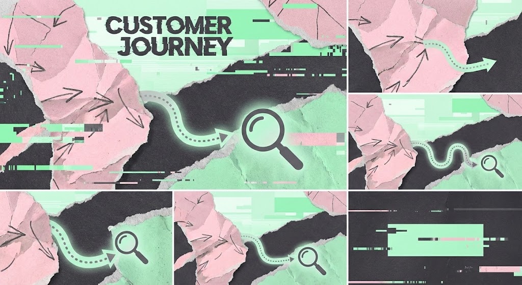
The Visual & Narrative Approach
This disruptive style uses a collage technique to visualize the "Phygital" reality. We see torn paper textures (representing physical receipts/maps) layered over digital glitches and sleek vector lines (representing apps/data). A path winds seamlessly through these clashing mediums. The pastel pink and mint palette contrasts with charcoal gray, creating an artistic, modern vibe that breaks the "corporate blue" mold.
Psychological Impact & KPI Focus
- Niche Psychology: The gritty, textured aesthetic stands out in social feeds, signaling that this brand is an innovator that understands the messy reality of customer journeys.
- Operational Impact: Boosts Ad Engagement (CTR). The unique visual style encourages users to stop scrolling and investigate the "glitch."
Strategic Implementation & Trade-offs
- Best Use Case: Meta Ads (Stories/Reels) targeting younger decision-makers or creative directors.
- Duration: 10-15 Seconds.
- Trade-off: May be too "edgy" for highly conservative sectors like banking or government.
Companies using similar video content -
Optimizely – Digital Experience Platform – Navigates complex customer journeys across channels.
Sitecore – Experience Platform – Blends physical and digital customer touchpoints.
5. Bold Kinetic Typography
TOFU | Vertical Social Organic

The Visual & Narrative Approach
This style strips away imagery to focus on velocity. Massive, abstract block shapes (representing text) in bright orange and indigo collide in the center of the frame, creating sparks and shockwaves. The camera moves with aggressive motion blur, supported by speed lines in the background. It visualizes "High Velocity Engagement" and the real-time speed of the platform.
Psychological Impact & KPI Focus
- Niche Psychology: The fast pacing triggers physiological arousal (excitement/alertness), aligning with the need for speed in modern commerce.
- Operational Impact: Maximizes View-Through Rate. The high energy keeps viewers watching the short loop on mobile devices.
Strategic Implementation & Trade-offs
- Best Use Case: TikTok or Instagram Reels for hype and announcements.
- Duration: 6-10 Seconds.
- Trade-off: Conveys zero detailed information. It is purely an attention hook and must be paired with a clear caption or call-to-action.
Companies using similar video content -
Attentive – SMS Marketing Platform – Drives high-velocity customer engagement and alerts.
Klaviyo – Marketing Automation – Accelerates real-time customer communication.
6. Low-Poly 3D Modeling
TOFU | Skippable Pre-Roll Ad
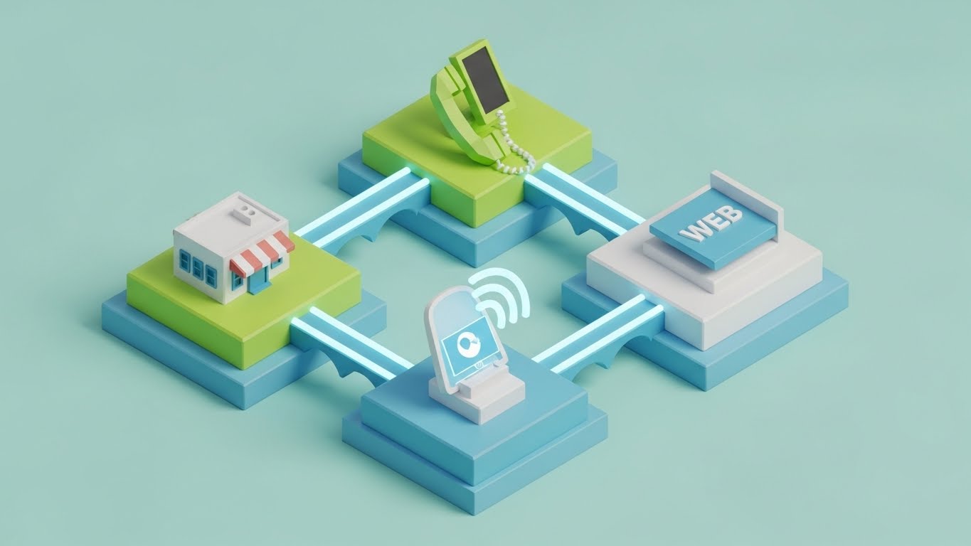
The Visual & Narrative Approach
This style creates a friendly "Omnichannel Map." We see a stylized, low-poly miniature city with islands representing a store, a phone, and a web browser. Glowing bridges connect these islands, visualizing the data flow. The lime green and sky blue palette is accessible and playful. It allows the viewer to see the entire ecosystem at a glance from a "god view" perspective.
Psychological Impact & KPI Focus
- Niche Psychology: By gamifying the architecture, it reduces the intimidation factor of enterprise integration. It makes the system look manageable and "plug-and-play."
- Operational Impact: Improves Message Retention. The simple visual map is easier to remember than a complex technical diagram.
Strategic Implementation & Trade-offs
- Best Use Case: YouTube Pre-roll ads where you need to explain "what we do" in the first 5 seconds.
- Duration: 15-30 Seconds.
- Trade-off: Can be perceived as "SMB" (Small Business) if not rendered with premium lighting.
Companies using similar video content -
Cisco Meraki – Smart Cameras & Sensors – Simplifies complex IoT network infrastructure.
Zebra Technologies – Retail Solutions – Visualizes connected store operations ecosystem.
7. Isometric 2D Motion Design
MOFU | Demand Gen

The Visual & Narrative Approach
This style visualizes the platform as a well-oiled machine. On a clean white floor, we see a factory line of violet and gray conveyor belts. Icons representing leads (envelopes, chat bubbles) slide along the tracks, passing through "automation gates." The motion is smooth and mechanical. It visualizes "Automated Lead Generation" as a predictable, reliable engine that never stops.
Psychological Impact & KPI Focus
- Niche Psychology: The mechanical rhythm reassures the viewer that the process is reliable and automated. It appeals to the desire for "set it and forget it" efficiency.
- Operational Impact: Drives Conversion to Demo. It proves the operational value, encouraging the viewer to see the actual tool.
Strategic Implementation & Trade-offs
- Best Use Case: LinkedIn Sponsored Content or landing page explainers.
- Duration: 30-45 Seconds.
- Trade-off: It is a common SaaS trope. To stand out, the animation needs unique details or a distinct color palette.
Companies using similar video content -
Emarsys – Customer Engagement Platform – Automates personalized marketing workflows.
Iterable – Customer Engagement Platform – Visualizes automated customer journey orchestration.
8. 2D Line Art Animation
MOFU | Product Differentiation

The Visual & Narrative Approach
Minimalism is the ultimate sophistication. A single, continuous ultra-thin black line on textured white paper draws a complex, tangled knot. As the narrative progresses, the line gracefully untangles itself, smoothing into a straight trajectory. This continuous motion visually metaphorizes "Simplifying Complexity"—taking a messy client problem and straightening it out.
Psychological Impact & KPI Focus
- Niche Psychology: The minimalist aesthetic signals a confident, high-end brand that doesn't need to shout. It appeals to executive buyers who value clarity and elegance.
- Operational Impact: Increases Time on Site. The mesmerizing, continuous motion encourages viewers to watch the full animation.
Strategic Implementation & Trade-offs
- Best Use Case: "About Us" or "Philosophy" website sections.
- Duration: 30-45 Seconds.
- Trade-off: Very subtle. It requires a quiet environment to be appreciated and is not suitable for high-noise social feeds.
Companies using similar video content -
Contentful – Headless CMS – Simplifies content delivery across diverse platforms.
Strapi – Open-Source Headless CMS – Untangles complex content management structures.
9. Clean UI Workflow (Light Mode)
MOFU | Feature Education
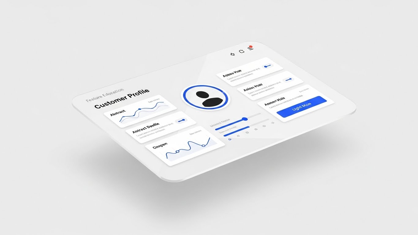
The Visual & Narrative Approach
This style offers "proof of life." A floating glass screen displays a high-fidelity "Customer Profile" dashboard in light mode. The royal blue and light grey UI is crisp and organized. The camera tilts slightly to show depth. It visualizes "Feature Education" by showing the actual interface, stripped of browser clutter, to highlight usability.
Psychological Impact & KPI Focus
- Niche Psychology: Reduces the fear of "clunky" legacy software. It shows the prospect that the daily user experience will be pleasant and organized.
- Operational Impact: Accelerates Sales Velocity. In emails, showing the actual product interface drives higher clicks than generic stock imagery.
Strategic Implementation & Trade-offs
- Best Use Case: Feature release emails or mid-funnel nurture sequences.
- Duration: 45-60 Seconds.
- Trade-off: Must be updated if the software UI changes. It is functional rather than emotional.
Companies using similar video content -
Lightspeed Commerce – Retail POS – Showcases intuitive point-of-sale interface.
Square – POS System – Highlights clean, user-friendly transaction dashboards.
10. Gen AI Realistic Character
MOFU | ABM Awareness

The Visual & Narrative Approach
This style humanizes the data story. We see a photorealistic male data analyst in a navy suit, standing in a modern glass-walled office. He interacts with a holographic pie chart floating above his palm. The cinematic lighting and bokeh background create a premium feel. It visualizes "ABM Awareness" by mirroring the target persona—a competent, data-empowered professional.
Psychological Impact & KPI Focus
- Niche Psychology: The viewer sees themselves (or their aspirational self) in the character. It builds trust by focusing on the human success enabled by the technology, rather than the technology itself.
- Operational Impact: Drives Account Engagement. Personalized visuals that look like the target's actual work environment drive higher relevance and engagement.
Strategic Implementation & Trade-offs
- Best Use Case: Account-Based Marketing (ABM) ads on LinkedIn targeting specific job titles.
- Duration: 15-20 Seconds.
- Trade-off: Requires high-quality generation to avoid the "Uncanny Valley." The character must look absolutely real to maintain credibility.
Companies using similar video content -
Gainsight – Customer Success Platform – Humanizes data-driven customer retention strategies.
Braze – Customer Engagement Platform – Empowers marketers with data mastery.
11. Split Screen: Optimized Reality**
MOFU | Competitive Displacement
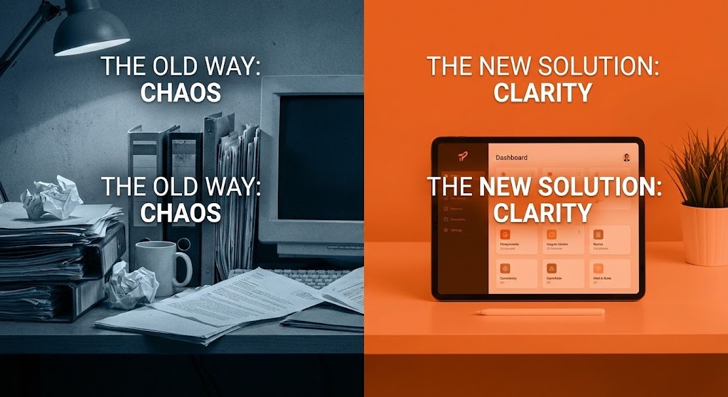
The Visual & Narrative Approach
This style creates an immediate, visceral contrast between the "Status Quo" and the "Future State." The screen is sharply divided. On the left, bathed in desaturated, gritty blue tones, we see the anxiety of legacy systems: a cluttered desk, overflowing paper files, and disorganized tech. On the right, vibrant orange lighting illuminates a pristine environment featuring a sleek tablet with a simplified, intuitive UI. The visual narrative is binary and instant: the pain of the past versus the ease of the platform.
Psychological Impact & KPI Focus
- Niche Psychology: Leverages the Contrast Principle. By placing the pain (chaos) directly next to the cure (clarity), the brain instinctively recoils from the clutter and craves the organized solution. It validates the buyer's frustration with their current disjointed tools.
- Operational Impact: Drives Competitive Switch Rate. It doesn't just show features; it emotionalizes the upgrade, making the competitor's legacy solution feel obsolete and stressful.
Strategic Implementation & Trade-offs
- Best Use Case: Retargeting Display Ads or LinkedIn Sponsored Content aimed at users of legacy competitor software.
- Duration: 6-10 Seconds (Static or Micro-loop).
- Trade-off: Lacks nuance. It is a blunt instrument designed for immediate reaction, not deep technical explanation.
Companies using similar video content -
Commercetools – Headless Commerce – Contrasts legacy systems with modern API-first solutions.
Elastic Path – Composable Commerce – Highlights migration from monolithic to flexible architecture.
12. Isometric 3D Workflow
MOFU | The Functional Buyer
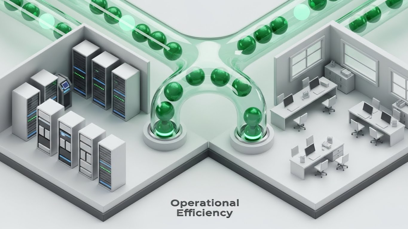
The Visual & Narrative Approach
To satisfy the "Functional Buyer," this style utilizes a pristine, orthographic perspective. We see a miniature, high-tech server room on the left connected to a modern marketing office on the right by translucent glass tubes. Glowing emerald green spheres—representing clean data packets—flow smoothly through these conduits, bypassing bottlenecks. The aesthetic is clinical and high-gloss (white and silver), symbolizing hygiene and precision in data handling.
Psychological Impact & KPI Focus
- Niche Psychology: Appeals to the Operations Manager’s need for Systematic Control. The "God’s Eye View" (isometric) gives the viewer a sense of total oversight and understanding of how the infrastructure connects disparate teams.
- Operational Impact: Increases Time-on-Page. The intricate detail invites the viewer to study the data flow, increasing dwell time and deepening their understanding of the platform's architectural integrity.
Strategic Implementation & Trade-offs
- Best Use Case: "How It Works" website sections or mid-funnel product explainers.
- Duration: 20-30 Seconds.
- Trade-off: Can feel detached. The lack of human characters means it relies entirely on the logic of the process to engage the viewer.
Companies using similar video content -
SAP Commerce Cloud – E-commerce Platform – Visualizes integrated enterprise commerce infrastructure.
Oracle Retail – Retail Solutions – Shows connected operational efficiency across retail.
13. Dynamic Data Visualization
BOFU | ROI Justification

The Visual & Narrative Approach
When speaking to the CFO, money must look tangible. This style treats data as a premium asset. We see towering 3D bar charts rendered in brushed gold and platinum textures, rising like skyscrapers against a clean white void. A glowing green trend line cuts aggressively upward through the metallic structures. The low-angle camera perspective makes the growth look monumental and unstoppable, turning abstract percentages into physical structures of wealth.
Psychological Impact & KPI Focus
- Niche Psychology: This is Financial Signaling. The use of precious metal textures (gold/platinum) subconsciously links the software’s output with high monetary value and stability. It reassures the economic buyer that this is an investment, not an expense.
- Operational Impact: Supports Deal Closure. Used in pitch decks, this visual effectively anchors the conversation on revenue growth rather than implementation cost.
Strategic Implementation & Trade-offs
- Best Use Case: Investor presentations, quarterly business reviews (QBRs), or BOFU proposal videos.
- Duration: 10-15 Seconds.
- Trade-off: Context-dependent. Without specific numbers or voiceover context, it is just a "up and to the right" graphic; it needs the narrator to define what the "Gold" represents.
Companies using similar video content -
Tableau – Business Intelligence – Justifies ROI with ascending, impactful data charts.
Looker – Business Intelligence – Visualizes financial growth and performance metrics.
Qlik – Data Analytics – Presents compelling ROI through dynamic data storytelling.
14. 3D X-Ray Visualization
BOFU | Risk Mitigation

The Visual & Narrative Approach
Security is often invisible; this style makes it undeniable. Using an "X-Ray" aesthetic, we see a transparent digital lock mechanism floating in a dark void. Inside, complex tumblers made of neon red light and brushed steel engage securely. The transparency reveals the internal engineering perfection, implying that there are no hidden vulnerabilities. It transforms the abstract concept of "SOC2 Compliance" into a robust, mechanical certainty.
Psychological Impact & KPI Focus
- Niche Psychology: Addresses the Fear of Vulnerability. By showing the "guts" of the security architecture, the brand demonstrates radical transparency, building trust with the Chief Information Security Officer (CISO).
- Operational Impact: Accelerates Security Review Cycles. Visualizing the complexity of the protection layers can preemptively answer technical objections regarding data safety.
Strategic Implementation & Trade-offs
- Best Use Case: Technical whitepapers, security compliance pages, or IT-focused nurture emails.
- Duration: 15-20 Seconds.
- Trade-off: Highly technical. It may alienate non-technical marketing buyers who find the mechanical aesthetic "cold" or intimidating.
Companies using similar video content -
Splunk – Security Information and Event Management – Reveals internal security architecture and threat mitigation.
Dynatrace – Software Intelligence Platform – Shows transparent application security and performance.
15. Lifestyle Stock with UI Overlay
BOFU | Building Trust

The Visual & Narrative Approach
Technology serves people, not the other way around. This style blends high-quality, warm lifestyle footage with subtle digital overlays. We see a confident professional in a sunlit co-working space, her natural hair and soft blue blazer signaling approachability. As she holds a tablet, floating holographic checkmarks and shield icons gently orbit the device. The lighting is natural and optimistic, suggesting that the software seamlessly integrates into a happy, productive work life.
Psychological Impact & KPI Focus
- Niche Psychology: Triggers Social Proof and empathy. The viewer sees a relaxed, successful human being using the tool, which subconsciously reduces the anxiety that the new software will be difficult or stressful to use.
- Operational Impact: Improves Brand Affinity. It softens the "Enterprise SaaS" image, making the brand feel approachable and partner-oriented rather than just a vendor.
Strategic Implementation & Trade-offs
- Best Use Case: "Success Stories" pages, testimonials, or the "Why Us" section of a website.
- Duration: 10-15 Seconds.
- Trade-off: Generic risk. If the stock footage looks too staged, it loses authenticity. The UI overlay must look custom and integrated to save it from being "just another stock photo."
Companies using similar video content -
Toast – Restaurant POS – Empowers staff with intuitive, integrated restaurant management.
NCR Corporation – Retail & Hospitality Solutions – Shows seamless, productive employee interactions.
16. Gen AI Cinematic Video
BOFU | The Economic Buyer

The Visual & Narrative Approach
This style visualizes the "Promised Land" for the C-Suite. Using high-end generative AI video, we create a cinematic scene of a corporate boardroom at dusk, with a panoramic city skyline symbolizing market dominance. Diverse executives in premium attire are engaged in a warm handshake. The amber and dark brown color grading evokes the feel of a prestige drama or luxury brand. It doesn't show software; it shows the result of the software: agreement, success, and partnership.
Psychological Impact & KPI Focus
- Niche Psychology: Appeals to Status and Achievement. It positions the purchase of this platform as a career-defining strategic win for the decision-maker, aligning the brand with executive excellence.
- Operational Impact: Influences Enterprise Deal Size. The premium aesthetic creates a "halo effect," justifying higher contract values by associating the brand with top-tier corporate success.
Strategic Implementation & Trade-offs
- Best Use Case: Connected TV (CTV) spots, account-based ads for Fortune 500 targets, or event openers.
- Duration: 15-30 Seconds.
- Trade-off: Zero product visibility. This is purely emotional brand building. It must be supported by collateral that explains what the product actually does.
Companies using similar video content -
Salesforce Commerce Cloud – E-commerce Platform – Visualizes executive success and strategic partnerships.
Adobe Commerce – E-commerce Platform – Depicts high-level boardroom agreement and market leadership.
17. Futuristic Neon/Dark Mode
BOFU | The Technical Buyer
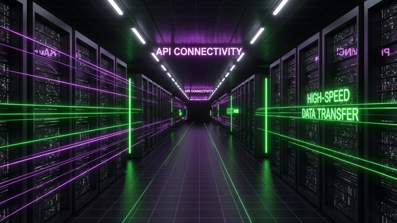
The Visual & Narrative Approach
To captivate the Technical Buyer (CTO/DevOps), this style adopts the visual language of the future. We fly down an infinite dark corridor of servers, illuminated by cyberpunk purple and laser green light beams. Floating neon text declares "API CONNECTIVITY" and "HIGH-SPEED DATA TRANSFER." The one-point perspective draws the eye deep into the center, symbolizing speed, infinite scalability, and the cutting-edge nature of the backend infrastructure.
Psychological Impact & KPI Focus
- Niche Psychology: Signals Innovation and Speed. The dark mode aesthetic aligns with the preferred coding environments of developers, creating an immediate "in-group" signal that "this tool was built by devs, for devs."
- Operational Impact: Increases Developer Advocacy. IT teams are often the gatekeepers; this style convinces them that the platform is modern, robust, and worthy of their stack.
Strategic Implementation & Trade-offs
- Best Use Case: Developer documentation, API portal headers, or technical blog posts.
- Duration: 10-20 Seconds (Loopable).
- Trade-off: Can appear "Gamery." It risks looking like a video game rather than a business tool if the text and data overlays aren't professional and precise.
Companies using similar video content -
Mulesoft – API Integration Platform – Visualizes high-speed API connectivity and data transfer.
Confluent – Data Streaming Platform – Shows infinite data corridors for real-time processing.
18. Wireframe to Reality Transition
BOFU | Objection Handling
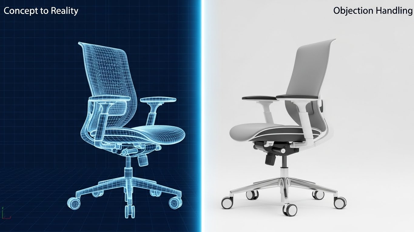
The Visual & Narrative Approach
This style is a visual metaphor for "Promise vs. Delivery." The screen is split by a glowing vertical wipe. As it passes, a blue wireframe sketch of a complex object (here, a high-end office chair) instantly renders into a photorealistic, tangible product. It visually demonstrates the platform's ability to take abstract strategy (the wireframe) and turn it into a concrete, usable reality. Text overlays "Concept to Reality" and "Objection Handling" reinforce the message of realization.
Psychological Impact & KPI Focus
- Niche Psychology: Resolves Implementation Doubt. Buyers worry that SaaS tools are "vaporware." This visual proves that the structure (wireframe) underpins a real, solid outcome, bridging the gap between theory and execution.
- Operational Impact: Reduces Sales Cycle Friction. It visually answers the question, "Will this actually work?" by showing the seamless transition from plan to product.
Strategic Implementation & Trade-offs
- Best Use Case: Retargeting ads for users who abandoned a demo or pricing page.
- Duration: 6-8 Seconds (Loopable).
- Trade-off: Abstract metaphor. The viewer must intuitively understand that the chair represents the "finished project" or "result."
Companies using similar video content -
Spryker – Composable Commerce OS – Transforms abstract blueprints into tangible commerce solutions.
VTEX – Commerce Platform – Demonstrates concept-to-reality for digital storefronts.
19. 2D Animation & UI Composition
BOFU | Reducing Implementation

The Visual & Narrative Approach
Implementation is the biggest friction point in BOFU. This style uses a friendly, flat 2D vector character to make setup look like child's play. A character dressed in calming turquoise and peach is shown effortlessly stacking glowing, translucent cubes. Each cube represents a module (Analytics, Security, Cloud), implying that building the system is as easy as playing with blocks. The "Modular Setup" text reinforces the plug-and-play nature of the platform.
Psychological Impact & KPI Focus
- Niche Psychology: Reduces Cognitive Load. The playful, simplified visual style lowers the stakes, reassuring the buyer that they don't need a PhD to set up the software. It promises a frustration-free experience.
- Operational Impact: Increases Trial-to-Paid Conversion. If users believe setup is easy, they are more likely to activate their trial.
Strategic Implementation & Trade-offs
- Best Use Case: Onboarding emails, "Getting Started" guides, or the support center homepage.
- Duration: 15-20 Seconds.
- Trade-off: Can feel "entry-level." This style should be used for onboarding/training, not for high-stakes executive pitches where gravity is required.
Companies using similar video content -
Acumatica – Cloud ERP – Visualizes easy, modular setup of business processes.
Odoo – Business Management Software – Shows simple stacking of integrated business modules.
20. Minimalist Flat 2D Vector
Onboarding | Driving Freemium/Trials
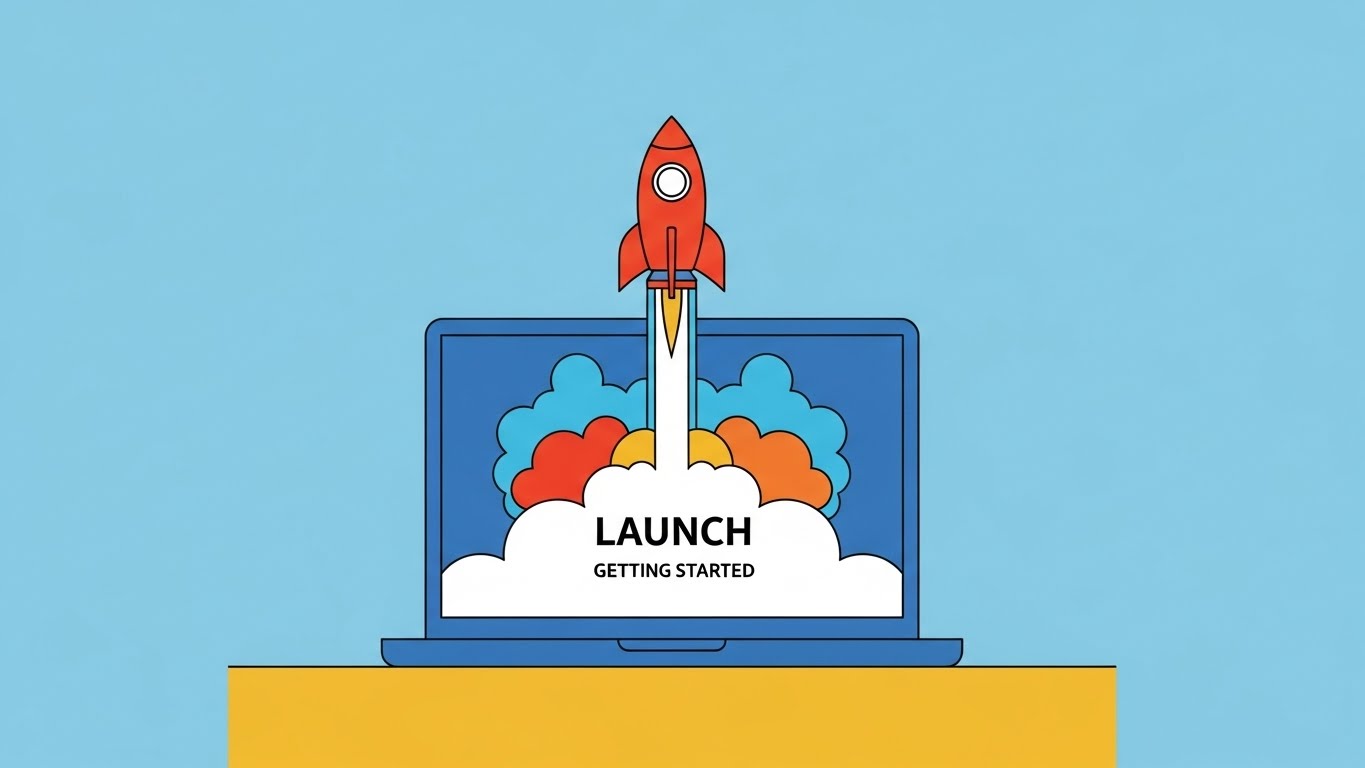
The Visual & Narrative Approach
The journey begins. This style uses ultra-clean, minimalist vector art to visualize the "Go Live" moment. A simple laptop on a desk serves as the launchpad for a stylized red rocket ship blasting off, leaving a trail of colorful smoke. The background is a solid, calming blue. It captures the excitement and energy of finally launching a campaign or a new store using the platform.
Psychological Impact & KPI Focus
- Niche Psychology: Triggers Anticipation of Success. The rocket is a universal symbol of growth and momentum. It reframes the work of configuration as the prelude to an exciting lift-off.
- Operational Impact: Drives User Activation. Used in welcome emails or "Day 1" login screens, it celebrates the user's action, reinforcing positive reinforcement loops.
Strategic Implementation & Trade-offs
- Best Use Case: Freemium conversion ads, "Welcome" emails, or social posts celebrating client launches.
- Duration: 3-5 Seconds (Loopable GIF).
- Trade-off: Very simple. It conveys energy but zero information. It is purely a mood-setter for the start of the customer lifecycle.
Companies using similar video content -
BigCommerce – E-commerce Platform – Visualizes the exciting launch of a new online store.
Shopify Plus – Enterprise E-commerce – Captures the energy of going live with a new campaign.
21. 2D Character-Driven Story**
Onboarding | Self-Serve Onboarding
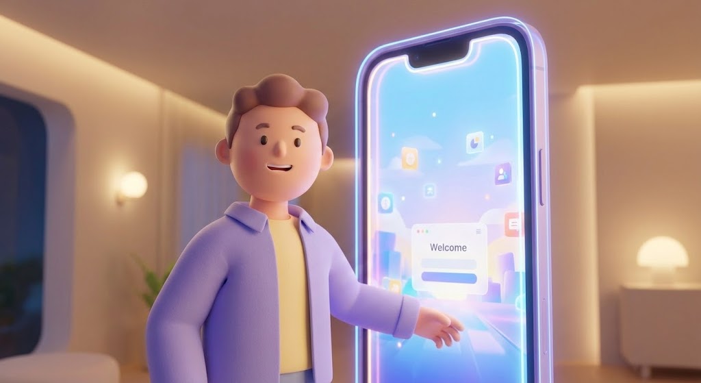
The Visual & Narrative Approach
To combat the "Cold Start" problem of a new software environment, this style introduces a friendly, stylized 3D character. Reminiscent of high-end animation studios, the character (dressed in professional lavender and soft yellow) steps through a glowing digital doorway shaped like a smartphone. The lighting is warm and cinematic. The character gestures welcomingly into a clean, organized digital workspace, effectively acting as a "Digital Concierge" that guides the user through the initial setup.
Psychological Impact & KPI Focus
- Niche Psychology: Leverages Anthropomorphism to build trust. By associating the complex platform with a friendly, non-threatening face, it lowers the anxiety of learning a new tool. It signals that "help is always here."
- Operational Impact: Increases Self-Serve Completion Rates. Users are more likely to finish a tutorial that feels like a narrative journey rather than a compliance checklist.
Strategic Implementation & Trade-offs
- Best Use Case: The first "Welcome" screen inside the platform or the initial onboarding wizard.
- Duration: 45-60 Seconds.
- Trade-off: Tone sensitivity. The character must strike a balance between "friendly" and "competent." If it leans too "cartoonish," it may undermine the enterprise authority of the tool.
Companies using similar video content -
WalkMe – Digital Adoption Platform – Guides users through self-serve onboarding journeys.
Appcues – Product Adoption Platform – Acts as a digital concierge for new feature discovery.
22. Rapid UI Feature Montage
Onboarding | Accelerating TTV
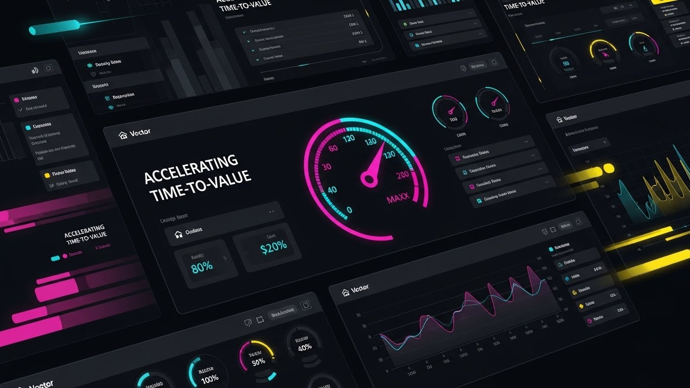
The Visual & Narrative Approach
This style is pure kinetic energy. It features a high-speed montage of UI screens layering over one another, snapping into place with a rhythmic beat. A central speedometer icon, glowing in vibrant magenta and cyan, ramps up into the "Max" zone, creating a focal point of acceleration. Motion blur effects on the edges suggest that the platform is moving forward rapidly. It visually promises that the user will get from "Login" to "Result" in record time.
Psychological Impact & KPI Focus
- Niche Psychology: Triggers the Need for Achievement. The fast pacing and "maxed out" gauges validate the user's desire for efficiency. It creates a sense of momentum that the user wants to join.
- Operational Impact: Accelerates Time-to-Value (TTV). By visually compressing the workflow into a fast montage, it motivates users to dive in and start working immediately.
Strategic Implementation & Trade-offs
- Best Use Case: "Get Started" email sequences, new feature announcements, or re-engagement campaigns.
- Duration: 15-20 Seconds.
- Trade-off: High density. It moves too fast to teach specific mechanics; its role is to generate excitement and awareness, not deep understanding.
Companies using similar video content -
Pendo – Product Analytics – Accelerates time-to-value by showcasing key features rapidly.
New Relic – Observability Platform – Highlights velocity of insights and rapid problem resolution.
23. Macro UI Micro-Interactions
Onboarding | Trial Activation

The Visual & Narrative Approach
Sometimes, the most important moment is a single click. This style uses an extreme macro close-up of a critical UI button (e.g., "User Activation"). The button is rendered in electric lime against a premium dark grey matte surface, highlighting its tactile quality. A stylized finger hovers and then presses it, releasing a satisfying ripple of light. It visualizes the "Moment of Commitment," elevating a simple interaction into a significant business event.
Psychological Impact & KPI Focus
- Niche Psychology: Focuses on Haptic Visuals. Even on a flat screen, the visual suggests a tactile, satisfying response. This creates a craving to perform the action (click the button).
- Operational Impact: Drives Feature Activation. Highlighting the specific "Go" button makes the required action unmistakable and desirable.
Strategic Implementation & Trade-offs
- Best Use Case: Tooltips, feature spotlights, or micro-videos embedded next to key action buttons.
- Duration: 3-5 Seconds (Loopable).
- Trade-off: Extremely narrow focus. It showcases the "what" (the button) but not the "why" (the workflow).
Companies using similar video content -
Yotpo – E-commerce Marketing Platform – Emphasizes the decisive click for user activation.
Narvar – Post-Purchase Platform – Highlights key customer interaction points.
24. 2D Graphics Over Live Action
Retention | Knowledge Base
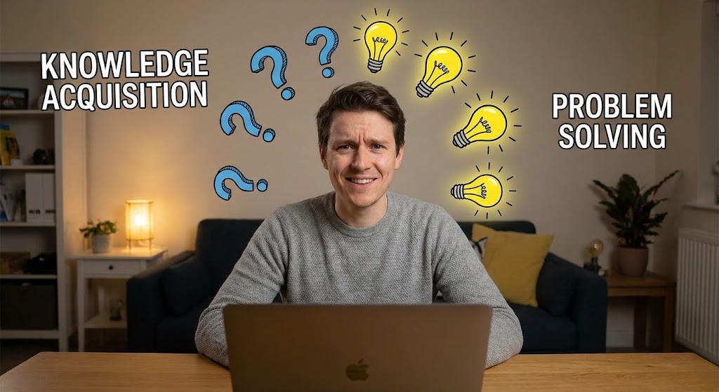
The Visual & Narrative Approach
This style bridges the gap between the user's physical reality and digital solutions. We see a high-quality still or video of a real person in a home office, initially looking confused. As they interact with the software (off-screen), 2D animated question marks pop up and transform into glowing yellow lightbulbs. Text overlays like "KNOWLEDGE ACQUISITION" and "PROBLEM SOLVING" anchor the narrative. It visualizes the "Aha!" moment of finding an answer in the Knowledge Base.
Psychological Impact & KPI Focus
- Niche Psychology: Builds Empathy and Relatability. It validates the user's struggle ("I am confused") and celebrates the resolution ("I found the answer"). It humanizes the support experience.
- Operational Impact: Increases Self-Service Resolution. By showing that answers are easily found, it encourages users to search the Knowledge Base before logging a support ticket.
Strategic Implementation & Trade-offs
- Best Use Case: YouTube "How-To" playlists, Support Portal headers, or FAQ video thumbnails.
- Duration: 30-60 Seconds.
- Trade-off: Production logistics. Requires filming real actors or licensing high-tier stock footage that matches your specific user demographics.
Companies using similar video content -
Zendesk – Customer Service Software – Illuminates answers within knowledge base articles.
Freshdesk – Customer Support Software – Visualizes problem-solving through self-service content.
25. 3D Parallax UI Presentation
Retention | Reducing Support
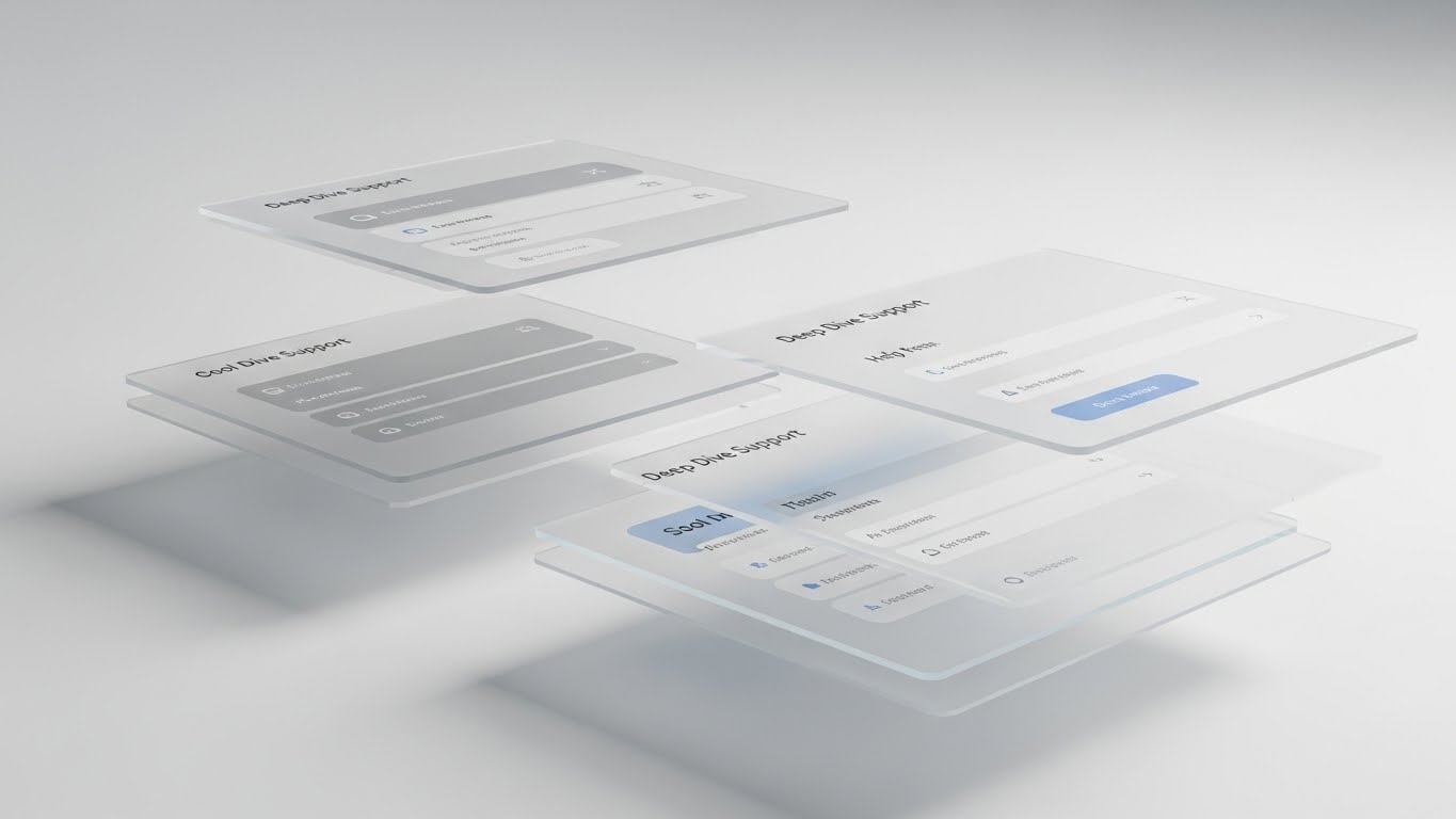
The Visual & Narrative Approach
To explain complex settings without overwhelming the eye, this style deconstructs the UI into 3D space. Menu layers float in a parallax arrangement, separated by depth (Z-axis). The foreground shows the primary action, while background layers show settings and help menus in soft focus cool greys and blues. It visualizes "Depth of Capability," allowing the user to understand the hierarchy of the software and where specific features "live."
Psychological Impact & KPI Focus
- Niche Psychology: Appeals to the Systemizer. Users who need to configure complex backends find comfort in seeing the logical, layered structure of the application.
- Operational Impact: Reduces Configuration Errors. By visualizing the depth and relationship of settings, users make fewer mistakes during complex setups.
Strategic Implementation & Trade-offs
- Best Use Case: Advanced "Deep Dive" tutorials, Admin certification courses, or "What's New" release notes.
- Duration: 20-30 Seconds.
- Trade-off: Abstract. Users must understand that the floating layers represent the flat menus they see on their screen.
Companies using similar video content -
Dynatrace – Software Intelligence Platform – Visualizes layered clarity of complex application settings.
LogicMonitor – Cloud Monitoring – Deconstructs monitoring dashboards for deep dive support.
26. Holographic UI over 3D Render
Retention | Reducing Churn

The Visual & Narrative Approach
Security and stability are the enemies of churn. This style features a photorealistic render of a sleek tablet on a desk in atmospheric lighting. Projecting upwards from the screen is a glowing holographic blue shield icon that encases a network of data nodes. It visualizes "Customer Protection" and "Data Integrity," reassuring the client that their most valuable asset—their customer data—is actively guarded by the platform.
Psychological Impact & KPI Focus
- Niche Psychology: Addresses Loss Aversion. The shield metaphor is a primal signal of safety. It reinforces the value of the subscription as an insurance policy against data loss.
- Operational Impact: Improves Net Dollar Retention (NDR). Reminding clients of the security and stability value they receive reinforces their decision to renew.
Strategic Implementation & Trade-offs
- Best Use Case: Renewal reminder emails, "Security Update" newsletters, or QBR presentations.
- Duration: 10-15 Seconds.
- Trade-off: Premium feel required. Cheap holographic effects look sci-fi; this must look like high-end enterprise tech to be credible.
Companies using similar video content -
Akeneo – Product Information Management – Visualizes data integrity and product content protection.
Salsify – Product Experience Management – Shows a guardian shield for brand and product data.
27. Photorealistic 3D Renders
Expansion | Deep Feature Adoption
The Visual & Narrative Approach
To sell a premium tier, the product must look expensive. This style places a metallic silver, high-tech device on a crisp white infinity curve. The screen displays a complex, multi-colored node graph (representing advanced workflows). Sharp studio lighting creates high-contrast reflections. It visualizes "Enterprise Power," signaling that this specific feature set is the "Pro" version for serious operators.
Psychological Impact & KPI Focus
- Niche Psychology: Leverages Status Signaling. The hardware-like aesthetic suggests that upgrading to this tier is like buying a luxury vehicle—it confers status and capability.
- Operational Impact: Drives Upsell Conversions. The high-fidelity visual justifies a higher price point by making the software feel tangible and substantial.
Strategic Implementation & Trade-offs
- Best Use Case: Landing pages for "Enterprise" or "Pro" tiers, or pitch decks for expansion deals.
- Duration: Static or Slow Pan (10-15 Seconds).
- Trade-off: Hardware metaphor. Since it's SaaS, you must ensure users don't think you are actually selling a tablet device.
Companies using similar video content -
Honeywell Retail – Connected Retail Solutions – Showcases advanced hardware and integrated software.
Toshiba Global Commerce Solutions – POS Systems – Presents premium retail console technology.
28. Hyper-lapse Stock Footage
Expansion | Upsell/Cross-sell

The Visual & Narrative Approach
Growth never sleeps. This style uses hyper-lapse footage of a bustling city at night, with streaks of light from traffic. Overlaying the city are bright, ascending white data lines and arrows moving rapidly upwards. It visualizes "Market Momentum" and "Unstoppable Growth." The kinetic energy aligns the platform with the pulse of the global economy, suggesting that using the tool helps the client keep pace.
Psychological Impact & KPI Focus
- Niche Psychology: Triggers FOMO (Fear Of Missing Out). The fast-moving world suggests that standing still is falling behind. It motivates the buyer to expand their usage to keep up with the market.
- Operational Impact: Increases Cross-Sell Opportunities. It frames additional modules not as "extra costs" but as "accelerators" for growth.
Strategic Implementation & Trade-offs
- Best Use Case: LinkedIn or Instagram ads targeting current customers for expansion modules.
- Duration: 10-15 Seconds.
- Trade-off: Generic if not branded. The data overlays must use brand fonts and colors to claim the generic city footage.
Companies using similar video content -
Mirakl – Marketplace Platform – Visualizes urban velocity and market expansion opportunities.
Algolia – Search & Discovery Platform – Shows rapid growth and market momentum.
29. Aspirational Stock Montage
Expansion | Referrals & Advocacy

The Visual & Narrative Approach
Ultimately, software is bought by people. This style uses a warm, authentic montage of diverse colleagues in a sunlit office, high-fiving and pointing at a large monitor displaying "Referral Success." The vibe is candid and celebratory. It visualizes "Team Advocacy" and the cultural win of using tools that people actually like. It moves the conversation from "functionality" to "morale."
Psychological Impact & KPI Focus
- Niche Psychology: Validates Social Belonging. It suggests that successful, happy teams use this platform. It encourages the champion to share the tool with other departments to spread that success.
- Operational Impact: Drives Net Promoter Score (NPS) & Referrals. Happy humans are the best advocates. Visualizing that happiness encourages users to become promoters.
Strategic Implementation & Trade-offs
- Best Use Case: "Refer a Friend" campaigns, Case Study headers, or Community newsletters.
- Duration: 15-20 Seconds.
- Trade-off: "Cheesy" factor. Requires high-budget stock or custom photography to avoid the "fake corporate smile" look.
Companies using similar video content -
Gainsight – Customer Success Platform – Visualizes team advocacy and collaborative success.
HubSpot – CRM Platform – Depicts winning teams and shared achievements.
30. Dark Mode UI Showcase
Expansion | Proactive Support
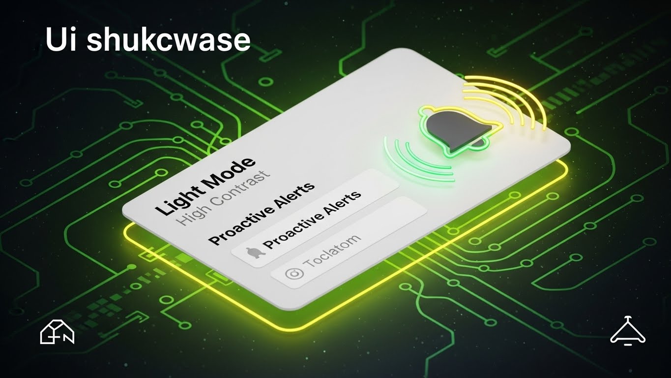
The Visual & Narrative Approach
This style is about absolute clarity in critical moments. We see a minimalist notification card in "Light Mode High Contrast"—white background, bold black text, and a vibrant green glowing outline—set against a contrasting background. A bell icon rings with visible radial waves. It visualizes "Proactive Intelligence," showing that the system is watching out for the user and alerting them before issues arise.
Psychological Impact & KPI Focus
- Niche Psychology: Builds Reliance and Trust. The "Alert" visual signals that the system is an active partner, not a passive tool. It relieves the user of the burden of constant monitoring.
- Operational Impact: Increases Daily Active Users (DAU). Useful, proactive alerts bring users back into the platform repeatedly.
Strategic Implementation & Trade-offs
- Best Use Case: In-app feature announcements, mobile app notification settings, or release notes.
- Duration: 5-8 Seconds (Loopable).
- Trade-off: Utility focused. It’s not "sexy," but it is highly functional and reassuring.
Strategic Knowledge Base: The Visual Operations Doctrine
To conclude this guide, we synthesize the 30 styles into a cohesive Visual Operations Doctrine. This framework transforms "video assets" into "strategic infrastructure," aligned with the lifecycle of the Omnichannel enterprise.
Strategic Alignment & Visual Architecture
The "Visual Operating System" for Unified Commerce
In an Omnichannel environment, your visual strategy cannot be siloed. Just as your backend unifies data, your "Visual Operating System" must unify the experience across all stakeholders—from the C-Suite to the Store Associate.
- The Cognitive Load Audit: Before production, audit your current training materials. If a concept takes 3 paragraphs to explain, it is a candidate for a Style 3 (Abstract Motion) or Style 6 (Low-Poly Map). Reduce cognitive load to accelerate understanding.
- Role-Based Visual Mapping: Differentiate your visuals. Drivers of the business (C-Suite) require Style 13 (Dynamic Data Viz) to see ROI. Operators of the business (Store Managers) require Style 9 (Clean UI) to see workflow efficiency. One size does not fit all.
- The "Glanceability" Standard: In high-stress retail environments, store associates cannot watch long videos. Design "Glanceable" assets (Style 30) that convey meaning in under 5 seconds for POS (Point of Sale) screens.
- Brand Voice Consistency: Ensure that the "friendly character" in your onboarding (Style 21) uses the same color palette as the "serious data" in your QBR deck (Style 13). Visual consistency builds subconscious trust in the platform's stability.
- The Advids Strategic Audit: Partner with Advids to define this architecture before asset creation. We map your user journey to specific visual triggers, ensuring no asset is created without a specific operational purpose.
- Standardization vs. Customization: Use standardized UI styles (Style 18) for core features that rarely change, but invest in bespoke High-End Motion (Style 2) for your unique value propositions (Category Creation).
- The Cross-Departmental Bridge: Use visuals to unify terminology. When Sales shows a "Chaos vs. Order" video (Style 3), Product and Support should use that same visual metaphor in their documentation to reinforce the concept.
- Legacy System Integration: Use "Wireframe to Reality" (Style 18) visuals to show how your modern SaaS layer connects with (rather than replaces) their expensive legacy ERP systems. Respect their past investments visually.
- Accessibility in Design: Omnichannel teams are diverse. Ensure text overlays in your motion graphics (Style 5) are legible and translatable, supporting a global workforce without re-rendering the entire video.
- The Mobile-First Mandate: Your users are often on the floor, not at desks. All 30 styles must be legible on a smartphone screen. Test every asset on mobile (Style 22) to ensure the "Phygital" workforce is supported.
Operational Adoption & Implementation
Driving Usage Through Visual Enablement
The sale is only the beginning. The "Phygital Divide" is bridged when the software is actually used. Visuals are the most potent tool for driving adoption and reducing resistance to change.
- Overcoming "Big Brother" Anxiety: When rolling out staff monitoring or analytics tools, use empathy-driven visuals (Style 15) that focus on empowerment and safety, rather than surveillance, to win over the frontline staff.
- The Micro-Learning Shift: Replace the 50-page PDF manual with a library of 30-second "Micro-Interactions" (Style 23). Staff can watch a 20-second clip on "How to Process a Return" between customers, increasing adoption velocity.
- Just-in-Time Support: Embed specific visual styles directly into the dashboard. A "Confused?" button that triggers a Style 19 (Modular Stacking) animation is far more effective than a link to a text forum.
- Gamification of Training: Use Style 28 (Hyper-lapse/Velocity) visuals in your training modules to create a sense of progress and speed. Distinct visual rewards for completing training modules boost engagement.
- Reducing Support Ticket Volume: There is a direct correlation between proactive visual guides and reduced call center load. Investing in Style 25 (Parallax UI) for complex settings can deflect up to 30% of Tier 1 support tickets.
- Remote Onboarding: For distributed teams, use Style 21 (Character Story) to create a sense of culture and welcome without a physical seminar. Visual warmth substitutes for physical presence.
- Visualizing SOPs (Standard Operating Procedures): Transform text-based SOPs into visual process flows (Style 7). A conveyor belt animation of a workflow is memorable; a bulleted list is forgettable.
- Feedback Loops: Use interactive video elements (Style 24) where users can "click" on the pain point they are facing. This visual data helps your product team understand where users are getting stuck.
- Scalable Localization: Design your motion graphics with "text-free" zones or separate text layers. This allows you to swap languages for global retail chains without re-animating the complex 3D backgrounds.
- Leadership Communication: When regional managers present to headquarters, equip them with Style 16 (Cinematic Success) assets. Make your champion look like a visionary leader by providing them with boardroom-ready visuals.
Measuring Impact & Future-Proofing
The ROI of Visualization & The Road Ahead
Visualization is an investment, not an expense. You must measure its return in terms of efficiency, retention, and growth.
- Beyond "Views": Do not measure video success by "views." Measure it by "Feature Adoption Rate." Did users who watched the Style 9 (Clean UI) video activate the feature? That is the only metric that matters.
- The "Idle Time" Metric: Correlate better visualization with reduced software navigation time. If Style 22 (Rapid Montage) helps a user find a function 10 seconds faster, multiply that by 10,000 users. That is your efficiency ROI.
- Compliance Velocity: How fast can you get the entire organization compliant with new regulations (e.g., GDPR)? Distributing a Style 14 (X-Ray Security) video is faster and more verifiable than sending a memo.
- Retention and Churn: High-quality UX visualization (Style 26) increases perceived value. Clients who "see" the security shield protecting them are less likely to churn to a cheaper, less secure competitor.
- The AI Visual Frontier: Prepare for Generative AI. Soon, your platform will generate Style 13 (Data Viz) videos in real-time for each specific client. Build your visual assets to be modular data containers now.
- Scalability of Assets: Build a library, not a folder. Ensure your Style 6 (Low-Poly) assets can be re-used in Style 12 (Isometric Workflow). Asset reusability lowers your long-term Cost Per Content piece.
- The Advids Partnership: Scale requires partners. Advids serves as your "Visual API," plugging into your marketing and product teams to ensure that as your software evolves, your visual language evolves with it, without lag.
- Benchmarking Success: "Good enough" visuals are a competitive risk. If your competitor uses Style 2 (Abstract 3D AI) and you use screen recordings, you lose the "Innovation" argument before you even speak.
- The ROI of Safety: In the SaaS context, "Safety" is data security. Quantify the value of a breach avoided and use Style 14 (X-Ray) to anchor that immense value in the buyer's mind.
- Final Call to Innovation: Treat video as infrastructure. It is as vital to your platform as the code itself. It is the interface through which human intelligence meets artificial intelligence. Visualize it well, and you do not just sell software—you sell clarity.
Companies using similar video content -
Datadog – Monitoring & Security Platform – Visualizes proactive alerts and critical insights.
New Relic – Observability Platform – Displays clear, high-contrast proactive notifications.
Author & Editor Bio


