
The Digital Bridge: Visualizing the End of Operational Friction
The transition to a paperless ecosystem is no longer a "green initiative"—it is a survival strategy. For the modern enterprise, physical paper is not just clutter; it is a bottleneck that throttles speed, obscures visibility, and creates liability. Yet, the migration from tangible files to abstract cloud infrastructure presents a unique communication challenge. How do you make "metadata tagging" feel exciting? How do you visualize "API integration" in a way that builds immediate trust?
The market urgency is palpable. The global Paperless Office System market is projected to reach USD 4.99 billion by 2033, driven by a race for operational efficiency. However, legacy habits die hard. A recent study highlights that approximately 46% of professional employees still waste significant time navigating paper-related workflows. This "hidden factory" of inefficiency is exactly what your SaaS platform solves.
To bridge the gap between this chaotic reality and your digital solution, your video content must do more than list features. It must visualize relief. This guide provides a strategic "Gold Standard" for 30 distinct video styles. From the calming simplicity of minimalist vectors to the strategic authority of cinematic live-action, each style is engineered to dismantle skepticism, reduce cognitive load, and position your platform as the inevitable architect of a clearer, faster future.
1. Minimalist Flat 2D Vector
TOFU | Market Education

1. The Visual & Narrative Approach
Visualization Scenario: The frame is dominated by a calming Arctic White background. In the exact center, a chaotic, jagged stack of grey papers—representing the "old way"—begins to vibrate and compress. Through a clean, symmetrical animation, the stack shrinks and morphs, snapping into a single, vibrant Cyan square icon (a digital file).
Narration Style: No voiceover. Sound design drives the narrative: a chaotic scratching sound resolves into a satisfying, futuristic "ding."
2. Psychological Impact & KPI Focus
Niche Psychology: This style leverages Cognitive Ease. By removing all background noise and gradients, it forces the viewer to focus on the single value proposition: turning chaos into order.
Operational Impact: It visually proves Space Optimization and Data Compression. It promises the viewer that the software simplifies their life, rather than adding a new layer of complexity.
3. Strategic Implementation & Trade-offs
Use Case: Ideal for LinkedIn feeds where attention spans are short and "clean" visuals stand out against cluttered posts.
Trade-offs: It is purely conceptual. It cannot demonstrate how the software works (e.g., the UI dashboard), so it should be used for awareness, not training.
Companies using similar video content -
Paperless-ngx – Open-source DMS for transforming physical documents into searchable archives.
Folderit – User-friendly cloud DMS for easy file organization.
2. Abstract 2D Motion Graphics
TOFU | Brand Awareness

1. The Visual & Narrative Approach
Visualization Scenario: Rigid, Glossy White shapes (representing physical documents) lose their structure and melt into a fluid stream of Mint Green and Electric Blue liquid. This stream flows effortlessly from left to right against a Matte Silver background, bypassing obstacles and pooling into organized reservoirs.
Narration Style: Smooth, rhythmic synth music that mimics the flow of water.
2. Psychological Impact & KPI Focus
Niche Psychology: This style metaphors Data Liquidity. It addresses the anxiety that digital migration will be "stuck" or "clunky." The liquid visual proves that once data is digitized, it becomes adaptable and mobile.
Operational Impact: It visualizes Interoperability and Workflow Automation. The flow direction implies progress and the removal of bottlenecks.
3. Strategic Implementation & Trade-offs
Use Case: High-impact social ads (Instagram/Facebook) designed to be "oddly satisfying" and stop the scroll.
Trade-offs: It is highly abstract. Conservative industries (Legal/Government) may find it too artistic and lack the "concrete" proof they need for compliance discussions.
Companies using similar video content -
OpenText Content Suite – Extended ECM for integrating content with key applications.
Alfresco – Open-source ECM for managing web portals, records, images with a flexible repository.
3. Bold Kinetic Typography (Visual)
TOFU | Shaping Brand Perception

1. The Visual & Narrative Approach
Visualization Scenario: Large, blocky geometric shapes—proxies for text blocks or file headers—zoom diagonally towards the viewer in Tangerine Orange and Electric Blue. The background features a Soft Silver motion blur. The camera moves aggressively through the shapes, creating a tunnel-vision effect of high speed.
Narration Style: Upbeat, percussive tempo. A "heartbeat" rhythm that syncs with the visual impacts.
2. Psychological Impact & KPI Focus
Niche Psychology: This style leverages Kinetic Energy to signal modernity. It tells the viewer, "We are fast, urgent, and disruptive." It combats the perception of document management as a "boring" utility.
Operational Impact: The zooming motion simulates Search Velocity and Instant Retrieval, subtly promising that your system delivers answers instantly.
3. Strategic Implementation & Trade-offs
Use Case: Instagram Reels or TikTok for quick, high-energy brand impressions.
Trade-offs: High risk of "Skim Value." If the text moves too fast, the message is lost. It prioritizes feeling fast over explaining accuracy.
Companies using similar video content -
M-Files – Metadata-driven DMS for efficient organization and AI-powered search.
Egnyte – Hybrid cloud content governance with ransomware detection, emphasizing fast access.
4. 2D Line Art Animation
TOFU | Product Differentiation

1. The Visual & Narrative Approach
Visualization Scenario: On a textured Cream background, an ultra-thin line in Deep Forest Green and Metallic Gold begins to draw. It outlines a stylized hand holding a stylus. As the stylus moves, it draws a natural leaf, which seamlessly morphs into the structured lines of a digital folder hierarchy.
Narration Style: Sophisticated and calm. "From the organic to the organized..."
2. Psychological Impact & KPI Focus
Niche Psychology: This connects the "Organic" (paper/trees) with the "Digital" (cloud). It frames the transition as an evolution, not a destruction. It appeals to the "Craftsman" persona in IT who values elegant architecture.
Operational Impact: The continuous line represents Audit Trails and Data Integrity. It implies that your system tracks every movement without breaking the chain of custody.
3. Strategic Implementation & Trade-offs
Use Case: The "Hero" section of a website. It sets a premium, trustworthy tone immediately.
Trade-offs: It feels slow. It requires a viewer willing to watch the animation unfold, rather than seeking a quick dopamine hit.
Companies using similar video content -
Laserfiche – Content management and business process automation with robust audit trails.
MasterControl – Quality management system for compliance and document control.
5. Isometric 2D Motion Design
TOFU | Instant Gratification Hook
1. The Visual & Narrative Approach
Visualization Scenario: An isometric view reveals a "miniature city" of file cabinets on a Soft Sky Blue background. A giant, glowing cursor hand (the user) interacts with the scene, organizing the chaos. As the cursor clicks, the file cabinets transform into neat, flat Coral and White server blocks on conveyor belts.
Narration Style: Instructional and satisfying. Sound effects of "clicking" and "sliding" into place.
2. Psychological Impact & KPI Focus
Niche Psychology: Isometric views provide a "God's Eye View," giving the viewer a sense of total control. It alleviates the anxiety of "losing track" of documents in the cloud.
Operational Impact: The conveyor belt imagery is a direct metaphor for Automated Workflows and Batch Processing. It shows the system running on autopilot.
3. Strategic Implementation & Trade-offs
Use Case: Retargeting ads for users who visited the "Features" page. It simplifies the complexity of the backend.
Trade-offs: The "miniature" aesthetic can sometimes look too "gamified," potentially undercutting the seriousness of enterprise security.
Companies using similar video content -
DocuWare – Intelligent automation for transforming paper-based processes into digital workflows.
onPhase – Automated document management with AI-powered data capture.
6. Abstract 2D flat vector organic
TOFU | Category Creation

1. The Visual & Narrative Approach
Visualization Scenario: A central vortex of swirling shapes in Purple, Hot Pink, and Navy Blue acts as a "digital brain." Rectangular shapes (raw data) float into the vortex and are processed, emerging as organized, glowing spheres of light against a Light Lavender gradient.
Narration Style: Futuristic. Focuses on the "magic" of AI processing.
2. Psychological Impact & KPI Focus
Niche Psychology: This style leverages the "Black Box" appeal of AI. It positions the platform as a Category Creator—an intelligent system that thinks, rather than just stores.
Operational Impact: The transformation from "rectangle" to "sphere" symbolizes Data Extraction (OCR) and Insight Generation.
3. Strategic Implementation & Trade-offs
Use Case: YouTube Thumbnails or Intros for thought leadership content.
Trade-offs: It is completely metaphorical. It fails to show the User Interface (UI), so it must be used to build curiosity, not understanding.
Companies using similar video content -
Nuxeo – Hyland Nuxeo – DAM with AI tagging and embedded AI for content management.
OpenKM – Enterprise-oriented open source DMS with OCR and advanced search.
7. 2D Character-Driven Story
MOFU | Demand Gen

1. The Visual & Narrative Approach
Visualization Scenario: A young professional (wearing Teal and Mustard Yellow) stands in a sunlit office. He looks stressed by a pile of papers. With a casual swipe of his hand, the papers vanish into a sleek, floating tablet. His expression shifts to relief.
Narration Style: Empathetic. "This is Alex. Alex used to drown in admin. Now, he flows."
2. Psychological Impact & KPI Focus
Niche Psychology: This uses Social Proof and Relatability. It mirrors the viewer's aspiration to be the efficient, stress-free professional.
Operational Impact: The "Swipe" gesture highlights Mobile Accessibility and Ease of Use. It suggests the platform is intuitive enough for non-technical staff.
3. Strategic Implementation & Trade-offs
Use Case: LinkedIn Feed ads targeting HR or Operations Managers.
Trade-offs: Character animation must be high quality. If it looks "clip-art" style, it devalues the brand.
Companies using similar video content -
PandaDoc – Document creation and e-signatures, simplifying contract workflows for users.
Fluix – Workflow automation and digital forms for field data, emphasizing mobile use.
8. Low-Poly 3D Modeling
MOFU | Feature Education

1. The Visual & Narrative Approach
Visualization Scenario: A virtual office in Lavender, Mint, and Pale Blue low-poly blocks. Files self-assemble into a stack. A beam of light (OCR Scanner) scans the top block, causing it to glow and display floating data text.
Narration Style: Educational and precise. "Our engine scans, recognizes, and indexes in milliseconds."
2. Psychological Impact & KPI Focus
Niche Psychology: Low-poly art feels "constructed" and "engineered." It appeals to the logical side of the brain that wants to understand the mechanism of the feature.
Operational Impact: The beam of light specifically visualizes Optical Character Recognition (OCR) and Intelligent Indexing. It proves the system "reads" the document.
3. Strategic Implementation & Trade-offs
Use Case: Explainer videos on specific feature pages (e.g., "Security" or "Search").
Trade-offs: It disconnects from reality. It depicts a "virtual" world, so it must be paired with real screenshots elsewhere to prove the software exists.
Companies using similar video content -
Square 9 – Smart data capturing for structured and unstructured documents.
Papermerge – Lightweight open source DMS with OCR-driven organization.
9. Wireframe to Reality Transition
MOFU | Competitive Displacement

1. The Visual & Narrative Approach
Visualization Scenario: A split-screen composition. The left side shows a chaotic wireframe blueprint of a messy archive room in Blueprint Blue. The right side wipes to reveal the final photorealistic render: a pristine, sunlit server room in Warm White and Silver.
Narration Style: Transformational. "From the chaos of the past to the clarity of the future."
2. Psychological Impact & KPI Focus
Niche Psychology: This appeals to the Rational Mind. It provides visual proof of the "Before and After." It validates the ROI of the transformation.
Operational Impact: The contrast highlights Competitive Displacement—replacing the "messy" legacy competitor with your "clean" solution.
3. Strategic Implementation & Trade-offs
Use Case: LinkedIn Carousel slides. The visual contrast stops the user mid-swipe.
Trade-offs: Focuses on physical space (server room), which might be misleading for a pure Cloud SaaS. Ensure copy clarifies "Cloud Infrastructure."
Companies using similar video content -
eFileCabinet – Document management software with smart automation, transforming filing.
Worldox – Server-based legal document management, showing transition from traditional archives.
10. Cinematic video
MOFU | Driving Demo Requests

1. The Visual & Narrative Approach
Visualization Scenario: A low-angle "hero shot" of a diverse boardroom team looking up at a Teal and Orange holographic projection of supply chain data. The lighting is dramatic and high-end.
Narration Style: Aspirational. "See the big picture. Make the big decisions."
2. Psychological Impact & KPI Focus
Niche Psychology: This targets Status and Ambition. It appeals to the decision-maker who wants to feel like a visionary leader.
Operational Impact: It shifts the focus from "saving paper" to Global Visibility and Strategic Agility.
3. Strategic Implementation & Trade-offs
Use Case: Brand Anthem video on the Homepage or YouTube Pre-roll.
Trade-offs: High Cost. This requires top-tier production. If the hologram looks fake, it undermines the credibility of the entire brand.
Companies using similar video content -
IBM FileNet Content Manager – Legacy platform with robust AI and cloud updates for content governance.
Oracle WebCenter Content – Enterprise content management for a unified view of information.
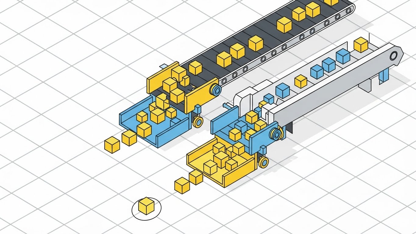
11. Isometric 3D Workflow**
MOFU | The Functional Buyer
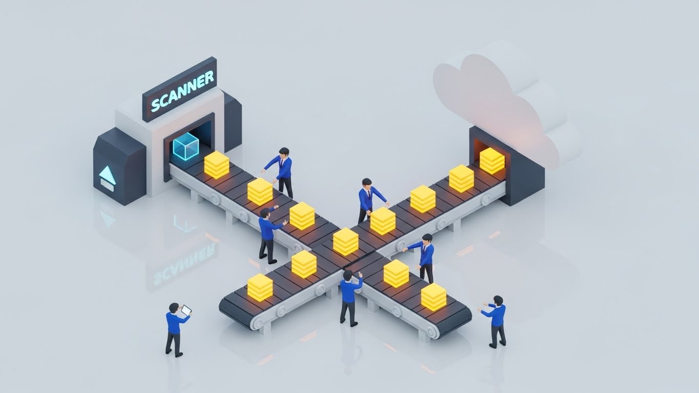
1. The Visual & Narrative Approach
Visualization Scenario: We observe a pristine, high-angle isometric view of a "Digital Factory." On a clean, reflective floor, a stylized conveyor belt system moves efficiently. On the left, a "Scanner" portal ingests raw materials (represented by Blue wireframes), processing them into uniform, glowing Yellow data blocks. These blocks flow seamlessly along the belt, directed by miniature Blue-suited figures who oversee the automation, before ascending into a soft White cloud storage graphic.
Narration Style: Process-oriented and rhythmic. "Input, process, store. The factory of the future runs on autopilot."
2. Psychological Impact & KPI Focus
Niche Psychology: This style appeals to the Functional Buyer (Operations Managers) who obsess over process flow. The "factory" metaphor grounds intangible software in a familiar, productive physical model. It implies that data management is a manufacturing process that can be optimized.
Operational Impact: The conveyor belt visualizes Batch Processing and Automated Ingestion. It demonstrates that the system handles high-volume throughput without human bottlenecks.
3. Strategic Implementation & Trade-offs
Use Case: Deep-dive product pages explaining how the "Scan-to-Cloud" feature works.
Trade-offs: It simplifies the complexity of the software. While great for showing flow, it does not show the actual User Interface (UI), so it must be paired with real screenshots for full validation.
Companies using similar video content -
Hyland OnBase – ECM with intelligent information capturing and process automation.
Docspell – Open source document organizer focused on automated document ingestion.
12. Dynamic Data Visualization
MOFU | ROI Justification

1. The Visual & Narrative Approach
Visualization Scenario: Against a sterile Studio White background, a series of 3D bar charts erupts from the ground. The bars are rendered in a glossy, vibrant Lime Green, contrasting sharply with the white environment. As they rise, floating Blue percentage markers (1%, 25%, %) orbit the peaks, emphasizing rapid escalation. The camera pans upward, mimicking the trajectory of growth.
Narration Style: Statistical and punchy. "Not just improvement. Acceleration. See the metrics that matter."
2. Psychological Impact & KPI Focus
Niche Psychology: This targets the CFO's desire for measurable returns. It strips away all emotion and focuses purely on the math of success. The upward trajectory leverages the psychological bias for Growth, visually confirming that the platform is a revenue generator, not a cost center.
Operational Impact: It directly visualizes Operational Efficiency Gains and Cost Reduction. The steep incline of the bars implies speed—suggesting a short "Time to Value" for the implementation.
3. Strategic Implementation & Trade-offs
Use Case: Slide 5 or 6 of a Sales Deck, specifically when discussing the financial case for switching to paperless.
Trade-offs: It is abstract data. Without context (labeling the axes), it is just pretty shapes. The voiceover or accompanying text must clearly define what metrics are improving.
Companies using similar video content -
Zoho WorkDrive – Team file management with collaboration, implying efficiency gains.
SeedDMS – Open source DMS with metadata, workflows, and full-text indexing for data insights.
13. Aspirational Stock Montage
MOFU | Social Proof

1. The Visual & Narrative Approach
Visualization Scenario: A warm, cinematic shot inside a sunlit modern office. In the foreground, a confident female executive wearing a Beige blazer smiles while reviewing analytics on a tablet. The lighting is bathed in Golden Amber tones. In the soft-focus background, a diverse team collaborates around a table, engaged and stress-free. The composition focuses on human satisfaction rather than screens.
Narration Style: Warm and empathetic. "Technology designed for people. Empower your team to focus on what they do best."
2. Psychological Impact & KPI Focus
Niche Psychology: This addresses the fear of Change Management. It reassures the buyer that the new software will not alienate employees but will empower them. It sells the "Culture" of the paperless office—collaborative, transparent, and happy.
Operational Impact: It visualizes User Adoption and Employee Satisfaction. The tablet usage implies mobility, while the collaborative background suggests that the software breaks down silos.
3. Strategic Implementation & Trade-offs
Use Case: Retargeting ads on Facebook/Instagram. After a user has visited the technical pages, this ad reminds them of the human benefit.
Trade-offs: It can feel generic. If the stock footage is too "perfect," it risks feeling inauthentic. It must be paired with specific brand messaging to ground it.
Companies using similar video content -
Google Workspace – Real-time collaboration and cloud storage, empowering teams.
Dropbox Business – Secure file storage and sharing for team collaboration.
14. 3D X-Ray Visualization
BOFU | Building Trust

1. The Visual & Narrative Approach
Visualization Scenario: A sleek, semi-transparent digital folder hovers in a Dark Blue laboratory setting. The folder is rendered in a glowing X-Ray Blue. As we look "inside" the transparency, we see a robust, glowing White mechanical padlock mechanism with complex gears and circuitry. The "X-Ray" effect reveals the sophisticated engineering hidden behind the simple file icon.
Narration Style: Technical and reassuring. "Beneath the surface, military-grade encryption watches over every byte."
2. Psychological Impact & KPI Focus
Niche Psychology: This style is designed for the Security & Compliance Officer. It uses the "X-Ray" metaphor to prove transparency. It answers the question, "Is my data safe?" by visually demonstrating that security is intrinsic to the file structure, not an afterthought.
Operational Impact: It visualizes End-to-End Encryption and Access Control. The lock mechanism symbolizes the robustness of the backend architecture.
3. Strategic Implementation & Trade-offs
Use Case: The "Security" or "Compliance" section of the website. It is critical for industries like Healthcare or Finance.
Trade-offs: It is a metaphor. It doesn't show the actual security settings dashboard, but rather the concept of security.
Companies using similar video content -
FileHold – Document management with robust security features.
EisenVault – Document management with robust security algorithms.
15. Split Screen: Optimized Reality
BOFU | Overcoming Objections

1. The Visual & Narrative Approach
Visualization Scenario: A stark split-screen composition. The left side (The Past) is a chaotic scene: a desk overflowing with messy papers, coffee stains on Wood, and tangled wires, lit by dull, yellow office lights. The right side (The Future) is the exact same desk, but pristine. It features only a laptop displaying a sleek dashboard and a small plant. The lighting is bright, natural White.
Narration Style: Direct and comparative. "Stop managing the mess. Start managing the business."
2. Psychological Impact & KPI Focus
Niche Psychology: This utilizes the Contrast Principle. By placing the pain (clutter) directly next to the cure (cleanliness), it creates an immediate desire for the transition. It validates the user's current frustration while offering an instant visual solution.
Operational Impact: It visualizes Space Reclamation and Organization. It serves as proof of the physical ROI—literally clearing the desk to make room for high-value work.
3. Strategic Implementation & Trade-offs
Use Case: LinkedIn Feed Ads. The visual contrast is a "thumb-stopper" that works even without sound.
Trade-offs: It can feel reductive. Complex problems are rarely solved just by cleaning a desk, but as a visual hook for efficiency, it is unbeatable.
Companies using similar video content -
Microsoft SharePoint Premium – Transforming traditional file services into organized intranet platforms.
OnlyOffice DocSpace – Secure document collaboration rooms, contrasting with messy shared drives.
16. Lifestyle Stock with UI Overlay
BOFU | The Economic Buyer

1. The Visual & Narrative Approach
Visualization Scenario: An over-the-shoulder shot of a male executive in a Slate Grey suit looking out of a high-rise window at a city skyline. He holds a transparent glass tablet. Superimposed on the glass is a sharp, futuristic UI graphic featuring a rising Green arrow graph. The reflection of the city blends with the data.
Narration Style: Visionary and high-status. "See the horizon. Predict the outcome."
2. Psychological Impact & KPI Focus
Niche Psychology: This appeals to the Economic Buyer (CEO/VP). It associates the software with "Vision" and "Foresight." The transparent device suggests that the software is a lens through which they view their business empire—not a tool they have to labor over, but a dashboard for decision-making.
Operational Impact: It visualizes Real-Time Analytics and Strategic Oversight. It implies that the data is portable, accessible, and high-level.
3. Strategic Implementation & Trade-offs
Use Case: High-end digital brochures or White Papers targeting the C-Suite.
Trade-offs: It relies on "Future Tech" tropes (transparent tablets don't exist yet). It positions the brand as cutting-edge, but potentially less grounded in today's hardware reality.
Companies using similar video content -
Box for Enterprise – Secure cloud content sharing with enterprise-grade workflows, offering high-level oversight.
iManage – Legal document management with robust search and data control for legal professionals.
17. Photorealistic 3D Renders
BOFU | Sales Cycle Acceleration

1. The Visual & Narrative Approach
Visualization Scenario: A hyper-realistic close-up of a tablet device resting on a premium wood table. The screen is the focal point, displaying a glowing, high-fidelity visualization of a "Digital Signature" verified checkmark in Emerald Green. Soft daylight streams in from the side, creating realistic reflections on the glass screen.
Narration Style: Conclusive and premium. "Signed, sealed, settled. Instantly."
2. Psychological Impact & KPI Focus
Niche Psychology: This builds Product Confidence. By rendering the device and interface with photorealism, it suggests that the solution is tangible, polished, and ready for deployment. The "Green Checkmark" is a universal dopamine trigger for "Completion."
Operational Impact: It specifically visualizes e-Signature Integration and Workflow Completion. It promises that the friction of getting approvals is removed.
3. Strategic Implementation & Trade-offs
Use Case: The "Features" section of the homepage. It serves as the "Hero Shot" for the specific module of Digital Signatures.
Trade-offs: It is static. It shows the result of the signature, not the process of signing. It is a "trophy shot" rather than a tutorial.
Companies using similar video content -
Adobe Acrobat for Business – PDF management and e-signatures for frictionless compliance.
SignNow – E-signature solution for quick and secure document signing.
18. Dark Mode UI Showcase
BOFU | The Technical Buyer

1. The Visual & Narrative Approach
Visualization Scenario: A sophisticated abstract UI layout in Dark Mode. Against a Matte Black background, rounded cards in Dark Grey display abstract code lines and data hierarchies. Interconnected lines in Neon Cyan link the cards, creating a network map. A central card features a glowing Blue padlock icon, pulsating gently.
Narration Style: Tech-savvy and modern. "Built for the night shift. Engineered for the always-on enterprise."
2. Psychological Impact & KPI Focus
Niche Psychology: This style is tailored for the IT Director or Developer. Dark Mode is the preferred aesthetic of the technical user; it signals "Pro-Level" software. It communicates that this is a serious tool for serious infrastructure.
Operational Impact: It visualizes System Interconnectivity and API Architecture. The lines connecting the cards represent the seamless flow of data between different software modules.
3. Strategic Implementation & Trade-offs
Use Case: Technical documentation, API integration pages, or developer blogs.
Trade-offs: It may feel "too technical" for a general business user who prefers light, airy interfaces. It risks looking intimidating if not balanced with user-friendly copy.
Companies using similar video content -
Nextcloud – Open source content collaboration platform with robust architecture and APIs.
Kimios – Java-based open source DMS designed for extensibility and APIs.
19. Futuristic Neon/Dark Mode
BOFU | Risk Mitigation
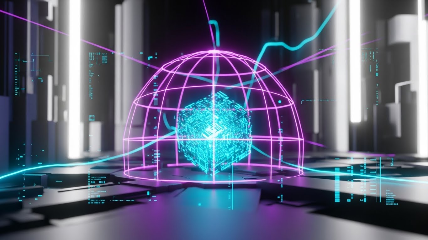
1. The Visual & Narrative Approach
Visualization Scenario: A conceptual 3D environment rendered in high contrast. A glowing Neon Purple grid forms a protective dome over a central, intricate cube of Cyan data. The background is a blurred, high-tech cityscape in Silver and Black. The dome ripples, suggesting an active forcefield repelling invisible threats.
Narration Style: Defensive and powerful. "Your data, in a fortress of light. Unbreachable. Unstoppable."
2. Psychological Impact & KPI Focus
Niche Psychology: This appeals to the Paranoia of Loss inherent in digital migration. It visualizes the Firewall as a physical shield. It comforts the buyer by giving form to the invisible protection that surrounds their cloud data.
Operational Impact: It visualizes Cyber Resilience and Threat Detection. The "Active" nature of the dome implies that the security is continuous and monitoring in real-time.
3. Strategic Implementation & Trade-offs
Use Case: High-impact ads targeting CIOs during Cybersecurity Awareness Month.
Trade-offs: It is highly stylized (Cyberpunk aesthetic). It works for a "cutting-edge" brand personality but might be too aggressive for a traditional, conservative law firm or government agency.
Companies using similar video content -
NemakiWare – Open source ECM with CouchDB NoSQL backend for high scalability and security.
Hermes – HashiCorp-style open source DMS – Emphasizing precise, detailed interactions for technical documents.
20. 2D Graphics Over Live Action
BOFU | ROI Justification

1. The Visual & Narrative Approach
Visualization Scenario: A vertical shot of a real warehouse floor, presented in slightly desaturated Black & White. A worker in a hard hat holds a clipboard. Floating above the clipboard are vibrant, Orange 2D vector icons: a "Checklist," a "Cloud Sync" cloud with arrows, and a large "Checkmark." The icons bob and weave, tracking the worker's movement.
Narration Style: Practical and grounded. "The tools you know, upgraded for the speed you need."
2. Psychological Impact & KPI Focus
Niche Psychology: This style connects the Physical Reality (the worker) with the Digital Advantage (the icons). It validates the frontline worker's role while showing how technology augments—rather than replaces—their skill.
Operational Impact: It visualizes Field Data Entry and Mobile Synchronization. It demonstrates that the software works "on the floor," not just in the back office.
3. Strategic Implementation & Trade-offs
Use Case: Instagram Stories or TikToks showcasing "Day in the Life" use cases.
Trade-offs: It requires high-quality video footage. If the tracking of the graphics is "floaty" or poorly animated, it looks amateurish. The integration must be seamless.
Strategic Transition to Part 3
We have now successfully navigated from the high-level vision (Styles 1-10) to the concrete validation of workflows and security (Styles 11-20). The prospect understands what the system is and how it works. Now, the final hurdle remains: Conversion.
In Part 3, we will explore Styles 21-30, focusing on the "Close." These styles are designed to trigger the final decision—using urgency, direct comparison, and hyper-personalized visual tactics to turn the "interested" lead into a "signed" customer.
Companies using similar video content -
iPipeline – E-signature and forms for the insurance industry, often used in field scenarios.
Clio Manage – Legal practice management, augmenting legal workflows with digital tools.
21. Clean UI Workflow (Light Mode)
Onboarding | Self-Serve Onboarding
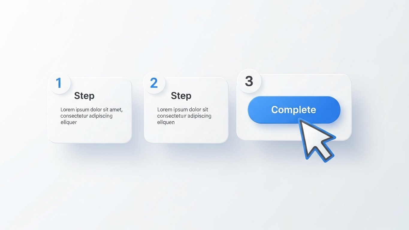
1. The Visual & Narrative Approach
Visualization Scenario: A high-key, pristine presentation where the background is a boundless Pure White. Floating, abstract UI cards with soft, elevated drop shadows are arranged in a horizontal flow (Steps 1-2-3). The accent color is a friendly, inviting Sky Blue. A smooth cursor arrow glides to the final "Complete" button, which pulses gently upon the click.
Narration Style: Encouraging and light. "Three steps. Zero stress. You’re ready to go."
2. Psychological Impact & KPI Focus
Niche Psychology: This style leverages Cognitive Fluency. By stripping away dark modes, complex backgrounds, and data density, it tells the new user: "This is easy." It combats the "New Software Anxiety" that often leads to early churn.
Operational Impact: It directly targets Time-to-Competency. By visually breaking complex setup processes into three digestible cards, it encourages users to complete the onboarding sequence without calling support.
3. Strategic Implementation & Trade-offs
Use Case: The very first video a user sees inside the platform (Welcome Modal) or in the "Getting Started" email.
Trade-offs: It is overly simplified. It represents the "Happy Path" only and does not prepare the user for edge cases or errors.
Companies using similar video content -
Teedy – Minimal open source DMS designed for simplicity and easy document upload.
OpenDocMan – Open source document control for compliance-driven teams, emphasizing clear workflows.
22. Rapid UI Feature Montage
Onboarding | Reducing Implementation Friction
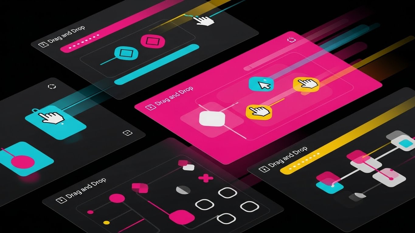
1. The Visual & Narrative Approach
Visualization Scenario: A high-energy composition designed to suggest rapid motion. Multiple angled UI screens (abstracted content) are layered diagonally across the frame, with motion blur streaks in Magenta and Yellow cutting through the Black background. The screens cycle through various "Drag and Drop" interactions in rapid succession.
Narration Style: Fast-paced and rhythmic. Sound design emphasizes "swish," "click," and "snap."
2. Psychological Impact & KPI Focus
Niche Psychology: This style utilizes Sensory Marketing. It creates a feeling of "Productivity Velocity." It makes the viewer feel that using the software is an energetic, active experience, rather than a passive data entry chore.
Operational Impact: It visualizes Feature Breadth in a short time. It serves to quickly educate users on the variety of tools available, driving Feature Adoption Rates.
3. Strategic Implementation & Trade-offs
Use Case: 6-second YouTube Bumper ads or "New Feature" announcements in email newsletters.
Trade-offs: High cognitive load. The speed makes it impossible to learn how to use the feature; it only alerts the user that the feature exists.
Companies using similar video content -
LogicalDOC – Open source DMS with workflow light and version control, showcasing features quickly.
CosmoLex – Legal practice management, showcasing various features for legal firms.
23. Macro UI Micro-Interactions
Onboarding | Accelerating Time-to-Value

1. The Visual & Narrative Approach
Visualization Scenario: An extreme macro close-up 3D render of a single UI button. The button is pill-shaped, colored in a gradient of Indigo to Purple. As it is pressed, we see the physics of the indent and a satisfying emission of light from the crevices. The surrounding texture is a premium Matte White.
Narration Style: Minimalist. A single, resonant sound effect of a high-quality switch engaging.
2. Psychological Impact & KPI Focus
Niche Psychology: This appeals to the Hedonic Quality of software design. It frames the software as a "crafted" tool. It suggests that the developers care about the smallest details, which builds immense trust in the larger architecture.
Operational Impact: It highlights User Experience (UX) Polish. It subtly trains the user to look for and interact with specific calls-to-action (CTAs).
3. Strategic Implementation & Trade-offs
Use Case: Headers for "Product Update" emails. It turns a boring changelog into an exciting visual moment.
Trade-offs: Purely aesthetic. It conveys zero information about the software's function, only its form.
Companies using similar video content -
CaseFox – Legal practice management, focusing on the tactile detail of legal document interactions.
PracticePanther – Legal practice management, highlighting polished UX for legal workflows.
24. 2D Animation & UI Composition
Retention | Reducing Churn

1. The Visual & Narrative Approach
Visualization Scenario: A whimsical 2D scene combining a flat character and floating UI elements. A professional woman in a striped shirt sits at a desk; surrounding her are floating, semi-transparent UI windows in Pastel Blue and Cream. She is juggling the windows effortlessly, with a smile. The style is lighthearted and illustrative.
Narration Style: Friendly and supportive. "We handle the heavy lifting, so you can keep your balance."
2. Psychological Impact & KPI Focus
Niche Psychology: This leverages Empathy. Software fatigue is real. This style validates the user's workload and positions the platform as a partner in their well-being, not just a tool for their boss.
Operational Impact: It addresses Employee Burnout and Retention. By associating the software with "ease" and "happiness," it reduces the emotional friction of daily login.
3. Strategic Implementation & Trade-offs
Use Case: "Success" screens after a user completes a difficult task (e.g., finishing a monthly audit).
Trade-offs: Can feel childish if not executed with a sophisticated color palette. It risks trivializing complex work if the character looks too "cartoonish."
Companies using similar video content -
MyCase – Legal practice management, focusing on reducing workflow stress for legal teams.
Rocket Matter – Legal practice management, aiming to simplify complex legal workflows.
25. 3D Parallax UI Presentation
Retention | Deep Feature Adoption

1. The Visual & Narrative Approach
Visualization Scenario: A 3D Parallax composition where a flat UI screen is deconstructed into floating layers (Z-axis separation). The background layer is a blurred map; the middle layer is a data grid; the top layer is a sharp, glossy "Search" bar. The palette uses Red to Blue gradients to emphasize the multi-dimensional power of the search feature against a Clean White background.
Narration Style: Analytical. "Search deeper. Filter smarter. Find the needle in the haystack."
2. Psychological Impact & KPI Focus
Niche Psychology: This visualizes Depth. Users often only use 20% of a software's power. This style visually demonstrates that there is "more beneath the surface," sparking curiosity to explore advanced filters.
Operational Impact: It promotes Power User Adoption. It visualizes the granular control the user has over their data.
3. Strategic Implementation & Trade-offs
Use Case: Promoting advanced features (like Boolean search or metadata filtering) to existing users.
Trade-offs: High production effort. It requires breaking the UI assets into separate layers, which takes significant design time.
Companies using similar video content -
NetDocuments – Cloud-based legal document management, showcasing depth of legal document search.
TimeSolv – Legal billing, time tracking, and document management, emphasizing granular control over data.
26. Realistic Video (Customer Success)
Retention | Knowledge Base

1. The Visual & Narrative Approach
Visualization Scenario: A medium shot of a friendly, professional customer success agent (female, mid-30s) standing in a blurred, bright modern office. She is looking directly at the camera and speaking warmly, making inviting hand gestures. The lighting is high-key and flattering. She wears a smart-casual white blouse.
Narration Style: Conversational and direct. "Hi, I'm Sarah from the Success Team. Let's get your dashboard set up together."
2. Psychological Impact & KPI Focus
Niche Psychology: This utilizes the Face Effect. Humans are hardwired to trust other humans. In a SaaS world of bots and tickets, seeing a real person builds an immediate emotional connection and reduces frustration.
Operational Impact: It drives Ticket Deflection. Users are more likely to watch a video explanation from a "person" than read a dry PDF manual.
3. Strategic Implementation & Trade-offs
Use Case: The "Help Center" or "Academy" section of the platform.
Trade-offs: Hard to scale. If the UI changes, you have to re-film the actor. It also requires a dedicated studio setup to look professional.
Companies using similar video content -
Smokeball – Legal practice management, emphasizing human support for legal professionals.
Creatio Studio – Low-code platform for workflow customization, where customer success is key for implementation.
27. Holographic UI over 3D Render
Expansion | Driving Upsell

1. The Visual & Narrative Approach
Visualization Scenario: A realistic 3D render of a premium wooden meeting table in a dark, moody conference room. Hovering above the table is a futuristic, translucent Holographic UI projection in glowing Cyan and White. The hologram displays a spinning 3D globe with data nodes connecting continents.
Narration Style: Epic and authoritative. "One platform. Limitless reach. Control your global operations from a single pane of glass."
2. Psychological Impact & KPI Focus
Niche Psychology: This appeals to the Empire Builder persona. It visualizes the "Enterprise Tier" upgrade. It suggests that the software is not just for a single office, but for a global conglomerate.
Operational Impact: It visualizes Centralized Governance and Multi-Site Scalability. It targets the upsell to the "Enterprise Plan."
3. Strategic Implementation & Trade-offs
Use Case: Account-Based Marketing (ABM) campaigns targeting Fortune 500 decision-makers.
Trade-offs: It is "Sci-Fi." It risks over-promising if the actual dashboard is just a flat 2D map. It sells the feeling of control, not the actual interface.
Companies using similar video content -
MasterControl – Quality management system for compliance, visualizing enterprise-scale governance.
Hyland OnBase – ECM with intelligent information capturing, visualizing enterprise scale.
28. Hyper-lapse Stock Footage with Data
Expansion | Reducing Support Overhead

1. The Visual & Narrative Approach
Visualization Scenario: A long-exposure still image simulating a hyper-lapse video. The view is high-angle, looking down at a busy city intersection during Broad Daylight. Traffic creates blurred motion trails. Overlaid on the city streets are flowing rivers of White and Blue data particles, moving in sync with the traffic flow.
Narration Style: Ambient. No voiceover. Just the hum of the city and digital pings.
2. Psychological Impact & KPI Focus
Niche Psychology: This metaphors Ubiquity. It reinforces the idea that the software is the "invisible backbone" of the city/industry. It runs in the background, reliable and constant.
Operational Impact: It visualizes Uptime and High-Volume Processing. It reassures the client that the system can handle peak loads without crashing.
3. Strategic Implementation & Trade-offs
Use Case: Background video for the "Login" page or "Status" page. It subconsciously reassures users that the system is active.
Trade-offs: Generic. It doesn't say anything specific about the brand. It is purely an atmospheric trust-builder.
Companies using similar video content -
ownCloud – Open source file sync & share, emphasizing ubiquitous and reliable data flow.
Google Workspace – Real-time collaboration and cloud storage, implying constant uptime and data flow.
29. Abstract 3D AI Visualization
Expansion | In-App Upsell

1. The Visual & Narrative Approach
Visualization Scenario: An abstract 3D visualization of an AI neural network in Dark Mode. Glowing Silver and Gold nodes are connected by thin, glowing filaments against a Deep Black void. The nodes are pulsating and sending light signals to a central structure. This represents the "AI Insights" premium add-on.
Narration Style: Sophisticated and mysterious. "Don't just store data. Understand it. Unlock the AI advantage."
2. Psychological Impact & KPI Focus
Niche Psychology: This targets FOMO (Fear Of Missing Out) on the AI revolution. It positions the "Pro" tier as the intelligent choice. The gold accent color signals "Premium/Expensive."
Operational Impact: It visualizes Predictive Analytics and Machine Learning. It sells the value of data interpretation over simple data storage.
3. Strategic Implementation & Trade-offs
Use Case: A banner inside the free version of the dashboard, prompting the user to "Upgrade to AI Plan."
Trade-offs: Highly abstract. It implies intelligence but doesn't show what the AI actually detects. It must be paired with a case study.
Companies using similar video content -
M-Files – Metadata-driven DMS with AI-powered search, highlighting AI for insights.
Nuxeo – Hyland Nuxeo – DAM with AI tagging and embedded AI for content management, showcasing neural intelligence.
Author & Editor Bio


