
Introduction: The $8.4 Billion Clarity Gap
The global payroll software market is a juggernaut, reaching $8.4 billion in 2024 as enterprises race to modernize their most critical operational function. Yet, for the modern buyer, this rapid expansion brings a paradox: as software becomes more powerful, it often becomes more opaque. The "Black Box" of compliance—where invisible algorithms handle millions in funds across hundreds of jurisdictions—is a source of profound anxiety for decision-makers.
The stakes for clarity are existential. In this domain, accuracy is not a feature; it is the baseline for survival. Research indicates that the average cost for a business is $291 to rectify just one payroll error. When multiplied by thousands of employees and complex tax codes, the narrative shifts from "efficiency" to "risk mitigation."
For SaaS marketers, the challenge is to visualize safety. How do you make a tax calculation look "secure"? How do you make a bank transfer look "fast" without using generic stock footage? The answer lies in Strategic Visual Concordance—bridging the Physical/Digital Divide by translating abstract data into tangible, reassuring visual metaphors.
This guide provides a blueprint for that translation. We have curated 30 distinct visual styles—from the urgent energy of Kinetic Typography to the reassuring solidity of Photorealistic 3D—designed to dismantle skepticism and build the visual authority required to close enterprise deals.
1. The Kinetic Compliance Engine
TOFU | Brand Awareness
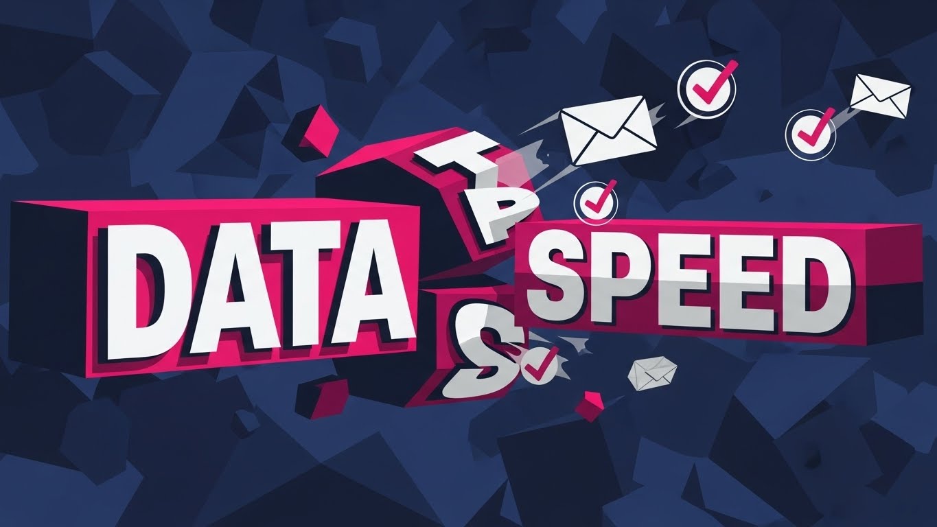
The Visual & Narrative Approach
This style utilizes a high-octane, flat vector aesthetic to create an immediate sense of urgency. Massive, blocky geometric shapes representing "DATA" and "SPEED" do not just float; they collide and reform with impactful weight. The narrative is driven by kinetic energy, where stylized envelopes rapidly transform into checkmarks, flying through a deep Electric Indigo void. It visualizes the backend processing power of the API as a physical force.
Psychological Impact & KPI Focus
For a Top-of-Funnel (TOFU) audience, the primary currency is attention. This style leverages the Impact Bias—we assume that big, bold, and fast visuals equate to a robust and capable system. By stripping away extraneous details and focusing on high-contrast text and motion, the viewer’s brain instantly processes the core message: Velocity. This addresses the anxiety of "slow processing," driving Brand Recall.
Strategic Implementation & Trade-offs
- Use Case: Social Media Ads (Instagram/LinkedIn) where sound-off viewing is common.
- Duration: Short and punchy (15-20 seconds).
- Trade-off: This style excels at grabbing attention but fails at explaining complexity. It generates excitement but cannot convey the nuances of a tax engine. Use it to stop the scroll.
Companies using similar video content -
Argyle – Payroll Data API – Fast, secure payroll data integration.
Finch – HR & Payroll API – Connects HR and payroll systems instantly.
2. The Fluidity of Finance
TOFU | Market Education
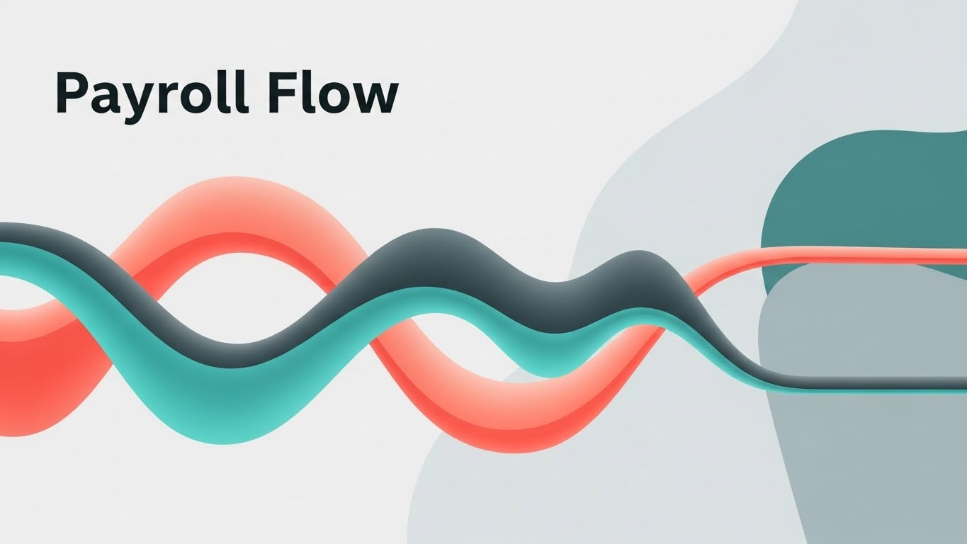
The Visual & Narrative Approach
This visualization adopts a fluid, calming aesthetic to tackle the concept of "Payroll Flow." The image captures smooth, morphing shapes resembling liquid pipes connecting from left to right. Unlike the jagged energy of the kinetic style, the motion here is continuous and frictionless, symbolizing an error-free process. The Teal and Coral gradients suggest a modern environment where data acts like a liquid stream—moving without leaks or blockages.
Psychological Impact & KPI Focus
The core anxiety in payroll is "friction"—the fear of data getting stuck between Time & Attendance and the General Ledger. This fluid animation style directly addresses that fear by using Process Fluency cues. The smooth left-to-right motion subconsciously signals ease and predictability to the brain. This style is highly effective for Market Education, helping viewers visualize how an integrated system eliminates manual bottlenecks.
Strategic Implementation & Trade-offs
- Use Case: YouTube Explainer Videos and "How it Works" sections.
- Duration: 60-90 Seconds.
- Trade-off: The abstract nature can sometimes feel too detached from the actual software interface. It sells the concept of flow, but not the reality of the dashboard.
Companies using similar video content -
Workday – Workday HCM – Seamlessly manages global HR and payroll.
Ceridian – Dayforce – Unified platform for HR, payroll, WFM.
SD Worx – Unified platform for global HR and payroll.
3. The Physical-Digital Bridge
TOFU | Vertical Social Organic

The Visual & Narrative Approach
This style is a chaotic collision of the physical and digital worlds. The visual anchors on the texture of reality—crumpled Kraft Brown paper representing the messy, tactile receipts and manual logs of the past. Superimposed on this is a crisp, glowing Cyan digital overlay that "scans" and digitizes the chaos. The "shaky cam" effect adds a raw, authentic energy that feels native to social platforms.
Psychological Impact & KPI Focus
This style resonates deeply with the Pain of Transition. Many stakeholders still live in a world of paper and manual entry. Seeing the literal transformation of crumpled paper into digital pixels triggers a "before/after" dopamine response. It acknowledges their current pain (the mess) and offers an immediate, high-tech remedy. This fits perfectly with Vertical Social Engagement, targeting younger decision-makers who value authenticity.
Strategic Implementation & Trade-offs
- Use Case: TikTok, Instagram Reels, and YouTube Shorts.
- Duration: 15-45 Seconds.
- Trade-off: The "shaky" and "gritty" aesthetic might feel unprofessional to conservative enterprise CFOs. It is a "disruptor" style best suited for SMB audiences.
Companies using similar video content -
Paychex – Paychex Flex – Digitizes traditional payroll and HR processes.
Zenefits – Transforms manual HR/payroll into digital workflows.
4. The Self-Assembling Sphere
TOFU | Skippable Pre-Roll Ad

The Visual & Narrative Approach
Here we see a highly polished, glossy "blob" aesthetic. The image features a self-assembling structure where fluid Lime Green and Glossy Black shapes come together to form a perfect, unified sphere labeled "Automation." The motion is satisfying and magnetic, suggesting that the software "just works." The background is a clean, silver-white liquid abstract environment.
Psychological Impact & KPI Focus
The rounded, organic shapes are inherently pleasing and "safe" to the human eye. Unlike sharp angles which signal caution, these soft curves signal comfort. This is vital for a Skippable Pre-Roll Ad, where you need to disarm the viewer instantly. The metaphor of self-assembly addresses the desire for "hands-off" management—the system builds itself, requiring no manual intervention.
Strategic Implementation & Trade-offs
- Use Case: YouTube Pre-roll and Programmatic Video Display.
- Duration: 06-15 Seconds.
- Trade-off: It is purely metaphorical. It builds brand affinity but educates very little about specific features. It requires a strong CTA to drive the user to a deeper content layer.
Companies using similar video content -
Paylocity – Automates HR and payroll with ease.
Paycom – Self-assembling HR and payroll automation.
Patriot Software – Self-assembling US payroll and HR.
5. The Enterprise Twilight
TOFU | Shaping Brand Perception

The Visual & Narrative Approach
This style shifts gears into pure aspiration. The visual places us inside a sleek, glass-walled corporate office at twilight—the "Power Hour." The Navy Blue and Gold lighting scheme evokes a sense of wealth and stability. A futuristic Head-Up Display (HUD) overlay tracks a "100% Secure" progress bar. The narrative is aspirational, framing payroll not as a back-office task, but as a strategic enterprise asset.
Psychological Impact & KPI Focus
This visual language speaks directly to the Status and Security motivations of the Enterprise buyer. It looks "expensive," which implies the software is robust and "Enterprise-Grade." The HUD element bridges the physical office with the digital solution, reassuring the viewer that the software monitors their physical world. This is powerful for Shaping Brand Perception.
Strategic Implementation & Trade-offs
- Use Case: Website Hero Backgrounds and Event Openers.
- Duration: 30-60 Seconds (Loopable).
- Trade-off: High production value perception can be expensive to achieve manually. It risks looking like "stock footage" if not customized with specific UI elements.
Companies using similar video content -
SAP – SuccessFactors Employee Central Payroll – Strategic enterprise payroll management.
Oracle – Cloud HCM – Aspirational, secure cloud HR and payroll.
Sage People – Strategic enterprise HR and payroll.
6. The Continuous Chain
TOFU | Overcoming Objections
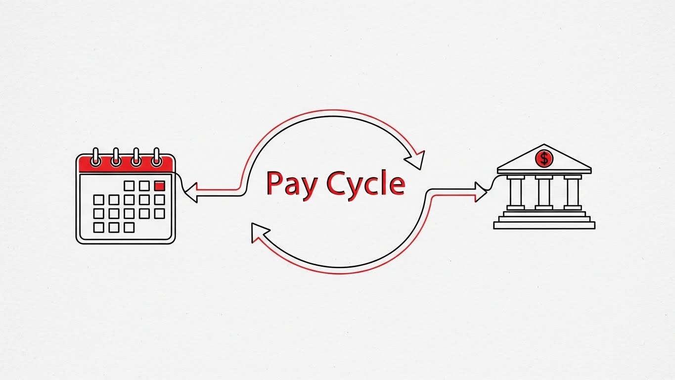
The Visual & Narrative Approach
This style relies on extreme minimalism. A single, continuous line in Black with Red Accents travels across a Paper White textured background. It draws a "Pay Cycle" loop, morphing seamlessly from a calendar (time tracking) to a calculator (processing) to a bank icon (deposit) without ever lifting or breaking. The perspective is a 2D side-scroller.
Psychological Impact & KPI Focus
The "Unbroken Line" is a powerful visual metaphor for Chain of Custody. For a skeptical buyer worried about data loss during transfers, this visual proves that the system is a closed loop. The simplicity of the line art reduces Cognitive Load to the absolute minimum, allowing the viewer to focus entirely on the logic of the integration. This is highly effective for Overcoming Objections.
Strategic Implementation & Trade-offs
- Use Case: Website Product Pages and Sales Decks.
- Duration: 60-90 Seconds.
- Trade-off: It can feel "dry" or academic. It lacks emotional excitement but excels at logical persuasion.
Companies using similar video content -
UKG – UKG Pro – Unbroken chain of custody for workforce management.
Ramco – Global Payroll – End-to-end integrated global payroll.
Cegid – Cegid Expert – European payroll compliance and management.
BrightPay – Continuous line for UK/IE payroll.
Zellis – End-to-end UK/IE payroll.
7. The Lead Magnet
MOFU | Demand Gen & Lead Capture
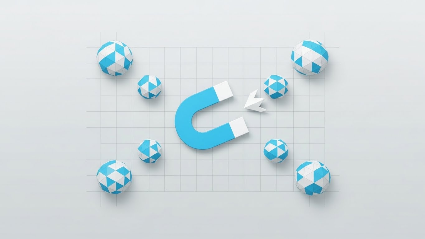
The Visual & Narrative Approach
From a "God view" top-down perspective, we see a clean, flat composition organized on a subtle grid. A central "Magnet" icon in Sky Blue and White pulls in geometric spheres (leads/data) from the edges of the frame. There are no shadows or gradients—strictly flat design. The narrative is about "Attraction" and "Centralization," illustrating how the platform consolidates scattered data.
Psychological Impact & KPI Focus
This style uses Negative Space to suggest clarity and organization. For a Middle-of-Funnel (MOFU) audience, the visual of "scattered things becoming organized" is deeply satisfying (the Zeigarnik Effect of seeking closure). It visually solves the problem of "Data Silos" without needing complex technical diagrams. It is a workhorse style for Demand Gen.
Strategic Implementation & Trade-offs
- Use Case: LinkedIn Carousel Ads and Social Retargeting.
- Duration: 10-15 Seconds.
- Trade-off: It is a very common SaaS aesthetic. To stand out, the animation timing needs to be snappy and the sound design precise.
Companies using similar video content -
Rippling – Centralizes HR, IT, and payroll data.
BambooHR – Attracts and organizes employee data.
HRMantra – Attracts and organizes HR data.
8. Breaking the Ceiling
MOFU | Product/Solution Differentiation

The Visual & Narrative Approach
This visualization features a high-tech 3D line graph that doesn't just rise—it physically smashes through a "glass ceiling" grid line. The style uses transparent glass overlays, thin elegant lines, and floating data points in Emerald Green and Gold. The camera floats with a slight parallax effect, adding depth. The narrative is about Differentiation—showing that this software delivers results that exceed standard limits.
Psychological Impact & KPI Focus
By giving data physical properties (momentum, impact), this style makes abstract metrics feel tangible. It appeals to the Analytical Brain of the CFO, using "up and to the right" imagery to signal ROI. The "breaking the ceiling" moment serves as an emotional peak, validating the buyer's desire for superior performance.
Strategic Implementation & Trade-offs
- Use Case: Case Study Videos and Website "Results" Sections.
- Duration: 30-45 Seconds.
- Trade-off: It relies heavily on the credibility of the data being shown. If the numbers aren't real or impressive, the visual feels hollow.
Companies using similar video content -
ADP – DataCloud – Breaks performance limits with advanced analytics.
Workday – Prism Analytics – Delivers superior payroll and HR insights.
Checkr – Breaks limits with background check integration.
9. The Ecosystem City
MOFU | Category Creation
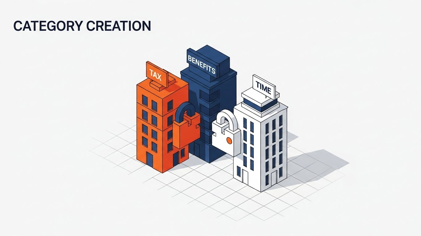
The Visual & Narrative Approach
This scene depicts the construction of a new "city block" on an isometric grid. Distinct buildings, colored in Orange (Tax), Navy Blue (Benefits), and White (Time), lock together like puzzle pieces to form a complete ecosystem. The camera is locked at a 45-degree angle. The narrative visualizes Category Creation, showing how separate tools are better when built as a unified city.
Psychological Impact & KPI Focus
Isometric design provides a "God-like" overview of a complex system, giving the viewer a sense of control and understanding. It allows you to show multiple modules functioning simultaneously without visual clutter. This style helps buyers visualize the Scale and Stability of the platform, making it an excellent choice for explaining complex multi-module architecture.
Strategic Implementation & Trade-offs
- Use Case: LinkedIn Organic Posts and Product Deep Dives.
- Duration: 45-90 Seconds.
- Trade-off: Isometric art can be time-consuming to produce if custom assets are required for every module. It also requires careful planning to avoid the screen becoming too busy.
Companies using similar video content -
Workday – Workday HCM – Builds a unified HR and payroll ecosystem.
SAP – SuccessFactors – Modular suite for comprehensive HR and payroll.
10. The Vault of Trust
MOFU | Building Trust & Credibility

The Visual & Narrative Approach
We see a heavy, solid steel vault door slowly closing shut. The texture is hyper-realistic—brushed metal, ray-traced reflections, and heavy shadows. The lighting is a dramatic 3-point studio setup. Colors are Mahogany, Silver, and Marble White. The sound design features a heavy, reassuring "thud." The narrative is simple and primal: "Your data is your most valuable asset. We treat it that way. Ironclad security for peace of mind."
Psychological Impact & KPI Focus
Security is the number one objection in cloud payroll. This style bypasses logical arguments and appeals directly to the Lizard Brain's need for safety. The "heaviness" of the vault implies that the cloud software has the same solidity as a physical bank. It is the ultimate visual anchor for Building Trust & Credibility.
Strategic Implementation & Trade-offs
- Use Case: "Security" Page on Website and Trust Center content.
- Duration: 10-20 Seconds.
- Trade-off: It is static and slow. It doesn't explain how the security works (encryption, SOC2), it just asserts that it works. It should be paired with technical copy.
Companies using similar video content -
Papaya Global – Ironclad security for global payroll data.
ADP – ADP Global Payroll – Ensures absolute data trust and security.
11. The Governance X-Ray**
MOFU | Risk Mitigation

The Visual & Narrative Approach
This visualization employs a sophisticated "X-Ray" aesthetic to conquer the "Black Box" paradox. The viewer is presented with a glossy, Translucent Blue outer shell representing the user interface. The camera slowly tracks inwards, dissolving this shell to reveal the internal architecture: glowing, organized rows of White data streams and server racks sitting on a precise Green technical grid. It visually translates "Encryption at Rest" and "Data Governance" into a structural reality, showing that the software’s core is orderly, illuminated, and robust.
Psychological Impact & KPI Focus
For the Risk & Compliance Officer, "transparency" is the ultimate reassurance. By literally looking inside the machine, this style leverages the Transparency Effect to dismantle the fear of hidden vulnerabilities. It transforms the abstract concept of backend security into a tangible, inspectable structure. This approach is critical for Risk Mitigation, proving that the vendor has nothing to hide and that the data architecture is engineered, not accidental.
Strategic Implementation & Trade-offs
- Use Case: "Security & Compliance" Website Sections and Trust Centers.
- Duration: 15-30 Seconds (Loopable).
- Trade-off: It is highly technical. It appeals to the logical, skeptical side of the brain but lacks emotional warmth. It validates safety but does not sell usability.
Companies using similar video content -
Sovos – Reveals internal tax compliance and governance.
Vertex Inc. – Vertex Tax Technology – Translucent architecture for tax solutions.
Symmetry Software – Organized rows for payroll tax engine.
Avalara – Reveals internal tax compliance.
12. The Zen of Operations
MOFU | The Functional Buyer
The Visual & Narrative Approach
Here, the aesthetic shifts to "Airy Minimalism." The composition features a pristine Light Mode interface floating in a bright, white studio space with subtle plant shadows adding depth. The UI elements—colored in calming Mint Green and Charcoal—are stripped of dense text, using abstract bars and avatars to represent data. A floating "Approved" card glides into place with a satisfying, weightless animation. The visual narrative is one of absolute clarity and breathability, suggesting that payroll tasks can be performed in a stress-free environment.
Psychological Impact & KPI Focus
This style directly targets the Functional Buyer (HR Managers/Admins) whose primary pain point is "UI Fatigue" and complex, clunky dashboards. The extensive use of white space and soft shadows triggers a Relaxation Response, signaling that the tool is intuitive and modern. It moves the conversation from "capability" to "usability," directly influencing User Adoption Rates by promising a workday free from visual clutter and cognitive strain.
Strategic Implementation & Trade-offs
- Use Case: Website Product Tours and Feature Highlight Reels.
- Duration: 45-60 Seconds.
- Trade-off: The abstraction of data (using lines instead of numbers) makes it look clean, but it may frustrate detailed-oriented buyers who want to see the exact fields and reporting columns.
Companies using similar video content -
Namely – Clean UI for frictionless HR and payroll.
Gusto – Stress-free payroll and benefits management.
13. The Legacy Displacement
MOFU | Competitive Displacement
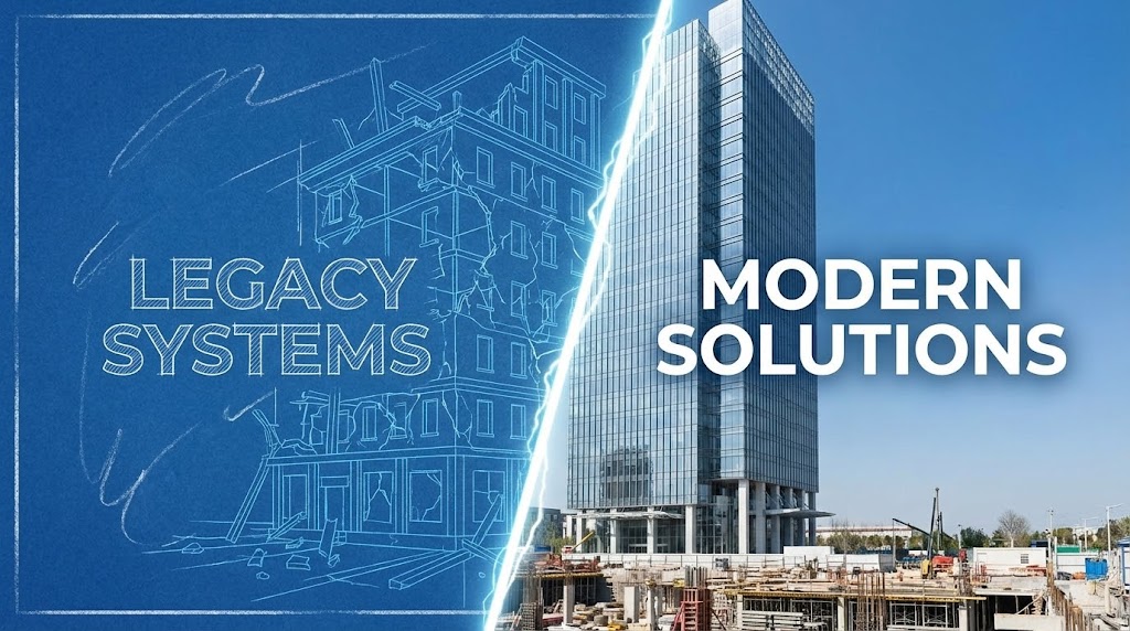
The Visual & Narrative Approach
This visualization uses a stark Split-Screen composition to force a comparison. On the left, titled "LEGACY SYSTEMS," we see a chaotic, blueprint-style wireframe of a crumbling structure in Blueprint Blue. On the right, titled "MODERN SOLUTIONS," stands a gleaming, photorealistic glass skyscraper in Chalk White and Sky Blue. A dynamic electric fissure separates the two worlds. The narrative is one of Competitive Displacement—visualizing the migration from a fragile, unfinished past to a solid, future-proof present.
Psychological Impact & KPI Focus
The human brain evaluates value largely through Relativity (Comparison). By juxtaposing the "Old Way" (crumbling/incomplete) directly against the "New Way" (solid/complete), this visual triggers the Loss Aversion mechanism—staying with the legacy provider feels like staying in a condemned building. It validates the urgency of digital transformation and positions the software as the only logical architectural upgrade.
Strategic Implementation & Trade-offs
- Use Case: Competitive Comparison Landing Pages and LinkedIn Ads.
- Duration: 15-20 Seconds.
- Trade-off: It is aggressive. While effective for displacement, it focuses on the "Why Change" rather than the "How." It must be followed by content that explains the migration process to avoid overwhelming the prospect.
Companies using similar video content -
Deel – Modern solution displacing traditional EOR services.
Remote – Upgrades global hiring from legacy systems.
14. The Active Defense Grid
MOFU | ABM Awareness

The Visual & Narrative Approach
To visualize the active protection of AI, this style uses a high-tech particle system. We see a "Risk Grid" of red laser lines attempting to penetrate the system. However, a central AI processor—glowing with Deep Violet and Electric Green light—intercepts these threats. The red lines are instantly neutralized and converted into organized green data nodes that float upward. The camera creates a "fly-through" effect, immersing the viewer in this digital battlefield. It narrates the story of Proactive Defense.
Psychological Impact & KPI Focus
This visual addresses the "Invisible Threat" anxiety. Security breaches often happen silently; this animation makes the prevention of those breaches visible and heroic. It demonstrates that the AI is not just a passive database but an active guardian. For Account-Based Marketing (ABM) targeting IT Directors, this builds Technical Authority, assuring them that the system is vigilant even when they are not watching.
Strategic Implementation & Trade-offs
- Use Case: Programmatic Display Ads and IT-Focused Retargeting.
- Duration: 06-12 Seconds.
- Trade-off: It is highly abstract. It sells the concept of security AI, not the actual settings or logs. It works best as a "Hook" to draw attention to a whitepaper or technical deep dive.
Companies using similar video content -
Ceridian – Dayforce – Proactive AI defense for workforce risks.
UKG – Workforce Dimensions – Active defense grid for workforce management.
Workforce Software – Proactive defense for workforce management.
15. The Velocity Interface
BOFU | Feature Education
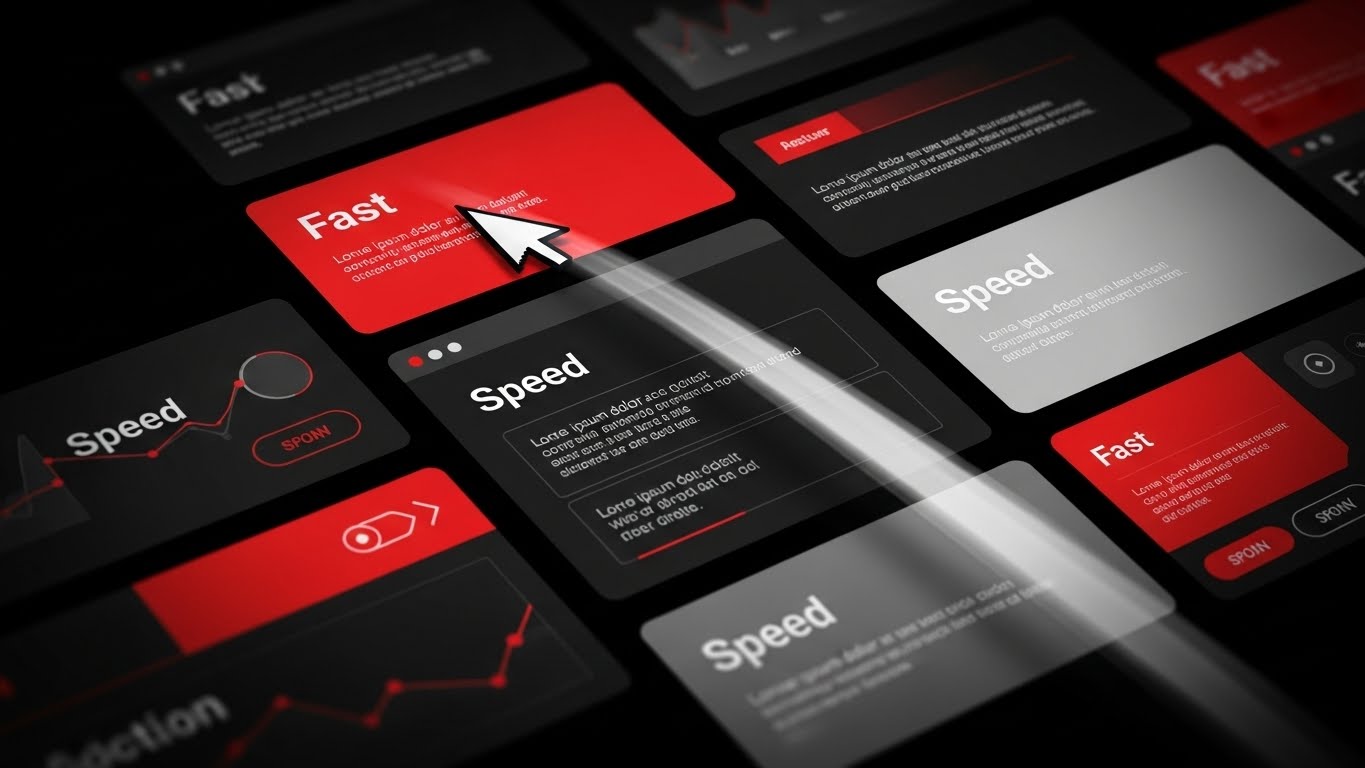
The Visual & Narrative Approach
Speed is the protagonist here. The visual composition is a dynamic montage of dark-themed UI cards accented with "Fast Red" and "Speed White." A mouse cursor moves with exaggerated velocity, clicking buttons labeled "Fast" and "Speed" while leaving a trail of motion blur. The camera zooms and cuts rapidly between screens, creating a rhythmic, high-energy sequence. The narrative is purely about Efficiency—reducing time-to-value and accelerating daily workflows.
Psychological Impact & KPI Focus
In the Bottom-of-Funnel (BOFU), the buyer wonders, "Will this slow my team down?" This style creates a Perceptual Fluency of speed. The rapid cuts and motion blur trick the brain into associating the software with high-energy performance. It visually promises that the platform keeps pace with the user's thought process, directly addressing concerns about latency and lag.
Strategic Implementation & Trade-offs
- Use Case: Pre-Roll Ads and Product Hype Reels.
- Duration: 10-15 Seconds.
- Trade-off: The pace is too fast for actual learning. Viewers won't read the text; they will only feel the speed. Do not use this for tutorial content where comprehension is key.
Companies using similar video content -
Paylocity – Rapid UI for accelerating payroll workflows.
Paycom – Kinetic motion for fast HR and payroll tasks.
Replicon – Kinetic motion for time tracking integration.
16. The ROI Factory
BOFU | ROI Justification
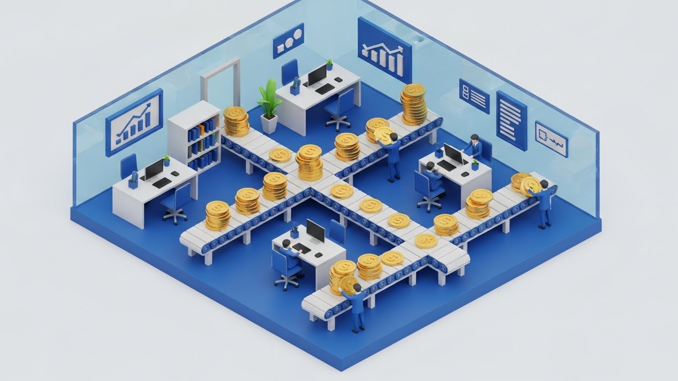
The Visual & Narrative Approach
This Isometric 3D diorama transforms the abstract concept of "Payroll Processing" into a literal factory of value. We see a miniature, high-fidelity office in Royal Blue and White. Tiny, stylized workers manage a complex network of conveyor belts that are not moving boxes, but stacks of Gold Coins. The coins flow seamlessly through "Approvals" and "Tax" stations without spilling. The lighting is crisp and ray-traced, giving the scene a premium, toy-like tactile quality.
Psychological Impact & KPI Focus
For the CFO, payroll is often seen as a cost center. This visual reframes it as a Value Flow. By visualizing the movement of money as a precise, mechanical process, it suggests control and optimization. The "Gold Coin" motif subtly triggers the Endowment Effect—the viewer feels the value of the funds being managed. It is a powerful tool for ROI Justification, showing that the system protects and organizes the company's capital.
Strategic Implementation & Trade-offs
- Use Case: Sales Decks and Investment Pitch Decks.
- Duration: 30-45 Seconds.
- Trade-off: The "gamified" look can appear too playful for some ultra-conservative banking prospects. It works best when the brand voice is modern and approachable.
Companies using similar video content -
Alight Solutions – Visualizes capital flow and ROI justification.
Insperity – Transforms payroll into a value-generating factory.
17. The Dopamine Button
BOFU | Sales Cycle Acceleration
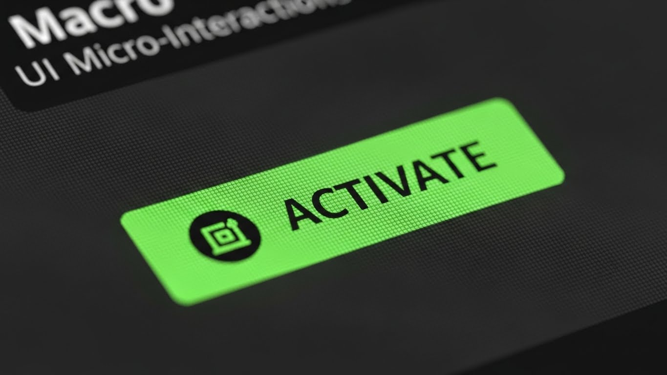
The Visual & Narrative Approach
This style zooms in to the extreme—a macro close-up of a single UI interaction. We focus on a "Vivid Cyan" button labeled "ACTIVATE." The background is blurred into a dark grey bokeh. A soft-focus finger hovers and then presses the button, which depresses with a 3D tactile weight. The visual creates a sensory illusion of "touch" on a digital screen. It emphasizes the Micro-Interaction—the satisfying moment of execution.
Psychological Impact & KPI Focus
Decision paralysis often happens right before the final commitment. This visual leverages Sensory Marketing principles. By making the digital button look physical and "pressable," it triggers the brain's desire for closure and action. It symbolizes that the complex implementation is ultimately just "one push of a button," reducing the perceived effort of saying "Yes" and helping to Accelerate the Sales Cycle.
Strategic Implementation & Trade-offs
- Use Case: "Call to Action" sections on Websites and Final Email Nurture sequences.
- Duration: 03-05 Seconds (Looping GIF).
- Trade-off: It is a micro-moment. It has zero context. It must be placed next to a strong headline or CTA button to be effective.
Companies using similar video content -
Gusto – One-click simplicity for payroll approvals.
Zenefits – Tactile depth for easy HR actions.
Justworks – One-click simplicity for PEO payroll.
18. The Empowered Executive
BOFU | The Economic Buyer

The Visual & Narrative Approach
Moving away from abstract graphics, this style returns to the human element. We see a candid, high-quality photograph of a confident professional (The Economic Buyer/CFO) in a sunlit, modern workspace. She is holding a tablet, smiling confidently not at the camera, but at a colleague off-screen. The tablet screen displays clean, upward-trending graphs. The lighting is warm—Amber and Forest Green tones—suggesting the "Golden Hour" of success.
Psychological Impact & KPI Focus
Ultimately, B2B buyers purchase Status and Security. This visual mirrors the buyer's desired future self: successful, relaxed, and in control of the numbers. It validates the purchase decision by associating the software with professional triumph. For the Economic Buyer, seeing a peer in a state of "financial health" is a powerful form of Social Proof, reassuring them that this investment leads to personal and professional growth.
Strategic Implementation & Trade-offs
- Use Case: Landing Page Testimonials and Case Study Headers.
- Duration: Static Image or subtle Cinemagraph.
- Trade-off: It risks looking like "Generic Stock" if the casting or lighting is poor. It requires high-authenticity photography to resonate; otherwise, it is ignored as "filler."
Companies using similar video content -
Workday – Workday HCM – Validates economic buyer success and control.
Oracle – Cloud HCM – Aspirational success for C-suite decision-makers.
19. The Developer's Canvas
BOFU | The Technical Buyer
The Visual & Narrative Approach
This style is a "love letter" to the IT and Developer persona. The visual features a sophisticated Dark Mode interface displayed on a holographic glass panel in a dimly lit server room. The UI elements glow in Neon Purple and Pink, displaying complex, abstracted code syntax and network schematics rather than simple buttons. The aesthetic is "Cyberpunk meets Enterprise," suggesting deep configurability and API robustness.
Psychological Impact & KPI Focus
The Technical Buyer (CTO/IT Admin) often equates "pretty" interfaces with "weak" power. This Dark Mode aesthetic signals that the software is a "Power Tool." The complex syntax lines imply that the system is open, extensible, and developer-friendly. It builds Technical Credibility, reassuring the IT team that they will have the granular control they need to integrate the software into their existing stack.
Strategic Implementation & Trade-offs
- Use Case: Developer Documentation (API Docs), Tech Blogs, and Integration Pages.
- Duration: 20-30 Seconds.
- Trade-off: It will alienate the non-technical HR buyer. It looks "hard" to use. Use strictly for technical audiences or integration segments.
Companies using similar video content -
Atomic – Payroll API – Developer-friendly interface for payroll integrations.
Rippling – Signals technical power for IT teams.
20. The Automated Life
BOFU | Objection Handling

The Visual & Narrative Approach
To close the loop on objection handling, we use a stylized 2D flat character illustration. A young professional sits in a relaxed, open posture, sipping coffee while a laptop on the desk glows with a "Job Done" signal. The palette is Vibrant Teal and Orange, creating a warm, energetic vibe. Surrounding the character are abstract floating icons of gears and graphs, working automatically in the background. The narrative is clear: "The software works so you can live."
Psychological Impact & KPI Focus
The final objection is often, "Will this eat up my time?" This visual answers with a definitive "No." By depicting the user in a state of leisure while the software works in the background, it visualizes Work-Life Balance. It appeals to the human desire for a manageable workload, effectively handling objections about complexity or maintenance effort. It leaves the viewer with a feeling of Optimism.
Strategic Implementation & Trade-offs
- Use Case: Social Media Retargeting (Facebook/Instagram) and "Thank You" pages.
- Duration: Static or Simple Loop.
- Trade-off: The "cartoon" style may feel too casual for the initial enterprise pitch, but it is perfect for humanizing the brand in retargeting layers once trust is established.
Companies using similar video content -
Namely – Automated ease for peace of mind.
BambooHR – Visualizes work-life balance through automation.
Zenefits – Automated ease for peace of mind.
21. The Transaction Metropolis
BOFU | Driving Demo Requests

The Visual & Narrative Approach
This style creates a visceral connection between the physical world and digital processing power. We see a hyper-lapse of a sprawling city at night, filmed from a high vantage point. The ribbons of car headlights (Gold and Red) accelerate into glowing, continuous streams of light. Through motion graphics, these traffic trails morph into high-velocity data packets flowing into a central server hub. The narrative equates the ceaseless, high-volume energy of a metropolis with the robust transaction processing capability of the software.
Psychological Impact & KPI Focus
For the Enterprise buyer, "Volume" is a stressor. Can the system handle 50,000 employees simultaneously? This visual uses Metaphorical Mapping to answer "Yes." The brain instinctively understands the city as a complex, high-volume system that flows. By mapping the software to this imagery, you borrow the city's scale and resilience. This is a powerful driver for Demo Requests, promising a system that won't crash under pressure.
Strategic Implementation & Trade-offs
- Use Case: Social Media Ads (LinkedIn/Twitter) targeting Enterprise CTOs.
- Duration: 06-12 Seconds.
- Trade-off: It is generic. It communicates "Scale" and "Speed" beautifully but says nothing about specific features or UI. It is a mood setter, not an educator.
Companies using similar video content -
Globalization Partners – Visualizes high-volume global transactions.
Multiplier – Equates city energy with processing scale.
Papaya Global – Visualizes high-volume global transactions.
22. The Blueprinted Reality
Onboarding | Reducing Implementation Friction

The Visual & Narrative Approach
Implementation is the most anxiety-inducing phase of the buying cycle. This style mitigates that fear by visualizing the "Construction" process. We start with a technical, Blueprint Blue wireframe grid of a complex structure. A diagonal "wipe" effect sweeps across the screen, transforming the wireframe into a solid, gleaming White and Glass photorealistic building. It visually narrates the journey from "Plan" to "Product," showing that the implementation process is structured, engineered, and finite.
Psychological Impact & KPI Focus
This style triggers the Completion Bias. Humans desire to see things finished. By showing the seamless transition from a sketch to a solid structure, you subliminally promise a smooth implementation project. It assures the buyer that the vendor has a blueprint for success and that the "messy middle" of integration will result in a solid outcome. This is crucial for Reducing Implementation Friction anxiety.
Strategic Implementation & Trade-offs
- Use Case: Kick-off Meeting Decks and "Welcome" Blog Posts.
- Duration: 15-30 Seconds.
- Trade-off: It is abstract. While it builds confidence in the process, it doesn't show the actual implementation steps (like data migration or API mapping).
Companies using similar video content -
SAP – SuccessFactors – Blueprint to reality for implementation success.
Oracle – Cloud HCM – Structured implementation for solid outcomes.
23. The Self-Serve Swipe
Onboarding | Self-Serve Onboarding

The Visual & Narrative Approach
To target the end-user (the employee), we shift to a friendly, approachable 2D aesthetic. A stylized character—young, professional, and relaxed—stands before a floating, simplified UI panel. With a casual swipe of a finger, a progress bar fills instantly, and a "Welcome" card slides into place. The palette uses soft Lavender, White, and Peach to evoke calmness. The narrative is: "Onboarding is not a task; it's a gesture."
Psychological Impact & KPI Focus
The goal here is Self-Efficacy. If employees feel the software is hard to learn, adoption tanks. This style uses Behavioral Modeling—showing a peer performing the task effortlessly—to convince the viewer that they can do it too. It frames the software as a consumer-grade app rather than an enterprise burden, directly driving Self-Serve Adoption and reducing the burden on HR support.
Strategic Implementation & Trade-offs
- Use Case: In-App "First Login" Welcome Videos and Employee Portal intros.
- Duration: 30-60 Seconds.
- Trade-off: The "cartoon" look is perfect for employees but may lack the gravitas required for the C-Suite. Keep this strictly for the end-user adoption layer.
Companies using similar video content -
ADP – MyPay – Empowers employees with frictionless self-service.
Ceridian – Dayforce Self-Service – Stylized interaction for easy onboarding.
24. The "Welcome Aboard" Moment
Onboarding | Accelerating Time-to-Value

The Visual & Narrative Approach
This style blends high-quality lifestyle photography with digital functionalism. We see an over-the-shoulder shot of a user in a cozy, sunlit home office (Coffee Brown and Beige tones). On their laptop screen, a crisp, semi-transparent 2D UI bubble pops up: "Setup Complete. Enjoy your new tools!" with a large checkmark. The lighting is warm and natural. The narrative anchors the software in the reality of the Remote Workforce—it works where they work.
Psychological Impact & KPI Focus
For a distributed workforce, "connectivity" is a concern. This visual validates the Remote Work Lifestyle. The juxtaposition of the cozy physical environment with the efficient digital overlay signals that the software respects the user's space and time. It provides a visual "Dopamine Hit" of completion, reinforcing the feeling of Time-to-Value—the system is ready now.
Strategic Implementation & Trade-offs
- Use Case: "Welcome" Emails and HR Onboarding Newsletters.
- Duration: Static Image or 05-Second Cinemagraph.
- Trade-off: It relies heavily on the quality of the stock footage. If the home office looks messy or "fake," it breaks the immersion. Authenticity is key.
Companies using similar video content -
Deel – Confirms instant setup for remote teams.
Remote – Remote comfort with quick onboarding.
Oyster – Confirms instant setup for remote teams.
25. The Bridge of Connectivity
Retention | Trial/Freemium User Activation

The Visual & Narrative Approach
Using a playful Low-Poly 3D aesthetic, this style visualizes the concept of "Integration." We see two floating digital islands in Blue and Orange (representing different departments, e.g., HR and Accounting). A bridge automatically constructs itself block-by-block between them, allowing data to flow across. The aesthetic is clean, geometric, and reminiscent of strategy games. The narrative is about Closing the Gap and unifying the business.
Psychological Impact & KPI Focus
The "Gamified" look triggers a Playfulness response, lowering the barrier to entry for trial users. It makes the complex task of API integration look like building with LEGO blocks—simple, constructive, and satisfying. This reduces the Fear of Breaking Things that often paralyzes new users, encouraging them to activate features and driving Freemium Conversion.
Strategic Implementation & Trade-offs
- Use Case: Email Nurture Campaigns for inactive users ("Connect your accounts!").
- Duration: 10-15 Seconds (Looping).
- Trade-off: It simplifies the technical reality significantly. It is a metaphor for connection, not a tutorial on how to connect.
Companies using similar video content -
Odoo – Odoo HR & Payroll – Gamifies user activation by bridging modules.
Dolibarr – Dolibarr ERP – Low-poly construction for system integration.
26. The "Aha!" Overlay
Retention | Knowledge Base & FAQ Videos

The Visual & Narrative Approach
This style brings the "Aha!" moment to life. We see a live-action shot of a busy open-plan office. An employee looks up from their screen with an expression of realization. Above their head, a tracked 2D graphic of a glowing Yellow lightbulb ("DING!") animates into existence. The style mixes the "Real World" (footage) with the "Solution Layer" (graphics), suggesting that the software provides the answers needed to navigate daily challenges.
Psychological Impact & KPI Focus
When users are stuck, they feel frustrated. This visual mirrors the Relief of Solution. By showing a real human experiencing that moment of clarity, you empathize with the user's struggle and promise a quick resolution. This creates a positive association with the Help Center/Knowledge Base, positioning it not as a "manual" but as a source of instant enlightenment, thereby Reducing Support Tickets.
Strategic Implementation & Trade-offs
- Use Case: Help Center headers and "Did You Know?" feature tip videos.
- Duration: 05-10 Seconds.
- Trade-off: It can feel cheesy if the acting is exaggerated. The "Lightbulb" is a cliché, so the animation quality must be premium to pull it off.
Companies using similar video content -
UKG – UKG Pro – Visualizes knowledge retention for quick solutions.
ADP – Workforce Now – Augmented reality for instant insights.
27. The Face of Retention
Retention | Reducing Churn

The Visual & Narrative Approach
Ultimately, payroll is about people getting paid. This style uses Generative AI to create a hyper-realistic portrait of an employee. The camera focuses on her face, captured with a shallow depth of field (85mm lens look). She smiles with genuine warmth and relief, while a subtle, futuristic HUD overlay shows a "Churn Reduced" metric ticking upward. The background is a soft, corporate Navy blur. It humanizes the data.
Psychological Impact & KPI Focus
Churn often happens when the emotional connection to the vendor is lost. This visual leverages Mirror Neurons—seeing a relieved, happy human face triggers a similar feeling in the viewer. It reminds the HR buyer that their choice of software directly impacts the happiness and financial security of their workforce. It validates the software as a tool for Employee Wellness, which is a powerful retention anchor.
Strategic Implementation & Trade-offs
- Use Case: LinkedIn Customer Success Stories and Quarterly Business Review (QBR) decks.
- Duration: Static or subtle facial animation.
- Trade-off: AI faces can sometimes fall into the "Uncanny Valley." Careful prompt engineering is required to ensure the expression feels genuine and not robotic.
Companies using similar video content -
Ceridian – Dayforce – Humanizes churn reduction with employee relief.
UKG – UKG Pro – The face of employee wellness and satisfaction.
28. The Global Hologram
Expansion | Driving Referrals & Advocacy
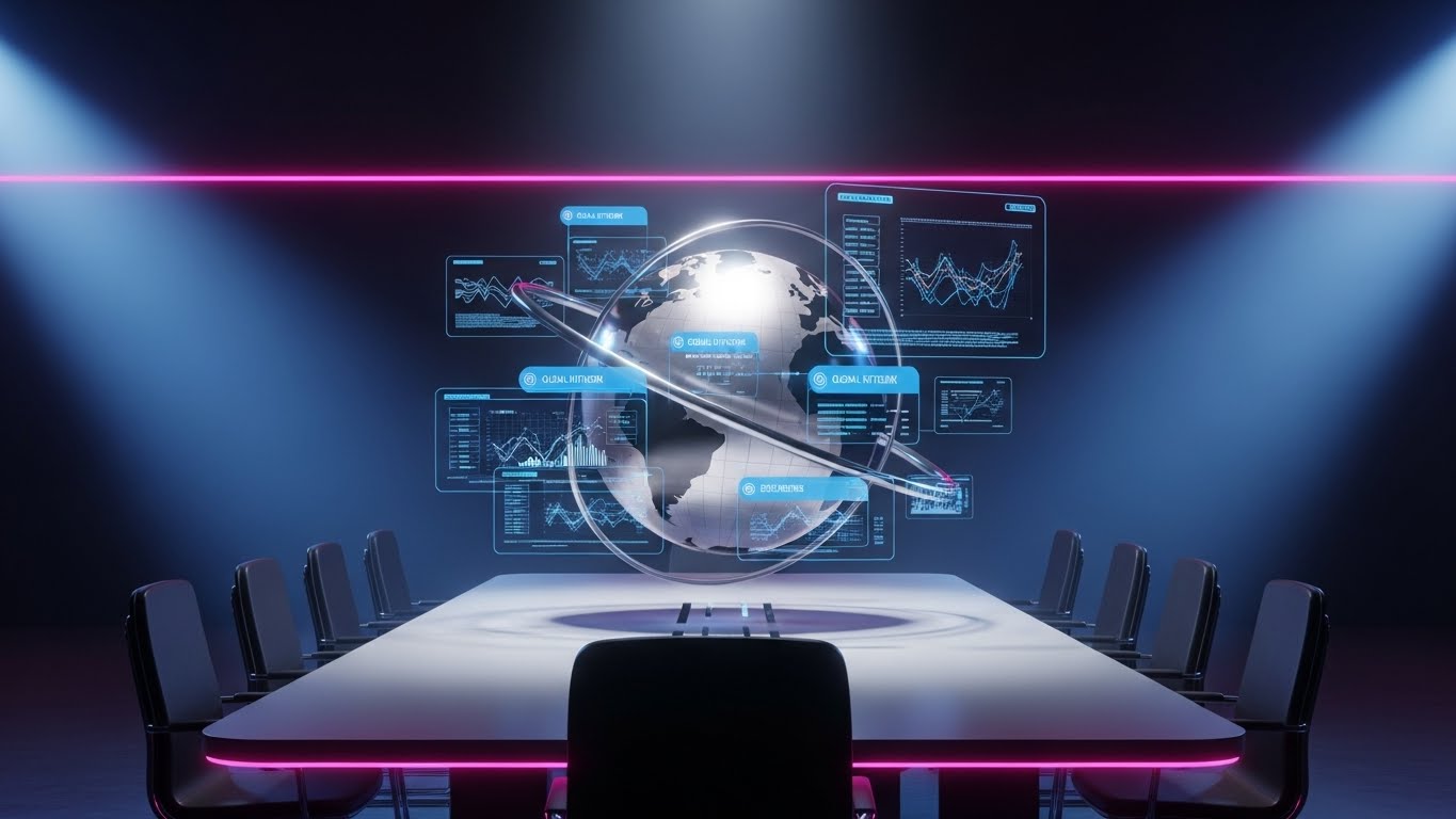
The Visual & Narrative Approach
For the "Expansion" phase, we need to sell scale. This visual places us in a darkened, high-tech war room. A 3D holographic globe rotates above a sleek meeting table. As it spins, data points in Neon Blue and Steel pop up from various continents, representing active payroll nodes. The aesthetic is premium, cinematic, and authoritative ("Mission Control" vibes). It tells the story of Global Dominance and control.
Psychological Impact & KPI Focus
This appeals to the Empire Building instinct of the C-Suite. As companies grow, they fear losing control. This visual reassures them that the software provides a "God's Eye View" of their global operations. It positions the platform as a strategic partner for international growth, directly supporting Upsell campaigns for Global Payroll modules (EOR/GEO services).
Strategic Implementation & Trade-offs
- Use Case: "Global Solutions" Landing Pages and Investor Relations videos.
- Duration: 15-30 Seconds.
- Trade-off: It looks expensive and complex. It is not suitable for SMBs; it is strictly an Enterprise/Mid-Market expansion play.
Companies using similar video content -
Papaya Global – Visualizes international scale and command.
Globalization Partners – Visualizes international scale and command.
FMP Global – Global command for international payroll.
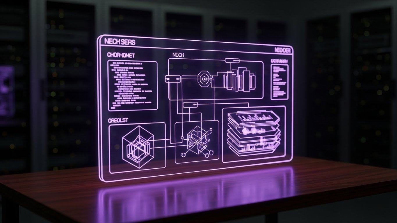
29. The Deep Dive Layer
Expansion | Driving Deep Feature Adoption

The Visual & Narrative Approach
To sell advanced features, we need to show depth. This style uses a "Z-Axis" parallax effect. A standard 2D UI screen explodes outward into multiple 3D layers floating in space. Each layer reveals a deeper level of functionality (e.g., Reporting, Compliance, API). Thin white lines connect the layers. The camera pushes through the top layer to reveal the "hidden gold" underneath.
Psychological Impact & KPI Focus
Users often only use 20% of a software's features. This visual triggers Curiosity. By showing that there is "more beneath the surface," it invites the user to explore deeper functionality. It visually represents the Depth of Architecture, proving that the platform is not just a surface-level tool but a deep, robust engine capable of handling complex needs. This drives Feature Adoption.
Strategic Implementation & Trade-offs
- Use Case: Product Update Webinars and "Advanced Features" emails.
- Duration: 10-20 Seconds.
- Trade-off: It is abstract. It requires clear labeling on the layers (e.g., "Analytics," "Tax Engine") so the viewer understands what is being revealed.
Companies using similar video content -
Infor – Global HR – Reveals architectural depth for advanced features.
Unit4 – Unit4 HCM – Exploded view for deep feature adoption.
30. The Platinum Unlock
Expansion | Driving Upsell/Cross-sell
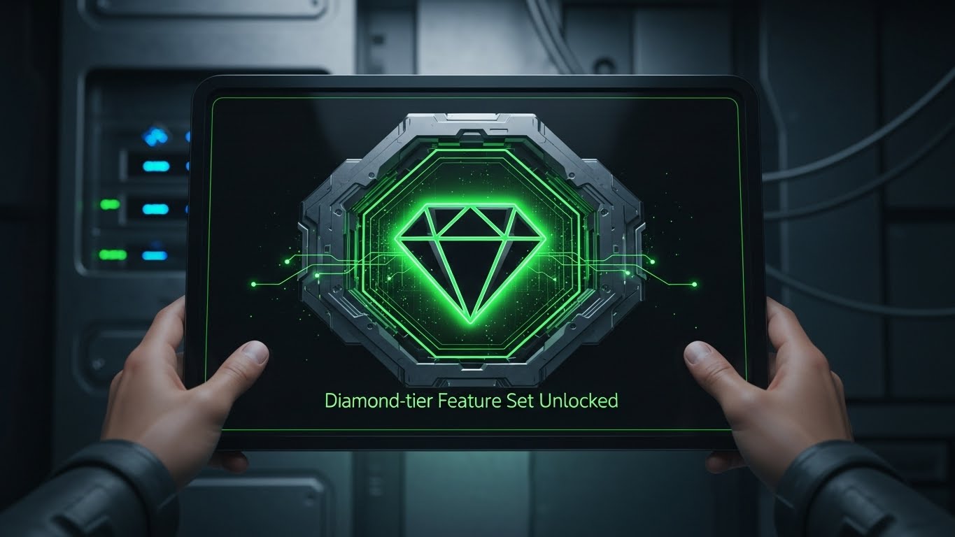
The Visual & Narrative Approach
This style gamifies the upsell. We see a first-person POV of a user holding a tablet. The interface is in a sleek "Dark Mode" with Neon Green accents. A central, stylized "Diamond" icon glows intensely and "unlocks" from a metallic casing, accompanied by a "Diamond-tier Unlocked" notification. The aesthetic is Cyberpunk-lite—futuristic, exclusive, and high-value.
Psychological Impact & KPI Focus
This leverages the Scarcity and Exclusivity bias. By framing the premium tier not just as "more features" but as an "Unlockable Status," you appeal to the user's desire for the best tools. The Dark Mode aesthetic signals "Pro Level" (as used by developers and power users). It makes the upgrade feel like a reward rather than a purchase, driving Upsell Conversions.
Strategic Implementation & Trade-offs
- Use Case: In-App Paywalls and End-of-Year Upgrade campaigns.
- Duration: 05-10 Seconds.
- Trade-off: It is highly stylized. It works best for a "Pro" tier or a specific "Power-User" add-on. It may feel too aggressive for a standard compliance update.
The Visual Operations Doctrine: 3 Strategic Frameworks
To transform these 30 visual styles from "marketing assets" into a cohesive business strategy, we must move beyond aesthetics and into Visual Operations (VisOps). The following frameworks provide the blueprint for integrating video into the very DNA of your payroll software’s lifecycle—from the first sales touch to the final renewal.
STRATEGIC ALIGNMENT & VISUAL ARCHITECTURE
The "Pre-Production" Strategy. Why and Who.
- The Cognitive Load Audit: Before commissioning a single pixel, audit your current training PDFs and compliance docs. Identify "High Friction" zones (e.g., tax jurisdiction explanations). These are your primary candidates for visual simplification using Style 2 (Fluidity) or Style 26 (Aha! Moment).
- Role-Based Visual Mapping: Do not use the same visual language for every user. Assign Style 23 (Friendly 2D) for Employee Self-Service (mobile/fast) and Style 19 (Dark Mode) for IT/Payroll Admins (desktop/dense). Match the visual complexity to the user’s role.
- The "Glanceability" Standard: Payroll Admins operate under time pressure. Visuals in the dashboard (like Style 25) must be "glanceable"—understanding the status of a payroll run in <2 seconds without audio.
- Brand Voice Consistency: Ensure the "Marketing Promise" (Styles 1-10) matches the "Product Reality" (Styles 21-30). If your ads are Kinetic (Style 1) but your onboarding is a dry PDF, you create a "Brand Gap" that leads to churn.
- The Advids Strategic Audit: A cohesive visual language requires a Design System. Advids recommends establishing a "Motion Guideline" document that defines how data moves, how success looks (Green vs. Gold), and how alerts appear across all 30 styles.
- Standardization vs. Customization: Use scalable, standardized styles (like Style 21 Hyper-lapse) for general market updates. Reserve high-cost, bespoke styles (like Style 29 Parallax) for high-value "Hero" features that differentiate you from competitors.
- The Cross-Departmental Bridge: Use visuals to unify terminology. If Sales uses Style 9 (Ecosystem City) to show the module connections, Implementation must use Style 22 (Blueprint) to show how that ecosystem is built, preventing "over-promising" friction.
- Legacy System Integration: Visually acknowledge the past. Use Style 3 (Physical/Digital) to show the connection between the client’s old "Green Screen" or paper ledgers and your new SaaS interface. It validates their history while selling their future.
- Accessibility in Payroll: Your workforce is diverse. All motion graphics (especially Styles 23 & 26) must be designed for "Sound-Off" viewing with large, high-contrast kinetic subtitles to ensure compliance training reaches everyone.
- The Mobile-First Mandate: Employees check pay stubs on phones. Styles 21-30 must be framed for vertical (9:16) consumption, ensuring the "Self-Serve" visual experience is native to the device they actually use.
OPERATIONAL ADOPTION & IMPLEMENTATION
The "Deployment" Phase. How to embed visuals into the workflow.
- Overcoming "Big Brother" Anxiety: Employee monitoring (Time & Attendance) triggers privacy fears. Use Style 20 (Lifestyle) to frame data collection as "support" (ensuring they get paid correctly) rather than "surveillance."
- The Micro-Learning Shift: Replace the 100-page "Admin Manual" with a library of 30-second Style 26 (Aha!) clips. Index them by specific error codes (e.g., "Tax Mismatch Error") for instant resolution.
- Just-in-Time Support: Embed Style 25 (Low Poly) loops directly into the software interface next to complex fields. If a user hovers over "Garnishment," a small animation should visually explain the rule.
- Gamification of Training: Use Style 24 (UI Overlay) to visualize the "Onboarding Progress" of new admins. Visualizing a "Level Up" upon completing training modules increases certification rates.
- Reducing Support Ticket Volume: There is a direct correlation between the quality of your visual library and your support costs. Proactively sending Style 23 (Self-Serve) videos before a major tax deadline can deflect thousands of "How do I?" tickets.
- Remote Onboarding: For distributed teams who never visit HQ, Style 28 (Global Hologram) helps visualize the company's size and stability, fostering a sense of belonging and culture during digital onboarding.
- Standard Operating Procedures (SOPs): Visualizing the "Payroll Run" checklist using Style 6 (Continuous Chain) ensures that critical steps are not missed, reducing compliance risk.
- Feedback Loops: Use interactive video elements. At the end of a Style 29 (Deep Dive) feature update, add a one-click "Was this helpful?" interaction to gather product feedback data.
- Scalable Localization: Global payroll requires global assets. Design Style 23 (2D) characters with abstract features or varying skin tones to ensure the same video asset works in London, Tokyo, and New York.
- Leadership Communication: When the C-Suite needs to communicate a merger or a new HR strategy, replace the memo with a Style 5 (Enterprise Twilight) video. High production value signals strategic importance.
MEASURING IMPACT & FUTURE-PROOFING
The "ROI" Phase. Measuring success and looking ahead.
- Beyond "Views": Stop measuring vanity metrics. Measure "Time-to-Competency." How much faster does a new Admin run their first payroll after watching a Style 22 (Blueprint) video versus reading the manual?
- The "Idle Time" Metric: Track the reduction in "Idle Time" (time spent staring at a screen confused) after implementing Style 15 (Velocity Interface) tooltips.
- Compliance Velocity: When a new law (e.g., GDPR update) hits, how fast does the organization reach 100% compliance? Video (specifically Style 1 (Kinetic)) travels faster than email.
- Retention and Churn: Correlate consumption of "Success Videos" (Style 27) with renewal rates. Customers who engage with your educational visuals are less likely to churn.
- The AI Visual Frontier: Prepare for Generative AI. Soon, you will use Style 30 aesthetics to generate personalized "Pay Stub Explainer" videos for every single employee dynamically.
- Scalability of Assets: Build a library, not a campaign. Create "Master Assets" (backgrounds, UI rigs) that can be re-assembled into new videos cheaply.
- The Advids Partnership: Visual styles evolve. Partnering with Advids ensures your "Visual Operating System" is updated annually, keeping your brand looking like Style 30 (Future) rather than drifting back to Style 3 (Legacy).
- Benchmarking Success: Compare your visual engagement against industry standards. If your "Feature Update" videos have a <40% completion rate, your visual style is likely too complex or too slow.
- The ROI of Safety: Quantify the "Cost Avoidance" of errors. If a visual guide prevents one major tax penalty, the ROI of the entire video program is positive.
- Final Call to Innovation: Treat video as Infrastructure, not content. In the AI era, your visual interface is your product. Invest in it with the same rigor you invest in your code.
Companies using similar video content -
SD Worx – Incentivizes feature upgrades with premium unlock.
Zellis – Neon dark mode for exclusive payroll tiers.
ADP – Incentivizes feature upgrades with premium unlock.
Author & Editor Bio


