
Introduction: The Visualization of Uptime
In the high-stakes world of performance diagnostics, the invisible backend drives the visible business. For DevOps leaders and SREs, the challenge is no longer just maintaining systems; it is translating complex, abstract data into immediate, actionable intelligence. We are moving from an era of simple monitoring to a new age of "Observable Mastery," where every metric tells a story of efficiency, resilience, and growth.
The opportunity for clarity has never been more urgent. Recent industry data reveals that the average cost of unplanned downtime across all industries has grown to about $14,056 per minute, a staggering figure that underscores the critical need for rapid incident resolution. In this environment, your software is not just a tool; it is the safeguard of revenue and reputation.
However, the path to reliability is paved with significant rewards for those who can communicate value effectively. A 2024 forecast highlights that businesses report a 4x median return on investment from their observability practices. The bridge between the risk of downtime and the ROI of observability is visualization. By transforming raw telemetry into intuitive visual narratives, we reduce cognitive load, accelerate decision-making, and align technical teams with business goals.
This guide presents a strategic framework for visualizing performance diagnostics. It moves beyond generic "matrix code" clichés to offer a sophisticated visual vocabulary—from fluid vector pathways that mimic data velocity to cinematic representations of infrastructure awakening. These styles are designed to bridge the physical/digital divide, ensuring your platform is perceived not just as a utility, but as a strategic asset for the modern enterprise.
1. Velocity Pathways
TOFU | Brand Awareness

The Visual & Narrative Approach
Imagine a high-level brand awareness ad designed to stop the scroll on social feeds. The visual does not show a dashboard; instead, it captures the feeling of frictionless data transmission. Vertical streams of glossy "Electric Amber" liquid merge and flow through channels of "Deep Charcoal," representing the seamless ingestion of massive log volumes. The movement is smooth and continuous, devoid of sharp jagged edges, symbolizing a system optimized for high throughput and low latency.
Psychological Impact & KPI Focus
- Niche Psychology: For an engineer battling "alert fatigue" and jagged spikes in performance graphs, smooth, organic curves offer a subconscious promise of stability and control.
- Operational Impact: This style addresses the Data Velocity challenge. By abstracting the concept of speed into a fluid form, we reduce the cognitive load required to understand "high availability," making the concept accessible even to non-technical buyers.
Strategic Implementation & Trade-offs
- Best Use Case: 6-10 second vertical video ads (Stories/Reels/TikTok) where the goal is purely impression-based.
- Strategic Trade-off: This style prioritizes Emotion over Precision. It is excellent for capturing attention but fails if used to explain specific technical features (like root cause analysis), where exactness is required.
Companies using similar video content -
Cribl – Stream – Streamlining observability data flow.
Mezmo – Log Analysis Platform – Seamlessly ingesting massive log volumes.
Kentik – Network Observability Cloud – Visualizing network data velocity.
2. Infrastructure Awakening
TOFU | Brand Awareness

The Visual & Narrative Approach
We enter the physical realm of the data center to visualize the digital impact of the software. The camera tracks slowly down a corridor of "Arctic White" server racks, bathed in a sterile, high-tech atmosphere. As the diagnostics software "scans" the environment, vertical strips of light on each rack ignite in a brilliant "Cyan" sequence. This ignition symbolizes the system "waking up" to full observability—the moment the lights go on in a previously dark room.
Psychological Impact & KPI Focus
- Niche Psychology: DevOps teams often feel disconnected from the physical hardware they manage in the cloud. This style bridges the Physical/Digital Divide, reminding the viewer that their code controls real, powerful machinery.
- Operational Impact: The lighting sequence serves as a powerful metaphor for MTTD (Mean Time to Detection). The instant illumination suggests immediate awareness of system health, positioning the platform as a proactive guardian rather than a reactive tool.
Strategic Implementation & Trade-offs
- Best Use Case: YouTube Pre-roll ads (15s) or website hero backgrounds (16:9) where cinematic production value builds premium brand equity.
- Strategic Trade-off: This style prioritizes Aspiration over Reality. Real server rooms are messy and loud; this idealized version sells the vision of a perfect infrastructure, which is necessary for high-ticket B2B sales.
Companies using similar video content -
LogicMonitor – LM Cloud – Illuminating cloud infrastructure health.
Schneider Electric – EcoStruxure IT – Waking up data center infrastructure.
3. Neural Observability
TOFU | Category Creation

The Visual & Narrative Approach
To explain the complex AI-driven predictive capabilities of the platform, we utilize a macro 3D visualization. A cluster of crystalline nodes, glowing in "Cyan" (operational) and "Magenta" (alert), acts as the focal point. Fine, pulsing "White" filaments connect these nodes, visualizing the flow of information between microservices. The camera depth-of-field focuses intensely on the connections, illustrating how the software identifies dependencies that are invisible to the naked eye.
Psychological Impact & KPI Focus
- Niche Psychology: The "Black Box" problem—not knowing how AI reaches a conclusion—is a major barrier to adoption. This visualization demystifies the algorithm, making the AI look organized, crystalline, and logical rather than chaotic.
- Operational Impact: This style directly targets Distributed Tracing. It visually explains how the software tracks requests across a fragmented microservices architecture, reinforcing the value of "Full-Stack Observability."
Strategic Implementation & Trade-offs
- Best Use Case: Website "Technology" pages or explainer video intros (16:9) where the goal is to establish the sophistication of the backend engine.
- Strategic Trade-off: This style prioritizes Complexity over Simplicity. It is visually dense and requires a high-resolution screen to be appreciated; avoid using this for small-format mobile banners.
Companies using similar video content -
Dynatrace – Davis AI – Illuminating predictive connections with AI.
Instana – Automated APM – Visualizing microservice dependencies.
Honeycomb – Observability Platform – Revealing complex system interactions.
4. Complexity Resolution
TOFU | Market Education

The Visual & Narrative Approach
This illustration perfectly captures the core value proposition: bringing order to chaos. On the left, a "Slate Blue" line is tangled, knotted, and erratic, representing unmanaged logs and technical debt. As the line flows to the right, it passes through an invisible filter (the software) and resolves into straight, parallel, equidistant lines. The clean "Pure White" background emphasizes the clinical precision of the transformation.
Psychological Impact & KPI Focus
- Niche Psychology: This triggers a "Psychological Relief" response. Engineers constantly battle entropy; seeing a visual representation of effortless untangling validates their desire for order and efficiency.
- Operational Impact: This visualizes MTTR (Mean Time to Resolution) reduction. It shows that the software doesn't just display data; it effectively "straightens" the workflow, removing friction and restoring operational flow.
Strategic Implementation & Trade-offs
- Best Use Case: LinkedIn carousel slides (1:1) or whitepaper illustrations. The simplicity ensures readability even on small screens or printed materials.
- Strategic Trade-off: This style prioritizes Clarity over Excitement. It is intellectually satisfying but lacks the emotional "wow" factor of 3D motion; use it for educational content, not hype reels.
Companies using similar video content -
Splunk – Observability Cloud – Resolving complex data instantly.
Elastic – Observability – Untangling log and metric chaos.
Sentry – Error Monitoring – Streamlining error resolution.
5. Metric Rhythm
TOFU | Vertical Social

The Visual & Narrative Approach
Designed for the fast-paced vertical feed, this style abandons imagery for pure motion and text. Large geometric blocks in "Vivid Lime Green" (growth) and "Stark Black" (contrast) dominate the screen in a dynamic, diagonal composition. The blocks expand and contract rhythmically, mimicking the pulse of real-time server metrics (IOPS, CPU load). While no specific data is readable, the motion conveys the speed and liveness of the dashboard.
Psychological Impact & KPI Focus
- Niche Psychology: The "Z-Pattern" scanning habit of users is disrupted here by the diagonal flow, creating dynamic tension that demands attention. It appeals to the user's need for speed and responsiveness.
- Operational Impact: This visualizes Real-Time Monitoring. The "expanding/contracting" motion metaphorically represents "Elasticity" and auto-scaling capabilities, key features of modern SaaS platforms.
Strategic Implementation & Trade-offs
- Best Use Case: TikTok or Instagram Reels (9:16) promoting a new feature launch or an upcoming webinar.
- Strategic Trade-off: This style prioritizes Impact over Information. It conveys energy but communicates zero technical detail. It must be paired with clear captioning or voiceover to deliver the message.
Companies using similar video content -
Grafana Labs – Grafana – Accelerating real-time metric insights.
Catchpoint – Digital Experience Monitoring – Pulsing real-time performance data.
6. Status Transition
TOFU | Skippable Ad
The Visual & Narrative Approach
A storytelling arc is condensed into a single visual transition. The left side of the frame is dominated by a chaotic, jagged "tide" of "Signal Red" shapes, representing a critical outage or security breach. From the right, a smooth, calming wave of "Success Green" washes over the red, neutralizing the chaos. The boundary where they meet is fluid, showing the active suppression of the incident. Floating white particles add texture, preventing the image from looking flat.
Psychological Impact & KPI Focus
- Niche Psychology: This leverages basic Color Semantics (Red = Bad, Green = Good) to tell a universal story of "Problem -> Solution" without needing language. It taps into the relief of seeing a dashboard turn all green.
- Operational Impact: This visualizes Incident Management. It shows the platform's ability to contain and resolve issues, highlighting the speed of recovery and the restoration of service health.
Strategic Implementation & Trade-offs
- Best Use Case: YouTube Skippable Ads (first 5 seconds). The strong color contrast hooks the eye immediately before the "Skip" button appears.
- Strategic Trade-off: This style prioritizes Binary Messaging. It frames the world as "broken" or "fixed," which is great for ads but lacks the nuance needed for deep-dive technical demos.
Companies using similar video content -
PagerDuty – Incident Management – Flowing from incident to resolution.
Opsgenie (Atlassian) – Incident Management – Visualizing incident suppression.
7. The Architect
TOFU | Aspiration

The Visual & Narrative Approach
We move from abstract shapes to the human element. The visual features a confident female DevOps engineer, the "Architect" of the system. She wears a smart-casual "Soft Grey" blazer, signaling authority without being overly formal. Her arms are crossed, a pose of confidence and control. The background is a soft-focus blur of blue server LEDs, placing her in the context of the data center but keeping the focus on her capability.
Psychological Impact & KPI Focus
- Niche Psychology: Representation matters. This image counters the "hoodie-wearing hacker in a basement" stereotype. It appeals to the Aspirations of the persona—to be seen as a professional, strategic leader who controls the tech, rather than being controlled by it.
- Operational Impact: This supports Team Efficiency. It implies that with the right tools (your software), the engineer is calm, collected, and in control, rather than firefighting in a panic.
Strategic Implementation & Trade-offs
- Best Use Case: LinkedIn Sponsored Content or Case Study headers. It builds trust and human connection in a B2B environment.
- Strategic Trade-off: This style prioritizes Identity over Utility. It sells the result (a confident engineer) but doesn't show the product. It must be paired with screenshots or technical copy to be effective.
Companies using similar video content -
New Relic – Full-Stack Observability – Humanizing DevOps excellence.
Datadog – Cloud Monitoring Platform – Empowering engineers with control.
8. Operational Clarity
MOFU | Differentiation

The Visual & Narrative Approach
A stark "Before & After" composition that creates immediate cognitive dissonance and resolution. The left side is a gritty, grainy, desaturated photograph of a desk cluttered with tangled cables—the "Legacy Reality." The right side cuts sharply to a pristine, high-definition render of a "Bright Blue" abstract UI dashboard floating in white space—the "Modern Future." A vertical white line divides the two eras.
Psychological Impact & KPI Focus
- Niche Psychology: This exploits the Contrast Effect. The brain instinctively prefers the clean, organized right side. It validates the user's pain (the messy left) while offering an immediate escape (the clean right).
- Operational Impact: This visualizes Digital Transformation. It represents the shift from manual, hardware-dependent debugging to cloud-native, software-defined observability.
Strategic Implementation & Trade-offs
- Best Use Case: Landing Page Hero sections or Email Marketing headers. It clearly articulates the value proposition: "Leave the mess behind."
- Strategic Trade-off: This style prioritizes Comparison. It works best when your competitor is "the old way of doing things" (status quo), but is less effective if you are competing against another modern tool.
Companies using similar video content -
SolarWinds – Hybrid Cloud Observability – Bridging the legacy IT gap.
ManageEngine – OpManager – Transforming messy infrastructure into clarity.
9. Growth Dimensions
MOFU | Feature Education

The Visual & Narrative Approach
Data becomes a tangible object in this 3D isometric illustration. Bar charts and floating percentage rings are rendered in "Matte Plastic" textures, giving them weight and substance. The palette represents sophistication: "Coral" for highlights, "Deep Indigo" for base data, and "Matte Silver" for structure. The charts rise upwards from a grid base, clearly visualizing the concept of "Scalability" without using a generic arrow.
Psychological Impact & KPI Focus
- Niche Psychology: Flat 2D charts can feel ephemeral. By adding 3D depth and tactile textures, the metrics feel Substantial and Real. It triggers a sense of value—this data is an asset, not just pixels.
- Operational Impact: This visualizes Capacity Planning. The isometric growth implies that the platform can handle increasing load (vertical scaling) without losing stability (the grid base).
Strategic Implementation & Trade-offs
- Best Use Case: Blog posts about scaling infrastructure or feature pages describing analytics capabilities.
- Strategic Trade-off: This style prioritizes Aesthetics over Granularity. While beautiful, isometric charts are often hard to read for exact values. Use this to sell the concept of analytics, not to display actual user data.
Companies using similar video content -
CloudZero – Cloud Cost Intelligence – Tangible metrics for cloud scalability.
ProsperOps – Autonomous Cloud Optimization – Visualizing cost optimization growth.
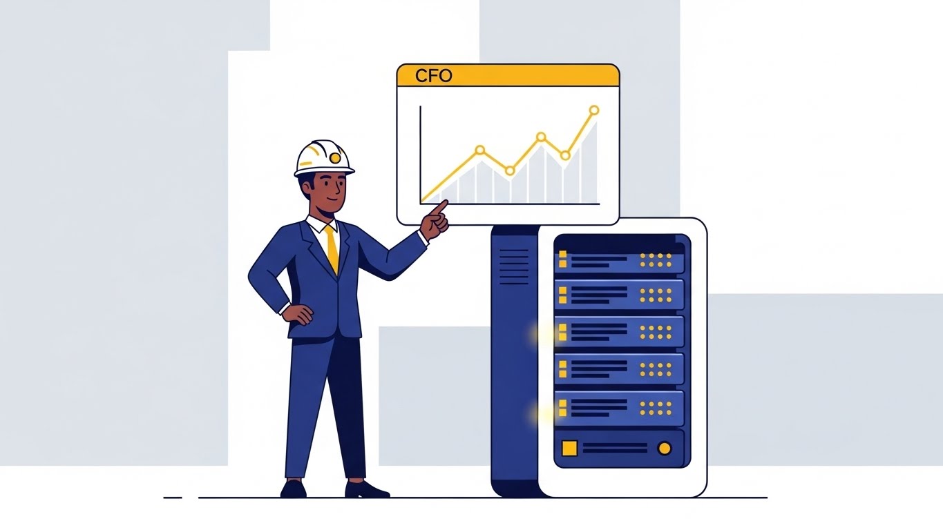
11. The Value Stack
MOFU | ROI Justification

The Visual & Narrative Approach
This illustration tackles the hardest conversation in DevOps: proving ROI to the CFO. We utilize a clean, flat isometric perspective on a pure white background. The visual narrative is one of literal transformation. A "Slate Grey" server rack, representing technical infrastructure, stands firmly at the base. As the eye moves upward, the hardware seamlessly morphs into a structured stack of "Flat Gold" coins. The transition is geometric and precise, implying a direct, causal link between server health and financial outcome.
Psychological Impact & KPI Focus
- Niche Psychology: Technical leaders often struggle to speak the language of finance. This visual acts as a "Translation Layer," validating the engineer’s work as a profit generator rather than a cost center.
- Operational Impact: This focuses on FinOps & Cost Optimization. It visually argues that efficient infrastructure management (the grey base) directly supports the bottom line, shifting the conversation from "maintenance costs" to "revenue protection."
Strategic Implementation & Trade-offs
- Best Use Case: Whitepapers, Annual Reports, or ROI Calculator landing pages (4:5 vertical or 1:1).
- Strategic Trade-off: This style prioritizes Business Logic over Tech Specs. It is highly effective for economic buyers but may feel too "marketing-heavy" for a purely technical audience looking for feature details.
12. Legacy Metamorphosis
MOFU | Displacement

The Visual & Narrative Approach
To visualize the concept of modernization, we freeze the moment of evolution. A server blade is presented in a ¾ angle view. The left side is a skeletal "Blueprint Blue" wireframe against a digital grid, representing the planning and architecture phase. As the eye scans right, the wireframe fills in, transitioning smoothly into a photorealistic, "Metallic Silver" hardware render. This creates a bridge between the abstract code and the physical reality of the data center.
Psychological Impact & KPI Focus
- Niche Psychology: This taps into the "Builder's Instinct." Engineers love seeing how things are made. The wireframe acknowledges the planning (the mind), while the realistic render acknowledges the execution (the matter).
- Operational Impact: This visualizes Infrastructure Provisioning. It illustrates the "Infrastructure as Code" (IaC) concept, showing how software definitions (wireframes) manifest as tangible computing power.
Strategic Implementation & Trade-offs
- Best Use Case: LinkedIn carousel slides comparing "Old vs. New" or product pages for migration tools.
- Strategic Trade-off: This style prioritizes Process over Result. It shows how the change happens, which is engaging, but doesn't necessarily show the final dashboard UI.
Companies using similar video content -
Apptio – Technology Business Management – Transmuting uptime into revenue.
CloudHealth (VMware) – Cloud Financial Management – Stacking financial value from infrastructure.
Kubecost – Kubernetes Cost Monitoring – Visualizing cost savings as tangible assets.
13. Silicon Transparency
MOFU | Deep Tech Dive

The Visual & Narrative Approach
For the skeptical architect who demands to know "what's under the hood," we use a macro X-ray visualization. The camera zooms deep into a processor chip, rendering the outer casing as translucent glass. Inside, the intricate "Radioactive Green" and "Bright White" logic gates pulse with activity. This is not a surface-level view; it is a forensic examination of the computing core, implying that the software offers visibility down to the bare metal.
Psychological Impact & KPI Focus
- Niche Psychology: This addresses Skepticism of Abstraction. High-level dashboards can hide problems. This visual assures the viewer that the platform creates nothing; it reveals everything, down to the granular level.
- Operational Impact: This visualizes Root Cause Analysis. It suggests that when a problem occurs, the user can drill down through layers of abstraction to find the physical source of the latency or error.
Strategic Implementation & Trade-offs
- Best Use Case: "How it Works" website sections or technical deep-dive documentation.
- Strategic Trade-off: This style prioritizes Depth over Breadth. It is intense and specific. Using this for a general overview would be overwhelming; keep it for the technical deep dive.
Companies using similar video content -
HashiCorp – Terraform – Visualizing infrastructure as code deployment.
Device42 – DCIM & CMDB – Bridging abstract planning to physical reality.
14. Ecosystem Overview
MOFU | Functional Buyer
The Visual & Narrative Approach
To combat the issue of "Tool Sprawl," we present the platform as a unified ecosystem. A tight grid of UI cards floats in a clean space. Each card is a simplified, high-key abstraction of a different function: a Kanban board, a line graph, a health gauge. They are unified by a consistent "Sky Blue" and "Soft Grey" palette. The arrangement implies that all these disparate tools now live in one organized house.
Psychological Impact & KPI Focus
- Niche Psychology: This offers Cognitive Relief. DevOps teams are tired of switching between ten different tabs to monitor one system. This visual promises a "Single Pane of Glass."
- Operational Impact: This visualizes Platform Consolidation. It demonstrates that the software handles logging, metrics, and tracing simultaneously, reducing context switching and licensing costs.
Strategic Implementation & Trade-offs
- Best Use Case: Product overview pages or "Features" section headers.
- Strategic Trade-off: This style prioritizes Volume over Detail. No single graph is readable, but the amount of functionality is impressive. It sells the suite, not the specific feature.
Companies using similar video content -
Sunbird DCIM – Power IQ – Revealing core data center architecture.
FNT Command – DCIM – Deep dive into physical infrastructure.
15. Lucid Operations
MOFU | Demo Request
The Visual & Narrative Approach
Sometimes, the most radical visual is simplicity. We present a front-on view of the dashboard in "Light Mode." Unlike the moody "Dark Mode" used for coolness, this "Pastel Purple" and "Mint Green" interface on white signals approachability, clarity, and daylight operations. The monitor stands on a simple wooden desk, bathed in natural light. It suggests a tool that is easy to learn and pleasant to use during a 9-to-5 day, not just at 3 AM during a crisis.
Psychological Impact & KPI Focus
- Niche Psychology: This lowers the Barrier to Entry. Complex, dark, matrix-like interfaces can look intimidating to new hires. This aesthetic says, "You can master this tool in minutes."
- Operational Impact: This visualizes User Experience (UX) and Adoption. It implies that the software is intuitive enough for the entire team to use, not just the senior architects, democratizing data access.
Strategic Implementation & Trade-offs
- Best Use Case: Email headers for demo requests or free trial sign-up pages.
- Strategic Trade-off: This style prioritizes Accessibility over Power. Hardcore engineers might find it too "soft" or "consumer-like." Ensure the data widgets shown are still technically relevant.
Companies using similar video content -
VMware – Tanzu Observability – Eliminating tool sprawl with a unified ecosystem.
Sysdig – Cloud-Native Intelligence – Comprehensive view of cloud-native ecosystem.
Aiven – Managed Open Source Data – Unifying diverse data technologies.
16. Infinite Reliability
BOFU | Building Trust

The Visual & Narrative Approach
Trust is built on stability. We utilize a photorealistic, one-point perspective shot down an infinite aisle of "Sterile White" server racks. The lighting is clinical, cool, and perfectly even, with "Cyan" and "Magenta" LEDs providing the only accent. There is no chaos, no dirt, no tangled wires. It is a cathedral of computation, representing the absolute stability and infinite scalability of the platform.
Psychological Impact & KPI Focus
- Niche Psychology: This appeals to the Need for Order. In a chaotic digital world, the perfect symmetry of the server aisle provides a sense of calm and permanence. It looks "Enterprise-Ready."
- Operational Impact: This visualizes Scalability and Uptime. The infinite repetition of racks implies that the platform can grow endlessly with the customer's needs without buckling under load.
Strategic Implementation & Trade-offs
- Best Use Case: Website backgrounds (hero section) or "Enterprise" plan pricing pages.
- Strategic Trade-off: This style prioritizes Atmosphere over Information. It sets a tone of high-end reliability but conveys zero information about what the software actually does.
Companies using similar video content -
SigNoz – Open-Source APM & Observability – The promise of intuitive observability.
Uptrace – OpenTelemetry APM – Clean interface for lucid operations.
17. The Digital Bastion
BOFU | Risk Mitigation
The Visual & Narrative Approach
Security is often an abstract concept, so we make it physical. We use a low-poly 3D style to build a fortress. A central cluster of blue servers is surrounded by thick, faceted walls shaped like "Safety Orange" shields. The bird's-eye view allows the user to see the entire perimeter, confirming that there are no gaps in the defense. The aesthetic is clean and solid, avoiding the fear-mongering of "hacker in a hoodie" imagery.
Psychological Impact & KPI Focus
- Niche Psychology: This addresses Anxiety about Vulnerability. By visualizing security as a physical wall, we provide a mental model of protection that feels robust and impenetrable.
- Operational Impact: This visualizes Security Compliance (DevSecOps). It shows that security is not an afterthought but a structural component of the infrastructure, wrapping around the data assets.
Strategic Implementation & Trade-offs
- Best Use Case: Security compliance blog posts or the "Trust Center" page of the website.
- Strategic Trade-off: This style prioritizes Metaphor over Detail. It doesn't show how the firewall works (packet inspection, etc.), only that it exists and is strong.
Companies using similar video content -
Vertiv – Environet – Visualizing infinite data center reliability.
Nlyte – DCIM – Showcasing enterprise-grade infrastructure stability.
18. Executive Command
BOFU | Economic Buyer

The Visual & Narrative Approach
For the final decision-maker, we shift focus from the server room to the boardroom. An over-the-shoulder shot shows an executive in a "Navy Suit" viewing a tablet. Instead of a flat screen, the tablet projects a holographic "Electric Blue" city map, where buildings represent data nodes. The background is a warm, blurred office. This frames the software not as a debugging tool, but as a strategic command center for business intelligence.
Psychological Impact & KPI Focus
- Niche Psychology: This appeals to Ego and Status. It positions the user as a visionary leader who oversees a "digital city," rather than a technician fixing bugs. It aligns with the "Control" motivation.
- Operational Impact: This visualizes Business Intelligence. It elevates the conversation from "server health" to "business health," showing how technical metrics translate into a macro view of the organization.
Strategic Implementation & Trade-offs
- Best Use Case: Pitch decks for investors or "Solutions for Executives" landing pages.
- Strategic Trade-off: This style prioritizes Aspiration over Utility. Real dashboards don't project holograms. This is a "vision sell," effective for closing the deal but not for training users.
Companies using similar video content -
Lacework – Cloud Security Platform – Securing the cloud perimeter.
TheHive – Security Incident Response Platform – Building a digital security fortress.
19. Deep-Dive Parallax
BOFU | Sales Accel

The Visual & Narrative Approach
To keep the viewer engaged during the final evaluation, we use depth. Floating, translucent glass UI cards are arranged in deep Z-space against a "Rich Indigo" void. Connecting lines of light link the cards, showing relationships between data sets. The cards are tilted, creating a dynamic parallax effect that suggests the software is multi-dimensional. It feels premium, modern, and deep.
Psychological Impact & KPI Focus
- Niche Psychology: This stimulates Curiosity and Immersion. Flat screenshots can feel static and boring. The depth cues in this visual invite the eye to "explore" the interface, increasing dwell time.
- Operational Impact: This visualizes Contextual Data. The layering suggests that the software provides context—showing not just the alert (top layer) but the underlying data (bottom layer) simultaneously.
Strategic Implementation & Trade-offs
- Best Use Case: Landing page hero animations or product hype reels.
- Strategic Trade-off: This style prioritizes Engagement over Readability. The tilt and transparency make the text hard to read. Use this to create a "vibe" of sophistication, then follow up with flat screenshots for clarity.
Companies using similar video content -
Everbridge – Critical Event Management – Strategic command for critical events.
IBM – Instana – Elevating technical metrics to business health.
20. Frictionless Resolve
BOFU | Objection Handling

The Visual & Narrative Approach
We end on the ultimate goal: resolution. A stylized "Corporate Memphis" character (Blue skin, Yellow shirt) is shown effortlessly pushing a large, floating "Green Button" with a checkmark. The action is weightless and easy. Floating UI elements around the character suggest the software is doing the heavy lifting. The background is clean white, emphasizing the lack of friction.
Psychological Impact & KPI Focus
- Niche Psychology: This triggers the Dopamine Response of completing a task. It visualizes the feeling of "Problem Solved." It counters the objection that the software will be "just another tool to manage."
- Operational Impact: This visualizes Automation and Remediation. It implies that complex workflows can be triggered with a single click, reducing the manual labor required to fix incidents.
Strategic Implementation & Trade-offs
- Best Use Case: Retargeting ads (display) for users who visited the pricing page but didn't convert.
- Strategic Trade-off: This style prioritizes Simplicity over Reality. DevOps is rarely one button press. This is a metaphorical promise of ease, designed to remove the final friction before purchase.
Companies using similar video content -
Lightstep (ServiceNow) – Distributed Tracing – Layered intelligence for deep-dive analysis.
Datadog – APM – Multi-dimensional data exploration.
21. Dark Mode UI
BOFU | Competitive
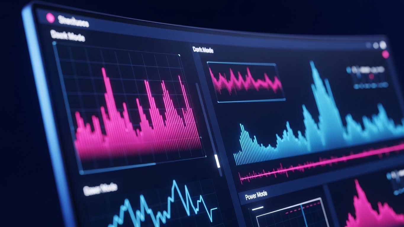
The Visual & Narrative Approach
To appeal to the developer who lives in the code, we showcase the interface in its native element: "Dark Mode." The visual is a sleek, angled close-up of a curved monitor. The UI background is "Midnight Blue" (almost black), minimizing glare. Data spikes and waveforms pop in glowing "Neon Pink" and "Electric Blue," creating high contrast for rapid readability. The aesthetic is cybernetic and intense, mirroring the environment of a late-night coding session or a war room scenario.
Psychological Impact & KPI Focus
- Niche Psychology: This signals "Developer Empathy." It acknowledges that engineers often work in low-light environments and prefer dark interfaces to reduce eye strain. It validates their preference and lifestyle.
- Operational Impact: This visualizes Ergonomics and Efficiency. High-contrast dark modes are often faster to scan for anomalies, directly supporting MTTD (Mean Time to Detection) during critical incidents.
Strategic Implementation & Trade-offs
- Best Use Case: Competitive comparison pages ("Us vs. Them") or "For Developers" feature pages.
- Strategic Trade-off: This style prioritizes Niche Appeal over Accessibility. While developers love dark mode, business stakeholders might find it "too techy" or hard to read in a bright boardroom presentation.
Companies using similar video content -
Rootly – Incident Management – The satisfaction of done with automated workflows.
FireHydrant – Incident Management – Effortless incident resolution.
22. 2D Character Story
Onboarding | Implementation
The Visual & Narrative Approach
Implementation is often the biggest hurdle to adoption. We use a friendly, simplified 2D vector style to alleviate this fear. A character in a "Teal" shirt is shown connecting two cables with a satisfying click, visualized by a "Peach" spark. The background is clean and uncluttered. It transforms the often frustrating task of API integration or agent installation into a simple, manual act that feels tactile and rewarding.
Psychological Impact & KPI Focus
- Niche Psychology: This addresses "Configuration Anxiety." New users fear breaking their production environment during setup. The playful, simple art style suggests that integration is safe, easy, and "plug-and-play."
- Operational Impact: This visualizes Time-to-Value (TTV). It implies that the distance between "Sign Up" and "First Data Received" is short and frictionless.
Strategic Implementation & Trade-offs
- Best Use Case: Onboarding emails (Day 1) or "Getting Started" documentation wizards.
- Strategic Trade-off: This style prioritizes Approachability over Technical Accuracy. It is a metaphor for connection, not a diagram of how the API actually works.
Companies using similar video content -
Raygun – Error & Performance Monitoring – Engineered for power users.
Atatus – APM & Error Tracking – Midnight ergonomics for developers.
23. 2D over Live Action
Onboarding | Time-to-Value

The Visual & Narrative Approach
Observability is a team sport. We combine the realism of live-action photography with the energy of 2D animation. A diverse team is captured in a candid moment of celebration (high-fiving) in a modern office. Overlaid on the photo are energetic, hand-drawn white doodles—stars, upward arrows, and checkmarks—floating around them. These animated elements visually amplify the positive emotion, representing the invisible "wins" provided by the software.
Psychological Impact & KPI Focus
- Niche Psychology: This fosters Community and Belonging. It reminds the user that the software helps the entire team succeed, reducing finger-pointing and fostering a culture of collaboration.
- Operational Impact: This visualizes Team Morale and Efficiency. It suggests that using the platform leads to fewer late-night pages and more "high-five" moments of successful deployment.
Strategic Implementation & Trade-offs
- Best Use Case: Social media posts (LinkedIn/Instagram) regarding company culture or "Customer Success" stories.
- Strategic Trade-off: This style prioritizes Culture over Product. It builds brand affinity but doesn't show the dashboard. It works best to humanize the brand after the technical sale is made.
Companies using similar video content -
OpenTelemetry – SDKs & APIs – Simplifying integration anxiety.
Particle – IoT Device Platform – Seamlessly connecting IoT devices.
24. Minimalist Flat
Onboarding | Self-Serve
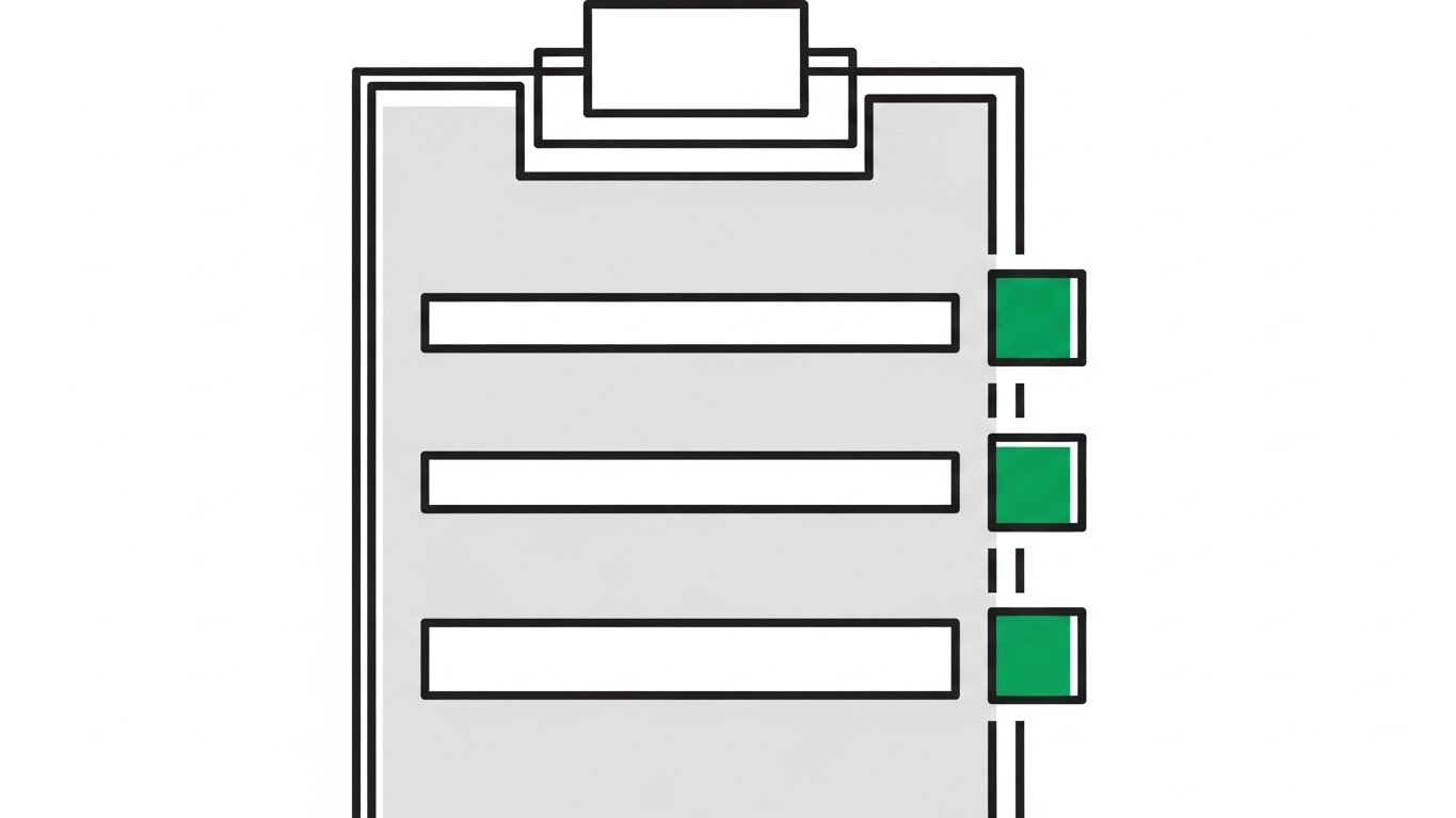
The Visual & Narrative Approach
For self-serve onboarding, clarity is king. This visual utilizes a minimalist flat lay design. A stylized clipboard represents the setup process. Three horizontal bars are marked with bright "Emerald Green" squares, indicating completed tasks. The rest of the palette is "Pure White" and "Light Grey." There is zero visual noise; the focus is entirely on the concept of completion and progress.
Psychological Impact & KPI Focus
- Niche Psychology: This leverages the Zeigarnik Effect (the desire to complete unfinished tasks) and the dopamine hit of a checklist. It motivates the user to finish the setup to see all green squares.
- Operational Impact: This visualizes Implementation Success Rate. It guides the user through the "First 5 Minutes," ensuring they configure the critical features necessary for the software to show value.
Strategic Implementation & Trade-offs
- Best Use Case: In-app empty states (before data is loaded) or progress widgets during the trial period.
- Strategic Trade-off: This style prioritizes Instruction over Inspiration. It is functional and dry. It effectively directs behavior but doesn't inspire awe.
Companies using similar video content -
Blameless – SRE Platform – Celebrating team wins in SRE.
Squadcast – Incident Management – Amplifying positive team outcomes.
25. Isometric 3D Workflow
Retention | Feature Adoption

The Visual & Narrative Approach
To encourage feature adoption, we visualize the software as a complete world. A high-angle isometric view reveals a miniature futuristic facility. "Buildings" are stylized server racks and database cylinders, connected by conveyor belts of "Blue" light representing data flow. The palette uses vibrant "Sky Blues" and "Park Greens," making the technical infrastructure feel like a thriving, well-managed city rather than a cold machine.
Psychological Impact & KPI Focus
- Niche Psychology: This appeals to the "SimCity" Effect—the joy of building and managing a complex system. It reframes maintenance as "city planning," making the day-to-day management feel constructive and engaging.
- Operational Impact: This visualizes Full-Stack Visibility. It shows how different parts of the stack (database, app, network) interact, encouraging the user to monitor the entire ecosystem, not just one silo.
Strategic Implementation & Trade-offs
- Best Use Case: Monthly newsletters showcasing new integrations or "Product Ecosystem" overview pages.
- Strategic Trade-off: This style prioritizes Holistic View over Specificity. It’s great for showing breadth but poor for teaching specific workflows.
Companies using similar video content -
Zabbix – Monitoring Solution – Visualizing monitoring setup progress.
Nagios – Core Monitoring – Green progress for actionable steps.
26. Macro UI
Retention | Reducing Churn

The Visual & Narrative Approach
Trust is established in the details. We use an extreme macro close-up of a single UI element: a toggle switch turning "On". The switch glows with a soft "Glowing Green" inner light against a dark grey background. The depth of field is incredibly shallow, blurring the surrounding elements into a bokeh. This focus on texture, lighting, and the "tactile" feel of the digital button communicates extreme polish and quality.
Psychological Impact & KPI Focus
- Niche Psychology: This appeals to the Quality Bias. If the interface is this polished and precise, the user subconsciously assumes the backend code is equally robust and bug-free.
- Operational Impact: This visualizes System Health and Control. The simple act of toggling "On" represents the power to control complex systems with a single, well-designed interaction.
Strategic Implementation & Trade-offs
- Best Use Case: "New Feature" announcements (e.g., "Auto-Remediation Now Live") or changelog updates.
- Strategic Trade-off: This style prioritizes Aesthetics over Context. It shows quality but not functionality. It’s a "beauty shot" that needs accompanying text to explain what the feature actually does.
Companies using similar video content -
Google Cloud – Operations Suite – Contextualizing cloud infrastructure growth.
AWS – CloudWatch – Visualizing a thriving cloud ecosystem.
Azure – Monitor – Managing a living cloud environment.
27. Hyper-lapse Stock
Retention | Knowledge Base

The Visual & Narrative Approach
To represent the "always-on" nature of the service, we use a static image that captures the aesthetic of a time-lapse. An aerial shot of a sprawling city at twilight features streaks of light from traffic, rendered in "Daylight Blue" and "Warm Amber." Overlaid are faint digital grid lines and nodes, implying that the software is the invisible grid managing this ceaseless activity. It conveys speed, scale, and the passage of time.
Psychological Impact & KPI Focus
- Niche Psychology: This addresses the Fear of Downtime. The continuous streaks of light symbolize uninterrupted flow and service availability. It reassures the user that the platform never sleeps.
- Operational Impact: This visualizes High Availability (HA) and Uptime. It reinforces the value of the platform in supporting 24/7 global business operations.
Strategic Implementation & Trade-offs
- Best Use Case: Help Center headers, Status Page backgrounds, or "About Us" sections emphasizing global support.
- Strategic Trade-off: This style prioritizes Mood over Subject. It is atmospheric and generic. It builds confidence in the brand's scale, but doesn't educate on product usage.
Companies using similar video content -
Cisco – AppDynamics – Highlighting system reliability with precise controls.
Splunk – IT Service Intelligence – Precision focus on service health.
28. Gen AI Character
Retention | Proactive Support
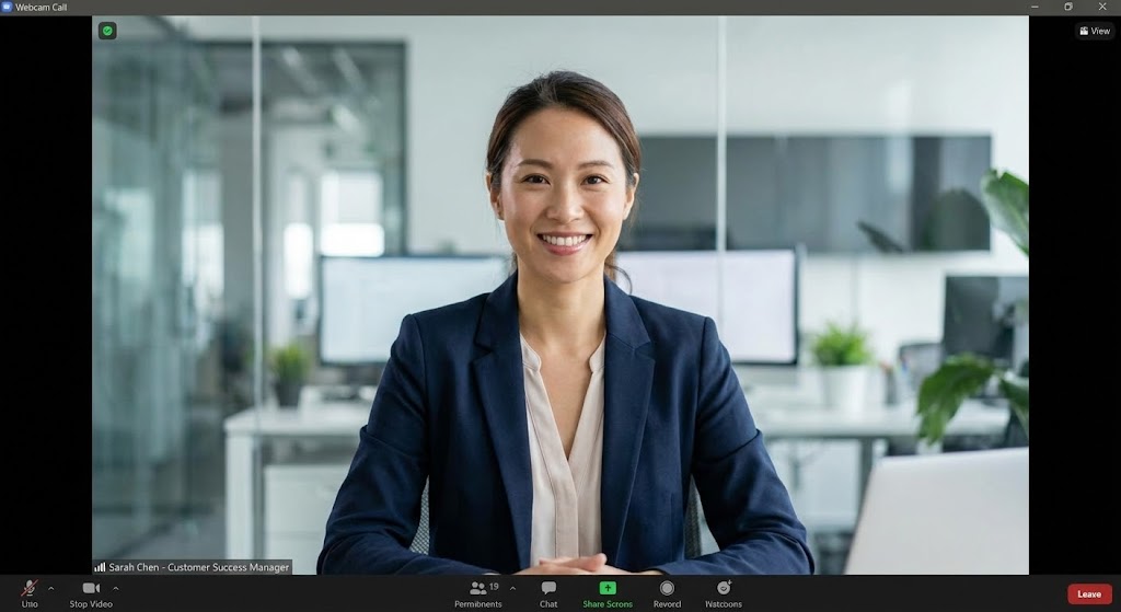
The Visual & Narrative Approach
In a world of chatbots, human connection is premium. We use a photorealistic Gen AI character to represent the Customer Success Manager. A professional female in a "Navy" blazer looks directly at the camera, smiling warmly. The background is a blurred, high-tech office. This is not a stock model; it is a consistent "persona" used in video updates to deliver proactive tips, making the support experience feel personal and high-touch.
Psychological Impact & KPI Focus
- Niche Psychology: This combats Automation Fatigue. Users are tired of talking to robots. Seeing a human face (even a generated one) creates a sense of accountability and partnership.
- Operational Impact: This visualizes Proactive Support. It shifts the perception of support from "fixing broken things" to "consultative partnership," driving higher Net Promoter Scores (NPS).
Strategic Implementation & Trade-offs
- Best Use Case: Personalized email video thumbnails sent to key accounts or "Quarterly Business Review" intros.
- Strategic Trade-off: This style prioritizes Relationship over Product. It sells the service, not the software. Use it to build rapport, not to demo features.
Companies using similar video content -
Akamai – Edge Platform – Visualizing continuous global operations.
Fastly – Edge Cloud Platform – City pulse of uninterrupted service.
29. Futuristic Neon
Expansion | Upsell

The Visual & Narrative Approach
To justify an upsell to the "Enterprise" tier, we must visually differentiate it from the standard offering. We use a "Cyberpunk" aesthetic. In a dark void, a complex, cubic structure of data nodes is illuminated by internal "Laser Red" and "Neon Cyan" lights. It looks powerful, dense, and slightly mysterious—like the core of a quantum computer. This visualizes "Advanced Features" (e.g., predictive AI, long-term retention) as a premium, high-tech upgrade.
Psychological Impact & KPI Focus
- Niche Psychology: This appeals to Exclusivity and Power. It frames the Enterprise tier not just as "more storage," but as access to a superior, futuristic technology that others don't have.
- Operational Impact: This visualizes Advanced Analytics and AI. The complexity of the structure implies deep, multi-dimensional analysis capabilities that go beyond simple line charts.
Strategic Implementation & Trade-offs
- Best Use Case: In-app paywalls or "Upgrade to Enterprise" promo cards.
- Strategic Trade-off: This style prioritizes Hype over Clarity. It is abstract and moody. It creates desire for the "next level" but requires clear copy to explain what the upgrade actually contains.
Companies using similar video content -
Moogsoft – AIOps Platform – Human interface for proactive support.
Harness – Software Delivery Platform – Personalizing customer success with AI insights.
30. Holographic UI
Expansion | Advocacy

The Visual & Narrative Approach
The final stage is turning users into advocates. We visualize their participation in a global standard. A 3D wireframe globe rotates in a dark blue gradient void. It is overlaid with a "Holographic Blue" interface, showing curved connection lines linking continents. Glowing dots represent network nodes—and by extension, the user's peers. It positions the user not as an isolated admin, but as part of a global elite of reliability engineers.
Psychological Impact & KPI Focus
- Niche Psychology: This appeals to Status and Belonging. It validates the user's career choice, placing them within a worldwide network of professionals who keep the internet running.
- Operational Impact: This visualizes Global Scale and Latency. It represents the platform's ability to monitor performance across geographies, essential for multinational advocacy.
Strategic Implementation & Trade-offs
- Best Use Case: User conference backdrops, community forum headers, or "State of the Internet" reports.
- Strategic Trade-off: This style prioritizes Scale over Detail. It is a "big picture" visual. It is perfect for celebrating the community but too high-level for day-to-day debugging.
Strategic Knowledge Base: The Visual Operations Doctrine
To transform these 30 visual styles from "marketing assets" into a cohesive "Visual Operating System," we must apply a strategic framework. This section outlines how to operationalize the visual guide to drive adoption, efficiency, and ROI.
Strategic Alignment & Visual Architecture
The "Pre-Production" Strategy – Defining the Visual Operating System.
- The Cognitive Load Audit: Before creating any asset, audit your current training materials. If a concept takes 5 paragraphs to explain (e.g., Distributed Tracing), it is a prime candidate for Style 3 (Neural Observability). Map visual complexity to concept complexity.
- Role-Based Visual Mapping: Differentiate your visual strategy by persona. Use "High-Contrast/Dark Mode" styles (Style 21) for the SRE/DevOps practitioner who values speed and ergonomics. Shift to "Clean UI/Light Mode" (Style 15) for the Product Manager who values clarity and approachability.
- The "Glanceability" Standard: In performance diagnostics, seconds matter. Adopt a "Glanceability" standard for all operational visuals (dashboards, alerts). If a user cannot understand the system status within 3 seconds (referencing Style 6: Status Transition), the visual has failed.
- Brand Voice Consistency: Your visual language must match your textual voice. If your copy is technical and precise, avoid overly cartoonish styles. Use Style 4 (Complexity Resolution) to align a promise of "Order" with a visual of "Precision."
- The Advids Strategic Audit: Partner with Advids during the architectural phase to define this "Visual Operating System." A fragmented visual strategy (mixing too many clashing styles) erodes trust. Advids helps enforce a unified visual dialect across all 30 styles.
- Standardization vs. Customization: Use "Stock/Hyper-lapse" styles (Style 27) for generic concepts like "Global Scale." Reserve bespoke, high-effort styles like Style 13 (Silicon Transparency) for your core differentiators (e.g., your unique root-cause algorithm).
- The Cross-Departmental Bridge: Use visuals to unify terminology. Sales, Support, and Engineering often use different words for the same thing. A shared visual glossary (using Style 14: Ecosystem Overview) ensures everyone points to the same "image" when discussing "Integrations."
- Legacy System Integration: Visualizing the connection between on-prem hardware and cloud SaaS is critical. Use Style 12 (Legacy Metamorphosis) to visually bridge this gap, respecting the customer's past while selling the future.
- Accessibility in Diagnostics: Ensure your color palettes (especially for Status Transitions) are color-blind friendly. "Red vs. Green" is classic but can be invisible to some. Use shape differentiation (e.g., Checkmarks vs. Exclamation Points) alongside color, as seen in Style 20.
- The Mobile-First Mandate: Even deep-tech buyers scroll on phones. Ensure complex visualizations like Style 3 (Neural Nodes) are legible on vertical screens. If the detail is lost on mobile, simplify the asset for that channel (Style 5).
Operational Adoption & Implementation
The "Deployment" Phase – Embedding Visuals into the Workflow.
- Overcoming "Black Box" Anxiety: AI features often generate fear. Use Style 3 (Neural Observability) or Style 13 (Silicon Transparency) in onboarding to "open the box" and show how the AI thinks. Transparency breeds trust and accelerates adoption.
- The Micro-Learning Shift: Replace 50-page PDF manuals with a library of 30-second video loops. Embed Style 26 (Macro UI) clips directly into the product tooltips. Users learn features faster when the instruction is visual and contextual.
- Just-in-Time Support: Integrate Style 6 (Status Transition) visuals into error messages. When a user hits a limit or error, show a visual of the solution immediately, rather than a generic error code.
- Gamification of Training: Use Style 24 (Minimalist Flat) visual mechanics in your onboarding wizard. Visualizing progress bars and "completed states" triggers the psychological drive to finish the setup, reducing drop-off rates.
- Reducing Support Ticket Volume: There is a direct correlation between proactive visual guides and reduced ticket volume. A well-placed Style 22 (2D Character Story) animation can eliminate thousands of "How do I connect the agent?" support queries.
- Remote Onboarding: For distributed engineering teams, physical seminars are impossible. Leverage Style 28 (Gen AI Character) to create a scalable, consistent "Welcome Series" that feels personal without requiring a CSM on every call.
- Visualizing SOPs: Transform text-based Standard Operating Procedures into visual process flows using Style 4 (Complexity Resolution). In a crisis, an engineer follows a clear visual diagram faster than a text document.
- Feedback Loops: Use interactive video elements (e.g., "Click to see the resolution") in your training. This active participation improves retention rates compared to passive viewing.
- Scalable Localization: Operations are global. Visuals like Style 1 (Velocity Pathways) and Style 25 (Isometric 3D Workflow) are language-neutral. Lean on abstract and symbolic visuals to reduce the cost of translating text overlays for different regions.
- Leadership Communication: Engineers need to sell tool value to executives. Equip them with Style 11 (The Value Stack) and Style 18 (Executive Command). These assets are designed specifically to translate "technical uptime" into "business revenue" for the C-Suite.
Measuring Impact & Future-Proofing
The "ROI" Phase – Measuring Success and Looking Ahead.
- Beyond "Views" – Actionable KPIs: Evolve beyond measuring video views. Measure "Time-to-Competency." How much faster does a user configure an alert after watching a Style 26 clip vs. reading the manual? This is your ROI.
- The "Idle Time" Metric: Track if better visualization reduces "Idle Time" in the dashboard. High-clarity visuals (Style 8) should lead to faster decision-making and less time staring at the screen trying to interpret data.
- Compliance Velocity: When new regulations (e.g., GDPR, SOC2) arrive, use Style 17 (The Digital Bastion) to visually demonstrate compliance. Measure how quickly the customer base adopts the necessary security configurations.
- Retention and Churn: High-quality UX visualization is a retention moat. Users stick with tools that make them feel smart and capable. Monitor the correlation between consumption of "Pro Tips" content (Style 28) and customer renewal rates.
- The AI Visual Frontier: Prepare for the next wave: Generative UI. The styles in this guide (especially Style 28) are precursors to interfaces that generate themselves. Start building a library of modular visual assets now to feed future AI engines.
- Scalability of Assets: Build a visual system, not just one-off videos. Ensure that the "Glowing Green" used in Style 26 is the exact same hex code used in Style 2 (Infrastructure Awakening). Consistency scales; chaos does not.
- The Advids Partnership: As your platform evolves, your visual library must grow. Advids serves as the long-term partner to maintain this visual continuity, ensuring that as you add features, your visual story remains cohesive and premium.
- Benchmarking Success: "Good enough" visuals are a competitive risk. If your competitor uses Style 16 (Infinite Reliability) 3D renders and you use flat screenshots, you lose the "Trust" battle before the demo starts. Regularly benchmark your visual fidelity against the market leaders.
- The ROI of Safety: For on-call engineers, burnout is a safety issue. Visuals that reduce cognitive load (Style 1, Style 4) literally reduce stress. Quantify this as "improved team health" and "reduced alert fatigue."
- Final Call to Innovation: Treat video and visualization not as "marketing content," but as Product Infrastructure. In the age of complexity, clarity is the most valuable currency you possess. Start building your visual legacy today.
Companies using similar video content -
C3 AI – Enterprise AI Platform – Unlocking advanced AI capabilities.
Uptake – Industrial AI – Visualizing futuristic predictive analytics.
Author & Editor Bio


