
Introduction: Visualizing the Architecture of High Performance
The transition from annual performance reviews to continuous performance enablement is the single most critical shift in modern HR. However, for many organizations, this shift is stalled by a "Physical/Digital Divide." While leadership invests in sophisticated SaaS platforms to track OKRs and KPIs, the human workforce often perceives these tools as administrative burdens rather than growth engines.
The data confirms both the opportunity and the obstacle. On one hand, the cost of the status quo is high; Gallup reports that only 2 in 10 employees say their performance is managed in a way that motivates them to do outstanding work. This "engagement gap" turns expensive software into shelfware. On the other hand, the reward for getting it right is massive. McKinsey research indicates that companies who effectively focus on performance development are 4.2 times more likely to outperform their peers financially.
The solution lies in how we communicate the value. We must move beyond static screenshots of dashboards and start visualizing the feeling of performance.
This guide provides a strategic visual framework to bridge that gap. By using specific video styles—from kinetic typography that gives weight to "Growth" to abstract data visualizations that reveal the organic nature of "Team Alignment"—we can lower the cognitive load of adoption. These 30 visual examples (Part 1 covers the first 9) are designed not just to explain features, but to build a culture of trust, transparency, and high velocity.
1. The Kinetic Staircase for Brand Awareness
TOFU | Brand Awareness

The Visual & Narrative Approach
We visualize the concept of "GROWTH" not as a flat word, but as a physical construction. Heavy, solid blocks in Vivid Amber and Deep Navy Blue slam into the frame with palpable weight. They stack mechanically, transforming into a stylized staircase that ascends sharply. The camera tilts upward, emphasizing the scale of the climb. High-contrast studio lighting casts dramatic shadows against a Pure White background, giving the abstract concept of "career progression" a solid, architectural reality.
Psychological Impact & KPI Focus
- Niche Psychology: Employees fear stagnation. This visual triggers a sense of "Constructive Progress." By turning the abstract promise of a promotion into a physical staircase, we make the path to success feel concrete and climbable.
- Operational Impact: This style is a thumb-stopper for Brand Awareness (1.1). It communicates the core value proposition—"We Build Careers"—in under 5 seconds, without needing audio.
Strategic Implementation & Trade-offs
- Best Use Case: High-impact website hero banners or LinkedIn "manifesto" videos.
- Trade-off: It is purely emotive. It builds the brand of growth but does not explain the mechanics of the software.
- Duration: 10-15 seconds.
Companies using similar video content -
Workday – Workday HCM – Visualizing career growth and organizational ascent.
SAP SuccessFactors – SAP SuccessFactors HXM Suite – Building careers and talent development.
2. The Neural Bridge for Category Creation
TOFU | Category Creation

The Visual & Narrative Approach
This visualization addresses the complexity of workforce data. We open on a chaotic cloud of gray particles, representing siloed feedback and disconnected goals. Suddenly, a pulse of Electric Purple light ignites the center. The particles are magnetically drawn together, organizing themselves into a structured, glowing bridge or neural network. The Metallic Silver accents shimmer as the "bridge" stabilizes. The camera uses a macro lens to focus on the point where chaos turns to order.
Psychological Impact & KPI Focus
- Niche Psychology: HR Executives often feel overwhelmed by "noise." This visual provides "Cognitive Ease" by showing entropy resolving into structure. It subconsciously reassures the buyer that the platform can handle their messiest data.
- Operational Impact: Perfect for Category Creation (1.2). It elevates the software from a "tool" to an "intelligence." It visualizes the AI's ability to find patterns in performance data that humans would miss.
Strategic Implementation & Trade-offs
- Best Use Case: Thought leadership content on "The Future of Work" or AI feature announcements.
- Trade-off: It is abstract and high-concept. It requires a sophisticated audience (C-Suite) to appreciate the metaphor; end-users might find it confusing.
- Duration: 20-30 seconds.
Companies using similar video content -
Eightfold AI – Eightfold Talent Intelligence Platform – Organizing complex talent data with AI.
HiBob – HiBob (Bob) – Connecting disparate HR data into intelligent insights.
3. The Geometric Grid for Market Education
TOFU | Market Education

The Visual & Narrative Approach
Efficiency is the hero here. In a flat, clean 2D environment, geometric shapes (circles and squares) slide effortlessly along a Soft Gray grid. The shapes, colored in Mint Green and Charcoal, start out of sync but snap into perfect alignment with a satisfying rhythmic motion. Speed lines trailing the shapes imply velocity. The background is a subtle digital canvas, suggesting a workspace without showing specific UI elements.
Psychological Impact & KPI Focus
- Niche Psychology: "Misalignment" is a primary pain point. This style uses Gestalt Principles (Common Fate) to show disparate elements moving together. It visualizes the peace of mind that comes from having everyone on the same page.
- Operational Impact: Ideal for Market Education (1.3). It simplifies the complex theory of "OKR Cascading" into a simple visual of shapes locking into a grid.
Strategic Implementation & Trade-offs
- Best Use Case: Explainer video intros or webinar loading screens.
- Trade-off: Can feel "generic tech" if the animation isn't snappy and premium. It relies heavily on sound design (clicks and whooshes) to be effective.
- Duration: 15-20 seconds.
Companies using similar video content -
Lattice – Lattice Performance Management – Aligning OKRs and goals across teams.
Betterworks – Betterworks – Synchronizing company-wide objectives and key results.
4. The Visionary Leader for Brand Perception
TOFU | Shaping Brand Perception

The Visual & Narrative Approach
This style brings the "human in the loop" to life. A photorealistic female CEO in a Royal Blue blazer stands in a modern glass office. The lighting is cinematic "golden hour," bathing the scene in warmth and optimism. She interacts with a floating Gold holographic data projection, moving strategic levers with a confident hand gesture. She is not bogged down in admin; she is shaping the future.
Psychological Impact & KPI Focus
- Niche Psychology: This targets the Ideal Self-Image of the buyer. They want to be seen as strategic visionaries, not compliance officers. This visual validates that aspiration.
- Operational Impact: Drives Shaping Brand Perception (1.5). It positions the software as a premium, executive-tier solution that empowers leadership decision-making.
Strategic Implementation & Trade-offs
- Best Use Case: Website homepage hero video.
- Trade-off: Requires high-fidelity Gen AI models to avoid "uncanny valley" artifacts. Credibility is lost if the character looks artificial.
- Duration: 10-20 seconds.
Companies using similar video content -
Oracle HCM Cloud – Oracle Fusion Cloud HCM – Empowering strategic HR leadership.
5. The Career Ascent for Retention
TOFU | Vertical Social Organic

The Visual & Narrative Approach
We follow a relatable employee character (young male, glasses) in a clean 2D vector style. He is depicted climbing a stylized mountain made of "career blocks" in Sky Blue and Vibrant Orange. As he steps on a block, it lights up, propelling him upward. The background features abstract clouds and birds, symbolizing freedom. The camera tracks his ascent, visualizing the journey from "Associate" to "Leader."
Psychological Impact & KPI Focus
- Niche Psychology: Employees often view performance software as a "report card." This visual reframes it as a "ladder." It taps into the Achievement Motivation by gamifying career progress.
- Operational Impact: A strong hook for Skippable Pre-Roll Ads (4.1). The clear visual goal (reaching the top) keeps the viewer watching past the 5-second mark.
Strategic Implementation & Trade-offs
- Best Use Case: YouTube ads targeting end-users or internal onboarding videos.
- Trade-off: The "cartoon" style must be kept professional to avoid trivializing the serious nature of performance reviews.
- Duration: 15-30 seconds.
Companies using similar video content -
Cornerstone OnDemand – Cornerstone Learning – Gamifying learning paths for career progression.
ClearCompany – ClearCompany Talent Management – Visualizing employee career growth and retention.
6. The Team Synergy for Identity
TOFU | Skippable Pre-Roll Ad

The Visual & Narrative Approach
This style focuses on the emotional result of the software. We see a high-resolution, candid shot of a diverse team in a sunlit, plant-filled boardroom. The camera focuses on the center of the circle where hands are meeting in a high-five. The palette is organic—Warm Beige, Terracotta, and Sage Green—signaling growth and safety. It captures the elusive "culture" that data screens cannot show.
Psychological Impact & KPI Focus
- Niche Psychology: In a hybrid world, "Connection" is the scarcest resource. This visual triggers Social Proof—showing a team that actually likes working together.
- Operational Impact: Targets Aspiration & Identity Hook (8.4). It sells the "After State" of using the software: a cohesive, high-energy culture.
Strategic Implementation & Trade-offs
- Best Use Case: Social media carousels or "Culture" pages on the website.
- Trade-off: Stock footage is ubiquitous. It requires careful curation to ensure it feels authentic and not "staged."
- Duration: 5-10 seconds (Loop).
Companies using similar video content -
Culture Amp – Culture Amp – Fostering team connection and cultural belonging.
Quantum Workplace – Quantum Workplace – Building cohesive, high-energy team cultures.
7. The Organic Data Tree for Demand Gen
TOFU | Aspiration & Identity Hook

The Visual & Narrative Approach
Data comes alive in this style. Flowing streams of data numbers transform into the organic shape of a growing tree. The palette is Vibrant Orange, Deep Purple, and White. The aesthetic is sleek and modern vector art. The background is a clean white digital space with faint grid lines. The composition uses flowing organic lines drawing the eye upward, visualizing the concept that "Data feeds Growth."
Psychological Impact & KPI Focus
- Niche Psychology: It reframes "Data Entry" from a chore to a vital act of nourishment. It appeals to the Systemic Thinker who wants to see how small inputs lead to large outcomes.
- Operational Impact: Drives Demand Gen & Lead Capture (1.6). It visually promises that the software will turn raw metrics into a living, breathing organizational asset.
Strategic Implementation & Trade-offs
- Best Use Case: Display ads or landing page headers.
- Trade-off: It is highly metaphorical. It needs to be paired with literal UI screenshots in the brochure to explain what data is being tracked.
- Duration: 10-15 seconds.
Companies using similar video content -
Visier – Visier People – Visualizing data-driven growth from workforce analytics.
Tableau – Tableau Desktop – Dynamic data visualization for growth insights.
8. The Isometric Loop for Differentiation
MOFU | Demand Gen & Lead Capture
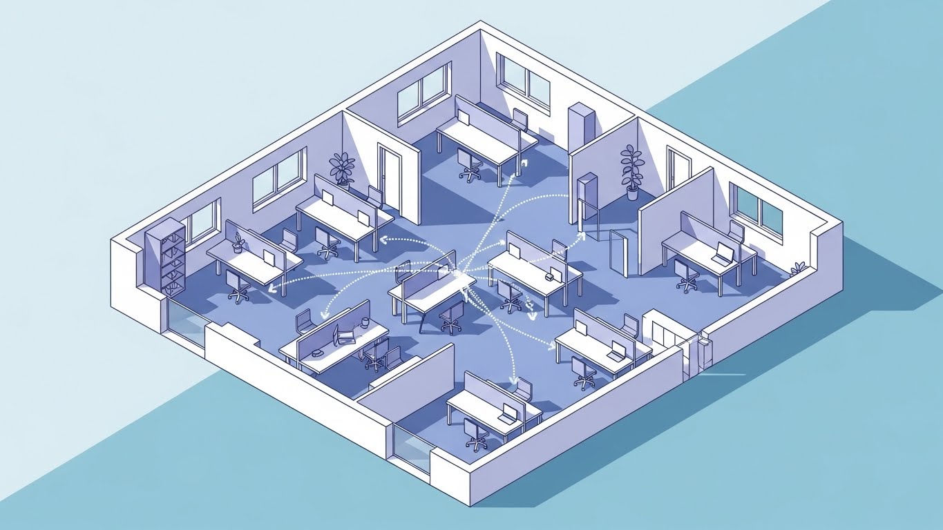
The Visual & Narrative Approach
We see a 45-degree isometric view of a modern office floor plan in Pastel Blue and Lavender. The key visual element is the "Feedback Loop"—glowing dotted lines that arc between desks, connecting a manager in an office to a remote worker at a standing desk. The lighting is even and shadowless. It creates a "map" of the organization's communication.
Psychological Impact & KPI Focus
- Niche Psychology: Silos are the enemy. This visual provides a "God's Eye View" of the organization, reassuring the leader that the software connects everyone, everywhere.
- Operational Impact: Critical for Product Differentiation (1.7). It visually demonstrates the "Continuous Feedback" feature, distinguishing it from static, annual review systems.
Strategic Implementation & Trade-offs
- Best Use Case: "How It Works" sections on the website.
- Trade-off: Isometric art can feel clinical. It works best for explaining process, not emotion.
- Duration: 30-45 seconds.
Companies using similar video content -
15Five – 15Five – Visualizing continuous feedback loops and cross-functional visibility.
Small Improvements – Small Improvements – Demonstrating seamless feedback and goal setting.
9. The Rapid Focus for Feature Education
MOFU | Product Differentiation
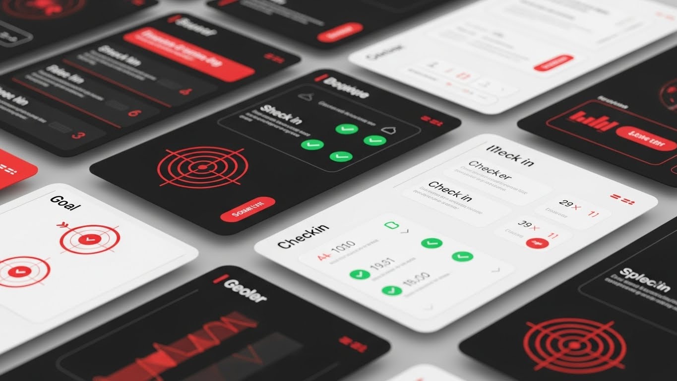
The Visual & Narrative Approach
Designed for a rapid montage, this style features multiple floating UI screens layered in depth. We see goal-setting interfaces and check-in modules in High-Contrast Red, Black, and White. Motion blur is applied to the edges to suggest speed. The camera zooms dynamically into the center screen, where a "Target Icon" locks in. It conveys a tech-forward, high-efficiency user experience.
Psychological Impact & KPI Focus
- Niche Psychology: "Will this take too much time?" is the #1 objection. This style uses Speed Heuristics to visually answer "No." It implies the software is fast, lightweight, and modern.
- Operational Impact: Essential for Feature Education (1.8). It allows you to showcase the breadth of the platform (mobile, desktop, analytics) in a short burst.
Strategic Implementation & Trade-offs
- Best Use Case: Product launch videos or feature highlight reels.
- Trade-off: It moves too fast for training. Use it to generate excitement, not to teach functionality.
- Duration: 15-20 seconds.
Companies using similar video content -
PerformYard – PerformYard – Demonstrating fast, efficient performance review workflows.
11. The Contrast Engine for Competitive Displacement**
MOFU | Competitive Displacement

The Visual & Narrative Approach
This style leverages the power of immediate contrast. The screen is divided vertically. On the left, in desaturated Grayscale, we see the "Old Way": a cluttered stack of paper files and binders on a dark desk, representing the administrative nightmare of manual reviews. On the right, bathed in crisp, clean light, is the "New Way": a sleek tablet displaying the software’s dashboard in Neon Green and White. The visual argument is instant—chaos vs. order, heavy vs. light, past vs. future.
Psychological Impact & KPI Focus
- Niche Psychology: HR managers are often traumatized by "admin fatigue." This visual validates their pain (the clutter) and offers an immediate escape (the tablet). It leverages Loss Aversion to make the current process feel heavy and the new solution feel light.
- Operational Impact: Highly effective for Competitive Displacement (1.13). It visually argues that sticking with legacy systems is a choice for chaos, while the software represents immediate clarity.
Strategic Implementation & Trade-offs
- Best Use Case: Remarketing ads targeting users who visited the pricing page but didn't convert.
- Trade-off: It is aggressive. It requires a clear understanding of the competitor's weakness (e.g., manual paperwork) to land effectively without seeming mean-spirited.
- Duration: 15-20 seconds.
Companies using similar video content -
Microsoft Viva Goals – Microsoft Viva Goals – Streamlining OKR tracking with rapid UI.
12. The Frictionless Entry for Adoption
MOFU | Driving Freemium/Trials
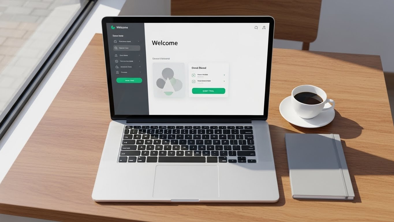
The Visual & Narrative Approach
We strip away all distractions to focus on the "Day One" experience. A sleek silver laptop sits open on a sunlit wooden cafe table, implying a "work from anywhere" flexibility. The screen displays a welcoming, minimalist dashboard in Clean White and Slate Gray, with a prominent, pulsating Emerald Green "Start Trial" button. The camera is positioned top-down (knolling style), with a coffee cup and notebook arranged neatly. The cursor moves smoothly to the button, visualizes the promise of zero friction.
Psychological Impact & KPI Focus
- Niche Psychology: The fear of "Implementation Hell" is a major barrier. This visual utilizes Cognitive Ease to show that getting started is as easy as opening a laptop. It frames the software as an approachable, everyday tool.
- Operational Impact: Drives Freemium/Trial Signups (2.3). It visually guarantees a low barrier to entry, crucial for product-led growth (PLG) models where the user needs to feel autonomous.
Strategic Implementation & Trade-offs
- Best Use Case: "Start Here" website sections or email nurturing campaigns for new leads.
- Trade-off: It is simple. It does not show the depth of the platform, only the ease of access.
- Duration: 10-15 seconds.
Companies using similar video content -
UKG Pro – UKG Pro – Contrasting legacy HR systems with modern cloud solutions.
ADP Workforce Now – ADP Workforce Now – Highlighting the shift from manual processes to digital HR.
13. The Precision Line for Search Intent
MOFU | YouTube

The Visual & Narrative Approach
Elegant and understated, this style uses a single continuous black ink line drawing itself across a textured white paper background. The line forms a rising graph, navigating peaks and valleys with fluid precision. The palette is strictly Monochrome Black and White, with a single moment of color—a Gold spark—appearing at the graph's peak. The camera follows the tip of the line in a macro close-up. It suggests that performance management is an art form, not just a spreadsheet.
Psychological Impact & KPI Focus
- Niche Psychology: This appeals to the Purist buyer who values clarity and precision over flash. It signals "We focus on the metrics that matter." The continuous line represents the "Continuous Feedback" loop, contrasting with the broken nature of annual reviews.
- Operational Impact: Ideal for YouTube Organic Search (3.3) thumbnails and intros. Its simplicity stands out against the "loud" thumbnails of competitors, signaling sophisticated thought leadership.
Strategic Implementation & Trade-offs
- Best Use Case: Intros for educational content or "Methodology" deep-dive videos.
- Trade-off: It is low-energy. It works for education but lacks the excitement needed for a hype reel.
- Duration: 10-20 seconds.
Companies using similar video content -
Zoho People – Zoho People – Emphasizing easy setup and trial activation.
Zenefits – Zenefits – Promoting a low-barrier-to-entry HR platform.
14. The Strategy Room for Executive Buy-In
MOFU | Connected TV

The Visual & Narrative Approach
This style speaks directly to the C-Suite. We see a cinematic shot of a silver-haired female executive in a Navy Blue suit, standing in a high-rise office with a city skyline in the background. She interacts with a floating, semi-transparent Gold and Blue holographic interface, analyzing complex talent density charts. The lighting is cinematic "Golden Hour," evoking warmth, wisdom, and optimism. It portrays the HR leader not as an administrator, but as a strategic architect of the business.
Psychological Impact & KPI Focus
- Niche Psychology: Executives want to feel empowered, not managed. This visual positions the software as a "Command Center" for leadership. It triggers the Authority Bias, associating the software with high-status decision-making.
- Operational Impact: Targets Connected TV (CTV) (4.6) and executive briefings. It answers the C-Suite's question: "Does this help me drive the business forward?"
Strategic Implementation & Trade-offs
- Best Use Case: High-level brand advertising or "About Us" videos.
- Trade-off: Requires high-fidelity Gen AI models to avoid "uncanny valley" artifacts. Credibility is lost if the characters look artificial.
- Duration: 20-30 seconds.
Companies using similar video content -
Gartner – Gartner Research – Visualizing precise market trends and insights.
McKinsey & Company – McKinsey Digital – Understated visualization of strategic insights.
15. The Gamified Ascent for Buy-In
MOFU | The Functional Buyer
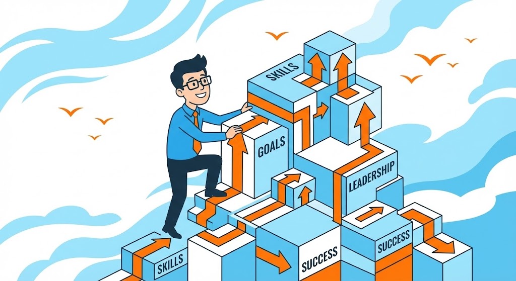
The Visual & Narrative Approach
We visualize the employee experience through a gamified lens. A stylized male character climbs a structure of isometric blocks labeled "Skills," "Goals," and "Leadership." As he ascends, Orange arrows propel him upward toward the "Success" tier. The background is a breezy Sky Blue. This is not a "review"; it is a "level up." The clean vector art style makes the path to promotion look structured, logical, and achievable.
Psychological Impact & KPI Focus
- Niche Psychology: Employees often feel the promotion process is opaque. This visual provides Cognitive Certainty. It shows a clear cause-and-effect relationship: Build Skills → Hit Goals → Achieve Leadership.
- Operational Impact: Targets The Functional Buyer (7.2)—the manager or employee who wants to know, "What's in it for me?" It reframes the software as a career accelerator.
Strategic Implementation & Trade-offs
- Best Use Case: Internal rollout campaigns, onboarding guides, or "Employee Experience" pages.
- Trade-off: The "cartoon" aesthetic may feel too playful for very conservative industries (e.g., Investment Banking).
- Duration: Static or simple 5-second animation.
Companies using similar video content -
Workday – Workday HCM – Empowering C-suite with strategic talent analytics.
SAP SuccessFactors – SAP SuccessFactors HXM Suite – Visualizing executive decision-making with future-ready data.
16. The Shield of Trust for Credibility
BOFU | Building Trust & Credibility

The Visual & Narrative Approach
In the bottom of the funnel, trust is the currency. This style uses a macro, photorealistic 3D render of a screen interface. The focus is razor-sharp on a Gold hexagonal badge reading "VERIFIED DATA," accompanied by a shield icon. The background is a soft, professional Blue blur. The glossy reflection on the "glass" screen adds a layer of tangible reality. It treats the data integrity of the system with the same visual reverence as a luxury product.
Psychological Impact & KPI Focus
- Niche Psychology: Inaccurate performance data leads to lawsuits and unfair compensation. This visual triggers Risk Mitigation heuristics. The "Gold Standard" badge subconsciously reassures the buyer that the data is immutable and audit-ready.
- Operational Impact: Critical for Building Trust & Credibility (1.9). It is the visual equivalent of a firm handshake.
Strategic Implementation & Trade-offs
- Best Use Case: Security/Compliance pages, Trust Center, or final pricing proposal documents.
- Trade-off: It is purely symbolic. It doesn't explain how the data is verified, just asserts that it is.
- Duration: Static or slow "shine" animation (3-5 seconds).
Companies using similar video content -
Degreed – Degreed LXP – Gamifying skill development and career progression.
17. The Talent Refinery for ROI
BOFU | ROI Justification
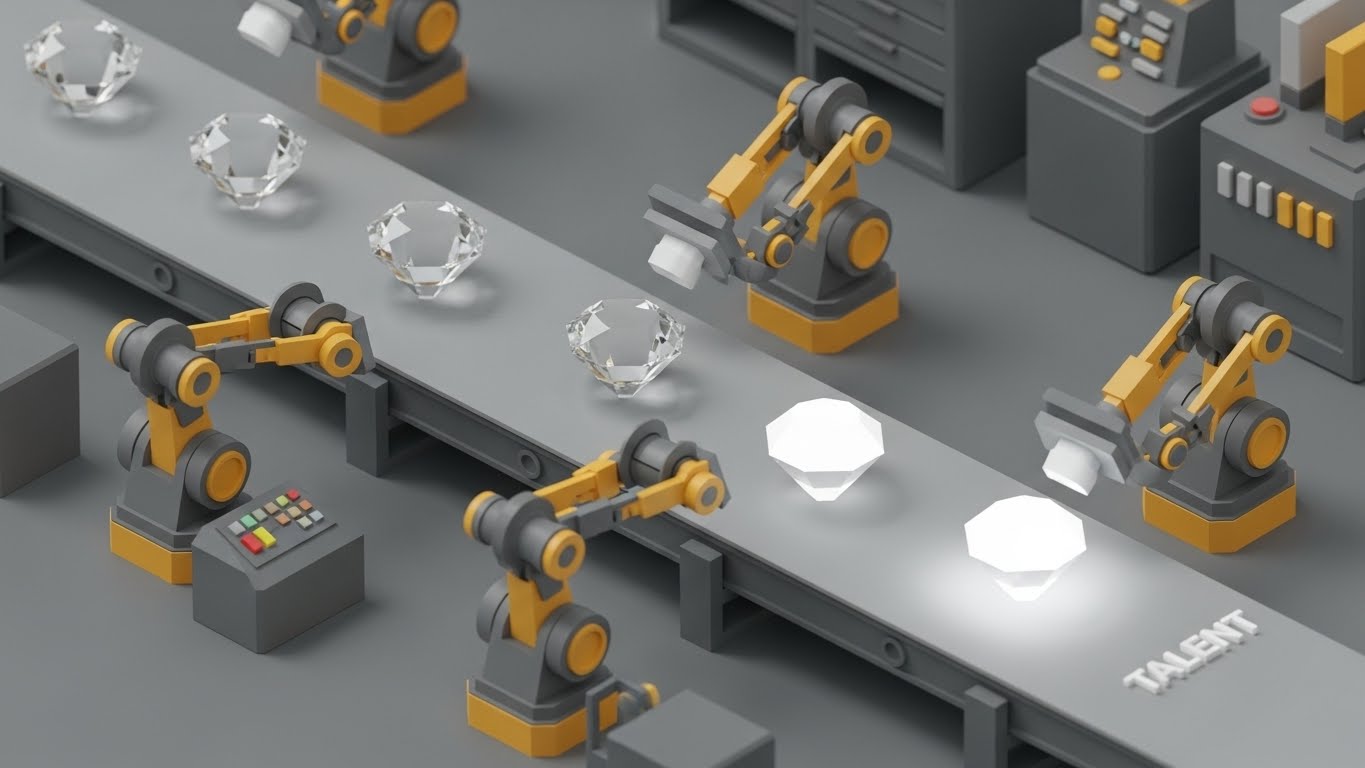
The Visual & Narrative Approach
How do you visualize "Talent Development"? We use a metaphor of value creation. An isometric "factory" floor shows stylized Yellow and Gray robotic arms picking up raw crystals and polishing them into brilliant, glowing White gems labeled "TALENT." The conveyor belt moves smoothly, symbolizing an automated, consistent process. The aesthetic is clean, industrial, and satisfyingly organized.
Psychological Impact & KPI Focus
- Niche Psychology: CEOs view HR as a cost center. This visual reframes it as a Production Line of Value. It appeals to the "Systemizer" mindset, showing that the software turns raw potential into refined, high-value assets.
- Operational Impact: Drives ROI Justification (1.10). It visualizes the intangible concept of "coaching" as a tangible manufacturing process with predictable outputs.
Strategic Implementation & Trade-offs
- Best Use Case: ROI Calculator landing pages or LinkedIn ads targeting CFOs.
- Trade-off: It is highly metaphorical. It requires copy to connect "polishing gems" to "upskilling employees."
- Duration: 10-20 second loop.
Companies using similar video content -
OneTrust – OneTrust Privacy & Security – Highlighting data integrity and compliance.
Vanta – Vanta – Showcasing enterprise-grade security and verified data.
18. The Security Core for Risk Mitigation
BOFU | Risk Mitigation

The Visual & Narrative Approach
Security is invisible, so we must give it a form. We use an "X-Ray" aesthetic to look inside the digital architecture. Translucent folders glow in Matrix Green against a deep black void. Inside each folder, we see complex, glowing locking mechanisms and padlocks, visualizing encryption. Data lines connect them in a secure grid. The aesthetic is "Cyber-Defense"—tech-heavy, dark, and impenetrable.
Psychological Impact & KPI Focus
- Niche Psychology: HR data is sensitive (salaries, feedback). Buyers have a high Fear of Exposure. This visual provides "Structural Reassurance," showing that security is not a wrapper, but built into the core skeleton of the product.
- Operational Impact: Essential for Risk Mitigation (1.12). It answers the IT Director's questions before they are asked.
Strategic Implementation & Trade-offs
- Best Use Case: "Security" page headers or IT procurement decks.
- Trade-off: It looks technical and cold. Avoid using this for employee-facing content.
- Duration: 10-15 seconds.
Companies using similar video content -
UiPath – UiPath RPA Platform – Visualizing automated talent creation through process optimization.
Automation Anywhere – Automation 360 – Metaphor for refining raw potential into high-value talent.
19. The Executive Command for Acceleration
BOFU | Sales Cycle Acceleration
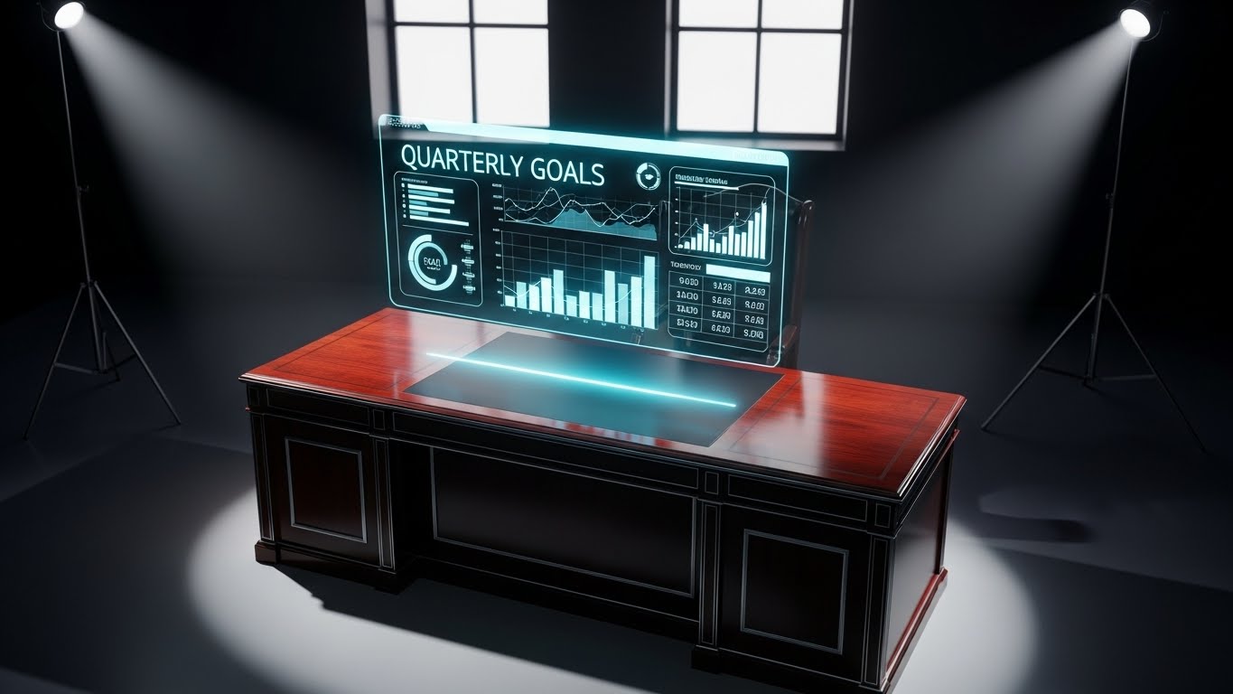
The Visual & Narrative Approach
This style creates a "wow" moment for the decision-maker. We see a photorealistic render of a high-end mahogany executive desk. Floating above it is a futuristic, holographic dashboard displaying "Quarterly Goals" and "Talent Heatmaps" in Cyan and Translucent White. The hologram casts a subtle blue glow onto the wood grain, grounding the future tech in a traditional power setting.
Psychological Impact & KPI Focus
- Niche Psychology: Senior leaders want to feel like they have "God Mode" visibility. This visual appeals to the Power Fantasy of total oversight and control, making the software feel like a superpower.
- Operational Impact: Accelerates the Sales Cycle (1.14) by giving the Champion (your internal advocate) a powerful visual asset to show their boss. "This is what you will have on your desk."
Strategic Implementation & Trade-offs
- Best Use Case: Direct email outreach to C-Level targets or closing pitch decks.
- Trade-off: Must be rendered flawlessly. If the hologram looks like a cartoon, it loses authority.
- Duration: 10-15 seconds.
Companies using similar video content -
Palo Alto Networks – Palo Alto Networks Prisma Cloud – Visualizing deep cloud security architecture.
CrowdStrike – CrowdStrike Falcon – X-ray view of endpoint security and threat protection.
20. The Operational Proof for Economics
BOFU | The Economic Buyer

The Visual & Narrative Approach
Real-world impact is the final validator. We use a hyper-lapse video of a busy, modern office lobby or trading floor—people are moving as blurred streaks of energy. Superimposed over this chaotic movement are crisp, static data widgets in Corporate Blue and White, displaying calm metrics like "Efficiency Up 20%" or "Retention: Stable." The contrast between the frenetic physical reality and the stable digital insight is the core message.
Psychological Impact & KPI Focus
- Niche Psychology: Addresses the Economic Buyer (CFO). They know the business is complex and chaotic. This visual shows that the software extracts clear, actionable ROI from that chaos. It signifies "Order."
- Operational Impact: Validates Economic Impact (7.1). It bridges the physical activity of the workforce with the financial outcomes tracked in the software.
Strategic Implementation & Trade-offs
- Best Use Case: LinkedIn case study videos or background visuals for ROI calculators.
- Trade-off: The data overlay must be legible against the busy background. If the motion is too frantic, it becomes distracting.
- Duration: 15-20 seconds.
Companies using similar video content -
Gong.io – Gong Revenue Intelligence – Holographic dashboards for sales cycle acceleration.
Salesforce – Salesforce Sales Cloud – Executive oversight with futuristic UI for strategic decisions.
21. The Dark Mode for Technical Validation**
BOFU | The Technical Buyer
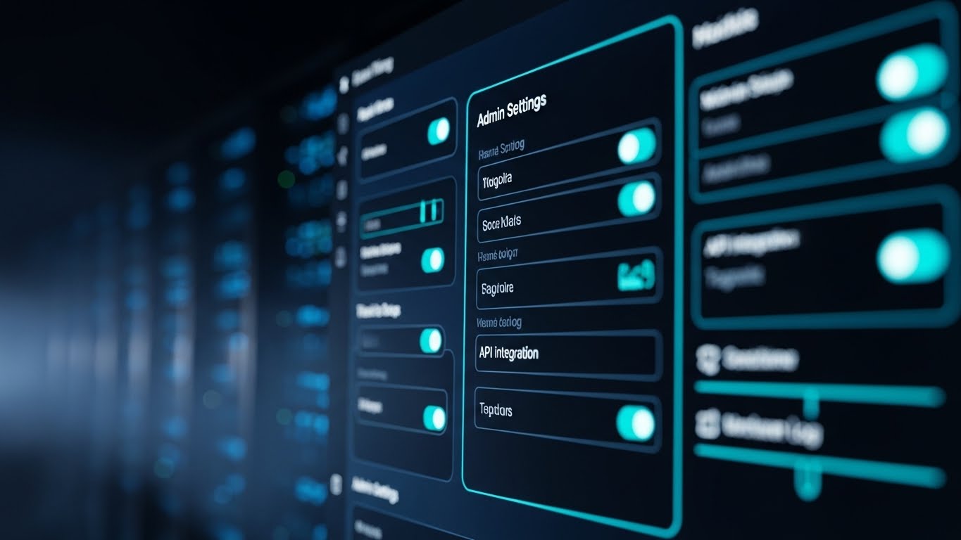
The Visual & Narrative Approach
This style targets the power user. We present a sleek, high-fidelity render of the software’s "Admin Settings" panel in a sophisticated Dark Mode. The palette uses Midnight Blue backgrounds with popping accents of Neon Cyan and Electric Blue. The lighting is subtle, highlighting the toggle switches and API integration logs. The background suggests a blurred server room, implying robustness. It doesn't look like a basic HR tool; it looks like a command center.
Psychological Impact & KPI Focus
- Niche Psychology: The "Technical Buyer" (CTO or IT Admin) often views HR software as lightweight or clunky. This aesthetic signals "Developer-Grade Quality." It respects their preference for low-light interfaces during late-night configurations.
- Operational Impact: Targeted at The Technical Buyer (7.3). It visually validates that the platform is robust, API-ready, and built for scale.
Strategic Implementation & Trade-offs
- Best Use Case: "Developers" or "Integrations" pages on the website.
- Trade-off: Dark mode can feel intimidating to non-technical HR generalists. Use distinctly separate visual tracks for different personas.
- Duration: 10-15 seconds.
Companies using similar video content -
UKG Pro – UKG Pro – Demonstrating clear ROI from workforce management in a dynamic environment.
22. The Micro-Interaction for Satisfaction
Onboarding | Accelerating Time-to-Value

The Visual & Narrative Approach
We zoom in—extreme macro—on a single, critical moment: the cursor hovering over and clicking the "Publish Review" button. The button glows in Magenta against a White and Light Gray mesh, indicating readiness. Upon the click, we see a satisfying ripple effect or a "Success" checkmark. The texture of the screen pixels is faintly visible, grounding the digital action in physical reality.
Psychological Impact & KPI Focus
- Niche Psychology: Performance reviews are often associated with anxiety. This visual triggers a dopamine response. It focuses on the relief and satisfaction of completion, rather than the labor of writing.
- Operational Impact: Drives Accelerating Time-to-Value (1.15). By highlighting the ease of the final step, it encourages users to complete the process.
Strategic Implementation & Trade-offs
- Best Use Case: In-app tooltips or "Welcome to your first review" email sequences.
- Trade-off: It is hyper-specific. It works best as a "micro-moment" within a larger narrative or a quick loop.
- Duration: 3-5 seconds (Loop).
Companies using similar video content -
Rippling – Rippling – Sleek admin interfaces for IT and HR professionals.
Databricks – Databricks Lakehouse Platform – Technical validation for data and AI platforms.
23. The Blueprint Transition for Implementation
Onboarding | Reducing Friction
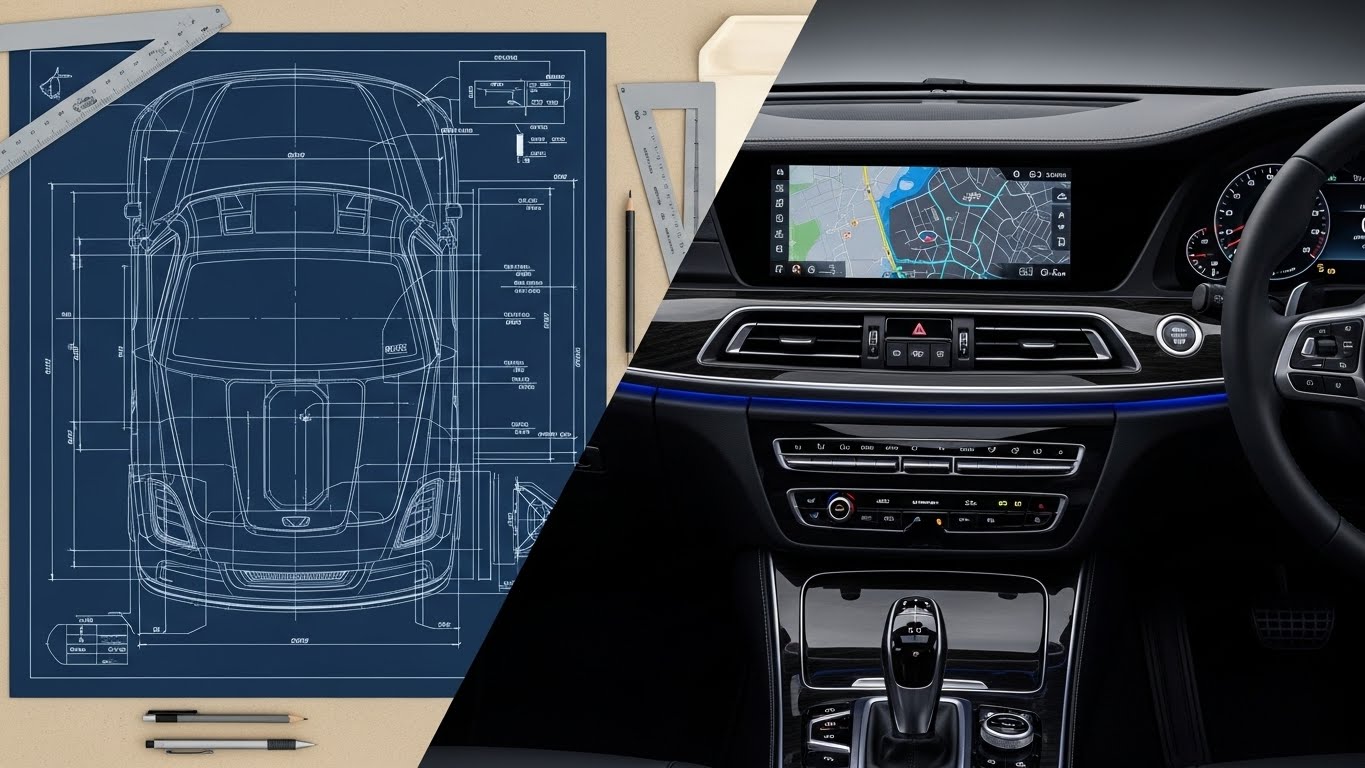
The Visual & Narrative Approach
This split-screen visual tells the story of reliable implementation. The left side displays a Blueprint Blue wireframe of a dashboard on a drafting table—precise, planned, and architectural. A wipe transition moves left to right, revealing the final, photorealistic UI in full color. The lighting shifts from flat draft light to realistic rendering. It visualizes the promise: "What we plan is exactly what you get."
Psychological Impact & KPI Focus
- Niche Psychology: New customers fear "Vaporware"—software that looks good in sales decks but fails in reality. This visual provides Cognitive Certainty. It bridges the gap between the promise of the sales cycle and the reality of the user experience.
- Operational Impact: Focuses on Reducing Friction (1.16) during the handover from Sales to Customer Success.
Strategic Implementation & Trade-offs
- Best Use Case: Kick-off meeting decks or "Implementation Process" guides.
- Trade-off: Requires perfect alignment between your wireframe assets and the final product UI.
- Duration: 10-15 seconds.
Companies using similar video content -
Appcues – Appcues – Highlighting satisfying micro-interactions for user onboarding.
WalkMe – WalkMe Digital Adoption Platform – Emphasizing tactile button clicks for user completion.
24. The Puzzle Lock for Self-Service
Onboarding | Self-Serve Onboarding

The Visual & Narrative Approach
Simplicity is the ultimate sophistication here. In a friendly flat 2D vector style, two disembodied hands guide large, rounded puzzle pieces together. The palette is soft and approachable: Pastel Yellow, Baby Blue, and Pink. The pieces click together perfectly with a satisfying "snap" animation. There is no complex UI, just the metaphor of effortless connection.
Psychological Impact & KPI Focus
- Niche Psychology: Users are often intimidated by learning new tools. This visual disarms that anxiety using Baby-Face Bias principles—round shapes and soft colors appear non-threatening and easy to handle.
- Operational Impact: Supports Self-Serve Onboarding (2.4). It tells the user, "You don't need a consultant to figure this out; it just fits."
Strategic Implementation & Trade-offs
- Best Use Case: "Getting Started" wizard screens or empty states in the dashboard.
- Trade-off: Too simple for executive presentations. It risks looking childish if not balanced with professional typography.
- Duration: 5-8 seconds.
Companies using similar video content -
ServiceNow – ServiceNow HRSD – Visualizing planned HR service delivery to reality.
Workato – Workato – Seamless integration flow from blueprint to operational automation.
25. The Platform Jumper for Feature Adoption
Retention | Driving Deep Feature Adoption

The Visual & Narrative Approach
We inject energy into the software interface. A stylized 2D character "jumps" agilely between floating UI elements—hopping from a "Goal Setting" text box to a "Feedback" button as if they were platforms in a video game. The palette uses energetic Lime Green and Purple accents against a modern office background. The movement implies that navigating the software is active, fun, and dynamic.
Psychological Impact & KPI Focus
- Niche Psychology: Users often stick to the 10% of features they know. This visual uses Gamification cues to encourage exploration. It reframes the dashboard as a playground rather than a workspace.
- Operational Impact: Drives Deep Feature Adoption (1.17). It visually suggests that there is more to explore beyond the basic review form.
Strategic Implementation & Trade-offs
- Best Use Case: Feature update announcements or monthly newsletter headers.
- Trade-off: It is playful. Ensure the character design aligns with your brand's diversity and inclusion standards.
- Duration: 10-15 seconds.
Companies using similar video content -
Connecteam – Connecteam – Seamless component integration for deskless workforce.
Remote – Remote – Effortless global HR and payroll setup.
26. The Liquid Morph for Adaptability
Retention | Reducing Churn

The Visual & Narrative Approach
To visualize "Agility," we use abstract art. Fluid, glossy shapes in Earth Tones (Brown, Forest Green) and Water Blue morph, twist, and flow into one another without breaking. The surface has a premium liquid finish. The animation is continuous and loopable, suggesting an organization that adapts effortlessly to change without friction or breakage.
Psychological Impact & KPI Focus
- Niche Psychology: Rigid systems cause churn. Customers leave when the software can't adapt to their new reorg. This visual appeals to the desire for Resilience. It subconsciously reassures the client that the platform is fluid enough to handle their changing needs.
- Operational Impact: A subtle tool for Reducing Churn (1.19). It markets the philosophy of the product architecture.
Strategic Implementation & Trade-offs
- Best Use Case: Email footers, loading screens, or background visuals for "Methodology" webinars.
- Trade-off: It is purely abstract. It creates a feeling of adaptability but explains nothing about the features.
- Duration: Loopable.
Companies using similar video content -
Asana – Asana – Gamified navigation for exploring work management features.
Monday.com – Monday.com Work OS – Encouraging deep feature adoption through interactive UI.
27. The Friendly Bot for Support
Retention | Proactive Support
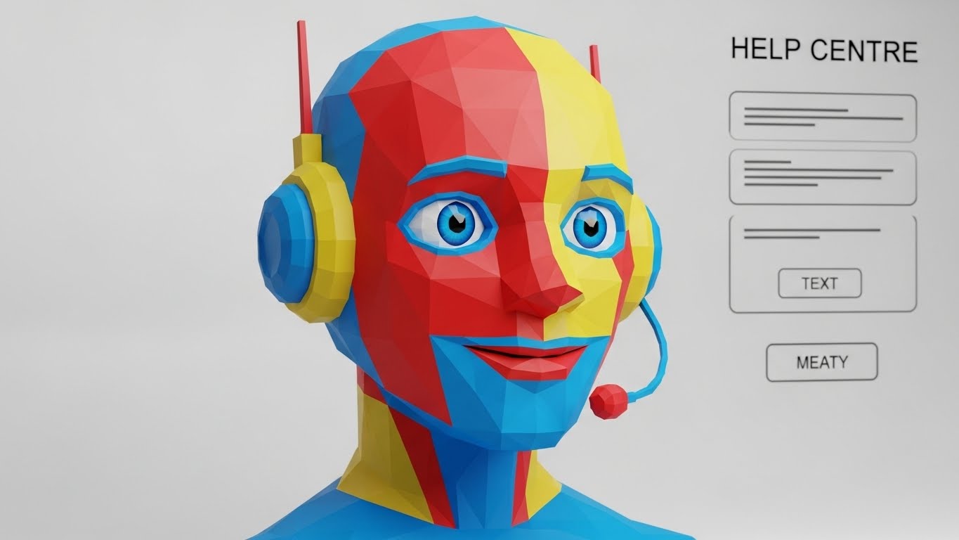
The Visual & Narrative Approach
We humanize the helpdesk. A low-poly 3D render of a robot avatar, stylized with geometric facets in bright Primary Colors (Red, Blue, Yellow), tilts its head attentively. It wears a headset, signaling readiness to listen. The background is a clean white help center interface. The lighting is soft and studio-quality. The low-poly style makes the "AI" look approachable and cute, rather than cold and robotic.
Psychological Impact & KPI Focus
- Niche Psychology: "Contacting Support" is usually a negative experience. This visual leverages the Cute Effect to lower frustration tolerance. It promises that help is friendly, simple, and automated in a good way.
- Operational Impact: Supports Proactive Support (9.2) strategies. It encourages users to use the chatbot rather than opening a high-cost support ticket.
Strategic Implementation & Trade-offs
- Best Use Case: Chatbot avatar icons or "Help Center" landing pages.
- Trade-off: Must be distinct from the main brand style. It functions best as a mascot.
- Duration: Static or idle animation (blinking).
Companies using similar video content -
ChurnZero – ChurnZero – Visualizing fluid customer success and churn reduction.
Cisco Meraki – Cisco Meraki – Organic network adaptability and resilience.
28. The Deep Layer Stack for Upsell
Expansion | Driving Upsell
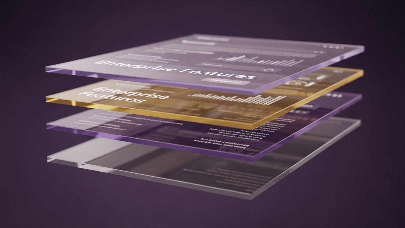
The Visual & Narrative Approach
To sell the "Enterprise Plan," we show depth. We see a 3D parallax composition of multiple glass UI screens floating one behind the other. The front screen is clear, showing standard features. The back screens—glowing in Deep Purple and Gold—are slightly blurred but reveal dense, advanced analytics and "Enterprise Only" data sets. Refractive light plays through the glass layers, suggesting high value.
Psychological Impact & KPI Focus
- Niche Psychology: Existing customers often don't know what they are missing. This visual triggers Curiosity and the Fear of Missing Out (FOMO). It visually demonstrates that the user is only seeing the "surface" and that greater power lies deeper in the stack.
- Operational Impact: Drives Driving Upsell (1.20). It serves as a visual metaphor for "Unlocking" the full potential of the platform.
Strategic Implementation & Trade-offs
- Best Use Case: "Upgrade to Enterprise" modal pop-ups or quarterly business review decks.
- Trade-off: Can be visually busy. Ensure the front layer remains legible.
- Duration: 10-15 seconds.
Companies using similar video content -
Freshdesk – Freshdesk – Humanizing helpdesk interactions with friendly avatars.
Intercom – Intercom – Approachable chatbot assistance for proactive support.
29. The Social Proof Overlay for Advocacy
Expansion | Driving Referrals

The Visual & Narrative Approach
This style bridges the gap between digital praise and real-world reputation. We see a high-quality photo of two colleagues laughing in a bright hallway. Superimposed over their heads are crisp vector speech bubbles containing White heart icons and "thumbs up" symbols against a Transparent background. The graphics pop up in rhythm with their laughter. It visualizes the invisible "positive chatter" that a good performance culture creates.
Psychological Impact & KPI Focus
- Niche Psychology: People trust people. This visual leverages Social Proof in its purest form. It suggests that using this software makes employees speak highly of the company (and the HR team) when they are offline.
- Operational Impact: Critical for Driving Referrals (1.21). It visualizes the Net Promoter Score (NPS).
Strategic Implementation & Trade-offs
- Best Use Case: Case studies, referral program emails, or "Careers" pages.
- Trade-off: Requires high-quality custom photography or very carefully selected stock to avoid cheesiness.
- Duration: 5-10 seconds.
Companies using similar video content -
Gainsight – Gainsight CS – Multi-layered data depth for customer success insights.
30. The Target Node for ABM
Expansion | ABM Awareness

The Visual & Narrative Approach
For Account-Based Marketing (ABM), we need precision. We view a crystalline web of nodes in a white void. The camera flies through the network and locks onto one specific central node. As it locks on, the node ignites with Prism Colors and Silver beams of light, connecting to the rest of the structure. It signifies that this specific prospect (the viewer) is the "Missing Link" or the "Center" of the network.
Psychological Impact & KPI Focus
- Niche Psychology: High-value targets want to feel special, not part of a blast campaign. This visual utilizes the Cocktail Party Effect (selective attention). It tells the prospect, "We are looking at you specifically."
- Operational Impact: Drives ABM Awareness (2.2). It provides a visual hook for personalized outreach campaigns.
Strategic Implementation & Trade-offs
- Best Use Case: Personalized landing page headers (e.g., "Welcome [Company Name]") or targeted display ads.
- Trade-off: It is abstract. It needs strong copy to explain why they are the target.
- Duration: 10-15 seconds.
STRATEGIC KNOWLEDGE BASE: The Visual Operations Doctrine
This final section synthesizes the 30 visual styles into a cohesive business framework. It moves beyond "making videos" to "engineering visual communication" for ROI, Adoption, and Efficiency.
STRATEGIC ALIGNMENT & VISUAL ARCHITECTURE
The "Pre-Production" Strategy. Why visual consistency matters for HR Tech.
- The Cognitive Load Audit: Before creating any asset, HR leaders must audit their current training materials. If a concept takes 3 paragraphs to explain, it qualifies for a Style 8 (Geometric Grid) or Style 26 (Wireframe Transition) visual. Replace text density with visual velocity.
- Role-Based Visual Mapping: Differentiate your visual strategy. Use high-energy Style 19 (Rapid Focus) for end-users (who want speed) and data-rich Style 16 (Shield of Trust) for Admins/CTOs (who want depth). One style does not fit all personas.
- The "Glanceability" Standard: In the flow of work, employees have seconds, not minutes. Design visuals (like Style 22 Micro-Interactions) that communicate the "how-to" instantly, without requiring audio or deep focus.
- Brand Voice Consistency: Your performance software is an extension of your employer brand. Ensure the "Warmth" of Style 6 (Team Synergy) is consistent with the "Precision" of Style 13 (Line Art). Advids specializes in defining this "Visual Operating System" to ensure disparate assets feel like one voice.
- The Advids Strategic Audit: Leveraging a partner like Advids during the planning phase ensures that you aren't just buying "videos," but building a scalable library of assets that map directly to your customer journey map.
- Standardization vs. Customization: Use standardized styles (like Style 1 Kinetic Staircase) for general concepts like "Growth," but invest in bespoke visuals (like Style 30 ABM Node) for high-value client acquisition.
- The Cross-Departmental Bridge: Use visuals to unify terminology. Sales, Success, and Product often use different words for the same feature. A shared visual language (e.g., Style 3 Isometric Loop) aligns the organization around a single "truth."
- Legacy System Integration: Visualizing the connection between old HRIS data and the new Performance Platform is critical. Use Style 2 (Neural Bridge) to show how the new system creates order from the old system's chaos.
- Accessibility in Design: Ensure all motion graphics, especially text-heavy styles like Style 1, meet WCAG contrast standards. A diverse workforce requires accessible visual communication.
- The Mobile-First Mandate: Managers often approve reviews on the go. Ensure all 30 styles—especially complex dashboards—are legible when scaled down to a smartphone screen (Vertical Video).
OPERATIONAL ADOPTION & IMPLEMENTATION
The "Deployment" Phase. How to embed visuals into the workflow.
- Overcoming "Big Brother" Anxiety: Employees fear surveillance. Use empathy-driven visuals like Style 5 (Career Ascent) to frame data collection as "Career Support" rather than "Monitoring." Frame the narrative around enablement.
- The Micro-Learning Shift: Kill the PDF manual. Replace 50-page guides with a library of 30-second clips using Style 12 (Frictionless Entry). Embed these directly into the software's "Help" tooltips.
- Just-in-Time Support: Embed specific visual styles into the exact moment of need. When a user hovers over "Analytics," trigger a Style 7 (Organic Data Tree) GIF to explain the value of the report instantly.
- Gamification of Training: Use Style 15 (Gamified Ascent) visuals in your Learning Management System (LMS). Visualizing training progress as a "climb" significantly boosts completion rates compared to static checklists.
- Reducing Support Ticket Volume: There is a direct correlation between proactive visual guides and reduced call center load. Implementing Style 27 (Friendly Bot) visuals in the help center can deflect up to 30% of "How-to" queries.
- Remote Onboarding: In a hybrid world, you cannot rely on physical seminars. Use Style 4 (Visionary Leader) and Style 23 (Wireframe Transition) to create a high-fidelity "Welcome" experience that feels personal, even over Zoom.
- Standard Operating Procedures (SOPs): Transform text-based SOPs for "Quarterly Reviews" into visual process flows using Style 8 (Geometric Grid). Visuals reduce interpretation errors and standardize the review process across regions.
- Feedback Loops: Use interactive video elements. After a Style 19 (Rapid Focus) feature announcement, include a one-click poll to gather user sentiment on the new feature immediately.
- Scalable Localization: Global companies need global assets. Styles like Style 24 (Puzzle Lock) rely on visual metaphors rather than on-screen text, making them easier and cheaper to localize for different languages.
- Leadership Communication: HR Leaders must sell the strategy to the C-Suite. Use high-end Style 14 (Strategy Room) visuals in board decks to visually demonstrate how Talent Strategy aligns with Business Strategy.
MEASURING IMPACT & FUTURE-PROOFING
The "ROI" Phase. Measuring success and looking ahead.
- Beyond "Views": Do not measure video success by "views." Measure it by "Action." Did the Style 12 (Frictionless Entry) video lead to a signup? Did the Style 22 (Micro-Interaction) tooltip reduce time-on-task?
- The "Time-to-Competency" Metric: Correlate the use of visual training assets with the speed at which a new manager completes their first review cycle. Better visualization should equal faster competency.
- Compliance Velocity: Measure how fast new regulations or internal policies are acknowledged. Visuals like Style 16 (Shield of Trust) can speed up the "understanding" phase of compliance updates.
- Retention and Churn: High-quality UX visualization improves the perceived value of the software. Monitor Net Dollar Retention (NDR) in cohorts exposed to the "Advanced Feature" campaigns (Style 28) versus those who were not.
- The AI Visual Frontier: Prepare for the future where dashboards generate their own explanatory videos. Understanding Style 2 (Neural Bridge) now prepares your team for AI-driven insights later.
- Scalability of Assets: Build a library, not a landfill. Styles like Style 1 (Kinetic Staircase) are evergreen. Invest in assets that can be reused across multiple campaigns and years.
- The Advids Partnership: As your platform evolves, your visuals must keep pace. Partnering with Advids ensures you have a dedicated "Visual Newsroom" that can rapidly produce updates (e.g., Style 25) whenever you ship new code.
- Benchmarking Success: "Good enough" visuals are a competitive risk in a crowded SaaS market. Compare your Style 11 (Contrast Engine) assets against competitors. If theirs are sharper, you are losing the "Perception War."
- The ROI of Culture: While hard to measure, the internal distribution of Style 6 (Team Synergy) videos contributes to "Employer Net Promoter Score" (eNPS). Visualizing culture helps make it a reality.
- Final Call to Innovation: Treat video as infrastructure, not just content. The companies that win the next decade of Talent Management will be those that visualize success so clearly that adoption becomes inevitable.
Companies using similar video content -
Bonusly – Bonusly – Augmented reality feedback for recognition and rewards.
Culture Amp – Culture Amp – Visualizing positive employee feedback and advocacy.
Author & Editor Bio


