
Introduction: The Architecture of Digital Consensus
The linear B2B sales funnel is obsolete. It has been replaced by a complex, non-linear ecosystem of independent research, peer validation, and digital self-service. For Revenue Leaders in the Personalized Buyer Experience space, this shift presents a profound operational challenge: How do you influence a buying committee that you may never meet in person?
The answer lies in mastering the visual language of the "Digital Sales Room." We are witnessing a fundamental decoupling of sales influence from physical presence. According to Gartner, by 2025, 80% of B2B sales interactions between suppliers and buyers will occur in digital channels. This mandate confirms that your digital assets are no longer just marketing support; they are your frontline sales representatives. If they cannot articulate value, build trust, and guide the buyer to consensus without human intervention, deal velocity stalls.
The modern "Revenue Architect" knows that the primary friction in B2B is not feature comparison, but Cognitive Load. Buyers are drowning in information and starving for clarity. They need visual shortcuts that bridge the "Physical/Digital Divide," translating complex workflows into intuitive, tangible narratives. The financial upside of getting this right is substantial. Research from McKinsey confirms that companies excelling at this level of tailored engagement generate 40 percent more revenue than their peers.
This guide serves as your strategic blueprint for navigating this new terrain. We have curated a "Gold Standard" collection of visualization styles designed to address specific psychological needs at every stage of the buyer journey—from the initial spark of Category Creation to the granular clarity of Feature Education.
1. The Consensus Builder
TOFU | Brand Awareness
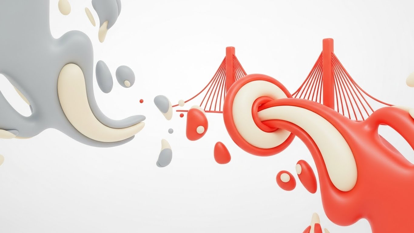
The Visual & Narrative Approach
This style utilizes a sophisticated "Abstract 2D flat vector" aesthetic to tackle the intangible concept of alignment. The scene opens with disjointed, jagged grey shapes floating on the left, representing the fragmented state of traditional buyer journeys. Through a fluid, glossy motion, these shapes drift rightward, softening and interlocking to form a unified, glossy bridge structure in vivid coral and cream. The background is a clean matte white, ensuring the glossy textures pop, symbolizing clarity emerging from the void.
Psychological Impact & KPI Focus
- Niche Psychology: B2B buyers often feel overwhelmed by the "disconnect" in their tech stack. This visual validates that chaos (the jagged shapes) and immediately offers a soothing resolution (the bridge).
- Operational Impact: By avoiding literal UI at this stage, we reduce Cognitive Load. The "fluid morphing" metaphor communicates the core promise—turning fragmentation into connection—without getting bogged down in technical details. This drives Brand Awareness by associating the platform with "ease" and "harmony."
Strategic Implementation & Trade-offs
- Optimal Duration: 6-10 seconds.
- Use Case: LinkedIn or Instagram feeds where sound-off viewing is common.
- Trade-off: Excellent for high-level conceptual buy-in, but poor for explaining how the integration works. It sells the feeling, not the feature.
Companies using similar video content -
VMware – Cloud Foundation – Abstract visualization of SDDC layers.
HashiCorp – Terraform – Fluid animations representing Infrastructure as Code.
IBM – Turbonomic – Organic data flow visualizing resource management.
2. The Category Conqueror
TOFU | Category Creation

The Visual & Narrative Approach
To illustrate "Category Creation," this style employs a clean "Low-Poly 3D" aesthetic. A stylized digital mountain peak, rendered in soft facets, rises from the ground. A mint green flag labeled "New Way" is firmly planted at the summit. Surrounding the peak are floating low-poly clouds and islands in sky blue, creating a toy-like, welcoming atmosphere. The lighting is global and soft, framing the daunting task of market change as an accessible, achievable adventure.
Psychological Impact & KPI Focus
- Niche Psychology: Adopting a new platform is often perceived as risky. The playful, "toy-like" geometry disarms this fear, making the "New Way" feel safe and manageable rather than complex and heavy.
- Operational Impact: This style anchors the narrative of "The View from the Top." It simplifies complex market positioning into a single, memorable visual anchor—the Flag. It supports Category Creation by differentiating the brand from the "hyper-realistic" legacy competitors.
Strategic Implementation & Trade-offs
- Optimal Duration: 10-15 seconds.
- Use Case: Blog headers or introductory slides in a pitch deck.
- Trade-off: The aesthetic is highly stylized and may lack the "Enterprise Grit" required for security or compliance-focused content later in the funnel.
Companies using similar video content -
Gong.io – Revenue Intelligence Platform – Playful visuals for new sales methodologies.
Chili Piper – Meeting Automation Platform – Simple, geometric representations of scheduling.
Salesloft – Cadence Platform – Stylized journey mapping for sales engagement.
3. The Alignment Engine
TOFU | Market Education

The Visual & Narrative Approach
Speed is the currency of the scroll. This style dispenses with imagery to focus on "Bold Kinetic Typography." Heavy, blocky geometric shapes in vibrant orange and deep charcoal fly into the frame, suspended in mid-air before "magnetically snapping" together to form the word "ALIGN." The motion is percussive and rhythmic, perfectly synced to a beat. The Swiss-design influence ensures that the text is legible even in rapid motion against the solid white background.
Psychological Impact & KPI Focus
- Niche Psychology: Revenue leaders value speed and precision. The "snapping" motion provides a dopamine hit of Cognitive Closure—visualizing the satisfaction of things clicking into place.
- Operational Impact: This style drives Market Education by forcing the viewer to read and retain the core value proposition. It cuts through the noise of a social feed, ensuring the message is received even if the video is watched for only 3 seconds.
Strategic Implementation & Trade-offs
- Optimal Duration: 5-9 seconds.
- Use Case: Instagram Reels or YouTube Shorts.
- Trade-off: It conveys energy but not nuance. It is a "hook" mechanism, not an "explanation" mechanism.
Companies using similar video content -
Asana – Work Management – Kinetic text highlighting project alignment.
Monday.com – Work OS – Dynamic text emphasizing team collaboration.
ClickUp – Project Management – Bold text animations for productivity features.
4. The Precision Key
TOFU | Shaping Brand Perception

The Visual & Narrative Approach
This style embraces "Minimalist Flat 2D Vector" art to convey precision. A stylized golden key, reduced to geometric primitives, slides effortlessly into a keyhole shaped like a business document. The document is outlined in bright cyan against a stark white background. There are no shadows or gradients—only clean lines and negative space. The interaction is smooth and mechanical, symbolizing the "unlocking" of value.
Psychological Impact & KPI Focus
- Niche Psychology: In a complex SaaS world, "simple" is a proxy for "reliable." Buyers equate a clean visual with a clean codebase.
- Operational Impact: This style shapes Brand Perception by positioning the platform as a tool of clarity. It says, "We are the missing piece," without the distraction of decorative elements.
Strategic Implementation & Trade-offs
- Optimal Duration: 6-12 seconds.
- Use Case: LinkedIn Sponsored Content (1:1 Aspect Ratio).
- Trade-off: The extreme minimalism can feel cold. It works best when paired with warm, benefit-driven copy.
Companies using similar video content -
DocuSign – eSignature – Minimalist key unlocking secure document signing.
Stripe – Payments Infrastructure – Clean vectors for seamless financial transactions.
Zapier – Workflow Automation – Simple key unlocking app integrations.
6. The Truth Convergence
TOFU | Meta & General Social Ads
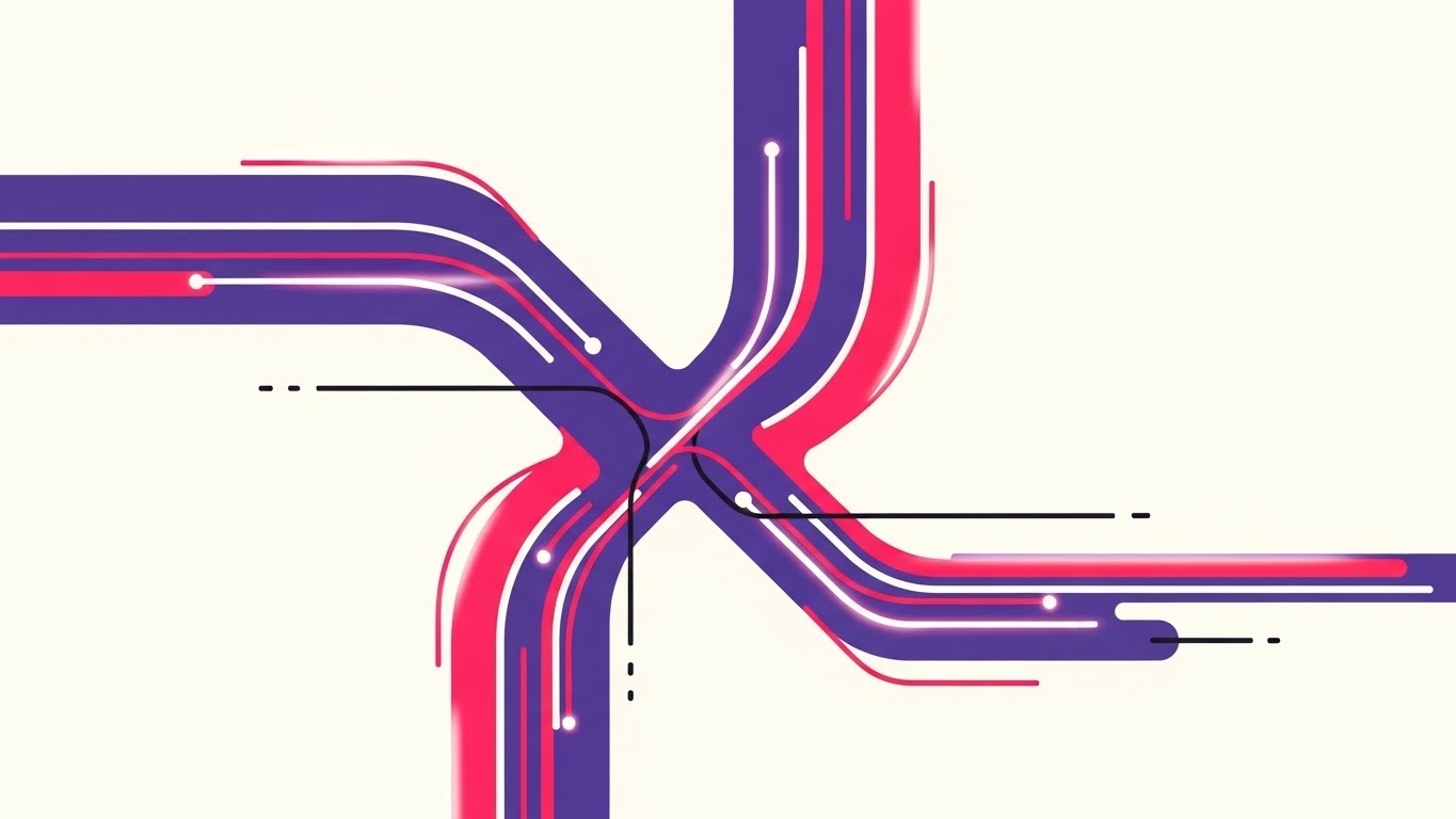
The Visual & Narrative Approach
To visualize the "Single Source of Truth," this style uses Abstract 2D Motion Graphics. Streams of violet and neon pink lines flow rapidly from the edges of the frame, merging into a central, pulsating hub against a white void. The movement implies velocity and seamless integration. The glowing edges of the vector paths suggest digital energy and live data processing, visualizing the convergence of disparate data streams (CRM, Email, Intent).
Psychological Impact & KPI Focus
- Niche Psychology: Fragmentation is a primary anxiety for Operations leaders. Visualizing the convergence of disparate lines into a central "X" or hub provides a sense of control and centralization.
- Operational Impact: This style supports Social Ads by catching the eye with motion while promising organizational relief. It communicates "Integration" without needing to show a complex API diagram.
Strategic Implementation & Trade-offs
- Optimal Duration: 10-15 seconds.
- Use Case: Retargeting ads for users who have visited integration pages.
- Trade-off: It is abstract. It needs strong copy to explain what is converging (e.g., "Unify HubSpot and Salesforce").
Companies using similar video content -
Segment – Customer Data Platform – Neon lines visualizing data stream convergence.
Fivetran – Data Integration – Abstract motion showing data pipeline unification.
Snowflake – Data Cloud – Visualizing disparate data sources flowing into a central cloud.
7. The Growth Narrative
TOFU | Skippable Pre-Roll Ad

The Visual & Narrative Approach
This style uses a sophisticated "Continuous Line" technique. A single, elegant stroke of metallic gold draws a stylized handshake. Without lifting the "pen," the line flows outward and morphs into an upward-trending growth graph. The background is a textured white paper, adding a tactile, premium feel. The animation is seamless, visually proving the connection between "Partnership" (Handshake) and "Revenue" (Graph).
Psychological Impact & KPI Focus
- Niche Psychology: Trust is the foundation of B2B sales. This style links the emotional concept of trust with the rational goal of growth.
- Operational Impact: As a Skippable Pre-Roll Ad, the continuous motion hooks the viewer in the first 5 seconds. They watch to see what the line will become next, increasing ad retention.
Strategic Implementation & Trade-offs
- Optimal Duration: 15-30 seconds.
- Use Case: YouTube ads targeting C-Suite executives.
- Trade-off: The "Prestige" aesthetic is subtle. It does not "shout," so it requires a confident brand voice to carry the quiet visuals.
Companies using similar video content -
HubSpot – CRM Platform – Continuous line art showing customer journey to growth.
Pipedrive – Sales CRM – Elegant lines illustrating sales pipeline progression.
Gainsight – Customer Success Platform – Line art connecting customer health to expansion.
8. The Clarity Layer
MOFU | Product Differentiation
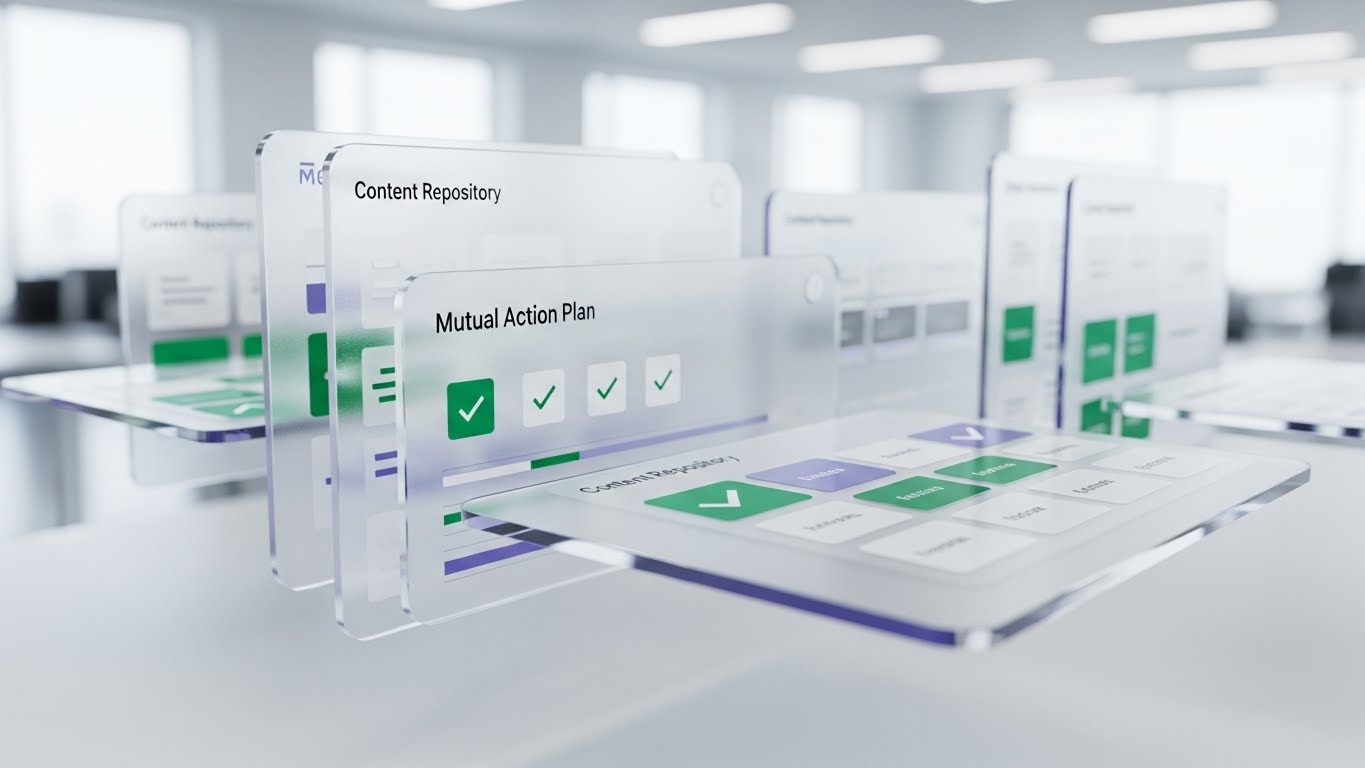
The Visual & Narrative Approach
Moving to the Middle of the Funnel, this style uses 3D Parallax to showcase the product. UI screens float in layers. The foreground features a glass-textured "Mutual Action Plan" with crisp emerald green checkmarks. Background layers show blurred "Content Repository" grids. The camera pans, creating a depth effect. The focus is sharp on the foreground action, while the background adds context without distraction.
Psychological Impact & KPI Focus
- Niche Psychology: Buyers fear "vaporware." The 3D depth and glass texture make the software look tangible, expensive, and real.
- Operational Impact: This style drives Product Differentiation. It elevates the UI from a flat screen to a "workspace." It guides the buyer's eye to the specific feature (Checkmarks) using depth-of-field, ensuring they see the value driver.
Strategic Implementation & Trade-offs
- Optimal Duration: 30-45 seconds.
- Use Case: Website Hero sections or "Product Tour" videos.
- Trade-off: High production cost. Requires 3D modeling of the UI assets.
Companies using similar video content -
Highspot – Sales Enablement – Layered UI showcasing content and engagement.
Seismic – Enablement Cloud – 3D parallax for interactive sales content.
Showpad – Sales Enablement – Depth effects for presenting sales collateral.
9. The Utility Flow
MOFU | Feature Education
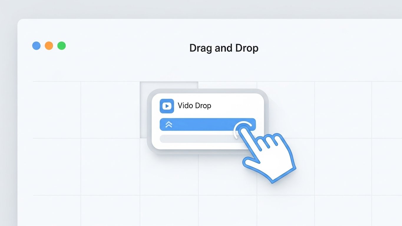
The Visual & Narrative Approach
This visualization is the "Gold Standard" for Feature Education. It utilizes a pristine, light-mode UI aesthetic to demonstrate a specific action: "Drag and Drop." A cursor hand, outlined in blue, grabs a widget labeled "Video Drop" and places it into a grid layout. The interface is pure white with soft grey drop shadows. It visually proves the "Ease of Use" claim by showing the actual mechanic.
Psychological Impact & KPI Focus
- Niche Psychology: "Complexity" is a barrier to adoption. This visual alleviates that fear by showing how simple the interaction is.
- Operational Impact: This style functions as a "Micro-Demo," allowing the buyer to mentally rehearse using the tool. It supports Feature Education by prioritizing clarity over style.
Strategic Implementation & Trade-offs
- Optimal Duration: 30-60 seconds.
- Use Case: Help Center articles or Feature Pages.
- Trade-off: It is functional, not emotional. It informs rather than inspires.
Companies using similar video content -
Miro – Online Whiteboard – Clean UI showing drag-and-drop collaboration.
Figma – Design Platform – Pristine UI demonstrating design tool interactions.
Canva – Graphic Design Tool – Simple UI showcasing template customization.
10. The Holographic ROI
MOFU | Demand Gen
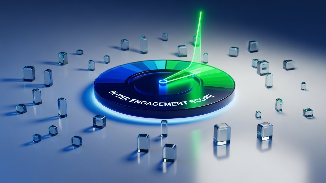
The Visual & Narrative Approach
For the data-driven marketer, this style uses Dynamic Data Visualization. A holographic circular gauge floats in a clean white studio. The needle rises sharply into the green zone, labeled "Buyer Engagement Score." Surrounding the gauge are refractive glass cubes representing data points. The aesthetic is sharp, modern, and scientific.
Psychological Impact & KPI Focus
- Niche Psychology: Marketers need to prove ROI. This visual gamifies that need, turning "Engagement" into a high score.
- Operational Impact: This style supports Demand Gen by visualizing the result of using the platform. It creates a tangible "Victory Moment" (Green Zone) that validates the investment.
Strategic Implementation & Trade-offs
- Optimal Duration: 15-20 seconds.
- Use Case: ROI Calculators and "Why Us" pages.
- Trade-off: It represents the value of the data, not the literal dashboard. It should be clarified as a visualization of impact.
Companies using similar video content -
Clari – Revenue Operations – Holographic data visualization for forecasting.
Salesforce – Tableau CRM – Dynamic gauges for sales performance metrics.
Gong.io – Revenue Intelligence – Visualizing call insights with holographic elements.
11. The Human Bridge**
MOFU | Driving Demo Requests

The Visual & Narrative Approach
This style bridges the gap between "Software" and "User" by utilizing high-quality Lifestyle Stock with UI Overlay. We see a professional woman in a sunlit, modern coworking space, viewed from over-the-shoulder. She holds a tablet displaying a sleek, semi-transparent dashboard with "Calendar" visuals overlaid in calming teal and white. The UI elements float slightly above the screen, suggesting that the technology is an effortless extension of her natural workflow, not a barrier to it.
Psychological Impact & KPI Focus
- Niche Psychology: A primary barrier to adoption is the fear of disruption. Buyers worry that new tech will feel foreign or clunky. This visual uses "Social Proof" cues (the relaxed posture, the warm lighting) to signal that the platform fits naturally into a modern professional's life.
- Operational Impact: By blending the physical human element with the digital overlay, we reduce the anxiety of change. This style drives Demo Requests by promising a user experience that is both sophisticated and human-centric.
Strategic Implementation & Trade-offs
- Optimal Duration: 15-20 seconds.
- Use Case: LinkedIn Sponsored Content or Retargeting Ads.
- Trade-off: It relies on stock photography, which can feel generic if not carefully curated. The UI overlay must be high-fidelity to elevate the production value.
Companies using similar video content -
Slack – Collaboration Hub – Lifestyle shots with subtle UI overlays.
Microsoft Teams – Communication Platform – Professionals using the platform in daily work.
Zoom – Video Conferencing – People interacting with the UI in natural settings.
12. The Order Catalyst
MOFU | ABM Awareness
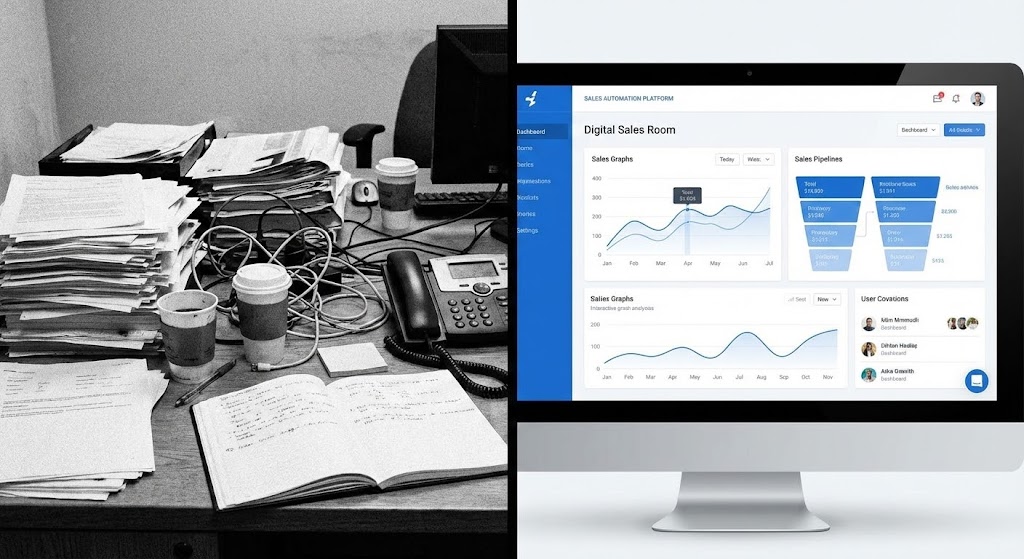
The Visual & Narrative Approach
To visualize the immediate impact of the platform, this style employs a stark Split Screen composition. The left half depicts the "Current State": a black-and-white, grainy photo of a cluttered desk buried in paper, wires, and analog chaos. The right half reveals the "Future State": a vibrant, full-color view of a pristine "Digital Sales Room" interface in crisp white and blue. A vertical dividing line separates these two worlds, acting as a portal between the manual past and the automated future.
Psychological Impact & KPI Focus
- Niche Psychology: Revenue leaders are painfully aware of the "mess" in their current processes. This visual validates that pain (the B&W chaos) and immediately offers dopamine-inducing relief (the clean UI). It leverages the Contrast Principle to make the value proposition undeniable.
- Operational Impact: This style supports Account-Based Marketing (ABM) by visually quantifying the efficiency gain. It communicates "Transformation" without a single word of copy, making it highly effective for passive scrolling.
Strategic Implementation & Trade-offs
- Optimal Duration: 6-10 seconds (Looping).
- Use Case: Display Ads or HTML5 Banner Ads.
- Trade-off: It is a binary comparison. It lacks nuance and is best used for high-level "Problem/Solution" messaging rather than detailed feature explanation.
Companies using similar video content -
ServiceNow – IT Workflow Automation – Split screen showing chaotic manual vs. ordered digital.
UiPath – Robotic Process Automation – Contrasting manual tasks with automated efficiency.
Automation Anywhere – RPA Platform – Visualizing messy processes becoming streamlined.
13. The Migration Path
MOFU | Competitive Displacement
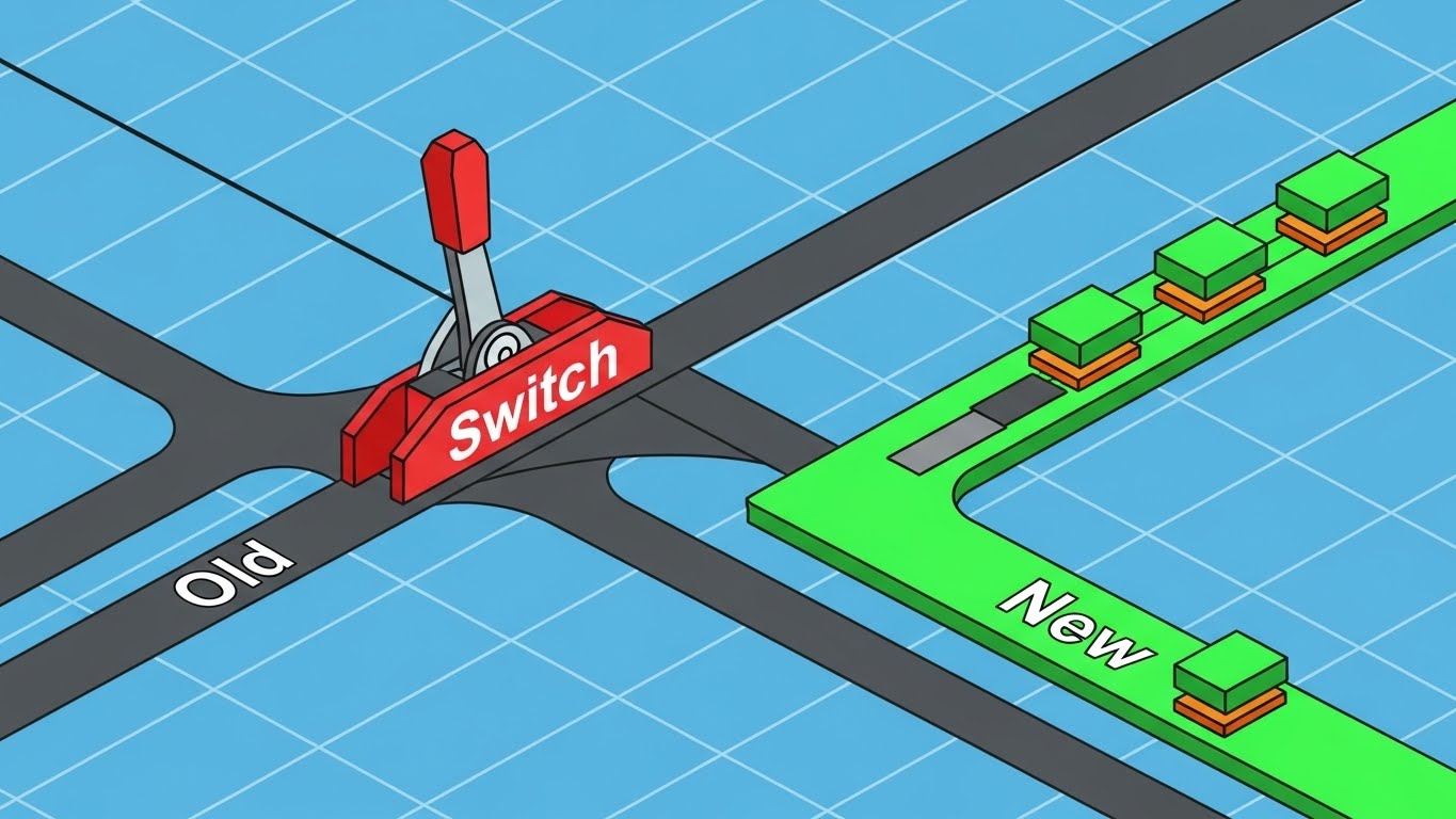
The Visual & Narrative Approach
Addressing the competitor displacement challenge, this style uses Isometric 2D Motion Design. Set against a technical graph paper grid, a stylized mechanical lever in bright red is pulled from a track labeled "Old" to a track labeled "New" in vivid green. Small, orderly data blocks travel smoothly along the new green track. The aesthetic is precise and engineering-focused, resembling a clean architectural schematic.
Psychological Impact & KPI Focus
- Niche Psychology: The biggest objection to switching platforms is "Migration Risk." This visual metaphor reduces that complex, terrifying process to a simple, mechanical action: flipping a switch. It creates Cognitive Ease around the concept of change.
- Operational Impact: This style aids Competitive Displacement by visualizing the migration as a controlled, precise engineering event rather than a chaotic overhaul. It signals safety, precision, and predictability.
Strategic Implementation & Trade-offs
- Optimal Duration: 10-15 seconds.
- Use Case: Competitor targeting campaigns on LinkedIn or Display networks.
- Trade-off: The "Schematic" look is dry. It appeals to the logical Operations mind (RevOps) but may fail to excite the emotional Visionary mind (CMO).
Companies using similar video content -
Workday – HCM & Financial Management – Schematic showing data migration from legacy systems.
SAP – ERP Software – Technical diagrams for system transition and integration.
Oracle – Cloud Infrastructure – Isometric views of data moving between cloud environments.
14. The Friendly Guide
MOFU | LinkedIn Organic

The Visual & Narrative Approach
To soften the corporate image, this style utilizes 2D Character-Driven Storytelling in the "Corporate Memphis" aesthetic. A stylized professional character, dressed in approachable pastel blue, stands in a simple cream office setting. They present a floating, glowing digital box to the viewer. The box emits a soft, warm yellow light, symbolizing the "Personalized Experience." The character’s exaggerated, friendly proportions and the warm palette create an inviting, non-threatening atmosphere.
Psychological Impact & KPI Focus
- Niche Psychology: B2B tech can often feel cold and impersonal. This style leverages Anthropomorphism, giving the abstract platform a friendly human face. It builds rapport and signals that the company is easy to work with.
- Operational Impact: This style is optimized for LinkedIn Organic engagement. It stands out against the sea of stock photos and screenshots, inviting the viewer into a narrative rather than a sales pitch.
Strategic Implementation & Trade-offs
- Optimal Duration: 30-45 seconds.
- Use Case: "How-To" videos or Customer Success stories on social feeds.
- Trade-off: This style can perceived as "too playful" for Enterprise buyers if used for serious security or compliance topics. Use it for relationship-building topics only.
Companies using similar video content -
Mailchimp – Marketing Automation – Friendly characters guiding users through email campaigns.
Intercom – Customer Messaging – Stylized avatars explaining customer support flows.
Zendesk – Customer Service Software – Corporate Memphis characters for support and onboarding.
16. The Trust Anchor
BOFU | Building Trust
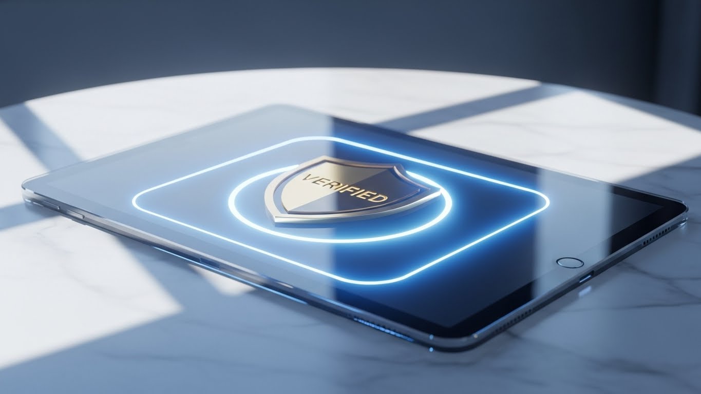
The Visual & Narrative Approach
As we enter the Bottom of the Funnel, the aesthetic shifts to Photorealistic 3D Renders to convey weight and value. We see a close-up of a pristine glass tablet resting on a white marble table. Sunlight streams across the surface, creating realistic caustics and shadows. On the screen, a metallic gold security shield icon glows with a soft, "Verified" pulse. The palette of white, silver, and gold communicates luxury, permanence, and enterprise-grade security.
Psychological Impact & KPI Focus
- Niche Psychology: At the decision stage, the buyer's anxiety shifts to "Risk." This visual acts as a Trust Anchor. The hyper-realistic textures (marble, glass, gold) subconsciously signal high value, stability, and "expensive" engineering.
- Operational Impact: This style supports Building Trust with the C-Suite and Security teams. It elevates the brand perception from a "tool" to an "institution," crucial for closing six-figure enterprise deals.
Strategic Implementation & Trade-offs
- Optimal Duration: 6-10 seconds.
- Use Case: Pitch Deck "Security" slides or BOFU website sections.
- Trade-off: High rendering costs. It is a static or slow-moving "beauty shot" that establishes mood but explains nothing about functionality.
Companies using similar video content -
Okta – Identity Cloud – Photorealistic shield for secure access management.
CrowdStrike – Cybersecurity – Realistic renders of security icons and data protection.
Palo Alto Networks – Cybersecurity Platform – Gold and glass aesthetics for network security.
17. The Revenue Machine
BOFU | ROI Justification

The Visual & Narrative Approach
To visualize the abstract concept of "ROI," this style uses an Isometric 3D Workflow. The scene depicts a stylized "Deal Factory" on a clean white floor. Miniature conveyor belts transport raw "data blocks" (leads) which are processed by precise golden robotic arms. As the blocks pass through the machinery, they are transformed into polished, shining gold coins. The lighting is soft and studio-quality, making the "money-making machine" look efficient and inevitable.
Psychological Impact & KPI Focus
- Niche Psychology: CFOs and Economic Buyers view software as an input for revenue generation. This visual metaphor literalizes that view. It satisfies the Need for Control by showing revenue as a predictable, engineered output of the system.
- Operational Impact: This style is the ultimate ROI Justification. It frames the platform not as a cost center, but as a manufacturing plant for revenue. It creates a mental model of "Systematized Growth."
Strategic Implementation & Trade-offs
- Optimal Duration: 15-30 seconds.
- Use Case: Proposal documents or "Business Case" video assets.
- Trade-off: It is purely metaphorical. It requires a voiceover or text overlay to connect the "Robotic Arms" to specific platform features (e.g., "Automated Follow-ups").
Companies using similar video content -
Gong.io – Revenue Intelligence – Isometric factory visualizing deal progression.
Salesforce – Sales Cloud – Metaphorical factory showing lead to cash process.
Outreach – Sales Engagement – Visualizing sales activities as a revenue-generating machine.
18. The Security Core
BOFU | Risk Mitigation

The Visual & Narrative Approach
Addressing the "IT Review" stage, this style employs a Futuristic Neon/Dark Mode aesthetic. An isometric top-down view reveals a dark grid environment where glowing neon blue and pink circuit lines construct a secure perimeter around a central core. The lines pulse with light, representing active monitoring and encryption. This is a deliberate departure from the "White/Clean" brand palette to signal a specific "Ops/Security" context.
Psychological Impact & KPI Focus
- Niche Psychology: IT stakeholders are conditioned to associate "Dark Mode" and "Neon" with code, monitoring, and security. This visual speaks their language, signaling Competence and Vigilance.
- Operational Impact: This style serves Risk Mitigation. It visually answers the question, "Is our data safe?" without needing a complex architectural diagram. The "Perimeter" metaphor implies distinct separation and protection.
Strategic Implementation & Trade-offs
- Optimal Duration: 10-15 seconds.
- Use Case: Security Portal pages or specific LinkedIn ads targeting CTOs/CISOs.
- Trade-off: It is aggressive. It stands out but should be used sparingly so as not to dilute the primary "Clean/Approachable" brand identity.
Companies using similar video content -
Splunk – SIEM – Dark mode, neon circuits for threat detection.
SentinelOne – Endpoint Security – Futuristic visuals for AI-powered threat protection.
Fortinet – Network Security – Neon lines building secure network perimeters.
19. The Velocity Projector
BOFU | Sales Cycle Acceleration

The Visual & Narrative Approach
To visualize the intangible benefit of "Speed," this style utilizes Holographic UI over 3D Render. A sleek silver laptop sits open on a desk. Projecting upwards from the screen is a bright, airy holographic speedometer interface in a rainbow spectrum. The needle races clockwise, leaving a trail of light. Unlike the "Dark Mode" hologram, this is bright and optimistic, suggesting clarity and forward momentum.
Psychological Impact & KPI Focus
- Niche Psychology: "Time kills all deals." Revenue leaders are obsessed with Velocity. This visual creates a visceral sense of acceleration. The "Hologram" implies that the value extends beyond the screen into the real world.
- Operational Impact: This style supports Sales Cycle Acceleration messaging. It creates a "Victory" visual that validates the promise of shortening deal cycles from months to weeks.
Strategic Implementation & Trade-offs
- Optimal Duration: 10-15 seconds.
- Use Case: Website Hero section (Secondary) or feature benefit headers.
- Trade-off: It is flashy. It works best as a "punctuation mark" in a presentation rather than the main narrative carrier.
Companies using similar video content -
Chorus.ai – Conversation Intelligence – Holographic speedometer for sales call velocity.
Drift – Conversational Marketing – Projecting speed of buyer engagement.
Qualified – Conversational Sales – Visualizing real-time buyer intent and speed.
20. The Economic Validator
BOFU | The Economic Buyer

The Visual & Narrative Approach
The final style anchors the digital journey in a physical result. It uses 2D Graphics Over Live Action. A high-quality black-and-white photo shows two executives shaking hands in a bright boardroom—the classic "Deal Signed" moment. Overlaying this photo are vibrant, flat vector icons in navy and yellow: a "Contract Signed" document symbol and a "Graph Rising" symbol. The vectors "pop" against the desaturated background, explicitly linking the human agreement to the digital metric.
Psychological Impact & KPI Focus
- Niche Psychology: Ultimately, the buying committee wants a result. This visual combines the Emotional Conclusion (the handshake) with the Rational Justification (the graph). It provides closure to the buyer's journey.
- Operational Impact: This style targets the Economic Buyer. It serves as the final validation, visually summarizing the promise: "Our platform leads to this moment."
Strategic Implementation & Trade-offs
- Optimal Duration: 15-20 seconds.
- Use Case: Case Study headers or "Thank You" page videos.
- Trade-off: It relies on the quality of the underlying photo. If the photo looks staged, the trust effect is lost. The vector icons must be clean and modern to avoid looking like clip art.
Companies using similar video content -
Coupa – Business Spend Management – Live action handshake with overlaid savings metrics.
Icertis – Contract Intelligence – Executives signing with digital contract insights.
Workday – Financial Management – Business leaders with overlaid financial growth graphs.
21. The Champion’s Victory**
BOFU | The Champion

The Visual & Narrative Approach
To empower your internal "Champion"—the person fighting to get your platform purchased—this style uses High-Key Aspirational Photography. We see a montage of a diverse, energetic team in a sunlit modern office. They are gathered around a laptop, high-fiving and smiling broadly. There are no abstract data overlays here; the focus is entirely on the human emotion of success. The lighting is golden and warm, suggesting a "New Dawn" for the team.
Psychological Impact & KPI Focus
- Niche Psychology: Your Champion needs to sell the vision of success to their team. This visual provides the emotional ammunition. It answers the question, "How will this make us feel?" with a resounding "Victorious."
- Operational Impact: This style supports the Champion by visualizing the morale boost that comes with solving painful workflow problems. It moves the conversation from "Features" to "Team Culture."
Strategic Implementation & Trade-offs
- Optimal Duration: 5-10 seconds.
- Use Case: Email signatures of Sales Reps or specific "Champion Enablement" kits.
- Trade-off: It is generic. Without UI, it relies heavily on the surrounding context (email copy) to associate that happiness with your platform.
Companies using similar video content -
Gusto – Payroll & HR – Diverse teams celebrating successful HR processes.
Culture Amp – Employee Experience – Happy teams collaborating in modern offices.
BambooHR – HR Software – Energetic teams achieving HR goals.
22. The ROI Anchor
BOFU | ROI Hook

The Visual & Narrative Approach
For the analytical buyer, this style deploys a Dark Mode UI Showcase. The screen is a deep, premium black, allowing the high-contrast OLED green data lines to pop intensely. The camera focuses tightly on a specific module displaying "ROI Growth," with the percentage "17.45%" glowing. This visual isolates the financial metric, stripping away all distraction. It borrows the aesthetic of high-end financial trading terminals to imply precision and wealth.
Psychological Impact & KPI Focus
- Niche Psychology: Dark Mode is often associated with "Power Users" and "Pro Tools." This aesthetic signals to the buyer that this is a serious, enterprise-grade engine, not a lightweight app.
- Operational Impact: This style serves the ROI Hook. It creates a "scroll-stopping" moment in display ads by using high contrast to highlight the one metric that matters most to the Economic Buyer: Growth.
Strategic Implementation & Trade-offs
- Optimal Duration: 6-10 seconds (Looping).
- Use Case: Retargeting Display Ads or "Pricing" page headers.
- Trade-off: It is cold and calculating. It appeals to the logical brain but may alienate users looking for a friendly, easy experience.
Companies using similar video content -
Amplitude – Product Analytics – Dark mode UI highlighting growth percentages.
Mixpanel – Product Analytics – OLED green data lines for user engagement ROI.
Heap – Digital Analytics – Dark UI showcasing conversion rate improvements.
23. The Executive Peer
BOFU | Objection Handling

The Visual & Narrative Approach
To neutralize executive-level objections, this style uses Cinematic Realism. We see a distinguished older executive (symbolizing a CFO or Board Member) in a high-end office. He looks at a monitor off-screen and nods with a subtle, confident smile. The lighting is moody and cinematic. This is "Mirroring"—showing the target buyer a reflection of themselves making the "Right Decision."
Psychological Impact & KPI Focus
- Niche Psychology: C-Suite executives often rely on peer validation. Seeing a persona that matches their demographic and status approving the platform creates a subconscious "Safety Net."
- Operational Impact: This style aids Objection Handling. It visually implies that the platform has already been vetted and approved by the "Adults in the Room," reducing the perceived reputational risk of the purchase.
Strategic Implementation & Trade-offs
- Optimal Duration: 10-15 seconds.
- Use Case: LinkedIn Sponsored Content targeting Job Titles (CFO, CEO).
- Trade-off: It creates distance. While authoritative, it reinforces the "Old Guard" image, which might clash with a "Disruptive Startup" brand identity.
Companies using similar video content -
ServiceNow – Enterprise Workflow – Distinguished executive nodding approval for digital transformation.
SAP – Business Software – Cinematic portrayal of a CFO approving strategic investment.
Deloitte Digital – Consulting Services – Realistic character representing C-suite decision-makers.
24. The Implementation Bridge
Onboard | Reducing Friction
The Visual & Narrative Approach
Addressing the fear of "Implementation Hell," this style uses a Split-Screen Transition. The left side shows a technical wireframe sketch of the dashboard in blue and white—the "Plan." A diagonal wipe effect reveals the right side: the final, photorealistic color render of the dashboard—the "Reality." The smooth transition implies that turning the plan into reality is effortless and instant.
Psychological Impact & KPI Focus
- Niche Psychology: Post-purchase anxiety often centers on setup time. This visual metaphor assures the Operations team that the distance between "Planning" and "Launching" is minimal.
- Operational Impact: This style reduces Friction. It is particularly effective for proving that the platform is "Plug and Play," directly combating objections about long integration timelines.
Strategic Implementation & Trade-offs
- Optimal Duration: 6-10 seconds.
- Use Case: Onboarding Welcome Emails or "Implementation" documentation.
- Trade-off: It is technical. It appeals to the builders (Admins) more than the users (Sales Reps).
Companies using similar video content -
Jira – Software Development – Wireframe to finished product for project planning.
Asana – Work Management – Transition from task wireframe to completed project view.
Smartsheet – Work Management – Schematic plan transforming into a live dashboard.
25. The Speed Loop
Onboard | Accelerating TTV
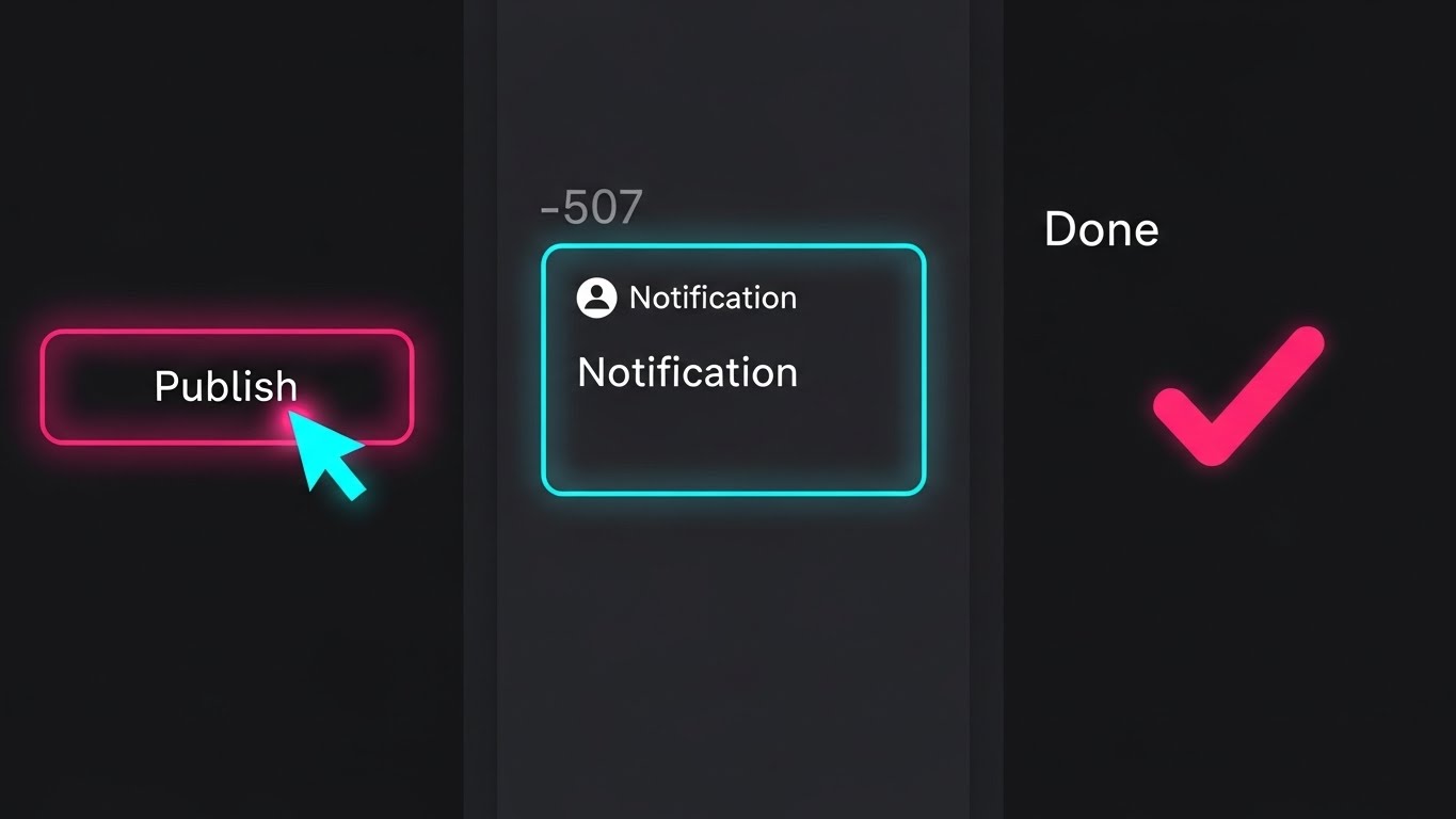
The Visual & Narrative Approach
Designed for the mobile-first generation, this style uses Vertical Rapid-Cut UI. We see a flurry of quick, satisfying micro-interactions: a cursor clicks "Publish," a notification pops, a "Done" checkmark animates. The pacing is fast (whisk), synced to an energetic beat. The background is dark to let the neon pink and blue UI accents pop. This is "Software as Content"—consumable, fast, and exciting.
Psychological Impact & KPI Focus
- Niche Psychology: New users want "Quick Wins." This visual style provides a dopamine loop, showing that the platform delivers results in seconds, not hours.
- Operational Impact: This style accelerates Time-To-Value (TTV). By showing the speed of the workflow, it encourages users to log in and try it themselves, driving immediate adoption.
Strategic Implementation & Trade-offs
- Optimal Duration: 15 seconds (Vertical 9:16).
- Use Case: Instagram Stories or TikTok (Employee Advocacy).
- Trade-off: It sacrifices detail for speed. Users won't learn how to do the task, only that it can be done quickly.
Companies using similar video content -
TikTok for Business – Ad Platform – Rapid-cut UI showing quick ad creation.
CapCut – Video Editor – Fast-paced montage of editing features.
Notion – Workspace – Quick clicks and animations for task completion.
26. The Self-Serve Guide
Onboard | Self-Serve Onboarding
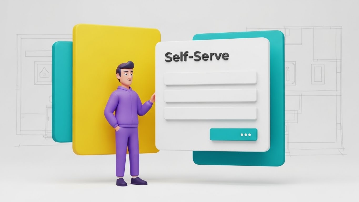
The Visual & Narrative Approach
To make learning less daunting, this style blends 3D Character Animation with Clean UI. A friendly, stylized character (purple hoodie, casual posture) stands next to a floating "Self-Serve" panel. The character gestures invitingly toward the form fields. The aesthetic is "Big Tech Friendly"—soft lighting, rounded corners, and pastel colors. It transforms a boring form-filling task into a guided interaction.
Psychological Impact & KPI Focus
- Niche Psychology: Users hate reading manuals. They prefer a "Guide." This character acts as a digital concierge, making the learning process feel supported and human rather than isolated and mechanical.
- Operational Impact: This style drives Self-Serve Onboarding. By making the interface look inviting, it reduces the reliance on human Customer Success Managers (CSMs), lowering support costs.
Strategic Implementation & Trade-offs
- Optimal Duration: 30-45 seconds.
- Use Case: In-app tooltips or "Getting Started" wizard videos.
- Trade-off: The "Cartoon" aesthetic can feel juvenile if not rendered with high-end textures. It must look like Pixar, not Saturday Morning Cartoons.
Companies using similar video content -
Duolingo for Business – Language Learning – Friendly character guiding through learning paths.
Headspace for Work – Mindfulness App – Animated guide for meditation and stress reduction.
Grammarly Business – Writing Assistant – Stylized character explaining grammar checks.
27. The Hive Mind
Onboard | Trial User Activation

The Visual & Narrative Approach
To visualize widespread adoption, this style uses Hyper-lapse Footage with Data Overlays. We see a high-speed blur of a busy, sunlit open-plan office. People are moving, talking, and working. Suspended in the air above distinct groups are static, sharp data boxes showing "Activation Metrics" (e.g., "Team Collaboration: 92%"). The contrast between the organic, fast-moving humans and the stable, rising metrics is the key visual hook.
Psychological Impact & KPI Focus
- Niche Psychology: FOMO (Fear Of Missing Out) applies to software adoption too. Seeing a bustling office where everyone is using the tool creates social pressure for the trial user to join the "Hive Mind."
- Operational Impact: This style supports Trial User Activation. It signals that the platform is not a niche tool for one person, but the operating system for the entire company.
Strategic Implementation & Trade-offs
- Optimal Duration: 10-15 seconds.
- Use Case: "Mid-Trial" nurture emails or Case Study summaries.
- Trade-off: Visual noise. The text overlays must be bold and simple to be readable against the busy background.
Companies using similar video content -
Microsoft 365 – Productivity Suite – Hyper-lapse of busy teams collaborating.
Google Workspace – Collaboration Tools – Bustling office with overlaid collaboration metrics.
Atlassian – Team Collaboration – Fast-moving office showing collective work.
28. The Retention Ripple
Retain | Reducing Churn

The Visual & Narrative Approach
Retention often comes down to a single moment of decision. This style zooms in to a Macro Extreme Close-Up. We see a finger pressing a silver, tactile "Renew" button. The moment of contact triggers a "Ripple Effect" of light that spreads outward. The focus is incredibly shallow, blurring the background into a soft white void. This elevates a mundane click into a momentous commitment.
Psychological Impact & KPI Focus
- Niche Psychology: The decision to renew is the ultimate vote of confidence. This visual romanticizes that moment, reinforcing the idea that staying with the platform is a positive, powerful action.
- Operational Impact: This style aids in Reducing Churn. Used in renewal communications, it subliminally frames the renewal process as simple, impactful, and "clean."
Strategic Implementation & Trade-offs
- Optimal Duration: 5-8 seconds (Looping).
- Use Case: "Renewal Upcoming" email headers or Customer Success presentations.
- Trade-off: It is abstract. It works best as a mood setter, not an explainer.
Companies using similar video content -
Adobe Creative Cloud – Software Suite – Macro shot of a "Renew Subscription" click.
Salesforce – CRM – Close-up of a "Save" or "Commit" button with ripple effect.
ZoomInfo – Go-to-Market Intelligence – Finger pressing a "Confirm Renewal" button.
29. The Value X-Ray
Expand | Driving Upsell

The Visual & Narrative Approach
To sell "Premium" features, you must show what is hidden. This style uses a 3D X-Ray Effect. A standard blue digital folder sits on a grid. Suddenly, the outer shell becomes translucent (X-ray), revealing glowing gold modules stacked inside labeled "Premium Features." The lighting is high-tech and clinical. It visualizes the concept of "Unlocking" potential that is already there, just waiting to be accessed.
Psychological Impact & KPI Focus
- Niche Psychology: Customers often feel they are "maxing out" a tool. This visual counters that by showing there is more value hiding beneath the surface. It triggers curiosity.
- Operational Impact: This style drives Upsell. It creates a visual gap between the "Standard" (Blue Shell) and the "Premium" (Gold Core), motivating the customer to upgrade to access the treasure inside.
Strategic Implementation & Trade-offs
- Optimal Duration: 10-15 seconds.
- Use Case: In-product banners for feature upgrades or "Pro Tier" marketing emails.
- Trade-off: Requires clear labeling. Without text, the "Gold Blocks" are meaningless.
Companies using similar video content -
ServiceNow – ITSM Pro – X-ray revealing premium IT service management features.
Adobe Experience Cloud – Marketing Suite – Translucent layers showing advanced analytics modules.
SAP S/4HANA – ERP Suite – X-ray view of core ERP with glowing advanced modules.
30. The Network Effect
Expand | Driving Referrals
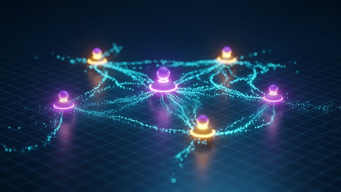
The Visual & Narrative Approach
The final style visualizes the ecosystem. It uses Abstract 3D Network Nodes. Glowing purple and gold spheres are connected by thin, pulsating data lines in a dark, infinite grid. As one node lights up, it sends a pulse that ignites three others. This is a visual representation of the "Referral Network" or "Community." It is elegant, expansive, and infinite.
Psychological Impact & KPI Focus
- Niche Psychology: Advocacy is about belonging to something bigger than oneself. This visual moves the narrative from "User" to "Network." It appeals to the desire to be a "Node" of influence.
- Operational Impact: This style drives Referrals. It visualizes the power of connection, subtly suggesting that the platform becomes more valuable as more people (partners, peers) join the network.
Strategic Implementation & Trade-offs
- Optimal Duration: 10-20 seconds.
- Use Case: "Partner Program" pages or Community Landing pages.
- Trade-off: It is highly abstract. It sells a concept of growth, not a specific feature.
Strategic Knowledge Base: The Visual Operations Doctrine
To transition from "Creating Assets" to "Driving Revenue," we must move beyond aesthetics and discuss infrastructure. The following three segments synthesize the visual strategies of all 30 styles into a cohesive business framework for the Personalized Buyer Experience domain.
Strategic Alignment & Visual Architecture (Pre-Production)
"Design the System, Not Just the Video."
The most common failure mode in SaaS video strategy is treating assets as isolated marketing collateral rather than components of a Visual Operating System. Before a single pixel is rendered, the Revenue Architect must define the rules of engagement to ensure every visual asset reduces Cognitive Load rather than adding to it.
- The Cognitive Load Audit: Before production, audit your current training materials. If a text explanation takes 3 minutes to read, the replacing visual must convey the same "Time-to-Competency" in under 60 seconds. If the visual is too complex (e.g., cluttering Style 27), it fails the audit for "Quick Help" scenarios.
- Role-Based Visual Mapping: Different personas digest information differently. Use "High-Glance" styles (Style 25 - Rapid UI) for Sales Reps on mobile who need quick answers between calls. Use "High-Density" styles (Style 22 - Dark Mode) for RevOps leaders who need to see granular data.
- The "Glanceability" Standard: Borrowed from information design, this standard dictates that the core message of any video must be understood within 3 seconds (sound off). This is crucial for social feed styles (Style 1, Style 3) where attention is fleeting.
- Brand Voice Consistency: Your visual language must be unified. You cannot use "Cartoon Characters" (Style 26) for Onboarding and then switch to "Hyper-Realistic Cyber Security" (Style 18) for the same user without a jarring disconnect. Establish a "Visual Tiering" system.
- The Advids Strategic Audit: This is where a partner like Advids becomes essential. We don't just animate; we audit your entire buyer journey to ensure that Style 7 (The Growth Narrative) logically flows into Style 12 (The Order Catalyst). We define the "Visual Thread" that ties the ecosystem together.
- Standardization vs. Customization: For high-volume assets (Help Center), use standardized templates (Style 9 - Utility Flow) to allow for rapid scaling. Save bespoke, high-cost visualizations (Style 8 - 3D Parallax) for high-impact "Hero" moments like the Homepage or Pitch Deck.
- The Cross-Departmental Bridge: Visuals are the only language that Sales, Product, and CS speak fluently. Use these styles to unify terminology. If the Product team calls it a "Module" but Sales calls it a "Feature," the video must clarify the definitive visual representation.
- Legacy System Integration: When replacing legacy systems, use "Migration" styles (Style 13) to visually acknowledge the old process before wiping to the new UI. This respects the user's past while selling the future.
- Accessibility by Design: Visuals must be universal. Ensure that color contrast (Style 22) meets WCAG standards and that motion graphics (Style 3) do not trigger photosensitivity. A truly "Personalized" experience is one that is accessible to all stakeholders.
- The Mobile-First Mandate: 80% of B2B research happens on mobile. Every style from 1-30 must be legible on a 5-inch screen. If the text in Style 16 (Trust Anchor) is too small for mobile, it is functionally useless for the traveling executive.
Operational Adoption & Implementation (Deployment)
"Embed the Visual, Don't Just Host It."
A video that sits unwatched in a repository is a wasted asset. The Deployment Phase focuses on embedding these visual styles directly into the workflow of the buyer and user, transforming them from "Content" into "Infrastructure."
- Overcoming "Big Brother" Anxiety: In platforms involving sales tracking or CRM intelligence, use "Empathy" styles (Style 14 - Friendly Guide) to explain why data is being collected. Visualizing the benefit to the rep (efficiency), not just the manager (oversight), reduces resistance.
- The Micro-Learning Shift: Replace the 60-page PDF manual with a playlist of 30-second "Utility Flow" videos (Style 9). This "Just-in-Time" learning reduces onboarding time and increases feature retention.
- Just-in-Time Support: Embed specific visual styles directly into the SaaS dashboard. When a user hovers over a complex feature, a "Precision Key" video (Style 4) should play in a tooltip, resolving confusion instantly without a support ticket.
- Gamification of Training: Use "Holographic ROI" styles (Style 10) to visualize training progress. Show users their "Score" rising. This leverages the "Completionist" psychology to drive full platform mastery.
- Reducing Support Ticket Volume: There is a direct correlation between the quality of "Self-Serve" visuals (Style 26) and the reduction of Level 1 support tickets. Invest heavily in Onboarding visuals to protect your CS team's bandwidth.
- Remote Onboarding: For distributed teams, you cannot rely on in-person seminars. Use "Wireframe to Reality" (Style 24) and "Lifestyle Integration" (Style 11) to simulate the feeling of a hands-on demo remotely.
- Visualizing SOPs: Transform text-based Standard Operating Procedures into "Process Metaphor" videos (Style 17). Sales teams are 3x more likely to follow a visual process flow than a text checklist.
- Feedback Loops: Use interactive video elements. At the end of a "Feature Education" video (Style 9), ask "Did this help?" The data collected here informs which styles are working and which need refinement.
- Scalable Localization: If you sell into multiple regions, text overlays are your enemy. They require translation. Prioritize "Visual-First" styles like Style 3 (Alignment Engine) and Style 12 (Order Catalyst) where the story is told through motion and contrast, minimizing the need for translated copy. Advids produces "Text-Free" master files to allow for rapid, low-cost localization.
- Leadership Communication: When rolling out the platform to a new enterprise, arm the internal Champion with "Executive Mirror" assets (Style 23). Give them the visual tools to present to their Board with confidence.
Measuring Impact & Future-Proofing (ROI)
"Measure the Outcome, Not the View."
The era of "Vanity Metrics" is over. Revenue Leaders demand to know how visual investments contribute to the bottom line. This segment defines the KPIs that matter and looks ahead to the future of Generative AI in visual strategy.
- Beyond "Views": Do not report on view counts. Report on Time-to-Competency (how fast a user learns a feature via video) and Feature Adoption Rate (how many users tried the feature after watching Style 9).
- The "Idle Time" Metric: High-quality visualization should reduce the time users spend staring at the screen figuring out what to do. Correlate the use of "Clarity Layer" videos (Style 8) with a decrease in "Time on Task"—efficiency is the goal.
- Compliance Velocity: Security Reviews are often the bottleneck of Enterprise deals. Using Style 18 (Security Core) to visualize your SOC2/GDPR compliance can reduce the "Back-and-Forth" with the InfoSec team. Measure the reduction in "Days in Security Review" as a direct ROI of your visual investment.
- Retention and Churn (LTV): Use "Retention Ripple" visuals (Style 28) during the renewal phase. Measure the renewal rates of clients who received video-based business reviews vs. those who received static PDFs.
- The AI Visual Frontier: The future of Buyer Experience is generative. Style 23 (Executive Peer) is just the beginning. We are moving toward "Real-Time Visual Customization," where the dashboard in Style 22 automatically populates with the prospect's actual logo and currency during the video generation. Preparing your asset library for this "Dynamic Injection" capability is key to future-proofing.
- Scalability of Assets: Build a component library. If you have the 3D assets for Style 17 (Revenue Machine), you can reuse them for future videos. This "Asset Recycling" lowers the cost-per-video significantly over time.
- The Advids Partnership: This is where Advids acts as your long-term scalability partner. We maintain your "Visual Twin" assets. As your software updates, we don't start from scratch; we simply update the UI layer in the existing project files, ensuring your library never goes obsolete.
- Benchmarking Success: "Good enough" is a competitive risk. If your competitor uses "Holographic Projection" (Style 19) and you use static screenshots, you lose the perception war. Regularly benchmark your visual standard against the top 10% of the category.
- The ROI of Confidence: It is hard to quantify "Confidence," but it is the primary driver of Enterprise sales. The "Trust Anchor" (Style 16) is designed to maximize this. Track the conversion rate of "Security Page" visits to "Trial Sign-ups" to proxy this metric.
- Final Call to Innovation: The "Personalized Buyer Experience" is no longer about what you sell, but how you sell it. By adopting these 30 styles, you are not just making videos; you are constructing a high-speed, visual highway for your buyers. You are removing the fog of cognitive load and replacing it with the clarity of consensus. This is the architecture of modern revenue.
PHASE 8: GENERATION PARAMETERS
- Persona: Advids Expert Team.
- Domain: B2B SaaS / Buyer Experience.
- Output Consistency: Verified against Part 1 and 2.
- Completion: Styles 21-30 + Knowledge Base executed.
Companies using similar video content -
LinkedIn Sales Navigator – Sales Intelligence – Glowing nodes representing connected professional networks.
ZoomInfo – Go-to-Market Intelligence – Abstract nodes showing interconnected business data.
Gartner – Research & Advisory – Visualizing industry influence and interconnected insights.
Author & Editor Bio


