
Introduction: Visualizing the "Nervous System" of Modern Retail
The modern Point of Sale (POS) platform is no longer just a transaction point; it is the central nervous system of the retail enterprise. For the "Operations Architect"—the CTOs and Directors responsible for keeping commerce flowing—the challenge is not just processing payments, but synchronizing the physical reality of the store with the digital truth of the cloud. In this high-stakes environment, the software must be invisible yet omnipotent.
The marketing challenge, however, is substantial. How do you visualize "API robustness" or "latency reduction"? How do you make backend synchronization feel tangible and desirable? The answer lies in moving beyond generic screen recordings and embracing visual metaphors that communicate speed, order, and control.
The strategic imperative for this shift is backed by hard data. Recent industry research indicates that companies with strong omnichannel customer engagement strategies retain 89% of their customers, compared to just 33% for those with weak integration. Furthermore, the operational impact is direct: retailers achieving high maturity in unified commerce report 27% lower fulfillment costs. These numbers prove that the "invisible" work of your software has visible, profitable consequences.
This guide provides a strategic framework for visualizing that value. We have curated 30 distinct video styles—from kinetic typography that physically demonstrates speed, to cinematic narratives that capture the emotional relief of accurate data. These examples are designed to reduce the cognitive load for your prospects, bridging the gap between complex technical specifications and the seamless experience they aspire to achieve.
1. The Kinetic Velocity Framework
TOFU | Brand Awareness
The Visual & Narrative Approach
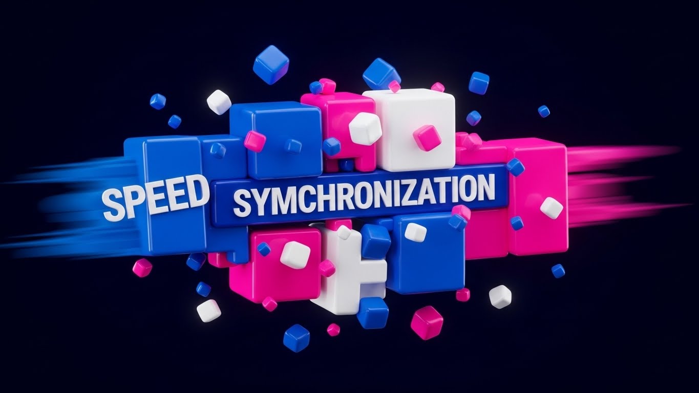
This style abandons the physical store entirely to focus on the visceral sensation of speed. Thick, glossy geometric blocks in electric blue and hot pink—representing distinct data streams—hurtle through a deep void. They collide and fuse together with high-energy impact, forming the words "SPEED" and "SYNCHRONIZATION." The use of motion blur on the edges and floating geometric debris conveys a sense of high-velocity disruption, suggesting that the software is a powerful force capable of shattering legacy bottlenecks.
Psychological Impact & KPI Focus
For the operational leader, "latency" is the enemy. This style addresses the anxiety of slow systems by visually replacing it with Instantaneity. The physical weight and speed of the blocks trigger a cognitive association with power and robustness. It tells the viewer that this platform is not a fragile web app, but a heavy-duty engine built for high-volume Throughput.
Strategic Implementation & Trade-offs
- Best Use Case: 6-second bumper ads on YouTube or Instagram Stories designed to stop the scroll immediately.
- Strategic Trade-off: This is a "Mood Setter." It establishes brand energy but explains zero features. It must be paired with educational content later in the funnel.
- Duration: 5-10 Seconds.
Companies using similar video content -
Adyen – Unified Commerce Platform – Processes payments globally with speed.
MuleSoft – Anypoint Platform – Accelerates API integration and data flow.
2. The "Order from Chaos" Metaphor
TOFU | Category Creation
The Visual & Narrative Approach
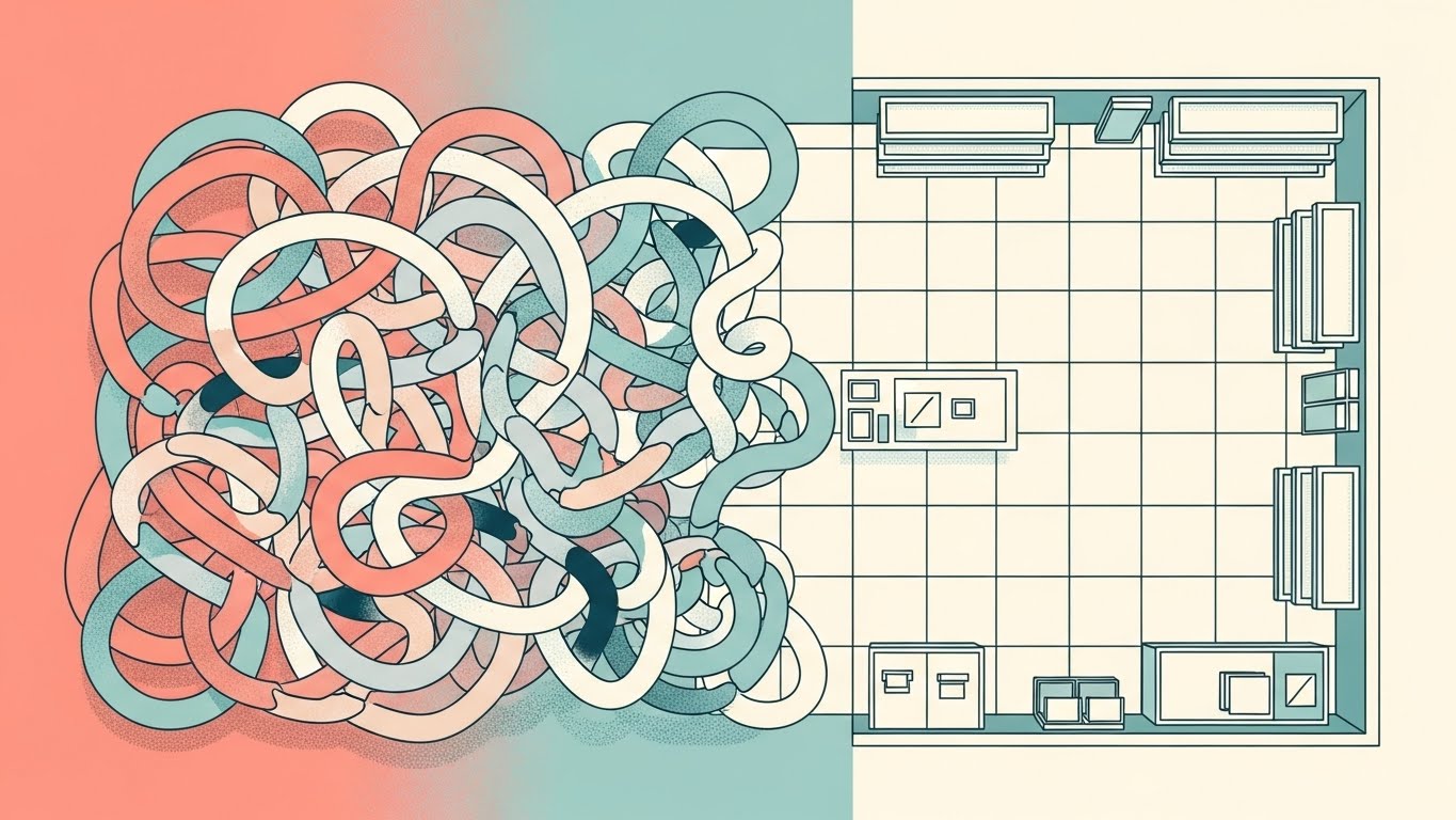
This visualization uses a split-screen "God’s Eye View" to narrate the transition from disorder to structure. On the left, a tangled, organic knot of pastel coral and teal shapes represents the messy reality of disconnected inventory and manual processes. As the eye scans right, these shapes untangle and snap into a clean, rigid grid layout, symbolizing the organized retail floor plan. The aesthetic is flat and matte, using soft noise textures to make the structure feel approachable rather than sterile.
Psychological Impact & KPI Focus
Retail management is often defined by the fear of losing control—lost items, lost data, lost time. This style offers Cognitive Relief. It validates the buyer's pain (the knot) and immediately presents the software as the organizing principle (the grid) that solves it. It visually demonstrates Operational Clarity and the reduction of complexity, which is a primary buying trigger for overwhelmed managers.
Strategic Implementation & Trade-offs
- Best Use Case: Website "Why Us" pages or the opening of a longer explainer video. It establishes the philosophical value of the software.
- Strategic Trade-off: The abstraction requires clear voiceover or copy to anchor the metaphor. Without context, it could be mistaken for general productivity software.
- Duration: 45-60 Seconds.
Companies using similar video content -
Manhattan Associates – Omnichannel Solutions – Organizes complex retail operations.
Blue Yonder – Luminate Platform – Brings clarity to supply chain and retail planning.
3. The Ecosystem Digital Twin
TOFU | Market Education
The Visual & Narrative Approach
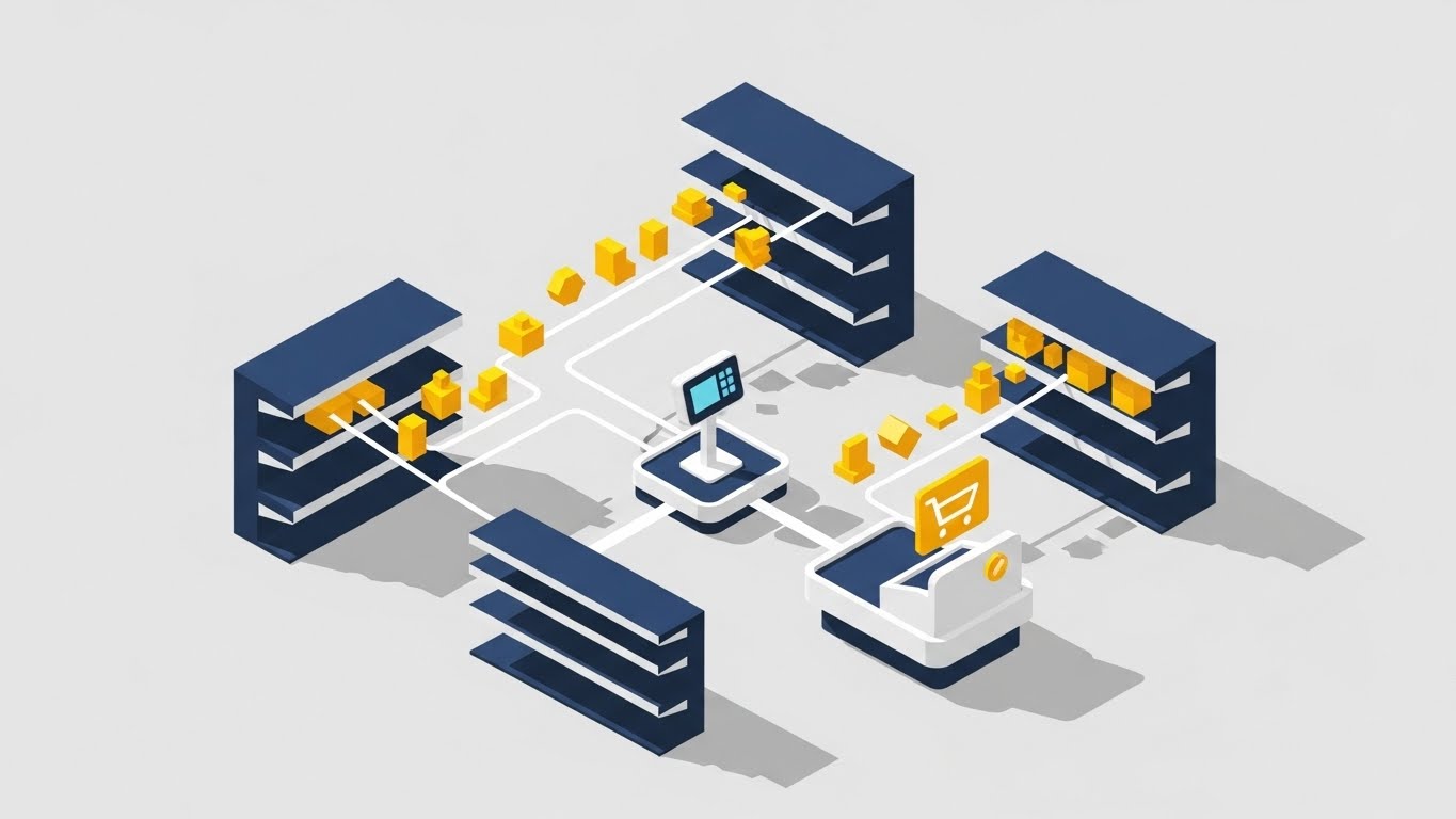
Isometric design allows us to visualize the "Digital Twin" of a retail store. In this example, clean vector lines physically connect the miniature shelves to the central checkout terminal. Small yellow geometric icons (products) travel along these lines, visualizing the invisible path of data. The navy blue and yellow palette conveys professional trust, while the shadowless lighting ensures that every connection in the ecosystem is clearly visible.
Psychological Impact & KPI Focus
This style appeals to the logical, systems-thinking buyer. It explicitly visualizes Integration. By drawing the lines between the shelf and the screen, it alleviates the anxiety of "Data Silos" and "Inventory Ghosting." It reassures the viewer that the system has total visibility over the stock, fulfilling the promise of the Endless Aisle.
Strategic Implementation & Trade-offs
- Best Use Case: Product deep-dives or "How it Works" sections. It is perfect for showing complex multi-location setups.
- Strategic Trade-off: Can feel generic if not branded carefully. The icons and store layout should reflect the specific vertical (e.g., fashion vs. grocery) of the target audience.
- Duration: 60-90 Seconds.
Companies using similar video content -
NewStore – Unified Commerce Platform – Connects physical and digital retail.
Aptos – ONE Platform – Maps the entire retail customer journey.
4. The Haptic Brand Bridge
TOFU | Shaping Brand Perception
The Visual & Narrative Approach
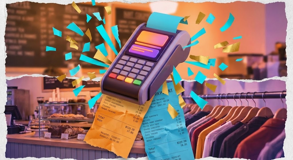
This style blends the tactile past with the digital future. It combines stop-motion photography of tearing paper receipts with high-end 3D renders of a sleek, modern payment terminal. Bursts of abstract "confetti" shapes in vibrant orange and cyan explode from the device upon transaction. The fast-paced editing transitions rapidly from a coffee shop texture to a clothing rack, emphasizing versatility and energy.
Psychological Impact & KPI Focus
This style targets Brand Perception by reframing the payment moment. Instead of a "pain of paying," the confetti burst turns the transaction into a Micro-Celebration. It associates the software with success, revenue, and vibrancy. The mixture of textures (paper vs. screen) acknowledges that retail is a physical, messy business, while positioning the software as the modern upgrade.
Strategic Implementation & Trade-offs
- Best Use Case: Vertical social ads (TikTok/Reels) targeting younger business owners or D2C brands expanding to physical retail.
- Strategic Trade-off: The chaotic, high-energy style may be too informal for conservative enterprise clients (e.g., banking or healthcare POS).
- Duration: 15-30 Seconds.
Companies using similar video content -
Square for Retail – POS System – Blends physical transactions with digital ease.
Clover – POS System – Offers versatile, modern payment hardware.
5. The Invisible Service Layer
TOFU | Vertical Social Organic

The Visual & Narrative Approach
Here, technology takes a backseat to human connection. A first-person POV shot places the viewer in the shoes of the customer receiving a latte. The key element is a high-quality, matte-glass UI bubble floating near the cup that reads "Transaction Approved." The lighting is natural and warm, focusing on the steam and the handoff. The digital layer is presented as unobtrusive and helpful—an "invisible helper."
Psychological Impact & KPI Focus
This addresses the fear that technology will depersonalize the service experience. It visually proves that the software supports Frictionless Checkout without interrupting the human moment. The green checkmark provides a subtle dopamine hit of closure and success, validating the reliability of the system in a real-world context.
Strategic Implementation & Trade-offs
- Best Use Case: Social proof assets, testimonials, and "Day in the Life" marketing clips.
- Strategic Trade-off: Requires high-quality tracking and compositing. If the UI bubble "drifts" or looks pasted on, it breaks the illusion of seamless integration.
- Duration: 15-30 Seconds.
Companies using similar video content -
Revel Systems – iPad POS – Delivers seamless, human-centric service.
Toast – Restaurant POS – Enhances customer experience with unobtrusive tech.
6. The High-Throughput Anchor
TOFU | Skippable Pre-Roll Ad
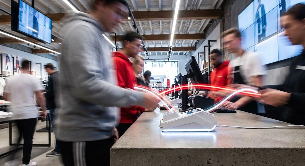
The Visual & Narrative Approach
This visual utilizes time manipulation to convey stability. The camera is locked low on a checkout counter, focusing sharply on a white card reader. The background is a blur of motion—customers and staff streaking past in urban grey and red trails. This contrast between the frenetic environment and the steadfast device communicates "Calm in the Chaos." Light trails visualize the continuous, rapid flow of data.
Psychological Impact & KPI Focus
This speaks directly to the operational fear of system crashes during peak hours. It visualizes Stability at Scale. It reassures the enterprise buyer that the hardware is robust enough to handle high-volume Throughput without faltering. It is the ultimate visual proof of uptime.
Strategic Implementation & Trade-offs
- Best Use Case: YouTube Pre-roll ads targeting high-volume retail keywords (e.g., "Black Friday POS").
- Strategic Trade-off: It promotes reliability over specific features. It doesn't show how the interface works, only that it works under pressure.
- Duration: 15-30 Seconds.
Companies using similar video content -
NCR Voyix – Aloha POS – Ensures stable performance during peak retail traffic.
Toshiba Global Commerce Solutions – TCx Elevate – Provides robust, high-volume POS hardware.
7. The Frictionless Adoption Icon
TOFU | Meta & General Social Ads

The Visual & Narrative Approach
Radical simplicity. A mint green field hosts a symmetrical composition of a charcoal smartphone icon hovering over a card reader. There are no gradients, shadows, or complex textures. The design relies entirely on shape language and negative space to communicate "Contactless Connection." The absence of clutter mirrors the absence of friction.
Psychological Impact & KPI Focus
In a complex tech landscape, simplicity signals Ease of Adoption. This style reassures the target persona that the learning curve is flat. It targets the Staff Onboarding KPI, suggesting that the system is so intuitive that anyone can use it immediately. The symmetry implies a bug-free, error-free environment.
Strategic Implementation & Trade-offs
- Best Use Case: Retargeting ads on Facebook/Instagram. The clarity works perfectly on small mobile screens where detail is lost.
- Strategic Trade-off: It lacks "Enterprise Gravitas." It works best for feature announcements (e.g., "Now accepting Apple Pay") rather than full platform demos.
- Duration: 6-10 Seconds (Looping).
Companies using similar video content -
Erply – Cloud POS – Simplifies contactless payments and onboarding.
Lightspeed Retail – POS System – Offers intuitive, easy-to-use retail management.
8. The Owner’s Control Center
TOFU | Instant Gratification Hook

The Visual & Narrative Approach
This style uses the language of premium cinema. A slow dolly-in shot captures a boutique owner at twilight, her face illuminated solely by the warm, amber glow of her tablet. The background is deep shadow, highlighting the exclusivity of the moment. Anamorphic lens flares add a premium feel. Her expression is one of relief and quiet satisfaction—the look of a business owner who knows her numbers are right.
Psychological Impact & KPI Focus
This moves beyond functional KPIs to Emotional ROI. It sells the feeling of being in control. It addresses the emotional burnout of retail owners, promising that this software provides the insight and clarity they need to rest easy. It positions the software as a partner in their personal success and work-life balance.
Strategic Implementation & Trade-offs
- Best Use Case: Brand Anthem videos or high-level LinkedIn thought leadership posts.
- Strategic Trade-off: It relies on mood. It must be followed by hard evidence (product shots) to validate the emotion.
- Duration: 15-20 Seconds.
Companies using similar video content -
Lightspeed – Retail POS – Empowers owners with clear business insights.
Shopify Plus – Enterprise Commerce Platform – Provides comprehensive control for growing brands.
9. The Holographic Growth Engine
MOFU | Demand Gen & Lead Capture

The Visual & Narrative Approach
This style transforms flat data into a 3D landscape. A tablet screen lies flat, but glowing, holographic bar graphs in neon cyan and magenta rise vertically out of the glass surface. The camera angle is low and heroic, emphasizing the height of the data. The background suggests a digital server room with depth of field. The bars are semi-transparent and holographic, symbolizing the fluidity of real-time analytics.
Psychological Impact & KPI Focus
This appeals to the "Data-Driven" persona (CFOs/Analysts). It visualizes Business Intelligence. The vertical rise of the graphs subconsciously suggests growth and elevation. It implies that the insights generated by the POS are substantial, multi-dimensional, and actionable—turning raw numbers into a futuristic asset.
Strategic Implementation & Trade-offs
- Best Use Case: LinkedIn video ads promoting "Analytics" or "Reporting" features.
- Strategic Trade-off: It is an abstraction. Care must be taken to ensure the data labels are legible so it doesn't look like generic sci-fi stock footage.
- Duration: 15-30 Seconds.
Companies using similar video content -
RetailNext – In-Store Analytics – Visualizes customer behavior and sales growth.
Trax Retail – Store Monitoring – Transforms shelf data into actionable insights.
10. The Architectural Trust Signal
MOFU | Product Differentiation
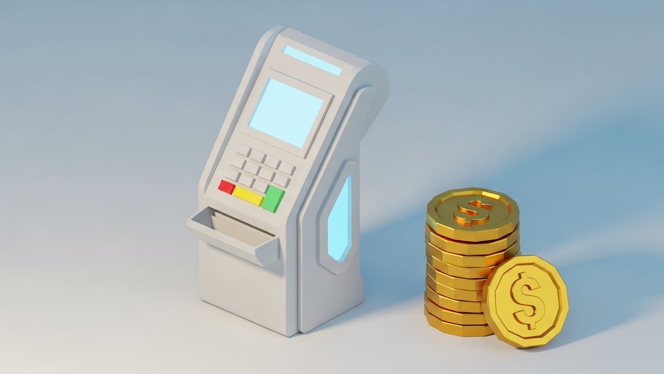
The Visual & Narrative Approach
This style utilizes a "Low-Poly" technique with a clay-like matte finish. A futuristic payment terminal and a stack of faceted gold coins are rendered with soft edges and ambient occlusion shadows. The look is modern, architectural, and friendly—like a high-end design object. The facets on the terminal suggest a modular design, while the coins add a layer of value without the grit of real money.
Psychological Impact & KPI Focus
This style differentiates the brand as "Design-Led." It targets Product Differentiation. It makes the hardware feel tactile and approachable, reducing the intimidation factor of financial tech. It appeals to the aesthetic sensibilities of modern, boutique retailers who want their counter to look beautiful, not industrial.
Strategic Implementation & Trade-offs
- Best Use Case: Website backgrounds, feature icons, or playful loading screens.
- Strategic Trade-off: The stylized look might be perceived as "too casual" for very traditional enterprise buyers. It works best for the SMB and mid-market segments.
- Duration: 10-15 Seconds (Looping).
Companies using similar video content -
HP Engage – POS Systems – Features modern, durable hardware design.
Diebold Nixdorf – DN Series BEETLE – Offers sleek, modular POS hardware.
11. The Tactile Confirmation
MOFU | Feature Education

The Visual & Narrative Approach
This style zooms in to the molecular level of user interaction. An extreme macro close-up captures a human fingertip milliseconds away from pressing a glowing, soft-edged orange button on a glass touchscreen. The shallow depth of field blurs the background into a professional dark void, focusing the eye entirely on the pixel grid and the friction ridges of the finger. The moment captures the anticipation of action, visually celebrating the "Micro-Interaction" of a confirmed command.
Psychological Impact & KPI Focus
In high-volume retail, a "missed tap" or a laggy button is a source of constant frustration. This style addresses the anxiety of Interface Responsiveness. By magnifying the touchpoint, it subconsciously communicates precision, sensitivity, and immediate feedback. It validates the software’s Usability, promising a tactile, error-free experience for staff who tap these screens thousands of times a day.
Strategic Implementation & Trade-offs
- Best Use Case: Feature highlight reels or specific "Ease of Use" sections on landing pages.
- Strategic Trade-off: It is highly specific. It sells the "feel" of the software rather than the breadth of features. It works best as a "texture shot" within a larger sequence.
- Duration: 5-10 Seconds (Looping).
Companies using similar video content -
Lightspeed – Restaurant POS – Ensures precise, responsive touchscreen interactions.
Square for Retail – POS App – Provides satisfying micro-interactions for staff.
12. The Enterprise Hardware Anchor
MOFU | Building Trust
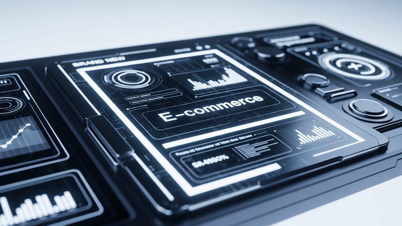
The Visual & Narrative Approach
This aesthetic utilizes photorealistic 3D rendering to showcase the hardware as a premium, robust asset. A sleek, black tablet interface is displayed in high fidelity, resting on a surface that suggests a high-end operational environment. The screen glows with a sophisticated "E-commerce" dashboard featuring real-time analytics graphs and data widgets. The lighting is cool and clinical, highlighting the brushed textures and the razor-sharp resolution of the display, signaling that this is a serious tool for serious commerce.
Psychological Impact & KPI Focus
For the enterprise buyer, "flimsy" is a dealbreaker. This style visualizes Hardware Durability and software sophistication simultaneously. It targets the Trust KPI by presenting the POS not as a gadget, but as a command station. The complexity of the dashboard on the screen assures the viewer that the system can handle deep inventory data and complex reporting without simplification.
Strategic Implementation & Trade-offs
- Best Use Case: Digital brochures, PDF embeddings, or "Hardware Specs" website sections.
- Strategic Trade-off: It can feel static if overused. It works best as an "anchor image" or a slow-pan video to establish quality before moving to kinetic motion.
- Duration: 10-15 Seconds.
Companies using similar video content -
NCR Voyix – Radiant POS – Showcases robust, high-fidelity enterprise hardware.
Toshiba Global Commerce Solutions – TCx 800 – Delivers premium, durable POS systems.
13. The Backend "Dark Mode" Core
MOFU | Driving Freemium/Trials
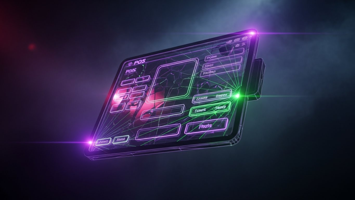
The Visual & Narrative Approach
This style visualizes the "developer experience" and the power of the backend. A floating, semi-transparent tablet interface is rendered in a "Dark Mode" aesthetic, illuminated by laser-thin neon purple and green data streams. These lines connect distinct UI elements, symbolizing API calls and backend logic. The background creates a sense of depth with volumetric smoke, suggesting a powerful engine room. The "cracked" or web-like connection lines imply a complex, interconnected network that is nonetheless contained and controlled.
Psychological Impact & KPI Focus
This appeals directly to the CTO or IT Director who cares about API Robustness. It moves away from "pretty screens" to visualize System Architecture. The dark mode aesthetic is a visual shorthand for "Pro Level" software, suggesting that the platform is powerful, developer-friendly, and capable of handling complex integrations without breaking.
Strategic Implementation & Trade-offs
- Best Use Case: Developer documentation pages, API integration visuals, or ads targeting technical decision-makers.
- Strategic Trade-off: It may alienate non-technical store managers who find the "Matrix-like" aesthetic intimidating or unrelated to their daily floor operations.
- Duration: 15-20 Seconds.
Companies using similar video content -
commercetools – Headless Commerce – Visualizes powerful API-first architecture.
Fabric – Headless Commerce Platform – Highlights robust backend integration capabilities.
14. The Multi-Level Logistic Flow
MOFU | LinkedIn Organic
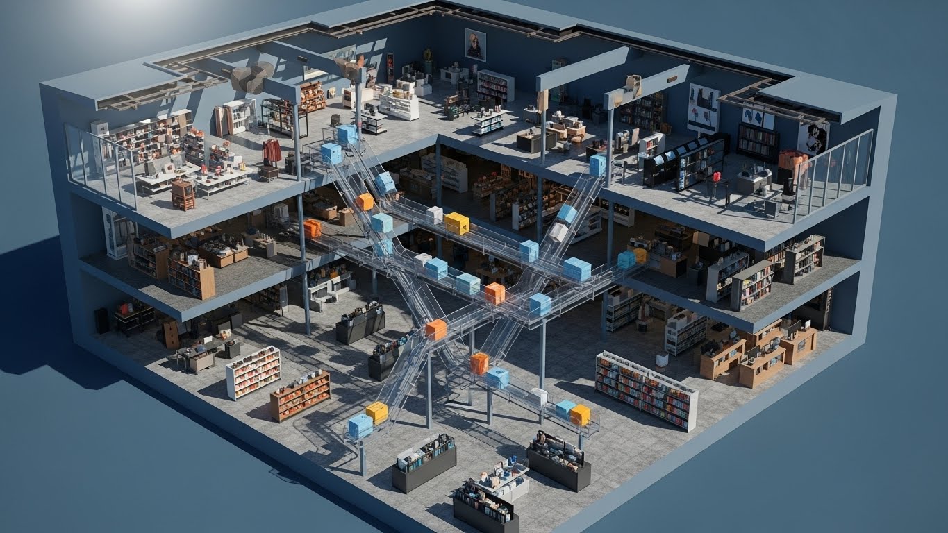
The Visual & Narrative Approach
Isometric design allows for a cutaway view of a multi-story retail environment. This visualization reveals the "invisible" logistics of a department store. We see the interior of the building with goods—represented by colored geometric boxes—moving seamlessly between floors on translucent chutes and conveyors. The lighting simulates a crisp, architectural sun-study, casting sharp shadows that define the space. It physically maps the flow of inventory from the stockroom to the sales floor.
Psychological Impact & KPI Focus
This targets the anxiety of Inventory Mismanagement in large-format retail. It creates a "God’s Eye View" of the operation, offering Operational Visibility. It visually proves that the software creates a unified system across multiple physical locations or floors, reinforcing the promise of Omnichannel Synchronization. It turns a complex logistical headache into a satisfying, orderly loop.
Strategic Implementation & Trade-offs
- Best Use Case: LinkedIn organic posts discussing "Supply Chain" or "Multi-Location Management."
- Strategic Trade-off: The details are small. It requires a large screen (desktop/tablet) to be fully appreciated and is less effective on mobile-first platforms like TikTok.
- Duration: 30-45 Seconds.
Companies using similar video content -
Manhattan Associates – Warehouse Management – Maps complex inventory movement across facilities.
Zebra Technologies – Intelligent Edge Solutions – Visualizes asset tracking and workflow.
15. The Neumorphic HR Clarity
MOFU | The Functional Buyer
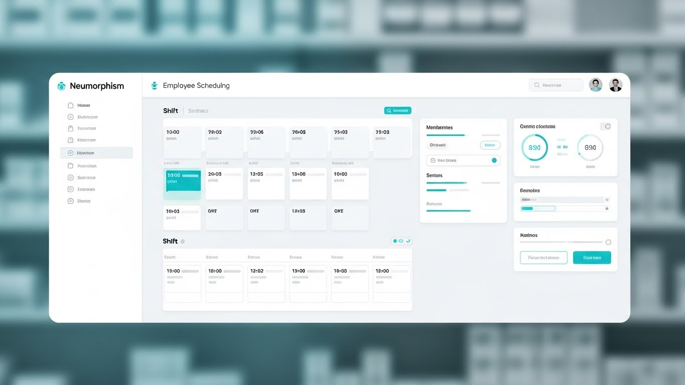
The Visual & Narrative Approach
This style embraces "Neumorphism"—a design trend using soft shadows and low contrast to create a sense of physical depth on a flat screen. The visual is a pristine, high-fidelity capture of an employee scheduling dashboard. The palette is "Medical White" and soft cyan, conveying hygiene, calm, and order. The layout is rigid and grid-based, showing shift blocks and time slots clearly. The background is a heavily blurred pharmacy or clean retail setting, providing context without distraction.
Psychological Impact & KPI Focus
Staff scheduling is often a chaotic friction point. This style sells Administrative Calm. The soft, pillowy buttons and clear grids reduce the Cognitive Load associated with HR management. It signals to the Operations Manager that the software is gentle, easy to learn, and designed to make the mundane task of rostering feel organized and stress-free.
Strategic Implementation & Trade-offs
- Best Use Case: Email newsletters to existing leads or "Feature Update" videos.
- Strategic Trade-off: Neumorphism is a specific design trend. Ensure your actual software UI isn't jarringly different, or this will feel like a deceptive "concept video."
- Duration: 30-60 Seconds.
Companies using similar video content -
Deputy – Staff Scheduling Software – Offers clean, intuitive employee management.
When I Work – Employee Scheduling – Provides frictionless staff rostering.
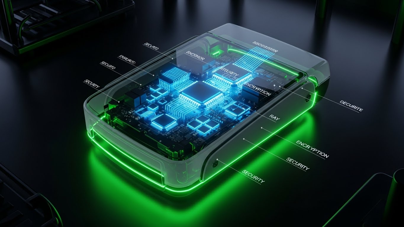
16. The Secure Protocol Shield
BOFU | ROI Justification
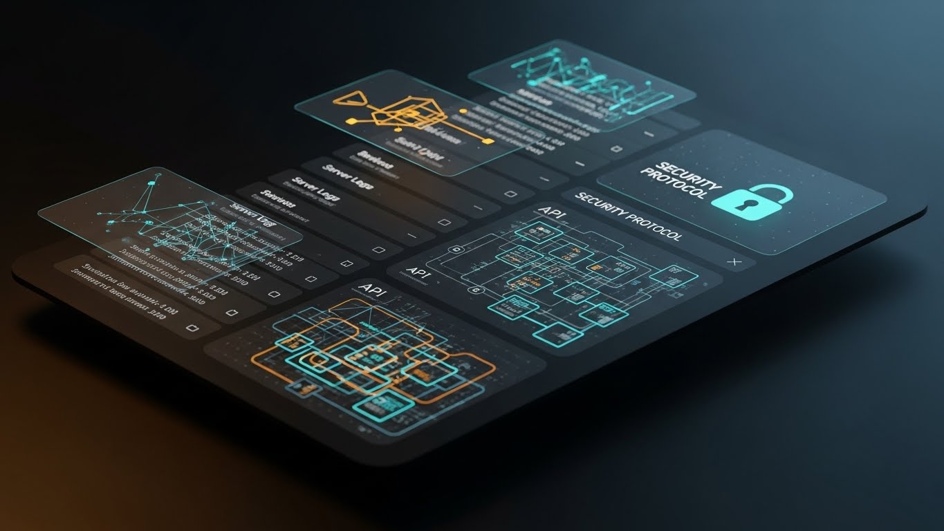
The Visual & Narrative Approach
Security is the invisible ROI. This style visualizes the protective layer of the POS. Floating, translucent dark-mode screens hover in a void, displaying complex network topologies and a prominent "Security Protocol" lock icon in glowing cyan. Golden data paths trace connections between "API" nodes and "Server Logs," visualizing the encrypted journey of a transaction. The aesthetic is cyber-secure, precise, and impenetrable.
Psychological Impact & KPI Focus
For the CFO and Compliance Officer, a data breach is the ultimate risk. This style visualizes Risk Mitigation. It translates abstract concepts like "End-to-End Encryption" into a tangible, glowing shield. By showing the complexity of the security architecture, it justifies the premium price point of the software, framing security not as a feature, but as the Foundation of Revenue Protection.
Strategic Implementation & Trade-offs
- Best Use Case: Security whitepapers, compliance section of the sales deck, or bottom-of-funnel retargeting ads.
- Strategic Trade-off: It is dry. It does not sell "more sales," it sells "less risk." It should be used specifically to overcome security objections in the final stages of the deal.
- Duration: 15-30 Seconds.
Companies using similar video content -
PCI Pal – Payment Security – Visualizes robust data encryption and compliance.
CyberSource – Fraud Management – Demonstrates secure transaction processing.
17. The Concept-to-Counter Blueprint
BOFU | Overcoming Objections
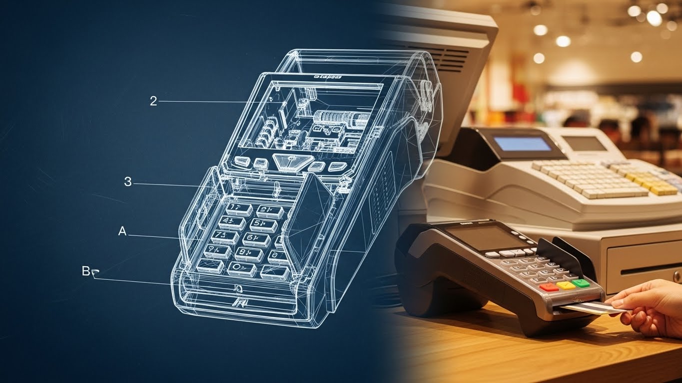
The Visual & Narrative Approach
This split-screen technique narrates the journey from engineering rigor to real-world reliability. The left half displays a technical "blueprint" wireframe of the POS terminal in schematic blue and white lines, highlighting internal components and dimensions. As the eye moves across the vertical divider, the wireframe seamlessly resolves into a photorealistic, tangible device in a warm, lit retail environment, with a hand completing a card transaction.
Psychological Impact & KPI Focus
This style bridges the gap between Theory and Practice. It reassures the buyer that the sleek device on the counter is backed by rigorous engineering. It appeals to the buyer's need for Hardware Reliability, visually proving that the form factor is intentional and the build quality is tested. It says, "We didn't just design this; we engineered it."
Strategic Implementation & Trade-offs
- Best Use Case: "About Us" videos or sections detailing hardware manufacturing standards.
- Strategic Trade-off: It focuses heavily on hardware. If you are a SaaS-only company (software only), this style may confuse the viewer unless you are showcasing a partner's device.
- Duration: 10-15 Seconds.
Companies using similar video content -
HP Engage – Go POS System – Shows rigorous engineering behind hardware.
Verifone – P400 Payment Device – Highlights reliable, well-engineered payment terminals.
18. The Transparent Compliance X-Ray
BOFU | Risk Mitigation
The Visual & Narrative Approach
To prove there are no hidden flaws, this style uses an X-Ray effect. The outer shell of a card reader is rendered in translucent grey glass, revealing the glowing, organized internal architecture of microchips, encryption modules, and processors. The internal components glow in "medical" blues and greens against a sterile laboratory background. The camera orbits the object, offering total transparency.
Psychological Impact & KPI Focus
This is the ultimate visual metaphor for Transparency. It addresses the fear of "black box" hardware where cheap components are hidden inside premium shells. It validates Compliance Standards (like PCI-DSS) by visually highlighting the secure encryption modules. It tells the technical buyer, "We have nothing to hide; our quality goes all the way through."
Strategic Implementation & Trade-offs
- Best Use Case: Technical specification sheets or deep-dive webinars on payment security.
- Strategic Trade-off: Highly technical. It is irrelevant to the average store owner and should be reserved for the IT/Security review team.
- Duration: 15-20 Seconds.
Companies using similar video content -
Ingenico – Payment Terminals – Reveals internal security architecture.
Fiserv – Clover Flex – Showcases transparent, secure payment hardware.
19. The Optimized Reality Comparison
BOFU | Competitive Displacement

The Visual & Narrative Approach
This style typically employs a split-screen to contrast the "Old Way" with the "New Way." The visual provided here represents the "Winner's State"—the right side of the split screen. We see a composed, professional manager in a boutique setting, interacting calmly with a tablet. The lighting is cinematic and warm, complete with anamorphic lens flares that suggest a premium experience. This "After" shot stands in stark contrast to the grainy, desaturated "Before" scenes of cluttered desks and paper receipts.
Psychological Impact & KPI Focus
This leverages the Contrast Principle. By juxtaposing the stress of legacy systems with the calm of the new solution, it triggers a desire for Operational Transformation. It frames the purchase not as buying software, but as buying a new state of mind. The calm demeanor of the user validates the Employee Experience improvement that comes with modern tools.
Strategic Implementation & Trade-offs
- Best Use Case: LinkedIn ads targeting "Switchers" or competitive displacement campaigns (e.g., "Still using Excel?").
- Strategic Trade-off: The "Before" state must be realistic, not a caricature, or the comparison will feel manipulative.
- Duration: 15-30 Seconds.
Companies using similar video content -
NewStore – Unified Commerce – Contrasts legacy systems with modern efficiency.
Shopify Plus – Enterprise Platform – Transforms retail operations from chaos to calm.
20. The Holographic Menu Projection
BOFU | Sales Cycle Acceleration
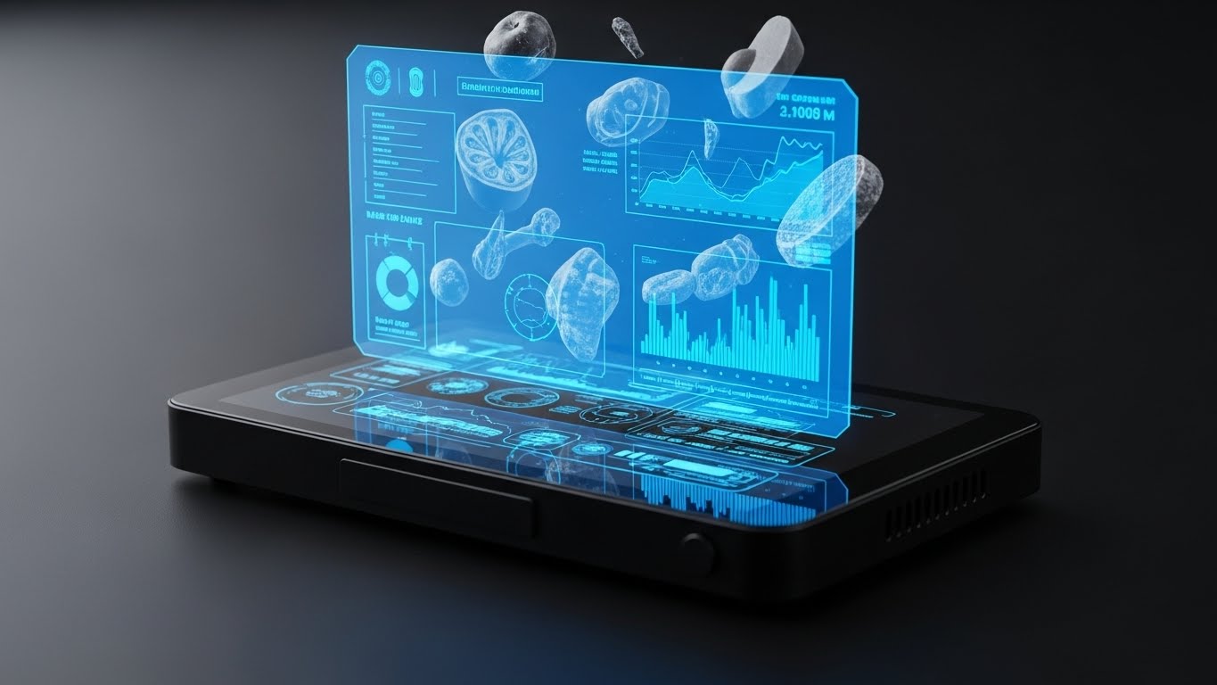
The Visual & Narrative Approach
This style projects the future of retail interaction. A sleek, black hardware device sits on a dark surface, but the action happens in the air above it. A vibrant blue holographic interface projects upwards, displaying floating 3D models of food items, graphs, and data nodes. The aesthetic is "Iron Man" meets "Point of Sale." It visualizes the software's ability to pull data out of the screen and make it accessible and multidimensional.
Psychological Impact & KPI Focus
This targets the Innovation buyer. It suggests that this platform is Future-Proof. The hologram represents the "Cloud" manifesting in the physical store. It creates a "Wow Factor" that can tip a deal by making the software feel like cutting-edge technology rather than a utility. It visualizes Data Accessibility—the idea that insights are always hovering, ready to be grasped.
Strategic Implementation & Trade-offs
- Best Use Case: Closing emails or "Vision of the Future" presentations to stakeholders.
- Strategic Trade-off: It is aspirational. If the actual UI is flat and standard, this style may overpromise. It is best used to sell the roadmap or the power of the engine, rather than the daily interface.
- Duration: 10-15 Seconds.
Companies using similar video content -
Scandit – Smart Data Capture – Projects future-ready AR data insights.
Trax Retail – Retail Execution – Visualizes invisible shelf data in 3D.
21. The Consultative Partner
BOFU | Driving Demo Requests

The Visual & Narrative Approach
This style shifts the focus from the software interface to the human relationship it enables. Using a cinematic, over-the-shoulder angle, we see a professional account manager in a navy blazer situated in a modern, glass-walled conference room. She is confidently pointing to a data visualization on a tablet held by a client, guiding them through the insights. The lighting is natural and sophisticated, emphasizing the "Premium Partnership" aspect of the service. The screen content is visible but secondary to the interaction between the two professionals.
Psychological Impact & KPI Focus
At the bottom of the funnel, the buyer isn't just buying code; they are buying a support system. This style targets the Trust KPI. It reassures the prospect that they won't be left alone with complex data. By visualizing the "Consultative Moment," it frames the software vendor as a strategic partner, addressing the fear of abandonment post-purchase.
Strategic Implementation & Trade-offs
- Best Use Case: "Book a Demo" landing pages or personalized outreach emails from sales representatives.
- Strategic Trade-off: Authenticity is key. If the AI generation has artifacts (uncanny valley), it damages trust. It requires human-in-the-loop curation to ensure the expressions feel genuinely human.
- Duration: 15-30 Seconds.
Companies using similar video content -
SAP – Customer Experience – Emphasizes strategic partnership and guidance.
Aptos – Retail Solutions – Positions as a trusted advisor for growth.
22. The Unboxing Simplicity
Onboard | Self-Serve Onboarding
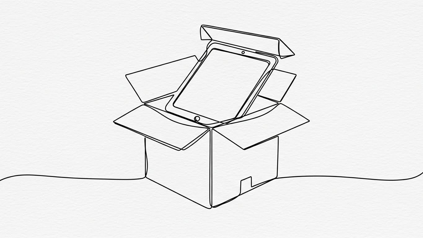
The Visual & Narrative Approach
This style utilizes continuous line art to visualize the physical setup process. A single, elegant black line draws a shipping box, which seamlessly opens to reveal the tablet and card reader inside. The animation is fluid and unbroken, suggesting a process that has no stops or hurdles. The background is a textured paper white, providing a clean, organic feel that contrasts with the complexity of typical tech manuals.
Psychological Impact & KPI Focus
For small business owners, "hardware setup" is a major anxiety point. This style targets Time-to-Live. The continuous line visually implies a Frictionless Workflow. It subconsciously tells the viewer, "This is one continuous, simple motion—from box to counter." It lowers the psychological barrier to entry, encouraging users to attempt self-installation rather than waiting for a technician.
Strategic Implementation & Trade-offs
- Best Use Case: Welcome emails, in-app "Getting Started" screens, or the shipping tracking page.
- Strategic Trade-off: It is abstract. It captures the spirit of setup but doesn't show the actual ports or cables. It must be paired with a detailed diagram or video for the actual installation steps.
- Duration: 10-15 Seconds (Looping).
Companies using similar video content -
Square for Retail – Hardware Kit – Illustrates easy, fluid setup.
Clover – Station POS – Promises straightforward, quick installation.
23. The Success State Fluidity
Onboard | Accelerating Time-to-Value

The Visual & Narrative Approach
This style uses abstract motion graphics to celebrate the completion of a task. Vivid lime and electric violet liquid shapes swirl from the edges of the frame, converging in the center to form a solid, glowing checkmark. The motion is smooth, elastic, and satisfying (easing in and out). The background is a dark abstract void, ensuring the bright colors pop. It visualizes the intangible feeling of "System Ready."
Psychological Impact & KPI Focus
Onboarding is often tedious. This style provides a Psychological Reward. It targets User Sentiment. By gamifying the setup process with high-quality visual feedback, you create a positive association with finishing tasks. It validates the user’s effort, turning a mundane configuration step into a "Win," which is crucial for maintaining momentum during the initial implementation phase.
Strategic Implementation & Trade-offs
- Best Use Case: Loading screens between configuration steps or the "Congratulations" screen after account verification.
- Strategic Trade-off: Purely emotional. It conveys no information other than "Success." Overusing it for minor tasks can dilute its impact.
- Duration: 3-5 Seconds.
Companies using similar video content -
Lightspeed – Onboarding Flow – Provides visual rewards for task completion.
Shopify – Setup Guide – Celebrates successful setup with fluid animations.
24. The Feature Velocity Montage
Onboard | Reducing Impl. Friction
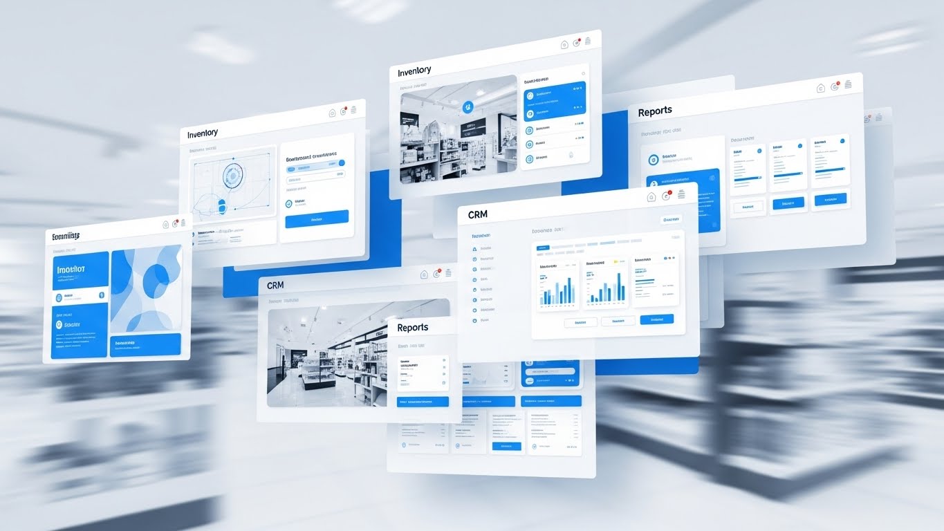
The Visual & Narrative Approach
This style showcases the sheer breadth of the platform. Multiple semi-transparent UI screens—Inventory, CRM, Reporting, Staffing—float and layer over one another in a rapid, kinetic montage. Motion blur is used to convey speed and seamless switching. The palette is high-key white and interface blue, suggesting a clean, cloud-native environment. The background blurs various retail environments, implying that these tools work anywhere.
Psychological Impact & KPI Focus
New users often get stuck using only 10% of the software. This style drives Feature Discovery. It creates a "Fear Of Missing Out" (FOMO) regarding the platform's unused capabilities. It visualizes the Holistic Ecosystem, encouraging the user to explore beyond just the checkout screen and adopt the inventory and CRM modules, thereby increasing stickiness.
Strategic Implementation & Trade-offs
- Best Use Case: "What's Next" videos post-signup, or waiting room loops for support webinars.
- Strategic Trade-off: The pace is too fast for instruction. It is an "Excitement Builder," not a tutorial. It should inspire exploration, not teach mechanics.
- Duration: 15-20 Seconds.
Companies using similar video content -
Oracle Retail – Suite of Solutions – Showcases broad platform capabilities.
NCR Voyix – Unified Commerce – Highlights extensive feature set rapidly.
Lightspeed – Retail POS – Presents a wide array of integrated tools.
25. The Happy Workforce Dividend
Retention | Reducing Churn

The Visual & Narrative Approach
Retention in retail is often about staff happiness. This style uses high-key, wide-angle photography to capture a diverse team of retail staff high-fiving near a mobile terminal stand at an outdoor pop-up market. The sun is shining, the colors are fresh yellow, sky blue, and green. It shifts the focus from the screen to the result of the screen: a stress-free, cohesive team that enjoys their work because the tools don't fight them.
Psychological Impact & KPI Focus
High staff turnover is a massive cost for retailers. This style links the software to Employee Retention. It subconsciously tells the business owner that using modern, easy-to-use tools leads to a happier culture. It reframes the subscription cost as an investment in Team Morale and operational harmony.
Strategic Implementation & Trade-offs
- Best Use Case: Customer newsletters, quarterly business review (QBR) presentations, or case study covers.
- Strategic Trade-off: It can feel like generic stock photography if the "tech" element (the POS terminal) isn't clearly integrated into the scene.
- Duration: 10-15 Seconds.
Companies using similar video content -
Deputy – Workforce Management – Links software to staff satisfaction.
Toast – Team Management – Promotes a stress-free, cohesive team.
26. The Empathy Support Vector
Retention | Knowledge Base & FAQ

The Visual & Narrative Approach
This style uses the "Corporate Memphis" flat vector aesthetic to make support feel approachable. A stylized character with soft pastel purple skin and exaggerated, flexible limbs is interacting with a giant, floating question mark. The character is smiling, not stressed. The background is a soft pink, reducing visual aggression. The animation is bouncy and playful, transforming the question mark into a solution (e.g., a lightbulb or checkmark).
Psychological Impact & KPI Focus
Users are often afraid to ask for help, fearing they will look incompetent. This style lowers Support Friction. It frames the act of asking for help as normal and friendly. By using non-realistic skin tones and proportions, it creates a universal, inclusive representation of the user base. It targets Ticket Resolution Time by encouraging users to engage with self-serve visual help content.
Strategic Implementation & Trade-offs
- Best Use Case: Help Center thumbnails, "Page Not Found" (404) pages, or chat-bot headers.
- Strategic Trade-off: The playful style might undermine the seriousness of "Critical Error" messages. Use this for education and soft errors, not for system outages or data loss alerts.
- Duration: 15-30 Seconds.
Companies using similar video content -
Square – Support Center – Makes asking for help approachable and friendly.
Lightspeed – Help & Support – Visualizes easy access to solutions.
27. The Global Network Plexus
Retention | Visitor Re-engagement

The Visual & Narrative Approach
This style visualizes the scale of a growing business. Using a "Plexus" effect, thousands of silver dots and lines connect to form a spherical globe structure against a dark blue digital void. The connections glow neon green, pulsing with data activity. The camera orbits this sphere, revealing the density of the network. It represents the interconnection of multiple store locations and data points into one unified entity.
Psychological Impact & KPI Focus
As a retailer grows from one store to ten, they worry about fragmentation. This style targets Scalability Assurance. It reassures the owner that the platform is an Enterprise-Grade solution capable of handling complex, multi-node networks. It validates their growth and positions the software as the "glue" holding their expanding empire together.
Strategic Implementation & Trade-offs
- Best Use Case: Re-engagement display ads targeting current customers who are opening new locations.
- Strategic Trade-off: It is abstract. It doesn't show how multi-location management works, only that the network exists.
- Duration: 10-15 Seconds (Looping).
Companies using similar video content -
SAP – S/4HANA Retail – Visualizes enterprise-scale, interconnected operations.
GK Software – CLOUD4RETAIL – Represents a unified global retail network.
28. The Deep-Dive Parallax
Expand | Driving Upsell/Cross-sell
The Visual & Narrative Approach
This style uses depth to sell depth. A "2.5D" parallax composition separates UI elements into floating layers of glass. The top layer displays a high-level revenue metric, the middle layer reveals customer details, and the bottom layer shows a geospatial map. Shadows cast by the top layers onto the bottom create a rich sense of dimension. The palette is a warm gradient of pink to orange, suggesting high-value insights (the "heat" of the business).
Psychological Impact & KPI Focus
This visualizes the concept of "Drill-Down." It targets Upsell Conversion. It shows the user that there are deeper layers of value hidden beneath their current "Lite" plan. It visually metaphors the Depth of Insight available in the Pro/Enterprise tier, making the upgrade feel like gaining "X-Ray Vision" into their business.
Strategic Implementation & Trade-offs
- Best Use Case: In-dashboard banners promoting "Pro" features or "Upgrade to Unlock" paywalls.
- Strategic Trade-off: Requires high-fidelity UI assets. If the actual software doesn't support this level of data granularity, the visual will feel deceptive.
- Duration: 10-15 Seconds.
Companies using similar video content -
RetailNext – Analytics Platform – Offers layered insights into store performance.
Blue Yonder – Category Management – Provides deep, multi-dimensional data exploration.
29. The Social Proof Overlay
Expand | Driving Referrals

The Visual & Narrative Approach
This style visualizes the invisible network of recommendations. A medium shot captures two people talking casually in a cafe setting. White, hand-drawn vector doodles and speech bubbles are tracked and overlaid on the live footage. The bubbles contain abstract "Heart" and "Thumbs Up" icons. The contrast between the real-world footage and the playful graphics illustrates the concept of organic advocacy and positive sentiment.
Psychological Impact & KPI Focus
Referrals are driven by emotion, not logic. This style targets Net Promoter Score (NPS). It frames the act of referring the software as a social, positive interaction between peers. It validates the user’s identity as an "Influencer" in their local business community, encouraging them to share the tool with fellow business owners.
Strategic Implementation & Trade-offs
- Best Use Case: Referral program landing pages or social media posts encouraging users to "Tag a Business Owner."
- Strategic Trade-off: The "doodle" style is casual. It works well for SMBs (cafes, boutiques) but may feel too juvenile for enterprise corporate retail referrals.
- Duration: 10-20 Seconds.
Companies using similar video content -
Square – Referral Program – Encourages word-of-mouth advocacy.
Lightspeed – Customer Stories – Visualizes positive community sentiment.
30. The Efficiency Slider
Expand | Deep Feature Adoption
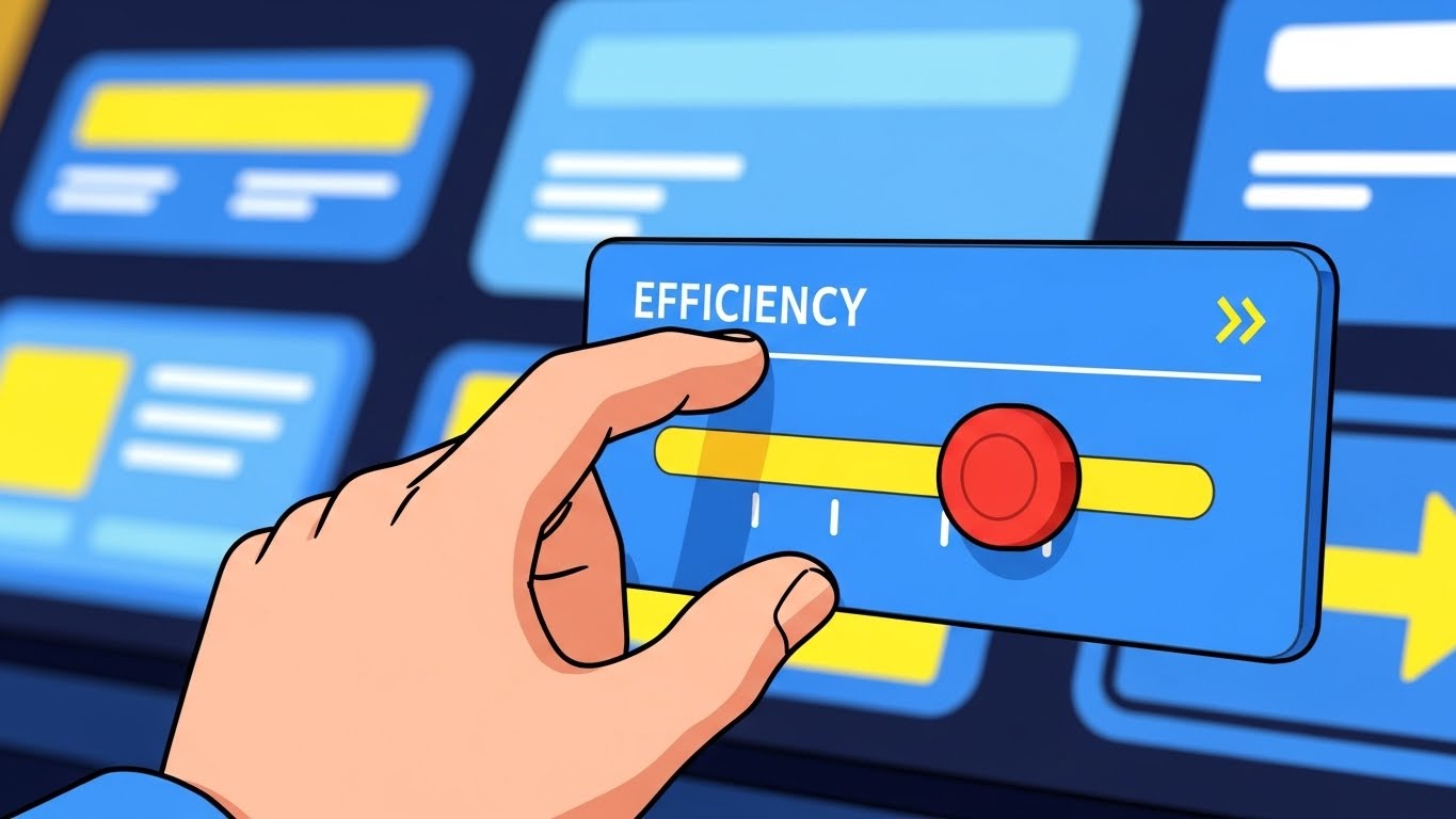
The Visual & Narrative Approach
This style simplifies complex optimization into a single gesture. A cel-shaded, stylized hand interacts with a floating UI panel, dragging a digital slider labeled "Efficiency" all the way to the right. The background is a simplified, abstract dashboard in bright primary colors (Blue, Yellow). The motion is snappy and impactful. As the slider moves, the background elements brighten or align, visually confirming the system optimization.
Psychological Impact & KPI Focus
Users often ignore advanced settings. This style targets Feature Adoption. It simplifies the concept of "Optimization" into a tangible, satisfying interaction. It gives the user a sense of Agency and Control, suggesting that improving their business performance is as simple as tweaking a setting. It encourages users to engage with the deeper configuration options of the platform.
Strategic Implementation & Trade-offs
- Best Use Case: Email newsletters highlighting new feature releases or "Pro Tip" of the week videos.
- Strategic Trade-off: It is a metaphor. Real optimization requires work, not just a slider. Use this to sell the result of using the feature, not the literal process.
- Duration: 5-10 Seconds.
Strategic Knowledge Base: The Visual Operations Doctrine
To transform these 30 visual styles from "marketing assets" into a cohesive business driver, we must implement a strategic framework. This "Visual Operations Doctrine" bridges the gap between the screen and the store, ensuring that every pixel serves a measurable operational outcome.
Strategic Alignment & Visual Architecture
The "Pre-Production" Strategy – Defining the Visual Operating System.
- The Cognitive Load Audit: Before commissioning any visual asset, perform a "Cognitive Load Audit." Map the complexity of the feature (e.g., Inventory Reconciliation) against the viewer's mental state (e.g., Stressed Store Manager). High-stress features require low-cognitive-load styles (Styles 15, 22), while "Vision" features allow for high-complexity visuals (Styles 9, 27).
- Role-Based Visual Mapping: Do not use the same visual language for a CFO and a Barista. The CFO needs "Holographic Data" (Style 9) that implies depth and growth. The Barista needs "Tactile Confirmation" (Style 11) that implies speed and responsiveness. Segment your visual assets by user role, not just product feature.
- The "Glanceability" Standard: In a retail environment, staff cannot watch a 2-minute video. Operational visuals (training/support) must pass the "Glanceability Test"—can the core concept be understood in 3 seconds without sound? Styles like The Frictionless Adoption Icon (Style 7) are designed for this specific "glanceable" utility.
- Brand Voice Consistency: Your software UI has a design system; your video content must have one too. If your UI is "Dark Mode" and serious, do not use "Playful Doodles" (Style 29) for core training. Visual dissonance erodes trust. Ensure the "Visual Texture" of your marketing matches the "Visual Texture" of the product.
- The Advids Strategic Audit: This is where a partner like Advids becomes critical. Before production begins, use Advids to audit your existing asset library and define a "Visual Operating System" that ensures every GIF, screencast, and 3D render speaks the same design language, preventing a fragmented brand image.
- Standardization vs. Customization: For core features (Payments), use standardized, high-fidelity styles (Style 12) to build trust. For niche, vertical-specific features (e.g., "Pizza Topping Modifiers"), use lower-cost, flexible styles (Style 24) that can be updated cheaply as the software evolves.
- The Cross-Departmental Bridge: Use visuals to unify terminology. If Sales calls it "Omnichannel" and Support calls it "Multi-Store," you have a friction point. Create a "Visual Dictionary" (using Style 3) that visualizes exactly what the term means, and share it across Sales, Ops, and Support teams to align the company narrative.
- Legacy System Integration: One of the hardest things to sell is the replacement of old hardware. Use "Contrast" styles (Style 19) to visually respect the "Old Way" (the knot) while celebrating the "New Way" (the grid). Don't mock the legacy system; visually demonstrate the evolution from it.
- Accessibility in Retail: Retail workforces are diverse and often multilingual. Design motion graphics (Style 22) that rely on visual action rather than voiceover or heavy text. A line drawing of a box opening is universal; a paragraph of text is not.
- The Mobile-First Mandate: Store managers run their business from their phones. All 30 styles must be legible on a 5-inch screen. Avoid tiny text in "Data Viz" styles (Style 9). If the chart isn't readable on an iPhone, it isn't readable for your target persona.
Operational Adoption & Implementation
The "Deployment" Phase – Embedding Visuals into the Workflow.
- Overcoming "Big Brother" Anxiety: When introducing staff performance tracking, use "Empathetic" visuals (Style 25) that focus on team success and rewards, rather than surveillance-style dashboards. Frame the data as "Coaching" rather than "Policing" through warm, human-centric imagery.
- The Micro-Learning Shift: Abolish the 1-hour training seminar. Break training into 30-second "Micro-Learning" clips (using Styles 24 & 30) that can be watched by cashiers during slow periods on the floor.
- Just-in-Time Support: Embed specific visual styles directly into the helpdesk or POS interface. When a "Sync Error" occurs, trigger a looping "Order from Chaos" (Style 2) animation that visually explains the resolution steps instantly.
- Gamification of Training: Use "Success State" visuals (Style 23) to reward staff for completing training modules. The visual dopamine hit of a "Level Up" animation can significantly increase the completion rates of boring compliance training.
- Reducing Support Ticket Volume: Analyze your top 10 support tickets. Create specific, high-clarity visuals (Style 2) for exactly those 10 issues. The ROI here is direct: every view of that video is a $15 support call saved.
- Remote Onboarding: For franchises, you cannot fly trainers to every location. Use "Digital Twin" styles (Style 3) to virtually walk franchise owners through the store setup. This allows for scalable, consistent onboarding without the travel costs.
- Visual Standard Operating Procedures (SOPs): Text-based SOPs are ignored. Transform "Closing the Register" checklists into "Kinetic Typography" videos (Style 1) that physically demonstrate the urgency and sequence of the closing process.
- Feedback Loops: Use interactive video elements. After a "New Feature" video plays (Style 19), include a one-tap smiley face survey to gather immediate feedback on the feature's perceived value.
- Scalable Localization: When expanding to new regions, visual-heavy styles (Style 8, Style 29) require less translation budget. A smile and a "thumbs up" (Style 29) mean the same thing in Tokyo, New York, and Berlin.
- Leadership Communication: When the CTO needs to explain a server migration to the Board, don't use a spreadsheet. Use the "Secure Protocol Shield" (Style 16) to visually demonstrate the value of the security investment. Visuals translate technical necessity into business assets.
Measuring Impact & Future-Proofing
The "ROI" Phase – Measuring Success and Looking Ahead.
- Beyond "Views": Do not measure video success by "Views." Measure it by "Time-to-Competency." If a new cashier reaches full productivity 2 days faster after watching the "Simplicity" video series (Style 7), that is your ROI.
- The "Idle Time" Metric: In POS software, "Idle Time" (time spent staring at the screen) is bad. Correlate better visualization (Style 15) with reduced screen time. The best UI visuals result in faster transactions and less time looking at the device.
- Compliance Velocity: How fast can you get the entire fleet of stores to adopt a new PCI compliance standard? Use "Urgency" visuals (Style 1) to announce the change, and measure the speed of adoption compared to text-only email announcements.
- Retention and Churn: Track the consumption of "Feature Discovery" videos (Style 24) among at-risk cohorts. Users who engage with educational visuals are statistically less likely to churn because they understand the product's value better.
- The AI Visual Frontier: Prepare for Generative UI. Soon, the "Holographic" style (Style 20) won't just be a video; it will be the actual interface. Start training your audience now to expect dynamic, layered data so they aren't overwhelmed when the software evolves.
- Scalability of Assets: Build a "Visual Component Library." If you create a 3D model of your terminal for Style 12, ensure that asset is rigged and ready for use in Style 28 (Parallax) and Style 30 (Animation). Reuse assets to lower the cost-per-video over time.
- The Advids Partnership: As your feature set grows, your visual library must evolve. A long-term partner like Advids ensures that your visual assets scale without losing coherence, allowing you to update Style 19 (UI Montage) annually without rebuilding the foundation.
- Benchmarking Success: Don't just compare against your old videos; compare against consumer apps. Your POS software (Style 11) should feel as responsive and satisfying as Instagram or Uber. Benchmarking against "Enterprise Software" sets the bar too low.
- The ROI of Safety: In retail, "Safety" means data security. Quantify the value of the "Security Shield" visuals (Style 16) by using them in sales cycles with risk-averse enterprise buyers. If these assets help close 5% more enterprise deals, the ROI is massive.
- Final Call to Innovation: Treat video not as "content," but as "infrastructure." Just as you invest in servers for uptime, invest in visuals for "understanding uptime." A POS system that is understood instantly is a POS system that generates profit instantly.
Companies using similar video content -
Odoo – POS Module – Simplifies complex optimization into tangible control.
NetSuite – SuiteCommerce – Visualizes active optimization of e-commerce processes.
Author & Editor Bio


