
Introduction: Visualizing the Future of Care Operations
The healthcare technology landscape is undergoing a seismic shift, driven by an urgent need to bridge the gap between complex medical operations and digital efficiency. While the industry accelerates toward digitization, a critical friction point remains: the human element. The cognitive load on medical staff is at an all-time high, with recent data indicating that 45.2% of physicians reported at least one symptom of burnout. This statistic is not just a warning; it is a mandate for software providers. The challenge is no longer just about building features—it is about reducing the mental burden of adoption.
Visualization is the strategic bridge across this "Physical/Digital Divide." By translating abstract workflows into intuitive visual formats, Practice Management Software (PMS) brands can lower barriers to entry, accelerate user onboarding, and vividly demonstrate how their tools dissolve administrative chaos. This guide serves as a blueprint for that transformation.
As the market consolidates—evidenced by the fact that the Integrated systems segment accounted for the vast majority of market share in 2024—your visual strategy must evolve. We have curated 30 distinct visual styles designed to resonate with the specific anxieties and aspirations of practice managers, moving from market education to competitive displacement. Drawing on the expertise of the Advids creative team, this guide explores how to leverage visual psychology to turn skeptical prospects into confident power users.
Let’s explore the first ten distinct styles that define this new standard of visual communication.
1. Abstract 2D flat vector organic flat vector
TOFU | Brand Awareness

The Visual & Narrative Approach
Visualization Scenario: Imagine a canvas of clean off-white, where deep teal and soft peach shapes flow like liquid data. These organic forms represent disparate clinic functions—billing, scheduling, records—slowly morphing toward the center. As they converge, they form a stylized, abstract medical cross. The "nodes" where these streams meet glisten with a subtle glossy texture, creating a modern, tactile feel.
Narration Style: The voiceover is smooth, calm, and visionary. It avoids technical jargon, focusing instead on concepts of "harmony," "convergence," and "holistic care."
Psychological Impact & KPI Focus
Niche Psychology: Medical professionals often feel their work is fragmented. This style addresses the anxiety of "disconnection" by visually promising a unified ecosystem. The organic shapes reduce the intimidation factor often associated with rigid, complex software.
Operational Impact: This style is a pure Brand Awareness play. It signals to the market that your platform is not just a tool, but a unifying force for the practice, aiming to increase Brand Recall.
Strategic Implementation & Trade-offs
Use Case: Best deployed in Top-of-Funnel (TOFU) Social Ads (Instagram/Facebook) where stopping the scroll is priority #1.
Duration: 15-30 seconds.
Trade-off: While visually stunning, this style is abstract. It establishes feeling but does not explain function. It is excellent for brand recall but poor for detailed feature training.
Companies using similar video content -
Innovaccer – Health Cloud – Unifying disparate healthcare data streams.
Redox – Interoperability Platform – Connecting diverse healthcare systems.
InterSystems – HealthShare – Harmonizing patient data across care networks.
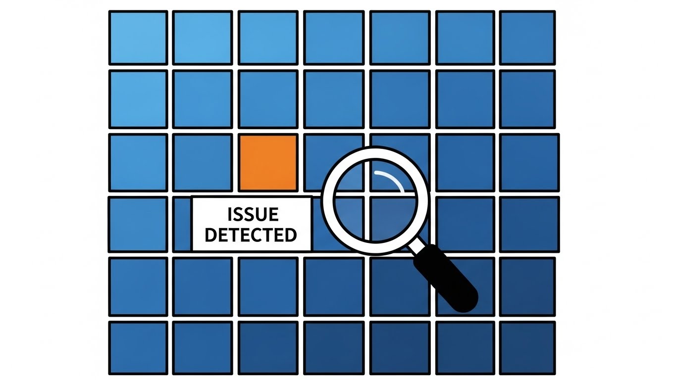
2. Minimalist Flat 2D Vector
TOFU | Market Education
The Visual & Narrative Approach
Visualization Scenario: A crisp, navy blue and pure white schematic of a clinic. Geometric abstractions replace clutter: a rectangle is the reception, a square is the kiosk. A bright white circle representing the "patient" moves along a dotted line. It glides through the "reception" rectangle without stopping, visualizing a zero-wait workflow. The movement is rhythmic and unobstructed, emphasizing speed.
Narration Style: Crisp, professional, and concise. The tone is akin to a high-end tech briefing—direct and focused on "velocity" and "optimization."
Psychological Impact & KPI Focus
Niche Psychology: Practice managers crave order. This minimalist style appeals to the desire for a "clean slate." The lack of gradients and shadows reduces cognitive load, allowing the viewer to focus entirely on the process improvement rather than the aesthetic details.
Operational Impact: Targeted at Market Education. It visually proves that the software removes friction, directly addressing the fear of bottlenecks in patient flow and improving Throughput Understanding.
Strategic Implementation & Trade-offs
Use Case: Ideal for Blog Headers or "How it Works" pages where clarity is paramount.
Duration: 45-60 seconds.
Trade-off: The high level of abstraction can feel impersonal. It lacks the "human touch" of character animation, making it less effective for building emotional rapport but superior for explaining logic.
Companies using similar video content -
Phreesia – Patient Intake – Streamlining patient check-in workflows.
Luma Health – Patient Engagement Platform – Optimizing patient communication flow.
3. AI generated mixed media video
TOFU | Shaping Brand Perception

The Visual & Narrative Approach
Visualization Scenario: A dynamic visual blending real-world textures of paper medical charts transforming into vibrant digital 3D polygons. The color palette features vivid amber and electric blue. The scene transitions from a grainy, black-and-white photo of a cluttered desk to a sleek, colorful 3D render of a clean workspace. Visual elements include ripped paper edges overlaid with glowing digital wireframes.
Narration Style: Dynamic and punchy. Sound design plays a huge role here—the sound of crumpling paper morphing into a digital "hum" or "whoosh."
Psychological Impact & KPI Focus
Niche Psychology: This style validates the user's struggle with legacy systems (the paper chaos) and offers a dopamine hit of modernization. It positions the brand as a transformative agent, shifting perception from "software provider" to "tech innovator."
Operational Impact: Focuses on Shaping Brand Perception. It visually dramatizes the "Before vs. After" state, making the ROI of switching immediately palpable and addressing Digital Transformation.
Strategic Implementation & Trade-offs
Use Case: High-impact YouTube Pre-rolls or Event Opener videos.
Duration: 15-30 seconds (keep it fast).
Trade-off: This style is resource-intensive to produce correctly and risks looking "messy" if the transition isn't seamless. It prioritizes "wow factor" over information density.
Companies using similar video content -
Nuance Communications (Microsoft) – DAX Express – Transforming analog dictation to digital notes.
Google Cloud – Healthcare API – Digitizing and integrating legacy health data.
4. Bold Kinetic Typography (Visual)
TOFU | Skippable Pre-Roll Ad

The Visual & Narrative Approach
Visualization Scenario: A visual representation of bold kinetic typography using massive, blocky geometric shapes in electric lime green and jet black. The shapes are arranged to suggest the heavy weight of the words "SCHEDULE" and "DONE" without actually spelling them out legibly. The composition is diagonal and dynamic, conveying speed and impact. Motion blur effects are applied to the edges of the lime green blocks as they appear to slide into a locked position.
Narration Style: Fast-paced, rhythmic, and percussion-driven. The words on screen are the hero; the voiceover (if any) is just a sparse echo of the text.
Psychological Impact & KPI Focus
Niche Psychology: In a busy practice, speed is currency. This style bypasses the need for complex imagery and speaks directly to the desire for immediate results. The "heavy" animation weight implies reliability and finality—once it's scheduled, it's set.
Operational Impact: A pure Skippable Pre-Roll Ad play. It is designed to deliver the core value proposition (Speed/Completion) within the first 5 seconds of a viewer's attention to maximize Message Recall.
Strategic Implementation & Trade-offs
Use Case: YouTube Bumper ads or intro hooks for longer demos.
Duration: 6-15 seconds.
Trade-off: Highly effective for simple messages (Speed, Ease) but impossible to use for complex features like compliance or billing logic. It lacks nuance.
Companies using similar video content -
Zocdoc – Online Scheduling – Instant booking confirmation for appointments.
CoverMyMeds – Prior Authorization – Accelerating medication approval process.
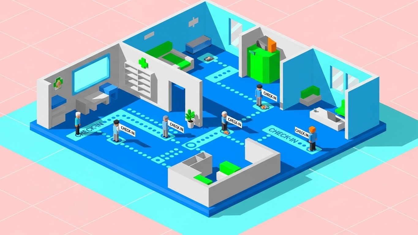
5. Isometric 2D Motion Design
TOFU | Vertical Social Organic
The Visual & Narrative Approach
Visualization Scenario: An isometric 2D design set on a pastel pink and cyan grid. The image depicts a miniature, stylized medical clinic floor plan. Tiny, uniform dots representing patients move along colored pathways (cyan lines) through the clinic, stopping briefly at "check-in" nodes. The perspective is a strict high-angle isometric view. The style is flat but uses distinct shades to create depth.
Narration Style: Playful yet organized. Think "SimCity" meets "Medical Journal." The tone is about orchestration and overview.
Psychological Impact & KPI Focus
Niche Psychology: This "God's eye view" gives the viewer a sense of total control. It gamifies the potentially stressful concept of high-volume patient management, making it look manageable and even satisfying to watch.
Operational Impact: Perfect for Vertical Social Organic content. The satisfying loops and bright colors increase dwell time and shareability among younger administrative staff, enhancing Organic Reach.
Strategic Implementation & Trade-offs
Use Case: TikTok, Instagram Reels, or explaining facility management features.
Duration: 15-45 seconds (loopable).
Trade-off: The stylized nature simplifies the reality of a clinic. It works best for "macro" concepts (flow, volume) rather than "micro" interactions.
Companies using similar video content -
Epic Systems – MyChart – Gamifying patient journey and portal interaction.
Athenahealth – athenaOne – Orchestrating clinic patient flow and management.
6. 2D Character-Driven Story
TOFU | Driving Freemium/Trials

The Visual & Narrative Approach
Visualization Scenario: A stylized 2D illustration of a young female receptionist character with soft lavender hair and a grey uniform. She is sitting at a modern, curved desk, smiling peacefully while looking at a floating, semi-transparent monitor. The monitor displays abstract blocks of color representing a perfectly organized schedule. The art style uses clean lines and flat colors with no shading, similar to premium corporate Memphis design.
Narration Style: Empathetic, story-driven, and relatable. The narrative focuses on "her day" transforming from chaotic to calm. "Meet Sarah. Sarah used to stay late..."
Psychological Impact & KPI Focus
Niche Psychology: This connects directly with the user's emotional state. By mirroring their desired state (calm, control, leaving work on time), it builds trust. The soft Memphis-style art reduces visual noise, reinforcing the "ease of use" message.
Operational Impact: Designed for Landing Pages (LP) to drive Freemium/Trials. It humanizes the software, making the "Join" or "Try Free" call-to-action feel like an invitation to a better work-life balance, boosting Conversion Rates.
Strategic Implementation & Trade-offs
Use Case: Website Homepages, Case Study videos.
Duration: 60-90 seconds.
Trade-off: Character animation is subjective; if the style feels too "cartoony," it may alienate enterprise-level buyers.
Companies using similar video content -
Kareo – Practice Management – Humanizing administrative ease for small practices.
SimplePractice – EHR & PM – Relatable stories of therapist workflow transformation.
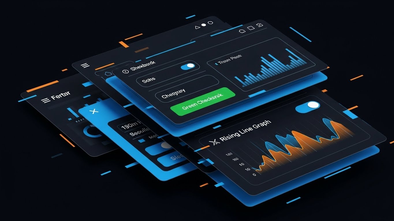
7. Rapid UI Feature Montage
MOFU | Demand Gen
The Visual & Narrative Approach
Visualization Scenario: A composition designed to suggest a rapid-fire montage of UI screens. Layers of interface elements—buttons, toggles, and graph lines—are stacked and slightly offset, creating a sense of motion. The color palette is bright blue and energetic orange against a white background. Specific UI elements include a "Green Checkmark" button and a "Rising Line Graph" widget.
Narration Style: Fast, rhythmic, and feature-focused. "Click. Track. Done." The audio mirrors the visual cuts—sharp and precise.
Psychological Impact & KPI Focus
Niche Psychology: This style leverages the "Technological Competence" bias. The speed and complexity of the montage imply that the software is robust and powerful. It appeals to the "Power User" who wants a tool that can keep up with them.
Operational Impact: A Demand Gen tool. It creates excitement around specific features without needing a full tutorial. It generates Marketing Qualified Leads (MQLs) by showcasing a "feature-rich" environment.
Strategic Implementation & Trade-offs
Use Case: Retargeting Ads on Social Media (LinkedIn/Facebook).
Duration: 15-30 seconds.
Trade-off: It can be overwhelming. It is not suitable for explaining how to use a feature, only that the feature exists and is fast.
Companies using similar video content -
AdvancedMD – EHR/PM Suite – Accelerating feature discovery for integrated solutions.
NextGen Healthcare – NextGen Enterprise – Showcasing rapid UI interaction and features.
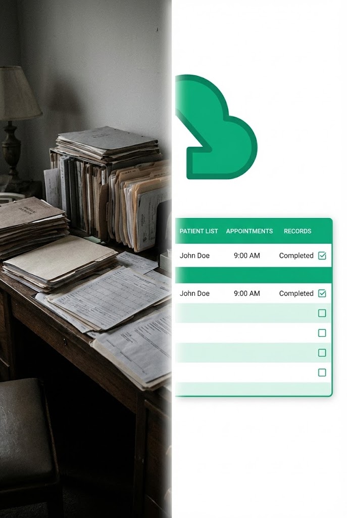
8. Split Screen: Optimized Reality and UI
MOFU | Product Differentiation
The Visual & Narrative Approach
Visualization Scenario: A vertical split-screen composition. The left side shows a desaturated, slightly grainy photo of a disorganized wooden desk piled high with paper medical files (Grey/Brown tones). The right side features a crisp, vibrant 2D vector graphic of a cloud icon and a streamlined list interface in emerald green and white. A bright white dividing line separates the two worlds.
Narration Style: Comparative and logical. "Stop doing this [left]. Start doing this [right]." The tone is objective and consultative.
Psychological Impact & KPI Focus
Niche Psychology: Visual confirmation bias. It explicitly validates the viewer's feeling that their current manual methods are "dark" and "obsolete" while presenting the software as the "bright" solution. The contrast ratio guides the eye naturally to the product.
Operational Impact: Focused on Product Differentiation on LinkedIn. It visually proves superiority over legacy methods, reinforcing the ROI of Digitization.
Strategic Implementation & Trade-offs
Use Case: LinkedIn Feed posts, Comparison pages.
Duration: 30-45 seconds.
Trade-off: Requires high-quality photography for the "left" side to look authentic but not repulsive. The contrast must be handled carefully so the "mess" doesn't distract from the UI.
Companies using similar video content -
Waystar – Revenue Cycle Management – Proving digital efficiency over manual billing.
Experian Health – Patient Access – Contrasting manual vs. automated patient registration.
9. Clean UI Workflow (Light Mode)
MOFU | Feature Education
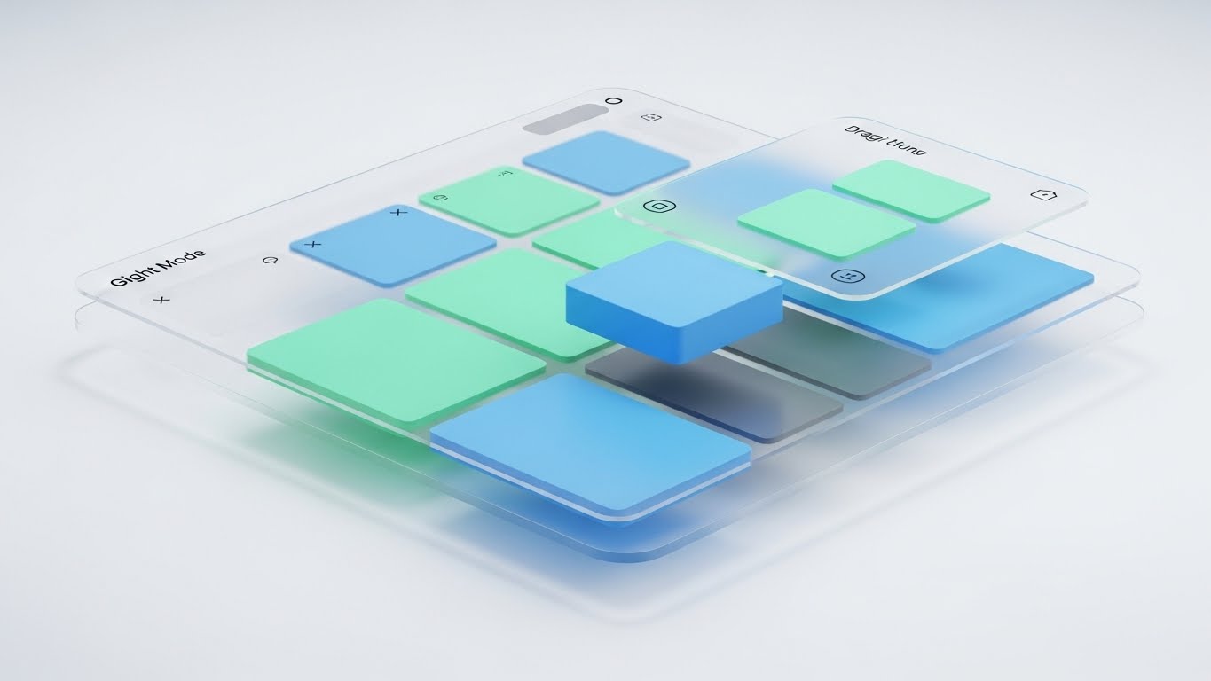
The Visual & Narrative Approach
Visualization Scenario: A high-fidelity rendering of a "Glassmorphism" UI interface floating in a bright, white space. The UI panel features a frosted glass effect with soft shadows. The screen displays a complex scheduling grid rendered abstractly with blocks of mint green and sky blue. Translucent distinct layers show a "drag and drop" action where one block is being lifted. The lighting is soft and global, highlighting the edges of the glass panels.
Narration Style: Educational, calm, and instructional. "Simply drag, drop, and confirm." The focus is on the elegance of the interaction.
Psychological Impact & KPI Focus
Niche Psychology: This style reduces "Interaction Cost." By showing the UI as airy, light, and floating, it subconsciously tells the viewer that the software is "lightweight" and easy to learn. It counters the fear of "clunky" enterprise software.
Operational Impact: A Feature Education asset. It is the "Gold Standard" for showing potential buyers exactly what the interface looks and feels like, improving Perceived Usability.
Strategic Implementation & Trade-offs
Use Case: Product Pages, Feature Deep-Dive videos.
Duration: 60-120 seconds.
Trade-off: While beautiful, glassmorphism can sometimes prioritize form over function. Ensure the actual data (text/numbers) remains legible despite the blur effects.
Companies using similar video content -
eClinicalWorks – EHR – Modernizing drag-and-drop scheduling and charting.
ModMed – EMA EHR – Showcasing elegant, intuitive specialty-specific workflows.
10. Wireframe to Reality Transition
MOFU | Competitive Displacement
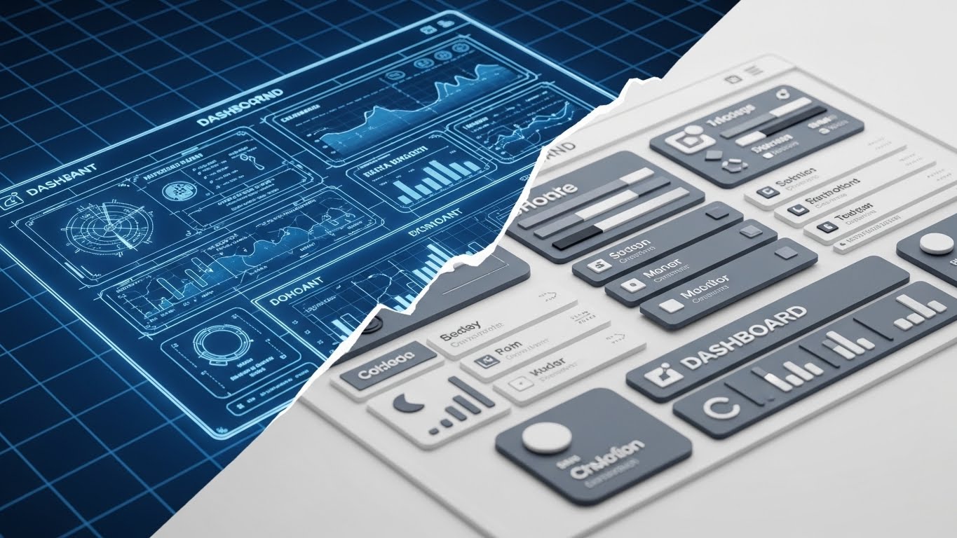
The Visual & Narrative Approach
Visualization Scenario: A split-composition image transitioning from left to right. The left side is a technical blue-print wireframe of a dashboard on a grid background (Blueprint Blue). As the image moves right, the wireframe fills in with solid colors and textures, becoming a polished, photorealistic UI in slate grey and white. The transition point is jagged and digital, like a rendering pass completing.
Narration Style: Technical, confident, and grounded. "Built from the ground up for stability."
Psychological Impact & KPI Focus
Niche Psychology: This appeals to the CTO or IT Director persona. It signals that the software isn't just a pretty skin; it has a solid, engineered architecture. It builds trust in the stability and security of the platform.
Operational Impact: A Competitive Displacement tool. It subtly implies that competitors are "just sketches" while your solution is the "constructed reality," boosting Trust/Credibility.
Strategic Implementation & Trade-offs
Use Case: Technical Whitepapers, "About Our Tech" pages, Integration documentation.
Duration: 45-60 seconds.
Trade-off: Can be too dry for a general administrative audience. Keep this targeted at decision-makers who care about structure and reliability.
Companies using similar video content -
Oracle Health – Cerner Millennium – Engineering reliable architecture from blueprint to reality.
Meditech – Expanse EHR – Building robust, integrated hospital information systems.
11. Abstract 2D Motion Graphics
MOFU | Category Creation

The Visual & Narrative Approach
Visualization Scenario: A sophisticated, abstract animation where fluid waves of deep violet and gold intersect and harmonize. The scene begins with scattered, glowing dots (representing siloed patient data) drifting in a dark void. As the golden currents sweep through, these dots are magnetically drawn together, connected by fine, elegant lines to form a cohesive, flowing network. The aesthetic excludes 3D depth, relying on high-end vector gradients to imply movement and value.
Narration Style: Elegant, high-level, and philosophical. It defines a new category of care: "Connected Intelligence." The music is orchestral and swelling.
Psychological Impact & KPI Focus
Niche Psychology: This addresses the "Fragmentation Anxiety" felt by administrators managing multi-location practices. The fluid, unbroken lines subconsciously reassure the viewer that the software creates a seamless, unbreakable bond between disparate clinics.
Operational Impact: Targeted at Category Creation. It elevates the conversation above "features" to "ecosystem," aiming to position the brand as the architect of a new standard in healthcare connectivity, driving Brand Equity.
Strategic Implementation & Trade-offs
Use Case: LinkedIn Thought Leadership posts or Keynote intro videos.
Duration: 30-45 seconds.
Trade-off: It is highly conceptual. It sells the vision of the company effectively but fails to explain what the software actually does. It requires supporting copy to land the message.
While connectivity acts as the backbone, the user interface serves as the face of the operation. The next style brings this interface into sharp, three-dimensional focus.
Companies using similar video content -
Innovaccer – Data Activation Platform – Unifying care networks with fluid connectivity.
Health Catalyst – DOS Platform – Abstract visualization of data intelligence.
12. 3D Parallax UI Presentation
MOFU | Driving Demo Requests
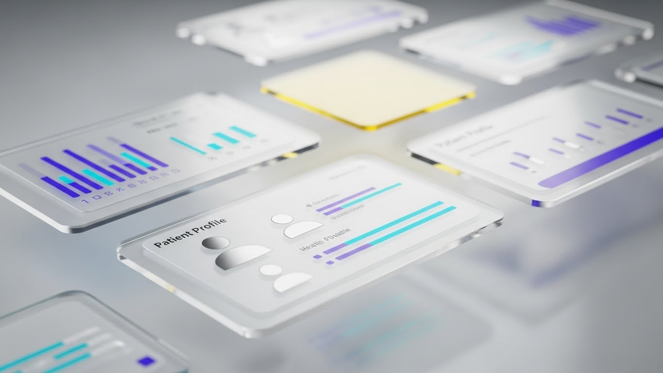
The Visual & Narrative Approach
Visualization Scenario: A cinematic 3D composition where high-fidelity Glassmorphism UI cards float in a deep, neutral grey space. The camera glides slowly, using a shallow depth of field to blur the background cards while keeping the hero card—a "Patient Profile" with turquoise health bars and silver avatars—crisply in focus. As the camera angles change, the layers within the cards (text vs. background) move at different speeds (parallax), creating a tangible sense of depth and hierarchy.
Narration Style: Polish and precision. "See deeper into your patient data." The audio highlights the "swish" and "lock" of the interface elements.
Psychological Impact & KPI Focus
Niche Psychology: The depth and glass textures trigger a "Premium Perception." It signals that the software is modern, expensive to build, and therefore valuable. The clarity of the foreground data against the blurred background visually mimics "focus," appealing to doctors who need to cut through noise.
Operational Impact: A primary driver for Demo Requests. By making the UI look touchable and immersive, it increases the user's desire to interact with the system, boosting Click-Through Rate (CTR) on "Book Demo" buttons.
Strategic Implementation & Trade-offs
Use Case: The "Hero" video on a Landing Page or specific Feature pages.
Duration: 45-60 seconds.
Trade-off: This is a "glamour shot" of the software. It sets a high expectation for the actual UI; if the real product is flat or dated, this video can create a disappointment gap.
A beautiful interface is essential, but trust is ultimately built by people. The following style reintroduces the human element into the digital narrative.
Companies using similar video content -
Salesforce – Health Cloud – Layering patient intelligence with immersive UI.
Veeva Systems – CRM for Life Sciences – Presenting deep customer data insights.
13. 2D Animation & UI Composition
MOFU | LinkedIn Organic

The Visual & Narrative Approach
Visualization Scenario: A sophisticated 2D Cel-shaded illustration featuring a confident male doctor character. Dressed in a crisp white coat, he stands beside large, floating illustrative icons: a stethoscope, a pill bottle, and a glowing calendar. The palette is muted and earthy (sage, beige, terracotta), moving away from "tech blue" to feel more organic. He gestures naturally toward the calendar, which pulses gently, symbolizing the seamless scheduling feature. The background is a stylized, abstract exam room wall.
Narration Style: Consultative and peer-to-peer. The voice is warm, sounding like a colleague sharing a tip rather than a salesperson.
Psychological Impact & KPI Focus
Niche Psychology: Medical professionals trust other professionals. By using a realistic, non-cartoony art style for the character, this visual respects the doctor's status while making the technology feel approachable and "assistant-like" rather than controlling.
Operational Impact: Designed for LinkedIn Organic reach. The human element encourages engagement (likes/comments) from peers, while the clear iconography communicates utility, driving Social Engagement.
Strategic Implementation & Trade-offs
Use Case: Educational posts on LinkedIn, "Did You Know?" feature snippets.
Duration: 20-40 seconds.
Trade-off: The "Cel-shaded" style is specific. It must be executed with high artistic quality; otherwise, it risks looking like a children's book, which undermines medical authority.
Trust is personal, but in healthcare, it must be backed by structural integrity. The next style visualizes this invisible shield.
Companies using similar video content -
DrChrono – EHR & PM – Humanizing clinical logic with professional illustrations.
Greenway Health – Intergy EHR – Illustrating seamless practice operations.
14. 2D Line Art Animation
MOFU | Overcoming Objections
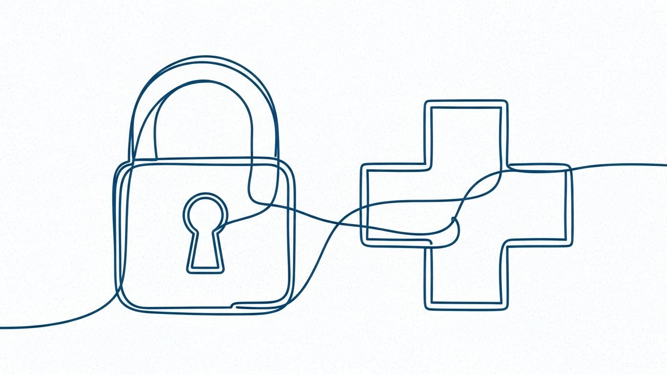
The Visual & Narrative Approach
Visualization Scenario: A minimalist masterpiece of continuous line art. A single, thin, dark blue line draws itself across a textured "blueprint" background. It weaves elegantly to form the shape of a secure padlock. Without breaking, the line morphs smoothly into a medical cross, and finally into a shield. The motion is deliberate and fluid, conveying a sense of unbroken continuity and logical progression.
Narration Style: Minimal verbal narration. The focus is on the visual metamorphosis, accompanied by sound design that evokes precision—clicks, pen strokes, and mechanical locks.
Psychological Impact & KPI Focus
Niche Psychology: Security is often a dry, scary topic. This style transforms "Compliance" and "Security" into concepts of "Elegance" and "Continuity." It reassures the viewer that security is woven into the fabric of the software, not bolted on.
Operational Impact: A tool for Overcoming Objections regarding HIPAA and data safety. It visually simplifies the complex architecture of security into a single, reliable thread, increasing Trust Metrics.
Strategic Implementation & Trade-offs
Use Case: Embedded video in Technical Whitepapers or Security Compliance pages.
Duration: 15-30 seconds (Loopable).
Trade-off: It is symbolic. It does not show how the encryption works, only that it is elegant and integral. It works best as a metaphorical reinforcement.
Security protects the data, but visionary leadership protects the future. This next style leverages AI to give that leadership a face and voice.
Companies using similar video content -
Fortinet – FortiGuard for Healthcare – Securing practice integrity with continuous precision.
Palo Alto Networks – Cortex XDR – Visualizing unbroken security architecture.
15. Generative AI Realistic Character video
MOFU | Thought Leadership

The Visual & Narrative Approach
Visualization Scenario: A close-up, cinematic video of a Medical Director. The visual quality is photorealistic, utilizing Generative AI to create a persona with authentic skin texture and professional attire. She is framed in a warm, "Rembrandt-lit" office with soft-focus wood accents in the background. She speaks directly to the camera, maintaining eye contact. There are no distractions—no floating UIs or charts—just her expression of confidence and empathy as she discusses the future of patient care.
Narration Style: Thought-leader tonality. Articulate, passionate, and unscripted in feel. "We didn't just build software; we built a support system."
Psychological Impact & KPI Focus
Niche Psychology: Humans buy from humans. This style bypasses the "tech filter" and connects on a leadership level. It mirrors the viewer's own self-image (or desired self-image) as a visionary leader, building deep emotional rapport.
Operational Impact: Establish Thought Leadership. It positions the brand not as a vendor, but as a partner with a face and a voice, significantly improving Brand Affinity and trust during the consideration phase.
Strategic Implementation & Trade-offs
Use Case: YouTube "Our Mission" videos, About Us page, CEO message.
Duration: 60-90 seconds.
Trade-off: Requires high-end AI generation to avoid the "Uncanny Valley." If the lip-sync or eye movement is slightly off, it creates distrust instantly. Authenticity is fragile here.
Vision requires execution on the ground. The following style grounds that vision in the daily reality of the practice manager.
Companies using similar video content -
Teladoc Health – Virtual Care – Articulating visionary leadership in telehealth.
Amwell – Telehealth Platform – Empathetic authority discussing future of care.
16. Lifestyle Stock with UI Overlay
BOFU | Functional Buyer
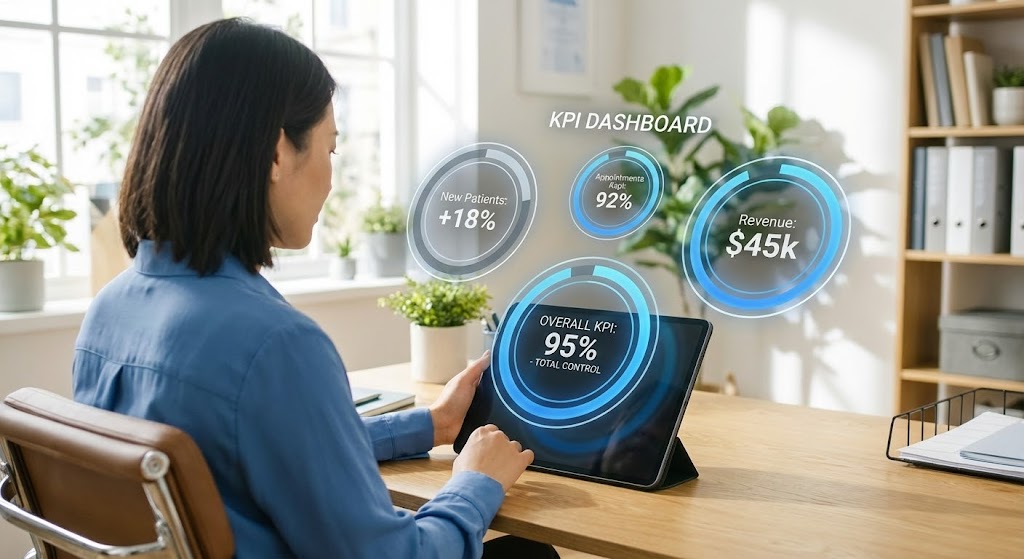
The Visual & Narrative Approach
Visualization Scenario: An over-the-shoulder shot of a practice manager in a sunlit, modern office. She is looking at a physical tablet. Superimposed over the screen is a crisp, "Augmented Reality" style UI layer that extends slightly beyond the device's bezel. This overlay displays a "KPI Dashboard" with glowing electric blue progress rings and floating text: "New Patients: +18%," "Revenue: $45k." The contrast between the warm, natural office and the sharp, cool data graphics creates a sense of "Superpowered Reality."
Narration Style: Empowering and results-oriented. "Your practice, enhanced. Your growth, visible."
Psychological Impact & KPI Focus
Niche Psychology: This style appeals to the "Functional Buyer" (VP of Ops) who wants to feel in control. It visualizes the "Augmented Manager"—the idea that the software gives them superpowers to see invisible data and trends instantly.
Operational Impact: Targets the Functional Buyer. It bridges the gap between the physical user and the digital result, making the Value Proposition of "Data-Driven Management" tangible and desirable.
Strategic Implementation & Trade-offs
Use Case: Product feature pages, "For Managers" persona pages.
Duration: 15-30 seconds.
Trade-off: Stock footage can feel generic. The quality of the "Tracking" (how the UI sticks to the tablet) is critical; poor tracking looks cheap and breaks the illusion of integration.
Operational control inevitably leads to financial scrutiny. The next style speaks directly to the Economic Buyer who signs the checks.
Companies using similar video content -
Kareo – Billing Services – Visualizing real-time KPIs for practice managers.
AdvancedMD – Reporting & Analytics – Augmented control over practice performance.
17. Dynamic Data Visualization
BOFU | Economic Buyer

The Visual & Narrative Approach
Visualization Scenario: A dedicated 3D abstract visualization of financial success. Hexagonal columns in matte gold and deep emerald green rise rhythmically from a grid, mimicking a bar chart on steroids. Floating above these rising structures are glossy 3D symbols: "%", "$", and upward trend arrows. The background is a gradient void that forces focus on the gold/green contrast. The motion is always upward, reinforcing growth.
Narration Style: Financial, rhythmic, and definitive. "Optimize. Monetize. Grow." The sound effects are heavy "thuds" of solidity and growth.
Psychological Impact & KPI Focus
Niche Psychology: CFOs and Economic Buyers care about one thing: ROI. This style strips away the "medical" fluff and focuses purely on the "financial" outcome. The gold and green palette triggers subconscious associations with wealth, stability, and profit.
Operational Impact: Designed for the Economic Buyer (CFO). It serves as a visual anchor in Pitch Decks or Proposal videos, explicitly visualizing Revenue Growth and ROI, making the investment feel secure.
Strategic Implementation & Trade-offs
Use Case: Investment Pitch Decks, BOFU Proposal Videos, ROI Calculator results.
Duration: 10-20 seconds.
Trade-off: It is cold and capitalist. It lacks patient empathy. Use strictly when talking to the person who signs the check, not the one creating the care plan.
Financial growth is powered by technical robustness. We now dive into the code environment to validate the system’s architecture.
Companies using similar video content -
R1 RCM – Revenue Cycle Management – Projecting revenue growth with fiscal geometry.
Waystar – Analytics & Reporting – Dynamic visualization of financial performance.
18. Dark Mode UI Showcase
BOFU | Technical Buyer
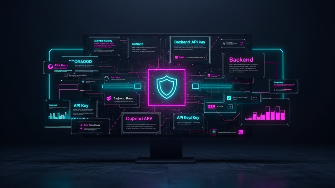
The Visual & Narrative Approach
Visualization Scenario: A sleek, high-contrast visualization of the software's "Dark Mode" interface, tailored for a technical audience. The background is deep charcoal. The UI elements—API keys, code snippets, and server stats—glow in neon cyan and magenta. A central shield icon pulses in the middle, symbolizing the core security engine. The layout is dense and symmetrical, suggesting robust architecture and complexity. Subtle reflections on the "glass" surface add a high-tech finish.
Narration Style: Technical, hushed, and secure. "Enterprise-grade architecture. Zero compromise."
Psychological Impact & KPI Focus
Niche Psychology: Developers and CIOs are skeptical of "pretty" software. They trust density, darkness (editor environments), and structure. This style speaks their visual language, signaling that the platform is "developer-friendly" and robust.
Operational Impact: Targets the Technical Buyer (CIO). It validates the Technical Feasibility and security of the platform, reducing friction during the IT review stage of the sales cycle.
Strategic Implementation & Trade-offs
Use Case: API Documentation videos, Security pages, IT implementation guides.
Duration: 30-60 seconds.
Trade-off: It is unintelligible to a layperson. A practice manager might find it intimidating or "too techy." Keep it siloed for the technical stakeholder.
Robust architecture allows for the scalable accumulation of value. The following style gamifies this accumulation, making growth feel tangible.
Companies using similar video content -
AWS – for Healthcare – Validating system architecture with backend logic.
Microsoft – Cloud for Healthcare – Showcasing enterprise-grade security and APIs.
19. Isometric 3D Workflow
BOFU | ROI Justification Hook

The Visual & Narrative Approach
Visualization Scenario: A delightful "Clay-style" 3D render of a miniature medical clinic cutaway viewed from an isometric angle. The walls are pure white, and the floors are emerald green. Inside the tiny rooms, abstract cylinders representing "value" or "coins" are being neatly stacked by invisible hands. The lighting is soft and global, giving the look of a high-end physical toy set. The scene is perfectly orderly, symbolizing a well-oiled money-making machine.
Narration Style: Light, confident, and satisfying. "Build a practice that builds itself."
Psychological Impact & KPI Focus
Niche Psychology: The "Toy Effect" (tilt-shift/miniature) makes complex systems feel manageable and "ownable." It appeals to the practice owner's desire to view their business as a tangible, growing asset. The stacking coins subtly reinforce the accumulation of value without being aggressive.
Operational Impact: An ROI Justification Hook. It simplifies the business case into a visual model of efficiency and accumulation, effective for Closing discussions where the owner needs to feel good about the business model.
Strategic Implementation & Trade-offs
Use Case: Retargeting Ads for decision-makers, "Business of Medicine" blog posts.
Duration: 15-30 seconds.
Trade-off: The "cute" aesthetic can trivialize serious medical care if overused. It works best for business/operations topics, not clinical outcomes.
Protecting that accumulated value requires absolute transparency. The final style uses an X-Ray view to reveal the hidden reliability of the system.
Companies using similar video content -
PracticeSuite – Practice Management – Building value infrastructure in a miniature ecosystem.
TheraNest – EHR & PM – Gamifying setup and accelerating practice growth.
20. 3D X-Ray Visualization
BOFU | Risk Mitigation Hook

The Visual & Narrative Approach
Visualization Scenario: A striking 3D visualization of a piece of hardware (like a server tower or a secure data drive) rendered with a semi-transparent, translucent blue glass casing. Inside, the core components—rotors, chips, and cooling lines—are visible and glowing with a warm, golden orange light. Streams of white data particles flow smoothly through the complex internal machinery. The camera orbits slowly, revealing the intricate, flawless internal construction.
Narration Style: Deep, resonant, and reassuring. "Transparency at the core. Reliability built in."
Psychological Impact & KPI Focus
Niche Psychology: Fear of the unknown (system crashes, data loss) is a major barrier to purchase. This X-Ray style acts as a "Visual Proof of Health." By showing the "insides" working perfectly, it alleviates the anxiety of what lies beneath the surface of the software.
Operational Impact: A Risk Mitigation tool. It visually demonstrates "Uptime" and "Reliability," crucial for final sign-off. It converts the abstract promise of "99.9% Uptime" into a concrete visual reality.
Strategic Implementation & Trade-offs
Use Case: Trust Center pages, SLA (Service Level Agreement) explanations, Final Proposal videos.
Duration: 20-40 seconds.
Trade-off: Highly abstract. Since PMS is software (cloud), showing "hardware" is a metaphor. Ensure the viewer understands this represents the infrastructure (AWS/Azure/Private Cloud), not a physical box they are buying.
Companies using similar video content -
Commvault – Healthcare Data Protection – Revealing robust reliability of data infrastructure.
Rubrik – Data Security Cloud – Internal transparency for data resilience.
21. Photorealistic 3D Renders
BOFU | Building Trust

The Visual & Narrative Approach
Visualization Scenario: A breathtakingly photorealistic macro shot of a pristine white desk surface. The composition features a high-end tablet displaying a medical application interface with crisp teal and white graphics. Beside it sits a stainless steel stethoscope, the metal texture reflecting the soft, natural morning light, and a glass of water. The depth of field is shallow, keeping the tablet's corner and the stethoscope in sharp focus while the background blurs into a soft, sterile medical environment.
Narration Style: Hushed, reverent, and sophisticated. "Precision in every pixel. Care in every detail." The sound design emphasizes the crisp silence of a clean, organized room.
Psychological Impact & KPI Focus
Niche Psychology: Medical professionals associate cleanliness and precision with safety. By rendering the software in a photorealistic, tangible environment alongside trusted medical tools, this style subliminally equates the software with the physical tools of the trade. It feels "real" and "essential."
Operational Impact: A powerful Trust Building asset for the website. It moves the product from "digital abstraction" to "physical reality," increasing the user's comfort level and Conversion Confidence.
Strategic Implementation & Trade-offs
Use Case: Website Hero sections, Print collateral, High-stakes presentation decks.
Duration: Static Image or 5-10 second loop.
Trade-off: It is static. It conveys quality and atmosphere beautifully but cannot communicate complex workflows or motion. It is an anchor, not an explainer.
Companies using similar video content -
GE Healthcare – Imaging Solutions – Anchoring premium quality of medical devices and software.
Philips Healthcare – Patient Monitoring – Tangible fidelity of integrated care solutions.
22. Hyper-lapse Stock Footage with Data
Onboard | Reducing Friction
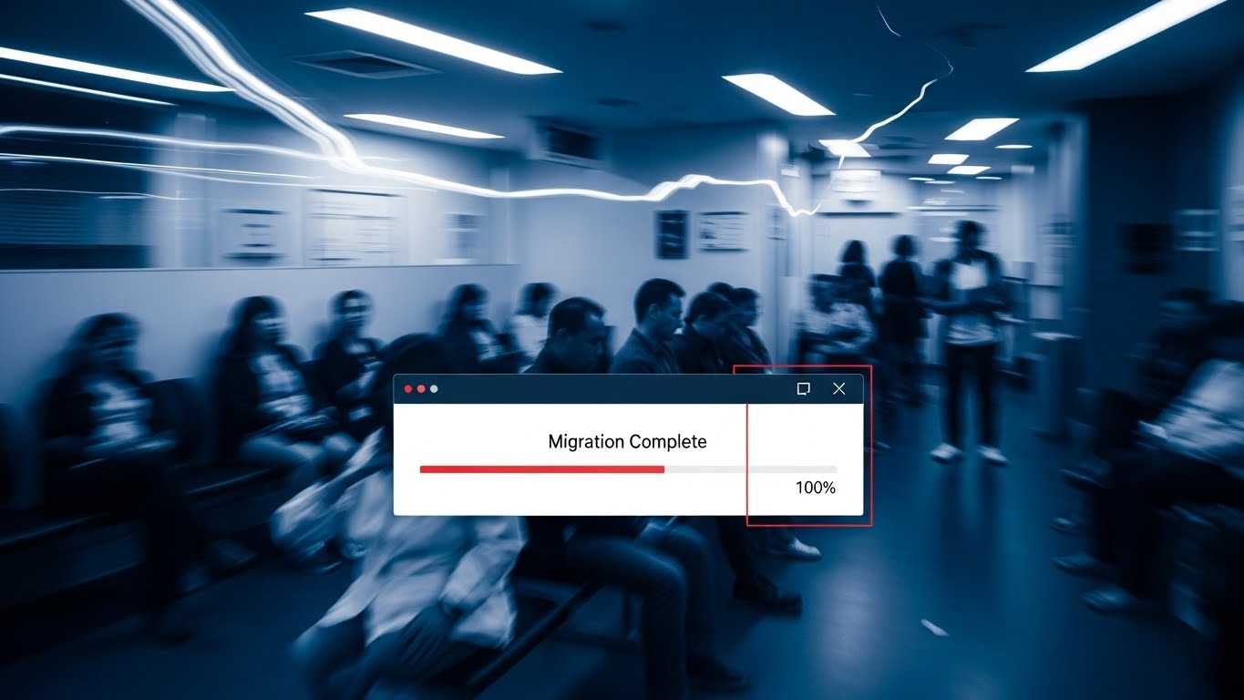
The Visual & Narrative Approach
Visualization Scenario: The background features a hyper-lapse video of a busy clinic waiting room. People (ghosted with motion blur) rush by, indicating the passage of time and high activity. In stark contrast, a sharp, static UI window in bright red and white floats steadily in the center foreground. It displays a "Migration Complete" progress bar hitting 100%. The UI remains perfectly stable and readable while the world behind it rushes by.
Narration Style: Calm amidst the storm. "While the clinic moves fast, your data stays grounded."
Psychological Impact & KPI Focus
Niche Psychology: Implementation anxiety is real. Practice managers fear that switching software will disrupt patient flow. This visual metaphor alleviates that fear by showing that the software remains stable and complete even when the physical environment is chaotic.
Operational Impact: Focused on Reducing Friction. It visually promises a seamless background migration that doesn't disrupt daily operations, directly addressing the barrier of Implementation Downtime.
Strategic Implementation & Trade-offs
Use Case: "Welcome" emails during onboarding, Kick-off meeting intros.
Duration: 10-20 seconds.
Trade-off: Requires high-quality stock footage to look professional. The contrast between the blur and the sharp UI must be technically perfect to avoid visual confusion.
Companies using similar video content -
Redox – Interoperability Engine – Stabilizing transition chaos during data migration.
Lyniate – Rhapsody Integration Engine – Static clarity during system integration.
23. Macro UI Micro-Interactions
Onboard | Self-Serve Onboarding

The Visual & Narrative Approach
Visualization Scenario: An extreme macro close-up of a single digital button labeled "Submit." The button is pill-shaped with a vibrant gradient from red to orange. The visual captures the split-second of anticipation before activation—the button appears slightly depressed into the screen, emitting a soft white glow. The texture of the screen pixels is faintly visible, adding a layer of tactile realism. The background is a soft, blurred interface.
Narration Style: Intimate and encouraging. "One click. Done." Sound effects are crucial here—a satisfying, high-quality digital "pop" or click sound.
Psychological Impact & KPI Focus
Niche Psychology: Learning new software can feel like work. This style focuses on the "Joy of Use." By highlighting the high-fidelity micro-interactions, it frames the software as responsive, tactile, and satisfying to use, rather than a chore.
Operational Impact: Supports Self-Serve Onboarding. By making the primary actions look inviting and easy, it encourages users to explore the interface themselves, reducing the need for guided training and boosting Feature Adoption.
Strategic Implementation & Trade-offs
Use Case: In-app tooltips, "New Feature" highlight reels, Email GIFs.
Duration: 3-6 seconds (Looping).
Trade-off: Very narrow focus. It highlights design quality but cannot explain context or workflow. Use it to punctuate larger tutorials.
Companies using similar video content -
eClinicalWorks – Patient Portal – Satisfying user actions for appointment booking.
ModMed – MIPS/MACRA Dashboard – Tactile anticipation for reporting submissions.
24. Low-Poly 3D Modeling
Onboard | Time-to-Value
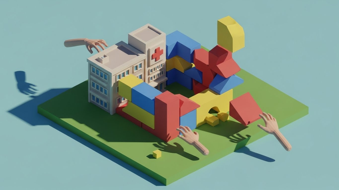
The Visual & Narrative Approach
Visualization Scenario: A playful, low-poly 3D animation showing a medical center being constructed by invisible hands. Colorful geometric blocks in primary red, blue, and yellow snap together with satisfying physics to form the building. The aesthetic is clean, with flat shading and hard facets, reminiscent of a high-end toy set. The background is a soft, optimistic sky blue.
Narration Style: Upbeat, light, and snappy. "Setup is a snap. Build your practice in minutes, not months."
Psychological Impact & KPI Focus
Niche Psychology: Setup is often perceived as a complex, heavy burden. The "Toy Block" metaphor reframes configuration as "play" rather than "work." It suggests modularity and ease, lowering the psychological barrier to starting the setup process.
Operational Impact: Targets Time-to-Value. It visually communicates that the system is modular and easy to configure, encouraging the user to begin the setup process immediately and reducing Onboarding Drop-off.
Strategic Implementation & Trade-offs
Use Case: Onboarding welcome sequence, "Getting Started" wizard intros.
Duration: 15-30 seconds.
Trade-off: The aesthetic is casual. Avoid using this style for serious topics like billing compliance or patient health records; keep it focused on structure and setup.
Companies using similar video content -
SimplePractice – Onboarding – Accelerating setup value with modular simplicity.
TherapyNotes – Getting Started – Modular construction of practice management.
25. Abstract 3D AI Visualization
Retain | Reducing Support Overhead

The Visual & Narrative Approach
Visualization Scenario: An abstract, mesmerizing 3D visualization of an AI neural network. Glowing nodes in deep violet and hot pink are connected by thin, light-emitting filaments, forming a spherical cloud. In the center, a bright white light pulses rhythmically, labeled "Answer." The background is deep black, making the neon colors pop. The camera rotates around this "brain," showing the interconnectivity of the data.
Narration Style: Tech-forward, intelligent, and calm. "Answers before you even ask. Support that thinks with you."
Psychological Impact & KPI Focus
Niche Psychology: Users hate calling support. This style reassures them that the system is intelligent enough to solve problems automatically. It visualizes the "Help Desk" not as a person you have to wait for, but as an always-on intelligence.
Operational Impact: Aimed at Reducing Support Overhead. It builds trust in the automated/AI support tools (chatbots, predictive help), encouraging users to use self-help tools and reducing Ticket Volume.
Strategic Implementation & Trade-offs
Use Case: Help Center loading screens, Chatbot avatar, "AI Assist" feature announcements.
Duration: 10-20 seconds (Loopable).
Trade-off: Highly abstract. It represents intelligence but does not show the interface. Users still need to know where to click to get this help.
Companies using similar video content -
Nuance Communications (Microsoft) – Dragon Medical One – Automating problem resolution with neural support.
Google Cloud – Vertex AI for Healthcare – Visualizing AI-driven insights and support.
26. 2D Graphics Over Live Action
Retain | Reducing Churn

The Visual & Narrative Approach
Visualization Scenario: A candid, warm photo of a nurse sitting at a computer, smiling genuinely. The lighting is natural and sun-drenched. Surrounding her head are hand-drawn, white 2D doodles: hearts, stars, and smiley faces that animate slightly (wiggling). This mixed-media approach overlays a layer of "visible happiness" onto the real-world image.
Narration Style: Human, appreciative, and warm. "Happy staff, healthy practice. Keep the team smiling."
Psychological Impact & KPI Focus
Niche Psychology: Retention is often emotional. If the staff is happy, the software stays. This style visualizes the emotional ROI of the software—stress reduction and job satisfaction. It reminds the decision-maker that the software affects real people's lives.
Operational Impact: Focused on Reducing Churn. By highlighting the human benefit (staff retention/happiness), it reinforces the soft value of the platform, making it harder to replace without emotional cost.
Strategic Implementation & Trade-offs
Use Case: Customer Success stories, "Year in Review" emails, Staff appreciation posts.
Duration: Static or 5-10 second Motion Graphic.
Trade-off: Can feel "cheesy" if the doodles are too messy. The photography must be authentic (not stiff stock) for the emotional connection to work.
Companies using similar video content -
Athenahealth – Patient Engagement – Visualizing staff satisfaction and emotional layering.
NextGen Healthcare – Patient Experience – Highlighting positive staff interactions.
27. Generative AI Cinematic Video
Retain | Visitor Re-engagement

The Visual & Narrative Approach
Visualization Scenario: A wide anamorphic shot of a futuristic hospital corridor. The architecture features curved glass walls emitting a soft, soothing teal light. The floor is polished white stone. A silhouette of a medical professional walks confidently toward a warm light at the end of the hall. The color grading is cinematic—teal and orange—evoking a high-budget sci-fi film but with a distinctly positive, utopian tone.
Narration Style: Epic, aspirational, and grand. "The future of care isn't just efficient. It's beautiful."
Psychological Impact & KPI Focus
Niche Psychology: This appeals to the user's desire to be part of the future. It combats the "boredom" of legacy software by painting a picture of a visionary tomorrow. It re-engages the user's imagination.
Operational Impact: Targets Visitor Re-engagement. It serves as a "brand refresh" for existing users, reminding them that they are partnered with a forward-thinking company, increasing Brand Loyalty.
Strategic Implementation & Trade-offs
Use Case: Conference backdrops, Login screen backgrounds, "What's Next" roadmap videos.
Duration: 15-30 seconds.
Trade-off: It is pure mood. It conveys no information about the software's current state. It is a brand piece, not a product piece.
Companies using similar video content -
Teladoc Health – Future of Virtual Care – Inspiring future loyalty with a utopian vision.
Amwell – Digital Care Transformation – Projecting an aspirational future of healthcare.
28. Futuristic Neon/Dark Mode
Expand | Driving Upsell
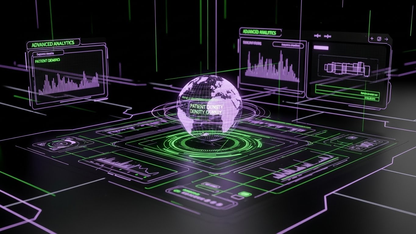
The Visual & Narrative Approach
Visualization Scenario: A dark-mode visualization of an advanced analytics module. The background is deep black, allowing the UI elements—constructed from glowing neon purple and laser-grid green lines—to pop vividly. A central holographic globe spins slowly, displaying patient density maps. The aesthetic is "Cyberpunk Medical," conveying extreme high-tech capability and data density.
Narration Style: Intense, fast, and exclusive. "Unlock the dark mode. See the data others miss."
Psychological Impact & KPI Focus
Niche Psychology: "Pro" features need to look different. This visual style distinguishes the "Enterprise/Premium" tier from the standard tier. It appeals to the user's ego—the desire to be a "power user" with access to elite tools.
Operational Impact: A tool for Driving Upsell. It creates a visual gap between the "Basic" (Light Mode) and "Premium" (Dark Mode/Neon) versions, stimulating desire for the upgrade and increasing Average Revenue Per User (ARPU).
Strategic Implementation & Trade-offs
Use Case: In-app paywalls, "Upgrade to Pro" landing pages, New Feature trailers.
Duration: 15-30 seconds.
Trade-off: High contrast can be straining to read for long periods. Use this style to sell the feature, not to use the feature permanently.
Companies using similar video content -
Health Catalyst – Data Operating System – Selling advanced insight with cyberpunk analytics.
Innovaccer – Population Health Management – Driving upsell with advanced data visualization.
29. Aspirational Stock Montage
Expand | Driving Referrals

The Visual & Narrative Approach
Visualization Scenario: A high-key, aspirational photo montage. A diverse group of medical professionals (doctors, nurses, admins) stands in a modern, glass-walled lobby. They are laughing, high-fiving, and interacting genuinely. The lighting is flooded with natural white sunlight. The composition is crisp and high-resolution. It conveys purely positive team dynamics and shared success.
Narration Style: Community-focused and celebratory. "Success is better when shared. Invite a peer today."
Psychological Impact & KPI Focus
Niche Psychology: People refer products that make them look good. This style associates the software with "Success" and "Team Harmony." It suggests that by sharing this software, the user can bring this level of happiness to their peers.
Operational Impact: Focused on Driving Referrals. It leverages social proof and the desire for community status to encourage users to participate in referral programs, lowering Customer Acquisition Cost (CAC).
Strategic Implementation & Trade-offs
Use Case: Referral program emails, "Invite a Colleague" modal windows.
Duration: Static or Slideshow.
Trade-off: It can look generic if standard stock photos are used. The diversity and authenticity of the models are critical to making it feel inclusive and real.
Companies using similar video content -
Doximity – Medical Network – Inspiring peer referral through collective success.
Zocdoc – Provider Network – Community-focused success for driving referrals.
30. Holographic UI over 3D Render
Expand | Proactive Support
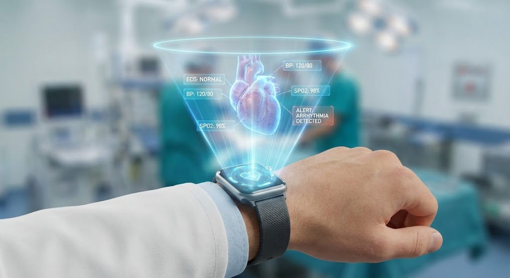
The Visual & Narrative Approach
Visualization Scenario: A close-up 3D render of a doctor's wrist wearing a sleek smartwatch. Projecting from the watch face is a detailed, semi-transparent blue holographic cone. Inside the cone floats a 3D heart model and floating data widgets (ECG, O2 stats). The background is a blurred hospital environment. The hologram is rendered with additive blending, making it look like pure light.
Narration Style: Visionary and protective. "Care that follows you. Alerts that anticipate."
Psychological Impact & KPI Focus
Niche Psychology: This speaks to the "Always-On" reality of modern medicine. It promises that the technology is proactive—alerting the doctor before a crisis occurs—and mobile, freeing them from the desk. It is the ultimate promise of digital freedom.
Operational Impact: Demonstrates Proactive Support and innovation. It positions the brand as a leader in wearable/IoT integration, validating long-term investment and justifying price increases for Innovation Access.
Strategic Implementation & Trade-offs
Use Case: Keynote finales, Trade show booth screens, Innovation Lab webpages.
Duration: 15-20 seconds.
Trade-off: This is "Future Tech." If the current mobile app is basic, this can create a gap between expectation and reality. Position it clearly as "Coming Soon" or "Vision."
Strategic Knowledge Base: The Visual Operations Doctrine
We have analyzed 30 distinct visual styles, ranging from the abstract and emotional to the technical and financial. However, a library of styles is only as powerful as the strategy that deploys them.
To transform these visuals from "marketing assets" into "business infrastructure," we must apply a cohesive operational framework. The following three segments synthesize the insights from this guide into actionable strategies for Practice Management Software leaders.
Strategic Alignment & Visual Architecture (Pre-Production)
Defining the "Why" and "Who" before a single pixel is rendered.
- The Cognitive Load Audit: Before creating a single asset, map your software’s friction points. Where do users stall? Use Style 2 (Minimalist Flat 2D) for complex logic and Style 23 (Macro UI) for repetitive tasks. Align visual complexity with the user's cognitive state; high stress (ER scheduling) requires low visual noise.
- Role-Based Visual Mapping: A doctor needs different visuals than a billing specialist. Use Style 30 (Holographic/Mobile) to appeal to the roaming provider’s need for speed, while deploying Style 28 (Dark Mode Analytics) to satisfy the practice manager’s need for data density.
- The "Glanceability" Standard: In a clinic, seconds matter. Your visuals must pass the "Glance Test." Can the viewer understand the feature's value in under 3 seconds? Styles like Style 4 (Bold Kinetic Typography) are engineered for this specific velocity.
- Brand Voice Consistency: Your visual language must be fluent across all channels. You cannot have a playful Style 5 (Isometric) on TikTok and a dry, text-heavy whitepaper. Use Style 14 (Line Art) to bridge the gap, maintaining professional integrity while simplifying concepts.
- The Advids Strategic Audit: We don't just animate; we architect. Partnering with Advids means defining this "Visual Operating System" before production begins, ensuring every pixel serves a business goal rather than just decorating a page.
- Legacy System Integration: Visualizing the invisible link between old hardware and new cloud systems is critical. Use Style 3 (Mixed Media) to literally show the paper-to-digital transformation, validating the user's journey from the past to the future.
- Accessibility in Clinical Settings: Motion graphics must be accessible to all staff. High-contrast modes and clear typography (as seen in Style 9 Clean UI) are not just aesthetic choices; they are operational mandates for diverse, multi-generational medical teams.
- The Mobile-First Mandate: Care happens on the move. All 30 styles must be optimized for mobile consumption. A Style 12 (3D Parallax) video must look as convincing on an iPad between rounds as it does on a desktop monitor.
- Standardization vs. Customization: Use standardized styles (Style 9) for core features that everyone uses (Scheduling). Reserve bespoke, high-budget styles (Style 3 Mixed Media) for your unique value propositions (AI Diagnosis) to maximize impact where it counts.
- The Sales/Ops Bridge: Visuals should unify your teams. The "Dream" sold by Sales using Style 27 (Cinematic) must be grounded by the "Reality" shown by Ops using Style 10 (Wireframe to Reality), creating a seamless transition for the customer.
Operational Adoption & Implementation (Deployment)
Embedding visuals into the workflow to drive usage and reduce friction.
- Overcoming "Big Brother" Anxiety: Staff often fear PMS software is monitoring their speed. Use Style 11 (Abstract Motion) and Style 1 (Organic Vector) to visualize data connectivity as "Harmony" and "Support" rather than "Surveillance," softening the blow of compliance monitoring.
- The Micro-Learning Shift: Nobody reads the manual. Replace 50-page PDFs with a library of 30-second clips using Style 7 (Rapid UI Montage). Embed these directly into the dashboard to provide "Just-in-Time" training at the exact moment of need.
- Just-in-Time Support: Reduce helpdesk calls by embedding Style 25 (Abstract AI) visuals into your chat widget. When users see a "thinking" brain, they are more patient, and visual cues can guide them to self-serve solutions faster.
- Gamification of Training: Use Style 5 (Isometric) to turn onboarding into a world-building exercise. Visualizing the clinic as a growing, thriving ecosystem encourages staff to complete their training modules to "level up" their practice.
- Reducing Support Ticket Volume: There is a direct correlation between the quality of your "Onboarding" visuals (Style 24) and the volume of "Level 1" support tickets. Investing in high-fidelity "How-To" videos is cheaper than hiring more support agents.
- Remote Onboarding: For distributed health networks, physical seminars are impossible. Use Style 15 (AI Avatar) to create a personalized, scalable onboarding experience that feels human without requiring a fly-in trainer.
- Standard Operating Procedures (SOPs): Text-based SOPs are ignored. Transform clinical protocols into Style 2 (Minimalist Vector) flowcharts that are animated and loopable. This ensures protocol adherence by making the "right way" the "easiest way" to visualize.
- Feedback Loops: Use Style 23 (Macro UI) elements in your surveys. A satisfying, animated "Thumbs Up" interaction increases response rates for product feedback, giving you better data on user sentiment.
- Scalable Localization: Medical software is global. Style 14 (Line Art) and Style 1 (Abstract) rely on symbols, not text. This makes them effortlessly localizable for different regions without expensive re-shoots.
- Leadership Communication: When the Medical Director needs to communicate a new strategy, don't send a memo. Use Style 27 (Cinematic) to wrap the message in a vision of the future, ensuring buy-in from the stakeholders who control the budget.
Measuring Impact & Future-Proofing (ROI)
Quantifying the value of visualization and preparing for the next shift.
- Beyond "Views": Vanity metrics are dead. Measure "Time-to-Competency." Did watching the Style 9 (Clean UI) video reduce the time it took a nurse to schedule her first appointment? That is the only metric that matters.
- The "Idle Time" Metric: High idle time means confusion. Correlate the placement of Style 16 (Augmented UI) visuals with a reduction in user "hover time" (hesitation) within the app. Clear visuals create confident users.
- Compliance Velocity: When a new HIPAA rule drops, how fast does the team adapt? Distribute a Style 4 (Kinetic Type) video to blast the core update in 10 seconds. Measure the time delta between "Regulation Announcement" and "Clinic Compliance" to prove the ROI of visual agility.
- Retention and Churn: High-quality UX visualization (Style 26) contributes to "Perceived Value." Survey users who see these visuals vs. those who don't. You will often find that users exposed to "Premium" visuals have a lower churn rate.
- The AI Visual Frontier: The future is generative. Preparing your visual assets now means you can eventually use AI to generate personalized training videos for every single user on the fly. Style 25 is just the beginning.
- Scalability of Assets: Don't build one-offs. Build a "Visual Lego Kit" (like Style 24). A library of modular 3D assets allows you to assemble new feature videos in hours, not weeks, keeping pace with your agile dev cycles.
- The Advids Partnership: Scale is the ultimate challenge. As your feature set grows, so must your visual library. Partnering with a dedicated agency like Advids ensures your visual standard remains high and consistent, even as you scale from 10 videos to 1,000.
- Benchmarking Success: Compare your "Visual Density" to competitors. If your competitor uses static screenshots and you use Style 12 (3D Parallax) workflows, you win the "Perceived Innovation" battle before the demo even starts.
- The ROI of Safety: In healthcare, errors cost lives (and lawsuits). Better visualization (Style 20) leads to fewer medical errors. Quantify this. "Visual training reduced data entry errors by 15%." This is a powerful sales argument for Risk Officers.
- Final Call to Innovation: Stop treating video as "Content Marketing." In the Practice Management sector, video is "Visual Infrastructure." It is the interface through which users understand your value. Invest in it with the same rigor you invest in your code.
Companies using similar video content -
Zebra Technologies – Healthcare Solutions – Projecting care mobility with wearable innovation.
Capsule Technologies – Medical Device Information System – Visualizing proactive support and data at the point of care.
Author & Editor Bio


