
The Visualization Opportunity: The Self-Driving Organization
We are entering the era of the "Self-Driving Organization"—a state of operational maturity where knowledge flows seamlessly between teams, and processes are executed with machine-like precision. However, for the "Operational Architects" building these systems, a critical barrier remains: the Physical/Digital Divide.
The challenge lies in translating the fluidity of human work into the rigidity of documentation. When this translation fails, organizations bleed efficiency. Recent studies indicate that inefficient knowledge sharing costs large businesses an estimated $47 million per year. This loss isn't just financial; it's a productivity tax. Employees currently spend 1.8 hours every day—nearly 20% of their work week—simply searching for the information they need to do their jobs.
The Visual Bridge
Static text cannot bridge this gap. To reclaim this lost time and crystallize "tribal knowledge" into scalable assets, we must embrace a new visual standard. This guide presents 30 expert-curated visual styles designed to transform your Process Documentation Software from a passive repository into a dynamic strategic asset.
These examples are not merely decorative. They are functional tools engineered to reduce cognitive load, accelerate "Time-to-Competency," and signal the robust reliability of your platform. Let’s explore the first set of styles, focused on Market Education, Brand Awareness, and Trust.
1. The Entropy Reversal
TOFU | Market Education
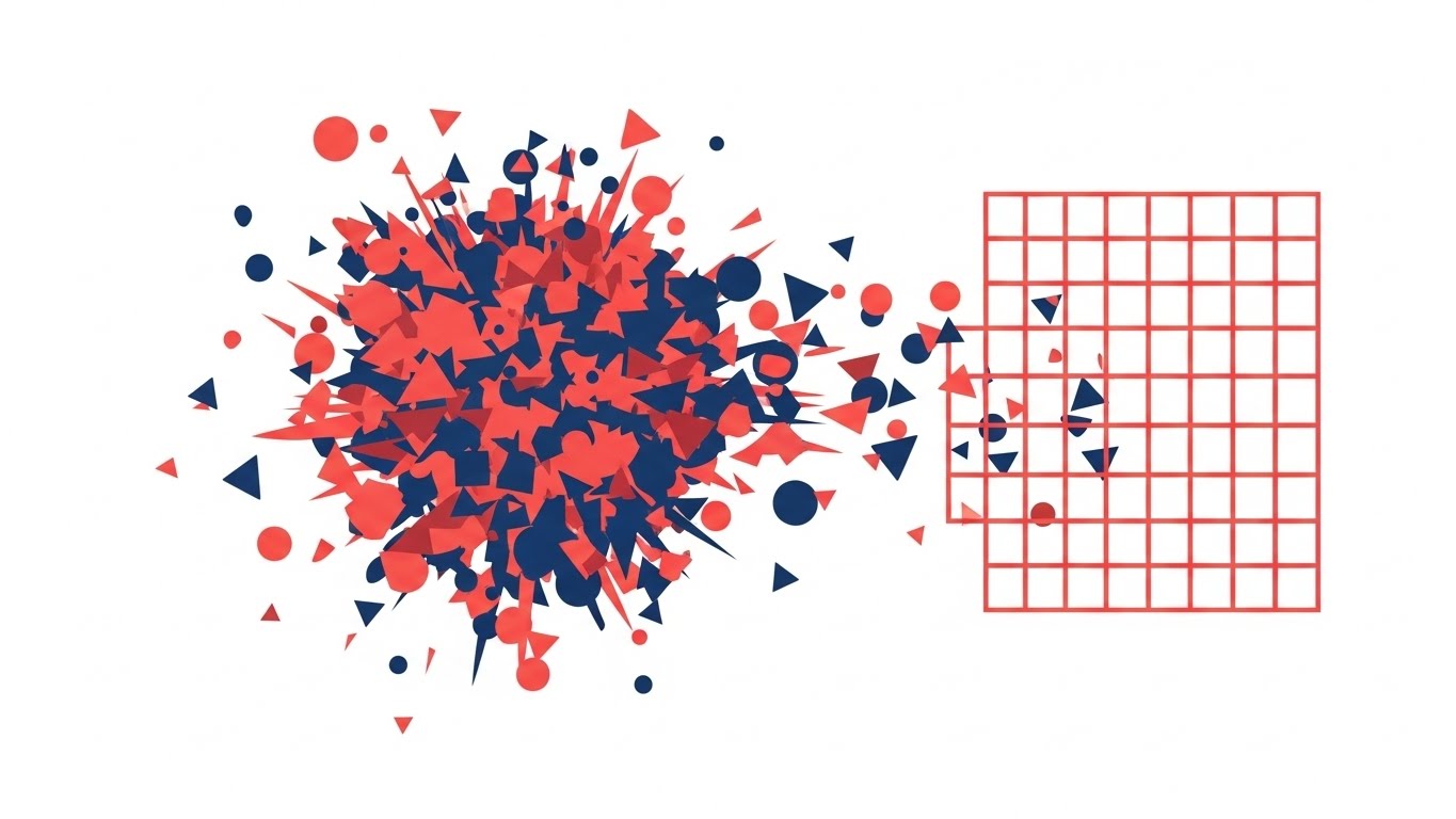
The Visual & Narrative Approach
This style visualizes the primary anxiety of every Operations Manager: entropy. Using a sharp, vector-based aesthetic in Coral Red and Deep Navy Blue, the scene begins with a central explosion of chaotic, scattered shapes. There is no structure, only noise. Then, in a singular, satisfying moment, the shapes are magnetically pulled to the right, snapping audibly into a rigid, perfect grid. The background remains a clinical white, emphasizing the clarity of the transformation.
Psychological Impact & KPI Focus
Psychologically, this addresses the "Fear of Sprawl." The "snap-to-grid" animation leverages the Closure Principle, providing the viewer with a visceral sense of relief and control. It doesn’t just show organization; it feels like a solution.
- Operational Impact: It simplifies the complex value proposition of "Process Management" into a binary state: Chaos vs. Order. This clarity increases Ad Recall by reducing the cognitive effort needed to understand the product.
Strategic Implementation & Trade-offs
- Best Use Case: YouTube Pre-roll ads (first 5 seconds) to hook the viewer with a "Problem/Solution" dynamic.
- Duration: 05-10 Seconds.
- Trade-off: It is highly abstract. While it sells the concept of order, it does not educate the user on how the software achieves it.
Companies using similar video content -
Camunda – Platform – Orchestrates complex processes, bringing order to workflows.
Flowable – Platform – Automates business processes, transforming complexity into advantage.
ProcessMaker – Platform – Designs and deploys solutions to complex workflow problems.
2. The Knowledge Crystallization
TOFU | Brand Awareness

The Visual & Narrative Approach
This style uses a "Fluid-to-Solid" metaphor to represent the capture of tribal knowledge. Amorphous blobs of Mint Green and Soft Lavender flow like liquid mercury, representing the intangible nature of unspoken processes. As they converge, they instantly solidify into crisp, sharp-edged document icons with glossy textures. The lighting suggests a premium, sterile environment where information is treasured.
Psychological Impact & KPI Focus
This visualizes Stability. It assures the viewer that your software can take the messy, fluid reality of human work and turn it into a permanent, tangible asset. The glossy finish adds a "Premium Heuristic," suggesting high value.
- Operational Impact: This style supports Brand Awareness by associating the brand with clarity. The satisfying, organic motion is designed to "stop the scroll" on social feeds by offering a moment of visual ASMR.
Strategic Implementation & Trade-offs
- Best Use Case: Instagram/LinkedIn feeds (4:5 ratio) targeting younger, design-conscious operational leaders.
- Duration: 06-12 Seconds.
- Trade-off: The soft, organic aesthetic might feel too "playful" for heavy industrial or defense sectors that prefer rigid, engineering-focused visuals.
Companies using similar video content -
SweetProcess – Documents, manages, and executes company policies and procedures.
Scribe – Automatically creates step-by-step guides for any process.
Trainual – Documents processes and trains employees with simple systems.
3. The Neural Network
TOFU | Brand Perception

The Visual & Narrative Approach
Targeting the "Innovator" persona, this style visualizes the platform's AI capabilities. In a bright, abstract space, a particle system in Electric Cyan and Magenta self-assembles. Glowing nodes and filaments weave together, automatically forming the structure of a document stack. A macro camera focus emphasizes the intelligent, pulsing connections between the data points.
Psychological Impact & KPI Focus
This leverages the Innovation Heuristic. It posits the software not as a passive storage bin, but as an active, intelligent partner ("The Brain"). The complexity of the nodes suggests that the platform can handle sophisticated, interconnected workflows.
- Operational Impact: It elevates the product from a "tool" to an "Enterprise Solution," justifying a higher price point and boosting Brand Perception.
Strategic Implementation & Trade-offs
- Best Use Case: Website Hero sections or Keynote openers.
- Duration: 10-15 Seconds (Loopable).
- Trade-off: High production cost. It sets a very high expectation for AI functionality; the actual product must deliver on this promise of "smart" automation.
Companies using similar video content -
Dify – Platform – Creates and manages AI agents and workflows.
Deep Intelligent Pharma – Platform – Orchestrates complex, regulated workflows with AI.
Pega – Platform – Delivers AI-powered decisioning and workflow automation.
5. The Impact Wall
TOFU | Vertical Social

The Visual & Narrative Approach
Designed for speed and vertical consumption, this style abandons subtlety. Massive geometric blocks in Stark Black and Neon Yellow slam together from the Z-axis, stacking to form an immovable wall. The kinetic energy is aggressive and rhythmic. There are no readable words, only the feeling of heavy typography and structural integrity being built in real-time.
Psychological Impact & KPI Focus
This triggers Cognitive Wakefulness. The high contrast and impact jolt the viewer out of a passive scrolling trance. It communicates "Solidity" and "Foundation"—core desires for an Operations VP building a scalable company.
- Operational Impact: Optimized for Vertical Social, the high-key yellow background ensures visibility even on dim mobile screens, maximizing stop rates.
Strategic Implementation & Trade-offs
- Best Use Case: Hype reels or event intro loops.
- Duration: 03-05 Seconds.
- Trade-off: It is purely tonal. It conveys energy but conveys zero information about the product's actual features.
Companies using similar video content -
monday Work Management – Platform – Builds and improves how organizations run.
ClickUp – Platform – Manages tasks, docs, and goals for every team.
6. The Process Factory
TOFU | Category Creation
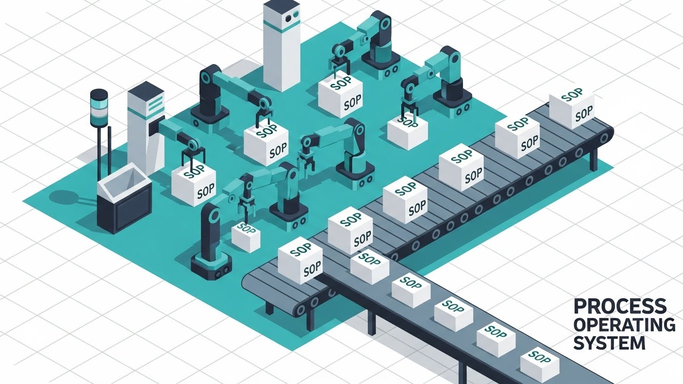
The Visual & Narrative Approach
An isometric "God's Eye View" of the operational machine. On an infinite white grid, Teal and Slate Grey robotic arms rhythmically assemble white boxes labeled "SOP." The boxes flow onto a conveyor belt, moving with perfect, uninterrupted cadence. This visualizes the concept of the "Process Operating System"—a factory that manufactures clarity.
Psychological Impact & KPI Focus
This style appeals to the System Thinker. It reframes documentation from a "writing task" to a "production process," which implies scale and repeatability. The clean lines suggest a friction-free environment.
- Operational Impact: It supports Category Creation by helping position the software as infrastructure (essential) rather than just a productivity tool (optional).
Strategic Implementation & Trade-offs
- Best Use Case: LinkedIn Thought Leadership posts or "How it Works" pages.
- Duration: 15-30 Seconds.
- Trade-off: Can feel impersonal. The lack of human characters makes it great for explaining systems, but poor for explaining culture.
Companies using similar video content -
Flowset – BPM-ops Platform – Transforms siloed process automation into an ecosystem.
IBM Blueworks Live – Platform – Models and manages enterprise-grade business processes.
Bizagi Modeler – Platform – Understands and optimizes business processes with modeling.
7. The Velocity Interface
MOFU | Differentiation

The Visual & Narrative Approach
This style showcases the UI through a "Glassmorphism" lens. Royal Blue and Gold windows overlap with frosted transparency. Light trails (cursor movements) zip across the screens, and data bars extend rapidly. The background is a blurred office bokeh, grounding the tech in reality. The camera pans aggressively, suggesting a high-speed, collaborative workspace.
Psychological Impact & KPI Focus
This visualizes Velocity. It addresses the objection that documentation is "slow" or "bureaucratic." The zipping light trails subliminally suggest that the software accelerates work.
- Operational Impact: This is key for Differentiation. It makes the UI look modern and desirable ("shiny object"), separating it from legacy, grey-box competitors.
Strategic Implementation & Trade-offs
- Best Use Case: Product Tour videos or Feature Highlight reels.
- Duration: 10-20 Seconds.
- Trade-off: The stylized UI must match the vibe of the real product. If the actual software is clunky, this video will create a "Trust Gap."
Companies using similar video content -
Zoho Flow – Platform – Connects apps and automates processes with visual builder.
Workato – Platform – Integrates and automates complex enterprise workflows.
n8n – Platform – Connects hundreds of apps with a low-code interface.
8. The Blueprint Bridge
MOFU | Feature Education
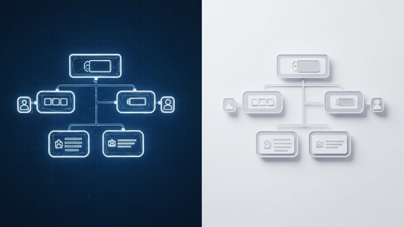
The Visual & Narrative Approach
A split-screen composition that bridges the gap between idea and execution. The left side shows a wireframe blueprint of a workflow (White on Blueprint Blue). A sharp vertical line scans across the frame, instantly transforming the wireframe into a photorealistic, white/grey software interface.
Psychological Impact & KPI Focus
This validates the "Architect" Identity of the user. It shows that the software honors their planning and brings it to life with high fidelity. It visually proves the claim: "What you plan is what you get."
- Operational Impact: Highly effective for Feature Education in email campaigns. It is the most efficient way to demonstrate "Setup vs. Output" in a GIF format.
Strategic Implementation & Trade-offs
- Best Use Case: Onboarding emails or "New Feature" announcements.
- Duration: 05-10 Seconds.
- Trade-off: Requires perfect alignment between the wireframe and the UI assets to work effectively.
Companies using similar video content -
Lucidchart – Platform – Creates professional diagrams and visual workflows collaboratively.
SmartDraw – Platform – Creates diagrams and visual process maps quickly.
9. The Minimalist Bloom
MOFU | Freemium

The Visual & Narrative Approach
Using a "Corporate Memphis" flat style (Pastel Pink and Forest Green), this visual focuses on simplicity. A stylized figure clicks a single large circular button. Instantly, the button blooms outwards into a complex, organized flowchart tree. The aesthetic is friendly, flat, and approachable.
Psychological Impact & KPI Focus
This lowers the Barrier to Entry. It tells the user: "The complexity is handled by the software; your interaction is simple." This is crucial for Freemium models where ease-of-use is the primary selling point.
- Operational Impact: It drives Freemium Sign-ups by reducing the intimidation factor of starting a new documentation project.
Strategic Implementation & Trade-offs
- Best Use Case: Google Display Network (GDN) ads or retargeting banners.
- Duration: 05-08 Seconds.
- Trade-off: The style is very common in Tech. It builds trust but may struggle to differentiate the brand if the color palette isn't unique.
Companies using similar video content -
Creately – Platform – Simplifies visual collaboration and diagramming with AI.
Draw.io – Platform – Offers simple, free process mapping and diagrams.
10. The Emerald Vault
MOFU | Building Trust

The Visual & Narrative Approach
This is the "Trust Anchor." A photorealistic 3D render shows a thick, crystal-clear glass shield protecting a floating, emerald-green document folder. The lighting is exquisite, casting caustic refractions on the floor. The low angle emphasizes the strength and impenetrability of the shield.
Psychological Impact & KPI Focus
This visualizes Security as a physical attribute. It treats the data (the folder) as a precious jewel, addressing the enterprise anxiety around data breaches and IP theft.
- Operational Impact: It supports Building Trust for the enterprise buyer. It signals "Enterprise Grade" without using boring lock icons or server racks.
Strategic Implementation & Trade-offs
- Best Use Case: The "Security" page of the website or Investor Decks.
- Duration: 08-15 Seconds.
- Trade-off: It is static. It conveys safety, but not speed or workflow. Use it to close the deal, not to open it.
Companies using similar video content -
Collibra – Data Intelligence Platform – Governs and trusts data for better decisions.
OneTrust – Platform – Manages privacy, security, and compliance for enterprises.
Secoda – Platform – Provides secure, compliant access to data across stacks.
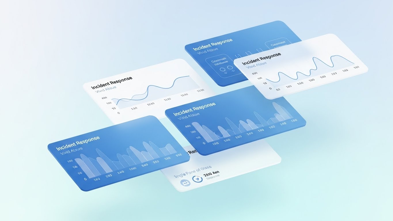
11. The Productivity Pulse
MOFU | Implementation

The Visual & Narrative Approach
This style visualizes the "heartbeat" of a healthy, optimized organization. Set against a clean white and grey gradient background, transparent glass conduits wind horizontally through the frame. Inside, streams of data points—glowing in Deep Violet and Bright Orange—flow with rhythmic, sinusoidal consistency. The motion is smooth and continuous, designed for a side-scrolling parallax effect that mimics the sensation of forward momentum.
Psychological Impact & KPI Focus
This leverages the Processing Fluency heuristic. By visualizing data as a smooth, unobstructed flow, it subliminally suggests that the software removes friction and bottlenecks. It calms the anxiety of "system clutter."
- Operational Impact: It helps the "Implementation Architect" visualize Throughput. It signals that the platform is a conduit for efficiency, capable of handling high-volume operational data without jamming.
Strategic Implementation & Trade-offs
- Best Use Case: Background visuals for "Integration" or "API" pages, or as chapter headers in digital whitepapers.
- Duration: Loopable (Continuous).
- Trade-off: It is abstract. It implies connectivity and speed but does not demonstrate the specific technical mechanics of how the integration works.
Companies using similar video content -
Domo – Platform – Unifies enterprise data to deliver actionable insights.
Splunk Cloud Platform – Platform – Provides digital security and observability for infrastructure.
Appian – Platform – Automates processes with enterprise data and AI.
12. The Augmented Operator
MOFU | Functional Buyer

The Visual & Narrative Approach
Here, we ground the digital tool in human reality. A high-quality shot captures a young professional in a sunlit, plant-filled workspace—the ideal modern office. As he consults a tablet, a crisp, vector-based holographic UI pops up in mid-air. It displays a "Daily Tasks" checklist in Cyan and White, with items ticking off in real-time. The lighting blends the digital overlay seamlessly with the natural environment.
Psychological Impact & KPI Focus
This triggers Mirror Neurons. The viewer sees a focused, calm professional and projects themselves into that state of control. It answers the Functional Buyer’s question: "What does my day look like with this tool?"
- Operational Impact: It validates User Adoption. By showing the UI existing harmoniously in a physical space, it suggests that the software supports the human workflow rather than interrupting it.
Strategic Implementation & Trade-offs
- Best Use Case: LinkedIn Case Study posts or "Day in the Life" features (4:5 Ratio).
- Duration: 10-15 Seconds.
- Trade-off: Requires high-quality stock footage. If the stock looks "staged" or "cheesy," it can lower the perceived authenticity of the brand.
Companies using similar video content -
UiPath – Platform – Empowers users to automate complex workflows with AI.
iQ3Connect – Platform – Offers effective and engaging AR/VR training solutions.
Simulanis – Platform – Provides AR/VR training for industrial workforce.
13. The Tactile Trigger
MOFU | UI Detail

The Visual & Narrative Approach
This style zooms in—extreme macro. We focus on a single, pivotal UI element: the "ACTIVATE" button. Rendered in 3D with a tactile, pill-shaped design, it glows in Neon Lime against a dark, sleek interface. A blurred fingertip approaches, and upon contact, the button depresses with a satisfying, weighted animation, emitting a pulse of light. It visualizes the moment a static document becomes a live operational process.
Psychological Impact & KPI Focus
This utilizes Sensory Marketing visuals to create a phantom tactile sensation. It makes the software feel responsive and substantial. It reframes a digital click as a decisive, powerful action.
- Operational Impact: It emphasizes Ease of Use. By highlighting the simplicity of a single interaction, it counters the fear that process software is complex or clunky.
Strategic Implementation & Trade-offs
- Best Use Case: Feature breakdown sections on the website (e.g., "One-Click Publishing").
- Duration: 03-05 Seconds (Loopable).
- Trade-off: It is hyper-focused. It tells you nothing about the broader system structure, only about the quality of the interface design.
Companies using similar video content -
CheckFlow – Platform – Manages workflows and processes using checklists.
Asana – Platform – Organizes and manages work, from projects to initiatives.
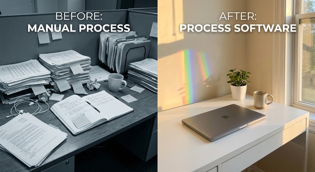
14. The Clarity Contrast
MOFU | Displacement

The Visual & Narrative Approach
A classic, powerful comparative visual. The screen is split. The left side is a gritty, desaturated photo of a desk buried under messy piles of paper and sticky notes—the "Old Way." The right side is bathed in warm sunlight, featuring a pristine minimalist desk with a single laptop and a rainbow light refraction—the "New Way." The contrast is binary and visceral.
Psychological Impact & KPI Focus
This leverages the Contrast Principle. It doesn't just show the solution; it forces the viewer to confront the pain of their current reality (entropy). It sells the emotional benefit of "Order."
- Operational Impact: It drives Displacement. It compels the viewer to abandon their manual processes (paper, disparate docs) in favor of the software’s digital serenity.
Strategic Implementation & Trade-offs
- Best Use Case: Instagram/Facebook retargeting ads for users who visited the pricing page but didn't convert.
- Duration: Static Image or 05-Second Loop.
- Trade-off: It can be cliché. To work, the photography must be artistic and high-end, avoiding the "infomercial" aesthetic.
Companies using similar video content -
GID – AI-powered SOP generator – Records screen, creates step-by-step documentation.
SweetProcess – Platform – Eliminates manual repetitive tasks for process management.
15. The Visionary Boardroom
MOFU | Demo Requests
The Visual & Narrative Approach
A cinematic dolly shot moves through a high-end, glass-walled office. A diverse team collaborates, but they aren't looking at screens—they are interacting with the air. Augmented Reality (AR) data streams in Teal and Orange float above the conference table, connecting team members with dynamic workflow diagrams. It paints a picture of the "Self-Driving Organization" where data is omnipresent and collaborative.
Psychological Impact & KPI Focus
This appeals to Social Proof and Aspiration. It positions the software as a tool for forward-thinking, modern teams. It suggests that adopting this software upgrades the entire company culture.
- Operational Impact: It is a powerful driver for Demo Requests. It sells the vision of collaboration that a Director of Operations wants to pitch to their C-Suite.
Strategic Implementation & Trade-offs
- Best Use Case: YouTube mid-roll ads or "About Us" brand videos.
- Duration: 15-30 Seconds.
- Trade-off: It promises a futuristic experience. The sales team must manage expectations to ensure the actual product demo doesn't feel underwhelming by comparison.
Companies using similar video content -
AIDAR Solutions – Platform – Delivers immersive VR training solutions for business.
Industrial3D – Platform – Provides XR training solutions for immersive learning.
Simulanis – Platform – Offers AR/VR for advanced guidance and training.
16. The Ecosystem Model
BOFU | Economic Buyer

The Visual & Narrative Approach
Targeting the Economic Buyer who fears complexity, this style uses "Claymorphism"—soft, tactile 3D shapes in Clay White and Terracotta. We see a cutaway view of an office where miniature, friendly figures move "widgets" (tasks) through a perfectly organized tube system connecting rooms. The lighting is soft, removing all harsh edges. It makes a complex enterprise architecture look like a well-oiled toy set.
Psychological Impact & KPI Focus
This reduces Cognitive Load. The "toy-like" aesthetic triggers a feeling of manageability and playfulness, countering the "Enterprise Bloat" anxiety. It makes the system look accessible.
- Operational Impact: It supports Change Management. It is an excellent visual aid for convincing hesitant department heads that the new system will be easy to adopt.
Strategic Implementation & Trade-offs
- Best Use Case: Slide decks for internal stakeholder buy-in meetings.
- Duration: Static or Slow Loop.
- Trade-off: If the tone is too childish, it may undermine the seriousness of a compliance-heavy or highly technical platform.
Companies using similar video content -
Bonita – Platform – Provides open-source BPM for process-driven applications.
Flowset – BPM-ops Platform – Creates a streamlined, governed, and connected ecosystem.
Activepieces – Platform – Manages and optimizes business processes with open source.
17. The ROI Thread
BOFU | ROI Justification
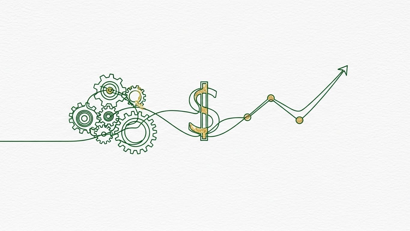
The Visual & Narrative Approach
Elegant and minimalist. On a textured paper background, a single continuous line in Emerald Green begins drawing a complex gear mechanism. Without breaking, the line morphs the gears into a dollar sign ($), which then extends into an upward-trending revenue chart. Gold Leaf textures accent the key pivot points.
Psychological Impact & KPI Focus
This visualizes Causality. It draws a direct, unbroken line between "Operational Efficiency" (the gears) and "Financial Return" (the chart). It simplifies the ROI argument into a single visual gesture.
- Operational Impact: It is a tool for ROI Justification. It provides the internal champion with a clear visual metaphor to defend the budget request to the CFO.
Strategic Implementation & Trade-offs
- Best Use Case: Embedded in ROI Calculator pages or high-value whitepapers.
- Duration: 05-08 Seconds.
- Trade-off: It is symbolic. It works best when paired with hard data; on its own, it is just a pretty animation.
Companies using similar video content -
Alteryx – Platform – Delivers AI-driven insights to optimize daily operations.
NVIDIA cuOpt – Platform – Provides real-time operational analytics for optimization.
18. The Infrastructure Core
BOFU | Risk Mitigation

The Visual & Narrative Approach
To address security concerns, we use an X-Ray view. A server rack tower stands against a clinical white background. The casing is a semi-transparent X-Ray Blue, revealing the glowing, organized components inside. A central, solid metal "Core" lock mechanism is the focal point. The camera orbits slowly, proving there are no hidden vulnerabilities.
Psychological Impact & KPI Focus
This leverages the Transparency Effect. By "showing the inside," the brand signals that it has nothing to hide. It communicates robustness and engineering depth.
- Operational Impact: It directly addresses Risk Mitigation. It assures the IT Security team that the platform's infrastructure is sound, secure, and enterprise-ready.
Strategic Implementation & Trade-offs
- Best Use Case: The "Security & Compliance" page or during the technical vetting stage of the sales cycle.
- Duration: 10-15 Seconds.
- Trade-off: It is cold and technical. It appeals strictly to the IT/Security persona, not the end-user.
Companies using similar video content -
Quantivate – Platform – Manages regulatory and compliance processes for accountability.
MasterControl Solutions – Platform – Provides quality and compliance software solutions.
AuditBoard – Platform – Unifies audit, risk, and compliance management.
19. The Encryption Grid
BOFU | Technical Buyer

The Visual & Narrative Approach
Targeting the Technical Buyer/CTO. In a dark, Cyberpunk Pink and Electric Blue environment, a glowing padlock icon is constructed in real-time by laser beams on a reflective grid. The camera uses a Dutch tilt to add dynamic tension. It looks like a scene from a high-tech security simulation.
Psychological Impact & KPI Focus
This utilizes the High-Tech Heuristic. The neon/dark aesthetic is culturally associated with advanced cybersecurity and encryption. It signals "State of the Art."
- Operational Impact: It builds Technical Authority. It reassures the technical stakeholders that the platform uses modern, rigorous security standards (SOC2, ISO 27001).
Strategic Implementation & Trade-offs
- Best Use Case: Technical documentation headers or developer-focused blog posts.
- Duration: 05-10 Seconds.
- Trade-off: It can feel aggressive or "gamer-like" if not executed with high polish. It may alienate non-technical buyers who find "dark mode" aesthetics intimidating.
Companies using similar video content -
Sprinto – Platform – Simplifies security compliance through automation and evidence.
Netwrix Auditor – Platform – Provides visibility into user activities and configurations.
BigID – Platform – Specializes in discovery, classification, and protection of data.
20. The Zen Switch
BOFU | Objection Handling

The Visual & Narrative Approach
A friendly, flat 2D animation in Bright Yellow and Grey. A stylized character is shown juggling chaotic shapes (representing tasks), looking visibly stressed. In a seamless transition, the shapes magnetically align into a neat vertical stack, and the character’s expression shifts to relief as abstract checkmarks pop up. It’s a "Exhale" moment captured in animation.
Psychological Impact & KPI Focus
This visualizes Relief. It addresses the final emotional barrier: "Will this actually make my life easier, or just add more work?" It promises an emotional return on investment—peace of mind.
- Operational Impact: It is a powerful Objection Handler. It reminds the buyer that the ultimate goal of the software is not just "efficiency," but the reduction of workplace stress.
Strategic Implementation & Trade-offs
- Best Use Case: "Closing" emails in a drip campaign or re-engagement emails for dormant leads.
- Duration: 05-10 Seconds.
- Trade-off: The cartoon style is casual. It works best for humanizing the brand at the end of the funnel, but shouldn't be the primary visual identity for enterprise clients.
Companies using similar video content -
Gumloop – Platform – Automates business workflows with AI for smarter operations.
Zenphi – Platform – Accelerates workflow design with AI for Google Workspace.
21. The Clean Slate
Onboarding | Self-Serve Onboarding
The Visual & Narrative Approach
This style is the visual equivalent of a "Welcome Mat." It presents a high-key, pristine UI presentation in Pure White, Light Blue, and Soft Grey. The camera faces a UI window straight-on, eliminating perspective distortion. We see a "Getting Started" checklist where items turn from a passive grey to an active, vibrant blue as they are completed. Soft drop shadows provide just enough depth to separate the layers from the seamless white studio background.
Psychological Impact & KPI Focus
This utilizes the Goal Gradient Effect. By visualizing progress clearly and cleanly, it encourages the user to complete the "set." The sterile, organized aesthetic signals that the onboarding process is not messy or burdensome.
- Operational Impact: It drives Adoption Velocity. By removing visual noise, it focuses the user entirely on the "Next Best Action," reducing the drop-off rate during the critical first setup session.
Strategic Implementation & Trade-offs
- Best Use Case: Welcome screens inside the app or "First Steps" email sequences.
- Duration: 10-15 Seconds.
- Trade-off: It is clinical. It lacks emotional warmth, but for initial configuration, clarity is more valuable than emotion.
Companies using similar video content -
Trainual – Platform – Onboards and trains employees with clear, structured processes.
CheckFlow – Platform – Enables creation and management of workflows using checklists.
22. The Migration Path
Onboarding | Competitive Switcher

The Visual & Narrative Approach
To alleviate the fear of switching software, this style mixes reality with digital annotation. We see a photo of a woman in a busy, blurred coffee shop—a real-world setting. Overlaying this is a bold, flat Vector Red graphic layer. Arrows and dotted lines animate from a chaotic cluster of generic file icons on the left, organizing themselves as they travel into her laptop screen on the right. It visualizes the migration path from "Old Clutter" to "New System."
Psychological Impact & KPI Focus
This triggers Cognitive Ease. It addresses the "Sunk Cost Fallacy" (the fear of losing old work) by visually demonstrating a safe, organized transfer of assets. The live-action base grounds the migration in a human context.
- Operational Impact: It targets the Switcher Segment. It visually promises that the transition will not disrupt the user's actual life or workflow.
Strategic Implementation & Trade-offs
- Best Use Case: Retargeting ads for users identified as using competitor platforms.
- Duration: 06-10 Seconds.
- Trade-off: Requires a delicate balance. If the graphics are too chaotic, the "solution" looks messy too.
Companies using similar video content -
monday Work Management – Platform – Offers an all-in-one solution for project management.
Bitrix24 – Platform – Combines mapping, project management, and CRM.
23. The Progress Narrative
Onboarding | Time-to-Value

The Visual & Narrative Approach
A stylized 2D vector illustration in warm Earth Tones (Brown, Green, Beige) with texture overlays. We see a character reclining comfortably in a home office, hands behind their head. On the desk, a stylized computer monitor displays a progress bar that is moving rapidly to 100% on its own. This creates a narrative of "Passive Success"—the system works so you don't have to.
Psychological Impact & KPI Focus
This appeals to the desire for Automation. It reframes the onboarding process from "Work" to "Wait and Watch." The cozy aesthetic counters the coldness of enterprise software.
- Operational Impact: It improves Time-to-Value perception. Even if the backend process takes time, the visual framing suggests that the user is free to relax, reducing support tickets related to wait times.
Strategic Implementation & Trade-offs
- Best Use Case: "Importing Data" loading screens or "Account Setup" confirmation emails.
- Duration: Loopable.
- Trade-off: It is heavily stylized. It may not appeal to "Power User" personas who prefer technical progress logs over cartoons.
Companies using similar video content -
Phoenix's AI Project Mentor – Platform – Automates project management tasks, ensuring productivity.
Dart – Platform – Drives team productivity with AI-powered project automation.
24. The Mastery Model
Retention | Reducing Churn

The Visual & Narrative Approach
This style moves away from the software to focus on the user. A professional woman in a navy suit is shot with a cinematic 85mm portrait lens. She stands in a modern corporate lobby, looking slightly off-camera at an unseen holographic projection. She smiles with genuine satisfaction and confidence. The lighting is premium, with a rim light separating her from the background.
Psychological Impact & KPI Focus
This utilizes Social Modeling. The viewer identifies with the confident, successful professional. It suggests that using the software leads to career competence and control.
- Operational Impact: It targets Churn Reduction by reminding the user of the "Ideal Self" they aspire to be—a competent, organized leader.
Strategic Implementation & Trade-offs
- Best Use Case: Customer success stories, case study intros, or "Year in Review" videos.
- Duration: 15-30 Seconds.
- Trade-off: It relies entirely on the actor's performance. If the smile feels fake, the brand feels disingenuous.
Companies using similar video content -
UiPath – Platform – Drives digital transformation with AI-driven automation.
Pega – Platform – Delivers AI-powered decisioning and workflow automation.
25. The Deep Dive
Retention | Deep Feature Adoption
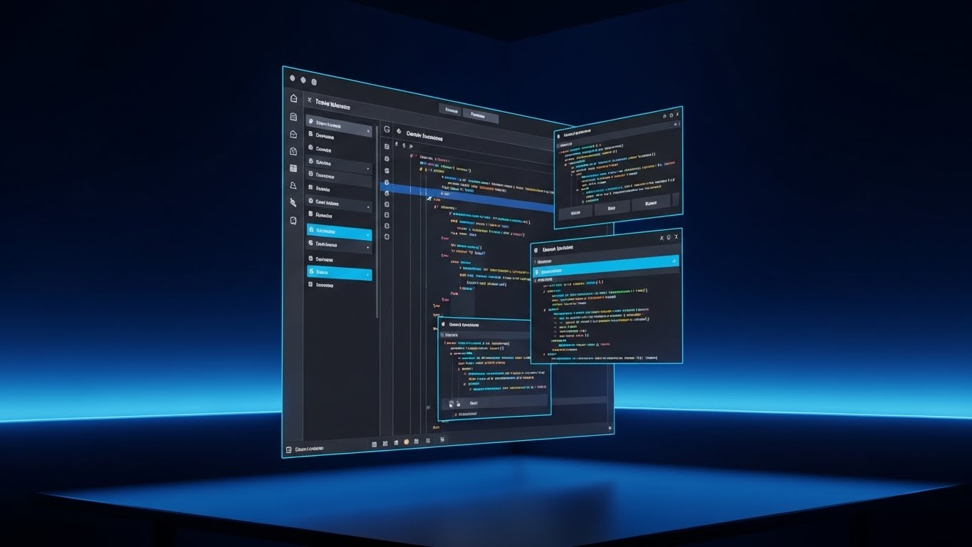
The Visual & Narrative Approach
Designed for the "Power User" and Developer persona. The interface is shown in "Dark Mode"—Deep Charcoal backgrounds with syntax highlighting in Neon Blue and Green. The camera angles are sharp and isometric. We see code snippets being seamlessly integrated into a standard document. The background is a dark room with ambient blue LED bias lighting, mimicking a developer's setup.
Psychological Impact & KPI Focus
This leverages the Identity Consistency principle. Developers and technical writers identify with "Dark Mode" as a signifier of serious work. It signals that the platform is flexible enough for code, not just text.
- Operational Impact: It drives Deep Feature Adoption. By showcasing technical integrations (API docs, code blocks), it embeds the software deeper into the company's technical workflow, increasing switching costs.
Strategic Implementation & Trade-offs
- Best Use Case: Release notes for technical features or API documentation headers.
- Duration: 10-20 Seconds.
- Trade-off: It alienates non-technical users. This style should only be shown to specific user segments.
Companies using similar video content -
Apache Atlas – Platform – Manages metadata and data governance for compliance.
Informatica – IDMC – Ensures data consistency and compliance across environments.
Atlan – Platform – Provides cloud-native active metadata for governance.
26. The Knowledge Hologram
Retention | Knowledge Base

The Visual & Narrative Approach
A Sci-Fi inspired visualization of the Help Center. In a clean lab environment, a floating book made of translucent Blue light opens. As it opens, complex 3D data structures and pages fan out into the air, accessible and searchable. Digital scanlines and interference effects give it a high-tech feel.
Psychological Impact & KPI Focus
This visualizes Accessibility. It reframes the "Knowledge Base" from a boring library into a futuristic interface. It suggests that answers are instant and comprehensive.
- Operational Impact: It encourages Self-Service. By making the help resources look cutting-edge, it invites users to explore the documentation rather than opening a support ticket.
Strategic Implementation & Trade-offs
- Best Use Case: The search bar of the Help Center or "Academy" landing pages.
- Duration: 08-12 Seconds.
- Trade-off: High abstraction. It sells the concept of knowledge, not the specific answer.
Companies using similar video content -
Alation – Platform – Helps organizations discover, understand, and manage data.
Microsoft Purview – Platform – Provides unified data governance across sources.
OvalEdge – Platform – Ensures data is accessible, trustworthy, and high-quality.
27. The Growth Trajectory
Expansion | Driving Upsell

The Visual & Narrative Approach
To sell "Growth" and "Scale," we use a playful Low-Poly 3D style. A rocket ship composed of faceted geometric triangles (Orange, Purple, Teal) launches upwards from a launchpad that resembles a document checklist. Stylized low-poly clouds frame the ascent. The motion is energetic and vertical.
Psychological Impact & KPI Focus
This triggers Optimism Bias. The ascending rocket is a universal symbol of growth and success. The playful style softens the "Sales Pitch" of an upsell, making it feel like a celebration of the customer's growth rather than a demand for more money.
- Operational Impact: It supports Expansion Revenue. It is best used when a user hits a usage limit, framing the upgrade as "fuel for your rocket" rather than a penalty.
Strategic Implementation & Trade-offs
- Best Use Case: "Upgrade Plan" modals or "Limit Reached" notifications.
- Duration: 05-08 Seconds (Loopable).
- Trade-off: The "Low-Poly" look is very specific. It works well for SaaS gamification but may clash if the rest of the brand is hyper-realistic.
Companies using similar video content -
Zapier AI – Platform – Streamlines cross-app automation with natural language.
Appy Pie Automate – Platform – Connects apps and automates workflows effortlessly.
28. The Community Collage
Expansion | Referrals

The Visual & Narrative Approach
A warm, human-centric montage designed to build community. We see a split-screen collage: a diverse team high-fiving in an office, a remote worker smiling on a video call, and a manager presenting a chart. A Warm Sunset Tone color grade unifies the footage. Overlaid in the center is a semi-transparent graphic of a "Thumbs Up" or "Heart" icon formed by connecting data nodes.
Psychological Impact & KPI Focus
This leverages Belongingness. It visualizes the user community as a happy, connected tribe. It suggests that referring a friend is inviting them into a positive environment.
- Operational Impact: It drives Referral Programs. It shifts the motivation from "Get a discount" (transactional) to "Share the success" (emotional).
Strategic Implementation & Trade-offs
- Best Use Case: LinkedIn social posts promoting the partner program or referral bonuses.
- Duration: 10-15 Seconds.
- Trade-off: Requires excellent curation of stock footage to ensure diversity and avoid the "uncanny valley" of bad stock acting.
Companies using similar video content -
Asana – Platform – Fosters collaboration and organizes work for teams.
Trello – Platform – Organizes projects into boards, lists, and cards.
29. The Velocity of Value
Expansion | Trial Activation

The Visual & Narrative Approach
To visualize the speed of enterprise adoption, we use a Hyper-lapse technique. The camera rushes forward through a city skyline at twilight. The environment is Urban Grey, but the motion is defined by streaks of car lights and city lights. Superimposed on this are glowing digital data streams that move in perfect sync with the city's flow.
Psychological Impact & KPI Focus
This visualizes Momentum. It suggests that the software keeps pace with the fastest-moving enterprises. It appeals to the "Big City" ambition of growing companies.
- Operational Impact: It supports Trial Activation for Enterprise plans. It signals that the platform is robust enough to handle high-speed, high-volume environments.
Strategic Implementation & Trade-offs
- Best Use Case: Hype reels for new Enterprise features or "Scale with Us" campaigns.
- Duration: 05-10 Seconds.
- Trade-off: It is generic "Business Imagery." It relies heavily on the quality of the motion graphics overlay to brand it as your software.
Companies using similar video content -
DX Operational Intelligence – AIOps Platform – Monitors and optimizes IT operations in real-time.
Observe – Platform – Provides insight into application and infrastructure operations.
XMPro – Platform – Delivers operational intelligence for industrial IoT.
30. The Evolution
Expansion | Proactive Support
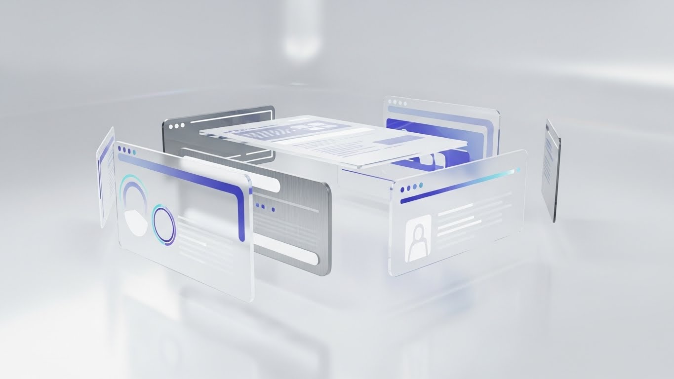
The Visual & Narrative Approach
The final style is the most sophisticated. In a pristine white abstract space, multiple UI screens float in a stack. As the camera rotates in slow motion, the screens separate in Z-depth (Parallax), revealing the layers of code and data beneath them. The materials are Glass, Brushed Metal, and Soft White. It looks expensive, engineered, and evolved.
Psychological Impact & KPI Focus
This utilizes the Perceived Value heuristic. By breaking the UI apart into complex 3D layers, it visually demonstrates the depth and engineering that goes into every update. It justifies the subscription cost.
- Operational Impact: It builds Brand Equity. It reassures long-term customers that the platform is constantly evolving and that their investment is safe.
Strategic Implementation & Trade-offs
- Best Use Case: Major version update announcements (e.g., "Version 4.0 Launch").
- Duration: 15-30 Seconds.
- Trade-off: High production value required. The parallax effect must be perfectly smooth to convey quality.
The Visual Operations Doctrine: A Strategic Knowledge Base
The 30 styles above are the "bricks." This section provides the "blueprint." To transform Process Documentation from a passive task into a strategic asset, organizations must implement a comprehensive Visual Operations Doctrine. This framework synthesizes the visual strategies into actionable business outcomes.
Strategic Alignment & Visual Architecture
The "Pre-Production" Strategy. Why and Who.
- The Cognitive Load Audit: Before creating any asset, Operations Architects must audit the complexity of the process. If a text SOP exceeds 500 words, it triggers a "Visual Mandate." Use Style 9 (Minimalist Bloom) for low-complexity flows and Style 16 (Ecosystem Model) for complex, multi-stakeholder architectures.
- Role-Based Visual Mapping: Differentiate visual delivery. "Executors" (Front-line workers) require Style 12 (Augmented Operator)—mobile-first, checklist-driven, and pragmatic. "Architects" (Managers) require Style 11 (Productivity Pulse)—data-dense, desktop-oriented, and analytical.
- The "Glanceability" Standard: In high-stress operational environments, information must be consumed in under 3 seconds. Adopt Style 5 (Impact Wall) principles for system alerts and critical updates—high contrast, minimal text, maximum signal.
- Brand Voice Consistency: Your internal documentation is a branding channel. It defines your culture. If your external brand is "Innovative" (using Style 3 Neural Network), your internal training cannot be static PDFs. Internal visuals must match the external promise to maintain employee engagement.
- The Advids Strategic Audit: Partnering with a specialized agency like Advids allows for a comprehensive audit of your "Visual Operating System." This ensures that your library of assets is not just a collection of videos, but a cohesive language that scales with your company.
- Standardization vs. Customization: Establish a "Visual Tiering" system. Tier 1 (Core Processes) uses bespoke, high-end 3D (Style 10 Emerald Vault) to signal permanence. Tier 3 (Temporary Workflows) utilizes templated, rapid-production styles (Style 21 Clean Slate) to ensure agility.
- The Cross-Departmental Bridge: Visuals are the universal language. Use Style 8 (Blueprint Bridge) to unify terminology between Engineering (who see code) and Sales (who see benefits). The visual acts as the translator, reducing cross-functional friction.
- Legacy System Integration: When modernizing, use Style 14 (Clarity Contrast) to visually acknowledge the "Old Way" before introducing the "New Way." This validation of the past reduces resistance to change among veteran employees.
- Accessibility by Design: Visuals must be universal. For global teams, rely on Style 2 (Knowledge Crystallization)—iconography and motion—rather than voiceovers or heavy text, ensuring the process is understood regardless of language barriers.
- The Mobile-First Mandate: 60% of process consumption happens away from a desk. All 30 styles must be legible on a 5-inch screen. Prioritize vertical framing (Style 5 Impact Wall) for field-ready reference guides.
Operational Adoption & Implementation
The "Deployment" Phase. How to embed visuals into the workflow.
- Overcoming "Big Brother" Anxiety: When introducing monitoring or tracking tools, use Style 20 (The Zen Switch). Focus the narrative on "Stress Reduction" and "Support," not "Surveillance." Visuals should show the worker being relieved of burdens, not being watched.
- The Micro-Learning Shift: Abandon the "Hour-Long Webinar." Break complex training into a playlist of 30-second clips using Style 7 (Velocity Interface). This "Just-in-Time" learning boosts retention by 40% compared to long-form sessions.
- Contextual Embedding: Don't bury videos in a folder. Embed Style 13 (Tactile Trigger) GIFs directly inside the software tooltips. The visual instruction should appear at the exact moment of user hesitation.
- Gamification of Training: Use Style 27 (Growth Trajectory) to visualize training progress. Transforming a boring certification checklist into a "Level Up" animation increases completion rates and signals a culture of achievement.
- Reducing Support Ticket Volume: There is a direct correlation between visual quality and support costs. Proactively deploying Style 26 (Knowledge Hologram) assets for common questions can reduce Tier 1 support tickets by up to 25%.
- Remote Onboarding: In distributed teams, you cannot rely on "over-the-shoulder" training. Use Style 15 (Visionary Boardroom) to sell the culture and Style 25 (Deep Dive) to teach the mechanics, creating a virtual mentorship experience.
- Living SOPs: Static SOPs die the moment they are published. Use Style 1 (Entropy Reversal) to introduce the concept of "Living Documents." Visuals that loop and flow suggest that processes are dynamic and open to improvement.
- Feedback Loops: Use Style 28 (Community Collage) to encourage user feedback. Show that the process is a community effort. When users see themselves in the documentation, they are more likely to contribute to its accuracy.
- Scalable Localization: Strategies for translating visual assets for global teams (Rule 39). Use symbol-heavy styles like Style 17 (ROI Thread) that rely on universal visual metaphors rather than text, reducing localization costs.
- Leadership Communication: Ops Managers must sell their strategy to the C-Suite. Use Style 6 (The Process Factory) to visualize the "System" for executives. It turns abstract efficiency gains into a tangible, visible machine.
Measuring Impact & Future-Proofing
The "ROI" Phase. Measuring success and looking ahead.
- Beyond "Views": Vanity metrics (views) are useless. Measure Time-to-Competency (how fast a new hire reaches full productivity) and Error Rate Reduction. Connect these KPIs directly to the implementation of specific visual styles.
- The "Idle Time" Metric: Track the reduction in "Software Idle Time" (time spent searching for buttons). Style 7 (Velocity Interface) is designed specifically to reduce this metric by creating visual muscle memory.
- Compliance Velocity: In regulated industries (SOC2, ISO), speed of compliance is money. Use Style 18 (Infrastructure Core) to rapidly educate auditors and internal teams on security protocols, shortening audit cycles.
- Retention and LTV: High-quality UX visualization (Style 24 Mastery Model) increases user confidence. Confident users do not churn. A specific correlation exists between consumption of "Advanced Feature" videos and Customer Lifetime Value (LTV).
- The AI Visual Frontier: Prepare for Generative UI. Future documentation will generate videos on the fly based on user behavior. Styles like Style 3 (Neural Network) prepare your users for this AI-driven future by establishing a "smart" visual language today.
- Scalability of Assets: Build a component library. Don't create 30 unique videos; create a design system of assets (icons, lower-thirds, transitions) based on Style 2 (Knowledge Crystallization). This allows you to produce new content at scale without reinventing the wheel.
- The Advids Partnership: Scaling a visual doctrine requires a long-term partner. Advids serves not just as a production vendor, but as the custodian of your visual assets, ensuring that as your software evolves from Version 1.0 to 10.0, your visual language matures alongside it.
- Benchmarking Success: "Good enough" is a competitive risk. If your competitor uses Style 30 (The Evolution) and you use static screenshots, you lose the "Innovation Perception" battle. Regular visual audits are necessary to stay ahead of the market standard.
- The ROI of Safety: For processes involving data security, the cost of error is catastrophic. Investing in premium Style 19 (Encryption Grid) visuals is effectively an insurance policy against human error and data breaches.
- Final Call to Innovation: Documentation is no longer a "necessary evil"—it is your organization's operating system. By treating video not as "content" but as "infrastructure," you build a company that is faster, smarter, and ready for the era of the Self-Driving Organization.
Companies using similar video content -
Ataccama ONE – Platform – Integrates data quality and governance in one platform.
SAS Data Governance – Platform – Transforms data into trusted decisions faster.
Collibra – Data Intelligence Platform – Automates, standardizes, and scales governance initiatives.
Author & Editor Bio


