
Introduction: Visualizing the Invisible Infrastructure
The modern enterprise is built on processes, yet for many organizations, these foundations remain invisible—buried in legacy code, scattered across spreadsheets, or locked in the minds of departing employees. This "invisibility cloak" is expensive. In a landscape where the average large enterprise lost $104 million to digital inefficiencies in 2024, the ability to clearly visualize, map, and optimize workflows is no longer a luxury; it is a survival mechanism.
For Operational Architects and Digital Transformation leaders, the challenge is bridging the Physical/Digital Divide. This is the gap between the messy reality of daily operations and the pristine, automated future promised by SaaS platforms. Bridging this gap requires more than just better code; it requires better communication. It demands a visual language that can translate complex logic into intuitive understanding.
The market recognizes this urgency. With the global Business Process Management market projected to grow at a CAGR of 12.0% through 2030, the race is on to adopt tools that drive efficiency. However, to capture this surging demand, your video content must do more than list features. It must reduce cognitive load, build trust in the "black box" of automation, and demonstrate exactly how your platform turns chaos into clarity.
This guide presents 30 expert-curated video styles designed to solve these specific communication challenges. From the "Minimalist Flat" aesthetics that simplify complexity to "Photorealistic" renders that signal enterprise scale, these examples serve as your blueprint for turning process intelligence into a compelling visual narrative.
1. Minimalist Flat + Kinetic Type
TOFU | Brand Awareness
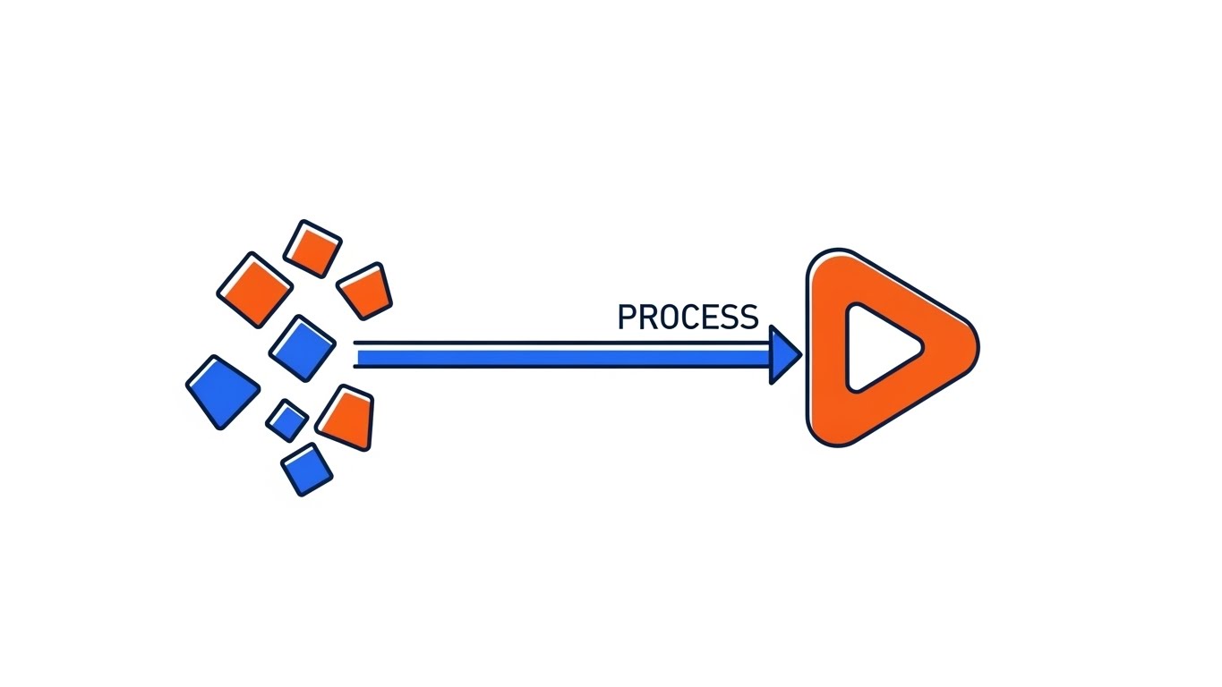
The Visual & Narrative Approach
Visualization Scenario: This style leverages a high-contrast 2D vector aesthetic to tell a story of "Entropy Reversal." The screen begins with a scattered array of abstract geometric shapes (triangles, jagged polygons) in Electric Indigo and Safety Orange, vibrating with kinetic energy to represent "Shadow IT" and disorganized data. Through a sharp, rhythmic transition, these shapes magnetically snap into a perfectly aligned, horizontal process line. The narrative uses bold kinetic typography that interacts directly with the graphics—words like "SYNC" and "ALIGN" physically push the shapes into place.
Narration Style: Punchy, rhythmic, and sound-design driven. There is no complex voiceover, just the satisfying clicks and snaps of organization happening in real-time.
Psychological Impact & KPI Focus
- Niche Psychology: It addresses the "Cognitive Clutter" that operations leaders feel daily. The immediate visual resolution (chaos to order) provides a sense of catharsis and control.
- KPI: Ad Recall Lift. The high contrast and rapid motion are engineered to act as a "pattern interrupt" on busy social feeds.
Strategic Implementation & Trade-offs
- Best For: Top-of-Funnel awareness campaigns where the goal is to communicate the feeling of efficiency in under 15 seconds.
- Trade-off: This abstract approach sacrifices detailed feature education. It sells the outcome, not the mechanics.
Companies using similar video content -
UiPath – RPA Platform – Visually simplifying complex robotic process automation.
Activepieces – Workflow Automation – Kinetic display of connecting diverse apps.
2. Abstract 2D Organic
TOFU | Market Education

The Visual & Narrative Approach
Visualization Scenario: Softening the rigid nature of B2B software, this style uses fluid, organic shapes and glossy textures. As seen in the visual, Mint Green, Soft Cyan, and Salmon Pink blobs represent information packets flowing effortlessly through transparent digital pipes. The camera adopts a macro perspective, following the data's journey as it navigates curves without resistance. The glossy textures catch simulated soft light, creating highlights that suggest a premium, polished user experience devoid of friction.
Narration Style: Calm, consultative, and educational. The narrator explains the concept of "fluid intelligence" in business—moving away from rigid bottlenecks to adaptive flows.
Psychological Impact & KPI Focus
- Niche Psychology: It counters the skepticism that enterprise software is "clunky" or "stiff." The fluid motion subliminally suggests adaptability—that the software molds to the business, not the other way around.
- KPI: Watch Time. The mesmerizing, continuous motion keeps viewers engaged longer, making it ideal for explaining abstract concepts like "Data Fluidity."
Strategic Implementation & Trade-offs
- Best For: Explaining integration concepts or API connectivity without getting bogged down in technical schematics.
- Trade-off: The lack of hard edges can make the solution appear "soft" to highly technical IT buyers who prefer rigid architectural diagrams.
Companies using similar video content -
Camunda – Process Orchestration – Fluid data flows across systems.
n8n – Workflow Automation – Organic connections between various services.
3. Abstract 2D Motion
TOFU | Shaping Brand Perception

The Visual & Narrative Approach
Visualization Scenario: Drawing inspiration from Bauhaus design, this style uses geometric primitives—circles, triangles, and squares—in Deep Violet, Bright Yellow, and Jet Black. The composition begins with these elements scattered, but they are aggressively snapped into a rigid diagonal grid system. Sharp lines emerge to connect the shapes, locking them into a cohesive structure. This visual represents the "Single Source of Truth"—the imposition of strict logic and standardization upon business variability.
Narration Style: Authoritative and precise. The sound design features mechanical latches and heavy clicks, emphasizing the weight and stability of the system.
Psychological Impact & KPI Focus
- Niche Psychology: This appeals to the "Architect" persona who values precision, rules, and governance. The "snapping" motion conveys a sense of rigorous control and reliability.
- KPI: Bounce Rate Reduction. Placing this on a homepage header signals operational maturity and design-forward thinking, encouraging visitors to stay.
Strategic Implementation & Trade-offs
- Best For: Differentiating the brand as a "modern" and "design-led" solution, distinguishing it from legacy, gray-interface tools.
- Trade-off: It is highly stylized and may feel too "artsy" for very conservative industries (e.g., traditional banking) that expect standard flowchart imagery.
Companies using similar video content -
Celonis – Process Mining – Snapping disparate data points into a cohesive process.
SAP Signavio – Process Intelligence – Imposing order on business variability.
4. Isometric 2D Motion
TOFU | Vertical Social Organic

The Visual & Narrative Approach
Visualization Scenario: This style transforms the abstract digital workspace into a relatable "factory floor" metaphor. Using an isometric 45-degree angle, the scene depicts a bird's-eye view of conveyor belts weaving through a Sky Blue and Grass Green environment. Simple icons representing emails, documents, and tasks travel along these belts, moving through sorting hubs without collision. The animation is loopable and rhythmic, providing a satisfying "God-mode" view of a complex system running perfectly.
Narration Style: Upbeat and fast-paced. "Stop manually sorting. Start automatically flowing."
Psychological Impact & KPI Focus
- Niche Psychology: The "God-mode" perspective gives the viewer a sense of total oversight—exactly what a COO craves. It physicalizes digital tasks, making the invisible work of a SaaS platform tangible.
- KPI: Social Engagement. The "oddly satisfying" nature of perfect loops performs exceptionally well on algorithmic feeds like TikTok.
Strategic Implementation & Trade-offs
- Best For: Simplifying complex routing logic or multi-step approval workflows into an easily digestible visual format.
- Trade-off: The "factory" metaphor can sometimes oversimplify the nuance of knowledge work, potentially making complex decision-making processes look too mechanical.
Companies using similar video content -
Fleetio – Fleet Management – Visualizing vehicle and asset movement.
Geotab – Fleet Management – Sorting operational complexity in logistics.
5. Low-Poly 3D Modeling
TOFU | Skippable Pre-Roll

The Visual & Narrative Approach
Visualization Scenario: This style creates a dramatic, tactile representation of process dependencies using low-poly 3D geometry. The visual focuses on a complex mechanism of interlocking gears rendered in Metallic Silver, Rust Orange, and Matte Gold. The camera zooms in on a single gear tooth engaging with another, illustrating how one small process trigger drives a larger outcome. The lighting is high-contrast, casting sharp shadows that emphasize the faceted surfaces against a dark void background.
Narration Style: Cinematic and intense. "One trigger. Infinite actions."
Psychological Impact & KPI Focus
- Niche Psychology: The mechanical aesthetic speaks to the engineering mindset. It implies that the software is a robust "engine" for the business, communicating durability and industrial-strength reliability.
- KPI: View-Through Rate (VTR). The high-quality 3D render implies a high-budget production, signaling to the viewer that this is a serious enterprise tool worth their time.
Strategic Implementation & Trade-offs
- Best For: Illustrating "backend" functionality, such as automated triggers, database dependencies, or the core reliability of the infrastructure.
- Trade-off: Low-poly is a specific stylistic choice that can sometimes look "video game-like," which might not resonate with C-level executives seeking a polished corporate look.
Companies using similar video content -
Siemens Industrial AI Suite – Industrial Automation – Interlocking gears representing machine dependencies.
Vention – Manufacturing Automation – Visualizing critical dependencies in factory setups.
6. Photorealistic 3D Renders
TOFU | Connected TV

The Visual & Narrative Approach
Visualization Scenario: This style aims for cinematic grandeur. It features a photorealistic render of a modern glass office skyscraper at sunrise. A low-angle shot emphasizes the towering structure. Streams of abstract blue data particles flow like a controlled weather system around the building, entering through the windows to symbolize data integration. The Steel Blue tones and ray-traced reflections convey a premium, Fortune 500 aesthetic.
Narration Style: Visionary and aspirational. "The connected enterprise is no longer a dream."
Psychological Impact & KPI Focus
- Niche Psychology: This imagery triggers a sense of corporate aspiration and stability. It aligns the software with the physical symbols of business success, reassuring the buyer that the platform is scalable and secure.
- KPI: Brand Lift. This style is designed to make the vendor look "too big to fail," reducing the perceived risk of adoption for large enterprises.
Strategic Implementation & Trade-offs
- Best For: High-stakes brand awareness campaigns on Connected TV or at major industry conferences.
- Trade-off: It is the most expensive production style and, while impressive, communicates very little about what the software actually does.
Companies using similar video content -
Appian – AI-Powered Process Orchestration – Enterprise-scale integration around a modern building.
IFS.ai – Industrial AI Software – Data streams flowing around a corporate HQ.
7. Clean UI + Macro Interaction
MOFU | Product Differentiation

The Visual & Narrative Approach
Visualization Scenario: Shifting from abstract metaphors to actual product utility, this style employs an extreme close-up (macro) view of the user interface. Against a Clean White background, a stylized blue cursor approaches a "Connect" node that glows Hot Pink upon hovering. A dotted line extends, ready to snap to a second node. The lighting simulates a high-end Retina display. The focus is entirely on the "micro-interaction"—the satisfying moment of connection.
Narration Style: Instructional whisper. "Drag. Drop. Done."
Psychological Impact & KPI Focus
- Niche Psychology: This style reduces "Usability Anxiety." By magnifying a simple, intuitive action, it subconsciously tells the viewer, "This is easy. You can do this."
- KPI: Conversion Rate (Sign-ups). By showing the actual interface looking clean and responsive, it removes the fear of a clunky learning curve.
Strategic Implementation & Trade-offs
- Best For: "Features" pages and product walkthroughs where demonstrating the User Experience (UX) design is critical.
- Trade-off: It focuses deeply on a single interaction, so it cannot convey the breadth of the platform's capabilities or the "big picture" workflow.
Companies using similar video content -
Kestra – Data Orchestration – Macro view of connecting nodes in a clean interface.
Prefect – Workflow Orchestration – Simplifying user connections in a modern UI.
8. Rapid UI Feature Montage
MOFU | Feature Education
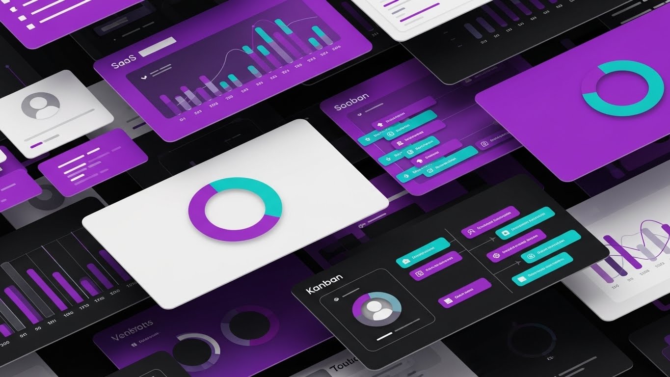
The Visual & Narrative Approach
Visualization Scenario: To showcase the sheer power of the platform, this style uses a dynamic "paper-cut" collage aesthetic. Layers of abstract dashboard interfaces—Kanban boards, pie charts, user profiles—are stacked on top of each other in Vibrant Purple and Teal. Drop shadows create depth between the layers. The composition is dynamic and crowded but organized. No readable text is used, just abstract data bars, keeping the focus on the volume of tools.
Narration Style: Fast and list-driven. "Analytics. Management. Reporting. All in one."
Psychological Impact & KPI Focus
- Niche Psychology: This triggers the "Value for Money" heuristic. The density of the visual suggests a robust, all-in-one platform that eliminates the need for multiple disparate tools.
- KPI: Click-Through Rate (CTR). The vibrant, busy composition creates curiosity and signals that there is "more to explore."
Strategic Implementation & Trade-offs
- Best For: Nurture emails or retargeting ads aimed at prospects who have visited the site but haven't converted.
- Trade-off: It can be overwhelming. The rapid pace and density might cause cognitive overload if the viewer isn't already familiar with the basic concept.
Companies using similar video content -
ServiceNow – IT Service Management – Collage of dashboards and features.
Pega Platform – Process Automation – Visualizing comprehensive suite depth.
9. Lifestyle Stock + UI Overlay
MOFU | Driving Demo Requests

The Visual & Narrative Approach
Visualization Scenario: This style bridges the gap between the tool and the user. It features high-quality footage of a professional in a modern workspace, bathed in warm amber light. Hovering in the air above the laptop is a semi-transparent, Electric Blue holographic flowchart (match-moved to the scene). As he completes a task, the hologram updates with a checkmark. This technique grounds the futuristic software in a relatable, human reality.
Narration Style: Testimonial-driven. "Finally, a tool that works like I do."
Psychological Impact & KPI Focus
- Niche Psychology: This appeals to the viewer's "Ideal Self." The protagonist looks calm, competent, and in control—emotions the target audience desperately wants to feel. It frames the software as an empowerment tool.
- KPI: Lead Quality. LinkedIn audiences respond well to human-centric content that visualizes the professional success associated with the product.
Strategic Implementation & Trade-offs
- Best For: Testimonials, case study teasers, and LinkedIn feed content where human connection is paramount.
- Trade-off: Stock footage can quickly feel generic. The "hologram" effect must look premium and tracked perfectly, or it risks looking cheesy.
Companies using similar video content -
Salesforce – CRM & Automation – Holographic flowchart over a professional working.
Nintex – Process Automation – Augmented workflow in a human-centric setting.
10. Split Screen: Optimized Reality and UI
MOFU | Competitive Displacement
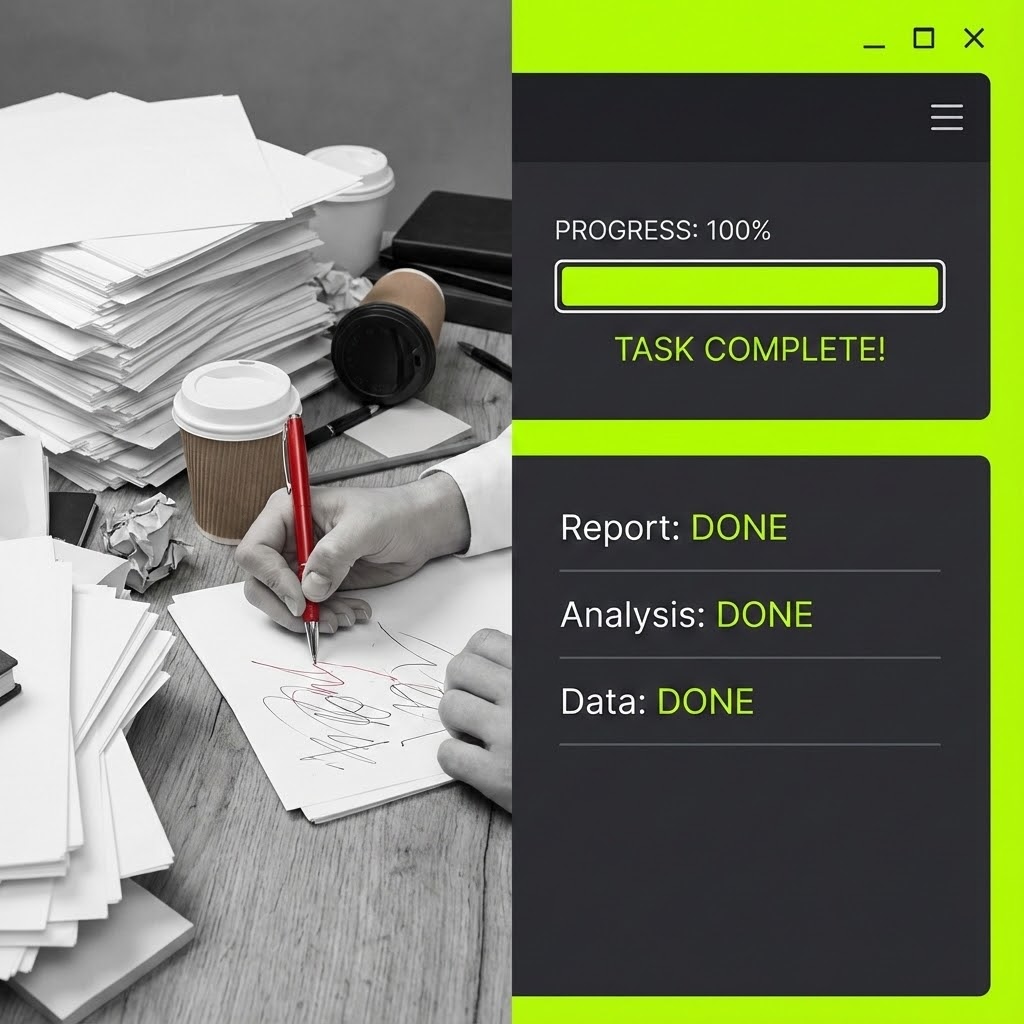
The Visual & Narrative Approach
Visualization Scenario: This is a classic "Problem/Solution" setup visualized through a sharp vertical split-screen. The left side shows a chaotic, messy desk (Desaturated Grey tones) with stacks of paper and a stressed hand holding a red pen (The Old Way). The right side shows a pristine, sleek digital interface in Vivid Lime Green and Dark Grey, displaying a completed progress bar. The dividing line is sharp, contrasting manual chaos with digital efficiency.
Narration Style: Comparative. "Stop drowning. Start driving."
Psychological Impact & KPI Focus
- Niche Psychology: This leverages "Loss Aversion." By placing the pain (messy desk) directly next to the relief (clean UI), the brain instantly prefers the right side. It validates the user's current frustration.
- KPI: Conversion Rate. The clear value proposition (Old Way vs. New Way) is highly effective at driving immediate action in display advertising.
Strategic Implementation & Trade-offs
- Best For: Competitive displacement campaigns targeting users of legacy systems or spreadsheets.
- Trade-off: It is a somewhat aggressive tactic that relies on negative reinforcement. It works for conversion but is less effective for building a premium brand long-term.
Companies using similar video content -
UiPath – RPA Platform – Contrasting manual chaos with digital efficiency.
Automation Anywhere – RPA Solutions – Binary contrast of old vs. new ways of working.
11. 2D Character + Line Art**
MOFU | The Functional Buyer
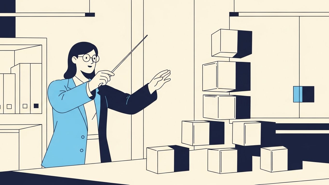
The Visual & Narrative Approach
Visualization Scenario: Addressing the "Functional Buyer" who fears losing agency to automation, this style humanizes the process. It features a stylized female manager in a minimalist office (Pastel Blue and Charcoal palette). Acting as a conductor, she uses a baton to direct floating, chaotic cubes (representing disparate tasks). Under her direction, the cubes obediently align into a stable, organized stack. The precise line art emphasizes that she is the source of the logic, not the software.
Narration Style: Empathetic and empowering. "You set the tempo. We keep the rhythm."
Psychological Impact & KPI Focus
- Niche Psychology: It addresses "Automation Anxiety." By reframing the user as a "Conductor" rather than a cog in the machine, it validates their expertise. It visualizes the software as a force multiplier for their management style.
- KPI: Time on Page. The relatable, character-driven visual breaks up dense technical blogs, keeping the reader engaged with the narrative of operational harmony.
Strategic Implementation & Trade-offs
- Best For: Educational content and internal champion enablement decks where winning the heart of the user is as important as winning the mind.
- Trade-off: The illustrative style can feel "lightweight." It builds rapport but may lack the technical gravity needed for strict IT procurement reviews.
Companies using similar video content -
Imixs-Workflow – Human-centric BPM – Manager directing tasks into order.
Bonitasoft – Digital Process Automation – Character orchestrating process flows.
12. 2D Animation & UI Composition
MOFU | Driving Freemium

The Visual & Narrative Approach
Visualization Scenario: To drive product trials, this style focuses on the emotional reward of the workflow. A vibrant character with exaggerated proportions leaps mid-air to high-five a floating UI window displaying a massive "Success" checkmark. Speed lines and energy bursts in Bright Red, Cyan, and Yellow emphasize the momentum. It borrows from gaming aesthetics to frame the completion of a business process as a triumphant moment.
Narration Style: Enthusiastic and punchy. "Launch. Approve. Celebrate. Repeat."
Psychological Impact & KPI Focus
- Niche Psychology: It leverages the "Dopamine Loop." By associating the software with positive reinforcement (high-fives, checkmarks), it subconsciously counters the dread of administrative drudgery.
- KPI: Sign-up Rate (Freemium). The palpable energy lowers the psychological barrier to entry, enticing users to experience that "winning feeling" themselves.
Strategic Implementation & Trade-offs
- Best For: Retargeting ads aimed at users who visited the pricing page but didn't convert.
- Trade-off: It trivializes complexity. While effective for driving volume, it might appear too casual for enterprise-grade compliance tools where "fun" is not a priority.
Companies using similar video content -
Kissflow – Workflow Automation – Gamified success with high-fives and checkmarks.
ProcessMaker – Low-code BPM – Joy of completion in a vibrant, animated UI.
13. 3D X-Ray Visualization
BOFU | Building Trust
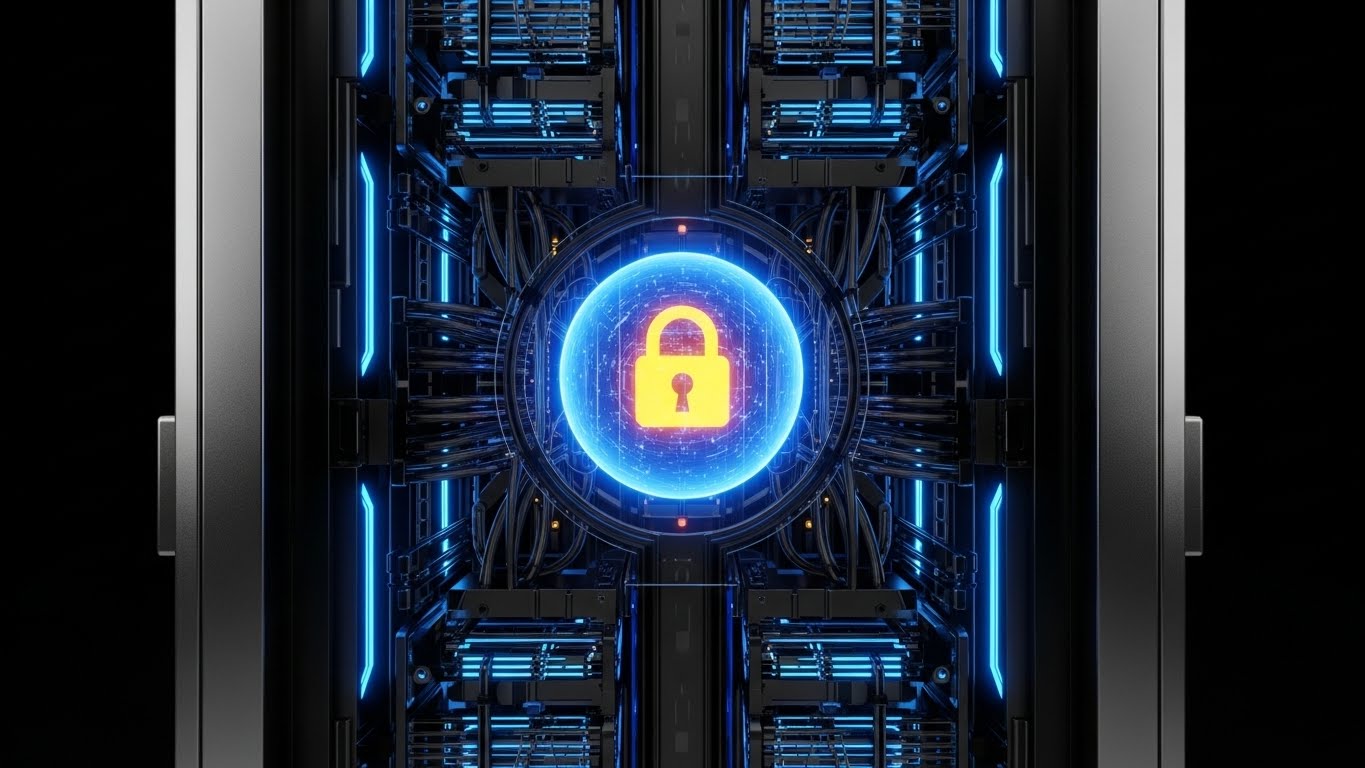
The Visual & Narrative Approach
Visualization Scenario: Security is often invisible; this style makes it the hero. Using an "X-Ray" aesthetic, we see through the exterior of a server rack rendered in Translucent Black. Deep within the core, a solid Gold padlock glows, shielded by a pulsating Neon Blue energy sphere. The camera pushes in confidently, visualizing "Encryption at Rest" and "SOC2 Compliance" as tangible, physical barriers.
Narration Style: Serious, resonant, and reassuring. "Security isn't a feature. It's the foundation."
Psychological Impact & KPI Focus
- Niche Psychology: It targets the CISO's "Risk Aversion." By visually exposing the internal "guts" of the system, the vendor demonstrates transparency. The solid gold lock anchors the concept of value and incorruptibility.
- KPI: Trust Score / Compliance Page Dwell Time. It acts as a visual seal of approval, speeding up the due diligence phase.
Strategic Implementation & Trade-offs
- Best For: The "Enterprise Security" section of the website or whitepapers on data governance.
- Trade-off: It is a static, defensive visual. It builds trust but does not communicate operational speed or feature differentiation.
Companies using similar video content -
Collibra – Data Governance – X-ray view of data security architecture.
OneTrust – AI Governance & Compliance – Visualizing security within the core system.
14. Dynamic Data Visualization
BOFU | ROI Justification

The Visual & Narrative Approach
Visualization Scenario: To convince the CFO, efficiency must look like wealth. Abstract 3D glass bars in Emerald Green and Gold shoot upwards from a reflective floor, resembling a rapidly constructing city skyline. Glowing white arrows spiral around the structures, propelling them higher. The "Worm's Eye" perspective makes the data look monumental and unstoppable, visualizing the compounding effect of process optimization.
Narration Style: Analytical and confident. "Small efficiencies. Monumental returns."
Psychological Impact & KPI Focus
- Niche Psychology: This appeals to the "Growth" motivation of the Economic Buyer. It translates abstract "time saved" metrics into physical, structural growth, making the ROI feel tangible and solid.
- KPI: Proposal Close Rate. Designed as the "Climax Slide" in a pitch deck, it cements the financial argument for the platform.
Strategic Implementation & Trade-offs
- Best For: Investor decks and QBRs (Quarterly Business Reviews) where the focus is on value realization.
- Trade-off: It is abstract. Without specific labels or context provided by a presenter, it can look like generic stock imagery.
Companies using similar video content -
SAS Data Governance – AI & Analytics – Compounding growth of efficiency gains.
Autonmis – Predictive Analytics – Visualizing monumental returns from optimization.
15. Wireframe to Reality Transition
BOFU | Risk Mitigation
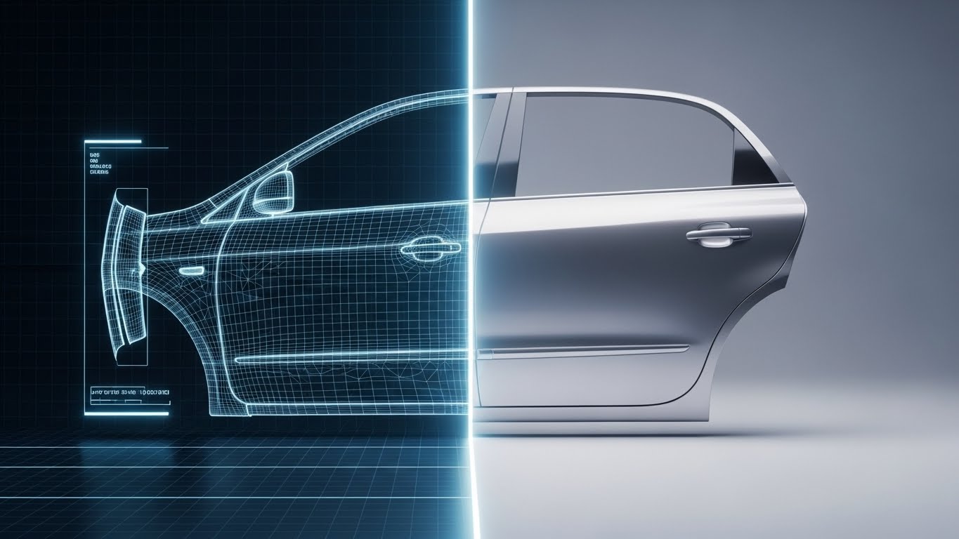
The Visual & Narrative Approach
Visualization Scenario: This style bridges the gap between planning and production. A split-screen effect wipes across a complex object—here, a vehicle chassis. The left side is a precise Blue wireframe (the process map/blueprint), and the right side is the photorealistic Silver metallic render (the final product). This "Digital Twin" metaphor visualizes that the software ensures 100% fidelity between the strategic plan and the operational reality.
Narration Style: Transformational. "What you map is exactly what you get."
Psychological Impact & KPI Focus
- Niche Psychology: It mitigates "Implementation Gap" anxiety—the fear that plans won't survive the real world. The seamless continuity proves that the software understands the complexities of physical production.
- KPI: Lead Quality. It signals to mature buyers in manufacturing and logistics that the tool is robust enough for complex, physical industries.
Strategic Implementation & Trade-offs
- Best For: Case studies or solution pages targeting manufacturing, automotive, or logistics sectors.
- Trade-off: Using a specific object (like a car) implies a vertical focus. This specific visual would not work as well for a purely service-based law firm.
Companies using similar video content -
Fleetbase – Logistics Platform – Digital twin of a supply chain or vehicle.
Eplan – Industrial Automation – Bridging planning and production for engineering.
16. Aspirational Stock Montage
BOFU | The Economic Buyer

The Visual & Narrative Approach
Visualization Scenario: This style sells status and control. It features a silhouette of an executive standing before a panoramic window at sunset (Golden Hour). The city skyline is overlaid with glowing digital circuit lines that connect the buildings. This visualizes the concept of the "Connected Enterprise"—the executive isn't just looking at the city; they are monitoring a vast, integrated network.
Narration Style: Visionary and leadership-focused. "See the whole board. Control the whole outcome."
Psychological Impact & KPI Focus
- Niche Psychology: It appeals to the C-Suite's desire for "Omniscience." It frames the software not as a utility for workers, but as a "Command Center" for leaders, elevating the conversation from features to strategy.
- KPI: Email Open/Reply Rates. The dramatic, high-quality aesthetic signals a strategic conversation, separating it from tactical spam.
Strategic Implementation & Trade-offs
- Best For: ABM (Account-Based Marketing) campaigns targeting top-tier decision-makers.
- Trade-off: It is highly atmospheric and says nothing about features. It relies entirely on emotional resonance and brand positioning.
Companies using similar video content -
IBM Business Automation Workflow – Process Orchestration – Executive overseeing a connected enterprise.
Oracle BPM Suite – Business Process Management – Strategic oversight of a vast network.
17. Futuristic Neon/Dark Mode + Dark Mode UI
BOFU | The Technical Buyer
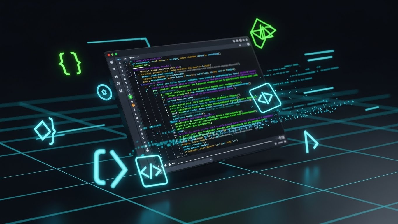
The Visual & Narrative Approach
Visualization Scenario: To win over the developers who influence the buying decision, this style celebrates the backend. A tilted 3D perspective displays a code editor in "Dark Mode" (Deep Black/Grey). Syntax highlighting glows in Neon Green and Purple. Abstract brackets and code symbols float in the Z-space. This aesthetic validates the platform's API robustness and modern architecture.
Narration Style: Technical and direct. "Clean code. Robust APIs. Infinite extensibility."
Psychological Impact & KPI Focus
- Niche Psychology: Developers judge a tool by its aesthetic proximity to their own IDEs. Dark mode signals "built by developers, for developers," creating immediate rapport and trust.
- KPI: API Doc Visits. It acts as a gateway, encouraging technical teams to verify the platform's extensibility.
Strategic Implementation & Trade-offs
- Best For: The "Integrations" or "Developers" section of the website.
- Trade-off: It alienates non-technical business users, who may find the code intimidatory. It should be siloed to technical channels.
Companies using similar video content -
Kubeflow Pipelines – ML Workflows – Dark mode code editor for ML engineers.
Argo Workflows – Container-native Workflow Engine – Celebrating backend robustness.
18. 3D Parallax UI Presentation
BOFU | Sales Cycle Acceleration

The Visual & Narrative Approach
Visualization Scenario: To showcase the breadth of the platform without clutter, this style uses depth. Multiple translucent glass UI screens float in a 3D Z-space. The camera focuses sharply on the center screen (Analytics), while the foreground and background screens are blurred (Bokeh effect). The Deep Ocean Blue palette and parallax movement create a sense of immersion, implying a "deep" solution.
Narration Style: Sophisticated and smooth. "Depth of insight. Breadth of control."
Psychological Impact & KPI Focus
- Niche Psychology: It triggers the "Value Perception" heuristic. The layered depth visually suggests that the platform is feature-rich and substantial, helping to justify a premium price point.
- KPI: Click-Through Rate (Display). The 3D effect "pops" on flat web pages, drawing the eye and inviting interaction.
Strategic Implementation & Trade-offs
- Best For: Retargeting display ads to users who have viewed multiple product pages, reinforcing the "All-in-One" value.
- Trade-off: Text on the blurred screens is illegible. The visual relies on the user recognizing the shapes of the UI components (charts, lists) rather than reading data.
Companies using similar video content -
Appian – Low-code Automation Platform – Layered UI screens showing ecosystem depth.
Pega Platform – Process Orchestration – Comprehensive suite with immersive depth.
19. Minimalist + Line Art
BOFU | Objection Handling
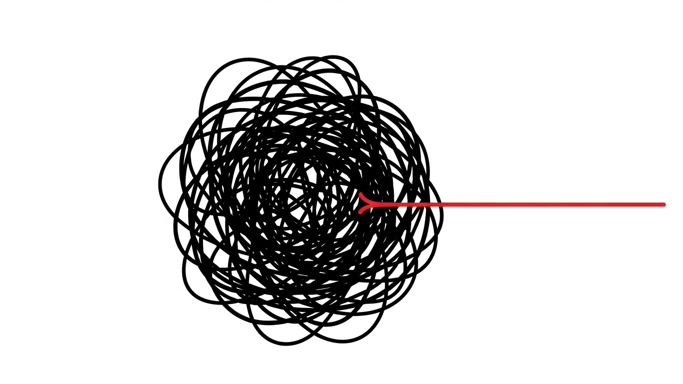
The Visual & Narrative Approach
Visualization Scenario: Addressing the objection "Our process is too complex," this style uses a stark metaphor. On a pure White background, a chaotic, scribbled knot of Black lines vibrates with tension. Slowly, a single Red line pulls away from the knot, straightening out perfectly. It is the visual definition of "untangling."
Narration Style: Minimal and relieving. "Complexity, untangled. Chaos, resolved."
Psychological Impact & KPI Focus
- Niche Psychology: It provides "Cognitive Relief." The brain seeks order. Watching the knot untangle offers a moment of calm, subconsciously associating the brand with the solution to the prospect's headache.
- KPI: Ad Recall. The extreme simplicity and negative space stand out against cluttered social feeds, creating a memorable hook.
Strategic Implementation & Trade-offs
- Best For: Objection-handling ads targeting users who are hesitant to change.
- Trade-off: It is purely metaphorical. It relies entirely on the copy to explain how the software achieves this result.
Companies using similar video content -
FlowForma – BPM Platform – Untangling chaotic lines into a clear path.
Process Street – Workflow Management – Complexity simplified with elegant line art.
20. Holographic UI over 3D Render
Onboarding | Self-Serve Onboarding

The Visual & Narrative Approach
Visualization Scenario: To ensure adoption, this style visualizes the support experience. A first-person POV shows a laptop on a desk. Glowing, semi-transparent Hologram Blue "Guide" markers float in the air, pointing to specific buttons on the screen. It suggests that the software itself creates a layer of intelligence that guides the user step-by-step.
Narration Style: Helpful and instructive. "Never lost. Always guided."
Psychological Impact & KPI Focus
- Niche Psychology: It reduces "New User Anxiety." It promises that the user won't be left alone to figure it out; the software acts as an always-on digital mentor.
- KPI: Activation Rate. By visualizing the support system, it encourages new users to log in and start their first project immediately.
Strategic Implementation & Trade-offs
- Best For: Welcome emails and "Getting Started" videos.
- Trade-off: The hologram effect must be clearly distinguished from the actual UI, so users understand it represents guidance, not the interface itself.
Companies using similar video content -
Medsphere – Healthcare Workflow Automation – Augmented guidance for new users.
Keragon – Healthcare Workflow Automation – Invisible mentor pointing to UI elements.
21. Hyper-lapse Stock Footage with Data**
Onboarding | Accelerating TTV

The Visual & Narrative Approach
Visualization Scenario: To capture the energy of rapid deployment, this style utilizes a hyper-lapse technique optimized for mobile screens. We see a bustling, open-plan office rendered with motion blur to indicate the frantic pace of modern logistics. However, superimposed over this chaos are sharp, glowing Neon Blue geometric lines and data nodes ("Team Sync: 98%", "Network Velocity") that connect the moving people. These graphic elements remain static and stable, creating a "Digital Grid" that implies the software provides stability amidst the velocity of daily operations.
Narration Style: Fast, rhythmic, and driving. "Move fast. Stay aligned. The platform that keeps pace with you."
Psychological Impact & KPI Focus
- Niche Psychology: It addresses "Operational Drag." New software often feels like it slows things down. This visual proves the opposite: the software is a lightweight layer that stabilizes speed rather than hindering it.
- KPI: Time-to-Value (TTV). The visual metaphor of speed and instant connection suggests that new teams can be onboarded and synchronized immediately.
Strategic Implementation & Trade-offs
- Best For: "Welcome" sequences and Instagram/TikTok ads targeting team leads who need to justify rolling out the tool to their entire department.
- Trade-off: Stock footage can feel generic. The quality of the motion tracking (match-moving) is what elevates it from "stock" to "strategic brand asset."
Companies using similar video content -
Fleetx – Transportation Management – Rapid team synchronization in a bustling office.
Samsara – Fleet Management – Kinetic alignment amidst logistics chaos.
22. Isometric 3D Workflow
Onboarding | Reducing Friction

The Visual & Narrative Approach
Visualization Scenario: Reducing the intimidation factor of new software, this style employs a charming, isometric "office diorama." The palette is Soft Pastel Pink and Serene Blue. A pristine white path winds through the miniature workspace, where stylized delivery trucks and document icons glide smoothly without hitting obstacles. The lighting is soft and studio-like, casting gentle shadows that make the scene feel tactile and manageable—like a well-organized toy set.
Narration Style: Gentle and reassuring. "No roadblocks. No detours. Just flow."
Psychological Impact & KPI Focus
- Niche Psychology: It addresses "Implementation Fatigue." By simplifying the workspace into a playful, orderly model, it lowers the cognitive barrier to entry and promises a stress-free adoption.
- KPI: Onboarding Completion Rate. The pleasant, low-stress aesthetic encourages users to engage with training modules and set up their first workflow.
Strategic Implementation & Trade-offs
- Best For: Tutorial intro videos and "Feature Spotlight" emails explaining routing logic or approval chains.
- Trade-off: The "cute" aesthetic might feel too light for heavy industrial sectors (e.g., oil & gas) that prefer rugged realism.
Companies using similar video content -
Flowable – Process Orchestration – Playful logistics, path of least resistance.
Activepieces – Workflow Automation – Charming office diorama for workflow setup.
23. Abstract 3D AI Visualization
Retention | Driving Deep Feature Adoption

The Visual & Narrative Approach
Visualization Scenario: To market advanced AI features (like predictive analytics), this style visualizes the "brain" of the platform. A complex network of glass-like nodes in Deep Purple and Bioluminescent Blue hangs in a dark digital void. Pulses of light fire along the connecting tendrils, representing data processing and machine learning logic. The camera drifts through the neural network, emphasizing depth and complexity.
Narration Style: Sophisticated and awe-inspiring. "Unlock the intelligence hidden in your data."
Psychological Impact & KPI Focus
- Niche Psychology: It triggers "FOMO" (Fear Of Missing Out) regarding innovation. It positions the software not just as a tool, but as a superior intelligence that the user can tap into.
- KPI: Feature Adoption Rate (AI Modules). The high-tech aesthetic justifies the time investment required to learn advanced features.
Strategic Implementation & Trade-offs
- Best For: In-app modals announcing new AI capabilities or "Pro Tips" newsletters.
- Trade-off: It is purely conceptual. It builds excitement but doesn't explain how to use the feature. It must be paired with a practical button or link.
Companies using similar video content -
DataGalaxy – Data & AI Governance – Neural core visualizing deep intelligence.
Thoughtful AI – Healthcare Automation – Pulsating network representing AI processing.
24. 2D Graphics Over Live Action
Retention | Knowledge Base

The Visual & Narrative Approach
Visualization Scenario: Bridging the gap between digital support and human connection, this style overlays crisp 2D vector graphics onto high-quality live-action footage. We see a friendly support agent (diverse, smiling) with a headset. Floating around her are playful, flat icons in Brand Blue and White: a lightbulb (solution), a chat bubble (communication), and a question mark (inquiry). The icons animate in sync with her speech, adding a layer of clarity to the human element.
Narration Style: Warm, conversational, and direct. "We're here to help you map every step."
Psychological Impact & KPI Focus
- Niche Psychology: It combats "SaaS Isolation"—the feeling of being stuck with a broken tool and no help. The human face builds immediate trust and rapport.
- KPI: Support Ticket Deflection. By making the help center feel welcoming, users are more likely to watch the video than submit a ticket.
Strategic Implementation & Trade-offs
- Best For: "Contact Us" pages, support intros, and community management content.
- Trade-off: Requires ongoing video production with actors, which is harder to update than pure animation if the script changes.
Companies using similar video content -
Zendesk – Customer Service Platform – Friendly agent with floating support icons.
Freshdesk – Customer Support Platform – Enhanced empathy in support videos.
25. 2D Line Art + Dynamic Data Viz
Retention | Reducing Churn

The Visual & Narrative Approach
Visualization Scenario: To reassure customers of long-term value, this style uses an elegant, minimalist aesthetic. On a background of textured white paper, a single line graph draws itself in Gold Foil texture, trending steadily upward. Delicate, thin Black lines extend from the graph nodes to detailed icons representing "Efficiency Gains," "Cost Savings," and "Time Returned." It looks like a high-end architectural sketch or financial report.
Narration Style: Calm, factual, and premium. "Consistent growth. Measurable returns."
Psychological Impact & KPI Focus
- Niche Psychology: It appeals to the "Stewardship" mindset. It frames the software subscription as a prudent, high-yield investment rather than an expense.
- KPI: Renewal Rate. Visualizing the cumulative value over time reinforces the decision to renew the contract.
Strategic Implementation & Trade-offs
- Best For: Quarterly Business Review (QBR) pre-reads and annual renewal reminder emails.
- Trade-off: The minimalist style is understated; it requires the viewer to pay attention to the details to get the message.
Companies using similar video content -
QPR ProcessAnalyzer – Process Mining – Golden trend visualizing consistent value.
IBM Process Mining – Process Mining – Elegant line graph showing efficiency gains.
26. Photorealistic 3D + Clean UI
Expansion | Driving Upsell

The Visual & Narrative Approach
Visualization Scenario: This style is designed to make the "Pro" tier feel like a luxury good. A floating, diamond-shaped "Premium" badge is rendered in photorealistic Platinum and Royal Blue, spinning slowly on a pedestal. Beside it, a sleek, glass-panel UI screen lists advanced features with glowing checkmarks. The lighting is high-contrast and dramatic, emphasizing the "weight" and value of the upgrade.
Narration Style: Exclusive and inviting. "Experience the full power of the platform."
Psychological Impact & KPI Focus
- Niche Psychology: It leverages "Prestige." The visual cues borrow from luxury car or jewelry advertising, subconsciously signaling that the Enterprise tier is a status symbol for the organization.
- KPI: Upsell Conversion Rate (ARPU). The tangible rendering of the "badge" makes the digital upgrade feel like a physical acquisition.
Strategic Implementation & Trade-offs
- Best For: Pricing pages and "Upgrade to Pro" modals within the application.
- Trade-off: It can look overly "marketing-heavy" if used in educational contexts. It is purely a sales asset.
Companies using similar video content -
Microsoft Power Apps – Low-code Platform – Premium tier badge for enterprise power.
OutSystems – Low-code Platform – Unlocking advanced features with a luxury feel.
27. Bold Kinetic Typography + Minimalist
Expansion | In-App Upsell

The Visual & Narrative Approach
Visualization Scenario: When a user hits a usage limit, this style creates urgency. The word "SCALE" is constructed from heavy, blocky 3D fonts in Heavy Black, filling the screen. The letters vibrate and appear to expand outward, pushing against the edges of the frame. An abstract field of Vibrant Yellow energy particles swirls around the text, symbolizing the pent-up potential waiting to be released.
Narration Style: Urgent and empowering. "Don't let limits stop your growth."
Psychological Impact & KPI Focus
- Niche Psychology: It targets "Constraint Frustration." The visual mimics the feeling of outgrowing a container, aligning with the user's need for more capacity.
- KPI: Click-Through Rate (Upgrade). The bold, aggressive typography acts as a pattern interrupt, demanding immediate attention.
Strategic Implementation & Trade-offs
- Best For: Paywall screens or usage limit notifications (e.g., "You've reached your process limit").
- Trade-off: It is aggressive. If shown too frequently, it can become annoying and damage the user experience.
Companies using similar video content -
Quickbase – Low-code Platform – "SCALE" expanding, symbolizing growth potential.
Conductor – Microservices Orchestration – Urgency of growth with bold, expanding text.
30. Generative AI Realistic Character Video
Expansion | Proactive Support

The Visual & Narrative Approach
Visualization Scenario: The future of support is proactive. This style uses a high-fidelity Generative AI avatar—a professional woman with a friendly, intelligent expression, filmed with an 85mm portrait lens. The background is a soft-focus modern office (bokeh). She speaks directly to the viewer, offering a personalized tip or a proactive alert. The realism is uncanny, bridging the gap between automated scalability and human connection.
Narration Style: Personal and direct. "I noticed you're optimizing route B. Here is a suggestion..."
Psychological Impact & KPI Focus
- Niche Psychology: It creates a "Concierge Experience." Even though the user knows it's AI, the face-to-face format feels significantly more attentive and premium than a text notification. It creates a sense of being watched over and cared for.
- KPI: Support Cost Reduction (Scale). It allows the vendor to deliver "face-to-face" support videos to thousands of users simultaneously without the cost of human recording.
Strategic Implementation & Trade-offs
- Best For: Personalized onboarding check-ins, renewal reminders, and proactive system alerts.
- Trade-off: The "Uncanny Valley." The AI generation must be top-tier. If the lip-sync or eye movement is slightly off, it will feel creepy rather than helpful.
Strategic Knowledge Base: The Visual Operations Doctrine
To transform these 30 visual styles from "marketing assets" into a cohesive "Visual Operating System," we must apply a strategic framework. This section synthesizes the visual examples into three actionable pillars for the Operational Architect.
Strategic Alignment & Visual Architecture
The "Pre-Production" Strategy: Defining Your Visual Operating System
Before a single frame is rendered, the visual strategy must be aligned with the operational reality of the enterprise. This is the "Blueprint Phase."
- The Cognitive Load Audit: Do not just create video; audit the complexity it replaces. If a process takes 40 pages of text to explain, a "Minimalist Flat" (Style 1) video is not a stylistic choice—it is a cognitive necessity. Measure the reduction in "Time to Comprehension" as a primary metric.
- Role-Based Visual Mapping: Differentiate your visual language by persona. Use "Mobile UI + Hand Gestures" (Style 28) for field operators who need quick, one-handed interactions. Reserve "Dynamic Data Visualization" (Style 14) for the CFO who needs to see the compounding ROI. One size does not fit all.
- The "Glanceability" Standard: In high-stress environments (logistics, manufacturing), visuals must be understood in under 2 seconds. Test your "Iconography" and "Kinetic Typography" (Style 27) against this standard. If it requires reading, it fails the glance test.
- The Advids Strategic Audit: Partner with experts like Advids early in this phase. Their role is to define the "Visual Operating System"—ensuring that the visual language used in Marketing (Style 6) is consistent with the visual language used in Training (Style 20), creating a seamless user journey.
- Standardization vs. Customization: For core platform features, use high-fidelity, standardized assets (Style 6) that can be reused for years. For variable scenarios (e.g., specific customer use cases), use flexible templates like "Wireframe to Reality" (Style 15) that can be quickly adapted without a full reshoot.
- Brand Voice Consistency: Your software likely spans multiple modules (Sales, Ops, Safety). Ensure a unified color palette and icon set across all video content to create a cohesive "Visual Operating System" that feels like a single platform, not a collection of tools.
- The Cross-Departmental Bridge: Use visuals to unify terminology. If Sales calls it a "Manifest" and Ops calls it a "Bill of Lading," use a "Kinetic Typography" (Style 27) video to visually link the terms and establish a shared vocabulary.
- Legacy System Integration: Visualizing the connection between old on-prem hardware and new SaaS interfaces is critical. Use "Wireframe to Reality" (Style 15) to show how your modern software wraps around and visualizes data from legacy "Green Screen" systems.
- Accessibility in Logistics: Your workforce is likely diverse and multi-lingual. Design motion graphics that rely on visual cues and iconography (Style 24) rather than voiceover alone, allowing for instant localization without re-recording audio.
- The Mobile-First Mandate: 60% of logistics software interaction happens on the road. Ensure all 30 styles are legible on a 5-inch screen. Vertical video formatting (Style 4) is not a trend; it is an operational requirement for driver engagement.
Operational Adoption & Implementation
The "Deployment" Phase: Embedding Visuals into the Workflow
Once the assets are created, their deployment determines their success. This is the "Embed Phase."
- Overcoming "Big Brother" Anxiety: When introducing tracking or process mining, use "Abstract 2D Organic" (Style 2) or "Human-Centric" (Style 11) visuals. Avoid mechanical, cold aesthetics. You must visually frame the software as a "helper" (Style 24), not a "watcher."
- The Micro-Learning Shift: Kill the PDF manual. Slice your "Isometric 3D Workflow" (Style 22) videos into 15-second loops and embed them directly into the software's tooltips. Support should be just-in-time, not just-in-case.
- Just-in-Time Support: Embed specific visual styles directly into the software interface. A "Show Me How" button on a complex dashboard should trigger a "Holographic UI" (Style 20) overlay that guides the user step-by-step without them leaving the screen.
- Gamification of Training: Drivers and dispatchers respond well to competition. Visualize performance scorecards and safety bonuses using "2D Animation" (Style 12) to turn training compliance into a high-energy, gamified achievement.
- Reducing Support Ticket Volume: There is a direct correlation between proactive visual guides and reduced call center load. Anticipating common errors and placing a "Mixed Media" (Style 24) explainer at that friction point can deflect up to 40% of Level 1 support tickets.
- Remote Onboarding: For distributed fleets or remote teams, use "Hyper-lapse Stock" (Style 21) to simulate the energy of a physical office. It builds culture and alignment without requiring a physical seminar.
- Visualizing SOPs: Transform text-based Standard Operating Procedures (SOPs) into visual process flows. A "Kinetic Alignment" (Style 1) video is far more likely to be remembered during a critical safety incident than a paragraph of text.
- Feedback Loops: Use interactive video elements. At the end of a training clip, include a one-click survey asking, "Did this help?" This data allows you to continuously refine your visual training library.
- Scalable Localization: When expanding to new regions, separate on-screen text from the video background layers. This allows Advids to swap out text for Spanish, French, or German versions in minutes, ensuring your global fleet stays aligned.
- Leadership Communication: When rolling out a major strategic pivot, generic emails get ignored. Use "Aspirational Stock" (Style 16) or "Futuristic HUD" (Style 29) to communicate the "Why" behind the change to stakeholders, securing buy-in from the top down.
Measuring Impact & Future-Proofing
The "ROI" Phase: Quantifying Success and Scaling for the Future
Finally, we must prove that this visual infrastructure is paying rent. This is the "Validation Phase."
- Beyond "Views": Vanity metrics are useless in B2B. Measure "Time-to-Competency." How much faster does a new hire reach full productivity after watching the "Holographic UI" (Style 20) guide compared to reading the manual?
- The "Idle Time" Metric: Correlate better visualization with reduced software navigation time. If the "Clean UI" (Style 7) video effectively taught the shortcut, user idle time should drop.
- Retention and Churn: Use "Minimalist Data" (Style 25) to visually remind customers of their success. Visualizing the "Upside" is a retention activity. High-quality, consistent education reduces frustration, which is the leading cause of churn.
- The AI Visual Frontier: Prepare for "Generative AI Characters" (Style 30). As the platform evolves, static videos will become obsolete. The future is real-time, AI-generated video support that answers specific questions visually.
- The Advids Partnership for Scale: Building a library of 30+ styles is not a one-time project; it is an ongoing operational commitment. Advids serves as the long-term partner to scale this library, ensuring that as your features grow, your visual infrastructure grows with it—maintaining quality, consistency, and strategic impact across the entire lifecycle.
- Compliance Velocity: How fast can you get the entire fleet compliant with a new regulation (e.g., ELD mandate)? Measure the speed of adoption when using "Minimalist Line Art" (Style 19) explainers versus traditional memos.
- Scalability of Assets: Software changes weekly. Build a library of "Master Assets" (3D models, vector icons) rather than flattened videos. This allows for rapid updates when UI buttons move or colors change, preventing your library from becoming obsolete.
- Benchmarking Success: "Good enough" visuals are a competitive risk. If your competitor uses "Photorealistic 3D" (Style 6) to sell their vision and you use static screenshots, you will lose the perception battle. Regularly audit your visual quality against the market leaders.
- The ROI of Safety: In industrial applications of your software, better visualization means fewer accidents. Quantify the reduction in insurance costs and accident rates achieved through better, more engaging visual safety training modules ("Wireframe to Reality", Style 15).
- Final Call to Innovation: Treat video as infrastructure. It is not "marketing content"; it is the Visual Interface of your brand. In a world of invisible algorithms and complex code, the company that tells the clearest visual story wins. The 30 styles in this guide are your toolkit—now, go build the bridge.
Companies using similar video content -
Factory – Agent-Native Software Development – AI avatar offering proactive support.
Heidi Health AI – Healthcare Workflow Automation – Realistic AI character for personalized guidance.
Author & Editor Bio


