
 /home/wwwroot/advids.co/design/index.php on line 425
Introduction: Bridging the Physical-Digital Divide Through Visualization
The global infrastructure and product development sectors are standing at a critical juncture. We are moving beyond the era of static spreadsheets and disjointed email threads into a future defined by radical transparency, real-time integration, and predictive intelligence. For the modern "Operational Architect"—the CTOs and Project Directors steering these massive portfolios—the challenge is no longer just managing data; it is about making that data visible and actionable before problems escalate.
However, a profound "Physical/Digital Divide" remains. Teams struggle to synchronize the tangible reality of on-site execution with the digital abstraction of their reporting tools. The cost of this opacity is not just frustration; it is a massive financial leak. Industry research indicates that inefficient project management processes cause nearly 12% wastage of organizational resources. When stakeholders cannot see the truth, they build on errors.
The opportunity for platforms that can close this gap is immense. The Product Lifecycle Management market is not just surviving; it is thriving, projected to reach USD 49.38 billion by 2030. This surge in investment signals a global race to adopt platforms that offer more than just storage; they offer clarity.
This guide serves as your strategic blueprint to dismantle the barriers to adoption. It is not merely a collection of video styles; it is a communication framework designed to translate abstract PLM concepts—Resource Allocation, Critical Path, Digital Twins—into compelling visual narratives. By mastering these 30 styles, you will reduce cognitive load, bridge the digital divide, and position your platform as the inevitable architecture of project success.
1. The Momentum Engine: Bold Kinetic Typography
TOFU | Brand Awareness

(Bold Kinetic Typography): Explosive Visual Momentum
The Visual & Narrative Approach
Scenario: This composition utilizes a high-octane "Bold Kinetic Typography" style. Using a high-contrast palette of Magma Orange and Slate Grey, abstract block shapes—suggesting heavy project components—explode outward toward the camera lens. They don't just appear; they collide. The text "MOMENTUM" forms for a split second amidst sparks of digital energy before shattering.
Narration: The audio is percussive and driving, lacking voiceover to focus entirely on visual impact.
Psychological Impact & KPI Focus
- Niche Psychology: It addresses the "Inertia" felt by project teams stuck in bureaucracy. The visual of explosive forward motion triggers a physiological alertness, associating your brand with speed and breakthrough.
- Operational Impact: It visually metaphors the "Cold Start" solution—getting a project moving instantly.
- KPI: Ad Recall Lift & Click-Through Rate (CTR).
Strategic Implementation & Trade-offs
- Best Use: Meta/Instagram Stories & High-Frequency Retargeting (6-10 seconds).
- Trade-off: It prioritizes emotional impact over information density. It builds heat, but doesn't explain features.
Companies using similar video content -
Procore – Accelerating construction project velocity and insights.
Siemens Teamcenter – Driving PLM innovation and product development speed.
PTC Windchill – Powering rapid product lifecycle management.
2. The Visionary Builder: Generative AI Cinematic
TOFU | Category Creation

(Generative AI Cinematic): Visionary Category Creation
The Visual & Narrative Approach
Scenario: We employ a "Generative AI Cinematic" style to render a futuristic, photorealistic cityscape. The camera adopts a "Hero Angle," looking up at skyscrapers self-assembling against a Steel Grey sky. Crucially, the structural beams glow with Cyan light, resembling holographic Gantt chart bars. This visual metaphor seamlessly blends the physical construction with the digital data that drives it.
Narration: A deep, resonant voiceover speaks to the "Architect of the Future," framing the software as the essential foundation of modern infrastructure.
Psychological Impact & KPI Focus
- Niche Psychology: It taps into the "God Complex" aspiration of senior leaders—the desire to oversee vast, complex operations effortlessly. It frames the platform as the invisible architect of the built environment.
- Operational Impact: It visualizes the "Digital Twin" concept (Rule 37), blurring the line between the site and the software.
- KPI: Organic Search Volume & Brand Sentiment.
Strategic Implementation & Trade-offs
- Best Use: YouTube "About Us" films & Homepage Hero Backgrounds (30-60 seconds).
- Trade-off: High production expectations. The polished look sets a high bar for the actual product UI's aesthetic.
Companies using similar video content -
Bentley Systems – iTwin – Architecting infrastructure digital twins.
Dassault Systèmes – 3DEXPERIENCE – Creating virtual twin experiences for innovation.
Trimble – Building construction digital twins for project insights.
3. From Chaos to Order: Abstract 2D Motion
TOFU | Market Education
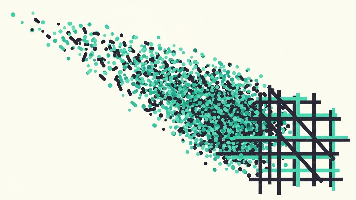
(Abstract 2D Motion Graphics): Entropy To Order
The Visual & Narrative Approach
Scenario: Using "Abstract 2D Motion Graphics," we visualize the core value proposition. A swarm of chaotic "Data Particles" (Mint Green/Charcoal) floods the screen, representing unorganized tasks. Suddenly, they hit an invisible barrier and snap satisfyingly into a rigid "Kanban Grid." The grainy texture adds a sophisticated, tactile feel, grounding the digital concept.
Narration: Sound design features a crescendo of "static noise" that cuts abruptly to a clean, harmonic hum the moment the grid forms.
Psychological Impact & KPI Focus
- Niche Psychology: This triggers the "Gestalt Principle of Closure." Watching chaos resolve into order provides a dopamine hit of relief, subconsciously associating the platform with control and sanity.
- Operational Impact: It simplifies "Standardization." It shows that the platform actively structures data, rather than just storing it.
- KPI: Time-on-Site & Bounce Rate Reduction.
Strategic Implementation & Trade-offs
- Best Use: Website Headers & Landing Page Intros (10-15 seconds).
- Trade-off: It is abstract. It explains the concept of organization but not the specific mechanics of the tool.
Companies using similar video content -
monday.com – Organizing chaotic workflows into structured clarity.
Smartsheet – Consolidating disparate data for unified project views.
Wrike – Transforming unorganized tasks into streamlined project management.
4. The Intelligence Core: Abstract 3D Visualization
TOFU | Shaping Brand Perception
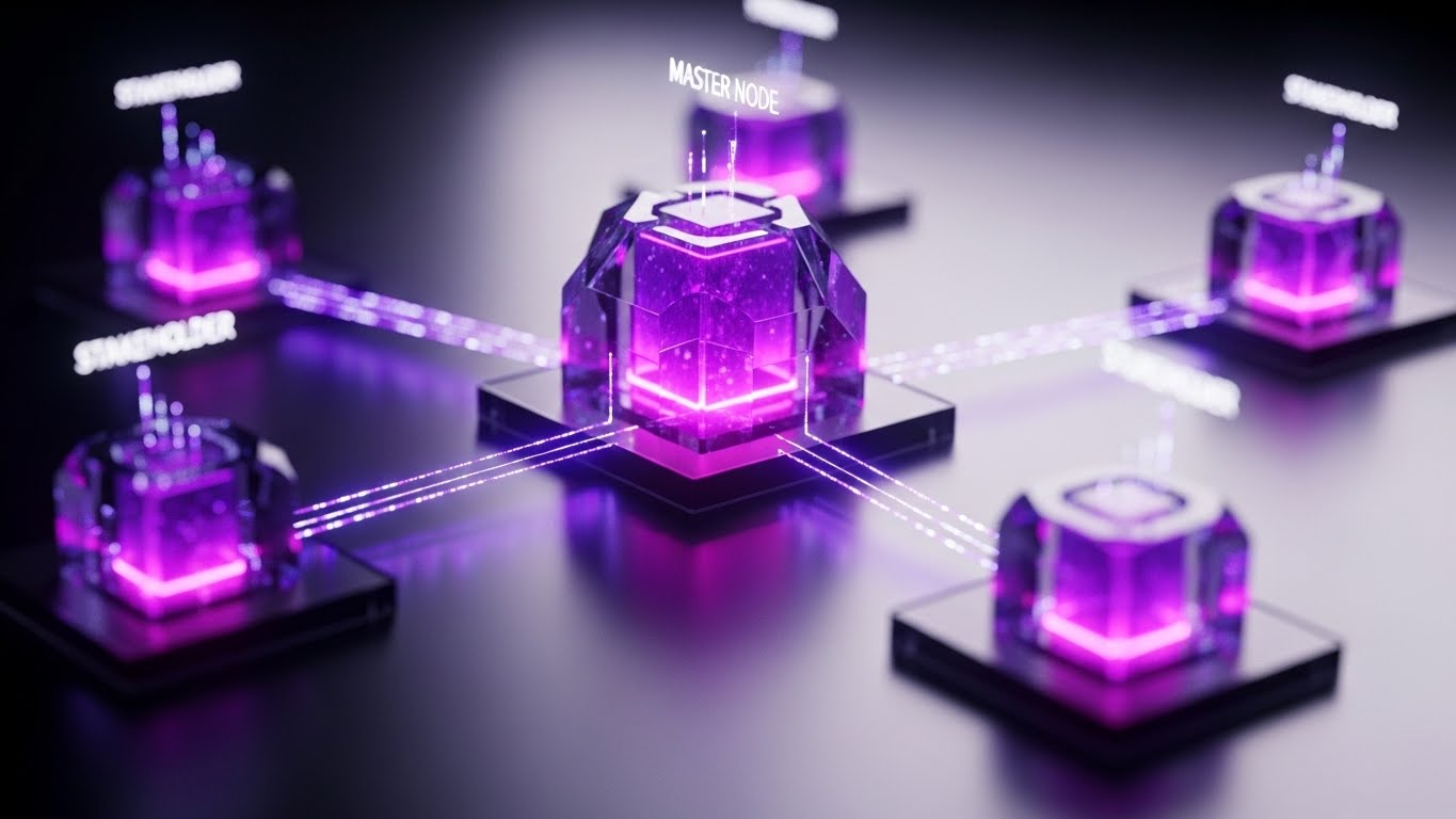
(Abstract 3D AI Visualization): Centralized Network Intelligence
The Visual & Narrative Approach
Scenario: We use "Abstract 3D AI Visualization" to create a macro view of a digital network. A central "Master Node" (Violet/Pink glass) pulses with bio-luminescent light. It connects to surrounding nodes via beams of pure white light. The shallow depth of field focuses attention entirely on the center, visually reinforcing the concept of a "Single Source of Truth."
Narration: "One source. Infinite reach."
Psychological Impact & KPI Focus
- Niche Psychology: It addresses the fear of "Siloed Data." The visual proves that the system is interconnected and alive, reassuring executives of data integrity.
- Operational Impact: It visualizes "Interoperability," showing how the platform connects disparate stakeholders into one cohesive intelligence unit.
- KPI: Brand Lift & Executive Engagement.
Strategic Implementation & Trade-offs
- Best Use: Connected TV (CTV) Ads & Event Backdrops.
- Trade-off: Highly conceptual. It must be paired with clear messaging to ensure viewers understand it represents data centralization.
Companies using similar video content -
IBM Maximo Asset Monitor – Centralizing asset performance intelligence.
Oracle Fusion Cloud PLM – Providing a single source of product truth.
CONTACT Software – CIM Database PLM – Unifying product engineering processes.
5. Blueprint to Reality: Mixed Media
TOFU | Vertical Social Organic

(AI Generated Mixed Media): Blueprint To Reality
The Visual & Narrative Approach
Scenario: This "Mixed Media" style blends the tactile with the digital. We start with a top-down view of an architect's desk (Blueprint Blue) cluttered with papers. As the camera moves, the drawings "lift" off the page and extrude into 3D structures. A hand-drawn yellow line transforms into a glowing digital "Critical Path." This transition celebrates the evolution from manual planning to digital execution.
Narration: Upbeat, modern lo-fi music that matches the creative flow.
Psychological Impact & KPI Focus
- Niche Psychology: It respects the user's craft. It acknowledges that great projects start with messy ideas, building empathy with the creator persona.
- Operational Impact: It visualizes "Digitization" without friction, showing the software as a natural extension of the user's existing skills.
- KPI: Social Shares & Engagement Rate.
Strategic Implementation & Trade-offs
- Best Use: TikTok, Reels, & YouTube Shorts (Vertical 9:16).
- Trade-off: The vertical format limits the ability to show complex, wide-screen dashboards.
Companies using similar video content -
Autodesk Construction Cloud – Bridging BIM designs to real-world construction.
Dalux – Transforming 3D models into tangible project reality.
Bluebeam Revu – Evolving project documents into executed structures.
6. The Quick Win: Flat Vector Organic
TOFU | Skippable Pre-Roll Ad
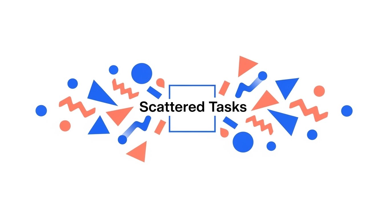
(Abstract 2D Flat Vector): Simplifying Complex Processes
The Visual & Narrative Approach
Scenario: This style uses "Abstract 2D Flat Vector" art. Clean, minimal geometric shapes (Electric Blue/Coral) representing "Scattered Tasks" float loosely before merging gracefully into the center to form a perfect, unified square. The motion is liquid and smooth, devoid of friction or noise.
Narration: A single, pleasant "pop" sound effect upon unification, followed by the tagline.
Psychological Impact & KPI Focus
- Niche Psychology: It leverages "Processing Fluency." Simple shapes are processed faster by the brain, leading to a positive aesthetic response. It promises a reduction in cognitive load.
- Operational Impact: It visualizes "Consolidation," showing how the platform unifies fragmented work streams into one deliverable.
- KPI: View-Through Rate (VTR) & Brand Recall.
Strategic Implementation & Trade-offs
- Best Use: YouTube Pre-Roll (5 seconds) & Display Ads.
- Trade-off: It is too simple to convey power. It serves only as a hook to lead to deeper content.
Companies using similar video content -
Zoho Projects – Simplifying complex project setups for quick wins.
OpenBOM – Streamlining BOM creation for rapid product development.
Propel – Accelerating PLM implementation for immediate value.
7. The Contrast: Split Screen Reality
MOFU | Product Differentiation
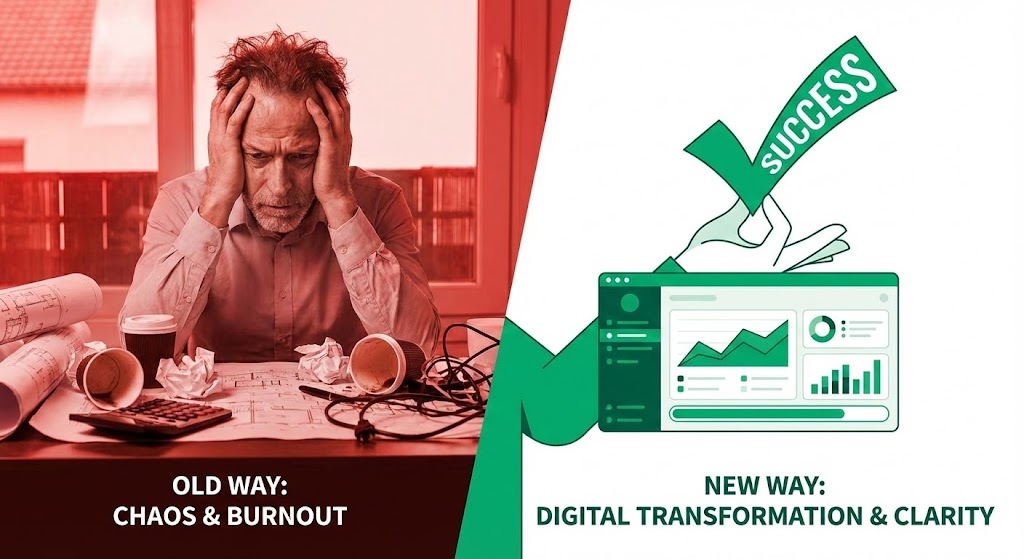
(Split Screen Optimized Reality): Chaos Vs Clarity
The Visual & Narrative Approach
Scenario: We use a "Split Screen" composition. The left side (Red tones) shows a stressed manager buried in physical chaos. The right side (Emerald Green) shows a clean vector UI with a "Success" checkmark. The dividing line acts as a threshold. This visualizes the tangible difference between the "Old Way" of burnout and the "New Way" of clarity.
Narration: "Left: The cost of doing business. Right: The value of doing it right."
Psychological Impact & KPI Focus
- Niche Psychology: It exploits "Loss Aversion" (fear of the red zone) and "Aspiration" (desire for the green zone). It validates the user's pain points immediately.
- Operational Impact: It visually demonstrates the ROI of "Digital Transformation"—moving from manual stress to automated success.
- KPI: Conversion Rate (Landing Page/Lead Form).
Strategic Implementation & Trade-offs
- Best Use: LinkedIn Video Ads & Retargeting.
- Trade-off: It is a direct, binary comparison. It lacks nuance but is highly effective for problem-aware audiences.
Companies using similar video content -
Fieldwire by Hilti – Contrasting field chaos with digital clarity.
Archdesk – Visualizing manual reporting versus real-time insights.
Kahua – Differentiating disjointed projects from collaborative success.
8. Tangible Resources: Isometric Workflow
MOFU | Feature Education
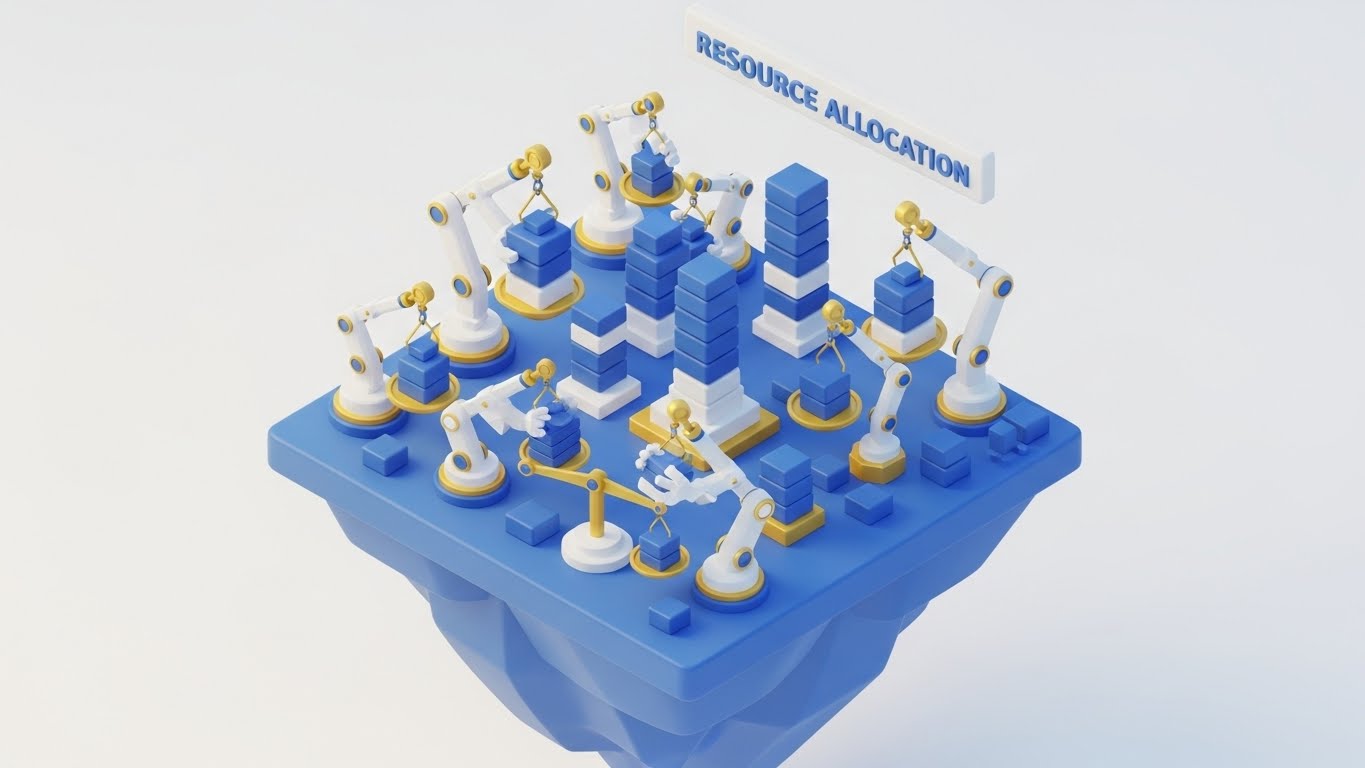
(Isometric 3D Workflow): Tangible Resource Balancing
The Visual & Narrative Approach
Scenario: This "Isometric 3D Workflow" uses "Claymorphism"—soft, matte textures. On a floating island, robotic arms (Royal Blue/Gold) balance stacks of colored blocks on scales. This gamifies the concept of "Resource Allocation," making the complex math of capacity planning look like a manageable, even satisfying, building game.
Narration: Soft, ASMR-style mechanical sounds emphasize precision and care.
Psychological Impact & KPI Focus
- Niche Psychology: The "Toy-like" aesthetic lowers the barrier to entry. It reassures the user that the platform is not a scary ERP monster, but a helpful tool they can master.
- Operational Impact: It visualizes "Load Balancing" without needing complex charts, showing how the system prevents team burnout.
- KPI: Dwell Time & Feature Adoption.
Strategic Implementation & Trade-offs
- Best Use: Website Feature Pages & Product Tours.
- Trade-off: Can appear too casual for strict enterprise environments (e.g., Defense/Gov). Balance with professional copy.
Companies using similar video content -
Resource Guru – Balancing tangible resources for optimal allocation.
Total Synergy – Gamifying engineering resource planning and utilization.
Productive – Optimizing project resource balancing with clear visuals.
9. The Unraveling: 2D Line Art
MOFU | Competitive Displacement

(2D Line Art Animation): Elegant System De-tangling
The Visual & Narrative Approach
Scenario: A sophisticated "2D Line Art Animation" uses a single continuous stroke in Sky Blue. It begins as a complex, tangled knot (representing the legacy system) and smoothly unravels into a straight, efficient arrow. The background is a subtle paper texture. This visual metaphor argues that your platform removes friction and straightens the path to value.
Narration: A "whoosh" sound of air rushing by as the knot unties, implying a release of tension.
Psychological Impact & KPI Focus
- Niche Psychology: It appeals to the intellectual buyer who values "Essentialism." It visualizes the relief of untangling a messy process.
- Operational Impact: It visualizes "Workflow Optimization," stripping away the noise to reveal the pure logic of the new process.
- KPI: Competitive Win Rate.
Strategic Implementation & Trade-offs
- Best Use: Sales Decks & "Why Switch" Pages.
- Trade-off: Very minimalist. It relies on the viewer instantly understanding the metaphor.
Companies using similar video content -
Aras Innovator – Untangling complex legacy PLM systems.
PROSTEP – Simplifying PLM integration and data exchange.
beCPG – Streamlining open-source PLM workflows.
10. The Value Crystal: Dynamic Data Viz
MOFU | Demand Gen & Lead Capture

(Dynamic Data Visualization): Premium Financial Clarity
The Visual & Narrative Approach
Scenario: We use "Dynamic Data Visualization" in a "Glassmorphism" style. Rising crystal columns in Ruby Red and Silver refract light, representing "Demand" metrics. Data lines weave through them. The aesthetic is premium, sharp, and expensive—signaling that the insights generated by the platform are high-value.
Narration: High-pitched, crystalline chimes resonate, suggesting clarity and wealth.
Psychological Impact & KPI Focus
- Niche Psychology: "Financial Confidence." The glass texture signals "Transparency" to the CFO, while the ruby color implies "Value." It makes the data look expensive and trustworthy.
- Operational Impact: It visualizes "ROI Transparency," linking operational metrics directly to financial outcomes.
- KPI: Lead Capture (Whitepaper/Report Download).
Strategic Implementation & Trade-offs
- Best Use: LinkedIn Organic Posts & Report Covers.
- Trade-off: It prioritizes aesthetic polish over data density. It is a teaser for the depth of the actual reporting.
Companies using similar video content -
Deltek ComputerEase – Providing premium financial clarity for construction.
Archdesk – Visualizing real-time cost tracking and project ROI.
Oracle Primavera Cloud – Demonstrating transparent project financial outcomes.
11. The Operational Pulse: Hyper-lapse Stock Footage
MOFU | The Functional Buyer

(Hyper-lapse Stock Footage): Synchronized Site Logistics
The Visual & Narrative Approach
Scenario: We utilize "Hyper-lapse Stock Footage" to capture the raw energy of a construction site. From a high-angle drone perspective, cranes pivot and trucks flow in fast-motion (Orange/Grey palette) against a bright daylight sky. Superimposed over this physical activity are glowing Blue "Data Streams" that act like fiber optic cables, connecting moving assets to a central digital hub.
Narration: The audio combines the mechanical hum of industry with a synchronized, high-tempo digital beat, emphasizing that the data moves as fast as the machinery.
Psychological Impact & KPI Focus
- Niche Psychology: This style validates the complexity of the user's daily reality. It creates a visual link between "Site Velocity" and "Data Velocity," assuring the functional buyer that the software is not a bottleneck, but a lubricant for operations.
- Operational Impact: It visualizes "Supply Chain Resilience," showing how material flow is tracked and optimized in real-time to prevent downtime.
- KPI: Engagement Rate (LinkedIn) & Demo Requests.
Strategic Implementation & Trade-offs
- Best Use: LinkedIn Video Ads & Trade Show Booth Backgrounds (15-30 seconds).
- Trade-off: It relies on stock footage quality. If the footage looks generic, the brand can feel generic. Custom drone footage is preferred.
Companies using similar video content -
Procore – Synchronizing construction site logistics and data flow.
Multivista – Capturing remote construction monitoring and progress.
Sablono – Visualizing real-time construction process monitoring.
12. The Invisible Fortress: 3D X-Ray Visualization
MOFU | Thought Leadership

(3D X-Ray Visualization): Uncompromising Data Security
The Visual & Narrative Approach
Scenario: This "3D X-Ray Visualization" adopts a clinical, high-tech aesthetic. We see a cross-section cutaway of a physical server rack against a clean white background. Inside, the hardware fades away to reveal a glowing "Structure" of heavy beams and digital locks (Translucent Blue/Grey). It visually transforms the abstract concept of "Cloud Security" into a fortress-like physical structure.
Narration: "Built on a foundation of ironclad compliance. ISO 27001 certified."
Psychological Impact & KPI Focus
- Niche Psychology: It addresses the "Fear of Data Breach." By giving security a physical form (beams, locks), it leverages the "Tangibility Bias," making the safety measures feel more real and robust than a simple checklist.
- Operational Impact: It visualizes "Data Integrity," reassuring IT Directors that their project data is structurally sound and protected.
- KPI: Time-on-Page (Security/Compliance Section).
Strategic Implementation & Trade-offs
- Best Use: Website "Security" Pages & Trust Center Videos (30-45 seconds).
- Trade-off: It is cold and technical. It appeals strictly to the IT/Compliance persona, not the creative user.
Companies using similar video content -
Navex RiskRate – Ensuring uncompromising GRC data security.
SafetyCulture – iAuditor – Fortifying operational compliance and integrity.
Bridgit – Protecting workforce planning and regulatory compliance.
13. The Mirror of Truth: Photorealistic 3D Renders
BOFU | Building Trust
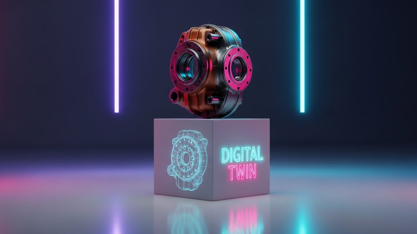
(Photorealistic 3D Renders): Absolute Digital Fidelity
The Visual & Narrative Approach
Scenario: We present a "Photorealistic 3D Render" of a precision-engineered machine part (Copper/Silver) sitting on a museum pedestal. The lighting is studio-quality. A sleek reflection on the floor reveals not the physical object, but its "Wireframe Digital Twin." This mirrors the perfect synchronization between the physical asset and its digital record.
Narration: A slow, confident voiceover emphasizing "Precision," "Accuracy," and "Truth."
Psychological Impact & KPI Focus
- Niche Psychology: It appeals to the engineer's love for "Fidelity." The high resolution signals that the platform handles complex data without degradation.
- Operational Impact: It visualizes the "As-Built Verification" process, proving that the digital record matches the physical reality to the millimeter.
- KPI: Email Click-Through Rate (Nurture Sequence).
Strategic Implementation & Trade-offs
- Best Use: Email Marketing Headers & Case Study Visuals.
- Trade-off: Static nature. It creates a moment of awe but requires surrounding context to explain the utility.
Companies using similar video content -
Dassault Systèmes – SIMULIA – Achieving absolute digital fidelity in simulation.
Hexagon Smart Digital Realities – Mirroring spatial data with high resolution.
Akselos – Delivering physics-based digital twins with precision.
14. The Efficiency Engine: Isometric 2D Motion Design
BOFU | ROI Justification

(Isometric 2D Motion Design): Streamlined Project Flow
The Visual & Narrative Approach
Scenario: Using "Isometric 2D Motion Design," we depict a "Project Workflow" as a stylized factory conveyor belt. In a palette of Teal, Navy, and Gold, abstract "Task Boxes" travel smoothly through "Approval Gates." The view is orthographic (45-degree angle). There are no shadows, just clean lines. It shows the process moving from "RFI" to "Approved" without a single bottleneck.
Narration: Rhythmic mechanical sounds, like a well-oiled machine, underscoring the lack of friction.
Psychological Impact & KPI Focus
- Niche Psychology: It triggers a sense of "Flow." The visual regularity suggests predictability—a key desire for financial stakeholders fearing scope creep.
- Operational Impact: It visualizes "Process Automation," showing how the software removes manual hand-offs and waiting periods.
- KPI: Sales Deck Conversion Rate.
Strategic Implementation & Trade-offs
- Best Use: Sales Presentation Slides & ROI Calculator Pages.
- Trade-off: Highly stylized. It works best as a theoretical model of efficiency, rather than a tutorial.
Companies using similar video content -
PASKR – Streamlining construction processes through automation.
Wrike – Designing efficient project workflows and task management.
Jira – Optimizing project flow for enhanced team efficiency.
15. The Sentinel: Futuristic Neon/Dark Mode
BOFU | Risk Mitigation
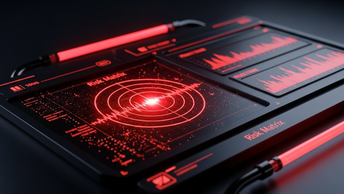
(Futuristic Neon/Dark Mode): Preemptive Risk Detection
The Visual & Narrative Approach
Scenario: We use a "Futuristic Neon/Dark Mode" UI visualization. In a Deep Black environment, a specific dashboard module glows with Neon Red tubing. A "Risk Matrix" pulses like a radar, identifying a "Critical Path Delay" blip before it impacts the timeline. The aesthetic is vigilant, serious, and precise—reminiscent of a mission control center.
Narration: "See it before it happens. Solve it before it costs."
Psychological Impact & KPI Focus
- Niche Psychology: It taps into "Vigilance." The dark mode aesthetic is associated with pro-tools used by experts (developers, pilots). It signals that this is a serious tool for high-stakes problem solving.
- Operational Impact: It visualizes "Predictive Analytics," demonstrating the shift from reactive firefighting to proactive risk mitigation.
- KPI: Conversion Rate (Schedule a Demo).
Strategic Implementation & Trade-offs
- Best Use: Pricing Page & "Enterprise" Solution Page (15-20 seconds).
- Trade-off: Can look intimidating. It emphasizes danger (Red) to sell safety, which requires careful tonal balance.
Companies using similar video content -
IBM Maximo Asset Monitor – Enabling preemptive asset risk detection.
GE Digital Twin Software – Monitoring equipment performance for early warnings.
Ansys Twin Builder – Predicting system behavior for risk mitigation.
16. The Velocity Stack: Rapid UI Feature Montage
BOFU | Driving Demo Requests
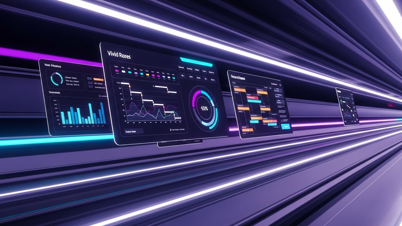
(Rapid UI Feature Montage): Comprehensive Feature Velocity
The Visual & Narrative Approach
Scenario: A "Rapid UI Feature Montage" uses a tilted Dutch angle and a rapid zoom effect. UI screens (Vivid Purple/Cyan) fly past the viewer like train windows in a high-speed tunnel. We catch glimpses of Gantt charts, Kanban boards, and Budget reports. It creates a sense of overwhelming value and speed.
Narration: A fast-paced "whoosh" sound design, culminating in a sudden stop on the "Book a Demo" button.
Psychological Impact & KPI Focus
- Niche Psychology: It leverages the "Availability Heuristic." By showing a flood of features quickly, the brain assumes the platform is comprehensive and powerful without analyzing each feature individually.
- Operational Impact: It visualizes "Platform Breadth," countering the objection that the tool might be too niche or limited.
- KPI: Cost Per Lead (CPL) on Social Ads.
Strategic Implementation & Trade-offs
- Best Use: Meta/Instagram Retargeting Ads (6-10 seconds).
- Trade-off: Zero educational value. It creates an impression of size, not an understanding of function.
Companies using similar video content -
Propel – Showcasing comprehensive product value management features.
Arena PLM – Highlighting cloud-native PLM capabilities rapidly.
Autodesk Fusion 360 – Displaying design, engineering, and manufacturing features.
17. The Command Center: Lifestyle Stock with UI Overlay
BOFU | The Economic Buyer

(Lifestyle Stock with UI Overlay): Executive Command Visibility
The Visual & Narrative Approach
Scenario: High-end "Lifestyle Photography" features a professional executive in a sunlit, modern office. Through an over-the-shoulder shot (Warm Beige/Sage Green), we see them looking at a tablet. A futuristic, semi-transparent "Holographic UI Overlay" hovers above the screen, displaying simplified "Team Velocity" and "Budget Health" metrics.
Narration: "Command your capital. Visualize your velocity."
Psychological Impact & KPI Focus
- Niche Psychology: It appeals to "Social Status" and "Control." It positions the user not as a worker bee, but as a commander. It sells the feeling of being in charge.
- Operational Impact: It visualizes "Executive Dashboards," showing that the platform synthesizes complex data into simple, decision-ready insights.
- KPI: Landing Page Conversion Rate.
Strategic Implementation & Trade-offs
- Best Use: Website Homepage Hero & Brochureware.
- Trade-off: If the stock footage looks too staged, it loses authenticity. Needs high-quality casting.
Companies using similar video content -
Procore – Providing executive command visibility over projects.
Oracle Primavera Cloud – Offering portfolio visibility for economic buyers.
Kahua – Empowering program collaboration with clear insights.
18. The Integration Bridge: Dark Mode UI Showcase
BOFU | The Technical Buyer
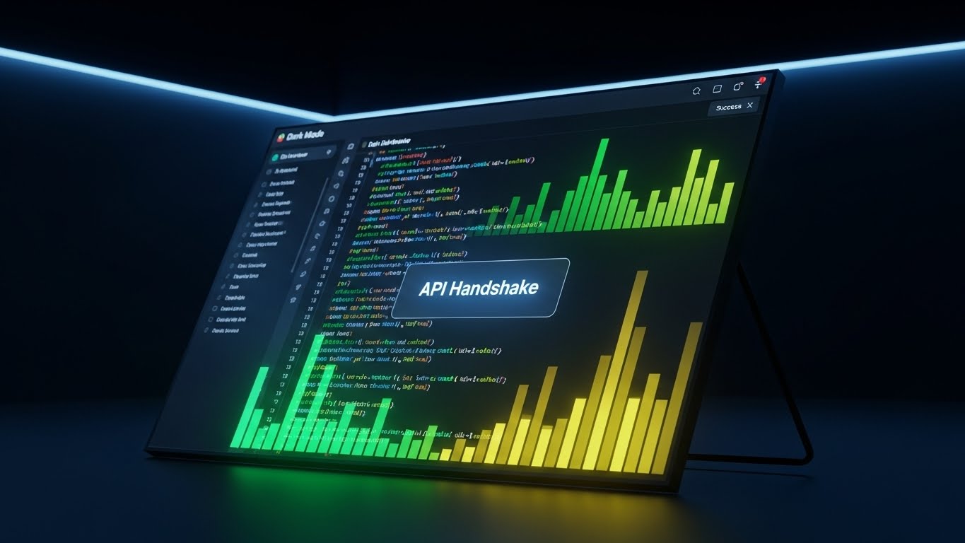
(Dark Mode UI Showcase): Seamless API Integration
The Visual & Narrative Approach
Scenario: A "Dark Mode UI Showcase" mimics a developer's environment (Charcoal/Code Green). The angled screen displays scrolling lines of clean code, syntax highlighting, and a terminal window. It concludes with a satisfying "API Handshake Success" message. It strips away the GUI to show the engine room.
Narration: Typing sounds (mechanical keyboard) and a subtle "ping" of connection.
Psychological Impact & KPI Focus
- Niche Psychology: It builds "Technical Trust." It respects the intelligence of the IT buyer by showing the code, proving the platform is developer-friendly and extensible.
- Operational Impact: It visualizes "Interoperability," proving the system can talk to ERPs, CRMs, and legacy databases without friction.
- KPI: Technical Documentation Pageviews.
Strategic Implementation & Trade-offs
- Best Use: Developer Portals & Integration Feature Pages.
- Trade-off: Alienates non-technical users. Must be kept strictly in the technical section of the funnel.
Companies using similar video content -
PTC ThingWorx – Demonstrating seamless IoT application integration.
OpenBOM – Showcasing open API for custom PLM integrations.
CONTACT Software – CIM Database PLM – Bridging IT systems with robust integration.
19. The Realization Engine: Wireframe to Reality Transition
BOFU | Objection Handling

(Wireframe to Reality Transition): Designing Without Friction
The Visual & Narrative Approach
Scenario: A split-screen composition creates a "Wireframe to Reality Transition." The left side shows a wireframe architectural blueprint (Cyan/White). As the "scan line" moves across the screen, the wireframe instantly resolves into a photorealistic, sunlit building structure. It visualizes the core promise of PLM: converting plans into reality without data loss.
Narration: "From imagination to implementation. Seamlessly."
Psychological Impact & KPI Focus
- Niche Psychology: It reduces "Change Anxiety." It suggests that the transition to the new software (and the resulting project) will be smooth and magical, rather than a painful slog.
- Operational Impact: It visualizes "Project Realization," linking the early design phase directly to the final handover.
- KPI: Remarketing Click-Through Rate.
Strategic Implementation & Trade-offs
- Best Use: Remarketing Ads & Case Study Videos.
- Trade-off: It is metaphorical. It doesn't show how the transition happens, just that it does.
Companies using similar video content -
Autodesk Construction Cloud – Seamlessly converting design to build.
Dalux – Transforming BIM wireframes into photorealistic structures.
Trimble – Verifying as-built reality from digital plans.
20. The Open Door: Clean UI Workflow
Onboarding | Driving Freemium
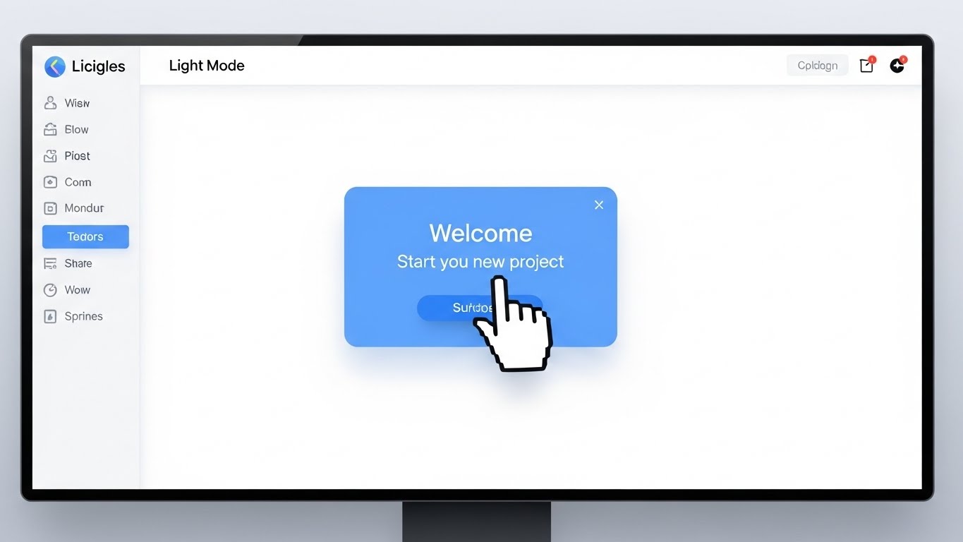
(Clean UI Workflow): Frictionless User Onboarding
The Visual & Narrative Approach
Scenario: We return to a "Clean UI Workflow" in Light Mode (Sky Blue/White). The aesthetic is pixel-perfect and inviting. We see a cursor hover over a large, friendly "Start New Project" button. A "Welcome" modal pops up with a soft shadow. The motion is slow and deliberate, emphasizing ease of use.
Narration: A human, encouraging voice: "Your best work starts here."
Psychological Impact & KPI Focus
- Niche Psychology: It leverages "UX Affordance." The clean design and clear call-to-action signals that the tool is intuitive. It lowers the "Barrier to Entry" and reduces the fear of complexity.
- Operational Impact: It visualizes "Adoption Velocity," showing that teams can get up and running in minutes, not months.
- KPI: Free Trial Sign-ups & User Activation Rate.
Strategic Implementation & Trade-offs
- Best Use: "Get Started" Landing Pages & Welcome Emails.
- Trade-off: It looks simple, so it must not be used to sell "Power" features. It is strictly for welcoming new users.
Companies using similar video content -
Trello – Offering frictionless project setup and collaboration.
Productboard – Guiding customer-centric product development.
Airfocus – Simplifying roadmap creation for easy adoption.
21. The Gentle Guide: 2D Animation & UI Composition
Onboarding | Self-Serve Onboarding

(2D Animation & UI Composition): Intuitive Self-Serve Guidance
The Visual & Narrative Approach
Scenario: We utilize a "2D Animation & UI Composition" featuring a stylized, cel-shaded character (Lavender/Purple). The composition adheres to the rule of thirds: the character stands on the left, gesturing warmly toward a floating, simplified software interface on the right. A "Tool Tip" bubble expands from the UI, clearly explaining a feature. The aesthetic is soft, clean, and inviting.
Narration: A calm, pacing-focused voiceover: "Don't guess. Just hover. We'll guide you through every step."
Psychological Impact & KPI Focus
- Niche Psychology: It leverages "Cognitive Scaffolding." By anthropomorphizing the help function (the character), it reduces the anxiety of learning a complex PLM system. It transforms the software from a tool into a teammate.
- Operational Impact: It visualizes "Self-Sufficiency," showing that users can learn the platform without scheduling expensive training seminars or calling IT.
- KPI: Time-to-Competency & Onboarding Completion Rate.
Strategic Implementation & Trade-offs
- Best Use: Welcome Email Sequences & In-App "First Run" Modals.
- Trade-off: The cartoon style is friendly but can feel "young." It must be balanced with the utility of the UI shown to ensure it retains professional credibility.
Companies using similar video content -
Userpilot – Providing intuitive self-serve guidance for product experiences.
Pendo – Offering gentle onboarding for product experience optimization.
Connecteam – Guiding employee management and operational compliance.
22. The Instant Factory: Low-Poly 3D Modeling
Onboarding | Reducing Implementation Friction
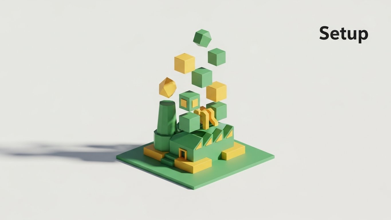
(Low-Poly 3D Modeling): Gamified Implementation Velocity
The Visual & Narrative Approach
Scenario: This "Low-Poly 3D Modeling" scene depicts a geometric factory (Forest Green/Gold) self-assembling in mid-air. Against a pristine white background, blocks fly in from the periphery to snap into place, building the structure piece by piece. The lighting is bright and directional, casting crisp shadows that emphasize the dimensionality of the "building blocks."
Narration: Sound design mimics the satisfying "clicks" and "snaps" of building bricks, accompanied by an ascending musical scale that resolves when the factory is complete.
Psychological Impact & KPI Focus
- Niche Psychology: It taps into the "Builder Instinct" and the "IKEA Effect"—we value what we build. The low-poly aesthetic reminds users of simulation games (like SimCity), triggering a subconscious desire to "play" with the setup rather than dread it.
- Operational Impact: It visualizes "Modular Configuration," demonstrating that the platform is not a monolith, but a flexible system built to the user's specifications.
- KPI: Setup Completion Rate & Time-to-First-Value.
Strategic Implementation & Trade-offs
- Best Use: Knowledge Base Articles (Setup Guides) & FAQ Videos.
- Trade-off: The low-fidelity look is stylistic. It represents the concept of building, not the actual UI settings, so it must be paired with specific text instructions.
Companies using similar video content -
OpenBOM – Gamifying modular PLM configuration and setup.
Aras Innovator – Building flexible digital thread solutions.
beCPG – Assembling customizable open-source PLM systems.
23. The First Win: 2D Character-Driven Story
Onboarding | Trial/Freemium User Activation
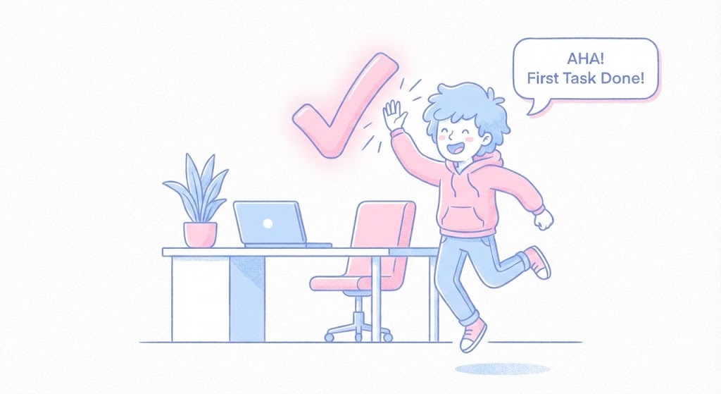
(2D Character-Driven Story): Celebrating User Activation
The Visual & Narrative Approach
Scenario: A "2D Character-Driven Story" presents a relatable scene: a user in a modern home office (Pastel Blue/Pink) completing a task. The moment they hit enter, a large, floating "Checkmark" symbol appears, and the character high-fives it. A subtle grainy texture overlay adds warmth and humanity to the vector art.
Narration: An enthusiastic chime, followed by: "Task one: Done. You're already moving faster."
Psychological Impact & KPI Focus
- Niche Psychology: It utilizes "Dopamine Looping." By visually celebrating a small win (the high-five), the video creates a positive emotional association with using the software, encouraging the user to seek the next "win."
- Operational Impact: It visualizes "Productivity Velocity," proving to the user that the tool is designed to help them finish work, not create more of it.
- KPI: User Activation Rate (Day 1 Retention).
Strategic Implementation & Trade-offs
- Best Use: In-App "Success" Screens & "Congratulations" Emails.
- Trade-off: It is purely emotional. It validates the user's effort but does not teach advanced functionality.
Companies using similar video content -
Jira – Celebrating task completion and project milestones.
monday.com – High-fiving workflow success and productivity.
Smartsheet – Activating users with visual project achievements.
24. The Micro-Support: Macro UI Micro-Interactions
Retention | Knowledge Base

(Macro UI Micro-Interactions): Frictionless Help Access
The Visual & Narrative Approach
Scenario: We use a "Macro UI Micro-Interaction" style, simulating a macro photography lens focused on a digital screen. The depth of field is razor-thin, blurring the edges and keeping the center pixel-sharp. We see a cursor pressing a glowing Green "Help" button. The button depresses physically (neumorphism), signaling a tactile, immediate response.
Narration: "Help isn't a ticket. It's a click. Instant access to our engineering team."
Psychological Impact & KPI Focus
- Niche Psychology: It addresses "Support Anxiety"—the fear of being trapped in a queue. The extreme close-up and the "Green" color signal safety, permission, and immediacy.
- Operational Impact: It visualizes "Accessibility," reassuring the user that expert help is embedded directly into the workflow, reducing the perceived risk of errors.
- KPI: Support Ticket Reduction (via self-help confidence) & NPS.
Strategic Implementation & Trade-offs
- Best Use: Social Retargeting (to existing users) & Sidebar Ads in the Knowledge Base.
- Trade-off: Extremely specific. It only works to highlight specific UI triggers or buttons.
Companies using similar video content -
SafetyCulture – iAuditor – Providing frictionless in-app help access.
Fieldwire by Hilti – Offering immediate jobsite support.
Procore – Delivering micro-interactions for field assistance.
25. The Human Outcome: Aspirational Stock Montage
Retention | Reducing Churn

(Aspirational Stock Montage): Visualizing Team Harmony
The Visual & Narrative Approach
Scenario: This "Aspirational Stock Montage" features a cinematic, "Golden Hour" shot of a diverse project team on a rooftop garden. The camera looks up (Hero Shot), framing them against the sky. They are gathered around a tablet, smiling and high-fiving. The palette is organic (Leaf Green, Denim, Sunlight). It doesn't show the software in detail; it shows the relief and success the software creates.
Narration: "Less time reporting. More time building. This is what project success looks like."
Psychological Impact & KPI Focus
- Niche Psychology: It targets "Social Belonging." It reminds the decision-maker that the ultimate goal of PLM is not data, but a happy, cohesive team that isn't burning out.
- Operational Impact: It visualizes "Collaboration," shifting the focus from individual tasks to collective success.
- KPI: Churn Rate Reduction & Customer Health Score.
Strategic Implementation & Trade-offs
- Best Use: Quarterly Business Review (QBR) Decks & "Year in Review" Emails.
- Trade-off: It can feel generic if the stock footage is not high-quality. Authentic, diverse casting is critical.
Companies using similar video content -
Bridgit – Visualizing team harmony and project success.
Kahua – Showcasing collaborative outcomes and relief.
Procore – Depicting project team satisfaction and achievement.
26. The Face of Care: Realistic Character Video
Retention | Proactive Support

(Realistic Character Video): High-Touch Support Personified
The Visual & Narrative Approach
Scenario: A "Realistic Character Video" features a photorealistic, 8K close-up of a Customer Success Lead. She wears a professional Azure blazer, and the lighting is warm and flattering (Portrait Studio style). She makes direct eye contact with the viewer, smiling warmly. The background is a soft-focus, modern tech office. This is not an avatar; it looks like a video call from a trusted partner.
Narration: A natural, conversational voice: "We noticed you're scaling up. Here are three ways to optimize your new dashboard."
Psychological Impact & KPI Focus
- Niche Psychology: It leverages the "Parasocial Interaction" effect. The direct eye contact creates a sense of personal connection and accountability, making it harder for the client to churn because they feel "known."
- Operational Impact: It visualizes "Proactive Account Management," transforming a generic update email into a personal consultation.
- KPI: Email Open Rates & Upsell Conversion.
Strategic Implementation & Trade-offs
- Best Use: Personalized Email Campaigns (using AI lip-sync for scale) & Major Update Announcements.
- Trade-off: The "Uncanny Valley" risk. The render must be perfect, or it will feel creepy.
Companies using similar video content -
Oracle – Personifying high-touch customer success and support.
SAP – Delivering proactive enterprise support with a human face.
Siemens – Providing personalized service and account management.
27. The Deep Dive: 3D Parallax UI Presentation
Expansion | Driving Deep Feature Adoption
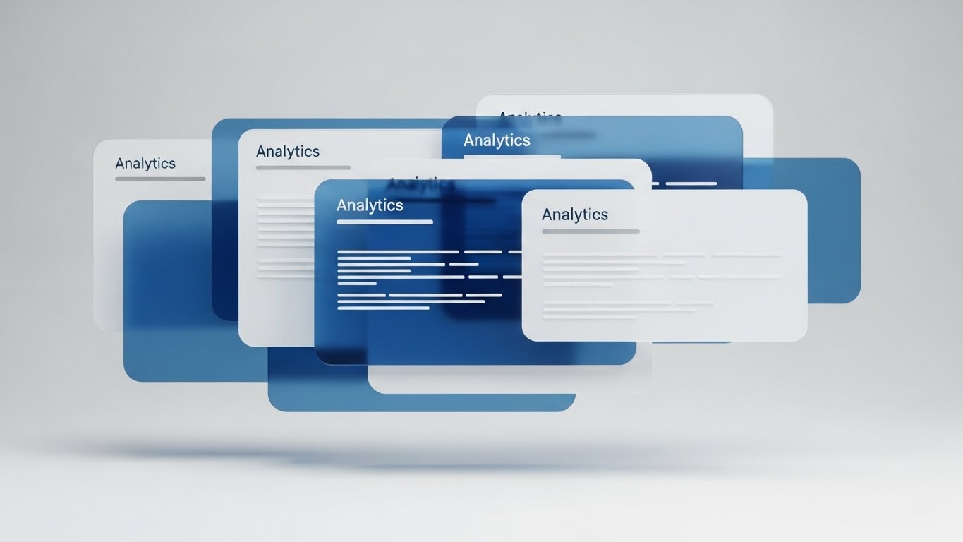
(3D Parallax UI Presentation): Multi-Layered Feature Depth
The Visual & Narrative Approach
Scenario: We employ a "3D Parallax UI Presentation." In a virtual desktop space (Deep Ocean Blue), interface panels and "Analytics" documents float in mid-air. The camera moves laterally, revealing the distinct Z-axis separation between the layers. Shadows cast by the front layers fall on the back layers, creating a sense of deep, rich space.
Narration: "There is more beneath the surface. Dive deeper into your data."
Psychological Impact & KPI Focus
- Niche Psychology: It appeals to "Curiosity" and "Mastery." The visual depth implies intellectual depth, suggesting that there is untapped value waiting to be discovered.
- Operational Impact: It visualizes "Platform Robustness," showing that the "Light" version the user has is just the top layer of a much more powerful engine.
- KPI: Feature Adoption Rate (Secondary Features).
Strategic Implementation & Trade-offs
- Best Use: "Pro Feature" Landing Pages & Webinar Intros.
- Trade-off: It is abstract. It impresses the eye but requires voiceover to explain exactly what those deeper layers are.
Companies using similar video content -
Vertex 3D Platform – Revealing multi-layered 3D data collaboration.
Hexagon Smart Digital Realities – Exploring deep spatial data visualization.
Ansys Twin Builder – Diving into multi-domain system simulation depth.
28. The Future Layer: Holographic UI over 3D Render
Expansion | Driving Upsell/Cross-sell

(Holographic UI over 3D Render): Advanced IoT Integration
The Visual & Narrative Approach
Scenario: A "Holographic UI over 3D Render" shows a high-tech laboratory environment. A metallic robot arm sits on a table. Overlaid on this physical object is a glowing, "Hologram Blue" UI projection displaying real-time IoT data streams (vibration, temperature, cycles). The visual merges the hardware with the software in a seamless, sci-fi manner.
Narration: "Connect the physical to the digital. Real-time IoT monitoring is now live."
Psychological Impact & KPI Focus
- Niche Psychology: It taps into "FOMO" (Fear Of Missing Out) regarding future tech. It positions the user as an innovator, promising them access to cutting-edge tools that their competitors don't have.
- Operational Impact: It visualizes the "Digital Twin" in action—the ultimate goal of PLM—where the machine and the data are one.
- KPI: Upsell Revenue (IoT Module) & Qualified Leads for Sales.
Strategic Implementation & Trade-offs
- Best Use: Executive Sales Decks & Trade Show Demos.
- Trade-off: It promises a very high level of tech maturity. Only use this if the product can actually deliver this level of real-time integration.
Companies using similar video content -
PTC ThingWorx – Showcasing advanced IoT integration and data.
Aveva – Visualizing industrial asset management with holograms.
Cintoo – Projecting reality capture data into future interfaces.
29. The Partnership: Minimalist Flat 2D Vector
Expansion | Driving Referrals

(Minimalist Flat 2D Vector): Symbiotic Network Growth
The Visual & Narrative Approach
Scenario: This "Minimalist Flat 2D Vector" illustration uses thick stroke lines and a palette of Teal and Slate. In the center of a white void, two stylized hands extend and shake, forming a perfect geometric connection. The negative space is balanced and calm. It strips away all tech noise to focus on the human agreement.
Narration: "Grow with us. Invite your network and build a stronger ecosystem."
Psychological Impact & KPI Focus
- Niche Psychology: It leverages "Reciprocity." The clean, balanced visual suggests a fair, equal partnership. It feels professional and safe, encouraging the user to put their own reputation on the line by referring a colleague.
- Operational Impact: It visualizes "Network Effects," implying that the platform becomes more valuable as more partners join the ecosystem.
- KPI: Referral Link Clicks & Partner Program Sign-ups.
Strategic Implementation & Trade-offs
- Best Use: Referral Program Pop-ups & "Thank You" Pages.
- Trade-off: It is very generic. It relies entirely on the accompanying copy to explain the referral incentive.
Companies using similar video content -
PROSTEP – Symbolizing vendor-neutral integration partnerships.
ILC – Representing symbiotic SAP PLM collaborations.
ArcherGrey – Fostering strategic PLM consulting alliances.
30. The Community Layer: 2D Graphics Over Live Action
Expansion | In-App Upsell

(2D Graphics Over Live Action): Vibrant Community Ecosystem
The Visual & Narrative Approach
Scenario: We use "2D Graphics Over Live Action." A handheld, dynamic camera moves through a bustling co-working space. Superimposed over the real people are bright Yellow 2D "Speech Bubbles" and icons representing "Idea Hub," "Premium Collab," and "Community Network." These graphics track with the people, showing the invisible layer of digital connection happening in the room.
Narration: Upbeat ambient noise of a busy office, overlayed with: "Join the conversation. Unlock the Premium Community today."
Psychological Impact & KPI Focus
- Niche Psychology: It targets "Social Proof." Seeing real people (even in stock footage) interacting with digital indicators of collaboration proves that the community is active and alive. It triggers the desire to be "in the know."
- Operational Impact: It visualizes "Collaborative Intelligence," showing that the platform is not just a tool, but a network of experts.
- KPI: Community Forum Sign-ups & Premium Plan Upgrades.
Strategic Implementation & Trade-offs
- Best Use: LinkedIn Video Ads & In-App "Community" Tab.
- Trade-off: The live-action footage must look modern and energetic. If it looks corporate or staged, the "community" vibe fails.
PHASE 5: THE VISUAL OPERATIONS DOCTRINE (Strategic Knowledge Base)
To transform these 30 visual styles from mere "marketing assets" into a cohesive business strategy, we must apply a rigorous operational framework. This "Visual Operations Doctrine" bridges the gap between the creative team and the C-Suite, ensuring every pixel drives ROI.
STRATEGIC ALIGNMENT & VISUAL ARCHITECTURE
The "Pre-Production" Strategy
Before a single frame is rendered, the Operational Architect must define the rules of engagement. This phase prevents "Visual Bloat"—the creation of disconnected assets that confuse rather than clarify.
- The Cognitive Load Audit: Prior to commissioning visuals, audit the "Cognitive Load" of your current training materials. If a PDF manual takes 20 minutes to read, the replacement video (e.g., Style 6) must deliver the same comprehension in 2 minutes. Advids specializes in this "density reduction" analysis.
- Role-Based Visual Mapping: Do not use the same style for everyone. Use "High-Contrast/Mobile-First" styles (Style 1) for Field Engineers (high-distraction environments) who need "Glanceability," while using "Data-Dense/Desktop" styles (Style 10) for CFOs in dim boardrooms.
- The "Glanceability" Standard: In high-stress construction or logistics environments, a visual must be understood in <1.5 seconds. Test your assets (Styles 11 & 15) against this strict "glanceability" benchmark.
- Brand Voice Consistency: Your PLM platform likely integrates various modules (Scheduling, Budgeting, BIM). Use a unified visual language (e.g., the "Glassmorphism" of Style 10 and Style 27) across all videos to create a seamless "Product Feel," even if the underlying codebases are different.
- The Advids Strategic Audit: Partner with Advids to define this "Visual Operating System" before production begins. We align your visual vocabulary with your operational goals to ensure scalability.
- Standardization vs. Customization: For core features, use standardized "Abstract" styles (Style 3). For client-specific case studies, invest in bespoke "Photorealistic" styles (Style 13) to prove specific capabilities.
- The Cross-Departmental Bridge: Use these visuals to unify terminology. If Sales calls it a "Roadmap" but Ops calls it a "Gantt," use a visual (Style 5) that labels it clearly to force a shared lexicon.
- Legacy System Integration: Visualizing the invisible connection between old on-prem hardware and new SaaS interfaces is critical. Use "X-Ray" styles (Style 12) to show stakeholders that their legacy data is safe inside the new container.
- Accessibility in Global Operations: For multinational teams, relying on voiceover is risky. Prioritize "Kinetic Typography" (Style 1) and visual metaphors (Style 8) that communicate clearly without audio, overcoming language barriers.
- The Mobile-First Mandate: 70% of PLM interaction happens on the job site. Ensure all 30 styles are legible on a 5-inch screen. If Style 10’s graph is unreadable on mobile, it fails the operational test.
OPERATIONAL ADOPTION & IMPLEMENTATION
The "Deployment" Phase
The best software fails if users don't adopt it. This segment details how to embed visuals directly into the workflow to reduce friction and drive habit formation.
- Overcoming "Big Brother" Anxiety: When rolling out tracking features, staff often feel watched. Use empathy-driven visuals (Style 25) to frame the technology as a "Safety Net" rather than a "Surveillance Tool."
- The Micro-Learning Shift: Replace the 50-page PDF manual with a library of 30-second clips (Style 21). Index them intelligently so a user can find "How to upload RFI" and watch the answer instantly.
- Just-in-Time Support: Embed specific visual styles directly into the software's UI. When a user hovers over a complex "Export" button, a "Macro UI" video (Style 24) should trigger to explain the function.
- Gamification of Training: Use "Level Up" visuals (Style 23) to reward users for completing training modules. Visualizing progress bars and achievement badges drives completion rates.
- Reducing Support Ticket Volume: There is a direct correlation between the quality of your "Self-Serve" visuals (Style 22) and the volume of Level 1 support tickets. Invest here to lower support costs.
- Remote Onboarding: For distributed teams, you cannot hold physical seminars. Use "3D Parallax" (Style 27) and screencasts to simulate the feeling of an over-the-shoulder demo for remote hires.
- Visualizing Standard Operating Procedures (SOPs): Text-based SOPs are ignored. Transform process flows into "Isometric Motion Design" (Style 14) loops that play on digital signage in the office, reinforcing the process passively.
- Feedback Loops: Use interactive video elements. At the end of a "Feature Update" video (Style 16), include a one-click poll: "Did this help?" This data is crucial for iterating your content strategy.
- Scalable Localization: When expanding to new regions, plan your visuals to be text-light. It is cheaper to translate a few "Kinetic Typo" words (Style 1) than to re-record an entire dialogue-heavy scene.
- Leadership Communication: When the CTO needs to communicate a strategy shift, don't send a memo. Use a "Cinematic AI" video (Style 2) to sell the vision of the change. It commands attention and signals importance.
MEASURING IMPACT & FUTURE-PROOFING
The "ROI" Phase
How do you prove the value of this visual investment? This segment defines the KPIs and future trends that the Operational Architect must monitor.
- Beyond "Views": Vanity metrics are useless. Measure "Time-to-Competency" (how fast a new user performs a task after watching Style 21) and "Feature Adoption Rate" (how many users try a feature after watching its video).
- The "Idle Time" Metric: Correlate better visualization with reduced software navigation time. If a "Clean UI" video (Style 20) saves every user 2 minutes a day, calculate the annual savings across the enterprise.
- Compliance Velocity: In regulated industries, measure how fast new regulations (e.g., ISO 19650 updates) are understood and acknowledged when delivered via video versus text.
- Retention and LTV: High-quality UX visualization (Style 26) increases Customer Lifetime Value (LTV). Track churn rates in cohorts exposed to your "Proactive Support" video series versus those who were not.
- The AI Visual Frontier: Prepare for Generative Video. Soon, Advids will help you generate personalized onboarding videos for every single user instantly. Your asset library must be tagged and ready for this AI future.
- Scalability of Assets: Build a library, not a landfill. Ensure source files for all 30 styles are organized so they can be updated when the software UI changes, rather than re-creating them from scratch.
- The Advids Partnership: You need a partner, not a vendor. Advids acts as the custodian of your visual strategy, ensuring that as your platform evolves from V1 to V2, your visual assets evolve in lockstep, protecting your investment.
- Benchmarking Success: Do not compare your visuals to your competitors; compare them to consumer apps (Netflix, Spotify). Your users expect that level of fluidity. "Good enough" B2B visuals are a competitive risk.
- The ROI of Safety: For physical industries, quantify the reduction in site accidents and insurance costs achieved through better, clearer visual safety training (Style 11).
- Final Call to Innovation: Treat video as infrastructure, not content. Just as you invest in servers and code, invest in the visual layer that translates that code for the human mind. This is the final bridge across the digital divide.
Companies using similar video content -
Jira – Atlassian – Cultivating a vibrant community ecosystem.
Trello – Building a collaborative network for project teams.
Productboard – Fostering a community for customer feedback.
Author & Editor Bio


