
 /home/wwwroot/advids.co/design/index.php on line 425
Introduction: Visualizing the $769 Billion Shift
The global reinsurance market is currently navigating an era of unprecedented capitalization and complexity. With total reinsurance capital reaching a record $769 billion in 2024, the industry is awash in capacity yet constrained by the friction of legacy operations. For the "Architects of Solvency"—the CUOs and CIOs tasked with deploying this capital—the challenge is no longer just about assessing risk, but about processing the sheer velocity of information required to bind it.
This friction is most visible in the data supply chain. As the industry moves away from email-attached spreadsheets, the volume of digital interactions is exploding; recent data highlights a massive 214% increase in the use of digital submission packs during renewal periods. This surge creates a profound "Physical/Digital Divide." On one side, you have the tangible reality of catastrophic events and capital deployment; on the other, the abstract, chaotic digital torrent of bordereaux, loss triangles, and probabilistic models.
For software platforms in this space, the opportunity lies in bridging this divide. It is not enough to simply display data; you must reduce the cognitive load of interpreting it. Effective visualization is the only scalable way to translate complex "Black Box" algorithms into trusted, actionable insights. By moving beyond generic stock footage and embracing precise, data-driven visual metaphors, you can position your platform not just as a tool, but as the essential operating system for modern risk transfer.
The following guide dissects 8 distinct visual styles (Part 1 of our framework) tailored specifically for the reinsurance lifecycle. Each example is calibrated to address specific psychological needs—from the trust required for Treaty negotiations to the clarity needed for Solvency II compliance—ensuring your visual strategy drives tangible commercial outcomes.
1. Minimalist Flat 2D Vector
TOFU | Brand Awareness

The Visual & Narrative Approach
Visualization Scenario: The screen opens on a pristine, pale grey canvas. A complex global network constructs itself in the center, formed by hexagonal nodes in vivid Coral and Slate Blue. As connections solidify, a semi-transparent shield layer seamlessly wraps around the globe. The motion is snappy and geometric, devoid of simulated physics, emphasizing structural integrity.
Narration Tone: Confident, high-level, and authoritative. "In a world of connected risks, your protection must be seamless."
Psychological Impact & KPI Focus
- Niche Psychology: Reinsurance buyers (Cedants) are inundated with noise. By stripping away textures, shadows, and 3D depth, this style leverages Cognitive Ease, allowing the viewer to focus entirely on the concept of global connectivity and protection without distraction.
- Operational Impact: It visually organizes the chaotic reality of global risk into a tidy, manageable system, appealing to the underwriter's desire for order and "Risk Aggregation" clarity.
Strategic Implementation & Trade-offs
- Best Use Case: High-level brand awareness campaigns on LinkedIn Organic feeds and "About Us" sections where you need to communicate global reach in under 15 seconds.
- Duration: 15-20 Seconds.
- Trade-offs: Optimal for rapid brand recall. Suboptimal for explaining technical nuances; it lacks the fidelity to show how the treaty works.
Transition Strategy: Once brand authority is established through clarity, the narrative must shift to the philosophy of how your platform handles the fluidity of risk.
Companies using similar video content -
Openkoda – Open-source platform for custom insurance apps.
Sapiens – Modular insurance software for life, P&C, reinsurance.
7. Abstract Organic Motion
MOFU | Differentiation

The Visual & Narrative Approach
Visualization Scenario: To visualize the intangible concept of "Risk Transfer," this style uses fluid dynamics. A digital liquid in shades of Mint Green and Pure White flows with a viscous, controllable quality. It moves to form a protective canopy over abstract geometric structures (representing a city or asset portfolio). The liquid adapts perfectly to the shape of the structures below, symbolizing the software's ability to mold coverage around unique exposure profiles.
Narration Tone: Sophisticated, smooth, and empathetic. "Risk is fluid. Your capital allocation should be too."
Psychological Impact & KPI Focus
- Niche Psychology: The fear of "gaps in coverage" is a primary anxiety for cedants. The fluid motion subliminally reassures the viewer that the software ensures total coverage, filling every crack and crevice of the risk profile.
- Operational Impact: Visualizes Liquidity and Customization. It metaphorically demonstrates that the platform adapts to the risk (Parametric triggers), rather than forcing the risk to fit a rigid template.
Strategic Implementation & Trade-offs
- Best Use Case: Homepage Hero backgrounds and "Vision" videos. It sets a premium, innovative tone immediately.
- Duration: 20-30 Seconds (Loopable).
- Trade-offs: Optimal for setting a modern, tech-forward mood. Suboptimal for compliance officers who need to see rigid, audit-proof structures.
Transition Strategy: However, philosophy must eventually meet the high-speed reality of the trading floor, where volume and speed are the only metrics that matter.
Companies using similar video content -
SmartCompliance – COI tracking and compliance management.
Ncontracts – Contract lifecycle management, risk, compliance.
4. Bold Kinetic Typography (Visual)
TOFU | Vertical Social

The Visual & Narrative Approach
Visualization Scenario: A high-energy vertical sequence designed for mobile consumption. Thick, blocky geometric shapes in Bright Orange and Charcoal crash onto the screen, stacking rapidly in a diagonal composition. The movement suggests the rapid accumulation of "Reinstatement Premiums"—showing how individual payments stack up to rebuild a solid capital structure after a loss event.
Narration Tone: Punchy, rhythmic, and fast. No voiceover; the visual rhythm drives the message.
Psychological Impact & KPI Focus
- Niche Psychology: Brokers and Underwriters operate in a high-speed environment. This style mimics the rapid intake of submissions and premiums. It triggers a sense of Momentum and Growth.
- Operational Impact: Targets the Speed of Quote KPI. It visually argues that your platform handles high-volume transactions (like Program Business) with speed and stability, stacking up wins without collapsing.
Strategic Implementation & Trade-offs
- Best Use Case: TikTok, Instagram Reels, and YouTube Shorts. Short, 9:16 content aimed at younger brokers and digital-native underwriters.
- Duration: 6-12 Seconds.
- Trade-offs: Optimal for attention-grabbing. Suboptimal for nuanced storytelling; it is a "hook," not an "explainer."
Transition Strategy: As the prospect moves deeper into the funnel, the need for clarity around the "Black Box" of algorithms becomes paramount.
Companies using similar video content -
DICEUS – Vitaminise – CX automation, mobile app, chatbot.
tigerlab – Insurance software, embedded insurance, API-driven.
6. Dynamic Data Visualization
MOFU | Market Education

The Visual & Narrative Approach
Visualization Scenario: An isometric view of a complex, chaotic cube made of thousands of jagged Electric Blue and Magenta shards. These shards represent raw, unstructured exposure data. As the animation progresses, the shards magnetically pull together, morphing into a perfectly smooth, glowing sphere. Translucent glass materials with glowing edges highlight the transformation.
Narration Tone: Analytical, precise, and transformative. "Turning millions of data points into a single source of truth."
Psychological Impact & KPI Focus
- Niche Psychology: The "Black Box" anxiety is real; stakeholders fear they don't understand the model's output. This visualization provides Cognitive Relief by literally showing the transformation of chaos (raw exposure data) into order (a clear Solvency Score).
- Operational Impact: Directly addresses Data Cleansing and Modeling Accuracy. It demonstrates that the platform doesn't just store data; it refines it, turning millions of bordereau rows into actionable strategic insights.
Strategic Implementation & Trade-offs
- Best Use Case: Product explainer videos for modeling modules or analytics dashboards.
- Duration: 15-20 Seconds.
- Trade-offs: Optimal for proving computational power. Suboptimal for showing human workflows; it is purely mathematical.
Transition Strategy: This mathematical clarity must also extend to the physical world of catastrophe exposure, where the data is geospatial.
Companies using similar video content -
Applied Systems – Applied Epic – Integrated insurance management.
Insly – Modular platform for MGAs and insurers.
9. Low-Poly 3D Modeling
MOFU | Building Trust

The Visual & Narrative Approach
Visualization Scenario: A bird's-eye view of a faceted, low-poly landscape rendered in soft Pastel Pink, Baby Blue, and Pale Yellow. The terrain is faceted like a gem. We see low-poly water planes rising and falling to simulate "Flood Mapping" scenarios. Floating geometric icons (houses, factories) hover above specific zones, turning red or green to indicate risk levels.
Narration Tone: Educational, calm, and "User-Friendly." "Visualizing risk down to the coordinate."
Psychological Impact & KPI Focus
- Niche Psychology: Catastrophe modeling is notoriously complex and "dry." The gamified, low-poly look reduces anxiety (Cognitive Ease), making the user feel that the tool is accessible and easy to manipulate.
- Operational Impact: Perfect for visualizing Geospatial Accumulation. It shows how the software identifies exposure clusters (e.g., in a flood zone) without requiring a heavy, photorealistic render engine.
Strategic Implementation & Trade-offs
- Best Use Case: Interactive web modules or explainer videos about Catastrophe (CAT) modeling tools.
- Duration: 30-45 Seconds.
- Trade-offs: Optimal for making technical geo-data look modern and approachable. Suboptimal for extremely serious investor reports where "cartoonish" visuals might be misjudged.
Transition Strategy: Yet, even the best models fail if the operational workflow is broken. We must visualize the flow of data itself.
Companies using similar video content -
Kohezion – Insurance policy management system.
openIMIS – Open-source health financing and social protection.
10. Isometric 3D Workflow
MOFU | Competitive Displacement
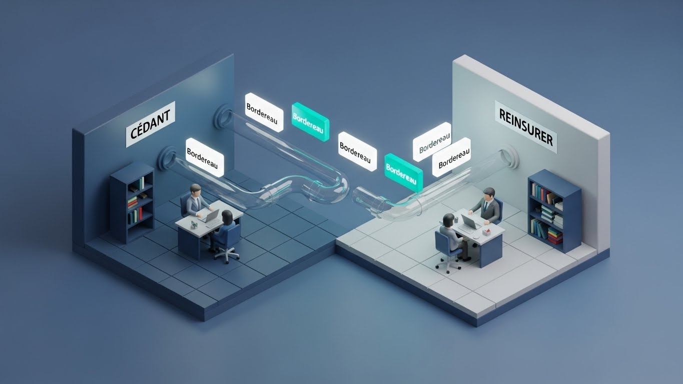
The Visual & Narrative Approach
Visualization Scenario: An isometric studio setup featuring a stylized, miniature reinsurance office. Tiny desks are connected by translucent pipes. Glowing Teal and White data packets (representing "Bordereau" files) zip through these pipes, flowing effortlessly from the "Cedant" (left) to the "Reinsurer" (right). The floor is a matte Grey grid, grounding the scene in engineering precision.
Narration Tone: Process-oriented, efficient, and logical. "Seamless connection. From submission to bind."
Psychological Impact & KPI Focus
- Niche Psychology: The greatest pain point in reinsurance operations is the "black hole" of bordereaux processing—emails getting lost, data not reconciling. This clean pipeline visually guarantees connectivity and transparency.
- Operational Impact: Visualizes the Frictionless Workflow, assuring the Ops Manager that data flows automatically via API, eliminating the "Claims Leakage" associated with manual entry.
Strategic Implementation & Trade-offs
- Best Use Case: "How it Works" pages and features focusing on data ingestion or clearinghouse capabilities.
- Duration: 45-60 Seconds.
- Trade-offs: Optimal for explaining logic and integration. Suboptimal for emotional storytelling; it is a functional schematic.
Transition Strategy: Operational efficiency is vital, but the entire industry rests on a foundation of contractual trust and human agreement.
Companies using similar video content -
FIS – Prophet – Actuarial modeling suite for life insurance.
Moody's Analytics – AXIS – Actuarial modeling for life, health, annuity.
2. 2D Line Art Animation
TOFU | Category Creation

The Visual & Narrative Approach
Visualization Scenario: A continuous line animation drawn in crisp black ink on a vibrant Yellow background. The line never breaks. It flows from left to right, morphing from the outline of two hands shaking (Agreement), into a sturdy padlock (Security), and finally into a shield (Coverage). This continuous metamorphosis visually represents "Binding Authority"—the unbroken chain of trust and permission.
Narration Tone: Personal, sincere, and direct. "Security built on connection."
Psychological Impact & KPI Focus
- Niche Psychology: Reinsurance is a relationship business based on "Utmost Good Faith." This style strips away technology to focus on the human agreement. The continuous line implies an Unbroken Chain of Title and data integrity.
- Operational Impact: Visualizes Contract Certainty. It reassures the Legal and Compliance teams that the digital process honors the sanctity of the binding agreement.
Strategic Implementation & Trade-offs
- Best Use Case: Email nurture sequences, onboarding welcome videos, or "Security & Compliance" overviews.
- Duration: 10-15 Seconds.
- Trade-offs: Optimal for communicating soft values like trust and partnership. Suboptimal for explaining interface features.
Transition Strategy: Finally, to displace incumbents, we must visualize the tangible value of modernization: the shift from legacy planning to realized capital.
Style 26: Wireframe to Reality Transition
Funnel Stage: MOFU | Goal: 1.13 Competitive Displacement | Channel: LinkedIn Ads
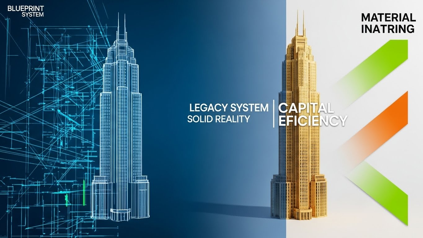
The Visual & Narrative Approach
Visualization Scenario: A visual "Before and After" designed to displace competitors. The composition is a vertical split-screen. The left side shows a chaotic, white-line wireframe blueprint of a skyscraper on a Blueprint Blue background (representing "Legacy Systems"). The right side transitions immediately into a photorealistic, Gold-textured finished 3D render of the same building. This contrast emphasizes the move from "planning" to "solid reality" and "Capital Allocation" efficiency.
Narration Tone: Comparative, bold, and results-driven. "Stop planning. Start capitalizing."
Psychological Impact & KPI Focus
- Niche Psychology: Everyone wants to modernize, but they fear the migration. This visual suggests the transition is instant and adds value (gold) without destroying the original structure (the shape remains the same).
- Operational Impact: It visually validates the ROI of Digital Transformation. It shows that the software doesn't just change the process; it materializes the value that was previously just a theoretical blueprint.
Strategic Implementation & Trade-offs
- Best Use Case: Competitive displacement ads on LinkedIn targeting CTOs/CIOs.
- Duration: 15-20 Seconds.
- Trade-offs: Optimal for highlighting the upgrade in quality. Suboptimal for detailed feature explanation, as it focuses on the result rather than the process.
Companies using similar video content -
WTW (Willis Towers Watson) – RiskAgility FM – Enterprise actuarial modeling.
Coherent – Spark – Excel to API-ready code for actuaries.
11. Abstract 3D AI Visualization**
MOFU | ABM Awareness

The Visual & Narrative Approach
Visualization Scenario: A dark, cinematic void is filled with a complex neural network of weaving fibers in Purple, Pink, and Neon Green. The camera utilizes a shallow depth of field to focus intensely on a single foreground node. As the network pulses with chaotic activity, this specific node glows brighter and stabilizes, identifying a clear pattern within the chaos. Volumetric lighting adds depth to the "Machine Learning" discovery process.
Narration Tone: Insightful, revelatory, and precise. "See the risk others miss. AI that separates signal from noise."
Psychological Impact & KPI Focus
- Niche Psychology: Actuaries are skeptical of "AI" as a buzzword. They fear the "Black Box." This visualization reduces anxiety by showing the process of detection—the moment the algorithm identifies a hidden correlation (e.g., fraudulent claims accumulation).
- Operational Impact: Visualizes Predictive Analytics. It demonstrates the software's ability to reduce IBNR (Incurred But Not Reported) uncertainty by spotting emerging risk trends before they become capital events.
Strategic Implementation & Trade-offs
- Best Use Case: Hero sections for "Analytics" or "Fraud Detection" modules.
- Duration: 15-25 Seconds.
- Trade-offs: Optimal for illustrating the concept of intelligence. Suboptimal for showing user workflow; it is metaphorical, not functional.
Transition Strategy: While abstract patterns build intellectual trust, specific threats like Cyber Liability require a more urgent, tactical visual language.
Companies using similar video content -
Insurity – Sure Suite – Policy, billing, claims, underwriting, AI.
Acturis – Cloud platform for brokers and insurers.
13. Futuristic Neon/Dark Mode
MOFU | Functional Buyer
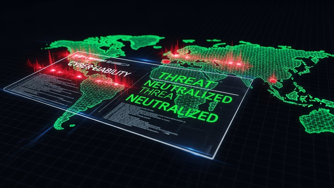
The Visual & Narrative Approach
Visualization Scenario: A high-tech "Dark Mode" environment displays a glowing wireframe world map. Pulsating Red heat zones emerge rapidly, indicating a spreading "Cyber Liability" threat. A sleek, semi-transparent UI overlay slides into view, running code snippets that turn the red zones into stable Green, stamped with "THREAT NEUTRALIZED." The aesthetic is precise, cyber-security focused, and high-contrast.
Narration Tone: Urgent, command-center style, and definitive. "Real-time accumulation control for a hyper-connected world."
Psychological Impact & KPI Focus
- Niche Psychology: Cyber is the most volatile class of business. Underwriters need to feel they have "God-Mode" visibility. This aesthetic taps into the Command & Control fantasy, reassuring them that they can manage silent cyber exposure.
- Operational Impact: Directly addresses Risk Aggregation Management. It shows how the platform handles high-velocity data to prevent accumulation clashes that could breach treaty limits.
Strategic Implementation & Trade-offs
- Best Use Case: LinkedIn video ads targeting Cyber Underwriters and Portfolio Managers.
- Duration: 15-20 Seconds.
- Trade-offs: Optimal for creating a sense of urgency and modernity. Suboptimal for traditional lines like Property, where this aesthetic may feel too aggressive.
Transition Strategy: Aggression works for Cyber, but regulatory compliance requires transparency. We must strip away the flash to show the secure core.
Companies using similar video content -
Verisk – AIR Worldwide – Catastrophe modeling.
KatRisk – Catastrophe modeling.
14. 3D X-Ray Visualization
MOFU | ROI Justification

The Visual & Narrative Approach
Visualization Scenario: A heavy, metallic bank vault door is rendered in Semi-Transparent Metallic Silver. As the door locks, the X-ray view reveals the internal mechanism: not just tumblers, but a perfectly organized stack of glowing Red and White digital ledgers and gears working in unison. The text "SOLVENCY II" is illuminated within the protected core, symbolizing the compliance engine hidden within the solid exterior.
Narration Tone: Secure, transparent, and regulatory. "Compliance isn't a hurdle. It's the engine of your security."
Psychological Impact & KPI Focus
- Niche Psychology: CROs (Chief Risk Officers) view compliance as a burden. This visual reframes compliance as a sophisticated, integral machine. The X-ray effect provides Visual Disclosure, proving there are no hidden flaws in the reporting engine.
- Operational Impact: Visualizes Auditability and Governance. It demonstrates that the logic driving capital requirements is robust, organized, and fully visible for regulatory review.
Strategic Implementation & Trade-offs
- Best Use Case: "Security" and "Compliance" pages, or investor relations videos.
- Duration: 20-30 Seconds.
- Trade-offs: Optimal for building deep institutional trust. Suboptimal for exciting sales teams; it is a defensive, not offensive, visualization.
Transition Strategy: With the secure core established, we can focus on the operational efficiency of the daily workflow—specifically, the art of selection.
Companies using similar video content -
Guidewire – InsuranceSuite – Policy, billing, claims, underwriting.
Majesco – P&C core suite, policy, billing, claims.
8. Abstract 2D Motion Graphics
MOFU | Feature Education
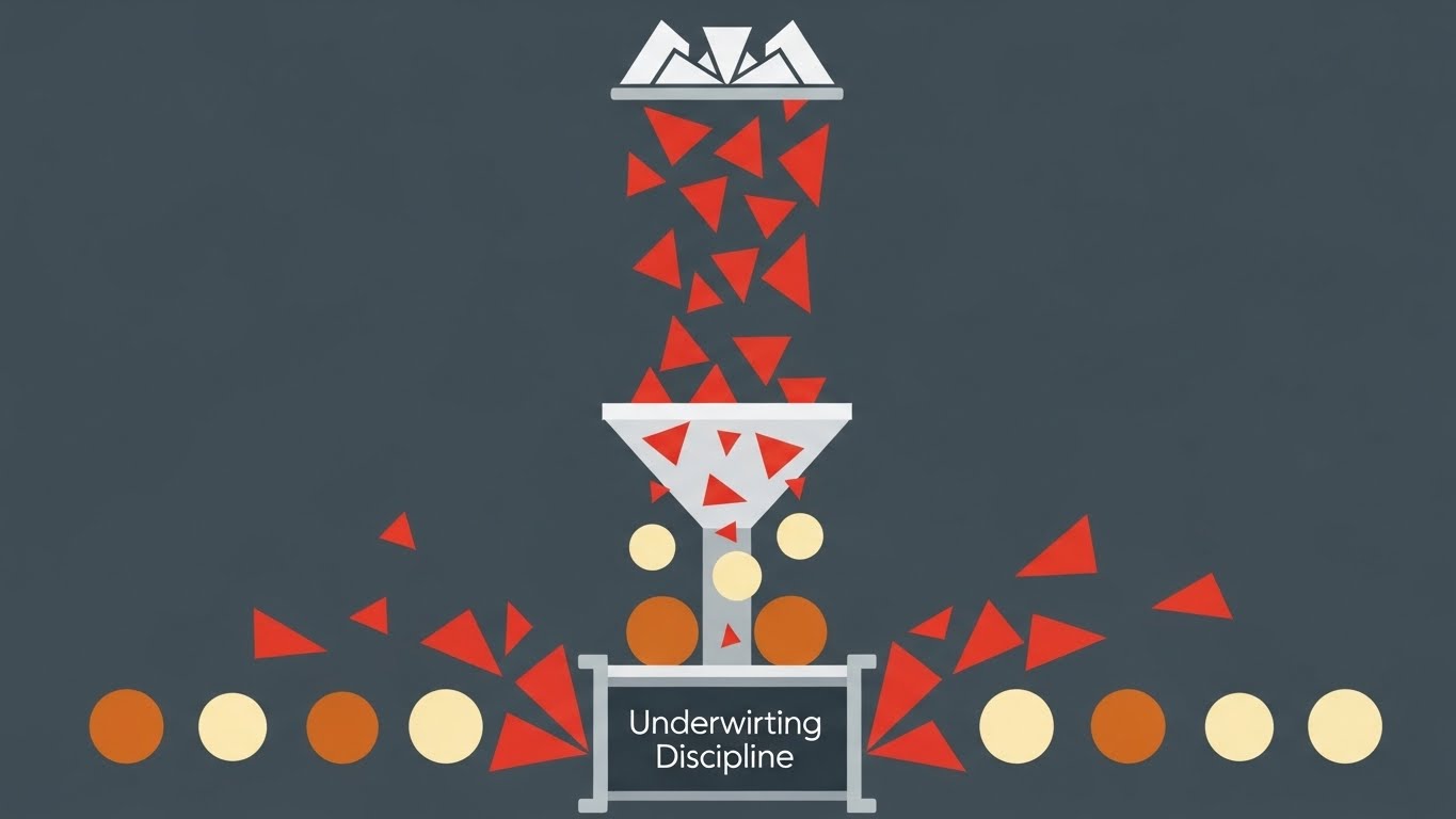
The Visual & Narrative Approach
Visualization Scenario: A flat, rhythmic animation showing a stream of geometric shapes falling into a funnel. Jagged red triangles (Bad Risk) are mechanically ejected sideways, while smooth Cream and Burnt Orange circles (Good Risk) flow unimpeded through the gate, landing in a neat row. The motion is satisfying and repetitive, visualizing the concept of "Underwriting Discipline" and automated filtering.
Narration Tone: Efficient, snappy, and rhythmic. "Filter the noise. Bind the quality. Automatically."
Psychological Impact & KPI Focus
- Niche Psychology: Underwriters are drowning in submissions. They suffer from "Decision Fatigue." This style appeals to the desire for an Automated Assistant that clears the desk of junk, allowing them to focus on complex deals.
- Operational Impact: Visualizes Submission Triage and Loss Ratio Improvement. It simplifies the complex rules engine into a clear "Pass/Fail" mechanic, demonstrating efficiency gains in quote-to-bind ratios.
Strategic Implementation & Trade-offs
- Best Use Case: Instagram/LinkedIn stories and quick social ads targeting junior to mid-level underwriters.
- Duration: 10-15 Seconds (Loopable).
- Trade-offs: Optimal for explaining the concept of filtering. Suboptimal for showing the complexity of the actual criteria used.
Transition Strategy: Once the risk is filtered, it must be managed. Now we simply show the dashboard where the decisions happen.
Companies using similar video content -
Cowbell – AI-powered cyber insurance and risk assessment.
At-Bay – Cyber insurance and proactive risk management platform.
16. Dark Mode UI Showcase
BOFU | Risk Mitigation
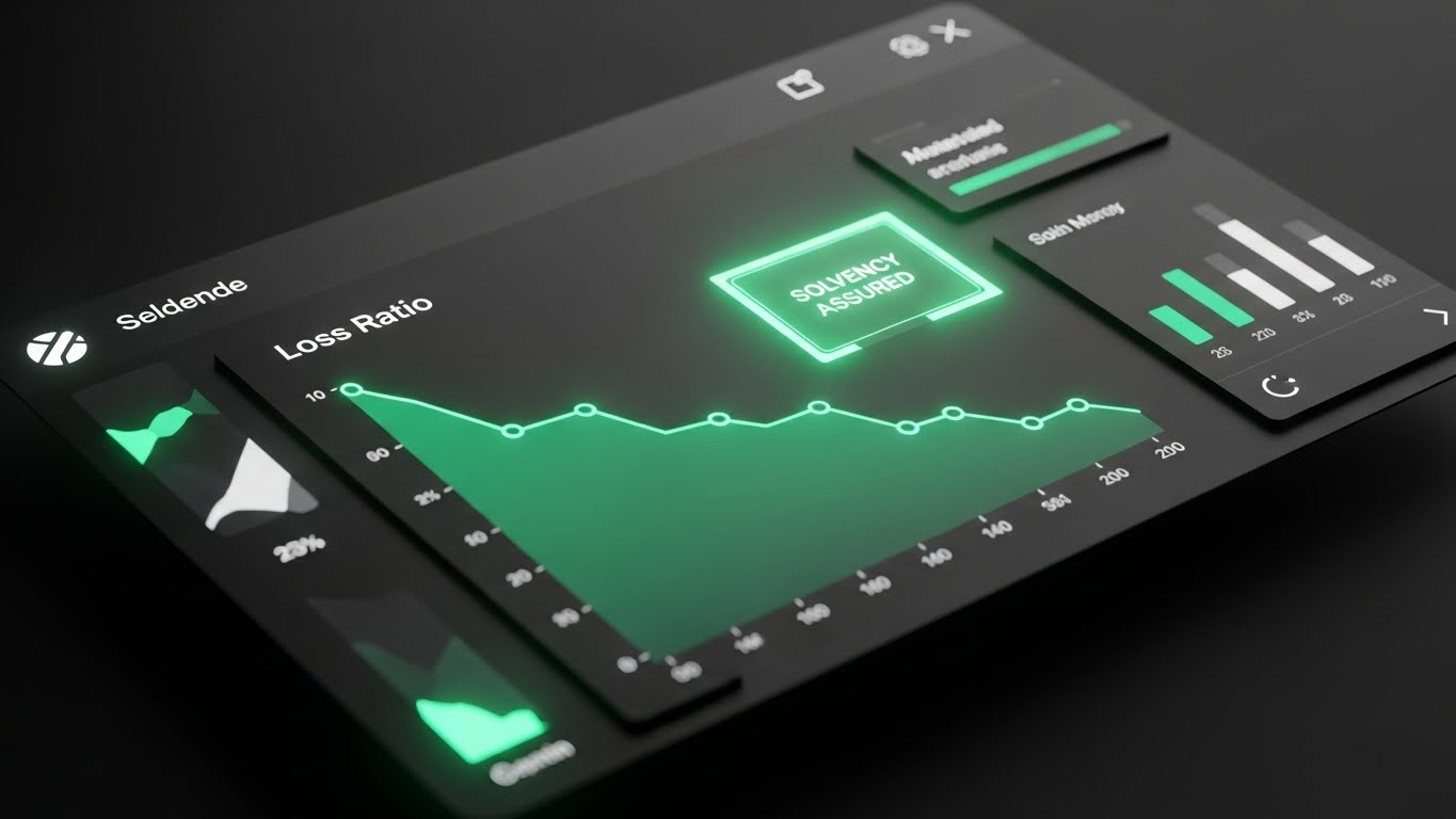
The Visual & Narrative Approach
Visualization Scenario: A sleek, high-fidelity UI presentation in "Dark Mode." The matte Dark Grey background makes the data pop. The central focus is a sharp, animated graph line in Emerald Green trending downward, labeled "Loss Ratio." A glowing badge appears: "SOLVENCY ASSURED." There is no clutter, just the purity of positive metrics and subtle drop shadows creating hierarchy.
Narration Tone: Professional, quiet, and results-oriented. "Clarity in the numbers. Confidence in the outcome."
Psychological Impact & KPI Focus
- Niche Psychology: For the CFO and Head of Analytics, the UI is the product. They judge software by its clarity. This "Dark Mode" aesthetic signals a modern, premium tool designed for heavy, daily use without eye strain (Cognitive Ease).
- Operational Impact: Visualizes Data Visualization Maturity. It proves the platform can synthesize complex treaty data into clear, immediate health signals for the portfolio.
Strategic Implementation & Trade-offs
- Best Use Case: Pricing pages, bottom-of-funnel landing pages, and demo request confirmation screens.
- Duration: 15-20 Seconds.
- Trade-offs: Optimal for validating UI quality. Suboptimal for explaining what lies behind the data; it assumes the user understands the metrics.
Transition Strategy: However, data on a screen is abstract. To close the deal, we must reconnect the software to the physical assets it protects.
Companies using similar video content -
Aon – Tyche – Actuarial modeling, capital management.
Milliman – MG-ALFA – Actuarial projection system.
20. Lifestyle Stock with UI Overlay
BOFU | Objection Handling

The Visual & Narrative Approach
Visualization Scenario: A high-end live-action shot of a female underwriter in a glass-walled office. She holds a tablet. Floating above the device is a detailed, Holographic Projection of a cargo ship. Data points in Blue and Warm Beige highlight the vessel's route, cargo value, and risk accumulation zones. She nods, tapping "Approve," blending the real world with the digital overlay.
Narration Tone: Empowering, human-centric, and sophisticated. "The power to see the full picture. In the palm of your hand."
Psychological Impact & KPI Focus
- Niche Psychology: Reinsurance is a relationship business. Pure software visuals can feel cold. This style reintroduces the Human Element, positioning the software as a superpower for the expert, not a replacement for them.
- Operational Impact: Visualizes Remote Assessment and Augmented Decision Making. It bridges the physical reality (the ship) and the digital decision (the tablet), reinforcing the "Physical/Digital Divide" narrative.
Strategic Implementation & Trade-offs
- Best Use Case: Case study videos, "Day in the Life" features, and testimonials.
- Duration: 20-30 Seconds.
- Trade-offs: Optimal for emotional connection and context. Suboptimal for showing detailed software mechanics.
Transition Strategy: From the specific deal to the grand strategy. The final decision sits with the C-Suite, where risk is a strategic game.
Companies using similar video content -
BOXX Insurance – Cyber risk management and insurance.
RiskOptics – ZenGRC – GRC management and compliance.
12. Photorealistic 3D Renders
MOFU | Data Storytelling

The Visual & Narrative Approach
Visualization Scenario: A slow, cinematic pan across a reflective glass chessboard. A Crystal Clear chess piece (the King) stands dominant. The lighting utilizes ray-tracing to create prism-like refractions in Gold and Clear tones. The scene is silent and heavy with significance, symbolizing the high stakes of "Strategic Risk" management and long-term planning.
Narration Tone: Epic, visionary, and final. "Reinsurance is strategy. Make your move with absolute clarity."
Psychological Impact & KPI Focus
- Niche Psychology: The CEO and Board do not care about UI buttons; they care about Market Position and Strategy. This imagery speaks the language of high finance, prestige, and dominance.
- Operational Impact: Visualizes Strategic Risk Management. It elevates the software from a "tool" to a "strategic asset" essential for winning in a competitive capital market.
Strategic Implementation & Trade-offs
- Best Use Case: Investor presentations, Annual Report digital headers, and "About Us" vision videos.
- Duration: 10-15 Seconds (Cinemagraph style).
- Trade-offs: Optimal for premium brand positioning. Suboptimal for explaining features; it is purely symbolic.
Transition Strategy: The strategy is clear. Now, the only barrier remaining is the fear of migration. We must show the upgrade is worth it.
Companies using similar video content -
Oracle Risk Management Cloud – Integrated risk, compliance, financial reporting.
SAI Global – Integrated risk management, compliance, ESG.
27. Split Screen: Optimized Reality and UI
Expansion | Feature Adoption
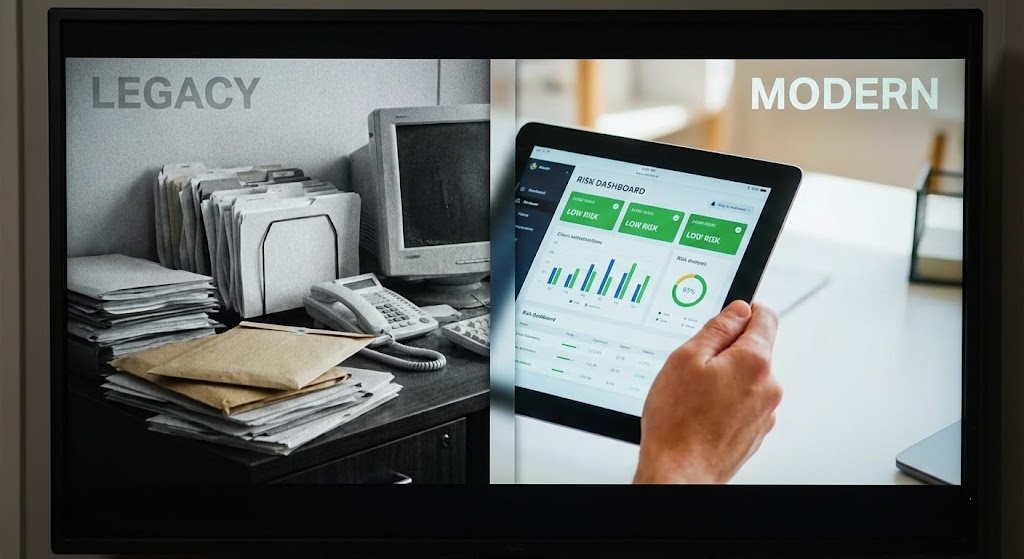
The Visual & Narrative Approach
Visualization Scenario: A split-screen composition. The left side (labeled "LEGACY") is desaturated, showing a messy desk piled with paper files and a clunky monitor. The right side (labeled "MODERN") is vivid, showing a hand using a clean iPad displaying an organized "Risk Dashboard." A vertical divider moves slowly to the left, allowing the modern UI to wipe away the chaotic past.
Narration Tone: Direct, comparative, and solution-oriented. "Leave the paper trail behind. Step into real-time intelligence."
Psychological Impact & KPI Focus
- Niche Psychology: The "Sunk Cost Fallacy" keeps firms tied to bad legacy systems. This visual provides a stark, undeniable contrast that triggers Loss Aversion—not for the money spent, but for the efficiency being lost every day by not switching.
- Operational Impact: Visualizes Digital Transformation ROI. It makes the intangible benefits of software (speed, organization) visibly superior to the tangible mess of the current workflow.
Strategic Implementation & Trade-offs
- Best Use Case: "Migration Services" pages and direct sales decks handling objections about implementation effort.
- Duration: 15-20 Seconds.
- Trade-offs: Optimal for forcing a choice. Suboptimal for subtle branding; it is a hard-sell tactic.
Transition Strategy: The choice is made. The final visualization serves to handle the most complex objection: can it handle the layers of our business?
Companies using similar video content -
BriteCore – Cloud-native core platform.
EIS – PolicyCore – High-velocity policy administration.
18. 3D Parallax UI Presentation
BOFU | Economic Buyer
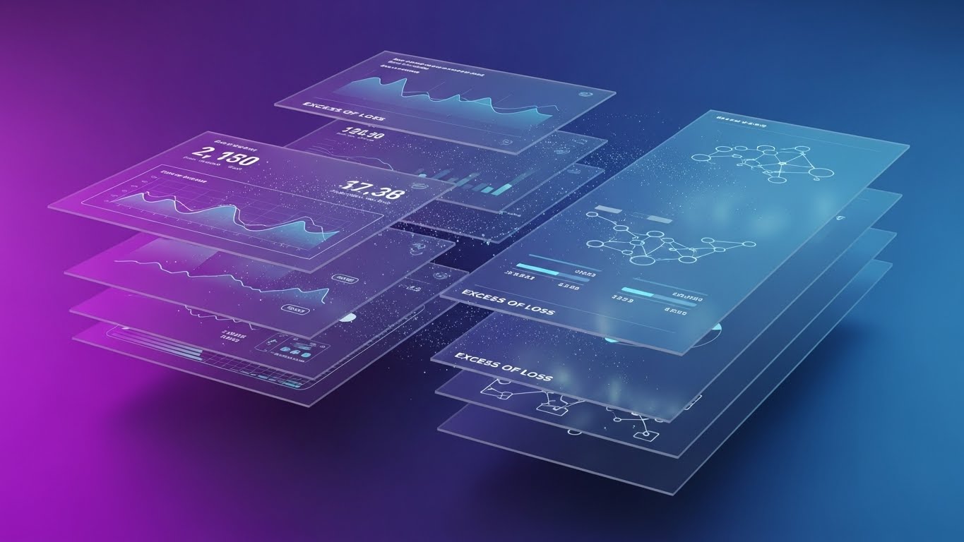
The Visual & Narrative Approach
Visualization Scenario: Multiple semi-transparent UI screens float in a 3D "Z-space" against a Gradient Purple to Blue void. The camera angles sideways to reveal the depth between layers. Data flows visibly between these screens, representing "Excess of Loss" tranches—showing how a claim pierces one layer and triggers coverage in the next.
Narration Tone: Sophisticated, multi-dimensional, and comprehensive. "Layered protection. Integrated visibility. One platform."
Psychological Impact & KPI Focus
- Niche Psychology: Reinsurance structures are multi-layered (QS, XoL, Retro). A flat screen fails to capture this depth. The parallax effect visualizes the Interconnectivity of the portfolio, reassuring the technical buyer that the system can handle complex "Tower" structures.
- Operational Impact: Visualizes Portfolio Holistic View. It demonstrates that the platform allows the user to drill down from the high-level summary (top layer) to the granular details (bottom layer) without losing context.
Strategic Implementation & Trade-offs
- Best Use Case: Bottom-of-funnel retargeting ads for users who viewed "Pricing" but didn't convert.
- Duration: 30-45 Seconds.
- Trade-offs: Optimal for showing complexity and depth. Suboptimal for simple, single-feature explanations.
Companies using similar video content -
Riskonnect – Integrated risk management, claims, policy, compliance, analytics.
Diligent – GRC, data analytics, fraud detection.
21. Clean UI Workflow (Light Mode)**
Onboarding | Time-to-Value
The Visual & Narrative Approach
Visualization Scenario: The screen opens on a pristine, high-key "Light Mode" canvas, utilizing a soft white background. A central, pill-shaped progress bar in Sky Blue fills smoothly from left to right. As it hits milestones (25%, 50%, 75%), small, stylized particle sparks pop gently, indicating "Module Activation." The interface is abstract but implies a friendly "Wizard" setup, devoid of complex data grids.
Narration Tone: Welcoming, light, and encouraging. "Welcome to clarity. Your workspace, ready in seconds."
Psychological Impact & KPI Focus
- Niche Psychology: The "Day 1" experience for a new user is often overwhelming. They expect a steep learning curve. This clean, airy visual counters that anxiety (Cognitive Ease), visually promising that the system is lightweight, modern, and ready to use immediately.
- Operational Impact: Visualizes Time-to-Value. It reassures the Implementation Manager that the "Migration Friction" is minimal and that their team can start binding risks almost immediately.
Strategic Implementation & Trade-offs
- Best Use Case: "Welcome" emails, onboarding kick-off decks, and "First Login" success screens.
- Duration: 10-15 Seconds.
- Trade-offs: Optimal for reducing implementation anxiety. Suboptimal for showing the depth of complex features; it focuses purely on the speed of setup.
Transition Strategy: Once the system is live, the user needs to feel supported without constantly calling the helpdesk.
Companies using similar video content -
AgencyBloc – CRM, commission tracking for life and health.
GloveBox – Mobile app for policyholders.
22. 2D Animation & UI Composition
Onboarding | Self-Serve

The Visual & Narrative Approach
Visualization Scenario: A composition blending a stylized 2D vector character with floating UI elements. The character, a professional guide dressed in Vibrant Lime and Purple, stands confidently on the right. They point to a large, floating "Help/Support" button on the left that glows invitingly. The background is a subtle geometric pattern, keeping the focus on the interaction between human intent and digital assistance.
Narration Tone: Helpful, prompt, and always-on. "Answers at the speed of risk. Support that never sleeps."
Psychological Impact & KPI Focus
- Niche Psychology: Users hate support tickets; they want immediate answers. This style visualizes Autonomy. The friendly character humanizes the "Help Desk," making it feel like a concierge service rather than a troubleshooting manual.
- Operational Impact: Targets Support Ticket Deflection. By visualizing the ease of self-serve tools, it encourages users to solve problems instantly, keeping the Ops team focused on complex queries.
Strategic Implementation & Trade-offs
- Best Use Case: In-app pop-ups (Intercom/Drift integrations) and "Getting Started" library covers.
- Duration: 15-20 Seconds.
- Trade-offs: Optimal for friendliness. Suboptimal for serious technical documentation.
Transition Strategy: Support is functional, but empathy is what builds long-term loyalty, especially in Claims.
Companies using similar video content -
Sapiens – Modular insurance software for life, P&C, reinsurance.
RNA Analytics – R³S – Actuarial and risk management suite.
23. 2D Character-Driven Story
Onboarding | Knowledge Base

The Visual & Narrative Approach
Visualization Scenario: A 3D character-driven scene in a high-quality, Pixar-like style. A Claims Manager sits at a desk, looking visibly stressed (furrowed brow). He taps a tablet glowing with Soft Amber light. A stylized "Shield" icon floats up, and his expression softens into a smile of relief. The lighting shifts from cool/tense to warm/inviting, symbolizing the resolution of a complex claim.
Narration Tone: Empathetic, narrative, and resolving. "Complex claims. Simplified solutions. Peace of mind delivered."
Psychological Impact & KPI Focus
- Niche Psychology: Claims professionals deal with conflict and loss daily. They need emotional validation. This style acknowledges their stress and positions the software as the hero that brings Emotional Relief.
- Operational Impact: Visualizes User Satisfaction (CSAT). It reinforces the narrative that the software isn't just a database; it's a partner that makes the hardest part of the job easier.
Strategic Implementation & Trade-offs
- Best Use Case: Knowledge Base intro videos and "Best Practices" tutorials on YouTube.
- Duration: 30-45 Seconds.
- Trade-offs: Optimal for storytelling and engagement. Suboptimal for showing precise UI steps (it’s too stylized).
Transition Strategy: While empathy retains the user, the buyer needs to see the full scope of the platform to renew the contract.
Companies using similar video content -
Guidewire – InsuranceSuite – Policy, billing, claims, underwriting.
Insurity – Sure Suite – Policy, billing, claims, underwriting, AI.
24. Rapid UI Feature Montage
Retention | Support Overhead
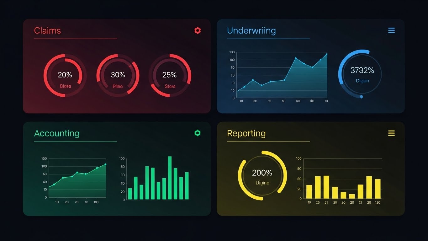
The Visual & Narrative Approach
Visualization Scenario: A dynamic grid composition split into four quadrants. Each quadrant displays a distinct abstract UI module: "Claims" (Red), "Underwriting" (Blue), "Accounting" (Green), and "Reporting" (Yellow). The animation cycles rapidly, highlighting the data interplay between them. It visually proves the "End-to-End" nature of the platform in a single glance.
Narration Tone: Rhythmic, fast, and comprehensive. "One platform. Every function. Total control."
Psychological Impact & KPI Focus
- Niche Psychology: Buyers often utilize only 20% of a platform's features. This visual triggers Fear Of Missing Out (FOMO) regarding their own utilization. It reminds them they are paying for a powerhouse suite, urging them to explore deeper.
- Operational Impact: Targets Feature Adoption Rate. It visually cross-sells the Accounting module to the Underwriting team, driving platform stickiness.
Strategic Implementation & Trade-offs
- Best Use Case: Quarterly Review emails and "New Feature" announcement blasts.
- Duration: 10-15 Seconds.
- Trade-offs: Optimal for breadth. Suboptimal for depth; it moves too fast for details.
Transition Strategy: To prevent churn, we must show that the software isn't just a screen—it impacts the real-world boardroom.
Companies using similar video content -
Archipelago Analytics – Commercial property risk management, AI for exposure data.
Karen Clark & Company – Catastrophe modeling.
25. 2D Graphics Over Live Action
Retention | Reducing Churn

The Visual & Narrative Approach
Visualization Scenario: High-quality live-action footage of a diverse boardroom meeting. As the executives discuss, 3D animated bar charts and "Real-time Analytics" graphs rise from the conference table in Neon Blue and Orange. The graphics track perfectly with the camera's perspective, integrating seamlessly with the real-world environment. It looks like the data is physically present in the discussion.
Narration Tone: Professional, collaborative, and integral. "Data that doesn't just sit on a server. It sits at the table."
Psychological Impact & KPI Focus
- Niche Psychology: Reinsurance deals are finalized by humans, not algorithms. This style validates the Hybrid Workflow, showing that the software empowers the conversation rather than replacing it.
- Operational Impact: Visualizes Actionable Intelligence. It proves the ROI of the software by showing its output directly influencing high-level strategy sessions.
Strategic Implementation & Trade-offs
- Best Use Case: Case Studies and "Customer Success" stories on LinkedIn.
- Duration: 20-30 Seconds.
- Trade-offs: Optimal for context and prestige. Suboptimal for low-budget productions due to tracking/compositing costs.
Transition Strategy: High-level strategy is key, but the most dangerous moment in the lifecycle is the renewal date. Let's automate it.
Companies using similar video content -
Applied Systems – Applied Epic – Integrated insurance management.
Vertafore – AMS360 – Agency management system.
26. Macro UI Micro-Interactions
Retention | Re-engagement

The Visual & Narrative Approach
Visualization Scenario: A cinematic macro shot focusing on a human finger hovering over a glass surface. The fingertip presses a glowing digital button labeled "Automated Renewal" with a circular refresh icon. The background is a soft, abstract bokeh. The interaction is deliberate and satisfying, symbolizing the ease of renewing a complex treaty.
Narration Tone: Quiet, effortless, and satisfying. "The easiest decision you'll make all year."
Psychological Impact & KPI Focus
- Niche Psychology: Renewals are traditionally frantic and paper-heavy. This visual distills the entire complex process into a single, effortless touch, triggering a sense of Relief and Modernity.
- Operational Impact: Visualizes Retention Velocity. It reminds the user that sticking with the platform is the path of least resistance compared to the friction of switching.
Strategic Implementation & Trade-offs
- Best Use Case: Retargeting ads 90 days before contract renewal.
- Duration: 6-10 Seconds.
- Trade-offs: Optimal for sensory appeal. Suboptimal for explaining the contract terms.
Transition Strategy: Once retained, the goal is expansion. We must sell the vision of the future.
Companies using similar video content -
Foliume – AI platform for brokers, automation, WhatsApp assistant.
Hyperproof – GRC workflows and continuous compliance.
27. Holographic UI over 3D Render
Expansion | Feature Adoption
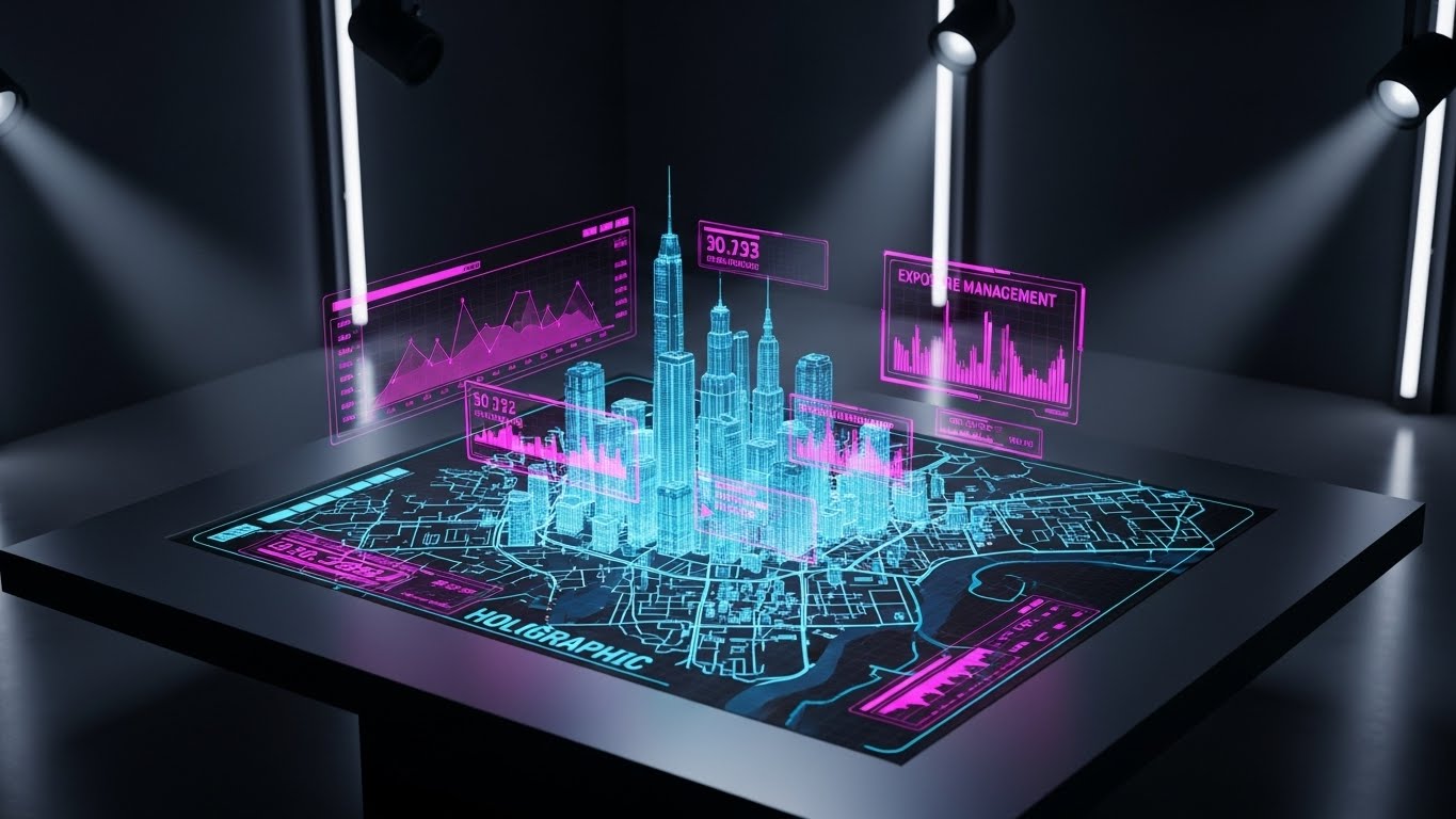
The Visual & Narrative Approach
Visualization Scenario: A holographic UI visualization in a dim, high-tech control room. A detailed 3D map of a metropolis rises from a tabletop, rendered in translucent Holographic Blue light. "Exposure Management" heat zones hover within the buildings. The camera looks down at the projection, emphasizing oversight and total accumulation control.
Narration Tone: Visionary, commanding, and futuristic. "See risk in three dimensions. Manage exposure with zero blind spots."
Psychological Impact & KPI Focus
- Niche Psychology: The "God View" is a powerful fantasy for Portfolio Managers. This style appeals to their desire for Total Situational Awareness regarding their accumulation risk in key zones (e.g., Florida wind, Tokyo quake).
- Operational Impact: Visualizes Upsell Potential. It markets advanced modules (like 3D Geocoding) to existing clients who only use basic features.
Strategic Implementation & Trade-offs
- Best Use Case: Product pages for "Advanced Analytics" modules.
- Duration: 20-30 Seconds.
- Trade-offs: Optimal for "Wow" factor. Suboptimal for showing standard data entry screens.
Transition Strategy: Static maps are good, but risk is dynamic. The future is real-time telematics.
Companies using similar video content -
LogicManager – Enterprise risk management and compliance.
OneTrust – Privacy, security, and governance platform.
28. Hyper-lapse Stock Footage with Data
Expansion | Upsell

The Visual & Narrative Approach
Visualization Scenario: A high-energy hyper-lapse of a busy city intersection at night. Car lights create long streaks. Overlaying the streets are digital data streams in Bright Cyan and Magenta, tracking the flow of traffic and risk. Floating tags read "Risk Score: Low" and "Telematics Active." The energy is fast-paced, symbolizing the shift to dynamic, usage-based reinsurance models.
Narration Tone: Dynamic, fast, and forward-looking. "Risk doesn't stand still. Neither should your data."
Psychological Impact & KPI Focus
- Niche Psychology: The industry is buzzing about "Real-Time Risk." This visual positions the platform at the bleeding edge, appealing to the Innovator segment of the client base.
- Operational Impact: Visualizes Data Integration Capabilities. It demonstrates the platform's ability to ingest high-frequency API feeds from IoT devices.
Strategic Implementation & Trade-offs
- Best Use Case: Social ads promoting new API integrations or Telematics partnerships.
- Duration: 10-15 Seconds.
- Trade-offs: Optimal for excitement. Suboptimal for traditional treaty explainers.
Transition Strategy: Innovation wins accolades, but partnership wins the market. We conclude with the human success story.
Companies using similar video content -
OasisLMF – Open-source catastrophe modeling framework.
Open Source Risk Engine (ORE) – Risk analytics and XVA platform.
29. Aspirational Stock Montage
Expansion | Advocacy

The Visual & Narrative Approach
Visualization Scenario: A bright, aspirational stock photo of a modern, diverse team in a sunlit office. They are high-fiving or celebrating a win. The lighting is natural sunlight with fresh Green and White tones. There are no heavy data overlays—just the pure emotion of a "Combined Ratio" win.
Narration Tone: Warm, celebratory, and human. "Your success is our metric. Together, we outperform."
Psychological Impact & KPI Focus
- Niche Psychology: Ultimately, clients want to feel like heroes in their organization. This style reflects their Ideal Self-Image—successful, happy, and validated by their choice of software.
- Operational Impact: Visualizes Net Promoter Score (NPS). It associates the software brand with positive professional outcomes, fostering advocacy.
Strategic Implementation & Trade-offs
- Best Use Case: "Year in Review" emails and "Referral Program" invites.
- Duration: Static Image or 5-second slow zoom.
- Trade-offs: Optimal for emotion. Suboptimal for differentiation (it looks like generic stock without context).
Transition Strategy: Finally, we position the brand not just as a vendor, but as a thought leader guiding the industry's future.
Companies using similar video content -
Pega – Pega Policy Administration System – Policy administration.
Life.io – Empower – Digital engagement for life insurers.
30. Generative AI Realistic Character Video
Expansion | Thought Leadership
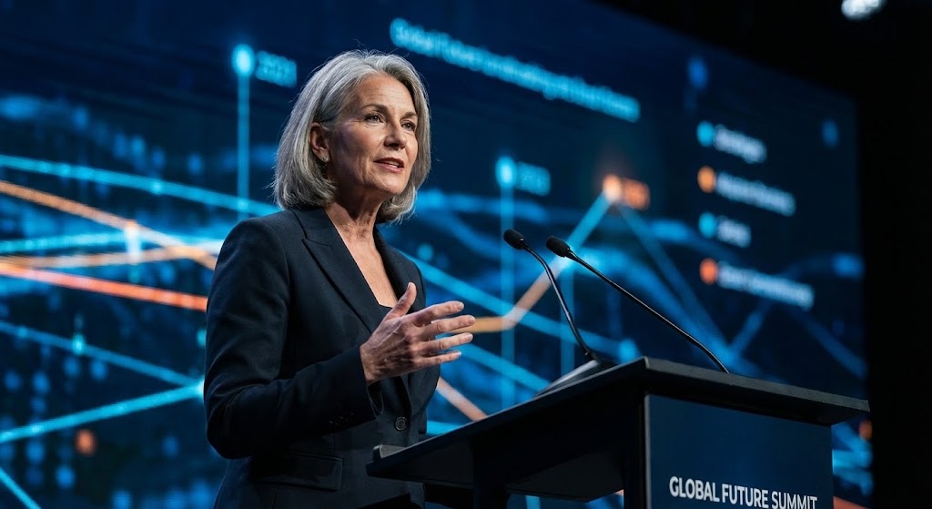
The Visual & Narrative Approach
Visualization Scenario: A medium close-up of a distinguished keynote speaker (generated by AI) on a stage. The lighting is dramatic, professional studio quality. The background is a blurred, large LED screen displaying abstract financial data nodes. The speaker looks confident and is mid-speech, embodying the persona of a Reinsurance thought leader.
Narration Tone: Authoritative, wise, and industry-shaping. "The future belongs to the connected. Lead the change."
Psychological Impact & KPI Focus
- Niche Psychology: Executives listen to peers. This style leverages Social Proof and Authority Bias, positioning the software company as a consultancy-grade partner that understands the macro-economic landscape.
- Operational Impact: Visualizes Brand Equity. It elevates the conversation from "features" to "market philosophy."
Strategic Implementation & Trade-offs
- Best Use Case: Webinar invites, Whitepaper summaries, and "Vision 2030" content.
- Duration: 30-60 Seconds.
- Trade-offs: Optimal for credibility. Suboptimal for product demos.
The Strategic Knowledge Base: The Visual Operations Doctrine
Having defined the 30 visual styles, we must now synthesize them into a cohesive operational strategy. This is not about "making pretty videos"; it is about deploying a Visual Operating System that drives adoption, efficiency, and ROI.
Strategic Alignment & Visual Architecture
The "Pre-Production" Strategy. Why and Who.
- The Underwriter's Cognitive Audit: Before commissioning a single pixel, audit the "Cognitive Load" of your users. An underwriter reviewing 50 submission packs a day requires high-contrast, "Glanceable" visuals (Style 16) that highlight exceptions, whereas an Actuary requires dense, explorable data visualizations (Style 6).
- Role-Based Visual Mapping: Do not use the same visual language for everyone. Create a visual hierarchy: Simple, mobile-friendly motion graphics for Relationship Managers on the road (Style 4), and complex, desktop-centric UI walkthroughs for Technical Accountants (Style 10).
- The "Glanceability" Standard: In the high-speed environment of renewal season, a user should understand the risk status in under 5 seconds. Enforce a design standard where "Red" always means "Stop/Check" and "Green" always means "Bind/Proceed" across all video assets to create a unified visual reflex.
- Brand Voice Consistency: Your platform likely consists of disparate modules (Legacy + New). Use a consistent overlay style (Style 25) to visually unify these tools, making them feel like a single, cohesive ecosystem even if the underlying code is different.
- The Advids Strategic Audit: Partnering with a specialized agency like Advids allows you to define this "Visual Operating System" upfront. This ensures that every asset, from a 6-second ad to a 60-minute tutorial, builds the same brand equity.
- Standardization vs. Customization: For core features (Claims Entry), use standardized, scalable assets (Style 21). For high-value, bespoke features (Parametric Triggers), invest in high-fidelity 3D productions (Style 7) to signal premium value.
- The Cross-Departmental Bridge: Use video to unify terminology. If Sales calls it "Risk Transfer" and Ops calls it "Retrocession," use a visual metaphor (Style 2) to show they are discussing the same mechanism, reducing internal friction.
- Legacy System Integration: Visualizing the connection between old on-premise servers and new cloud interfaces is critical. Use "Wireframe to Reality" styles (Style 27) to validate the user's past experience while guiding them to the future.
- Accessibility in Global Markets: Reinsurance is global. Ensure all text-heavy styles (Style 4) are designed with "Text-Safe" zones to allow for easy localization into Spanish, French, or Japanese for global hubs like Zurich and Tokyo.
- The Mobile-First Mandate: Even if your software is desktop-based, your marketing is consumed on mobile. Ensure all styles, especially styles 1-10, are optimized for vertical consumption (9:16) to catch Brokers scrolling on LinkedIn during commutes.
Operational Adoption & Implementation
The "Deployment" Phase. How to embed visuals into the workflow.
- Overcoming "Black Box" Anxiety: Actuaries and Senior Underwriters are skeptical of algorithms they cannot see. Use Style 11 (Abstract AI) and Style 6 (Dynamic Data) to visualize the logic of the algorithm. By showing the data "organizing itself," you provide Cognitive Relief and prove that the AI is an assistant, not a replacement.
- The Micro-Learning Shift: Stop sending 50-page PDF manuals. Break complex "Solvency II" or "IFRS 17" workflows into 30-second "Micro-Learning" clips (Style 26). These assets should be embedded directly into the software (Contextual Help), reducing the need for external training sessions.
- Just-in-Time Support: Embed specific visual styles directly into the "Help" modal. If a user struggles with a "Claims Entry," a pop-up video showing Style 5 (Character Story) can guide them through the emotional and technical steps, resolving the issue before a ticket is created.
- Gamification of Risk Discipline: Underwriting discipline is hard to enforce. Use Style 8 (Abstract Motion) to visualize the "Filtering" process. Gamify the concept of "Good Risk Selection" by showing the satisfying, rhythmic sorting of data. This subtle psychological cue reinforces the desired behavior.
- Reducing Support Ticket Volume: There is a direct correlation between proactive visual guides and reduced call center load. Mapping the top 10 support queries to specific "Self-Serve" videos (Style 25) can drop ticket volume by 30%.
- Remote Onboarding: With distributed teams, you cannot rely on in-person seminars. Leverage 3D storytelling (Style 10) to train remote teams on complex workflows like "Treaty Hierarchy" without a single physical meeting.
- Standard Operating Procedures (SOPs): Transform text-based Standard Operating Procedures (SOPs) for claims triaging into linear, animated process flows. Visuals are recalled 60,000x faster than text, crucial for compliance during a catastrophe event.
- Feedback Loops: Use interactive video elements to gather feedback. If a user watches a "How-to" video on "Fac Placement" twice, trigger a pop-up asking if they need human help, proactively solving frustration.
- Scalable Localization: When expanding to LATAM or APAC, use "Text-Free" visual narratives (Style 1) where possible. This allows you to reuse the same visual asset globally, changing only the voiceover or subtitles, saving massive production costs.
- Leadership Communication: Use high-end "Boardroom" styles (Style 23) to communicate quarterly strategy to internal stakeholders. Executives respond better to polished, data-rich video than to raw spreadsheets.
Measuring Impact & Future-Proofing
The "ROI" Phase. Measuring success and looking ahead.
- Beyond "Views" – Measuring Velocity: The KPI for a "New Feature" video isn't clicks; it's Feature Adoption Rate. If you launch an "Exposure Management" module with Style 24 (Holographic UI), measure how many users activate the module within 7 days.
- The "Idle Time" Metric: Poor interfaces cause "Idle Time"—users staring at screens, confused. High-quality onboarding visuals (Style 15) reduce this. Measure the decrease in "Session Duration" for standard tasks (efficiency) and the increase in "Quote Volume" (productivity).
- Compliance Velocity: When new regulations like IFRS 17 or Solvency II drop, measure how fast the team achieves compliance certification using video training versus old text-based methods.
- Retention and Churn: Track the Net Promoter Score (NPS) of clients who engage with your "Customer Success" videos (Style 21). Higher engagement with educational content is a leading indicator of high retention.
- The AI Visual Frontier: The future of reinsurance is Generative AI. Prepare your visual strategy for this shift. Style 30 (Gen AI Character) is just the beginning. Future-proof your assets by designing data visualizations (Style 22) that can be fed by real-time API streams.
- Scalability of Assets: Build a "Modular Asset Library"—separate layers for UI, Characters, and Backgrounds. If your UI updates from "Light Mode" to "Dark Mode," you shouldn't need to re-shoot live action; you simply swap the UI layer in Style 23.
- The Advids Partnership: This is where Advids transitions from a content vendor to a strategic growth partner. By maintaining your central asset library, they ensure that as your platform scales, your visual language evolves without fracturing.
- Benchmarking Success: Do not just compare your visuals to other software. Compare them to consumer apps (Spotify, Uber). Your users expect "Consumer-Grade" UX even in B2B Reinsurance software.
- The ROI of Safety: Quantify the reduction in "Claims Leakage" attributed to better visual training. If a video saves 1% of leakage on a $100M book, the ROI of the video program is exponential.
- Final Call to Innovation: In the $769 billion reinsurance market, clarity is the ultimate competitive advantage. By treating video not as "marketing content" but as "operational infrastructure," you build a platform that is not only bought but trusted, adopted, and championed. The transition from "Legacy" to "Leader" is visual. Make it clear.
Companies using similar video content -
Openkoda – Open-source platform for custom insurance apps.
BriteCore – Cloud-native core platform.
Author & Editor Bio


